data visualization market landscape report · twenty-eight percent of vendors provide horizontal...
TRANSCRIPT

Data Visualization Market Landscape Report

Data Visualization Market Landscape Report
�
Table of ContentsExecutive SummaryOverview and Introduction Methodology and Survey Overview General Assumptions Understanding Dashboards and Data Visualization Where Dashboards Fit Within Business Intelligences Data Visualization Market Overview Targeted Solutions – Industry and Department Specific Target Audience Delivery Model Vendor Licensing Model Technical Requirements Feature and Functionality Breakdown Vendor/data Visualization Category Overview Common Dashboard Applications – Case Study AccuRev implements self-service dashboards using InetSoft Company Overview Business problem Solution Challenges Recommendations and lessons learnedConclusion and Recommendations Appendix 1 – Overview of Vendor Participants/Competitive LandscapeAuthorSponsorsMedia Sponsor
�34555678
10111�1315
161919191919�0�0�1���7�7�7
Table of Contents

Data Visualization Market Landscape Report
3
Executive Summary
Dashboards are becoming one of the most valuable tools for organizations to gain visibility into how they are performing as well as help develop ways for increasing overall efficiencies. Whether as part of a larger business intelligence (BI) solution or as a standalone solution, organizations are looking at dashboards to help solve their business problems. Unfortunately, the ability to sift through solutions and understand the nuances of the data visualization industry is not always easy. This report aims to provide an overview of the data visualization market by identifying what dashboards are, the value they provide, what offerings are provided by vendors, and the considerations organizations should take into account when looking at solutions.
To collect this information, a survey of solution providers was performed to identify industry trends, features and functionality, positioning, etc. Overall, �6 vendors participated in the survey. These include Dundas Data Visualization, IBM, InetSoft, Information Builders, Klipfolio, PivotLink, Tableau Software, Visual Mining, and QlikTech. In addition, industry research and interviews were conducted to provide a broad view of the data visualization industry and the value dashboards provide to the organization. Vendors were broken out into categories to help identify the types of solutions they provide. These include analytical, operational, Microsoft specific, and business performance management. In general, vendors fall into multiple categories.
Twenty-eight percent of vendors provide horizontal solutions to their customers letting them customize dashboards. The most targeted vertical solution is manufacturing at 3�%, with high tech a close second at �8%. Marketing and operations are the most broadly targeted departments within an organization at 44% and 40% respectively. Sales dashboards come in a close third place with 36% of vendors offering sales dashboard solutions. Business decision makers are the largest targeted market related to decision makers at 80%, with finance being the lowest targeted audience at just 44% of data visualization vendors.
With cloud computing and Software as a Service becoming an important delivery model within BI and the overall software industry, it is not surprising that 17% of vendors offer on-demand models and that 43% of vendors offer both on-premise or Software as a Service solutions. As this model becomes more widely adopted within the market, solution providers that do not currently provide hosted solutions will begin to do so, giving organizations more of a choice when looking at the type of deployment option they prefer.
With technical advancements, the ability to provide a wide range of features and functionality is no longer a key differentiation when evaluating solutions. Consequently, vendors have also expanded their support and licensing structures to create more flexible solutions for their customers. This means organizations have the upper hand when looking at the dashboard solutions that best meet their business requirements.

Data Visualization Market Landscape Report
4
Overview and Introduction
With so many options available within the BI and data management industries, the ability to sift through products and solutions to understand the value proposition of disparate categories within BI is not always intuitive. Consequently, organizations may end up with solutions that do not fully meet their business requirements. Alternatively, organizations might not even know where to start when looking to enhance their performance. In addition, many publications and research reports created focus on expanding current user knowledge of the market and target organizations that have already adopted some form of business intelligence, limiting what is available for organizations in the beginning phases of BI adoption. This report takes a different approach by targeting companies seeking guidance when looking at dashboards and data visualization to help enhance their decision-making ability.
Dashboards let organizations gain insights into their business, monitor key performance metrics, and help visualize information in a way that is easier to quantify. By understanding the value of using dashboards as part of a larger BI project or as a way to manage and monitor performance, the ability to attain buy-in and to understand the overall value of dashboards to the business increases.
The purpose of this report is to help organizations understand:
what dashboards are and how they are applied within organizations,
how dashboards fit within the world of business intelligence,
the business value of using dashboards,
what types of solutions are available and who the players are, and
how these solutions differ from one another on a high level.
Organizations will understand the business value of deploying dashboards. Case studies will provide practical examples of how dashboards are used in organizations, the business value gained through dashboard use, and the lessons that organizations have learned that can benefit other organizations evaluating solutions.
In general, two categories of organizations exist within the data visualization/dashboard market. The first consists of those that are using business intelligence within their organization and have a good understanding of how solutions work. The second is those interested in learning more and getting value out of a solution but do not have the time or resources to sift through the plethora of solutions or to understand the nuances between industry-standard terminology and how it relates to the various solutions available. Unfortunately, because of the industry focuses on the advanced audience, there are few resources available for those trying to get up to speed on the industry, to justify the value of investing in BI, and to identify what solutions are available and how they differ on a high level. This report assumes little previous knowledge to enable all organizations to get the benefits of identifying the various types of solutions and how organizations can benefit.
•
•
•
•
•
Data Visualization Market Landscape Report
5
Methodology and Survey Overview
The information collection for the market landscape report occurred in three general ways:
A survey was distributed to vendors to identify where they see themselves fitting in the market, the high-level feature and functions they provide, their service offerings, what other technologies they integrate with, etc. The survey includes �6 questions that identify a vendor’s target vertical markets, licensing structure, main competition and key differentiators. The overall goal of the survey is to identify where each vendor fits within the overall data visualization market, how they compare and contrast on a high-level based on category placement, and give organizations a general overview of what solutions are available.
Case studies and end-user interviews were conducted to identify how organizations are currently using dashboards, what challenges they have encountered and what they learned in the process.
Industry research was collected, including secondary sources of research such as utilizing current market resources, interviews about the data visualization industry, and understanding how the market is seen from vendor and industry experts perspectives.
General Assumptions
The vendors in this report are a subset of total vendors within the data visualization space. The only vendors represented are those that filled in the survey completely and were willing to showcase their solutions and answer additional questions.
The graphs and charts presented are based on a subset of survey results.
The information represented is up to date as of Q� �009.
The overall information presented is meant to give a high-level view of the data visualization market and the types of offerings available. In-depth explanations regarding technology or licensing, professional services, and support are outside the scope of this document.
Understanding Dashboards and Data Visualization
Many definitions exist within a continuing debate of what true data visualization entails. This ranges from data visualization simply being a display of information towards being the analytical representation of data. Despite these debates and different definitions of what data visualization is, for the purposes of this report, data visualization and the use of dashboards is the visual representation of data, whether that data comes from a data warehouse, is streamed from operational systems or is stored and updated using in-memory capabilities. Some solutions discussed within this report offer only a connection to analytical data and provide the look and feel so that end users can drill through and analyze their requirements; other solutions enable organizations to perform in-depth analytics on top of the dashboarding and visualization components, and others still, offer dashboards as a subset of offerings within overall product suites.
1.
�.
3.
1.
�.
3.
4.

Data Visualization Market Landscape Report
6
Because organizations have diverse requirements, various vendors within multiple categories will be included to help give organizations the information they need to help with decision making in regards to the type of solution required. This range of solution representation enables organizations to choose the type of solution that best meets their business requirements and also understand the additional components that may be required. For instance, a visual dashboard that displays information is not the same as an analytical dashboard. The former may require a back-end analytical engine as opposed to the latter that is more likely to be standalone in terms of requiring other business intelligence components.
The general purpose of dashboards and applying data visualization techniques is to help decision makers access and identify the right information, that when combined, provides additional insight leading to more informed decisions. Whether identifying sales performance against set targets, employee performance, or problem resolution rates, the fact is that dashboards have the flexibility to monitor and manage an organization’s every-day performance leading to better management and planning.
Where Dashboards Fit Within Business Intelligences
To understand the value dashboards bring to the organization, it is important to first identify where dashboards fit within the application of analytics within the organization. When simplified, business intelligence can be broken down into four distinct layers:
Data infrastructure – this can be considered the backbone of the system. In many cases this includes a data warehouse, or other database that can be used to hold information separately from the information housed in the organization’s operational systems. The reason data is stored in a separate system is twofold. One, many organizations do not want to affect production system performance by running complicated reports and queries against operational data. And two, within a data warehouse, data is stored at various points in time, leading to the ability to identify and analyze trends-based data and identify underlying patterns that would otherwise remain undetected.
Data integration – activities within this category include taking data from one or various source systems and integrating that data into a data warehouse. In some cases, data is streamed directly into a reporting or front-end solution. However, for organizations looking to identify trends and use historical data to make forward-looking predictions, the use of a data warehouse to store this information becomes important. Data integration also includes activities such as data profiling, data quality and all of the extract transform and load (ETL) actions to make data ready to be transformed into valuable information.
Data analysis – this phase takes the data that lives inside a data warehouse and transforms it into actionable information that is seen on reports or on dashboards, scorecards and analytics tools. Analysis can include data mining or text mining to help uncover hidden patterns, algorithms used to report accurate sales values or virtually any other form of data combinations that can help increase overall visibility within the organization.
Data presentation – this is where data visualization fits within BI – on the top layer to help organizations present information in a way that is actionable. The goal of the presentation layer is to help decision makers understand where they stand regarding the targets they set, overall performance, etc.
1.
�.
3.
4.

Data Visualization Market Landscape Report
7
Data Visualization Market Overview
There is much debate over the intricacies of data visualization and dashboards. This includes design, delivery, metric development and any aspect included as part of their deployment. Consequently, it is not always easy to keep the discussion of a dashboard (its design and how it brings value to organizations) simple. For the purposes of this report, the definition of dashboards and data visualization will be contained within the role of dashboards and scorecards used as part of or as an extension of business intelligence applications. Essentially, organizations may use these solutions for multiple and varied purposes; the overall goal, however, remains gaining visibility into the overall performance of the organization and the transformation of data from being a roadblock to enabling decision making.
The goal of these applications is to visualize information so that data gathered can be better analyzed in a way that is easier to digest. For instance, reporting that a department has met 83% of its monthly sales target on the 15th of the month is less effective than showing a visual representation of a radial gauge with the arrow pointing at 4/5 of the way to 100% of the monthly target or amount. This example represents one of the many that, when combined with key performance metrics (KPIs), enable organizations to get more out of their data.
In the past, dashboards were generally deployed as a subset of a larger business intelligence solution. As technology advanced and as BI solutions become more flexible, dashboards have developed into their own niche market, with vendors offerings best-of-breed dashboard solutions to be used on top of current BI applications or alternatively on top of operational systems. This new and expanded approach allows organizations to get a daily or intra-daily view of how they are performing. Whether used as part of a larger business intelligence platform or independently, dashboard use is flexible and solutions can accommodate an individual organization’s business needs.

Data Visualization Market Landscape Report
8
Targeted Solutions – Industry and Department Specific
Dashboards now encompass more broad offerings including horizontal solutions that can be built and customized or those targeted towards specific business functions. In this category, offerings may include marketing campaign analysis, sales analysis or trending over time. Vendors generally offer solutions broken out over the following industries and departments.

Data Visualization Market Landscape Report
9
To understand how vendors target their solutions towards specific vertical industries, it becomes important to understand the two ways industry can be differentiated:
Customer base, and
Packaged solution.
In many cases solution providers develop a customer based within a number of specific industries. This means they are well poised to understand the unique issues facing companies within those industries and they provide additional services to get the most value out of dashboard use. This expertise differs from vendors offering industry-specific packaged solutions. These vendors generally have large customer bases within one or numerous vertical markets and develop solutions that are pre-packaged with set metrics, business rules and functionality that enables customers to get more value out of these solutions more quickly. Even if these solutions do not provide 100% of what an organization requires, little customization is required to tweak the solution. Examples include healthcare (HIPAA compliance), communications, manufacturing, etc.
In addition to industry-based solutions, vendors develop departmental solutions as well. The premise is similar as that above – departmental or solutions offered targeting specific business units enable organizations to implement data visualization applications more quickly than having to spend time on customizations. Generally, this involves having metrics out of the box that match requirements within sales, marketing, operations, call centers, and the like. Out of the solutions available, marketing tops the list with 44% of vendors targeting marketing functions. Following close behind is operations at 40% and sales at 36%. Accounting, HR, and finance-oriented solutions are offered by �0% of respondents. In general, these solutions are not typical BI focuses, but as analytics and collaboration expands across the organization, these areas will also be increasingly applied within an organization’s BI strategy.
1.
�.

Data Visualization Market Landscape Report
10
Target Audience
Aside from the type of solutions offered, many vendors target their solutions towards specific audiences within the organization. In some cases this means developing solutions for business analysts (or executives) and in other cases this means that marketing messages are targeted towards specific roles within the organization. In general, the trend of targeting roles within an organization is increasing and will continue to do so as dashboards become more intuitive and customizable at the end-user level.
At 80%, business decision makers are the most targeted with IT decision maker following close behind at 64%. Most decisions are made with collaboration between both groups. IT may implement and manage a solution, but the day-to-day users generally remain business decision makers or business analysts (at 56%). When looking at business analysts specifically, many solutions are targeted to address these roles within the organization because business analysts tend to focus on continuous business improvements.

Data Visualization Market Landscape Report
11
Delivery Model
The chart below identifies the number of vendors offering on-premise versus on-demand or Software as a Service solution delivery. Forty percent of vendors offer their solutions in house, whereas 17% of vendors provide their customers with a hosted services model. The remaining 43% offer both models. As Software as a Service and solutions in the cloud continue to gain momentum, more vendors may make their solutions available for both on-premise and on-demand deployments, giving organizations a broader range of options. For vendors offering only on-demand solutions, their customers are usually already familiar with the model by using other on-demand solutions such as Salesforce.com, or have their ERP, CRM, or HR solutions hosted.

Data Visualization Market Landscape Report
1�
Vendor Licensing Model
The following graph identifies the licensing models offered by vendors. Because of the general flexibility within software delivery and deployment, licensing structures are also more broadly applied within organizations than they were in the past. This means that organizations can use the model that best meets their needs as opposed to having to conform to vendor offerings. The most common types of licensing are CPU/server-based at 56% and perpetual licensing with additional yearly support at 48%. Sixteen percent of vendors listed other in addition to the licensing structures identified. In these cases, the other category includes specific licensing for developers and concurrent users.

Data Visualization Market Landscape Report
13
Technical Requirements
After looking at the types of solutions offered by vendors and factors affecting cost, such as licensing fees, organizations also look at integration and general features and functionality. One of the most important factors for many organizations is the time to it takes to implement a solution. The ability to integrate with an organization’s internal data sources can affect the time it takes to implement a data visualization solution. The following graphs provide an overview of integration and vendor exporting capabilities.

Data Visualization Market Landscape Report
14
The products supported by data visualization vendors most are Microsoft SQL Server at 88%, flat files at 84%, and tied for third place are Excel and Oracle at 80%. The Other category includes support for DB�, ODBC, JDBC, Web Services, map reduce, Salesforce.com and HTML tables. In general, most data visualization tools support integration with more than one type of data source to accommodate their customers who want to combine data from multiple operational sources. Certain vendors support only Microsoft environments, whereas others support multiple types of data.
In addition to support, solutions import data from CSV files, Excel, RSS feeds, etc. as well as export data to allow decision makers to share information across the organization. The majority of supported exports are to Excel and CSV files at 88% and 84% respectively. Export to PDF is third at 64%. Sources such as RSS and XML are increasing in popularity as organizations expand their data analysis towards external and unstructured data sources. This expansion of supported exports becomes most obvious when looking at the fact that 48% of vendors export to non-traditional sources such as HTML, Microsoft Word, flat files, and images increasing the diversity and role of dashboard data beyond analytics.

Data Visualization Market Landscape Report
15
Feature and Functionality Breakdown
With technological advancements, features and functionality are becoming less of a differentiation when looking at competitive solutions. Vendors are now required to provide value added services in order to differentiate themselves from their competitors. However, identifying what features are supported at a high level can help organizations understand where their requirements fit within the overall market and the number of vendors that support those features.
The following chart identifies �5 features and functions that organizations have identified as important factors when looking at data visualization solutions:
Data Visualization Market Landscape Report
16
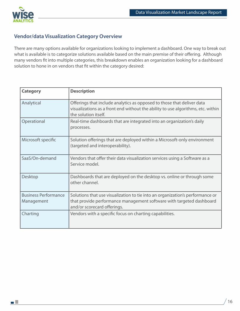
Vendor/data Visualization Category Overview
There are many options available for organizations looking to implement a dashboard. One way to break out what is available is to categorize solutions available based on the main premise of their offering. Although many vendors fit into multiple categories, this breakdown enables an organization looking for a dashboard solution to hone in on vendors that fit within the category desired:
Category Description
Analytical Offerings that include analytics as opposed to those that deliver data visualizations as a front end without the ability to use algorithms, etc. within the solution itself.
Operational Real-time dashboards that are integrated into an organization’s daily processes.
Microsoft specific Solution offerings that are deployed within a Microsoft-only environment (targeted and interoperability).
SaaS/On-demand Vendors that offer their data visualization services using a Software as a Service model.
Desktop Dashboards that are deployed on the desktop vs. online or through some other channel.
Business Performance Management
Solutions that use visualization to tie into an organization’s performance or that provide performance management software with targeted dashboard and/or scorecard offerings.
Charting Vendors with a specific focus on charting capabilities.

Data Visualization Market Landscape Report
17
The chart below identifies the categories in which vendors fit and are in no particular order.
Analytical Operational Microsoft
specific
SaaS/On-
demand
Desktop Business Performance Management
Charting
SAP
Information Builders
Lyzasoft, Inc.
PivotLink Corp
LogiXML
Tableau Software
Pentaho Corp.
IBM
KPIfix Inc
QlikTech
Strategy Companion
Host Analytics
Dundas Data Visualization
VisualCalc
Altosoft
Visual Mining, Inc.
BrightPoint Consulting Inc
SiSense Ltd
AnyChart
PROPHIX Software
Klipfolio Inc.
Corda Technologies
InetSoft Technology
myDIALS Inc.
Transpara Corporation

In addition to identifying in which categories vendors fit, the graph below identifies the percentage of vendor revenue that is based on data visualization solutions versus other BI related solutions. In many cases, vendors within the business intelligence market offer separate dashboards and overall visualization solutions in addition to their analytics. Vendors with lower overall percentages generally offer a broader range of solutions, whereas those with higher percentages can be considered best of breed data visualization vendors.
What percentage of your overall revenue is based on your data visualization products?
SAP 5
Information Builders 5
InetSoft Technology 5
IBM 5
BrightPoint Consulting Inc LogiXML 5
PROPHIX Software Tableau Software 15
Pentaho Corp. �5
Host Analytics 45
myDIALS Inc. 45
Altosoft 55
VisualCalc 65
Dundas Data Visualization 65
Klipfolio 75
Strategy Companion 75
LogiXML 75
KPIfix Inc 75
Visual Mining, Inc. 85
Transpara Corporation 85
Corda Technologies 85
Tableau Software 95
PivotLink Corp 95
AnyChart 95
SiSense Ltd 100
QlikTech 100
Lyzasoft, Inc. 100

Data Visualization Market Landscape Report
19
Common Dashboard Applications – Case Study
AccuRev implements self-service dashboards using InetSoft
Company overview
AccuRev is a software vendor focused on optimizing and automating the software development process for organizations challenged with today’s highly evolving geographically distributed, parallel and agile software development environments. More than 500 organizations around the world rely on AccuRev software to develop, release and maintain their mission critical applications. AccuRev eliminates the need for time consuming, expensive, and error-prone manual processes within an organization.
Business Problem
With sales that involve large dollar amounts and include �0 or more people, it becomes important to identify effective marketing campaigns and how the actual buying cycle works. As avid Salesforce.com users for five years, John Wall, Marketing Programs Manager and his team, were running many reports simultaneously to attempt to figure out how things work related to the success of marketing campaigns and the overall sales process. According to Wall, “it came to a point where I was probably spending more than �0 hours a quarter generating reports and extracting data and we really wanted to find a tool that would do that a little bit better and would carve a lot of the time out of getting those reports generated.”
Solution
While attending Dreamforce, a three-day Salesforce.com conference focusing on cloud computing, John Wall used the exhibit hall as a catalyst to his search for a business intelligence solution. While visiting the InetSoft booth, Wall saw the power of the tool right away. “ InetSoft had some bubble charts and they build those on the fly. So that grabbed me right away because bubble charts were part of the dashboard I was using in Salesforce. And the other thing is that a lot of InetSoft is self-service – users get trained on the tool and then are free to run the tool independently. In addition, we wanted to pay a flat expense out the door.” Consequently InetSoft met all of AccuRev’s key criteria.
AccuRev selected InetSoft and uses the solution to generate interactive reports and dashboards that steer their marketing strategy. Dashboards are used to identify which marketing campaigns are effective so that marketing budget can be allocated to the most beneficial programs. For instance, because these campaigns and programs touch many people in prospective organizations, yet signing a contract only occurs with one person, these dashboards allow Wall to provide a broad view of campaigns across client and prospect bases enabling AccuRev to drop marketing campaigns that aren’t effective after a specific period of time. As use of InetSoft becomes more mature, the use of dashboards has expanded towards looking into the quality of individual campaigns and into specific vendors to look at the sources of leads that AccuRev buys or gets through events to compare those across the board and identify overall performance.

Data Visualization Market Landscape Report
�0
In addition to ease of use, generating buy-in was straight-forward because of the decreased number of hours spent building reports and the increased ability to get more value out of the data coming out of Salesforce. In addition, the low price point enabled AccuRev to implement InetSoft without having to get permission from a committee or the impression of being a large expense.
Challenges
AccuRev’s interaction with InetSoft was fairly seamless, and challenges that did exist were related to data issues and technical savvy.
No matter what the circumstance, dashboard initiatives will bring data issues to the forefront. John Wall remembers that “when we built it we said: let’s just capture the data and worry about the rest of it later. Now we are looking at the data and now we’re seeing that specific fields need to be pick lists, others need to be required fields, etc. so it generates more work as far as the whole procedure.” In general, the quality of data directly relates to the success of a dashboard and the ability to analyze data. This means that organizations are required to ensure the integrity, validity, and completeness of their data in order to get the most value out of their analysis capabilities.
Even though InetSoft is easy to install, it requires database analysis skills to understand how features such as joins work. With Salesforce, any salesperson can figure out what to do because of the standard Web-based user interface. However, it is not possible to develop the complex dashboard required. Consequently, transferring to a more robust but multifaceted solution required a bit of a learning curve.
Recommendations and lessons learned
The general implementation and running of InetSoft was a smooth transition from using Salesforce dashboards and reports. InetSoft has enabled AccuRev to get a more in-depth view of marketing and sales operations. However, looking back on the implementation, attending training may have quickened the time to value of the overall solution.
For Salesforce users, it can be beneficial to deploy a solution on top of Salesforce to get more value out of the organization’s data. For example, with Salesforce reports are static, whereas with InetSoft, checkboxes and sliders are used to update and change data dynamically. This enables more data exploration and what-if analyses intuitively. In general, best of breed dashboard solutions can provide organizations with more insight than using analytics within a CRM or ERP solution.
The choice to attend end user training in the beginning of an implementation is one that many organizations face. Reflecting back, John Wall feels that, “there was always the question of whether it would have been better to learn more about database analysis before playing with the tool, because had to learn things on the fly. For instance, the fifth and sixth iterations of the reports do not look anything like the first rounds.” However, even though initial training would have lowered the learning curve, Wall is still satisfied with the advancements made since first implementing InetSoft.
Data Visualization Market Landscape Report
�1
Conclusion and Recommendations
Choosing a data visualization solution is no easy task. Vendors offer products that include dashboards, analytics, and overall business intelligence suites. Selecting the right solution for the organization can mean the difference between a successful project or the inability to meet project expectations.
Aspects to consider beyond features and functionality include targeted departmental or vertical solutions, licensing structure, time to implement and supported technology. Although there is no one-size-fits-all approach to data visualization and dashboard deployments, organizations can identify the solution that most fits their requirements by identifying the business problem they are looking to solve and by matching their requirements to vendor solutions and value added services. Additional considerations for organizations include:
The data visualization category – for organizations that want operational dashboards or information streamed in real time looking at vendors who offer operational dashboards are the best fit as a starting point. Not all organizations require real-time information or analytics capabilities. Knowing the requirements that are essential for the organization will help limit the amount of work involved in the evaluation process.
Best-of-breed versus broader solution – for organizations looking at dashboards for the first time or looking to expand their current applications within the organization, it becomes important to look at whether best-of-breed solutions will meet the growing needs of the organization. For organizations that choose to implement various components or use dashboards based on operational data stores, best-of-breed solutions may offer the best solution. For organizations looking to expand towards a full business intelligence solution, it may be more beneficial to evaluate solutions based on their ability to meet a broader range of BI functionality as well.
Integration – in addition to time to implement, organizations should understand their integration requirements and select vendors that have plug-ins to the organization’s current IT infrastructure. Otherwise, integration complications can extend an implementation needlessly. This includes identifying future requirements to enable dashboard use within the organization to expand as the organization’s requirements expand.
1.
�.
3.

Data Visualization Market Landscape Report
��
Appendix 1 – Overview of Vendor Participants/Competitive Landscape
The following chart provides an overview of the vendors included in the survey. These do not represent all vendors in the data visualization market but offer general insights into the wide variety of offerings and types of solutions available within the data visualization market. Vendors are listed in alphabetical order.
Vendor Data Visualization category/details
AltosoftAltosoft provides business intelligence while integrating business process optimization and collaboration. Their business process state engine enables organizations to use process monitoring and analysis within their dashboard environment. In addition, their SharePoint integration and MS Office integration pack lets customers use Altosoft within a collaborative portal environment. Altosoft products include separate modules for reporting, dashboards, analysis and incident management
Delivery: on premiseMobile: through customizationAlerting: desktop popup, Email, SMS, inlineExport: Excel, PDF, CSV, PPT, XMLBalanced Scorecard: yesDifferentiator: Business process state engine for process intelligence
AnyChartAnyChart is an Adobe Flash-based solution that lets customers create their own charts, dashboards, reports and general visualizations. In addition, dashboards can be deployed both online and on the desktop creating an overall flexible environment. Following a Software as a Service licensing model, organizations can subscribe to AnyChart on a yearly basis, or get developer licenses. In addition, AnyChart offers a version of their solution for SharePoint, enabling organizations to create visualizations and dashboards that can be used in a collaborative environment.
Delivery: on-demand, on premiseMobile: through customizationAlerting: emailExport: PDF, imagesBalanced Scorecard: through customizationDifferentiator: cross-platform solution
Corda TechnologiesCorda offers best of breed data visualization solutions focusing on performance dashboards. Their main solution CenterView provides dashboards with the ability to collect data from multiple data sources, through the use of their patented product DataFunnel, and present it over the Web or via mobile applications. Corda also offers customers a series of server-based applications can be used to create charts, visualizations, and geographic mapping. Corda Builder, their design tool, in addition to the extra professional services and consulting they offer, gives them the ability to cater to organizations that want a self-service model as well as those that require extra help.
Delivery: on-demand, on premiseMobile: yesAlerting: desktop popup, email, PDFExport: Excel, PDF, CSV, PPT, XMLBalanced Scorecard: yes Differentiator: DataFunnel, patented data integration within overall solution

Data Visualization Market Landscape Report
�3
Vendor Data Visualization category/details
Dundas Data VisualizationDundas offers data visualization solutions for .NET, SQL Server Reporting Services and SharePoint. Dundas provides separate products to enable the development of charts, key performance indicator (KPI) analysis, general dashboards and scorecards, and geographic data analysis. Dundas also provides consulting services to complement their software offerings so that organizations that do not want to build solutions in-house can use Dundas expertise.
Delivery: on premiseMobile: through customizationAlerting: developer definedExport: Excel, CSV, PPT, RSS, XML, Microsoft Reporting ServicesBalanced Scorecard: through customizationDifferentiator: highly customizable
Host AnalyticsHost Analytics is a Software as a Service performance management solution. Their dashboard and scorecard solutions target finance departments to help with budgeting, forecasting, and consolidation requirements. Host Analytics offers several modules based on the types of performance management desired, and offers licensing models for small, mid-sized and enterprise organizations.
Delivery: on-demandMobile: noAlerting: desktop popup, emailExport: Excel, PDF, CSVBalanced Scorecard: yesDifferentiator: Ability to attach high level action plans to KPIs/groups of KPIs that impact the budget
IBMIBM Cognos Software is a full business intelligence and performance management suite. Dashboards and data visualization provide the front end of a much larger solution suite that spans across multiple departments and vertical industries. IBM offers a broader range of hardware and business software with Cognos providing the intelligence layer of the overall IBM stack.
Delivery: on premise, on-demandMobile: yesAlerting: email, SMS, inline, web portal based eventsExport: Excel, PDF, CSV, PPT, RSS, XML, HTMLBalanced Scorecard: yesDifferentiator: Access to both structured and unstructured data; support of multi data sources simultaneously
InetSoftInetSoft offers business intelligence features and functionality using high-level data visualization and reporting functionality to bring analysis to decision makers. Their goal of offering customers a self-service model with the ability to include data mashups within their dashboards gives organizations the opportunity to include a variety of information that extends beyond the delivery of key performance indicators.
Delivery: on-demand, on premiseMobile: not a current considerationAlerting: emailExport: Excel, PDF, CSV, PPT, DOCBalanced Scorecard: yesDifferentiator: end- user defined mashups
Information BuildersInformation Builders is a business intelligence vendor with iWay Software representing the integration components of the overall suite. WebFOCUS is based on the premise of business intelligence for the masses by providing reports and visualizations that are widely deployed within the organization, moving BI away from being a back office or super-user tool towards providing value to all decision makers within the organization.
Delivery: on-demand, on premiseMobile: yesAlerting: email, SMSExport: Excel, PDF, CSV, PPT, XML, DOC, Flash, RTF, etc.Balanced Scorecard: yesDifferentiator: scalability and breadth of data access

Data Visualization Market Landscape Report
�4
Vendor Data Visualization category/details
Klipfolio Inc. Klipfolio provides desktop dashboards to customer within IT/helpdesk, sales and marketing, operations and internal communications. By being visible on the customer’s desktop, Klipfolio feels that they have a competitive advantage due to the relative ease in which information is accessed by constantly being visible. Consequently, desktop dashboards offer an alternative to their Web-based counterparts by taking a portion of desktop screen real estate to deliver constant updates to decision makers within the organization.
Delivery: on-premiseMobile: future releaseAlerting: desktop popup , inline, audioExport: Excel, CSV, RSS, XML, text filesBalanced Scorecard: through customizationDifferentiator: key metrics always visible on the desktop
KPIfixKPIfix bases its product on an on-demand balanced scorecard offering targeted to small and mid-sized organizations looking for an easy way to achieve their performance management goals. End users enter their information into the solution, which acts as a standalone dashboard application to manage performance based on financial, customer, internal processes, and learning and growth perspectives.
Delivery: on demandMobile: yesAlerting: user specific messages shown at loginExport: PDF in future releaseBalanced Scorecard: yesDifferentiator: Standalone Web based system
LogiXMLLogiXML offers business intelligence solutions in the form of three products: Logi Info for developers, Logi Ad Hoc reporting for end users, and Logi 9 the full BI suite. Solutions can be designed and deployed online creating a quick time to implement. Because solutions are available that target both developers and business users, solutions are transferable within the organization.
Delivery: on demand, on premiseMobile: through customizationAlerting: email, SMSExport: Excel, CSV, PPT, RSS, XMLBalanced Scorecard: through customizationDifferentiator: Simple to start – Super element concept
LyzasoftLyzasoft is a desktop analytics and data visualization vendor that targets solutions towards an organization’s business analysts. This role-based solution enables business analysts to work through problems using the same logic they would using rational problem solving techniques and enabling them to change their analysis based on how people think through solutions.
Delivery: on-premiseMobile: future releaseAlerting: email – future releaseExport: Excel, PDF, CSV, images, flat filesBalanced Scorecard: noDifferentiator: collaboration tools and step by step workflow
myDIALSmyDIALS is an on-demand dashboard solution that focuses on interactive visual analysis. myDIALS enables users to perform value stream analysis and integrate their processes within their dashboard environment. Also, by offering dashboards as a service, implementation involves turning the solution on without the involvement of an internal IT staff.
Delivery: on-demandMobile: through customizationAlerting: email, dashboard KPI alertsExport: Excel, XMLBalanced Scorecard: through customizationDifferentiator: interactive visual analysis

Data Visualization Market Landscape Report
�5
Vendor Data Visualization category/details
Pentaho Pentaho is a commercial open source BI solution that offers full BI capabilities including reporting, data integration, analytics, dashboards, etc. Their wide range of professional services in addition to their open source version of BI allows Pentaho to provide customers with a broad range of professional services that complement their product offerings.
Delivery: on premise, cloud based deploymentMobile: yesAlerting: email, Web-based dashboard alertsExport: Excel, PDF, CSV, HTML, Rich TextBalanced Scorecard: through customizationDifferentiator: scalable architecture, simplicity of use
PivotLinkPivotLink is a Software as a Service business intelligence solution that focuses on collaboration and flexibility. With quick implementation times because of its on demand platform, organizations can implement a wide range of analytics, dashboard, and reporting solutions.
Delivery: on demandMobile: yesAlerting: noExport: Excel, PDF, CSVBalanced Scorecard: future releaseDifferentiator: speed and scalability
ProphixProphix is a business performance management vendor with dashboards embedded into their product offerings. Organizations can use their dashboards and scorecards separately or as part of an overall financial- based application that include forecasting, budgeting, planning, etc. In addition, their product is horizontal and does not target specific vertical markets making it a good fit for organizations that are looking for combined performance management functionality and KPI related information.
Delivery: on premiseMobile: future releaseAlerting: emailExport: Excel, PDF, CSV, PPT, XML, Microsoft Reporting ServicesBalanced Scorecard: noDifferentiator: all in one performance management solution with simple user interface
QlikViewQlikView business analysis software from QlikTech, is a horizontal business intelligence solution, meaning that its products are generic to enable any type of company to take advantage of its functionality. QlikView is built on the premise that analysis should mirror the way the human mind works and mimic the way people build their analysis. Through the use of in-memory analysis, calculations and algorithms can be applied as end users work through their questions to solve business issues.
Delivery: on premiseMobile: yesAlerting: desktop popup, email, inlineExport: Excel, PDF, CSV, PPT, XMLBalanced Scorecard: through customizationDifferentiator: in-memory architecture and linear scalability
SAPSAP Business Objects is a business intelligence portfolio within SAP’s larger solution set. SAP offers solutions for different verticals, departments, and company sizes that include overall business intelligence suites as well as reporting solutions (Crystal) and interactive dashboards (XCelsius). These dashboards can be deployed independently or as part of a larger BI solution.
Delivery: on premise, on demandMobile: yesAlerting: email, visual components on screenExport: Excel, PDF, CSV, PPT, XML, PortalsBalanced Scorecard: yesDifferentiator: flexible dashboard design, integration with BI infrastructure (Business Objects)
SiSenseSiSense is a desktop dashboard solution that uses in-memory data access to enable on the fly analysis. SiSense targets small companies, with a monthly or yearly subscription model, making it easily accessible to organizations that are on a tight budget. With the ability to model data and provide OLAP analysis without a data warehouse or back end design, SiSense Prism offers a more traditional BI type dashboard offering.
Delivery: on premiseMobile: noAlerting: noExport: Excel, PDF, CSVBalanced Scorecard: noDifferentiator: connection to data in memory, Excel like interface

Data Visualization Market Landscape Report
�6
Vendor Data Visualization category/details
Strategy Companion Strategy Companion leverages Microsoft technology to provide front-end analytics, dashboards, and reporting for customers using Microsoft’s BI platform. By combining analytics with dashboarding capabilities, Strategy Companion provides performance management capabilities and monitor business processes. In addition, by leveraging Microsoft’s platform and the ability to integrate with SharePoint, organizations looking for more advanced BI functionality within a SQL Server environment.
Delivery: on premise, on-demand (hosted by customers for deployment to their customers)Mobile: noAlerting: email, inlineExport: Excel, CSV, XML, HTMLBalanced Scorecard: through customizationDifferentiator: ease of use and targeted to non-technical business users
Tableau SoftwareTableau Software provides data visualization solutions to enable better data analysis. With a variety of solutions targeted to run on the desktop and server, with an additional reader, enables solutions to be developed independently or more broadly across the organization. Tableau has strong visualizations and is easy to use.
Delivery: on premiseMobile: through customizationAlerting: noExport: Excel, PDF, CSV, PPT, Microsoft Reporting Services, text files, MS AccessBalanced Scorecard: yesDifferentiator: downloadable from the Web; creation of visualizations in minutes
TransparaTranspara is a best- of- breed operational dashboard solution that focuses on real-time mobile delivery. Their product Visual KPI is designed for any screen whether in-house or on the road and organizations use their solutions for both mobile and on-premise applications. Currently, manufacturing and utilities embody a large portion of Transpara’s customer base due to their ability to offer dashboards and KPIs on handheld devices, mobile devices or through a company portal.
Delivery: on-premiseMobile: YesAlerting: Email, SMSExport: Excel, CSVBalanced Scorecard: YesDifferentiator: no screens or programming to maintain
VisualCalcVisualCalc offers customers pre-formatted online calculators to help manage financial processes as well as dashboard solutions. VisualCalc also offers a public dashboard site that pulls together public information in various vertical markets that can be used by consumers for additional analysis. In addition, AdWords Dashboards enable organizations to identify how they are performing online and increase the online marketing strategy.
Delivery: on-demandMobile: noAlerting: noExport: Excel, CSVBalanced Scorecard: noDifferentiator: pre-configured dashboards that are customizable by end users
Visual MiningVisual Mining offers customers a broad- based dashboard solution offering that provides flexible deployment and pricing structures. In addition, separate solutions exist for developers and business users to enable easy deployment through a four-step process that walks end users through the process of dashboard creation and customization.
Delivery: on premise, on-demandMobile: yesAlerting: inline, highlighted alerts in dashboardExport: Excel, XML, RDMSBalanced Scorecard: yesDifferentiator: embedded analytics and extensive chart library

Data Visualization Market Landscape Report
�7
Sponsors
Author
Media Sponsor

Data Visualization Market Landscape Report
�8
© �009 by Wise Analytics and Dashboard Insight. All rights reserved. Product and company names mentioned may be trademarks and/or registered trademarks of their respective companies.