data report 2013/14 trends and performance analysis · lp low prevalence mch mean cell haemoglobin...
TRANSCRIPT

Sickle Cell and Thalassaemia
Data Report 2013/14 Trends and performance analysis

Data Report 2013/14: Trends and performance analysis
2
Acknowledgements The programme would like to thank all those who have provided data for inclusion in this report for all their hard work. In particular we would like to thank the antenatal, prenatal diagnostic and newborn laboratories, as well as the maternity units.
NHS Sickle Cell and Thalassaemia Screening Programme Zone B, 2nd Floor Skipton House, 80 London Road, London, SE1 6LH T +44 (0)20 3682 0890 Twitter: @PHE_Screening sct.screening.nhs.uk www.gov.uk/phe Prepared by: Matthew Charlton, Data Manager, Infectious Diseases in Pregnancy/Newborn Blood Spot/Sickle Cell and Thalassaemia Screening Programmes For queries relating to this document, contact: [email protected] © Crown Copyright 2015 You may re-use this information (excluding logos) free of charge in any format or medium, under the terms of the Open Government Licence v3.0. To view this licence, visit OGL or email [email protected] Where we have identified any third party copyright information you will need to obtain permission from the copyright holders concerned.
Published March 2015 PHE publications gateway number: 2014808

Data Report 2013/14: Trends and performance analysis
3
Contents
Contents .......................................................................................................................... 3
Executive summary ................................................................................................................. 4
Abbreviations .......................................................................................................................... 6
Glossary .......................................................................................................................... 7
List of charts and tables .......................................................................................................... 9
Antenatal Screening ............................................................................................................................................... 9 Prenatal Diagnostic Testing ................................................................................................................................. 10 Newborn Screening .............................................................................................................................................. 11
1. Introduction ...................................................................................................................... 12
1.1. About the NHS Sickle Cell and Thalassaemia Screening Programme .................................................... 12 1.2. Methods ..................................................................................................................................................... 12
2. Overview of national screening figures ........................................................................ 13
3. Antenatal screening data ................................................................................................ 14
3.1. Response rates and data quality ............................................................................................................... 14 3.2. Numbers screened and detected .............................................................................................................. 15 3.3. Bookings tested by 10 weeks .................................................................................................................... 17 3.4. Samples with FOQ attached ..................................................................................................................... 20 3.5. Tests not performed due to a known previous result ................................................................................ 24 3.6. Declined screening tests ........................................................................................................................... 26 3.7. Testing of the baby’s father ....................................................................................................................... 28
4. Prenatal diagnostic (PND) testing data ......................................................................... 32
4.1. Response rates and data quality ............................................................................................................... 32 4.2. Numbers tested and detected ................................................................................................................... 32 4.3. Gestation data ........................................................................................................................................... 34 4.4. Results by ethnicity ................................................................................................................................... 36 4.5. Pregnancy outcomes ................................................................................................................................. 37
5. Newborn screening data ................................................................................................. 40
5.1. Response rates and data quality ............................................................................................................... 40 5.2. Numbers screened .................................................................................................................................... 40 5.3. Newborn screening results ........................................................................................................................ 41 5.4. Results by ethnicity ................................................................................................................................... 49 5.5. Declined screening tests ........................................................................................................................... 51 5.6. Post-transfusion testing ............................................................................................................................. 52 5.7. Timeliness of reporting results .................................................................................................................. 54
6. Key Performance Indicators (KPIs) ................................................................................ 55
7. Appendices ...................................................................................................................... 60
Appendix One: Update on the Newborn Outcomes Project: An evaluation of the linked antenatal and newborn screening programme .......................................................................................................................................... 60
Appendix Two: Antenatal data return form part two - breakdown of screen positive women .............................. 61

Data Report 2013/14: Trends and performance analysis
4
Executive summary
In 2013/14 approximately 731,000 women were screened antenatally for sickle cell disease and
thalassaemia conditions, and of these approximately 15,000 women (2%) were identified as screen
positive. There were 353 prenatal diagnostic (PND) tests performed, which represents approximately
40% of the number of ‘high risk’ couples identified in antenatal screening.
There were approximately 668,000 babies screened through newborn blood spot screening. Of these,
319 were identified as affected by significant conditions (approximately 1 in 2,000 babies screened) and
8,850 were identified with carrier results (approximately 1 in 76 babies screened).
There has been an improvement in the proportion of antenatal screening tests performed by 10 weeks
gestation, from approximately 46% in 2012/13 to approximately 50% nationally in 2013/14. This meets
the acceptable standard for the first time. However, the variation between high and low prevalence areas
remains the same each year with the proportion of women tested by 10 weeks gestation approximately
10% lower in high prevalence areas than in low prevalence areas. This could mean that women who are
at greater risk of being screen positive are less likely to be offered screening before 10 weeks gestation.
Similarly, there is variation in completion of the family origin questionnaire (FOQ) between high and low
prevalence areas.
There has been a decrease in the proportion of samples not tested due to a known previous result with
national rates comparable to those from 2007/08. This may be linked to a change in programme
guidance on re-testing women in subsequent pregnancies which recommends that women need not be
re-tested in the same or subsequent pregnancy provided that there are two or more previous results from
an accredited laboratory. Anecdotal reports suggest that some laboratories may be opting to re-test all
samples.
There has been an improvement in the completion of gestational data for PND testing, although
completion of pregnancy outcome data has declined. Approximately half of PND tests are performed by
12 weeks and six days, which is consistent with figures for previous years. However, approximately 30%
of PND tests are being performed after 15 weeks gestation. Early PND testing is dependent on early
antenatal screening, unless the parents’ results are already known, in order to identify the risk to the
pregnancy. It is therefore important that efforts continue to improve early antenatal screening to move
towards the achievable standard of 75%.
Pregnancy outcome data covering six years show that in approximately 67% of cases where there was a
sickle cell affected result, and in approximately 87% of cases with a beta thalassaemia affected result,
parents opted to terminate the pregnancy.
There were 668,117 babies reported as being screened by newborn screening laboratories in 2013/14.
This represents a decrease in numbers screened compared to previous years, but this drop is also

Data Report 2013/14: Trends and performance analysis
5
reflected in ONS birth figures for 2013. Significant conditions are most prevalent in black African and
black Caribbean backgrounds, but these conditions are not exclusive to these ethnic categories. In
2013/14 five affected cases were identified as white British, or one in 64 cases identified with significant
conditions.
Declined newborn screening tests for sickle cell disease have continued to increase and are now at
approximately one per 1,000 babies screened. Nationally the rates for post-transfusion samples appear
to have increased, although this appears to mainly be due to an increase in the South East Coast region.
Whilst beta thalassaemia is not currently screened for in newborn screening, F-only cases are picked up
as a by-product of screening for sickle cell disease. These are probable beta thalassaemia major cases
and require follow-up. In 2013/14 there were 32 F-only cases reported by the newborn laboratories.
The Sickle Cell and Thalassaemia (SCT) Screening Programme has expanded the data requested on
timeliness of newborn screening to include anonymised data on screening outcomes. Data for these new
fields were requested for 2013/14 so that the programme could assess whether they are appropriate, but
will only be reported from 2014/15. Preliminary findings from incomplete data based on 292 babies with
significant conditions of F-only results suggest that the median age for reporting a screen positive result
is 15 days. This suggests that the system is capable of meeting the 28 day standard for informing
parents of results.
Data Report 2013/14: Trends and performance analysis
6
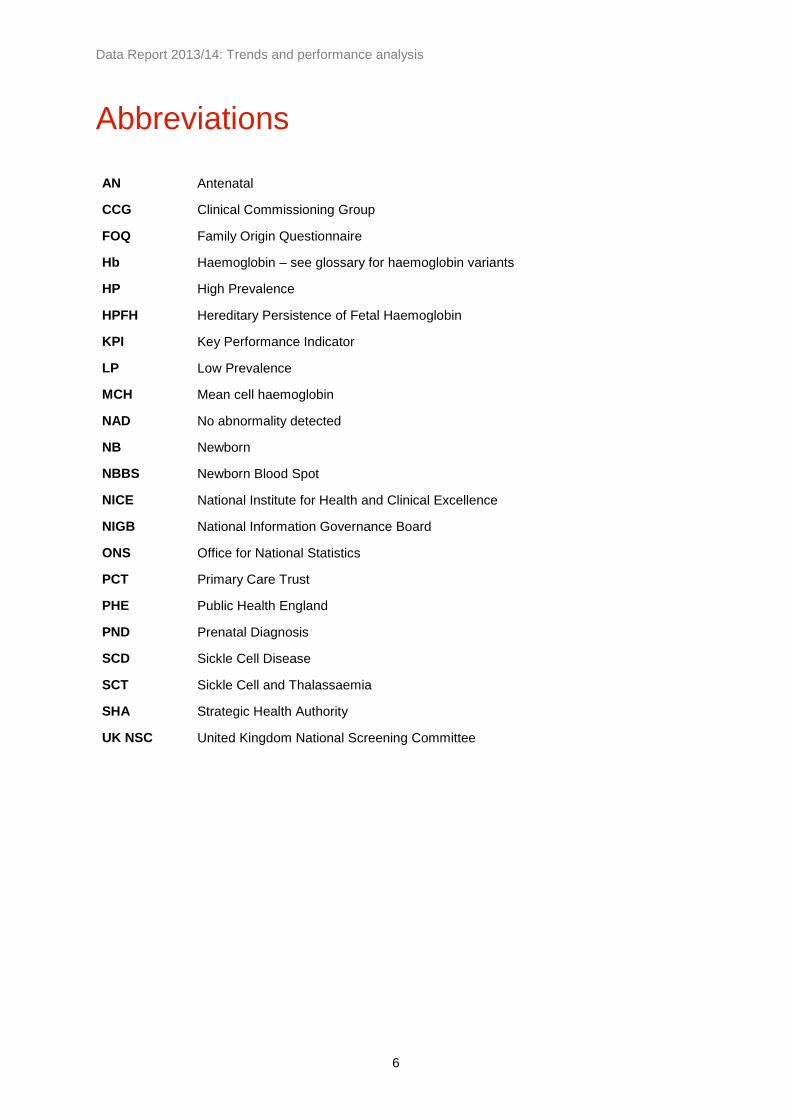
Abbreviations
AN Antenatal
CCG Clinical Commissioning Group
FOQ Family Origin Questionnaire
Hb Haemoglobin – see glossary for haemoglobin variants
HP High Prevalence
HPFH Hereditary Persistence of Fetal Haemoglobin
KPI Key Performance Indicator
LP Low Prevalence
MCH Mean cell haemoglobin
NAD No abnormality detected
NB Newborn
NBBS Newborn Blood Spot
NICE National Institute for Health and Clinical Excellence
NIGB National Information Governance Board
ONS Office for National Statistics
PCT Primary Care Trust
PHE Public Health England
PND Prenatal Diagnosis
SCD Sickle Cell Disease
SCT Sickle Cell and Thalassaemia
SHA Strategic Health Authority
UK NSC United Kingdom National Screening Committee

Data Report 2013/14: Trends and performance analysis
7
Glossary
Alpha plus thalassaemia (-α/αα or -α/-α): This is found in all ethnic groups, with a high carrier frequency in populations in some parts of Africa, in the Caribbean and in South and Southeast Asia. Even if both partners are carriers, there is no risk to the fetus. Homozygous alpha plus thalassaemia is not a clinically significant disorder with respect to genetic or obstetric complications, but can cause diagnostic confusion with carriers of alpha zero thalassaemia or iron deficiency. Alpha thalassaemia major, or Hb Barts hydrops fetalis (--/--): A severe anaemia that affects the fetus. No normal fetal haemoglobin is produced and this leads to stillbirth or neonatal death. Alpha zero thalassaemia (--/αα): This carries the potential for a clinically significant disorder if both parents are carriers. If both parents are carriers of alpha zero thalassaemia, there is a risk of having a fetus with alpha thalassaemia major and the mother runs the risk of obstetric complications, particularly in the third trimester of pregnancy. The mutations are almost always due to a gene deletion. If one partner carries alpha zero thalassaemia and the other alpha plus thalassaemia, then there is a risk of having a child with Hb H disease. Prenatal diagnosis is not usually indicated for Hb H disease. ‘At risk’ couples: Pregnancies identified with a potential risk of an affected baby, based on antenatal screening results for both parents. Cases where the father is not available for testing or where father results cannot be linked to mother results are also considered to be ‘at risk’ for an affected pregnancy. The number of ‘at risk’ couples includes ‘high risk’ couples (see below). Beta thalassaemia major: A severe anaemia caused by inheritance of two beta thalassaemia genes, resulting in a lack of normal haemoglobin production. Treatment by regular blood transfusions and drugs to remove excess iron leads to long-term survival. Some affected children can be ‘cured’ by bone marrow transplantation. Carrier (also referred to as trait): An individual who carries a single altered gene where two altered genes are required for an individual to be affected with a condition that may require treatment. The carrier can pass on the gene to their offspring. The most common haemoglobin carrier states in the UK are Hb S, C, D, E and beta thalassaemia. Family origins: A term used to describe a person’s ancestry. Haemoglobin: The substance in our blood that carries oxygen around the body. Hb A is normal adult haemoglobin, and Hb F is fetal haemoglobin.

Data Report 2013/14: Trends and performance analysis
8
Haemoglobin disease: Mild or serious diseases that can occur in people who have inherited two haemoglobin gene variants. The most common haemoglobin diseases are sickle cell diseases and thalassaemia disorders, also called haemoglobinopathies. Haemoglobin variants include: Hb S – Sickle haemoglobin Hb C – Haemoglobin C Hb D – Haemoglobin D Hb E – Haemoglobin E Examples of newborn screening results include FS (baby with fetal and sickle haemoglobins – probable sickle cell disease) and FAS (baby with fetal, adult, and sickle haemoglobins – probable sickle cell carrier). ‘High risk’ couples: Pregnancies that are identified as having a high risk of an affected baby. These are identified based on the combinations of mother and father antenatal test results which are considered to indicate a high risk of an affected baby (represented by the dark orange boxes on the antenatal data return, see Appendix Two). Prevalence: The proportion of people in a population who have an attribute or a given disease. Sickle cell disease: A group of inherited diseases that are characterised by sickling of red blood cells when there is a shortage of oxygen. The most common sickle cell diseases are sickle cell anaemia (Hb SS), haemoglobin SC disease, and haemoglobin S/beta thalassaemia. Sickle cell diseases can cause episodes of acute pain (crisis), anaemia, increased risk of infections, and chest problems. They can be life-threatening, particularly for young children. Thalassaemia major: A group of inherited conditions caused by a reduction in the amount of haemoglobin produced. People with a thalassaemia condition have various degrees of severe anaemia. Variant: A change from the usual, for example, in a gene or protein. A variant haemoglobin gene may result in sickle or another type of haemoglobin in the body.

Data Report 2013/14: Trends and performance analysis
9
List of charts and tables
Antenatal Screening
Table AN-1. Antenatal screening results by region, 2013/14: England ......................................................... 15
Table AN-2. Antenatal screening results by region, 2013/14: High prevalence areas .................................. 16
Table AN-3. Antenatal screening results by region, 2013/14: Low prevalence areas .................................. 17
Table AN-4. Antenatal booking bloods tested by 10 weeks gestation, 2013/14: England by
prevalence ................................................................................................................................. 18
Figure AN-1. Percentage of antenatal booking bloods tested by 10 weeks by laboratory,
2012-14: England by prevalence ............................................................................................... 18
Figure AN-2. Percentage of antenatal booking bloods tested by 10 weeks by region,
2013/14: High and low prevalence areas ................................................................................. 19
Figure AN-3. Booking bloods received with a FOQ attached, 2007-14: England by prevalence ................... 20
Table AN-5. Booking bloods received with a FOQ attached by region, 2011-14: England .......................... 21
Figure AN-4. Booking bloods received with a FOQ attached, 2007-14: Low prevalence
areas by region .......................................................................................................................... 21
Figure AN-5. Percentage of antenatal booking bloods with a FOQ attached, 2013/14: England
by laboratory .............................................................................................................................. 22
Table AN-6. Use of the FOQ in determining women at high risk of being alpha zero carriers,
2008-14: England ...................................................................................................................... 23
Table AN-7. Use of the FOQ in determining women at high risk of being alpha zero carriers,
2008-14: High prevalence areas ............................................................................................... 23
Table AN-8. Use of the FOQ in determining women at high risk of being alpha zero carriers,
2008-14: Low prevalence areas ................................................................................................ 23
Table AN-9. Pregnant women where testing was not indicated due to a known previous result,
2011-14: England by region ...................................................................................................... 24
Figure AN-6. Percentage of pregnant women where testing was not indicated due to a known
previous test result, 2007-14: England by prevalence .............................................................. 25
Figure AN-7. Percentage of pregnant women where testing was not indicated due to a known
previous result, 2012-14: England by laboratory ....................................................................... 25
Table AN-10. Declined tests by region, 2011-14: England ............................................................................. 26
Figure AN-8. Declined tests as a percentage of booking bloods received, 2007-14: England by
prevalence ................................................................................................................................. 27

Data Report 2013/14: Trends and performance analysis
10
Figure AN-9. Percentage of women that declined testing, 2012-14: England by laboratory.......................... 27
Table AN-11. Uptake of father testing, 2013/14: England by region ............................................................... 28
Table AN-12. Uptake of father testing, 2011-14: England by region ............................................................... 29
Figure AN-10. Uptake of father testing, 2007-14: England by prevalence ....................................................... 30
Table AN-13. Breakdown of pregnancy risk for screen positive women, 2013/14: England .......................... 31
Prenatal Diagnostic Testing
Table PND-1. Number of PNDs performed, 2007-14: England by laboratory ................................................. 32
Table PND-2. Number of PNDs performed, 2007-14: England by regions ..................................................... 33
Table PND-3. PND fetal results, 2007-14: England ......................................................................................... 33
Table PND-4. Breakdown of PND fetal results by condition, 2007-14: England ............................................. 34
Table PND-5. Gestation at sample for PND, 2007-14: England ...................................................................... 34
Figure PND-1. Percentage of PND tests performed by gestation and year, 2007-14: England ....................... 35
Table PND-6. Number of PND tests by mother's ethnicity, 2007-14: England ................................................ 36
Table PND-7. Number of PND tests with affected results by outcome, 2008-14: England ............................. 37
Table PND-8. Outcomes for pregnancies with affected fetal diagnoses
at PND, 2008-14: England by condition .................................................................................... 37
Figure PND-2. Outcomes for pregnancies with affected fetus diagnosis at PND,
2008-14: England by condition .................................................................................................. 38
Table PND-9. Gestation at PND for affected results with a known outcome,
2008-14: England ...................................................................................................................... 38
Figure PND-3. Percentage of affected results where parents opted to
terminate, by gestation at PND for known pregnancy outcomes, 2008-14 ............................... 39

Data Report 2013/14: Trends and performance analysis
11
Newborn Screening
Table NB-1. Comparison of ONS birth figures and number of babies screened as reported by
newborn screening laboratories, 2013/14: England by region .................................................. 40
Table NB-2. Babies screened and newborn screening results, 2013/14: England by region ....................... 41
Table NB-3. Trends in the number of babies identified with significant conditions, 2011-14:
England by region...................................................................................................................... 42
Figure NB-1. Babies identified with a significant condition per 1000 babies screened, 2013/14:
England by region...................................................................................................................... 43
Figure NB-2. Trends in babies identified with a significant condition, 2005-14: England by region ............... 44
Figure NB-3. Trends in babies identified with a signficant condition, 2005-14: London and the
rest of England .......................................................................................................................... 44
Table NB-4. Trends in the number of babies identified with carrier results, 2011-14: England by
region ......................................................................................................................................... 45
Figure NB-4. Babies identified with a carrier result per 1000 babies screened, 2013/14: England
by region .................................................................................................................................... 46
Figure NB-5. Trends in babies identified as carriers, 2005-14: England by region ........................................ 47
Figure NB-6. Trends in babies identified as carriers, 2005-14: London sectors (pre-2006 SHAs) ................ 47
Figure NB-7. Trends in babies identified as carriers, 2005-14: England by region (excluding
London) ..................................................................................................................................... 48
Figure NB-8. Trends in babies identified as carriers, 2005-14: London and the rest of England................... 48
Table NB-5. Numbers of babies identified with significant conditions, 2011-14: England by
ethnicity ..................................................................................................................................... 49
Table NB-6. Numbers of babies identified with carrier results, 2011-14: England by ethnicity..................... 50
Figure NB-9. Declined screening for sickle cell disease, 2005-14: England .................................................. 51
Table NB-7. Post-transfusion samples, number and rate per 1000 babies screened, 2011-14:
England by region...................................................................................................................... 52
Figure NB-10. Post-transfusion samples, rate per 1000 babies screened, 2005-14: England ........................ 53
Table NB-8. Numbers detected through DNA testing for transfused babies, 2009-14 ................................. 53
Table NB-9. Timeliness of reporting affected newborn results, 2013/14: England by laboratory ................. 54

Data Report 2013/14: Trends and performance analysis
12
1. Introduction
1.1. About the NHS Sickle Cell and Thalassaemia Screening
Programme
The NHS Sickle Cell and Thalassaemia (SCT) Screening Programme uses blood tests to screen newborn babies and pregnant women for two serious inherited blood disorders – sickle cell disease and thalassaemia major. The NHS Sickle Cell and Thalassaemia Screening Programme was set up in England in 2001 following a Government commitment in the NHS Plan in 2000 and is the world’s first linked antenatal and newborn screening programme. Our mission statement is to develop a linked programme of high quality screening and care in order to:
support people to make informed choices during pregnancy and before conception
improve infant health through prompt identification of affected babies
provide high quality and accessible care throughout England
promote greater understanding and awareness of the disorders and the value of screening Public Health England (PHE) is responsible for the NHS Screening Programmes. PHE is an executive agency of the Department of Health and works to protect and improve the nation’s health and wellbeing, and reduce health inequalities.
1.2. Methods
Timely annual data returns are required from all screening laboratories in accordance with the laboratory guidance. Data are collated by the laboratories and submitted to the Sickle Cell and Thalassaemia Screening Programme via spreadsheet-based data return templates. On receipt, the data are checked for any discrepancies or aspects that would benefit from clarification and if needed are followed up with the relevant laboratory. For the antenatal laboratories in particular, we recognise the difficulty of data collection in the absence of standardised data collection tools and IT systems. We try to ask for limited data and work hard to justify all data requests, ensuring there are no gaps and no duplication across the screening pathway and between screening programmes. PND data are requested several months after the requests for data are sent to the antenatal and newborn laboratories. This is to allow time for complete gestation in all pregnancies in order to give a more complete set of data on pregnancy outcomes following PND testing. The newborn data received by the programme sometimes include data for areas outside of England. These are excluded in our analysis. Prevalence data by region and by ethnicity are compared and laboratories contacted for clarification if inconsistencies are found. Current versions of the antenatal and newborn data returns can be found at sct.screening.nhs.uk/datacollection.

Data Report 2013/14: Trends and performance analysis
13
2. Overview of national screening figures
Note: These figures represent total numbers reported and numbers may differ from those where exclusions could be made based on missing or unavailable data. *‘Screen positive’ in antenatal screening includes both sickle cell haemoglobin variants and thalassaemia results. †‘Significant conditions’ in newborn screening comprises FS, FSC, FS Other and FE. ‡‘Carrier results’ in newborn screening comprises FAS, FAC, FAD, FAE and other carriers. ** ‘High risk’ comprises cases where both parents are carriers or affected and there is a high risk that the baby will be affected by a significant condition. This number excludes low risk cases and cases where the father was not available for testing.
Total number of antenatal samples screened
730,779
Number of mothers identified as ‘screen positive’* 15,281
Number of fathers offered screening for ‘at risk’ couple assessment
15,078
Number of fathers tested for ‘at risk’ couple assessment for this pregnancy
9,687 (64% of ‘screen positive’)
Number of ‘high risk’** couples detected 944
Antenatal screening
Number of PNDs performed 353
(Approximately 40% of ‘high risk’ couples)
Number of ‘affected’ fetal
results
89 (25% of total
PNDs performed)
Number of ‘carrier’ fetal
results 163
(46% of total PNDs
performed)
Number PNDs with ‘NAD’
results
100 (28% of total
PNDs performed)
Number of pregnancy outcomes known
50 (56% of affected
results)
Number of outcomes not known
39 (44% of affected
results)
PND testing
Total number of newborn samples screened 668,117
Number of ‘screen positive’ newborn results for
significant conditions† 319
(0.48 per 1000 screened)
Number of carrier results‡ 8,850
(13.25 per 1000 screened)
Newborn screening

Data Report 2013/14: Trends and performance analysis
14
3. Antenatal screening data
3.1. Response rates and data quality
Response rate:
The SCT screening programme received all 142 data returns requested across England. We would like to thank all those involved in providing data to the programme.
Data quality:
A total of 730,779 booking bloods were reported for 2013/14. Whilst data returns were received from all laboratories, not all laboratories were able to provide complete data for all of the requested fields. To reduce bias when reporting rates, exclusions have been made where data were missing. This means that some figures may differ when comparing charts and tables. Where exclusions have been made, these are specified in the relevant footnotes. The number of exclusions required in 2013/14 were comparable to those in 2012/13. Figures on booking bloods tested by 10 weeks are often dependent on completion of the FOQ to obtain gestational information. This means that the figures presented on timeliness of testing offer a base rate, but actual proportions achieving this standard may be higher. The number of father specimens received may not include cases where the father’s results were previously known, and so the rates for father uptake may in fact be higher than those shown. Some laboratories are unable to match mother results to father results and so can’t provide the number of high risk couples. As a result, the actual number of high risk couples is likely to be higher than reported. Some laboratories use figures that are provided by maternity units to determine the number of booking bloods received as they are unable to distinguish between antenatal and non-antenatal specimens. This may distort the figures slightly as maternity units may refer samples to more than one laboratory and so the number of booking bloods received may appear higher than it actually is. Some laboratories cover more than one hospital and we ask for separate data returns for each hospital covered. As a result, the number of laboratories represented where data are broken down to this level may be higher than the actual number of laboratories that provide screening for sickle cell and thalassaemia. The data presented in this report represent the data provided by the antenatal laboratories. We are aware that figures may differ from those from other data sources. We are aware that the number of screen positive and screen negative women, plus pending results does not add up to the number of booking bloods received. This is due to the way that data are provided by some laboratories. The difference may be accounted for to a degree by the inclusion of other haemoglobinopathy variants which are outside the scope of the SCT screening programme and would not be considered to be ‘screen positive’.

Data Report 2013/14: Trends and performance analysis
15
3.2. Numbers screened and detected
National:
Table AN-1 shows the antenatal screening figures by region for England in 2013/14. These figures represent the totals reported and no exclusions are made in this table based on missing or incomplete data. In 2013/14 a total of 730,779 antenatal samples were identified by the laboratories, of which 15,281 women (one in 48 women screened) were identified as carriers of haemoglobin variants which could result in the pregnancy being at risk for sickle cell disease or a thalassaemia condition. The number of screen positive women includes cases where the woman had a known previous screen positive result, cases where a donor egg was used or there was a bone marrow transplant, and other haemoglobin variant carriers where testing of the baby’s father was recommended. ‘High risk’ couples comprise pregnancies where both parents are identified as either carriers or as affected and there is a high risk that the baby will be affected by a significant condition. In 2013/14 there were 944 pregnancies (one in 16 screen positive women) identified as at high risk of an affected pregnancy. This figure excludes cases where the father was not available for testing, or where the father’s result cannot be matched with the mother’s result to determine risk. It is therefore estimated that the actual number of high risk pregnancies is higher. We would expect the number of high risk couples in antenatal screening to be approximately four times the number of newborn screen positive cases identified with significant conditions (FS, FSC, FS-Other and FE results) plus four times the number of babies with an F-only newborn result (which are potential beta thalassaemia affected results), plus terminations of affected pregnancies following PND testing, giving an estimate of approximately 1,450 high risk pregnancies. It should be noted that some high prevalence laboratories provide screening services for low prevalence maternity services. While we request that data from laboratories are provided separately by site, some laboratories cannot differentiate between samples received, which could affect the figures.
Table AN-1. Antenatal screening results by region, 2013/14: England Booking
bloods
received
(BBs)
Region n n% of
BBsn
% of
BBsn
% of
BBsn
% of
BBsn
% of
BBsn
% of
screen
'positive
women
East of England 17 / 17 81,303 35,221 43.32 79,228 97.45 1,120 1.38 66,422 81.70 13 0.02 65 5.80
East Midlands 8 / 8 52,367 33,769 64.49 51,408 98.17 674 1.29 51,581 98.50 * 0.00 43 6.38
London 24 / 24 146,281 43,162 29.51 120,096 82.10 7,653 5.23 134,484 91.94 24 0.02 505 6.60
North East 10 / 10 33,171 13,666 41.20 31,672 95.48 220 0.66 31,517 95.01 3 0.01 12 5.45
North West 19 / 19 90,926 37,244 40.96 87,955 96.73 1,148 1.26 87,421 96.15 31 0.03 61 5.31
South Central 10 / 10 52,918 27,779 52.49 49,199 92.97 814 1.54 51,947 98.17 16 0.03 54 6.63
South East Coast 10 / 10 58,525 11,041 18.87 57,291 97.89 649 1.11 53,105 90.74 10 0.02 27 4.16
South West 17 / 17 65,585 29,285 44.65 65,054 99.19 449 0.68 60,829 92.75 * 0.00 22 4.90
West Midlands 15 / 15 77,809 25,453 32.71 75,228 96.68 1,512 1.94 74,665 95.96 6 0.01 91 6.02
Yorkshire and The
Humber12 / 12 71,894 39,082 54.36 70,489 98.05 1,042 1.45 70,196 97.64 9 0.01 64 6.14
Total England 142 / 142 730,779 295,702 40.46 687,620 94.09 15,281 2.09 682,167 93.35 115 0.02 944 6.18
*Numbers less than 3 have been suppressed
High risk
couples
identified
Submitted
/ Total
Labs
No. of LabsBooking bloods
tested by 10 wksFOQ Attached
Screen
'positive'
women
Screen 'negative'
women
Result
pending

Data Report 2013/14: Trends and performance analysis
16
High prevalence areas:
Table AN-2 shows the antenatal screening figures for high prevalence areas for 2013/14 as reported by the antenatal laboratories. A total of 392,592 antenatal samples were identified in high prevalence areas in 2013/14. Of these, 12,750 women (one in 31 women screened) were identified as screen positive as carriers of haemoglobin variants which could result in the pregnancy being at risk for sickle cell disease or thalassaemia, including women with a known previous result. In high prevalence areas 825 pregnancies (one in 16 screen positive women) were identified as being at high risk for these conditions.
Table AN-2. Antenatal screening results by region, 2013/14: High prevalence areas Booking
bloods
received
(BBs)
Region n n% of
BBsn
% of
BBsn
% of
BBsn
% of
BBsn
% of
BBsn
% of
screen
'positive
women
East of England 5 / 5 25,887 8,102 31.30 25,055 96.79 599 2.31 24,987 96.52 * 0.00 40 6.68
East Midlands 4 / 4 31,282 20,595 65.84 30,641 97.95 534 1.71 30,701 98.14 * 0.00 33 6.18
London 24 / 24 146,281 43,162 29.51 120,096 82.10 7,653 5.23 134,484 91.94 24 0.02 505 6.60
North East 1 / 1 6,574 * 0.00 6,538 99.45 88 1.34 6,477 98.52 * 0.00 5 5.68
North West 7 / 7 51,555 19,880 38.56 49,340 95.70 969 1.88 49,587 96.18 20 0.04 54 5.57
South Central 6 / 6 31,829 17,535 55.09 28,391 89.20 576 1.81 31,196 98.01 10 0.03 46 7.99
South East Coast 2 / 2 11,147 3,393 30.44 11,001 98.69 222 1.99 10,770 96.62 * 0.00 10 4.50
South West 2 / 2 12,121 4,158 34.30 12,036 99.30 192 1.58 11,876 97.98 * 0.00 10 5.21
West Midlands 7 / 7 47,363 12,135 25.62 45,149 95.33 1,314 2.77 44,450 93.85 * 0.00 76 5.78
Yorkshire and The
Humber3 / 3 28,553 12,648 44.30 27,285 95.56 603 2.11 27,746 97.17 8 0.03 46 7.63
Total England 61 / 61 392,592 141,608 36.07 355,532 90.56 12,750 3.25 372,274 94.82 64 0.02 825 6.47
*Numbers less than 3 have been suppressed
High risk
couples
identified
Submitted
/ Total
Labs
No. of LabsBooking bloods
tested by 10 wksFOQ Attached
Screen
'positive'
women
Screen 'negative'
women
Result
pending
Low prevalence areas:
Table AN-3 shows the antenatal screening figures by region for low prevalence areas for 2013/14 as reported by the antenatal laboratories. A total of 338,187 antenatal samples were identified in low prevalence areas in 2013/14. Of these, 2,531 women (one in 134 women screened) were identified as screen positive as carriers of haemoglobin variants which could result in the pregnancy being at risk for sickle cell disease or thalassaemia, including women with a known previous result. In low prevalence areas 119 pregnancies (one in 21 screen positive women) were identified as being at high risk for these conditions.

Data Report 2013/14: Trends and performance analysis
17
Table AN-3. Antenatal screening results by region, 2013/14: Low prevalence areas Booking
bloods
received
(BBs)
Region n n% of
BBsn
% of
BBsn
% of
BBsn
% of
BBsn
% of
BBsn
% of
screen
'positive
women
East of England 12 / 12 55,416 27,119 48.94 54,173 97.76 521 0.94 41,435 74.77 13 0.02 25 4.80
East Midlands 4 / 4 21,085 13,174 62.48 20,767 98.49 140 0.66 20,880 99.03 * 0.00 10 7.14
London 0 / 0 - - - - - - - - - - - - -
North East 9 / 9 26,597 13,666 51.38 25,134 94.50 132 0.50 25,040 94.15 3 0.01 7 5.30
North West 12 / 12 39,371 17,364 44.10 38,615 98.08 179 0.45 37,834 96.10 11 0.03 7 3.91
South Central 4 / 4 21,089 10,244 48.58 20,808 98.67 238 1.13 20,751 98.40 6 0.03 8 3.36
South East Coast 8 / 8 47,378 7,648 16.14 46,290 97.70 427 0.90 42,335 89.36 10 0.02 17 3.98
South West 15 / 15 53,464 25,127 47.00 53,018 99.17 257 0.48 48,953 91.56 * 0.00 12 4.67
West Midlands 8 / 8 30,446 13,318 43.74 30,079 98.79 198 0.65 30,215 99.24 4 0.01 15 7.58
Yorkshire and The
Humber9 / 9 43,341 26,434 60.99 43,204 99.68 439 1.01 42,450 97.94 * 0.00 18 4.10
Total England 81 / 81 338,187 154,094 45.56 332,088 98.20 2,531 0.75 309,893 91.63 51 0.02 119 4.70
*Numbers less than 3 have been suppressed
High risk
couples
identified
Submitted
/ Total
Labs
No. of LabsBooking bloods
tested by 10 wksFOQ Attached
Screen
'positive'
women
Screen 'negative'
women
Result
pending
3.3. Bookings tested by 10 weeks
The target for antenatal testing is an offer of testing by 10 weeks gestation. To offer informed choice, a series of tests may be required: for the mother, the father and, if required, on the unborn baby. If tests show that the baby is at risk of inheriting a major haemoglobin disorder then the parents need time to receive counselling and consider their options, with a target for all tests to be completed by 12 weeks and six days of gestation. The proportion of booking bloods tested by 10 weeks of gestation links to KPI ST2 (timeliness of testing) and with programme standard AP1. It is important to note that standard AP1 specifies an offer by 10 weeks, whereas these data identify samples actually tested by 10 weeks. This means that these figures are using a stricter measure than that identified in the programme standards, as it is not currently possible for all maternity services to collect data on the offer of test. Figures on booking bloods tested by 10 weeks are often dependent on completion of the FOQ to obtain gestational information (see 3.1 Response rates and data quality). Table AN-4 shows the proportion of booking bloods tested by 10 weeks of gestation in high and low prevalence areas covering a three-year period. In this period the proportion tested by 10 weeks was consistently higher in low prevalence areas than in high prevalence areas, but an increase has been reported each year and the national figures show nearly half of booking bloods tested by 10 weeks in 2013/14. The data indicate that in high prevalence areas where there is a greater risk of being screen positive a carrier of sickle cell disease or thalassaemia, pregnant women are less likely to be offered screening before 10 weeks gestation (45% tested by 10 weeks in high prevalence areas compared to 55% in low prevalence areas). This could have an impact on equality and access to screening. This gap of approximately 8% can be seen in each of the three years shown in Table AN-4.

Data Report 2013/14: Trends and performance analysis
18
Table AN-4. Antenatal booking bloods tested by 10 weeks gestation, 2013/14: England by
prevalence
Prevalence
Booking
bloods
(BBs)
received
BBs
tested by
10 wks
% of
BBs
Booking
bloods
(BBs)
received
BBs
tested by
10 wks
% of
BBs
Booking
bloods
(BBs)
received
BBs
tested by
10 wks
% of
BBs
High prevalence areas 302,004 121,349 40.18 302,348 125,509 41.51 306,470 137,503 44.87
Low prevalence areas 245,768 120,250 48.93 267,547 136,205 50.91 281,377 153,774 54.65
Total England 547,772 241,599 44.11 569,895 261,714 45.92 587,847 291,277 49.55
Exclusions based on missing or unavailable data for the data fields shown: 2011/12: 36; 2012/13: 27; 2013/14: 25.
2011/12 2012/13 2013/14
Figure AN-1 shows a breakdown of the figures for 2013/14 by laboratory, comparing them to those for 2012/13. Whilst a greater number of laboratories appear to be achieving the 50% acceptable level for programme standard AP1, it also appears that those currently below the standard level are improving compared to the previous year.
Figure AN-1. Percentage of antenatal booking bloods tested by 10 weeks by laboratory,
2012-14: England by prevalence
0
10
20
30
40
50
60
70
80
90
100
%
Standard AP1
2013/14: HighPrevalence
2013/14: LowPrevalence
2012/13: HighPrevalence
2012/13: LowPrevalence
Each marker represents one laboratory. The reference line represents the 50% acceptable level for programme standard AP1. The rate for the whole of England was 44% in 2011/12, was 46% in 2012/13 and was 50% in 2013/14. *2013/14 data excludes 25 data returns, 2012/13 data excludes 27 data returns based on missing or unavailable data.

Data Report 2013/14: Trends and performance analysis
19
Figure AN-2 shows a breakdown of the figures for 2013/14 by laboratory grouped by region. This includes only laboratories that were able to provide information on both the total number of booking bloods and the number of samples tested by 10 weeks.
Figure AN-2. Percentage of antenatal booking bloods tested by 10 weeks by region, 2013/14:
High and low prevalence areas
0
10
20
30
40
50
60
70
80
90
100
EastMidlands
(8/8)
East ofEngland(14/17)
London (HPonly)
(18/24)
North East(9/10)
North West(14/19)
SouthCentral(11/11)
South EastCoast(4/10)
South West(14/17)
WestMidlands(12/15)
Yorkshireand TheHumber(12/12)
% o
f b
oo
kin
g b
loo
ds
teste
d b
y 1
0 w
eeks
Each bar represents one laboratory. Red bars represent high prevalence areas and blue bars represent low prevalence areas. The reference line represents the 50% acceptable level for programme standard AP1. The rate for the whole of England is 46% The numbers below the region represents how many of the laboratories that provided data were received were able to provide complete data on booking bloods tested by 10 weeks, e.g. "4/10" shows that of the 10 returns received, 4 included complete data for both fields. Excludes 25 laboratories where data on booking bloods tested by 10 weeks or the total number of booking was missing or unavailable.

Data Report 2013/14: Trends and performance analysis
20
3.4. Samples with FOQ attached
The family origin questionnaire (FOQ) is used as a screening tool in both high and low prevalence areas. The proportion of booking bloods received with a FOQ attached links to programme standard AO1aiii and KPI ST3 (completion of FOQ). Figure AN-3 shows the proportion of booking bloods received with a FOQ attached in both high and low prevalence areas across England between 2007 and 2014. The proportion has continued to improve in both high and low prevalence areas, and as a whole high prevalence areas are now achieving the 90% acceptable level for programme standard AO1aiii. In high prevalence areas approximately 91% of booking bloods had a FOQ attached in 2013/14, compared to approximately 98% in low prevalence areas. Aggregated data for the whole of England shows that approximately 94% of booking bloods had a FOQ attached. Samples arriving without a completed FOQ could lead to unnecessary testing, and tests are performed using implied consent in the absence of information on the FOQ.
Figure AN-3. Booking bloods received with a FOQ attached, 2007-14: England by prevalence
Table AN-5 shows the number and rates of samples received with a FOQ attached between 2011 and 2014 by region and for the whole of England (both high and low prevalence areas). Aggregated data show that outside of London, all regions are achieving the acceptable level for programme standard AO1aiii, and most are achieving over 95%.
0
10
20
30
40
50
60
70
80
90
100
2007/08 2008/09 2009/10 2010/11 2011/12 2012/13 2013/14
%
High PrevalenceAreas
Low PrevalenceAreas
England Total
Exclusions based on missing or unavailable data for the data fields shown: 2007/08: 36; 2008/09: 23; 2009/10: 19; 2010/11: 8; 2011/12: 1; 2012/13: 2; 2013/14: 2.
2007/08 2008/09 2009/10 2010/11 2011/12 2012/13 2013/14
High prevalence areas 19.6 18.2 47.8 78.0 86.4 89.7 90.7
Low prevalence areas 88.9 94.2 94.8 96.5 96.7 98.1 98.2
England total 56.0 57.2 72.2 87.3 91.2 93.7 94.2

Data Report 2013/14: Trends and performance analysis
21
Table AN-5. Booking bloods received with a FOQ attached by region, 2011-14: England
Region
Booking
Bloods (BBs)
FOQ
attached
% of
BBs
Booking
Bloods (BBs)
FOQ
attached
% of
BBs
Booking
Bloods (BBs)
FOQ
attached
% of
BBs
East Midlands 55,195 53,653 97.2 53,016 52,238 98.5 52,367 51,408 98.2
East of England 81,767 79,752 97.5 78,123 75,433 96.6 81,303 79,228 97.4
London 142,595 117,395 82.3 125,135 105,123 84.0 141,535 116,404 82.2
North East 34,319 33,697 98.2 33,288 32,799 98.5 33,171 31,672 95.5
North West 90,653 82,461 91.0 91,004 86,892 95.5 90,926 87,955 96.7
South Central 54,676 50,710 92.7 51,803 48,351 93.3 52,918 49,199 93.0
South East Coast 44,716 43,508 97.3 57,885 56,366 97.4 58,525 57,291 97.9
South West 67,534 66,452 98.4 65,570 64,458 98.3 65,585 65,054 99.2
West Midlands 79,565 66,029 83.0 77,760 70,691 90.9 77,809 75,228 96.7
Yorkshire and The
Humber72,381 66,270 91.6 71,773 68,751 95.8 71,894 70,489 98.0
England Total 723,401 659,927 91.2 705,357 661,102 93.7 726,033 683,928 94.2
Exclusions based on missing or unavailable data for the data fields shown: 2011/12: 1; 2012/13: 2; 2013/14: 2.
2011/12 2012/13 2013/14
Figure AN-4 shows these rates for low prevalence laboratories only, showing trends for each region. Some labs appear to have shown an increase in the proportion of booking bloods received with a FOQ attached, while others appear to have rates consistent with previous years.
Figure AN-4. Booking bloods received with a FOQ attached, 2007-14: Low prevalence areas by
region
0
10
20
30
40
50
60
70
80
90
100
EastMidlands
East ofEngland
North East North West SouthCentral
South EastCoast
South West WestMidlands
Yorkshireand TheHumber
2007/08
2008/09
2009/10
2010/11
2011/12
2012/13
2013/14
Exclusions based on missing or unavailable data for the data fields shown: 2007/08: 5; 2008/09: 5; 2009/10: 5; 2010/11: 2; 2011/12: 1; 2012/13: 0; 2013/14: 0.

Data Report 2013/14: Trends and performance analysis
22
Figure AN-5 shows the proportion of booking bloods received with a FOQ attached by each laboratory across the whole of England in 2013/14, highlighting high and low prevalence areas. The majority of low prevalence areas are exceeding the 90% acceptable level for programme standard AO1aiii, but there are a number of laboratories falling below this level. Rates over 100% indicate data quality issues.
Figure AN-5. Percentage of antenatal booking bloods with a FOQ attached, 2013/14: England
by laboratory
Table AN-6 shows the usage of the FOQ in identifying potential carriers of alpha zero thalassaemia for the whole of England covering 2008-2014. These figures are broken down by high and low prevalence areas in Table AN-7 and Table AN-8. Cases where the MCH is less than 25pg are potentially carriers of alpha zero thalassaemia. If the FOQ shows that the woman has a high risk family origin they are considered to be at high risk of being carriers of alpha zero thalassaemia. If no FOQ information is provided, laboratories are unable to exclude this risk which may lead to unnecessary testing.
0
20
40
60
80
100
120
% o
f an
ten
ata
l b
oo
kin
g b
loo
ds
wit
h F
OQ
att
ach
ed
High PrevalenceAreas
Low PrevalenceAreas
Standard AO1aiii
Each marker represents one laboratory. The reference line represents the 90% acceptable level for programme standard AO1iii. The rate for the whole of England is 94%. *Excludes 2 laboratories where either data on booking bloods with an FOQ attached or the total number of booking bloods was missing or unavailable.

Data Report 2013/14: Trends and performance analysis
23
Table AN-6. Use of the FOQ in determining women at high risk of being alpha zero carriers,
2008-14: England
Booking bloods
received (BBs)
Year n n % of BBs n
% of FOQ
attached n % of BBs
2008/09 554,216 317,009 57.20 17,826 5.62 4,817 0.87
2009/10 526,343 393,606 74.78 16,344 4.15 2,075 0.39
2010/11 659,060 574,641 87.19 20,557 3.58 3,532 0.54
2011/12 692,845 634,051 91.51 21,247 3.35 3,212 0.46
2012/13 691,310 647,252 93.63 23,881 3.69 2,834 0.41
2013/14 685,932 649,943 94.75 20,777 3.20 2,609 0.38
Total for six
year period3,809,706 3,216,502 84.43 120,632 3.75 19,079 0.50
FOQ attached MCH < 25pg High risk alpha0
Exclusions based on missing or unavailable data for the data fields shown: 2008/09: 29; 2009/10: 28; 2010/11: 11;
2011/12: 9; 2012/13: 7; 2013/14: 8.
Table AN-7. Use of the FOQ in determining women at high risk of being alpha zero carriers,
2008-14: High prevalence areas
Booking bloods
received (BBs)
Year n n % of BBs n
% of FOQ
attached n % of BBs
2008/09 271,815 51,375 18.90 12,937 25.18 4,031 1.48
2009/10 236,843 119,305 50.37 11,463 9.61 1,179 0.50
2010/11 328,967 255,854 77.77 14,861 5.81 2,185 0.66
2011/12 369,639 317,377 85.86 15,589 4.91 1,911 0.52
2012/13 364,656 326,730 89.60 17,522 5.36 2,089 0.57
2013/14 352,930 322,773 91.46 13,710 4.25 1,742 0.49
Total for six
year period1,924,850 1,393,414 72.39 86,082 6.18 13,137 0.68
FOQ attached MCH < 25pg High risk alpha0
Exclusions based on missing or unavailable data for the data fields shown: 2008/09: 21; 2009/10: 22; 2010/11: 7; 2011/12:
4; 2012/13: 3; 2013/14: 6.
Table AN-8. Use of the FOQ in determining women at high risk of being alpha zero carriers,
2008-14: Low prevalence areas
Booking bloods
received (BBs)
Year n n % of BBs n
% of FOQ
attached n % of BBs
2008/09 282,401 265,634 94.06 4,889 1.84 786 0.28
2009/10 289,500 274,301 94.75 4,881 1.78 896 0.31
2010/11 330,093 318,787 96.57 5,696 1.79 1,347 0.41
2011/12 323,206 316,674 97.98 5,658 1.79 1,301 0.40
2012/13 326,654 320,522 98.12 6,359 1.98 745 0.23
2013/14 333,002 327,170 98.25 7,067 2.16 867 0.26
Total for six
year period1,884,856 1,823,088 96.72 34,550 1.90 5,942 0.32
FOQ attached MCH < 25pg High risk alpha0
Exclusions based on missing or unavailable data for the data fields shown: 2008/09: 8; 2009/10: 6; 2010/11: 4; 2011/12: 5;
2012/13: 4; 2013/14: 2.

Data Report 2013/14: Trends and performance analysis
24
3.5. Tests not performed due to a known previous result
Current programme guidance states that women do not need to be tested again in the same or a subsequent pregnancy, provided that there are two or more previous results from an accredited laboratory, the red cell indices remain the same and can be used for a reliable interpretation, and the woman’s identification has three or more matching data items (see the Handbook for Laboratories, third edition, available at http://sct.screening.nhs.uk/standardsandguidelines, for full guidance). Table AN-9 shows the number and rates of pregnant women who were not tested due to a known previous result in England by region. These figures combine previous screen positive and negative results and exclusions are only made where both of these fields were missing or unavailable. In 2013/14 approximately 3% of women screened had a known previous result, or one in 30 women screened.
Table AN-9. Pregnant women where testing was not indicated due to a known previous result,
2011-14: England by region
Region
Booking
bloods
received
(BBs)
Known
previous
results
% of BBs
Booking
bloods
received
(BBs)
Known
previous
results
% of BBs
Booking
bloods
received
(BBs)
Known
previous
results
% of BBs
East Midlands 49,991 6,492 12.99 40,763 6,191 15.19 52,367 2,972 5.68
East of England 76,421 2,508 3.28 72,604 2,332 3.21 78,659 1,231 1.56
London 100,504 9,016 8.97 79,069 3,006 3.80 68,158 337 0.49
North East 29,059 2,680 9.22 33,288 2,882 8.66 33,171 432 1.30
North West 53,813 3,024 5.62 71,164 2,730 3.84 65,168 1,309 2.01
South Central 54,676 10,353 18.94 44,986 4,033 8.97 44,856 2,019 4.50
South East Coast 38,166 1,224 3.21 45,054 1,277 2.83 47,340 386 0.82
South West 54,831 1,256 2.29 53,555 791 1.48 50,456 687 1.36
West Midlands 72,422 6,728 9.29 68,040 8,298 12.20 75,513 7,926 10.50
Yorkshire and The
Humber68,503 4,249 6.20 50,528 2,832 5.60 44,443 1,388 3.12
England Total 598,386 47,530 7.94 559,051 34,372 6.15 560,131 18,687 3.34
2011/12 2012/13 2013/14
Exclusions based on missing or unknown data on number of booking bloods received or where data on both previous screen positive
and previous screen negative were missing or unavailable: 2011/12: 27; 2012/13: 31; 2013/14: 34.
Figure AN-6 shows trends in the proportion of women not tested due to a previously known test result by prevalence and for the whole of England. Rates remain higher in high prevalence areas than in low prevalence areas. Rates appear to have increased in low prevalence areas, but there has been a decline in high prevalence areas. However if the low prevalence outlier shown in Figure AN-7 at 82% is removed, the rate for low prevalence areas decreases to approximately 1.1%. The decrease may be related to the change in guidance on re-testing women in subsequent pregnancies which requires two previous results as described above.

Data Report 2013/14: Trends and performance analysis
25
Figure AN-6. Percentage of pregnant women where testing was not indicated due to a known
previous test result, 2007-14: England by prevalence
Figure AN-7 shows the proportion of women not tested due to a previously known test result by laboratory and by prevalence. The decline seen in Figure AN-6 is seen across all laboratories with the exception of one low prevalence outlier at 82%. A number of laboratories report zero per cent of mothers as having a known previous test result, which could be an indication of laboratories not linking up (or not being able to link) their data to identify previous test results. It may also indicate that laboratories may be re-testing all samples.
Figure AN-7. Percentage of pregnant women where testing was not indicated due to a known
previous result, 2012-14: England by laboratory
0
10
20
30
40
50
60
70
80
90
%
2012/13: HighPrevalence Areas
2012/13: LowPrevalence Areas
2013/14: HighPrevalence Areas
2013/14: LowPrevalence Areas
Exclusions where data on mothers not tested due to a previous test or the total number of booking bloods were missing or unavailable: 2012/13: 31; 2013/14: 34.
0
2
4
6
8
10
12
14
16
2007/08 2008/09 2009/10 2010/11 2011/12 2012/13 2013/14
%
HighPrevalenceAreas
LowPrevalenceAreas
England
Exclusions based on missing or unavailable data: 2007/08: 35; 2008/09: 50; 2009/10: 45; 2010/11: 33; 2011/12: 27; 2012/13: 31; 2013/14: 34.
2007/08 2008/09 2009/10 2010/11 2011/12 2012/13 2013/14
High prevalence areas 6.0 11.0 13.8 14.8 13.3 10.1 3.7
Low prevalence areas 0.5 0.9 1.4 1.7 2.3 2.2 3.0
England total 3.3 6.0 8.0 7.8 7.9 6.1 3.3

Data Report 2013/14: Trends and performance analysis
26
3.6. Declined screening tests
Table AN-10 shows the number and proportions of pregnant women that declined antenatal screening for sickle cell and thalassaemia, by region and for the whole of England between 2011 and 2014. In 2013/14 approximately 0.3% booking bloods received nationally were identified as having declined screening, varying between 0.07% and 1.16% regionally.
Table AN-10. Declined tests by region, 2011-14: England
Region
Booking
bloods
received
(BBS)
Declined
testing% of BBs
Booking
bloods
received
(BBS)
Declined
testing% of BBs
Booking
bloods
received
(BBS)
Declined
testing% of BBs
East Midlands 55,195 164 0.30 53,016 210 0.40 52,367 93 0.18
East of England 81,767 844 1.03 78,123 580 0.74 81,303 426 0.52
London 102,155 184 0.18 103,108 76 0.07 105,994 49 0.05
North East 34,319 385 1.12 33,288 317 0.95 33,171 166 0.50
North West 75,842 477 0.63 75,294 555 0.74 73,911 121 0.16
South Central 50,484 225 0.45 47,740 80 0.17 48,783 79 0.16
South East Coast 54,925 109 0.20 52,783 258 0.49 50,834 67 0.13
South West 58,273 860 1.48 61,527 810 1.32 61,516 715 1.16
West Midlands 74,944 449 0.60 73,336 191 0.26 73,353 50 0.07
Yorkshire and The
Humber72,381 604 0.83 71,773 571 0.80 71,894 448 0.62
England Total 660,285 4,301 0.65 649,988 3,648 0.56 653,126 2,214 0.34
Exclusions based on missing or unavailable data: 2011/12: 14; 2012/13: 14; 2013/14: 15.
2011/12 2012/13 2013/14
Figure AN-8 shows trends in the proportion of booking bloods received where testing was declined between 2007 and 2013, aggregated by prevalence. The proportion of reported declined tests has continued to decrease each year, but remains higher in low prevalence areas than in high prevalence areas.

Data Report 2013/14: Trends and performance analysis
27
Figure AN-8. Declined tests as a percentage of booking bloods received, 2007-14: England by
prevalence
Figure AN-9 shows the percentage of pregnant women who declined testing for sickle cell disease and thalassaemia by laboratory and by prevalence for 2012/13 and 2013/14. This shows that the decrease in the proportion of declined tests appears to have occurred across all trusts, including both high and low prevalence areas.
Figure AN-9. Percentage of women that declined testing, 2012-14: England by laboratory
0
1
2
3
4
5
6
7
8
9
%
2012/13: HighPrevalence Areas
2012/13: LowPrevalence Areas
2013/14: HighPrevalence Areas
2013/14: LowPrevalence Areas
Each marker represents one laboratory. Exclusions where data on mothers that declined testing or the total number of booking bloods were missing or unavailable: 2012/13: 14; 2013/14: 15.
0.0
0.5
1.0
1.5
2.0
2.5
3.0
3.5
2007/08 2008/09 2009/10 2010/11 2011/12 2012/13 2013/14
%
High PrevalenceAreas
Low PrevalenceAreas
England
Exclusions based on missing or unavailable data: 2007/08: 40; 2008/09: 47; 2009/10: 32; 2010/11: 17; 2011/12: 14; 2012/13: 14; 2013/14: 15.
2007/08 2008/09 2009/10 2010/11 2011/12 2012/13 2013/14
High prevalence areas 3.20 2.38 0.90 0.89 0.33 0.26 0.15
Low prevalence areas 2.31 2.38 2.46 1.65 0.95 0.84 0.53
England total 2.73 2.38 1.76 1.31 0.65 0.56 0.34

Data Report 2013/14: Trends and performance analysis
28
3.7. Testing of the baby’s father
Programme standard AP2ii requires that all fathers of carrier women’s babies are to be offered information about counselling and testing. Table AN-11 shows the uptake of father testing by region and across England in 2013/14. In some regions the number of father specimens requested is greater than the number of screen positive women. This could be due to local variation in policy for father testing. In some cases it may also be the case that midwives collect specimens from both parents if they are both available at the initial booking, before the mother’s haemoglobinopathy status is known. Another explanation may be that in cases where the mother’s results are inconclusive a specimen is requested from the baby’s father. It is possible that the number of father specimens requested for some laboratories does not include cases where father testing was not indicated due to a known previous result.
Table AN-11. Uptake of father testing, 2013/14: England by region
Booking
bloods
received
(BBs)
Region n n % of BBs n
% of screen
positive
women n
% of fathers
requested n
% of fathers
received
East Midlands 52,367 674 1.29 732 108.61 581 79.37 43 7.40
East of England 81,303 1,120 1.38 1,090 97.32 735 67.43 65 8.84
London 141,535 7,210 5.09 7,259 100.68 3,929 54.13 471 11.99
North East 33,171 220 0.66 217 98.64 186 85.71 12 6.45
North West 73,143 928 1.27 904 97.41 595 65.82 54 9.08
South Central 52,918 814 1.54 800 98.28 690 86.25 54 7.83
South East Coast 58,525 649 1.11 665 102.47 496 74.59 27 5.44
South West 56,531 429 0.76 406 94.64 296 72.91 19 6.42
West Midlands 74,159 1,498 2.02 1,497 99.93 1,058 70.67 89 8.41
Yorkshire and The
Humber71,894 1,042 1.45 944 90.60 678 71.82 64 9.44
England total 695,546 14,584 2.10 14,514 99.52 9,244 63.69 898 9.71
Screen positive
women
Father specimens
requested
Father specimens
received 'High risk' couples
Excludes 8 laboratories where data on the number of booking bloods received, number of screen positive women, data on father
specimens requested or received, or the number of 'high risk' couples was missing or unavailable.

Data Report 2013/14: Trends and performance analysis
29
In England 14,514 father specimens were reported as requested, which approximately equates to the number of screen positive women (although this does not take into account regional variation and areas reporting more than 100% screen positive women with father specimens requested). Of these, 9,244 father specimens were received by laboratories, or approximately 64% of those requested. Of the father specimens received, 898 (approximately 10%) were identified as being carriers and the pregnancies at high risk for a sickle cell disease or thalassaemia affected baby. It is not possible to assess the risk status of the pregnancy in cases where the baby’s father was not available for testing. These are considered to be ‘at risk’, but are not included here in the number of ‘high risk’ couples. These are estimated to account for approximately 36% of screen positive women (calculated from the number of screen positive women minus the number of father specimens received). As a result, the actual number of ‘high risk’ pregnancies is likely to be higher than the figures shown in these data. Table AN-12 shows the number and rates of father uptake from 2011/12 to 2013/14 by region. Father uptake varies between regions, ranging between approximately 55% in London and approximately 86% in the North East in 2013/14.
Table AN-12. Uptake of father testing, 2011-14: England by region
SHA
Fathers
requested
Fathers
received% uptake
Fathers
requested
Fathers
received% uptake
Fathers
requested
Fathers
received% uptake
East Midlands 721 577 80.03 713 555 77.84 732 581 79.37
East of England 1,027 694 67.58 1,057 693 65.56 1,090 735 67.43
London 8,296 4,290 51.71 6,218 3,154 50.72 7,705 4,201 54.52
North East 214 187 87.38 256 208 81.25 217 186 85.71
North West 826 583 70.58 996 740 74.30 904 595 65.82
South Central 997 735 73.72 836 631 75.48 800 690 86.25
South East Coast 577 443 76.78 725 543 74.90 665 496 74.59
South West 458 338 73.80 430 338 78.60 406 296 72.91
West Midlands 1,521 872 57.33 1,434 942 65.69 1,497 1,058 70.67
Yorkshire and The
Humber859 746 86.85 890 688 77.30 944 678 71.82
England total 15,496 9,465 61.08 13,555 8,492 62.65 14,960 9,516 63.61
Exclusions based on missing or unavailable data: 2011/12: 6; 2012/13: 6; 2013/14: 6.
2011/12 2012/13 2013/14

Data Report 2013/14: Trends and performance analysis
30
Figure AN-10 shows the national rates for father uptake between 2007/08 and 2013/14 by prevalence. Across England there has been a small increase in father uptake each year since 2008/09, from approximately 55% to approximately 64%. Rates appear to have increased in high prevalence areas and father uptake is now at approximately 60%. A small decline can be seen in low prevalence areas in 2013/14, but rates remain higher than in high prevalence areas. Father uptake figures may have been affected by the change in guidance for re-testing babies’ fathers in subsequent pregnancies in line with the guidance for re-testing pregnant women (see 3.5 Tests not performed due to a known previous result). If fathers have been tested previously but decline to have a second test in this pregnancy, these would be included as having declined testing and so the reported rates for father uptake may be lower.
Figure AN-10. Uptake of father testing, 2007-14: England by prevalence
The SCT programme requests breakdown data on mother and father results to identify the specific risk of an affected pregnancy. This information also allows us to separate out sickle cell and thalassaemia screen positive results. Table AN-13 shows the risk status of pregnancies for antenatal screening by the mother’s results for 2013/14. Not all laboratories have been able to provide these data or to provide complete data, which means that this breakdown does not include all screening encounters in this period. However, of the 15,281 screen positive women identified in antenatal screening, 14,328 (94%) are included in this breakdown, and of the 944 ‘high risk’ couples identified, 817 (87%) are included here. This represents an improvement in data completion for this breakdown when compared to the previous year, where completion was at 93% and 85% respectively. Of the 14,328 screen positive women included in the breakdown, 7,739 (54%) had clinically significant haemoglobin variants where there was a risk of a baby with sickle cell disease (comprising HbS, HbD, HbC, and HbO
Arab). There were 6,145 screen positive women (43%) identified with results that could
lead to a thalassaemia affected baby (comprising beta thalassaemia, delta beta thalassaemia, those at high risk of being carriers of alpha zero thalassaemia, HbE and Hb Lepore). The remaining 444 screen positive women (3%) were identified with compound heterozygous results including one of more of the screen positive results for sickle cell or thalassaemia, cases where a donor egg was used or where there was a bone marrow transplant, cases identified with Hereditary Persistence of Fetal Haemoglobin (HPFH), or other haemoglobin variants where testing of the baby’s father was recommended. ‘High risk’ pregnancies are those that are represented by the dark orange boxes in the breakdown table in Appendix Two. Low risk pregnancies are represented by the light orange boxes, and minimal risk pregnancies are represented by the white boxes in the breakdown.
54.5 51.8 52.1 52.0
57.1 57.9 59.8
77.6 81.5
75.8
82.8 82.0 84.9 84.1
58.0 55.4 55.9 57.1
61.1 62.6 63.6
0
10
20
30
40
50
60
70
80
90
100
2007/08 2008/09 2009/10 2010/11 2011/12 2012/13 2013/14
%
High PrevalenceAreas
Low PrevalenceAreas
England Total
Exclusions based on missing or unavailable data: 2007/08: 19; 2008/09: 10; 2009/10: 7; 2010/11: 3; 2011/12: 6; 2012/13: 6; 2013/14: 6.

Data Report 2013/14: Trends and performance analysis
31
Table AN-13. Breakdown of pregnancy risk for screen positive women, 2013/14: England
Mother's
screening resultHigh Risk Low Risk
Minimal
Risk
Father not
a carrier
Father
result not
available
Total
number of
mothers
with result
Total for
group
Rate/1000
BBs
received
Hb S 567 8 67 2,386 2,791 5,819
Hb D * - 42 541 144 728
Hb C 63 - 49 508 564 1,184
Hb O-Arab * * * 5 3 8
βThalassaemia 142 * 63 2,539 936 3,680
δβ thalassaemia * * * 28 11 41
Hb E 12 * 59 730 224 1,026
Hb Lepore * * * 6 10 16
Possible alpha
thalassaemia
affected baby
High risk alpha0 23 - 25 528 806 1,382 1,382 1.89
Other clinically
significant
mother results
HPFH/Compound
heterozygous/donor
egg/bone marrow
transplant
9 4 23 272 128 436 436 0.60
Other Hb variants
requiring testing
of baby's father
Other Hb variants
requiring testing of
baby's father
- - * 8 * 8 8 0.01
Totals 817 14 329 7,551 5,617 14,328 14,328
*Numbers less than 3 have been suppressed
Not all laboratories were able to provide complete breakdown data for all screen positive women. For comparison, the total number of screen
positive women reported by laboratories was 15,281 (94% included here) and 944 high risk couples (87% included here). The figure for rate per
1000 booking bloods received is based on the number of booking bloods reported by laboratories with no exclusions made. The rates are
therefore likely to be an under estimate.
10.59
Totals
Note: Mothers' results combine both carrier and affected results
Risk to pregnancy
Possible sickle
cell affected baby7,739
Possible beta
thalassaemia
affected baby
6.524,763

Data Report 2013/14: Trends and performance analysis
32
4. Prenatal diagnostic (PND) testing
data
4.1. Response rates and data quality
Response rate:
Data were received from all three PND laboratories, including pregnancy outcome data for the period 1
st April 2013 – 31
st March 2014. We would like to thank the PND laboratories for their efforts in
submitting this data.
Data quality:
The proportion of PND tests with an unknown or missing gestation has continued to decrease, and in 2013/14 approximately 99.9% of tests had information on gestation at time of test. However, the proportion of PND tests resulting in an affected pregnancy that had a known pregnancy outcome (i.e. whether the couple continued the pregnancy, miscarried, or opted for termination) has continued to decrease. In 2013/14 approximately 44% of affected results had an unknown outcome, compared to 39% in 2012/13, 34% in 2011/12, and 20% in 2010/11.
4.2. Numbers tested and detected
Table PND-1 shows the number of PND tests performed by each PND laboratory by year since 2007/08. PND tests for patients who were outside of England or who were private patients were excluded. Table PND-2 shows the number of PND tests performed by the mother’s region and by year.
Table PND-1. Number of PNDs performed, 2007-14: England by laboratory
PND laboratory 2007/08 2008/09 2009/10 2010/11 2011/12 2012/13 2013/14
King's College Hospital 86 101 119 141 134 125 104
Oxford 130 166 159 159 149 161 140
University College London Hospital 109 119 118 120 135 112 109
Total 325 386 396 420 418 398 353

Data Report 2013/14: Trends and performance analysis
33
Table PND-2. Number of PNDs performed, 2007-14: England by regions
Regionn % n % n % n % n % n % n %
East Midlands 14 4.3 - 0.0 9 2.3 18 4.3 12 2.9 4 1.0 3 0.8
East of England 23 7.1 20 5.2 30 7.6 30 7.1 22 5.3 21 5.3 16 4.5
London 205 63.1 183 47.4 229 57.8 266 63.3 249 59.6 195 49.0 189 53.5
North East 5 1.5 - 0.0 8 2.0 4 1.0 4 1.0 * 0.3 * 0.3
North West 18 5.5 - 0.0 26 6.6 22 5.2 21 5.0 * 0.3 * 0.6
South Central 16 4.9 3 0.8 15 3.8 15 3.6 12 2.9 * 0.3 4 1.1
South East Coast 5 1.5 9 2.3 9 2.3 12 2.9 12 2.9 17 4.3 7 2.0
South West * 0.6 - 0.0 4 1.0 11 2.6 4 1.0 * 0.3 * 0.3
West Midlands 18 5.5 - 0.0 28 7.1 16 3.8 21 5.0 3 0.8 5 1.4
Yorkshire and the
Humber 10 3.1 * 0.3 15 3.8 16 3.8 11 2.6 4 1.0 * 0.3
Unknow n Region 9 2.8 170 44.0 23 5.8 10 2.4 50 12.0 150 37.7 124 35.1
England total 325 100.0 386 100.0 396 100.0 420 100.0 418 100.0 398 100.0 353 100.0
*Number less than three have been suppressed.
Numbers may differ from those presented in previous years as the regions are derived from CCGs rather than PCTs as in previous years.
2007/08 2013/142012/132011/122010/112009/102008/09
Table PND-3 shows the number of affected, carrier, and ‘NAD’ (no abnormality detected) results by year. The figures each year reflect the expected 25:50:25 ratio of affected, carrier, and NAD results respectively. Table PND-4 breaks these figures down by PND result or risk to the pregnancy.
Table PND-3. PND fetal results, 2007-14: England
Fetal result n % n % n % n % n % n % n %
Affected 90 27.7 84 21.8 102 25.8 95 22.6 101 24.2 85 21.4 89 25.2
Carrier 152 46.8 201 52.1 198 50.0 224 53.3 207 49.5 213 53.5 163 46.2
NAD 78 24.0 96 24.9 96 24.2 100 23.8 104 24.9 96 24.1 100 28.3
Inconclusive/
Missing result5 1.5 5 1.3 * 0.0 * 0.2 6 1.4 4 1.0 * 0.3
England total 325 100.0 386 100.0 396 100.0 420 100.0 418 100.0 398 100.0 353 100.0
*Numbers less than three have been suppressed.
2008/092007/08 2013/142012/132011/122010/112009/10

Data Report 2013/14: Trends and performance analysis
34
Table PND-4. Breakdown of PND fetal results by condition, 2007-14: England
Fetal result PND result/risk 2007/08 2008/09 2009/10 2010/11 2011/12 2012/13 2013/14
Sickle Cell affected 66 60 79 66 85 68 69
Thalassaemia affected 24 24 23 29 15 17 19
Other * * * * * * *
Sickle Cell carrier 110 150 152 174 154 169 124
Thalassaemia carrier 42 51 46 50 52 42 39
Other * * * * * * *
Risk for Sickle Cell 33 58 72 80 63 52 77
Risk for Thalassaemia 22 25 24 20 6 18 22
Risk not know n 23 13 * * 35 26 *
Inconclusive† All risks 5 5 * * 6 4 *
Total325 386 396 420 418 398 353
Alpha and beta thalassaemia cases are grouped due to the small number of alpha thalassaemia cases.
*Numbers less than three have been suppressed.
Affected
Carrier
NAD
†Inconclusive results include both those declared as "inconclusive" in the data returns and those where the data was
not of a quality to determine a result with certainty.
4.3. Gestation data
Programme standard AO1requires a minimum of 50% of all prenatal diagnoses to be performed by 12 weeks and six days of gestation, and 75% as an achievable standard. Table PND-5 shows the gestation at which PND tests were performed between 2007/08 and 2013/14.
Table PND-5. Gestation at sample for PND, 2007-14: England
n % n % n % n % n % n % n %
<12+6 w eeks 150 46.2 182 47.2 199 50.3 202 48.1 219 52.4 198 49.7 183 51.8
13+0 - 14+6 w eeks 49 15.1 65 16.8 76 19.2 105 25.0 93 22.2 71 17.8 63 17.8
≥15+0 w eeks 93 28.6 119 30.8 110 27.8 108 25.7 98 23.4 123 30.9 105 29.7
Unknow n gestation 33 10.2 20 5.2 11 2.8 5 1.2 8 1.9 6 1.5 * 0.6
Total 325 100.0 386 100.0 396 100.0 420 100.0 418 100.0 398 100.0 353 100.0
*Numbers less than three have been suppressed.
2011/12 2012/13 2013/14
Gestation
2007/08 2008/09 2009/10 2010/11

Data Report 2013/14: Trends and performance analysis
35
Figure PND-1 shows the proportion tested before and after 12 weeks and six days of gestation, and the proportion with an unknown gestation. The proportions have been fairly steady each year with approximately half tested by 12 weeks and six days. It is important to continue efforts to ensure that the acceptable standard is maintained and to work towards the achievable standards of 75% in order to ensure early testing to facilitate parents to make informed choices. The proportion with an unknown gestation has decreased each year, indicating an improvement in the quality of gestation data.
Figure PND-1. Percentage of PND tests performed by gestation and year, 2007-14: England
0
10
20
30
40
50
60
2007/08 2008/09 2009/10 2010/11 2011/12 2012/13 2013/14
%
< 12+6 weeks
> 12+6 weeks
Unknown gestation
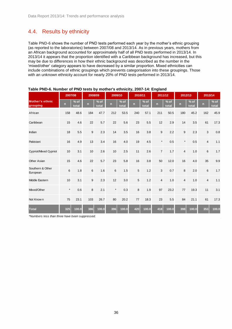
Data Report 2013/14: Trends and performance analysis
36
4.4. Results by ethnicity
Table PND-6 shows the number of PND tests performed each year by the mother’s ethnic grouping (as reported to the laboratories) between 2007/08 and 2013/14. As in previous years, mothers from an African background accounted for approximately half of all PND tests performed in 2013/14. In 2013/14 it appears that the proportion identified with a Caribbean background has increased, but this may be due to differences in how their ethnic background was described as the number in the ‘mixed/other’ category appears to have decreased by a similar proportion. Mixed ethnicities can include combinations of ethnic groupings which prevents categorisation into these groupings. Those with an unknown ethnicity account for nearly 20% of PND tests performed in 2013/14.
Table PND-6. Number of PND tests by mother's ethnicity, 2007-14: England
Mother's ethnic
groupingn
% of
totaln
% of
totaln
% of
totaln
% of
totaln
% of
totaln
% of
totaln
% of
total
African 158 48.6 184 47.7 212 53.5 240 57.1 211 50.5 180 45.2 162 45.9
Caribbean 15 4.6 22 5.7 22 5.6 23 5.5 12 2.9 14 3.5 61 17.3
Indian 18 5.5 9 2.3 14 3.5 16 3.8 9 2.2 9 2.3 3 0.8
Pakistani 16 4.9 13 3.4 16 4.0 19 4.5 * 0.5 * 0.5 4 1.1
Cypriot/Mixed Cypriot 10 3.1 10 2.6 10 2.5 11 2.6 7 1.7 4 1.0 6 1.7
Other Asian 15 4.6 22 5.7 23 5.8 16 3.8 50 12.0 16 4.0 35 9.9
Southern & Other
European6 1.8 6 1.6 6 1.5 5 1.2 3 0.7 8 2.0 6 1.7
Middle Eastern 10 3.1 9 2.3 12 3.0 5 1.2 4 1.0 4 1.0 4 1.1
Mixed/Other * 0.6 8 2.1 * 0.3 8 1.9 97 23.2 77 19.3 11 3.1
Not Know n 75 23.1 103 26.7 80 20.2 77 18.3 23 5.5 84 21.1 61 17.3
Total 325 100.0 386 100.0 396 100.0 420 100.0 418 100.0 398 100.0 353 100.0
*Numbers less than three have been suppressed.
2007/08 2013/142012/132011/122010/112009/102008/09

Data Report 2013/14: Trends and performance analysis
37
4.5. Pregnancy outcomes
Data collection for pregnancy outcomes for PND testing began in 2008/09. Table PND-7 shows the number of PND tests with each pregnancy outcome where an affected pregnancy was identified, and Table PND-8 shows these figures separated out by condition. Completeness of outcome data has decreased in recent years (see 4.1 Response rates and data quality) and in 2013/14 44% of affected results had missing outcome data.
Table PND-7. Number of PND tests with affected results by outcome, 2008-14: England
Outcome n % n % n % n % n % n %
Continued 9 10.8 19 18.6 26 27.4 18 18.0 13 15.7 13 14.6
Terminated 27 32.5 41 40.2 50 52.6 48 48.0 38 45.8 37 41.6
Not Know n 47 56.6 42 41.2 19 20.0 34 34.0 32 38.6 39 43.8
Total 83 100.0 102 100.0 95 100.0 100 100.0 83 100.0 89 100.0
Cases where the pregnancy miscarried have been excluded due to the small numbers involved.
2008/09 2013/142012/132011/122010/112009/10
Table PND-8. Outcomes for pregnancies with affected fetal diagnoses at PND, 2008-14:
England by condition
n
% of total
identified
with
condition
n
% of total
identified
with
condition
n
% of total
identified
with
condition
n
% of total
identified
with
condition
n
% of total
identified
with
condition
n
% of total
identified
with
condition
Continued 8 13.3 18 22.8 21 31.8 17 20.0 12 17.6 12 17.4
Terminated 17 28.3 30 38.0 31 47.0 38 44.7 28 41.2 31 44.9
Miscarried * 1.7 * 0.0 * 0.0 * 0.0 * 2.9 * 0.0
Not Know n 34 56.7 31 39.2 14 21.2 30 35.3 26 38.2 26 37.7
Continued * 0.0 * 4.8 4 16.0 * 8.3 * 7.1 * 6.3
Terminated 8 38.1 9 42.9 17 68.0 8 66.7 8 57.1 5 31.3
Miscarried * 0.0 * 0.0 * 0.0 * 8.3 * 0.0 * 0.0
Not Know n 13 61.9 11 52.4 4 16.0 * 16.7 5 35.7 10 62.5
Continued * 33.3 * 0.0 * 25.0 * 0.0 * 0.0 * 0.0
Terminated * 66.7 * 100.0 * 50.0 * 66.7 * 66.7 * 33.3
Miscarried * 0.0 * 0.0 * 0.0 * 0.0 * 0.0 * 0.0
Not Know n * 0.0 * 0.0 * 25.0 * 33.3 * 33.3 * 66.7
Total Affected 84 102 95 101 85 89
*Numbers less than three have been suppressed
Affected results for other haemoglobinopathies have been excluded.
2012/13 2013/14
Sickle Cell
Beta
Thalassaemia
Alpha
Thalassaemia
Condition
Pregnancy
outcome
2008/09 2009/10 2010/11 2011/12

Data Report 2013/14: Trends and performance analysis
38
Figure PND-2 shows the proportion of PND tests with an affected result where parents opted to continue the pregnancy or opted to terminate the pregnancy, using aggregated data covering 2008/09 – 2013/14. Alpha thalassaemia results and miscarriages are excluded as the numbers are small, as are cases where the pregnancy outcome was not known. Of the PND tests performed where the outcome was known (56% of affected results), approximately 33.5% of cases with sickle cell affected results opted to continue the pregnancy while 66.5% opted to terminate. Approximately 13% of cases with beta thalassaemia affected results opted to continue the pregnancy while 87% opted to terminate.
Figure PND-2. Outcomes for pregnancies with affected fetus diagnosis at PND, 2008-14:
England by condition
Table PND-9 shows pregnancy outcomes by gestation at which the PND test was performed for affected sickle cell and beta thalassaemia results. This includes data between 2008/09 and 2013/14. Where couples opted to terminate the pregnancy following a beta thalassaemia affected result, the majority were tested by 12 weeks and six days gestation (40 tested by 12 weeks and six days compared to 14 tested at 13 weeks or later). For sickle cell affected results where the parents opted to terminate, 82 were tested by 12 weeks and six days and 89 were tested at 13 weeks or later.
Table PND-9. Gestation at PND for affected results with a known outcome, 2008-14: England
<12+6 weeks 13+0 - 14+6 weeks ≥15+0 wks
Condition Outcome n n n
Continued 29 17 40
Terminated 82 40 49
Continued 7 * *
Terminated 40 9 5
*Numbers less than three have been suppressed.
Sickle Cell
Beta Thalassaemia
66.5
87.3
33.5
12.7
0
10
20
30
40
50
60
70
80
90
100
Sickle Cell* Beta Thalassaemia
% Continued
Terminated
The "Sickle Cell" category includes cases where the result was 'sickle cell and thalassaemia' Excludes alpha thalassaemia cases, miscarriage outcomes, and 213 cases where pregnancy outcome was not known.

Data Report 2013/14: Trends and performance analysis
39
Figure PND-3 shows the proportion of affected results where the parents opted to terminate the pregnancy, shown with 95% confidence intervals by gestation for all conditions. These data indicate that the later in pregnancy that PND tests are performed, the lower the percentage of parents that opt to terminate the pregnancy.
Figure PND-3. Percentage of affected results where parents opted to terminate, by gestation at
PND for known pregnancy outcomes, 2008-14
76.9 72.9 56.7 0
10
20
30
40
50
60
70
80
90
100
<12+6 weeks 13+0 - 14+6 weeks ≥15+0 wks
%
Gestation
Excludes cases where the gestation at PND was unknown, and cases where the pregnancy outcome was unknown.

Data Report 2013/14: Trends and performance analysis
40
5. Newborn screening data
5.1. Response rates and data quality
Response rate:
Data were received from all 13 newborn screening laboratories in England. We would like to thank all those involved in collecting and submitting these data to the screening programme.
Data quality:
Newborn laboratories report on ‘results’ which may differ from the number of babies tested. Data by region and by ethnicity are collected separately, which can lead to discrepancies when comparing the figures. Potential causes for these differences can include samples from outside of England being excluded in the regional data where these could be identified, but not in the ethnicity data. For the 2013/14 data collection year the data fields requested were expanded to include screening outcome data. As this was the first year that outcome data were requested in this format, we asked that laboratories provide this information if they can. This data will be fed back to the laboratories and will be used to assess the suitability of the data fields requested, but these data is not included here.
5.2. Numbers screened
Laboratory data report 668,117 babies screened in 2013/14. Birth figures from the Office of National Statistics (ONS) can offer a point of comparison to the laboratory data to provide validation for numbers screened, shown in Table NB-1. Nationally there is a discrepancy of 0.54% between these two datasets. This discrepancy could be accounted for in part by the different periods covered (the ONS data covers the 2013 calendar year, whereas the laboratory data covers the 2013/14 financial year 1 April – 31 March); by declined screening tests; and babies reported with an unknown region. The ‘unknown’ region category includes cases where the laboratories provide figures as ‘out of region’ or ‘unknown region’ and so cannot be attributed to a specific region. Laboratory data may include repeat tests and babies born abroad who moved to England up to one year of age.
Table NB-1. Comparison of ONS birth figures and number of babies screened as reported by
newborn screening laboratories, 2013/14: England by region
Region Data from newborn laboratories* ONS figures† Discrepancy (%)
East of England 69,082 71,309 3.12
East Midlands 48,382 52,895 8.53
London 130,373 128,332 -1.59
North East 27,896 28,961 3.68
North West 84,384 86,372 2.30
South East 103,123 102,190 -0.91
South West 57,940 58,710 1.31
West Midlands 70,773 71,188 0.58
Yorkshire and The Humber 67,820 64,560 -5.05
Unknow n Region 8,344 - -
England Total 668,117 664,517 -0.54
*Data collected from the 13 newborn laboratories in England. This data covers the financial year 2013/14.
†Data from ONS (Live Births by Area of Usual Residence 2013, found at http://www.ons.gov.uk/ons/publications/re-reference-
tables.html?edition=tcm%3A77-320857). This data covers the 2013 calendar year.

Data Report 2013/14: Trends and performance analysis
41
5.3. Newborn screening results
Laboratory data for 2013/14 identified 668,117 babies as having been screened, of whom 319 (one in 2,094) were identified as screen positive for a significant condition, and 8,850 (one in 75) were identified as carriers. Table NB-2 shows a breakdown of newborn screening results by haemoglobinopathy result for 2013/14 including both significant conditions and carrier results.
Table NB-2. Babies screened and newborn screening results, 2013/14: England by region
Region FS FSC
FS-
Other FE F-only FAS FAC FAD FAE
Other
Carrier
Transfused Declined
Normal+
Abnormal
East Midlands 10 4 * * * 241 61 46 35 * 94 * 48,382
East of England 16 5 * * 4 393 95 49 74 18 22 124 69,082
London 128 49 3 10 10 3,081 688 230 407 4 522 161 130,373
North East * * * * * 54 8 18 31 23 36 18 27,896
North West 15 * * * 5 462 83 80 91 5 137 75 84,384
South Central 14 3 * * 3 298 70 50 63 * 33 32 51,413
South East Coast 8 * * * * 226 42 48 53 * 619 49 51,710
South West 4 * * * * 167 50 45 41 * 30 54 57,940
West Midlands 16 3 * * 4 511 131 124 115 * 115 93 70,773
Yorkshire and
the Humber7 3 3 * 5 266 41 74 68 * 96 45 67,820
Unknow n region * * * * * 56 19 * 7 * 236 21 8,344
England Total 219 72 8 20 32 5,755 1,288 766 985 56 1,940 672 668,117
*Numbers less than three have been suppressed.
Significant Conditions Carriers Total Screened

Data Report 2013/14: Trends and performance analysis
42
Significant conditions:
Significant conditions comprise FS, FSC, FS-Other and FE. Table NB-3 shows the number and rates of babies identified with a significant condition for each year between 2011 and 2014. In 2013/14 there were 319 babies identified with a significant condition, which equates to 0.48 per 1000 babies screened or one in 2,094 babies screened. Prior to 2011/12 there were approximately 360 babies identified with a significant condition through newborn screening each year, which equates to between 0.52 and 0.56 per 1000 babies screened each year between 2005 and 2011. Rates across England range between 0.07 per 1000 (one in 13,948) babies screened in the North East and 1.46 per 1000 (one in 686) babies screened in London. Babies born with a significant condition were identified in all regions in England, although approximately 60% of these babies were in London. Newborn screening does not specifically test for beta thalassaemia major. However, F-only cases are probable beta thalassaemia cases and require follow-up testing. There are approximately 20 to 30 F-only cases reported each year, and in 2013/14 there were 32 cases reported. Figure NB-1 shows the geographical prevalence of babies identified with a significant condition per 1000 babies screened in 2013/14.
Table NB-3. Trends in the number of babies identified with significant conditions, 2011-14:
England by region
Regionn
Total
screened
Rate/
1000n
Total
screened
Rate/
1000n
Total
screened
Rate/
1000
East Midlands 8 50,901 0.16 8 49,898 0.16 16 48,382 0.33
East of England 18 72,091 0.25 21 72,421 0.29 21 69,082 0.30
London 205 133,245 1.54 195 131,424 1.48 190 130,373 1.46
North East * 28,122 0.07 * 28,966 0.03 * 27,896 0.07
North West 21 88,405 0.24 25 87,369 0.29 19 84,384 0.23
South Central 18 54,286 0.33 13 53,352 0.24 20 51,413 0.39
South East Coast 8 53,521 0.15 7 51,682 0.14 9 51,710 0.17
South West 4 60,811 0.07 7 59,938 0.12 8 57,940 0.14
West Midlands 21 72,970 0.29 21 72,559 0.29 20 70,773 0.28
Yorkshire and the
Humber10 69,457 0.14 11 69,613 0.16 13 67,820 0.19
Unknow n region 5 9,469 0.53 3 8,216 0.37 * 8,344 0.12
England total 320 693,278 0.46 312 685,438 0.46 319 668,117 0.48
*Numbers less than three have been suppressed.
2013/142012/132011/12
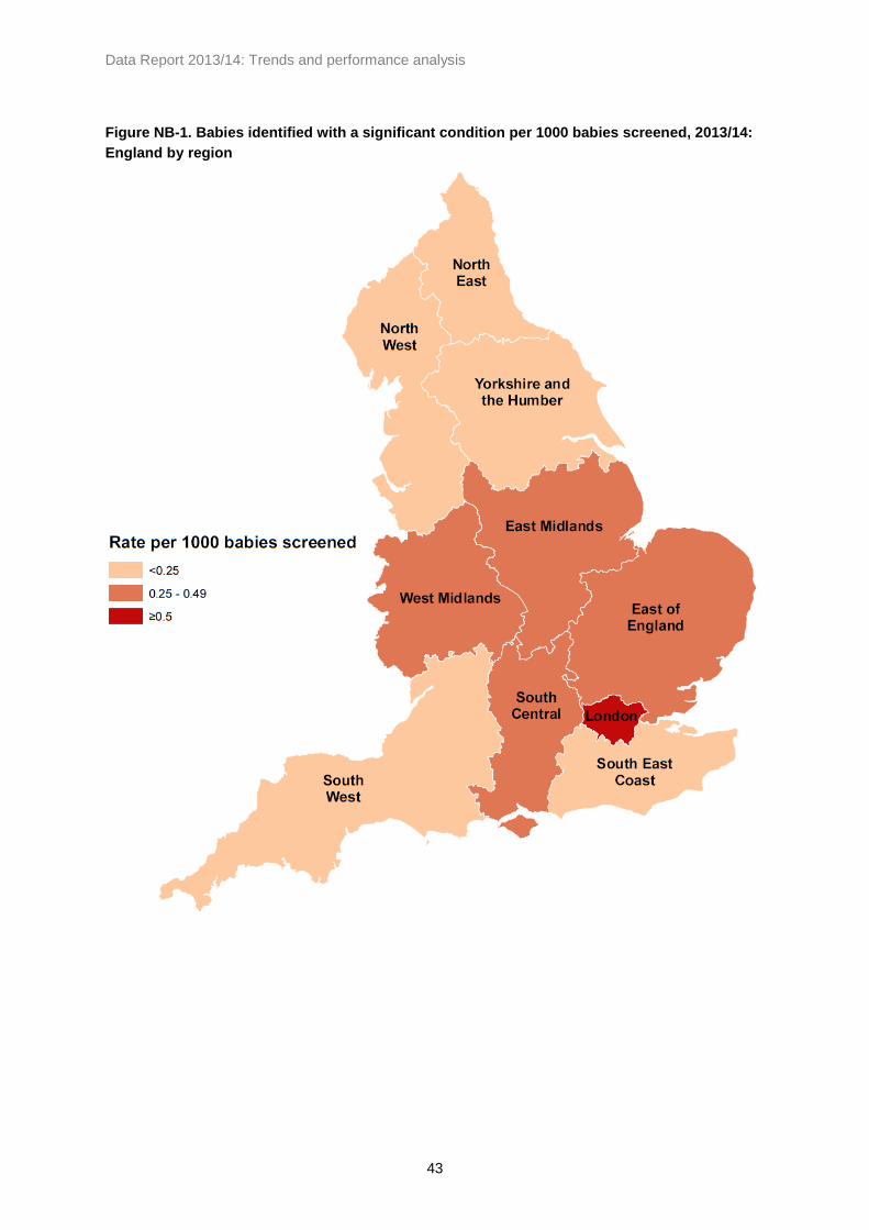
Data Report 2013/14: Trends and performance analysis
43
Figure NB-1. Babies identified with a significant condition per 1000 babies screened, 2013/14:
England by region

Data Report 2013/14: Trends and performance analysis
44
Figure NB-2 shows the trends in rates of babies identified with a significant condition for England by region. Figure NB-3 compares the rates for London with those for the rest of England (including cases where the region is unknown). The rates for the whole of England appear steady at approximately 0.5 per 1000 babies screened with some slight variation between years. The rates in London are consistently higher than in the rest of England, although there appears to be an overall decline in rates for London.
Figure NB-2. Trends in babies identified with a significant condition, 2005-14: England by
region
Figure NB-3. Trends in babies identified with a signficant condition, 2005-14: London and the
rest of England
0.0
0.5
1.0
1.5
2.0
2.5
2005/06 2006/07 2007/08 2008/09 2009/10 2010/11 2011/12 2012/13 2013/14
Rate
pe
r 1000 b
ab
ies s
cre
en
ed
East Midlands
East of England
London
North East
North West
South Central
South East Coast
South West
West Midlands
Yorkshire and theHumberUnknown
England Total
Significant conditions comprise FS,FSC, FS Other and FE. *Bristol data for first half of 2005/06 not included and Oxford and Portsmouth data not included for whole of 2005/06; Oxford data starts from 1st July 2006.
0.0
0.5
1.0
1.5
2.0
2.5
2005/06 2006/07 2007/08 2008/09 2009/10 2010/11 2011/12 2012/13 2013/14
Rate
pe
r 1000 b
ab
ies s
cre
en
ed
London
Rest of England(incl. Unknown)
England Total
Significant conditions comprise FS,FSC, FS Other and FE.

Data Report 2013/14: Trends and performance analysis
45
Carriers:
Carrier results comprise FAS, FAC, FAD, FAE and other haemoglobin variants. Table NB-4 shows the number and rates of babies with a carrier result between 2011 and 2014. In 2013/14 there were 8,850 babies identified as carriers, which equates to 13.25 per 1000 babies screened or one in 76 babies screened. Rates across England ranged between approximately one in 208 babies screened in the North East and one in 30 babies screened in London. Figure NB-4 shows the geographical prevalence of babies identified with a carrier result per 1000 babies screened in 2013/14 by region.
Table NB-4. Trends in the number of babies identified with carrier results, 2011-14: England by
region
Regionn
Total
Screened
Rate/
1000n
Total
Screened
Rate/
1000n
Total
Screened
Rate/
1000
East Midlands 398 50,901 7.82 444 49,898 8.90 383 48,382 7.92
East of England 728 72,091 10.10 706 72,421 9.75 629 69,082 9.11
London 4,778 133,245 35.86 4,679 131,424 35.60 4,410 130,373 33.83
North East 122 28,122 4.34 157 28,966 5.42 134 27,896 4.80
North West 817 88,405 9.24 665 87,369 7.61 721 84,384 8.54
South Central 542 54,286 9.98 564 53,352 10.57 481 51,413 9.36
South East Coast 404 53,521 7.55 357 51,682 6.91 369 51,710 7.14
South West 351 60,811 5.77 323 59,938 5.39 305 57,940 5.26
West Midlands 939 72,970 12.87 900 72,559 12.40 881 70,773 12.45
Yorkshire and the
Humber529 69,457 7.62 477 69,613 6.85 450 67,820 6.64
Unknow n 110 9,469 11.62 96 8,216 11.68 87 8,344 10.43
England Total 9,718 693,278 14.02 9,368 685,438 13.67 8,850 668,117 13.25
2013/142012/132011/12

Data Report 2013/14: Trends and performance analysis
46
Figure NB-4. Babies identified with a carrier result per 1000 babies screened, 2013/14: England
by region

Data Report 2013/14: Trends and performance analysis
47
Figure NB-5 shows the trends in rates of babies identified with a carrier result for England by region. Rates in London are consistently higher in each year than other regions in England. Figure NB-6 shows the rates for London, broken down by London sectors (pre-2006 SHAs), and Figure NB-7 shows the rates by region excluding London. Carrier numbers are higher than those for significant conditions, which makes the rates more steady when comparing between years. Outside of London, rates are consistently highest in the West Midlands in this nine-year period and lowest in the South West and North East.
Figure NB-5. Trends in babies identified as carriers, 2005-14: England by region
Figure NB-6. Trends in babies identified as carriers, 2005-14: London sectors (pre-2006 SHAs)
0
5
10
15
20
25
30
35
40
45
2005/06 2006/07 2007/08 2008/09 2009/10 2010/11 2011/12 2012/13 2013/14
Rate
pe
r 1000 b
ab
ies s
cre
en
ed
East Midlands
East of England
London
North East
North West
South Central
South East Coast
South West
West Midlands
Yorkshire and the Humber
Unknown region
England Total
Carrier results comprise FAS, FAC, FAD, FAE and other carriers. *Bristol data for first half of 2005/06 not included and Oxford and Portsmouth data not included for whole of 2005/06; Oxford data starts from 1st July 2006.
0
10
20
30
40
50
60
70
2005/06 2006/07 2007/08 2008/09 2009/10 2010/11 2011/12 2012/13 2013/14
Rate
pe
r 1000 b
ab
ies s
cre
en
ed
London NorthCentral
London North East
London NorthWest
London SouthEast
London SouthWest
London Total
Carrier results comprise FAS, FAC, FAD, FAE and other carriers.

Data Report 2013/14: Trends and performance analysis
48
Figure NB-7. Trends in babies identified as carriers, 2005-14: England by region (excluding
London)
Figure NB-8 compares the rates for London, where they are highest in England, to those for the rest of England (including cases where the region is unknown). Carrier rates for the whole of England appear stable across this period ranging between 13 and 15 per 1000 babies screened. There appears to be a continuation of the decline in rates in London, ranging from 40 per 1000 babies screened in 2006/07 to 34 per 1000 babies screened in 2013/14. There is also some indication of a decline in the rates for the rest of England, although this appears smaller than in London.
Figure NB-8. Trends in babies identified as carriers, 2005-14: London and the rest of England
0
2
4
6
8
10
12
14
16
2005/06 2006/07 2007/08 2008/09 2009/10 2010/11 2011/12 2012/13 2013/14
Rate
pe
r 1000 b
ab
ies s
cre
en
ed
East Midlands
East of England
North East
North West
South Central
South East Coast
South West
West Midlands
Yorkshire and theHumber
England Total(Including London)
Carrier results comprise FAS, FAC, FAD, FAE and other carriers. *Bristol data for first half of 2005/06 not included and Oxford and Portsmouth data not included for whole of 2005/06; Oxford data starts from 1st July 2006.
0
5
10
15
20
25
30
35
40
45
2005/06 2006/07 2007/08 2008/09 2009/10 2010/11 2011/12 2012/13 2013/14
Rate
pe
r 1000 b
ab
ies s
cre
en
ed
London
Rest of England (incl.Unknown)
England Total
Carrier results comprise FAS, FAC, FAD, FAE and other carriers.

Data Report 2013/14: Trends and performance analysis
49
5.4. Results by ethnicity
Newborn screening figures by ethnicity can differ slightly from the figures shown by region (see 5.1 Response rates and data quality). Table NB-5 shows the number and rates of babies identified with a significant condition in the three years since 2011/12, and Table NB-6 shows similar data for carrier results in the same period. Babies reported as black African accounted for approximately 60% of significant conditions detected and approximately 38% of carrier results detected in 2013/14. The next largest group is babies reported as black Caribbean, which accounted for 10% of significant conditions and 9% of carriers. Whilst sickle cell disease is more common in people from these ethnic categories, it is not confined to these groups and in 2013/14 1.6% of affected babies and 8.9% of carriers were identified as white British, white Irish, or any other white background.
Table NB-5. Numbers of babies identified with significant conditions, 2011-14: England by
ethnicity
Ethnic categoryn
Total
Screened
Rate/
1000n
Total
Screened
Rate/
1000n
Total
Screened
Rate/
1000
A - White British 3 443,448 0.01 5 434,514 0.01 5 413,538 0.01
B - White Irish * 1,671 0.00 * 1,723 0.00 * 1,910 1.05
C - Any other w hite background * 47,675 0.00 * 49,386 0.00 * 57,664 0.00
D - White and black Caribbean 9 7,581 1.19 8 7,803 1.03 10 8,042 1.24
E - White and black African 6 4,407 1.36 3 4,348 0.69 5 5,080 0.98
F - White and Asian * 8,056 0.00 * 10,495 0.00 * 8,545 0.12
G - Any other mixed background 4 12,340 0.32 3 10,735 0.28 8 13,404 0.60
H - Indian 4 21,736 0.18 4 21,560 0.19 * 21,149 0.05
J - Pakistani * 27,262 0.04 * 27,855 0.00 3 27,595 0.11
K - Bangladeshi 7 9,096 0.77 9 9,856 0.91 8 9,166 0.87
L - Any other Asian background 3 9,869 0.30 * 8,078 0.25 4 10,868 0.37
M - Black Caribbean 38 6,668 5.70 30 7,402 4.05 32 6,163 5.19
N - Black African 195 24,294 8.03 196 22,244 8.81 191 22,770 8.39
P - Any other black background 20 3,330 6.01 17 4,838 3.51 25 3,233 7.73
R - Chinese * 3,687 0.00 * 3,951 0.00 * 3,213 0.00
S - Any other ethnic category 5 16,828 0.30 10 18,615 0.54 5 14,234 0.35
Z - Not stated 25 46,071 0.54 24 43,490 0.55 19 42,863 0.44
England total 320 694,019 0.46 311 686,893 0.45 319 669,437 0.48
*Numbers less than three have been suppressed.
2013/142012/132011/12

Data Report 2013/14: Trends and performance analysis
50
Table NB-6. Numbers of babies identified with carrier results, 2011-14: England by ethnicity
Ethnic categoryn
Total
Screened
Rate/
1000n
Total
Screened
Rate/
1000n
Total
Screened
Rate/
1000
A - White British 957 443,448 2.16 762 434,514 1.75 609 413,538 1.47
B - White Irish 5 1,671 2.99 3 1,723 1.74 25 1,910 13.09
C - Any other w hite background 171 47,675 3.59 139 49,386 2.81 158 57,664 2.74
D - White and black Caribbean 464 7,581 61.21 457 7,803 58.57 506 8,042 62.92
E - White and black African 375 4,407 85.09 359 4,348 82.57 384 5,080 75.59
F - White and Asian 168 8,056 20.85 146 10,495 13.91 139 8,545 16.27
G - Any other mixed background 327 12,340 26.50 352 10,735 32.79 395 13,404 29.47
H - Indian 328 21,736 15.09 314 21,560 14.56 262 21,149 12.39
J - Pakistani 351 27,262 12.88 293 27,855 10.52 305 27,595 11.05
K - Bangladeshi 416 9,096 45.73 420 9,856 42.61 468 9,166 51.06
L - Any other Asian background 182 9,869 18.44 158 8,078 19.56 147 10,868 13.53
M - Black Caribbean 850 6,668 127.47 843 7,402 113.89 750 6,163 121.69
N - Black African 3,467 24,294 142.71 3,483 22,244 156.58 3,369 22,770 147.96
P - Any other black background 396 3,330 118.92 412 4,838 85.16 391 3,233 120.94
R - Chinese 27 3,687 7.32 29 3,951 7.34 11 3,213 3.42
S - Any other ethnic category 401 16,828 23.83 495 18,615 26.59 245 14,234 17.21
Z - Not stated 838 46,071 18.19 746 43,490 17.15 693 42,863 16.17
England total 9,723 694,019 14.01 9,411 686,893 13.70 8,857 669,437 13.23
2013/142012/132011/12

Data Report 2013/14: Trends and performance analysis
51
5.5. Declined screening tests
Figure NB-9 shows the rate per 1000 babies screened that declined testing in England between 2005 and 2014. There were approximately 672 declined screening tests in 2013/14, which equates to approximately 1 per 1000 babies screened. There has been an increase each year in the number of reported declined tests in the past six years, from 0.43 per 1000 babies screened in 2008/09 to 1.01 per 1000 babies screened in 2013/14.
Figure NB-9. Declined screening for sickle cell disease, 2005-14: England
0.50 0.52 0.51
0.43
0.51
0.65
0.85
0.97 1.01
0.0
0.2
0.4
0.6
0.8
1.0
1.2
2005/06 2006/07 2007/08 2008/09 2009/10 2010/11 2011/12 2012/13 2013/14
Rat
e p
er
10
00
bab
ies
scre
en
ed
Bristol data for first half of 2005/06 not included and Oxford and Portsmouth data not included for whole of 2005/06; Oxford data starts from 1st July 2006.

Data Report 2013/14: Trends and performance analysis
52
5.6. Post-transfusion testing
Routine techniques are not suitable for testing samples from transfused babies as transfused red cells can survive up to 120 days in circulation. It is therefore important that pre-transfusion samples are taken in accordance with standards. Table NB-7 shows he number and rates of post-transfusion samples between 2011 and 2014. In 2013/14 there were 1,940 post-transfusion samples reported which require follow-up DNA testing, which equates to approximately three per 1000 babies screened. No data on post-transfusion samples were identified by the Great Ormond Street Hospital (GOSH) laboratory for 2013/14, so this figure is likely to be an under-estimate. Rates by region appear consistent with previous years with the exception of the South East Coast region where rates have increased from approximately four per 1000 babies screened to approximately 12 per 1000 babies screened.
Table NB-7. Post-transfusion samples, number and rate per 1000 babies screened, 2011-14:
England by region
Regionn
Total
Screened
Rate/
1000n
Total
Screened
Rate/
1000n
Total
Screened
Rate/
1000
East Midlands 94 50,901 1.85 89 49,898 1.78 94 48,382 1.94
East of England 83 72,091 1.15 96 72,421 1.33 22 69,082 0.32
London 344 133,245 2.58 368 131,424 2.80 522 130,373 4.00
North East 35 28,122 1.24 44 28,966 1.52 36 27,896 1.29
North West 224 88,405 2.53 137 87,369 1.57 137 84,384 1.62
South Central 34 54,286 0.63 42 53,352 0.79 33 51,413 0.64
South East Coast 195 53,521 3.64 199 51,682 3.85 619 51,710 11.97
South West 42 60,811 0.69 34 59,938 0.57 30 57,940 0.52
West Midlands 213 72,970 2.92 182 72,559 2.51 115 70,773 1.62
Yorkshire and the
Humber145 69,457 2.09 133 69,613 1.91 96 67,820 1.42
Unknow n region 229 9,469 24.18 195 8,216 23.73 236 8,344 28.28
England total 1,638 693,278 2.36 1,519 685,438 2.22 1,940 668,117 2.90
2013/142012/132011/12
Transfusion data for GOSH for 2013/14 not separated out from the 'normal+abnormal' figure and so not included here.

Data Report 2013/14: Trends and performance analysis
53
Figure NB-10 shows the national rates for each year since 2005. Since the programme implemented the pre-transfusion policy in 2008/09 rates for post-transfusion samples have remained steady at approximately 2.2 per 1000 babies screened, although an increase can be seen in 2013/14. This increase may reflect the higher figures reported for the South East Coast region (see Table NB-7).
Figure NB-10. Post-transfusion samples, rate per 1000 babies screened, 2005-14: England
Post-transfusion samples require DNA testing to mitigate the risk of a missed baby. Data on DNA testing for transfused babies from the laboratories at King’s College Hospital and Sheffield Children’s Hospital is shown in Table NB-8. In 2013/14 there were 1,160 samples tested by these laboratories. Since Q3 of 2009/10 there have been 6,190 samples tested, of which five were found to be screen positive for sickle cell disease (approximately one in 1,238 babies screened using DNA testing).
Table NB-8. Numbers detected through DNA testing for transfused babies, 2009-14
2009/10† 2010/11 2011/12 2012/13 2013/14 Total
Total Specimens received per
Quarter493 1674 1520 1343 1160 6190
Number of Negative results
(HbS not detected)483 1650 1497 1319 1140 6089
Number of Positive
Heterozygotes10 24 21 21 20 96
Number of Positive
Homozygotes* * * 3 * 5
Number of Results pending * * * * * *
Number rejected due to lack of
identif iers* * * * * *
†2009/10 data is for Q3 and Q4 only
*Numbers less than three have been suppressed
7.4
7.0
5.6
3.4
2.2 2.1 2.4 2.2
2.9
0
1
2
3
4
5
6
7
8
9
2005/06 2006/07 2007/08 2008/09 2009/10 2010/11 2011/12 2012/13 2013/14
Rate
pe
r 1000 b
ab
ies s
cre
en
ed
Bristol data for first half of 2005/06 not included and Oxford and Portsmouth data not included for whole of 2005/06; Oxford data starts from 1st July 2006; Transfused data from Manchester laboratory for 2009/10 not available; Transfusion data for GOSH for 2013/14 not separated out from the 'normal+abnormal' figure and so not included here.
Imple
menta
tio
n o
f pre
-tr
ansfu
sio
n p
olic
y

Data Report 2013/14: Trends and performance analysis
54
5.7. Timeliness of reporting results
Newborn Blood Spot Screening (NBBS) Programme standard 4 (timely sample collection) is for the sample to be taken on day five and in exceptional circumstances between day five and day eight (day of birth is day zero). This standard has a 95% acceptable threshold and 99% achievable threshold. Standard 5 (timely receipt of a sample in the newborn screening laboratory) sets an acceptable threshold of 99% of samples to arrive in the laboratory within four working days of sample collection and an achievable threshold of 99% of samples to arrive in the laboratory within three working days. Sickle Cell and Thalassaemia (SCT) Screening Programme standard NP3 (timely communication of positive screening results) requires 90% of sickle cell disease results to be communicated to parents by four weeks of age. Table NB-9 shows timeliness figures for newborn babies identified with a significant condition in newborn screening, including F-only cases which are probable beta thalassaemia affected cases. Turn-around-time is calculated from the number of days between the age at sample and the age at which the positive result was reported. Turn-around times for Bristol are not shown because data on age at clinical referral were missing, and for Newcastle because timeliness data were not included in the data returned to the Programme Centre.
Table NB-9. Timeliness of reporting affected newborn results, 2013/14: England by laboratory
No. of screen
positives
Laboratory n n % n % n % Min Max Average
Bristol * * 100 * 100 † N/A † † †
Cambridge * * 100 * 100 * 100 13 13 13
GOS & CMH 109 103 94 99 91 106 97 6 46 10
Leeds 13 12 92 11 85 13 100 5 23 11
Liverpool 7 7 100 6 86 7 100 5 10 7
Manchester 17 16 94 17 100 17 100 7 16 10
Newcastle † † N/A † N/A † N/A † † †
Oxford 20 17 85 17 85 16 80 9 26 14
Portsmouth 5 * 80 * 60 * 80 14 32 19
Sheffield 22 21 95 20 91 18 82 12 31 18
South East Thames 89 83 93 73 82 83 93 3 86 12
South West Thames 32 32 100 23 72 32 100 4 24 14
West Midlands 24 24 100 20 83 23 96 8 25 14
England Total 343 324 94 294 86 320 93 3 86 12
†Missing data
*Numbers less than five have been suppressed
Sample ≤8
days
Sample received by
lab within 4 days
Clinical referral
by 28 daysTurn-around time

Data Report 2013/14: Trends and performance analysis
55
6. Key Performance Indicators (KPIs)
Background to Key Performance Indicators (KPIs) The Sickle Cell and Thalassaemia Screening Programme has three antenatal KPIs and shares one newborn KPI with the Newborn Blood Spot Screening Programme. Newborn KPIs NB1 and NB2 are also relevant to SCT screening. For more information on KPI data collection and reporting, please see www.screening.nhs.uk/kpi.
KPI Code
KPI Description Acceptable
level Achievable
level
ST1
The proportion of pregnant women eligible for antenatal sickle cell and thalassaemia screening for whom a conclusive screening result is available at the day of report (the day on which data to support an audit or performance return are collated)
≥95.0% ≥99.0%
ST2 The proportion of women having antenatal sickle cell and thalassaemia screening for whom a conclusive screening result is available by 10 weeks’ gestation
≥50.0% ≥75.0%
ST3 The proportion of antenatal sickle cell and thalassaemia samples submitted to the laboratory which are supported by a completed Family Origin Questionnaire (FOQ)
≥90.0% ≥95.0%
NB1
The proportion of babies registered within the CCG both at birth and on the last day of the reporting period who are eligible for newborn blood spot screening and have a conclusive result recorded on the Child Health Information System within an effective timeframe. For this KPI, PKU is used as a proxy for all tests and the test must be completed by 17 days of age.
≥95.0% ≥99.9%
NB2 The percentage of babies from whom it is necessary to take a repeat blood sample due to an avoidable failure in the sampling process.
≤2.0% ≤0.5%
NB3 The proportion of newborn blood spot screening results which are screen negative for all five conditions, available for communication to parents within six weeks of birth
95.0% 98.0%

Data Report 2013/14: Trends and performance analysis
56
Table KPI-1 shows a breakdown of KPI data for each quarter in the 2013/14 financial year with national performance levels for each.
Table KPI-1. KPI figures by quarter, 2013/14
KPI Num Denom % Num Denom % Num Denom % Num Denom % Num Denom %
ST1 137,500 140,016 98.2 142,224 144,739 98.3 138,884 140,701 98.7 150,872 152,937 98.6 569,480 578,393 98.5
ST2 80,739 165,909 48.7 84,462 165,765 51.0 86,194 164,441 52.4 87,374 176,682 49.5 338,769 672,797 50.4
ST3 167,595 175,974 95.2 168,029 176,877 95.0 169,363 177,733 95.3 176,615 183,870 96.1 681,602 714,454 95.4
NB1 122,073 129,682 94.1 132,412 142,418 93.0 142,916 154,084 92.8 137,590 143,137 96.1 534,991 569,321 94.0
NB2 3,564 108,316 3.3 4,194 128,191 3.3 4,010 144,145 2.8 3,752 132,210 2.8 15,520 512,862 3.0
NB3 127,342 128,007 99.5 138,892 139,615 99.5 150,322 151,384 99.3 139,779 140,797 99.3 556,335 559,803 99.4
Q4Q3Q2Q1 Total for year
The KPI data presented here is aggregated data for Q1 – Q4 2013/14. Completeness of data and response rates vary in each quarter and for each KPI. Where complete cohort data cannot be provided, these figures are excluded. KPI ST1 is defined as the number of women tested as a proportion of eligible women. The acceptable threshold for this KPI is greater than or equal to 95% and the achievable level is greater than or equal to 99%.
Figure KPI-1. ST1 - Coverage by region, 2013/14: England
95.7 97.8 99.1 98.4 98.0 99.1 98.6 99.4 98.0 98.8 92
93
94
95
96
97
98
99
100
EastMidlands
East ofEngland
London North East North West SouthCentral
South East South West WestMidlands
Yorkshire &The Humber
%
The lower reference line represents the acceptable level for this KPI, and the upper reference line represents the achievable level for this KPI.

Data Report 2013/14: Trends and performance analysis
57
KPI ST2 is defined as the number of women tested by 10 weeks gestation as a proportion of women for whom a sample was received at the laboratory. The acceptable threshold for this KPI is greater than or equal to 50% and the achievable level is greater than or equal to 75%.
Figure KPI-2. ST2 - Timeliness of test by region, 2013/14: England
KPI ST3 is defined as the number of laboratory requests with a completed FOQ form as a proportion of laboratory requests. The acceptable threshold for this KPI is greater than or equal to 90% and the achievable level is greater than or equal to 95%.
Figure KPI-3. ST3 - Completion of FOQ, 2013/14: England
57.3 57.6 37.4 64.5 50.4 56.7 55.7 55.6 39.4 55.1 0
10
20
30
40
50
60
70
80
EastMidlands
East ofEngland
London North East North West SouthCentral
South East South West WestMidlands
Yorkshire &The Humber
%
The lower reference line represents the acceptable level for this KPI, and the upper reference line represents the achievable level for this KPI.
97.1 96.1 89.2 99.0 96.8 95.5 98.3 97.1 97.3 96.7 84
86
88
90
92
94
96
98
100
EastMidlands
East ofEngland
London North East North West SouthCentral
South East South West WestMidlands
Yorkshire &The
Humber
%
The lower reference line represents the acceptable level for this KPI, and the upper reference line represents the achievable level for this KPI.

Data Report 2013/14: Trends and performance analysis
58
KPI NB1 is defined as the number of babies tested as a proportion of eligible babies. The acceptable threshold for this KPI is greater than or equal to 95% and the achievable level is greater than or equal to 99.9%.
Figure KPI-4. NB1 - Coverage by region, 2013/14: England
KPI NB2 is defined as the number of avoidable repeats as a proportion of the number of initial blood samples. The acceptable threshold for this KPI is less than or equal to 2.0% and the achievable level is less than or equal to 0.5%.
Figure KPI- 5. NB2 - Avoidable repeat tests, 2013/14: England
83.9 97.6 94.9 97.9 93.7 96.7 97.3 92.1 97.6 89.0 75
80
85
90
95
100
EastMidlands
East ofEngland
London North East North West SouthCentral
South East South West WestMidlands
Yorkshire &The
Humber
%
The lower reference line represents the acceptable level for this KPI, and the upper reference line represents the achievable level for this KPI.
4.2 2.0 2.2 2.2 2.0 2.3 3.3 2.1 4.5 4.3 0.0
0.5
1.0
1.5
2.0
2.5
3.0
3.5
4.0
4.5
5.0
EastMidlands
East ofEngland
London North East North West SouthCentral
South East South West WestMidlands
Yorkshire &The
Humber
%
The upper reference line represents the acceptable level for this KPI, and the lower reference line represents the achievable level for this KPI.

Data Report 2013/14: Trends and performance analysis
59
KPI NB3 is defined as the number of results available for communication by six weeks as a proportion of the number of babies that are screen negative for all conditions screened for. The acceptable threshold for this KPI is 95% and the achievable level is 98%.
Figure KPI-6. NB3 - Timeliness of result availability, 2013/14: England
99.7 99.7 98.7 98.9 99.6 99.4 99.5 99.7 99.5 99.5 90
91
92
93
94
95
96
97
98
99
100
EastMidlands
East ofEngland
London North East North West SouthCentral
South East South West WestMidlands
Yorkshire &The
Humber
%
The lower reference line represents the acceptable level for this KPI, and the upper reference line represents the achievable level for this KPI.

Data Report 2013/14: Trends and performance analysis
60
7. Appendices
Appendix One: Update on the Newborn Outcomes Project: An
evaluation of the linked antenatal and newborn screening programme
Universal newborn screening for sickle cell disease and beta thalassaemia has been available in England since 2005. In September 2010, the NHS Sickle Cell and Thalassaemia Screening Programme started a project to assess the outcomes of the linked antenatal and newborn screening programme. We are collecting identifiable data on babies, or children under age 5, with sickle cell disorders or beta thalassaemia. This project will assess:
the health of babies or children affected with sickle cell disorders or thalassaemia
timely entry to care and start of treatment of affected babies or children
a look back at the mother’s antenatal screening history
The main rationale of this project is to reduce early mortality from invasive pneumococcal sepsis by ensuring that all affected babies with sickle cell disease are in clinical care and receiving the standard treatment. The programme currently has approval to collect named data without consent. We are collecting anonymised data alongside this data to assess its viability as a long-term exit strategy for this project, to provide assurance that all babies who need clinical care are receiving it. There is also an expectation that clinicians will enrol every newborn with sickle cell disease and clinically significant beta thalassaemia onto the National Haemoglobinopathy Registry if parents give consent, which may provide an alternative exit strategy. Between 1 April 2013 and 31 March 2014 there were 300 screen positive babies born. Of these:
268 babies had suspected sickle cell disease of which 88% were seen in clinic by 3 months
32 had suspected beta thalassaemia of which 85% were seen by 3 months
Babies were excluded from this cohort where there were clinically insignificant cases, births abroad, and deaths which were not ascribed to sickle cell disease. Data collection has been a lengthy and protracted process. This has been in part due to manual processes and varying numbers of babies across the country (with the greatest number in London), and in part due to differing methods used for notification to specialist and community centres. The process needs to be streamlined and simplified to avoid duplication. It has been proposed that a single data collection form is used both by the lab for notification and by the community centre as part of the referral process to the clinician. The updated forms are available at sct.screening.nhs.uk/evaluation. The clinician would be expected to complete the relevant clinical data and return it to the project administrator using nhs.net email, to ensure confidentiality. These changes have been supported by the programme’s information governance and clinical group and a jointly signed letter by the programme and the newborn blood spot laboratory lead will be sent to the newborn labs. This new approach will aim to improve data quality and completeness. In the future there will also be a data analysis and quality assurance group which will oversee ongoing developments of the programme.
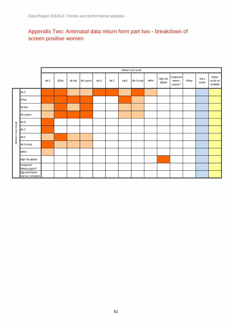
Data Report 2013/14: Trends and performance analysis
61
Appendix Two: Antenatal data return form part two - breakdown of
screen positive women
Hb S βThal db thal Hb Lepore Hb D Hb C Hb E Hb O-Arab HPFHHigh risk
alpha0
Compound
Hetero-
zygous**
*OtherNot a
carrier
Father
result not
available
Hb S
βThal
db thal
Hb Lepore
Hb D
Hb C
Hb E
Hb O-Arab
HPFH
High risk alpha0
Compound
Heterozygous**
Egg donor/bone
marrow transplant
Father's test result
Moth
er's test re
sult

Data Report 2013/14: Trends and performance analysis
62