coldplay -...
TRANSCRIPT
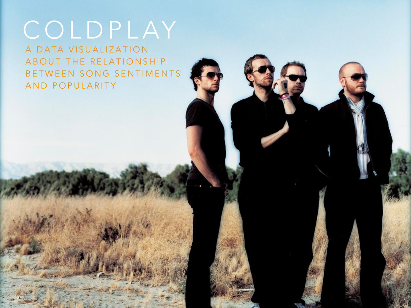
C O L D P L AYA D A TA V I S U A L I Z A T I O N A B O U T T H E R E L A T I O N S H I P B E T W E E N S O N G S E N T I M E N T S A N D P O P U L A R I T Y
The subject of my ‘Interactive Data Visualization Assignment’ will be the relationship between Coldplay’s song sentiments and its popularity.
About Coldplay:Coldplay is an Alternative British rock band formed in 1996 by lead vocalist Chris Martin and lead guitarist Jonny Buckland at University College London. It was later joined by Will Champion as a drummer and Guy Berryman as a bassist. After surfacing in 2000 with the breakthrough single "Yellow," Coldplay quickly became one of the biggest bands of the new millennium, honing a mix of introspective Brit-pop and anthemic rock that landed the British quartet a near-permanent residence on record charts worldwide. With 4 albums, many awards and tours, Coldplay is one of my favorite bands!
While researching for topics for this project, I came across many intriguing visualizations of timelines and facts of bands, which is when I realized Coldplay doesn't have any.
This visualization will analyze the sentiment of Coldplay’s songs (positive, negative, neutral), and then using that data will display the relationship between the sentiment and its popularity.
S U B J E C T
I will be generating my own data using “Semantria’s API. Semantria is a complete cloud-based text and sentiment analysis solution launched in 2011. It extracts the meaning, tone, positivity/negativity from any text it’s given.
I will run through Semantria all the song lyrics of Coldplay’s 4 albums and perform a sentiment test for them. The results will be on a scale from 0 to 1 for positive and 0 to -1 for negative.
Using this data I will then generate a graph that visualizes first the album negativity or positivity, and then for each song in the album and how this relates to the popularity of the albums and songs.
D A TA
I will be using Semantria’s Excel API to generate my data. The API comes in the form of a plug-in for Excel which parses and analyses the data in the Excel sheet.
I will then be using processing to generate my graphs. To generate the visual (see comp), I will be following tutorials and sample codes :
http://krazydad.com/tutorials/circles_js/
http://www.openprocessing.org/sketch/34748
http://forum.processing.org/two/
T E C H N O L O G Y
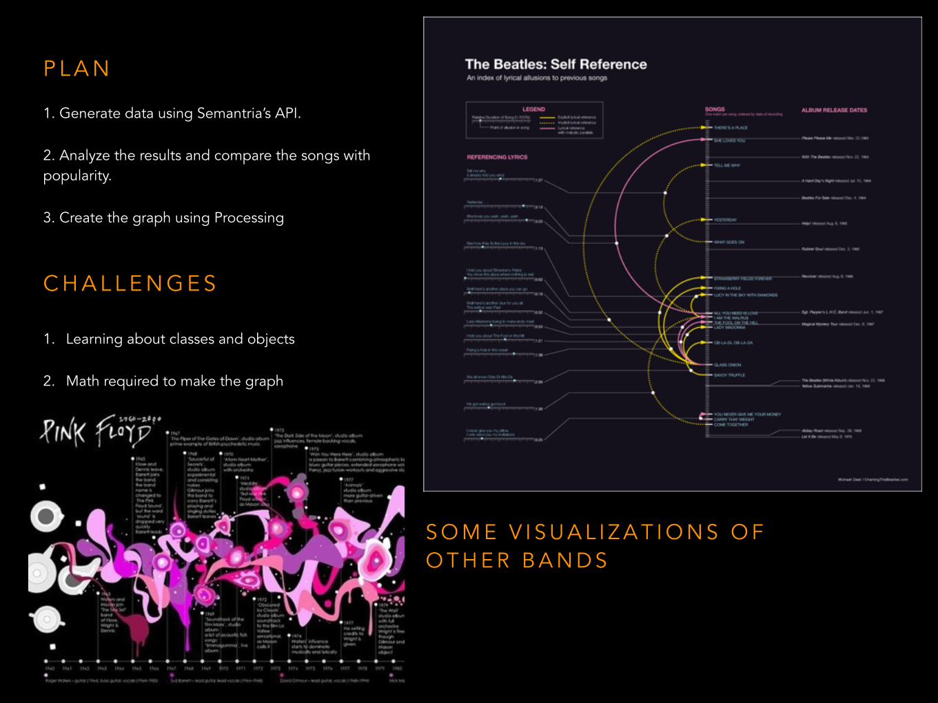
1. Generate data using Semantria’s API.
2. Analyze the results and compare the songs with popularity.
3. Create the graph using Processing
P L A N
C H A L L E N G E S
1. Learning about classes and objects
2. Math required to make the graph
S O M E V I S U A L I Z A T I O N S O F O T H E R B A N D S
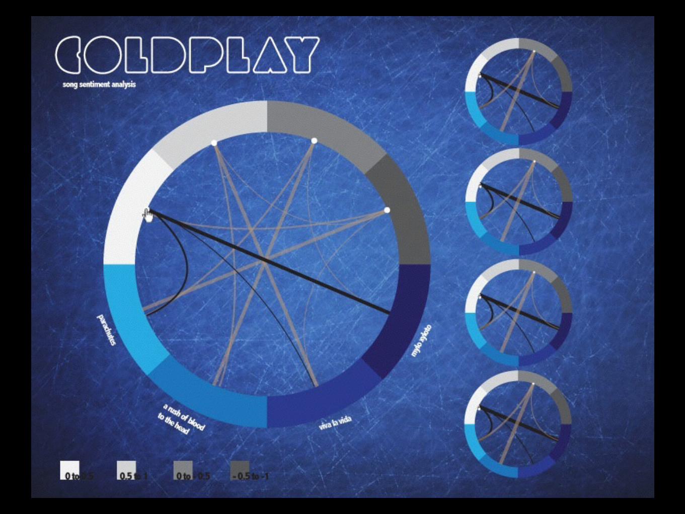
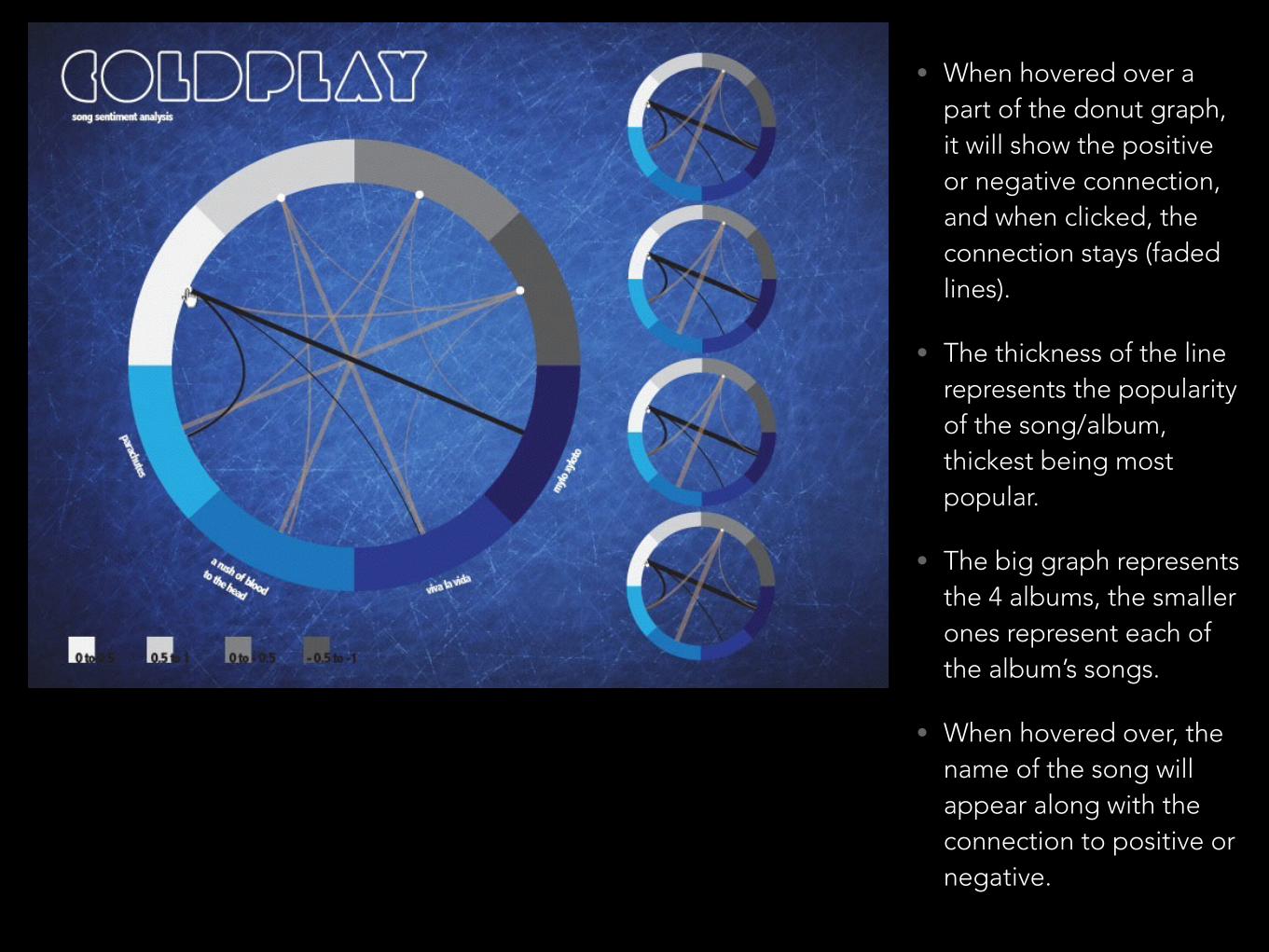
• When hovered over a part of the donut graph, it will show the positive or negative connection, and when clicked, the connection stays (faded lines).
• The thickness of the line represents the popularity of the song/album, thickest being most popular.
• The big graph represents the 4 albums, the smaller ones represent each of the album’s songs.
• When hovered over, the name of the song will appear along with the connection to positive or negative.