chapter - massachusetts bay transportation authority€¦ · web viewelizabeth moore. data...
TRANSCRIPT
Potential MBTA Fare Increase and Service Reductions in 2012: Impact Analysis
Project ManagerRobert Guptill
Project PrincipalElizabeth Moore
Data AnalystsGrace KingRobert Guptill
GraphicsRobert Guptill
Cover DesignKim Noonan
The preparation of this document was funded by the Massachusetts Bay Transportation Authority.
Produced for the Massachusetts BayTransportation Authority by theCentral Transportation Planning StaffCTPS is directed by the Boston RegionMetropolitan Planning Organization.The MPO is composed of state andregional agencies and authorities, andlocal governments.
December 30, 2011
CHAPTER 5: INNER CORE HIGHWAY ALTERNATIVES
To request additional copies of this document or copies in an accessible format, contact:
Central Transportation Planning StaffState Transportation BuildingTen Park Plaza, Suite 2150Boston, Massachusetts 02116(617) 973-7100(617) 973-8855 (fax)(617) 973-7089 (TTY)[email protected]
CTPS 12/30/2011 3
ABSTRACTThis analysis estimates various impacts of two potential scenarios for MBTA pricing and service aimed at preventing a projected budget deficit. The two scenarios offer a choice between a greater reliance on a fare increase or on service reductions for reaching that objective. The ridership, revenue, air quality, and environmental justice impacts are estimated for both scenarios. Two different modeling methodologies are used to produce these projections. The two models are complementary; in addition, producing two sets of estimates provides a range of possible impacts.
CTPS 12/30/2011 iii
AcknowledgmentsWe wish to thank Charles Planck, Melissa Dullea, and Greg Strangeways of the MBTA and the members of the Rider Oversight Finance Subcommittee for their participation in the analysis of various fare increase and service reduction scenarios.
iv 12/30/2011 Boston Region MPO
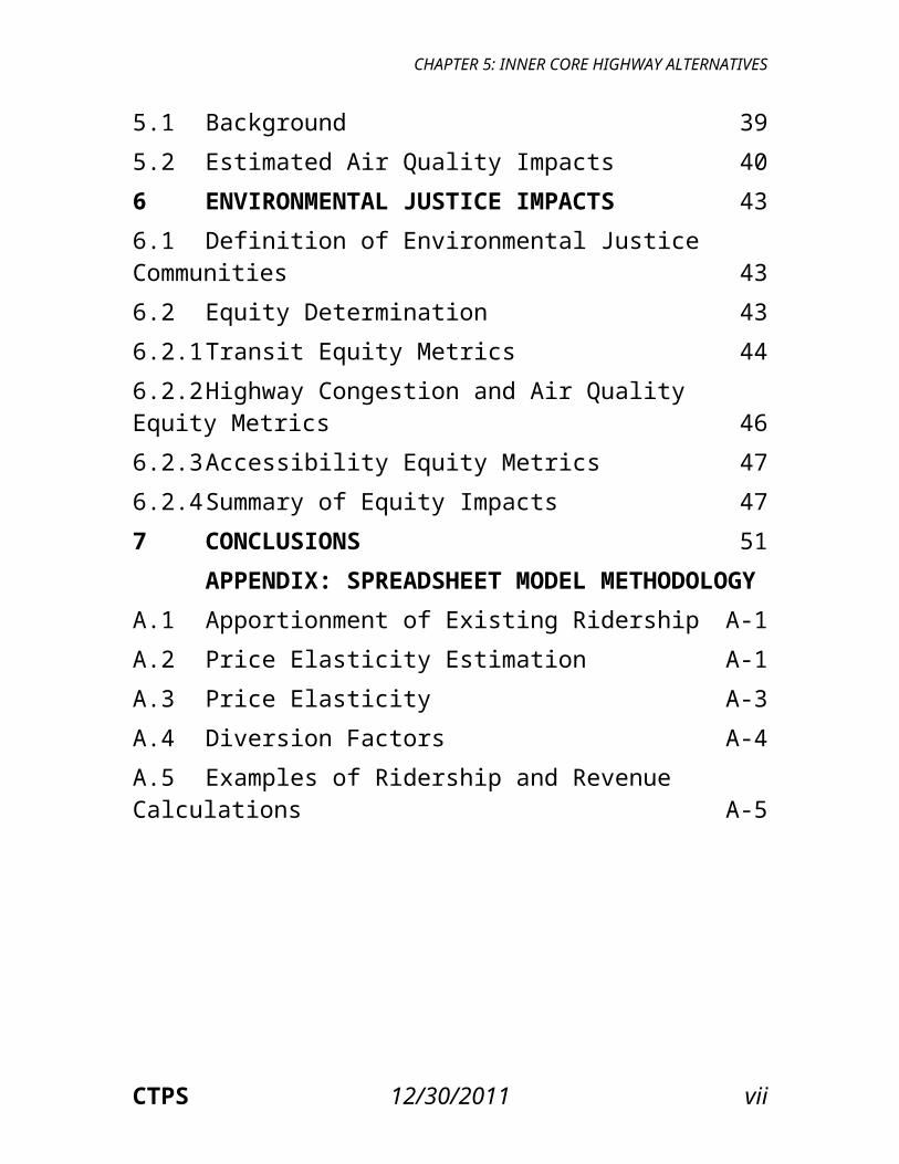
CONTENTSList of Exhibits viiEXECUTIVE SUMMARY xi
1 INTRODUCTION 12 DESCRIPTION OF PROPOSED FARE
INCREASE/SERVICE REDUCTION SCENARIOS 32.1 Fare Structure Changes 32.2 Service Reductions and Revisions 42.2.1 Bus 42.2.2 Rapid Transit, Commuter Rail, Ferry, and THE RIDE 62.2.3 Summary of Service Changes 112.3 Fare Increase: Single-Ride Fares, Pass Prices, and
Parking Rates 133 METHODS USED TO ESTIMATE RIDERSHIP AND
REVENUE 193.1 CTPS Spreadsheet Model Approach 193.1.1 Modeling of Existing Ridership and Revenue 193.1.2 Estimation of Ridership Changes Resulting from a
Fare Increase 203.2 Boston Region MPO Travel Demand Model Set
Approach 213.3 Differences between the Two Estimation
CTPS 12/30/2011 v
CONTENTS
Methodologies 234 RIDERSHIP AND REVENUE IMPACTS 254.1 Overview of Results and Methodology 254.2 Spreadsheet Model Estimates 264.2.1 Scenario 1 264.2.2 Scenario 2 284.2.3 Comparison of Scenarios 1 and 2 Total Revenue
Changes (Fare Revenue Changes Combined with Saved Operating Costs) 30
4.3 Regional Travel Demand Model Set Estimates 314.3.1 Scenario 1 314.3.2 Scenario 2 324.4 Comparison of Model Results: Ranges of
Projected Impacts 344.4.1 Scenario 1 344.4.2 Scenario 2 365 AIR QUALITY IMPACTS 395.1 Background 395.2 Estimated Air Quality Impacts 406 ENVIRONMENTAL JUSTICE IMPACTS 436.1 Definition of Environmental Justice Communities 436.2 Equity Determination 436.2.1 Transit Equity Metrics 446.2.2 Highway Congestion and Air Quality Equity Metrics 466.2.3 Accessibility Equity Metrics 476.2.4 Summary of Equity Impacts 477 CONCLUSIONS 51
APPENDIX: SPREADSHEET MODEL
vi 12/30/2011 Boston Region MPO
CHAPTER 5: INNER CORE HIGHWAY ALTERNATIVES
METHODOLOGYA.1 Apportionment of Existing Ridership A-1A.2 Price Elasticity Estimation A-1A.3 Price Elasticity A-3A.4 Diversion Factors A-4A.5 Examples of Ridership and Revenue Calculations A-5
CTPS 12/30/2011 vii
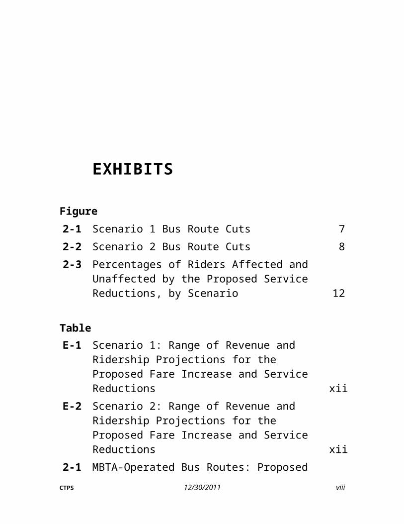
EXHIBITS
Figure2-1 Scenario 1 Bus Route Cuts 72-2 Scenario 2 Bus Route Cuts 82-3 Percentages of Riders Affected and Unaffected by
the Proposed Service Reductions, by Scenario 12
TableE-1 Scenario 1: Range of Revenue and Ridership
Projections for the Proposed Fare Increase and Service Reductions xii
E-2 Scenario 2: Range of Revenue and Ridership Projections for the Proposed Fare Increase and Service Reductions xii
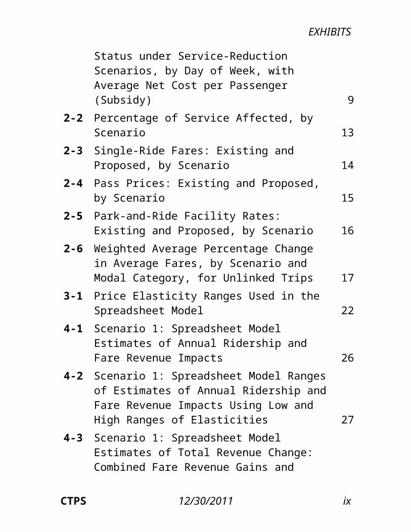
2-1 MBTA-Operated Bus Routes: Proposed Status under Service-Reduction Scenarios, by Day of Week, with Average Net Cost per Passenger (Subsidy) 9
2-2 Percentage of Service Affected, by Scenario 132-3 Single-Ride Fares: Existing and Proposed, by
Scenario 142-4 Pass Prices: Existing and Proposed, by
CTPS 12/30/2011 viii
EXHIBITS
Scenario 152-5 Park-and-Ride Facility Rates: Existing and
Proposed, by Scenario 162-6 Weighted Average Percentage Change in
Average Fares, by Scenario and Modal Category, for Unlinked Trips 17
3-1 Price Elasticity Ranges Used in the Spreadsheet Model 22
4-1 Scenario 1: Spreadsheet Model Estimates of Annual Ridership and Fare Revenue Impacts 26
4-2 Scenario 1: Spreadsheet Model Ranges of Estimates of Annual Ridership and Fare Revenue Impacts Using Low and High Ranges of Elasticities 27
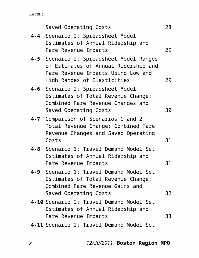
4-3 Scenario 1: Spreadsheet Model Estimates of Total Revenue Change: Combined Fare Revenue Gains and Saved Operating Costs 28
4-4 Scenario 2: Spreadsheet Model Estimates of Annual Ridership and Fare Revenue Impacts 29
4-5 Scenario 2: Spreadsheet Model Ranges of Estimates of Annual Ridership and Fare Revenue Impacts Using Low and High Ranges of Elasticities 29
4-6 Scenario 2: Spreadsheet Model Estimates of Total Revenue Change: Combined Fare Revenue Changes and Saved Operating Costs 30
4-7 Comparison of Scenarios 1 and 2 Total Revenue Change: Combined Fare Revenue Changes and Saved Operating Costs 31
4-8 Scenario 1: Travel Demand Model Set Estimates of Annual Ridership and Fare Revenue Impacts 31
CTPS 12/30/2011 ix
EXHIBITS
4-9 Scenario 1: Travel Demand Model Set Estimates of Total Revenue Change: Combined Fare Revenue Gains and Saved Operating Costs 32
4-10 Scenario 2: Travel Demand Model Set Estimates of Annual Ridership and Fare Revenue Impacts 33
4-11 Scenario 2: Travel Demand Model Set Estimates of Total Revenue Change: Combined Fare Revenue Changes and Saved Operating Costs 33
4-12 Scenario 1: Range of Ridership Projections 354-13 Scenario 1: Range of Fare Revenue Projections 354-14 Scenario 1: Range of Projections for Total
Revenue: Combined Fare Revenue Gains and Saved Operating Costs 36
4-15 Scenario 2: Range of Ridership Projections 374-16 Scenario 2: Range of Fare Revenue Projections 374-17 Scenario 2: Range of Projections for Total
Revenue: Combined Fare Revenue Gains and Saved Operating Costs 38
5-1 Projected Average Weekday Changes in Selected Pollutants (Regionwide) 41
6-1 Scenario 1: Existing and Projected Measures of Transit Equity Metrics 45
6-2 Scenario 2: Existing and Projected Measures of Transit Equity Metrics 45
6-3 Scenario 1: Existing and Projected Measures of Highway Congestion and Air Quality Equity Metrics 48
6-4 Scenario 2: Existing and Projected Measures of Highway Congestion and Air Quality Equity Metrics 48
6-5 Scenario 1: Existing and Projected Measures of
x 12/30/2011 Boston Region MPO
EXHIBITS
Accessibility Equity Metrics 486-6 Scenario 2: Existing and Projected Measures of
Accessibility Equity Metrics 48A-1 AFC Fare Categories A-1A-2 AFC Modal Categories A-2A-3 Single-Ride and Pass Elasticities by Fare Type
and Mode A-3
KEYWORDSridershiprevenueair qualityenvironmental justicefare increaseservice reduction
CTPS 12/30/2011 xi
EXECUTIVESUMMARYThe Massachusetts Bay Transportation Authority (MBTA) faces a projected budget deficit for fiscal year (FY) 2013 (July 1, 2012–June 30, 2013) of $161 million. The MBTA has limited means by which to raise revenue sufficiently to close this budget deficit. The primary means are raising fares, reducing service, or a combination of both. The MBTA has developed two potential scenarios in which these means are employed in different ways in order to close the FY 2013 budget gap.Scenario 1 raises the majority of the needed revenue through a fare increase, with the remainder of the deficit being covered by reducing service. Scenario 2 is split approximately evenly between revenue gains from a fare increase and saved operating costs from service reductions. This report documents the projection of the impacts of these potential fare increases and service reductions on ridership, revenue, air quality, and environmental justice communities.The Central Transportation Planning Staff (CTPS) to the Boston Region Metropolitan Planning Organization (MPO), using a spreadsheet model, assisted the MBTA in determining the fare levels for each mode and fare category that would be needed in the context of each scenario to reach the revenue targets the MBTA had established. It then used several analysis techniques to estimate and evaluate the impacts of each scenario’s proposed fare
CTPS 12/30/2011 xiii

EXECUTIVE SUMMARY
increase and service reductions. Both the spreadsheet model and the Boston Region MPO’s regional travel demand model set were used to estimate the projected ridership loss associated with each scenario and the net revenue change that would result from the lower ridership and higher fares. By employing both techniques, CTPS produced a range of potential impacts on ridership and revenue for each scenario. The travel demand model set was also used to predict the effects of the fare increase on regional air quality and environmental justice.Scenario 1 is projected to raise annual fare revenue by $123.2 million to $134.6 million through increasing fares by approximately 43.0 percent and to save approximately $38.3 million in operating costs through reducing service, for a total estimated gain in annual revenue of $161.5 million to $172.9 million. Scenario 1 is projected to result in a ridership loss of 34.0 million to 48.6 million annual unlinked trips. Scenario 2 is projected to raise annual fare revenue by $86.8 million to $104.0 million through increasing fares by approximately 34.7 percent and to save approximately $78.4 million in operating costs through reducing service, for a total estimated gain in annual revenue of $165.1 million to $182.4 million. Scenario 2 is projected to result in a ridership loss of 53.1 million to 64.2 million annual unlinked trips.A summary of the total ridership and revenue projections for each scenario and estimation methodology is presented in the following tables. As the tables indicate, CTPS estimated a smaller decrease in ridership and a greater increase in revenue when using the travel demand model set than when using the spreadsheet approach. This
xiv 12/30/2011 Boston Region MPO
EXECUTIVE SUMMARY
relationship is generally consistent across all modes. The ridership and revenue estimates reflect the fact that, with a fare increase, a smaller ridership loss results in a greater revenue gain.
TABLE E-1Scenario 1: Range of Revenue and Ridership
Projections for the Proposed Fare Increase and Service Reductions
Annual Revenue and Ridership*Spreadsheet Approach Travel Demand Model
Existing Projected Change % Chg. Projecte
d Change % Chg.
Revenue $477.5M $639.0M +$161.5M +33.8% $650.4M +$172.9M +36.2%Ridership 386.4M 337.8M -48.6M -12.6% 352.4M -34.0M -8.8%
*Ridership figures are based on unlinked transit trips.
TABLE E-2Scenario 2: Range of Revenue and Ridership
Projections for the Proposed Fare Increase and Service Reductions
Annual Revenue and Ridership*Spreadsheet
ApproachTravel Demand
ModelExisti
ngProject
edChang
e%
Chg.Project
edChang
e%
Chg.Revenue
$477.5M
$642.6M
+$165.1
M
+34.6%
$659.9M
+$182.4
M
+38.2%
Ridership
386.4M 322.2M -64.2M
-16.6
%333.4M -53.1M
-13.7
%*Ridership figures are based on unlinked transit trips.
CTPS 12/30/2011 xv
EXECUTIVE SUMMARY
Both scenarios are projected to decrease air quality in terms of all pollutants except nitrogen oxides. Scenario 2’s predicted increases in the levels of carbon monoxide and fine and coarse particulates exceed those of Scenario 1 by approximately 50 percent, and its predicted increases in the levels of volatile organic compounds exceed those of Scenario 1 by approximately 300 percent. The estimated magnitudes of the air quality impacts reflect the increases in vehicle-miles traveled (0.39 percent in Scenario 1 and 0.57 percent in Scenario 2) and vehicle-hours traveled (0.95 percent in Scenario 1 and 1.33 percent in Scenario 2) projected to occur as transit riders divert to automobile trips and congestion worsens as a result.Equity was measured according to three categories of metrics: transit; highway congestion and air quality; and accessibility. The transit metrics are average fare, average walk-access time, average wait time, and total transit trips. Scenario 1 has smaller increases in the average fare and average walk-access and wait times for environmental justice (EJ) communities than non-EJ communities. Scenario 2 also has a smaller increase in the average fare for EJ communities than non-EJ communities but greater increases in the average walk-access and wait times. Scenario 1 has a greater estimated decrease in EJ transit riders than non-EJ transit riders, while in Scenario 2 the reverse is true; however, the total decrease in both EJ and non-EJ transit riders, along with increases in the average fare and average walk-access and wait times, is greater in Scenario 2. Both scenarios increase local congestion and air pollution in EJ communities more than non-EJ communities;
xvi 12/30/2011 Boston Region MPO
EXECUTIVE SUMMARY
Scenario 2 is projected to increase these two metrics more, overall, than Scenario 1. Finally, both scenarios are projected to result in worse overall access to jobs, healthcare, and educational opportunities, but this negative impact is projected to be worse for non-EJ communities than EJ communities. The negative impacts on access are projected to be worse, overall, in Scenario 2 than Scenario 1.
CTPS 12/30/2011 xvii
IntroductionThe Massachusetts Bay Transportation Authority (MBTA) currently faces serious financial problems. Its fiscal year (FY) 2013 (July 1, 2012–June 30, 2013) budget deficit is projected to total $161 million, and given continued increases in operating expenses, projected decreases in revenue, and growing debt service costs for capital investments, the Authority will face continuous and growing deficits in future years. The primary methods that the MBTA has at its disposal for reducing deficits are raising fares to increase revenue and reducing service to decrease operating expenses, though the MBTA can raise revenue through other, less significant means. The MBTA recently explored the impacts of various combinations of potential fare-increase and service-reduction levels and decided to model two scenarios with different combinations. The amount of the fare increase and service reductions proposed by the MBTA for each scenario was determined by the objective of closing the projected FY 2013 budget deficit.The first step in the analysis process was for the Central Transportation Planning Staff (CTPS) to the Boston Region Metropolitan Planning Organization (MPO), in consultation with the MBTA, to determine,
CTPS 12/30/2011 1
INTRODUCTION
for each scenario, the fare level for each mode and fare category that would be needed to reach the MBTA’s revenue targets given the estimated ridership loss due to the scenario’s proposed service reductions. This was accomplished through an iterative process in which CTPS utilized a spreadsheet model that was specifically developed to analyze the degree to which ridership and revenue would change if fares were raised by any given amount. CTPS also produced alternative estimates of the impact on both ridership and revenue using the Boston Region MPO’s regional travel demand model set. A comparison of the projections of each model provides a range of estimated impacts on ridership and revenue. The impacts on air quality and environmental justice were projected using the travel demand model set.This report first presents detailed descriptions of the proposed scenarios. It then explains the estimation methods used by CTPS in its analysis and presents the projected impacts of each of the two scenarios on ridership, revenue, air quality, and environmental justice communities. A brief summary of findings concludes the report.
2 12/30/2011 Boston Region MPO
Description of theProposed FareIncrease/ServiceReduction Scenarios
CTPS modeled the impacts of two proposed scenarios that include varying levels of a fare increase and of service reductions. Generally, Scenario 1 has fewer service reductions but a greater fare increase, while Scenario 2 has a smaller fare increase but greater service reductions and revisions. The scenarios also include different changes to the fare structure.This chapter describes first the scenarios’ fare structures, then their service reductions, and finally their fare increases.
2.1 FARE STRUCTURE CHANGESSignificant time and effort were expended, as part of developing the last fare increase plan, implemented in 2007, to simplify the fare structure and to modify it in ways that encourage riders to use certain fare media. Zoned local bus routes were collapsed into a single local bus category. Fare zones and exit fares were eliminated on the rapid transit system. The number of express bus zones was reduced. The transfer price between bus and rapid transit was reduced for CharlieCard users. CharlieTicket fares were priced at a higher rate than CharlieCard fares. The Subway Pass was eliminated and the LinkPass
CTPS 12/30/2011 3

DESCRIPTION OF PROPOSED FARE INCREASE/SERVICE REDUCTION SCENARIOS
was introduced for use on both local bus routes and rapid transit routes at a reduced price compared to the similar pass type that existed prior to the fare increase, the Combo Pass. While the two proposed scenarios for FY 2013 raise prices, eliminate services, and change the fare structure in different ways, the suggested changes do not conflict with or alter the structural changes or goals of the previous restructuring.The differences between the two scenarios in terms of fare structure are in their senior and student fares and their pricing structures for THE RIDE, the MBTA paratransit service. In the current fare structure for local bus and rapid transit, the senior fare and student fare (regardless of whether a CharlieCard or CharlieTicket is used) are set at approximately 33 percent and 50 percent, respectively, of the adult CharlieCard fare. In Scenario 1, these ratios are set at approximately 50 percent for both seniors and students, and the adult CharlieTicket fare, rather than the CharlieCard fare, is used as the base rate. In Scenario 2, these ratios are again set at approximately 50 percent for both seniors and students, but the CharlieCard fare is still used as the base rate.1
The current fare structure for THE RIDE charges a flat fare for any trip within THE RIDE’s service area. THE RIDE currently serves riders living in any part of all the towns to which the MBTA provides fixed-route local or express bus or rapid transit service as well as riders living in some nearby towns that do not have
1 The MBTA’s enabling legislation (MGL 161A, Section 5(e)) requires that student and senior fares cannot be set higher than 50 percent of the adult cash fare.
4 12/30/2011 Boston Region MPO
DESCRIPTION OF PROPOSED FARE INCREASE/ SERVICE REDUCTION SCENARIOS
any fixed-route service. In Scenario 1, THE RIDE’s base fare increases to twice the adult local bus CharlieTicket fare and a premium fare is charged for trips to or from any area outside of the service area mandated by the Americans with Disabilities Act (ADA) (0.75-mile buffer from any local or express bus stop or rapid transit station), for trips before or after the service hours mandated by the ADA, and for same-day and will-call trips (which are outside the scope of the ADA). The fare structure for THE RIDE in Scenario 2 is the same as in Scenario 1 except that THE RIDE’s base fare is based off of the adult local bus CharlieCard fare, instead of the CharlieTicket fare.There are also several changes to the fare structure that are the same in both scenarios. Tokens (used for MBTA fares prior to 2007 and still accepted in fare vending machines) are no longer accepted; this reduces administrative costs. A $10.00 cash-to-CharlieCard upload minimum is instituted on fareboxes to improve the speed at which passengers board buses and surface light rail vehicles. A 7-day Student Pass is introduced to accompany the existing 5-day Student Pass. All multi-ride tickets, including the 12-ride ticket on commuter rail and the 10- and 60-ride tickets on the ferry, are eliminated. In addition, the duration of the validity of commuter rail tickets is reduced from 180 days to 14 days. These changes to tickets are intended to improve revenue collection on these modes. Finally, for both scenarios, a 25 percent discount off the single-ride fare is provided for all midday and reverse-commute commuter rail trips, and the surcharge for paying with cash onboard commuter rail trains is increased to $3.00.
CTPS 12/30/2011 5
DESCRIPTION OF PROPOSED FARE INCREASE/SERVICE REDUCTION SCENARIOS2.2 SERVICE REDUCTIONS AND REVISIONS
Both scenarios include some level of service reductions or revisions.
2.2.1 BUS
For the bus network, Scenario 1 proposes the elimination of all routes that currently fail the net-cost-per-passenger standard.2 This standard is failed by any route with an average net cost (or subsidy) per passenger trip greater than three times the systemwide average; weekday, Saturday, and Sunday services are assessed separately. The systemwide averages are $1.42 on weekdays, $1.37 on Saturday, and $1.30 on Sunday, resulting in cost standards of $4.26 on weekdays, $4.11 on Saturday, and $3.90 on Sunday. According to these standards, 23 weekday bus routes, 19 Saturday bus routes, and 18 Sunday bus routes fail, and these routes are thus eliminated under Scenario 1. They collectively have an average net cost per passenger of approximately $5.63. The routes are listed in Table 2-1, along with all other MBTA bus routes; the net cost per passenger is given for each route. The eliminated routes carry approximately 2.1 million trips annually, or 1.6 percent of all MBTA bus trips. In Scenario 1, the net-cost-per-passenger standard is also applied to private bus routes (routes that are part of the Private Carrier Bus Program or the Suburban Bus Program, under which bus service is funded by
2 For the purpose of this standard, which is found in the MBTA’s Service Delivery Policy, net cost per passenger is the difference between the cost to operate the route and the average revenue collected on the route, divided by the number of passengers.
6 12/30/2011 Boston Region MPO
DESCRIPTION OF PROPOSED FARE INCREASE/ SERVICE REDUCTION SCENARIOS
the MBTA but operated by a private contractor). Application of this standard eliminates two private-carrier routes serving Canton and Medford and all Suburban Bus Program routes. These routes collectively have an average net cost per passenger of approximately $3.38 to the MBTA, with additional subsidies provided by others for the suburban routes. They carry approximately 0.2 million trips annually, or 25.6 percent of all private bus trips. A map of MBTA and private bus service that shows Scenario 1’s route eliminations is presented in Figure 2-1.In Scenario 2, a much greater reduction in bus service is proposed with the objective of saving approximately $60.0 million in net operating costs. To do this, routes totaling approximately $71.7 million in operating costs are eliminated, with approximately $13.5 million of that being reinvested in the remaining routes in order to improve their frequency by 10 percent. Instead of using the MBTA’s existing net-cost-per-passenger standard, a net cost per passenger of $2.00 was used to generally determine which routes would be eliminated. However, given the greater number of routes that would be eliminated under a $2.00 threshold if applied without exception, the proposed bus eliminations also take into account the geographic locations of the proposed cuts and the overlap of routes. Therefore, some routes with an average net cost per passenger greater than $2.00 are maintained, and some routes with an average net cost per passenger under $2.00 are eliminated. Under Scenario 2, 101 weekday routes, 69 Saturday routes, and 50 Sunday routes are eliminated or revised. They are listed in Table 2-1, along with all other MBTA bus routes; the net cost per passenger is
CTPS 12/30/2011 7
DESCRIPTION OF PROPOSED FARE INCREASE/SERVICE REDUCTION SCENARIOS
given for each route. Scenario 2 also eliminates all private bus routes. The proposed revisions of routes (for all days of the week in which these routes operate) are as follows:
Route 34E terminates at the Walpole town line Route 70A terminates at Central Square,
Waltham Route 134 terminates in West Medford Routes 214 and 216 are combined Routes 220, 221, and 222 terminate at Bicknell
Square Route 225 terminates at Weymouth Landing Routes 426, 442, 450, and 455 terminate at
Wonderland StationThe routes proposed for elimination in Scenario 2 have an average net cost per passenger trip of $2.37 and carry approximately 30.3 million trips annually, or 23.6 percent of all bus trips. The private bus routes, all of which would be eliminated under this scenario, have an average net cost per passenger trip of approximately $2.91 to the MBTA, with additional subsidies provided by others for the suburban routes. A map of MBTA and private bus service showing the proposed route eliminations and revisions is presented in Figure 2-2.
2.2.2 RAPID TRANSIT, COMMUTER RAIL, FERRY, AND THE RIDEThe only service reduction proposed for the rapid transit system is the elimination, in both Scenario 1 and Scenario 2, of weekend service on the Mattapan High-Speed Line and the E Branch of the Green Line. These two light rail services collectively have an average net cost per passenger of approximately
8 12/30/2011 Boston Region MPO
DESCRIPTION OF PROPOSED FARE INCREASE/ SERVICE REDUCTION SCENARIOS
$1.27. They carry approximately 1.3 million trips annually, or 2 percent of all light rail trips.The change in commuter rail service, in both Scenario 1 and Scenario 2, is the elimination of all service after 10:00 PM as well as all Saturday and Sunday service. Commuter rail service after 10:00 PM has an estimated $1.99 average net cost per passenger and serves approximately 1.4 million trips annually, while Saturday service and Sunday service have an average net cost per passenger trip of $0.70 and $1.45 and annually serve approximately 1.7 million and 1.3 million trips, respectively. Therefore, these three service reductions on commuter rail affect an estimated 4.3 million annual trips. These trips represent approximately 11.7 percent of all annual trips on commuter rail.In both Scenario 1 and Scenario 2, the entire $3.7 million Commuter Boat Program subsidy, which funds all commuter boat and ferry service, is eliminated. The average net cost per passenger on these services is $2.82.Finally, while no service reductions per se are proposed for THE RIDE, the increase in fares and the institution of a premium-fare zone are estimated to reduce the demand for service under both scenarios, saving the MBTA the cost of serving the trips no longer made. These saved operating costs are estimated to be greater in Scenario 1, which has the greater fare increase and premium surcharge for THE RIDE.
CTPS 12/30/2011 9
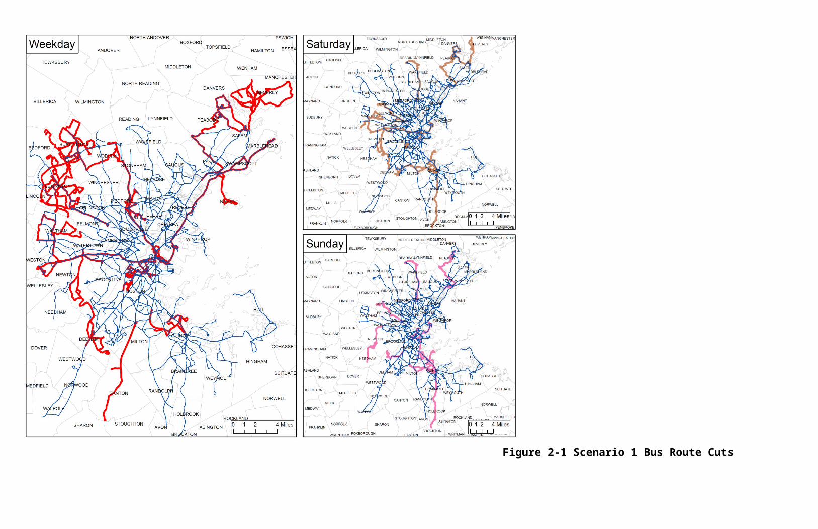
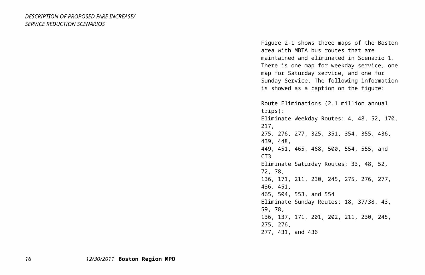
Figure 2-1 Scenario 1 Bus Route Cuts
Figure 2-1 shows three maps of the Boston area with MBTA bus routes that are maintained and eliminated in Scenario 1. There is one map for weekday service, one map for Saturday service, and one for Sunday Service. The following information is showed as a caption on the figure:
Route Eliminations (2.1 million annual trips):Eliminate Weekday Routes: 4, 48, 52, 170, 217, 275, 276, 277, 325, 351, 354, 355, 436, 439, 448,449, 451, 465, 468, 500, 554, 555, and CT3Eliminate Saturday Routes: 33, 48, 52, 72, 78,136, 171, 211, 230, 245, 275, 276, 277, 436, 451,465, 504, 553, and 554Eliminate Sunday Routes: 18, 37/38, 43, 59, 78,136, 137, 171, 201, 202, 211, 230, 245, 275, 276,277, 431, and 436
Eliminate Private Carrier Bus Program inCanton and Medford and eliminate SuburbanBus Program subsidies to Bedford, Beverly,Boston, (Mission Hill), Burlington, Dedham, and Lexington (0.2 million annual trips)
Of the 128,948,230 existing annual bus trips: 2,282,543 (2%) are on eliminated routes 126,665,687 (98%) are not on eliminated routes
DESCRIPTION OF PROPOSED FARE INCREASE/SERVICE REDUCTION SCENARIOS
12 12/30/2011 Boston Region MPO
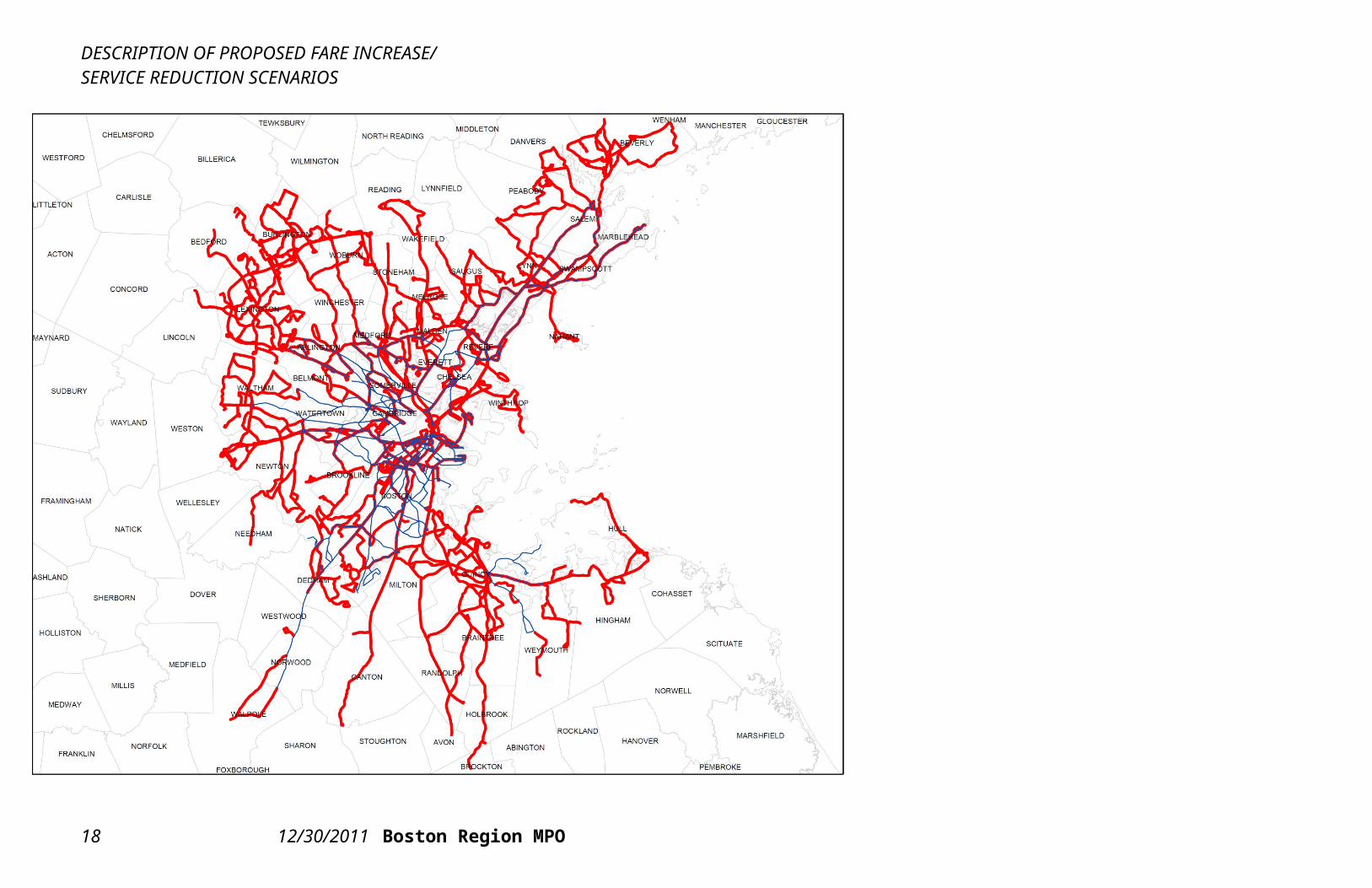
Figure 2-2 Scenario 2 Bus Route Cuts
Figure 2-2 shows a map of the Boston area with MBTA bus routes that are maintained and eliminated in Scenario 2. The following information is showed as a caption on the figure:
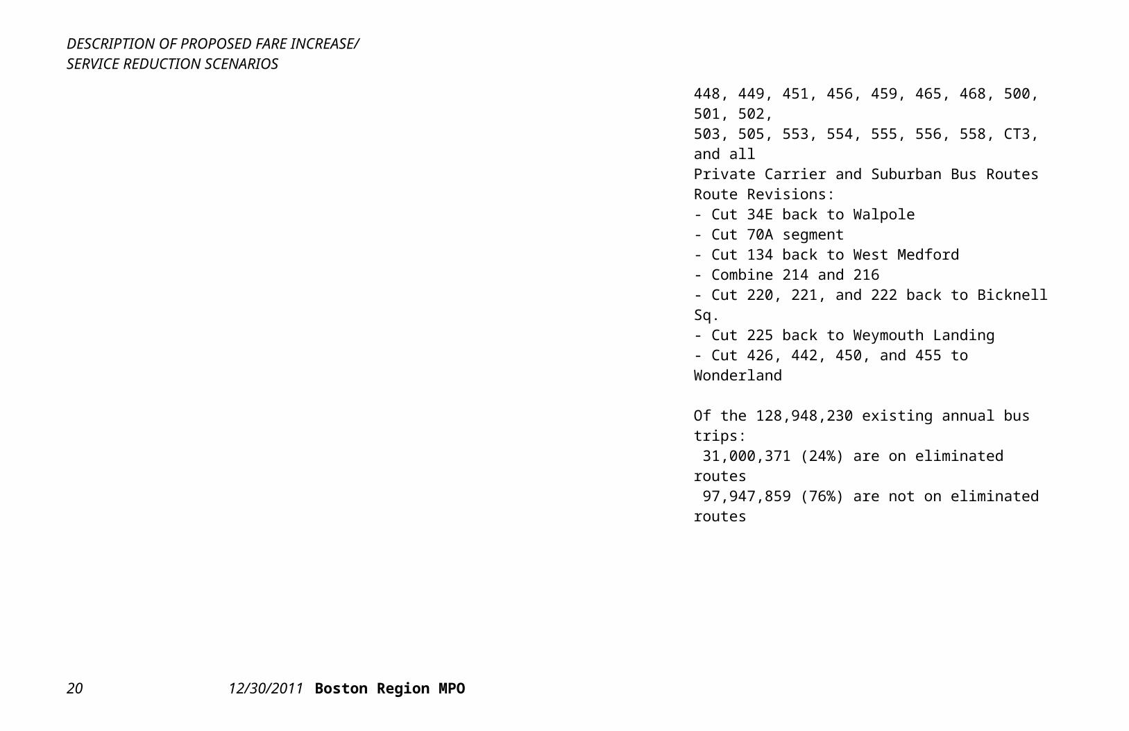
Route Eliminations (31.0 million annual trips):Eliminate Routes (all days): 4, 5, 14, 18, 27, 29,33, 37, 38, 40, 43, 45, 48, 50, 51, 52, 55, 59, 60,62, 64, 67, 68, 74, 75, 76, 78, 79, 80, 85, 90, 92,95, 96, 97, 99, 100, 105, 106, 108, 112, 119, 120,121, 131, 132, 136, 137, 170, 171, 201, 202, 210,211, 212, 215, 217, 230, 236, 238, 240, 245, 275,276, 277, 325, 326, 350, 351, 352, 354, 355, 411,424, 428, 429, 430, 431, 434, 435, 436, 439, 441,448, 449, 451, 456, 459, 465, 468, 500, 501, 502, 503, 505, 553, 554, 555, 556, 558, CT3, and allPrivate Carrier and Suburban Bus RoutesRoute Revisions:- Cut 34E back to Walpole- Cut 70A segment- Cut 134 back to West Medford- Combine 214 and 216- Cut 220, 221, and 222 back to Bicknell Sq.- Cut 225 back to Weymouth Landing- Cut 426, 442, 450, and 455 to Wonderland
Of the 128,948,230 existing annual bus trips: 31,000,371 (24%) are on eliminated routes 97,947,859 (76%) are not on eliminated routes
DESCRIPTION OF PROPOSED FARE INCREASE/SERVICE REDUCTION SCENARIOS
14 12/30/2011 Boston Region MPO
DESCRIPTION OF PROPOSED FARE INCREASE/SERVICE REDUCTION SCENARIOS
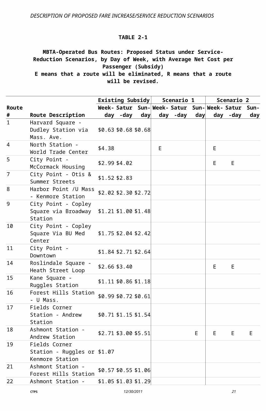
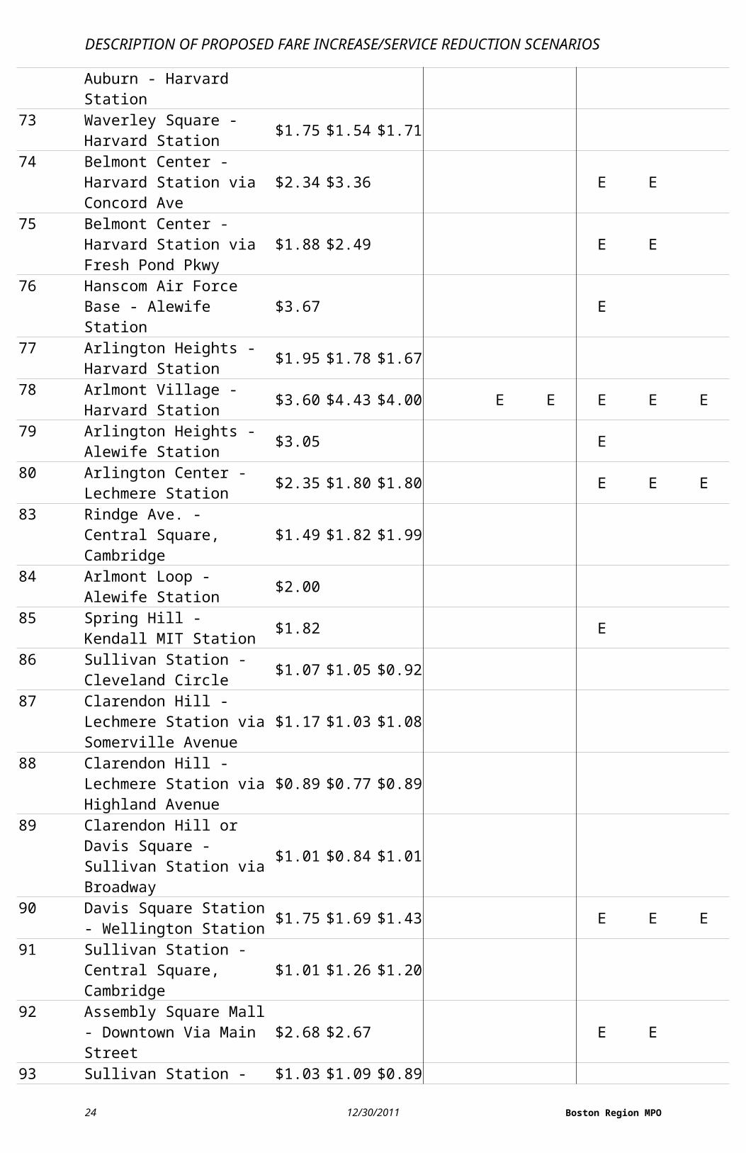
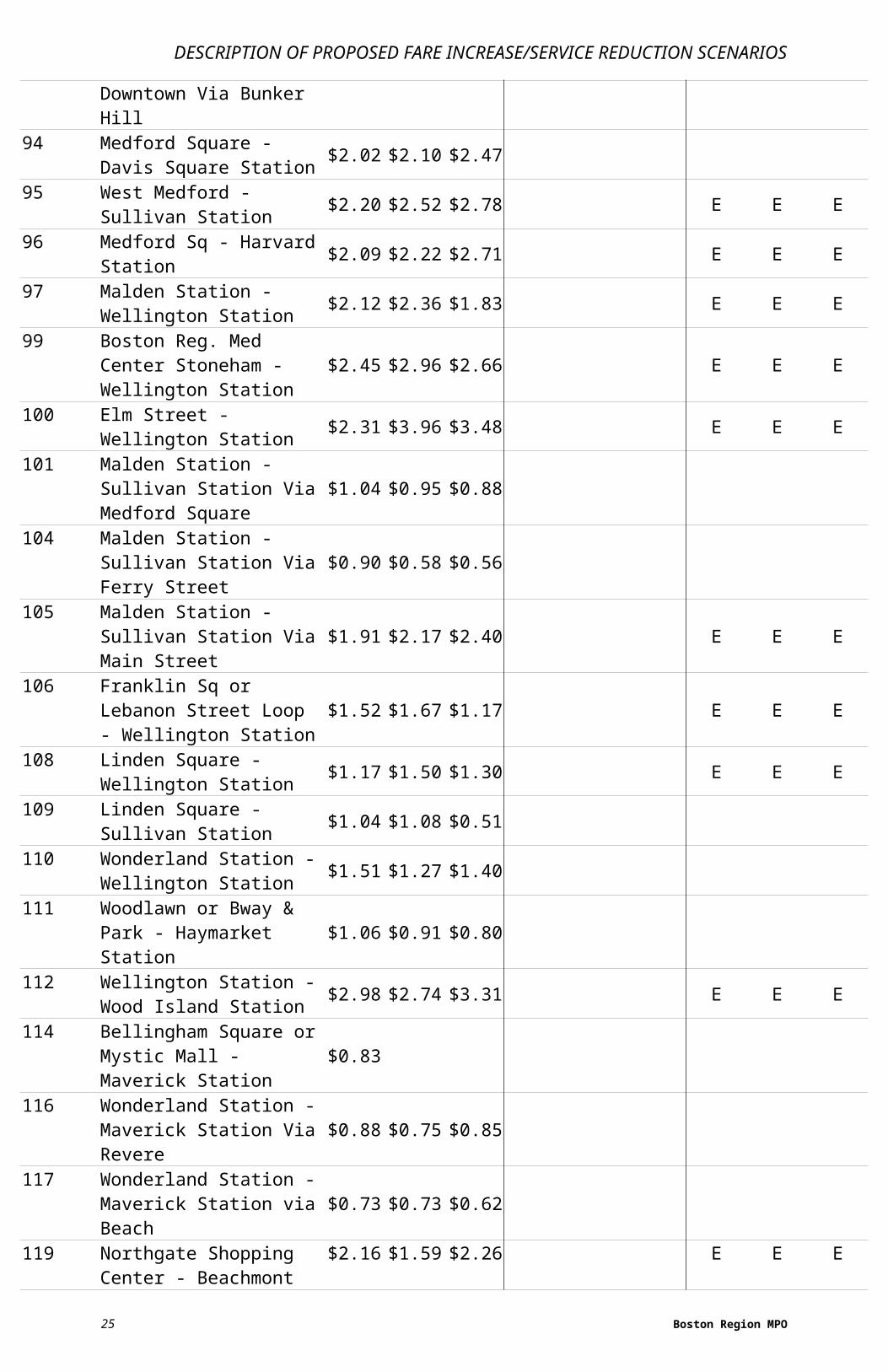
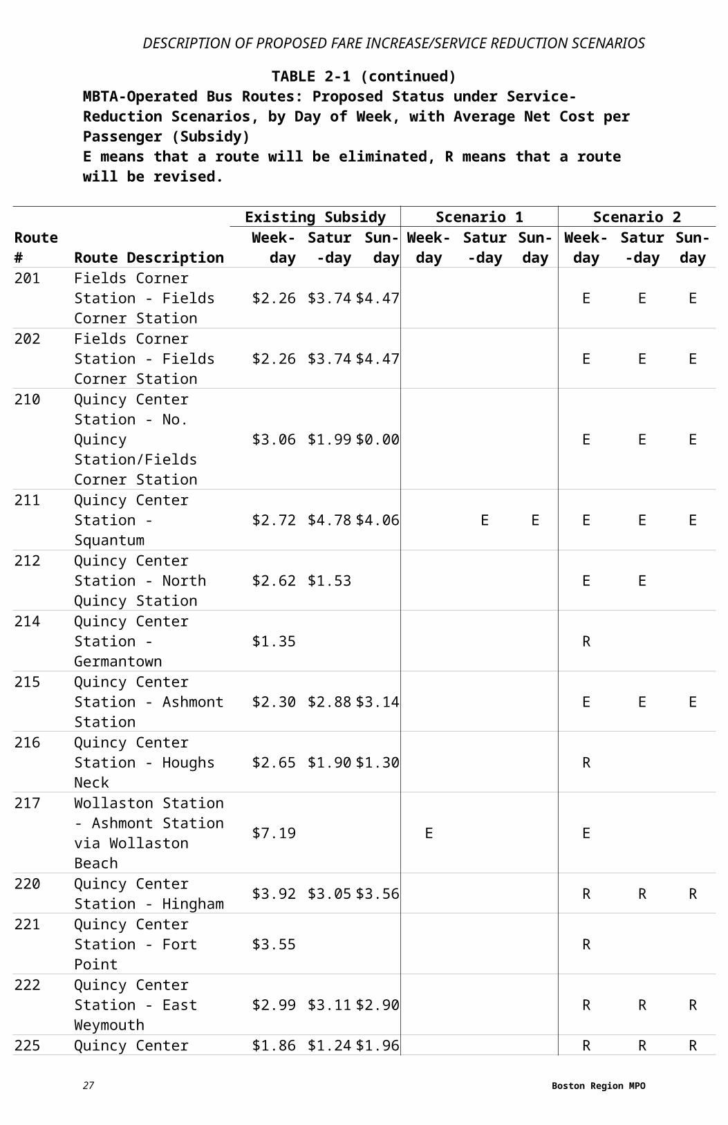
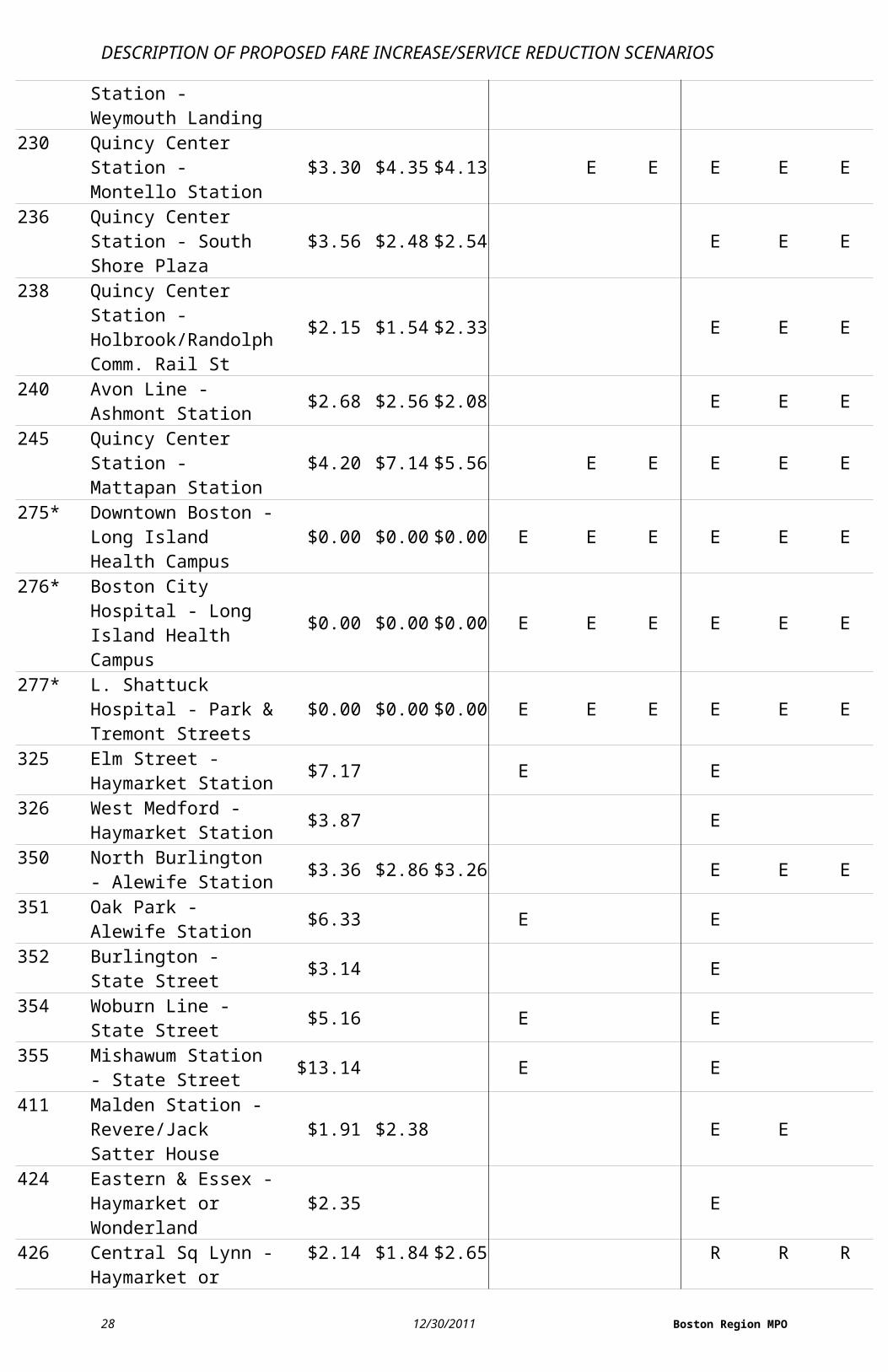
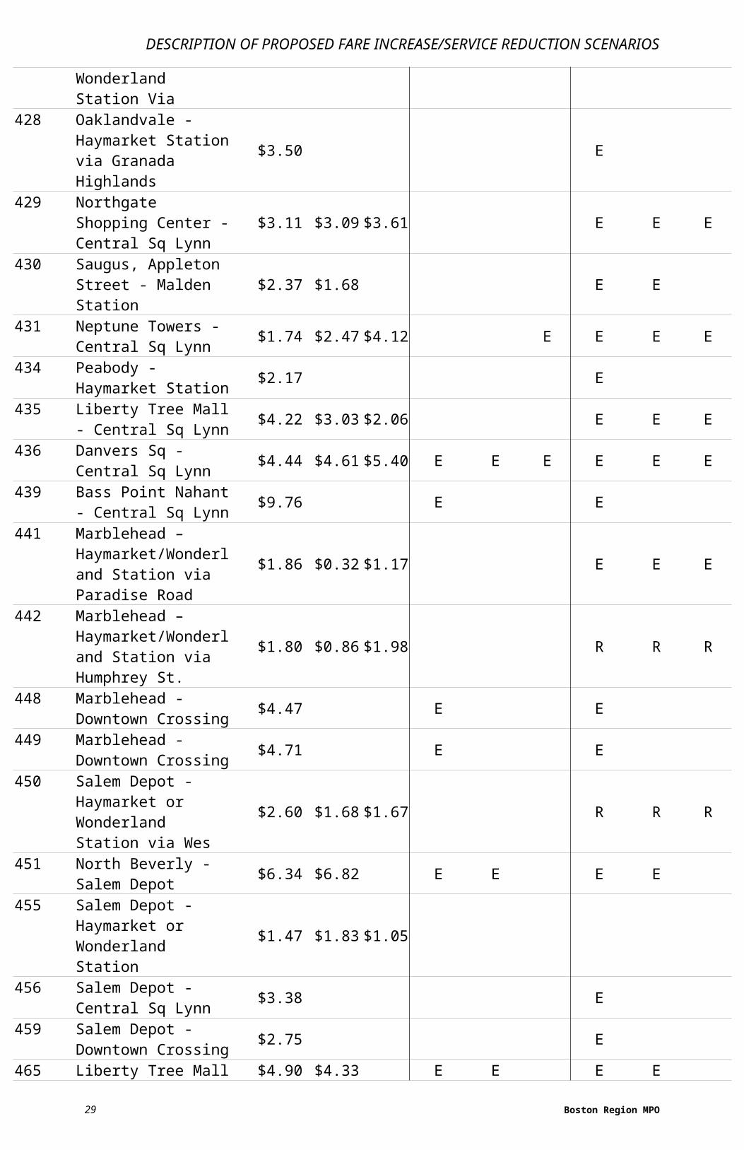
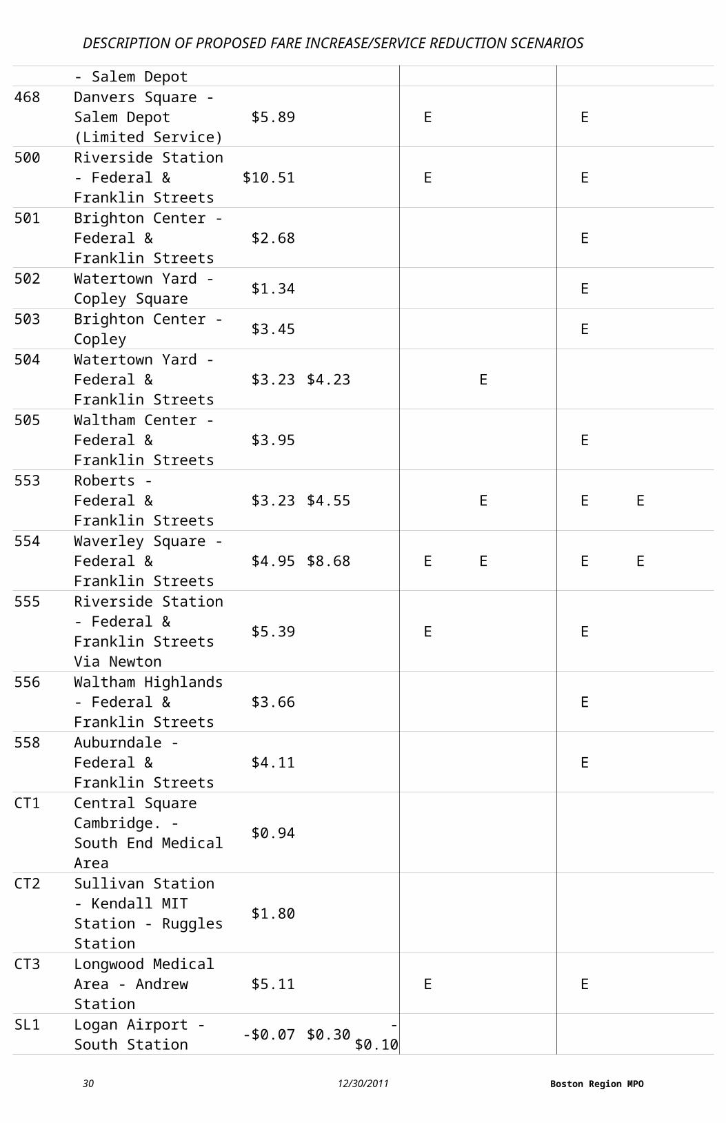
TABLE 2-1
MBTA-Operated Bus Routes: Proposed Status under Service-Reduction Scenarios, by Day of Week, with Average Net Cost per Passenger (Subsidy)E means that a route will be eliminated, R means that a route will be revised.
Existing Subsidy Scenario 1 Scenario 2
Route # Route DescriptionWeek-
daySatur-
daySun-day
Week-day
Satur-day
Sun-day
Week-day
Satur-day
Sun-day
1 Harvard Square - Dudley Station via Mass. Ave. $0.63 $0.68 $0.68
4 North Station - World Trade Center $4.38 E E
5 City Point - McCormack Housing $2.99 $4.02 E E
7 City Point - Otis & Summer Streets $1.52 $2.83
8 Harbor Point /U Mass - Kenmore Station $2.02 $2.30 $2.72
9 City Point - Copley Square via Broadway Station $1.21 $1.00 $1.48
10 City Point - Copley Square Via BU Med Center $1.75 $2.04 $2.42
11 City Point - Downtown $1.84 $2.71 $2.6414 Roslindale Square - Heath
Street Loop $2.66 $3.40 E E
15 Kane Square - Ruggles Station $1.11 $0.86 $1.18
16 Forest Hills Station - U Mass. $0.99 $0.72 $0.61
17 Fields Corner Station - Andrew Station $0.71 $1.15 $1.54
18 Ashmont Station - Andrew Station $2.71 $3.00 $5.51 E E E E
19 Fields Corner Station - Ruggles or Kenmore Station
$1.07
21 Ashmont Station - Forest Hills Station $0.57 $0.55 $1.06
22 Ashmont Station - Ruggles Station Via Talbot Ave $1.05 $1.03 $1.29
23 Ashmont Station - Ruggles Station via Washington Street
$1.00 $0.97 $1.15
24 Wakefield Ave. - Mattapan Station or Ashmont $1.30 $2.71 $2.02
26 Ashmont Station - Norfolk & Wash. Belt $0.80 $0.98 $1.10
27 Mattapan Station - Ashmont Station $1.13 E
28 Mattapan Station - Ruggles Station $0.80 $0.50 $0.86
29 Mattapan Station - Jackson Sq Station $1.71 $1.35 E E
30 Mattapan Station - $1.17 $1.36 $1.71
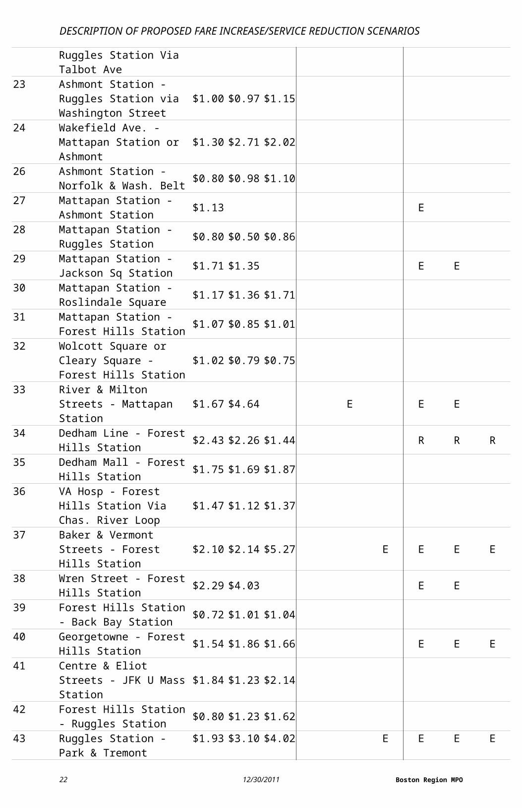
CTPS 12/30/2011 15
DESCRIPTION OF PROPOSED FARE INCREASE/SERVICE REDUCTION SCENARIOS
Roslindale Square31 Mattapan Station - Forest
Hills Station $1.07 $0.85 $1.01
32 Wolcott Square or Cleary Square - Forest Hills Station
$1.02 $0.79 $0.75
33 River & Milton Streets - Mattapan Station $1.67 $4.64 E E E
34 Dedham Line - Forest Hills Station $2.43 $2.26 $1.44 R R R
35 Dedham Mall - Forest Hills Station $1.75 $1.69 $1.87
36 VA Hosp - Forest Hills Station Via Chas. River Loop
$1.47 $1.12 $1.37
37 Baker & Vermont Streets - Forest Hills Station $2.10 $2.14 $5.27 E E E E
38 Wren Street - Forest Hills Station $2.29 $4.03 E E
39 Forest Hills Station - Back Bay Station $0.72 $1.01 $1.04
40 Georgetowne - Forest Hills Station $1.54 $1.86 $1.66 E E E
41 Centre & Eliot Streets - JFK U Mass Station $1.84 $1.23 $2.14
42 Forest Hills Station - Ruggles Station $0.80 $1.23 $1.62
43 Ruggles Station - Park & Tremont Streets $1.93 $3.10 $4.02 E E E E
44 Jackson Sq Station - Ruggles Station $1.28 $1.68 $2.22
45 Franklin Park - Ruggles Station $1.53 $0.95 $1.70 E E E
47 Central Square Cambridge. - Broadway Station $1.41 $2.65 $3.84
48 Centre & Eliot Streets - Jamaica Plain Loop $6.34 $6.14 E E E E
50 Cleary Sq - Forest Hills Station Via Metropolitan $1.74 $1.35 E E
51 Cleveland Circle - Forest Hills Station $1.95 $2.78 E E
52 Dedham Mall - Watertown Yard $4.97 $7.17 E E E E
55 Queensberry Street - Park & Tremont Streets $2.34 $2.26 $3.05 E E E
57 Watertown Yard - Kenmore Station $0.86 $1.22 $0.91
59 Needham Junction - Watertown Square $2.71 $2.66 $4.74 E E E E
60 Chestnut Hill - Kenmore Station $2.99 $4.22 $3.78 E E E
62 Bedford V.A. Hospital - Alewife Station $2.53 $3.75 E E
64 Oak Square - University Pk. Cambridge $2.33 $2.40 $2.94 E E E
65 Brighton Center - Kenmore Station $1.43 $2.39
16 12/30/2011 Boston Region MPO
DESCRIPTION OF PROPOSED FARE INCREASE/SERVICE REDUCTION SCENARIOS
66 Harvard Square - Dudley Station via Brookline $0.79 $0.73 $0.85
67 Turkey Hill - Alewife Station $2.98 E68 Harvard Square - Kendall
MIT Station $2.23 E
69 Harvard Square - Lechmere Station $0.82 $1.23 $1.09
70 Cedarwood - Central Square Cambridge $1.96 $1.87 $1.80 R R
71 Watertown Square - Harvard Station $1.35 $1.71 $1.51
72 Aberdeen & Mt. Auburn - Harvard Station $3.05 $4.65 $3.32 E
73 Waverley Square - Harvard Station $1.75 $1.54 $1.71
74 Belmont Center - Harvard Station via Concord Ave $2.34 $3.36 E E
75 Belmont Center - Harvard Station via Fresh Pond Pkwy
$1.88 $2.49 E E
76 Hanscom Air Force Base - Alewife Station $3.67 E
77 Arlington Heights - Harvard Station $1.95 $1.78 $1.67
78 Arlmont Village - Harvard Station $3.60 $4.43 $4.00 E E E E E
79 Arlington Heights - Alewife Station $3.05 E
80 Arlington Center - Lechmere Station $2.35 $1.80 $1.80 E E E
83 Rindge Ave. - Central Square, Cambridge $1.49 $1.82 $1.99
84 Arlmont Loop - Alewife Station $2.00
85 Spring Hill - Kendall MIT Station $1.82 E
86 Sullivan Station - Cleveland Circle $1.07 $1.05 $0.92
87 Clarendon Hill - Lechmere Station via Somerville Avenue
$1.17 $1.03 $1.08
88 Clarendon Hill - Lechmere Station via Highland Avenue
$0.89 $0.77 $0.89
89 Clarendon Hill or Davis Square - Sullivan Station via Broadway
$1.01 $0.84 $1.01
90 Davis Square Station - Wellington Station $1.75 $1.69 $1.43 E E E
91 Sullivan Station - Central Square, Cambridge $1.01 $1.26 $1.20
92 Assembly Square Mall - Downtown Via Main Street $2.68 $2.67 E E
93 Sullivan Station - Downtown Via Bunker Hill $1.03 $1.09 $0.89
94 Medford Square - Davis Square Station $2.02 $2.10 $2.47
17 Boston Region MPO
DESCRIPTION OF PROPOSED FARE INCREASE/SERVICE REDUCTION SCENARIOS
95 West Medford - Sullivan Station $2.20 $2.52 $2.78 E E E
96 Medford Sq - Harvard Station $2.09 $2.22 $2.71 E E E
97 Malden Station - Wellington Station $2.12 $2.36 $1.83 E E E
99 Boston Reg. Med Center Stoneham - Wellington Station
$2.45 $2.96 $2.66 E E E
100 Elm Street - Wellington Station $2.31 $3.96 $3.48 E E E
101 Malden Station - Sullivan Station Via Medford Square $1.04 $0.95 $0.88
104 Malden Station - Sullivan Station Via Ferry Street $0.90 $0.58 $0.56
105 Malden Station - Sullivan Station Via Main Street $1.91 $2.17 $2.40 E E E
106 Franklin Sq or Lebanon Street Loop - Wellington Station
$1.52 $1.67 $1.17 E E E
108 Linden Square - Wellington Station $1.17 $1.50 $1.30 E E E
109 Linden Square - Sullivan Station $1.04 $1.08 $0.51
110 Wonderland Station - Wellington Station $1.51 $1.27 $1.40
111 Woodlawn or Bway & Park - Haymarket Station $1.06 $0.91 $0.80
112 Wellington Station - Wood Island Station $2.98 $2.74 $3.31 E E E
114 Bellingham Square or Mystic Mall - Maverick Station
$0.83
116 Wonderland Station - Maverick Station Via Revere
$0.88 $0.75 $0.85
117 Wonderland Station - Maverick Station via Beach $0.73 $0.73 $0.62
119 Northgate Shopping Center - Beachmont Station $2.16 $1.59 $2.26 E E E
120 Orient Heights Station - Maverick Station $1.18 $1.46 $2.04 E E E
121 Wood Island Station - Maverick Station $1.10 E
131 Melrose Highlands - Malden Station $3.12 E
132 Redstone Shopping Center - Malden Station $2.49 $3.63 E E
134 North Woburn - Wellington Station $2.21 $2.71 $2.71 R R R
136 Reading Depot - Malden Station Via Lakeside $3.18 $4.68 $4.09 E E E E E
137 Reading Depot - Malden Station Via North Ave $2.91 $3.82 $3.95 E E E
170 Oak Park - Dudley Station (Limited Service) $5.56 E E
171 Logan Airport - Dudley $3.23 $4.65 $5.07 E E E E E
18 12/30/2011 Boston Region MPO
DESCRIPTION OF PROPOSED FARE INCREASE/SERVICE REDUCTION SCENARIOS
Station Sunrise
19 Boston Region MPO
DESCRIPTION OF PROPOSED FARE INCREASE/SERVICE REDUCTION SCENARIOS
TABLE 2-1 (continued)MBTA-Operated Bus Routes: Proposed Status under Service-Reduction Scenarios, by Day of Week, with Average Net Cost per Passenger (Subsidy)E means that a route will be eliminated, R means that a route will be revised.
Existing Subsidy Scenario 1 Scenario 2
Route # Route DescriptionWeek-
daySatur-
daySun-day
Week-day
Satur-day
Sun-day
Week-day
Satur-day
Sun-day
201 Fields Corner Station - Fields Corner Station $2.26 $3.74 $4.47 E E E
202 Fields Corner Station - Fields Corner Station $2.26 $3.74 $4.47 E E E
210 Quincy Center Station - No. Quincy Station/Fields Corner Station
$3.06 $1.99 $0.00 E E E
211 Quincy Center Station - Squantum $2.72 $4.78 $4.06 E E E E E
212 Quincy Center Station - North Quincy Station $2.62 $1.53 E E
214 Quincy Center Station - Germantown $1.35 R
215 Quincy Center Station - Ashmont Station $2.30 $2.88 $3.14 E E E
216 Quincy Center Station - Houghs Neck $2.65 $1.90 $1.30 R
217 Wollaston Station - Ashmont Station via Wollaston Beach
$7.19 E E
220 Quincy Center Station - Hingham $3.92 $3.05 $3.56 R R R
221 Quincy Center Station - Fort Point $3.55 R
222 Quincy Center Station - East Weymouth $2.99 $3.11 $2.90 R R R
225 Quincy Center Station - Weymouth Landing $1.86 $1.24 $1.96 R R R
230 Quincy Center Station - Montello Station $3.30 $4.35 $4.13 E E E E E
236 Quincy Center Station - South Shore Plaza $3.56 $2.48 $2.54 E E E
238 Quincy Center Station - Holbrook/Randolph Comm. Rail St
$2.15 $1.54 $2.33 E E E
240 Avon Line - Ashmont Station $2.68 $2.56 $2.08 E E E
245 Quincy Center Station - Mattapan Station $4.20 $7.14 $5.56 E E E E E
275* Downtown Boston - Long Island Health Campus
$0.00 $0.00 $0.00 E E E E E E
276* Boston City Hospital - Long Island Health Campus
$0.00 $0.00 $0.00 E E E E E E
277* L. Shattuck Hospital - Park & Tremont Streets $0.00 $0.00 $0.00 E E E E E E
325 Elm Street - Haymarket $7.17 E E
20 12/30/2011 Boston Region MPO
DESCRIPTION OF PROPOSED FARE INCREASE/SERVICE REDUCTION SCENARIOS
Station326 West Medford -
Haymarket Station $3.87 E
350 North Burlington - Alewife Station $3.36 $2.86 $3.26 E E E
351 Oak Park - Alewife Station $6.33 E E
352 Burlington - State Street $3.14 E
354 Woburn Line - State Street $5.16 E E
355 Mishawum Station - State Street $13.14 E E
411 Malden Station - Revere/Jack Satter House
$1.91 $2.38 E E
424 Eastern & Essex - Haymarket or Wonderland
$2.35 E
426 Central Sq Lynn - Haymarket or Wonderland Station Via
$2.14 $1.84 $2.65 R R R
428 Oaklandvale - Haymarket Station via Granada Highlands
$3.50 E
429 Northgate Shopping Center - Central Sq Lynn
$3.11 $3.09 $3.61 E E E
430 Saugus, Appleton Street - Malden Station $2.37 $1.68 E E
431 Neptune Towers - Central Sq Lynn $1.74 $2.47 $4.12 E E E E
434 Peabody - Haymarket Station $2.17 E
435 Liberty Tree Mall - Central Sq Lynn $4.22 $3.03 $2.06 E E E
436 Danvers Sq - Central Sq Lynn $4.44 $4.61 $5.40 E E E E E E
439 Bass Point Nahant - Central Sq Lynn $9.76 E E
441 Marblehead – Haymarket/Wonderland Station via Paradise Road
$1.86 $0.32 $1.17 E E E
442 Marblehead – Haymarket/Wonderland Station via Humphrey St.
$1.80 $0.86 $1.98 R R R
448 Marblehead - Downtown Crossing $4.47 E E
449 Marblehead - Downtown Crossing $4.71 E E
450 Salem Depot - Haymarket or Wonderland Station via Wes
$2.60 $1.68 $1.67 R R R
21 Boston Region MPO
DESCRIPTION OF PROPOSED FARE INCREASE/SERVICE REDUCTION SCENARIOS
451 North Beverly - Salem Depot $6.34 $6.82 E E E E
455 Salem Depot - Haymarket or Wonderland Station
$1.47 $1.83 $1.05
456 Salem Depot - Central Sq Lynn $3.38 E
459 Salem Depot - Downtown Crossing $2.75 E
465 Liberty Tree Mall - Salem Depot $4.90 $4.33 E E E E
468 Danvers Square - Salem Depot (Limited Service)
$5.89 E E
500 Riverside Station - Federal & Franklin Streets
$10.51 E E
501 Brighton Center - Federal & Franklin Streets
$2.68 E
502 Watertown Yard - Copley Square $1.34 E
503 Brighton Center - Copley $3.45 E
504 Watertown Yard - Federal & Franklin Streets
$3.23 $4.23 E
505 Waltham Center - Federal & Franklin Streets
$3.95 E
553 Roberts - Federal & Franklin Streets $3.23 $4.55 E E E
554 Waverley Square - Federal & Franklin Streets
$4.95 $8.68 E E E E
555 Riverside Station - Federal & Franklin Streets Via Newton
$5.39 E E
556 Waltham Highlands - Federal & Franklin Streets
$3.66 E
558 Auburndale - Federal & Franklin Streets $4.11 E
CT1 Central Square Cambridge. - South End Medical Area
$0.94
CT2 Sullivan Station - Kendall MIT Station - Ruggles Station
$1.80
CT3 Longwood Medical Area - Andrew Station $5.11 E E
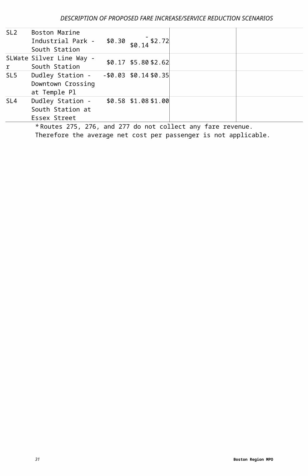
SL1 Logan Airport - South Station -$0.07 $0.30 -$0.10
SL2 Boston Marine Industrial Park - South Station
$0.30 -$0.14 $2.72
SLWater Silver Line Way - South $0.17 $5.80 $2.62
22 12/30/2011 Boston Region MPO
DESCRIPTION OF PROPOSED FARE INCREASE/SERVICE REDUCTION SCENARIOS
StationSL5 Dudley Station -
Downtown Crossing at Temple Pl
-$0.03 $0.14 $0.35
SL4 Dudley Station - South Station at Essex Street $0.58 $1.08 $1.00
* Routes 275, 276, and 277 do not collect any fare revenue. Therefore the average net cost per passenger is not applicable.
23 Boston Region MPO
DESCRIPTION OF PROPOSED FARE INCREASE/ SERVICE REDUCTION SCENARIOS
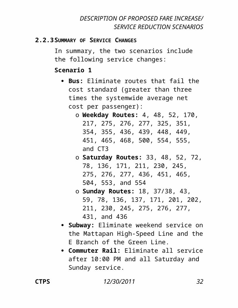
2.2.3 SUMMARY OF SERVICE CHANGES In summary, the two scenarios include the following service changes:Scenario 1
Bus: Eliminate routes that fail the cost standard (greater than three times the systemwide average net cost per passenger):o Weekday Routes: 4, 48, 52, 170, 217,
275, 276, 277, 325, 351, 354, 355, 436, 439, 448, 449, 451, 465, 468, 500, 554, 555, and CT3
o Saturday Routes: 33, 48, 52, 72, 78, 136, 171, 211, 230, 245, 275, 276, 277, 436, 451, 465, 504, 553, and 554
o Sunday Routes: 18, 37/38, 43, 59, 78, 136, 137, 171, 201, 202, 211, 230, 245, 275, 276, 277, 431, and 436
Subway: Eliminate weekend service on the Mattapan High-Speed Line and the E Branch of the Green Line.
Commuter Rail: Eliminate all service after 10:00 PM and all Saturday and Sunday service.
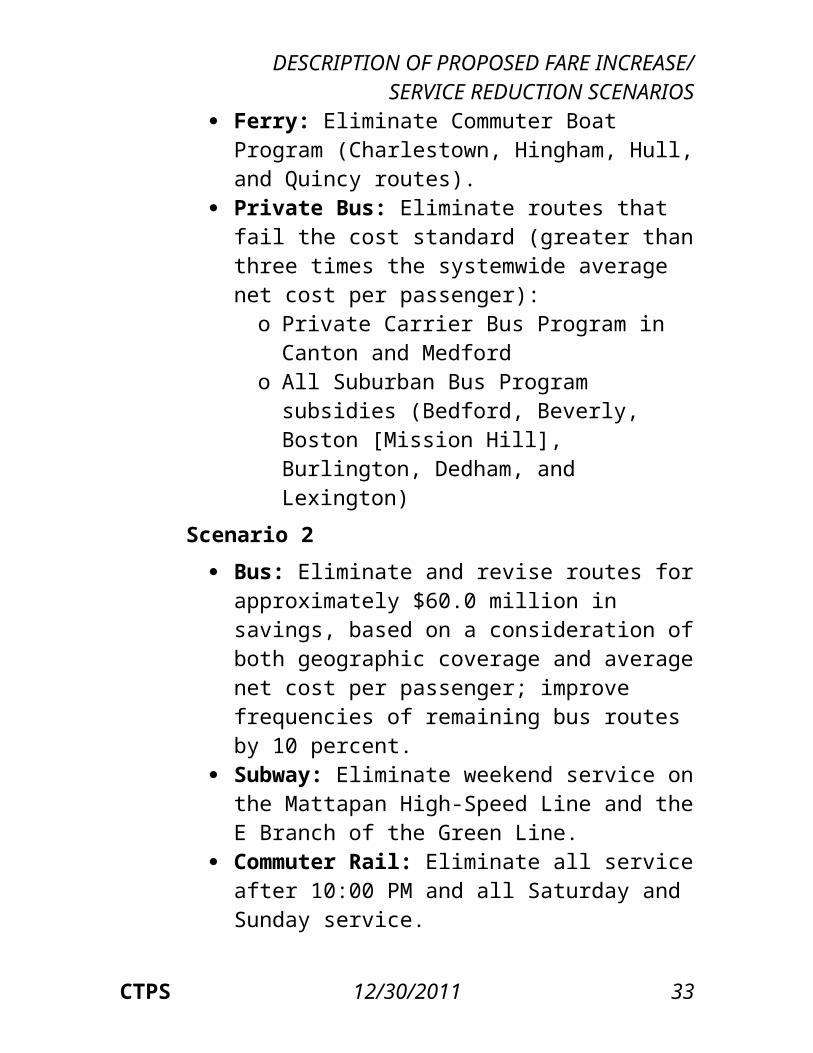
Ferry: Eliminate Commuter Boat Program (Charlestown, Hingham, Hull, and Quincy routes).
Private Bus: Eliminate routes that fail the cost standard (greater than three times the systemwide average net cost per passenger):o Private Carrier Bus Program in Canton and
Medfordo All Suburban Bus Program subsidies
(Bedford, Beverly, Boston [Mission Hill],
CTPS 12/30/2011 24
DESCRIPTION OF PROPOSED FARE INCREASE/SERVICE REDUCTION SCENARIOS
Burlington, Dedham, and Lexington)Scenario 2
Bus: Eliminate and revise routes for approximately $60.0 million in savings, based on a consideration of both geographic coverage and average net cost per passenger; improve frequencies of remaining bus routes by 10 percent.
Subway: Eliminate weekend service on the Mattapan High-Speed Line and the E Branch of the Green Line.
Commuter Rail: Eliminate all service after 10:00 PM and all Saturday and Sunday service.
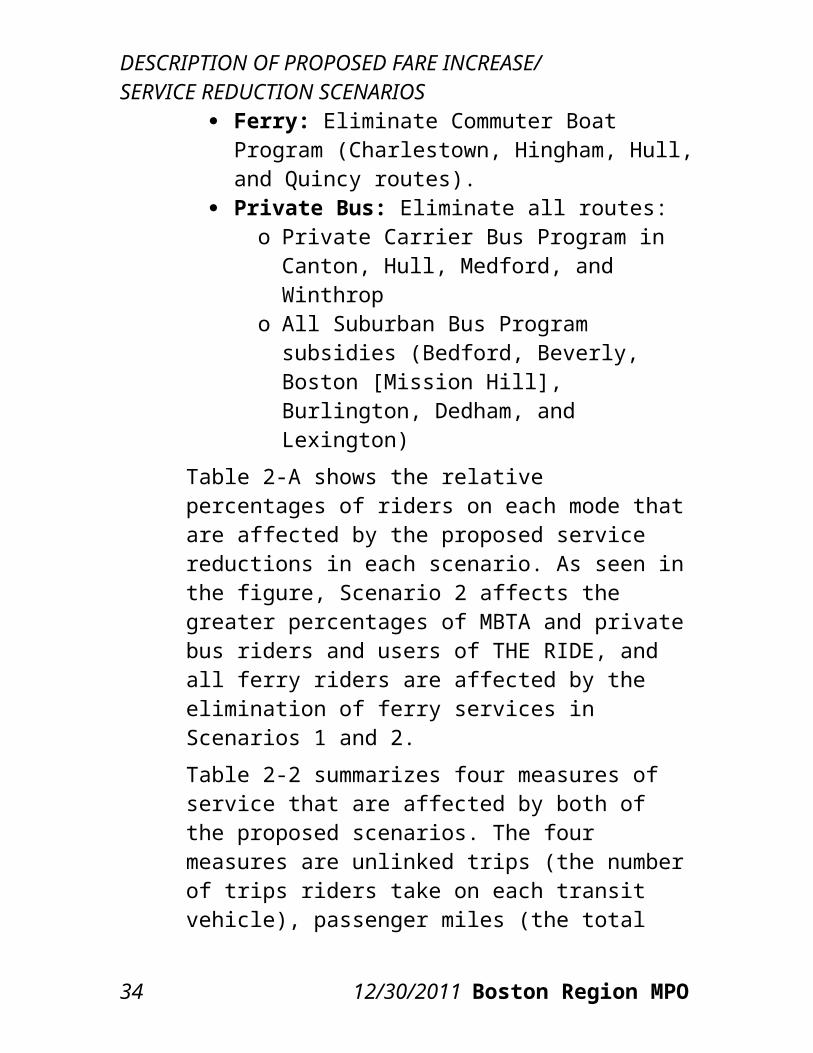
Ferry: Eliminate Commuter Boat Program (Charlestown, Hingham, Hull, and Quincy routes).
Private Bus: Eliminate all routes:o Private Carrier Bus Program in Canton,
Hull, Medford, and Winthropo All Suburban Bus Program subsidies
(Bedford, Beverly, Boston [Mission Hill], Burlington, Dedham, and Lexington)
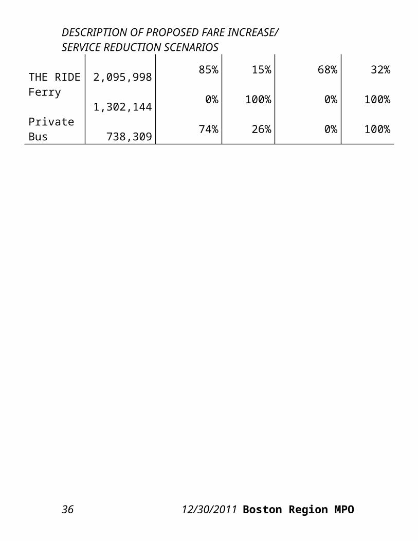
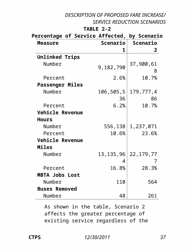
Table 2-A shows the relative percentages of riders on each mode that are affected by the proposed service reductions in each scenario. As seen in the figure, Scenario 2 affects the greater percentages of MBTA and private bus riders and users of THE RIDE, and all ferry riders are affected by the elimination of ferry services in Scenarios 1 and 2.Table 2-2 summarizes four measures of service that are affected by both of the proposed scenarios. The four measures are unlinked trips (the number of trips riders take on each transit vehicle), passenger miles
CTPS 12/30/2011 25
DESCRIPTION OF PROPOSED FARE INCREASE/ SERVICE REDUCTION SCENARIOS
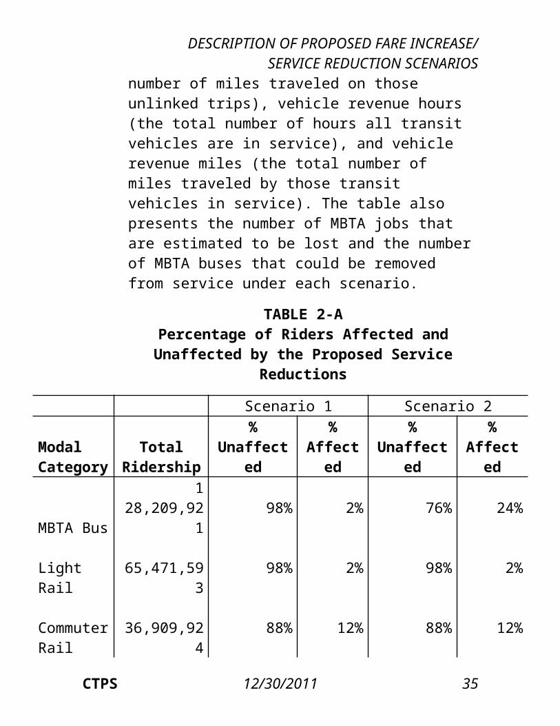
(the total number of miles traveled on those unlinked trips), vehicle revenue hours (the total number of hours all transit vehicles are in service), and vehicle revenue miles (the total number of miles traveled by those transit vehicles in service). The table also presents the number of MBTA jobs that are estimated to be lost and the number of MBTA buses that could be removed from service under each scenario.
TABLE 2-APercentage of Riders Affected and Unaffected by
the Proposed Service Reductions
Scenario 1 Scenario 2Modal Category
Total Ridership
% Unaffected
% Affected
% Unaffected
% Affected
MBTA Bus 128,20
9,921 98% 2% 76% 24%
Light Rail 65,47
1,593 98% 2% 98% 2%
Commuter Rail
36,909,924 88% 12% 88% 12%
THE RIDE 2,09
5,998 85% 15% 68% 32%
Ferry 1,30
2,144 0% 100% 0% 100%
Private Bus
738,309 74% 26% 0% 100%
26 12/30/2011 Boston Region MPO
DESCRIPTION OF PROPOSED FARE INCREASE/SERVICE REDUCTION SCENARIOS
TABLE 2-2Percentage of Service Affected, by Scenario
Measure Scenario 1 Scenario 2Unlinked Trips Number 9,182,790 37,900,618 Percent 2.6% 10.7%Passenger Miles Number 106,505,53
6 179,777,486
Percent 6.2% 10.7%Vehicle Revenue Hours Number 556,138 1,237,071 Percent 10.6% 23.6%Vehicle Revenue Miles Number 13,135,964 22,179,777 Percent 16.8% 28.3%MBTA Jobs Lost Number 110 564Buses Removed Number 48 261
As shown in the table, Scenario 2 affects the greater percentage of existing service regardless of the measure. Scenario 2 also results in the greater numbers of MBTA jobs lost and buses removed from service. Both scenarios generally reduce bus and commuter rail service on routes with longer distances, which is why the percentages of passenger miles, vehicle revenue hours, and vehicle revenue miles affected are greater than the percentage of unlinked trips.
CTPS 12/30/2011 27
DESCRIPTION OF PROPOSED FARE INCREASE/ SERVICE REDUCTION SCENARIOS2.3 FARE INCREASE: SINGLE-RIDE FARES, PASS
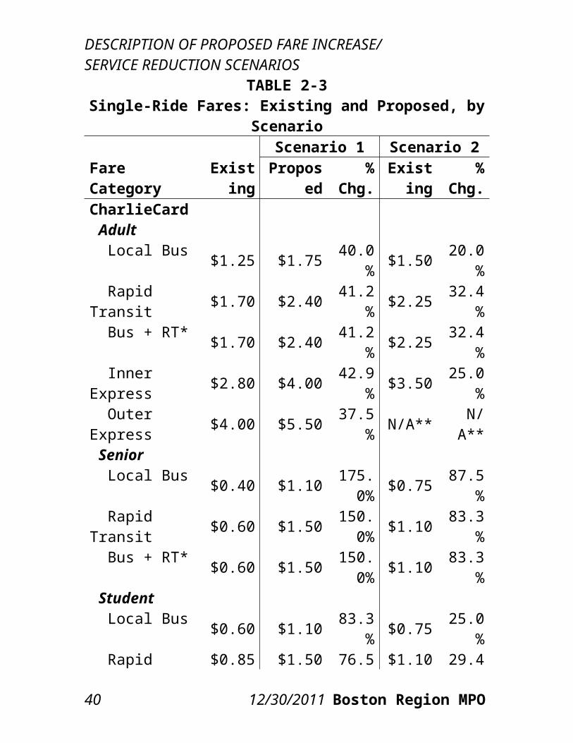
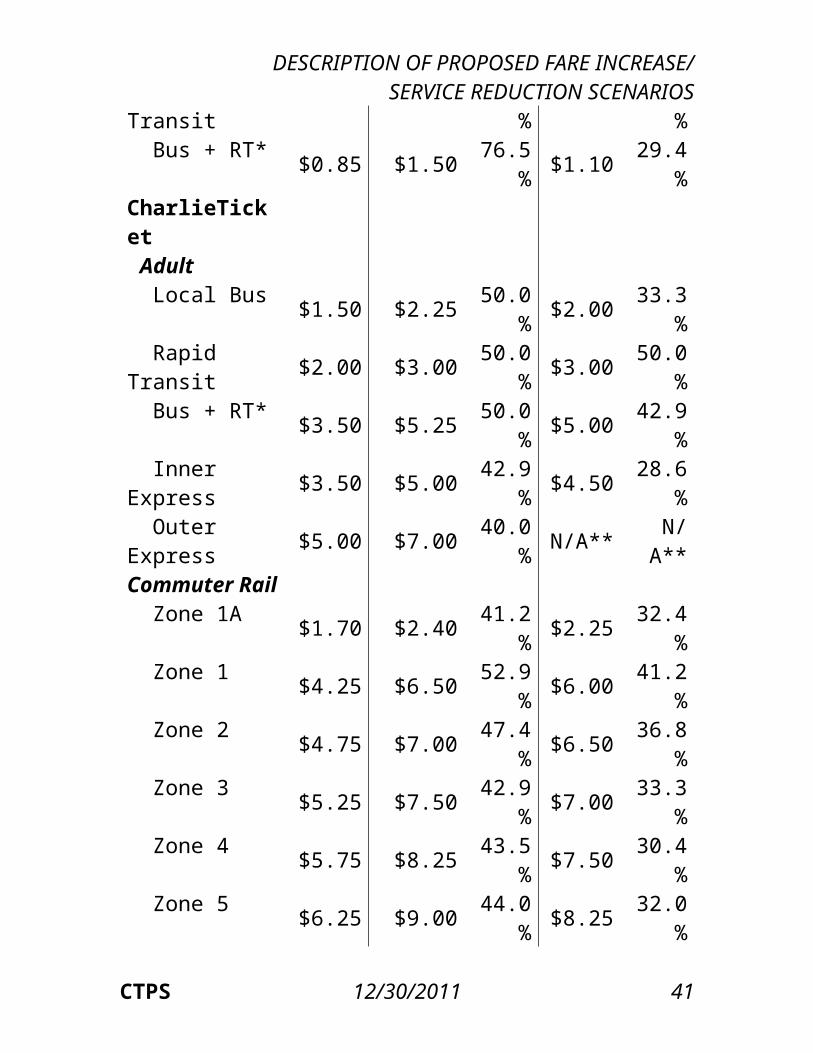
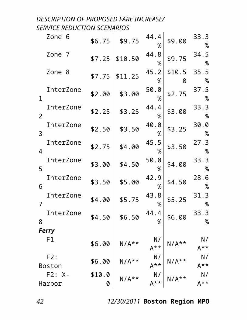
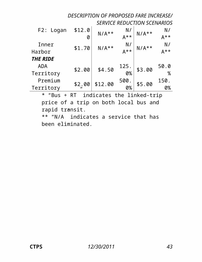
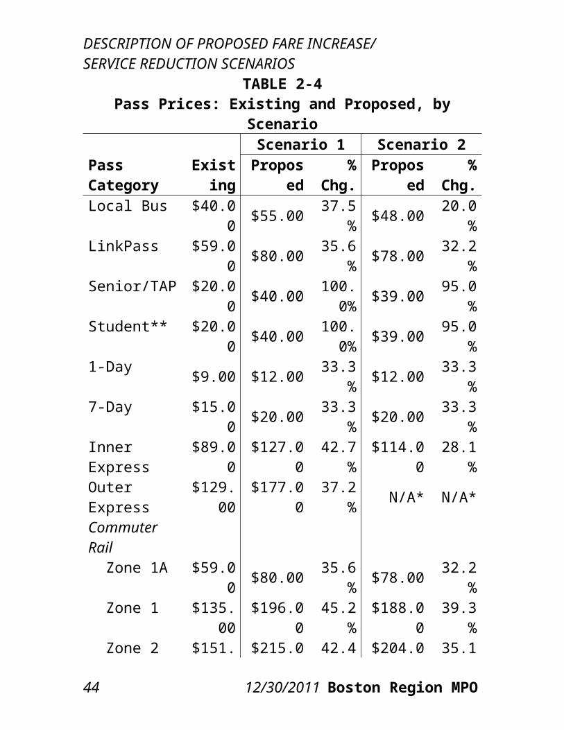
PRICES, AND PARKING RATESTable 2-3 presents the existing and proposed single-ride fares under each proposed scenario for each fare category, along with the percentage change in price from the existing to the proposed price. Table 2-4 presents the existing and proposed pass prices under each proposed scenario for each pass category, along with the percentage change in price from the existing to the proposed price. Table 2-5 presents the existing and proposed parking rates under each proposed scenario for each parking facility, along with the percentage change in price from the existing to the proposed price.The overall price increase across all modes and fare categories is approximately 43.5 percent for Scenario 1 and 35.0 percent for Scenario 2. These weighted averages were calculated by multiplying the percentage change in price for each fare/pass category by the existing ridership in that category and dividing by total existing ridership. Table 2-6 presents the weighted average percentage change by modal category. Note that the percentage changes in price can differ between modes that are similarly priced (such as local bus and the Silver Line–Washington Street or subway and surface light rail) because of differences in how the riders on these modes pay for their trips.
28 12/30/2011 Boston Region MPO
DESCRIPTION OF PROPOSED FARE INCREASE/SERVICE REDUCTION SCENARIOS
TABLE 2-3Single-Ride Fares: Existing and Proposed, by Scenario
Fare Category
Scenario 1 Scenario 2Existi
ngPropos
ed%
Chg.Existi
ng%
Chg.CharlieCard Adult Local Bus $1.25 $1.75 40.0
% $1.50 20.0%
Rapid Transit $1.70 $2.40 41.2% $2.25 32.4
% Bus + RT* $1.70 $2.40 41.2
% $2.25 32.4%
Inner Express $2.80 $4.00 42.9% $3.50 25.0
% Outer Express $4.00 $5.50 37.5
% N/A** N/A**
Senior Local Bus $0.40 $1.10 175.0
% $0.75 87.5%
Rapid Transit $0.60 $1.50 150.0% $1.10 83.3
% Bus + RT* $0.60 $1.50 150.0
% $1.10 83.3%
Student Local Bus $0.60 $1.10 83.3
% $0.75 25.0%
Rapid Transit $0.85 $1.50 76.5% $1.10 29.4
% Bus + RT* $0.85 $1.50 76.5
% $1.10 29.4%
CharlieTicket Adult Local Bus $1.50 $2.25 50.0 $2.00 33.3
CTPS 12/30/2011 29
DESCRIPTION OF PROPOSED FARE INCREASE/ SERVICE REDUCTION SCENARIOS
% %
30 12/30/2011 Boston Region MPO
DESCRIPTION OF PROPOSED FARE INCREASE/SERVICE REDUCTION SCENARIOS
Rapid Transit $2.00 $3.00 50.0% $3.00 50.0
% Bus + RT* $3.50 $5.25 50.0
% $5.00 42.9%
Inner Express $3.50 $5.00 42.9% $4.50 28.6
% Outer Express $5.00 $7.00 40.0
% N/A** N/A**
Commuter Rail Zone 1A $1.70 $2.40 41.2
% $2.25 32.4%
Zone 1 $4.25 $6.50 52.9% $6.00 41.2
% Zone 2 $4.75 $7.00 47.4
% $6.50 36.8%
Zone 3 $5.25 $7.50 42.9% $7.00 33.3
% Zone 4 $5.75 $8.25 43.5
% $7.50 30.4%
Zone 5 $6.25 $9.00 44.0% $8.25 32.0
% Zone 6 $6.75 $9.75 44.4
% $9.00 33.3%
Zone 7 $7.25 $10.50 44.8% $9.75 34.5
% Zone 8 $7.75 $11.25 45.2
% $10.50 35.5%
InterZone 1 $2.00 $3.00 50.0% $2.75 37.5
% InterZone 2 $2.25 $3.25 44.4
% $3.00 33.3%
InterZone 3 $2.50 $3.50 40.0% $3.25 30.0
% InterZone 4 $2.75 $4.00 45.5
% $3.50 27.3%
CTPS 12/30/2011 31
DESCRIPTION OF PROPOSED FARE INCREASE/ SERVICE REDUCTION SCENARIOS InterZone 5 $3.00 $4.50 50.0
% $4.00 33.3%
InterZone 6 $3.50 $5.00 42.9% $4.50 28.6
% InterZone 7 $4.00 $5.75 43.8
% $5.25 31.3%
InterZone 8 $4.50 $6.50 44.4% $6.00 33.3
%Ferry F1 $6.00 N/A** N/A** N/A** N/A** F2: Boston $6.00 N/A** N/A** N/A** N/A** F2: X-Harbor $10.00 N/A** N/A** N/A** N/A** F2: Logan $12.00 N/A** N/A** N/A** N/A** Inner Harbor $1.70 N/A** N/A** N/A** N/A**THE RIDE ADA Territory $2.00 $4.50 125.0
% $3.00 50.0%
Premium Territory $2.00 $12.00 500.0
% $5.00 150.0%
* “Bus + RT” indicates the linked-trip price of a trip on both local bus and rapid transit.** “N/A” indicates a service that has been eliminated.
32 12/30/2011 Boston Region MPO
DESCRIPTION OF PROPOSED FARE INCREASE/SERVICE REDUCTION SCENARIOS
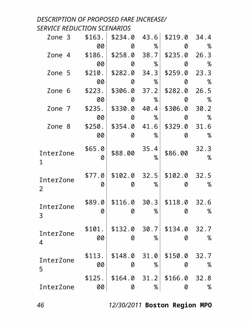
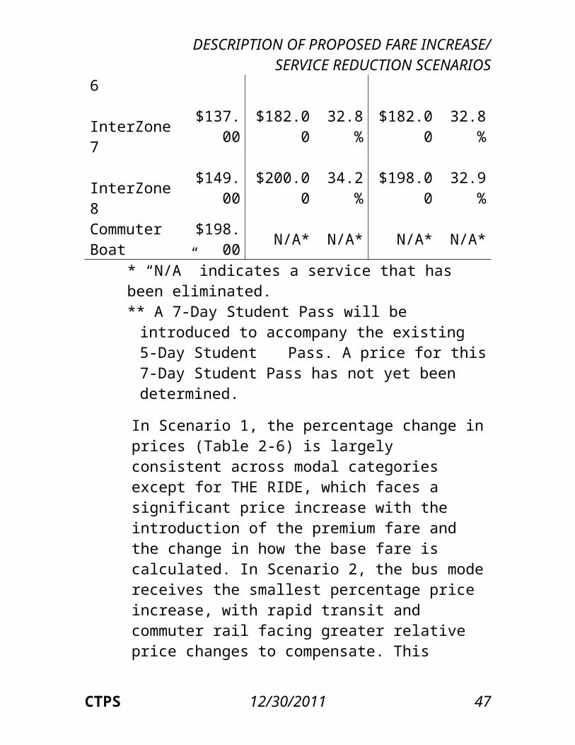
TABLE 2-4Pass Prices: Existing and Proposed, by Scenario
Pass Category
Scenario 1 Scenario 2Existin
gPropos
ed%
Chg.Propos
ed%
Chg.Local Bus $40.00 $55.00 37.5% $48.00 20.0%LinkPass $59.00 $80.00 35.6% $78.00 32.2%Senior/TAP $20.00 $40.00 100.0
% $39.00 95.0%
Student** $20.00 $40.00 100.0% $39.00 95.0%
1-Day $9.00 $12.00 33.3% $12.00 33.3%7-Day $15.00 $20.00 33.3% $20.00 33.3%Inner Express $89.00 $127.00 42.7% $114.00 28.1%
Outer Express
$129.00 $177.00 37.2% N/A* N/A*
Commuter Rail Zone 1A $59.00 $80.00 35.6% $78.00 32.2% Zone 1 $135.0
0 $196.00 45.2% $188.00 39.3%
Zone 2 $151.00 $215.00 42.4% $204.00 35.1%
Zone 3 $163.00 $234.00 43.6% $219.00 34.4%
Zone 4 $186.00 $258.00 38.7% $235.00 26.3%
Zone 5 $210.00 $282.00 34.3% $259.00 23.3%
Zone 6 $223.00 $306.00 37.2% $282.00 26.5%
Zone 7 $235.00 $330.00 40.4% $306.00 30.2%
CTPS 12/30/2011 33
DESCRIPTION OF PROPOSED FARE INCREASE/ SERVICE REDUCTION SCENARIOS Zone 8 $250.0
0 $354.00 41.6% $329.00 31.6%
InterZone 1 $65.00 $88.00 35.4% $86.00 32.3% InterZone 2 $77.00 $102.00 32.5% $102.00 32.5% InterZone 3 $89.00 $116.00 30.3% $118.00 32.6% InterZone 4 $101.0
0 $132.00 30.7% $134.00 32.7%
InterZone 5 $113.00 $148.00 31.0% $150.00 32.7%
InterZone 6 $125.00 $164.00 31.2% $166.00 32.8%
InterZone 7 $137.00 $182.00 32.8% $182.00 32.8%
InterZone 8 $149.00 $200.00 34.2% $198.00 32.9%
Commuter Boat
$198.00 N/A* N/A* N/A* N/A*
* “N/A” indicates a service that has been eliminated.** A 7-Day Student Pass will be introduced to
accompany the existing 5-Day Student Pass. A price for this 7-Day Student Pass has not yet been determined.
In Scenario 1, the percentage change in prices (Table 2-6) is largely consistent across modal categories except for THE RIDE, which faces a significant price increase with the introduction of the premium fare and the change in how the base fare is calculated. In Scenario 2, the bus mode receives the smallest percentage price increase, with rapid transit and commuter rail facing greater relative price changes to compensate. This difference in modal price increases is meant to compensate in a manner for the fact that the bus mode in Scenario 2 faces a much greater service reduction than rapid transit and commuter rail.
34 12/30/2011 Boston Region MPO
DESCRIPTION OF PROPOSED FARE INCREASE/SERVICE REDUCTION SCENARIOS
Once again, THE RIDE faces the greatest percentage price increases due to the premium fare and the change in how the base fare is calculated.
In both scenarios, the percentage change in prices (Table 2-6) for parking is less than the percentage changes in single-ride fares and pass prices. This is because the only parking rate increases are proposed for subway and surface light rail parking facilities (to compensate in a manner for the fact that relatively minor service reductions are proposed for rapid transit compared to commuter rail and express bus). The zero percent changes for the other modal
CTPS 12/30/2011 35
DESCRIPTION OF PROPOSED FARE INCREASE/ SERVICE REDUCTION SCENARIOS
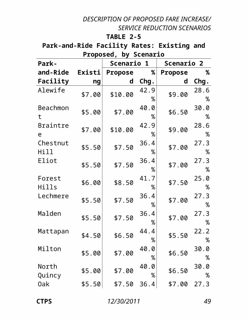
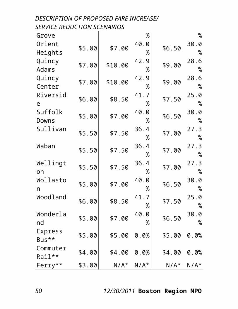
TABLE 2-5Park-and-Ride Facility Rates: Existing and Proposed, by
ScenarioPark-and-Ride Facility
Scenario 1 Scenario 2
Existing Proposed
% Chg.
Proposed
% Chg.
Alewife $7.00 $10.00 42.9% $9.00 28.6%Beachmont $5.00 $7.00 40.0% $6.50 30.0%Braintree $7.00 $10.00 42.9% $9.00 28.6%Chestnut Hill $5.50 $7.50 36.4% $7.00 27.3%
Eliot $5.50 $7.50 36.4% $7.00 27.3%Forest Hills $6.00 $8.50 41.7% $7.50 25.0%Lechmere $5.50 $7.50 36.4% $7.00 27.3%Malden $5.50 $7.50 36.4% $7.00 27.3%Mattapan $4.50 $6.50 44.4% $5.50 22.2%Milton $5.00 $7.00 40.0% $6.50 30.0%North Quincy $5.00 $7.00 40.0% $6.50 30.0%
Oak Grove $5.50 $7.50 36.4% $7.00 27.3%Orient Heights $5.00 $7.00 40.0% $6.50 30.0%
Quincy Adams $7.00 $10.00 42.9% $9.00 28.6%
Quincy Center $7.00 $10.00 42.9% $9.00 28.6%
Riverside $6.00 $8.50 41.7% $7.50 25.0%Suffolk Downs $5.00 $7.00 40.0% $6.50 30.0%
Sullivan $5.50 $7.50 36.4% $7.00 27.3%Waban $5.50 $7.50 36.4% $7.00 27.3%Wellington $5.50 $7.50 36.4% $7.00 27.3%Wollaston $5.00 $7.00 40.0% $6.50 30.0%Woodland $6.00 $8.50 41.7% $7.50 25.0%
36 12/30/2011 Boston Region MPO
DESCRIPTION OF PROPOSED FARE INCREASE/SERVICE REDUCTION SCENARIOS
Wonderland $5.00 $7.00 40.0% $6.50 30.0%
Express Bus** $5.00 $5.00 0.0% $5.00 0.0%
Commuter Rail** $4.00 $4.00 0.0% $4.00 0.0%
Ferry** $3.00 N/A* N/A* N/A* N/A** “N/A” indicates a service that has been eliminated.** Park-and-ride facility rates are the same for all facilities serving these modes.categories bring down the overall percentage change in parking price. Note that the average “fares” (in this case, the parking rates) for park-and-ride facility modal categories, as in all the other modal categories, reflect the unlinked-trip price rather than the linked-trip price. In both scenarios, the largest proposed percentage increases in price (Table 2-6) within a modal category are generally for CharlieTicket and onboard cash fares. These increases are greater than the more modest increases in the CharlieCard fares, due to the greater price increases assessed to CharlieTicket and onboard cash fares for the local bus, express bus, and rapid transit modes. The increase in CharlieTicket and onboard cash fares is most apparent when comparing those fare categories with the CharlieCard with respect to the price for transfers between local bus and rapid transit service. Under Scenario 1, for example, with a CharlieCard, a “step-up” transfer between those modes would make the total price for a linked trip $2.40. The “step-up” transfer benefit is not available on CharlieTickets, however, resulting in a total proposed linked-trip price of $5.25 using CharlieTickets or onboard cash.
CTPS 12/30/2011 37
DESCRIPTION OF PROPOSED FARE INCREASE/ SERVICE REDUCTION SCENARIOS
The percentage increase in pass prices is generally less than that in the respective single-ride fares in both scenarios. Pass prices increase by various amounts in order to maintain or revise certain cash-fare equivalents (based on
38 12/30/2011 Boston Region MPO
DESCRIPTION OF PROPOSED FARE INCREASE/SERVICE REDUCTION SCENARIOS
TABLE 2-6Weighted Average Percentage Change in Average Fares,
by Scenario and Modal Category, for Unlinked TripsModal Category Scenario 1 Scenario 2Bus 44.6% 27.1% Local Bus 44.5% 27.1% Inner Express 44.8% 25.8% Outer Express 37.1% N/A*Rapid Transit 41.8% 37.5% Subway 41.6% 37.6% SL Washington 47.1% 29.0% SL Waterfront 42.7% 38.6% Surface Light Rail 42.9% 37.9%Commuter Rail 43.1% 34.5% Zone 1A 34.8% 35.6% Zone 1 47.8% 40.6% Zone 2 41.8% 34.1% Zone 3 41.2% 32.2% Zone 4 37.8% 25.3% Zone 5 35.7% 24.4% Zone 6 38.0% 27.1% Zone 7 40.6% 30.2% Zone 8 41.0% 31.4% InterZone 37.9% 33.7% Onboard 87.0% 80.1%Ferry N/A* N/A* F1 N/A* N/A* F2: Boston N/A* N/A* F2: X-Harbor N/A* N/A* F2: Logan N/A* N/A* Inner Harbor N/A* N/A*THE RIDE 138.8% 71.9% ADA Territory 117.7% 48.2% Premium Territory 366.6% 140.0%Parking 28.2% 19.5%
CTPS 12/30/2011 39
DESCRIPTION OF PROPOSED FARE INCREASE/ SERVICE REDUCTION SCENARIOS
Express Bus 0.0% 0.0% Subway 40.8% 28.5% Surface Light Rail 40.8% 25.3% Commuter Rail 0.0% 0.0% Ferry N/A* N/A*Total System 43.0% 34.7%
* “N/A” indicates a service that has been eliminated.
the lowest-priced respective single-ride fare), which are the number of single-ride trips equivalent to the total pass price. In both scenarios, the difference between the lowest and highest cash-fare-equivalent values of the various commuter rail passes is reduced. The cash-fare equivalents of commuter rail passes currently range from 31.05 to 33.60 trips per pass; under the proposed fare increase in Scenario 1, the cash-fare equivalent would range from 30.15 to 31.47 trips per pass, while in Scenario 2, the cash-fare equivalent would range from 31.29 to 31.39 trips per pass. For local bus, express bus, and rapid transit passes, the cash-fare equivalent would decrease or remain virtually the same in both scenarios.
40 12/30/2011 Boston Region MPO
Methods Used toEstimate Ridershipand Revenue
Two separate approaches were used in this analysis to project the impact of the proposed fare increase and service reductions on MBTA ridership and revenue. One approach utilized a set of spreadsheets created by CTPS in consultation with the MBTA specifically for the purpose of such calculations. The second approach consisted of applying the Boston Region MPO’s regional travel demand model set to estimate demand for each MBTA mode using the existing and proposed fare levels.The travel demand model set was also employed as a complement to the spreadsheet model in the 2007 Pre–Fare Increase Impacts Analysis, with the two models together providing an indication of the potential range of impacts on ridership and revenue. In addition, unlike the spreadsheet model, the travel demand model set can also be used to conduct the air quality and environmental justice impact analyses.
3.1 CTPS SPREADSHEET MODEL APPROACHThe spreadsheet model was used to estimate the revenue and ridership impacts of the fare increase component of both proposed scenarios. This model reflects the many fare-payment categories of the MBTA pricing system and applies price elasticities to
CTPS 12/30/2011 43
analyze various changes across these categories. The accuracy of this methodology was proven to be satisfactory through the 2007 Post–Fare Increase Impacts Analysis, which included an analysis of its effectiveness in predicting the impacts of the proposed 2007 fare increase.
3.1.1 MODELING OF EXISTING RIDERSHIP AND REVENUE
Inputs to the spreadsheet model included existing ridership in the form of unlinked trips by mode, by fare-payment method, and by fare-media type. An unlinked trip is an individual trip on any one transit vehicle; any trip using multiple vehicles—so-called “linked” trips—is counted as multiple unlinked trips.Existing ridership (to which the spreadsheet model applies price elasticity figures – see Section 3.1.2) for the local bus, express bus, and rapid transit networks was provided in the form of automated fare-collection (AFC) data. Data were provided by month, with subtotals of transactions (unlinked trips) by the various possible combinations of product type (single-ride fare or pass) and stock (smart card, magnetic-stripe ticket, etc.). AFC data were also provided at the modal level at which each transaction occurs. More detailed information on AFC fare types, modes, and media can be found in the appendix.Because AFC equipment has not yet been deployed on commuter rail and commuter boat, the number of trips on these modes was estimated using sales figures. Single-ride trips on commuter rail and ferry were set equal to the number of single-ride fares sold, while pass trips on these modes were estimated by dividing the number of pass sales by the estimated average number of trips made using the respective
CTPS 12/30/2011 44
METHODS USED TO ESTIMATE RIDERSHIP AND REVENUE
pass type, calculated as part of the 2007 Post–Fare Increase Impacts Analysis. Dividing the number of pass sales by the estimated number of trips per pass resulted in an estimate of the total number of pass trips for each pass type.Other data used were estimates of the number of trips currently made using THE RIDE and the number of cars currently parked at transit stations. These data were provided to CTPS directly by the MBTA.Because the spreadsheet model cannot estimate the ridership impacts of eliminating or revising service, estimates of the ridership changes that would be associated with service changes without a fare increase were first calculated separately in order to adjust the existing ridership numbers to reflect a post-service-change situation. The spreadsheet model then estimated the ridership and revenue impacts of a fare increase using the revised existing ridership as the baseline. The MBTA estimated the ridership loss associated with the service changes in each scenario and provided those estimates to CTPS.Revenue for single-ride trips was calculated in the spreadsheet model by multiplying the number of trips in each fare/modal category by that category’s price. Revenue for pass trips was calculated for each pass type by multiplying the number of pass sales by the pass price. Pass revenue was then distributed between modal categories based on each category’s ridership and weighted by each category’s single-ride fare.
3.1.2 ESTIMATION OF RIDERSHIP CHANGES RESULTING FROM A FARE INCREASE
Fares are one of many factors that influence the level
CTPS 12/30/2011 45
METHODS USED TO ESTIMATE RIDERSHIP AND REVENUE
of ridership on transit services. Price elasticity is the measure of either the expected or observed rate of change in ridership relative to a change in fares if all other factors remain constant. On a traditional demand curve that describes the relationship between price, on the y-axis, and demand, on the x-axis, elasticities are equivalent to the slope along that curve. As such, price elasticities are generally expected to be negative, meaning that a price increase will lead to a decrease in demand (with a price decrease having the opposite effect). The larger the negative value of the price elasticity (the greater its distance from zero), the greater the projected impact on demand. Larger (more negative) price elasticities are said to be relatively “elastic,” while smaller negative values, closer to zero, are said to be relatively “inelastic.” Thus, if the price elasticity of the demand for transit were relatively elastic, a given fare increase would cause a greater loss of ridership than if demand were relatively inelastic. An example of the application of price elasticities is demonstrated in the appendix.The spreadsheet model permits the use of various ranges of elasticities to estimate different possible ridership impacts of price increases. Performing calculations in the spreadsheet model with the same prices but with a range of higher and lower elasticities provides a range of estimates. In the present analysis, the model was generally set to use the middle range of elasticities, as these represent the best estimate of where the elasticities should be set based on past experiences. However, estimates were also made using more inelastic and elastic elasticities, as a sensitivity analysis of the model’s
46 12/30/2011 Boston Region MPO
METHODS USED TO ESTIMATE RIDERSHIP AND REVENUE
projections of the ridership losses and revenue gains. Such a sensitivity analysis may be particularly relevant for this analysis given the lack of any contemporary experiences at the MBTA with fare increases and service reductions as large as those in Scenarios 1 and 2. Table 3-1 presents the three elasticity ranges used in the spreadsheet model for this study’s analysis. For a description of how these elasticity values were determined, see the appendix.
An additional complexity of the spreadsheet model that provides increased accuracy is its use of ridership diversion factors. These factors reflect estimates of the likelihood of a switch in demand from one MBTA product type or mode to another as a result of a change in the relative prices. The diversion factors essentially work to redistribute demand between the two product types or modes after the respective price elasticities have been applied. The appendix provides examples of the application of diversion factors and the methodology for combining the use of price elasticities and diversion factors. These examples reflect the methodology used in the present analysis. While diversion factors estimate the diversion of riders between MBTA product types and modes based on their price, the spreadsheet model can only estimate the total loss of riders from the MBTA transit system, not the diversion of riders to specific non-MBTA modes such as driving or walking.
3.2 BOSTON REGION MPO TRAVEL DEMAND MODEL SET APPROACHThe regional travel demand model set used by CTPS simulates travel on the transportation network in eastern Massachusetts, including both the transit and
CTPS 12/30/2011 47
METHODS USED TO ESTIMATE RIDERSHIP AND REVENUE
highway systems. It covers all MBTA commuter rail, rapid transit, and bus services, as well as all private express bus services. The model set reflects service frequency (how often trains and buses arrive at a given transit stop), routing, travel time, and fares for all of these services. In the modeling of the highway system, all express highways, all principal arterial roadways, and many minor arterial and local roadways are included.
48 12/30/2011 Boston Region MPO
METHODS USED TO ESTIMATE RIDERSHIP AND REVENUE
TABLE 3-1Price Elasticity Ranges Used in the Spreadsheet Model
Elasticity RangeModal Category Low Medium HighCash ElasticitiesBus -
0.10 -0.20 -0.30
Adult -0.10 -0.20 -0.30
Senior -0.05 -0.15 -0.25
Student -0.05 -0.15 -0.25
Subway -0.15 -0.25 -0.35
Adult -0.15 -0.25 -0.35
Senior -0.05 -0.15 -0.25
Student -0.05 -0.15 -0.25
Surface Light Rail -0.15 -0.25 -0.35
Adult -0.15 -0.25 -0.35
Senior -0.10 -0.20 -0.30
Student -0.10 -0.20 -0.30
Commuter Rail -0.25 -0.35 -0.45
Adult -0.25 -0.35 -0.45
CTPS 12/30/2011 49
METHODS USED TO ESTIMATE RIDERSHIP AND REVENUE
Half-Fare -0.15 -0.25 -0.35
Ferry -0.20 -0.30 -0.40
Adult -0.20 -0.30 -0.40
Half-Fare -0.10 -0.20 -0.30
THE RIDE -0.08 -0.12 -0.16
Parking -0.10 -0.20 -0.30
Pass ElasticitiesBus -
0.20 -0.30 -0.40
Inner Express -0.10 -0.20 -0.30
Outer Express -0.10 -0.20 -0.30
LinkPass -0.20 -0.30 -0.40
1-Day LinkPass -0.25 -0.35 -0.45
7-Day LinkPass -0.25 -0.35 -0.45
Commuter Rail -0.05 -0.10 -0.20
Ferry -0.15 -0.25 -0.35
Senior -0.05 -0.15 -0.25
Student -0.05 -0.15 -0.25
The travel demand forecasting procedure used in this
50 12/30/2011 Boston Region MPO
METHODS USED TO ESTIMATE RIDERSHIP AND REVENUE
analysis is based on a traditional four-step, sequential process: trip generation, trip distribution, mode choice, and trip assignment. This process may be used to estimate average daily transit ridership, primarily on the basis of estimates of population and employment, projected highway travel conditions (including downtown parking costs), and projected transit service to be provided. Such a process was used to analyze MBTA ridership and revenue impacts due to the fare increase and service reductions proposed in each of the two scenarios.The eastern Massachusetts geographic area represented in the model set is divided into several hundred areas known as transportation analysis zones (TAZs). The model set employs sophisticated and complex techniques in each of the four steps of the process. These steps can be very briefly summarized as follows.Trip Generation: This step estimates the number of trips produced in and attracted to each TAZ. This is done using estimates of the population, employment, and other socioeconomic and household characteristics of each zone.Trip Distribution: This step links the trip ends estimated in the trip generation step to form zonal trip interchanges (movements between pairs of zones). The output of this step is a trip table, which is a matrix containing the number of trips occurring in every origin-zone-to-destination-zone combination.Mode Choice: This step allocates the person trips estimated in the trip distribution step to the two primary competing modes, automobile and transit, and to walking and biking. This allocation is based on
CTPS 12/30/2011 51
METHODS USED TO ESTIMATE RIDERSHIP AND REVENUE
the desirability or utility of each choice a traveler can opt for, based on the attributes of that choice and the characteristics of the individual. The resulting output of this step includes the percentage of trips that use automobiles and the percentage that use transit for all trips that have been generated.Trip Assignment: This final step assigns the transit trips to the various transit modes, such as subway, commuter rail, local bus, or express bus. This is done by assigning each trip to one of several possible transit paths from one zone to another; each of these assignments is based on minimizing the generalized “cost” (including not only the transit fare, but also in-vehicle travel time, number of transfers, etc.). These paths may involve just one mode, such as express bus or commuter rail, or multiple modes, such as a local bus and a transfer to the subway. The trip assignment step also assigns the highway trips to the highway network. Thus, the traffic volumes on the highways and the ridership on the transit lines can be obtained from the outputs of this step.Population and employment data are key inputs to the demand forecasting process; those used in this study were obtained from the Metropolitan Area Planning Council (MAPC). The highway travel times used in the analysis are those used in recent CTPS transit and highway studies. Downtown parking costs were obtained from recent CTPS studies. The travel demand model set assumes that, in general, people wish to minimize transfers. It also assumes that they may wish to minimize travel time, even if doing so costs more.Note that the travel demand model set does not possess the capability of modeling THE RIDE, given
52 12/30/2011 Boston Region MPO
METHODS USED TO ESTIMATE RIDERSHIP AND REVENUE
the nature of paratransit service. As a result, the ridership and revenue impacts on THE RIDE that are included with the travel demand model set results are taken from the spreadsheet model results.Existing revenue was estimated by multiplying the trips estimated by the model set for each mode by the average fare for that mode. The average fares were based on calculations in the spreadsheet model. The revenue impact was estimated by taking the ratio from the spreadsheet model of each mode’s change in revenue divided by the change in unlinked trips and applying this to the travel demand model set’s estimate of the change in that mode’s unlinked trips.
3.3 DIFFERENCES BETWEEN THE TWO ESTIMATION METHODOLOGIESThere are several differences between the two methodologies. The spreadsheet model is primarily used to estimate the impacts of a fare change (though the estimated ridership impacts of service changes can be added to the model as an adjustment to existing ridership, so that the spreadsheet model’s projections will reflect the impacts of a simultaneous change in fare and service). On the other hand, the travel demand model set can forecast both impacts caused by fare changes and those caused by service changes.The chief strengths of the spreadsheet model are that it accounts for every distinct type of fare that can be paid for an MBTA transit mode and that it assigns the fare to the correct number of passengers who are in that fare-payment/modal category. In comparison, the travel demand model set does not permit analysis of fares at this detailed level, but assumes for each
CTPS 12/30/2011 53
METHODS USED TO ESTIMATE RIDERSHIP AND REVENUE
more-generalized modal category an average fare for all fare types. However, unlike the travel demand model set, the spreadsheet model cannot predict how many riders who leave the system due to a fare increase are switching to modes other than transit (driving alone, carpooling, bicycling, or walking). The travel demand model set also provides the outputs necessary for conducting the air quality and environmental justice impact analyses.There is another key difference between the two approaches in how they estimate ridership changes. The use of elasticities in the spreadsheet model has a relatively simple premise: the greater the percent change in price, the greater the percent change in demand. In the travel demand model set, while a greater percent change in fares will undoubtedly trigger a greater decline in transit ridership, it is not so much the percent change in transit fares that is important for determining the overall ridership change. Rather, it is the comparison of the resulting transit fares to the comparable cost of making the same trip via a different mode. For example, if the price of transit increases relative to the cost of driving, the travel demand model set will show transit diversions to driving.
54 12/30/2011 Boston Region MPO
Ridership andRevenue Impacts
4.1 OVERVIEW OF RESULTS AND METHODOLOGYScenario 1 is projected to result in a gain in annual revenue of between $161.5 million using the spreadsheet model and $172.9 million using the travel demand model set. The corresponding estimated annual ridership losses are 48.6 million and 34.0 million unlinked trips. Scenario 2 is projected to result in a gain in annual revenue of between $165.1 million using the spreadsheet model and $182.4 million using the travel demand model set. The corresponding estimated annual ridership losses are 64.2 million and 53.1 million unlinked trips. For both scenarios, these revenue projections are in keeping with the target amount that the MBTA has identified as needed to meet the FY 2013 budget deficit.The 2007 Post–Fare Increase Impacts Analysis shows the projections from the spreadsheet model, which uses elasticities to project ridership and revenue changes based on a detailed analysis by mode and fare category, to be close to the actual changes in ridership and revenue that occurred after that fare increase was implemented. In addition, through the 2007 Post–Fare Increase Impacts Analysis, CTPS was able to adjust the elasticities in
CTPS 12/30/2011 55

RIDERSHIP AND REVENUE IMPACTS
the spreadsheet model to even better reflect the changes that occurred. This presumably improved the capability of the spreadsheet model to accurately project the ridership and revenue impacts of other fare increases. However, the greater size of the fare increases and service reductions proposed for 2012 under both scenarios increases the uncertainty involved in forecasting. In addition, this marks the first time that CTPS has modeled the combined impacts of both a fare increase and service reductions. The travel demand model set is capable of incorporating both a fare increase and service reductions into its projections, whereas in the case of the spreadsheet model, the ridership losses associated with service reductions must be made independently and then added to the model. Therefore, it was appropriate to use both models in combination as well as to conduct a sensitivity analysis of the spreadsheet model using different elasticity values to help to define a range of probable outcomes of the changes in fares and service.
4.2 SPREADSHEET MODEL ESTIMATES
4.2.1 SCENARIO 1
Scenario 1 ProjectionsTable 4-1 presents CTPS’s estimates of the ridership and fare revenue impacts of the Scenario 1 fare increase and service reductions produced using the spreadsheet model and its medium range of elasticities. The existing ridership and fare revenue numbers, also presented, represent existing conditions before any adjustments are made to account for the estimated ridership lost due to the
56 12/30/2011 Boston Region MPO
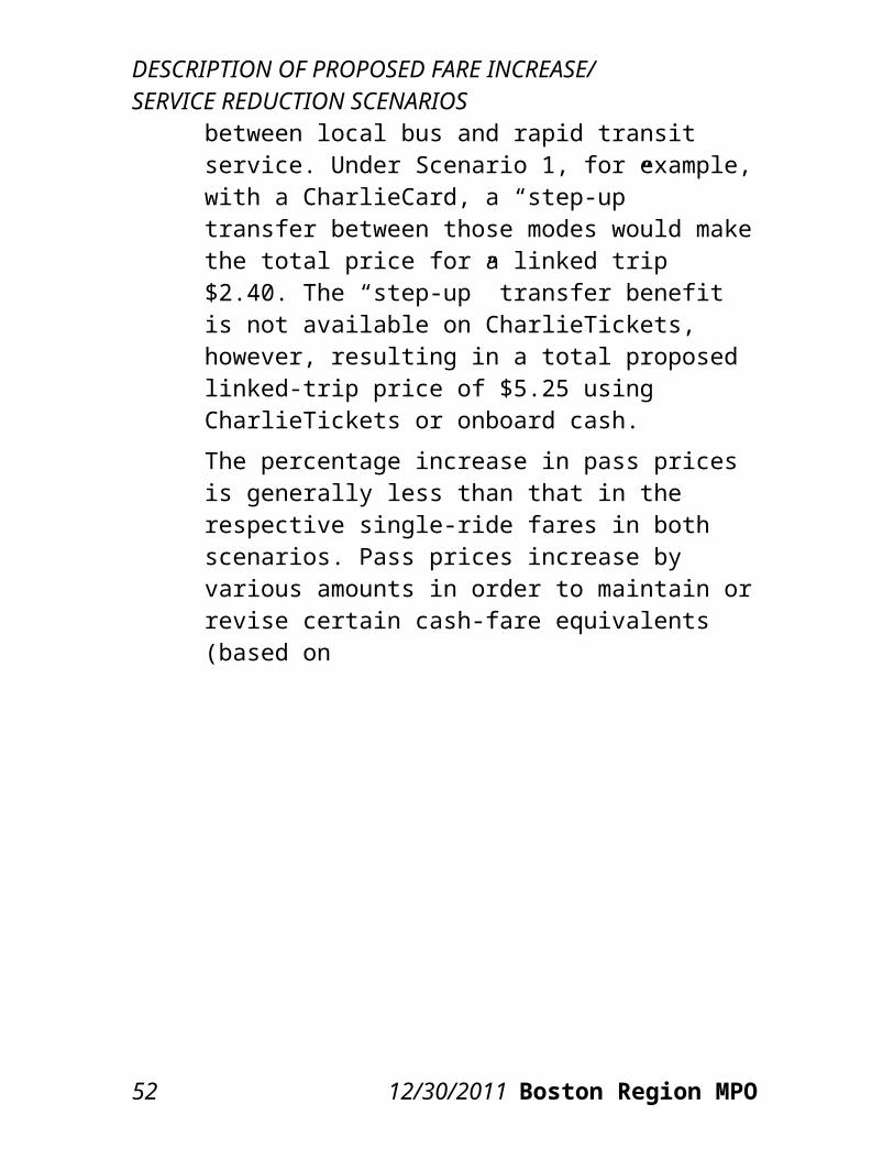
RIDERSHIP AND REVENUE IMPACTS
service reductions in this scenario. All figures are annual.The total projected fare revenue increase from Scenario 1 comes to $123.2 million, or a 25.8 percent increase. The total projected ridership loss is estimated at 48.6 million annual unlinked trips, or a 12.6 percent decrease. For the Scenario 1 fare increase, the greatest absolute fare revenue increase is projected for the heavy rail (Blue, Orange, and Red Lines) category ($41.8 million). This is due partly to the fact that heavy rail riders take 39.7 percent of all annual unlinked trips, the largest percentage of any category. However, heavy rail riders, who are not affected by any service reductions, also have one of the smallest projected percentage decreases in ridership, at 11.0 percent. The commuter rail category provides the second-greatest projected absolute revenue increase ($32.3 million), followed by the bus category ($23.9 million). However, commuter rail riders are projected to decrease by a much greater percentage (20.4 percent) than bus riders (12.2 percent), though the projected absolute number of lost riders is greater for bus than for commuter rail (13.6 million versus 6.7 million unlinked trips). The relative overall fare revenue gains for these two modes reflect the much greater average fare paid by commuter rail riders compared to bus riders. Finally, note that fare revenue is collected by ferry operators and not by the MBTA. As a result, the change in ridership but not revenue on the ferry mode is reported.
CTPS 12/30/2011 57
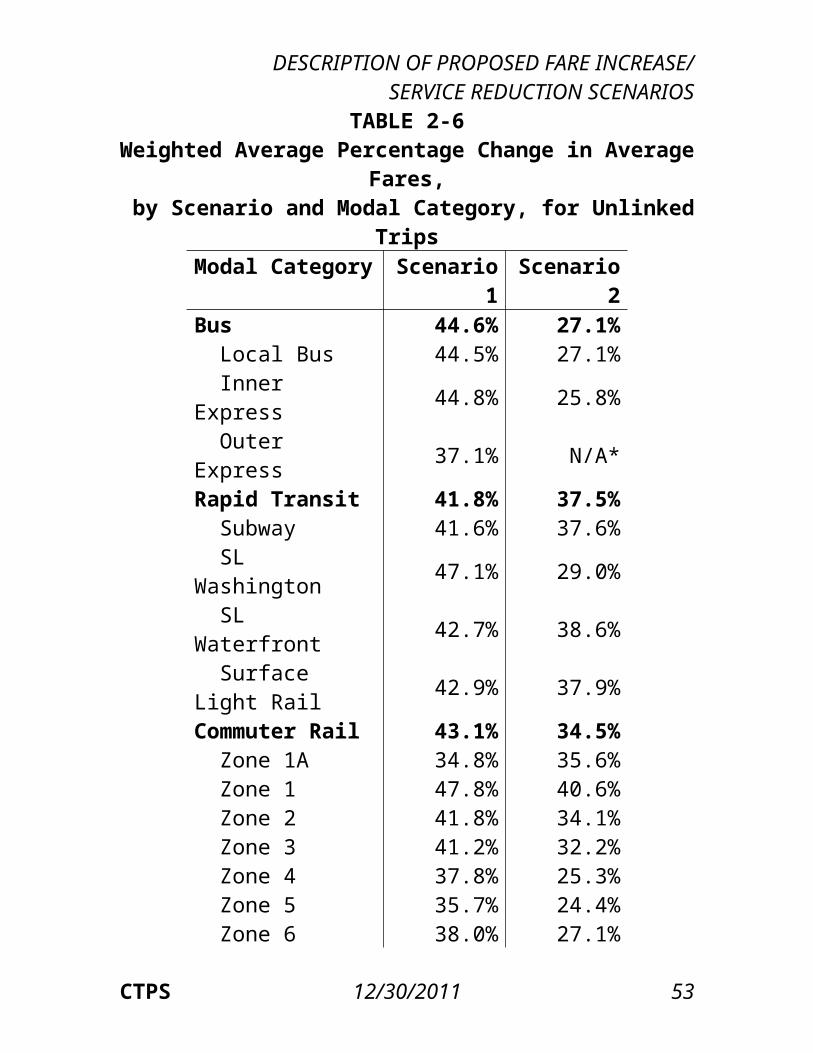
RIDERSHIP AND REVENUE IMPACTS
TABLE 4-1Scenario 1: Spreadsheet Model Estimates of Annual
Ridership and Fare Revenue ImpactsExisting Fare Revenue
Change Ridership ChangeModal Category Fare Revenue Ridership $ % # %Bus $84,943,538 111,903,868 $23,933,063 28.2% -13,646,904 -12.2%Heavy Rail $150,317,103 153,439,900 $41,781,853 27.8% -16,855,647 -11.0%Light Rail $61,940,438 77,659,524 $16,908,813 27.3% -8,688,834 -11.2%Commuter Rail $139,373,877 32,802,960 $32,268,780 23.2% -6,684,772 -20.4%
Ferry* $0 1,309,167 $0 0.0% -1,309,167-100.0%THE RIDE $3,820,407 2,359,966 $3,741,277 97.9% -404,295 -17.1%Parking $37,092,637 6,948,420 $4,575,853 12.3% -999,827 -14.4%Total System $477,488,002 386,423,805 $123,209,637 25.8% -48,589,445 -12.6%
* Ferry fare revenue is not collected by the MBTA, so the loss in ferry fare revenue is not counted in the total revenue change.
Scenario 1 Sensitivity AnalysisThe Scenario 1 results reported in Table 4-1 were produced using the medium range of elasticities. Table 4-2 presents a sensitivity analysis of the spreadsheet model, showing the range of Scenario 1’s estimated ridership and fare revenue impacts from the fare increase and service reductions using the lower and higher ranges of elasticities presented in Table 3-1. In the ranges of ridership-loss estimates in the table, the greater losses are those resulting from the higher range of elasticities, while in the ranges of fare-revenue-increase estimates, the greater increases are those resulting from the lower range of elasticities.
The use of the higher range of elasticities results in
58 12/30/2011 Boston Region MPO
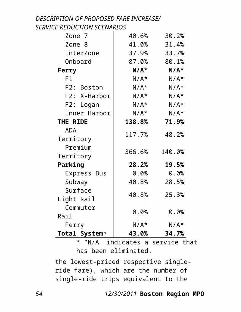
RIDERSHIP AND REVENUE IMPACTS
much greater estimates of ridership losses: 65.8 million unlinked trips, compared to 32.0 million using the lower range of elasticities; using the medium range of elasticities results in a loss of 48.6 million unlinked trips. As a result, the projected revenue gain from the fare increase estimated using the higher range of elasticities is approximately $30.7 million less than that estimated using the medium range of elasticities ($92.5 million versus $123.2 million) and $58.5 million less than that estimated using the lower range of elasticities.
CTPS 12/30/2011 59

RIDERSHIP AND REVENUE IMPACTS
TABLE 4-2Scenario 1: Spreadsheet Model Ranges of Estimates of
Annual Ridership and Fare Revenue ImpactsUsing Low and High Ranges of Elasticities
Range of Fare Revenue Increases
Range of Ridership Losses
Modal Category
$ (millions) %
$ Range
(millions)
# (million
s)%
# Range
(millions)
Bus $17.9─$30.0
21.0%─35.3%
$12.1 8.2─19.1
7.4%─17.0%
10.8
Heavy Rail
$32.5─$50.8
21.6%─33.8%
$18.4 10.2─23.6
6.7%─15.4%
13.4
Light Rail
$13.1─$20.7
21.1%─33.4%
$7.6 5.3─12.1
6.8%─15.6%
6.8
Commuter Rail
$23.5─$38.8
16.9%─27.8%
$15.3 5.8─7.9 17.6%─24.0%
2.1
Ferry $0.0 0.0% $0.0 1.3 100.0% 0.0THE RIDE $2.7─$4.7 71.8%─124.
1%$2.0 0.3─0.5 11.4%─22.
8%0.3
Parking $2.9─$6.1 7.9%─16.3%
$3.1 0.8─1.2 11.7%─17.6%
0.4
Total System
$92.5─$151.1
19.4%─31.6%
$58.5 32.0─65.8
8.3%─17.0%
33.8
Scenario 1 Total Revenue EstimateTable 4-3 adds the MBTA’s estimates of saved operating costs from Scenario 1’s service reductions to the spreadsheet model’s estimates of the gains in fare revenue from Scenario 1’s fare increase and service reductions reported in Table 4-1 to obtain an estimate of the change in total revenue. While heavy rail again represents the greatest revenue gain, the saved operating costs for the bus and commuter rail modes place their total revenue gain close to that of
60 12/30/2011 Boston Region MPO

RIDERSHIP AND REVENUE IMPACTS
heavy rail, which only incurs a fare increase. THE RIDE also has a significant revenue increase. Again note that when the ferry service is eliminated, the MBTA saves money (as represented by the saved operating costs) by not providing the subsidy to operate the service.
TABLE 4-3Scenario 1: Spreadsheet Model Estimates of Total
Revenue Change:Combined Fare Revenue Gains and Saved Operating
Costs
Modal Category
Fare Revenue
Gain
Saved Operating
Costs
Fare Revenue Gain + Saved
Operating Costs
Bus $23,933,063 $12,417,864 $36,350,927Heavy Rail $41,781,853 $0 $41,781,853Light Rail $16,908,813 $1,489,024 $18,397,837Commuter Rail $32,268,780 $5,736,219 $38,004,999
Ferry* $0 $3,676,569 $3,676,569THE RIDE $3,741,277 $14,949,038 $18,690,315Parking $4,575,853 $0 $4,575,853Total System $123,209,637 $38,268,714 $161,478,351
* Ferry fare revenue is not collected by the MBTA, so the loss in fare revenue is not counted in the total revenue change but the saved operating costs of eliminating the Commuter Boat Subsidy are counted.
4.2.2 SCENARIO 2
Scenario 2 ProjectionsTable 4-4 presents CTPS’s estimates of the ridership and fare revenue impacts of the Scenario 2 fare
CTPS 12/30/2011 61
RIDERSHIP AND REVENUE IMPACTS
increase and service reductions produced using the spreadsheet model and its medium range of elasticities. As with Scenario 1, the existing ridership and fare revenue numbers, also presented, represent existing conditions before any adjustments are made to account for the estimated ridership lost due to the service reductions in this scenario. All figures are annual.The total projected fare revenue increase from Scenario 2 comes to $86.8 million, or an 18.2 percent increase. The total projected ridership loss is estimated at 64.2 million annual unlinked trips, or a 16.6 percent decrease. For the Scenario 2 fare increase, the greatest absolute fare revenue increase is projected for the heavy rail category ($45.4 million). This is due partly to the fact that heavy rail riders take 39.7 percent of all annual unlinked trips, the largest percentage of any category. However, heavy rail riders, who are not affected by any service reductions, also have one of the smallest projected percentage decreases in ridership, at 10.0 percent. The commuter rail category provides the second-greatest projected absolute revenue increase ($25.2 million), followed by the light rail category ($17.8 million). The fare increase on buses is not enough to compensate for the lost bus fare revenue that results from the reduction in the number of bus routes; note, however, that overall bus revenue does increase because of the saved operating costs on these eliminated routes, as will be detailed subsequently. Finally, note that fare revenue is collected by ferry operators and not by the MBTA. As a result, the change in ridership but not revenue on the ferry mode is reported.
62 12/30/2011 Boston Region MPO
RIDERSHIP AND REVENUE IMPACTS
TABLE 4-4Scenario 2: Spreadsheet Model Estimates of Annual
Ridership and Fare Revenue Impacts
Existing Fare Revenue Change Ridership Change
Modal Category
Fare Revenue Ridership $ % # %
Bus $84,943,538 111,903,868 -$6,044,895 -7.1% -32,425,169 -29.0%Heavy Rail $150,317,103 153,439,900 $45,371,424 30.2% -15,285,778 -10.0%
Light Rail $61,940,438 77,659,524 $17,838,297 28.8% -7,771,487 -10.0%Commuter Rail $139,373,877 32,802,960 $25,217,949 18.1% -6,310,916 -19.2%
Ferry* $0 1,309,167 $0 0.0% -1,309,167 -100.0%THE RIDE $3,820,407 2,359,966 $2,250,984 58.9% -178,795 -7.6%Parking $37,092,637 6,948,420 $2,154,262 5.8% -937,897 -13.5%Total System $477,488,002 386,423,805 $86,788,020 18.2% -64,219,210 -16.6%
* Ferry fare revenue is not collected by the MBTA, so the loss in ferry fare revenue is not counted in the total revenue change.
Scenario 2 Sensitivity AnalysisThe Scenario 2 results reported in Table 4-4 used the medium range of elasticities. Table 4-5 presents a sensitivity analysis of the spreadsheet model, showing the range of Scenario 2’s estimated ridership and revenue impacts from the fare increase and service reductions using the lower and higher ranges of elasticities presented in Table 3-1. In the ranges of ridership-loss estimates in the table, the greater losses are those resulting from the higher range of elasticities, while in the ranges of fare-revenue-increase estimates, the greater increases are those
CTPS 12/30/2011 63
RIDERSHIP AND REVENUE IMPACTS
resulting from the lower range of elasticities.
The use of the higher range of elasticities results in much greater estimates of ridership losses: 77.5 million unlinked trips compared to 51.4 million using the lower range of elasticities; using the medium range of elasticities results in a loss of 64.2 million unlinked trips. As a result, the projected revenue gain from the fare increase estimated using the higher range of elasticities is approximately $22.5 million less than that estimated using the medium range of elasticities ($64.3 million versus $86.8 million) and $42.9 million less than that estimated using the lower range of elasticities.
TABLE 4-5Scenario 2: Spreadsheet Model Ranges of Estimates of Annual
Ridership and Fare Revenue ImpactsUsing Low and High Ranges of Elasticities
Range of Fare Revenue Increases Range of Ridership Losses
Modal Category $ (millions) %
$ Range (millions
)#
(millions) %# Range (millions
)
Bus (-$9.0)─(-$3.1)
(-10.6%)─(-3.7%) $5.9 29.3─35.
626.2%─31.8
% 6.2
Heavy Rail $37.3─$53.2 24.8%─35.4
% $15.9 9.5─21.2 6.2%─13.8% 11.7
Light Rail $14.5─$21.1 23.5%─34.0% $6.5 4.8─10.7 6.2%─13.8% 5.9
Commuter Rail $18.5─$30.3 13.3%─21.7
% $11.8 5.5─7.3 16.9%─22.3% 1.8
Ferry $0.0 0.0% $0.0 1.3 100.0% 0.0THE RIDE $2.0─$2.5 52.6%─65.3
% $0.5 0.1─0.2 5.1%─10.1% 0.1
Parking $0.9─$3.3 2.5%─8.8% $2.3 0.8─1.1 11.3%─16.1% 0.3
Total $64. 13.5 $42.9 51.4─77. 13.3%─20.0 26.1
64 12/30/2011 Boston Region MPO
RIDERSHIP AND REVENUE IMPACTS
System 3─$107.3 %─22.5% 5 %
Scenario 2 Total Revenue EstimateTable 4-6 adds the MBTA’s estimates of saved operating costs from Scenario 2’s service reductions to the spreadsheet model’s estimates of the changes in fare revenue from Scenario 2’s fare increase and service reductions reported in Table 4-4 to obtain an estimate of the change in total revenue. Under this scenario, while heavy rail has the greatest fare revenue gain, the saved operating costs for the bus mode place its total revenue gain above that of heavy rail, and the saved operating costs for the commuter rail mode place its total revenue gain close to that of heavy rail, which only incurs a fare increase. THE RIDE also has a significant total revenue increase. Again note that when the ferry service is eliminated, the MBTA saves money (as represented by the saved operating costs) by not providing the subsidy to operate the service.
CTPS 12/30/2011 65
RIDERSHIP AND REVENUE IMPACTS
TABLE 4-6Scenario 2: Spreadsheet Model Estimates of Total
Revenue Change (Combined Fare Revenue Changes and Saved Operating Costs)
Modal Category
Fare Revenue Change
Saved Operating
Costs
Fare Revenue Change +
Saved Operating
CostsBus -$6,044,895 $60,358,388 $54,313,493Heavy Rail $45,371,424 $0 $45,371,424
Light Rail $17,838,297 $1,489,024 $19,327,321Commuter Rail $25,217,949 $5,736,219 $30,954,168
Ferry* $0 $3,676,569 $3,676,569THE RIDE $2,250,984 $7,094,175 $9,345,159
Parking $2,154,262 $0 $2,154,262Total System $86,788,020 $78,354,375 $165,142,395
* Ferry fare revenue is not collected by the MBTA, so the loss in fare revenue is not counted in the total revenue change but the saved operating costs of eliminating the Commuter Boat Subsidy are counted.
4.2.3 COMPARISON OF SCENARIOS 1 AND 2 TOTAL REVENUE CHANGES: FARE REVENUE CHANGES COMBINED WITH SAVED OPERATING COSTS
Finally, Table 4-7 compares the total estimated revenue impacts of fare revenue changes and saved operating costs from service reductions under Scenarios 1 and 2. As in Tables 4-3 and 4-6, the total revenue changes equal the projected revenue gain
66 12/30/2011 Boston Region MPO
RIDERSHIP AND REVENUE IMPACTS
from the fare increase plus the saved operating costs from the service reductions. As seen in Table 4-7, the greatest differences between Scenarios 1 and 2 in terms of the percentage of the total revenue increase represented by each modal category occur for bus, commuter rail, and THE RIDE. In Scenario 1, commuter rail and THE RIDE contribute greater percentages than the other modes of the total revenue increase, because of the large percentage price increases on these modes and their already more expensive starting points. In Scenario 2, the bus mode contributes the greatest percentage of the revenue increase because of the significant level of service reductions and the resulting saved operating costs.
CTPS 12/30/2011 67
RIDERSHIP AND REVENUE IMPACTS
TABLE 4-7Comparison of Scenarios 1 and 2 Total Revenue
Change: Combined Fare Revenue Changes and Saved Operating Costs
Scenario 1 Scenario 2Modal Category $ Change % of
Total $ Change % of Total
Bus $36,350,927 22.5% $54,313,493 32.9%Heavy Rail $41,781,853 25.9% $45,371,424 27.5%
Light Rail $18,397,837 11.4% $19,327,321 11.7%Commuter Rail $38,004,999 23.5% $30,954,168 18.7%
Ferry $3,676,569 2.3% $3,676,569 2.2%THE RIDE $18,690,315 11.6% $9,345,159 5.7%
Parking $4,575,853 2.8% $2,154,262 1.3%Total System
$161,478,351
100.0%
$165,142,395
100.0%
4.3 REGIONAL TRAVEL DEMAND MODEL SET ESTIMATES
4.3.1 SCENARIO 1
Scenario 1 ProjectionsTable 4-8 presents CTPS’s estimates, produced using the travel demand model set, of the ridership and fare revenue impacts of the fare increase and service reductions proposed in Scenario 1. All figures are annual. The travel demand model set projects that the greatest absolute increase in fare revenue will occur on heavy rail and the greatest percentage increase in fare revenue will occur on THE RIDE. These projected impacts reflect the fact that no
68 12/30/2011 Boston Region MPO
RIDERSHIP AND REVENUE IMPACTS
service reductions are proposed for heavy rail and the fact that THE RIDE faces the greatest percentage price increase of any mode. In terms of ridership, the greatest projected absolute decrease is estimated on the bus mode because of the elimination of several bus routes. The greatest percentage decrease in ridership, aside from the ferry mode, which is eliminated, is on commuter rail. This is likely caused by a more elastic response to the fare increase given the already high prices of commuter rail fares and passes as well as the diversion of commuter rail riders to the less expensive heavy rail and light rail modes.
TABLE 4-8Scenario 1: Travel Demand Model Set Estimates of
Annual Ridership and Fare Revenue Impacts
Existing Fare Revenue Change Ridership Change
Modal Category Fare Revenue Ridership $ % # %
Bus $84,943,538 111,903,868 $29,786,338 35.1% -12,055,868 -10.8%Heavy Rail $150,317,103 153,439,900 $55,990,847 37.2% -6,739,900 -4.4%
Light Rail $61,940,438 77,659,524 $22,682,434 36.6% -3,649,524 -4.7%Commuter Rail $139,373,877 32,802,960 $17,477,421 12.5% -8,922,960 -27.2%
Ferry* $0 1,309,167 $0 0.0% -1,309,167 -100.0%THE RIDE $3,820,407 2,359,966 $3,741,277 97.9% -404,295 -17.1%
Parking $37,092,637 6,948,420 $4,965,899 13.4% -948,420 -13.6%Total System $477,488,002 386,423,805 $134,644,215 28.2% -34,030,134 -8.8%
* Ferry fare revenue is not collected by the MBTA, so the loss in ferry fare revenue is not counted in the total revenue change.
CTPS 12/30/2011 69
RIDERSHIP AND REVENUE IMPACTS
Scenario 1 Total Revenue Estimate
Table 4-9 adds the MBTA’s estimates of saved operating costs from Scenario 1’s service reductions to the travel demand model set’s estimates of the changes in fare revenue resulting from Scenario 1’s fare increase and service reductions. Under this scenario, while heavy rail has the greatest revenue gain, the saved operating costs for the bus and commuter rail modes place their total revenue gain closer to that of heavy rail, which only incurs a fare increase. THE RIDE also has a significant revenue increase because of its large price increase. Again note that when ferry service is eliminated, the MBTA saves money (as represented by the saved operating costs) by not providing the subsidy to operate the service, but does not lose fare revenue because it does not collect the fares.
70 12/30/2011 Boston Region MPO
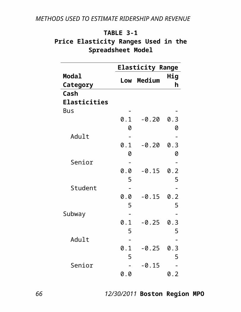
RIDERSHIP AND REVENUE IMPACTS
TABLE 4-9Scenario 1: Travel Demand Model Set Estimates of Total
Revenue Change: Combined Fare Revenue Gains and Saved Operating Costs
Modal Category
Fare Revenue Gain
Saved Operating
Costs
Fare Revenue Gain + Saved
Operating CostsBus $29,786,338 $12,417,864 $42,204,202 Heavy Rail $55,990,847 $0 $55,990,847 Light Rail $22,682,434 $1,489,024 $24,171,458 Commuter Rail $17,477,421 $5,736,219 $23,213,640
Ferry* $0 $3,676,569 $3,676,569 THE RIDE $3,741,277 $14,949,038 $18,690,315 Parking $4,965,899 $0 $4,965,899 Total System $134,644,215 $38,268,714 $172,912,929
* Ferry fare revenue is not collected by the MBTA, so the loss in ferry fare revenue is not counted in the total revenue change but the saved operating costs of eliminating the Commuter Boat Subsidy are counted.
4.3.2 SCENARIO 2
Scenario 2 ProjectionsTable 4-10 presents CTPS’s estimates, produced using the travel demand model set, of the ridership and fare revenue impacts of the fare increase and service reductions proposed in Scenario 2. All figures are annual. The travel demand model set projects that the greatest absolute increase in fare revenue will occur on heavy rail and the greatest percentage increase in fare revenue will occur on THE RIDE.
CTPS 12/30/2011 71

RIDERSHIP AND REVENUE IMPACTS
These projected impacts reflect the fact that no service reductions are proposed for heavy rail and the fact that THE RIDE faces the greatest percentage price increase of any mode. The fare increase on buses is not enough to compensate for the lost bus fare revenue that results from the reduction in the number of bus routes; note, however, that overall bus revenue does increase because of the saved operating costs on these eliminated routes. In terms of ridership, the greatest projected absolute decrease is estimated on the bus mode because of the elimination of several bus routes. The greatest percentage decrease in ridership, aside from the ferry mode, which is eliminated, is also on the bus mode. It appears that the diversion of commuter rail riders is less in Scenario 2 than in Scenario 1.
72 12/30/2011 Boston Region MPO
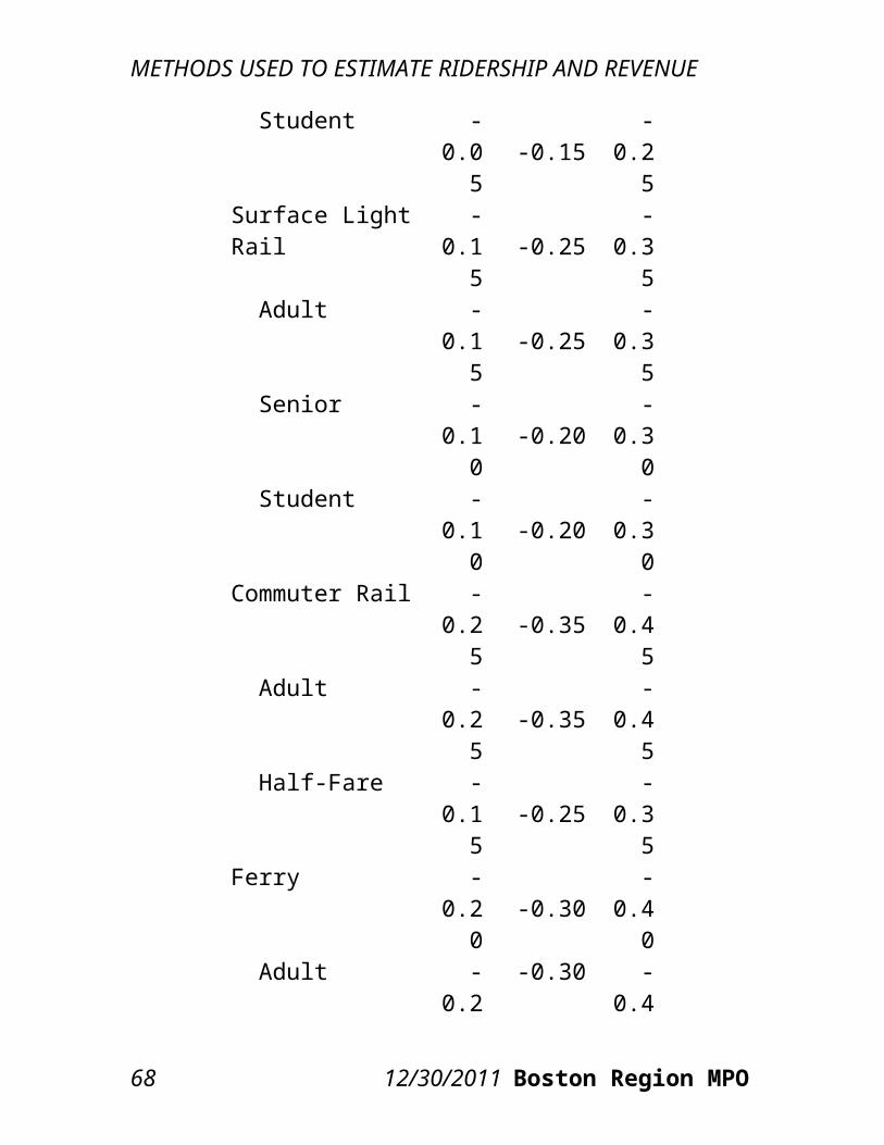
RIDERSHIP AND REVENUE IMPACTS
TABLE 4-10Scenario 2: Travel Demand Model Set Estimates of Annual
Ridership and Fare Revenue Impacts
Existing Fare Revenue Change Ridership Change
Modal Category
Fare Revenue Ridership $ % # %
Bus $84,943,538 111,903,868 -$3,936,759 -4.6% -24,483,868 -21.9%Heavy Rail $150,317,103 153,439,900 $53,276,987 35.4% -9,709,900 -6.3%Light Rail $61,940,438 77,659,524 $12,899,570 20.8% -12,079,524 -15.6%Commuter Rail $139,373,877 32,802,960 $36,389,362 26.1% -4,512,960 -13.8%
Ferry* $0 1,309,167 $0 0.0% -1,309,167 -100.0%
THE RIDE $3,820,407 2,359,966 $2,250,984 58.9% -178,795 -7.6%Parking $37,092,637 6,948,420 $3,128,363 8.4% -798,795 -7.6%Total System $477,488,002 386,423,805 $104,008,508 21.8% -53,072,634 -13.7%
* Ferry fare revenue is not collected by the MBTA, so the loss in ferry fare revenue is not counted in the total revenue change.
Scenario 2 Total Revenue Estimate
Table 4-11 adds the MBTA’s estimates of saved operating costs from Scenario 2’s service reductions to the travel demand model set’s estimates of the changes in fare revenue resulting from Scenario 2’s fare increase and service reductions. Under this scenario, the bus mode has the greatest revenue gain, due to the saved operating costs, in spite of the lost fare revenue. Heavy rail, which only incurs a fare increase, has the second-greatest revenue gain. The saved operating costs for commuter rail and THE RIDE also increase their total revenue gain. Again note that when ferry service is eliminated, the MBTA
CTPS 12/30/2011 73
RIDERSHIP AND REVENUE IMPACTS
saves money (as represented by the saved operating costs) by not providing the subsidy to operate the service, but does not lose fare revenue because it does not collect the fares.
TABLE 4-11Scenario 2: Travel Demand Model Set Estimates of Total
Revenue Change: Combined Fare Revenue Changes and Saved Operating Costs
Modal Category
Fare Revenue Change
Saved Operating
Costs
Fare Revenue Change + Saved Operating Costs
Bus -$3,936,759 $60,358,388 $56,421,629 Heavy Rail $53,276,987 $0 $53,276,987 Light Rail $12,899,570 $1,489,024 $14,388,595 Commuter Rail $36,389,362 $5,736,219 $42,125,581 Ferry* $0 $3,676,569 $3,676,569 THE RIDE $2,250,984 $7,094,175 $9,345,159 Parking $3,128,363 $0 $3,128,363 Total System $104,008,508 $78,354,375 $182,362,883
* Ferry fare revenue is not collected by the MBTA, so the loss in ferry fare revenue is not counted in the total revenue change but the saved operating costs of eliminating the Commuter Boat Subsidy are counted.
4.4 COMPARISON OF MODEL RESULTS: RANGES OF PROJECTED IMPACTS
4.4.1 SCENARIO 1Projected ranges of ridership impacts and fare revenue impacts of the proposed Scenario 1 fare increase and service reductions are presented,
74 12/30/2011 Boston Region MPO

RIDERSHIP AND REVENUE IMPACTS
respectively, in Tables 4-12 and 4-13. Probable ranges of impacts have been projected, as discussed above, by using both the spreadsheet model and the travel demand model set. As can be seen, the projections from the travel demand model set show a smaller overall decrease in ridership and a greater overall increase in fare revenue than are projected using the spreadsheet model (with medium-range elasticities).Using the travel demand model set, CTPS projects a decrease of 34.0 million unlinked trips, or an 8.8 percent decrease, compared to a decrease of 48.6 million unlinked trips, or a 12.6 percent decrease, using the spreadsheet model. The projections from the travel demand model set show smaller ridership decreases in the bus, heavy rail, and light rail modal categories and larger ridership decreases in the commuter rail category compared to the spreadsheet model.Overall, the travel demand model set appears to estimate a less elastic response of riders to the fare increase than the spreadsheet model. This explains the difference in estimates for the bus mode. However, the differences in heavy rail and light rail estimates may be caused by a combination of factors. It appears that, in addition to generally projecting a less elastic response, the travel demand model set is also estimating that a significant number of commuter rail riders will divert to heavy and light rail. This diversion occurs to a greater extent on commuter rail than other modes because its cost is already high, and the fare increase brings prices to a level where riders will search for less expensive travel options. The proposed service reductions would also
CTPS 12/30/2011 75
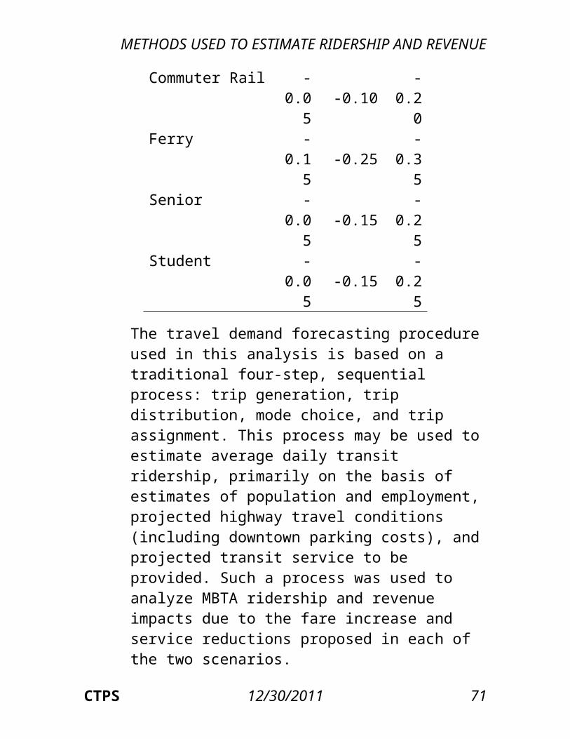
RIDERSHIP AND REVENUE IMPACTS
encourage riders to switch to heavy and light rail at those times when commuter rail is no longer in service. In addition, the decline in commuter rail ridership is likely caused by a number of riders switching to the automobile mode as the already high cost of commuter rail makes driving relatively more competitive with commuter rail than it is for users of other transit modes. It appears that as much as one-third of the decrease in commuter rail riders and one-half of the increase in heavy rail and light rail riders could be diversions from commuter rail to heavy and light rail.In terms of annual fare revenue, projections from the travel demand model set show a gain of $134.6 million, or a 28.2 percent increase, compared to a gain of $123.2 million, or a 25.8 percent increase, from the spreadsheet model. The smaller estimates of ridership loss from the travel demand model set result in greater estimates of fare revenue gains given the size of the proposed fare increase in Scenario 1. The greater ridership losses estimated by the spreadsheet model are correlated with smaller estimated fare revenue gains. When comparing modes, these differences are most apparent for heavy and light rail. However, as was the case in the ridership projections, it appears that this difference, as well as that for commuter rail fare revenue, can be at least partly explained by the diversion of commuter rail riders to heavy rail and light rail apparently projected by the travel demand model set. Overall, this diversion would represent a loss in fare revenue, as riders switch from the higher-priced mode to lower-priced modes.
76 12/30/2011 Boston Region MPO
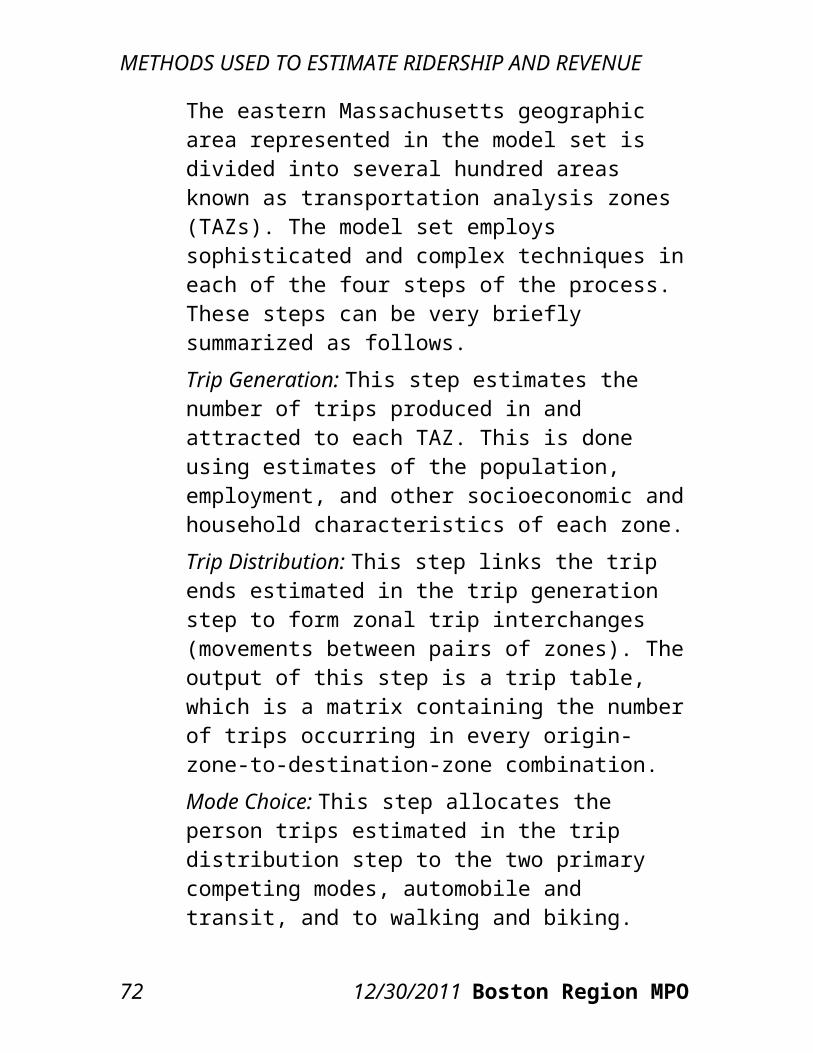
RIDERSHIP AND REVENUE IMPACTS
Taken together, the projections shown in these tables provide a probable range of outcomes from the proposed fare increase and service reductions in terms of ridership and fare revenue impacts.
TABLE 4-12Scenario 1: Range of Ridership Projections
Annual Ridership
Spreadsheet Model Travel Demand Model Set
Modal Category Existing Projected # Chg. % Chg. Projected # Chg. % Chg.
Bus 111.9M 98.3M -13.6M -12.2% 99.8M -12.1M -10.8%Heavy
Rail 153.4M 136.6M -16.9M -11.0% 146.7M -6.7M -4.4%
Light Rail 77.7M 69.0M -8.7M -11.2% 74.0M -3.6M -4.7%Commute
r Rail 32.8M 26.1M -6.7M -20.4% 23.9M -8.9M -27.2%
Ferry 1.3M 0 -1.3M -100.0% 0 -1.3M -
100.0%THE
RIDE 2.4M 2.0M -0.4M -17.1% 2.0M -0.4M -17.1%
Parking 6.9M 5.9M -1.0M -14.4% 6.0M -0.9M -13.6%Total System 386.4M 337.8M -48.6M -12.6% 352.4M -34.0M -8.8%
CTPS 12/30/2011 77
RIDERSHIP AND REVENUE IMPACTS
TABLE 4-13Scenario 1: Range of Fare Revenue Projections
Annual Fare RevenueSpreadsheet Model Travel Demand Model Set
Mode Existing Projected $ Chg. % Chg. Projected $ Chg. % Chg.Bus $84.9M $108.9M +$23.9M +28.2
% $114.7M +$29.8M +35.1%
Heavy Rail $150.3M $192.1M +$41.8M +27.8
% $206.3M +$56.0M +37.2%
Light Rail $61.9M $78.8M +$16.9M +27.3% $84.6M +$22.7M +36.6%
Commuter Rail $139.4M $171.6M +$32.3M +23.2
% $156.9M +$17.5M +12.5%
Ferry* $0 $0 $0 0.0% $0 $0 0.0%THE
RIDE $3.8M $7.6M +$3.7M +97.9% $7.6M +$3.7M +97.9%
Parking $37.1M $41.7M +$4.6M +12.3% $42.1M +$5.0M +13.4%
Total System $477.5M $600.7M +$123.2M +25.8
% $612.1M +$134.6M +28.2%
* Ferry fare revenue is not collected by the MBTA, so the loss in fare revenue is not counted in the total revenue change.
Table 4-14 adds the projected saved operating costs from service reductions to the two models’ estimates of the revenue change from the fare increase. Therefore, this table presents a range of projections for the total estimated revenue change resulting from Scenario 1. The total change in revenue is projected to be an increase ranging between $161.5 million and $172.9 million, or between a 33.8 percent and a 36.2 percent increase.
78 12/30/2011 Boston Region MPO
RIDERSHIP AND REVENUE IMPACTS
TABLE 4-14Scenario 1: Range of Projections for Total Revenue:Combined Fare Revenue Gains and Saved Operating
CostsAnnual Total Revenue
Spreadsheet Model Travel Demand Model Set
Mode Existing
Projected $ Chg. %
Chg.Projec
ted $ Chg. % Chg.
Bus $84.9M
$121.3M
+$36.4
M
+42.8%
$127.1M
+$42.2
M
+49.7%
Heavy Rail
$150.3M
$192.1M
+$41.8
M
+27.8%
$206.3M
+$56.0
M
+37.2%
Light Rail
$61.9M $80.3M
+$18.4
M
+29.7% $86.1M
+$24.2
M
+39.0%
Commuter Rail
$139.4M
$177.4M
+$38.0
M
+27.3%
$162.6M
+$23.2
M
+16.7%
Ferry* $0 $3.7M +$3.7M
+100.0% $3.7M +
$3.7M+100.
0%
THE RIDE $3.8M $22.5M
+$18.7
M
+489.2% $22.5M
+$18.7
M
+489.2%
Parking $37.1M $41.7M +
$4.6M+12.3
% $42.1M $5.0M +13.4%
Total System
$477.5M
$639.0M
+$161.5
M+33.8
%$650.4
M+
$172.9M
+36.2%
CTPS 12/30/2011 79
RIDERSHIP AND REVENUE IMPACTS
* Ferry fare revenue is not collected by the MBTA, so the loss in ferry fare revenue is not counted in the total revenue change.
4.4.2 SCENARIO 2Projected ranges of ridership impacts and fare revenue impacts, respectively, of the proposed Scenario 2 fare increase and service reductions are presented in Tables 4-15 and 4-16. Probable ranges of impacts have been projected, as discussed above, by using both the spreadsheet model and the travel demand model set. As can be seen, as with Scenario 1, the projections from the travel demand model set show a smaller overall decrease in ridership and a greater overall increase in fare revenue than are projected using the spreadsheet model.Using the travel demand model set, CTPS projects a decrease of 53.1 million unlinked trips, or a 13.7 percent decrease, compared to a decrease of 64.2 million unlinked trips, or a 16.6 percent decrease, using the spreadsheet model. The projections from the travel demand model set show smaller ridership decreases in the bus, heavy rail, and commuter rail modal categories and larger ridership decreases in the light rail category compared to the spreadsheet model.Overall, the travel demand model set appears to estimate a less elastic response of riders to the fare increase than the spreadsheet model. This is the case for the difference in estimates for the bus mode. It is likely that, as in Scenario 1, the travel demand model set estimates that some commuter rail riders are switching to heavy rail and light rail, as evidenced by the greater decrease in commuter rail trips compared to heavy rail trips, but this diversion does
80 12/30/2011 Boston Region MPO
RIDERSHIP AND REVENUE IMPACTS
not appear to be as large in Scenario 2. In addition, the travel demand model set’s estimate of light rail trips actually represents a greater percentage decrease than the spreadsheet model’s estimate. This is explained by the fact that, in the travel demand model set’s estimates, several bus routes that act as feeder services to the Green Line are eliminated in Scenario 2, which, in turn, reduces the number of trips on the Green Line. In addition, several bus routes that parallel portions of the Green Line have improved frequencies in Scenario 2, which further reduces ridership on the Green Line.In terms of annual fare revenue, projections from the travel demand model set show a gain of $104.0 million, or a 21.8 percent increase, compared to a gain of $86.8 million, or an 18.2 percent increase, from the spreadsheet model. The smaller estimates of ridership loss from the travel demand model set result in greater estimates of fare revenue gains, given the size of the proposed fare increase in Scenario 2. The greater ridership losses estimated by the spreadsheet model are correlated with smaller estimated fare revenue gains. When comparing modes, these differences are most apparent for heavy and light rail and commuter rail. However, as was the case in the ridership projections, it appears that these differences can be at least partly explained by the diversion of commuter rail riders to heavy rail and by the loss of light rail riders, which is likely caused by the elimination of feeder bus routes to Green Line stations and the improved frequencies of competing bus routes to the Green Line. The diversion from commuter rail to heavy rail would represent a loss in fare revenue, as riders switch from
CTPS 12/30/2011 81
RIDERSHIP AND REVENUE IMPACTS
the higher-priced mode to the lower-priced mode. Taken together, the projections shown in these tables provide a probable range of outcomes from the proposed fare increase and service reductions in terms of ridership and fare revenue impacts.
TABLE 4-15Scenario 2: Range of Ridership Projections
Annual Ridership
Spreadsheet Model Travel Demand Model Set
Modal Category Existing Projected # Chg. % Chg. Projected # Chg. % Chg.
Bus 111.9M 79.5M -32.4M -29.0% 87.4M -24.5M -21.9%Heavy
Rail 153.4M 138.2M -15.3M -10.0% 143.7M -9.7M -6.3%
Light Rail 77.7M 69.9M -7.8M -10.0% 65.6M -12.1M -15.6%Commute
r Rail 32.8M 26.5M -6.3M -19.2% 28.3M -4.5M -13.8%
Ferry 1.3M 0 -1.3M -100.0% 0 -1.3M -
100.0%THE
RIDE 2.4M 2.2M -0.2M -7.6% 2.2M -0.2M -7.6%
Parking 6.9M 6.1M -0.9M -13.5% 6.2M -0.8M -11.5%Total System 386.4M 322.2M -64.2M -16.6% 333.4M -53.1M -13.7%
82 12/30/2011 Boston Region MPO
RIDERSHIP AND REVENUE IMPACTS
TABLE 4-16Scenario 2: Range of Fare Revenue Projections
Annual Fare RevenueSpreadsheet Model Travel Demand
Model SetMode Existi
ngProject
ed $ Chg. % Chg.
Projected $ Chg. %
Chg.Bus $84.9
M $78.9M -$6.0M -7.1% $81.0M -$3.9M -4.6%
Heavy Rail
$150.3M
$195.7M
+$45.4
M
+30.2%
$203.6M
+$53.3M
+35.4%
Light Rail
$61.9M $79.8M
+$17.8
M
+28.8% $74.8M +
$12.9M+20.8
%
Commuter Rail
$139.4M
$164.6M
+$25.2
M
+18.1%
$175.8M
+$36.4M
+26.1%
Ferry $0 $0 $0 0.0% $0 $0 0.0%THE
RIDE $3.8M $6.1M +$2.3M
+58.9% $6.1M +$2.3M +58.9
%
Parking $37.1M $39.2M +
$2.2M+5.8
% $40.2M $3.1M +8.4%
Total System
$477.5M
$564.3M
+$86.8
M+18.2
%$581.5
M+
$104.0M
+21.8%
* Ferry fare revenue is not collected by the MBTA, so the loss in ferry fare revenue is not counted in the total revenue change.
Table 4-17 adds the projected saved operating costs from service reductions to the two models’ estimates of the revenue change from the fare increase. Therefore, this table presents a range of projections for the total revenue change resulting from Scenario
CTPS 12/30/2011 83
RIDERSHIP AND REVENUE IMPACTS
2. The total change in revenue is projected to be an increase ranging between $165.1 million and $182.4 million, or between a 34.6 percent and a 38.2 percent increase.
TABLE 4-17Scenario 2: Range of Projections for Total Revenue:Combined Fare Revenue Gains and Saved Operating
CostsAnnual Total Revenue
Spreadsheet Model Travel Demand Model SetMode Existing Projected $ Chg. % Chg. Projected $ Chg. % Chg.Bus $84.9M $139.3M +$54.3M +63.9% $141.4M +$56.4M +66.4%Heavy
Rail $150.3M $195.7M +$45.2M +30.2% $203.6M +$53.3M +35.4%
Light Rail $61.9M $81.3M +$19.3M +31.2% $76.3M +$14.4M +23.2%Commute
r Rail $139.4M $170.3M +$31.0M +22.2% $181.5M +$42.1M +30.2%
Ferry $0 $3.7M +$3.7M +100.0% $3.7M +$3.7M +100.0%
THE RIDE $3.8M $13.2M +$9.3M +244.6
% $13.2M +$9.3M +244.6%
Parking $37.1M $39.2M +$2.2M +5.8% $40.2M $3.1M +8.4%Total $477.5M $642.6M +$165.1M +34.6% $659.9M +$182.4M +38.2%
* Ferry fare revenue is not collected by the MBTA, so the loss in ferry fare revenue is not counted in the total revenue change.
84 12/30/2011 Boston Region MPO
Air Quality Impacts
5.1 BACKGROUNDThe air quality impacts of alternative transportation scenarios can be analyzed using standard transportation-forecasting models, including the Boston Region MPO’s travel demand model set. The travel demand model set can be used to estimate future traffic characteristics within the region’s transportation network: traffic volumes, average highway speeds, and vehicle-miles and vehicle-hours traveled. Since the amount of air pollution emitted by highway traffic depends on the prevailing highway speeds and vehicle-miles traveled, it is possible to estimate these air quality impacts with reasonable accuracy.Air pollutants produced by vehicles generally fall into two groups: gaseous and particulate. Examples of gaseous pollutants include carbon monoxide (CO), volatile organic compounds (VOC, also known as hydrocarbons), nitrogen oxides (NOx), and carbon dioxide (CO2). In addition, there are the photochemical oxidants (such as ozone), which are not directly emitted from vehicles but are formed when VOC and NOx chemically react in the presence of sunlight and warm temperatures. Particulate
CTPS 12/30/2011 85
AIR QUALITY IMPACTS
pollutants produced by vehicles are commonly broken into two categories: fine particulates—those with a diameter of 2.5 micrometers or less, and coarse particulates—those with a diameter between 2.5 and 10 micrometers. Under the Clean Air Act, the U.S. Environmental Protection Agency (EPA) sets standards for various types of emissions. Historically, EPA has regulated particulates, CO, and ground-level ozone, all of which are hazardous to human health. The Boston Region MPO is currently required to report the amount of CO, NOx, and VOC produced by the regional transportation system in such documents as the Transportation Improvement Program and the Long-Range Transportation Plan. Due to its contribution to climate change, CO2 is also an important type of emission to measure.CTPS employs EPA MOBILE 6.2 emission factors for calculating the amounts of pollutants. For each link within the highway network, the travel demand model set applies the MOBILE 6.2 emission factors corresponding to the link’s average speed and estimates the emissions of pollutants based on the vehicle-miles traveled on that link. The total amount of emissions of a pollutant in the entire region is obtained by summing the amounts associated with the individual links in the system.
5.2 ESTIMATED AIR QUALITY IMPACTSWith respect to the fare increase and service reductions proposed under Scenarios 1 and 2, the air quality impacts are primarily those associated with existing transit users who choose to drive to their destinations instead of using transit. A reduction in
86 12/30/2011 Boston Region MPO
AIR QUALITY IMPACTS
transit trips and addition of automobile trips generally causes increases in the generation of CO, VOC, NOx, CO2, and particulates, and these increases can be measured in the manner described in the preceding section. It should be noted that as the numbers of automobile trips and vehicle hours increase, the congestion on area roadways also increases. This additional congestion results in lower travel speeds (which are associated with higher emissions of pollutants) for all vehicles, not just those of former transit users. While air quality will typically worsen in response to fare increases and service reductions, the elimination of transit vehicle trips does represent a reduction in emissions, and this reduction is included in the estimates produced using the travel demand model set.After calculating the ridership impacts of each scenario as described earlier in this report, CTPS used the model set to estimate the change in regional vehicle-miles traveled and average miles per hour for private automobiles and transit vehicles. Specifically, for automobiles, the path of each automobile trip made by a former transit user was identified and the travel times for all automobile trips were estimated. For transit vehicles, the paths and travel times for all eliminated trips were identified. CTPS applied to these data the emission factors provided by the EPA that are associated with each of the pollutants identified above. As shown in Table 5-1, automobile vehicle-miles and vehicle-hours traveled are estimated to increase and average miles per hour is estimated to decrease because of the proposed fare increase and service reductions in either Scenario 1 or Scenario 2. Transit
CTPS 12/30/2011 87
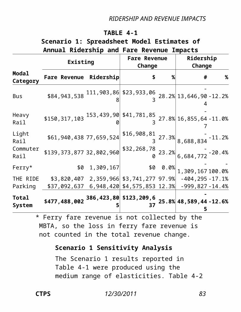
AIR QUALITY IMPACTS
vehicle-miles traveled are estimated to decrease in both scenarios, though the decrease is greater in Scenario 2. The projected regional change in emissions per weekday of each of the selected pollutants is reported for the sum of automobile and transit emissions under each scenario.The decreases in transit emissions are greater for all pollutants in Scenario 2, but greater increases in automobile emissions in that scenario result in worse air quality for all of the pollutants other than NOx compared to Scenario 1. Scenario 2’s percentage increases in emissions for CO, VOC, and fine and coarse particulates all exceed those of Scenario 1; its percentage increase in CO2 is only slightly less than Scenario 1’s.Both scenarios result in decreases in NOx emissions; the decrease is greater in Scenario 2 than in Scenario 1 because of a larger decrease in transit-vehicle emissions of NOx. However, despite these decreases, both scenarios bear out a general rule that usually applies in air quality analyses of this kind: any loss in transit ridership that results in an increase in auto vehicle-miles and vehicle-hours traveled will lead to some level of increase in pollutants.In summary, under both scenarios, air quality worsens. A margin of error is associated with the estimation process, but the results are well beyond that margin.
88 12/30/2011 Boston Region MPO
AIR QUALITY IMPACTS
TABLE 5-1Projected Average Weekday Changes in Selected
Pollutants (Regionwide)
Scenario 1 Scenario 2
Indicator/PollutantAbsolute
ChangePercent Change
Absolute Change
Percent Change
Auto vehicle-miles traveled +430,837 +0.39% +626,060 +0.57%
Auto vehicle-hours traveled +31,808 +0.95% +44,383 +1.33%
Auto average miles-per-hour -0.18 -0.55% -0.24 -0.75%
Transit vehicle-miles traveled -11,117 -10.86% -39,187 -38.27%
Carbon monoxide (kg) +4,917 +0.39% +7,146 +0.57%Nitrogen oxides (kg) -696 -0.61% -916 -0.80%Volatile organic compounds (kg) +31 +0.07% +123 +0.30%
Carbon dioxide (kg) +194,990 +0.33% +174,852 +0.30%Fine particulates (kg) +10 +0.41% +15 +0.60%Coarse particulates (kg) +17 +0.41% +25 +0.60%
CTPS 12/30/2011 89
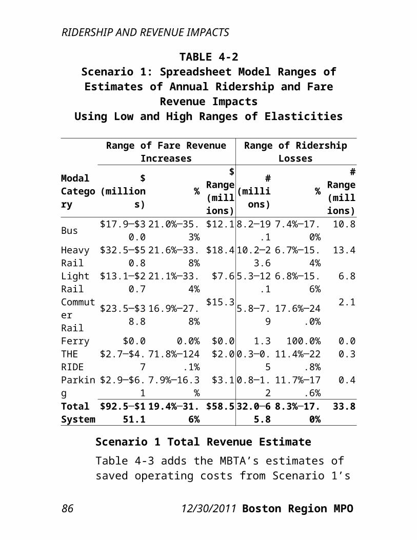
EnvironmentalJustice Impacts
6.1 DEFINITION OF ENVIRONMENTAL JUSTICE COMMUNITIESTo assess the impacts of each proposed scenario’s fare increase and service reductions on minority and low-income communities, CTPS conducted an environmental justice (EJ) impacts analysis. Environmental justice communities were identified based on a methodology developed from Federal Transit Administration guidance to the MBTA’s ongoing Title VI program and on past practice of CTPS. For the purposes of Title VI analyses, the MBTA has defined two service areas with different demographic characteristics: one for the urban fixed-route transit system and another for the commuter rail system. Therefore, the Authority has two sets of criteria for identifying EJ communities, one for each service area.For each of the two service areas, the average annual income and the percentage of minority population were identified for each transportation analysis zone (TAZ). A TAZ was then defined as low-income if its income level was at or below 60 percent of the median household income in the service area; this meant at or below $40,766 in the urban fixed-
CTPS 12/30/2011 91
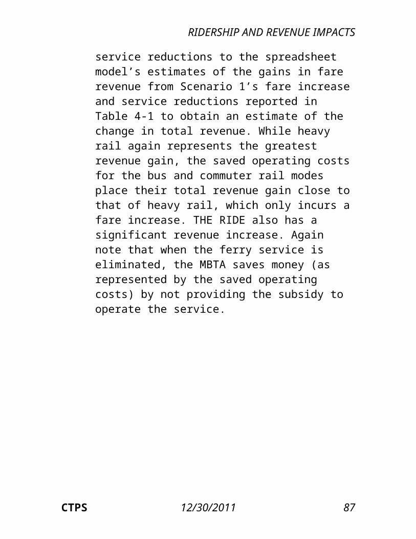
ENVIRONMENTAL JUSTICE IMPACTS
route transit service area and $41,636 in the commuter rail service area. Minority TAZs were defined as those in which the percentage of the non-white population (including the Hispanic population) was greater than the average for the service area. The average percentage of minority residents is 31.3 percent in the urban fixed-route transit service area and 26.2 percent in the commuter rail service area. Any TAZ which qualifies as either minority or low-income is considered an EJ community.3
6.2 EQUITY DETERMINATIONAfter identifying the EJ communities in both service areas, CTPS analyzed, for each service area (except where noted otherwise), areawide equity in terms of both the existing and proposed conditions for both scenarios using the Boston Region MPO’s travel demand model set. Each TAZ’s “score” in terms of various metrics was estimated by the model set for both the existing system and each projected scenario. To measure the areawide results, averages across TAZs (for EJ and non-EJ communities) were calculated; in this calculation, each TAZ’s score was weighted according to its existing transit trips. Three general categories of metrics were analyzed with respect to their projected equity impacts. Note that this analysis used data for the weekday AM peak time period, as this represents the greatest number of transit trips in any time period. For the first category, transit equity, the measures
3 Median household income was determined based on the 2006-2010 American Community Survey. Minority percentages were determined based on the 2010 U.S. Census.
92 12/30/2011 Boston Region MPO
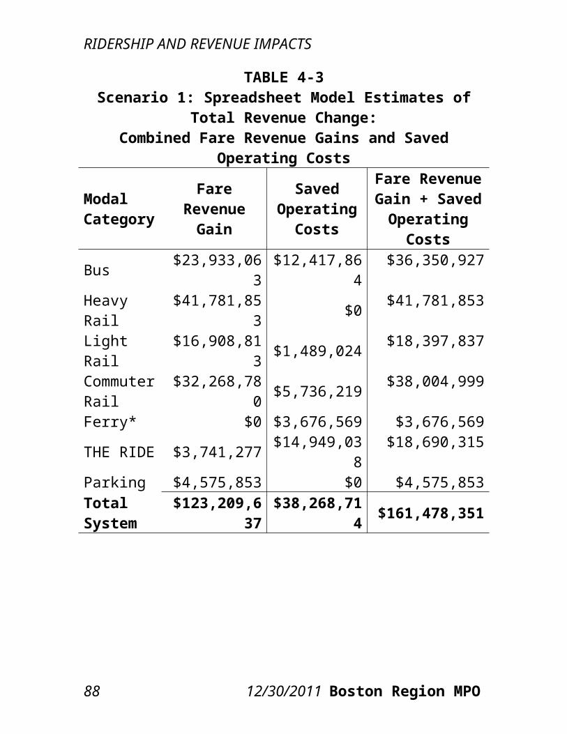
ENVIRONMENTAL JUSTICE IMPACTS
were the average fare, the average walk-access time, the average wait time, and the total number of transit trips. The average fare and average walk-access and wait times for a given TAZ were measured based on the trips originating from that TAZ (as opposed to the trips destined for that TAZ). The total number of transit trips was only calculated for the commuter rail service area, as this area represents the entire transit market. The second category was highway congestion and air quality. Average vehicle-miles traveled per square mile was the metric for representing local levels of congestion. Average carbon monoxide emissions per square mile was the metric representing the local level of air pollution (since carbon monoxide is a local pollutant). The third category was accessibility. The travel demand model set was utilized to produce measures of transit accessibility to various types of destinations; accessibility was measured relative to the ability to access the desired destination by transit within at least 40 minutes, which is based on the average commute trip time for the Boston region. Jobs were one of the destination types included in the measurement of transit accessibility; specifically, service sector jobs were used in this analysis, as the results tended to mirror those for the other job sectors. Accessibility to healthcare (as measured by the total number of beds at the accessible health facilities) and accessibility to post-secondary education (as measured by the total enrollment at the accessible colleges) were also measured by the travel demand model set.
CTPS 12/30/2011 93
ENVIRONMENTAL JUSTICE IMPACTS
6.2.1 TRANSIT EQUITY METRICS
Table 6-1 and Table 6-2 present, for Scenario 1 and Scenario 2, respectively, the existing and projected values for the four transit equity metrics: average fare ($ per trip), average walk-access time (minutes), average wait time (minutes), and total number of transit trips. As seen in the tables, in both the commuter rail and urban fixed-route service areas, the existing average fare is less for EJ communities than for non-EJ communities, as are the average walk-access time and wait time. This reflects the greater concentration of EJ communities in areas currently well-served by transit, which also tend to be more urban and densely developed. For these same reasons, EJ communities have more than twice the number of transit trips compared to non-EJ communities. These relationships between the EJ and non-EJ existing conditions remain consistent in the projected conditions.
94 12/30/2011 Boston Region MPO
TABLE 6-1Scenario 1: Existing and Projected Measures of Transit Equity Metrics
Existing Projected Absolute Change
Percentage Change
Service Area Metric Non-
EJ EJ EJ Non-EJ EJ Non-EJ EJ Non-EJCommuter Rail Average Fare $2.20 $2.11 $2.84 $3.01 +$0.73 +$0.81 +34.6% +36.7%
Walk-Access Time (min.) 21.1 19.4 19.5 21.2 +0.06 +0.10 +0.3% +0.5%
Wait Time (min.) 18.2 16.9 17.0 18.4 +0.09 +0.14 +0.5% +0.8%
Total Transit Trips 58,951 126,182 121,856 54,924 -4,326 -4,027 -3.4% -6.8%
Urban Fixed-Route
Average Fare $2.09 $1.81 $2.38 $2.85 +$0.57 +$0.76 +31.4% +36.2%
Walk-Access Time (min.) 20.5 19.2 19.3 20.6 +0.08 +0.13 +0.4% +0.6%
Wait Time (min.) 17.2 16.6 16.7 17.4 +0.08 +0.11 +0.5% +0.6%
CTPS 12/30/2011 95
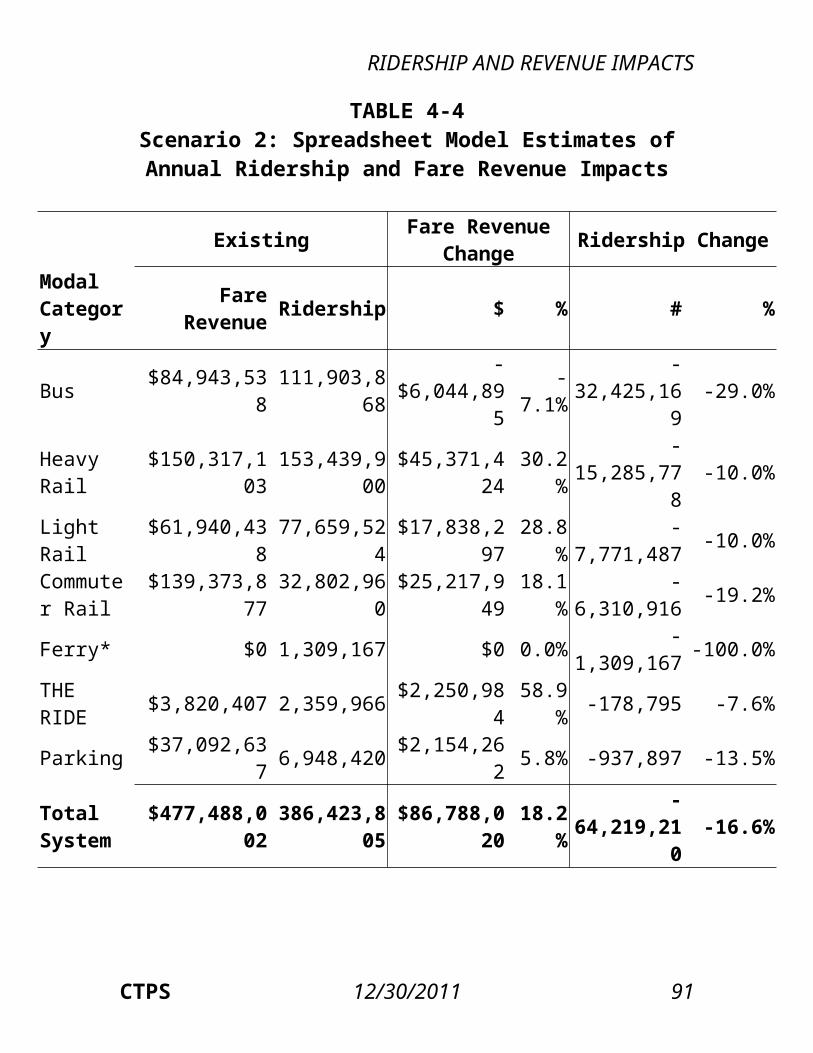
ENVIRONMENTAL JUSTICE IMPACTS
TABLE 6-2Scenario 2: Existing and Projected Measures of Transit Equity Metrics
Existing Projected Absolute Change
Percentage Change
Service Area Metric EJ Non-
EJ EJ Non-EJ EJ Non-
EJ EJ Non-EJ
Commuter Rail Average Fare $2.11 $2.20 $2.74 $3.06 +$0.63 +$0.86 +30.0% +39.1%
Walk-Access Time (min.) 19.4 21.1 20.3 21.8 +0.86 +0.74 +4.4% +3.5%
Wait Time (min.) 16.9 18.2 17.6 18.5 +0.72 +0.23 +4.3% +1.3%
Total Transit Trips 126,182 58,951 117,218 49,142 -8,964 -9,808 -7.1% -16.6%
Urban Fixed-Route
Average Fare $1.81 $2.09 $2.39 $2.89 +$0.58 +$0.80 +32.3% +38.1%
Walk-Access Time (min.) 19.2 20.5 20.1 21.3 +0.88 +0.79 +4.6% +3.9%
Wait Time (min.) 16.6 17.2 17.3 17.5 +0.73 +0.25 +4.4% +1.5%
96 12/30/2011 Boston Region MPO
ENVIRONMENTAL JUSTICE IMPACTS
Looking at the projected changes, both the absolute and percentage increases in Scenario 1 are less for EJ communities than non-EJ communities for average fare, average walk-access time, and average wait time. This reflects the fact that in Scenario 1 the service reductions are generally located outside the urban core. However, because EJ communities have a greater number of existing transit riders, the absolute decrease in transit trips in Scenario 1 is greater for EJ communities than non-EJ communities, although the percentage decrease for EJ communities is less. In Scenario 2, both the absolute and percentage increases in average walk-access and wait time are greater for EJ communities than non-EJ communities, although the projected averages for EJ communities are still less than the projected averages for non-EJ communities. As with Scenario 1, both the absolute and percentage increases for average fare are less for EJ communities than non-EJ communities. Because more of the service reductions in Scenario 2 affect areas outside the urban core, the absolute decrease in transit trips in Scenario 2 is greater for non-EJ communities than EJ communities. As in Scenario 1, the percentage decrease in transit trips in Scenario 2 is less for EJ communities than non-EJ communities.When the two scenarios are compared, it is apparent that Scenario 2 provides worse service generally, as the average walk-access and wait times increase by a greater number and percentage for both EJ and non-EJ communities in Scenario 2 compared to Scenario 1. The loss in transit riders for both EJ and non-EJ communities reflects this, as the decreases in
97 12/30/2011 Boston Region MPO
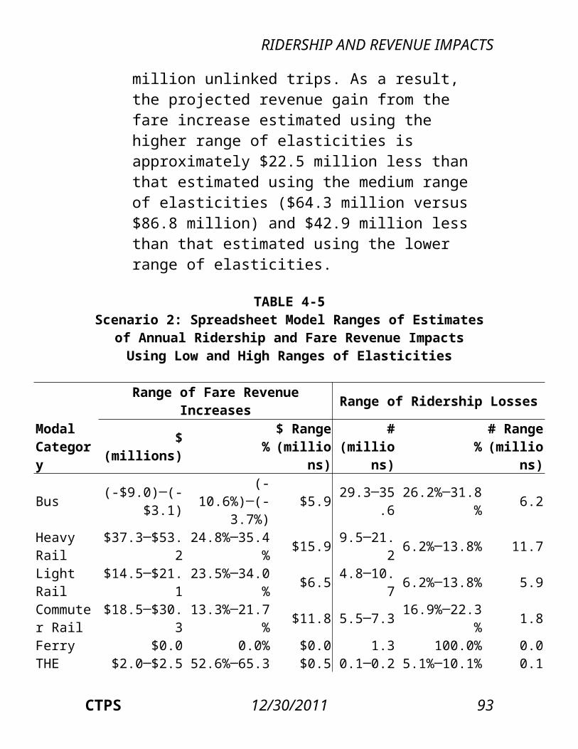
ENVIRONMENTAL JUSTICE IMPACTS
Scenario 2 are more than double those in Scenario 1. Interestingly, although Scenario 1 has the greater overall price increase, the non-EJ average fare is estimated to increase by a smaller percentage in Scenario 1 than Scenario 2. This is caused by the diversion of commuter rail riders to heavy and light rail in Scenario 1, as these riders seek a less costly mode of travel. In terms of comparing the impacts on EJ and non-EJ communities, Scenario 1 generally has smaller EJ impacts than non-EJ impacts for all metrics. In Scenario 2, EJ communities fare much better than non-EJ communities in terms of the increase in average fare and the decrease in transit trips, but EJ communities have greater increases in average walk-access and wait times.
6.2.2 HIGHWAY CONGESTION AND AIR QUALITY EQUITY METRICS
Table 6-3 and Table 6-4 present, for Scenario 1 and Scenario 2, respectively, the existing and projected measures of average vehicle-miles traveled (VMT) per square mile and average kilograms of carbon monoxide (CO) emissions per square mile. The first metric was used to represent impacts on local congestion, and the second was used to represent impacts on local air pollution. As shown in the table, the average existing-conditions measures of both VMT and CO emissions are greater for EJ communities than non-EJ communities. This is a reflection of the much greater traffic levels in the more urban areas, which is where EJ communities are typically located. In the urban fixed-route service area, EJ communities have existing averages for VMT and average CO per square mile that are more
98 12/30/2011 Boston Region MPO
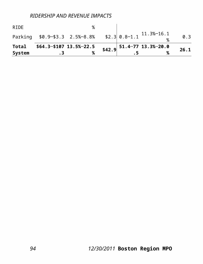
ENVIRONMENTAL JUSTICE IMPACTS
than twice the averages for non-EJ communities. In the commuter rail service area, this ratio is more than 2.75 for both metrics.Unlike the transit equity metrics, the highway congestion and air quality metrics show a greater negative impact on EJ communities compared to non-EJ communities, a further exacerbation of the difference in local congestion and air quality that already exists. In Scenario 1, for the commuter rail service area, the absolute increase in the average VMT per square mile for EJ communities is more than five times that for non-EJ communities, and the absolute increase in the average CO per square mile for EJ communities is more than six times that for non-EJ communities. Similar ratios hold for Scenario 2, and the increases are larger than those in Scenario 1. As percentage changes, Scenario 1 has slightly greater increases in both metrics for EJ communities compared to non-EJ communities, while Scenario 2 has much greater increases in both metrics for EJ communities compared to non-EJ communities.
6.2.3 ACCESSIBILITY EQUITY METRICS
Table 6-5 and Table 6-6 present, for Scenario 1 and Scenario 2, respectively, the existing and projected accessibility measures. Access to jobs is measured by the number of accessible jobs in the service employment category. The changes in accessibility to service jobs largely match those for retail and other jobs; therefore, service jobs are presented in the table as a proxy for all jobs. Access to healthcare is measured by the number of beds at accessible hospitals. Access to higher education is measured by the number of enrolled students at accessible
CTPS 12/30/2011 99
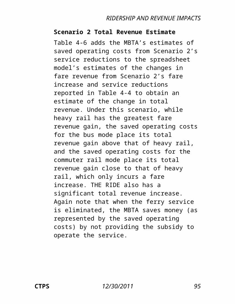
ENVIRONMENTAL JUSTICE IMPACTS
colleges. These metrics indicate the accessibility of EJ and non-EJ communities to high-demand destinations.As seen in the table, in both the commuter rail and urban fixed-route service areas, EJ communities have a greater level of existing access in terms of all three metrics compared to non-EJ communities. This basic difference between EJ and non-EJ accessibility is not projected to change in either Scenario 1 or Scenario 2. While accessibility is projected to decrease overall, the loss in access to jobs, healthcare, and higher education is estimated to be greater for non-EJ communities than EJ communities, in terms of both the absolute and percentage changes. Comparing the two scenarios, the decrease in accessibility is projected to be greater in Scenario 2 than Scenario 1.
6.2.4 SUMMARY OF EQUITY IMPACTS
In Scenario 1 and Scenario 2, the impacts on equity follow a similar pattern that depends on the metric. In general, for the metrics in which EJ communities have better existing “scores” than non-EJ communities, that is, for the transit and accessibility equity measures, both Scenario 1 and Scenario 2, while making the scores worse overall, degrade the scores less for EJ versus non-EJ communities. For example, the existing EJ average fare is less than the non-EJ
100 12/30/2011 Boston Region MPO
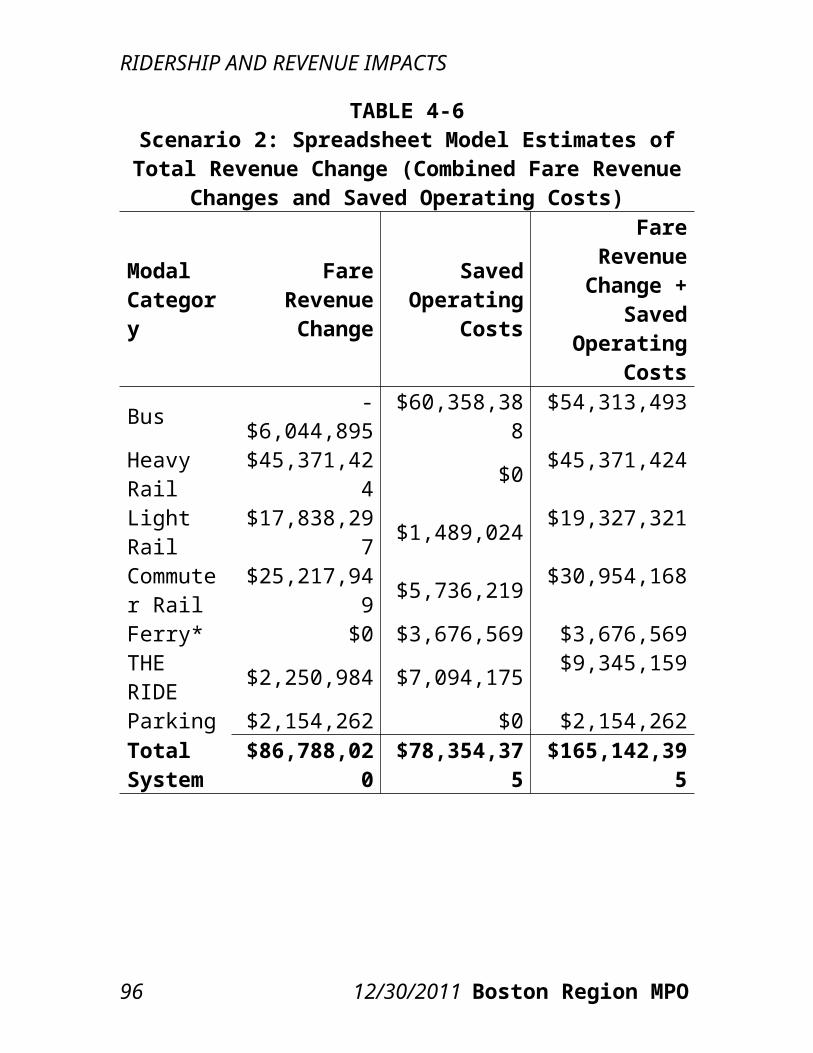
TABLE 6-3Scenario 1: Existing and Projected Measures of Highway Congestion and Air Quality
Equity Metrics
Existing Projected Absolute Change Percentage Change
Service Area Metric EJ Non-EJ EJ Non-EJ EJ Non-EJ EJ Non-EJ
Commuter Rail
Avg. VMT per Sq. Mile
40,123 14,375 40,529 14,446 +407 +71 +1.0% +0.5%
Avg. CO per Sq. Mile (kg)
457,055 164,662 462,295 165,497 +5,240 +835 +1.1% +0.5%
Urban Fixed-Route
Avg. VMT per Sq. Mile
54,112 25,848 54,904 26,087 +792 +240 +1.5% +0.9%
Avg. CO per Sq. Mile (kg)
617,539 292,673 627,913 295,619 +10,375 +2,946 +1.7% +1.0%
101 12/30/2011 Boston Region MPO

ENVIRONMENTAL JUSTICE IMPACTS
TABLE 6-4Scenario 2: Existing and Projected Measures of Highway Congestion and Air Quality
Equity Metrics
Existing Projected Absolute Change
Percentage Change
Service Area Metric EJ Non-EJ EJ Non-EJ EJ Non-EJ EJ Non-
EJCommuter Rail
Avg. VMT per Sq. Mile 40,123 14,375 40,676 14,467 +553 +92 +1.4% +0.6%
Avg. CO per Sq. Mile (kg) 457,055 164,662 464,096 165,749 +7,041 +1,087 +1.5% +0.7%
Urban Fixed-Route
Avg. VMT per Sq. Mile 54,112 25,848 55,199 26,181 +1,087 +337 +2.0% +1.3%
Avg. CO per Sq. Mile (kg) 617,539 292,673 631,582 296,757 +14,043 +4,085 +2.3% +1.4%
102 12/30/2011 Boston Region MPO
ENVIRONMENTAL JUSTICE IMPACTS
TABLE 6-5Scenario 1: Existing and Projected Measures of Accessibility Equity Metrics
Existing Projected Absolute Change
Percentage Change
Service Area Metric EJ Non-EJ EJ Non-EJ EJ Non-
EJ EJ Non-EJ
Commuter Rail Service Jobs 291,455 192,299 288,990 187,841 -2,466 -4,459 -0.8% -2.3%
Hospital Beds 3,053 2,009 3,023 1,955 -30 -55 -1.0% -2.7%
College Enrollment 45,575 33,790 45,360 33,394 -215 -396 -0.5% -1.2%
Urban Fixed-Route
Service Jobs 302,852 231,313 300,851 226,093 -2,001 -5,220 -0.7% -2.3%
Hospital Beds 3,171 2,419 3,140 2,365 -31 -55 -1.0% -2.3%
College Enrollment 46,552 40,560 46,360 40,124 -191 -435 -0.4% -1.1%
CTPS 12/30/2011 103
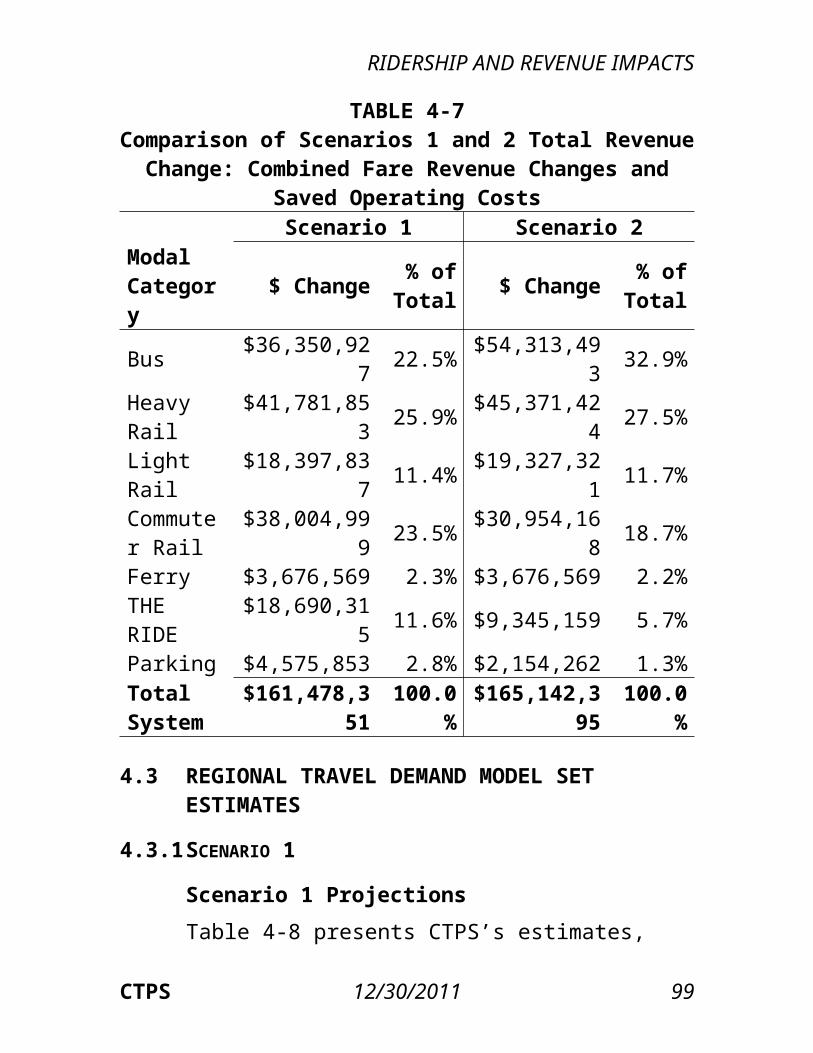
ENVIRONMENTAL JUSTICE IMPACTS
TABLE 6-6Scenario 2: Existing and Projected Measures of Accessibility Equity Metrics
Existing Projected Absolute Change
Percentage Change
Service Area Metric EJ Non-EJ EJ Non-EJ EJ Non-EJ EJ Non-
EJCommuter Rail Service Jobs 291,455 192,299 283,645 181,383 -7,811 -10,917 -2.7% -5.7%
Hospital Beds 3,053 2,009 2,974 1,876 -79 -133 -2.6% -6.6%
College Enrollment 45,575 33,790 45,347 33,297 -228 -493 -0.5% -1.5%
Urban Fixed-Route
Service Jobs 302,852 231,313 297,018 216,734 -5,834 -14,579 -1.9% -6.3%
Hospital Beds 3,171 2,419 3,094 2,280 -77 -139 -2.4% -5.8%
College Enrollment 46,552 40,560 46,406 39,949 -145 -611 -0.3% -1.5%
104 12/30/2011 Boston Region MPO
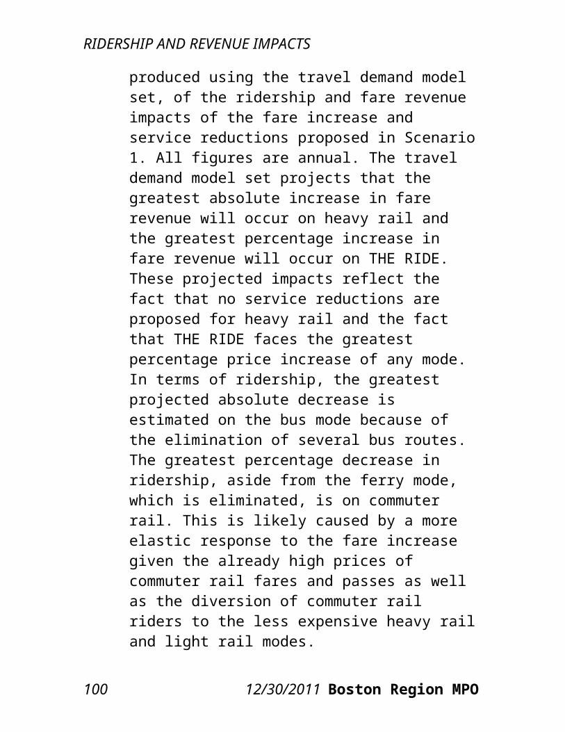
ENVIRONMENTAL JUSTICE IMPACTS
average fare and both scenarios result in greater absolute and percentage increases in the non-EJ average fare, further increasing the difference. For the metrics in which EJ communities have worse existing scores than non-EJ communities, that is, for the highway congestion and air quality equity measures, both scenarios result in larger negative impacts on EJ communities than non-EJ communities. As for differences between the impacts of Scenario 1 and Scenario 2, the transit equity metrics reflect a difference between the basic characteristics of the scenarios that has already been noted: Scenario 1 has a greater fare increase and smaller service reductions, while Scenario 2 has a smaller fare increase and greater service reductions. The increase in the EJ average fare is accordingly less in Scenario 2 than in Scenario 1, and the difference between the resulting EJ and non-EJ average fares in Scenario 2 is greater than the difference in Scenario 1. Again reflecting basic differences between the scenarios, Scenario 2 has greater increases in the average walk-access and wait times for EJ communities than Scenario 1 does. Scenario 2 also has a much greater estimated decrease in both EJ and non-EJ transit trips than Scenario 1.Similar to the pattern demonstrated by the transit equity metrics, in comparison to Scenario 1, Scenario 2 results in greater overall increases in congestion and CO emissions and greater decreases in access to jobs, hospitals, and educational opportunities for both EJ and non-EJ communities. In both scenarios, the increase in congestion and CO emissions is greater for EJ communities than non-EJ communities,
CTPS 12/30/2011 105
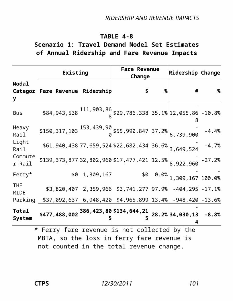
ENVIRONMENTAL JUSTICE IMPACTS
while the decrease in access affects a greater relative number of transit riders living in non-EJ communities.
106 12/30/2011 Boston Region MPO

ConclusionsThe means available to the MBTA for addressing the $161.0 million projected budget deficit for FY 2013 are limited to increasing fares and reducing service; the two proposed scenarios analyzed in this report offer a choice between different ways of combining those two means. Scenario 1 raises the majority of the needed revenue through a fare increase, with the remainder of the deficit being covered by reducing service. Scenario 2 is split approximately evenly between revenue gains from a fare increase and saved operating costs from service reductions.Closing the budget deficit employing only a fare increase or only service reductions is untenable. Modeling exercises done with the spreadsheet model show that it is not feasible to increase fares to an extent that would raise $161.0 million: the ridership losses estimated to result are so substantial under any fare increase above 60 percent that the fare revenue increases become minimal. Similarly, cutting $161.0 million from operating expenses is also infeasible, as the necessary service reductions would likely reduce ridership to such an extent that the already low average revenue per passenger would decrease even further.Scenarios 1 and 2 are projected to produce roughly
CTPS 12/30/2011 108
CONCLUSION
equivalent gains in revenue, and either would close the projected budget deficit. The sensitivity analysis using different fare elasticity values in the spreadsheet model shows that this model projects a greater range of potential fare revenue impacts for Scenario 1 than Scenario 2; however, in terms of range of results between the travel demand model and the spreadsheet model, Scenario 1 has a smaller range of estimated revenue impacts. Scenario 1 maintains most of the existing system while eliminating services with the greatest net cost (or subsidy) per passenger and increasing fares by the amount necessary to reach the revenue target. While this scenario reduces the systemwide net cost per passenger, in the long run it does not change the situation currently faced by the MBTA, namely, operating too many services that cost too much money given the size of the MBTA’s dedicated revenue stream. Scenario 2 essentially re-envisions the scope of the MBTA, streamlining its operations to focus on serving the most cost-efficient routes, which are largely in the urban core. However, Scenario 2 eliminates services in many areas where no other transit options exist and is projected to result in a greater ridership loss than Scenario 1.Neither fare increases nor service reductions present an appealing choice, but the primary methods that the MBTA has at its disposal for reducing deficits are these two measures, barring any additional sources of revenue. This report’s projections of the impacts of each scenario on ridership, revenue, air quality, and environmental justice communities will inform the Authority’s decision making. It is based on these data—and on a vision of what shape the MBTA will take in
109 12/30/2011 Boston Region MPO
CONCLUSIONS
the future—that a course of action must be chosen.
110 12/30/2011 Boston Region MPO
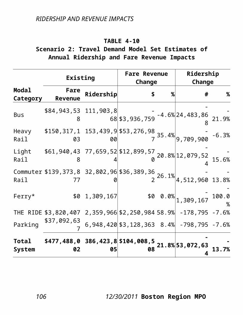
APPENDIX Spreadsheet Model Methodology
A.1 APPORTIONMENT OF EXISTING RIDERSHIPAutomated fare-collection (AFC) data are provided on a monthly basis, including subtotals of transactions (unlinked trips) for the various combinations of fare type, fare mode, and fare media (Table A-1).
CTPS 12/30/2011 A-1
APPENDIX: SPREADSHEET MODEL METHODOLOGY
TABLE A-1AFC Fare Categories
Fare TypeFare Mode Fare Media
Adult/Senior/TAP/Student/Free Single-Ride
CharlieCardCharlieTicketOnboard Cash
Adult/Senior/TAP/Student Transfer CharlieCardCharlieTicket
Short (fares below the full value) Single-Ride
Onboard Cash
Bus/Inner Express/Outer Express Pass CharlieCardCharlieTicket
LinkPass: Monthly/1-Day/7-Day Pass CharlieCardCharlieTicket
Commuter Rail Zone and Interzone/Commuter Boat Pass CharlieTicket
Senior/TAP/Student Pass CharlieCardCharlieTicket
AFC data are also provided at the modal level at which each transaction occurs. Table A-2 lists the modal and summary categories used in the Post–Fare Increase Impacts Analysis that was conducted for the 2007 MBTA fare increase.
A.2 PRICE ELASTICITY ESTIMATIONSubsequent to the 2007 fare increase, CTPS conducted a Post–Fare Increase Impacts Analysis, which was intended, in part, to test the accuracy of the elasticities used for the Pre–Fare Increase Impacts Analysis that had been conducted to project
A-2 12/30/2011 Boston Region MPO
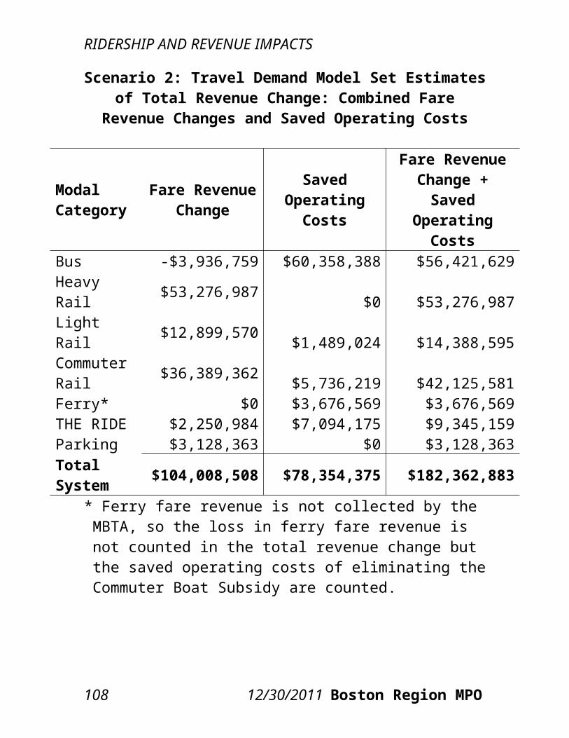
APPENDIX: SPREADSHEET MODEL METHODOLOGY
changes in ridership that would result from higher fares.
TABLE A-2AFC Modal Categories
Mode AFC EquipmentBus/ Trackless Trolley
Local Bus FareboxInner Express Bus FareboxOuter Express Bus Farebox
Rapid Transit
Red, Orange, Blue, Green, Silver Waterfront Subway Faregate
Silver Line Waterfront Surface FareboxSilver Line Washington Street FareboxGreen Line Surface B, C, D, E Farebox/ValidatorMattapan High-Speed Line Farebox
The price elasticities used in the spreadsheet model for the present analysis of a potential 2012 fare increase are based on the elasticities that the 2007 Post–Fare Increase Impacts Analysis found to have been demonstrated in the actual ridership impacts of the 2007 increase. In that analysis, CTPS used the percentage change in trips and price for each fare payment category and calculated the price elasticities. While the elasticities of smaller, individual categories were likely unreliable, CTPS was able to determine realistic elasticity figures for larger and more general categories. Those figures were generally found to be more elastic than the elasticity inputs used in the 2007 Pre–Fare Increase Impacts Analysis, which had underestimated the ridership loss from the 2007 fare increase.It is admittedly difficult to isolate the effects of price elasticity on changes in demand. Over the course of a
CTPS 12/30/2011 A-3
APPENDIX: SPREADSHEET MODEL METHODOLOGY
year (in which time it is assumed that the effects of price changes are largely internalized by the population), economic, demographic, and other factors may play as much, if not more, of a role in influencing transit demand than price. Indeed, the upcoming year promises to be characterized by significant uncertainty with regard to these larger trends.Table A-3 presents the elasticities used in the spreadsheet model categorized by type of fare payment and mode. The types of fare payment are divided into two categories: “single-ride” (or pay-per-ride) and “pass.” Elasticities are further divided into several modal categories: bus, subway, surface light rail, commuter rail, ferry, and THE RIDE. All modes have both single-ride and pass price elasticities except for THE RIDE, which has only single-ride customers.Based on the 2007 Post–Fare Increase Impacts Analysis, single-ride price elasticities are assumed to be as or less elastic than pass price elasticities, signifying that the spreadsheet model projects single-ride customers to be slightly less responsive to changes in price than pass customers. The least elastic of the single-ride modal price elasticities is that for THE RIDE, followed by bus, parking, subway and surface light rail, ferry, and, finally, commuter rail. Elasticities for seniors and students are also assumed to be less elastic than those for adults. For pass price elasticities, commuter rail is the least elastic of the modes. Express bus passes are the next-least elastic, followed by the Senior and Student Pass, the Commuter Boat Pass, the monthly Bus Pass and LinkPass, and the 1- and 7-Day LinkPasses.
A-4 12/30/2011 Boston Region MPO
APPENDIX: SPREADSHEET MODEL METHODOLOGY
TABLE A-3: Single-Ride and Pass Elasticities by Fare Type and Mode
Fare Type/Mode ElasticitySingle-RideBus -0.20 Adult -0.20 Senior -0.15 Student -0.15Subway -0.25 Adult -0.25 Senior -0.15 Student -0.15Surface Light Rail -0.25
Adult -0.25 Senior -0.20 Student -0.20Commuter Rail -0.35 Adult -0.35 Half-Fare -0.25Ferry -0.30 Adult -0.30 Half-Fare -0.20THE RIDE -0.12Parking -0.20Pass Bus -0.30Inner Express -0.20Outer Express -0.20LinkPass -0.301-Day LinkPass -0.357-Day LinkPass -0.35Commuter Rail -0.10Ferry -0.25Senior -0.15
CTPS 12/30/2011 A-5
APPENDIX: SPREADSHEET MODEL METHODOLOGY
Student -0.15
A.3 PRICE ELASTICITYPrice elasticity is the measure of either the expected or observed rate of change in ridership relative to a change in fares if all other factors remain constant. On a traditional demand curve that describes the relationship between price, on the y-axis, and demand, on the x-axis, elasticities are equivalent to the slope along that curve. Therefore, price elasticities are generally expected to be negative, meaning that a positive price increase will lead to a decrease in demand (with a price decrease having the opposite effect). The more negative (farther from zero) the value of a price elasticity, the larger the projected decrease in demand. More negative price elasticities are said to be relatively “elastic,” while smaller negative values, closer to zero, are said to be relatively “inelastic.” Thus, if the price elasticity of the demand for transit is assumed to be elastic, a given fare increase would cause a greater loss of ridership than if demand were assumed to be inelastic.At its most elemental level, the spreadsheet model is based on this simple price elasticity relationship, and requires four inputs: original demand, original fare, new fare, and the price elasticity. The formula for calculating new demand is:New Demand = Original Demand × [1 + Price Elasticity × (New Fare / Old Fare - 1)] As an example, assume that original demand equals 100 and that the impact that is being modeled is a 10 percent fare increase from $1.00 to $1.10. Also assume that the price elasticity is -0.25.
A-6 12/30/2011 Boston Region MPO
APPENDIX: SPREADSHEET MODEL METHODOLOGY
New Demand = 100 × [1 + -0.25 × ($1.10 / $1.00 - 1)] = 97.50Thus, using an elasticity of -0.25, a simple price elasticity model projects that a 10 percent increase in price will lead to a 2.50 percent decrease in demand. With the fare increased from $1.00 to $1.10, this simplified model projects a 7.25 percent increase in revenue ($100.00 to $107.25).
A.4 DIVERSION FACTORSThe spreadsheet model’s calculations are more complex—and therefore more accurate—than a simple elasticity calculation. Its greater complexity lies in its use of ridership diversion factors. Diversion factors reflect estimates of the likelihood of a switch in demand for one type of good to another as a result of a change in the relative prices of those goods. In the spreadsheet model, such factors are used for estimating the number of riders choosing to divert from one fare/modal category to another.Using cash tickets and passes as an example, assume that original ridership equals 100 cash riders and 1,000 pass riders. Also assume that original prices for cash tickets and passes equal $2.00 and $100.00, respectively, and that the new prices are set at $1.50 for cash tickets and $50.00 for passes, representing price decreases of 25 percent and 50 percent. Assume that the cash price elasticity equals -0.35 and the pass price elasticity equals -0.25. Finally, assume a cash-to-pass diversion factor of 0.05 and a pass-to-cash diversion factor of 0.00. In these calculations of diversion, one of the diversion factors must always equal zero, indicating that the diversion is expected to occur in one direction only.
CTPS 12/30/2011 A-7
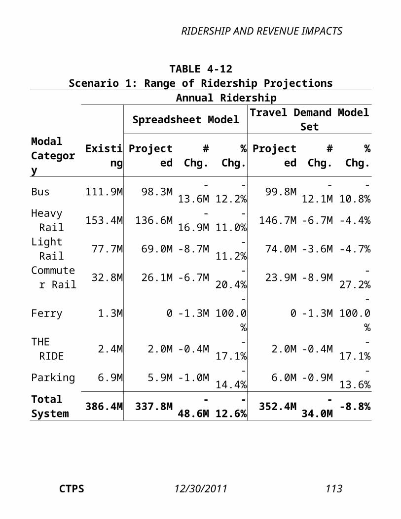
APPENDIX: SPREADSHEET MODEL METHODOLOGY
The direction of the diversion, and thus the diversion factor value, depends on the respective price changes of the two types of goods. The category with the greater relative price decrease (or the smaller relative price increase)—in this case, pass, for which the price decrease is 50 percent, compared to 25 percent for cash tickets—would gain riders from the diversion, while the other category, with the smaller relative price decrease (or the greater relative price increase), would lose riders from the diversion. One would therefore expect that cash customers would switch to passes, but not that pass customers would switch to cash tickets: hence the 0.05 cash-to-pass and 0.00 pass-to-cash diversion factors.The diversion factors essentially work to redistribute demand between the two categories after the respective price elasticities have been applied. For instance, after the cash fare is decreased from $2.00 to $1.50, the projected effect of price elasticity is that cash demand grows to 108.75 riders. Similarly, the pass price decrease from $100 to $50 leads to a projected increase in pass demand, due to price elasticity, to 1,125, for a total ridership of 1,233.75. However, the percentage decrease in the pass price is larger than that in cash fares (50 percent versus 25 percent); thus, one would expect some customers to switch from cash to pass. This diversion is estimated by taking the ratio of new-to-original cash prices ($1.50/$2.00, or 75 percent), dividing that ratio by the ratio of new-to-original pass prices ($50/$100, or 50 percent), subtracting 1, and multiplying this result by the 0.05 diversion factor and the price-elasticity-estimated cash ridership (108.75). The number of riders “diverted” from cash to pass
A-8 12/30/2011 Boston Region MPO
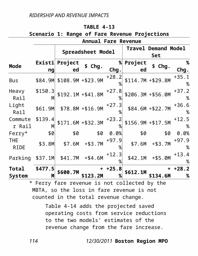
APPENDIX: SPREADSHEET MODEL METHODOLOGY
equals 2.72, giving final ridership estimates of 106.03 for cash and 1,127.72 for pass (still summing, of course, to a total ridership of 1,233.75). New Cash Demand (Price Effect), Cp = 100 [1 + -0.35 × ($1.50 / $2.00 - 1)] = 108.75New Pass Demand (Price Effect), Pp = 1,000 [1 + -0.25 × ($50 / $100 - 1)] = 1,125.00Total Demand = 108.75 + 1,125.00 = 1,233.75Diverted Riders from Cash to Pass =
[( $ NewCash /$OldCash$ NewPass /$OldPass )−1]×Diversion×CP
Diverted Riders from Cash to Pass =
[( $ 1. 50 /$ 2. 00$50 /$ 100 )−1]×0. 05×CP
= 2.72New Cash Demand = Cp – Diverted Riders from Cash to Pass = 106.03New Pass Demand = Pp + Diverted Riders from Cash to Pass = 1,127.72Total Demand = 106.03 + 1,127.72 = 1,233.75In the present impact analysis, diversion factors were used to estimate diversions between cash and pass categories (for example, bus cash versus bus pass, subway cash versus subway pass, etc.), between bus and rapid transit (in other words, bus cash versus subway cash, bus pass versus subway pass, etc.), and between CharlieTicket/onboard cash and CharlieCard (for example, bus onboard cash versus bus CharlieCard, subway CharlieTicket versus subway CharlieCard, etc.). The factors were determined based on the 2007 Post–Fare Increase
CTPS 12/30/2011 A-9
APPENDIX: SPREADSHEET MODEL METHODOLOGY
Impacts Analysis.
A.5 EXAMPLES OF RIDERSHIP AND REVENUE CALCULATIONS
A.5.1 SIMPLE EXAMPLE: PRICE ELASTICITY ONLY
Original Demand: 100,000 Original Fare: $1.50 New Fare: $2.50 Price Elasticity: -0.05
New Demand = 100,000 [1 + -0.05 × ($2.50 / $1.50 - 1)] = 96,666.67
A-10 12/30/2011 Boston Region MPO
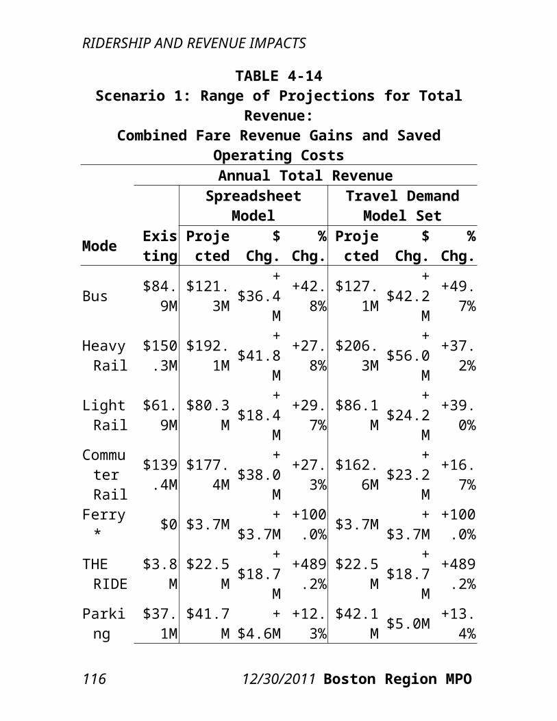
APPENDIX: SPREADSHEET MODEL METHODOLOGY
A.5.2 MORE COMPLEX EXAMPLE: PRICE ELASTICITY PLUS RIDERSHIP DIVERSION – CASH TO PASS
Original Cash Demand: 10,000 Original Cash Fare: $2.25 New Cash Fare: $2.00 Cash Price Elasticity: -0.30
New Cash Demand (Price Effect), Cp = 10,000 [1 + -0.30 × ($2.00 / $2.25 - 1)] = 10,333.33
Original Pass Demand: 5,000 Original Pass Price: $71.00 New Pass Price: $50.00 Pass Price Elasticity: -0.25
New Pass Demand (Price Effect), Pp = 5,000 [1 + -0.25 × ($50 / $71 - 1)]
= 5,369.72
Total Demand = 10,333.33 + 5,369.72 = 15,703.05
Percentage Change in Cash Price: $2.25 to $2.00: -11%
Percentage Change in Pass Price: $71 to $50: -30%
Cash to Pass Diversion Factor: 0.05 Pass to Cash Diversion Factor: 0.00
Diverted Riders from Cash to Pass =
[( $ 2. 00 /$2 .25$50 /$71 )−1]×0 .05×CP
= 135.48
New Cash Demand = Cp – Diverted Riders from Cash to Pass = 10,197.85
CTPS 12/30/2011 A-11
APPENDIX: SPREADSHEET MODEL METHODOLOGY
New Pass Demand = Pp + Diverted Riders from Cash to Pass = 5,505.20
Total Demand = 10,197.85 + 5,505.20 = 15,703.05
A.5.3 ADDITIONALLY COMPLEX EXAMPLE: PRICE ELASTICITY PLUS TWO RIDERSHIP DIVERSIONS – SINGLE-RIDE CHARLIECARD (SR-CC) TO PASS, AND SINGLE-RIDE CHARLIETICKET (SR-CT) TO SINGLE-RIDE CHARLIECARD (SR-CC)
Original Single-Ride CharlieCard Demand: 10,000
Original Single-Ride CharlieCard Fare: $2.20 New Single-Ride CharlieCard Fare: $3.50 Single-Ride CharlieCard Price Elasticity: -0.30
New SR-CC Demand (Price Effect), CCp = 10,000 [1 + -0.30 × ($3.50 / $2.20 - 1)] = 8,227.27
Original Pass Demand: 50,000 Original Pass Price: $71.00 New Pass Price: $90.00 Pass Price Elasticity: -0.25
New Pass Demand (Price Effect), Pp = 50,000
[1 + -0.25 × ($90 / $71 - 1)] = 46,654.93
Original Single-Ride CharlieTicket Demand: 5,000
Original Single-Ride CharlieTicket Fare: $2.50 New Single-Ride CharlieTicket Fare: $4.50 Single-Ride CharlieTicket Price Elasticity: -0.30
A-12 12/30/2011 Boston Region MPO
APPENDIX: SPREADSHEET MODEL METHODOLOGY
New SR-CT Demand (Price Effect), CTp = 5,000 [1 + -0.30 × ($4.50 / $2.50 - 1)] = 3,800.00
Total Demand = 8227.27 + 46,654.93 + 3,800.00 = 58,682.20
Percentage Change in Single-Ride CharlieCard Fare: $2.20 to $3.50: 59.09%
Percentage Change in Pass Price: $71 to $90: 26.76%
Percentage Change in Single-Ride CharlieTicket Fare: $2.50 to $4.50: 80.00%
Single-Ride CharlieCard to Pass Diversion Factor: 0.05
Pass to Single-Ride CharlieCard Diversion Factor: 0.00
Single-Ride CharlieCard to Single-Ride CharlieTicket Diversion Factor: 0.00
Single-Ride CharlieTicket to Single-Ride CharlieCard Diversion Factor: 0.25
Diverted Riders from SR-CC to Pass =
[( $ 3. 50 /$2 .20$90 /$71 )−1]× 0.05 × CCp = 104.92
Diverted Riders from SR-CT to SR-CC =
[( $ 4 .50 /$ 3 .50$3 .50 /$2 .20 )−1] × 0.25 × CTp = 79.80
New Single-Ride CharlieCard Demand = CCp – Diverted Riders from SR-CC to Pass + Diverted Riders from SR-CT to SR-CC = 8,202.15
New Pass Demand = Pp + Diverted Riders from SR-CC to Pass = 46,759.85
CTPS 12/30/2011 A-13
APPENDIX: SPREADSHEET MODEL METHODOLOGY
New Single-Ride CharlieTicket Demand = CTp – Diverted Riders from SR-CT to SR-CC = 3,720.20
Total Demand = 8,202.15 + 46,759.85 + 3,720.20 = 58,682.20
Note that as each additional ridership diversion factor is introduced, and more and more cells in the spreadsheet become linked, the complexity of the spreadsheet model increases significantly. However, the basics of the methodology explained above with regard to price elasticities and ridership diversion factors remain the same.
A-14 12/30/2011 Boston Region MPO