chapter 3: examining relationships ap statistics
TRANSCRIPT

Chapter 3: Examining Chapter 3: Examining RelationshipsRelationships
AP Statistics

IntroductionIntroduction
Quantitative Variables vs. Categorical Variables◦Quantitative Variables take numerical values
for which arithmetic operations such as adding and subtracting make sense.
◦Categorical Variables place an individual into one of several groups or categories.
Sometimes we want to know more than this though; sometimes we want to know if the two things are related or if one is causing the other to happen.

IntroductionIntroduction
Response Variable measures an outcome of a study.
Explanatory Variables attempt to explain the observed outcomes.
Explanatory Variables sometimes called independent variables.
Response Variables sometimes called dependent variables.
The response variable depends on the explanatory variable.

IntroductionIntroduction
Example 3.1: Effect of Alcohol on Body Temperature◦Alcohol has many effects on the body. One
effect is a drop in body temperature. To study this effect, researchers give several different amounts of alcohol to mice, then measure the change in each mouse’s body temperature in the 15 minutes after taking the alcohol.
◦Explanatory Variable?◦Response Variable?

IntroductionIntroduction
Example 3.2: Are SAT Math and Verbal Scores Linked ◦Jim wants to know how the median SAT Math and
Verbal scores in the 50 states (plus the District of Columbia) are related to each other. He doesn’t think that either score explains or causes the other. Jim has two related variables , and neither is an explanatory variable.Julie looks at the same data. She asks, “Can I
predict a state’s median SAT Math score if I know its median SAT Verbal score?”

IntroductionIntroduction
Example 3.2 ContinuedJulie is treating the Verbal score as the
explanatory variable and the Math score as the response variable.
Calling one explanatory and one response doesn’t necessarily mean that one causes the other.

3.1 Scatterplots 3.1 Scatterplots
A scatterplot shows the relationship between two quantitative variables measured on the same individuals.◦The values of one variable appear on the
horizontal axis, and the values of the other appear on the vertical axis.
◦Each individual in the data appears as the point in the plot fixed by the values of both variables for the individual.

ScatterplotsScatterplots
Example 3.3 State SAT Scores◦Using Table 1.15 on page 70. Create a
scatterplot showing the relationship between the Percent of graduates taking the SAT and the State Average SAT Math Score.

Example 3.3Example 3.3

ScatterplotsScatterplots
How do we describe distributions? What four things do we consider?◦Shape◦Center ◦Spread◦Outliers

ScatterplotsScatterplots
Scatterplots have characteristics used to describe them as well:◦Overall pattern and deviations from the
pattern.Overall pattern is described by:
◦Form◦Direction◦Strength of the Relationship
Deviations from the Pattern◦Outliers

ScatterplotsScatterplots
Form - There are two distinct clusters with lots of space between them. ACT is taken more in some states while states with high SAT participation have lower SAT Math scores.
Direction – States in which a higher percentage take the SAT tend to have lower SAT Math scores, negative association.
Strength – Not strong, we will come up with a measure for strength later.

ScatterplotsScatterplots
Two variables are positively associated when above-average values of one tend to accompany above-average values if the other and below-average values also tend to occur together.
Two variables are negatively associated when above-average values of one tend to accompany below-average values of the other and vice versa.
Example 3.4 Heating Degree-DaysExample 3.4 Heating Degree-Days
The Sanchez household is about to install solar panels to reduce the cost of heating their house. In order to see how much the solar panels help, they record their consumption of natural gas before the panels are installed. Gas consumption is higher in cold weather, so the relationship between outside temperature and gas consumption is important. Table 3.1.

Example 3.4Example 3.4
Explanatory Variable?Response Variable?

Example 3.4 Heating Degree-DaysExample 3.4 Heating Degree-Days

Example 3.4 Example 3.4
Form? Direction?Strength?

ScatterplotsScatterplots
Tips for Drawing Scatterplots◦Scale the horizontal and vertical axes. The
intervals must be uniform like a histogram. If the axis does not begin at zero use a symbol on the axis to denoted the break.
◦Label both axes.◦If given a grid adopt a scale that uses the
entire grid.◦Title the scatterplot.
3.1 Homework3.1 Homework
3.1 through 3.4 all3.6, 3.7 all3.9, 3.10, 3.11 allRead section 3.1 and the introduction to
Chapter 3.3.11 is not linear.

ScatterplotsScatterplots
When showing categories, use different symbols on scatterplots to denote the categories. See Example 3.5 and 3.6.
3.2 Correlation3.2 Correlation
We say a graph has a strong correlation if the points lie close to a line, and weak if the points are scattered about a line.
Look at Figure 3.8…two depictions of the same data, the scale of a graph can confuse our eyes about the strength of data so we need a measurement for strength.

3.2 Correlation3.2 Correlation
The correlation measures the direction and strength of the linear relationship between two quantitative variables.
Correlation is usually written as r.
y
i
x
i
s
yy
s
xx
nr
1
1

3.2 Scatterplots3.2 Scatterplots
y
i
x
i
s
yy
s
xx
nr
1
1
The mean of the x’s is x bar and the mean of the y’s is y bar.The standard deviation of the x’s is s sub x and the standard deviation of the y’s is s sub y.x sub i denotes each of the individual x’s andy sub i denotes each of the individual y’s.

Exercise 3.24Exercise 3.24
3.24 Classifying Fossils◦The measurements of the lengths of two bones
in five fossils of the extinct beast Arcaeopteryx:
Femur 38 56 59 64 74
Humerus 41 63 70 72 84

Exercise 3.24◦A) Find the correlation r step-by-step. That is
find the mean and standard deviation of the femur lengths and the humerus lengths. Then find the five standardized values for each varaible and use the formula for r.

ScatterplotsScatterplots
Facts About Correlation◦Correlation makes no distinction between
explanatory and response variables. It makes no difference which variable you call x and which you call y in calculating the correlation.
◦Correlation requires that both variables be quantitative, so that it makes sense to do the arithmetic indicated by the formula r. We cannot calculate a correlation between incomes of a group of people and what city they live in, because city is a categorical variable.

ScatterplotsScatterplots
Facts About Correlation◦Because r uses standardized units of
measurement, its value will not change if we change the units of measurement. r has no unit of measurement, it is just a number.
◦Positive r indicates a positive association between the variables and a negative r indicates a negative association,

ScatterplotsScatterplots
Facts About Correlation◦Correlation is always between -1 and 1. r= -1
and r = 1 means that all points lie on a straight line. The closer to 1 or -1 the stronger the relationship. The closer to zero the weaker the relationship.
◦Correlation is used only for linear relationships not curved relationship.

ScatterplotsScatterplots
Facts About Correlation◦Like the mean and standard deviation, the
correlation is not resistant: r is strongly affected by a few outlying observations. Use r with caution when outliers appear in a scatterplot.
◦Figure 3.9
ScatterplotsScatterplots
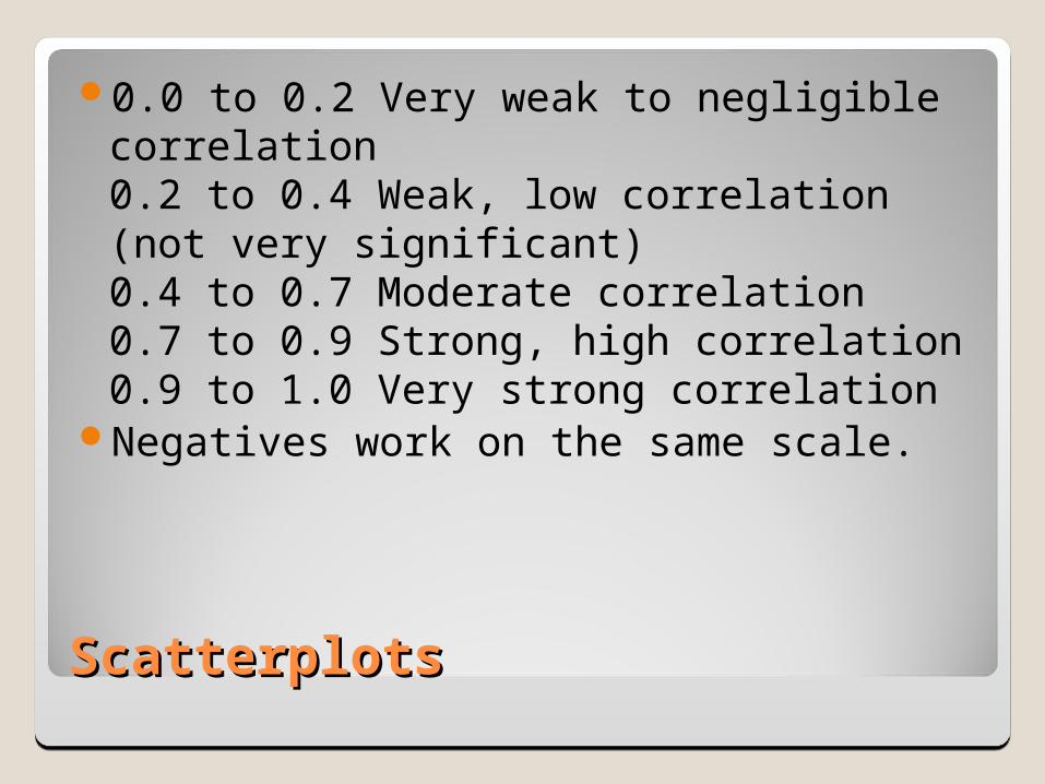
0.0 to 0.2 Very weak to negligible correlation0.2 to 0.4 Weak, low correlation (not very significant)0.4 to 0.7 Moderate correlation0.7 to 0.9 Strong, high correlation0.9 to 1.0 Very strong correlation
Negatives work on the same scale.

3.3 Least-Squares Regression3.3 Least-Squares Regression
Correlation measures the strength and direction of the linear relationship between any two variables.
Least-Squares regression is a method for finding a line that summarizes the relationship between two variables.

3.3 Least-Squares Regression3.3 Least-Squares Regression
A regression line is a straight line that describes how a response variable y changes as an explanatory variable x changes.
Regression lines are used to predict the value of y for a given value of x.
Regression requires an explanatory variable and a response variable.

3.3 Least-Squares Regression Model, LSRL3.3 Least-Squares Regression Model, LSRL
Example 3.8 Predicting Natural Gas Consumption
Read and summarize the example with a partner.

3.3 Least-Squares Regression3.3 Least-Squares Regression
error = observed – predictederror = y - ỹThe least squares regression line makes
the sums of the squares of these distances as small as possible.

3.3 Least-Squares Regression3.3 Least-Squares Regression
Figure 3.11bTake 2 minutes and summarize how this
represents a least – squares idea.

3.3 Least-Squares Regression3.3 Least-Squares Regression
Equation of the least squares line:We have data on an explanatory variable
x and a response variable y for n individuals.
From the data, calculate the means and and the standard deviations sx and sy of the two variables and their correlation r.
x
y

3.3 Least-Squares Regression3.3 Least-Squares Regression
The least squares regression line is ◦ỹ = a + bx
The slope
y – intercept
x
y
s
srb
xbya
3.3 Least- Squares Regression3.3 Least- Squares Regression
y is the observed value and ỹ is the predicted value.
Every least squares regression line goes through the point .
),( yx

3.3 Least-Squares Regression3.3 Least-Squares Regression
Example 3.9Take 3 minutes with a partner. Be able to
summarize this example for the class.

3.3 Least-Squares Regression3.3 Least-Squares Regression
TI-84 CommandsUse the catalog feature to ensure
Diagnostics On. This will ensure that you see r and r2.
Put data into List 1 and List 2Stat Calc option 8 linear regression
◦ y = a + bxLin Reg (a + bx) L1, L2, Y1 will graph your
linear regression line.Round a and b to four decimal places.

3.3 Least-Squares Regression3.3 Least-Squares Regression
The slope of the regression line b, is the amount of change in ỹ when x increases by 1.
The intercept is the ỹ value when x = 0.Plot two points at the extremes of the x-
values we know against their ỹ values.

3.3 Least-Squares Regression3.3 Least-Squares Regression
The role of r2
Read Example 3.10 with a partner and be ready to discuss in 5 minutes.

3.3 Least-Squares Regression3.3 Least-Squares Regression
SST
SSESSTr
yySSE
yySST
2
2
2
3.3 Least-Squares Regression3.3 Least-Squares Regression
r2 is the proportion of the total sample variability that is explained by the least-squares regression of y on x.
r2 is the coefficient of determination.SST is the total sample variation of the
observations about the mean of the y’s.SSE is the remaining unexplained
sample variability after fitting the line of regression.

3.3 Least-Squares Regression 3.3 Least-Squares Regression
Example 3.11 Read through with a partner and be ready to discuss in 5 minutes.

3.3 Least-Squares Regression3.3 Least-Squares Regression
Facts about Least-Squares Regression◦Fact 1 The distinction between explanatory and
response variables is essential in regression.◦Example 3.12 Read and be able to explain.◦Fact 2 There is a close connection between
correlation and the slope of the least-squares regression line. A change of one standard deviation in x
corresponds to a change of r standard deviations in y
x
y
s
srb
3.3 Least –Squares Regression3.3 Least –Squares Regression
Facts about least-squares regression◦Fact 3 The least squares regression line always
passes through
◦Fact 4 The coefficient of determination r2 is the fraction of the variation in the values of y that is explained by the least-squares regression of y on x.
),( yx