chapter 2 examining relationships between variables
TRANSCRIPT

Math 115 N. Psomas Probability & Statistics
Copyright (c), 2012 by Nikos Psomas Page | 1
CHAPTER 2
Examining Relationships between variables.
Contents Introduction .............................................................................................................................................. 2
A. Scatterplots ............................................................................................................................................... 2
Interpreting Scatterplots ........................................................................................................................... 3
Common types of association between two variables: ............................................................................ 4
Types of linear association ........................................................................................................................ 5
The Linear Correlation Coefficient (r) ....................................................................................................... 6
B. Regression Lines ........................................................................................................................................ 7
The least-squares regression line ............................................................................................................. 7
How to plot the least-squares regression line .......................................................................................... 7
Interpretation of Regression ..................................................................................................................... 8
The role of r in regression ......................................................................................................................... 8
The role of r2 in regression ........................................................................................................................ 9
Residuals ................................................................................................................................................. 10
Residual plot ........................................................................................................................................... 11
Outliers and influential observations in the regression setting .............................................................. 12
Extrapolation ........................................................................................................................................... 12
Math 115 N. Psomas Probability & Statistics
Copyright (c), 2012 by Nikos Psomas Page | 2
Introduction
Here we look at relationships among several variables. Even though it is possible to analyze the relationship between any number of variables, we will only consider the case of two variables.
A. Scatterplots
The most effective way to display the relationship between two quantitative variables, is a scatterplot.
In a scatterplot the values of one variable appear on the horizontal axis, and the values of the other variable appear on the vertical axis. Each “case” - ordered pair of numbers - in the data appears as the point in the plot whose coordinates are the values of the variables for that “case”.
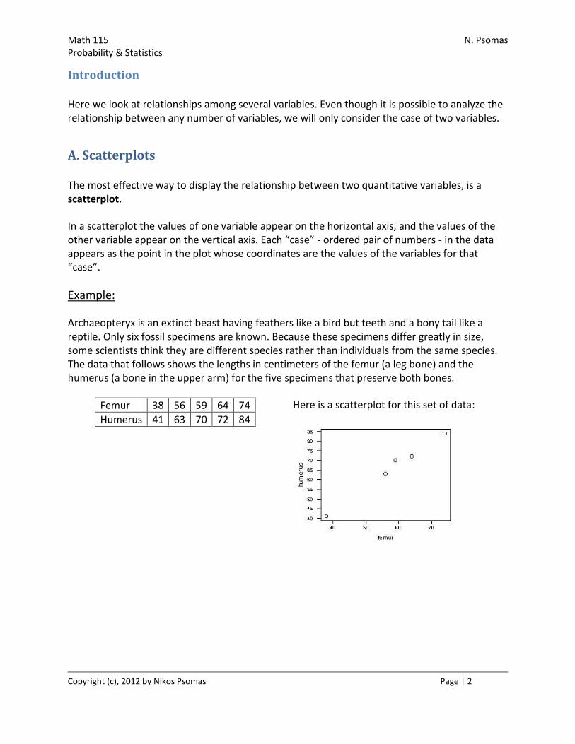
Example:
Archaeopteryx is an extinct beast having feathers like a bird but teeth and a bony tail like a reptile. Only six fossil specimens are known. Because these specimens differ greatly in size, some scientists think they are different species rather than individuals from the same species. The data that follows shows the lengths in centimeters of the femur (a leg bone) and the humerus (a bone in the upper arm) for the five specimens that preserve both bones.
Femur 38 56 59 64 74
Humerus 41 63 70 72 84
Here is a scatterplot for this set of data:

Math 115 N. Psomas Probability & Statistics
Copyright (c), 2012 by Nikos Psomas Page | 3
NOTES:
Analyzing the relationship between two variables may be done for two reasons;
1. To explore the nature of the relationship alone, or 2. To find out whether one variable can explain changes in the other.
In the second case it is essential that we classify the two variables into response and explanatory.
1. Response variable (y) ...........measures an outcome 2. Explanatory variable (x) .......attempts to explain the observed outcomes
In the first case the distinction between response and explanatory is not essential. Take a look at another example. Here we look at the relationship between price and mileage of a 3-series BMW. Notice that the direction of the association does not change if the two variables switch roles.
Interpreting Scatterplots
1. Look for an overall pattern. 2. Look for the form, direction, and strength of the relationship. 3. Look for outliers
Math 115 N. Psomas Probability & Statistics
Copyright (c), 2012 by Nikos Psomas Page | 4
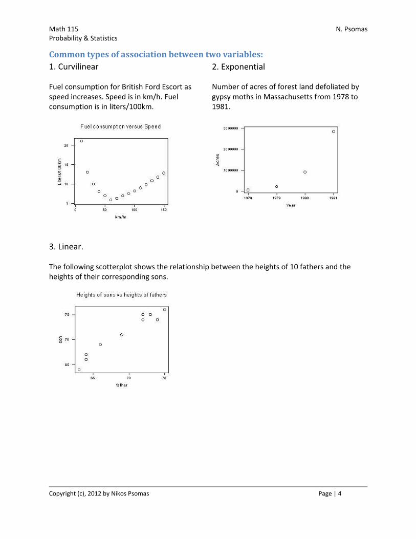
Common types of association between two variables:
1. Curvilinear
Fuel consumption for British Ford Escort as speed increases. Speed is in km/h. Fuel consumption is in liters/100km.
2. Exponential
Number of acres of forest land defoliated by gypsy moths in Massachusetts from 1978 to 1981.
3. Linear.
The following scotterplot shows the relationship between the heights of 10 fathers and the heights of their corresponding sons.
Math 115 N. Psomas Probability & Statistics
Copyright (c), 2012 by Nikos Psomas Page | 5
Types of linear association
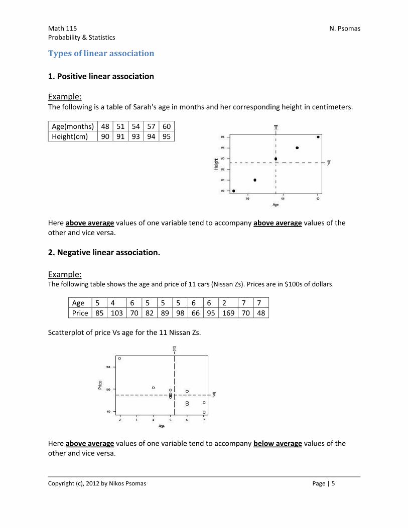
1. Positive linear association
Example: The following is a table of Sarah's age in months and her corresponding height in centimeters.
Age(months) 48 51 54 57 60
Height(cm) 90 91 93 94 95
Here above average values of one variable tend to accompany above average values of the other and vice versa.
2. Negative linear association. Example: The following table shows the age and price of 11 cars (Nissan Zs). Prices are in $100s of dollars.
Age 5 4 6 5 5 5 6 6 2 7 7
Price 85 103 70 82 89 98 66 95 169 70 48
Scatterplot of price Vs age for the 11 Nissan Zs.
Here above average values of one variable tend to accompany below average values of the other and vice versa.
Math 115 N. Psomas Probability & Statistics
Copyright (c), 2012 by Nikos Psomas Page | 6
The Linear Correlation Coefficient (r)
The Linear Correlation Coefficient ( r ) measures the strength and direction of the linear relationship between two quantitative variables.
The formula for computing r is:
or
Facts About r
1. r measures the strength of a linear(only) relation between two quantitative variables. 2. r is strongly affected by outliers 3. r ignores the distinction between response and explanatory variables 4. r is not affected by changes in the unit of measurement 5. a positive value of r means a positive association between the two variables and a
negative value of r means negative association between the variables
Math 115 N. Psomas Probability & Statistics
Copyright (c), 2012 by Nikos Psomas Page | 7
B. Regression Lines
In regression we study the association between two variables in order to explain the values of one from the values of the other (i.e., make predictions). In regression the distinction between Response and Explanatory is important. It determines which of the two variables is used as a predictor for values of the other.
When there is a linear association between two variables, then a straight line equation can be used to model the relationship.
The least-squares regression line
A regression line is a line that best describes the linear relationship between the two variables, and it is expressed by means of an equation of the form:
y = mx + b
Once the equation of the regression line is established, we can use it to predict values of the response variable for given values of the explanatory.
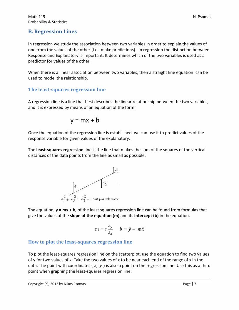
The least-squares regression line is the line that makes the sum of the squares of the vertical distances of the data points from the line as small as possible.
The equation, y = mx + b, of the least squares regression line can be found from formulas that give the values of the slope of the equation (m) and its intercept (b) in the equation.
How to plot the least-squares regression line
To plot the least-squares regression line on the scatterplot, use the equation to find two values of y for two values of x. Take the two values of x to be near each end of the range of x in the data. The point with coordinates ( is also a point on the regression line. Use this as a third point when graphing the least-squares regression line.

Math 115 N. Psomas Probability & Statistics
Copyright (c), 2012 by Nikos Psomas Page | 8
As expected, the role of x and y in regression is different. Two different regression lines can be drawn if we interchange the roles of x and y.
Example:
Correlation Coefficient: r = 0.994 Regression Equation:
Humerus = - 3.66 + 1.20*( Femur)
Correlation Coefficient: r = 0.994 Regression Eguetion:
Femur = 3.70 + 0.826 *(Humerus)
Notice how the value of r (the correlation coefficient) stays the same in both cases
Interpretation of Regression
1. The slope equals the rate of change in the values of the response variable per unit of change in the values of the explanatory.
2. The intercept (in regression analysis) is meaningful only when x can actually take values close to zero.
The role of r in regression
There is a close relation between the correlation coefficient r and regression. The formula
shows that a change of one standard deviation in x corresponds to a change of r standard deviations in y. For values of r close to 1 or -1, the change in the response is approximately the same (in standard units) as the change in x. For values of r not close to 1 or -1, the change in the values of y moves less in response to changes in x.

Math 115 N. Psomas Probability & Statistics
Copyright (c), 2012 by Nikos Psomas Page | 9
The role of r2 in regression
Another important connection between correlation and regression is expressed by the following fact.
The total variation in the observed values of y can be broken into two parts:
Explained variation due to the linear association (i.e., variation in y tied to the x factor)
Unexplained variation
Example:
Here is an example using three arbitrary values for x & y:
x y
5 4
2 3
8 2
y_avg = 3
r2 for this example is 0.25 or 25%
y_avg= 3

Math 115 N. Psomas Probability & Statistics
Copyright (c), 2012 by Nikos Psomas Page | 10
Computing the total square variation of the y's from y_avg.
x y (y - y_avg) (y - y_avg)^2
5 4 1 1
2 3 0 0
8 2 -1 1
y_avg = 3 Total square variation in y from y_avg = 2
Computing the total explained square variation (using predicted y-values) from y_avg.
Predicted y Explained variation = (y_predicted - y_avg) (y_predicted - y_avg)^2
3.000003 0.000003 0.000000000009
3.500001 0.500001 0.250001000001
2.500005 -0.499995 0.249995000025
Total explained square variation in y = 0.499996
Conclusion
The square of the correlation coefficient, r-squared, is the fraction (expressed as a percent) of the total variation in the values of y, about its mean, that can be explained by its linear connection to x.
The value of r-squared is a measure of how successful the explanatory variable (x) is in explaining the variation in the response variable (y).
Residuals
A residual is the difference between an observed value of the response variable (y) and the value predicted by the equation (ŷ).
Residual = (y_actual - y_predicted) =

Math 115 N. Psomas Probability & Statistics
Copyright (c), 2012 by Nikos Psomas Page | 11
Residual plot
The Residual Plot is a graph (scoter plot) of the residual vs. the explanatory variable.
Example:
In the following figure we see the regression line fitted to the data of a previous example.
A residual plot is used to examine how well the regression line fits the data. This can tell us how reliable the predictions that we make using the regression equation are.
Math 115 N. Psomas Probability & Statistics
Copyright (c), 2012 by Nikos Psomas Page | 12
When examining a residual plot look for:
1. Curve patterns. 2. Increasing or decreasing spread about the line as x increases. 3. Individual points with large residuals. (Outliers) 4. Influential observations
Outliers and influential observations in the regression setting
In any graph of data an outlier is an individual observation that falls outside the overall pattern of the graph.
In the regression setting we have two kind of outliers.
1. Points that are outside the overall pattern in the y direction. These are points with large residuals.
2. Points that fall outside the overall pattern in the x direction. These are points
that cannot be seen when looking at the residual plot, because they tend to have small residuals due to the fact that they pull the line towards them. This type of outlier is
called an influential observation.
Extrapolation
Using the regression line to make predictions outside the range of values of the explanatory variable x that were used to derive the equation of the least-squares regression line is called extrapolation. Extra caution must be exercised when using extrapolation. Use the regression equation to forecast values for the response for values of x that are not far from the range of values of x that were used to derive the equation.