chapter 2 organizing and graphing data - …math.uhcl.edu/li/teach/stat3308/ch02_9e.pdf3 worries...
TRANSCRIPT

1
Chapter 2 Organizing and Graphing Data
21 Organizing and Graphing Qualitative Data
22 Organizing and Graphing Quantitative Data
23 Stem-and-leaf Displays
24 Dotplots
21 Organizing and Graphing Qualitative Data
Data recorded in the sequence in which they are collected and before they are processed or ranked are called raw data
Examples Ages of 50 students
Status of 50 Students
Dr Yingfu (Frank) Li111STAT 3308
2
New Table of Data for Previous Example
Dr Yingfu (Frank) Li2
Name Age StatusJohn 21 Junior
Mary 19 Freshman
STAT 3308
Organizing and Graphing Qualitative Data
Easy job for this type of data
Frequency Distributions (tables) A frequency distribution for qualitative data lists all categories and
the number of elements that belong to each of the categories
Relative Frequency and Percentage Distributions Relative frequency = frequency sum of all frequency
Percentage = (Relative frequency) 100
Graphical Presentation of Qualitative Data Bar graph
Pie chart
hellip
Dr Yingfu (Frank) Li3STAT 3308
3
Worries About Not Having Enough Money to Pay Normal Monthly Bills
MATH 3038 - 01 Dr Yingfu (Frank) Li4
Frequency Distribution Example 21
Dr Yingfu (Frank) Li5
A sample of 30 persons who often consume donuts were asked what variety of donuts is their favorite The responses from these 30 persons are as follows
glazed filled other plain glazed other
frosted filled filled glazed other frosted
glazed plain other glazed glazed filled
frosted plain other other frosted filled
filled other frosted glazed glazed filled
Construct a (relative amp percentage) frequency distribution table for these data
STAT 3308
4
Frequency Distribution of Favorite Donut Variety
Dr Yingfu (Frank) Li6
Relative Frequency and Percentage Distributions
STAT 3308
Graphical Presentation of Qualitative Data
Bar graph Height of each bar represents the
frequency of respective category
A Pareto chart A bar graph with bars arranged by
their heights in descending order
To make a Pareto chart arrange the bars according to their heights such that the bar with the largest height appears first on the left side and then subsequent bars are arranged in descending order with the bar with the smallest height appearing last on the right side
Dr Yingfu (Frank) Li7STAT 3308
5
Pie Chart of Favorite Donut Variety
Dr Yingfu (Frank) Li8STAT 3308
Pie chart Each portion represent the relative frequencies or percentages of a population or a sample belonging to a category
Case Studies
Dr Yingfu (Frank) Li9STAT 3308
6
22 Organizing and Graphing Quantitative Data
Frequency Distributions Group class etc
Class width class limit class boundary etc
Frequency of each group or class
Constructing Frequency Distribution Tables
Relative and Percentage Distributions
Graphing Grouped Data Histogram ndash similar to bar graph
polygons
Dr Yingfu (Frank) Li10STAT 3308
Weekly Earnings of 100 Employees of a Company
Dr Yingfu (Frank) Li11STAT 3308
7
Frequency Distributions for Quantitative Data
A frequency distribution for quantitative data lists all the classes and the number of values that belong to each class Data presented in the form of a frequency distribution are called grouped data
The class boundary is given by the midpoint of the upper limit of one class and the lower limit of the next class
Class width = Lower limit of the next class ndash Lower limit of the current class
Class midpoint = (upper limit + lower limit)2
Approximate class width = (largest value ndash smallest value) number of classes
Dr Yingfu (Frank) Li12STAT 3308
Class Boundaries Widths and Midpoints
Dr Yingfu (Frank) Li13STAT 3308
8
Example 2-3
Dr Yingfu (Frank) Li14
The following table gives the value (in million dollars) of each of the 30 baseball teams as estimated by Forbes magazine Construct a frequency distribution table
STAT 3308
Example 2-3 Solution
Dr Yingfu (Frank) Li15STAT 3308
Now we round this approximate width to a convenient number say 450 The lower limit of the first class can be taken as 605 or any number less than 605 Suppose we take 601 as the lower limit of the first class Then our classes will be
601ndash1050 1051ndash1500 1501ndash1950 1951ndash2400 and 2851ndash3300
The minimum value is 605 and the maximum value is 3200 Suppose we decide to group these data using six classes of equal width Then
Approximatewithofeachclass 3200 605
6 4325
9
Freq Distribution for the Data of Baseball Teams
Dr Yingfu (Frank) Li16
Example 2-4 Relative Frequency and Percentage Distributions
STAT 3308
Constructing Frequency Table Histogram for Large Data
Dr Yingfu (Frank) Li17
1 Range = largest value ndash smallest value
2 Pick the number of classes usually 5 ~ 20
3 Range of classes asymp round up =gt approx width
4 Lower boundary of the first class
= smallest ndash half of smallest unit of data or place value
5 Obtain all boundaries and this defined classes
6 Construct (relative) frequency distribution table
7 Construct (relative) Histogram
Suitable for using computer to obtain frequency table of large data set
STAT 3308
10
Graphing Grouped Data
A histogram is a graph in which classes are marked on the horizontal axis and the frequencies relative frequencies or percentages are marked on the vertical axis The frequencies relative frequencies or percentages are represented by the heights of the bars In a histogram the bars are drawn adjacent to each other Bar graph of frequency table
One class =gt one bar
Height = frequency relative frequency percentage
A graph formed by joining the midpoints of the tops of successive bars in a histogram with straight lines is called apolygon Plot (midpoint frequency)
Dr Yingfu (Frank) Li18STAT 3308
Graphing Grouped Data
Dr Yingfu (Frank) Li19
Polygon is a graph formed by joining the midpoints of the tops of successive bars in a histogram with straight lines
It starts and ends from the horizontal line
STAT 3308
11
Frequency Distribution Curve
Dr Yingfu (Frank) Li20
For large data set the number of classes is big Then the frequency polygon becomes a smooth curve
STAT 3308
Example 2-5
Dr Yingfu (Frank) Li21
Based on the information collected by American Petroleum Institute Table 210 lists the total of federal and state taxes (in cents per gallon) on gasoline for each of the 50 states as of April 1 2015 (wwwapiorg)
Construct a frequency distribution table Calculate the relative frequencies and percentages for all classes
STAT 3308
12
Example 25 Solution
Dr Yingfu (Frank) Li22STAT 3308
The minimum value in the data set of Table 210 is 297 and the maximum value is 70 Suppose we decide to group these data using five classes of equal width Then
We round this to a more convenient number say 9 and take 9 as the width of each class We can take the lower limit of the first class equal to 297 or any number lower than 297 If we start the first class at 27 the classes will be written as 27 to less than 36 36 to less than 45 etc
70 297
5806
Example 2-6
Dr Yingfu (Frank) Li23
The administration in a large city wanted to know the distribution of vehicles owned by households in that city A sample of 40 randomly selected households from this city produced the following data on the number of vehicles owned
5 1 1 2 0 1 1 2 1 11 3 3 0 2 5 1 2 3 42 1 2 2 1 2 2 1 1 14 2 1 1 2 1 1 4 1 3
Construct a frequency distribution table for these data and draw a bar graph
STAT 3308
13
Example 26 Solution
Dr Yingfu (Frank) Li24
The observations assume only six distinct values 0 1 2 3 4 and 5 Each of these six values is used as a class in the frequency distribution in Table 213
STAT 3308
Cumulative Frequency Distribution
A cumulative frequency distribution gives the total number of values that fall below the upper boundary of each class
MATH 3038 - 01 Dr Yingfu (Frank) Li25
100 frequency) relative e(Cumulativ percentage Cumulative
set data in the nsobservatio Total
class a offrequency Cumulativefrequency relative Cumulative
14
Cumulative Frequency Distribution
MATH 3038 - 01 Dr Yingfu (Frank) Li26
Hands-on Example
Data set Road race
Tool Microsoft Excel Add-ins
Statistical Analysis Tool Package
Cell reference
Bin upper boundary (limit)
Method follow the guideline of slide 17 How to find max and min values
Dr Yingfu (Frank) Li27STAT 3308
15
Shapes of Histograms
Dr Yingfu (Frank) Li28STAT 3308
Frequency Curves
Symmetric frequency curves - (a) and (b)
Frequency curve skewed to the right ndash (c) and frequency curve skewed to the left (d)
Dr Yingfu (Frank) Li29STAT 3308
16
Truncating Axes
Changing the scale either on one or on both axesmdashthat is shortening or stretching one or both of the axes
Truncating the frequency axismdashthat is starting the frequency axis at a number greater than zero
MATH 3038 - 01 Dr Yingfu (Frank) Li30
23 Stem-and-Leaf Displays
In a stem-and-leaf display of quantitative data each value is divided into two portions ndash a stem and a leaf The leaves for each stem are shown separately in a display
Example 28 The following are the scores of 30 college students on a statistics
test
Construct a stem-and-leaf display
Dr Yingfu (Frank) Li31
756983
527284
808177
966164
657671
798687
717972
876892
935057
959298
STAT 3308
17
Construct a Stem-and-Leaf Display
To construct a stem-and-leaf display for these scores we split each score into two parts The first part contains the first digit which is called the stem The second part contains the second digit which is called the leaf We observe from the data that the stems for all scores are 5 6 7 8 and 9 because all the scores lie in the range 50 to 98
MATH 3038 - 01 Dr Yingfu (Frank) Li32
Example 2-8 Solution
After we have listed the stems we read the leaves for all scores and record them next to the corresponding stems on the right side of the vertical line The complete stem-and-leaf display for scores is shown in Figure 214 The leaves for each stem of the stem-and-leaf display of Figure 214
are ranked (in increasing order) and presented in Figure 215
Dr Yingfu (Frank) Li33
Key5|2 = 52
STAT 3308
18
Example 2-9
The following data are monthly rents paid by a sample of 30 households selected from a small city
Construct a stem-and-leaf display for these data
Dr Yingfu (Frank) Li34
88012101151
1081985630
72112311175
1075932952
1023850
1100
775825
1140
12351000750
750915
1140
96511911370
96010351280
Key6|30 = 630
STAT 3308
Example 2-10
The following stem-and-leaf display is prepared for the number of hours that 25 students spent working on computers during the last month
Prepare a new stem-and-leaf display
by grouping the stems
Dr Yingfu (Frank) Li35STAT 3308
19
Example 2-11
Consider the following stem-and-leaf display which has only two stems Using the split stem procedure rewrite the stem-and-leaf display
Dr Yingfu (Frank) Li36STAT 3308
24 Dotplots
Values that are very small or very large relative to the majority of the values in a data set are called outliers or extreme values
Dotplot can help us detect outliers ndash extremely small or large values
Example 2-12 A statistics class that meets once a week at night from 700 PM to
945 PM has 33 students The following data give the ages (in years) of these students Create a dotplot for these data
34 21 49 37 23 22 33 23 21 20 19
33 23 38 32 31 22 20 24 27 33 19
23 21 31 31 22 20 34 21 33 27 21
Dr Yingfu (Frank) Li37STAT 3308
20
Example 212 Ages of Students
Dr Yingfu (Frank) Li38STAT 3308
Step1 Draw a horizontal line with numbers that cover the given data as shown in Figure 222
Step 2 Place a dot above the value on the numbers line that represents each of the ages listed above After all the dots are placed Figure 223 gives the complete dotplot
As we examine the dotplot of Figure 223 we notice that there are two clusters (groups) of data Eighteen of the 33 students (which is almost 55) are 19 to 24 years old and 10 of the 33 students (which is about 30) are 31 to 34 years old There is one student who is 49 years old and is an outlier
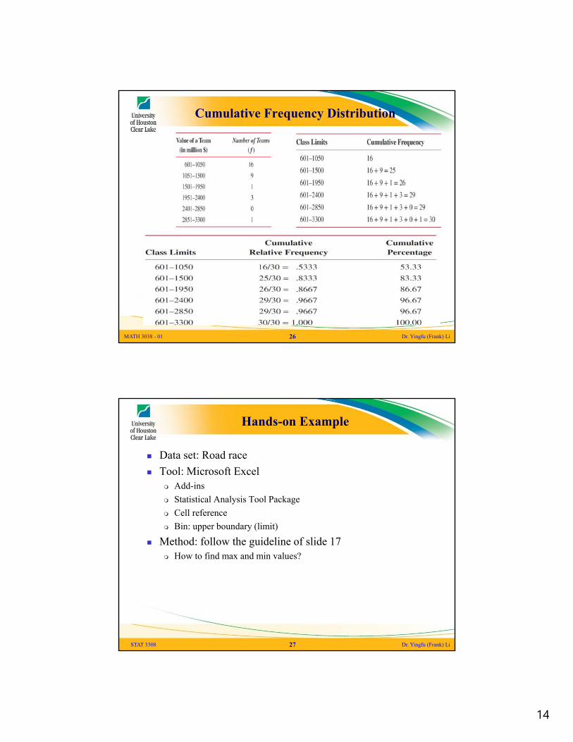