chapter 2 emphasis…. objectives appreciate the importance of the principle of emphasis. consider...
TRANSCRIPT
Chapter 2
Emphasis…
Objectives• Appreciate the importance of the principle of emphasis.
• Consider the effect of emphasis in a design.
• Learn what visual hierarchy is and why using it improves designs.
• Comprehend key emphasis techniques.

What is Emphasis?The principle of emphasis states that the most important element on the page should be most prominent, the second most important element should be secondary in prominence and so on.

Effective Use of Emphasis (1 of 2)• Determine what copy is most important.
• Group related elements.
• Visually stress the important information through emphasis techniques.

Effective Use of Emphasis (2 of 2)
• Limit the use of emphasis—too much emphasis is as bad as no emphasis.

Why Use Emphasis?• Effective emphasis assists readers in identifying important information.
• Pages with good emphasis are more visually interesting.

Visual Hierarchy • Before applying emphasis need to establish a visual hierarchy.
• Visual hierarchy is the arrangement of visual elements on the page according to their order of importance.
• Designers use visual hierarchy to direct the reader’s attention to key points, starting with the focal point.

Focal Points and Accents
• The focal point is the visual element or part of a page that is most emphasized and catches the reader’s eye first.
• Secondary or tertiary focal points are called accents.

Visual Hierarchy Example (1 of 2)
• This cookbook cover lacks visual hierarchy.
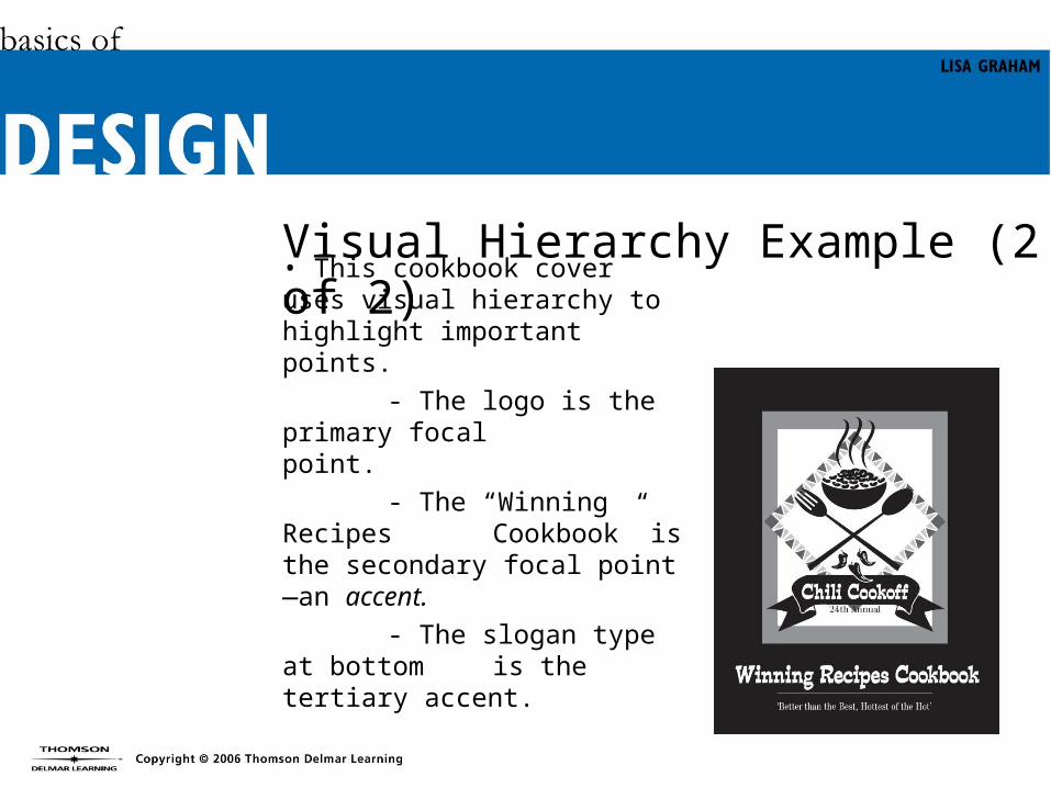
Visual Hierarchy Example (2 of 2)• This cookbook cover uses visual hierarchy to highlight important points.
- The logo is the primary focal point.
- The “Winning Recipes Cookbook” is the secondary focal point—an accent.
- The slogan type at bottom is the tertiary accent.

Emphasis Techniques (1 of 4)
• Designers employ visual techniques to emphasize key elements and establish a strong visual hierarchy. Some techniques are:
- Make the element biggest- Make the element boldest

Emphasis Techniques (2 of 4)

Emphasis Techniques (3 of 4)
- Add a special visual effect to the element.
- Changing its color to make it different than other elements.
- Tilting it at an angle when other elements are horizontal.

Emphasis Techniques (4 of 4)
-Adding color to one element emphasizes it and draws the reader’s attention.

Emphasis Example (1 of 3)
• This page lacks emphasis, and consequently visual interest.

Emphasis Example (2 of 3)• Applying the principle of emphasis to this flyer results in a more attractive design.
• Emphasizing the title makes it most important and adds visual interest.

Emphasis Example (3 of 3)
• Making the subheads bigger and gray highlights important topics.
• Placing listed items into three columns tightens up the composition, groups related elements, and opens up space to emphasize titles and subheads.

Too Much of a Good Thing
• Overuse of emphasis makes a page busy and visually confusing.

Chapter Summary• Analyze the page’s message and establish a visual hierarchy.
• Stick to the visual hierarchy to emphasize critical information.
• Effective emphasis assists in communication.
• Too much emphasis detracts from communication.

MINI QUIZ #2• accents
• emphasis• visual
hierarchy
1. Using the principle of___________ simplifies the reader’s task and helps him or her out the most important points of information in your message.
2. Arranging the headlines and graphics and words in the layout in order of their importance establishes a _______ ____________ on the page.
3. Secondary and tertiary focal points are called _____________ because they highlight other important information on the page.

MINI QUIZ #2 (Continued)
4. What is a focal point and why is it important?
5. Which visual elements you emphasize in a design, and how you emphasize them, influence your readers perceptions about the design. Which of the two type designs in the figure has a playful look? Which one looks stodgy and old-fashioned? Why?
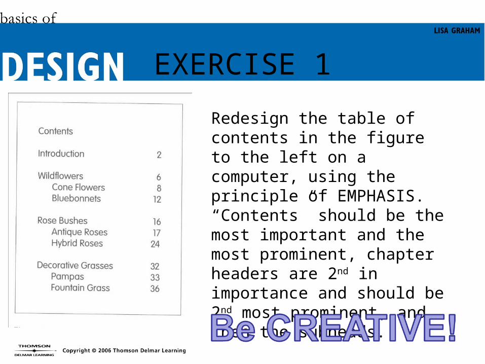
EXERCISE 1
Redesign the table of contents in the figure to the left on a computer, using the principle of EMPHASIS. “Contents” should be the most important and the most prominent, chapter headers are 2nd in importance and should be 2nd most prominent, and then the subheads.