chapter 10 design principles and guidelines - … - usability engineering...design principles and...
TRANSCRIPT
Design Principles and Guidelines
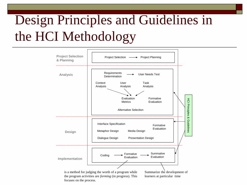
Design Principles and Guidelines in
the HCI Methodology
Evaluation
Metrics
Dialogue Design
Metaphor Design
Analysis
Design
HC
I Prin
cip
les &
Gu
idelin
es
Implementation
Formative
Evaluation
Summative
EvaluationCoding
User Needs TestRequirements
Determination
Project Selection Project PlanningProject Selection
& Planning
Alternative Selection
Media Design
Presentation Design
Formative
Evaluation
Formative
Evaluation
Interface Specification
Task
Analysis
User
Analysis
Context
Analysis
Summarize the development of
learners at particular time
is a method for judging the worth of a program while
the program activities are forming (in progress). This
focuses on the process.
Introduction
Design principles: high-level and context-free
design goals based on theories of human-
computer interaction.
Design guidelines: specific and usually
context dependent rules for designers to
follow in order to achieve the principles.
Design Standards: standards are to ensure
quality,
Design Principles
Improve users task performance and
reduce their effort.
User activity depends on memory and attention.
Automate or partially automate the user activity
and to do so with minimal user effort.
Often compromises in functionality produce
higher usability. Example:- Incorrect entry in any online form should not result in filling up
the whole form again. Except incorrect entry,
Design Principles
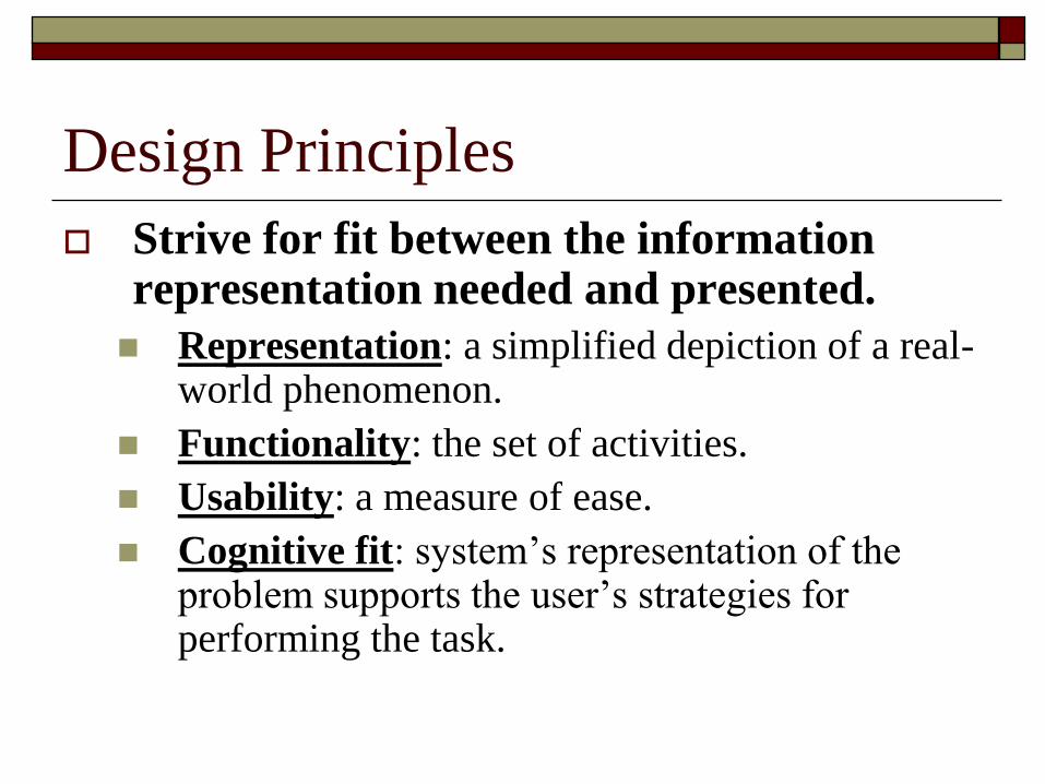
Strive for fit between the information representation needed and presented.
Representation: a simplified depiction of a real-world phenomenon.
Functionality: the set of activities.
Usability: a measure of ease.
Cognitive fit: system’s representation of the problem supports the user’s strategies for performing the task.
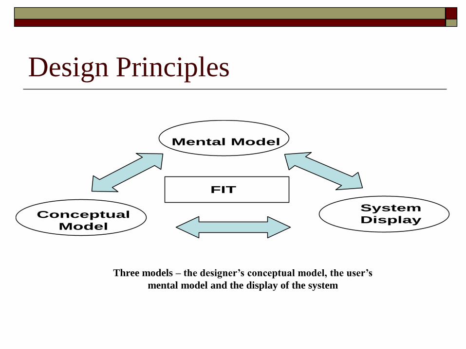
Design Principles
FIT
Mental Model
Conceptual
Model
System
Display
Three models – the designer’s conceptual model, the user’s
mental model and the display of the system
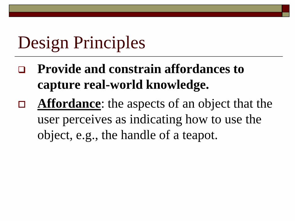
Provide and constrain affordances to
capture real-world knowledge.
Affordance: the aspects of an object that the
user perceives as indicating how to use the
object, e.g., the handle of a teapot.
Design Principles
Design Principles
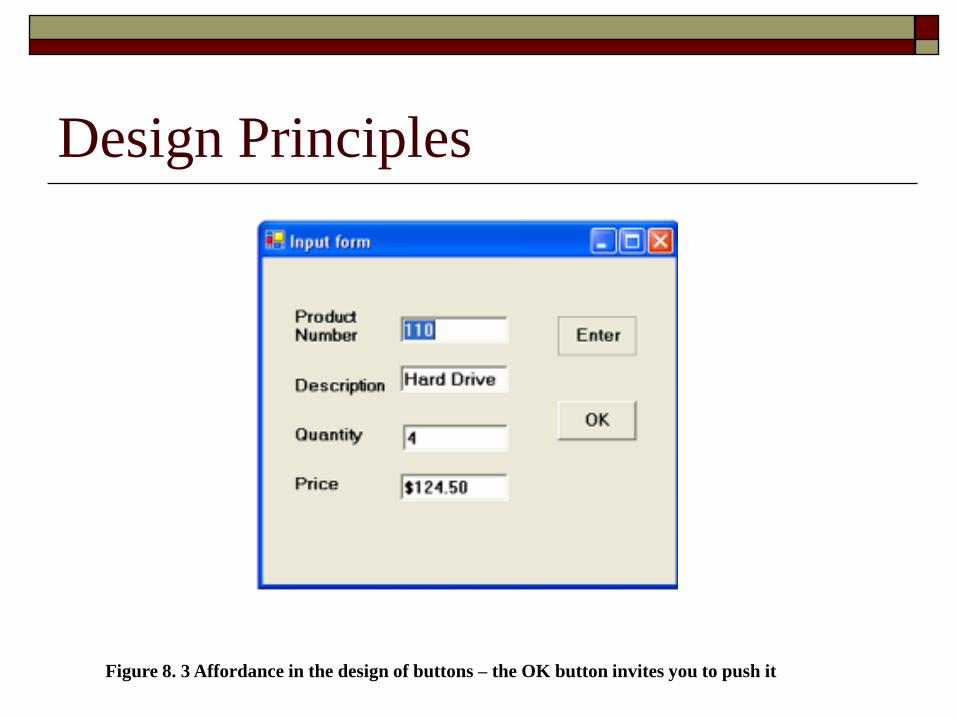
Figure 8. 3 Affordance in the design of buttons – the OK button invites you to push it
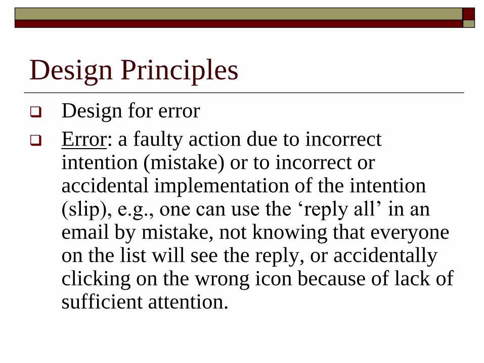
Design for error
Error: a faulty action due to incorrect intention (mistake) or to incorrect or accidental implementation of the intention (slip), e.g., one can use the ‘reply all’ in an email by mistake, not knowing that everyone on the list will see the reply, or accidentally clicking on the wrong icon because of lack of sufficient attention.
Design Principles
How Gmail is handling Design for Errors?
Do you recollect any similar kind of handling
of errors?
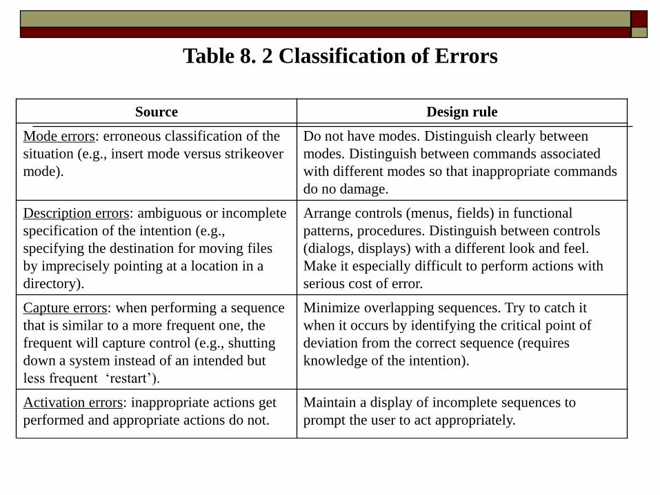
Source Design rule
Mode errors: erroneous classification of the
situation (e.g., insert mode versus strikeover
mode).
Do not have modes. Distinguish clearly between
modes. Distinguish between commands associated
with different modes so that inappropriate commands
do no damage.
Description errors: ambiguous or incomplete
specification of the intention (e.g.,
specifying the destination for moving files
by imprecisely pointing at a location in a
directory).
Arrange controls (menus, fields) in functional
patterns, procedures. Distinguish between controls
(dialogs, displays) with a different look and feel.
Make it especially difficult to perform actions with
serious cost of error.
Capture errors: when performing a sequence
that is similar to a more frequent one, the
frequent will capture control (e.g., shutting
down a system instead of an intended but
less frequent ‘restart’).
Minimize overlapping sequences. Try to catch it
when it occurs by identifying the critical point of
deviation from the correct sequence (requires
knowledge of the intention).
Activation errors: inappropriate actions get
performed and appropriate actions do not.
Maintain a display of incomplete sequences to
prompt the user to act appropriately.
Table 8. 2 Classification of Errors
Design Principles
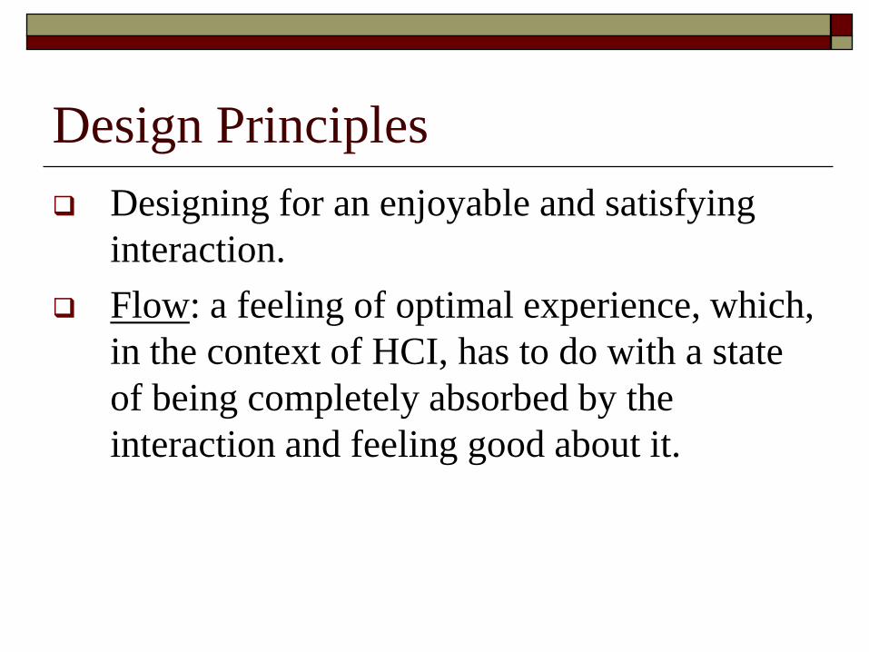
Designing for an enjoyable and satisfying
interaction.
Flow: a feeling of optimal experience, which,
in the context of HCI, has to do with a state
of being completely absorbed by the
interaction and feeling good about it.
Design Principles
Promote trust
Trust is another aspect of HCI that requires
analysis beyond task analysis. In e-commerce
systems where the interactions translate directly
into revenue, trust is a critical component. As
developers, we must ask the question, “How can
we design HCI that positively affects the user’s
trust in the system and in the services it
provides?”
Design Principles
Support diversity of users
As designers we have the responsibility to open
our design to the effective use of diverse
populations of users.
We should assume that users from different
nationalities with different backgrounds may use the
system.
Some of the users may be handicapped in one way or
another and find it difficult or impossible to use
certain features.
Design Guidelines
Issue I: Consistency Guidelines
Consistency has been one of the cardinal rules of design. If the interface is consistent (even if poorly designed), the end user can adapt to it.
Is consistency as important as it appears?
There are several types of consistency.
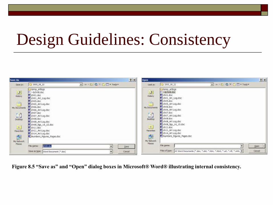
Internal consistency: the same appearance, meaning and operation holds true for all the user’s interactions within the same application.
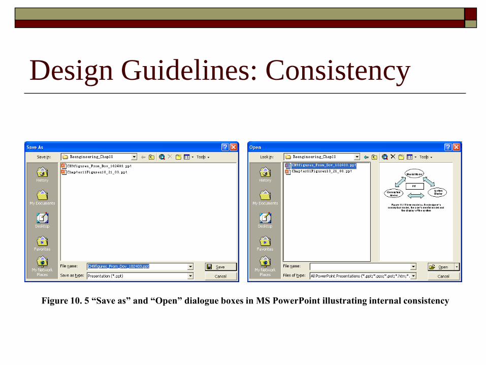
Design Guidelines: Consistency
Figure 10. 5 “Save as” and “Open” dialogue boxes in MS PowerPoint illustrating internal consistency
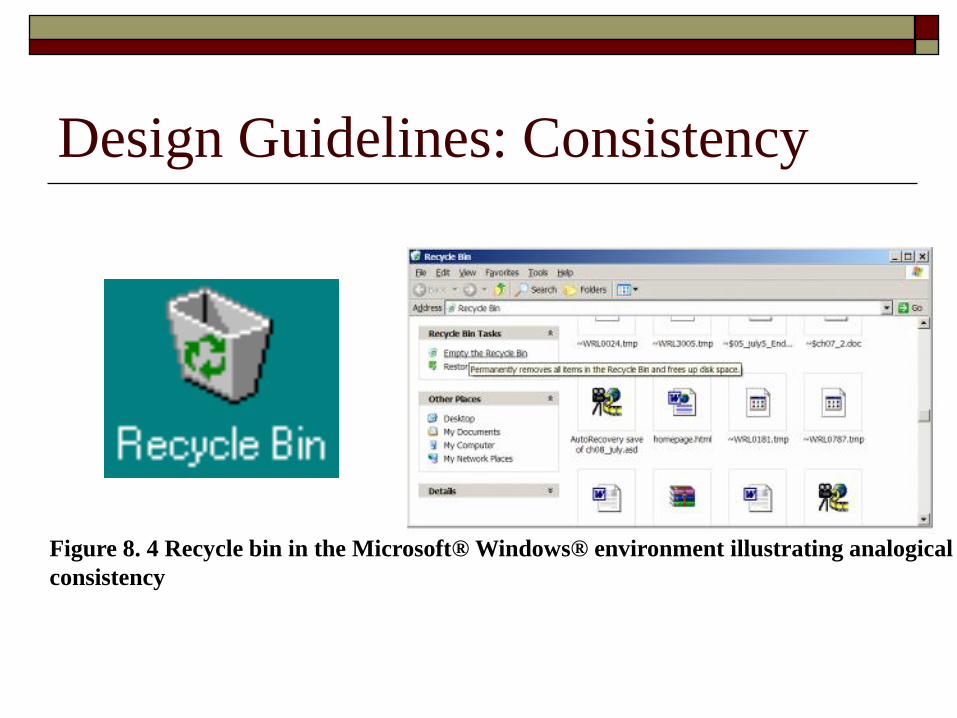
Analogical consistency: the correspondence
between the system’s representation and the
real-world phenomenon in terms of
appearance, meaning and operation.
Design Guidelines: Consistency
Design Guidelines: Consistency
Figure 8. 4 Recycle bin in the Microsoft® Windows® environment illustrating analogical
consistency
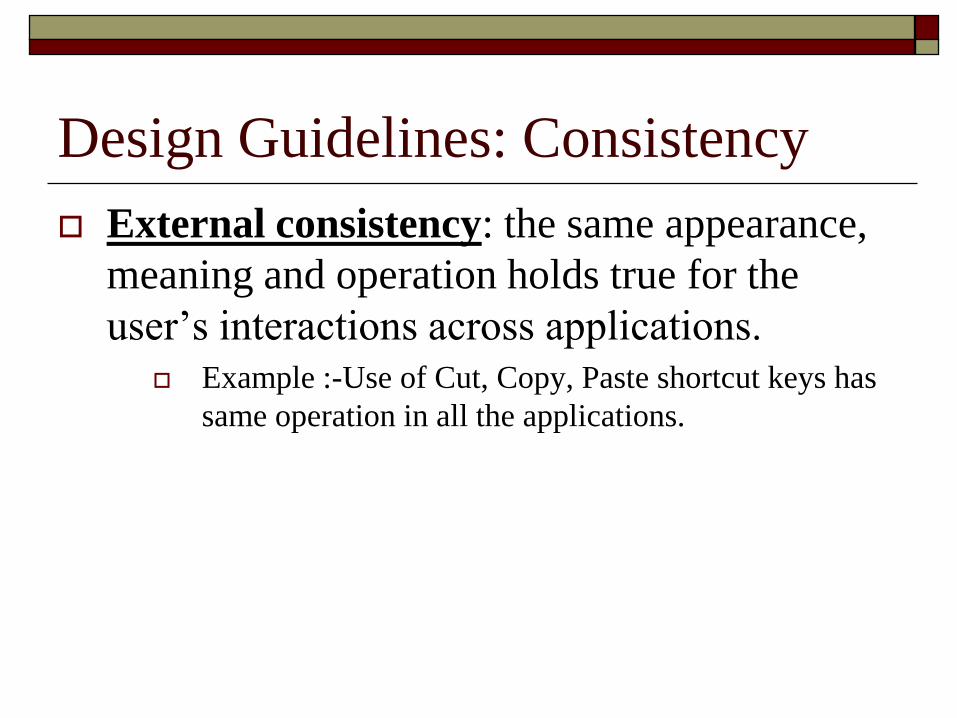
External consistency: the same appearance,
meaning and operation holds true for the
user’s interactions across applications. Example :-Use of Cut, Copy, Paste shortcut keys has
same operation in all the applications.
Design Guidelines: Consistency
Design Guidelines: Consistency
Figure 8.5 “Save as” and “Open” dialog boxes in Microsoft® Word® illustrating internal consistency.
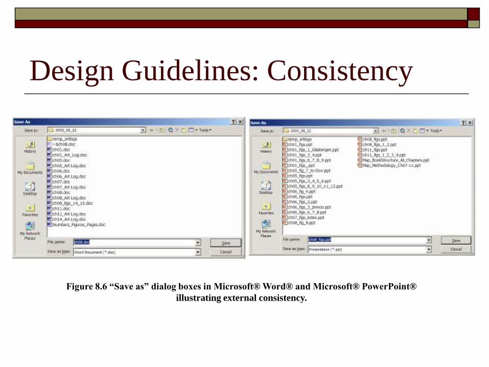
Design Guidelines: Consistency
Figure 8.6 “Save as” dialog boxes in Microsoft® Word® and Microsoft® PowerPoint®
illustrating external consistency.
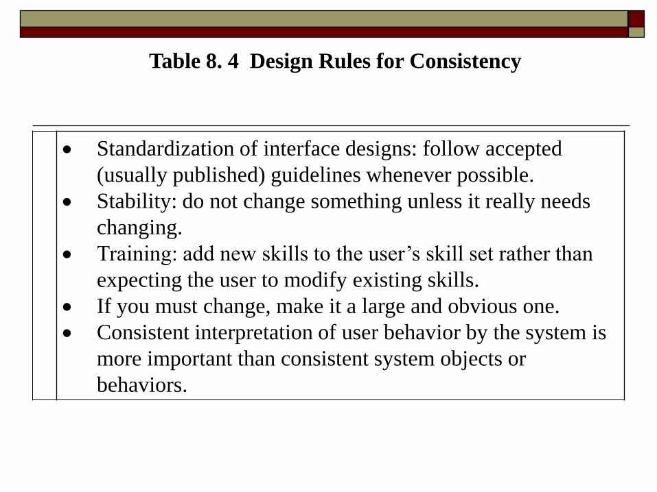
Standardization of interface designs: follow accepted
(usually published) guidelines whenever possible.
Stability: do not change something unless it really needs
changing.
Training: add new skills to the user’s skill set rather than
expecting the user to modify existing skills.
If you must change, make it a large and obvious one.
Consistent interpretation of user behavior by the system is
more important than consistent system objects or
behaviors.
Table 8. 4 Design Rules for Consistency
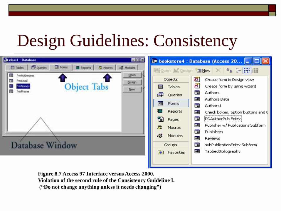
Design Guidelines: Consistency
Figure 8.7 Access 97 Interface versus Access 2000.
Violation of the second rule of the Consistency Guideline I.
(“Do not change anything unless it needs changing”)
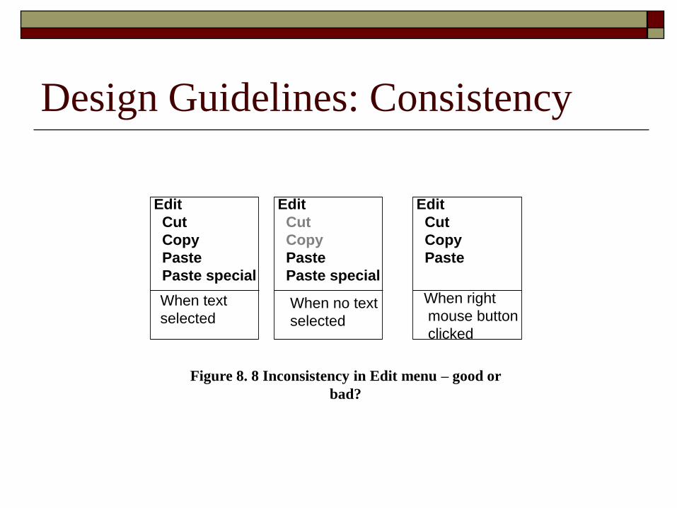
Design Guidelines: Consistency
Edit
Cut
Copy
Paste
Paste special
Edit
Cut
Copy
Paste
Paste special
Edit
Cut
Copy
Paste
When text
selectedWhen no text
selected
When right
mouse button
clicked
Figure 8. 8 Inconsistency in Edit menu – good or
bad?
Design Guidelines:
Issue II - User control and feedback
Control and feedback go hand in hand. Providing feedback is probably the most accepted guideline in the design of any interaction.
However, it is important to understand the rationale for each specific feedback instance.
Feedback can support three important factors of user activity: motivation, control and learning.
Control feedback is designed to promote the user’s control over the interaction and the completion of the task at hand.
The first guideline is therefore to ensure that the user perceives that he or she is in control.
For example, the user should always be able to abort one activity and initiate another (the system should not ‘take over’ control).
Furthermore, the user should be able to control the pace and format of presentation (e.g., controlling the speed of scrolling and the size of the font).
Design Guidelines:
Issue II - User control and feedback
Our basic assumption is that optimal control depends
on both the type of user activity that needs to be
controlled and the level of interaction.
Ask:
What effect their action has had on the system?
Possible consequences of that action.
The new system state.
The new location of the user in the system or state.
Design Guidelines:
Issue II - User control and feedback
Feedback should be presented in the manner
that most directly supports the action to be
taken - ‘strive for fit between the information
representation needed and presented’.
Design Guidelines:
Issue II - User control and feedback
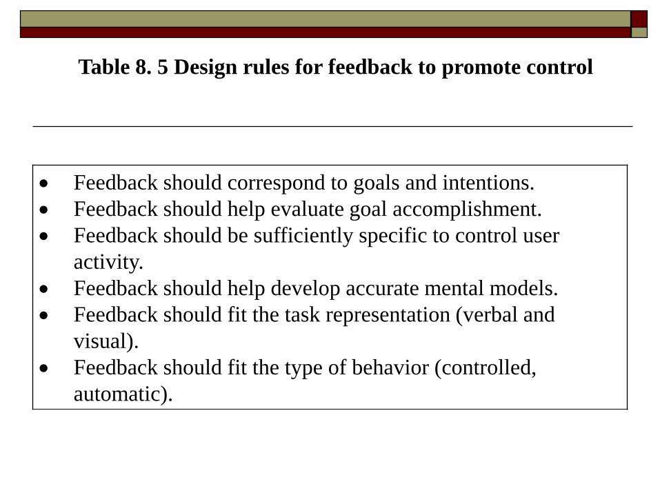
Feedback should correspond to goals and intentions.
Feedback should help evaluate goal accomplishment.
Feedback should be sufficiently specific to control user
activity.
Feedback should help develop accurate mental models.
Feedback should fit the task representation (verbal and
visual).
Feedback should fit the type of behavior (controlled,
automatic).
Table 8. 5 Design rules for feedback to promote control
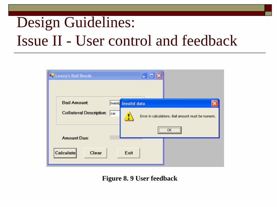
Design Guidelines:
Issue II - User control and feedback
Figure 8. 9 User feedback
Design Guidelines:
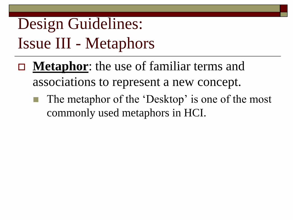
Issue III - Metaphors
Metaphor: the use of familiar terms and
associations to represent a new concept.
The metaphor of the ‘Desktop’ is one of the most
commonly used metaphors in HCI.
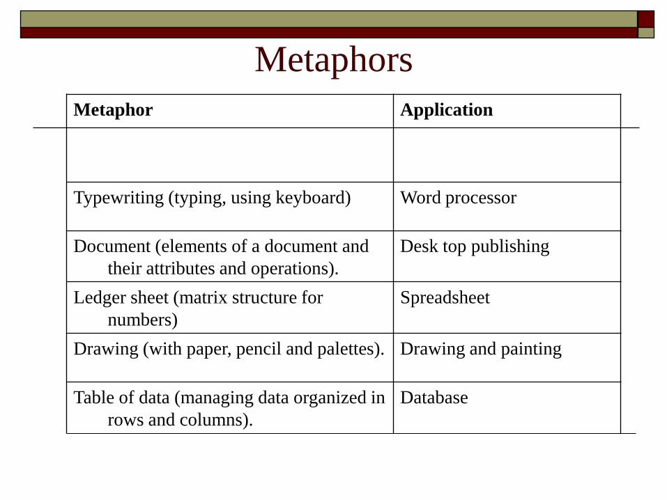
Metaphors
Metaphor Application
Typewriting (typing, using keyboard) Word processor
Document (elements of a document and
their attributes and operations).
Desk top publishing
Ledger sheet (matrix structure for
numbers)
Spreadsheet
Drawing (with paper, pencil and palettes). Drawing and painting
Table of data (managing data organized in
rows and columns).
Database
Design Guidelines:
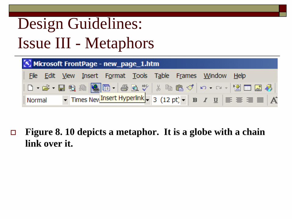
Issue III - Metaphors
Figure 8. 10 depicts a metaphor. It is a globe with a chain
link over it.
Design Guidelines:
Issue IV – Direct Manipulation
Direct manipulation: an interaction style in which objects are represented and manipulated in a manner analogous to the real world (e.g. by directly pointing at an object and dragging it to a location rather than issuing logical instructions to bring about the same effect).
The general guideline is to use direct manipulation whenever possible.
Consider the simple example of moving a file to a trash bin by clicking on its icon and dragging it to the trash bin icon.
Contrast this with the same action carried out by a sequence of menu options and commands (e.g. locating the appropriate directory of files, finding the exact name of the file, specifying a ‘delete’ command and receiving (at least in some operating systems) confirmation that ‘the file had been deleted’).
Design Guidelines:
Issue IV – Direct Manipulation
Designs should be aesthetically pleasing
ideally without compromising on the
usefulness and usability of the system.
Design Guidelines:
Issue V – Aesthetics in Screen Design
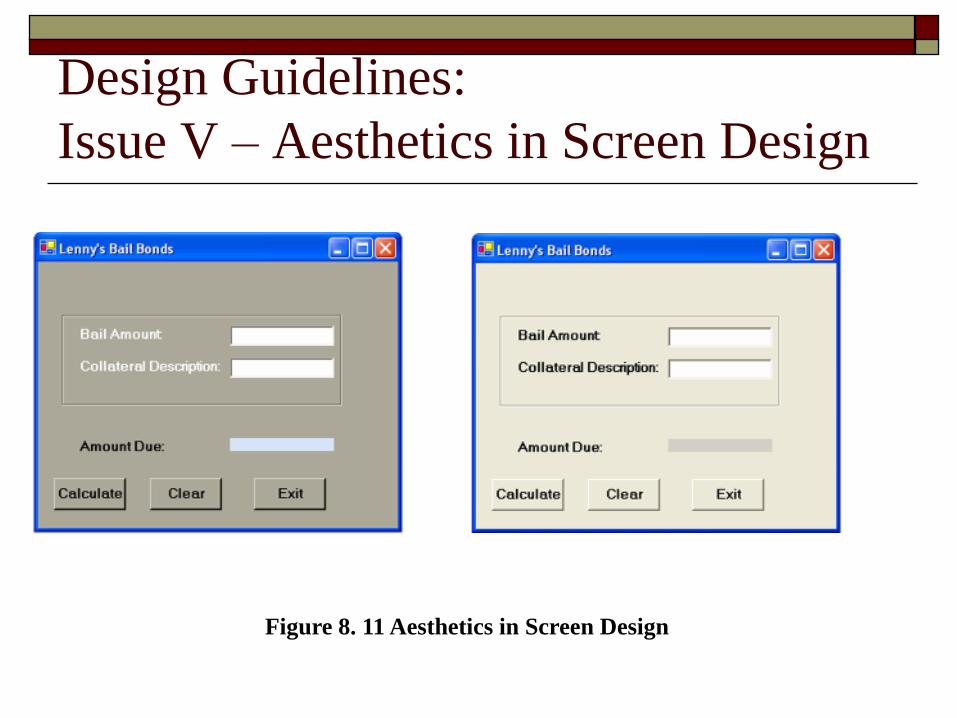
Design Guidelines:
Issue V – Aesthetics in Screen Design
Figure 8. 11 Aesthetics in Screen Design
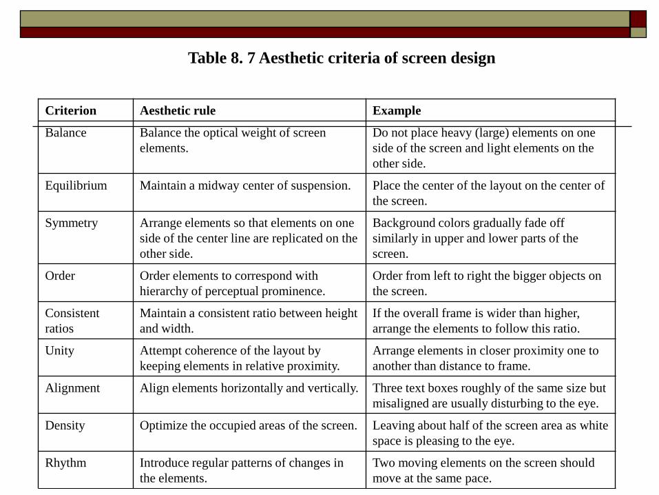
Criterion Aesthetic rule Example
Balance Balance the optical weight of screen
elements.
Do not place heavy (large) elements on one
side of the screen and light elements on the
other side.
Equilibrium Maintain a midway center of suspension. Place the center of the layout on the center of
the screen.
Symmetry Arrange elements so that elements on one
side of the center line are replicated on the
other side.
Background colors gradually fade off
similarly in upper and lower parts of the
screen.
Order Order elements to correspond with
hierarchy of perceptual prominence.
Order from left to right the bigger objects on
the screen.
Consistent
ratios
Maintain a consistent ratio between height
and width.
If the overall frame is wider than higher,
arrange the elements to follow this ratio.
Unity Attempt coherence of the layout by
keeping elements in relative proximity.
Arrange elements in closer proximity one to
another than distance to frame.
Alignment Align elements horizontally and vertically. Three text boxes roughly of the same size but
misaligned are usually disturbing to the eye.
Density Optimize the occupied areas of the screen. Leaving about half of the screen area as white
space is pleasing to the eye.
Rhythm Introduce regular patterns of changes in
the elements.
Two moving elements on the screen should
move at the same pace.
Table 8. 7 Aesthetic criteria of screen design
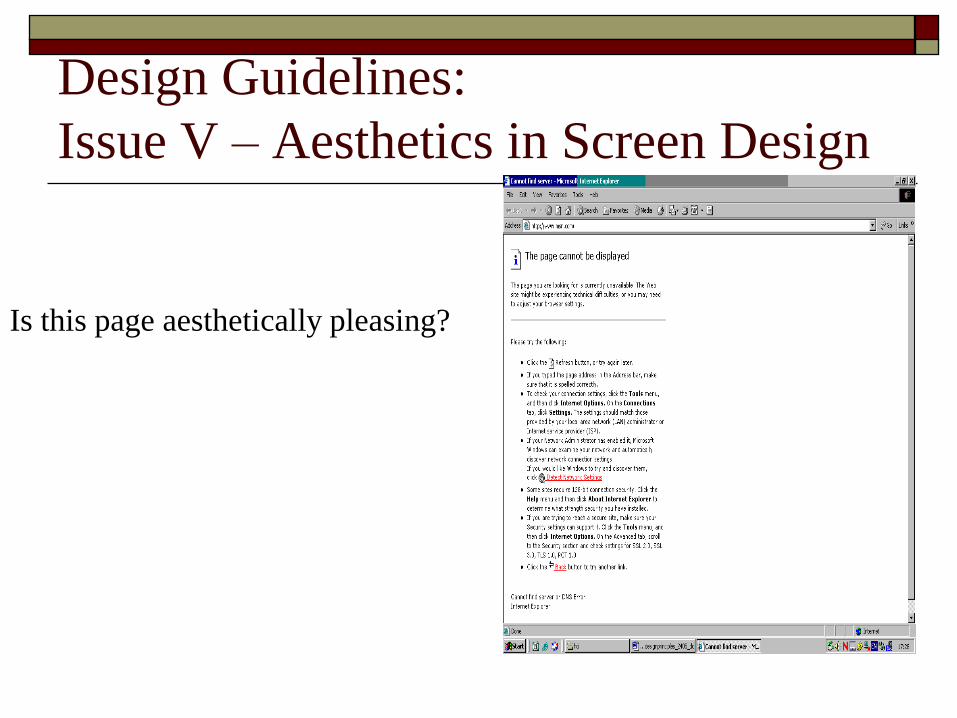
Design Guidelines:
Issue V – Aesthetics in Screen Design
Is this page aesthetically pleasing?
Summary
Design Principles Improve users’ task performance and reduce their effort.
Strive for fit between the information representation needed and presented.
Direct and constrain user affordances to capture real-world knowledge.
Design for error.
Enable an enjoyable and satisfying interaction.
Promote trust.
Support diversity of users.
Summary
Design Guidelines Maintain consistent interaction.
Provide the user with control over the interaction,
supported by feedback.
Use metaphors.
Use direct manipulation.
Design aesthetic interfaces.