brand standards & styel gudi e
TRANSCRIPT
Brand Standards& Style Guide
Contents
The Office of Marketing & Communications 1
Our Process/Steps to Requesting Materials 2
Color Palette 4
Font Usage/Typography 5
Logo 6
Current Messaging 10
Image Library 12
Writing Style Guidelines 13
Website, E-Mail & Social Media 14
To maintain BCC’s brand identity, it is important to consistently use BCC colors and graphics properly, as well as to maintain consistent technical style across written materials.
Please use the information below when writing BCC-related text and when using BCC logos or colors.
www.berkshirecc.edu/marketing Revised May. 2018
Join us for a presentation, campus tour, hands-on activities & lunch!Thursday, January 25, 2018
9:30 am – 1:30 pmRSVP by Friday, January 19, 2017 — call Connie West at 413-236-4740.
Parents and/or school personnel are also invited.
STEM Starter AcademyOPEN HOUSE
Science Technology Engineering Mathematics www.berkshirecc.edu/stem
Meet with your advisor ®ister now!
Register by MAY 12 to qualify!
Students must be enrolled in a degree or certificate program and register for 6 or more credits for the fall 2017 semester.
100 students will win a $10 gift card!
www.berkshirecc.edu/marketing 1
MISSIONThe Office of Marketing & Communications’ mission is to utilize integrated marketing that best positions the college to communicate its benefits to its many constituents and to maintain a competitive edge, while enhancing the college’s positive image through effective communications, public relations, marketing/advertising, social media and publications.
WHAT WE DOThe Office of Marketing & Communications manages the college’s marketing, communications, and public relations efforts to promote and communicate the college’s mission, goals, and initiatives to external and internal audiences. The division also assists in the college’s recruitment and enrollment efforts and strives to present a consistent image in the community. While the Office of Marketing & Communications primarily focuses on the institutional initiatives, we also support academic departments to help develop marketing strategies for effective commu-nity communication and enrollment.
Marketing provides the following services:
• Advertising
• Business cards
• Content development & copywriting
• Graphic design
• Marketing plans & campaigns
• Public relations & news publicity
• Publications
• Photography
• Social media coverage
• Web & online forms
Marketing & CommunicationsCONTACT INFORMATIONIf you would like assistance in any of these items, or have another marketing communications request, please visit www.berkshirecc.edu/marketing for a variety of online job request forms as well as easy-to-use downloadable templates.
Projects sometimes require further in-person discussion. Brainstorming sessions can be helpful. Please do not hesitate to get in touch if you need guidance, etc.
A project begins with an initial email to [email protected]. Please outline instructions in your email and attach all relevant content. A graphic designer will then follow up with you.
• Norah Beauregard — Department Contact/Administrative Assistant [email protected]
• Christina Wynn — Dean of Enrollment [email protected]
• Jonah Sykes — Associate Director of Marketing & [email protected]
• Douglas Oldham — Web [email protected]
• Jay Miller — Graphic [email protected]
• Cara Borelli — Graphic [email protected]
www.berkshirecc.edu/marketing 2
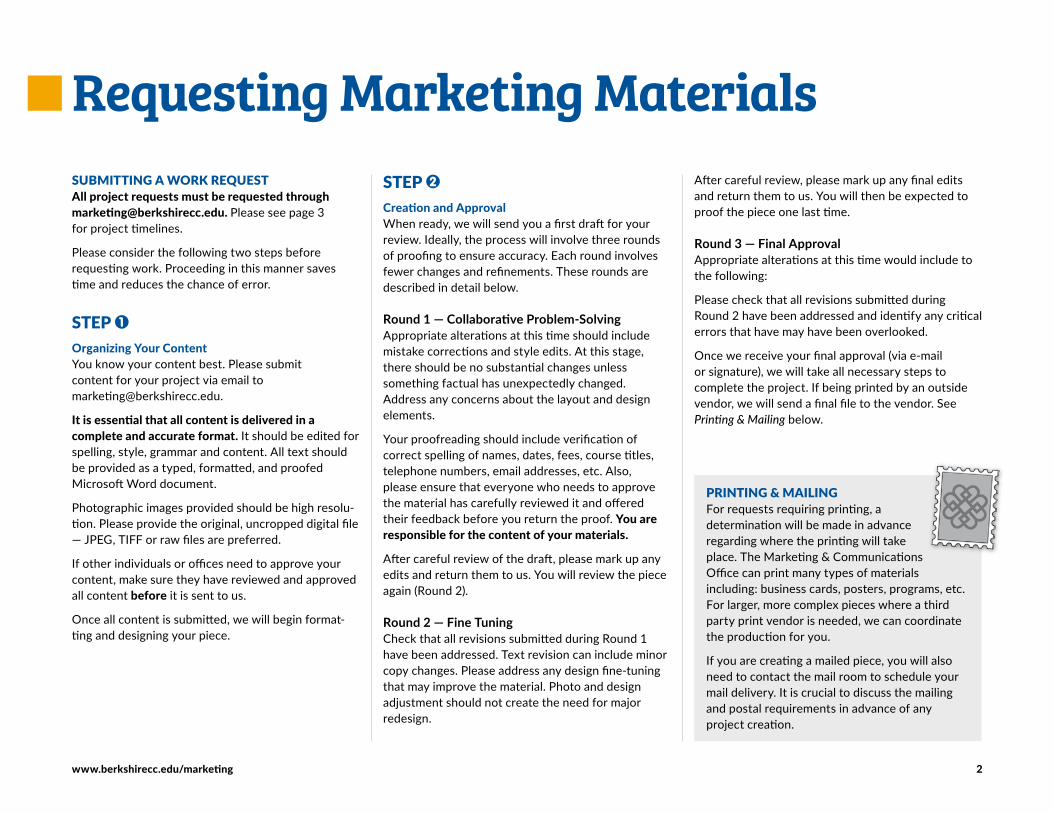
Requesting Marketing MaterialsSUBMITTING A WORK REQUESTAll project requests must be requested through [email protected]. Please see page 3 for project timelines.
Please consider the following two steps before requesting work. Proceeding in this manner saves time and reduces the chance of error.
STEP 1Organizing Your ContentYou know your content best. Please submit content for your project via email to [email protected].
It is essential that all content is delivered in a complete and accurate format. It should be edited for spelling, style, grammar and content. All text should be provided as a typed, formatted, and proofed Microsoft Word document.
Photographic images provided should be high resolu-tion. Please provide the original, uncropped digital file — JPEG, TIFF or raw files are preferred.
If other individuals or offices need to approve your content, make sure they have reviewed and approved all content before it is sent to us.
Once all content is submitted, we will begin format-ting and designing your piece.
STEP 2 Creation and ApprovalWhen ready, we will send you a first draft for your review. Ideally, the process will involve three rounds of proofing to ensure accuracy. Each round involves fewer changes and refinements. These rounds are described in detail below.
Round 1 — Collaborative Problem-SolvingAppropriate alterations at this time should include mistake corrections and style edits. At this stage, there should be no substantial changes unless something factual has unexpectedly changed. Address any concerns about the layout and design elements.
Your proofreading should include verification of correct spelling of names, dates, fees, course titles, telephone numbers, email addresses, etc. Also, please ensure that everyone who needs to approve the material has carefully reviewed it and offered their feedback before you return the proof. You are responsible for the content of your materials.
After careful review of the draft, please mark up any edits and return them to us. You will review the piece again (Round 2).
Round 2 — Fine TuningCheck that all revisions submitted during Round 1 have been addressed. Text revision can include minor copy changes. Please address any design fine-tuning that may improve the material. Photo and design adjustment should not create the need for major redesign
After careful review, please mark up any final edits and return them to us. You will then be expected to proof the piece one last time.
Round 3 — Final ApprovalAppropriate alterations at this time would include to the following:
Please check that all revisions submitted during Round 2 have been addressed and identify any critical errors that have may have been overlooked.
Once we receive your final approval (via e-mail or signature), we will take all necessary steps to complete the project. If being printed by an outside vendor, we will send a final file to the vendor. See Printing & Mailing below.
PRINTING & MAILING For requests requiring printing, a determination will be made in advance regarding where the printing will take place. The Marketing & Communications Office can print many types of materials including: business cards, posters, programs, etc. For larger, more complex pieces where a third party print vendor is needed, we can coordinate the production for you.
If you are creating a mailed piece, you will also need to contact the mail room to schedule your mail delivery. It is crucial to discuss the mailing and postal requirements in advance of any project creation.
www.berkshirecc.edu/marketing 3
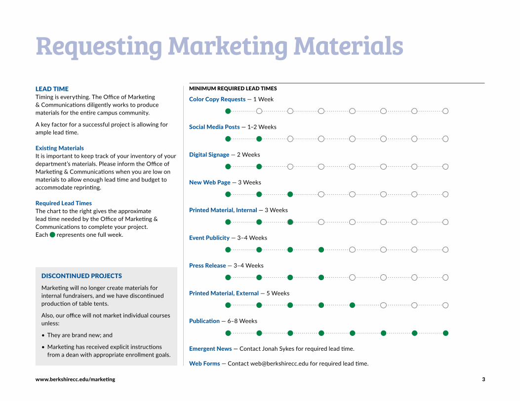
Requesting Marketing MaterialsLEAD TIMETiming is everything. The Office of Marketing & Communications diligently works to produce materials for the entire campus community.
A key factor for a successful project is allowing for ample lead time.
Existing MaterialsIt is important to keep track of your inventory of your department’s materials. Please inform the Office of Marketing & Communications when you are low on materials to allow enough lead time and budget to accommodate reprinting.
Required Lead Times The chart to the right gives the approximate lead time needed by the Office of Marketing & Communications to complete your project. Each represents one full week.
MINIMUM REQUIRED LEAD TIMES
Color Copy Requests — 1 Week
Social Media Posts — 1–2 Weeks
Digital Signage — 2 Weeks
New Web Page — 3 Weeks
Printed Material, Internal — 3 Weeks
Event Publicity — 3–4 Weeks
Press Release — 3–4 Weeks
Printed Material, External — 5 Weeks
Publication — 6–8 Weeks
Emergent News — Contact Jonah Sykes for required lead time.
Web Forms — Contact [email protected] for required lead time.
DISCONTINUED PROJECTS
Marketing will no longer create materials for internal fundraisers, and we have discontinued production of table tents.
Also, our office will not market individual courses unless:
• They are brand new; and
• Marketing has received explicit instructionsfrom a dean with appropriate enrollment goals.
www.berkshirecc.edu/marketing 4
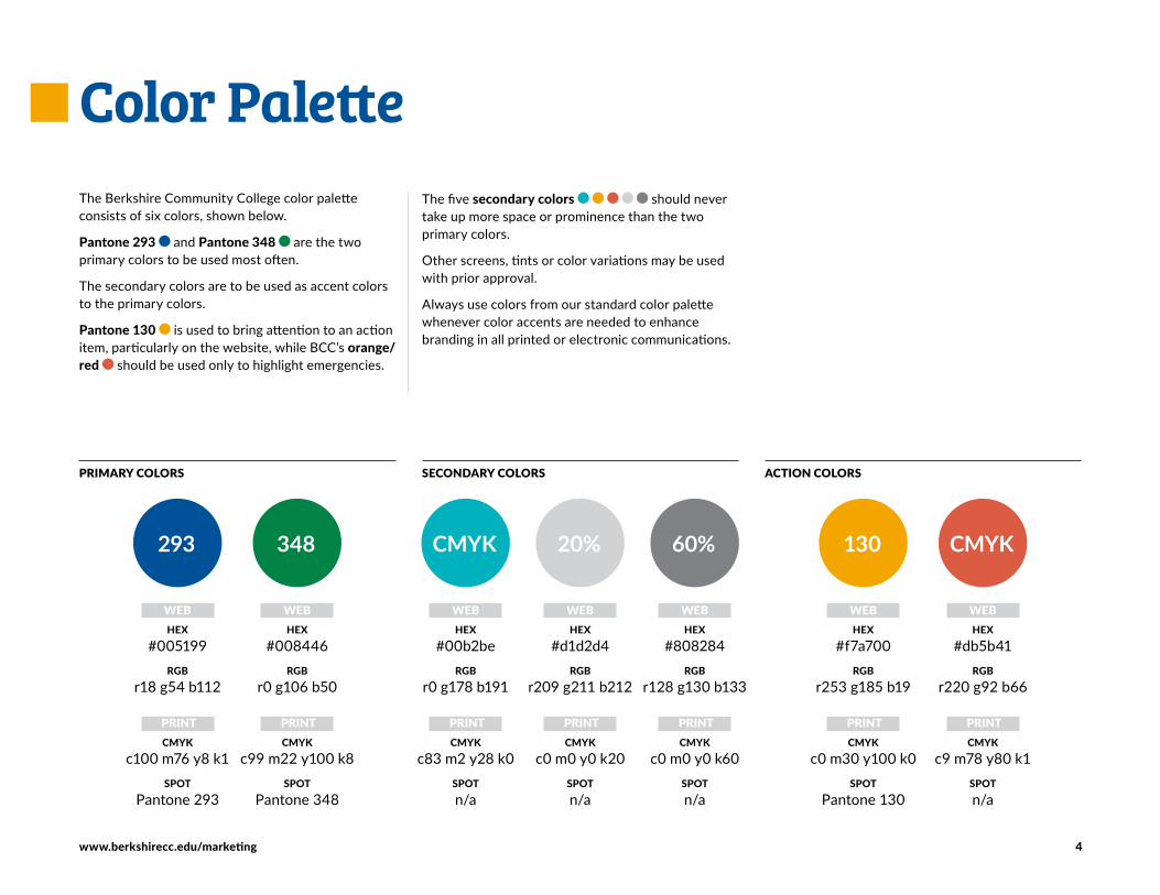
The Berkshire Community College color palette consists of six colors, shown below.
Pantone 293 and Pantone 348 are the two primary colors to be used most often.
The secondary colors are to be used as accent colors to the primary colors.
Pantone 130 is used to bring attention to an action item, particularly on the website, while BCC’s orange/red should be used only to highlight emergencies.
Color PaletteThe five secondary colors should never take up more space or prominence than the two primary colors.
Other screens, tints or color variations may be used with prior approval.
Always use colors from our standard color palette whenever color accents are needed to enhance branding in all printed or electronic communications.
293
WEBHEX
#005199RGB
r18 g54 b112
PRINTCMYK
c100 m76 y8 k1SPOT
Pantone 293
WEBHEX
#008446RGB
r0 g106 b50
PRINTCMYK
c99 m22 y100 k8SPOT
Pantone 348
348
WEBHEX
#db5b41RGB
r220 g92 b66
PRINTCMYK
c9 m78 y80 k1SPOTn/a
CMYK
WEBHEX
#d1d2d4RGB
r209 g211 b212
PRINTCMYK
c0 m0 y0 k20SPOTn/a
20%
WEBHEX
#808284RGB
r128 g130 b133
PRINTCMYK
c0 m0 y0 k60SPOTn/a
60%
PRIMARY COLORS SECONDARY COLORS ACTION COLORS
WEBHEX
#00b2beRGB
r0 g178 b191
PRINTCMYK
c83 m2 y28 k0SPOTn/a
CMYK
WEBHEX
#f7a700RGB
r253 g185 b19
PRINTCMYK
c0 m30 y100 k0SPOT
Pantone 130
130
www.berkshirecc.edu/marketing 5
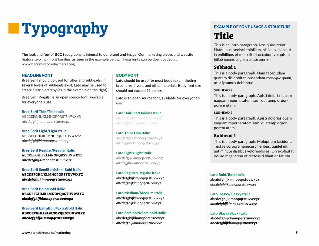
EXAMPLE OF FONT USAGE & STRUCTURE
TitleThis is an intro paragraph. Nos quias reriat. Natquibus, senisci enihiliam, nis id eveni blaut la enihilibus et mos elit ut occabori volupisim hillab ipienis alignim aliqui omnim.
Subhead 1This is a body paragraph. Nam facepudam quatem dis nobitat ibusandam conseque quam, ut la ipsamus debitatur.
SUBHEAD 2
This is a body paragraph. Apisti dolorias quam eaquam repernatatem sam quatemp orpor-porem utem.
SUBHEAD 2
This is a body paragraph. Apisti dolorias quam eaquam repernatatem sam quatemp orpor-porem utem.
Subhead 1This is a body paragraph. Moluptium facidunt. Tectae corpore henecescil eribus, quidel int aut mincte distibus volorendis es. On explautat odi ad magnatem et rectessiti blaut et taturia.
Typography
BODY FONTLato should be used for most body text, including brochures, flyers, and other materials. Body font size should not exceed 11 points.
Lato is an open source font, available for everyone’s use.
Lato Hairline/Hairline Italicabcdefghijklmnopqrstuvwxyz abcdefghijklmnopqrstuvwxyz
Lato Thin/Thin Italicabcdefghijklmnopqrstuvwxyz abcdefghijklmnopqrstuvwxyz
Lato Light/Light Italicabcdefghijklmnopqrstuvwxyz abcdefghijklmnopqrstuvwxyz
Lato Regular/Regular Italicabcdefghijklmnopqrstuvwxyz abcdefghijklmnopqrstuvwxyz
Lato Medium/Medium Italicabcdefghijklmnopqrstuvwxyz abcdefghijklmnopqrstuvwxyz
Lato Semibold/Semibold Italicabcdefghijklmnopqrstuvwxyz abcdefghijklmnopqrstuvwxyz
HEADLINE FONTBree Serif should be used for titles and subheads. If several levels of subheads exist, Lato may be used to create clear hierarchy (as in the example on the right).
Bree Serif Regular is an open source font, available for everyone’s use.
Bree Serif Thin/Thin ItalicABCDEFGHIJKLMNOPQRSTUVWXYZ abcdefghijklmnopqrstuvwxyz
Bree Serif Light/Light ItalicABCDEFGHIJKLMNOPQRSTUVWXYZ abcdefghijklmnopqrstuvwxyz
Bree Serif Regular/Regular ItalicABCDEFGHIJKLMNOPQRSTUVWXYZ abcdefghijklmnopqrstuvwxyz
Bree Serif SemiBold/SemiBold ItalicABCDEFGHIJKLMNOPQRSTUVWXYZ abcdefghijklmnopqrstuvwxyz
Bree Serif Bold/Bold ItalicABCDEFGHIJKLMNOPQRSTUVWXYZ abcdefghijklmnopqrstuvwxyz
Bree Serif ExtraBold/ExtraBold ItalicABCDEFGHIJKLMNOPQRSTUVWXYZ abcdefghijklmnopqrstuvwxyz
The look and feel of BCC typography is integral to our brand and image. Our marketing pieces and website feature two main font families, as seen in the example below. These fonts can be downloaded at www.berkshirecc.edu/marketing.
Lato Bold/Bold Italicabcdefghijklmnopqrstuvwxyz abcdefghijklmnopqrstuvwxyz
Lato Heavy/Heavy Italicabcdefghijklmnopqrstuvwxyz abcdefghijklmnopqrstuvwxyz
Lato Black/Black Italicabcdefghijklmnopqrstuvwxyz abcdefghijklmnopqrstuvwxyz
www.berkshirecc.edu/marketing 6
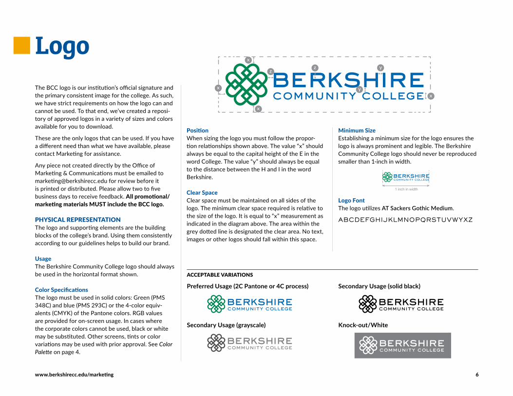
PositionWhen sizing the logo you must follow the propor-tion relationships shown above. The value “x” should always be equal to the capital height of the E in the word College. The value “y” should always be equal to the distance between the H and I in the word Berkshire.
Clear SpaceClear space must be maintained on all sides of the logo. The minimum clear space required is relative to the size of the logo. It is equal to “x” measurement as indicated in the diagram above. The area within the grey dotted line is designated the clear area. No text, images or other logos should fall within this space.
The BCC logo is our institution’s official signature and the primary consistent image for the college. As such, we have strict requirements on how the logo can and cannot be used. To that end, we’ve created a reposi-tory of approved logos in a variety of sizes and colors available for you to download.
These are the only logos that can be used. If you have a different need than what we have available, please contact Marketing for assistance.
Any piece not created directly by the Office of Marketing & Communications must be emailed to [email protected] for review before it is printed or distributed. Please allow two to five business days to receive feedback. All promotional/marketing materials MUST include the BCC logo.
PHYSICAL REPRESENTATION The logo and supporting elements are the building blocks of the college’s brand. Using them consistently according to our guidelines helps to build our brand.
UsageThe Berkshire Community College logo should always be used in the horizontal format shown.
Color SpecificationsThe logo must be used in solid colors: Green (PMS 348C) and blue (PMS 293C) or the 4-color equiv-alents (CMYK) of the Pantone colors. RGB values are provided for on-screen usage. In cases where the corporate colors cannot be used, black or white may be substituted. Other screens, tints or color variations may be used with prior approval. See Color Palette on page 4.
Logo
ACCEPTABLE VARIATIONS
Preferred Usage (2C Pantone or 4C process)
Secondary Usage (grayscale)
Secondary Usage (solid black)
Knock-out/White
Minimum SizeEstablishing a minimum size for the logo ensures the logo is always prominent and legible. The Berkshire Community College logo should never be reproduced smaller than 1-inch in width.
Logo FontThe logo utilizes AT Sackers Gothic Medium
ABCDEFGHIJKLMNOPQRSTUVWYXZ
www.berkshirecc.edu/marketing 7
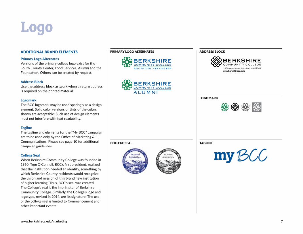
ADDITIONAL BRAND ELEMENTS
Primary Logo AlternatesVersions of the primary college logo exist for the South County Center, Food Services, Alumni and the Foundation. Others can be created by request.
Address BlockUse the address block artwork when a return address is required on the printed material.
LogomarkThe BCC logomark may be used sparingly as a design element. Solid color versions or tints of the colors shown are acceptable. Such use of design elements must not interfere with text readability.
TaglineThe tagline and elements for the “My BCC” campaign are to be used only by the Office of Marketing & Communications. Please see page 10 for additional campaign guidelines.
College SealWhen Berkshire Community College was founded in 1960, Tom O’Connell, BCC’s first president, realized that the institution needed an identity, something by which Berkshire County residents would recognize the vision and mission of this brand new institution of higher learning. Thus, BCC’s seal was created. The College’s seal is the imprimatur of Berkshire Community College. Similarly, the College’s logo and logotype, revised in 2014, are its signature. The use of the college seal is limited to Commencement and other important events.
PRIMARY LOGO ALTERNATES
LOGOMARK
LogoADDRESS BLOCK
1350 West Street, Pittsfield, MA 01201www.berkshirecc.edu
COLLEGE SEAL TAGLINE

www.berkshirecc.edu/marketing 8
SECONDARY COLLEGE LOGOS
AthleticsThe Falcons logo is the mark of the institution’s athletics program. This logo should be used on all materials relating to Club Sports.
Using the Falcons LogoThe design and colors may not vary from the samples shown on the right. Note that the falcon itself is always shown in either black or white. There are two color versions of the Falcons logo. Both utilize the blue and green from the BCC color palette (see Color Palette on page 4). The blue version is the primary athletic logo.
Color is introduced only in the background of the word “FALCONS” and in the falcon’s eye. The word “FALCONS” always appears in white.
Departments, Organizations and EventsSeveral BCC departments, organizations and events have their own visual identities, based upon BCC’s official color palette and styles.
LogoATHLETICS LOGO
DOWNLOADABLE FILESThe BCC logos, tagline and elements are avail-able for download on the college website at: www.berkshirecc.edu/marketing
It is important to choose the proper file type for your needs.
JPEG files are most appropriate for web/screen use and in-house printing projects where the logo size is small and the background is white. Regardless of its size or application, the resolu-tion of the logo must be such that it never appears blurry.
EPS files can be infinitely sized without loss of quality. Use the EPS version for high-quality or large-scale printing of the logo. EPS files have a transparent background and are the best choice when placing the logo on a color background. EPS is also the file of choice for apparel and merchandise items. Most users cannot view an actual EPS file on their computers as they lack appropriate software.
PNG files are appropriate for web/screen use when a transparent background is needed.
PDF versions of our logo function identically to EPS files. They can be printed at large sizes with no loss of quality and they have transparent backgrounds — however, users are able to view PDF content.
GREEN TEAMBERKSHIRE COMMUNITY COLLEGE
DEPARTMENTS, ORGANIZATIONS & EVENTS
40 underfortyPRESENTED BY
BERKSHIRE COMMUNITY COLLEGE
www.berkshirecc.edu/marketing 9
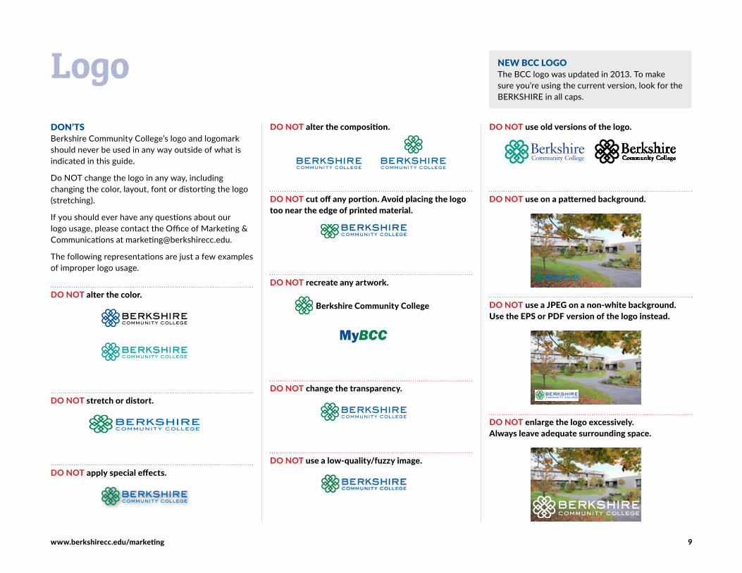
DON’TSBerkshire Community College’s logo and logomark should never be used in any way outside of what is indicated in this guide.
Do NOT change the logo in any way, including changing the color, layout, font or distorting the logo (stretching).
If you should ever have any questions about our logo usage, please contact the Office of Marketing & Communications at [email protected].
The following representations are just a few examples of improper logo usage.
DO NOT alter the color.
DO NOT stretch or distort.
DO NOT apply special effects.
LogoDO NOT alter the composition.
DO NOT cut off any portion. Avoid placing the logo too near the edge of printed material.
DO NOT recreate any artwork.
Berkshire Community College
DO NOT change the transparency.
DO NOT use a low-quality/fuzzy image.
DO NOT use old versions of the logo.
DO NOT use on a patterned background.
DO NOT use a JPEG on a non-white background. Use the EPS or PDF version of the logo instead.
DO NOT enlarge the logo excessively. Always leave adequate surrounding space.
NEW BCC LOGOThe BCC logo was updated in 2013. To make sure you’re using the current version, look for the BERKSHIRE in all caps.
www.berkshirecc.edu/marketing 10
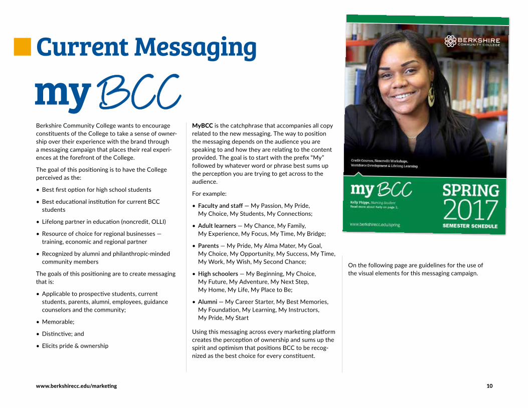
Berkshire Community College wants to encourage constituents of the College to take a sense of owner-ship over their experience with the brand through a messaging campaign that places their real experi-ences at the forefront of the College.
The goal of this positioning is to have the College perceived as the:
• Best first option for high school students
• Best educational institution for current BCC students
• Lifelong partner in education (noncredit, OLLI)
• Resource of choice for regional businesses — training, economic and regional partner
• Recognized by alumni and philanthropic-minded community members
The goals of this positioning are to create messaging that is:
• Applicable to prospective students, current students, parents, alumni, employees, guidance counselors and the community;
• Memorable;
• Distinctive; and
• Elicits pride & ownership
Current Messaging
MyBCC is the catchphrase that accompanies all copy related to the new messaging. The way to position the messaging depends on the audience you are speaking to and how they are relating to the content provided. The goal is to start with the prefix “My” followed by whatever word or phrase best sums up the perception you are trying to get across to the audience.
For example:
• Faculty and staff — My Passion, My Pride, My Choice, My Students, My Connections;
• Adult learners — My Chance, My Family, My Experience, My Focus, My Time, My Bridge;
• Parents — My Pride, My Alma Mater, My Goal, My Choice, My Opportunity, My Success, My Time, My Work, My Wish, My Second Chance;
• High schoolers — My Beginning, My Choice, My Future, My Adventure, My Next Step, My Home, My Life, My Place to Be;
• Alumni — My Career Starter, My Best Memories, My Foundation, My Learning, My Instructors, My Pride, My Start
Using this messaging across every marketing platform creates the perception of ownership and sums up the spirit and optimism that positions BCC to be recog-nized as the best choice for every constituent.
On the following page are guidelines for the use of the visual elements for this messaging campaign.
www.berkshirecc.edu/marketing 11
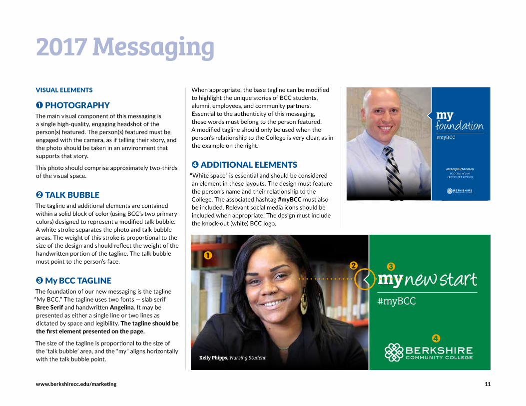
VISUAL ELEMENTS
1 PHOTOGRAPHYThe main visual component of this messaging is a single high-quality, engaging headshot of the person(s) featured. The person(s) featured must be engaged with the camera, as if telling their story, and the photo should be taken in an environment that supports that story.
This photo should comprise approximately two-thirds of the visual space.
2 TALK BUBBLEThe tagline and additional elements are contained within a solid block of color (using BCC’s two primary colors) designed to represent a modified talk bubble. A white stroke separates the photo and talk bubble areas. The weight of this stroke is proportional to the size of the design and should reflect the weight of the handwritten portion of the tagline. The talk bubble must point to the person’s face.
3 My BCC TAGLINEThe foundation of our new messaging is the tagline “My BCC.” The tagline uses two fonts — slab serif Bree Serif and handwritten Angelina. It may be presented as either a single line or two lines as dictated by space and legibility. The tagline should be the first element presented on the page.
The size of the tagline is proportional to the size of the ‘talk bubble’ area, and the “my” aligns horizontally with the talk bubble point.
When appropriate, the base tagline can be modified to highlight the unique stories of BCC students, alumni, employees, and community partners. Essential to the authenticity of this messaging, these words must belong to the person featured. A modified tagline should only be used when the person’s relationship to the College is very clear, as in the example on the right.
4 ADDITIONAL ELEMENTS“White space” is essential and should be considered an element in these layouts. The design must feature the person’s name and their relationship to the College. The associated hashtag #myBCC must also be included. Relevant social media icons should be included when appropriate. The design must include the knock-out (white) BCC logo.
2017 Messaging
Jeromy Richardson BCC Class of 2010
Partner, edm Services
my foundation#myBCC
#myBCC
my new start
Kelly Phipps, Nursing Student

www.berkshirecc.edu/marketing 12
All images and photography are representative of the College and should keep branding in mind.
Berkshire Community College’s photo library contains thousands of images of students, faculty, staff, campus grounds, campus signage for satellite locations, etc.
Existing photos can be viewed and downloaded (in multiple sizes) via our Flickr page, which is easily accessed from the BCC website home page. The page can also be accessed directly at: www.flickr.com/berkshirecommunitycollege
(Note that students are also able to conveniently access photos from numerous college events.)
When using images, consider:• Quality (clear vs. blurry, etc.)
• Location (is it a recognizable BCC location?)
• Social media images
• Permissions (signed permission forms)
• Include diversity
• Student-centric
• Focuses on an activity
• Focus on foreground
• Headshots
• Tells a story
• Avoid cropping too tightly
• Space for text placement
Image LibraryREQUESTING PHOTOGRAPHYThe Marketing & Communications Department is well-equipped to photograph college events. Please email [email protected] early in the event planning process to ensure photographer availability. Please provide helpful information about the event and what type of photos should be taken (general, group, individuals, locations, etc…).
PRINT IMAGES VS. WEB IMAGES
Converting images from the web to use on print documents can be tricky. When you have a choice of image sizes at your disposal, it’s best to choose the largest image possible. Any image can be made smaller as needed, but it can’t be sized up without losing quality. Images that appear sharp and clear on the computer screen often print as pixelated, grainy pictures.
On a computer screen, images are displayed as a series of dots known as pixels. The more pixels an image contains, the more crisp it will appear on the screen. However, a high pixel count makes for slow loading on web pages. Therefore, images must be carefully sized for the web.
Changing an image’s size changes the size of the pixels — enlarging a web image simply makes the pixels bigger. Therefore, web images are generally not suitable for resizing. When planning your printed project, please avoid submitting images taken from the web whenever possible.
Note that some graphics are saved as vector files (EPS, AI, SVG, PDF) which displays an image using mathe-matical formulae. This allows the image to be scaled up or down with no loss of quality. Logos are almost always available in vector format.
RELEASE FORMSIt is important to secure permission from people featured in a photograph. Release forms can be downloaded at www.berkshirecc.edu/marketing and should be submitted to Rose Shaw in Marketing.
www.berkshirecc.edu/marketing 13
Consistency with grammar and style is paramount. The reference guide suggested for staff writing is The AP Style Guide
ACADEMIC DEGREES• Use proper name, capitalize full degree title:
Associate of Science; Bachelor of Arts, Accounting Certificate
• Doctoral: doctorate in English (note lowercase)
• Short form: Lowercase and do not use apostrophe for associate degree
• Lowercase and use apostrophe for bachelor’s degree, master’s degree
• Abbreviations: Use periods after all the letters (with the exception of MBA): A.A.; A.S.; B.A.; B.S.; M.A.; M.S.; Ph.D., MBA, M.D.
BUILDINGS & FACILITY NAMESCommonly misnamed buildings on campus:
• Field Administration Center
• Koussevitzky Arts Center
• Susan B. Anthony Center & Annex
• Jonathan Edwards Library
• Ralph Hoffmann Environmental Science & Sustainable Energy Center
• The Connector
• Paterson Field House
ROOM NUMBERS• Room numbers should contain a hyphen between
the building code and number: K-111; F-216
CAPITALIZATION
Departments, Centers and Organizational Titles• Capitalize the formal names of departments and
centers; use lowercase for the generic terms.
• Capitalize the full names of specific departments, divisions and offices.
• Use lower case when used in the general sense. Office of the President; workforce development; student services
Courses• Capitalize the names of specific courses:
Composition I.
Titles• Capitalize formal titles that precede a name:
President Ellen Kennedy
• Do not capitalize titles that follow a name: Ellen Kennedy, president of BCC
College Name• Capitalize: Berkshire Community College; the
College
• Use the full name on first reference, then abbre-viate as BCC or the College in subsequent references.
PHONE NUMBERS & EXTENSIONS• Use hyphens, not parenthesis or periods, for
telephone area codes: 413-236-XXXX
• After the phone number, use a comma before the extension. Extensions are not capitalized: 413-499-4660, ext. 1234 or extension 1234
• College publications always use direct extensions for faculty and staff members: 413-236-[extension]
NUMBERS• Spell out numbers one through nine. 10 and up use
numerical form.
TIMESTime descriptors should be abbreviated with lower-case letters and with periods. Always use a space between the time and the a.m. or p.m. If a time range is entirely in the morning or evening, use a.m. or p.m. only once: 11 a.m. – 2 p.m.; 3 – 4:30 p.m.
QUOTATIONS• Place in quotation marks: chapters of books, article
headlines, unpublished manuscripts, songs, poems, television shows
• Periods and commas always go inside quotation marks: “affordable,” or “affordable.”
• Semicolons and colons always go outside quotation marks: “affordable”; or “affordable”:
• Question marks and exclamation points may go either inside or outside, depending on whether the phrase is part of the quoted material.
Writing Style Guidelines
www.berkshirecc.edu/marketing 14
WEBSITEBCC’s website is the most comprehensive source of information and an important and widely used vehicle for communication to external audiences.
The website has three major purposes:1 To serve as a major recruitment tool for prospec-
tive students;
2 To enhance BCC’s image and reputation by providing comprehensive, timely and consistent information to prospective students, current students, media, the college community and the public; and
3 To build community by creating and managing relationships between BCC and our most important audiences.
Due to the website’s highly visible platform for informing many audiences about BCC, the College has developed a set of official guidelines and elements of style to help create and maintain pages. Please see the additional website resources online. (Website standards are currently in the process of development.)
Email [email protected] for the following requests and services:• A new web project such as a photo gallery or a form;
• Updates to existing pages. The pages for which you are requesting an update may be managed by another area outside of Marketing. In this case, your request will be processed and re-routed to the appropriate individual or office; or
• Requesting one-on-one training.
EMAILTo ensure visual and content consistency in e-mail received from the College, please adhere to the following guidelines:
BackgroundA white background free of images should be used for e-mail correspondence.
FontThere are many font options in our e-mail software. Please use only legible, professional-looking fonts — sans serif fonts (such as Lato or Arial) are preferred. Official BCC fonts are available for download at www.berkshirecc.edu/marketing.
Email SignaturePlease include an email signature with the following information:
• Name
• Title
• Department
• Building and Office
• Street
• City, State Zip
• Phone
• Email address
Note: Marketing will design a universal email signa-ture that will be emailed to faculty and staff for consistency.
Website, E-mail & Social Media
SOCIAL MEDIA
• BCC currently utilizes Facebook, Twitter, Instagram, LinkedIn, YouTube and Flickr.
• Social media provides BCC’s employees, students and alumni and others (“users”) an opportunity to interact online to exchange thoughts, ideas and experiences through discussions, posting, photos and videos.
• Questions specific to the use of social media on behalf of BCC or to place a posting request, email marketing at [email protected]. Jonah Sykes will review and manage the request.