bellwork quiz! you may write on quiz! answers on answer sheet 9-7 day 2.pdf · bellwork quiz! you...
TRANSCRIPT
December 11, 2012
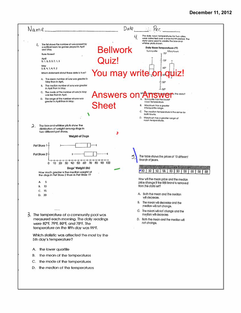
BellworkQuiz!
You may write on quiz!
Answers on Answer Sheet

December 11, 2012

December 11, 2012

December 11, 2012
1. Bell Work: Bellwork Quiz
2. Vocabulary: Ch. 9-7
3. Notes/Examples: Ch. 9-7 Scatterplots

December 11, 2012
Lesson Objective: Students will learn to create and intepret scatterplots.
HW: WS: Practice C 9-7 Scatterplots
Credit Card Projects past Due!
Study Island goals Due December 20th!

December 11, 2012
Scatter Plots
Math Bookpage 494

December 11, 2012
A scatter plot is a graph with points plotted to show a possible relationship between two sets of data.

December 11, 2012
We need to collect some data.
First - Your height in inches!!!
To the nearest inch, how tall are you.This is going to be our x number.

December 11, 2012
Second - Your jump height in inches!! (How high can you reach, in inches)
This is a stand and jump NOT a run and jump!!!!!
To the nearest inch.
You can use masking tape. Be sure to remove the tape after you measure.
To the nearest inch, how height can you jump.This is going to be our y number.

December 11, 2012
Work with a partner or a group of 3. Be sure one person in your group takes a pencil and paper to record all the heights and jump heights.
studentsheight
jump height
inches

December 11, 2012
Period 1Data

December 11, 2012
Period 2Data

December 11, 2012
Period 3Data

December 11, 2012
Period 4Data

December 11, 2012
Period 7Data

December 11, 2012

December 11, 2012

December 11, 2012
December 11, 2012

December 11, 2012

December 11, 2012
A teacher surveyed her students about the amount of physical activity they get each week. She then had their body mass index (BMI) measured. Use her data to make a scatter plot.
1.
2.

December 11, 2012
Correlation describes the type of relationship between two data sets.A line of best fit a.k.a.(trend line) is a straight line that comes closest to the points on a scatter plot.

December 11, 2012

December 11, 2012

December 11, 2012

December 11, 2012

December 11, 2012

December 11, 2012

December 11, 2012

December 11, 2012

December 11, 2012
One way to examine a possible relationship between two measured quantities is to make a scatter plot of the values, one value plotted along the x-axis and the other value on the y-axis.
When the plotted points appear to lie approximately along a line, called a trend line, it is reasonable to conjecture that there is some relationship between the two measurements plotted. A trend can be used to predict other values for similar data.

December 11, 2012

December 11, 2012
Step 1: Make a scatter plot. Let hours worked represent the independent variable x and tips earned represent the dependent variable y.
Step 2: Draw a line of best fit. Draw a line that has about the same number of points above and below it.
Make a scatter plot of the data, and draw a line of best fit. Then use the data to predict how much a worker will earn in tips in 10 hours.

December 11, 2012
Step 3: Make a prediction. According to the graph, working 10 hours will earn about $24 in tips.

December 11, 2012
1. The table shows the study times and test scores for a number of students. Draw a scatter plot of the data. Put study time on the horizontal axis and test score on the vertical axis.

December 11, 2012
2. The weights of ten Holstein calves, of different ages, are given in the table. Sketch a scatter plot of the data. Put age on the horizontal axis. Then describe any pattern that you see in the scatter plot.

December 11, 2012
3. The table below shows the number of wins and the number of goals scored for the Eastern Conference in the National Hockey League in 1999. Use the data set to answer the questions.
a. Construct a scatter plot that compares wins with the number of goals scored. Put the number of goals on the horizontal axis.b. Do the number of goals scored seem to affect the number of wins? Can this be expected? Explain your thinking.

December 11, 2012
4. Which line best fits the data graphed below?

December 11, 2012
Homework #12WS:
Scatterplots

December 11, 2012
Homework #12
FinishPacket #4-9
Homework #12

December 11, 2012
Tell whether the scatter plot has a straight-line pattern, a curved pattern, or not pattern.

December 11, 2012
7. The graph show the price of a gallon of unleaded gasoline at randomly selected stations located various distances from town.
Use the fitted line to determine the cost of a gallon of gasoline 90 miles from town.

December 11, 2012
The table shows the relationship between the time a student spends studying each week and the student's percent improvement on test grades. On graph paper, make a scatter plot of percent improvement versus study hours. Put study hours on the horizontal axis. Then draw a fitted line. Using the fitted line, estimate how many study hours would be expected if the percent gain was 13%.
8.

December 11, 2012
9. In the table, x represents the number of years a company has been in business and y represents the number of employees that the company has. Construct a scatter plot with a fitted line for this data and find an equation you think best represents the data. What can you conclude about the data, based on the scatter plot?

December 11, 2012
Bellwork
You received this lastThursday.

December 11, 2012

December 11, 2012

December 11, 2012

December 11, 2012

December 11, 2012

December 11, 2012