be free to teach powerpoint tips - université de moncton · powerpoint tips design keys for ......
TRANSCRIPT
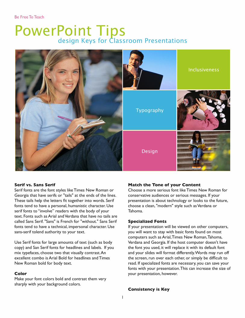
PowerPoint Tipsdesign Keys for Classroom Presentations
Inclusiveness
Typography
Design
Serif vs. Sans SerifSerif fonts are the font styles like Times New Roman or Georgia that have serifs or "tails" at the ends of the lines. These tails help the letters fit together into words. Serif fonts tend to have a personal, humanistic character. Use serif fonts to “involve” readers with the body of your text. Fonts such as Arial and Verdana that have no tails are called Sans Serif. "Sans" is French for "without." Sans Serif fonts tend to have a technical, impersonal character. Use sans-serif tolend authority to your text.
Use Serif fonts for large amounts of text (such as body copy) and San Serif fonts for headlines and labels. If you mix typefaces, choose two that visually contrast. An excellent combo is Arial Bold for headlines and Times New Roman bold for body text. ColorMake your font colors bold and contrast them very sharply with your background colors.
Match the Tone of your ContentChoose a more serious font like Times New Roman for conservative audiences or serious messages. If your presentation is about technology or looks to the future, choose a clean, "modern" style such as Verdana or Tahoma.
Specialized FontsIf your presentation will be viewed on other computers, you will want to stay with basic fonts found on most computers such as Arial, Times New Roman, Tahoma, Verdana and Georgia. If the host computer doesn't have the font you used, it will replace it with its default font and your slides will format differently. Words may run off the screen, run over each other, or simply be difficult to read. If specialized fonts are necessary, you can save your fonts with your presentation. This can increase the size of your presentation, however.
Consistency is Key
Be Free To Teach
1
For a professional-looking presentation, limit your font selection. Use only 2 or 3 fonts. Most slide templates cover this for you. If you want to edit the slide template:
1. Click and hold on your View menu and pull down to Slide.
2. Select Slide Master from the submenu that appears.
3. Choose a font for your headline and a different font for your body text. Now, each new slide you create will have the font styles you selected in your template, ensuring a polished, consistent look.
4. Use that third font for labels or call-outs. A little variety is good, too.
Text EffectsItalics can be hard to read. Italics can be hard to read. So can underlines and drop shadows. Use these very spar-ingly and test them out if possible. Use an ordinary type-face to convey simple information and save the bold/italic typeface for emphasis.
Text SizeIncrease font size 4 points larger than you're comfortable with. This way, the folks in the back row will see it. Try not to make any fonts smaller than 28 points in your presentation. Typically, stick with 36 point minimum for your body text. However, leave some blank space. Very large type with no space is between that fills the entire space is very oppressive and more difficult to read. If you can’t fit all your points on a slide without moving to a smaller font, break the points up onto separate slides.
Mixed CaseNormal upper and lower case is always easier to read than all capitals.
Visual ImpairmentAvoid making your slides too "busy" with lots of colors. Simple is often best.
PowerPoint Color SchemesPowerPoint comes with pre-installed color schemes. These schemes contain eight complementary colors. Specific colors are assigned to headline, body, back-ground, etc. Consider varying the color scheme to make “old” backgrounds seem “new” to students.
Limited Color VisionAvoid the situation where important information is conveyed
only in the form of color. - Being friendly to colorblind peo-ple does not necessarily mean that one should not use colors. Even for colorblind individuals, colors are very useful cues to distinguish different objects easily and quickly. By carefully selecting colors that are easily recog-nizable to people with all kinds of color vision, one can maximize the effect of her/his presentations.
Avoid the situation where texts and objects are obscured with the background. - For example, there should be enough contrasts in brightness and saturation between texts/objects and backgrounds. Avoid the combination of col-ors that have the same brightness but different only in hue. For example, red characters on green backgrounds is unreadable for colorblind individuals. Use either bright texts/objects over dark backgrounds, or vice versa.
Make texts and objects as thick or big as possible. - When the size of color-coded objects is small, only a few cone cells can be used for recognition. Colorblind people find it especially difficult to distinguish the colors of thin lines and small symbols. For color-coded text, use bold fonts such as Arial or Helvetica , rather than thin Times or New York .
Caution when using red. - For non-colorblind people, red is a bright and vivid color. But for colorblind individuals, it is as dull as blue or dark green. Thus, avoid using red char-acters on black backgrounds, including blackboards.
How Much Text?Use the 7 and 7 rule for legibility: 7 words per line, 7 lines per slide with a 25 word-per-slide maximum. To do this, be sure you use text to highlight, not to narrate. Keep text to the essential. Also, highly detailed charts or graphics will not be readable from a distance. Keep them simple. This may mean anywhere from 3 to 6 bullet points and a single, simple graphic that illustrates the slide title. If you can’t fit all your points on a slide without moving to a smaller font, break the points up onto separate slides. Bring points onto the slide one at a time with no special effects and “gray out” points after finishing with them. This approach gives better control and pace.
Background Color
Be Free To Teach
2

In general, it is best to use a dark background with light text for projection. However, lighting options available in the room, the size of the class, etc. can create a need to veer away from that. Consider using light objects on a dark background or dark objects on a light background. The key is contrast. Even with strongly contrasting col-ors, low contrast between the shades can make it diffi-cult to read. Use font and background colors with a strong contrast, as colors often look paler when viewed on a projector and pale text can "fade" into the back-ground.
In general, cool colors make better backgrounds. These colors include shades of blue and green. Additionally, pur-ple may work well as a background. Conversely, the worst backgrounds are usually the "hot" colors. These include red and orange. However, both of these colors make excellent choices for graphics such as charts and diagrams. Yellow also does not work well as a back-ground. Remember, there are exceptions to every rule. The key is learning when to break them.
If the room remains dark for your whole lecture, you may lose touch with your audience, so lighten things up. Insert a light background slide from time to time and/or pause occasionally and turn the lights on.
Design TemplatesConsistency is key. Design templates contain color schemes, slides with custom formatting, and styled fonts, all designed to create a particular look. After you apply a design template, each slide you add has the same custom look. PowerPoint comes with a wide variety of design templates. In addition, you can create your own design templates. If you create a special look for one of your presentations, you can save it as a design template.
Hold the ExtrasUse graphic devices such as borders, boxes, lines, or arrows only when needed. Avoid too many different types of transition in one presentation. When in doubt, select a subtle transition or none at all. Use transitions to add emphasis to create a flow. Limit animation and sound effect use to providing highlights or emphasis.
Keep it SimpleDon’t overuse effects or overcrowd slides. Don’t let
people focus on the effects in your program. You want them to focus on the content of your presentation and on you as the deliverer of that content. Use your slides to illustrate your speech, not to replace your handouts. Don’t cram them with information that belongs in a handout. Avoid sub-headings. Instead, break major points into separate slides. Stick with the same backgrounds, styles and transition effects throughout your presentation. Think carefully before using animations, sound and video. It’s best to use those effects sparingly — they’ll have more impact.
Using ImagesUse images when appropriate to the message: to capture attention and clarify points, to explain, to describe, to show relationships. Keep it simple. In most cases, use one image per slide and vary the location. Be aware of your audience and how they will respond to the images you choose.
Be Free To Teach
3

Be Free To Teach Teaching Effectiveness Program
TEACHING EFFECTIVENESS PROGRAMACADEMIC LEARNING SERVICESUNIVERSITY OF OREGON
BeFr
eeTo
Teac
hTeaching Effectiveness ProgramAcademic Learning ServicesUniversity of Oregon
Georgeanne CooperDirector, [email protected](541) 346-2177
Tim McMahonFaculty Development Consultant, [email protected](541) 346-2123
Scott Huette Instructional TechnologyFaculty Development Consultant, [email protected](541) 346-1934
Laurie Jones NeighborsFaculty Development Consultant, [email protected](541) 346-3484
Additional Support for Faculty Center for Educational Technologies19 Knight Library9 a.m. - 6 p.m., M - F(541) 346-1942
Media ServicesGround Floor, Knight [email protected](541)346-3091