basic reports and dashboards - university of...
TRANSCRIPT

updated 06.01.2015 v.3.10
For information and permission to use our PDF manuals, please send an email to: [email protected]
UACCESS ANALYTICS
Basic Reports & Dashboards
© Arizona Board of Regents, 2015
THE UNIVERSITY OF ARIZONA
COPYRIGHT & TRADEMARKS
Copyright © 2015, Arizona Board of Regents. All rights reserved.
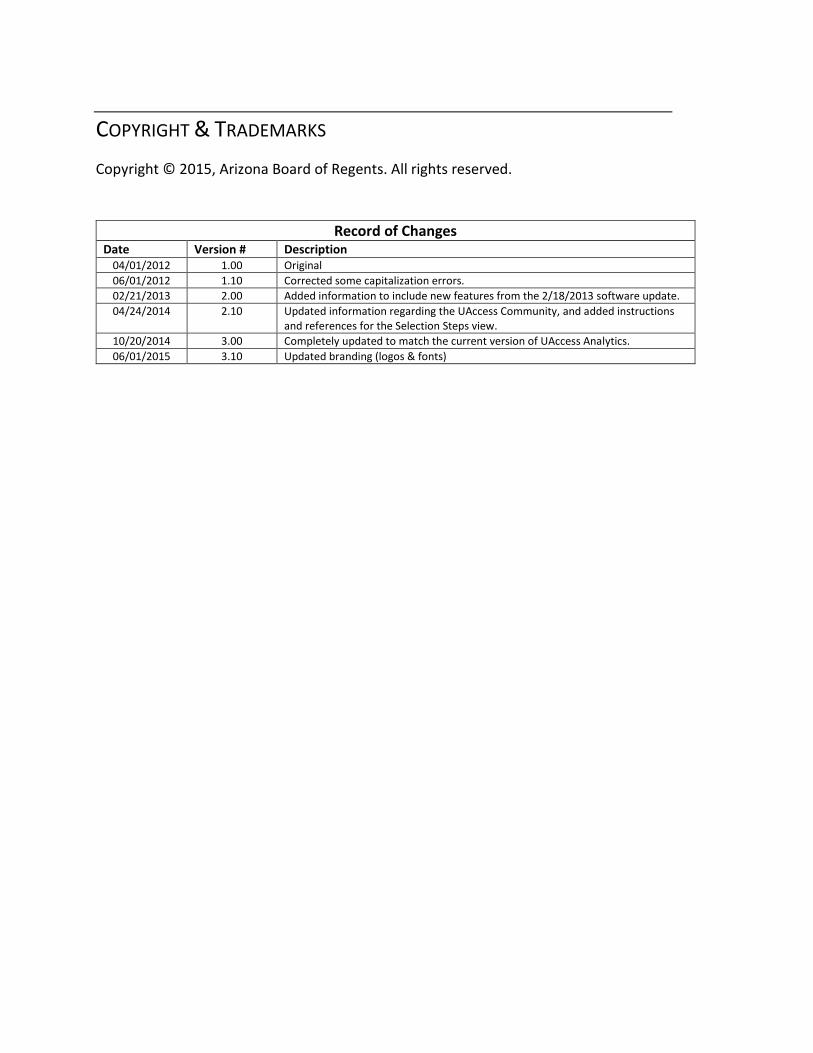
Record of Changes Date Version # Description
04/01/2012 1.00 Original
06/01/2012 1.10 Corrected some capitalization errors.
02/21/2013 2.00 Added information to include new features from the 2/18/2013 software update.
04/24/2014 2.10 Updated information regarding the UAccess Community, and added instructions and references for the Selection Steps view.
10/20/2014 3.00 Completely updated to match the current version of UAccess Analytics.
06/01/2015 3.10 Updated branding (logos & fonts)

Training Guide Basic Reports & Dashboards
Page iii
Table of Contents
About this Workshop .............................................................................................................................. v Access to Analytics Data ......................................................................................................................... v UAccess Community ................................................................................................................................ v
Basic Reports and Dashboards .................................................................................... 1
Getting Around in Analytics ................................................................................................1 Working with the Home Page ................................................................................................................. 1 Working with the Global Header ............................................................................................................ 9 Review - Home Page and Global Header .............................................................................................. 15
Working with Analyses ..................................................................................................... 17 Analytics Data ....................................................................................................................................... 17 Creating a New Analysis ........................................................................................................................ 21 Filtering an Analysis .............................................................................................................................. 29 Working with Columns ......................................................................................................................... 39 Editing the Table View .......................................................................................................................... 47 Finishing Up .......................................................................................................................................... 57 Exercise - Creating a New Analysis ....................................................................................................... 59 Adding a Graph ..................................................................................................................................... 61 Exercise - Adding a Graph ..................................................................................................................... 71
Working with Dashboards ................................................................................................ 73 Creating a New Dashboard ................................................................................................................... 73 Editing a Dashboard .............................................................................................................................. 81 Review - Working with Dashboards ...................................................................................................... 85
Appendix A: Working with Dashboard Functionality .......................................................... 87
Appendix B: More Analysis Functions on Dashboards ........................................................ 97

Training Guide Basic Reports & Dashboards
Page iv

Training Guide Basic Reports & Dashboards
Page v
About this Workshop
This workshop introduces attendees to UAccess Analytics, the University's report and dashboard creating tool.
This is a basic hands-on session, appropriate for people who will be creating employee-based ad hoc analyses (reports) and basic dashboards (collections of reports on a single web page) in Analytics. For information on additional workshops in which you can further your knowledge of Requests and Dashboards, please go to the Workshops and Training Team website at http://workshops.arizona.edu.
Access to Analytics Data
Request for Individual access to UAccess Analytics can be submitted to https://request.uaccess.arizona.edu.
UAccess Community
The UAccess Community is an online networking resource available to everyone on campus who uses UAccess systems.
If you have an official UA email address, you can request membership in the UAccess Community. Just go to http://community.uaccess.arizona.edu and click the Sign Up link in the upper right corner of the screen.
Once your membership is confirmed – usually within a few hours – you’ll have access to valuable information about all of the various aspects of the UAccess systems. You’ll want to join one or more of the groups within the Community, because that’s where the value comes in.
There is a Welcome Center available through a link on the Home page, as well as a great set of frequently asked questions (FAQs) linked through the top menu. Be sure to browse through the different Forums, check out upcoming Events, and peruse the extensive Resources provided through the Community.
Please take advantage of the opportunity and become a member of the UAccess Community.


Training Guide Basic Reports & Dashboards
Page 1
Basic Reports and Dashboards
Getting Around in Analytics
Working with the Home Page
Procedure
The Home page is the first screen you land on when you log into UAccess Analytics.
Step Action
1. The white area of the screen is the UAccess Analytics Home page. The white and blue bars across the top of the screen are called the Global Header. We'll look at that in a moment. Both of these items are simply navigation tools. Let's look at the Home page.
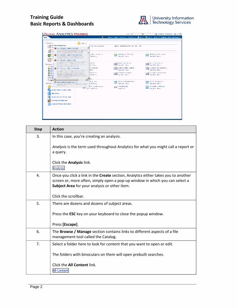
2. The Home page is divided into different sections, each of which has a different purpose. The Create section contains links which let you start building different Analytics items. To get started, just click the appropriate link.
Training Guide Basic Reports & Dashboards
Page 2
Step Action
3. In this case, you're creating an analysis. Analysis is the term used throughout Analytics for what you might call a report or a query. Click the Analysis link.
4. Once you click a link in the Create section, Analytics either takes you to another screen or, more often, simply open a pop-up window in which you can select a Subject Area for your analysis or other item. Click the scrollbar.
5. There are dozens and dozens of subject areas. Press the ESC key on your keyboard to close the popup window. Press [Escape].
6. The Browse / Manage section contains links to different aspects of a file management tool called the Catalog.
7. Select a folder here to look for content that you want to open or edit. The folders with binoculars on them will open prebuilt searches. Click the All Content link.
Training Guide Basic Reports & Dashboards
Page 3
Step Action
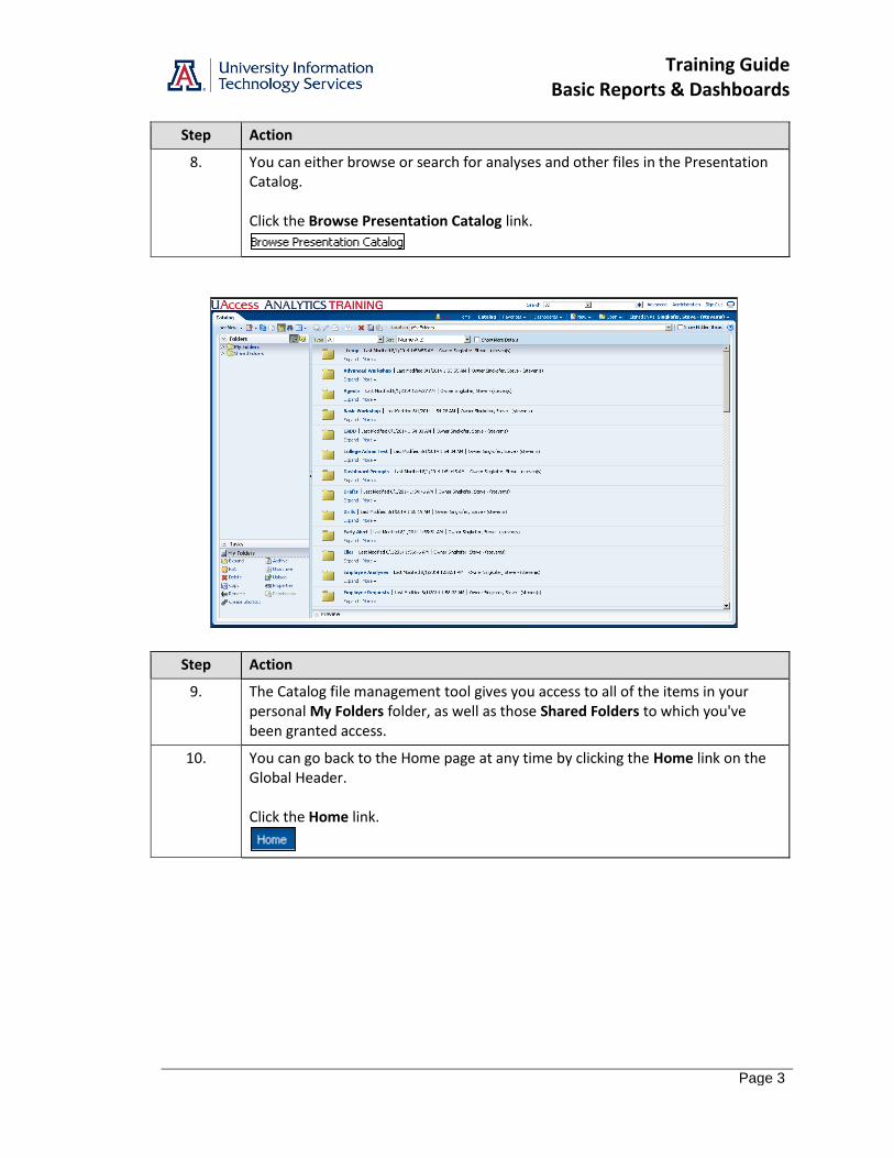
8. You can either browse or search for analyses and other files in the Presentation Catalog. Click the Browse Presentation Catalog link.
Step Action
9. The Catalog file management tool gives you access to all of the items in your personal My Folders folder, as well as those Shared Folders to which you've been granted access.
10. You can go back to the Home page at any time by clicking the Home link on the Global Header. Click the Home link.
Training Guide Basic Reports & Dashboards
Page 4
Step Action
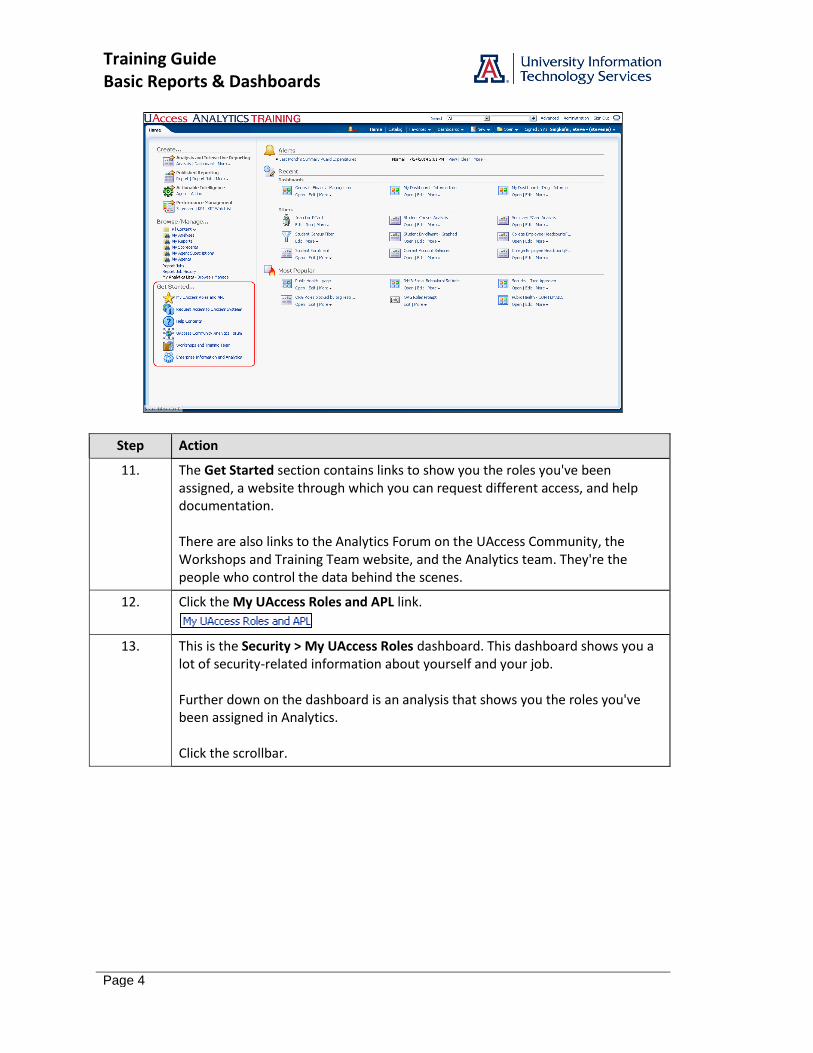
11. The Get Started section contains links to show you the roles you've been assigned, a website through which you can request different access, and help documentation. There are also links to the Analytics Forum on the UAccess Community, the Workshops and Training Team website, and the Analytics team. They're the people who control the data behind the scenes.
12. Click the My UAccess Roles and APL link.
13. This is the Security > My UAccess Roles dashboard. This dashboard shows you a lot of security-related information about yourself and your job. Further down on the dashboard is an analysis that shows you the roles you've been assigned in Analytics. Click the scrollbar.

Training Guide Basic Reports & Dashboards
Page 5
Step Action
14. The Your UAccess System Roles analysis lists the roles you've been assigned in UAccess Analytics, as well as those you've been assigned in any other UAccess system. Some of the typical roles you'll see will be BI_FS_MED, BI_HR_MED, BI_RA_MED, and BI_SA_MED. You're assigned roles by request, but only if your supervisor approves the request, and only if your job requires you to have the role.
15. Return to the Home page. Click the Home link.
16. Take a closer look at the Help documentation. Click the Help Contents link.
17. Click the UAccess Analytics link.
Training Guide Basic Reports & Dashboards
Page 6
Step Action
18. You can navigate through all of the help documentation from this one screen. Context-specific help is also available on nearly every screen or window throughout Analytics. Note: Oracle Business Intelligence Enterprise Edition is the software that drives UAccess Analytics. Note: Use your browser's built-in find function, typically available by pressing [CTRL+F] on your keyboard, to search for a specific topic on this screen.
19. Click the Close button.
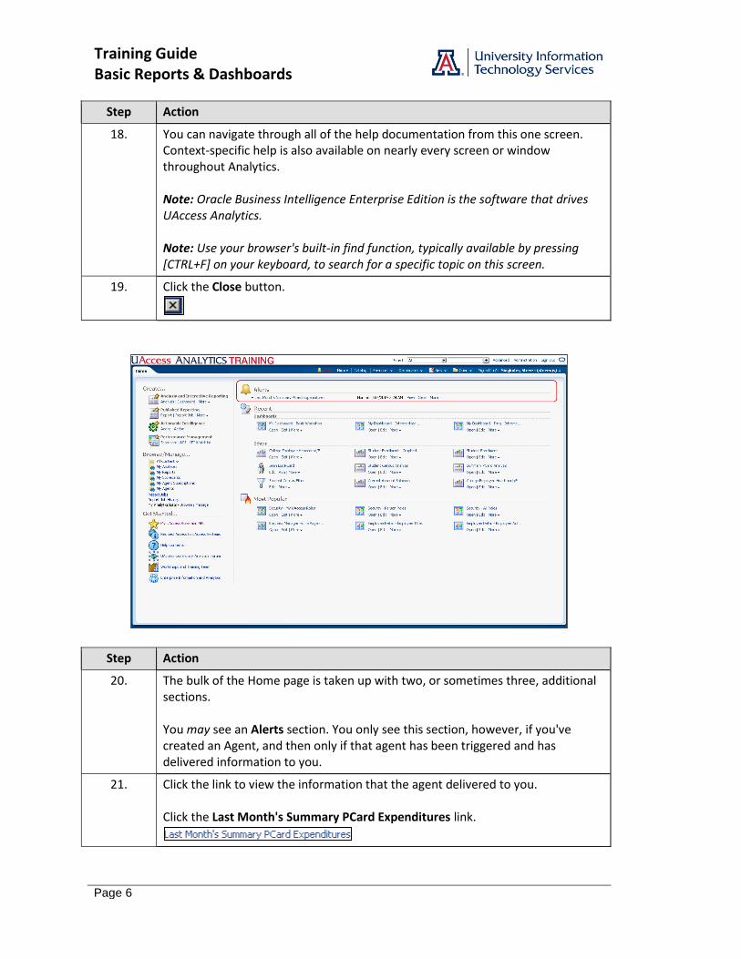
Step Action
20. The bulk of the Home page is taken up with two, or sometimes three, additional sections. You may see an Alerts section. You only see this section, however, if you've created an Agent, and then only if that agent has been triggered and has delivered information to you.
21. Click the link to view the information that the agent delivered to you. Click the Last Month's Summary PCard Expenditures link.
Training Guide Basic Reports & Dashboards
Page 7
Step Action
22. This analysis was delivered to the Home page, but could also have been delivered via email. Note: Agents are not covered in this workshop, but are covered in the UAccess Analytics: Intermediate Reports and Dashboards workshop or tutorial. Click the OK button.
Step Action
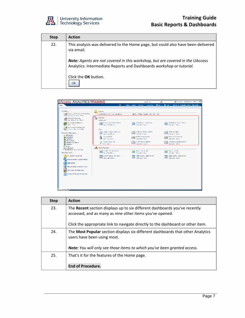
23. The Recent section displays up to six different dashboards you've recently accessed, and as many as nine other items you've opened. Click the appropriate link to navigate directly to the dashboard or other item.
24. The Most Popular section displays six different dashboards that other Analytics users have been using most. Note: You will only see those items to which you've been granted access.
25. That's it for the features of the Home page. End of Procedure.

Training Guide Basic Reports & Dashboards
Page 8
Training Guide Basic Reports & Dashboards
Page 9
Working with the Global Header
Procedure
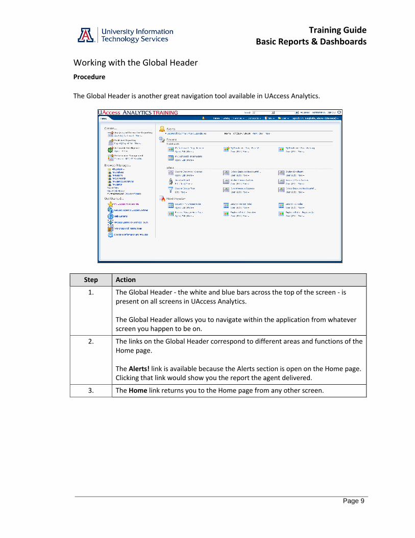
The Global Header is another great navigation tool available in UAccess Analytics.
Step Action
1. The Global Header - the white and blue bars across the top of the screen - is present on all screens in UAccess Analytics. The Global Header allows you to navigate within the application from whatever screen you happen to be on.
2. The links on the Global Header correspond to different areas and functions of the Home page. The Alerts! link is available because the Alerts section is open on the Home page. Clicking that link would show you the report the agent delivered.
3. The Home link returns you to the Home page from any other screen.
Training Guide Basic Reports & Dashboards
Page 10
Step Action
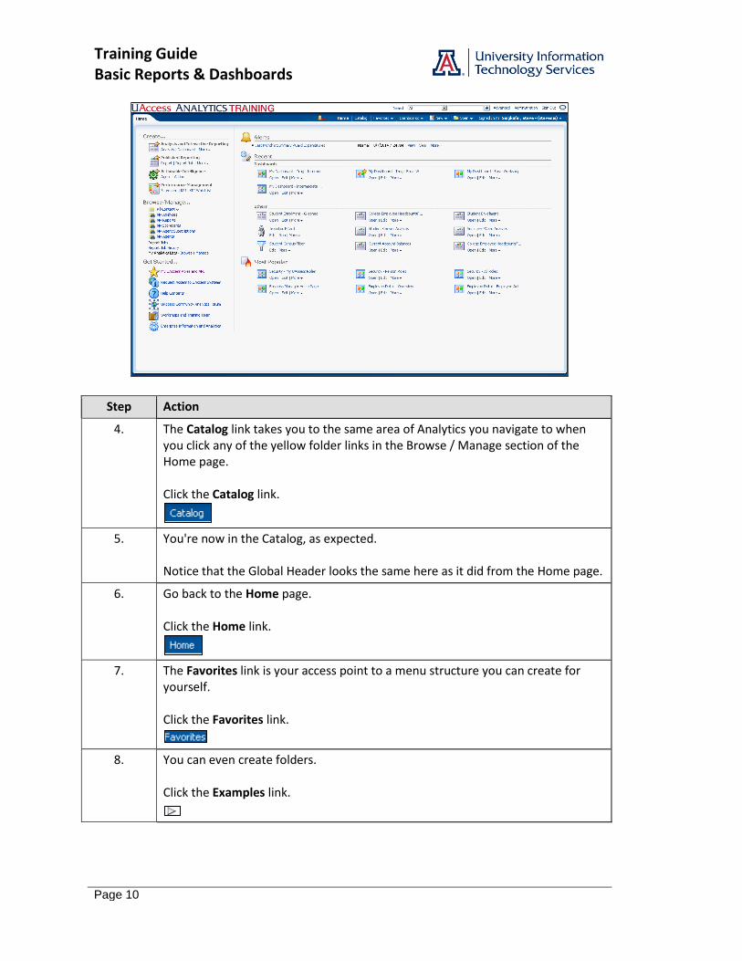
4. The Catalog link takes you to the same area of Analytics you navigate to when you click any of the yellow folder links in the Browse / Manage section of the Home page. Click the Catalog link.
5. You're now in the Catalog, as expected. Notice that the Global Header looks the same here as it did from the Home page.
6. Go back to the Home page. Click the Home link.
7. The Favorites link is your access point to a menu structure you can create for yourself. Click the Favorites link.
8. You can even create folders. Click the Examples link.
Training Guide Basic Reports & Dashboards
Page 11
Step Action
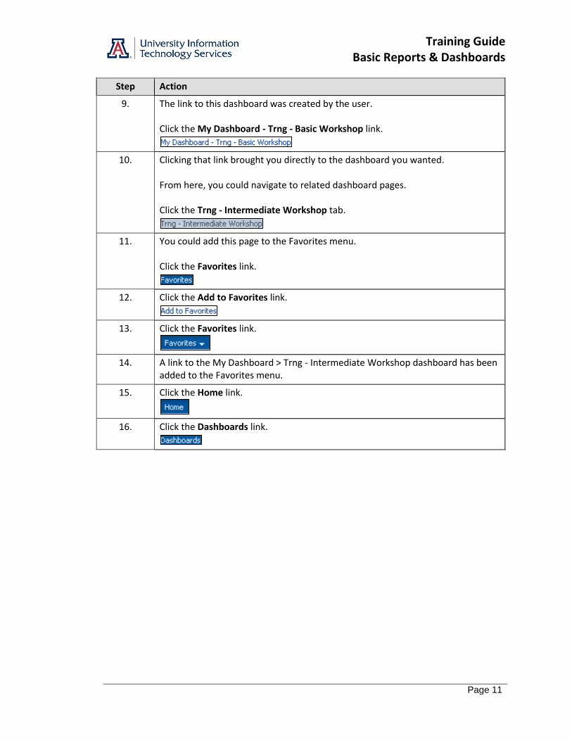
9. The link to this dashboard was created by the user. Click the My Dashboard - Trng - Basic Workshop link.
10. Clicking that link brought you directly to the dashboard you wanted. From here, you could navigate to related dashboard pages. Click the Trng - Intermediate Workshop tab.
11. You could add this page to the Favorites menu. Click the Favorites link.
12. Click the Add to Favorites link.
13. Click the Favorites link.
14. A link to the My Dashboard > Trng - Intermediate Workshop dashboard has been added to the Favorites menu.
15. Click the Home link.
16. Click the Dashboards link.

Training Guide Basic Reports & Dashboards
Page 12
Step Action
17. The Dashboards menu is your access point to all of the dashboards your roles allow you to see. If you've been granted access to Financial data, for example, you'll see the Financial link. If not, you won't.
18. Click the Financial link.
19. There are dozens and dozens of dashboards available, and hundreds of different dashboard pages.
20. When you need to create a new analysis, you can simply click the New link on the Global Header, no matter where you are in the Analytics system. Click the New link.
21. You'll see a list of the same items that are available in the Create section of the Home page. Click the Analysis link.
22. You'll see the same list of Subject Areas, too.
23. Click the Open link.

Training Guide Basic Reports & Dashboards
Page 13
Step Action
24. The Open menu lets you open different items, just like the Open menu in any other piece of software would do. One unique thing about this Open menu is that it replicates some of the data from the Recent and Most Popular sections of the Home page. It's also the quickest way to jump between multiple items you might be working on. Click the My Dashboard - Trng - Intermediate Workshop link.
25. You're right back on the last dashboard you'd accessed. Click the Home link.
26. That's it for the Global Header. Remember that it's available everywhere in Analytics and allows you to quickly navigate to any other part of the system. End of Procedure.

Training Guide Basic Reports & Dashboards
Page 14
Training Guide Basic Reports & Dashboards
Page 15
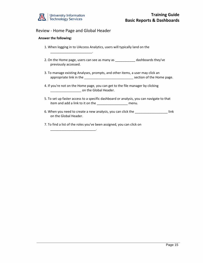
Review - Home Page and Global Header
Answer the following:
1. When logging in to UAccess Analytics, users will typically land on the _______________________.
2. On the Home page, users can see as many as ___________ dashboards they've previously accessed.
3. To manage existing Analyses, prompts, and other items, a user may click an appropriate link in the ___________________________ section of the Home page.
4. If you're not on the Home page, you can get to the file manager by clicking _________________ on the Global Header.
5. To set up faster access to a specific dashboard or analysis, you can navigate to that item and add a link to it on the _________________ menu.
6. When you need to create a new analysis, you can click the __________________ link on the Global Header.
7. To find a list of the roles you've been assigned, you can click on _________________________.

Training Guide Basic Reports & Dashboards
Page 16
Training Guide Basic Reports & Dashboards
Page 17
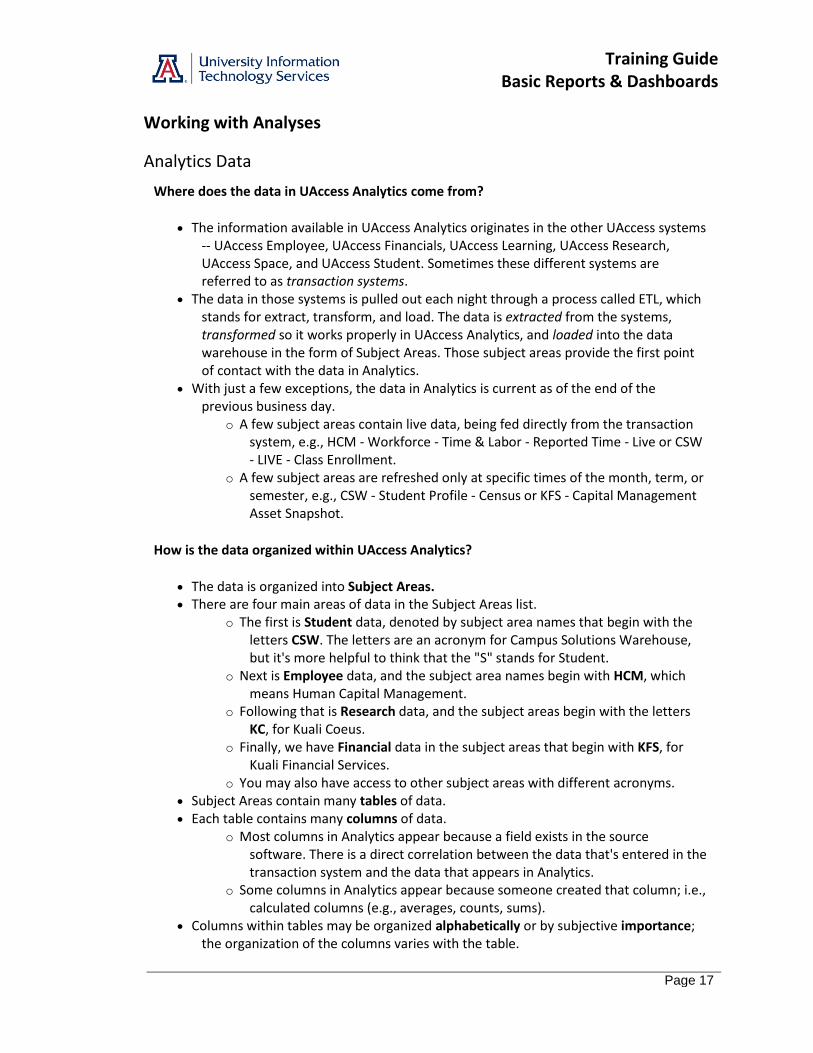
Working with Analyses
Analytics Data
Where does the data in UAccess Analytics come from?
The information available in UAccess Analytics originates in the other UAccess systems -- UAccess Employee, UAccess Financials, UAccess Learning, UAccess Research, UAccess Space, and UAccess Student. Sometimes these different systems are referred to as transaction systems.
The data in those systems is pulled out each night through a process called ETL, which stands for extract, transform, and load. The data is extracted from the systems, transformed so it works properly in UAccess Analytics, and loaded into the data warehouse in the form of Subject Areas. Those subject areas provide the first point of contact with the data in Analytics.
With just a few exceptions, the data in Analytics is current as of the end of the previous business day.
o A few subject areas contain live data, being fed directly from the transaction system, e.g., HCM - Workforce - Time & Labor - Reported Time - Live or CSW - LIVE - Class Enrollment.
o A few subject areas are refreshed only at specific times of the month, term, or semester, e.g., CSW - Student Profile - Census or KFS - Capital Management Asset Snapshot.
How is the data organized within UAccess Analytics?
The data is organized into Subject Areas. There are four main areas of data in the Subject Areas list.
o The first is Student data, denoted by subject area names that begin with the letters CSW. The letters are an acronym for Campus Solutions Warehouse, but it's more helpful to think that the "S" stands for Student.
o Next is Employee data, and the subject area names begin with HCM, which means Human Capital Management.
o Following that is Research data, and the subject areas begin with the letters KC, for Kuali Coeus.
o Finally, we have Financial data in the subject areas that begin with KFS, for Kuali Financial Services.
o You may also have access to other subject areas with different acronyms. Subject Areas contain many tables of data. Each table contains many columns of data.
o Most columns in Analytics appear because a field exists in the source software. There is a direct correlation between the data that's entered in the transaction system and the data that appears in Analytics.
o Some columns in Analytics appear because someone created that column; i.e., calculated columns (e.g., averages, counts, sums).
Columns within tables may be organized alphabetically or by subjective importance; the organization of the columns varies with the table.

Training Guide Basic Reports & Dashboards
Page 18
How current is the data in Analytics?
The data available in UAccess Analytics is typically current as of the close of business on the previous business day. That means that the data you’re seeing today was from yesterday.
In some instances, the data might be live – available in Analytics as it’s being entered in the transaction system – or it might be snapshot data. Snapshot data is data that was preserved or saved as of a specific date. In some Student subject areas, for example, the data is captured on the 21st day of the spring and fall terms and is only ever updated when the next major term rolls around.
What are some examples of the different types of data in available in UAccess Analytics?
Tables very often contain three versions of many columns, e.g., o Position Code (or ID) – a one-, two-, or three-character alphanumeric code or
abbreviation. o Position – a shorter form of the Description column (10 char). o Position Desc – a longer description of the column’s information (30 char).
Sometimes there are just two versions of columns, e.g., o ABOR Code (or ID) – a one-, two-, or three-character alphanumeric code or
abbreviation. o ABOR Code Description – a longer description of the column’s information (30
char).
The particular version of any data column you might add to your analysis depends on your understanding of the data, or the understanding of those for whom the analysis is intended. If the analysis users won't understand the code version of the data, you should use either the short-form description column or the long-form description column. What are Indicators and Flags?
Indicators and Flags are Y or N columns, e.g., Disabled Veteran Flag, Works with Animals Flag, or Current Indicator are all Y/N columns. If the Y/N answer to the implied question is not known, those columns may display a dash (-).
What about those Date Tables?
Date tables for important dates contain many versions of date data. The date column you'll most likely want will be the Day Date column, which is typically
the top data column in the date table.
Training Guide Basic Reports & Dashboards
Page 19
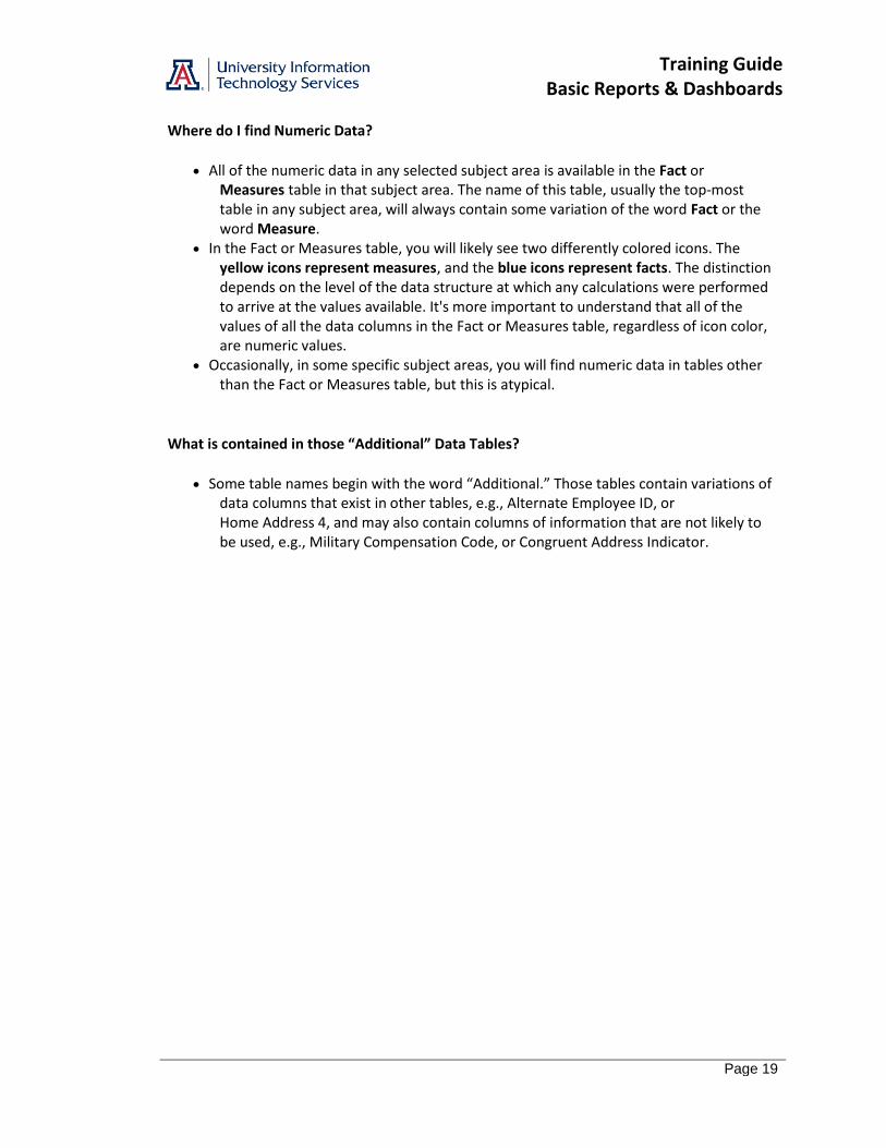
Where do I find Numeric Data?
All of the numeric data in any selected subject area is available in the Fact or Measures table in that subject area. The name of this table, usually the top-most table in any subject area, will always contain some variation of the word Fact or the word Measure.
In the Fact or Measures table, you will likely see two differently colored icons. The yellow icons represent measures, and the blue icons represent facts. The distinction depends on the level of the data structure at which any calculations were performed to arrive at the values available. It's more important to understand that all of the values of all the data columns in the Fact or Measures table, regardless of icon color, are numeric values.
Occasionally, in some specific subject areas, you will find numeric data in tables other than the Fact or Measures table, but this is atypical.
What is contained in those “Additional” Data Tables?
Some table names begin with the word “Additional.” Those tables contain variations of data columns that exist in other tables, e.g., Alternate Employee ID, or Home Address 4, and may also contain columns of information that are not likely to be used, e.g., Military Compensation Code, or Congruent Address Indicator.

Training Guide Basic Reports & Dashboards
Page 20
Training Guide Basic Reports & Dashboards
Page 21
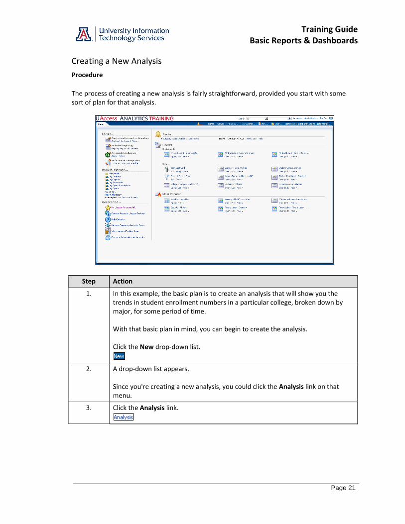
Creating a New Analysis
Procedure
The process of creating a new analysis is fairly straightforward, provided you start with some sort of plan for that analysis.
Step Action
1. In this example, the basic plan is to create an analysis that will show you the trends in student enrollment numbers in a particular college, broken down by major, for some period of time. With that basic plan in mind, you can begin to create the analysis. Click the New drop-down list.
2. A drop-down list appears. Since you're creating a new analysis, you could click the Analysis link on that menu.
3. Click the Analysis link.
Training Guide Basic Reports & Dashboards
Page 22
Step Action
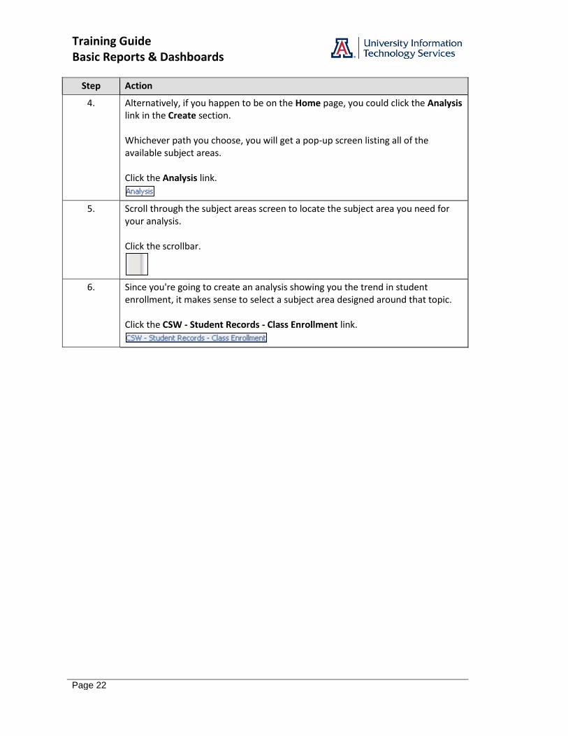
4. Alternatively, if you happen to be on the Home page, you could click the Analysis link in the Create section. Whichever path you choose, you will get a pop-up screen listing all of the available subject areas. Click the Analysis link.
5. Scroll through the subject areas screen to locate the subject area you need for your analysis. Click the scrollbar.
6. Since you're going to create an analysis showing you the trend in student enrollment, it makes sense to select a subject area designed around that topic. Click the CSW - Student Records - Class Enrollment link.

Training Guide Basic Reports & Dashboards
Page 23
Step Action
7. You are now in analysis-building mode. Note the tabs in the upper-left corner of the screen. You are working on an Untitled analysis, and the process of creating the analysis always begins on the Criteria tab.
8. The first data column we want is the column that will tell us the number of students enrolled. As you learned earlier, all of the numeric columns are typically contained in the Fact or Measures table. Note: Refer to the Analytics Data discussion to learn how data is organized within UAccess Analytics. Click the Fact Class Enrollment dropdown button to activate the menu.
9. Which data column should you select to show how many students are enrolled? Note: the Student Enrollment Count column is a measures column, represented by a yellow icon. This bit of information will have some relevance later in the workshop. Double-click the Student Enrollment Count list item.
Training Guide Basic Reports & Dashboards
Page 24
Step Action
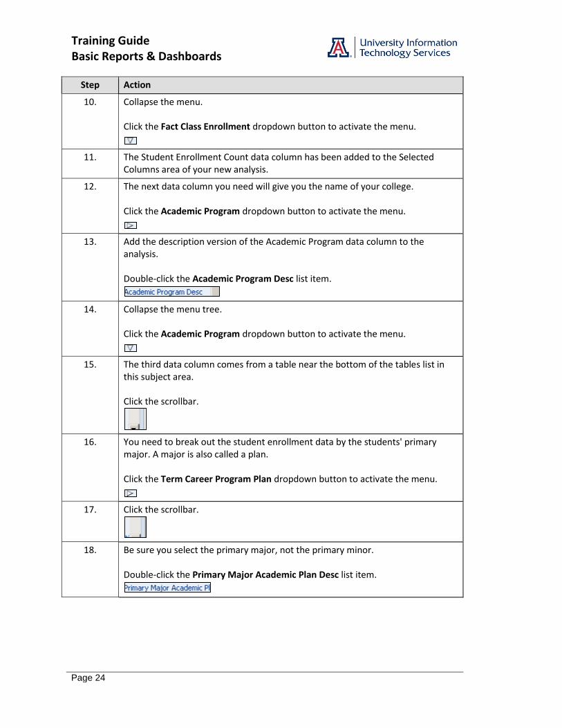
10. Collapse the menu. Click the Fact Class Enrollment dropdown button to activate the menu.
11. The Student Enrollment Count data column has been added to the Selected Columns area of your new analysis.
12. The next data column you need will give you the name of your college. Click the Academic Program dropdown button to activate the menu.
13. Add the description version of the Academic Program data column to the analysis. Double-click the Academic Program Desc list item.
14. Collapse the menu tree. Click the Academic Program dropdown button to activate the menu.
15. The third data column comes from a table near the bottom of the tables list in this subject area. Click the scrollbar.
16. You need to break out the student enrollment data by the students' primary major. A major is also called a plan. Click the Term Career Program Plan dropdown button to activate the menu.
17. Click the scrollbar.
18. Be sure you select the primary major, not the primary minor. Double-click the Primary Major Academic Plan Desc list item.
Training Guide Basic Reports & Dashboards
Page 25
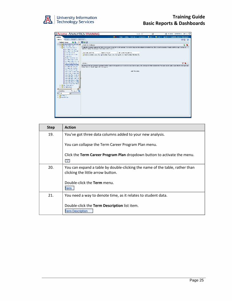
Step Action
19. You've got three data columns added to your new analysis. You can collapse the Term Career Program Plan menu. Click the Term Career Program Plan dropdown button to activate the menu.
20. You can expand a table by double-clicking the name of the table, rather than clicking the little arrow button. Double-click the Term menu.
21. You need a way to denote time, as it relates to student data. Double-click the Term Description list item.
Training Guide Basic Reports & Dashboards
Page 26
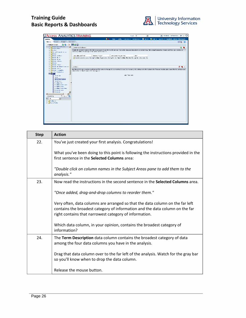
Step Action
22. You've just created your first analysis. Congratulations! What you've been doing to this point is following the instructions provided in the first sentence in the Selected Columns area: "Double click on column names in the Subject Areas pane to add them to the analysis."
23. Now read the instructions in the second sentence in the Selected Columns area. "Once added, drag-and-drop columns to reorder them." Very often, data columns are arranged so that the data column on the far left contains the broadest category of information and the data column on the far right contains that narrowest category of information. Which data column, in your opinion, contains the broadest category of information?
24. The Term Description data column contains the broadest category of data among the four data columns you have in the analysis. Drag that data column over to the far left of the analysis. Watch for the gray bar so you'll know when to drop the data column. Release the mouse button.
Training Guide Basic Reports & Dashboards
Page 27
Step Action
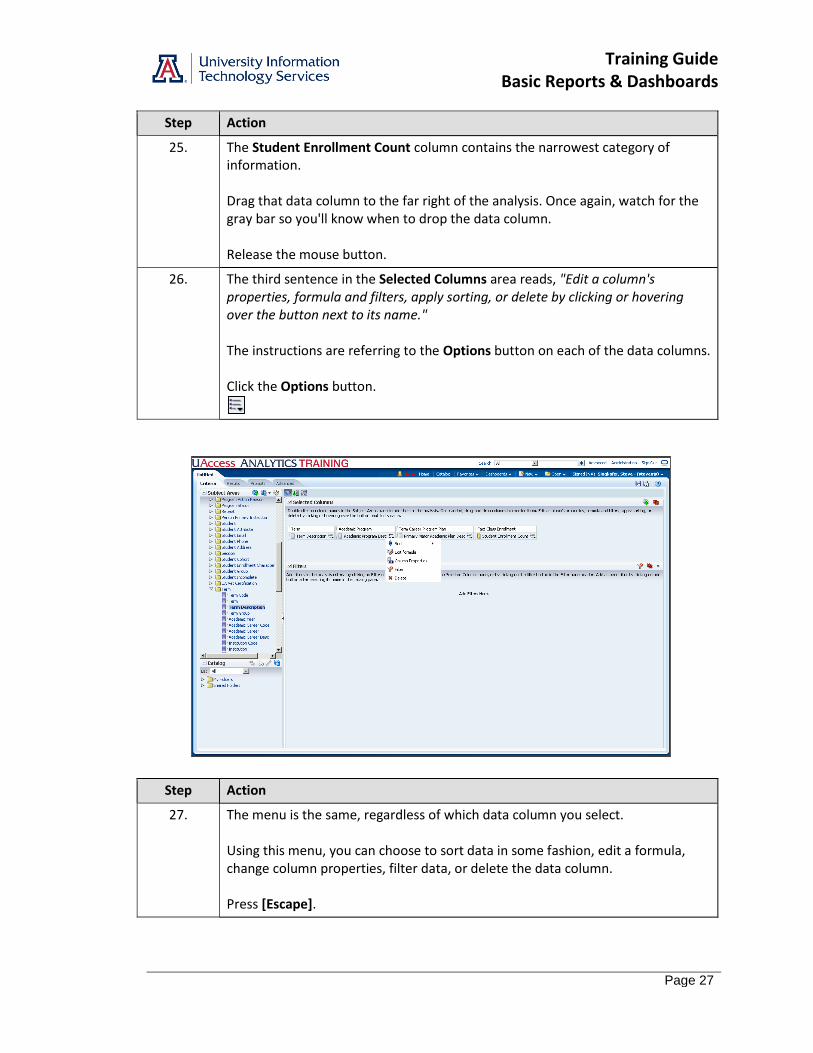
25. The Student Enrollment Count column contains the narrowest category of information. Drag that data column to the far right of the analysis. Once again, watch for the gray bar so you'll know when to drop the data column. Release the mouse button.
26. The third sentence in the Selected Columns area reads, "Edit a column's properties, formula and filters, apply sorting, or delete by clicking or hovering over the button next to its name." The instructions are referring to the Options button on each of the data columns. Click the Options button.
Step Action
27. The menu is the same, regardless of which data column you select. Using this menu, you can choose to sort data in some fashion, edit a formula, change column properties, filter data, or delete the data column. Press [Escape].
Training Guide Basic Reports & Dashboards
Page 28
Step Action
28. You've added the data columns you need, and rearranged them to put them in a logical order. Now you should create a filter for the analysis. End of Procedure.
Training Guide Basic Reports & Dashboards
Page 29
Filtering an Analysis
Procedure
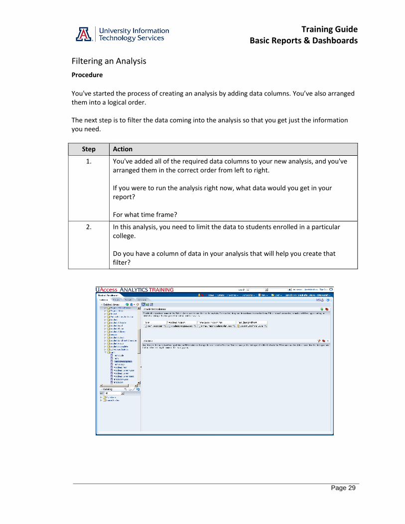
You've started the process of creating an analysis by adding data columns. You’ve also arranged them into a logical order. The next step is to filter the data coming into the analysis so that you get just the information you need.
Step Action
1. You've added all of the required data columns to your new analysis, and you've arranged them in the correct order from left to right. If you were to run the analysis right now, what data would you get in your report? For what time frame?
2. In this analysis, you need to limit the data to students enrolled in a particular college. Do you have a column of data in your analysis that will help you create that filter?
Training Guide Basic Reports & Dashboards
Page 30
Step Action
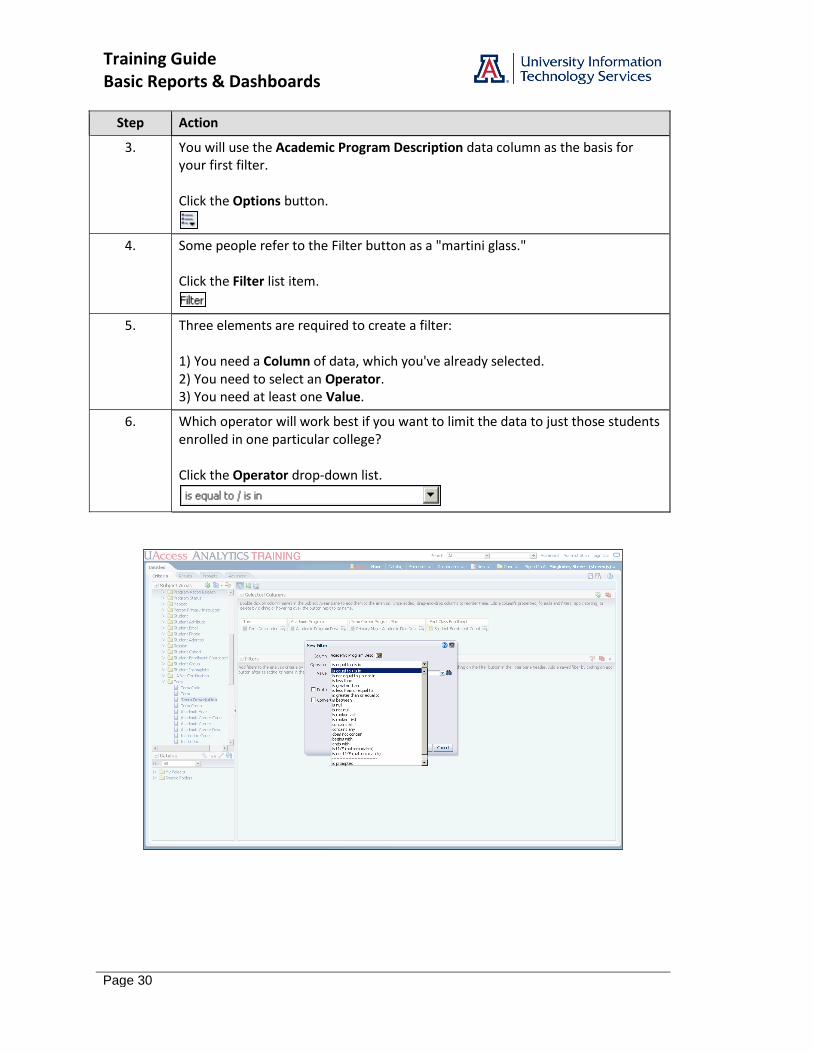
3. You will use the Academic Program Description data column as the basis for your first filter. Click the Options button.
4. Some people refer to the Filter button as a "martini glass." Click the Filter list item.
5. Three elements are required to create a filter: 1) You need a Column of data, which you've already selected. 2) You need to select an Operator. 3) You need at least one Value.
6. Which operator will work best if you want to limit the data to just those students enrolled in one particular college? Click the Operator drop-down list.
Training Guide Basic Reports & Dashboards
Page 31
Step Action
7. Although there are typically several different ways to create nearly any filter, there is always one way that is more direct than any other way. In this case, the default operator is your best choice. Click the is equal to / is in list item.
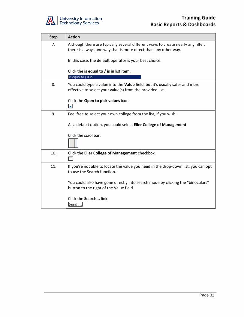
8. You could type a value into the Value field, but it's usually safer and more effective to select your value(s) from the provided list. Click the Open to pick values icon.
9. Feel free to select your own college from the list, if you wish. As a default option, you could select Eller College of Management. Click the scrollbar.
10. Click the Eller College of Management checkbox.
11. If you're not able to locate the value you need in the drop-down list, you can opt to use the Search function. You could also have gone directly into search mode by clicking the “binoculars” button to the right of the Value field. Click the Search... link.
Training Guide Basic Reports & Dashboards
Page 32
Step Action
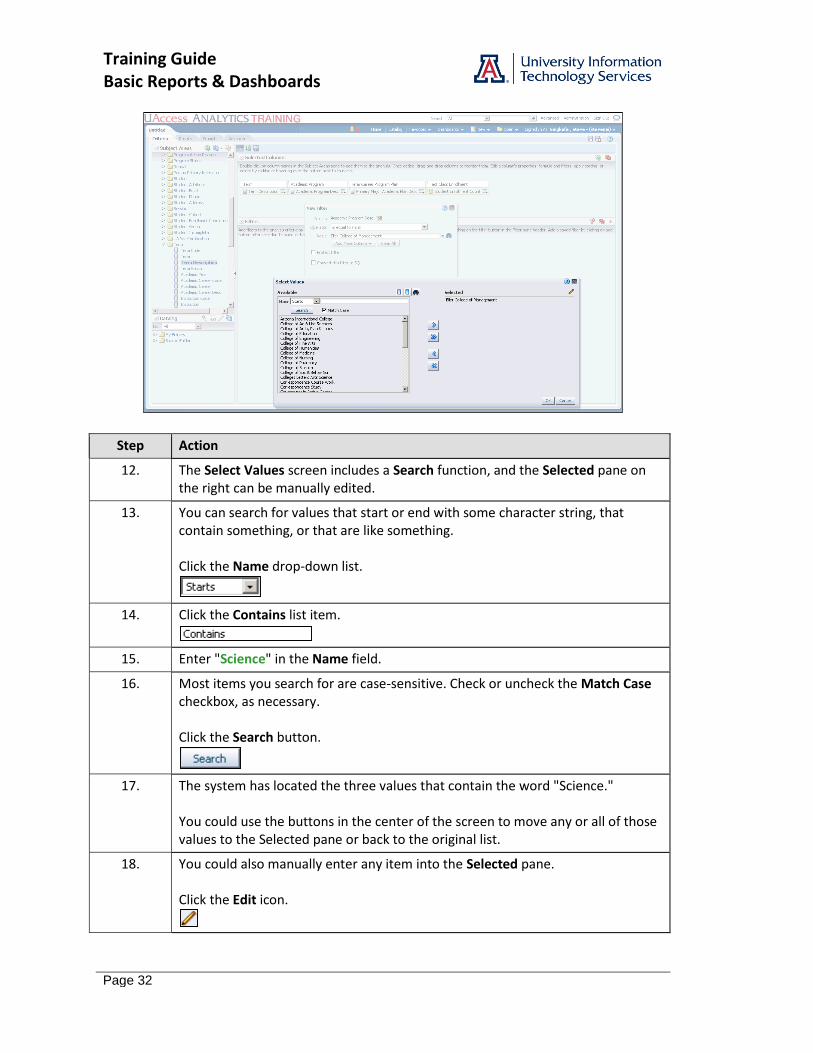
12. The Select Values screen includes a Search function, and the Selected pane on the right can be manually edited.
13. You can search for values that start or end with some character string, that contain something, or that are like something. Click the Name drop-down list.
14. Click the Contains list item.
15. Enter "Science" in the Name field.
16. Most items you search for are case-sensitive. Check or uncheck the Match Case checkbox, as necessary. Click the Search button.
17. The system has located the three values that contain the word "Science." You could use the buttons in the center of the screen to move any or all of those values to the Selected pane or back to the original list.
18. You could also manually enter any item into the Selected pane. Click the Edit icon.
Training Guide Basic Reports & Dashboards
Page 33
Step Action
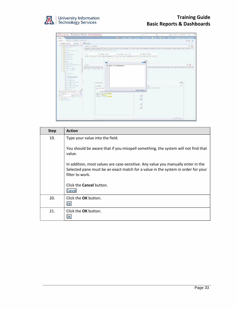
19. Type your value into the field. You should be aware that if you misspell something, the system will not find that value. In addition, most values are case-sensitive. Any value you manually enter in the Selected pane must be an exact match for a value in the system in order for your filter to work. Click the Cancel button.
20. Click the OK button.
21. Click the OK button.
Training Guide Basic Reports & Dashboards
Page 34
Step Action
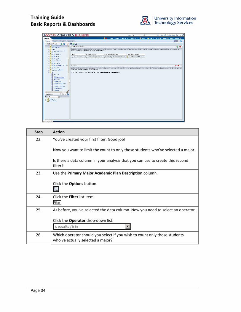
22. You've created your first filter. Good job! Now you want to limit the count to only those students who've selected a major. Is there a data column in your analysis that you can use to create this second filter?
23. Use the Primary Major Academic Plan Description column. Click the Options button.
24. Click the Filter list item.
25. As before, you've selected the data column. Now you need to select an operator. Click the Operator drop-down list.
26. Which operator should you select if you wish to count only those students who've actually selected a major?
Training Guide Basic Reports & Dashboards
Page 35
Step Action
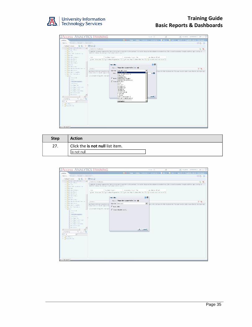
27. Click the is not null list item.
Training Guide Basic Reports & Dashboards
Page 36
Step Action
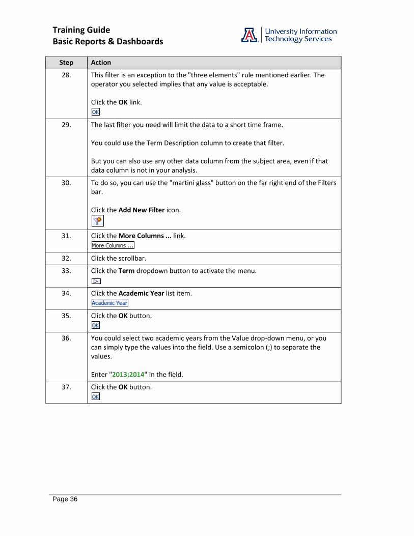
28. This filter is an exception to the "three elements" rule mentioned earlier. The operator you selected implies that any value is acceptable. Click the OK link.
29. The last filter you need will limit the data to a short time frame. You could use the Term Description column to create that filter. But you can also use any other data column from the subject area, even if that data column is not in your analysis.
30. To do so, you can use the "martini glass" button on the far right end of the Filters bar. Click the Add New Filter icon.
31. Click the More Columns ... link.
32. Click the scrollbar.
33. Click the Term dropdown button to activate the menu.
34. Click the Academic Year list item.
35. Click the OK button.
36. You could select two academic years from the Value drop-down menu, or you can simply type the values into the field. Use a semicolon (;) to separate the values. Enter "2013;2014" in the field.
37. Click the OK button.
Training Guide Basic Reports & Dashboards
Page 37
Step Action
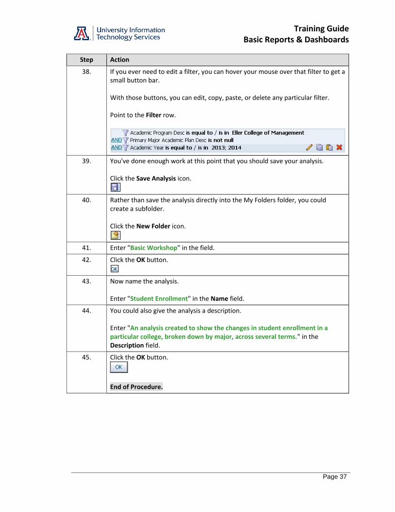
38. If you ever need to edit a filter, you can hover your mouse over that filter to get a small button bar. With those buttons, you can edit, copy, paste, or delete any particular filter. Point to the Filter row.
39. You've done enough work at this point that you should save your analysis. Click the Save Analysis icon.
40. Rather than save the analysis directly into the My Folders folder, you could create a subfolder. Click the New Folder icon.
41. Enter "Basic Workshop" in the field.
42. Click the OK button.
43. Now name the analysis. Enter "Student Enrollment" in the Name field.
44. You could also give the analysis a description. Enter "An analysis created to show the changes in student enrollment in a particular college, broken down by major, across several terms." in the Description field.
45. Click the OK button.
End of Procedure.

Training Guide Basic Reports & Dashboards
Page 38
Training Guide Basic Reports & Dashboards
Page 39
Working with Columns
Procedure
You've created, filtered, and saved the analysis. It's time to look at the results.
Step Action
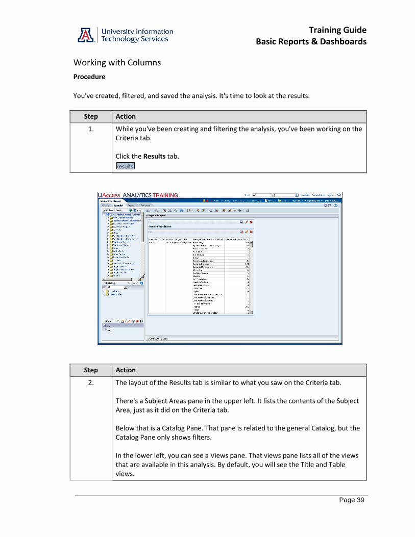
1. While you've been creating and filtering the analysis, you've been working on the Criteria tab. Click the Results tab.
Step Action
2. The layout of the Results tab is similar to what you saw on the Criteria tab. There's a Subject Areas pane in the upper left. It lists the contents of the Subject Area, just as it did on the Criteria tab. Below that is a Catalog Pane. That pane is related to the general Catalog, but the Catalog Pane only shows filters. In the lower left, you can see a Views pane. That views pane lists all of the views that are available in this analysis. By default, you will see the Title and Table views.
Training Guide Basic Reports & Dashboards
Page 40
Step Action
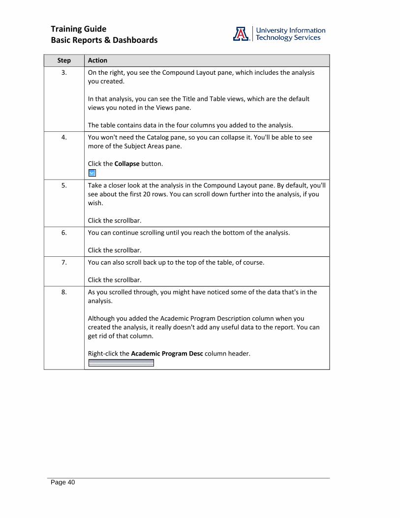
3. On the right, you see the Compound Layout pane, which includes the analysis you created. In that analysis, you can see the Title and Table views, which are the default views you noted in the Views pane. The table contains data in the four columns you added to the analysis.
4. You won't need the Catalog pane, so you can collapse it. You'll be able to see more of the Subject Areas pane. Click the Collapse button.
5. Take a closer look at the analysis in the Compound Layout pane. By default, you'll see about the first 20 rows. You can scroll down further into the analysis, if you wish. Click the scrollbar.
6. You can continue scrolling until you reach the bottom of the analysis. Click the scrollbar.
7. You can also scroll back up to the top of the table, of course. Click the scrollbar.
8. As you scrolled through, you might have noticed some of the data that's in the analysis. Although you added the Academic Program Description column when you created the analysis, it really doesn't add any useful data to the report. You can get rid of that column. Right-click the Academic Program Desc column header.
Training Guide Basic Reports & Dashboards
Page 41
Step Action
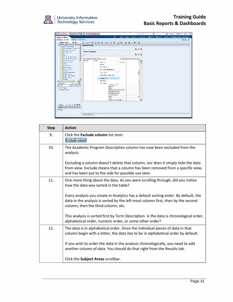
9. Click the Exclude column list item.
10. The Academic Program Description column has now been excluded from the analysis. Excluding a column doesn't delete that column, nor does it simply hide the data from view. Exclude means that a column has been removed from a specific view, and has been put to the side for possible use later.
11. One more thing about the data. As you were scrolling through, did you notice how the data was sorted in the table? Every analysis you create in Analytics has a default sorting order. By default, the data in the analysis is sorted by the left-most column first, then by the second column, then the third column, etc. This analysis is sorted first by Term Description. Is the data is chronological order, alphabetical order, numeric order, or some other order?
12. The data is in alphabetical order. Since the individual pieces of data in that column begin with a letter, the data has to be in alphabetical order by default. If you wish to order the data in the analysis chronologically, you need to add another column of data. You should do that right from the Results tab. Click the Subject Areas scrollbar.
Training Guide Basic Reports & Dashboards
Page 42
Step Action
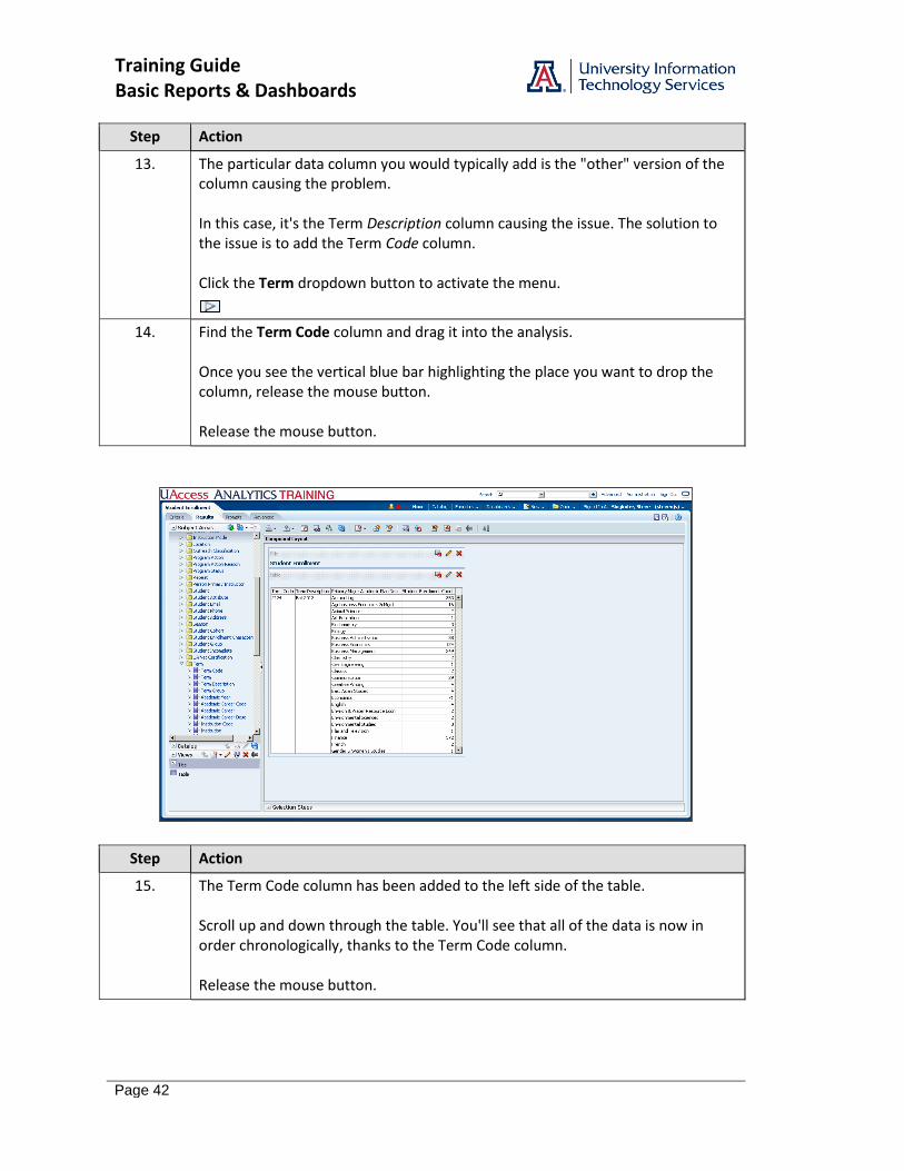
13. The particular data column you would typically add is the "other" version of the column causing the problem. In this case, it's the Term Description column causing the issue. The solution to the issue is to add the Term Code column. Click the Term dropdown button to activate the menu.
14. Find the Term Code column and drag it into the analysis. Once you see the vertical blue bar highlighting the place you want to drop the column, release the mouse button. Release the mouse button.
Step Action
15. The Term Code column has been added to the left side of the table. Scroll up and down through the table. You'll see that all of the data is now in order chronologically, thanks to the Term Code column. Release the mouse button.
Training Guide Basic Reports & Dashboards
Page 43
Step Action
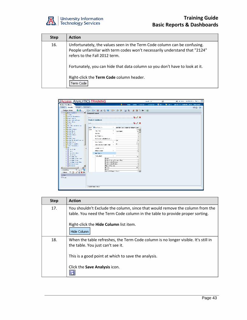
16. Unfortunately, the values seen in the Term Code column can be confusing. People unfamiliar with term codes won't necessarily understand that "2124" refers to the Fall 2012 term. Fortunately, you can hide that data column so you don't have to look at it. Right-click the Term Code column header.
Step Action
17. You shouldn't Exclude the column, since that would remove the column from the table. You need the Term Code column in the table to provide proper sorting. Right-click the Hide Column list item.
18. When the table refreshes, the Term Code column is no longer visible. It's still in the table. You just can't see it. This is a good point at which to save the analysis. Click the Save Analysis icon.

Training Guide Basic Reports & Dashboards
Page 44
Step Action
19. Now that you've made some changes to the analysis on the Results tab, take a look at the changes that have been taking place on the Criteria tab. Click the Criteria tab.
Step Action
20. There are two things to note here: 1. The Academic Program Desc column is still in the analysis. That's the column that you Excluded from the table. "Exclude" does not mean "delete." 2. The Term Code column that you added on the Results tab is present, but note that it's on the far right side of the row of data columns. Where did you add that column on the Results tab? When you moved from the Criteria tab to the Results tab that first time, the system created a disconnect between the two tabs. The same data columns must exist on both tabs in some fashion, but the order of the columns and how and whether you can see them is determined elsewhere.
21. Click the Results tab.

Training Guide Basic Reports & Dashboards
Page 45
Step Action
22. Those are the basic steps for excluding, adding, and hiding columns in the Results tab. End of Procedure.

Training Guide Basic Reports & Dashboards
Page 46
Training Guide Basic Reports & Dashboards
Page 47
Editing the Table View
Procedure
You can change the structure and functions on the table by editing the table.
Step Action
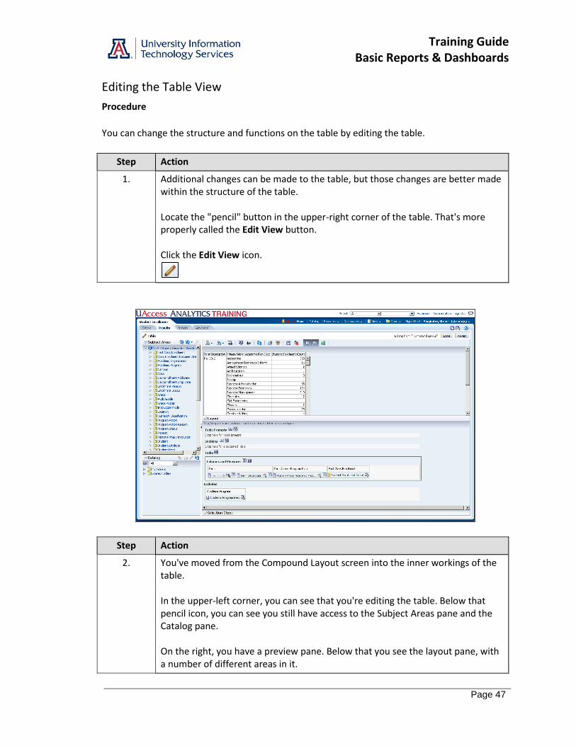
1. Additional changes can be made to the table, but those changes are better made within the structure of the table. Locate the "pencil" button in the upper-right corner of the table. That's more properly called the Edit View button. Click the Edit View icon.
Step Action
2. You've moved from the Compound Layout screen into the inner workings of the table. In the upper-left corner, you can see that you're editing the table. Below that pencil icon, you can see you still have access to the Subject Areas pane and the Catalog pane. On the right, you have a preview pane. Below that you see the layout pane, with a number of different areas in it.
Training Guide Basic Reports & Dashboards
Page 48
Step Action
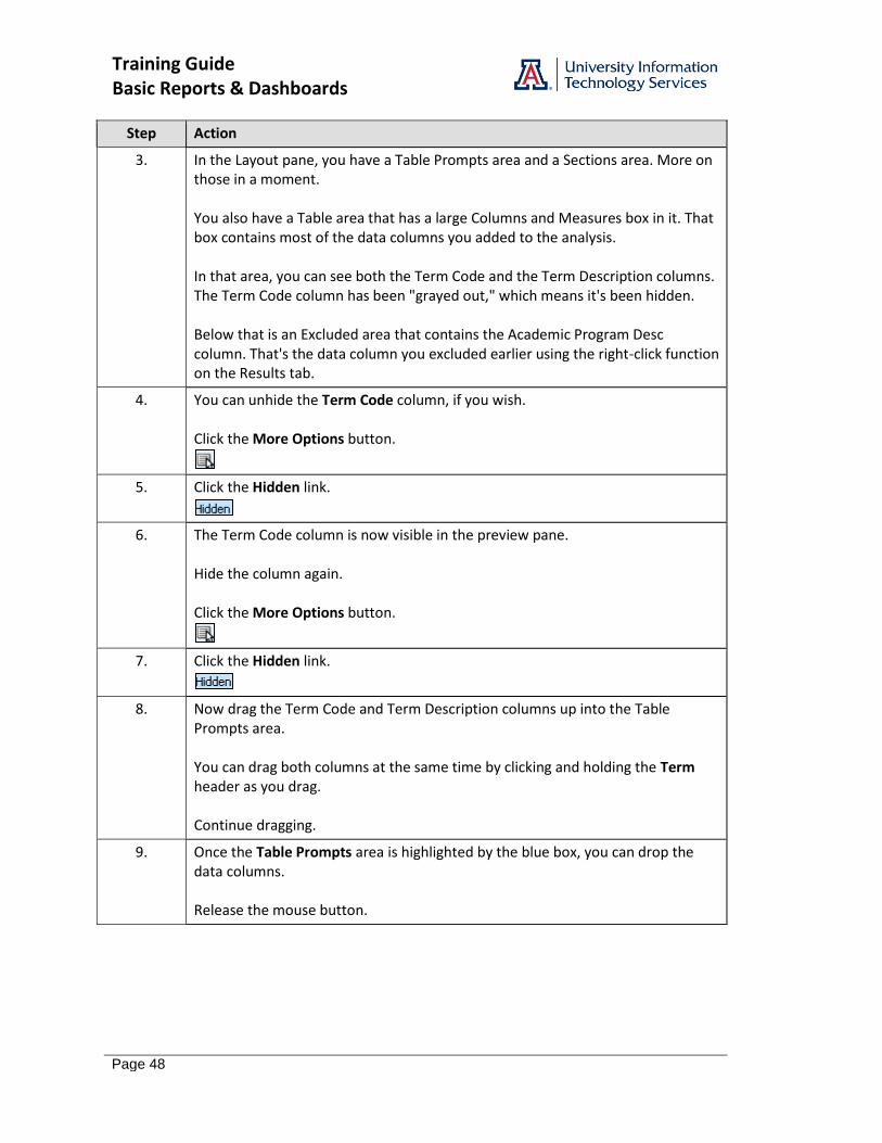
3. In the Layout pane, you have a Table Prompts area and a Sections area. More on those in a moment. You also have a Table area that has a large Columns and Measures box in it. That box contains most of the data columns you added to the analysis. In that area, you can see both the Term Code and the Term Description columns. The Term Code column has been "grayed out," which means it's been hidden. Below that is an Excluded area that contains the Academic Program Desc column. That's the data column you excluded earlier using the right-click function on the Results tab.
4. You can unhide the Term Code column, if you wish. Click the More Options button.
5. Click the Hidden link.
6. The Term Code column is now visible in the preview pane. Hide the column again. Click the More Options button.
7. Click the Hidden link.
8. Now drag the Term Code and Term Description columns up into the Table Prompts area. You can drag both columns at the same time by clicking and holding the Term header as you drag. Continue dragging.
9. Once the Table Prompts area is highlighted by the blue box, you can drop the data columns. Release the mouse button.
Training Guide Basic Reports & Dashboards
Page 49
Step Action
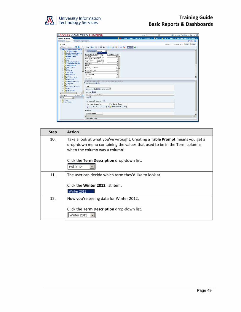
10. Take a look at what you've wrought. Creating a Table Prompt means you get a drop-down menu containing the values that used to be in the Term columns when the column was a column! Click the Term Description drop-down list.
11. The user can decide which term they'd like to look at. Click the Winter 2012 list item.
12. Now you're seeing data for Winter 2012. Click the Term Description drop-down list.
Training Guide Basic Reports & Dashboards
Page 50
Step Action
13. And you can switch back to Fall 2012. Click the Fall 2012 list item.
14. Why did you have to move both of the Term columns into the Table Prompts area if you're only able to see the Term Description column? What purpose does the Term Code column serve?
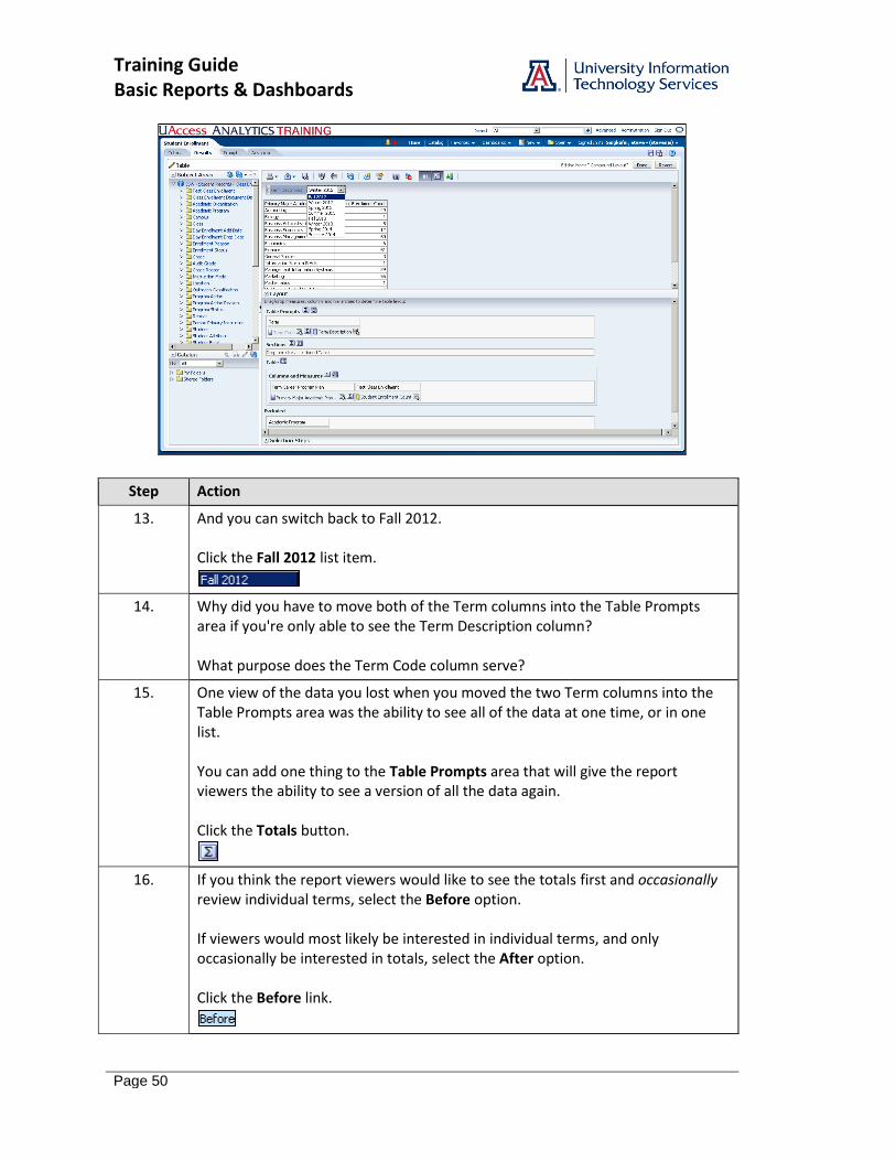
15. One view of the data you lost when you moved the two Term columns into the Table Prompts area was the ability to see all of the data at one time, or in one list. You can add one thing to the Table Prompts area that will give the report viewers the ability to see a version of all the data again. Click the Totals button.
16. If you think the report viewers would like to see the totals first and occasionally review individual terms, select the Before option. If viewers would most likely be interested in individual terms, and only occasionally be interested in totals, select the After option. Click the Before link.
Training Guide Basic Reports & Dashboards
Page 51
Step Action
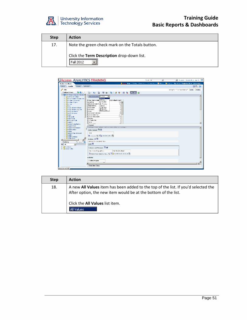
17. Note the green check mark on the Totals button. Click the Term Description drop-down list.
Step Action
18. A new All Values item has been added to the top of the list. If you'd selected the After option, the new item would be at the bottom of the list. Click the All Values list item.

Training Guide Basic Reports & Dashboards
Page 52
Step Action
19. The table now shows you combined values for all of the different terms. Be careful using the word total in this situation. What you're seeing in this table are not totals. The numbers from the Accounting major for each academic term, for example, are not simply added together. The number of Accounting students you see in the All Values version of the table represents a distinct count of Accounting students pulled together from the eight academic terms available in this analysis. If you were to list the student's names, you'd see the given number of unique names. If you added up or summed the numbers of Accounting students from each term, you'd see that there were over 2000 seats filled up in Accounting classes. Those seats were filled by the given number of individual, unique students.
20. You can also add a grand total to the bottom of the table. To do that, you need to click the Totals button in the Columns and Measures area. Click the Totals button.
21. There's only one option here. Click the After link.
Training Guide Basic Reports & Dashboards
Page 53
Step Action
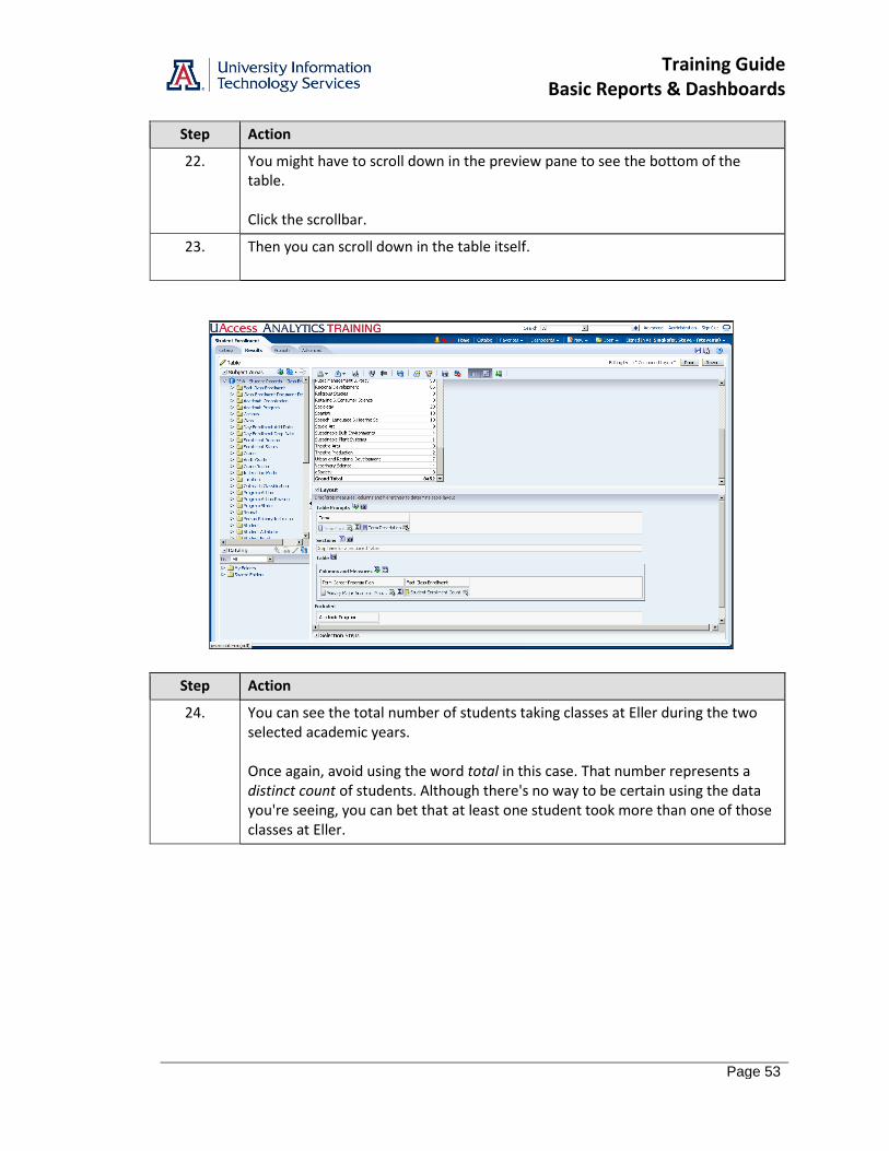
22. You might have to scroll down in the preview pane to see the bottom of the table. Click the scrollbar.
23. Then you can scroll down in the table itself.
Step Action
24. You can see the total number of students taking classes at Eller during the two selected academic years. Once again, avoid using the word total in this case. That number represents a distinct count of students. Although there's no way to be certain using the data you're seeing, you can bet that at least one student took more than one of those classes at Eller.
Training Guide Basic Reports & Dashboards
Page 54
Step Action
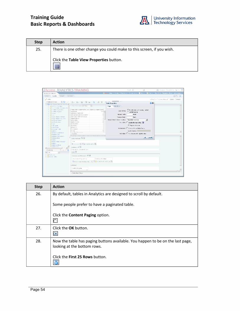
25. There is one other change you could make to this screen, if you wish. Click the Table View Properties button.
Step Action
26. By default, tables in Analytics are designed to scroll by default. Some people prefer to have a paginated table. Click the Content Paging option.
27. Click the OK button.
28. Now the table has paging buttons available. You happen to be on the last page, looking at the bottom rows. Click the First 25 Rows button.

Training Guide Basic Reports & Dashboards
Page 55
Step Action
29. You could change the setting back to scroll. Click the Table View Properties button.
30. Click the Fixed headers option.
31. When you select this Fixed headers option, the default maximum width for the table is 600 pixels. The default maximum height is 700 pixels. The maximum values for those fields are 2880 pixels wide and 1800 pixels tall. Click the OK button.
32. You have a scrolling table again. You've also made all of the changes you need to make. Click the Done button.
33. You should take this opportunity to save your analysis. Click the Save Analysis icon.
34. You're nearly done with this analysis. End of Procedure.

Training Guide Basic Reports & Dashboards
Page 56
Training Guide Basic Reports & Dashboards
Page 57
Finishing Up
Procedure
There are one or two things left to do to complete this analysis.
Step Action
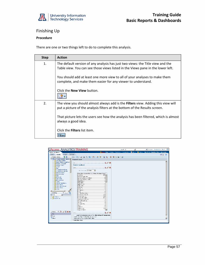
1. The default version of any analysis has just two views: the Title view and the Table view. You can see those views listed in the Views pane in the lower left. You should add at least one more view to all of your analyses to make them complete, and make them easier for any viewer to understand. Click the New View button.
2. The view you should almost always add is the Filters view. Adding this view will put a picture of the analysis filters at the bottom of the Results screen. That picture lets the users see how the analysis has been filtered, which is almost always a good idea. Click the Filters list item.
Training Guide Basic Reports & Dashboards
Page 58
Step Action
3. You've created a nice, simple analysis. Be sure you save your work! Click the Save Analysis button.
4. Good job! End of Procedure.
Training Guide Basic Reports & Dashboards
Page 59
Exercise - Creating a New Analysis
Scenario: Your boss has asked you to create a very simple analysis. She would like to see a listing of all the colleges on campus, along with a count of their employees and a count of their FTE positions. The list should be sorted to show the colleges with a greater number of employees at the top. Objectives: The following objectives are intended to be accomplished with minimal input from others. You are, however, allowed and encouraged to ask questions for clarification, direction, and assistance. There are hints or additional instructions listed in italics at the end of some steps.
Create a new basic analysis.
Create a basic filter for that analysis.
Add a new view to the basic analysis.
Save the analysis.
Two Questions Before You Begin: 1. You have an analysis on your screen already. What, if anything, must be done with that report before you start creating a new one?
2. Provided you have a plan in mind for your analysis, what's the very first step you should take in Analytics when you need to create a new analysis?
Step-by-Step Instructions: 1. Create a new analysis using the HCM - Employee Profile subject area.
2. Add these three data columns:
Department > College Name for Job Department Measures > Counts > Employee Headcount Measures > Counts > Employee FTE - Total
3. Add a filter to limit the data to just the various colleges on all campuses. Do not include any auxiliary departments like Parking & Transportation. If you select all of the colleges, you will end up with approximately 19 rows of data in your analysis.
4. Order or Sort the information properly. Read the last sentence of the scenario at the top of this page for a big hint.
5. Edit the Column Properties and format the data such that any numbers in the report are displayed with two decimal places. This step is optional.
6. Look at the Results.
7. Add the Filters view.
8. Save the analysis in your Basic Workshop folder as College Employee Headcount/FTE Comparison.

Training Guide Basic Reports & Dashboards
Page 60
Training Guide Basic Reports & Dashboards
Page 61
Adding a Graph
Procedure
A table of data is useful. Adding a graph to the analysis can help viewers get a better idea of any trends in enrollment.
Step Action
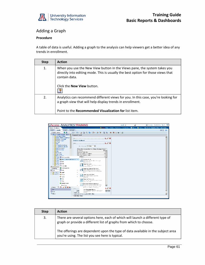
1. When you use the New View button in the Views pane, the system takes you directly into editing mode. This is usually the best option for those views that contain data. Click the New View button.
2. Analytics can recommend different views for you. In this case, you're looking for a graph view that will help display trends in enrollment. Point to the Recommended Visualization for list item.
Step Action
3. There are several options here, each of which will launch a different type of graph or provide a different list of graphs from which to choose. The offerings are dependent upon the type of data available in the subject area you're using. The list you see here is typical.

Training Guide Basic Reports & Dashboards
Page 62
Step Action
4. The choice is obvious. You are trying to create a graph that will show trends in student enrollment over time. Click the Analyzing Trends list item.
5. Even within the trends option, there are options. The most-often-used type of graph for showing trends is the line graph. Click the Line Graph icon.
Training Guide Basic Reports & Dashboards
Page 63
Step Action
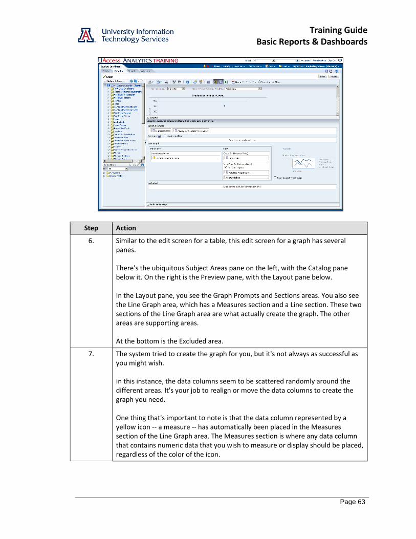
6. Similar to the edit screen for a table, this edit screen for a graph has several panes. There's the ubiquitous Subject Areas pane on the left, with the Catalog pane below it. On the right is the Preview pane, with the Layout pane below. In the Layout pane, you see the Graph Prompts and Sections areas. You also see the Line Graph area, which has a Measures section and a Line section. These two sections of the Line Graph area are what actually create the graph. The other areas are supporting areas. At the bottom is the Excluded area.
7. The system tried to create the graph for you, but it's not always as successful as you might wish. In this instance, the data columns seem to be scattered randomly around the different areas. It's your job to realign or move the data columns to create the graph you need. One thing that's important to note is that the data column represented by a yellow icon -- a measure -- has automatically been placed in the Measures section of the Line Graph area. The Measures section is where any data column that contains numeric data that you wish to measure or display should be placed, regardless of the color of the icon.
Training Guide Basic Reports & Dashboards
Page 64
Step Action
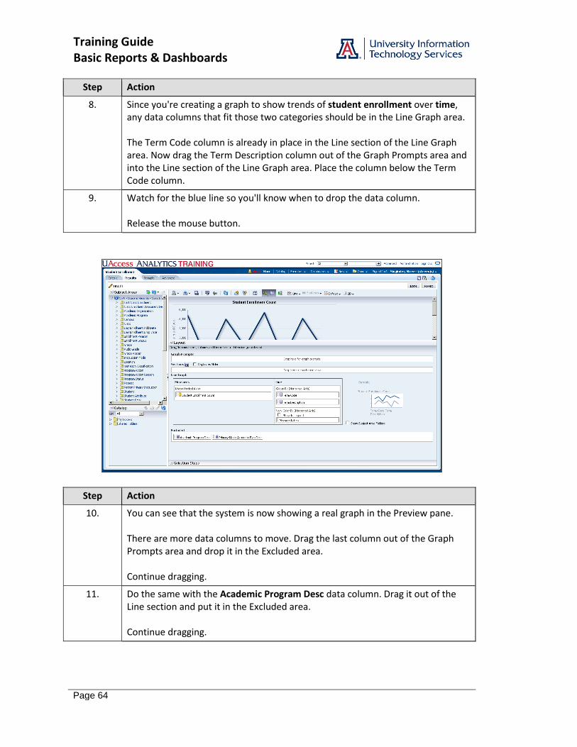
8. Since you're creating a graph to show trends of student enrollment over time, any data columns that fit those two categories should be in the Line Graph area. The Term Code column is already in place in the Line section of the Line Graph area. Now drag the Term Description column out of the Graph Prompts area and into the Line section of the Line Graph area. Place the column below the Term Code column.
9. Watch for the blue line so you'll know when to drop the data column. Release the mouse button.
Step Action
10. You can see that the system is now showing a real graph in the Preview pane. There are more data columns to move. Drag the last column out of the Graph Prompts area and drop it in the Excluded area. Continue dragging.
11. Do the same with the Academic Program Desc data column. Drag it out of the Line section and put it in the Excluded area. Continue dragging.
Training Guide Basic Reports & Dashboards
Page 65
Step Action
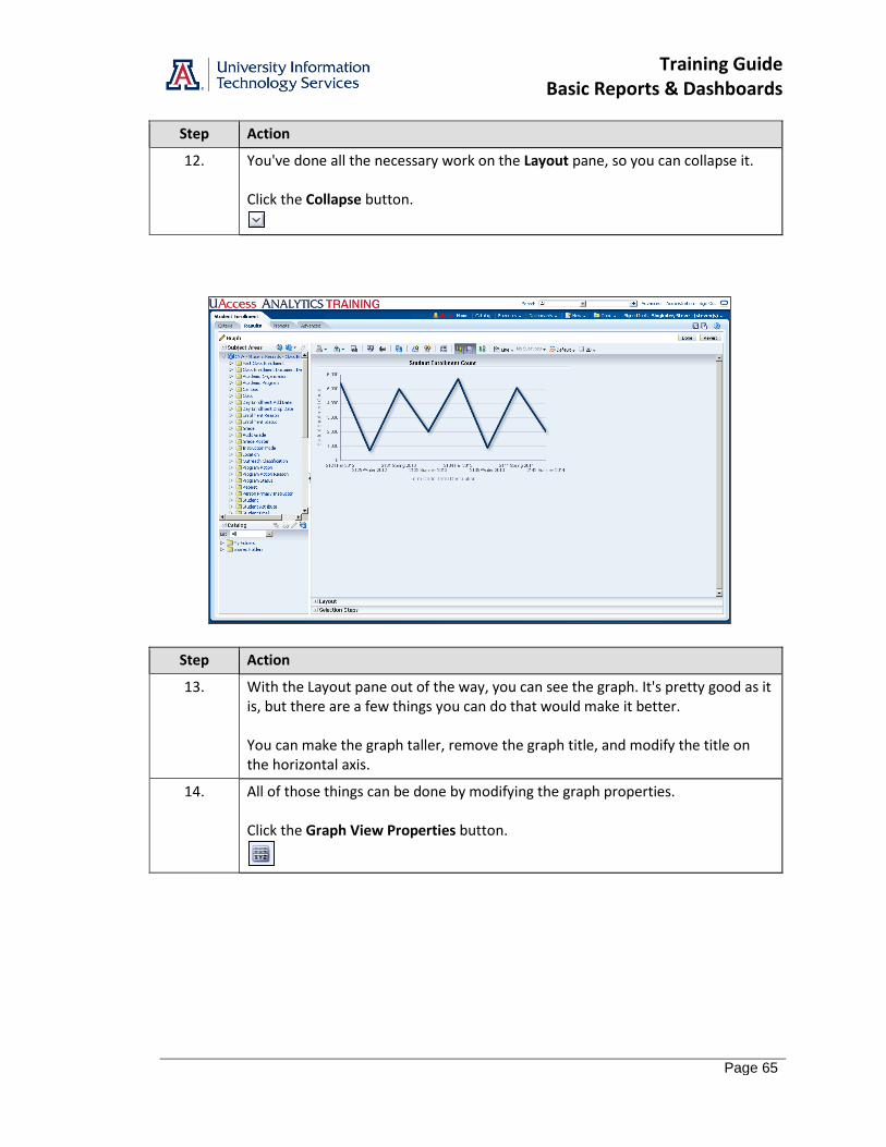
12. You've done all the necessary work on the Layout pane, so you can collapse it. Click the Collapse button.
Step Action
13. With the Layout pane out of the way, you can see the graph. It's pretty good as it is, but there are a few things you can do that would make it better. You can make the graph taller, remove the graph title, and modify the title on the horizontal axis.
14. All of those things can be done by modifying the graph properties. Click the Graph View Properties button.
Training Guide Basic Reports & Dashboards
Page 66
Step Action
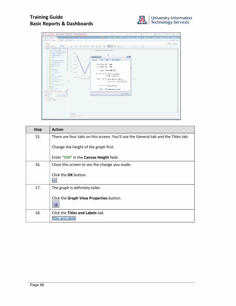
15. There are four tabs on this screen. You'll use the General tab and the Titles tab. Change the height of the graph first. Enter "500" in the Canvas Height field.
16. Close this screen to see the change you made. Click the OK button.
17. The graph is definitely taller. Click the Graph View Properties button.
18. Click the Titles and Labels tab.

Training Guide Basic Reports & Dashboards
Page 67
Step Action
19. You can remove the graph title. Just uncheck the box and leave the field blank. Click the Graph Title checkbox.
20. You can change the value for the Horizontal Axis title. Click the Horizontal Axis checkbox.
21. Enter "Term" in the Horizontal Axis field.
22. Click the OK button.
Training Guide Basic Reports & Dashboards
Page 68
Step Action
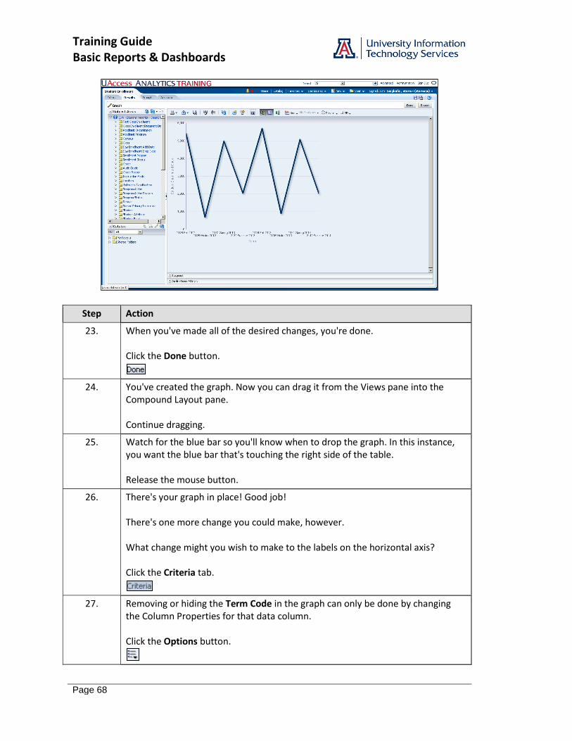
23. When you've made all of the desired changes, you're done. Click the Done button.
24. You've created the graph. Now you can drag it from the Views pane into the Compound Layout pane. Continue dragging.
25. Watch for the blue bar so you'll know when to drop the graph. In this instance, you want the blue bar that's touching the right side of the table. Release the mouse button.
26. There's your graph in place! Good job! There's one more change you could make, however. What change might you wish to make to the labels on the horizontal axis? Click the Criteria tab.
27. Removing or hiding the Term Code in the graph can only be done by changing the Column Properties for that data column. Click the Options button.
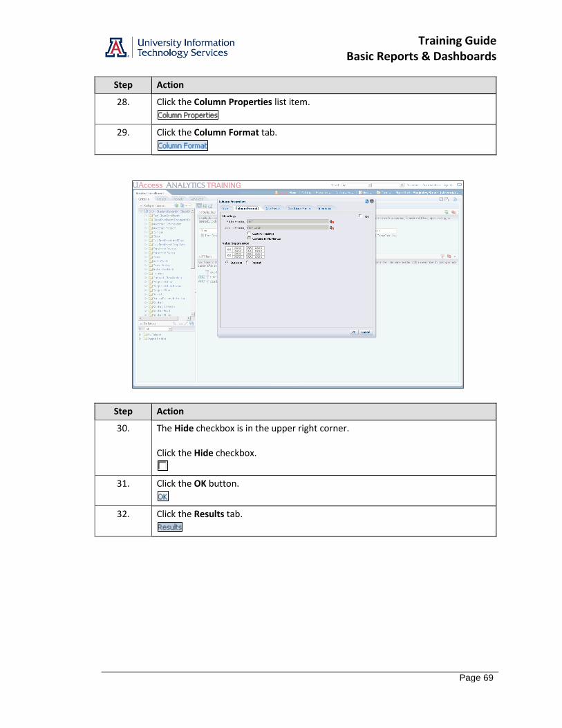
Training Guide Basic Reports & Dashboards
Page 69
Step Action
28. Click the Column Properties list item.
29. Click the Column Format tab.
Step Action
30. The Hide checkbox is in the upper right corner. Click the Hide checkbox.
31. Click the OK button.
32. Click the Results tab.
Training Guide Basic Reports & Dashboards
Page 70
Step Action
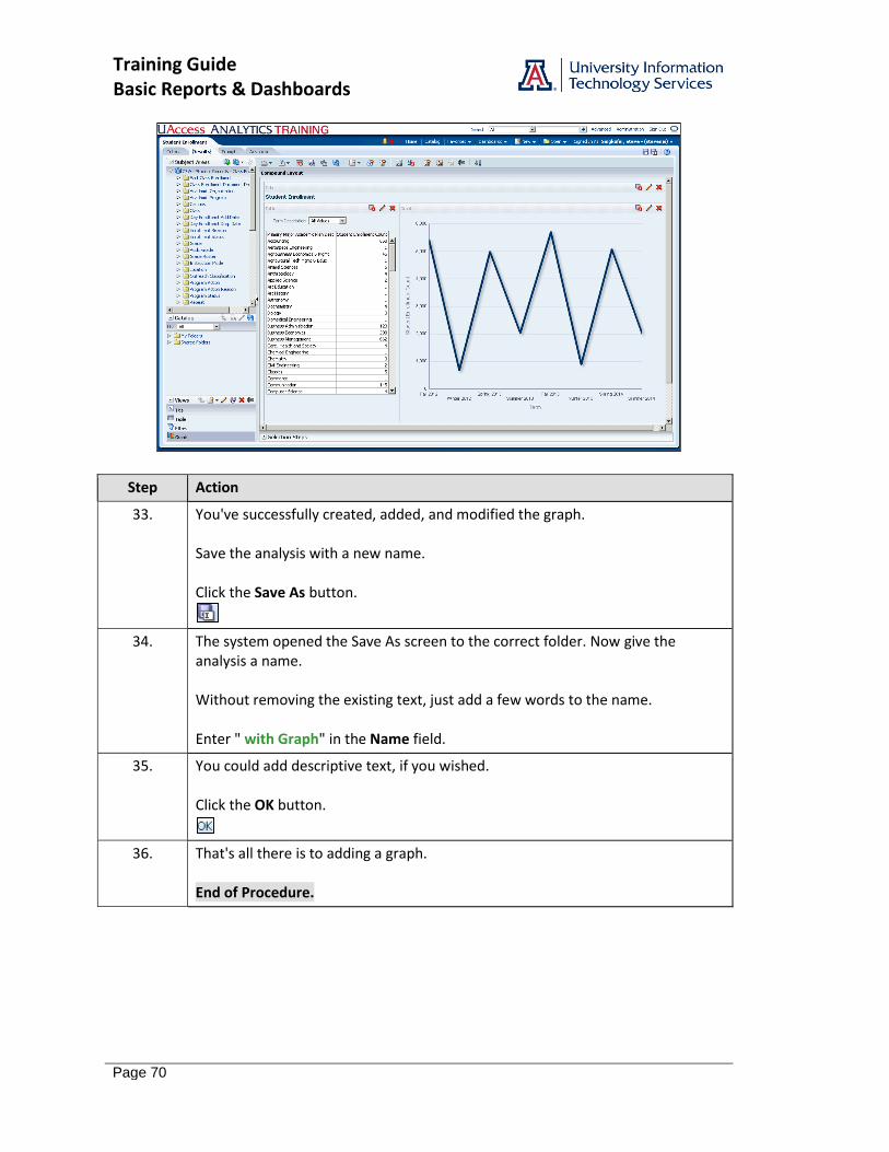
33. You've successfully created, added, and modified the graph. Save the analysis with a new name. Click the Save As button.
34. The system opened the Save As screen to the correct folder. Now give the analysis a name. Without removing the existing text, just add a few words to the name. Enter " with Graph" in the Name field.
35. You could add descriptive text, if you wished. Click the OK button.
36. That's all there is to adding a graph. End of Procedure.
Training Guide Basic Reports & Dashboards
Page 71
Exercise - Adding a Graph
Scenario: Your boss likes the analysis you created for her earlier. Now she'd like you to add a graph to the analysis. Objectives: The following objectives are intended to be accomplished with minimal input from others. You are, however, allowed and encouraged to ask questions when needed for clarification or direction.
Add a new graph to the analysis. Arrange the data columns properly on the Layout pane. Format the graph properly. Add the graph to the Compound Layout pane on the Results tab.
Step-by-Step Instructions: 1. Open the analysis you created in Exercise 1 - Creating a New Analysis. 2. Add a New View: Graph > Bar > Horizontal. 3. Edit the graph properties: On the General tab: a. Increase the height of the graph to 400 pixels. b. Move the legend and put it above the graph. On the Titles and Labels tab: c. Remove the graph title. d. Modify the vertical axis title to read "Colleges." e. Modify the horizontal axis title to read "Counts." f. Click Done. 4. Move the Graph View into the Compound Layout pane. Place it on the right side of the Table View. 5. Save the modified analysis in your Basic Workshop folder as College Employee Headcount/FTE Comparison with Graph.

Training Guide Basic Reports & Dashboards
Page 72
Training Guide Basic Reports & Dashboards
Page 73
Working with Dashboards
Creating a New Dashboard
Procedure
You've created four analyses. It's time to put them all together on your personal dashboard.
Step Action
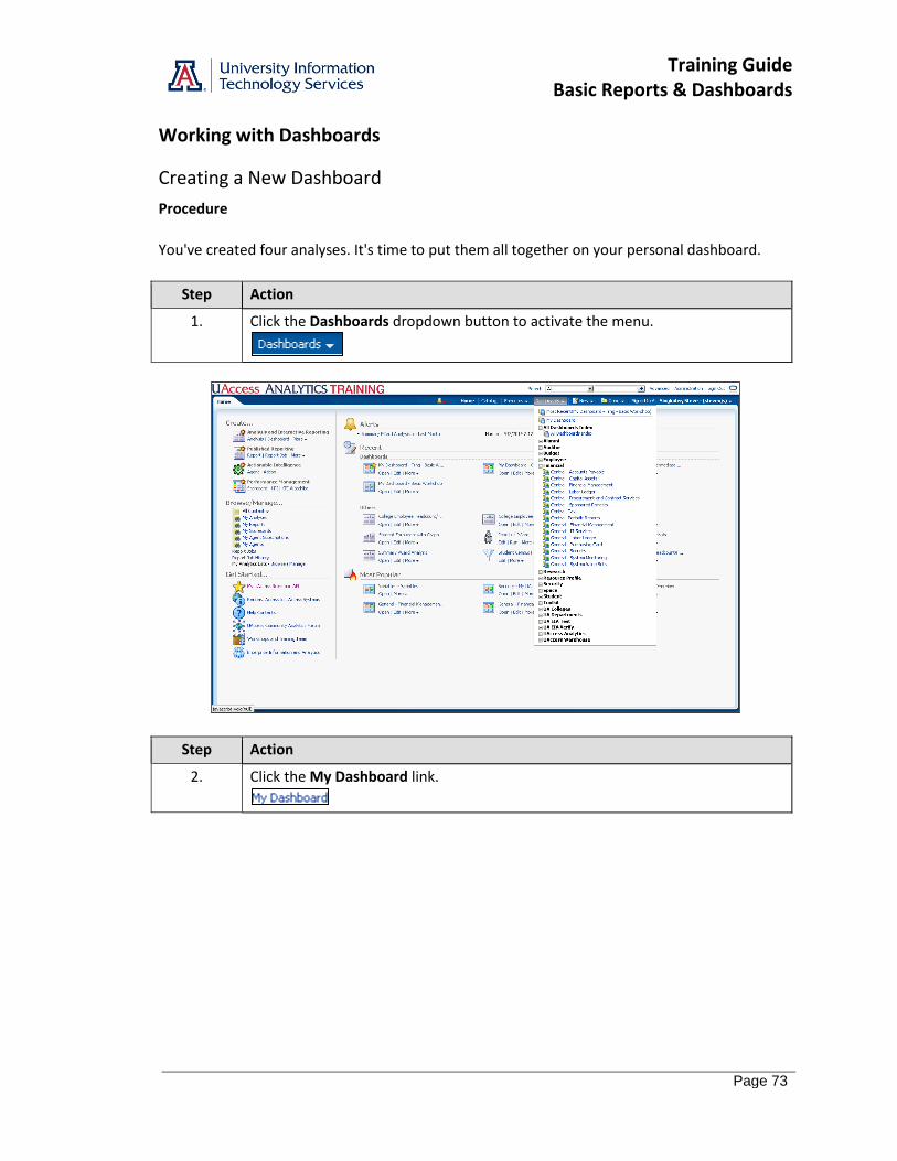
1. Click the Dashboards dropdown button to activate the menu.
Step Action
2. Click the My Dashboard link.
Training Guide Basic Reports & Dashboards
Page 74
Step Action
3. You may already have a number of dashboard pages created, or you may have a completely empty dashboard. Regardless, you will add a new page. If you are starting on an empty dashboard, you can simply click the Edit button in the center of the page. You could also start with the Page Options button. Click the Page Options button.
4. Click the Edit Dashboard link.
5. Click the Add Dashboard Page button.
6. Enter "Basic Workshop" in the Page Name field.
7. Enter "This dashboard was created in the Basic Reports and Dashboards Workshop." in the Page Description field.
8. Click the OK button.
Training Guide Basic Reports & Dashboards
Page 75
Step Action
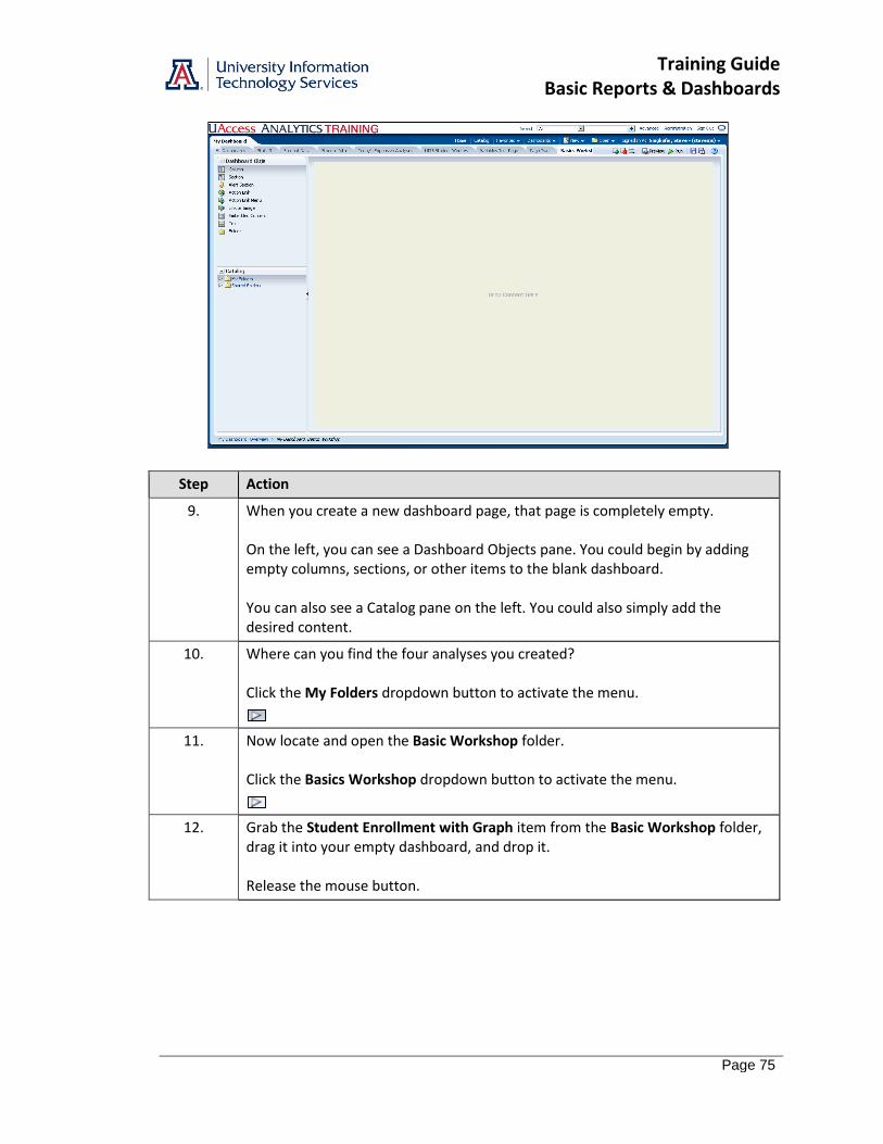
9. When you create a new dashboard page, that page is completely empty. On the left, you can see a Dashboard Objects pane. You could begin by adding empty columns, sections, or other items to the blank dashboard. You can also see a Catalog pane on the left. You could also simply add the desired content.
10. Where can you find the four analyses you created? Click the My Folders dropdown button to activate the menu.
11. Now locate and open the Basic Workshop folder. Click the Basics Workshop dropdown button to activate the menu.
12. Grab the Student Enrollment with Graph item from the Basic Workshop folder, drag it into your empty dashboard, and drop it. Release the mouse button.
Training Guide Basic Reports & Dashboards
Page 76
Step Action
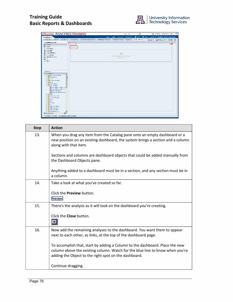
13. When you drag any item from the Catalog pane onto an empty dashboard or a new position on an existing dashboard, the system brings a section and a column along with that item. Sections and columns are dashboard objects that could be added manually from the Dashboard Objects pane. Anything added to a dashboard must be in a section, and any section must be in a column.
14. Take a look at what you've created so far. Click the Preview button.
15. There's the analysis as it will look on the dashboard you're creating. Click the Close button.
16. Now add the remaining analyses to the dashboard. You want them to appear next to each other, as links, at the top of the dashboard page. To accomplish that, start by adding a Column to the dashboard. Place the new column above the existing column. Watch for the blue line to know when you're adding the Object to the right spot on the dashboard. Continue dragging.
Training Guide Basic Reports & Dashboards
Page 77
Step Action
17. There's the blue line indicating the new column will be added above the existing column. Release the mouse button.
18. Now add the three remaining analyses, one by one. Start with the Student Enrollment analysis. Continue dragging.
19. Next, bring in one of the Employee-based analyses. Continue dragging.
20. Line them up next to each other across the dashboard. Watch for the blue line so you know you're about to drop the object to the right of the existing analysis. Continue dragging.
Step Action
21. Repeat for the third analysis. Once you have all three analyses added to the top column, you can preview your work. Click the Preview button.

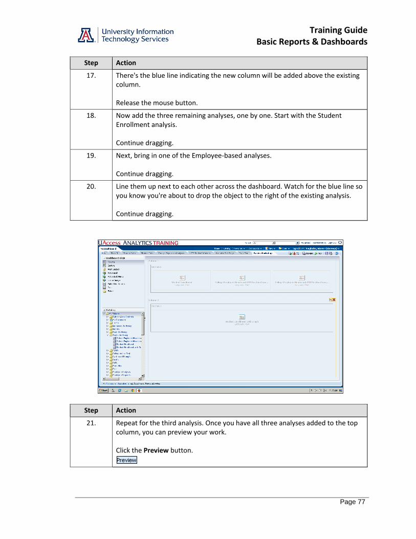
Training Guide Basic Reports & Dashboards
Page 78
Step Action
22. Whoa! You're seeing all three analyses displayed on the page! You need to make those reports into links that will open on a new page when clicked. Click the Close button.
23. Start with the Student Enrollment analysis on the left. When you hover over that analysis, a two-button menu bar appears. Click the Properties button.
24. Change the way the results are displayed. Click the Display Results link.
Training Guide Basic Reports & Dashboards
Page 79
Step Action
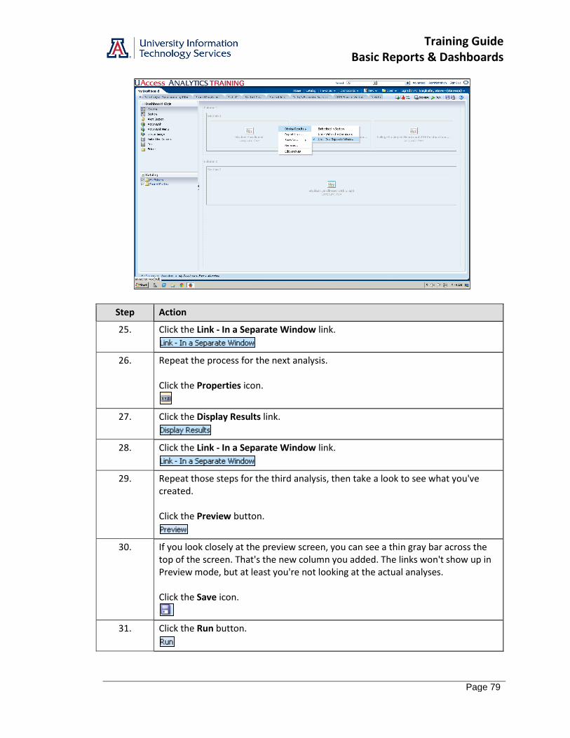
25. Click the Link - In a Separate Window link.
26. Repeat the process for the next analysis. Click the Properties icon.
27. Click the Display Results link.
28. Click the Link - In a Separate Window link.
29. Repeat those steps for the third analysis, then take a look to see what you've created. Click the Preview button.
30. If you look closely at the preview screen, you can see a thin gray bar across the top of the screen. That's the new column you added. The links won't show up in Preview mode, but at least you're not looking at the actual analyses. Click the Save icon.
31. Click the Run button.
Training Guide Basic Reports & Dashboards
Page 80
Step Action
32. You've created a basic dashboard page. Congratulations!
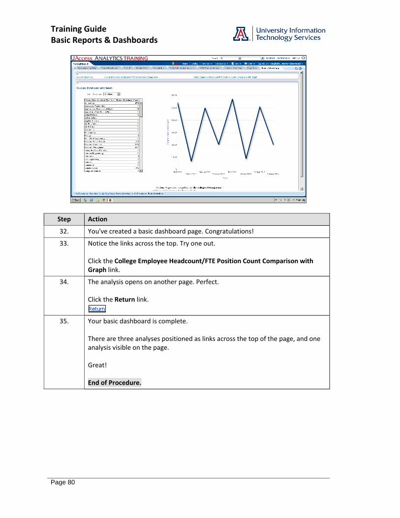
33. Notice the links across the top. Try one out. Click the College Employee Headcount/FTE Position Count Comparison with Graph link.
34. The analysis opens on another page. Perfect. Click the Return link.
35. Your basic dashboard is complete. There are three analyses positioned as links across the top of the page, and one analysis visible on the page. Great! End of Procedure.
Training Guide Basic Reports & Dashboards
Page 81
Editing a Dashboard
Procedure
There are a few modifications you can make that will help you as you work with your dashboard.
Step Action
1. If you look in the upper-left corners of the two sections, you can see little Collapse buttons. Those aren't necessary. You can remove them. Click the Page Options button.
2. Click the Edit Dashboard link.
3. Hover your mouse over Section 1 so you can see the small button bar in the upper-right corner. Click the Properties button.
4. Click the Collapsible link.
5. Repeat the procedure for Section 2. Click the Properties icon.
Training Guide Basic Reports & Dashboards
Page 82
Step Action
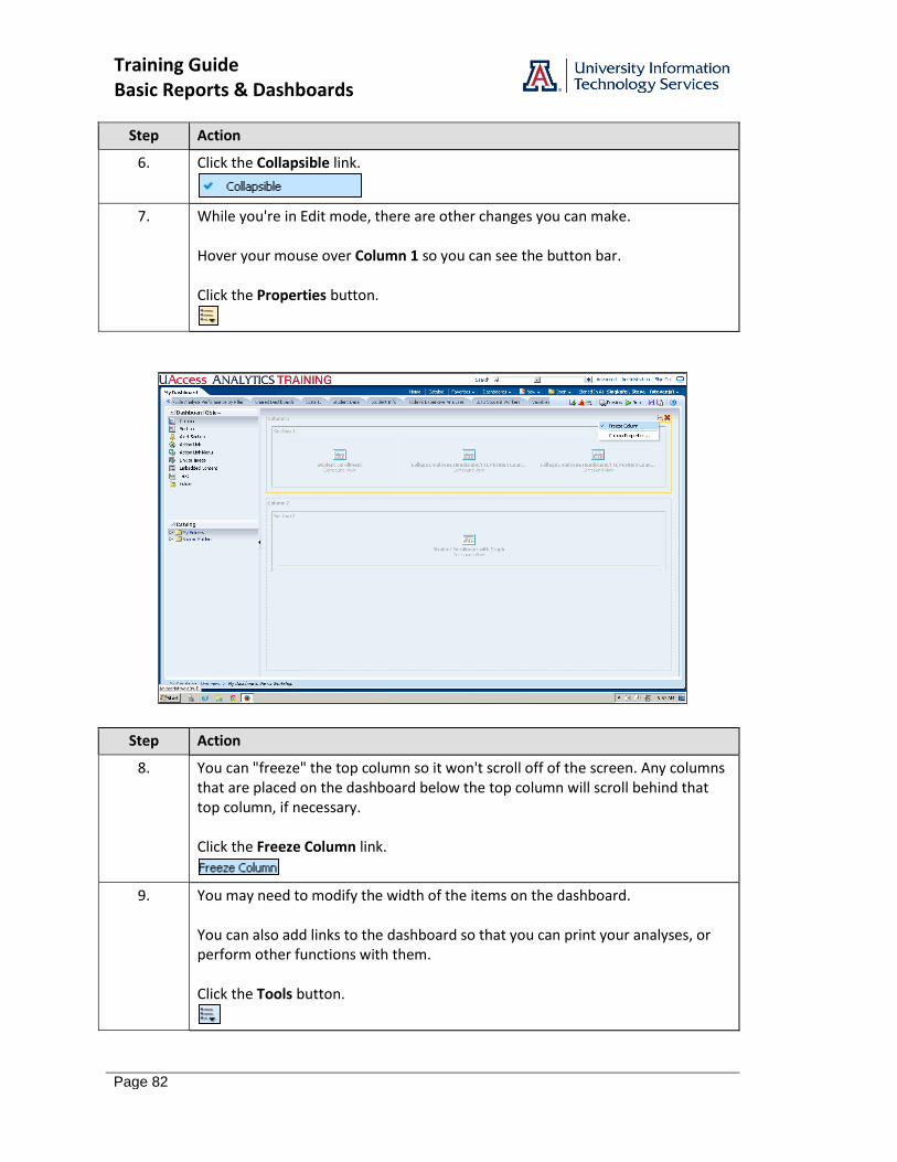
6. Click the Collapsible link.
7. While you're in Edit mode, there are other changes you can make. Hover your mouse over Column 1 so you can see the button bar. Click the Properties button.
Step Action
8. You can "freeze" the top column so it won't scroll off of the screen. Any columns that are placed on the dashboard below the top column will scroll behind that top column, if necessary. Click the Freeze Column link.
9. You may need to modify the width of the items on the dashboard. You can also add links to the dashboard so that you can print your analyses, or perform other functions with them. Click the Tools button.
Training Guide Basic Reports & Dashboards
Page 83
Step Action
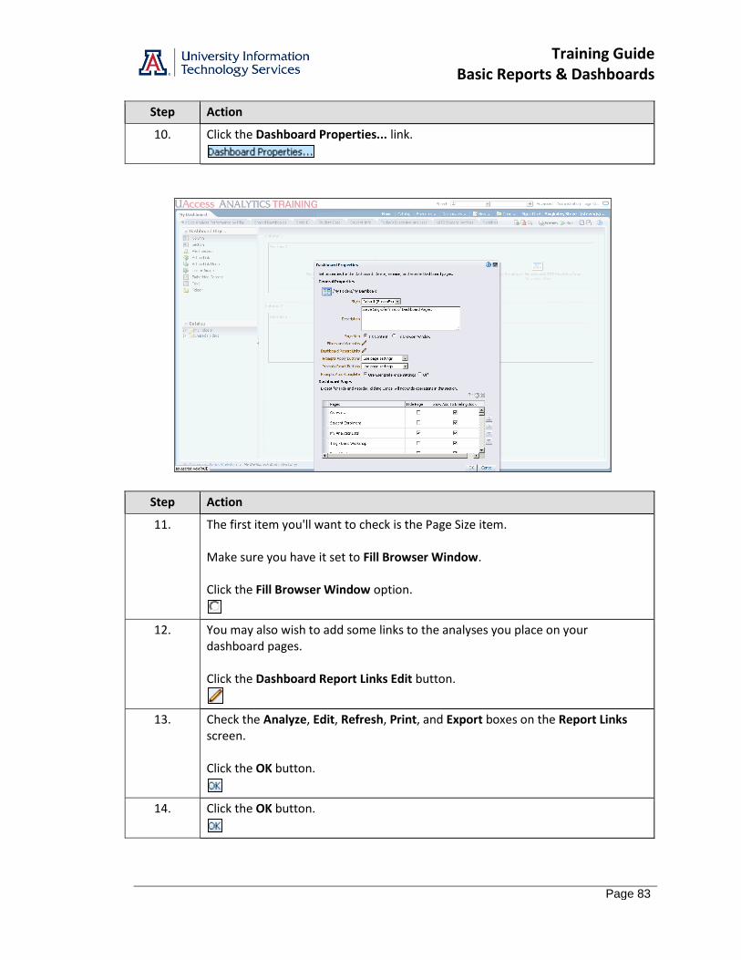
10. Click the Dashboard Properties... link.
Step Action
11. The first item you'll want to check is the Page Size item. Make sure you have it set to Fill Browser Window. Click the Fill Browser Window option.
12. You may also wish to add some links to the analyses you place on your dashboard pages. Click the Dashboard Report Links Edit button.
13. Check the Analyze, Edit, Refresh, Print, and Export boxes on the Report Links screen. Click the OK button.
14. Click the OK button.

Training Guide Basic Reports & Dashboards
Page 84
Step Action
15. Those are all the changes you need make. Click the Save button.
16. Once the dashboard has been saved - watch for the word "Saved" to appear just to the left of the button bar - you can run the dashboard. Click the Run button.
Step Action
17. The updated dashboard is displayed. Those Collapse buttons have been removed. The other changes are more subtle. You can see two vertical scroll bars on the right side of the dashboard.
18. If you scroll down a bit using the inside scroll bar, you'll see the links you added to the dashboard page. Click the scrollbar.
19. You may also notice that the section along the top of the screen doesn't scroll. That's the column you locked, and the bottom column is scrolling behind it. Click the scrollbar.
20. Your dashboard looks great! Good job! End of Procedure.
Training Guide Basic Reports & Dashboards
Page 85
Review - Working with Dashboards
Answer the following:
1. You are the only person who has access to your ____________________ dashboard.
2. To add a new page to any dashboard, you must first edit that dashboard. To start editing, you should click the ____________________ button.
3. When you add a new item from the Catalog pane to an empty dashboard, the system also adds a ____________________ and a ____________________.
4. True False The Analyze, Edit, Refresh, Print, and Export links are automatically added to any item you add to a dashboard.
5. True False When you save a dashboard for the first time, you must give it an appropriate name.
6. True False This was fun.

Training Guide Basic Reports & Dashboards
Page 86

Training Guide Basic Reports & Dashboards
Page 87
Appendix A: Working with Dashboard Functionality
Procedure
Very often, you'll be working with shared analyses and dashboards. Those dashboards have a lot of available functions you should know about.
Step Action
1. Click the Dashboards link.
Step Action
2. Use one of the Financial dashboards. The functions you will apply there can be applied to any dashboard. Click the General - Financial Management link.
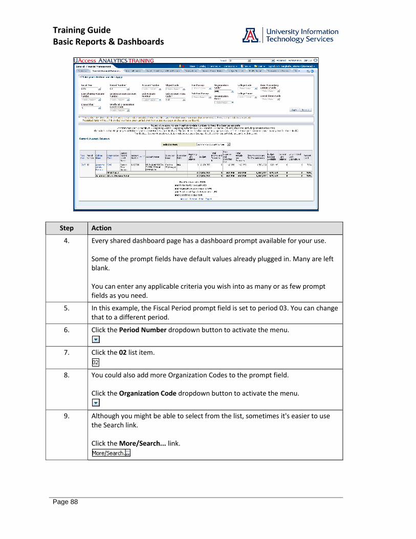
3. You will always land on an Overview page when using a shared dashboard, and there are typically many different pages of data available to you. Click the Current Account Balances tab.
Training Guide Basic Reports & Dashboards
Page 88
Step Action
4. Every shared dashboard page has a dashboard prompt available for your use. Some of the prompt fields have default values already plugged in. Many are left blank. You can enter any applicable criteria you wish into as many or as few prompt fields as you need.
5. In this example, the Fiscal Period prompt field is set to period 03. You can change that to a different period.
6. Click the Period Number dropdown button to activate the menu.
7. Click the 02 list item.
8. You could also add more Organization Codes to the prompt field. Click the Organization Code dropdown button to activate the menu.
9. Although you might be able to select from the list, sometimes it's easier to use the Search link. Click the More/Search... link.
Training Guide Basic Reports & Dashboards
Page 89
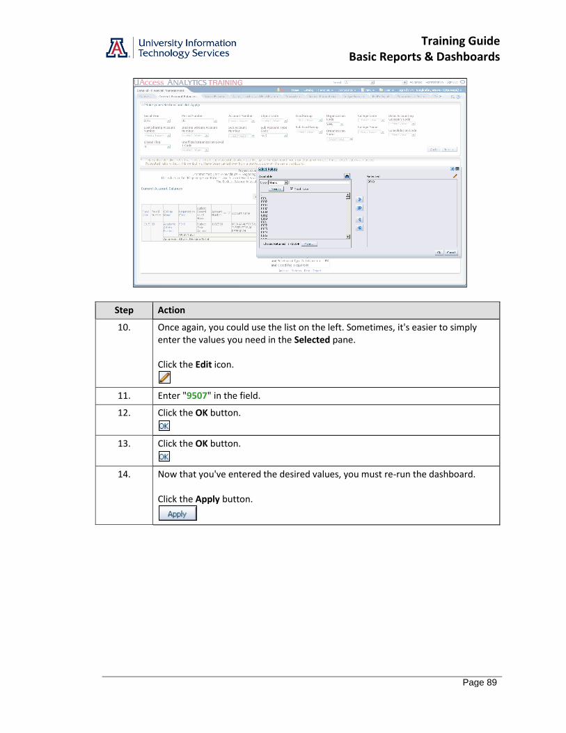
Step Action
10. Once again, you could use the list on the left. Sometimes, it's easier to simply enter the values you need in the Selected pane. Click the Edit icon.
11. Enter "9507" in the field.
12. Click the OK button.
13. Click the OK button.
14. Now that you've entered the desired values, you must re-run the dashboard. Click the Apply button.

Training Guide Basic Reports & Dashboards
Page 90
Step Action
15. Scroll down to see the full analysis. Click the scrollbar.
16. Sometimes you're able to select from a list of views. Click the Select a View: drop-down list.
17. There are quite a few different views, but the default view will work for you. You can collapse the menu. Click the pane.
18. There are quite a few data columns in this analysis. It's possible that you might not need or want all of those columns, or that you might want them to be arranged differently. You can make that happen!
19. Since the Filters view shows that this analysis has been filtered to Fiscal Year 2015, you may not wish to keep that data column. Right-click the Fiscal Year column header.
Training Guide Basic Reports & Dashboards
Page 91
Step Action
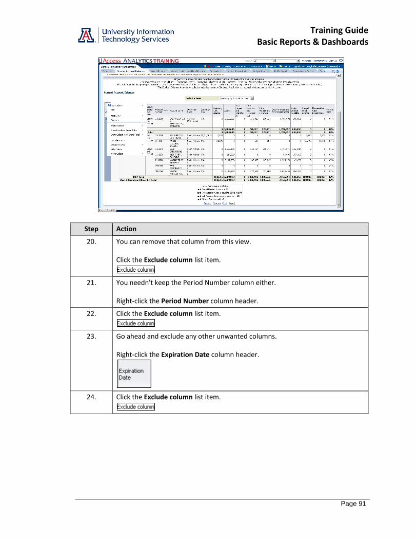
20. You can remove that column from this view. Click the Exclude column list item.
21. You needn't keep the Period Number column either. Right-click the Period Number column header.
22. Click the Exclude column list item.
23. Go ahead and exclude any other unwanted columns. Right-click the Expiration Date column header.
24. Click the Exclude column list item.
Training Guide Basic Reports & Dashboards
Page 92
Step Action
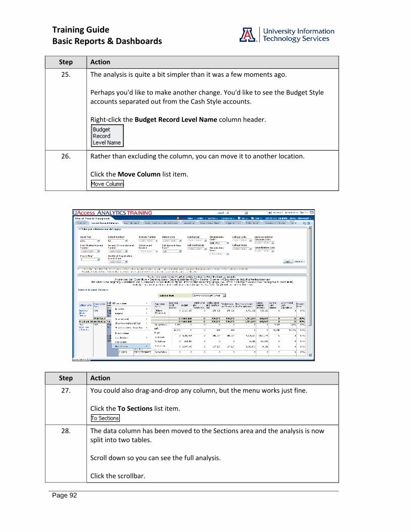
25. The analysis is quite a bit simpler than it was a few moments ago. Perhaps you'd like to make another change. You'd like to see the Budget Style accounts separated out from the Cash Style accounts. Right-click the Budget Record Level Name column header.
26. Rather than excluding the column, you can move it to another location. Click the Move Column list item.
Step Action
27. You could also drag-and-drop any column, but the menu works just fine. Click the To Sections list item.
28. The data column has been moved to the Sections area and the analysis is now split into two tables. Scroll down so you can see the full analysis. Click the scrollbar.
Training Guide Basic Reports & Dashboards
Page 93
Step Action
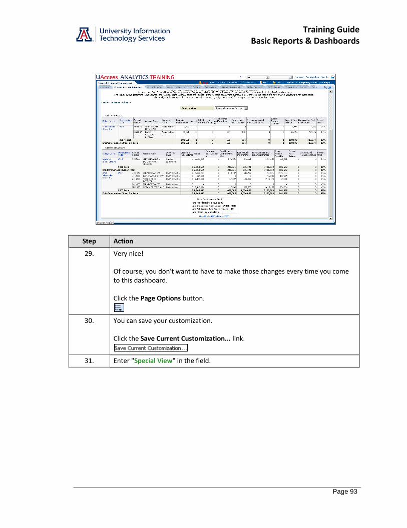
29. Very nice! Of course, you don't want to have to make those changes every time you come to this dashboard. Click the Page Options button.
30. You can save your customization. Click the Save Current Customization... link.
31. Enter "Special View" in the field.
Training Guide Basic Reports & Dashboards
Page 94
Step Action
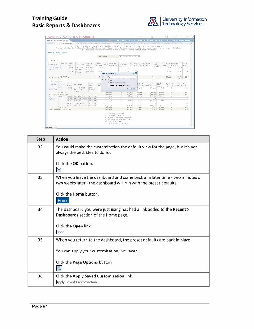
32. You could make the customization the default view for the page, but it's not always the best idea to do so. Click the OK button.
33. When you leave the dashboard and come back at a later time - two minutes or two weeks later - the dashboard will run with the preset defaults. Click the Home button.
34. The dashboard you were just using has had a link added to the Recent > Dashboards section of the Home page. Click the Open link.
35. When you return to the dashboard, the preset defaults are back in place. You can apply your customization, however. Click the Page Options button.
36. Click the Apply Saved Customization link.

Training Guide Basic Reports & Dashboards
Page 95
Step Action
37. Click the Special View link.
38. Your customization has been applied. Click the scrollbar.
39. Beautiful! Click the Home button.
End of Procedure.

Training Guide Basic Reports & Dashboards
Page 96
Training Guide Basic Reports & Dashboards
Page 97
Appendix B: More Analysis Functions on Dashboards Right-Click Menu
There is an extensive right-click menu available to you for most analyses on most dashboards. The menu can be fairly involved, depending on context, but there is a separate document to more fully explain all of the features and functions. That document, entitled Working with Dashboards: Right-Click Menus, is available from the UAccess Analytics Resources page on the UAccess Community.
You will also see a slightly different right-click menu, depending on where on the column you right-click. If you right-click on a column header, you will see a menu that resembles what you see here. If you right-click on the column data, the name of the column will be at the bottom of the main section of the right-click menu, and the secondary menu will closely resemble what is displayed here in the main section of the menu.
We’ll take a look at some of the more common items in this document.
Here’s an example of a typical right-click menu:
Drill
This function, available on some columns, allows you to drill down to see more detailed information. The column header and column data will be displayed in blue font for those columns where the Drill function is available.
When you drill in a typical column, you add a lower level of information to the table, pivot table, graph, or other view. Depending on where and how you drill, you may also be applying an additional filter to the analysis.
All views in the analysis are affected by drilling in an attribute column. In addition, drilling typically opens the analysis in a new window. You can click the Return link below the analysis to restore the original data.
In addition to the right-click procedures listed here, you could also directly click on either the column header or a column value to get the same results mentioned below.
Procedure – Column Header Drill
This procedure will simply add another, more detailed column of data to the analysis.
Step Action
1. Right-click the column header of the column in which you wish to drill. Alternatively, you can just click the label in the column header.
Training Guide Basic Reports & Dashboards
Page 98
Step Action
2. Select Drill. The analysis refreshes itself, adding a new column of information to the structure of the analysis. The information in the column will be from a lower level than the original column. For example, if you drill on a college name column, you may see a department column appear.
3. Select the Return link in the lower left corner of the analysis to return to the previous view. End of Procedure.
Procedure – Column Value Drill
This procedure will filter the analysis to the data you selected when you right-clicked, and will also add another, more detailed column of data to the analysis.
Step Action
1. Right-click one of the values in the column in which you wish to drill. Alternatively, you can just click the value to start the drill/filter process.
2. Select Drill. The analysis refreshes itself, adding a new column of information to the structure of the analysis. The information in the column will be from a lower level than the original column. For example, if you drill on a college name column, you may see a department column appear. In addition, a new level of filtering will be applied to the analysis, based on the data value you selected when you right-clicked. You will see the additional filter in the Filters View at the bottom of the analysis.
3. Select the Back link in the lower left corner of the analysis to return to the previous view. Select the Return link in the lower left corner of the analysis to return to the default view. End of Procedure.
When you drill on a hierarchical column (they have a plus sign (+) on the left side of the highest-level column values), you expand or collapse the levels of data that are in the analysis. Drilling in a hierarchical column affects only that particular view. No other views are affected.
Sort Column
You have the option of sorting or ordering the analysis by any of the available columns, as always. This function hasn’t changed.
Training Guide Basic Reports & Dashboards
Page 99
Keep Only or Remove
Right-clicking on a column heading reveals a pop-up menu with a variety of options for column settings. Two of those options give you the ability to either Keep or Remove particular information from the analysis.
Right-clicking on the data, as previously mentioned, will typically give you a slightly different menu than you’d see by right-clicking the column header.
The Keep Only and/or Remove functions are really powerful ways to personalize a dashboard analysis, narrowing the scope of the data to see just the information you wish to see.
Please understand that the number and scope of the items revealed on the sub-menu will differ from analysis to analysis, as those menu items are based on the data contained within the analysis. There are, however, four main options as explained below.
Step Action
1. Right-click the column header of the column you wish to work with.
2. Select Keep Only > or Remove > from the menu, as desired.
3. Select an item from the sub-menu and enter any required information. Top X > Based on (one of the columns to the right) Bottom X > Based on (one of the columns to the right) Members where (one of the columns to the right) is greater than > a set value or another column’s value Members where (one of the columns to the right) is less than > a set value or another column’s value The analysis will refresh itself appropriately, keeping or removing data as requested.
4. You can only undo this change by using the Clear My Customizations option available under the Page Options button in the upper-right corner of the screen. Please remember that using this option will clear all of the customizations or modifications that you’ve made up to this point. End of Procedure.
Show Subtotal, Show Row level Grand Total, or Show Column level Grand Total
You now have the ability to include or remove any totals or subtotals that might appear in the analysis. (The procedures for any of the three options are similar.)
Show Subtotal will add a subtotal to nearly any column in either a table or pivot table, totaling all values vertically within the selected column. The subtotal will appear in the selected location.
Show Row level Grand Total will add a grand total to the bottom of the table or pivot table, totaling all values vertically, including subtotals.
Show Column level Grand Total, available only on pivot tables, will add a column on the far right end of the pivot table, totaling all values horizontally within each row.
Training Guide Basic Reports & Dashboards
Page 100
Step Action
1. Right-click the column header of the column you wish to subtotal.
2. Select Show Subtotal > from the menu. Select After Values, Before Values, At the Beginning, or At the End, as appropriate. The analysis will refresh itself and show the subtotal in the selected location.
3. To remove a subtotal, right-click the column for which a subtotal is displayed. Select None from the menu. The analysis will refresh itself and the subtotal will no longer be shown.
4. You can only undo this change by using the Clear My Customizations option available under the Page Options button in the upper-right corner of the screen. Please remember that using this option will clear all of the customizations or modifications that you’ve made up to this point. End of Procedure.
Exclude Column
One of the existing options is the option to Exclude columns from the analysis.
This is a powerful way to personalize those prebuilt dashboard reports that seem to have more columns than you or your department need in the report. The process hasn’t changed.
Step Action
1. Right-click the column header of the column you wish to exclude.
2. Select Exclude column. The analysis will refresh itself, removing the column. Please note that the column is only removed from the view you have on your screen. It is not deleted from the analysis. End of Procedure.
Include Column
This function gives you the ability to include a column from a list of all of the columns that are in the analysis. That means that if the person or team who created the analysis have excluded a column from the table or pivot table, you can add it back in with this function. You cannot, however, add just any column from the subject area. You can only include those columns which have previously been excluded, either by you or by the person or team who created the analysis.
Step Action
1. Right-click the column header to the left of the position in which you wish to add the new column.
2. Select Include column.
Training Guide Basic Reports & Dashboards
Page 101
Step Action
3. The menu includes all columns that have been added to the analysis but that have been excluded. The analysis will refresh itself. The new included column will be added to the analysis to the right of the column you right-clicked on as you started the procedure. End of Procedure.
Hide Column
You also have the option of hiding a column. Hiding a column means that you’re keeping the column in place for one reason or another, but simply won’t see the data in the table or other view. Excluding, on the other hand, physically removes the column and the associated data from the view altogether.
Columns are typically hidden – rather than excluded – so that their values can be used to establish a default sort order for the analysis. For example, some code columns are put in place to the left of a description-type column, providing sorting structure, but the code column is hidden to simplify the data the user eventually sees.
If you are familiar with creating or editing analyses, you will have run across this option on the edit screen for tables and pivot tables.
Step Action
1. Right-click the column header for the column you wish to hide.
2. Click Hide column. The entire analysis will refresh itself and the selected column will be hidden.
Hiding a column is not the same as excluding or deleting a column. Hiding a column simply makes the column and its values disappear. The analysis behaves as if the column were still present, but the data is no longer visible. Excluding a column removes the column altogether and is one step short of actually deleting the column. The column no longer has any ability to affect the table or pivot table.

Training Guide Basic Reports & Dashboards
Page 102
Here’s a simple student-based example. Note that each term is listed on a separate row and that the student data – name and credit hours – are listed separately for each term:
Term Student Name Credit Hours
2101 Smith, Tom 12
2104 Smith, Tom 9
2111 Smith, Tom 11
2114 Smith, Tom 12
If you hide the Term column, the results will look like this. The table responds as if the column were still present, keeping one line of data per term:
Student Name Credit Hours
Smith, Tom 12
Smith, Tom 9
Smith, Tom 11
Smith, Tom 12
If you exclude the Term column, the results will look like this. The table responds as if the column were no longer present – and it’s not – and you end up with a sum of credit hours for the four terms:
Student Name Credit Hours
Smith, Tom 44
The only way to unhide a column is to use the Clear My Customizations option available under the Page Options button.
Move Column
The Move Column function has been changed a bit, but in essence is the same as it was previously. Feel free to follow the right-click procedure below. Alternatively, you can simply drag-and-drop any column to a new location, as before. Note that you cannot use drag-and-drop in the Chrome or Safari browsers.
Step Action
1. Right-click the column header for the column you wish to move.
2. Select Move Column >. Select Before Current Column or After Current Column to move the selected column one space to the left or right, as appropriate. Select To Prompts or To Sections to move the column to that area of the table or pivot table. Within pivot tables, you also have the option of To Columns, which will move the data column to the Columns area of the pivot table. The analysis will refresh itself, moving the column as requested. If you wish to move the column back or move it again, simply repeat the procedure.

Training Guide Basic Reports & Dashboards
Page 103