appendix b - sign design principles · book 1, appendix b • sign design principles 1....
TRANSCRIPT

OntarioTrafficManual
July 2001
Bo
ok
1B
Introduction to theOntario Traffic Manual
Appendix B - Sign Design Principles

Bo
ok
1BOntarioTrafficManual
July 2001
Introduction to theOntario Traffic Manual
Appendix B - Sign Design Principles

ISBN 0-7794-1858-1
Copyright © 2001Queen’s Printer for Ontario
All rights reserved.

Ontario Traffic Manual • July 2001 1
Book 1, Appendix B • Sign Design Principles
Table of Contents
1. Introduction . . . . . . . . . . . . . . . . . . . . . . . . . . . . . . . . . . . . . . . . . . . . . . . . . . . . . . 5
1.1 Purpose . . . . . . . . . . . . . . . . . . . . . . . . . . . . . . . . . . . . . . . . . . . . . . . . . . . . . . . . . . . . 5
1.2 Standardization of Design . . . . . . . . . . . . . . . . . . . . . . . . . . . . . . . . . . . . . . . . . . . . . 5
2. Driver Requirements . . . . . . . . . . . . . . . . . . . . . . . . . . . . . . . . . . . . . . . . . . . . . . . 6
3. Shape and Colour Codes . . . . . . . . . . . . . . . . . . . . . . . . . . . . . . . . . . . . . . . . . . . 10
4. Hierarchy of Signs . . . . . . . . . . . . . . . . . . . . . . . . . . . . . . . . . . . . . . . . . . . . . . . . . 11
5. Text Legends. . . . . . . . . . . . . . . . . . . . . . . . . . . . . . . . . . . . . . . . . . . . . . . . . . . . . . 13
5.1 Font Type . . . . . . . . . . . . . . . . . . . . . . . . . . . . . . . . . . . . . . . . . . . . . . . . . . . . . . . . . . . 13
5.2 Letter Height . . . . . . . . . . . . . . . . . . . . . . . . . . . . . . . . . . . . . . . . . . . . . . . . . . . . . . . . 14
5.3 Upper/Mixed Case . . . . . . . . . . . . . . . . . . . . . . . . . . . . . . . . . . . . . . . . . . . . . . . . . . . 14
5.4 Horizontal Reduction . . . . . . . . . . . . . . . . . . . . . . . . . . . . . . . . . . . . . . . . . . . . . . . . . 14
6. Symbolic Legends . . . . . . . . . . . . . . . . . . . . . . . . . . . . . . . . . . . . . . . . . . . . . . . . . 15
6.1 Arrow Type and Size . . . . . . . . . . . . . . . . . . . . . . . . . . . . . . . . . . . . . . . . . . . . . . . . . . 15
6.2 Interdictory and Permissive Symbols . . . . . . . . . . . . . . . . . . . . . . . . . . . . . . . . . . . 15
6.3 Logo Design . . . . . . . . . . . . . . . . . . . . . . . . . . . . . . . . . . . . . . . . . . . . . . . . . . . . . . . . . 18
7. Calculating Letter Height and Symbol Size . . . . . . . . . . . . . . . . . . . . . . . . . . . . 18
7.1 Reading Time . . . . . . . . . . . . . . . . . . . . . . . . . . . . . . . . . . . . . . . . . . . . . . . . . . . . . . . . 19
7.2 Perception-reaction Time . . . . . . . . . . . . . . . . . . . . . . . . . . . . . . . . . . . . . . . . . . . . . . 20
7.3 Manoeuvre Time . . . . . . . . . . . . . . . . . . . . . . . . . . . . . . . . . . . . . . . . . . . . . . . . . . . . . 20
7.4 Required Legibility Distance . . . . . . . . . . . . . . . . . . . . . . . . . . . . . . . . . . . . . . . . . . . 21
7.5 Minimum Letter Height . . . . . . . . . . . . . . . . . . . . . . . . . . . . . . . . . . . . . . . . . . . . . . . 21

Book 1, Appendix B • Sign Design Principles
Ontario Traffic Manual • July 20012
7.6 Symbol Legibility . . . . . . . . . . . . . . . . . . . . . . . . . . . . . . . . . . . . . . . . . . . . . . . . . . . . . 21
7.7 Example . . . . . . . . . . . . . . . . . . . . . . . . . . . . . . . . . . . . . . . . . . . . . . . . . . . . . . . . . . . . 22
8. Sign Layout . . . . . . . . . . . . . . . . . . . . . . . . . . . . . . . . . . . . . . . . . . . . . . . . . . . . . . . 23
8.1 Message Length . . . . . . . . . . . . . . . . . . . . . . . . . . . . . . . . . . . . . . . . . . . . . . . . . . . . . 23
8.2 Line Spacing . . . . . . . . . . . . . . . . . . . . . . . . . . . . . . . . . . . . . . . . . . . . . . . . . . . . . . . . 23
8.3 Border Space . . . . . . . . . . . . . . . . . . . . . . . . . . . . . . . . . . . . . . . . . . . . . . . . . . . . . . . . 24
9. Reflectorization and Illumination . . . . . . . . . . . . . . . . . . . . . . . . . . . . . . . . . . . . . 25
9.1 Retroreflective Sheeting . . . . . . . . . . . . . . . . . . . . . . . . . . . . . . . . . . . . . . . . . . . . . . 25
9.2 Illumination . . . . . . . . . . . . . . . . . . . . . . . . . . . . . . . . . . . . . . . . . . . . . . . . . . . . . . . . . 28
10. Contrast . . . . . . . . . . . . . . . . . . . . . . . . . . . . . . . . . . . . . . . . . . . . . . . . . . . . . . . . 28
11. Selecting the Sign Size . . . . . . . . . . . . . . . . . . . . . . . . . . . . . . . . . . . . . . . . . . . . . 31
12. Sign Position . . . . . . . . . . . . . . . . . . . . . . . . . . . . . . . . . . . . . . . . . . . . . . . . . . . . . . 32
12.1 Side and Overhead Mounting . . . . . . . . . . . . . . . . . . . . . . . . . . . . . . . . . . . . . . . . . . 32
12.2 Horizontal Mounting Offset . . . . . . . . . . . . . . . . . . . . . . . . . . . . . . . . . . . . . . . . . . . . 32
12.3 Vertical Mounting Offset . . . . . . . . . . . . . . . . . . . . . . . . . . . . . . . . . . . . . . . . . . . . . . 35
12.4 Horizontal and Vertical Angling of Sign Face . . . . . . . . . . . . . . . . . . . . . . . . . . . . . 35
12.5 Other Position Criteria . . . . . . . . . . . . . . . . . . . . . . . . . . . . . . . . . . . . . . . . . . . . . . . . 36
13. Bilingual Sign Design . . . . . . . . . . . . . . . . . . . . . . . . . . . . . . . . . . . . . . . . . . . . . . . 37
14. Process for Assessing and Revising Sign Designs . . . . . . . . . . . . . . . . . . . . . . 37
14.1 Comprehension Testing . . . . . . . . . . . . . . . . . . . . . . . . . . . . . . . . . . . . . . . . . . . . . . . 38
15. Operational Programs . . . . . . . . . . . . . . . . . . . . . . . . . . . . . . . . . . . . . . . . . . . . . . 39
15.1 Sign Maintenance and Replacement . . . . . . . . . . . . . . . . . . . . . . . . . . . . . . . . . . . . 39
15.2 Sign Inventory . . . . . . . . . . . . . . . . . . . . . . . . . . . . . . . . . . . . . . . . . . . . . . . . . . . . . . . 40

Ontario Traffic Manual • July 2001 3
Book 1, Appendix B • Sign Design Principles
List of Tables
Table 1 – Shape and Colour Codes for Signs . . . . . . . . . . . . . . . . . . . . . . . . . . . . . . . . . . . 7
Table 2 – Shape and Function of Arrows . . . . . . . . . . . . . . . . . . . . . . . . . . . . . . . . . . . . . . 16
Table 3 – Lane Change Manoeuvre Time . . . . . . . . . . . . . . . . . . . . . . . . . . . . . . . . . . . . . . 20
Table 4 – Legibility-Distance-to-Letter-Height Ratios . . . . . . . . . . . . . . . . . . . . . . . . . . . . . 21
Table 5 – ASTM R-Values . . . . . . . . . . . . . . . . . . . . . . . . . . . . . . . . . . . . . . . . . . . . . . . . . . . 27
Table 6 – Acceptable Sign Colour Combinations Based on Brightness Contrast . . . . . . 29
List of Figures
Figure 1 – Examples of Text Fonts . . . . . . . . . . . . . . . . . . . . . . . . . . . . . . . . . . . . . . . . . . . . 13
Figure 2 – Example Sign . . . . . . . . . . . . . . . . . . . . . . . . . . . . . . . . . . . . . . . . . . . . . . . . . . . . 23
Figure 3 – Entrance Angle . . . . . . . . . . . . . . . . . . . . . . . . . . . . . . . . . . . . . . . . . . . . . . . . . . 26
Figure 4 – Observation Angle . . . . . . . . . . . . . . . . . . . . . . . . . . . . . . . . . . . . . . . . . . . . . . . 27
Figure 5 – Height and Location of Signs (Typical Installation) . . . . . . . . . . . . . . . . . . . . . 33
Figure 6 – Height and Location of Markers . . . . . . . . . . . . . . . . . . . . . . . . . . . . . . . . . . . . 34
Figure 7 – Horizontal Angling of Sign Face . . . . . . . . . . . . . . . . . . . . . . . . . . . . . . . . . . . . 35
Figure 8 – Vertical Angling of Sign Face . . . . . . . . . . . . . . . . . . . . . . . . . . . . . . . . . . . . . . 36
3

Book 1, Appendix B • Sign Design Principles
Ontario Traffic Manual • July 20014
Ontario Traffic Manual • July 2001 5
Book 1, Appendix B • Sign Design Principles
1. Introduction
1.1 Purpose
A consistently applied set of sign design principles isnecessary to facilitate driver understanding of, andresponse to, sign messages. For the sign designprinciples to be effective, they must realistically bebased on the visual and mental abilities of roadusers.
Book 1b (Sign Design Principles) of the OntarioTraffic Manual (OTM) is intended to assist OTM usersin understanding sign design principles and relateddriver requirements. This knowledge will enableOTM users to:
• Understand the design of existing signs in theOTM;
• Design new local directional guide signs andother information signs;
• Use the appropriate size of sign for a givenapplication;
• Use the appropriate sheeting material and level ofillumination for a given application;
• Mount each sign in an appropriate location;
• Institute operational programs to ensure theongoing effectiveness of signage.
In outlining general sign design principles, Book 1breflects sign design principles applied currently inOntario, by the Ministry of Transportation of Ontario(MTO) and municipalities, that are considered to begood practice.
1.2 Standardization of Design
High travel speeds and increasingly complex drivingenvironments require that signs be readily detectedand understood at a glance. Uniformity andsimplicity in design, position and application arecrucial for speedy detection and recognition. It istherefore important that sign design principles beconsistently applied, and that signs installed onhighways conform to the designs and standardsrepresented in the Ontario Traffic Manual.
Uniformity in design includes sign shape, colour,dimensions, symbols, wording, lettering andreflectorization or illumination. Many of the signdesigns in the Ontario Traffic Manual have beenapproved by the National Committee on UniformTraffic Control Devices for Canada after a thoroughreview of various designs used in Canada,supplemented by test studies.
Sign patterns for standard OTM signs are providedin Book 2 (Sign Patterns and Fabrication). All signshapes and colours must be used as indicated inOTM Book 2. In addition, all symbols must be thesame as those shown in Book 2, and wording onsigns containing text must be as indicated.
Uniformity of application is also an importantelement of standardization. Similar conditions shouldbe signed in the same manner, regardless of actuallocation. It is recognized, however, that urbanconditions differ from rural conditions with respectto speed, frequency of intersections, trafficcongestion, parking and competing lights anddisplays. Where such differences in the driverenvironment impact the sign message, signapplication must take into account thesedifferences. Where practical, the OTM presentsseparate guidelines for rural and urban areas.

Book 1, Appendix B • Sign Design Principles
Ontario Traffic Manual • July 20016
2. Driver Requirements
Sign design must take into account driver limitationsin detecting signs in the roadway environment,processing the sign information, and selecting anappropriate response. Driver limitations determinerequirements for letter size, the selection of font,contrast, retroreflectivity, spacing and borders,message layout and reading time, as well as signspacing and placement. The more a sign meetsdriver needs, the more likely a driver will detect it,the more likely he or she will be able to read andunderstand the message, and the more likely he orshe is to select the response desired by the trafficpractitioner.
Traditional sign design does not explicitly considerthese driver needs. In particular, no allowance ismade for the fact that longer messages requiremore time and therefore greater legibility distance.Nor is sufficient distinction made, in terms of signplacement, between signs requiring the driver tomake one of several choices and then complete amanoeuvre, as compared to signs that are“information only”. Instead, a particular distance isassumed, depending mainly on speed, and letterheight is determined through an assumed driverreading ability of some number of metres legibilityper centimetre of letter height. In the past thisassumed driver reading ability has been 6 mlegibility per centimetre of letter height (50 feetlegibility per inch letter height), which does notencompass the majority of drivers, and assumesalmost double the actual legibility distance of driverswith 20/40 vision, licensable under MTOregulations.
Several criteria must be met for a sign to beeffective. Initially, it must command attention or beeasily detected by the person who needs theinformation (i.e., it must have good conspicuity). Itmust be legible at the appropriate distance (in time
to read the whole message and take the necessaryaction). At busy urban locations, signs, traffic signalsand markings can easily be hidden by large vehiclesand seen only briefly. Therefore signs should bereadable quickly, as drivers often have only a secondor two to interpret and respond to the message. Themessage must obviously be understandable,otherwise the user will not know whether or how torespond to it. If the meaning of the message (e.g., anew symbol) is not immediately understood, drivererror or delay can easily result.
Other, perhaps less obvious, criteria are that theinformation on the sign should be easily rejected if itis irrelevant for the driver, and that the action to betaken in response to the message should beimmediately obvious. Drivers often are in situationswhere there is a great deal of information from theroadway environment (not only signs). It may not bepossible to attend to and process fully all of thisinformation. The driver must be able to glance atthe sign and determine rapidly whether theinformation is relevant and should be processed,retained and acted upon. As all signs are possiblesources of relevant information, the driver must firsttake in and process the information at a superficiallevel before it can be decided whether it is relevant.This takes mental effort and time, which the drivermay not have under conditions of input overloadand stress. The appropriate action should not requirea significant amount of thinking and decision time,especially if the action involves a manoeuvre whichmust be taken quickly (e.g., change lanes to exit orto avoid exiting ahead).
Finally, signs are most likely to be obeyed when theyappear to be reasonable to the driver, and whenthey augment the roadway message rather thancontradict it. For example, the use of speed signs tolower speed, in the absence of changes in theroadway, is likely to be ineffective.
Ontario Traffic Manual • July 2001 7
Book 1, Appendix B • Sign Design Principles
Table 1 – Shape and Colour Codes for Signs
ShapeCode
Colour Code
Back-Ground
Message Border
Sub-ClassClass Comments
RRegulatory
Red White White Shape reserved for STOP signRaRight of WayControl
RRegulatory
RaRight of WayControl
White Red Red Shape reserved for YIELD sign
RRegulatory
RaRight of WayControl
White Black Black Various Pedestrian Right of WayControl Signs
White Black Black A green annular band shallindicate a permissive message
A red annular band withinterdictory stroke shall indicatea prohibitive message
RbRoad UseControl
RRegulatory
RbRoad UseControl
WhiteBlack
BlackWhite
BlackWhite
A green annular band shallindicate a permissive message
A red annular band withinterdictory stroke shall indicatea prohibitive message
RRegulatory
RRegulatory
RbRoad Use Control
Blue White White Reserved for School Area Signs
Book 1, Appendix B • Sign Design Principles
Ontario Traffic Manual • July 20018
Table 1 – Shape and Colour Codes for Signs (cont’d)
ShapeCode
Colour Code
Back-Ground
Message Border
Sub-ClassClass Comments
WWarning
Yellow Black BlackWaPhysicalConditions
WWarning
WbTrafficRegulationsAhead
Yellow Black Black Some messages contain othercolours to adequately representsymbols
WWarning
WcIntermittentMoving Hazards
Yellow Black Black
Orange Black BlackTcTemporaryConditions
WWarning
WcIntermittentMoving Hazards
Blue White White Reserved for School Area Signs
RRegulatory
RcMiscellaneousControl Signs
White Black Black

Ontario Traffic Manual • July 2001 9
Book 1, Appendix B • Sign Design Principles
Table 1 – Shape and Colour Codes for Signs (cont’d)
Tab SignsALL Classes
ALLSub-Classes
Colours on tab signs to bethe same as on primary sign
ShapeCode
Colour Code
Back-Ground
Message Border
Sub-ClassClass Comments
Information GreenBlueWhite
WhiteWhiteBlack
WhiteWhiteBlack
Some signs in this group maycontain minor elements of othercolours
GGuide Signs
Information GGuide Signs
GreenWhite
WhiteBlack
WhiteBlack
Information GGuide Signs
Black White White Some signs in this group have abrown background; or a whitebackground with a blue messageand blue border
BlackGreenBrown
WhiteWhiteWhite
WhiteWhiteWhite
Some signs in this group maycontain minor elements of othercolours
MHighway Markers
Information
Information MHighway Markers
BlackGreen
WhiteWhite
WhiteWhite

Book 1, Appendix B • Sign Design Principles
Ontario Traffic Manual • July 200110
In summary, the effectiveness of highway signsdepends on several factors:
• Conspicuity – does the sign attract attentiongiven the background in which it is placed;
• Legibility – at what distance can drivers read thesign;
• Information load – do drivers have sufficienttime to read the entire message;
• Comprehension – do drivers understand themeaning of the message, and any symbols orabbreviations used;
• Driver response – do drivers make the desiredaction as a result of reading the sign.
3. Shape and Colour Codes
Signs that are similar in function are typicallydesigned to be the same shape and to use thesame colour combinations for legends, backgroundsand borders. Shape and colour codes serve toorganize pieces of information into larger units andestablish message redundancy. Drivers canrecognize sign shapes and colours well before theycan distinguish symbols or read sign text. The shapeand colour codes alert the driver to the generalfunction of the sign. They simplify the driving taskby enabling the road user to judge in advance thenature of the expected response and to prepareaccordingly. For example, drivers can recognize theshape and colour of the STOP sign before they canactually read the sign text. In fact, the STOP sign isone case where the shape and colour conventionhas made the sign so familiar to drivers that actuallyreading the text has become unnecessary.
All signs in the OTM have been allocated to classesand sub-classes, according to the specific functionof the sign. For example, Class R representsregulatory signs, which regulate the flow of trafficby instructing drivers on what they must or shoulddo. Sub-class Ra, within Class R, refers to right-of-way control signs, which regulate the right-of-way ofvehicles and other users at locations where theirmovements may otherwise be in conflict.
Unique sign shape and colour codes have beenassigned to each sign class, with further shape andcolour distinctions provided for some sub-classes,and in some cases even within the sub-class. For

Ontario Traffic Manual • July 2001 11
Book 1, Appendix B • Sign Design Principles
example, Class R regulatory signs are generallyrectangular in shape and have white backgroundswith black legends. Sub-class Ra signs include somesigns with shape and colour codes that follow thegeneral rule for Class R, but also some special signs,such as the STOP sign and YIELD sign, which havetheir own unique shape and colour codes. Shapeand colour codes for sign classes and sub-classesare illustrated in Table 1.
Clearly, shape and colour codes are a powerfulelement of sign design. Therefore, all signs mustfollow the shape and colour codes indicated in theOTM. Precise sign shapes are specified in OTM Book2 (Sign Patterns and Fabrication). Sign colours mustbe according to the ASTM (American Society forTesting and Materials) Specification D 4956-95 (orits subsequent revisions), typically used bymanufacturers of signs and sign sheeting materials.A similar specification available in Canada is theCGSB (Canadian General Standards Board)Specification 62-GP-11M.
To ensure immediate recognition of signs, it isimportant that the correct shades of the colours areused. Also signs required at night should retain thesame colour by night as by day through use ofretroreflective sheeting or internal or externalillumination (see Section 9). Signs discolour withage, due to ultraviolet radiation and deterioration ofretroreflective sheeting. To alleviate discolourationfrom these causes, regular programs for signmaintenance, inspection and inventory arerecommended (see Section 15).
4. Hierarchy of Signs
While all signs that are posted should be necessary,some signs are more critical to drivers than others.A sign can be deemed to be more critical thananother sign if failure to read it in time has moreserious safety implications than for the other sign.Signs that are more critical from a safety standpointhave been mandated to have high intensity sheetingas of a prescribed date. A suggested overallhierarchy for sign criticalness is provided below.Sign groups are listed in order from most critical toleast critical.
(1) Signs required to have high intensitysheeting as of a prescribed date:
(a) Temporary Conditions Signs (Book 7)(These are highest priority. Therequirement for high intensity sheetingmeans that these signs are important.Temporary condition signs take priorityover other signs requiring high intensitysheeting because of the unexpectedsituations drivers may encounter, andalso because temporary conditions signplacement may be more critical than forother signs.)
(b) Regulatory Signs (Book 5)
(c) Warning Signs (Book 6)(Note: The reference to a prescribeddate does not affect the priority of thisgroup of sign; that is, whether or not thesigns already have high intensitysheeting, they still retain their priorityover signs in the other groups.)
(2) Other Temporary Conditions Signs(Book 7)
Book 1, Appendix B • Sign Design Principles
Ontario Traffic Manual • July 200112
(3) Other Regulatory Signs (Book 5)
(4) Other Warning Signs (Book 6)
(5) Information Signs:
(a) Directional Guide Signs (Book 8)
(b) Emergency Services Signs (Book 9)(give directions to hospitals providingemergency services and lawenforcement offices, and recommendradio frequencies for severe weatheradvisories)
(c) Motorist Services Signs (Book 9)(give directions to gas, food and lodgingestablishments, public telephones andtravel information centres)
(d) Public Transportation Signs (Book 9)(give directions to rail transit stations,bus terminals and airports)
(e) Boundary Signs (Book 8)(mark municipal, regional and countyboundary lines)
(f) Attraction Signs (Book 9)(identify and direct motorists to specialpoints of interest meeting certaincriteria, e.g., provincial and nationalparks, tourist attractions, historic sites,museums, special commercialattractions, campgrounds)
(g) General Information Signs (Book 8)(identify lakes, rivers and other items ofgeneral interest).
Sign hierarchy can be used in prioritizing signimprovements with regard to size, level ofretroreflective sheeting, new fonts, and otherfeatures which may be implemented to moresuccessfully meet driver requirements. Also, somesigns low in the hierarchy, such as tourism signs,may be so large as to distract from more importantsigns higher in the hierarchy, which are smaller.Consequently, the sign hierarchy must beconsidered in effectively spacing more critical andless critical signs (see Book 1, Section 7 for moreinformation on sign function and interference).

Ontario Traffic Manual • July 2001 13
Book 1, Appendix B • Sign Design Principles
5. Text Legends
Many of the signs in the OTM are text-based, as it isdifficult to convey certain complex messages clearlyusing symbols. In determining the text to be usedon a sign, font type, letter height and the use ofupper case versus mixed case letters must beconsidered.
5.1 Font Type
The font type determines not only the appearanceof the letters, but the ratio of letter height to letterwidth, stroke width of the letter relative to letterheight, the kerning or space between letters and thespacing between words. Many of the standard fontscurrently used for sign texts in the OTM are from theHighway Gothic series of fonts. Three series arecommonly used for signs: Series C, D andE(modified) or E(M) (see Figure 1). (Note: For alimited number of signs, several other fonts havebeen used, such as Helvetica Medium, HelveticaBold Condensed, Interstate, Century SchoolbookBold and Century Bold. Because they are inrelatively limited use, they are not addressed in thediscussion below.)
The letter width to letter height ratio, the strokewidth to letter height ratio and the spacing betweenletters all increase as the font series progresses fromC to E(M). For letters of equal height, a number ofstudies have shown that Series E(M) letters aresignificantly more legible than Series C or Series Dletters of the same height. Series C and D fonts aretypically used for regulatory signs, which are quitefamiliar to drivers and are often easily recognized bytheir shape and colour codes, while Series E(M) isused for directional guide signs, which have uniquemessages and rely for effectiveness on whether ornot they can be easily read.
Recently, a new font called Clearview (see Figure 1)was developed for traffic signs. It has been shownto be significantly more legible at night than eventhe Series E(M) font. Because of the increasedopenness of Clearview characters, its spacing issmaller than that of the standard highway fonts.Words in Clearview font take up 12% less signspace than words in Series E(M) font, but provideexactly the same legibility. When Clearview fontspacing is increased to 112%, the letters occupy thesame sign space as Series E(M) font, whileproviding improved legibility at night for olderdrivers aged 65 and up by 16% to 22%, incomparison to Series E(M) font. (Daytime legibilityrelative to Series E(M) font is not changed by usingClearview font.)
As noted, the Clearview font offers improvedlegibility. This font is currently being reviewed by theMinistry for its potential application to replaceHighway Gothic fonts on new and replacementdirectional guide signs.
6
ClearviewOne HWY Regular Street
ClearviewOne HWY Expressway
ClearviewOne HWY Light Road
ClearviewOne HWY Condensed Street
Figure 1 – Examples of Text Font

Book 1, Appendix B • Sign Design Principles
Ontario Traffic Manual • July 200114
5.2 Letter Height
In order for a sign to be effective, it must be legibleat a distance which allows a driver to read it andcarry out any required actions before reaching thesign. When the message is lengthy (e.g., severaldestination names, or complex constructioninformation), drivers will need more time to read theentire message than for a sign with a single symbolor a word or two. In addition, if the driver must carryout some action, such as a lane change or a stopbefore reaching the sign, then it must be legible at adistance that allows the driver both to read it andrespond before reaching the sign. One of the keyfactors in ensuring sign legibility at the requireddistance is the letter height. For details oncalculating letter height, see Section 7 (CalculatingLetter Height and Symbol Size).
5.3 Upper/Mixed Case
In terms of legibility, mixed case text is better thanupper case text, as long as the maximum height ofthe lower case letters is the same as the height ofthe upper case capitals. Words in mixed case areeasier to recognize since each word forms adistinctive shape with a unique pattern ofascenders, descenders, dots and other features.Word shape pattern recognition enables the driverto identify a word before it can actually be read.While this is a distinct benefit of mixed case overupper case lettering, it must be traded off againstmotorist familiarity with signs that have been inupper case for many years.
Signs in most of the sign classes have traditionallyused upper case letters. For most signs, it isdesirable from the standpoint of driver familiarityand uniformity to maintain consistency with existingsign standards. However, in the case of directionalguide signs, other information signs and new signseries, mixed case should be used to supportimproved word recognition. Cardinal directions oninformation signs (e.g., north, west) may be shownin upper case when used in a mixed case context,to draw attention to the word and to make the wordfunction almost as a symbol.
5.4 Horizontal Reduction
When a sign message does not fit onto a sign blank,there is a tendency to squeeze the width of theletters until the message fits. This type of horizontalreduction reduces legibility. The length of a wordshould be reduced by no more than 10% to make amessage fit onto a given blank size.

Ontario Traffic Manual • July 2001 15
Book 1, Appendix B • Sign Design Principles
6. Symbolic Legends
Symbols can convey in a single image the samemessage that may require several words of text.Therefore the symbol size is generally considerablylarger than individual letters, making the sign legibleat greater distances than the equivalent wordmessage. Due to the significant legibility benefits ofsymbol signs, their use is encouraged whereverpractical.
In order to be effective, though, the meaning of thesymbol must be understood by a high percentageof the driver population. It is thereforerecommended that, when a new symbol isdesigned, it is tested with representative drivers andnot simply shown to other traffic practitioners.Methods to do this are described in Section 14.1.Testing, which is followed by any redesignnecessary to eliminate driver confusion, shouldalleviate difficulties in comprehension. Wheresymbols are understood by fewer than 85% ofdrivers, educational tabs may be used to assistcomprehension. Good initial design will avoid signswhich are ineffective and/or which requireexpensive educational campaigns to inform driversof their meaning.
For details on calculating symbol size, see Section 7(Calculating Letter Height and Symbol Size).
6.1 Arrow Type and Size
Arrows are extensively used as symbols on trafficsigns for the following basic purposes:
• To indicate dimensions on or around the road,with the arrowhead indicating the direction of theassociated dimension;
• To indicate the distance ahead on the road towhich a sign condition refers, with the arrowheadindicating the direction of the road ahead;
• To indicate the direction and path of travel, withthe arrowhead indicating direction and the shaftindicating the path of travel.
Various types of arrows and their meanings areillustrated and summarized in Table 2. The only typeof arrow shaft that is tapered is the first arrowindicated in the table, a horizontal arrow with ashort shaft used to indicate the dimension or extentof a parking restriction.
When an arrow with a full shaft is used, care mustbe taken to avoid having too short a shaft, relative tothe dimensions of the arrowhead. A shaft at leastdouble the length of the arrowhead is preferred.
Patterns for all arrows are available in Book 2 (SignPatterns and Fabrication).
6.2 Interdictory andPermissive Symbols
The convention of using interdictory and permissivesymbols superimposed on other symbols is appliedthroughout the OTM. The interdictory symbolconsists of a red annular band or circle with adiagonal red stroke. This symbol signifies that theaction represented by the symbol inside the circleand covered by the diagonal red stroke is prohibited.The diagonal red stroke runs from the top left of thecircle to the bottom right, or from the top right tothe bottom left, at an angle of 45 degrees to thehorizontal. If the diagonal stroke at this angleobliterates the symbol representing the prohibitedaction, an angle as close as practicable to 45degrees should be used.

Book 1, Appendix B • Sign Design Principles
Ontario Traffic Manual • July 200116
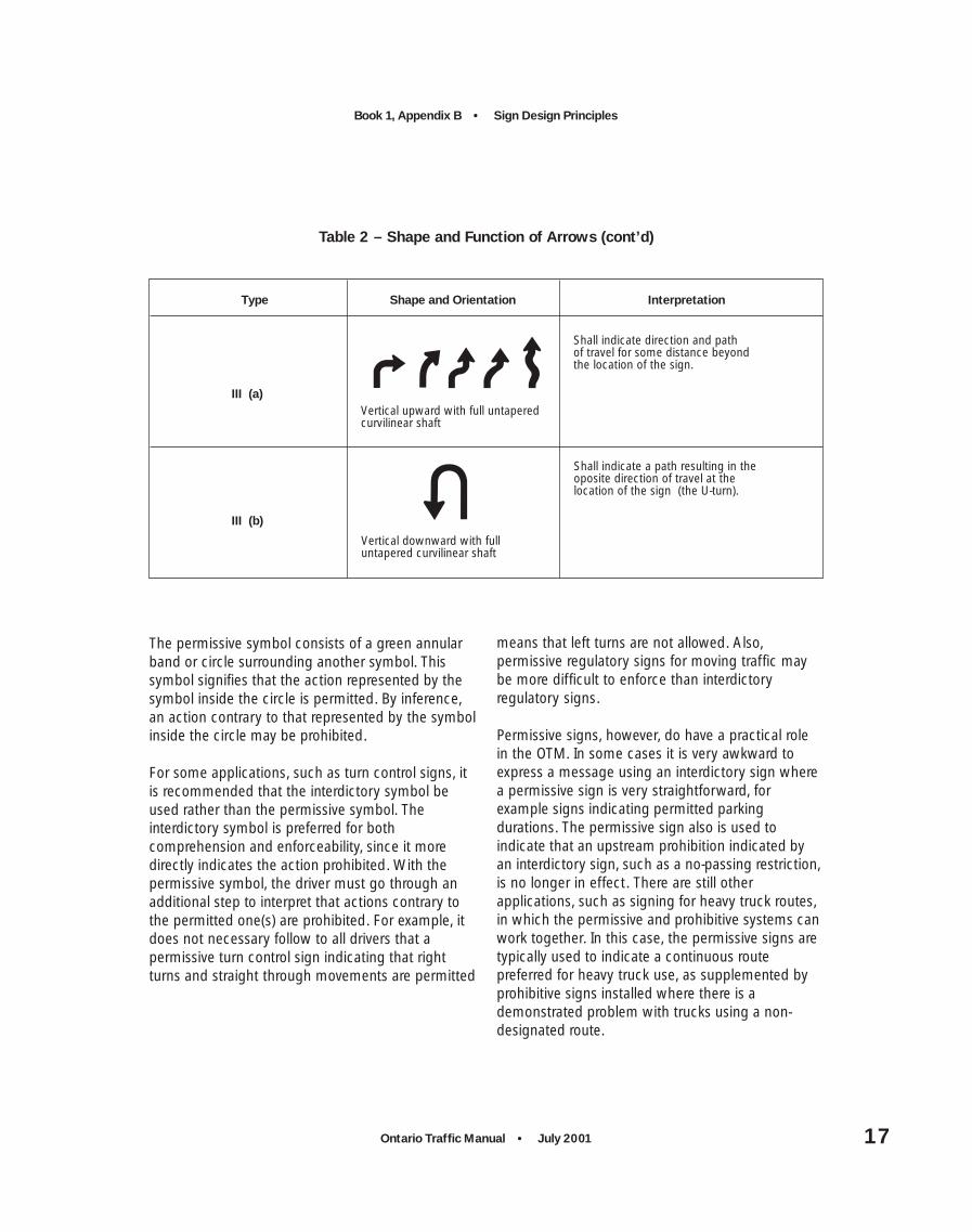
Table 2 – Shape and Function of Arrows
Type Shape and Orientation Interpretation
I (a)
I (b)
I (c)
II (a)
II (b)
Horizontal with short tapered shaft
Vertical downward with shortuntapered shaft
Vertical upward with shortuntapered shaft
Vertical upward with full untaperedshaft
Shall indicate the dimension or extentof a parking restriction.
Shall indicate the dimension under anabove-road structure or shall indicatethe application of an above-road signto a traffic lane.
Shall indicate that the sign message applies ahead.
Shall indicate direction and path oftravel at the location of the sign.
Shall indicate direction and path oftravel at and beyond the locationof the sign.
Horizontal or angled with fulluntapered shaft
II (c)
Angled with full untapered shaft
Shall indicate that the sign messageapplies to the lane the arrow pointstoward.
Ontario Traffic Manual • July 2001 17
Book 1, Appendix B • Sign Design Principles
The permissive symbol consists of a green annularband or circle surrounding another symbol. Thissymbol signifies that the action represented by thesymbol inside the circle is permitted. By inference,an action contrary to that represented by the symbolinside the circle may be prohibited.
For some applications, such as turn control signs, itis recommended that the interdictory symbol beused rather than the permissive symbol. Theinterdictory symbol is preferred for bothcomprehension and enforceability, since it moredirectly indicates the action prohibited. With thepermissive symbol, the driver must go through anadditional step to interpret that actions contrary tothe permitted one(s) are prohibited. For example, itdoes not necessary follow to all drivers that apermissive turn control sign indicating that rightturns and straight through movements are permitted
means that left turns are not allowed. Also,permissive regulatory signs for moving traffic maybe more difficult to enforce than interdictoryregulatory signs.
Permissive signs, however, do have a practical rolein the OTM. In some cases it is very awkward toexpress a message using an interdictory sign wherea permissive sign is very straightforward, forexample signs indicating permitted parkingdurations. The permissive sign also is used toindicate that an upstream prohibition indicated byan interdictory sign, such as a no-passing restriction,is no longer in effect. There are still otherapplications, such as signing for heavy truck routes,in which the permissive and prohibitive systems canwork together. In this case, the permissive signs aretypically used to indicate a continuous routepreferred for heavy truck use, as supplemented byprohibitive signs installed where there is ademonstrated problem with trucks using a non-designated route.
Table 2 – Shape and Function of Arrows (cont’d)
Type Shape and Orientation Interpretation
III (a)
III (b)
Vertical upward with full untaperedcurvilinear shaft
Vertical downward with fulluntapered curvilinear shaft
Shall indicate direction and pathof travel for some distance beyondthe location of the sign.
Shall indicate a path resulting in theoposite direction of travel at the location of the sign (the U-turn).

Book 1, Appendix B • Sign Design Principles
Ontario Traffic Manual • July 200118
6.3 Logo Design
With the new tourist signing system, numerouslogos are being used on traffic signs. In some casesthese logos were developed for letterheads and areintended to be viewed at arm’s length. Such logosare not easily recognized on highway signs wherethey are seen at 100 m or more for a second ortwo. For easy recognition logos should be:
• Simple in design – small details will not beresolvable at distances at which highway signs areread;
• Simple in colour – use of colour should berestricted so that the different coloured areas canbe resolved at a distance – three or fewer coloursare preferable;
• Evaluated at the distance at which drivers willhave to read them – a design which is attractivewhen viewed at arm’s length, may be clutteredand difficult to resolve at long distances whenseen briefly.
7. Calculating Letter Heightand Symbol Size
A number of factors must be considered to ensuresigns are legible at an appropriate distance. Thefollowing steps should be used to determine theminimum letter height on a text sign, or the symbolsize on a symbol sign, to accommodate the majorityof the driving population:
(1) Reading Time – Calculate the time requiredto read a sign with a given message.
(2) Perception-reaction Time – Determine thetime required to make a decision and initiate amanoeuvre, (if one is required).
(3) Manoeuvre Time – Determine the time tocomplete any required manoeuvre beforereaching the sign.
(4) Required Legibility Distance – Determinethe distance at which the sign must belegible, based on the travel speed (usually thespeed limit) and the sum of the timesobtained in Steps 1, 2 and 3 above.
(5) Minimum Letter Height – Calculateminimum letter height using set ratios forlegibility-distance-to-letter-height, specific tothe font type used.
(6) Symbol Legibility – Calculate symbol sizebased on legibility distance and the width ofthe critical detail in the symbol.

Ontario Traffic Manual • July 2001 19
Book 1, Appendix B • Sign Design Principles
This process, while based on reasonable driverrequirements, tends to be conservative, since it doesnot fully account for redundant information. Forexample, the presence of advance guide signs willlikely reduce the time required to recognize andread a sign at a freeway exit.
As is noted in Section 14, this process was not usedto arrive at current sign designs. Because mostregulatory signs and warning signs contain fewwords or symbols, and are for the most part veryfamiliar to drivers, and because relatively few signsrequire that a manoeuvre be completed before thesign is reached, it is likely that future analysis willshow that most current signs meet driver needs.The signs which are of real concern in terms ofletter height are those with long messages, withinformation that is new to the driver, or which mustbe read in their entirety. These signs include guidesigns, information signs and tourism signs.
Tourism signs have been developed using a processwhich considered driver requirements, and thestandards developed and described in Book 9(Tourism and Commercial Signs) are based on thisprocess. However, guide signs and information signsare continually being developed to suit therequirements of specific locations. The methodoutlined in this section should be used to determineappropriate letter heights for these signs. (Thereading times given do not apply for changeablemessage signs. These are discussed in Book 10(Changeable Message Signs).)
7.1 Reading Time
Reading time should be considered to be on theorder of 1/2 second per word or number (with 1second as a minimum for total reading time), and 1second per symbol. If some of the sign informationis redundant, then reading time should becalculated for the critical words only.
For example, when drivers read destination signs,they do not need to read every word of eachdestination. If they are looking for Kennedy Road,they do not need to read both “Kennedy” and“Road”, since the road is assumed. Similarly, if theyare looking for Kennedy Road, they only need readthe “Yonge” of “Yonge Street” to realize that this isnot the destination they are looking for and they cango quickly to the next line in the sign. Furthermore,if drivers are reading a list of destination names,they only need to read the arrow direction for theplace name they are searching for.
Reading Time = 1*(number of symbols) +0.5*(no. of words and numbers) [secs]
Notes:
(1) Minimum reading time is 1 second.
(2) If there are more than 4 words on a sign, adriver must glance at it more than once, andlook back to the road and at the sign again.For every additional 4 words and numbers, orevery 2 symbols, an additional 3/4 secondshould be added to the reading time.
(3) When the sign is very close, it is seen on anangle, and becomes difficult to read. It isassumed that the sign is not visible for the last1/2 second. Therefore, 1/2 second is addedto the required reading time. The onlyexception to this is signs requiring amanoeuvre before the sign is reached, as theywould not be read at this close distance.

Book 1, Appendix B • Sign Design Principles
Ontario Traffic Manual • July 200120
7.2 Perception-reaction Time
Once a driver has detected and then read the sign,he or she is in an alerted state, ready to make adecision and initiate a manoeuvre. The time requiredto do this is the perception-reaction time. Manysigns are for information only and do not require anydecision. Perception-reaction time can beconsidered to be zero in these cases.
Most signs that do require a decision, require astraightforward one, e.g., stop, reduce speed. Forthese signs, given that drivers are in an alerted stateand the choice about what to do is very limited,perception-reaction time can be considered to be 1second. If the driver is presented with severalchoices about what to do, or if the decision iscomplex because of the roadway layout, then longerperception-reaction times will occur. In suchsituations, up to 2.5 seconds may be required.
7.3 Manoeuvre Time
The requirement to complete a manoeuvre, and thetype of manoeuvre required can add significantly tothe total time required for a driver to read andrespond to a traffic sign, and consequently to thedistance at which a sign must be legible. For aSTOP sign, sufficient time is required for the driverto come to a complete stop by the time the sign isreached. Therefore it must be recognized at a
greater distance than a REDUCED SPEED AHEADsign, which alerts the driver to a change of speedlimit ahead, but does not require a driver tocomplete any actions before reaching the sign.
There are two main types of manoeuvres: lanechanges and speed reductions, including thoseresulting in a total stop.
For lane changes, manoeuvre time is a sum of thetime required to search for a gap in traffic and thetime to actually perform the lane change. Gapsearch time increases as traffic volume increases,since it is more difficult to find suitable gaps intraffic. Lane change manoeuvre time is calculatedusing Table 3.
For speed reductions, a constant deceleration rateof 8.8 km/(h*sec) is assumed. Therefore, themanoeuvre time can be calculated as follows:
Manoeuvre Time (for speed reduction) [secs]= (initial speed – final speed) [km/h]
— 8.8 [km/(h*sec)]
If the speed reduction results in a stop, as requiredfor a STOP sign, the final speed is zero, and theabove equation is simplified to the following:
Manoeuvre Time (for stopping) [secs] = initial
speed [km/h] — 8.8 [km/(h*sec)]
emiTervueonaMegnahCenaL–3elbaT
emuloVciffarTemiThcraeSpaG
]sces[emiTegnahCenaL
]sces[emiTervueonaMlatoT
]sces[
woL 5.3 5.4 0.8
hgiH 3.5 5.4 8.9
Ontario Traffic Manual • July 2001 21
Book 1, Appendix B • Sign Design Principles
7.4 Required Legibility Distance
The required legibility distance is calculated asfollows:
If a manoeuvre is not required,
Total Time Required = Reading Time + Out-of-View Time
= Reading Time + 0.5secs
If a manoeuvre is required,
Total Time Required = Reading Time +Perception-reactionTime + ManoeuvreTime [secs]
Legibility Distance[in metres] = Total Time Required
[secs] * TravelSpeed [km/h]* 0.28 [(m/sec)/km/h)]
7.5 Minimum Letter Height
Table 4 shows the legibility-distance-to-letter-heightratio according to font type. Note that the ratio ishigher for Series E(M) font than for the narrowerSeries C and D fonts that have poorer legibility. Thehigher ratio for Series E(M) font means that, for agiven letter height, this font is legible from a greaterdistance than are Series C and D fonts. Clearviewfont has the same legibility-distance-to-letter-heightratio as Series E(M) font.
Minimum letter height is calculated as follows:
Minimum Letter Height [cm] = Required
Legibility Distance [m] — Legibility-Distance-to-Letter-Height Ratio [m/cm]
7.6 Symbol Legibility
The legibility of a symbol depends on the smallestcritical detail in the symbol that needs to beresolved in order that the symbol be understood.This is often difficult to determine without testing.Consequently the guidelines that can be given areestimates only. The width of the critical detail (ratherthan the length) determines legibility, e.g., the widthof an arrow shaft. Legibility distance isapproximately 24 m/cm of symbol width.
soitaRthgieH-retteL-ot-ecnatsiD-ytilibigeL–4elbaT
epyTtnoF ]mc/m[oitaRthgieH-retteL-ot-ecnatsiD-ytilibigeL
CseireS 2.4
DseireS 2.4
)M(EseireS 8.4
weivraelC 8.4

Book 1, Appendix B • Sign Design Principles
Ontario Traffic Manual • July 200122
7.7 Example
Consider a destination sign with two names andtwo arrows, placed 30 m from the intersection on atwo-lane highway, where there is no advancesigning (see Figure 2). This is a situation that canoccur on secondary highways, but not on primaryhighways where advance signing is used. The driverpotentially must slow from 80 km/h to 40 km/h inorder to turn at the intersection. Therefore the drivermust be able to read at least two words and onearrow direction to make a decision. He or she mustthen begin to brake, and slow down to 40 km/hbefore reaching the intersection.
Reading Time = (2 words) * (0.5 secs/word) +(1 symbol) * (1 sec /symbol)
= 2 secs
Perception-reaction Time = 1 sec
Manoeuvre Time(for speed reduction) = (80 – 40) km/h
8.8 km/h/sec
= 4.5 secs
Total TimeRequired = Reading Time + Perception-
reaction Time + ManoeuvreTime
= 2 + 1 + 4.5
= 7.5 secs
Travel Speed
= Mean Speed
=
Where:
= (2 + 1)*80 + [4.5 * 0.5 * (80+40)] 7.5
= 68 km/h
Required Legibility Distance
= Total Time Required [secs] * TravelSpeed [km/h] * 0.28 [(m/sec)/(km/h)]
= 7.5 secs * 68 km/h * 0.28 [(m/sec)/(km/h)]
= 143 m
(T + T ) V + (T * V )r pr i m avg
Tt
T = Reading TimeT = Perception-reaction TimeV = Initial SpeedT = Manoeuvre TimeV = Average SpeedT = Total Time Required
r
pr
i
m
avg
T

Ontario Traffic Manual • July 2001 23
Book 1, Appendix B • Sign Design Principles
Since the sign is 30 m from the turning point, thespeed reduction can continue for 30 m after thesign is passed. Therefore, required legibility distancecan be reduced by 30 m to 113 m.
Minimum Letter Height
= Required Legibility Distance [m]¸Legibility-Distance-to-Letter-HeightRatio [m/cm]
= 113 m — 4.8 m/cm (for Series E letters)
= 24 cm
The calculations for letter height are based onvalues intended to ensure that the majority ofdrivers will have ample time to read signs and carryout manoeuvres. Sign blanks come in standard sizesand the maximum letter heights possible given thesign blank size may not allow the calculated letterheight. To allow some flexibility for practical reasons,it is recommended that the actual letter height usedbe no smaller than 90% of the calculated value.
8. Sign Layout
Following on the development of some generalguidelines for the design of sign text and symbols,this section considers how these elements arearranged on the sign face. Aspects of design toconsider include the length of the message on asign, the distribution of the legend on the sign, linespacing and border space.
8.1 Message Length
For the purposes of reduced reading time andincreased legibility, it is important to minimize themessage length, provided that the messagedoes not become ambiguous. A sign with alonger message will have to be legible from furtherback, and will therefore need to have larger text anda larger overall size, than a sign with a shortermessage in the same environment and requiring thesame driver response.
Message length will determine letter height, andtherefore sign size. The method described in Section7, which considers driver visual capabilities, readingtime, perception-reaction time and manoeuvre time,should be used to calculate letter height.
8.2 Line Spacing
The spacing between lines of text on a sign shouldbe sufficient so that the individual lines aredistinguishable from a distance and the messagecan be clearly read. The general guideline is toprovide a space of between 0.5 to 1 times themaximum letter height between each line. The signpatterns shown in Book 2 (Sign Patterns andFabrication) adhere to this guideline.
Figure 2 – Example Sign

Book 1, Appendix B • Sign Design Principles
Ontario Traffic Manual • July 200124
For signs using mixed case text, the impacts onlegibility and overall aesthetic effect caused byinteracting ascenders (such as the vertical stroke ofthe letter “b”) and descenders (such as the verticalstroke of the letter “p”) need to be taken intoaccount. If ascender/descender interference resultswith standard line spacing, the space between linesshould be slightly increased and the legend centredvertically on the sign blank.
8.3 Border Space
Sign borders delineate the sign against itsbackground environment, help direct driver attentionto the message and can differentiate messageswithin groups of signs. Three kinds of borders areused on signs in the OTM:
(1) Inner Border: a continuous narrow strip thesame colour as the legend, just inside theedge of the sign. This type of border improvesthe appearance of the sign. The width of theinner border should be approximately 1.5% to3% of the smallest outer dimension of thesign. For a 60 cm x 60 cm sign, this translatesto about 1 cm to 1.5 cm.
(2) Outer Border: a continuous narrow frame thesame colour as the sign background, at thevery edge of the sign. The outer borderemphasizes the inner border by providingcontrasting colour on both sides of the innerborder. The width of the inner border shouldbe approximately 1.5% of the smallest outerdimension of the sign. For a 60 cm x 60 cmsign, this translates to about 1 cm.
(3) Background Space Around Legend: emptybackground space between the legend andthe inner border. This space is required so thatthe legend is clearly distinguishable from aborder of the same colour.
On regulatory, warning and temporaryconditions signs, the minimum clearancebetween the legend and inner border shouldbe approximately 4% to 10% of the smallestouter dimension of the sign. For a 60 cm x 60cm sign, this translates to about 2.5 cm to6 cm.
On directional guide signs and otherinformation signs, the minimum sideclearance between the legend and the sidesof the inner border should be equal to theheight of the largest letter. The minimumclearance to the top and bottom of the innerborder should be 66% to 100% of the largestletter height, minus the width of the innerborder.

Ontario Traffic Manual • July 2001 25
Book 1, Appendix B • Sign Design Principles
9. Reflectorization andIllumination
Signs that convey messages of warning, importantregulations or essential directional information thatare relevant during the hours of darkness need to belegible and conspicuous at night, as well as duringthe day. Since conspicuity depends to some degreeon colour code recognition, the colour of the signmust appear the same by night as by day. Theengineering tools used for maintaining a reasonablelevel of sign legibility and conspicuity at night arereflectorization and illumination.
9.1 Retroreflective Sheeting
Most signs are assembled by applying thin adhesivesheeting materials in the background and legendcolours to a rigid sign blank. Some types of sheetingcontain tiny glass beads or prisms that refract thelight so most of it is reflected straight back to thesource, which is a vehicle with headlights.Therefore, the light from the headlights is veryefficiently used, with a significant amount of itreflected back towards the driver’s eyes. Materialhaving this property is known as retroreflectivesheeting.
There are different types of retroreflective sheeting.Types in use today on road signs include thefollowing:
• Type I –Engineering Grade (enclosed lensglass-bead material);
• Type II –Super-Engineering Grade (enclosedlens glass-bead material);
• Type III –High Intensity Grade (encapsulatedglass-bead material);
• Type IV –High Intensity Prismatic(non-metalized micro-prismaticmaterial);
• Type VIIA –Diamond Grade (non-metalized micro-prismatic material, for short rangeviewing);
• Type VII B –Diamond Grade (non-metalized micro-prismatic material, for long rangeviewing).
In general, the higher the type number, the greaterthe amount of light reflected back to the driver’seyes. Each type of retroreflective sheeting ischaracterized by a range of R-values. R is known asthe coefficient of retroreflectivity and indicates theproportion of light reflected back to the driver. Theunits for R are candelas per lux per square metre(cd/(lux*m2)).
R-values associated with each type of retroreflectivesheeting are detailed in the ASTM Specification D4956-95 (or its subsequent revisions). In Canada,the CGSB Specification 62-GP-11M (or itssubsequent revisions) also specifies retroreflectivesheeting. The main difference between the ASTMstandard and the CGSB standard is that the CGSBstandard sets out a performance level requirementat 50 degrees entrance angle, while the widestentrance angle for which the ASTM standardspecifies a performance level is 30 degrees. If signsare to be installed where viewing angles are greaterthan 30 degrees (e.g., if the sign has a very largehorizontal mounting offset), the CGSB specificationshould be used.

Book 1, Appendix B • Sign Design Principles
Ontario Traffic Manual • July 200126
In the specifications, R-values are provided fordifferent entrance angles and observation angles.The entrance angle is the angle between theheadlight beam and the perpendicular to the signface (see Figure 3). The observation angle is theangle formed by light travelling from the headlightand reflected off the sign back to the driver’s eye(see Figure 4). Larger entrance and observationangles result in lower R-values (see Sections 12.2,12.3 and 12.4).
The entrance angle is affected by:
• The horizontal sign offset;
• Sign mounting height (vertical offset);
• The distance between the vehicle and the sign;
• The travel lane of the vehicle;
• The curvature of the roadway;
• Tilt angle of the sign about its vertical axis(horizontal angling of side-mounted signs); and
• Tilt angle of the sign about its horizontal axis(vertical angling of overhead signs).
The observation angle is affected by:
• The distance between the vehicle and the sign;
• Sign mounting height (vertical offset); and
• The distance between headlight height and drivereye height.
The R-values vary according to colour, with darkercolours having generally lower R-values. Forexample, minimum ASTM R-values for new Type Iand Type IV sheeting of various colours, measuredat an observation angle of 0.2 degrees and anentrance angle of 4 degrees, are shown in Table 5.These R-values should be considered as guidelinesonly. Typically, new sheeting has much highervalues, by on the order of 30%, than the minimumASTM values indicated in the table.
The OTM mandates the use of high intensitysheeting for several signs which are critical from asafety standpoint, that is, failure to see or heedthese signs at night could have seriousconsequences (see Book 5 (Regulatory Signs), Book6 (Warning Signs) and Book 7 (TemporaryConditions)). However, it may make sense to usehigh intensity sheeting for other applications also,
Figure 3 – Entrance Angle
Sign Perpendicular
Average Headlight Entrance Path
Headlight Path
90
Entrance Angle

Ontario Traffic Manual • July 2001 27
Book 1, Appendix B • Sign Design Principles
for new signs installed and as part of a regular signreplacement program. In addition to the obviousbenefit of improving legibility, high intensity sheetingis also more cost effective over the life of the sign.
While the capital cost of high intensity sheeting ishigher, the life cycle is also longer. In addition, thepercentage of the new R-value that is guaranteed tothe end of the life cycle is generally higher with
Figure 4 – Observation Angle
Headlight Path
Path of Returned Light
Observation Angle
seulaV-RMTSA–5elbaT
ruoloC IepyT VIepyT
etihW 07 052
wolleY 05 071
egnarO 52 001
neerG 9 53
deR 41 53
eulB 4 02
nworB 1 7
seergeD2.0=elgnAnoitavresbO*seergeD4–=elgnAecnartnE

Book 1, Appendix B • Sign Design Principles
Ontario Traffic Manual • July 200128
higher intensity sheeting. For example, with Type Isheeting, 50% of its new R-value is guaranteed atthe end of 7 years (R at end of life cycle = 35 forwhite sheeting at observation angle = 0.2 degreesand entrance angle = 4 degrees), while with Type IIIsheeting, 80% of its new R-value is guaranteed atthe end of 10 years, and has been observed to bemaintained after even 20 years (R at end of lifecycle = 200 for identical conditions).
9.2 Illumination
As an alternative or supplement to high intensitysheeting, external or internal illumination of the signmay be used. As with retroreflective sheeting, allsign illumination must result in sign coloursappearing the same by night as by day. Illuminationmay be by one of the following means:
• A light behind a translucent sign face, illuminatingthe legend and/or background;
• An attached or independently mounted lightsource designed to direct essentially uniformillumination over the entire sign face;
• Luminous tubing shaped to the legend or symbol.
Ordinary street or highway lighting does not meetthe requirements for sign illumination. However,street lighting can aid visibility. The presence ofstreet lighting should be taken into consideration inselecting the exact placement of signs which arenot required to be reflectorized or illuminated.
10. Contrast
Contrast refers to differences in colour or inbrightness which allow a target, such as a signmessage or symbol, to be seen against the signbackground. Contrast is dependent on a propertycalled reflectance, which represents the amount oflight reflected back from a sign, relative to theamount of light shining on the sign. Contrast isdefined in various ways. Contrast can be calculatedaccording to the following formula:
Contrast = RL – RB
RB
Contrast Ratio = RL
RB
Where: RL is Reflectance of Legend; and
RB is Reflectance of Background.
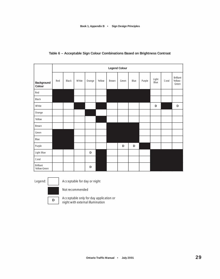
Contrast affects legibility. Where there is a low levelof contrast (e.g., orange letters on a light bluebackground) legibility will be poorer than withhigher contrast (e.g., black letters on a whitebackground). Table 6 shows acceptable andrecommended combinations for sign colours usedin the Ontario Traffic Manual, based on contrast.
During the day contrast is determined by the degreeto which various colours reflect light. At night, lightis provided by streetlights and headlights. Even withthese light sources there is insufficient lightreflected from a non-retroreflective sign to allow it tobe read. In order to raise the level of light reflectedback to the observer, retroreflective sheeting is used(see Section 9 (Reflectorization and Illumination).For a sign with retroreflective sheeting, reflectanceat night is measured by the R-values of the materialsused for the sign legend and background.
Ontario Traffic Manual • July 2001 29
Book 1, Appendix B • Sign Design Principles
Table 6 – Acceptable Sign Colour Combinations Based on Brightness Contrast
dnuorgkcaBruoloC
ruoloCdnegeL
deR kcalB etihW egnarO wolleY nworB neerG eulB elpruPthgiL
eulBlaroC
tnaillirB--wolleY
neerG
deR
kcalB
etihW D D
egnarO
wolleY
nworB
neerG
eulB
elpruP D D
eulBthgiL D
laroC
tnaillirBneerG-wolleY
D
Legend: Acceptable for day or night
Not recommended
Acceptable only for day application ornight with external illumination
D
Book 1, Appendix B • Sign Design Principles
Ontario Traffic Manual • July 200130
For positive contrast signs (e.g., white legends ongreen or blue or red backgrounds), brightnesscontrast at night has a major impact on legibility.Laboratory studies have shown that:
• Legibility falls off rapidly for contrast values belowabout 4:1;
• Best legibility is found for contrasts in the regionof 10:1 to 15:1;
• Beyond 15:1, legibility very gradually decreases,but even at 100:1 it is still greater than at 4:1.
For this reason, sheeting combinations whoserelative R-values produce contrast ratios below avalue of 4:1 are not recommended. At the upperend, laboratory studies have shown that nightlegibility is significantly reduced for Type VII legendson a Type I (Engineering Grade) background. Thusthis combination is not recommended.
Some signs, such as STOP signs, are fabricated bysilk screening coloured reflective paint onto whitesheeting. When new, reflective paint tends to have alower R-value for a given colour than its equivalentlevel of sheeting, resulting in higher contrast ratioswith the white sheeting. However, the reflectivepaint fades more quickly than sheeting, and withtime, contrast ratios fall below those for the sametypes of signs surfaced entirely with sheeting. Forbest results, it is recommended that components ofsilk screened signs (e.g., sheeting, ink, clear coating)be provided from the same manufacturer to ensurecompatibility of the components.
For negative contrast signs, that is black legends onwhite or orange backgrounds, the retroreflectanceof the black sheeting is zero, and a contrast ratiocannot be calculated. For such signs, nighttimelegibility depends on sign luminance. Studies showthat with type C letters, there is little impact ofsheeting on legibility – legibility is as good with TypeI as with Type IV. With type D letters, Type III and IVsheeting increase legibility over that of Type I and IIby about one-third.
Ontario Traffic Manual • July 2001 31
Book 1, Appendix B • Sign Design Principles
11. Selecting the Sign Size
Books 5, 6, 7, 8 and 9 of the OTM show signdesigns and minimum sizes of signs, typically asrelated to type and speed of roads. Most signscurrently in use are considered to meet the needs ofthe majority of drivers, based on experience inOntario and elsewhere. However, these signs havenot all been systematically analyzed in accordancewith the sign design principles described herein.This is proposed to be done, through the processoutlined in Section 14. Over a period of time,revisions and refinements to the OTM will be madeon a continuing basis. At any given time, the OTMBooks and the minimum sign sizes shown thereinrepresent best guidance and practice based oncurrent knowledge at the time.
In some situations, it may be desirable to increasethe sign size over those shown in the OTM. Much ofthe information discussed in the above sections(especially Section 7), including font type, letter size,symbol size and sign layout with appropriatespacing and borders, can be used to determinewhether increased sign size should be used. Thestandard sign size can then be adjusted to fit thenext larger standard sign blank size available (SeeBook 2 (Sign Patterns and Fabrication)).
Some of these situations where larger sign size maybe desirable, include the following:
• If there is a known challenged driver population ina given area, such as in the vicinity of a SeniorCitizens’ centre, consideration should be given tomoving up to the next largest blank size.
• If there are factors that impact the amount of timea driver can devote to reading the sign, such as acomplex and distracting background environment,heavy traffic volumes and a high density ofintersections and driveways requiring complexchoices, consideration should be given to movingup to the next largest blank size, to increase thedistance at which the sign is legible.
• If the required sign size is prohibitively large and ifattempts to redesign the sign have not succeededin the short term, consideration should be givento using a higher intensity sheeting to improvenighttime legibility. For example, increasing theintensity of sheeting from Type II to Type VII forboth legend and background has the equivalentimpact of increasing night legibility distance by15 m to 30 m, or increasing the letter height by2.5 cm to 5 cm for nighttime conditions only.
• It may not be economically feasible to install allnew signs and to replace all damaged and agedsigns with the sizes required to accommodate85% of the driving population. In this case, priorityshould be given to signs that are higher on thesign hierarchy (see Section 4).

Book 1, Appendix B • Sign Design Principles
Ontario Traffic Manual • July 200132
12. Sign Position
Drivers are very limited in how many places theycan look as they drive along the roadway at speedsof 10 m to 30 m every second (about 40 km/h to110 km/h). Therefore, standardization of signposition is important so that drivers can quickly findsigns in expected locations, and spend the little timeavailable reading them rather than looking for them.Standardization of position, however, cannot alwaysbe attained in practice, since signs must be placedin the most advantageous position and must beadapted to the road design and alignment.
12.1 Side and Overhead Mounting
The general rule for sign placement is to locatesigns on the right side of the road to meet driverexpectations. In some circumstances, signs may bemost conspicuous when placed on a channelizingisland, overhead or, as in the case of sharp rightcurves, on the left shoulder of the road directly infront of approaching vehicles.
In addition, there are situations where it is advisableto place a second sign on the left side of the road tosupplement the primary sign normally placed on theright side. Examples are multi-lane one-way streets,expressways and locations where collisionexperience has shown that the drivers are failing tosee the primary signs.
Overhead mounting should preferably be used forlane designation signs and as required for multi-lanefacilities. Certain classes of directional guide signson expressways are typically overhead mounted. Formore information on standards for mountingoverhead signs, see Book 3 (Sign Support andInstallation).
12.2 Horizontal Mounting Offset
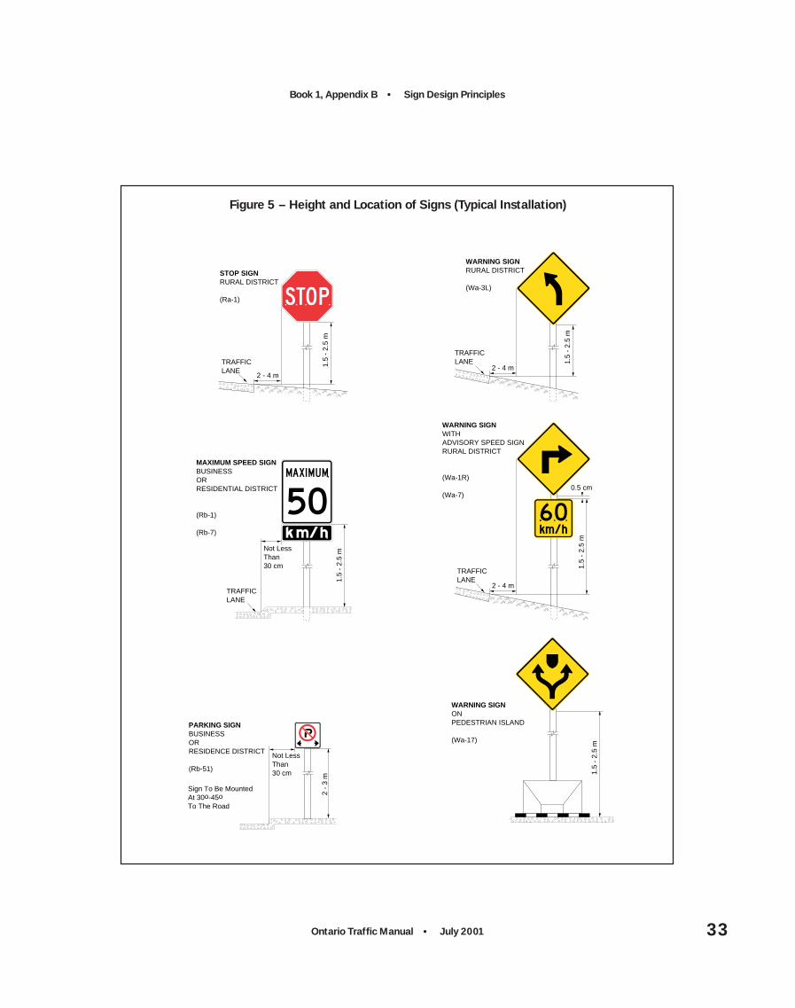
Typical examples of horizontal mounting offsets forground-mounted signs are illustrated in Figures 5and 6. The basic guidelines for horizontal mountingoffsets are as follows:
• Rural areas without raised curbs: 2 m to 4 mfrom the outside edge of the outer traffic lane;
• Urban or residential areas with raised curbs:30 cm to 2 m from the curb line.
Where restricted by physical features such as cliffs,or structural features such as bridge supports, thehorizontal offset should be as close as possible tothe above guidelines. For some signs the horizontaloffsets do not conform to the general guidelines.These exceptions are discussed on a sign-by-signbasis throughout the Ontario Traffic Manual.
In the event that vehicles must leave the roadway,the horizontal offset should allow for a safe andpractical clearance so that vehicles are less likely tostrike sign supports. Advantage should be taken ofexisting guide rails, overhead structures and otherphysical features to minimize the exposure of trafficto sign supports. Otherwise breakaway or yieldingsupports should be used.
Where there is a range of horizontal mountingpositions available, minimizing the horizontal offsetis recommended, provided that a practical clearancebetween the roadway and sign is maintained.Minimizing the horizontal offset reduces theentrance angle, which in turn increases thecoefficient of retroreflectivity, R, and improves nightlegibility of the sign (see Section 9.1). Drivers canalso keep a sign with a smaller offset in theirperipheral vision for a longer time, which increasesthe time available for viewing the sign.
Ontario Traffic Manual • July 2001 33
Book 1, Appendix B • Sign Design Principles
2 - 4 m
1.5
- 2.
5 m
TRAFFICLANE
STOP SIGNRURAL DISTRICT
(Ra-1)
2 -
3 m
Not LessThan30 cm
PARKING SIGNBUSINESSORRESIDENCE DISTRICT
(Rb-51)
Sign To Be MountedAt 30o-45oTo The Road
1.5
- 2.
5 m
WARNING SIGNONPEDESTRIAN ISLAND
(Wa-17)
TRAFFICLANE
2 - 4 m
1.5
- 2.
5 m
WARNING SIGNRURAL DISTRICT
(Wa-3L)
TRAFFICLANE
2 - 4 m
0.5 cm
1.5
- 2.
5 m
WARNING SIGNWITHADVISORY SPEED SIGNRURAL DISTRICT
(Wa-1R)
(Wa-7)
TRAFFICLANE
Not LessThan30 cm
1.5
- 2.
5 m
MAXIMUM SPEED SIGNBUSINESSORRESIDENTIAL DISTRICT
(Rb-1)
(Rb-7)
Figure 5 – Height and Location of Signs (Typical Installation)

Book 1, Appendix B • Sign Design Principles
Ontario Traffic Manual • July 200134
NOTE: Where shoulder width is less than 3 m signs should be erected 60 cm from edge of shoulder
2 - 4 m
Min
. 1.5
m
TRAFFICLANE
OVERSIZE MARKER
M.h-3
M.h-9
TRAFFICLANE
Min
. 2
.5 m
Max.
3 m
JUNCTIONASSEMBLY
M.h-19
M.h-3
2 m
COUNTY ROAD MARKER
M.h-4
URBAN 0.3 - 2 mRURAL 2 - 4 m
TRAFFICLANE
2 m
TRANS-CANADAMARKER
M.h-2
M.h-1
URBAN 0.3 - 2 mRURAL 2 - 4 m
TRAFFICLANE
2 m
MARKER ANDTRAILBLAZER
M.h-2
M.h-8
URBAN 0.3 - 2 mRURAL 2 - 4 m
TRAFFICLANE
M.h-21
M.h-9
UR
BA
N 2
m M
in.
RU
RA
L 1
.5 m
Min
.
DIRECTIONALMARKERASSEMBLY
M.h-3
M.h-10
M.h-3
M.h-15
URBAN 0.3 - 2 mRURAL 2 - 4 m
TRAFFICLANE
M.h-5
M.h-18
M.h-3
M.h-15
Figure 6 – Height and Location of Markers

Ontario Traffic Manual • July 2001 35
Book 1, Appendix B • Sign Design Principles
12.3 Vertical Mounting Offset
Typical examples of vertical mounting offsets forground-mounted signs are illustrated in Figures 5and 6. The basic guidelines for vertical mountingoffsets of ground-mounted signs include thefollowing:
• Areas with no pedestrians and withoutraised curbs: 1.5 m to 2.5 m from outer edge ofouter lane to bottom of principal sign, regardlessof whether there is a tab sign mounted beneathprincipal sign;
• Areas with no pedestrians and with raisedcurbs: 1.5 m to 2.5 m from curb line to bottomof principal sign, regardless of whether there is atab sign mounted beneath principal sign;
• Areas with pedestrians: 2 m to 3 m fromground elevation at the base of the sign post tothe bottom of the overall sign, including tab ifpresent.
For overhead signs, the minimum vertical mountingoffset ranges from 4.5 m to 5.3 m, measured fromthe road surface to the bottom of the overall sign,including tab if present. For overhead signsmounted on dedicated overhead sign supports,such as aluminum trusses, the vertical mountingoffset must be at least 5.3 m. If an overheight truckhits one of these large signs, it may bring down theentire structure, posing a safety risk and havingsignificant restoration cost implications. If, however,the same sign is mounted on an overpass bridge, a4.5 m clearance is sufficient. The 4.5 m clearanceis equal to the clearance of the bridge, itself, and ifthe sign is damaged it will likely not bring down thebridge. Similarly, if a sign is mounted on a trafficsignal arm, there is no benefit in making the verticalclearance for the sign greater than the 4.5 mclearance for the traffic signal. Overhead signsshould be centred over the traffic lanes to whichthey apply.
Where there is a range of vertical mountingpositions available, minimizing the vertical offset isrecommended, provided that the minimumrequirement is met. Mounting the sign lowerreduces the entrance angle, which in turn increasesthe coefficient of retroreflectivity, R, and improvesnight legibility of the sign (see Section 9.1).
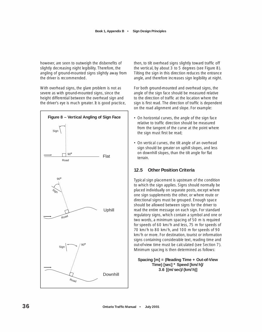
12.4 Horizontal and VerticalAngling of Sign Face
Generally, signs must be mounted at approximatelyright angles to the direction of traffic, facing thetraffic that they are intended to address. Exceptionsto this rule include regulatory parking control signs.These signs should be placed at an angle of 30 to45 degrees to the flow of traffic, and should alwaysbe visible to approaching traffic.
Ground-mounted signs should be angled horizontallyslightly away from traffic (by about 3 degrees), sothat glare is reduced (see Figure 7). Glare is a brightreflection off the sign’s smooth surface, whichmakes the sign legend unreadable while the driver’seye is within a certain angle of the sign. As noted inSection 9.1, horizontal angling of ground-mountedsigns impacts the entrance angle for nightreflectivity . Increasing the entrance angle decreasesR, the coefficient of retroreflectivity, which in turnreduces night legibility of the sign. By angling side-mounted signs slightly away from traffic, theentrance angle is increased, and unfortunatelylegibility is decreased. The benefits of reduced glare,
Figure 7 – Horizontal Angling of Sign Face
Direction of Traffic
Sign93
Book 1, Appendix B • Sign Design Principles
Ontario Traffic Manual • July 200136
however, are seen to outweigh the disbenefits ofslightly decreasing night legibility. Therefore, theangling of ground-mounted signs slightly away fromthe driver is recommended.
With overhead signs, the glare problem is not assevere as with ground-mounted signs, since theheight differential between the overhead sign andthe driver’s eye is much greater. It is good practice,
then, to tilt overhead signs slightly toward traffic offthe vertical, by about 3 to 5 degrees (see Figure 8).Tilting the sign in this direction reduces the entranceangle, and therefore increases sign legibility at night.
For both ground-mounted and overhead signs, theangle of the sign face should be measured relativeto the direction of traffic at the location where thesign is first read. The direction of traffic is dependenton the road alignment and slope. For example:
• On horizontal curves, the angle of the sign facerelative to traffic direction should be measuredfrom the tangent of the curve at the point wherethe sign must first be read;
• On vertical curves, the tilt angle of an overheadsign should be greater on uphill slopes, and lesson downhill slopes, than the tilt angle for flatterrain.
12.5 Other Position Criteria
Typical sign placement is upstream of the conditionto which the sign applies. Signs should normally beplaced individually on separate posts, except whereone sign supplements the other, or where route ordirectional signs must be grouped. Enough spaceshould be allowed between signs for the driver toread the entire message on each sign. For standardregulatory signs, which contain a symbol and one ortwo words, a minimum spacing of 50 m is requiredfor speeds of 60 km/h and less, 75 m for speeds of70 km/h to 80 km/h, and 100 m for speeds of 90km/h or more. For destination, tourist or informationsigns containing considerable text, reading time andout-of-view time must be calculated (see Section 7).Minimum spacing is then determined as follows:
Spacing [m] = (Reading Time + Out-of-ViewTime) [sec] * Speed [km/h]/
3.6 [(m/sec)/(km/h)]
90
Sign
Road
Uphill
90
Sign
Road
DownhillRoad
90Sign
Flat
Figure 8 – Vertical Angling of Sign Face
Ontario Traffic Manual • July 2001 37
Book 1, Appendix B • Sign Design Principles
13. Bilingual Sign Design
Signs with text in both English and French may beinstalled in designated areas, conforming withmunicipal and provincial policies (see Book 1,Section 8 for information on bilingual signingpolicy). Bilingual messages can be presented eitheron the same sign or on separate signs. If bothlanguages are shown on one sign, one of twooptions must be used:
• English text on the left side and French text on theright side; or
• English text on the upper portion of the sign withFrench text below.
If a pair of signs is used instead, the English textmust be presented first and its French textequivalent must be located beyond it. The signsshould be placed far enough apart to be bothlegible, but close enough so that their individualmessages can be recognized as being equivalent.For longer texts, the two-sign approach is preferred,to avoid overloading the driver with what mayappear as a lengthy message.
Bilingual signs must conform to established signdesign principles for application, location, position,colour, shape and size. They must employ the samesymbols, arrows and borders, and where possiblemust maintain the same fonts and equivalent letterheights as their corresponding English-only versions.Sign patterns for bilingual signs are shown in Book2 (Sign Patterns and Fabrication).
14. Process for Assessing andRevising Sign Designs
A cursory analysis would suggest that most signscurrently in use probably do meet the needs of themajority of drivers, despite the fact that they weredesigned in the absence of explicit knowledge ofdriver needs. However, a systematic analysis isrequired because there are signs which appear tobe inadequate. Given the aging of the driverpopulation and the increasing complexity of theroad network, it is important that such signs beconsidered for redesign. In addition, such an analysisis needed to ensure that sign sizes designated forvarious road types and speed zones are appropriate.
Due to the time required to complete an analysis ofthis depth, it is not possible to incorporate theanalysis results for the sign designs of the first fewOTM Books to be released. A process has beenstarted, however, which will eventually lead to theupdate of sign designs as required throughout theentire Ontario Traffic Manual (see Book 1, Sections2.5 and 5.12). The process involves the followingsteps:
(1) On an interim basis, for this edition of theOntario Traffic Manual, incorporate essentiallythe current versions of the regulatory,warning, temporary conditions, and guidesigns appearing in the Ontario Manual ofUniform Traffic Control Devices (MUTCD),specifying different minimum sizes of signs fordifferent speed ranges, according to rule ofthumb and commonly used sign blank sizes.Increases above these minimum sizes maybecome desirable when other factors and signdesign principles are taken into account.

Book 1, Appendix B • Sign Design Principles
Ontario Traffic Manual • July 200138
(2) On a longer-term basis, adopt a procedure forsign review and revision, involving the Ontariotraffic engineering community, through theOntario Traffic Manual Committee (OTMC) andits subcommittees. This procedure isenvisaged as follows:
(a) Existing Signs – Identify those signswhich appear most problematic, andsubject them to systematic analysis ofdriver requirements, to determine theappropriate letter height. Develop andtest for comprehension alternative signdesigns for any signs that are found tobe deficient, or that appear to requiresignificant increases in sign size. Discussalternatives at the OTMC and approvethe approach preferred by the OTMC,which would be incorporated in the nextedition of the relevant Book of the OTM.Over time, all existing signs should bereviewed in this manner.
(b) New Signs – Any new sign designs (allcategories) should be developed on thebasis of current knowledge of driverneeds, as discussed in Section 2. If theresulting sign designs are very large orare substantially larger in size thanexisting signs, raising questions as tofeasibility, this may require an alternativesign design or an alternative signingapproach.
14.1 Comprehension Testing
When signs are developed, they are frequentlytested in a number of ways. Generally they areshown to a committee, usually of traffic engineersor related professionals, who comment on theadequacy of the design. Several alternative designsmay be shown to focus groups to determine driverpreference. They may then be mounted at a testlocation, and any public feedback about them is
recorded before a final design emerges. However,none of these methods ensures that a sign will beadequately legible for unfamiliar drivers, or that itwill be comprehended by the majority of drivers.Traffic engineers have a much greater familiaritywith traffic engineering terms, and messages suchas “limited sight distance” which may be verymeaningful to them, turn out to be poorlyunderstood by the general public. Focus groupsreveal preference, which may have to do withattractiveness of a design, but not necessarily withthe ability of individual drivers to comprehend asign, particularly when it is viewed very briefly asthe driver passes by.
To ensure adequate legibility, the procedure fordetermining letter height described in Section 7should be followed. To ensure that the majority ofdrivers understand the sign it should be tested witha representative sample of drivers – on the order of200, with varying age, education and languagebackgrounds. Such studies were carried out toensure the bilingual freeway signs, installed in 1993,would be comprehended by the majority of drivers.
If a sign must be produced quickly, there may beinsufficient time for a systematic test. In this case,there are some simple steps that will assistengineers to develop a sign likely to be understoodby the general public. The sign, or signs if there arealternative designs, must be shown to a sample ofthe general public. Office employees who arefamiliar with engineering language, even thoughthey are not themselves engineers, are not idealcandidates because of their “inside knowledge”. Aminimum sample would be 24 drivers, and thissample should include approximately 1/3 underage 25, 1/3 aged 26 to 55, and 1/3 over 55 years.Less educated rather than better educated driversare preferable. When there are several alternativesof one sign to be tested, it is preferable that eachdriver be tested with only one version of the sign.

Ontario Traffic Manual • July 2001 39
Book 1, Appendix B • Sign Design Principles
Sample signs should be drawn up. Each sign shouldbe placed in a background typical of the context inwhich it will be seen, e.g., on a freeway, at an urbanintersection. Drivers should see the sign for a fewseconds only – this is generally the length of timethey have to figure out a sign on the roadway.Drivers should then be asked simply what the signmeans and their answer recorded. This technique ispreferable to using a multiple choice approach,because it will reveal potential confusions. Forexample, the SLIPPERY WHEN WET sign isinterpreted by many drivers as WINDING ROADAHEAD. Where fewer than 80% (20/25) of driverstested understand the sign, redesign is required. Thedrivers’ wrong answers will assist in determiningwhat aspects of the design need to be changed.
Where comprehension is poor, and redesign isrequired, it is often the case that only small changesneed be made. For example, the comprehension ofthe SLIPPERY WHEN WET sign was greatlyimproved by merely crossing the lines trailing fromthe vehicle.
The purpose of signs is to convey information todrivers. Signs which are poorly comprehended areineffective. While education campaigns can assist inhelping drivers understand a new sign, suchcampaigns are costly, and must be repeated toreach drivers new to the road or new to the area. Itis far more preferable to use a method of signdevelopment and testing that helps ensure that themajority of drivers comprehend the sign withouteducation being required.
15. Operational Programs
The previous sections have discussed theimportance of installing well-designed signs inappropriate locations that are comprehended by ahigh percentage of drivers. However, ongoingoperational programs instituted by Road Authoritiesare recommended to ensure the continuingeffectiveness of the signs. This section outlinesrecommended operational practices to optimize thebenefits of good sign design. (See Book 3 (SignSupport and Installation) and Book 4 (SignMaintenance) for further details.)
15.1 Sign Maintenanceand Replacement
Poorly maintained signs lose their authority as trafficcontrol devices. Damaged, defaced or dirty signs, aswell as signs with degraded reflective sheeting, areineffective and discredit the agency responsible forthem. All traffic signs should be kept in properposition and should be clean and legible at all times.Damaged signs and signs with sheeting that hasaged beyond the guaranteed lifetime should berepaired or replaced as soon as possible. Specialcare should also be taken to ensure that weeds,shrubbery, construction materials and snow are notallowed to obscure the face of a sign.
To ensure adequate maintenance, a suitableschedule for inspection, cleaning and replacementof signs should be established. A daytime inspectionof all signs should be carried out on a regular basis.Suggested times are as follows:
• During the fall, prior to the onset of hazardouswinter conditions and decreased daylight hours;
• During the spring, to identify signs damagedduring the winter months, prior to seasonal trafficincreases in some areas.
Book 1, Appendix B • Sign Design Principles
Ontario Traffic Manual • July 200140
It is recommended that Road Authorities institute asign inspection program to regularly inspect signconditions by night, to identify sign performanceand condition. A three-year inspection cycle issuggested as a reasonable period to inspect allsigns in the jurisdiction, that is, one third of the signinventory inspected each year. It is suggested thatreflectivity performance be classified according tothree categories: acceptable, marginal andunacceptable. The categories would represent theresidual effective life of the sign based on itsreflectivity.
The program of night inspection could be based onvisual observation of material reflectivityperformance by comparing signs to materialsamples representing the acceptable, marginal andunacceptable conditions. It is recommended thatvisual night inspections be performed:
• By older persons, preferably 50 years old or older;
• Using low-beam headlights;
• From the distance that the sign needs to belegible in order that drivers can read it andrespond to it in time.
There are also hand-held and vehicle-equippedreflectometers on the market. These devices may beused either to spot-check the reliability of the visualinspection, or as part of a more rigorous process.While a vehicle-equipped reflectometer is expensive,some versions enable sign inspection during the dayand without having to leave the vehicle. Thesefeatures would reduce the staff resources spent oninspection and would limit the inspection time toregular working hours.
15.2 Sign Inventory
A sign inventory program is recommended forcataloguing all signs by type, size, material, date ofinstallation and sign condition. Consideration shouldbe given to bar coding signs with this information asa means of permanently identifying and trackingnew signs. Such an initiative would greatly facilitatea sign inspection program.
The sign inventory database would help RoadAuthorities keep track of items such as thefollowing:
• When signs were installed and replaced;
• When the sheeting service life has expired;
• When the bulbs of illuminated signs should bereplaced, based on life expectancy;
• Improved versions of signs to be installed whenreplacements are required. Improvements may berelated to sign design features such as legibility,comprehension, symbolism and night reflectivity;
• Performance record of retroreflective sheeting,using input from night inspection program;
• Priorities for sign replacement;
• Budgetary impacts.

Enquiries regarding the purchase and distribution of this manual should be directed to:
Publications Ontario
880 Bay Street
Toronto, Ontario, Canada M7A 1N8
Phone: 416.326.5300
Toll Free: 800.668.9938
TTY: 800.268.7095
Fax: 613.566.2234
Website: www.publications.gov.on.ca