active monitoring of selective laser melting process …
TRANSCRIPT

ACTIVE MONITORING OF SELECTIVE LASER MELTING PROCESS BY TRAINING AN ARTIFICIAL NEURAL NET CLASSIFIER ON LAYER-BY-LAYER
SURFACE LASER PROFILOMETRY DATA
Benjamin S. Terry1, Brandon Baucher2, Anil Chaudhury2, Subhadeep Chakraborty1,*
1University of Tennessee, 1512 Middle Drive, Knoxville, Tennessee, 37916 2Applied Optimization; 3040 Presidential Drive Suite 100, Fairborn, OH 45324
*Corresponding Author: [email protected]
Abstract: This paper reports some recent results related to active monitoring of Selective Laser Melting (SLM) processes through analysis of layer-by-layer surface profile data. Estimation of fault probability was carried out experimentally in a Renishaw AM250 machine, by collecting Fe3Si powder bed height data, in-situ, during the metal additive manufacturing of a Heat Exchanger section, comprised of a series of conformal channels. Specifically, high-resolution powder bed surface height data from a laser profilometer was linked to post-print ground-truth labels (faulty or nominal) for each site from CT scans, by training a shallow artificial neural net (ANN). The ANN demonstrated interesting capabilities for discovering correlations between surface roughness characteristics and the presence and size of faults. Strong performance was achieved with respect to several standard metrics for classifying faulty and nominal sites. These developments can potentially enable active monitoring processes to become a future component of a layer-by-layer feedback system for better control of SLM processes.
Keywords: Selective Laser Melting, In-Situ Inspection, Laser Profilometry, Machine Learning
1. Introduction Once largely limited to prototyping, Additive Manufacturing (AM) technology has improved
tremendously, with AM parts attaining suitable material characteristics and surface finish to qualify as final products [1] and often matching traditional manufacturing quality with post-processing [2].These advancements are in no small part due to continual research into the physics governing AM processes. For metal parts, these have largely focused on, but not limited to, study of the melt pool and heat transfer through the part [3-6], focusing on how process parameters affect these elements and their effect on end product quality (microstructure, fatigue properties, etc.) [5, 6].
More recently, though, several research groups have supplemented modeling-based efforts to estimate build quality with image processing and machine learning algorithms. These algorithms largely use high-definition raw images (or similar) from overhead digital cameras, image processing [7-10] and machine learning [8-10] techniques to identify faults. These ML-based fault-detection techniques, in general, involve a data collection step, data mapping, feature extraction, fault labeling, and finally model creation/evaluation. Use of image filters, either to extract features or clean the data [7-11] is also a common practice in the realm of image processing [12]. Many works, including the present paper, use CT scans to examine the ex-situ quality of a part [7, 8, 13]. To better understand the current direction of research in this field, a few key recent works are now discussed.

Abdelrahman et. al [7] used a set of 5 images of the powder bed, taken throughout the cycle, as the base for attempting in-situ fault detection. Intensity and gradient values were compared pair wise (5 images, 10 total pairs) to determine the assumed presence or absence of faults. The use of gradients is a well-documented method in the field of image processing for finding the edges of objects in an image [12]. The defects in question were purposefully added to the design of the part and confirmed by post-build CT scans; efforts were specifically focused on 0.05- 0.07 mm lack-of-fusion defects. Mapping of the pre-built template to the final build was done using a level sets methodology that relied solely on the intensity values drawn from the images, rather than using machine learning algorithms. The results were largely positive, though the number of nominal layers skews the data. Further, there was a high rate of true positives [7]. These are both issues seen in the present work as well.
Gobert et. al [8], following this precedence, used a similar set up, but taking 3 additional images of the powder bed (for a total of 8). Further, rather than relying on in-built defects, the image data was correlated to post-build CT scan data of the part. A gaussian kernel (of varying size corresponding to the size of standard defects) was used to extract the presence of faults in the CT data. The locations of these faults were mapped to the image data using an affine transform [14] and lining up known points. From there, features were extracted from the image data using a 3D kernel filter. The results of this convolution, were then used to train a support vector machine [15], which acted as the classifier for faults. Performance was good using individual images, and the 8 powder bed images were ultimately combined into an ensemble classifier with an accuracy of 85% [8].
Scime and Beuth [9] also employ in-situ optical imaging techniques but focused on building a large database of fault examples to train their classifier, allowing them to identify specific types of faults. At time of publishing their work (2018), their database consisted of “2402 image patches, composed of 1040 anomaly free patches, 264 recoater hopping patches, 228 recoater streaking patches, 187 debris patches, 314 super-elevation patches, 264 part failure patches, and 105 incomplete spreading patches” across multiple builds. Their fault classification algorithm used a bag of words approach, with features being extracted using the Scale Invariant Feature Transform algorithm (SIFT), which makes use of filtering, similar to other work [9].
Scime and Beuth [10] also worked in combining machine learning with prior research regarding melt pool morphology [3-6]. Using the same bag of words and SIFT approach, they sought to classify a given melt pool image as being desirable or corresponding to a specific fault. These correspondences were based on existing work, also by Scime and Beuth, in which melt pool characteristics and process parameters were directly correlated with part defects, without the use of machine learning [16]. The result was a classifier that takes an image of the melt pool and assigns it as likely to produce (based on prior investigation) a given type of fault (or no fault). For this work, there was significant overlap between the features of melt pool images that were considered desirable and that indicated certain types of faults. A similar grouping is found in the current work and the solution presented by Scime and Beuthe may be applicable in later research [10].

As can be seen, several groups have approached the problem of applying machine learning and image processing to additive manufacturing processes [7-11]. The present work is novel in that it examines the powder bed surface, specifically after sintering but before a new layer was deposited. While recent work has been done demonstrating the viability of scanning the powder bed more directly and its potential used in predicting faults, little work has been done in actually building a classifier [11]. Comparing to other works, in-situ powder bed data represents this work’s “image” from which features are extracted. Being a novel source of data, however, requires changes to how data is collected and mapped, faults grouped and labeled, and features extracted. Collecting the data is, as noted, a completely novel methodology and discussed in detail. Mapping the in-situ data to the post build CT scans is done largely using existing methods, such as gaussian filters [8, 12] and affine transforms [8, 14]. Grouping the data and extracting features is more cumbersome, as roughness as a parameter is only meaningful when considering multiple data points (i.e. a whole surface or region) at once. The work describes steps taken to address this issue. The layer-by-layer in-situ surface topology data reported in this paper thus adds a new data modality to prior work focusing on visual and thermal images or monitoring using melt pool and heat transfer characteristics [3-6]. Similar to other works [7, 8, 13] , post-build Computed Tomography (CT) scans are used to establish the ground truth of whether a given region was nominal or faulty.
This work first describes the procedure related to collection of the data. For the build, this includes information about the part itself, the machine, scanning mechanism and resolution, as well as outline of scanning timeline1. For the CT data, this includes the resolution, accuracy, and machine used. Next, image pre-processing and methodology for generating inputs and targets for the NN are discussed. Specifically, the CT scan data is used to identify the presence and locations of faults. This location data is then used to group the same regions in the profile data, generating inputs that should more highly correlate with the output. The basics of the NN architecture and subdivision of the sample set are then. Finally, the results of training the NN are presented and future work discussed.
2. Experimental Procedure and MethodsAll data analysis software discussed was developed within the MATLAB 2018a environment. The above MATLAB versions also included the following add-on packages: The Image Processing Toolbox and the Statistics and Machine Learning toolbox. 2.1 Build Setup and Parameters
The part used for this study is a liquid-cooled heat exchanger (HeX) for cooling power-electronics components with specially designed conformal channels that would enhance the heat transfer effectiveness by wrapping the heat source with coolant channels. This HeX was designed with the intent of exploiting the unique capabilities of metal additive manufacturing, since
Figure 1: The finished build plate of the heat exchanger parts with conformal channels. Part B with a footprint of 44.460mm x 9.360 mm was used for this research.
45 mm
X

channels that bend internally would be near impossible to fabricate using traditional methods; the final build plate can be seen in Figure 1.
The part was made from Fe3Si powder (composition and size distribution listed in Table 1)
Table 2: Renishaw AM 250 machine specifications Laser Type Focal diameter Build Area Min. Layer Thickness XY accuracy Fiber laser 200W 70 microns 250 × 250 × 365 mm 0.02 mm 0.07 mm
A Renishaw AM 250 machine (see Table 2 for specifications) at the Manufacturing Demonstration Facility at the Oak Ridge National Lab was used for this build. Table 3 lists the process parameters.
The raw powder bed profile height data was collected using a laser surface profilometer fitted on 2 orthogonally mounted motorized linear stages, or gantry system, designed to fit the chamber and span about 50% of the Renishaw machine build plate. Unfortunately, the setup is proprietary and full details on the sensor, software, or incorporation into the Renishaw machine cannot be made available due to IP constraints. However, a schematic of the system shown in Figure 2 should be useful to visualize the components and interconnections. The resolution of the profilometer is provided in Table 4. Repeatability was provided by the manufacturer and was calculated with 4096 times of averaging while measuring a reference distance.
Table 4: Profilometer specifications Measurement Range Repeatability Profile data interval
X-axis (width) Z-axis (height) X-axis (width) Z-axis (height) X-axis (width) 7𝑚𝑚 ±2.5𝑚𝑚 2.5𝜇𝑚 0.2𝜇𝑚 10𝜇𝑚
The motors controlling the linear stages moving the laser profilometer and the scanning operation were remotely controlled (wired through suitable port holes leading to the Renishaw chamber) through a custom software suite developed in house. Once the machine had sintered a layer of powder, but before spreading a new layer, the scanner moved over the area of interest, collecting and saving data in the process. In order to provide enough time for the scanner to
90% <22 microns 80% <16 microns 52% <10 microns 15% <5 microns
Table 1: Chemical composition and typical particle size distribution (1-250 microns). Mean size: 10.0 microns. Alloy Fe C Mn Si S P Fe3Si Balance 0.03 0.3 3.0 0.03 0.03
Table 3: Parameter set for Fe3Si Heat Exchanger Build at ORNL Region Power (W) Exposure time (µs) Point-to-point distance (µm)
Core 200 110 75 Inner contour 160 110 75 Outer contour 110 80 40
Hatch distance (µm) Contour spacing (µm) Layer thickness (µm) Hatch rotation per layer
(° clockwise) 100 90 50 67

complete the data collection process, a ‘0-power’ or ‘ghost part’ was designed to be built in the unoccupied area inside the build envelope. As the laser stopped melting the HeX parts and moved to trace the ghost part using 0 laser power, the change in intensity in luminance inside the chamber was captured by a camera and used to trigger the scanning process. The scanned area was 150𝑚𝑚 long due to the combined length of parts A, B and C (part D was not scanned) with inter-part spacing and 10𝑚𝑚 wide accounting for the width of the parts (9.36𝑚𝑚) with some margins on both sides (Figure 1). With a chosen sampling rate of 10𝐻𝑧, and the slide movement speed of 20𝑚𝑚/𝑠𝑒𝑐 in the X-direction, the process of scanning took about 30𝑠. This time was needed to accommodate the forward and backward passes necessary for covering the whole width of the parts, due to limitations in width of the laser profilometer’s scannable area (7𝑚𝑚). For this build specifically, the profilometer scanned back-to-front (X direction), moved over so there was an 1𝑚𝑚 overlap with the previous pass, and scanned front-to-back, making 2 total passes. The data is then stitched together to generate a single set of data. A timeline of the entire process for 1 layer can be seen in Figure 3.
(a)
(b) (c) Figure 2: Marked schematic of the data collection assembly. a) shows the chamber as manufactured with certain parts labeled [17]. b) and c) provide a front and side view of the chamber with the scanning apparatus installed. Key elements include a light sensor (black, upper side of the chamber) for detecting when the laser is off, signaling the start of the scan cycle; the gantry system (blue, spanning the x and y directions) to move the profilometer; and the profilometer itself (black). The Recoater Arm (gray) was specially machined so as not to collide with the profilometer (which had to be close to the surface) during operation; this is seen in the step down towards the right of the chamber. The graphics also show build directions; these are concurrent with the axis given in relevant figures.

It may be noted that the designed pause between each layer to accommodate the scanning process affects the heat transfer and cooling rates throughout the part and result in a slightly different thermal interaction between layers. However, the delay created by the scanning process is not greater than the delay that would be nominally incurred while manufacturing multiple parts in the same build. These effects are thus not outside the designed operating envelope of the machine and are not considered in this paper.
Figure 3. The schematic showing the timeline for scanning a single layer
It is however, important to consider the effect of this delay on the additional time-overhead incurred with potentially large economic and practical implications. This is a serious issue but may be partially mitigated through targeted scanning of potentially error-prone geometries, better use of statistical quality control principles along with sampled scanning, rather than scanning each layer. Moreover, development of faster scanners capable of scanning larger areas in a single pass will also speed up the scanning process in the future. Last, and perhaps most importantly, direct integration of the sensor into the machine (possibly the recoater arm) would greatly reduce delays.
2.2 Data Preprocessing
2.2.1 Alignment of Sensor Passes
As mentioned, the data was collected from a laser surface profilometer mounted on a 2-axes stage and completed in two passes. As such, a number of preprocessing steps are needed to transform the data into a usable form. The first step in this process involves de-warping the data. This is not simply sensor noise, but rather, a much more gradual warping of the entire scanned surface which stems from the sagging of the lead screw that drives the gantry holding the profilometer. Even with state-of-the-art actuators, micrometer level sagging is unavoidable.
Due to these reasons, the roughness distribution of the sensor data varied qualitatively and quantitatively from the ground truth data (as determined manually using microscopy). To de-warp the data, a gaussian kernel is used to smooth and average the data retaining only the large order trend; this smoothed version of the data is then subtracted from the actual data to produce clean data that agreed well with the ground truth statistics. This method was specifically developed to address the warping that can be expected to accompany the bulk movement of the scanner during the scanning process. Further details about this process can be found in [18].

Figure 4a: Overlapping areas of the forward and backward scans are arranged next to each other to demonstrate the shifting and distortion that have to be corrected in order to stich the two scans together. Here data is filtered to reveal only the higher levels of un-melted powder inside the channels.
Figure 4b: Labelled contiguous regions are isolated based on connectedness and size for both scan passes. The centroid for each contiguous region is identified along with major and minor axes for best fit.
The next step in pre-processing is to align the two passes, as the use of a gantry system may have introduced vibration and displacement. Moreover, unless the sensor is absolutely flat with respect to the measured surface, (within micrometer level precision) the lateral movement of the sensor to cover multiple passes usually result in each measurement plane being slightly tilted with respect to each other (even without the sensor rotating in-between passes). Alignment is accomplished by engineering a 1mm overlap between passes and matching the coordinates of features common to both scans. An affine transform is then used to map these identical features in this case, the centroids of the channels which are characterized by approximately circular areas of un-melted powder (Figure 4). These un-melted powder areas are raised with respect to the surrounding melted metal part and stands out in the color scheme as green and yellow. The affine transform is given as
!𝑥′𝑦′1
% = (1 0 𝑥!0 1 𝑦!0 0 1
* +𝑥𝑦1, (1)
!𝑥′𝑦′1
% = (𝑐𝑜𝑠(𝛼) sin(𝛼) 0𝑠𝑖𝑛(𝛼) 𝑐𝑜𝑠(𝛼) 00 0 1
* +𝑥𝑦1, (2)
!𝑥′𝑦′1
% = (𝑠" 0 00 𝑠# 00 0 1
* +𝑥𝑦1, (3)
In the above equations, 𝑥 and 𝑦 denote the original coordinates, 𝑥′ and 𝑦′ denote the transformed coordinates 𝑥! and 𝑦! represent linear translations in the 𝑥 and 𝑦 direction,
Z (m
icro
ns)

respectively, α is the angle of rotation, and 𝑠" and 𝑠# are scale factors. While the x-y shift is the most prevalent for this work, the scale and rotation operations were considered for completeness and to account for any vibration or displacement of the profilometer. These transforms can be applied in sequence to generate a single transform, more details on the subject of affine transforms can be found in [14, 19]. Gobert et. al. used a similar approach in their work. They also used a gaussian kernel, mentioned prior and used again later, though for the purpose of extracting features from the data [8].
The relevant coefficients are found that best aligned known features in the printed part. Specifically, referring again to the 3D model in Figure 1, several of the channels lay in the 1 mm overlap. Labelled contiguous regions are isolated based on connectedness and size for both scan passes. The centroid for each contiguous region is identified along with major and minor axes. Next, using MATLAB’s image processing toolbox, the best transformation matrix is determined. An example of the data before and after it has been aligned and stitched together is shown in Figure 5.
(a)
(b)
(c)
Figure 5. Profile Data (a) of the entire build before allignment and a single part after allignment and filtering displayed as a (b) 3D isometric view and (c) colormap for a single layer
While this process could be repeated for each layer of data, it is found that the angle of rotation and scale factors were small enough to be negligible. Further, the 𝑥! and 𝑦! translation coefficients are found to be consistent across layers. As such, when further processing the data, only the translation component (𝑥and 𝑦shift) was applied to align scans from the two passes of the scanner.
2.2.2 Masking
Following alignment and stitching, the next step in preprocessing is removing the data representing the channel-regions of the HeX. This is important since the data from the un-melted powder particles inside the conformal channels should not contribute to either training or testing of the machine learning algorithm. This is achieved by masking the profile data with a binary mask
-200
-400
-600
-800
140001200010000800060004000200000
400
800
1200
1600
z (!")
x (!")
y (!")
0
010002000
-1000-2000
15004000 2000 0
x (!")y (!")
z (!")
1500
1000
500
00 500 1000 1500 2000 2500 3000 3500 4000 4500
1000
0
-1000
-2000
x (!")
y (!")
z (!")

obtained from the corresponding slice of the part file. This mask marks the channels and boundaries of the part file by replacing the z-height data with ‘NaNs’ which can then be efficiently excluded from further calculations. The mask and resulting filtered data are shown in Figure 6.
(a)
(b)
Figure 6. (a) Mask Extracted from Part File (b) Usable Height Data, broken into cells as discussed in Section 2.3.1
2.2.3 Fault Extraction and Data Mapping
The post-build CT scan data was created and delivered as a VGL project file and analyzed using myVGL. myVGL is an application published by Volume Graphics and used for visualizing 3D volumetric data (such as is produced by a CT scan). The data is stored as a 3D data map using voxel, point cloud, mesh, or CAD format in a .vgl file. More details about the software and file type can be found at myVGL’s website [20]. For this application, the CT data was extracted as a density map over the 3D volume, represented by individual voxels, of the build. This was converted to a fault map by tagging each voxel with lower than threshold density as a void; exact details about thresholding are propriety. The CT data resolution is 23.5 microns in each of x, y, and z directions.
From the raw VGL file, the CT data was subsequently sliced in the 𝑧 direction and each slice was converted to individual .tif file. These files are then read into MATLAB for processing and comparison to the in-situ profile bed height data. A direct mapping from CT layer to build layer is possible given the resolutions of the scans and known corresponding points; that is the corresponding CT-scan layer for any given build layer can be calculated. However, due to the higher resolution of the CT scan in the 𝑧 direction, several CT layers map to a single profile layer. For example, 4 CT layers (say 62-65) may approximately map to profile layer 41; similarly, profile

layer 40 could map to CT layer 63.5. As such, the CT scans need to be averaged to get the “correct” CT output corresponding to a given profile layer. An illustration of this can be seen in Figure 7. Figure 8 visualizes the fault map (marked by red) corresponding to a particular CT scan slice. The red dots in Figure 8 show the sites of the faults discovered on a random slice of the CT scan. For this application, the CT data was extracted as a density map over the 3D volume, represented by individual voxels, of the build. This was converted to a fault map by tagging each voxel with lower than threshold density as a void.
For this work, the CT slices are combined by taking a weighted average using a 1D Gaussian kernel. The equation for the Gaussian kernel is given in Equation 4.
𝑔(𝑥) = $%√'(
𝑒)!"*("),)
%. /"
(4)
The average, 𝜇 , is set as what the corresponding build layer would be if were directly transferred to the CT-domain (the 63.5 in the prior hypothetical example). 𝑥 is set as the CT layer number for each layer. 𝜎 is a function parameter. The term $
%√'( is used to control the magnitude;
assuming an infinite sum. For a discrete application, this term is replaced with the sum of the weights. This is done to ensure that the magnitude of the response is not significantly changed. Due to the inexact nature of this mapping (i.e. the spread of CT layers around a build layer never being exactly the same), mapping in the z-direction was programmed manually.
Figure 7: Illustration of how multiple CT-scan layers correspond to a single layer of the in-situ build data. A Gaussian function is used to assign weights to the surrounding CT layers, and a weighted average is taken to find the “true” CT image for a given build-layer, with the Gaussian assigning the weights.
(a)
(b) Figure 8. Example of raw CT scan output as a a) tif file where the red dots correspond to faults determined by tagging each voxel with lower than threshold density as a void, and b) as a MATLAB Binary Array. The red dots in (a) correspond to the white dots in (b).
5.5 mm

Mapping in the x-y direction is done using MATLAB’s built-in resize functions, which uses a similar method of taking a weighted average of the surrounding pixels. Instead of a Gaussian, however, MATLAB defaults to a Bicubic interpolation in the 4x4 neighborhood surrounding the point.
2.3 Neural Nets 2.3.1 Basic Inputs and Parameters
Although supervised machine learning literature abounds with binary classifiers, in this work, an artificial neural network (ANN) architecture is employed without modification to model the interactions between the surface topology and fault occurrence. This choice was made based on a multilayer perceptron's universal function approximation capacity, and the conjectured possibility of non-linear interactions between the input surface characteristics and the presence of faults. Algorithms based on linear functions (e.g., logistic regression, linear regression, naive Bayes, Support Vector Machines) and distance functions (e.g., nearest neighbor methods, support vector machines with Gaussian kernels) are generally not designed to handle such non-linearities and complex interactions.
The input to most Machine Learning algorithms and specifically an artificial neural net (ANN) is a large number of data points, each data point comprising of a vector of features and corresponding output label or class. In this case, six measures of roughness calculated based on the profile data serve as input feature vectors to the ANN and are defined in Table 5. These measures of roughness are taken from Keyence [5].
To transform the data into a large number of discrete input-output pairs suitable for ANN, a computationally efficient and intuitive quantization of the profile data is carried out by splitting the data into rectangular cells, illustrated in Figure 6(b). The cell size (number of rows and columns) is one of the key design parameters affecting both efficiency and performance and is discussed more in the results, Section 3.1.
Table 5: Measures of roughness that form the feature vector for each cell Roughness average: 𝑆0 =
$1∑ 𝑍2123$
Root Mean Square Deviation: 𝑆4 = >$
1∑ 𝑍2'123$
Skewness: 𝑆5 =$
678#$1∑ 𝑍29123$
Kurtosis: K = $678$
$1∑ 𝑍2:123$
Maximum and Minimum Heights: 𝑍;0" and 𝑍;21
During training, the input feature vector corresponding to each discrete cell is mapped to a label which classifies that cell as a member of a particular class. From a fault prediction perspective, each cell is categorized as either nominal or faulty, corresponding to the ground truth provided by CT data.
Cross entropy was used as the loss function. The cross-entropy function is designed to heavily penalize extremely inaccurate outputs (𝑦 near 1 − 𝑡 ), with little penalty for close to correct

classifications (𝑦 near 𝑡). Here y is the NN output and t is target. Good classifiers can be designed by minimizing cross-entropy. In our binary 'fault-no fault' type problem, the outputs and targets are interpreted as binary encoding. The binary cross-entropy expression is:
𝑐𝑒 = −𝑡 ∗ 𝑙𝑜𝑔(𝑦) − (1 − 𝑡) ∗ 𝑙𝑜𝑔(1 − 𝑦)
When the output y is a single value between 0 and 1, it can be interpreted as the probability of being in Class 1 vs 2, and can be made to indicate membership using a softmax output layer. Varying the threshold allows an ROC to be produced.
2.3.2 Processing of CT scan data to provide ground truth
Training the neural net is essentially a process of optimizing the weights and biases to find the best parameter set (weights and bias values) that maps the inputs to the correct classes. These target classes, or ground truth data for the Neural Net are derived from CT scans of the part. Mapping of the CT data to the in-situ build data was discussed in section 2.2.3.
The most straightforward way of converting the CT scan data into a large labelled training set is to superimpose onto it the same cells used to define regions in the original profile data and treat each cell as an independent observation, provided that the cell is not totally inside a channel. The channels are addressed separately, being treated the same as nominal regions until filtered out at a
(a)
(b) Figure 9. (a) Raw CT Scan Data imported to MATLAB and extracted to match profile data dimensions; faults are represented by black spots. (b) Grey cells are used to indicate cells that should be marked as faulty. Red bounding boxes indicate the edges of that fault on the given layer (location of faults is discussed in Section 2.3.3); note the apparent discontinuity in some regions. This is due to connectivity being determined 3-dimensionally.

later step; this filtering is done using the masking discussed in Section 2.2.2. A basic illustration of this can be seen in Figure 9.
No work is done to consider how much a cell must be faulty for it to be considered a fault for the purposes of a Neural Network. This is largely because it can be clearly seen in Figure 9 that one fault typically spans multiple cells, especially when the cells are small. It is thus concluded that the rectangular cells superimposed by the grid structure did not fully capture the nature of a fault. To remedy this, a stitching algorithm is employed, which ensures that a single fault and a corresponding singular super cell is considered as a single data point for the neural net, as opposed to being artificially split up into multiple faulty cells. It is important for the reader to note that the faults also extend across layers; this z-axis span is taken into consideration when the group-membership of faults is found.
2.3.3 Stitching of Faulty Super Cells
To facilitate robust automatic stitching of faulty super cells, the method of Connected Component Labeling (CCL) [21], a technique from the field of image processing is used to first locate all of the faults and the associated pixels in the ground truth CT images. In this process, the CT data is used to generate a 3D stack of binary images, where the lower density associated with the faulty areas are represented as black spots and are designated as “foreground”. From there, the
connected components algorithm traverses the stack, labeling adjacent foreground pixels as being connected. Normally, the algorithm uses a recursive tree to resolve instances of adjacent components initially labeled as separate to ensure they are ultimately counted as one object [12].
(a)
(b) Layer 23 (c) Layer 22 (d) Layer 21 (e) Layer 20 (f) Layer 19
Figure 10. Example of extracted fault using the method of connected components.
Layer19
Columns (mm)
Row
s (m
m)
Layer20
Row
s (m
m)
Layer21
Row
s (m
m)
Layer22
Row
s (m
m)
Close up, 2D View of 3D Scatter PlotLayer23
Row
s (m
m)
Layer19
Columns (mm)
Row
s (m
m)
Layer20
Row
s (m
m)
Layer21
Row
s (m
m)
Layer22
Row
s (m
m)
Close up, 2D View of 3D Scatter PlotLayer23
Row
s (m
m)
Layer19
Columns (mm)
Row
s (m
m)
Layer20
Row
s (m
m)
Layer21
Row
s (m
m)
Layer22
Row
s (m
m)
Close up, 2D View of 3D Scatter PlotLayer23
Row
s (m
m)
Layer19
Columns (mm)
Row
s (m
m)
Layer20
Row
s (m
m)
Layer21R
ows
(mm
)
Layer22
Row
s (m
m)
Close up, 2D View of 3D Scatter PlotLayer23
Row
s (m
m)
Layer19
Columns (mm)
Row
s (m
m)
Layer20
Row
s (m
m)
Layer21
Row
s (m
m)
Layer22
Row
s (m
m)
Close up, 2D View of 3D Scatter PlotLayer23
Row
s (m
m)
As with the affine transform, built-in MATLAB functions are used for the process of finding objects.
The result of MATLAB’s CCL is an array of arrays, each array representing one 3D object/fault found and provides the absolute indices of the pixels comprising that fault in the 3D matrix. This enables the grouping of faults that are connected in the 𝑥, 𝑦 as well as 𝑧 dimensions, as evidenced by a generic fault found in layers 19 to 23, and demonstrated in Figure 10. Figure 10(b) demonstrates this grouping for a given layer. It is important to note that the algorithm groups faults in three dimensions; faults that appear isolated in Layer 19 are actually contiguous due to connections across layers in the z-dimension.
Once the indexes of faults are extracted from the CT data, they can be used to stitch together more representative regions of the profile data. The roughness values for these stitched regions are calculated, using measures defined in Table 5, and used as input for the NN along with the roughness values for the nominal cells. It is also at this step that faults of size smaller than a threshold are ignored. While all voids and defects are undesirable, the largest commonly occurring faults spanning more than 50 microns in the CT scan are typically lack of fusion pores (50-500 microns) [22], which are the main kind of faults under investigation here. Gas pores (typically 5-20 microns) are also addressed, both by using a lower threshold and via a multi-class ANN classifier (Section 4.3), where the cell labels can be nominal, small faults, or large faults. Because the size of faults will change based on how many layers are included in the process, the threshold size must be relative. For this work, threshold size is defined as the number of standard deviations above the mean fault size.
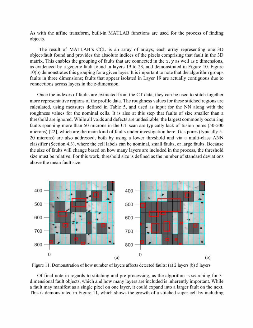
Of final note in regards to stitching and pre-processing, as the algorithm is searching for 3-dimensional fault objects, which and how many layers are included is inherently important. While a fault may manifest as a single pixel on one layer, it could expand into a larger fault on the next. This is demonstrated in Figure 11, which shows the growth of a stitched super cell by including
(a) (b)
Figure 11. Demonstration of how number of layers affects detected faults: (a) 2 layers (b) 5 layers

more layers in the CCL algorithm. This suggests that including more layers as opposed to less is likely ideal. Though, too many layers and too fine a profile grid may raise issues with limitations in computing power.
Generation of inputs and outputs corresponding to these supercells can largely be broken into two steps. First, which cells are associated with which faults is established and recorded. Also, during this step, the faults are converted from absolute indices to x-y-z coordinates and the outer bounds of a given fault for each layer are recorded. This positional information is useful for visualization and limits searching for other cells attached to a given fault to a localized area.
The second step is to use this information to stitch areas corresponding to a fault together into a super cell and generate inputs and outputs for the NN. This is done by cycling through every cell and checking whether a fault was associated with it, established in step 1. If it is not associated with faults, the cell is marked as nominal and its roughness values are calculated using Table 5 and set as inputs for the NN. If it is associated with faults, other cells in a localized area (established by the bounds found in step 1) are checked for correspondence with the same fault. If they are associated with the same fault, the data for that cell is appended to the data of other cells associated with the fault. Once the data for all cells associated with a fault has been collated, Table 5 metrics are used to generate inputs to the NN; the corresponding output is marked as faulty.
2.3.4 Statistical comparison of faulty and nominal cell features
There are two final notes to be made in regard to cell stitching. First is that the nominal cells are not stitched. The roughness values, for nominal examples, are generated from simple rectangular regions of profile data. Examining the values and ranges of the roughness values for input and outputs reveals no systematic difference that would separate the nominal from the faulty. This is evidenced in Figure 12.
Of course, physical differences likely still exist between the profiles of nominal and faulty regions, and ideally a NN will be able to find them. The key here is to note that stitching adjacent faulty cells and pre-processing the data as is done here does not introduce any systematic differences; this also suggests that overfitting is likely not an issue.
Further, Figure 12 grants some insight into the physical nature of sintered surface profiles associated with faults and nominal regions. Interestingly, the overall trend of skewness for nominal cells tends to a dual peak distribution around ±1 . A value of 1 or -1 indicates a greater concentration of values above or below the mean with a few outliers shifting the mean, respectively, i.e., these distributions represent relatively flat regions that are either elevated or depressed and have a few outliers in the opposite direction (depressions if elevated and elevations if depressed). In contrast, the faulty cells, being concentrated around a skewness of 0 indicates a roughly equal amount of powder above and below 0 (for this work, the data was shifted to have a mean of 0).

Figure 13 highlights some of these trends by looking specifically at the associated probability distribution functions. Each pdf also includes the results of a Two-sample Kolmogorov-Smirnov test for whether two samples are from the same distribution. For these examples, faults are not thresholded based on size (as discussed in Section 2.3.3) for demonstration purposes, as not thresholding means more faulty cells to draw data from. However, it also means this may not be the most representative distribution; in other trials, the trend holds for higher thresholding, though.
The general trends of faults having higher peaks and lower valleys is clearly demonstrated. Further, looking at the values for the average roughness, peaks in the powder bed appear to be slightly more prevalent in faults than valleys.
The skewness of faulty super cells, do not follow the same distribution as nominal cells, as shown by the Kolmogorov-Smirnov test, likely due to the tendency of the faulty cells to be more centrally distributed around 0. Interestingly, a skewness of 1 or -1 requires a certain level and number of outliers pulling the mean in the opposite direction of an otherwise uniform distribution.
Figure 12. Scatter plot of data points generated using Algorithm 1. Note that there is little to no apparent, systematic separation between nominal and faulty data

Despite this, faults also demonstrate higher maximum values and lower minimum values (Figure 13a and b).
Figure 13. Histograms showing interesting trends in the height distributions for nominal and faulty cells
All of this data considered together, ultimately suggest that faults are characterized not only by greater extrema, but by those extrema in the opposite direction being in close proximity to each other (i.e. a very high peak in the powder bed close to a very low valley). For nominal cells, a few extrema are acceptable as long as the region is largely flat, the extrema are mostly in the same direction (i.e. peaks or valleys, not both), and are not too extreme.
This hypothesis is revisited from a very different perspective later in Sec. 3.2.1 by carefully looking at the surface profile of faulty cells and tracking the NN predictions for these cells.
2.3.5 Neural Net Training and Parameters
Once inputs and the outputs are set, the NN is initialized and trained. For this process, built in MATLAB functions, as part of the Machine Learning toolkit, were used to build, train, and evaluate the network. The network used for this pattern recognition problem is a standard two-layer feedforward network, with a sigmoid transfer function in the hidden layer, and a softmax transfer function in the output layer. The number of hidden neurons was set to 40 after performing a small-scale parameter sensitivity study. The number of output neurons was set to 2, to represent this binary classification problem (classification between normal and faulty cells). Bayesian regularization back-propagation is used to train the network. The dataset was divided into 70% for training, 15% for validation and 15% for testing. The output of the Neural Network is a score, indicating how likely a set of input features is to be of class 1. For this research, class 1 refers to nominal or positive examples; class 2 is examples of faults.
Prob
abilit
y D
ensi
ty
Maximum height of cells (microns)
98
7
6
5
4
3
2
1
0
x10-3
-200 -100 0 100 200 300
Prob
abilit
y D
ensi
ty
8
7
6
5
4
3
2
1
0
x10-3
Minimum height of cells (microns)-300 -200 -100 0 100 200
Prob
abilit
y D
ensi
ty
0.025
0.02
0.015
0.01
0.005
0 0 50 100 150 200 250Average Height of cell (microns)
0.90.8
0.7
0.6
0.5
0.4
0.3
0.2
0.1
0 -10 -8 -6 -4 -2 0 2 4 6 8
Prob
abilit
y D
ensi
ty
Skewness

The key parameters studied for generating results are cell size, number of layers, and fault size thresholding. The cell size is dictated by how many pixels of the raw profile data are used in a single cell and is discussed in Section 2.3.3. Smaller cell size means the region covered by a fault can be more accurately isolated. The concept of the number of layers and why it is important is also discussed in Section 2.3.3. Thresholding refers to the number of standard deviations above the mean size below which “faults” will not be counted as faults, as discussed in Section 1.3.1. The classification accuracy of the ANN will be measured using metrics defined in Table 6.
Here, true positive refers to the number of samples the NN correctly predicted as being nominal. False positive is the number of faulty samples the NN incorrectly identified as nominal. True Negative represent faulty cells correctly identified and False Negative represent nominal cells misclassified as faulty by the Neural Net [23]. Traditionally, these values are presented in a confusion matrix, an example of which is seen in Table 7. True positives, etc. and associated scores have been used to measure performance in [7, 8]
Table 7: Example of a confusion matrix and how it relates to the current study [24] Actual Nominal (Positive) Faulty (Negative)
Predicted Nominal (Positive) True Positive False Positive Faulty (Negative) False Negative True Negative
Further, a Receiver Operator Characteristic (ROC) curve is also often used as a visualization of performance. A ROC plots the true positive rate versus the false positive rate for a given design parameter, which determines the tradeoff between Type 1 and Type 2 errors. For this work, the design parameter is the threshold for determining class. When generating the confusion matrix and evaluating equations 9-13 to provide metrics of performance, a threshold value of 0.5 is used, which is standard for a 2-category classification problem. A threshold of 0.5 means that if the score reported by the Neural Net is greater than 0.5, the Neural Net will label the input feature vector as class 1 or positive. The ROC curve is created by varying this value. ROC curves were also used by Gobert, et. al. in earlier versions of their work [25].
Table 6: Performance Metrics for Trained Neural Nets
Precision = <=>?ABC2D2E?C<=>?ABC2D2E?CFG0HC?ABC2D2E?C
(9)
Recall, Sensitivity, True Positive Rate (TPR) = <=>?ABC2D2E?C<=>?ABC2D2E?CFG0HC?I?J0D2E?C
(10)
False Positive Rate (FPR) = G0HC?ABC2D2E?CG0HC?ABC2D2E?CF<=>?I?J0D2E?C
(11)
F1 score = 2 A=?!2C2B1∗6?!0HHA=?!2C2B1F6?!0HH
(12)
Accuracy = <=>?ABC2D2E?CF<=>?I?J0D2E?C<BD0HI>;L?=BM80;NH?C
(13)

3 Results and Discussion of Training
3.1 Parametric Study
As mentioned in Section 1.3.4, the primary variables changed to evaluate the performance of the NN are cell resolution, the number of layers tested, and the threshold value, represented as the number of standard deviations above the mean. For the parametric study, these variables were varied in accordance with Table 8
Table 8: Test Matrix for Parametric Study Parameter Values Threshold 0 to 3 Standard Deviations above Average Fault Size Cell Row Resolution 8, 10, 16, 20, 25, 32, 40, 50, and 80 Pixels per cell, y direction Cell Column Resolution 19, 38, 50, 76, and 100 Pixels per cell, x direction Number of Layers 2-11 layers
Figure 14: Results of Parametric study, displayed as a colormap. The x- and y-axis for each graph are the pixels per cell in the x and y direction. The z-axis represents the number of layers considered.
Rows: Top: F1 Score, Middle: Accuracy, Bottom: Performance.
Columns: Left: No Threshold for fault size; Middle: Faults larger than mean fault size are considered: Mean; Right: Faults larger than Mean fault size + 3 SD are considered.

To create consistent rectangular cells, the original imported and cropped part footprint of 3800-by-800 pixels was suitably partitioned in both 𝑥 and 𝑦 directions with cell size varying from (19px×8px) (finest resolution) to (100 px×80px) (coarsest resolution).
The lower bound on the number of layers was chosen to be 2 layers to minimally include the effect of multiple layers. Although initial tests used only up to 5 layers, due to limitations in computing power, 10 was chosen as a reasonable extension for starting to truly understand the effects of including multiple layers. The results of the parametric study are summarized in Figure 14.
Here, the performance metrics chosen are displayed as a colormap. For accuracy and F1 score, dark red indicates a higher score and better performance. For the mean-squared error, dark blue indicates a lower score and better performance. In all cases, the best cases occur in the bottom, forward corner. This corresponds to finer resolution grid, with less pixels per cell in both the x and y direction. Further, the scores generally improve as the threshold is increased; specifically, all scores for the highest level of thresholding performed are excellent. This result is not unexpected, since a finer grid enables only relevant local data to be included from around a fault and a higher threshold implies that only relatively large faults are treated as faults which can be more easily correlated to the physical roughness parameters from the corresponding cell. Looking specifically, the highest accuracy found was 99.8% using a cell resolution of 8-by-19 pixels across 3 layers and thresholding at 3 standard deviations above the mean size. The highest F1 score found was 0.9990, also using a cell resolution of 8-by-19 pixels across 3 layers and thresholding at 3 standard deviations above the mean size. The lowest mean-squared error was 0.0017, using a 10-by-19 cell resolution across 3 layers and thresholding at 3 standard deviations above the mean size.
Looking closer, 2 more interesting results are noticeable. First, it is noted that more layers included generally results in slightly better performance for lower fault-size thresholds; As such, it is reasonable to claim that performance is linked less to how many layers are included and more to how well truly faulty regions are identified. In the case of small cells, this is done by precise extraction of relevant surface roughness data; for large cells, this is done by better thresholding faulty regions using 3-dimensional data.
Further, it is reasonable to assume that a fault initiated on one layer invites faults in following layers [9]. As such, it is possible that small faults on one layer, that themselves are not particularly exemplar of a fault, could propagate in larger faults. At a low layer count, ignoring these regions must be done via thresholding. Hence, the trend of more layers yielding better performance breaks down for greater thresholds. For lower thresholds, these faults would be included if a single layer was considered; by considering the data in 3-dimensions, they can be removed.
In conclusion for this point, and considering the data further, the most important elements are cell size and threshold level. Referring again to the parametric results, while the number of layers included does affect performance, the difference it causes is not as significant as the difference caused by cell size and threshold level.
The next interesting trend is that while smaller cells and higher thresholds generally result in better performance, this is not always the case. Figure 14 shows that accuracy and performance are also high for low thresholds and large cells. Examining this trend more closely, this is likely

the result of an excess of faulty examples, as show in Figure 9a. These results are a good example of why other metrics, like the F1-score, are important to consider; factors relating to how the data is processed may result in arbitrarily high accuracy or low error but affect other metrics less.
3.2 Results Following the parametric study, training was performed using the best parameters found; 8-
by-19 cell resolution across 3 layers with thresholding at 3 deviations above the mean. These results are displayed in Figure 15 and Table 9.
(a) (b)
(c) (d) Figure 15: Regional Operating Curves for (a) training set, (b) validation set, (c) testing set, and (d) all of the data
These results, in general indicate excellent performance of the NN. For these parameters, the accuracy is 99.83%, the F1 score is 0.9991, and the mean-square error is 0.0016. Referring again
1
0.9
0.8
0.7
0.6
0.5
0.4
0.3
0.2
0.1
0
True
Pos
itive
Rat
e
0 0.1 0.2 0.3 0.4 0.5 0.6 0.7 0.8 0.9 1
1
0.9
0.8
0.7
0.6
0.5
0.4
0.3
0.2
0.1
0
True
Pos
itive
Rat
e
0 0.1 0.2 0.3 0.4 0.5 0.6 0.7 0.8 0.9 1
False Positive Rate
1
0.9
0.8
0.7
0.6
0.5
0.4
0.3
0.2
0.1
0
True
Pos
itive
Rat
e
0 0.1 0.2 0.3 0.4 0.5 0.6 0.7 0.8 0.9 1
False Positive Rate
1
0.9
0.8
0.7
0.6
0.5
0.4
0.3
0.2
0.1
0
True
Pos
itive
Rat
e
0 0.1 0.2 0.3 0.4 0.5 0.6 0.7 0.8 0.9 1
False Positive Rate

to Figure 14, it is noted that the NN performed well regardless of parameters chosen when a higher fault size threshold is set. As such, 3 layers is deemed acceptable, despite marginally higher benefits if 5 were used; 3 layers also requires less computation time.
Despite excellent scores, however, one problem is evident; the prevalence of false positives. These are examples that were faulty but classified as nominal. This trend is noted for most parameter combinations. Part of the problem may be due to the inherent nature of fault detection. NNs and machine learning in general can break down when the number of positive (or negative) examples far outweigh the negative examples. This trend usually occurs because with so few negative examples, just labeling all examples as positive often results in the best solution. However, that the NN was able to correctly identify roughly the same proportion of faults as faults suggests that a causal mapping between features and classes was found that performs significantly better than just assuming the part is completely nominal.
Table 9: Confusion matrices for (a) training set, (b) validation set, (c) testing set, and (d) all of the data Actual Nominal
(Positive) Faulty
(Negative) Predicted Nominal
(Positive) 27918 99.7%
45 0.2%
Faulty (Negative)
2 0.0%
49 0.2%
(a)
Actual Nominal
(Positive) Faulty
(Negative) Predicted Nominal
(Positive) 5986
99.7% 7
0.1% Faulty
(Negative) 3
0.0% 7
0.1% (b)
Actual Nominal
(Positive Faulty
(Negative) Predicted Nominal
(Positive) 5982
99.7% 12
0.2% Faulty
(Negative) 1
0.0% 8
0.1% (c)
Actual Nominal
(Positive Faulty
(Negative) Predicted Nominal
(Positive) 39886 99.7%
64 0.2%
Faulty (Negative)
6 0.0%
64 0.2%
(d)
3.2.1 Further insights into the NN's mapping of surface profile to faults
A careful look at the mechanism of the learned NN model reveals some very interesting facts about how this mapping from surface roughness to fault estimates are being made. Figure 16 zooms in on a sample fault (identified using CT data) and displays the surface roughness data (following Table 5), separately for each cell that constitute the fault. It is very interesting to note, that when each of the constituent cells are treated individually, the fault indicator from the NN is very close to 0 (ranging between 7.54e-49 to 4.33e-119) indicating that the NN, with very high confidence predicts that each of these cells is nominal. However, when the surface roughness values calculated over the whole area, (combining all the cells) is processed by the NN, the output is 1.00, implying that the NN confidently classifies that data to be coming from a faulty cell. Closely observing the data from the individual cells as well as the combined data, one clear difference in the min and max values can be noted, the combined data is characterized by a very low trough (-221.9 microns) as well as a very high peak (146.6 microns) while none of the individual cell were characterized

by this simultaneous presence of a peak and a trough. During training the NN successfully could generalize that the presence of a high peak and low trough is correlated to a higher probability of a fault being present. A statistical comparison of nominal and faulty cells as shown in Sec. 2.3.4 also revealed the same correlation but as a much larger trend.
3.3 Multi-class Classification
Lastly, attempts were made to extend the algorithm to a multi-class system. In these attempts, the stitching and thresholding were identical to Sec 2.2. However, instead of a binary classification - faulty or nominal, faulty regions were now divided into sub-categories: large and small, each defined by a threshold.
These results were generated using 3 layers with a cell resolution of 8-by-19. Class 1 is nominal cells. Class 2 are faults that are between 0 and 3 standard deviations above the average fault size. Class 3 is all faults above 3 standard deviations above the average fault size. As can be seen in the ROC curve, the results once again are good. The ability to discern nominal from faulty regions, represented by the curve for Class 1, is on par with a 2-class system. The ability to distinguish between different degrees of fault is excellent, but the problem of a skewed data set and correctly
Figure 16. Surface roughness measures for each cell encompassed by a larger fault. Each cell also depicts the fault measure calculated by the trained NN.
Table 1: Surface Parameters (equations 1-5) Combined Parameters: 75.97 (Ra), 89.24 (Rq), -1.392 (Kurtosis), 2.391 (Skewness), -221.9 (min), 146.6 (max)
120.5446 123.5479 -1.05634 1.149275 -159.675 62.72513
37.33317 59.17184 -2.48487 7.366808 -210.625 17.67513
100.4107 105.2912 -1.08273 1.398696 -167.975 82.37513
93.95552 119.9879 -1.44275 2.198237 -220.425 16.82513
100.2239 118.0228 -1.38586 2.100782 -221.925 2.625129
50.28383 61.17711 -0.16101 2.561206 -112.175 146.6251
70.57752 83.47339 -1.38056 2.286838 -221.775 59.02513
86.42816 88.43491 -1.06289 1.16898 -139.075 -23.9749
69.76142 80.09699 -1.45055 2.603619 -206.425 29.27513
75.56862 80.62339 -1.25176 1.855739 -204.425 -47.6749
4.33e-119
4.43e-64
2.27e-81
4.89e-105
7.54e-49
1.17e-75
7.73e-73
4.73e-60
9.17e-55
4.45e-69

identifying faults, originally acknowledged in Section 2.2, remains and appears to worsen, since the number of representations in Classes 2 and 3 are further diminished.
(a) (b)
Figure 17: Multiclass ROC curve for (a) training set and (b) testing set
Table 10. Multiclass Confusion matrices for (a) training set, (b) testing set, and (c) all of the data
Actual Nominal Faulty;
small Faulty; large
Predicted Nominal 46492 95.9%
908 1.9%
42 0.1%
Faulty; small
152 0.3%
701 1.4%
68 0.1%
Faulty; large
4 0.0%
15 0.0%
113 0.2%
(a)
Actual Nominal Faulty;
small Faulty; large
Predicted Nominal 8193 95.7%
171 2.0%
10 0.1%
Faulty; small
58 0.7%
76 0.9%
27 0.3%
Faulty; large
2 0.0%
13 0.2%
8 0.1%
(b) Actual Nominal Faulty;
small Faulty; large
Predicted Nominal 54685 95.8%
1079 1.9%
52 0.1%
Faulty; small
210 0.4%
777 1.4%
95 0.2%
Faulty; large 6 0.0%
28 0.0%
121 0.2%
(c) 4. Discussion and Future Work
One of the main issues with the current work is that the part used for analysis was of exceptionally poor quality with a larger than usual concentration of faults and defects. As such,
1
0.9
0.8
0.7
0.6
0.5
0.4
0.3
0.2
0.1
0
True
Pos
itive
Rat
e
0 0.1 0.2 0.3 0.4 0.5 0.6 0.7 0.8 0.9 1
False Positive Rate
1
0.9
0.8
0.7
0.6
0.5
0.4
0.3
0.2
0.1
0
True
Pos
itive
Rat
e0 0.1 0.2 0.3 0.4 0.5 0.6 0.7 0.8 0.9 1
False Positive Rate

the methods developed here may not generalize well and the excellent results may only be a result of this high fault concentration; We are aware of the issues (Section 3.2) with a large bias towards nominal samples and this issue will probably be exacerbated with even smaller fault sample sizes that may be expected from a competently designed and executed build. This opens up questions about transfer learning – i.e., whether the neural net learned from one build can be utilized for prediction of fault sites in a different build and how that transferability is affected by material, machine, process parameters and even geometries.
The second option for advancement of this research is to further investigate the statistical trends noted in Section 2.3.3. One of the more intuitive results born out of analyzing the data was the statistical correlation between the presence of adjacent peaks and valleys in the powder bed and presence of a fault in that site. More research needs to be done to determine both experimentally and theoretically the reason for this causal relation.
Lastly, one of the key issues is the amount of preprocessing performed both on the collected laser profilometer data as well as using the post build CT scan data. The computational burden and consequently the delay incurred due to the data collection and processing will pose a significant challenge to the practical implementation of this method in real time. However, with the rapid progress in implementation of GPU-hosted ML techniques, we believe that the processing can be made faster to reach real-time execution. It should also be remembered that the main time-consuming part in this process is the training which will always have to be done off-line with millions of data point curated over time. The real-time computational burden is relatively less and can be optimized to function in real time, much like the strategy enabling the image processing in self-driving cars.
However, the profilometer operation will still exist as the weak-link since the physical movement of the profilometer and the data acquisition rate is limited by hardware capabilities. Along with the use of better hardware, such as using scanners with "broader" scanning width, which will reduce the need for data stitching, better schemes of mounting the scanner, such as integration with the recoater arm will eliminate any need of devoting time exclusively for scanning – the movement of the recoater arm might be able to serve the dual purpose of scanning and powder distribution. Moreover, statistical tools will also need to be included in optimizing the frequency with which the scanning will be performed and which specific areas will need to be prioritized for scanning. This is an exciting new area of research that will need to be thoroughly researched in order to complement the scanning and ML based techniques in order to take a step towards implementation.
Real-time feedback control of the build process has been elusive for SLM processes mainly due to the lack of a robust low order model that is realistic yet can be solved fast enough. The ML method bypasses the modeling by training the NN to map features to faults directly. Although very far from implementation, the method discussed in the paper, can be used to predict potential sites of lack-of-fusion porosity in a layer that has just been sintered. This information can hypothetically be used to fix the future error by adjusting the build parameters of the next layer.

Declarations
Funding – This work was funded by the NAVAIR SBIR Program Office Conflicts of interest/Competing interests - None Availability of data and material – Not available due to IP restrictions Code availability – Not available due to IP restrictions
References
[1] I. Gibson, D. Rosen, and B. Stucker, Additive Manufacturing Technologies: 3D Printing, Rapid Prototyping, and Direct Digital Manufacturing, 2nd ed.: Springer, 2014.
[2] A. H. Chern et al., "A review on the fatigue behavior of Ti-6Al-4V fabricated by electron beam melting additive manufacturing," International Journal of Fatigue, vol. 119, pp. 173-184, 2019/02/01/ 2019, doi: https://doi.org/10.1016/j.ijfatigue.2018.09.022.
[3] Y. S. Lee and W. Zhang, "Modeling of heat transfer, fluid flow and solidification microstructure of nickel-base superalloy fabricated by laser powder bed fusion," Additive Manufacturing, vol. 12, pp. 178-188, 2016/10/01/ 2016, doi: https://doi.org/10.1016/j.addma.2016.05.003.
[4] A. Plotkowski, M. M. Kirka, and S. S. Babu, "Verification and validation of a rapid heat transfer calculation methodology for transient melt pool solidification conditions in powder bed metal additive manufacturing," Additive Manufacturing, vol. 18, pp. 256-268, 2017/12/01/ 2017, doi: https://doi.org/10.1016/j.addma.2017.10.017.
[5] T. Purtonen, A. Kalliosaari, and A. Salminen, "Monitoring and Adaptive Control of Laser Processes," Physics Procedia, vol. 56, pp. 1218-1231, 2014/01/01/ 2014, doi: https://doi.org/10.1016/j.phpro.2014.08.038.
[6] G. Tapia and A. Elwany, "A Review on Process Monitoring and Control in Metal-Based Additive Manufacturing," Journal of Manufacturing Science and Engineering, vol. 136, no. 6, pp. 060801-060801-10, 2014, doi: 10.1115/1.4028540.
[7] M. Abdelrahman, E. W. Reutzel, A. R. Nassar, and T. L. Starr, "Flaw detection in powder bed fusion using optical imaging," Additive Manufacturing, vol. 15, pp. 1-11, 2017/05/01/ 2017, doi: https://doi.org/10.1016/j.addma.2017.02.001.
[8] C. Gobert, E. W. Reutzel, J. Petrich, A. R. Nassar, and S. Phoha, "Application of supervised machine learning for defect detection during metallic powder bed fusion additive manufacturing using high resolution imaging," Additive Manufacturing, vol. 21, pp. 517-528, 2018/05/01/ 2018, doi: https://doi.org/10.1016/j.addma.2018.04.005.
[9] L. Scime and J. Beuth, "Anomaly detection and classification in a laser powder bed additive manufacturing process using a trained computer vision algorithm," Additive Manufacturing, vol. 19, pp. 114-126, 2018/01/01/ 2018, doi: https://doi.org/10.1016/j.addma.2017.11.009.
[10] L. Scime and J. Beuth, "Using machine learning to identify in-situ melt pool signatures indicative of flaw formation in a laser powder bed fusion additive manufacturing process," Additive Manufacturing, vol. 25, pp. 151-165, 2019/01/01/ 2019, doi: https://doi.org/10.1016/j.addma.2018.11.010.
[11] L. Tan Phuc and M. Seita, "A high-resolution and large field-of-view scanner for in-line characterization of powder bed defects during additive manufacturing," Materials & Design, vol. 164, p. 107562, 2019/02/15/ 2019, doi: https://doi.org/10.1016/j.matdes.2018.107562.
[12] W. Burger and M. J. Burge, Principles of Digital Image Processing: Fundamental Techniques, 1 ed. (Undergraduate Topics in Computer Science). Springer-Verlag London, 2009.
[13] S. Clijsters, T. Craeghs, S. Buls, K. Kempen, and J.-P. Kruth, "In situ quality control of the selective laser melting process using a high-speed, real-time melt pool monitoring system," International

Journal of Advanced Manufacturing Technology, vol. 75, pp. 1089-1101, 08/10 2014, doi: 10.1007/s00170-014-6214-8.
[14] "Affine Transformation: Linear mapping method using affine transformation." MathWorks. https://www.mathworks.com/discovery/affine-transformation.html (accessed.
[15] R. O. Duda, P. E. Hart, and D. G. Stork, Pattern Classification, 2nd ed. New York: John Wiley & Sons, 2000.
[16] L. Scime and J. Beuth, "Melt pool geometry and morphology variability for the Inconel 718 alloy in a laser powder bed fusion additive manufacturing process," Additive Manufacturing, vol. 29, p. 100830, 2019/10/01/ 2019, doi: https://doi.org/10.1016/j.addma.2019.100830.
[17] "Renishaw – Making Dentistry Digital." Additive Manufacturing.com. http://additivemanufacturing.com/2017/09/21/renishaw-making-dentistry-digital/ (accessed.
[18] B. Baucher, A. B. Chaudhary, S. S. Babu, and S. Chakraborty, "Defect Characterization Through Automated Laser Track Trace Identification in SLM Processes Using Laser Profilometer Data," Journal of Materials Engineering and Performance, vol. 28, no. 2, pp. 717-727, 2019/02/01 2019, doi: 10.1007/s11665-018-3842-4.
[19] W. Burger and M. J. Burge, Principles of Digital Image Processing: Core Algorithms, 1 ed. (Undergraduate Topics in Computer Science). Springer-Verlag London, 2009.
[20] "myVGL: The Free Viewer App for Your 3D Data." Volume Graphics. https://www.volumegraphics.com/en/products/myvgl.html (accessed.
[21] L. G. Shapiro, "Connected component labeling and adjacency graph construction," in Machine Intelligence and Pattern Recognition, vol. 19: Elsevier, 1996, pp. 1-30.
[22] S. K. Everton, M. Hirsch, P. Stravroulakis, R. K. Leach, and A. T. Clare, "Review of in-situ process monitoring and in-situ metrology for metal additive manufacturing," Materials & Design, vol. 95, pp. 431-445, 2016/04/05/ 2016, doi: https://doi.org/10.1016/j.matdes.2016.01.099.
[23] D. Powers, Evaluation: From Precision, Recall and F-Factor to ROC, Informedness, Markedness & Correlation. 2008.
[24] W. Koehrsen, "Beyond Accuracy: Precision and Recall," Towards Data Science. [Online]. Available: https://towardsdatascience.com/beyond-accuracy-precision-and-recall-3da06bea9f6c
[25] C. P. Gobert, Jan; Phoha, Shashi; Nassar, Abdalla R.; Reutzel, Edward W., "Machine Learning for Defect Detection for PBFAM using High Resolution Layerwise Imaging Coupled with Post-Build CT Scans," presented at the Solid Freeform Fabrication Symposium, Austin, TX, 2017.