a design journey case study
TRANSCRIPT
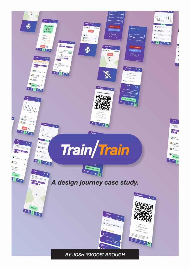
A design journey case study.
BY JOSH ‘SKOOB’ BROUGH
Section 1: Ideation
“As long as we have each other, we’ll never run out of problems.”
GDD710 rapid ideation: The challenge
In the first module of this course, we were challenged to produce an artefact of any form in a time-boxed ‘rapid ideation’ challenge.
The ideation material for the challenge came in two parts. The first was the phrase, “as long as we have each other, we’ll never run out of problems”. The second was a selection of wikipedia articles, that we each chose at random.
I took the challenge as an opportunity to explore my capabilities as a creative practitioner, and to collaborate with a fellow student , Astrid Arismendi.
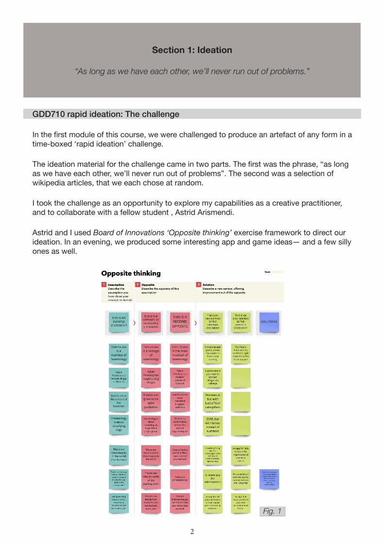
Astrid and I used Board of Innovations ‘Opposite thinking’ exercise framework to direct our ideation. In an evening, we produced some interesting app and game ideas— and a few silly ones as well.
2
Fig. 1

GDD710 rapid ideation: The Artefact
The concept we decided to explore further was:
“a fitness tracking app that rewards regular activity with discounts on public transport fares”.
Within the timeframe, we produced a wireframe for the concept and simple prototype. The product was well-received by our peers and, most importantly, we had fun putting it together. But, the challenge was time-boxed and we had other learning (and assignments) to prioritise.
We didn’t revisit the concept for the remainder of GDD710.
With Astrid’s blessing, I used this module as an opportunity to revisit our idea with a more critical eye.
3
Fig. 2
Section 2: Research
The highs and lows of validating my assumptions
Recognising blockers to my user research
I completed two rounds of user research in this design journey. The first was at the start of the journey, as expected when following Design Council’s Double Diamond design process (Ball, 2019).
The second round came some weeks later. In carrying out competitor analysis on Strava, I had lost faith in my own concept; Strava simply felt like a more well-rounded product. Specifically, I wasn’t confident that my research supported the ‘party system’ that I had created (more on that shortly).
Upon reflection, I realise that returning to user research wasn’t the failure I originally saw it as. Cat Drew, CDO of Design Council, agrees that the Double Diamond isn’t a linear process:
“...there are many instances when you might be in the second diamond and, through testing something, you reveal a much deeper issue that requires you to ‘go back to the beginning’. In reality, each project will have its own set of feedback loops, and the main thing is to be
open to them.”
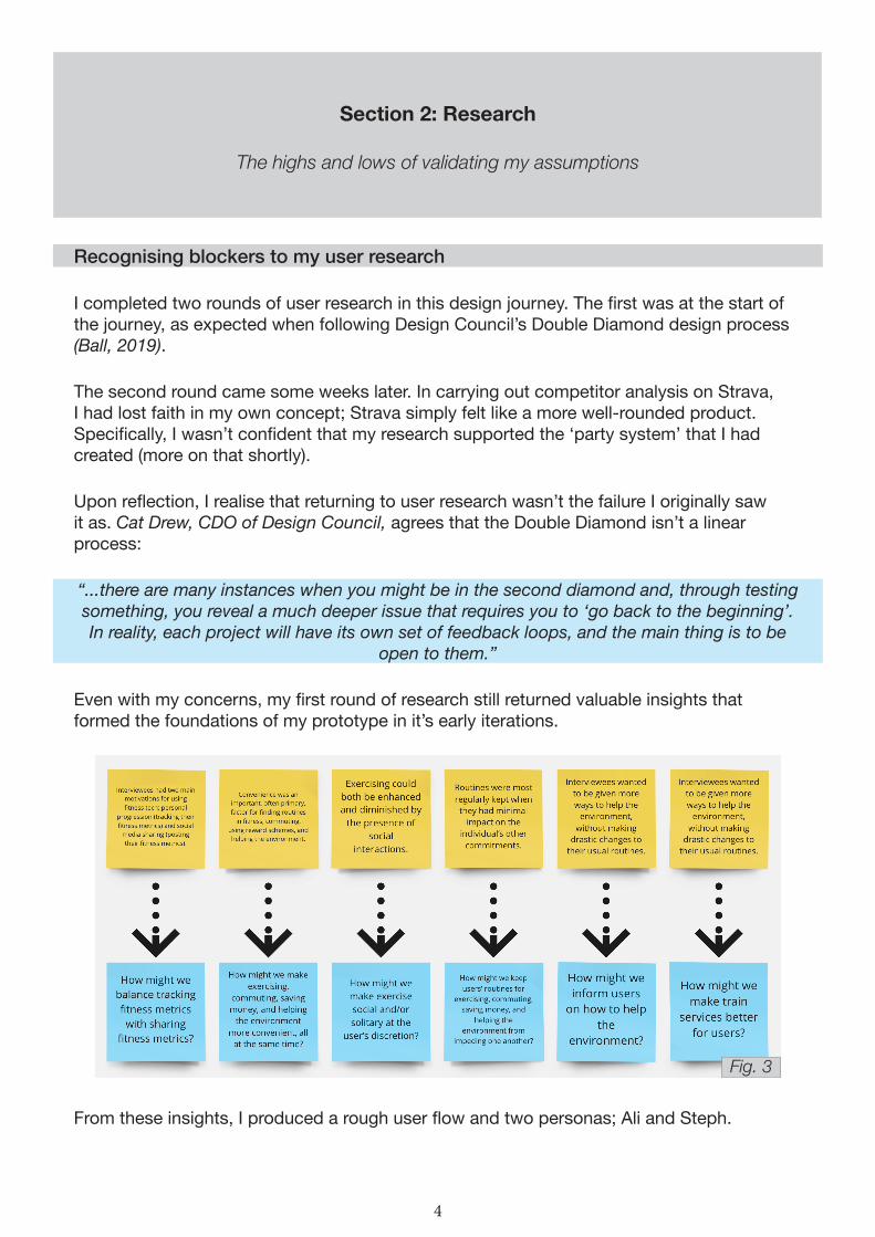
Even with my concerns, my first round of research still returned valuable insights that formed the foundations of my prototype in it’s early iterations.
From these insights, I produced a rough user flow and two personas; Ali and Steph.
4
Fig. 3

5
Fig. 4
Fig. 5
Fig. 6

Resolving a lack of depth
In my first round of research, I explored interviewees’ thoughts and behaviours around exercise, public transport, reward schemes, and being environmentally friendly. My interviews averaged around 40 minutes, roughly equating to 10 minutes per section. That limited the amount of exploration I could do in each facet.
In the second round, my questions were focused entirely around how interviewees’ perceived exercising alone and with friends.
Resolving divided attention
In round one, I found it difficult to stay focused and present in the interviews whilst also taking notes, and on a few occasions I had to ask interviewees to bear with me while I caught up with my notes. My notes were disorganised and repetitive, which made it difficult to synthesise them on an affinity map.
Erin May, 2020, agrees that having a notetaker present in moderated research is a good way of helping the researcher be more present.
In round two, I aimed to stay present in the interviews. Instead of dividing my attention between participant and paper, I recorded the interview sessions then took notes at my own pace afterwards. This approach meant I could go through the interviews in multiple passes and write more consolidated notes. This made the synthesis process more engaging and returned more valuable insights.
Promoting effective listening
Though I wasn’t particularly worried about my interviewer technique in my first round of research, I was keen to find ways of maximising the value gained from my research.
I dedicated Week 6 (reading week) to exploring academic literature around clinical care and compassionate nursing. I reevaluated what it meant to be an empathetic practitioner, and found that what I actually wanted to be was a compassionate practitioner (Matthews, 2017). I did that by differentiating and making use of the four types of listening (Vora and Vora, 2008).
Discriminative listening – paying attention to non-verbal cues and the delivery of language to infer emotion and the message behind the words.
Comprehensive listening – listening to understand and retain information.
Therapeutic listening – stimulating discussion for the altruistic purpose of bettering the person’s state.
Critical listening – listening to evaluate your own understanding of a situation.
6
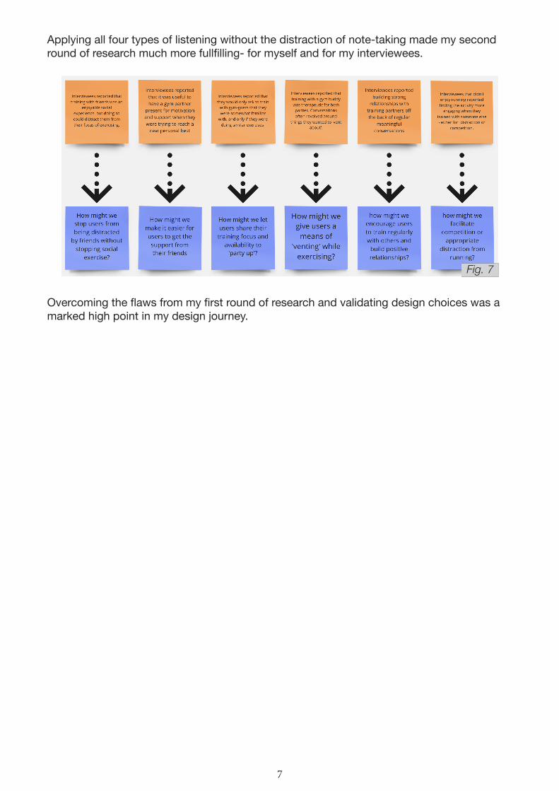
Applying all four types of listening without the distraction of note-taking made my second round of research much more fullfilling- for myself and for my interviewees.
Overcoming the flaws from my first round of research and validating design choices was a marked high point in my design journey.
7
Fig. 7

Section 3: Iteration
The evolution of my prototype, as informed by user feedback
Plotting an onboarding flow
After my first round of research, I moved into analog wireframing. At this phase, the designs included a social media feed, a party-based run tracker, a ‘wallet’ for points and tickets, and a train ticket shop.
For the most part, this aligned with the artefact Astrid and I produced in GDD710 - the only new addition being the party system.
Having four key facets to my feature set lent itself nicely to my onboarding. My first sketch of the onboarding flow was simply a four-item carousel introducing each facet. I planned to include copy with each item, but writing copy didn’t feel necessary at that level of fidelity.
Rationalising the party system
In short, the party system is a conference call held between users while they run together, remotely. Before starting a run, a user has the option to invite their friends to participate. If the friends accept the invitation, the initial user becomes the party leader, meaning they have the authority to start the run.
When the run starts, all party members see a synchronised timer. Each user’s run stats (total distance and average pace per kilometer) are made visible to the rest of the party. Finishing a run stops the timer for that user, while the timer continues for everyone else.
The decision to implement the party system was originally based on seeing preferences for both grouped and solitary exercise in my research. While some individuals prefered the ‘headspace’ of running alone, other’s enjoyed using exercise as a means of socialising with friends.
8
Fig. 8
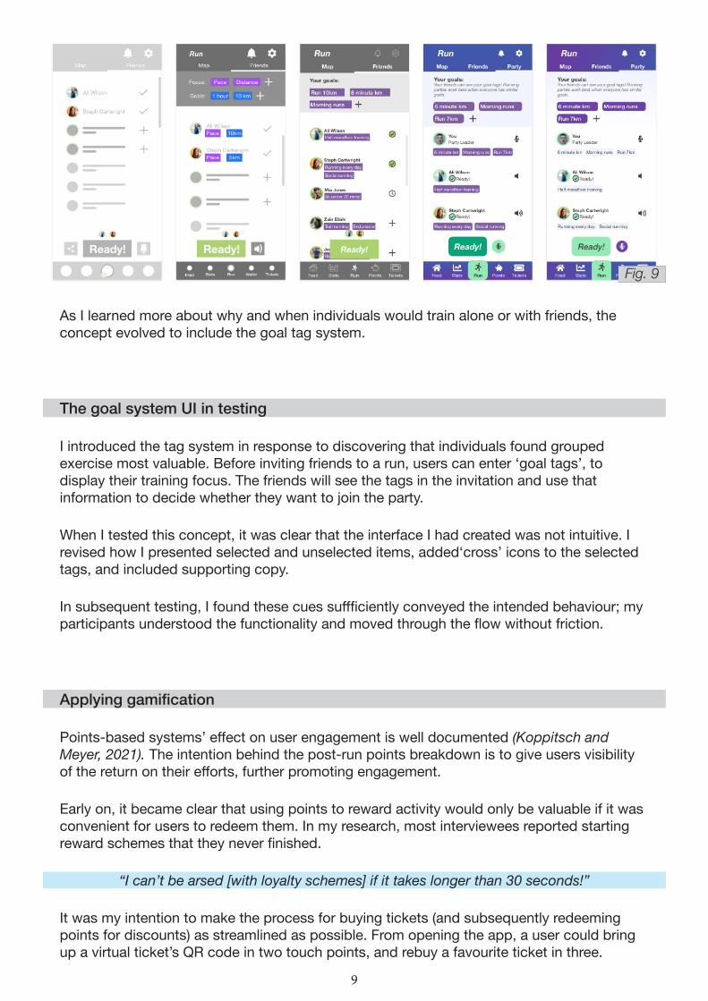
As I learned more about why and when individuals would train alone or with friends, the concept evolved to include the goal tag system.
The goal system UI in testing
I introduced the tag system in response to discovering that individuals found grouped exercise most valuable. Before inviting friends to a run, users can enter ‘goal tags’, to display their training focus. The friends will see the tags in the invitation and use that information to decide whether they want to join the party.
When I tested this concept, it was clear that the interface I had created was not intuitive. I revised how I presented selected and unselected items, added‘cross’ icons to the selected tags, and included supporting copy.
In subsequent testing, I found these cues suffficiently conveyed the intended behaviour; my participants understood the functionality and moved through the flow without friction.
Applying gamification
Points-based systems’ effect on user engagement is well documented (Koppitsch and Meyer, 2021). The intention behind the post-run points breakdown is to give users visibility of the return on their efforts, further promoting engagement.
Early on, it became clear that using points to reward activity would only be valuable if it was convenient for users to redeem them. In my research, most interviewees reported starting reward schemes that they never finished.
“I can’t be arsed [with loyalty schemes] if it takes longer than 30 seconds!”
It was my intention to make the process for buying tickets (and subsequently redeeming points for discounts) as streamlined as possible. From opening the app, a user could bring up a virtual ticket’s QR code in two touch points, and rebuy a favourite ticket in three.
9
Fig. 9
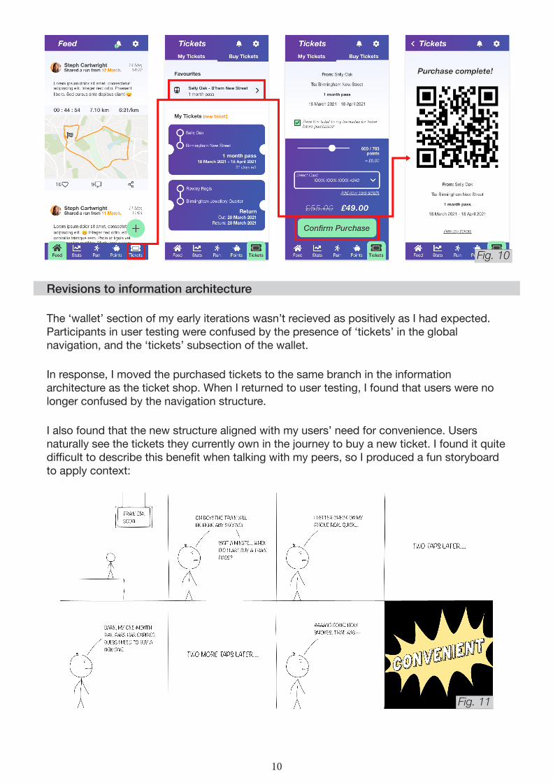
Revisions to information architecture
The ‘wallet’ section of my early iterations wasn’t recieved as positively as I had expected. Participants in user testing were confused by the presence of ‘tickets’ in the global navigation, and the ‘tickets’ subsection of the wallet.
In response, I moved the purchased tickets to the same branch in the information architecture as the ticket shop. When I returned to user testing, I found that users were no longer confused by the navigation structure.
I also found that the new structure aligned with my users’ need for convenience. Users naturally see the tickets they currently own in the journey to buy a new ticket. I found it quite difficult to describe this benefit when talking with my peers, so I produced a fun storyboard to apply context:
10
Fig. 10
Fig. 11
Section 4: Design
Building my prototype’s personality
Finding a personality and name
I used Jennifer Aaker’s Brand personality framework to identify brand adjectives (Aaker, 1997). The words I found were wholesome, friendly, spirited, hardworking, and confident.
I condensed these adjectives down to three ‘pillars’ for my prototype’s personality: sincere, spirited, and encouraging.
I decided on the name ‘TrainTrain’ after remarkably little consideration. With that being said, I think it’s in keeping with the spirited pillar, it’s easy to remember, and it’s just silly enough to be leveraged in marketing.
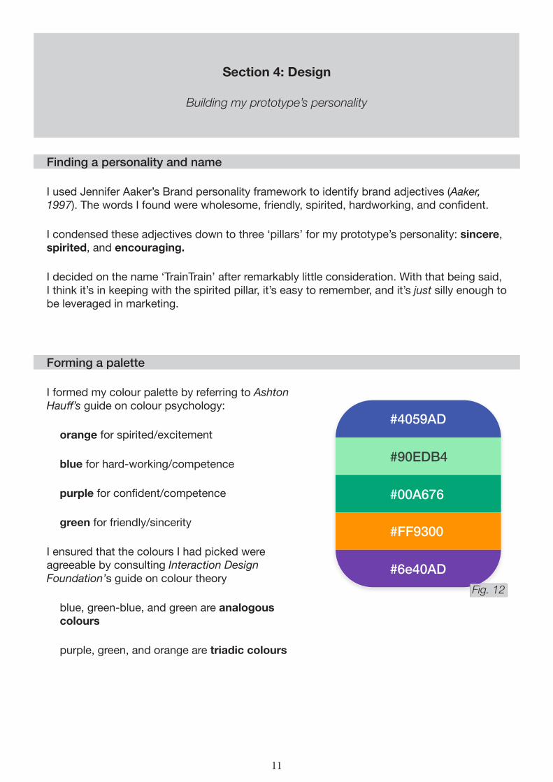
Forming a palette
I formed my colour palette by referring to Ashton Hauff’s guide on colour psychology:
orange for spirited/excitement
blue for hard-working/competence
purple for confident/competence
green for friendly/sincerity
I ensured that the colours I had picked were agreeable by consulting Interaction Design Foundation’s guide on colour theory
blue, green-blue, and green are analogous colours
purple, green, and orange are triadic colours
#4059AD
#90EDB4
#00A676
#FF9300
#6e40AD
11
Fig. 12
Section 5: Next steps
Proposing future work from unaddressed research and feature requests
Further design work around the party system
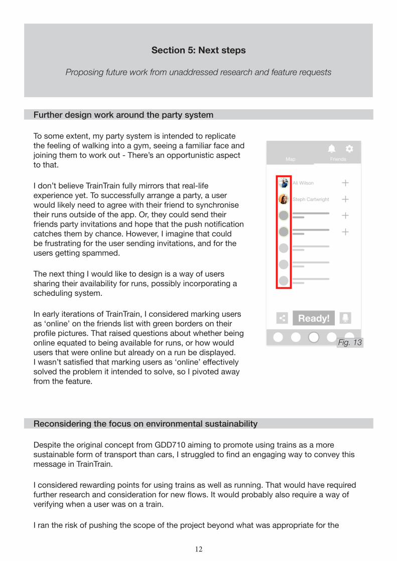
To some extent, my party system is intended to replicate the feeling of walking into a gym, seeing a familiar face and joining them to work out - There’s an opportunistic aspect to that.
I don’t believe TrainTrain fully mirrors that real-life experience yet. To successfully arrange a party, a user would likely need to agree with their friend to synchronise their runs outside of the app. Or, they could send their friends party invitations and hope that the push notification catches them by chance. However, I imagine that could be frustrating for the user sending invitations, and for the users getting spammed.
The next thing I would like to design is a way of users sharing their availability for runs, possibly incorporating a scheduling system.
In early iterations of TrainTrain, I considered marking users as ‘online’ on the friends list with green borders on their profile pictures. That raised questions about whether being online equated to being available for runs, or how would users that were online but already on a run be displayed. I wasn’t satisfied that marking users as ‘online’ effectively solved the problem it intended to solve, so I pivoted away from the feature.
Reconsidering the focus on environmental sustainability
Despite the original concept from GDD710 aiming to promote using trains as a more sustainable form of transport than cars, I struggled to find an engaging way to convey this message in TrainTrain.
I considered rewarding points for using trains as well as running. That would have required further research and consideration for new flows. It would probably also require a way of verifying when a user was on a train.
I ran the risk of pushing the scope of the project beyond what was appropriate for the
Ready!
Ali Wilson
Steph Cartwright
Map Friends
12
Fig. 13
assigment, so I moved away from the sustainability focus (Larson and Larson, 2009).
With more time for research and iteration, I would like to introduce a means of helping users to be more socially and environmentally responsible.
Gifting points
A lot of the value that my users would get from TrainTrain really comes from the interactions they have with other users. As my research showed, one of the benefits of exercising with a buddy is having someone to push you further and support you.
With that in mind, I’d like to empower my users to reward their friends after exercising. I’d like to do this by letting users gift some of the points they earned in a run to other party members.
I’d need to ensure the feature isn’t exploitable and complies with any legal (or other) regulations that may apply. For example, Item 5.3.3 of the apple store review guidelines is as follows:
5.3.3: Apps may not use in-app purchase to purchase credit or currency for use in conjunction with real money gaming of any kind, and may not enable people to purchase
lottery or raffle tickets or initiate fund transfers in the app.
The points being earned have some monetary value, in that they equate to real-world discounts. I’d have to commit time to R&D, to ensure that a gifting mechanic doesn’t qualify as ‘initiating a fund transfer in the app’.
13
14
Section 6: Conclusion
Final reflections on my design journey
Meta-reflections
It goes without saying that a professional UX designer should have the skillset to produce polished prototypes. In writing this case study, I have realised that other deliverables typical to a career in UX should not be overlooked (Andreas Komninos, 2020).
In truth, writing this case study has been one of the most difficult tasks of this module. I’ll be sure to give more consideration to deliverables along the design process in GDD730.
Reflections on visual design.
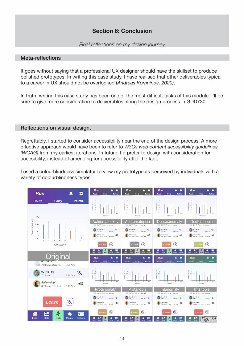
Regrettably, I started to consider accessibility near the end of the design process. A more effective approach would have been to refer to W3Cs web content accessibility guidelines (WCAG) from my earliest iterations. In future, I’d prefer to design with consideration for accesibility, instead of amending for accessibility after the fact.
I used a colourblindness simulator to view my prototype as perceived by individuals with a variety of colourblindness types.
Fig. 14
While most of my prototype has acceptable colour contrast, my use of orange text on a white background may elicit readability issues for some users. It would be irresponsible for me, as a creative practitioner, to be remiss about accessibility. If I was ever to take TrainTrain to market, I would need to address this issue.
Reflections on the TrainTrain concept.
As a piece of course work, I think it’s important to reflect on the learning experience, more so than the viability of the final product. This is the first product that I have researched, iterated on, and delivered without the support from a wider team.
The last sixteen weeks have held innumerable ‘first times’ for me. I’m satisfied with my journey, and my final product. It has paved the way for me to develop my skills in modules to come, and it has set a trajectory for lifelong learning (Cambridge University Press).
“Lifelong learning. The process of gaining knowledge and skills throughout your life, often to help you do your job properly.”
15
List of figures
Fig. 1: The ‘opposite thinking’ activity Astrid and I completed during GDD710’s rapid ideation challenge.
Fig. 2: The wireframe Astrid and I produced in GDD710.
Fig. 3: My gathered insights and corresponding ‘how might we’ statements from my first round of user research.
Fig. 4: The early concept of my user flow.
Fig. 5: My primary persona, Steph.
Fig. 6: My secondary persona, Ali.
Fig. 7: My gathered insights and corresponding ‘how might we’ statements from my second round of user research.
Fig. 8: Analog sketches of my concept wireframe and onboarding flow, pre-prototype.
Fig. 9: The evolution of my party interface, from iterations one to five.
Fig. 10: Diagram demonstrating the number of touchpoints from navigating to ‘Tickets’ to rebuying and viewing a favourite ticket.
Fig. 11: Storyboard contextualising the value of making a user’s tickets visible during the flow for rebuying a favourite ticket.
Fig. 12: TrainTrain’s main brand colours.
Fig. 13: The green borders around user profiles that I used to mark users as online in iteration one.
Fig. 14: Simulated variations of TrainTrain for a variety of colour blindness types.
References
AAKER, J. 1997. ‘Dimensions of Brand Personality’. Journal of Marketing Research, 8, 347-356.
APPLE. ‘App Store Review Guidelines’. Apple [online]. Available at: https://developer.apple.com/app-store/review/guidelines/#gaming-gambling-and-lotteries [accessed 12/05/2021].
BALL, J. 2019. ‘The Double Diamond: A universally accepted depiction of the design process’. Design Council [online]. Available at: https://www.designcouncil.org.uk/news-opinion/double-diamond-universally-accepted-depiction-design-process [accessed 12/05/2021].
16
BOARD OF INNOVATION. ‘Opposite Thinking’. Board of Innovation [online]. Available at: https://www.boardofinnovation.com/tools/opposite-thinking [accessed 12/05/2021].
CAMBRIDGE UNIVERSITY PRESS. ‘LIFELONG LEARNING | meaning in the Cambridge English Dictionary’. Cambridge Dictionary [online]. Cambridge: University of Cambridge. Available at: https://dictionary.cambridge.org/dictionary/english/lifelong-learning [accessed 12/05/2021].
DREW, C. 2019. ‘The Double Diamond: 15 years on’. Design Council [online]. Available at: https://www.designcouncil.org.uk/news-opinion/double-diamond-15-years [accessed 12/05/2021].
HAUFF, A. 2018. ‘The Know It All Guide To Color Psychology In Marketing + The Best Hex Chart’. CoSchedule [online]. Available at: https://coschedule.com/blog/color-psychology-marketing [accessed 12/05/2021].
INTERACTION DESIGN FOUNDATION. ‘Color Theory’. Interaction Design Foundation [online]. Available at: https://www.interaction-design.org/literature/topics/color-theory [accessed 12/05/2021].
KOMNINOS, A. 2020. ‘7 UX Deliverables: What will I be making as a UX designer?’. Interaction Design Foundation [online]. Available at: https://www.interaction-design.org/literature/article/7-ux-deliverables-what-will-i-be-making-as-a-ux-designer [accessed 12/05/2021].
KOPPITSCH, S. E. & MEYER, J. 2021. ‘Do points matter? The effects of gamificatino activities with and without points on student learning and engagement’. Marketing Education Review [online]. Available at: https://doi.org/10.1080/10528008.2021.1887745 [accessed 12/05/2021].
LARSON, R. & LARSON, E. 2009. ‘Top five causes of scope creep ... and what to do about them’. Paper presented at PMI® Global Congress. Project Management Institute [online]. Available at: https://www.pmi.org/learning/library/top-five-causes-scope-creep-6675 [accessed 12/05/2021].
MATTHEWS, A. 2017. ‘From Empathy to Compassion: An Evolution in UX’. Auldyn Matthews [online]. Available at: https://medium.com/@auldyn.matthews/from-empathy-to-compassion-an-evolution-in-ux-3a56d4b31be9 [accessed 12/05/2021].
MAY, E. 2020. ‘Why You Really Need a Notetaker for Moderated Research Sessions’. User Interviews [online]. Available at: https://www.userinterviews.com/blog/why-you-really-need-a-notetaker-for-moderated-research-sessions [accessed 12/05/2021].
VORA, E & VORA, A. 2008. ‘A Contingency Framework for Listening to the Dying’. International Journal of Listening, 22(1), 59-72.
WORLD WIDE WEB CONSORTIUM (W3C) WEB ACCESSIBILITY INITIATIVE (WAI). ‘Web Content Accessibility Guidelines (WCAG)’. World Wide Web Consortium [online]. Available at: https://www.w3.org/WAI/standards-guidelines/wcag/ [accessed 12/05/2021].