6. process or product monitoring and control - itl.nist.gov · statistical process control (spc)...
TRANSCRIPT

6. Process or Product Monitoring and Control
http://www.itl.nist.gov/div898/handbook/pmc/pmc.htm[6/27/2012 2:37:20 PM]
6. Process or Product Monitoring and Control
This chapter presents techniques for monitoring and controlling processesand signaling when corrective actions are necessary.
1. Introduction
1. History2. Process Control Techniques3. Process Control4. "Out of Control"5. "In Control" but Unacceptable6. Process Capability
2. Test Product for Acceptability
1. Acceptance Sampling 2. Kinds of Sampling Plans3. Choosing a Single Sampling
Plan4. Double Sampling Plans5. Multiple Sampling Plans6. Sequential Sampling Plans7. Skip Lot Sampling Plans
3. Univariate and MultivariateControl Charts
1. Control Charts2. Variables Control Charts3. Attributes Control Charts4. Multivariate Control charts
4. Time Series Models
1. Definitions, Applications andTechniques
2. Moving Average orSmoothing Techniques
3. Exponential Smoothing4. Univariate Time Series
Models 5. Multivariate Time Series
Models
5. Tutorials
1. What do we mean by"Normal" data?
2. What to do when data are non-normal
3. Elements of Matrix Algebra4. Elements of Multivariate
Analysis5. Principal Components
6. Case Study
1. Lithography Process Data2. Box-Jenkins Modeling
Example
Detailed Table of Contents References
6. Process or Product Monitoring and Control
http://www.itl.nist.gov/div898/handbook/pmc/pmc_d.htm[6/27/2012 2:35:29 PM]
6. Process or Product Monitoring and Control - Detailed Table ofContents [6.]
1. Introduction [6.1.]1. How did Statistical Quality Control Begin? [6.1.1.]2. What are Process Control Techniques? [6.1.2.]3. What is Process Control? [6.1.3.]4. What to do if the process is "Out of Control"? [6.1.4.]5. What to do if "In Control" but Unacceptable? [6.1.5.]6. What is Process Capability? [6.1.6.]
2. Test Product for Acceptability: Lot Acceptance Sampling [6.2.]1. What is Acceptance Sampling? [6.2.1.]2. What kinds of Lot Acceptance Sampling Plans (LASPs) are there? [6.2.2.]3. How do you Choose a Single Sampling Plan? [6.2.3.]
1. Choosing a Sampling Plan: MIL Standard 105D [6.2.3.1.]2. Choosing a Sampling Plan with a given OC Curve [6.2.3.2.]
4. What is Double Sampling? [6.2.4.]5. What is Multiple Sampling? [6.2.5.]6. What is a Sequential Sampling Plan? [6.2.6.]7. What is Skip Lot Sampling? [6.2.7.]
3. Univariate and Multivariate Control Charts [6.3.]1. What are Control Charts? [6.3.1.]2. What are Variables Control Charts? [6.3.2.]
1. Shewhart X-bar and R and S Control Charts [6.3.2.1.]2. Individuals Control Charts [6.3.2.2.]3. Cusum Control Charts [6.3.2.3.]
1. Cusum Average Run Length [6.3.2.3.1.]4. EWMA Control Charts [6.3.2.4.]
3. What are Attributes Control Charts? [6.3.3.]1. Counts Control Charts [6.3.3.1.]2. Proportions Control Charts [6.3.3.2.]
4. What are Multivariate Control Charts? [6.3.4.]1. Hotelling Control Charts [6.3.4.1.]2. Principal Components Control Charts [6.3.4.2.]3. Multivariate EWMA Charts [6.3.4.3.]
4. Introduction to Time Series Analysis [6.4.]1. Definitions, Applications and Techniques [6.4.1.]2. What are Moving Average or Smoothing Techniques? [6.4.2.]
1. Single Moving Average [6.4.2.1.]2. Centered Moving Average [6.4.2.2.]

6. Process or Product Monitoring and Control
http://www.itl.nist.gov/div898/handbook/pmc/pmc_d.htm[6/27/2012 2:35:29 PM]
3. What is Exponential Smoothing? [6.4.3.]1. Single Exponential Smoothing [6.4.3.1.]2. Forecasting with Single Exponential Smoothing [6.4.3.2.]3. Double Exponential Smoothing [6.4.3.3.]4. Forecasting with Double Exponential Smoothing(LASP) [6.4.3.4.]5. Triple Exponential Smoothing [6.4.3.5.]6. Example of Triple Exponential Smoothing [6.4.3.6.]7. Exponential Smoothing Summary [6.4.3.7.]
4. Univariate Time Series Models [6.4.4.]1. Sample Data Sets [6.4.4.1.]
1. Data Set of Monthly CO2 Concentrations [6.4.4.1.1.]2. Data Set of Southern Oscillations [6.4.4.1.2.]
2. Stationarity [6.4.4.2.]3. Seasonality [6.4.4.3.]
1. Seasonal Subseries Plot [6.4.4.3.1.]4. Common Approaches to Univariate Time Series [6.4.4.4.]5. Box-Jenkins Models [6.4.4.5.]6. Box-Jenkins Model Identification [6.4.4.6.]
1. Model Identification for Southern Oscillations Data [6.4.4.6.1.]2. Model Identification for the CO2 Concentrations Data [6.4.4.6.2.]3. Partial Autocorrelation Plot [6.4.4.6.3.]
7. Box-Jenkins Model Estimation [6.4.4.7.]8. Box-Jenkins Model Diagnostics [6.4.4.8.]
1. Box-Ljung Test [6.4.4.8.1.]9. Example of Univariate Box-Jenkins Analysis [6.4.4.9.]
10. Box-Jenkins Analysis on Seasonal Data [6.4.4.10.]5. Multivariate Time Series Models [6.4.5.]
1. Example of Multivariate Time Series Analysis [6.4.5.1.]
5. Tutorials [6.5.]1. What do we mean by "Normal" data? [6.5.1.]2. What do we do when data are "Non-normal"? [6.5.2.]3. Elements of Matrix Algebra [6.5.3.]
1. Numerical Examples [6.5.3.1.]2. Determinant and Eigenstructure [6.5.3.2.]
4. Elements of Multivariate Analysis [6.5.4.]1. Mean Vector and Covariance Matrix [6.5.4.1.]2. The Multivariate Normal Distribution [6.5.4.2.]3. Hotelling's T squared [6.5.4.3.]
1. T2 Chart for Subgroup Averages -- Phase I [6.5.4.3.1.]2. T2 Chart for Subgroup Averages -- Phase II [6.5.4.3.2.]3. Chart for Individual Observations -- Phase I [6.5.4.3.3.]4. Chart for Individual Observations -- Phase II [6.5.4.3.4.]5. Charts for Controlling Multivariate Variability [6.5.4.3.5.]6. Constructing Multivariate Charts [6.5.4.3.6.]
5. Principal Components [6.5.5.]1. Properties of Principal Components [6.5.5.1.]2. Numerical Example [6.5.5.2.]
6. Case Studies in Process Monitoring [6.6.]1. Lithography Process [6.6.1.]
1. Background and Data [6.6.1.1.]2. Graphical Representation of the Data [6.6.1.2.]

6. Process or Product Monitoring and Control
http://www.itl.nist.gov/div898/handbook/pmc/pmc_d.htm[6/27/2012 2:35:29 PM]
3. Subgroup Analysis [6.6.1.3.]4. Shewhart Control Chart [6.6.1.4.]5. Work This Example Yourself [6.6.1.5.]
2. Aerosol Particle Size [6.6.2.]1. Background and Data [6.6.2.1.]2. Model Identification [6.6.2.2.]3. Model Estimation [6.6.2.3.]4. Model Validation [6.6.2.4.]5. Work This Example Yourself [6.6.2.5.]
7. References [6.7.]

6.1. Introduction
http://www.itl.nist.gov/div898/handbook/pmc/section1/pmc1.htm[6/27/2012 2:35:35 PM]
6. Process or Product Monitoring and Control
6.1. Introduction
Contentsof Section
This section discusses the basic concepts of statistical processcontrol, quality control and process capability.
1. How did Statistical Quality Control Begin?2. What are Process Control Techniques? 3. What is Process Control?4. What to do if the process is "Out of
Control"?5. What to do if "In Control" but
Unacceptable?6. What is Process Capability?
6.1.1. How did Statistical Quality Control Begin?
http://www.itl.nist.gov/div898/handbook/pmc/section1/pmc11.htm[6/27/2012 2:35:35 PM]
6. Process or Product Monitoring and Control 6.1. Introduction
6.1.1. How did Statistical Quality ControlBegin?
Historicalperspective
Quality Control has been with us for a long time. Howlong? It is safe to say that when manufacturing began andcompetition accompanied manufacturing, consumers wouldcompare and choose the most attractive product (barring amonopoly of course). If manufacturer A discovered thatmanufacturer B's profits soared, the former tried toimprove his/her offerings, probably by improving thequality of the output, and/or lowering the price.Improvement of quality did not necessarily stop with theproduct - but also included the process used for making theproduct.
The process was held in high esteem, as manifested by themedieval guilds of the Middle Ages. These guildsmandated long periods of training for apprentices, andthose who were aiming to become master craftsmen had todemonstrate evidence of their ability. Such procedureswere, in general, aimed at the maintenance andimprovement of the quality of the process.
In modern times we have professional societies,governmental regulatory bodies such as the Food and DrugAdministration, factory inspection, etc., aimed at assuringthe quality of products sold to consumers. Quality Controlhas thus had a long history.
Science ofstatistics isfairly recent
On the other hand, statistical quality control iscomparatively new. The science of statistics itself goesback only two to three centuries. And its greatestdevelopments have taken place during the 20th century.The earlier applications were made in astronomy andphysics and in the biological and social sciences. It was notuntil the 1920s that statistical theory began to be appliedeffectively to quality control as a result of the developmentof sampling theory.
The concept ofqualitycontrol inmanufacturingwas first
The first to apply the newly discovered statistical methodsto the problem of quality control was Walter A. Shewhartof the Bell Telephone Laboratories. He issued amemorandum on May 16, 1924 that featured a sketch of amodern control chart.

6.1.1. How did Statistical Quality Control Begin?
http://www.itl.nist.gov/div898/handbook/pmc/section1/pmc11.htm[6/27/2012 2:35:35 PM]
advanced byWalterShewhart
Shewhart kept improving and working on this scheme, andin 1931 he published a book on statistical quality control,"Economic Control of Quality of Manufactured Product",published by Van Nostrand in New York. This book set thetone for subsequent applications of statistical methods toprocess control.
Contributionsof Dodge andRomig tosamplinginspection
Two other Bell Labs statisticians, H.F. Dodge and H.G.Romig spearheaded efforts in applying statistical theory tosampling inspection. The work of these three pioneersconstitutes much of what nowadays comprises the theoryof statistical quality and control. There is much more tosay about the history of statistical quality control and theinterested reader is invited to peruse one or more of thereferences. A very good summary of the historicalbackground of SQC is found in chapter 1 of "QualityControl and Industrial Statistics", by Acheson J. Duncan.See also Juran (1997).
6.1.2. What are Process Control Techniques?
http://www.itl.nist.gov/div898/handbook/pmc/section1/pmc12.htm[6/27/2012 2:35:36 PM]
6. Process or Product Monitoring and Control 6.1. Introduction
6.1.2. What are Process Control Techniques?
Statistical Process Control (SPC)
Typicalprocesscontroltechniques
There are many ways to implement process control. Keymonitoring and investigating tools include:
HistogramsCheck SheetsPareto ChartsCause and Effect DiagramsDefect Concentration DiagramsScatter DiagramsControl Charts
All these are described in Montgomery (2000). This chapterwill focus (Section 3) on control chart methods, specifically:
Classical Shewhart Control charts,Cumulative Sum (CUSUM) chartsExponentially Weighted Moving Average (EWMA)chartsMultivariate control charts
Underlyingconcepts
The underlying concept of statistical process control is basedon a comparison of what is happening today with whathappened previously. We take a snapshot of how the processtypically performs or build a model of how we think theprocess will perform and calculate control limits for theexpected measurements of the output of the process. Then wecollect data from the process and compare the data to thecontrol limits. The majority of measurements should fallwithin the control limits. Measurements that fall outside thecontrol limits are examined to see if they belong to the samepopulation as our initial snapshot or model. Stated differently,we use historical data to compute the initial control limits.Then the data are compared against these initial limits. Pointsthat fall outside of the limits are investigated and, perhaps,some will later be discarded. If so, the limits would berecomputed and the process repeated. This is referred to asPhase I. Real-time process monitoring, using the limits fromthe end of Phase I, is Phase II.
Statistical Quality Control (SQC)

6.1.2. What are Process Control Techniques?
http://www.itl.nist.gov/div898/handbook/pmc/section1/pmc12.htm[6/27/2012 2:35:36 PM]
Tools ofstatisticalqualitycontrol
Several techniques can be used to investigate the product fordefects or defective pieces after all processing is complete.Typical tools of SQC (described in section 2) are:
Lot Acceptance sampling plansSkip lot sampling plansMilitary (MIL) Standard sampling plans
Underlyingconcepts ofstatisticalqualitycontrol
The purpose of statistical quality control is to ensure, in a costefficient manner, that the product shipped to customers meetstheir specifications. Inspecting every product is costly andinefficient, but the consequences of shipping non conformingproduct can be significant in terms of customer dissatisfaction.Statistical Quality Control is the process of inspecting enoughproduct from given lots to probabilistically ensure a specifiedquality level.
6.1.3. What is Process Control?
http://www.itl.nist.gov/div898/handbook/pmc/section1/pmc13.htm[6/27/2012 2:35:37 PM]
6. Process or Product Monitoring and Control 6.1. Introduction
6.1.3. What is Process Control?
Two typesofinterventionarepossible --one isbased onengineeringjudgmentand theother isautomated
Process Control is the active changing of the process based onthe results of process monitoring. Once the processmonitoring tools have detected an out-of-control situation,the person responsible for the process makes a change tobring the process back into control.
1. Out-of-control Action Plans (OCAPS) detail the actionto be taken once an out-of-control situation is detected.A specific flowchart, that leads the process engineerthrough the corrective procedure, may be provided foreach unique process.
2. Advanced Process Control Loops are automatedchanges to the process that are programmed to correctfor the size of the out-of-control measurement.

6.1.4. What to do if the process is "Out of Control"?
http://www.itl.nist.gov/div898/handbook/pmc/section1/pmc14.htm[6/27/2012 2:35:37 PM]
6. Process or Product Monitoring and Control 6.1. Introduction
6.1.4. What to do if the process is "Out ofControl"?
Reactionsto out-of-controlconditions
If the process is out-of-control, the process engineer looks foran assignable cause by following the out-of-control actionplan (OCAP) associated with the control chart. Out-of-controlrefers to rejecting the assumption that the current data are fromthe same population as the data used to create the initialcontrol chart limits.
For classical Shewhart charts, a set of rules called the WesternElectric Rules (WECO Rules) and a set of trend rules often areused to determine out-of-control.
6.1.5. What to do if "In Control" but Unacceptable?
http://www.itl.nist.gov/div898/handbook/pmc/section1/pmc15.htm[6/27/2012 2:35:38 PM]
6. Process or Product Monitoring and Control 6.1. Introduction
6.1.5. What to do if "In Control" butUnacceptable?
In controlmeansprocess ispredictable
"In Control" only means that the process is predictable in astatistical sense. What do you do if the process is “incontrol” but the average level is too high or too low or thevariability is unacceptable?
Processimprovementtechniques
Process improvement techniques such as
experimentscalibrationre-analysis of historical database
can be initiated to put the process on target or reduce thevariability.
Processmust bestable
Note that the process must be stable before it can becentered at a target value or its overall variation can bereduced.

6.1.6. What is Process Capability?
http://www.itl.nist.gov/div898/handbook/pmc/section1/pmc16.htm[6/27/2012 2:35:40 PM]
6. Process or Product Monitoring and Control 6.1. Introduction
6.1.6. What is Process Capability?
Process capability compares the output of an in-control process to the specificationlimits by using capability indices. The comparison is made by forming the ratio ofthe spread between the process specifications (the specification "width") to thespread of the process values, as measured by 6 process standard deviation units (theprocess "width").
Process Capability Indices
A processcapabilityindex usesboth theprocessvariabilityand theprocessspecificationsto determinewhether theprocess is"capable"
We are often required to compare the output of a stable process with the processspecifications and make a statement about how well the process meets specification. To do this we compare the natural variability of a stable process with the processspecification limits.
A process where almost all the measurements fall inside the specification limits is acapable process. This can be represented pictorially by the plot below:
There are several statistics that can be used to measure the capability of a process: Cp, Cpk, Cpm.
Most capability indices estimates are valid only if the sample size used is 'largeenough'. Large enough is generally thought to be about 50 independent data values.
The Cp, Cpk, and Cpm statistics assume that the population of data values is normallydistributed. Assuming a two-sided specification, if and are the mean and

6.1.6. What is Process Capability?
http://www.itl.nist.gov/div898/handbook/pmc/section1/pmc16.htm[6/27/2012 2:35:40 PM]
standard deviation, respectively, of the normal data and USL, LSL, and T are theupper and lower specification limits and the target value, respectively, then thepopulation capability indices are defined as follows:
Definitions ofvariousprocesscapabilityindices
Sampleestimates ofcapabilityindices
Sample estimators for these indices are given below. (Estimators are indicated witha "hat" over them).
The estimator for Cpk can also be expressed as Cpk = Cp(1-k), where k is a scaleddistance between the midpoint of the specification range, m, and the process mean, .
Denote the midpoint of the specification range by m = (USL+LSL)/2. The distancebetween the process mean, , and the optimum, which is m, is - m, where
. The scaled distance is
(the absolute sign takes care of the case when ). To determine theestimated value, , we estimate by . Note that .
The estimator for the Cp index, adjusted by the k factor, is
Since , it follows that .
Plot showingCp for varyingprocesswidths
To get an idea of the value of the Cp statistic for varying process widths, considerthe following plot

6.1.6. What is Process Capability?
http://www.itl.nist.gov/div898/handbook/pmc/section1/pmc16.htm[6/27/2012 2:35:40 PM]
This can be expressed numerically by the table below:
Translatingcapability into"rejects"
USL - LSL 6 8 10 12
Cp 1.00 1.33 1.66 2.00
Rejects .27% 64 ppm .6 ppm 2 ppb
% of spec used 100 75 60 50
where ppm = parts per million and ppb = parts per billion. Note that the rejectfigures are based on the assumption that the distribution is centered at .
We have discussed the situation with two spec. limits, the USL and LSL. This isknown as the bilateral or two-sided case. There are many cases where only thelower or upper specifications are used. Using one spec limit is called unilateral orone-sided. The corresponding capability indices are
One-sidedspecificationsand thecorrespondingcapabilityindices
and
where and are the process mean and standard deviation, respectively.
Estimators of Cpu and Cpl are obtained by replacing and by and s,respectively. The following relationship holds
6.1.6. What is Process Capability?
http://www.itl.nist.gov/div898/handbook/pmc/section1/pmc16.htm[6/27/2012 2:35:40 PM]
Cp = (Cpu + Cpl) /2.
This can be represented pictorially by
Note that we also can write:
Cpk = min {Cpl, Cpu}.
Confidence Limits For Capability Indices
Confidenceintervals forindices
Assuming normally distributed process data, the distribution of the sample
follows from a Chi-square distribution and and have distributions relatedto the non-central t distribution. Fortunately, approximate confidence limits relatedto the normal distribution have been derived. Various approximations to the
distribution of have been proposed, including those given by Bissell (1990),and we will use a normal approximation.
The resulting formulas for confidence limits are given below:
100(1- )% Confidence Limits for Cp
where
ν = degrees of freedom.

6.1.6. What is Process Capability?
http://www.itl.nist.gov/div898/handbook/pmc/section1/pmc16.htm[6/27/2012 2:35:40 PM]
ConfidenceIntervals forCpu and Cpl
Approximate 100(1- )% confidence limits for Cpu with sample size n are:
with z denoting the percent point function of the standard normal distribution. If isnot known, set it to .
Limits for Cpl are obtained by replacing by .
ConfidenceInterval forCpk
Zhang et al. (1990) derived the exact variance for the estimator of Cpk as well as anapproximation for large n. The reference paper is Zhang, Stenback and Wardrop(1990), "Interval Estimation of the process capability index", Communications inStatistics: Theory and Methods, 19(21), 4455-4470.
The variance is obtained as follows:
Let
Then
Their approximation is given by:
where
6.1.6. What is Process Capability?
http://www.itl.nist.gov/div898/handbook/pmc/section1/pmc16.htm[6/27/2012 2:35:40 PM]
The following approximation is commonly used in practice
It is important to note that the sample size should be at least 25 before theseapproximations are valid. In general, however, we need n 100 for capabilitystudies. Another point to observe is that variations are not negligible due to therandomness of capability indices.
Capability Index Example
An example For a certain process the USL = 20 and the LSL = 8. The observed process average, = 16, and the standard deviation, s = 2. From this we obtain
This means that the process is capable as long as it is located at the midpoint, m =(USL + LSL)/2 = 14.
But it doesn't, since = 16. The factor is found by
and
We would like to have at least 1.0, so this is not a good process. If possible,
reduce the variability or/and center the process. We can compute the and
From this we see that the , which is the smallest of the above indices, is 0.6667.
Note that the formula is the algebraic equivalent of the min{
, } definition.
What happens if the process is not approximately normally distributed?
What you can The indices that we considered thus far are based on normality of the process

6.1.6. What is Process Capability?
http://www.itl.nist.gov/div898/handbook/pmc/section1/pmc16.htm[6/27/2012 2:35:40 PM]
do with non-normal data
distribution. This poses a problem when the process distribution is not normal.Without going into the specifics, we can list some remedies.
1. Transform the data so that they become approximately normal. A populartransformation is the Box-Cox transformation
2. Use or develop another set of indices, that apply to nonnormal distributions.One statistic is called Cnpk (for non-parametric Cpk). Its estimator is calculatedby
where p(0.995) is the 99.5th percentile of the data and p(.005) is the 0.5thpercentile of the data.
For additional information on nonnormal distributions, see Johnson and Kotz(1993).
There is, of course, much more that can be said about the case of nonnormal data.However, if a Box-Cox transformation can be successfully performed, one isencouraged to use it.
6.2. Test Product for Acceptability: Lot Acceptance Sampling
http://www.itl.nist.gov/div898/handbook/pmc/section2/pmc2.htm[6/27/2012 2:35:41 PM]
6. Process or Product Monitoring and Control
6.2. Test Product for Acceptability: LotAcceptance Sampling
This section describes how to make decisions on a lot-by-lotbasis whether to accept a lot as likely to meet requirements orreject the lot as likely to have too many defective units.
Contentsof section2
This section consists of the following topics.
1. What is Acceptance Sampling?2. What kinds of Lot Acceptance Sampling Plans (LASPs)
are there?3. How do you Choose a Single Sampling Plan?
1. Choosing a Sampling Plan: MIL Standard 105D2. Choosing a Sampling Plan with a given OC
Curve4. What is Double Sampling? 5. What is Multiple Sampling?6. What is a Sequential Sampling Plan?7. What is Skip Lot Sampling?

6.2.1. What is Acceptance Sampling?
http://www.itl.nist.gov/div898/handbook/pmc/section2/pmc21.htm[6/27/2012 2:35:42 PM]
6. Process or Product Monitoring and Control 6.2. Test Product for Acceptability: Lot Acceptance Sampling
6.2.1. What is Acceptance Sampling?
Contributionsof Dodge andRomig toacceptancesampling
Acceptance sampling is an important field of statisticalquality control that was popularized by Dodge and Romigand originally applied by the U.S. military to the testing ofbullets during World War II. If every bullet was tested inadvance, no bullets would be left to ship. If, on the otherhand, none were tested, malfunctions might occur in thefield of battle, with potentially disastrous results.
Definintionof LotAcceptanceSampling
Dodge reasoned that a sample should be picked at randomfrom the lot, and on the basis of information that wasyielded by the sample, a decision should be made regardingthe disposition of the lot. In general, the decision is either toaccept or reject the lot. This process is called LotAcceptance Sampling or just Acceptance Sampling.
"Attributes"(i.e., defectcounting)will beassumed
Acceptance sampling is "the middle of the road" approachbetween no inspection and 100% inspection. There are twomajor classifications of acceptance plans: by attributes ("go,no-go") and by variables. The attribute case is the mostcommon for acceptance sampling, and will be assumed forthe rest of this section.
Importantpoint
A point to remember is that the main purpose of acceptancesampling is to decide whether or not the lot is likely to beacceptable, not to estimate the quality of the lot.
Scenariosleading toacceptancesampling
Acceptance sampling is employed when one or several ofthe following hold:
Testing is destructiveThe cost of 100% inspection is very high100% inspection takes too long
AcceptanceQualityControl andAcceptanceSampling
It was pointed out by Harold Dodge in 1969 thatAcceptance Quality Control is not the same as AcceptanceSampling. The latter depends on specific sampling plans,which when implemented indicate the conditions foracceptance or rejection of the immediate lot that is beinginspected. The former may be implemented in the form ofan Acceptance Control Chart. The control limits for theAcceptance Control Chart are computed using the
6.2.1. What is Acceptance Sampling?
http://www.itl.nist.gov/div898/handbook/pmc/section2/pmc21.htm[6/27/2012 2:35:42 PM]
specification limits and the standard deviation of what isbeing monitored (see Ryan, 2000 for details).
Anobservationby HaroldDodge
In 1942, Dodge stated:
"....basically the "acceptance quality control" system thatwas developed encompasses the concept of protecting theconsumer from getting unacceptable defective product, andencouraging the producer in the use of process qualitycontrol by: varying the quantity and severity of acceptanceinspections in direct relation to the importance of thecharacteristics inspected, and in the inverse relation to thegoodness of the quality level as indication by thoseinspections."
To reiterate the difference in these two approaches:acceptance sampling plans are one-shot deals, whichessentially test short-run effects. Quality control is of thelong-run variety, and is part of a well-designed system forlot acceptance.
Anobservationby EdSchilling
Schilling (1989) said:
"An individual sampling plan has much the effect of a lonesniper, while the sampling plan scheme can provide afusillade in the battle for quality improvement."
Control ofproductquality usingacceptancecontrolcharts
According to the ISO standard on acceptance control charts(ISO 7966, 1993), an acceptance control chart combinesconsideration of control implications with elements ofacceptance sampling. It is an appropriate tool for helping tomake decisions with respect to process acceptance. Thedifference between acceptance sampling approaches andacceptance control charts is the emphasis on processacceptability rather than on product disposition decisions.
6.2.2. What kinds of Lot Acceptance Sampling Plans (LASPs) are there?
http://www.itl.nist.gov/div898/handbook/pmc/section2/pmc22.htm[6/27/2012 2:35:42 PM]
6. Process or Product Monitoring and Control 6.2. Test Product for Acceptability: Lot Acceptance Sampling
6.2.2. What kinds of Lot Acceptance SamplingPlans (LASPs) are there?
LASP is asamplingschemeand a setof rules
A lot acceptance sampling plan (LASP) is a sampling schemeand a set of rules for making decisions. The decision, basedon counting the number of defectives in a sample, can be toaccept the lot, reject the lot, or even, for multiple or sequentialsampling schemes, to take another sample and then repeat thedecision process.
Types ofacceptanceplans tochoosefrom
LASPs fall into the following categories:
Single sampling plans:. One sample of items isselected at random from a lot and the disposition of thelot is determined from the resulting information. Theseplans are usually denoted as (n,c) plans for a samplesize n, where the lot is rejected if there are more than cdefectives. These are the most common (and easiest)plans to use although not the most efficient in terms ofaverage number of samples needed.
Double sampling plans: After the first sample is tested,there are three possibilities:
1. Accept the lot2. Reject the lot3. No decision
If the outcome is (3), and a second sample is taken, theprocedure is to combine the results of both samples andmake a final decision based on that information.
Multiple sampling plans: This is an extension of thedouble sampling plans where more than two samples areneeded to reach a conclusion. The advantage of multiplesampling is smaller sample sizes.
Sequential sampling plans: . This is the ultimateextension of multiple sampling where items are selectedfrom a lot one at a time and after inspection of eachitem a decision is made to accept or reject the lot orselect another unit.
Skip lot sampling plans:. Skip lot sampling means thatonly a fraction of the submitted lots are inspected.

6.2.2. What kinds of Lot Acceptance Sampling Plans (LASPs) are there?
http://www.itl.nist.gov/div898/handbook/pmc/section2/pmc22.htm[6/27/2012 2:35:42 PM]
Definitionsof basicAcceptanceSamplingterms
Deriving a plan, within one of the categories listed above, isdiscussed in the pages that follow. All derivations depend onthe properties you want the plan to have. These are describedusing the following terms:
Acceptable Quality Level (AQL): The AQL is a percentdefective that is the base line requirement for the qualityof the producer's product. The producer would like todesign a sampling plan such that there is a highprobability of accepting a lot that has a defect level lessthan or equal to the AQL.
Lot Tolerance Percent Defective (LTPD): The LTPD isa designated high defect level that would beunacceptable to the consumer. The consumer would likethe sampling plan to have a low probability ofaccepting a lot with a defect level as high as the LTPD.
Type I Error (Producer's Risk): This is the probability,for a given (n,c) sampling plan, of rejecting a lot thathas a defect level equal to the AQL. The producersuffers when this occurs, because a lot with acceptablequality was rejected. The symbol is commonly usedfor the Type I error and typical values for range from0.2 to 0.01.
Type II Error (Consumer's Risk): This is theprobability, for a given (n,c) sampling plan, ofaccepting a lot with a defect level equal to the LTPD.The consumer suffers when this occurs, because a lotwith unacceptable quality was accepted. The symbol is commonly used for the Type II error and typicalvalues range from 0.2 to 0.01.
Operating Characteristic (OC) Curve: This curve plotsthe probability of accepting the lot (Y-axis) versus thelot fraction or percent defectives (X-axis). The OCcurve is the primary tool for displaying andinvestigating the properties of a LASP.
Average Outgoing Quality (AOQ): A commonprocedure, when sampling and testing is non-destructive, is to 100% inspect rejected lots and replaceall defectives with good units. In this case, all rejectedlots are made perfect and the only defects left are thosein lots that were accepted. AOQ's refer to the long termdefect level for this combined LASP and 100%inspection of rejected lots process. If all lots come inwith a defect level of exactly p, and the OC curve forthe chosen (n,c) LASP indicates a probability pa ofaccepting such a lot, over the long run the AOQ caneasily be shown to be:

6.2.2. What kinds of Lot Acceptance Sampling Plans (LASPs) are there?
http://www.itl.nist.gov/div898/handbook/pmc/section2/pmc22.htm[6/27/2012 2:35:42 PM]
where N is the lot size.
Average Outgoing Quality Level (AOQL): A plot of theAOQ (Y-axis) versus the incoming lot p (X-axis) willstart at 0 for p = 0, and return to 0 for p = 1 (whereevery lot is 100% inspected and rectified). In between,it will rise to a maximum. This maximum, which is theworst possible long term AOQ, is called the AOQL.
Average Total Inspection (ATI): When rejected lots are100% inspected, it is easy to calculate the ATI if lotscome consistently with a defect level of p. For a LASP(n,c) with a probability pa of accepting a lot with defectlevel p, we have
ATI = n + (1 - pa) (N - n)
where N is the lot size.
Average Sample Number (ASN): For a single samplingLASP (n,c) we know each and every lot has a sampleof size n taken and inspected or tested. For double,multiple and sequential LASP's, the amount of samplingvaries depending on the number of defects observed.For any given double, multiple or sequential plan, along term ASN can be calculated assuming all lots comein with a defect level of p. A plot of the ASN, versus theincoming defect level p, describes the samplingefficiency of a given LASP scheme.
The finalchoice is atradeoffdecision
Making a final choice between single or multiple samplingplans that have acceptable properties is a matter of decidingwhether the average sampling savings gained by the variousmultiple sampling plans justifies the additional complexity ofthese plans and the uncertainty of not knowing how muchsampling and inspection will be done on a day-by-day basis.
6.2.3. How do you Choose a Single Sampling Plan?
http://www.itl.nist.gov/div898/handbook/pmc/section2/pmc23.htm[6/27/2012 2:35:43 PM]
6. Process or Product Monitoring and Control 6.2. Test Product for Acceptability: Lot Acceptance Sampling
6.2.3. How do you Choose a Single SamplingPlan?
Twomethodsforchoosing asinglesampleacceptanceplan
A single sampling plan, as previously defined, is specified bythe pair of numbers (n,c). The sample size is n, and the lot isrejected if there are more than c defectives in the sample;otherwise the lot is accepted.
There are two widely used ways of picking (n,c):
1. Use tables (such as MIL STD 105D) that focus on eitherthe AQL or the LTPD desired.
2. Specify 2 desired points on the OC curve and solve forthe (n,c) that uniquely determines an OC curve goingthrough these points.
The next two pages describe these methods in detail.

6.2.3.1. Choosing a Sampling Plan: MIL Standard 105D
http://www.itl.nist.gov/div898/handbook/pmc/section2/pmc231.htm[6/27/2012 2:35:44 PM]
6. Process or Product Monitoring and Control6.2. Test Product for Acceptability: Lot Acceptance Sampling6.2.3. How do you Choose a Single Sampling Plan?
6.2.3.1. Choosing a Sampling Plan: MILStandard 105D
The AQL orAcceptableQualityLevel is thebaselinerequirement
Sampling plans are typically set up with reference to anacceptable quality level, or AQL . The AQL is the base linerequirement for the quality of the producer's product. Theproducer would like to design a sampling plan such that theOC curve yields a high probability of acceptance at the AQL.On the other side of the OC curve, the consumer wishes to beprotected from accepting poor quality from the producer. Sothe consumer establishes a criterion, the lot tolerance percentdefective or LTPD . Here the idea is to only accept poorquality product with a very low probability. Mil. Std. planshave been used for over 50 years to achieve these goals.
The U.S. Department of Defense Military Standard 105E
MilitaryStandard105Esamplingplan
Standard military sampling procedures for inspection byattributes were developed during World War II. ArmyOrdnance tables and procedures were generated in the early1940's and these grew into the Army Service Forces tables.At the end of the war, the Navy also worked on a set oftables. In the meanwhile, the Statistical Research Group atColumbia University performed research and outputted manyoutstanding results on attribute sampling plans.
These three streams combined in 1950 into a standard calledMil. Std. 105A. It has since been modified from time to timeand issued as 105B, 195C and 105D. Mil. Std. 105D wasissued by the U.S. government in 1963. It was adopted in1971 by the American National Standards Institute as ANSIStandard Z1.4 and in 1974 it was adopted (with minorchanges) by the International Organization forStandardization as ISO Std. 2859. The latest revision is Mil.Std 105E and was issued in 1989.
These three similar standards are continuously being updatedand revised, but the basic tables remain the same. Thus thediscussion that follows of the germane aspects of Mil. Std.105E also applies to the other two standards.
Description of Mil. Std. 105D
6.2.3.1. Choosing a Sampling Plan: MIL Standard 105D
http://www.itl.nist.gov/div898/handbook/pmc/section2/pmc231.htm[6/27/2012 2:35:44 PM]
MilitaryStandard105Dsamplingplan
This document is essentially a set of individual plans,organized in a system of sampling schemes. A samplingscheme consists of a combination of a normal sampling plan,a tightened sampling plan, and a reduced sampling plan plusrules for switching from one to the other.
AQL isfoundationof standard
The foundation of the Standard is the acceptable quality levelor AQL. In the following scenario, a certain military agency,called the Consumer from here on, wants to purchase aparticular product from a supplier, called the Producer fromhere on.
In applying the Mil. Std. 105D it is expected that there isperfect agreement between Producer and Consumer regardingwhat the AQL is for a given product characteristic. It isunderstood by both parties that the Producer will besubmitting for inspection a number of lots whose qualitylevel is typically as good as specified by the Consumer.Continued quality is assured by the acceptance or rejection oflots following a particular sampling plan and also byproviding for a shift to another, tighter sampling plan, whenthere is evidence that the Producer's product does not meetthe agreed-upon AQL.
Standardoffers 3types ofsamplingplans
Mil. Std. 105E offers three types of sampling plans: single,double and multiple plans. The choice is, in general, up to theinspectors.
Because of the three possible selections, the standard doesnot give a sample size, but rather a sample code letter. This,together with the decision of the type of plan yields thespecific sampling plan to be used.
Inspectionlevel
In addition to an initial decision on an AQL it is alsonecessary to decide on an "inspection level". This determinesthe relationship between the lot size and the sample size. Thestandard offers three general and four special levels.
Steps in thestandard
The steps in the use of the standard can be summarized asfollows:
1. Decide on the AQL.2. Decide on the inspection level.3. Determine the lot size.4. Enter the table to find sample size code letter.5. Decide on type of sampling to be used.6. Enter proper table to find the plan to be used.7. Begin with normal inspection, follow the switching
rules and the rule for stopping the inspection (ifneeded).
Additional There is much more that can be said about Mil. Std. 105E,

6.2.3.1. Choosing a Sampling Plan: MIL Standard 105D
http://www.itl.nist.gov/div898/handbook/pmc/section2/pmc231.htm[6/27/2012 2:35:44 PM]
information (and 105D). The interested reader is referred to referencessuch as (Montgomery (2000), Schilling, tables 11-2 to 11-17,and Duncan, pages 214 - 248).
There is also (currently) a web site developed by GalitShmueli that will develop sampling plans interactively withthe user, according to Military Standard 105E (ANSI/ASQCZ1.4, ISO 2859) Tables.
6.2.3.2. Choosing a Sampling Plan with a given OC Curve
http://www.itl.nist.gov/div898/handbook/pmc/section2/pmc232.htm[6/27/2012 2:35:45 PM]
6. Process or Product Monitoring and Control 6.2. Test Product for Acceptability: Lot Acceptance Sampling 6.2.3. How do you Choose a Single Sampling Plan?
6.2.3.2. Choosing a Sampling Plan with a given OCCurve
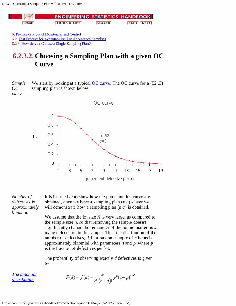
SampleOCcurve
We start by looking at a typical OC curve. The OC curve for a (52 ,3)sampling plan is shown below.
Number ofdefectives isapproximatelybinomial
It is instructive to show how the points on this curve areobtained, once we have a sampling plan (n,c) - later wewill demonstrate how a sampling plan (n,c) is obtained.
We assume that the lot size N is very large, as compared tothe sample size n, so that removing the sample doesn'tsignificantly change the remainder of the lot, no matter howmany defects are in the sample. Then the distribution of thenumber of defectives, d, in a random sample of n items isapproximately binomial with parameters n and p, where pis the fraction of defectives per lot.
The probability of observing exactly d defectives is givenby
The binomialdistribution

6.2.3.2. Choosing a Sampling Plan with a given OC Curve
http://www.itl.nist.gov/div898/handbook/pmc/section2/pmc232.htm[6/27/2012 2:35:45 PM]
The probability of acceptance is the probability that d, thenumber of defectives, is less than or equal to c, the acceptnumber. This means that
Sample tablefor Pa, Pdusing thebinomialdistribution
Using this formula with n = 52 and c=3 and p = .01, .02,...,.12 we find
Pa Pd
.998 .01
.980 .02
.930 .03
.845 .04
.739 .05
.620 .06
.502 .07
.394 .08
.300 .09
.223 .10
.162 .11
.115 .12
Solving for (n,c)
Equations forcalculating asampling planwith a givenOC curve
In order to design a sampling plan with a specified OCcurve one needs two designated points. Let us design asampling plan such that the probability of acceptance is 1-
for lots with fraction defective p1 and the probability ofacceptance is for lots with fraction defective p2. Typicalchoices for these points are: p1 is the AQL, p2 is the LTPDand , are the Producer's Risk (Type I error) andConsumer's Risk (Type II error), respectively.
If we are willing to assume that binomial sampling is valid,then the sample size n, and the acceptance number c are thesolution to
These two simultaneous equations are nonlinear so there isno simple, direct solution. There are however a number ofiterative techniques available that give approximatesolutions so that composition of a computer program posesfew problems.
6.2.3.2. Choosing a Sampling Plan with a given OC Curve
http://www.itl.nist.gov/div898/handbook/pmc/section2/pmc232.htm[6/27/2012 2:35:45 PM]
Average Outgoing Quality (AOQ)
CalculatingAOQ's
We can also calculate the AOQ for a (n,c) sampling plan,provided rejected lots are 100% inspected and defectivesare replaced with good parts.
Assume all lots come in with exactly a p0 proportion ofdefectives. After screening a rejected lot, the final fractiondefectives will be zero for that lot. However, accepted lotshave fraction defectivep0. Therefore, the outgoing lotsfrom the inspection stations are a mixture of lots withfractions defective p0 and 0. Assuming the lot size is N, wehave.
For example, let N = 10000, n = 52, c = 3, and p, thequality of incoming lots, = 0.03. Now at p = 0.03, we gleanfrom the OC curve table that pa = 0.930 and
AOQ = (.930)(.03)(10000-52) / 10000 = 0.02775.
Sample tableof AOQversus p
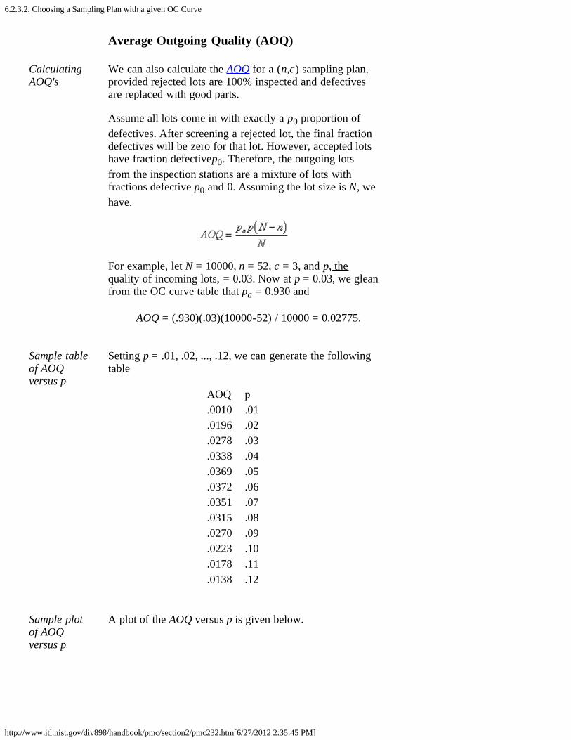
Setting p = .01, .02, ..., .12, we can generate the followingtable
AOQ p.0010 .01.0196 .02.0278 .03.0338 .04.0369 .05.0372 .06.0351 .07.0315 .08.0270 .09.0223 .10.0178 .11.0138 .12
Sample plotof AOQversus p
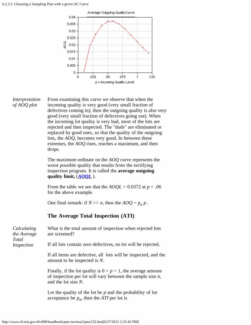
A plot of the AOQ versus p is given below.
6.2.3.2. Choosing a Sampling Plan with a given OC Curve
http://www.itl.nist.gov/div898/handbook/pmc/section2/pmc232.htm[6/27/2012 2:35:45 PM]
Interpretationof AOQ plot
From examining this curve we observe that when theincoming quality is very good (very small fraction ofdefectives coming in), then the outgoing quality is also verygood (very small fraction of defectives going out). Whenthe incoming lot quality is very bad, most of the lots arerejected and then inspected. The "duds" are eliminated orreplaced by good ones, so that the quality of the outgoinglots, the AOQ, becomes very good. In between theseextremes, the AOQ rises, reaches a maximum, and thendrops.
The maximum ordinate on the AOQ curve represents theworst possible quality that results from the rectifyinginspection program. It is called the average outgoingquality limit, (AOQL ).
From the table we see that the AOQL = 0.0372 at p = .06for the above example.
One final remark: if N >> n, then the AOQ ~ pa p .
The Average Total Inspection (ATI)
Calculatingthe AverageTotalInspection
What is the total amount of inspection when rejected lotsare screened?
If all lots contain zero defectives, no lot will be rejected.
If all items are defective, all lots will be inspected, and theamount to be inspected is N.
Finally, if the lot quality is 0 < p < 1, the average amountof inspection per lot will vary between the sample size n,and the lot size N.
Let the quality of the lot be p and the probability of lotacceptance be pa, then the ATI per lot is
6.2.3.2. Choosing a Sampling Plan with a given OC Curve
http://www.itl.nist.gov/div898/handbook/pmc/section2/pmc232.htm[6/27/2012 2:35:45 PM]
ATI = n + (1 - pa) (N - n)
For example, let N = 10000, n = 52, c = 3, and p = .03 Weknow from the OC table that pa = 0.930. Then ATI = 52 +(1-.930) (10000 - 52) = 753. (Note that while 0.930 wasrounded to three decimal places, 753 was obtained usingmore decimal places.)
Sample tableof ATI versusp
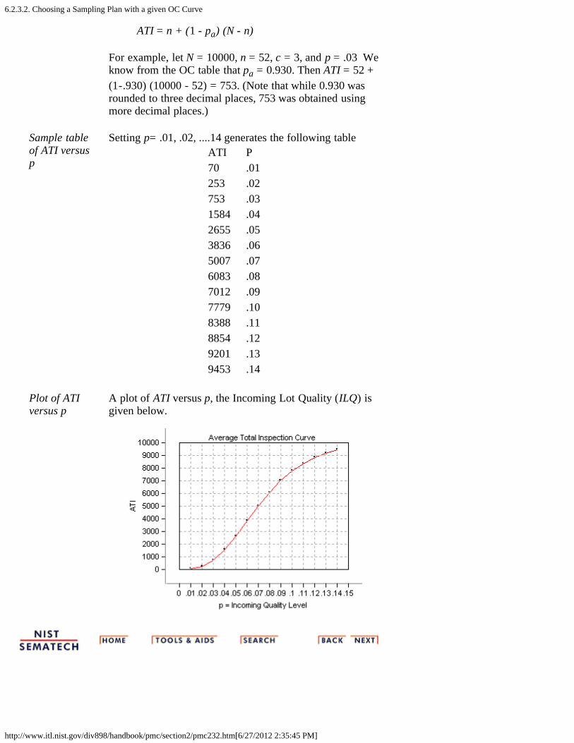
Setting p= .01, .02, ....14 generates the following tableATI P70 .01253 .02753 .031584 .042655 .053836 .065007 .076083 .087012 .097779 .108388 .118854 .129201 .139453 .14
Plot of ATIversus p
A plot of ATI versus p, the Incoming Lot Quality (ILQ) isgiven below.
6.2.4. What is Double Sampling?
http://www.itl.nist.gov/div898/handbook/pmc/section2/pmc24.htm[6/27/2012 2:35:46 PM]
6. Process or Product Monitoring and Control 6.2. Test Product for Acceptability: Lot Acceptance Sampling
6.2.4. What is Double Sampling?
Double Sampling Plans
How doublesamplingplans work
Double and multiple sampling plans were invented to give aquestionable lot another chance. For example, if in double samplingthe results of the first sample are not conclusive with regard toaccepting or rejecting, a second sample is taken. Application ofdouble sampling requires that a first sample of size n1 is taken atrandom from the (large) lot. The number of defectives is thencounted and compared to the first sample's acceptance number a1and rejection number r1. Denote the number of defectives in sample1 by d1 and in sample 2 by d2, then:
If d1 a1, the lot is accepted. If d1 r1, the lot is rejected. If a1 < d1 < r1, a second sample is taken.
If a second sample of size n2 is taken, the number of defectives, d2,is counted. The total number of defectives is D2 = d1 + d2. Now thisis compared to the acceptance number a2 and the rejection numberr2 of sample 2. In double sampling, r2 = a2 + 1 to ensure a decisionon the sample.
If D2 a2, the lot is accepted. If D2 r2, the lot is rejected.
Design of a Double Sampling Plan
Design of adoublesamplingplan
The parameters required to construct the OC curve are similar to thesingle sample case. The two points of interest are (p1, 1- ) and (p2,
, where p1 is the lot fraction defective for plan 1 and p2 is the lotfraction defective for plan 2. As far as the respective sample sizes areconcerned, the second sample size must be equal to, or an evenmultiple of, the first sample size.
There exist a variety of tables that assist the user in constructingdouble and multiple sampling plans. The index to these tables is thep2/p1 ratio, where p2 > p1. One set of tables, taken from the ArmyChemical Corps Engineering Agency for = .05 and = .10, is

6.2.4. What is Double Sampling?
http://www.itl.nist.gov/div898/handbook/pmc/section2/pmc24.htm[6/27/2012 2:35:46 PM]
given below:
Tables for n1 = n2 accept approximation values
R = numbers of pn1 forp2/p1 c1 c2 P = .95 P = .10
11.90 0 1 0.21 2.507.54 1 2 0.52 3.926.79 0 2 0.43 2.965.39 1 3 0.76 4.114.65 2 4 1.16 5.394.25 1 4 1.04 4.423.88 2 5 1.43 5.553.63 3 6 1.87 6.783.38 2 6 1.72 5.823.21 3 7 2.15 6.913.09 4 8 2.62 8.102.85 4 9 2.90 8.262.60 5 11 3.68 9.562.44 5 12 4.00 9.772.32 5 13 4.35 10.082.22 5 14 4.70 10.452.12 5 16 5.39 11.41
Tables for n2 = 2n1 accept approximation values
R = numbers of pn1 forp2/p1 c1 c2 P = .95 P = .10
14.50 0 1 0.16 2.328.07 0 2 0.30 2.426.48 1 3 0.60 3.895.39 0 3 0.49 2.645.09 0 4 0.77 3.924.31 1 4 0.68 2.934.19 0 5 0.96 4.023.60 1 6 1.16 4.173.26 1 8 1.68 5.472.96 2 10 2.27 6.722.77 3 11 2.46 6.822.62 4 13 3.07 8.052.46 4 14 3.29 8.112.21 3 15 3.41 7.55

6.2.4. What is Double Sampling?
http://www.itl.nist.gov/div898/handbook/pmc/section2/pmc24.htm[6/27/2012 2:35:46 PM]
1.97 4 20 4.75 9.351.74 6 30 7.45 12.96
Example
Example ofa doublesamplingplan
We wish to construct a double sampling plan according to
p1 = 0.01 = 0.05 p2 = 0.05 = 0.10 and n1 = n2
The plans in the corresponding table are indexed on the ratio
R = p2/p1 = 5
We find the row whose R is closet to 5. This is the 5th row (R =4.65). This gives c1 = 2 and c2 = 4. The value of n1 is determinedfrom either of the two columns labeled pn1.
The left holds constant at 0.05 (P = 0.95 = 1 - ) and the rightholds constant at 0.10. (P = 0.10). Then holding constant wefind pn1 = 1.16 so n1 = 1.16/p1 = 116. And, holding constant wefind pn1 = 5.39, so n1 = 5.39/p2 = 108. Thus the desired samplingplan is
n1 = 108 c1 = 2 n2 = 108 c2 = 4
If we opt for n2 = 2n1, and follow the same procedure using theappropriate table, the plan is:
n1 = 77 c1 = 1 n2 = 154 c2 = 4
The first plan needs less samples if the number of defectives insample 1 is greater than 2, while the second plan needs less samplesif the number of defectives in sample 1 is less than 2.
ASN Curve for a Double Sampling Plan
Constructionof the ASNcurve
Since when using a double sampling plan the sample size depends onwhether or not a second sample is required, an importantconsideration for this kind of sampling is the Average SampleNumber (ASN) curve. This curve plots the ASN versus p', the truefraction defective in an incoming lot.
We will illustrate how to calculate the ASN curve with an example.Consider a double-sampling plan n1 = 50, c1= 2, n2 = 100, c2 = 6,where n1 is the sample size for plan 1, with accept number c1, andn2, c2, are the sample size and accept number, respectively, for plan2.
Let p' = .06. Then the probability of acceptance on the first sample,which is the chance of getting two or less defectives, is .416 (using
6.2.4. What is Double Sampling?
http://www.itl.nist.gov/div898/handbook/pmc/section2/pmc24.htm[6/27/2012 2:35:46 PM]
binomial tables). The probability of rejection on the second sample,which is the chance of getting more than six defectives, is (1-.971) =.029. The probability of making a decision on the first sample is.445, equal to the sum of .416 and .029. With complete inspection ofthe second sample, the average size sample is equal to the size of thefirst sample times the probability that there will be only one sampleplus the size of the combined samples times the probability that asecond sample will be necessary. For the sampling plan underconsideration, the ASN with complete inspection of the secondsample for a p' of .06 is
50(.445) + 150(.555) = 106
The general formula for an average sample number curve of adouble-sampling plan with complete inspection of the second sampleis
ASN = n1P1 + (n1 + n2)(1 - P1) = n1 + n2(1 - P1)
where P1 is the probability of a decision on the first sample. Thegraph below shows a plot of the ASN versus p'.
The ASNcurve for adoublesamplingplan

6.2.5. What is Multiple Sampling?
http://www.itl.nist.gov/div898/handbook/pmc/section2/pmc25.htm[6/27/2012 2:35:48 PM]
6. Process or Product Monitoring and Control 6.2. Test Product for Acceptability: Lot Acceptance Sampling
6.2.5. What is Multiple Sampling?
MultipleSamplingis anextensionof thedoublesamplingconcept
Multiple sampling is an extension of double sampling. Itinvolves inspection of 1 to k successive samples as required toreach an ultimate decision.
Mil-Std 105D suggests k = 7 is a good number. Multiplesampling plans are usually presented in tabular form:
Procedureformultiplesampling
The procedure commences with taking a random sample ofsize n1from a large lot of size N and counting the number ofdefectives, d1.
if d1 a1 the lot is accepted. if d1 r1 the lot is rejected. if a1 < d1 < r1, another sample is taken.
If subsequent samples are required, the first sample procedureis repeated sample by sample. For each sample, the totalnumber of defectives found at any stage, say stage i, is
This is compared with the acceptance number ai and therejection number ri for that stage until a decision is made.Sometimes acceptance is not allowed at the early stages ofmultiple sampling; however, rejection can occur at any stage.
Efficiencymeasuredby theASN
Efficiency for a multiple sampling scheme is measured by theaverage sample number (ASN) required for a given Type I andType II set of errors. The number of samples needed whenfollowing a multiple sampling scheme may vary from trial totrial, and the ASN represents the average of what mighthappen over many trials with a fixed incoming defect level.
6.2.6. What is a Sequential Sampling Plan?
http://www.itl.nist.gov/div898/handbook/pmc/section2/pmc26.htm[6/27/2012 2:35:49 PM]
6. Process or Product Monitoring and Control 6.2. Test Product for Acceptability: Lot Acceptance Sampling
6.2.6. What is a Sequential Sampling Plan?
SequentialSampling
Sequential sampling is different from single, double ormultiple sampling. Here one takes a sequence of samples froma lot. How many total samples looked at is a function of theresults of the sampling process.
Item-by-item andgroupsequentialsampling
The sequence can be one sample at a time, and then thesampling process is usually called item-by-item sequentialsampling. One can also select sample sizes greater than one, inwhich case the process is referred to as group sequentialsampling. Item-by-item is more popular so we concentrate onit. The operation of such a plan is illustrated below:
Diagram ofitem-by-itemsampling
Descriptionofsequentailsamplinggraph
The cumulative observed number of defectives is plotted onthe graph. For each point, the x-axis is the total number ofitems thus far selected, and the y-axis is the total number ofobserved defectives. If the plotted point falls within the parallellines the process continues by drawing another sample. Assoon as a point falls on or above the upper line, the lot isrejected. And when a point falls on or below the lower line,the lot is accepted. The process can theoretically last until thelot is 100% inspected. However, as a rule of thumb,sequential-sampling plans are truncated after the numberinspected reaches three times the number that would have beeninspected using a corresponding single sampling plan.

6.2.6. What is a Sequential Sampling Plan?
http://www.itl.nist.gov/div898/handbook/pmc/section2/pmc26.htm[6/27/2012 2:35:49 PM]
Equationsfor thelimit lines
The equations for the two limit lines are functions of theparameters p1, , p2, and .
where
Instead of using the graph to determine the fate of the lot, onecan resort to generating tables (with the help of a computerprogram).
Example ofasequentialsamplingplan
As an example, let p1 = .01, p2 = .10, = .05, = .10. Theresulting equations are
Both acceptance numbers and rejection numbers must beintegers. The acceptance number is the next integer less thanor equal to xa and the rejection number is the next integergreater than or equal to xr. Thus for n = 1, the acceptancenumber = -1, which is impossible, and the rejection number =2, which is also impossible. For n = 24, the acceptance numberis 0 and the rejection number = 3.
The results for n =1, 2, 3... 26 are tabulated below.
ninspect
naccept
nreject
ninspect
naccept
nreject
1 x x 14 x 22 x 2 15 x 23 x 2 16 x 34 x 2 17 x 35 x 2 18 x 36 x 2 19 x 37 x 2 20 x 38 x 2 21 x 39 x 2 22 x 3

6.2.6. What is a Sequential Sampling Plan?
http://www.itl.nist.gov/div898/handbook/pmc/section2/pmc26.htm[6/27/2012 2:35:49 PM]
10 x 2 23 x 311 x 2 24 0 312 x 2 25 0 313 x 2 26 0 3
So, for n = 24 the acceptance number is 0 and the rejectionnumber is 3. The "x" means that acceptance or rejection is notpossible.
Other sequential plans are given below.
ninspect
naccept
nreject
49 1 358 1 474 2 483 2 5100 3 5109 3 6
The corresponding single sampling plan is (52,2) and doublesampling plan is (21,0), (21,1).
Efficiencymeasuredby ASN
Efficiency for a sequential sampling scheme is measured bythe average sample number (ASN) required for a given Type Iand Type II set of errors. The number of samples needed whenfollowing a sequential sampling scheme may vary from trial totrial, and the ASN represents the average of what might happenover many trials with a fixed incoming defect level. Goodsoftware for designing sequential sampling schemes willcalculate the ASN curve as a function of the incoming defectlevel.
6.2.7. What is Skip Lot Sampling?
http://www.itl.nist.gov/div898/handbook/pmc/section2/pmc27.htm[6/27/2012 2:35:50 PM]
6. Process or Product Monitoring and Control 6.2. Test Product for Acceptability: Lot Acceptance Sampling
6.2.7. What is Skip Lot Sampling?
Skip LotSampling
Skip Lot sampling means that only a fraction of the submitted lotsare inspected. This mode of sampling is of the cost-saving variety interms of time and effort. However skip-lot sampling should only beused when it has been demonstrated that the quality of the submittedproduct is very good.
Implementationof skip-lotsampling plan
A skip-lot sampling plan is implemented as follows:
1. Design a single sampling plan by specifying the alpha and betarisks and the consumer/producer's risks. This plan is called"the reference sampling plan".
2. Start with normal lot-by-lot inspection, using the referenceplan.
3. When a pre-specified number, i, of consecutive lots areaccepted, switch to inspecting only a fraction f of the lots. Theselection of the members of that fraction is done at random.
4. When a lot is rejected return to normal inspection.
The f and iparameters
The parameters f and i are essential to calculating the probability ofacceptance for a skip-lot sampling plan. In this scheme, i, called theclearance number, is a positive integer and the sampling fraction f issuch that 0 < f < 1. Hence, when f = 1 there is no longer skip-lotsampling. The calculation of the acceptance probability for the skip-lot sampling plan is performed via the following formula
where P is the probability of accepting a lot with a given proportionof incoming defectives p, from the OC curve of the single samplingplan.
The following relationships hold:
for a given i, the smaller is f, the greater is Pa for a given f, the smaller is i, the greater is Pa
6.2.7. What is Skip Lot Sampling?
http://www.itl.nist.gov/div898/handbook/pmc/section2/pmc27.htm[6/27/2012 2:35:50 PM]
Illustration ofa skip lotsampling plan
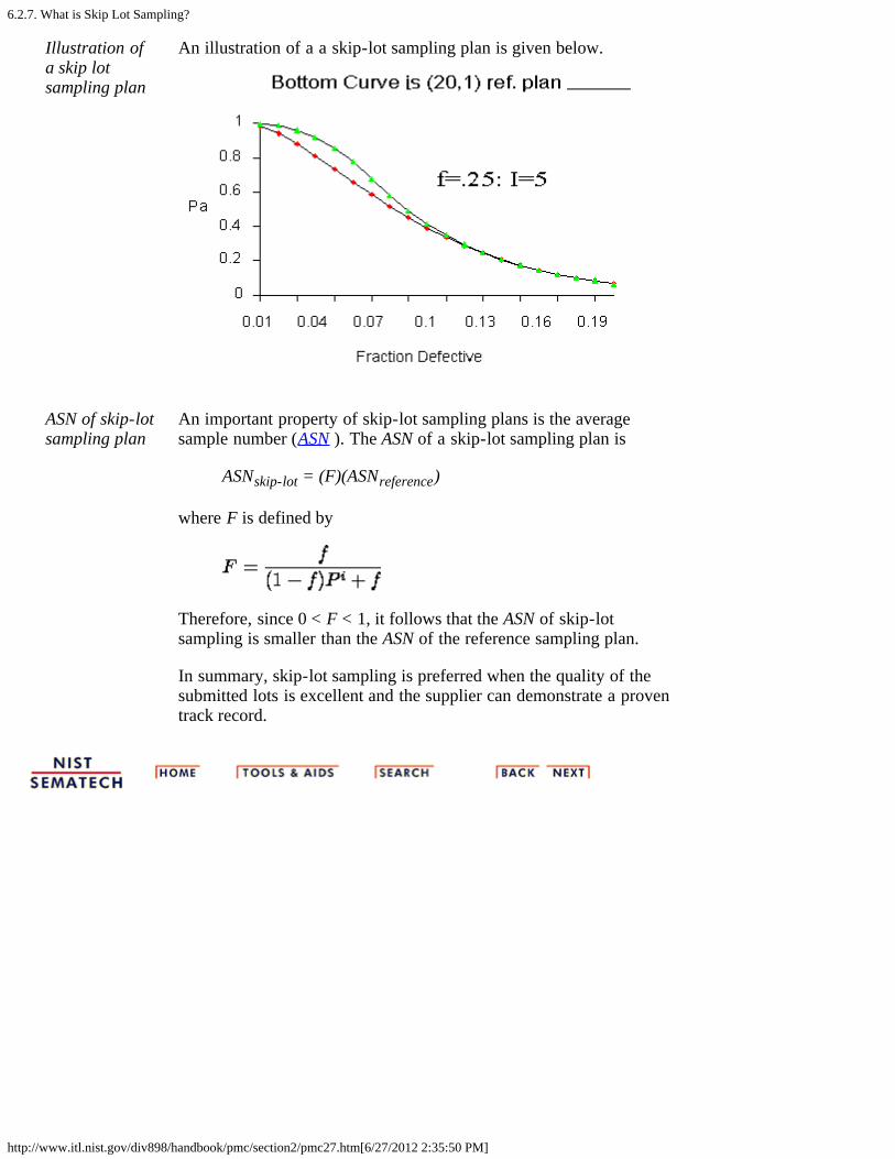
An illustration of a a skip-lot sampling plan is given below.
ASN of skip-lotsampling plan
An important property of skip-lot sampling plans is the averagesample number (ASN ). The ASN of a skip-lot sampling plan is
ASNskip-lot = (F)(ASNreference)
where F is defined by
Therefore, since 0 < F < 1, it follows that the ASN of skip-lotsampling is smaller than the ASN of the reference sampling plan.
In summary, skip-lot sampling is preferred when the quality of thesubmitted lots is excellent and the supplier can demonstrate a proventrack record.

6.3. Univariate and Multivariate Control Charts
http://www.itl.nist.gov/div898/handbook/pmc/section3/pmc3.htm[6/27/2012 2:35:50 PM]
6. Process or Product Monitoring and Control
6.3. Univariate and Multivariate Control Charts
Contentsof section3
Control charts in this section are classified and describedaccording to three general types: variables, attributes andmultivariate.
1. What are Control Charts? 2. What are Variables Control Charts?
1. Shewhart X bar and R and S Control Charts 2. Individuals Control Charts 3. Cusum Control Charts
1. Cusum Average Run Length 4. EWMA Control Charts
3. What are Attributes Control Charts? 1. Counts Control Charts 2. Proportions Control Charts
4. What are Multivariate Control Charts? 1. Hotelling Control Charts 2. Principal Components Control Charts3. Multivariate EWMA Charts
6.3.1. What are Control Charts?
http://www.itl.nist.gov/div898/handbook/pmc/section3/pmc31.htm[6/27/2012 2:35:51 PM]
6. Process or Product Monitoring and Control 6.3. Univariate and Multivariate Control Charts
6.3.1. What are Control Charts?
Comparison ofunivariate andmultivariatecontrol data
Control charts are used to routinely monitor quality.Depending on the number of process characteristics to bemonitored, there are two basic types of control charts. Thefirst, referred to as a univariate control chart, is a graphicaldisplay (chart) of one quality characteristic. The second,referred to as a multivariate control chart, is a graphicaldisplay of a statistic that summarizes or represents more thanone quality characteristic.
Characteristicsof controlcharts
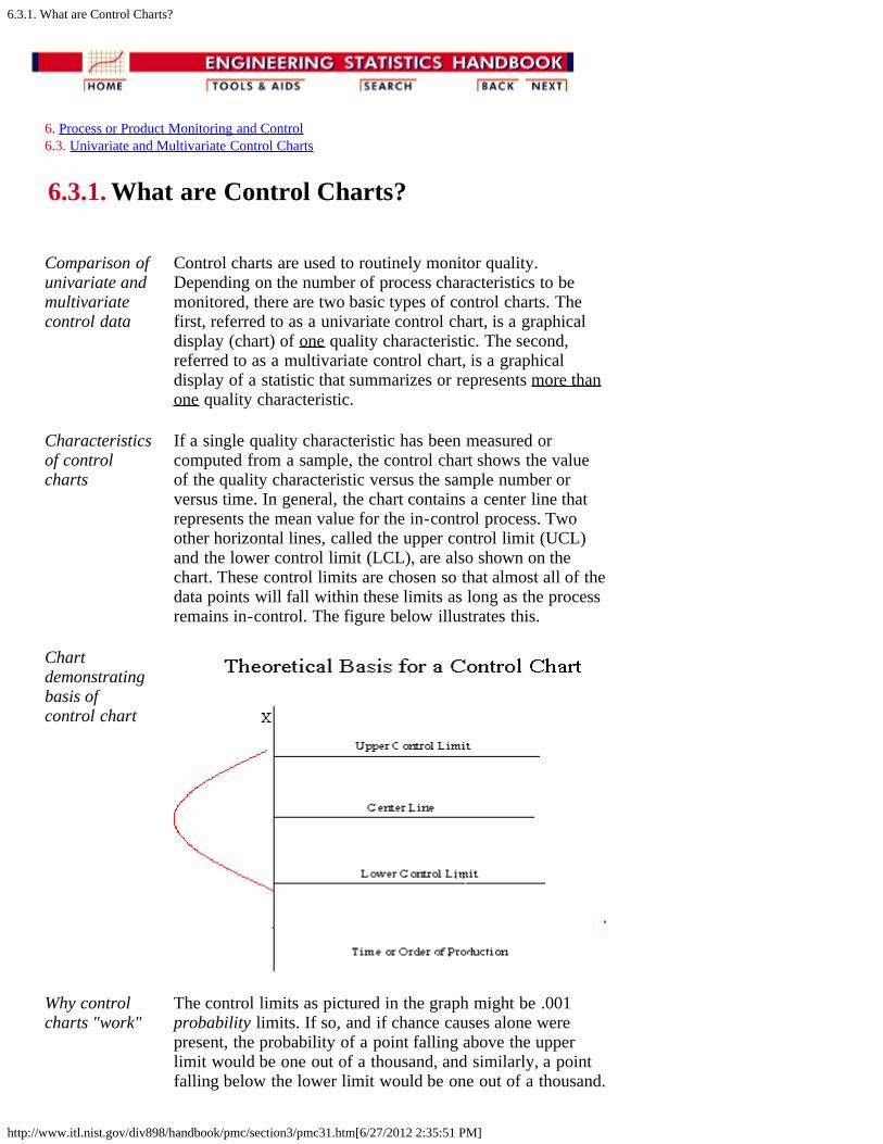
If a single quality characteristic has been measured orcomputed from a sample, the control chart shows the valueof the quality characteristic versus the sample number orversus time. In general, the chart contains a center line thatrepresents the mean value for the in-control process. Twoother horizontal lines, called the upper control limit (UCL)and the lower control limit (LCL), are also shown on thechart. These control limits are chosen so that almost all of thedata points will fall within these limits as long as the processremains in-control. The figure below illustrates this.
Chartdemonstratingbasis ofcontrol chart
Why controlcharts "work"
The control limits as pictured in the graph might be .001probability limits. If so, and if chance causes alone werepresent, the probability of a point falling above the upperlimit would be one out of a thousand, and similarly, a pointfalling below the lower limit would be one out of a thousand.
6.3.1. What are Control Charts?
http://www.itl.nist.gov/div898/handbook/pmc/section3/pmc31.htm[6/27/2012 2:35:51 PM]
We would be searching for an assignable cause if a pointwould fall outside these limits. Where we put these limitswill determine the risk of undertaking such a search when inreality there is no assignable cause for variation.
Since two out of a thousand is a very small risk, the 0.001limits may be said to give practical assurances that, if a pointfalls outside these limits, the variation was caused be anassignable cause. It must be noted that two out of onethousand is a purely arbitrary number. There is no reasonwhy it could not have been set to one out a hundred or evenlarger. The decision would depend on the amount of risk themanagement of the quality control program is willing to take.In general (in the world of quality control) it is customary touse limits that approximate the 0.002 standard.
Letting X denote the value of a process characteristic, if thesystem of chance causes generates a variation in X thatfollows the normal distribution, the 0.001 probability limitswill be very close to the 3 limits. From normal tables weglean that the 3 in one direction is 0.00135, or in bothdirections 0.0027. For normal distributions, therefore, the 3limits are the practical equivalent of 0.001 probability limits.
Plus or minus"3 sigma"limits aretypical
In the U.S., whether X is normally distributed or not, it is anacceptable practice to base the control limits upon a multipleof the standard deviation. Usually this multiple is 3 and thusthe limits are called 3-sigma limits. This term is usedwhether the standard deviation is the universe or populationparameter, or some estimate thereof, or simply a "standardvalue" for control chart purposes. It should be inferred fromthe context what standard deviation is involved. (Note that inthe U.K., statisticians generally prefer to adhere toprobability limits.)
If the underlying distribution is skewed, say in the positivedirection, the 3-sigma limit will fall short of the upper 0.001limit, while the lower 3-sigma limit will fall below the 0.001limit. This situation means that the risk of looking forassignable causes of positive variation when none exists willbe greater than one out of a thousand. But the risk ofsearching for an assignable cause of negative variation, whennone exists, will be reduced. The net result, however, will bean increase in the risk of a chance variation beyond thecontrol limits. How much this risk will be increased willdepend on the degree of skewness.
If variation in quality follows a Poisson distribution, forexample, for which np = .8, the risk of exceeding the upperlimit by chance would be raised by the use of 3-sigma limitsfrom 0.001 to 0.009 and the lower limit reduces from 0.001to 0. For a Poisson distribution the mean and variance bothequal np. Hence the upper 3-sigma limit is 0.8 + 3 sqrt(.8) =3.48 and the lower limit = 0 (here sqrt denotes "square root").

6.3.1. What are Control Charts?
http://www.itl.nist.gov/div898/handbook/pmc/section3/pmc31.htm[6/27/2012 2:35:51 PM]
For np = .8 the probability of getting more than 3 successes =0.009.
Strategies fordealing without-of-controlfindings
If a data point falls outside the control limits, we assume thatthe process is probably out of control and that aninvestigation is warranted to find and eliminate the cause orcauses.
Does this mean that when all points fall within the limits, theprocess is in control? Not necessarily. If the plot looks non-random, that is, if the points exhibit some form of systematicbehavior, there is still something wrong. For example, if thefirst 25 of 30 points fall above the center line and the last 5fall below the center line, we would wish to know why this isso. Statistical methods to detect sequences or nonrandompatterns can be applied to the interpretation of control charts.To be sure, "in control" implies that all points are betweenthe control limits and they form a random pattern.

6.3.2. What are Variables Control Charts?
http://www.itl.nist.gov/div898/handbook/pmc/section3/pmc32.htm[6/27/2012 2:35:52 PM]
6. Process or Product Monitoring and Control 6.3. Univariate and Multivariate Control Charts
6.3.2. What are Variables Control Charts?
During the 1920's, Dr. Walter A. Shewhart proposed a generalmodel for control charts as follows:
ShewhartControlCharts forvariables
Let w be a sample statistic that measures some continuouslyvarying quality characteristic of interest (e.g., thickness), andsuppose that the mean of w is w, with a standard deviation of
w. Then the center line, the UCL and the LCL are
UCL = w + k w Center Line = w LCL = w - k w
where k is the distance of the control limits from the centerline, expressed in terms of standard deviation units. When k isset to 3, we speak of 3-sigma control charts.
Historically, k = 3 has become an accepted standard inindustry.
The centerline is the process mean, which in general isunknown. We replace it with a target or the average of all thedata. The quantity that we plot is the sample average, . Thechart is called the chart.
We also have to deal with the fact that is, in general,unknown. Here we replace w with a given standard value, orwe estimate it by a function of the average standard deviation.This is obtained by averaging the individual standarddeviations that we calculated from each of m preliminary (orpresent) samples, each of size n. This function will bediscussed shortly.
It is equally important to examine the standard deviations inascertaining whether the process is in control. There is,unfortunately, a slight problem involved when we work withthe usual estimator of . The following discussion willillustrate this.
SampleVariance
If 2 is the unknown variance of a probability distribution,then an unbiased estimator of 2 is the sample variance
6.3.2. What are Variables Control Charts?
http://www.itl.nist.gov/div898/handbook/pmc/section3/pmc32.htm[6/27/2012 2:35:52 PM]
However, s, the sample standard deviation is not an unbiasedestimator of . If the underlying distribution is normal, then sactually estimates c4 , where c4 is a constant that depends onthe sample size n. This constant is tabulated in most text bookson statistical quality control and may be calculated using
C4 factor
To compute this we need a non-integer factorial, which isdefined for n/2 as follows:
FractionalFactorials
For example, let n = 7. Then n/2 = 7/2 = 3.5 and
With this definition the reader should have no problemverifying that the c4 factor for n = 10 is .9727.
Mean andstandarddeviation oftheestimators
So the mean or expected value of the sample standarddeviation is c4 .
The standard deviation of the sample standard deviation is
What are the differences between control limits andspecification limits ?
Controllimits vs.specifications
Control Limits are used to determine if the process is in a stateof statistical control (i.e., is producing consistent output).
Specification Limits are used to determine if the product willfunction in the intended fashion.
How many data points are needed to set up a control chart?

6.3.2. What are Variables Control Charts?
http://www.itl.nist.gov/div898/handbook/pmc/section3/pmc32.htm[6/27/2012 2:35:52 PM]
How manysamples areneeded?
Shewhart gave the following rule of thumb:
"It has also been observed that a person wouldseldom if ever be justified in concluding that astate of statistical control of a given repetitiveoperation or production process has been reacheduntil he had obtained, under presumably the sameessential conditions, a sequence of not less thantwenty five samples of size four that are incontrol."
It is important to note that control chart properties, such asfalse alarm probabilities, are generally given under theassumption that the parameters, such as and , are known.When the control limits are not computed from a large amountof data, the actual properties might be quite different fromwhat is assumed (see, e.g., Quesenberry, 1993).
When do we recalculate control limits?
When do werecalculatecontrollimits?
Since a control chart "compares" the current performance ofthe process characteristic to the past performance of thischaracteristic, changing the control limits frequently wouldnegate any usefulness.
So, only change your control limits if you have a valid,compelling reason for doing so. Some examples of reasons:
When you have at least 30 more data points to add to thechart and there have been no known changes to theprocess
- you get a better estimate of the variability
If a major process change occurs and affects the wayyour process runs.
If a known, preventable act changes the way the tool orprocess would behave (power goes out, consumable iscorrupted or bad quality, etc.)
What are the WECO rules for signaling "Out of Control"?
Generalrules fordetecting outof control ornon-randomsitualtions
WECO stands for Western Electric Company Rules
Any Point Above +3 Sigma --------------------------------------------- +3 LIMIT 2 Out of the Last 3 Points Above +2 Sigma --------------------------------------------- +2 LIMIT 4 Out of the Last 5 Points Above +1 Sigma --------------------------------------------- +1 LIMIT 8 Consecutive Points on This Side of Control Line

6.3.2. What are Variables Control Charts?
http://www.itl.nist.gov/div898/handbook/pmc/section3/pmc32.htm[6/27/2012 2:35:52 PM]
=================================== CENTERLINE 8 Consecutive Points on This Side of Control Line --------------------------------------------- -1 LIMIT 4 Out of the Last 5 Points Below - 1 Sigma ---------------------------------------------- -2 LIMIT 2 Out of the Last 3 Points Below -2 Sigma --------------------------------------------- -3 LIMIT Any Point Below -3 Sigma
TrendRules:
6 in a row trending up or down. 14 in a rowalternating up and down
WECO rulesbased onprobabilities
The WECO rules are based on probability. We know that, for anormal distribution, the probability of encountering a pointoutside ± 3 is 0.3%. This is a rare event. Therefore, if weobserve a point outside the control limits, we conclude theprocess has shifted and is unstable. Similarly, we can identifyother events that are equally rare and use them as flags forinstability. The probability of observing two points out of threein a row between 2 and 3 and the probability of observingfour points out of five in a row between 1 and 2 are alsoabout 0.3%.
WECO rulesincreasefalse alarms
Note: While the WECO rules increase a Shewhart chart'ssensitivity to trends or drifts in the mean, there is a severedownside to adding the WECO rules to an ordinary Shewhartcontrol chart that the user should understand. When followingthe standard Shewhart "out of control" rule (i.e., signal if andonly if you see a point beyond the plus or minus 3 sigmacontrol limits) you will have "false alarms" every 371 points onthe average (see the description of Average Run Length orARL on the next page). Adding the WECO rules increases thefrequency of false alarms to about once in every 91.75 points,on the average (see Champ and Woodall, 1987). The user hasto decide whether this price is worth paying (some users addthe WECO rules, but take them "less seriously" in terms of theeffort put into troubleshooting activities when out of controlsignals occur).
With this background, the next page will describe how toconstruct Shewhart variables control charts.

6.3.2.1. Shewhart X-bar and R and S Control Charts
http://www.itl.nist.gov/div898/handbook/pmc/section3/pmc321.htm[6/27/2012 2:35:54 PM]
6. Process or Product Monitoring and Control 6.3. Univariate and Multivariate Control Charts 6.3.2. What are Variables Control Charts?
6.3.2.1. Shewhart X-bar and R and S ControlCharts
and S Charts
and SShewhartControlCharts
We begin with and s charts. We should use the s chart firstto determine if the distribution for the process characteristic isstable.
Let us consider the case where we have to estimate byanalyzing past data. Suppose we have m preliminary samplesat our disposition, each of size n, and let si be the standarddeviation of the ith sample. Then the average of the mstandard deviations is
ControlLimits for
and SControlCharts
We make use of the factor c4 described on the previous page.
The statistic is an unbiased estimator of . Therefore, theparameters of the S chart would be
Similarly, the parameters of the chart would be
, the "grand" mean is the average of all the observations.
6.3.2.1. Shewhart X-bar and R and S Control Charts
http://www.itl.nist.gov/div898/handbook/pmc/section3/pmc321.htm[6/27/2012 2:35:54 PM]
It is often convenient to plot the and s charts on one page.
and R Control Charts
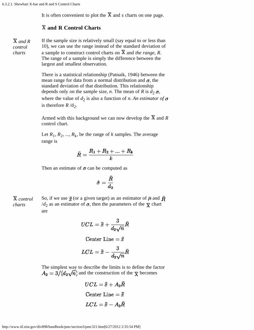
and Rcontrolcharts
If the sample size is relatively small (say equal to or less than10), we can use the range instead of the standard deviation ofa sample to construct control charts on and the range, R.The range of a sample is simply the difference between thelargest and smallest observation.
There is a statistical relationship (Patnaik, 1946) between themean range for data from a normal distribution and , thestandard deviation of that distribution. This relationshipdepends only on the sample size, n. The mean of R is d2 ,where the value of d2 is also a function of n. An estimator of is therefore R /d2.
Armed with this background we can now develop the and Rcontrol chart.
Let R1, R2, ..., Rk, be the range of k samples. The averagerange is
Then an estimate of can be computed as
controlcharts
So, if we use (or a given target) as an estimator of and /d2 as an estimator of , then the parameters of the chartare
The simplest way to describe the limits is to define the factor and the construction of the becomes
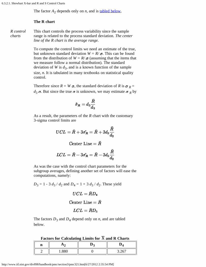
6.3.2.1. Shewhart X-bar and R and S Control Charts
http://www.itl.nist.gov/div898/handbook/pmc/section3/pmc321.htm[6/27/2012 2:35:54 PM]
The factor A2 depends only on n, and is tabled below.
The R chart
R controlcharts
This chart controls the process variability since the samplerange is related to the process standard deviation. The centerline of the R chart is the average range.
To compute the control limits we need an estimate of the true,but unknown standard deviation W = R/ . This can be foundfrom the distribution of W = R/ (assuming that the items thatwe measure follow a normal distribution). The standarddeviation of W is d3, and is a known function of the samplesize, n. It is tabulated in many textbooks on statistical qualitycontrol.
Therefore since R = W , the standard deviation of R is R =d3 . But since the true is unknown, we may estimate R by
As a result, the parameters of the R chart with the customary3-sigma control limits are
As was the case with the control chart parameters for thesubgroup averages, defining another set of factors will ease thecomputations, namely:
D3 = 1 - 3 d3 / d2 and D4 = 1 + 3 d3 / d2. These yield
The factors D3 and D4 depend only on n, and are tabledbelow.
Factors for Calculating Limits for and R Chartsn A2 D3 D4
2 1.880 0 3.267
6.3.2.1. Shewhart X-bar and R and S Control Charts
http://www.itl.nist.gov/div898/handbook/pmc/section3/pmc321.htm[6/27/2012 2:35:54 PM]
3 1.023 0 2.5754 0.729 0 2.2825 0.577 0 2.1156 0.483 0 2.0047 0.419 0.076 1.9248 0.373 0.136 1.8649 0.337 0.184 1.81610 0.308 0.223 1.777
In general, the range approach is quite satisfactory for samplesizes up to around 10. For larger sample sizes, using subgroupstandard deviations is preferable. For small sample sizes, therelative efficiency of using the range approach as opposed tousing standard deviations is shown in the following table.
Efficiencyof R versusS/c4
n RelativeEfficiency
2 1.0003 0.9924 0.9755 0.9556 0.93010 0.850
A typical sample size is 4 or 5, so not much is lost by usingthe range for such sample sizes.
Time To Detection or Average Run Length (ARL)
Waitingtime tosignal "outof control"
Two important questions when dealing with control charts are:
1. How often will there be false alarms where we look foran assignable cause but nothing has changed?
2. How quickly will we detect certain kinds of systematicchanges, such as mean shifts?
The ARL tells us, for a given situation, how long on theaverage we will plot successive control charts points before wedetect a point beyond the control limits.
For an chart, with no change in the process, we wait on theaverage 1/p points before a false alarm takes place, with pdenoting the probability of an observation plotting outside thecontrol limits. For a normal distribution, p = .0027 and theARL is approximately 371.
A table comparing Shewhart chart ARL's to CumulativeSum (CUSUM) ARL's for various mean shifts is given later in

6.3.2.1. Shewhart X-bar and R and S Control Charts
http://www.itl.nist.gov/div898/handbook/pmc/section3/pmc321.htm[6/27/2012 2:35:54 PM]
this section.
There is also (currently) a web site developed by GalitShmueli that will do ARL calculations interactively with theuser, for Shewhart charts with or without additional (WesternElectric) rules added.
6.3.2.2. Individuals Control Charts
http://www.itl.nist.gov/div898/handbook/pmc/section3/pmc322.htm[6/27/2012 2:35:55 PM]
6. Process or Product Monitoring and Control 6.3. Univariate and Multivariate Control Charts 6.3.2. What are Variables Control Charts?
6.3.2.2. Individuals Control Charts
Samples are Individual Measurements
Movingrange usedto deriveupper andlower limits
Control charts for individual measurements, e.g., the sample size =1, use the moving range of two successive observations to measurethe process variability.
The moving range is defined as
which is the absolute value of the first difference (e.g., thedifference between two consecutive data points) of the data.Analogous to the Shewhart control chart, one can plot both the data(which are the individuals) and the moving range.
Individualscontrollimits for anobservation
For the control chart for individual measurements, the lines plottedare:
where is the average of all the individuals and is theaverage of all the moving ranges of two observations. Keep in mindthat either or both averages may be replaced by a standard ortarget, if available. (Note that 1.128 is the value of d2 for n = 2).
Example ofmovingrange
The following example illustrates the control chart for individualobservations. A new process was studied in order to monitor flowrate. The first 10 batches resulted in
BatchNumber
Flowratex
MovingRangeMR

6.3.2.2. Individuals Control Charts
http://www.itl.nist.gov/div898/handbook/pmc/section3/pmc322.htm[6/27/2012 2:35:55 PM]
1 49.6 2 47.6 2.03 49.9 2.34 51.3 1.45 47.8 3.56 51.2 3.47 52.6 1.48 52.4 0.29 53.6 1.2
10 52.1 1.5 = 50.81 =
1.8778
Limits forthe movingrange chart
This yields the parameters below.
Example ofindividualschart
The control chart is given below
The process is in control, since none of the plotted points falloutside either the UCL or LCL.
Alternativeforconstructingindividualscontrol
Note: Another way to construct the individuals chart is by usingthe standard deviation. Then we can obtain the chart from

6.3.2.2. Individuals Control Charts
http://www.itl.nist.gov/div898/handbook/pmc/section3/pmc322.htm[6/27/2012 2:35:55 PM]
chart It is preferable to have the limits computed this way for the start ofPhase 2.
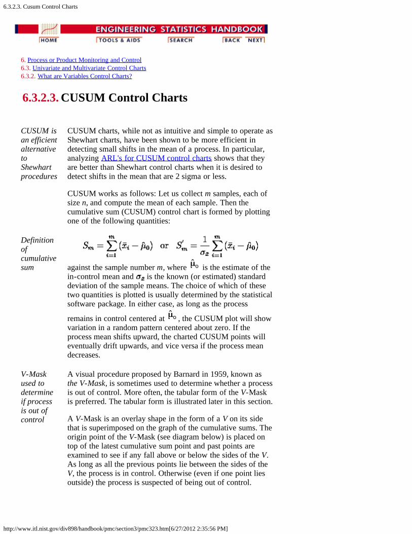
6.3.2.3. Cusum Control Charts
http://www.itl.nist.gov/div898/handbook/pmc/section3/pmc323.htm[6/27/2012 2:35:56 PM]
6. Process or Product Monitoring and Control 6.3. Univariate and Multivariate Control Charts 6.3.2. What are Variables Control Charts?
6.3.2.3. CUSUM Control Charts
CUSUM isan efficientalternativetoShewhartprocedures
CUSUM charts, while not as intuitive and simple to operate asShewhart charts, have been shown to be more efficient indetecting small shifts in the mean of a process. In particular,analyzing ARL's for CUSUM control charts shows that theyare better than Shewhart control charts when it is desired todetect shifts in the mean that are 2 sigma or less.
CUSUM works as follows: Let us collect m samples, each ofsize n, and compute the mean of each sample. Then thecumulative sum (CUSUM) control chart is formed by plottingone of the following quantities:
Definitionofcumulativesum against the sample number m, where is the estimate of the
in-control mean and is the known (or estimated) standarddeviation of the sample means. The choice of which of thesetwo quantities is plotted is usually determined by the statisticalsoftware package. In either case, as long as the process
remains in control centered at , the CUSUM plot will showvariation in a random pattern centered about zero. If theprocess mean shifts upward, the charted CUSUM points willeventually drift upwards, and vice versa if the process meandecreases.
V-Maskused todetermineif processis out ofcontrol
A visual procedure proposed by Barnard in 1959, known asthe V-Mask, is sometimes used to determine whether a processis out of control. More often, the tabular form of the V-Maskis preferred. The tabular form is illustrated later in this section.
A V-Mask is an overlay shape in the form of a V on its sidethat is superimposed on the graph of the cumulative sums. Theorigin point of the V-Mask (see diagram below) is placed ontop of the latest cumulative sum point and past points areexamined to see if any fall above or below the sides of the V.As long as all the previous points lie between the sides of theV, the process is in control. Otherwise (even if one point liesoutside) the process is suspected of being out of control.

6.3.2.3. Cusum Control Charts
http://www.itl.nist.gov/div898/handbook/pmc/section3/pmc323.htm[6/27/2012 2:35:56 PM]
Sample V-Maskdemonstratingan out ofcontrolprocess
Interpretationof the V-Mask on theplot
In the diagram above, the V-Mask shows an out of controlsituation because of the point that lies above the upper arm.By sliding the V-Mask backwards so that the origin pointcovers other cumulative sum data points, we can determinethe first point that signaled an out-of-control situation. Thisis useful for diagnosing what might have caused the processto go out of control.
From the diagram it is clear that the behavior of the V-Maskis determined by the distance k (which is the slope of thelower arm) and the rise distance h. These are the designparameters of the V-Mask. Note that we could also specifyd and the vertex angle (or, as is more common in theliterature, θ = 1/2 of the vertex angle) as the designparameters, and we would end up with the same V-Mask.
In practice, designing and manually constructing a V-Maskis a complicated procedure. A CUSUM spreadsheet styleprocedure shown below is more practical, unless you havestatistical software that automates the V-Maskmethodology. Before describing the spreadsheet approach,we will look briefly at an example of a V-Mask in graphform.
V-MaskExample
An example will be used to illustrate the construction andapplication of a V-Mask. The 20 data points
324.925, 324.675, 324.725, 324.350, 325.350, 325.225,324.125, 324.525, 325.225, 324.600, 324.625, 325.150,328.325, 327.250, 327.825, 328.500, 326.675, 327.775,326.875, 328.350
are each the average of samples of size 4 taken from a
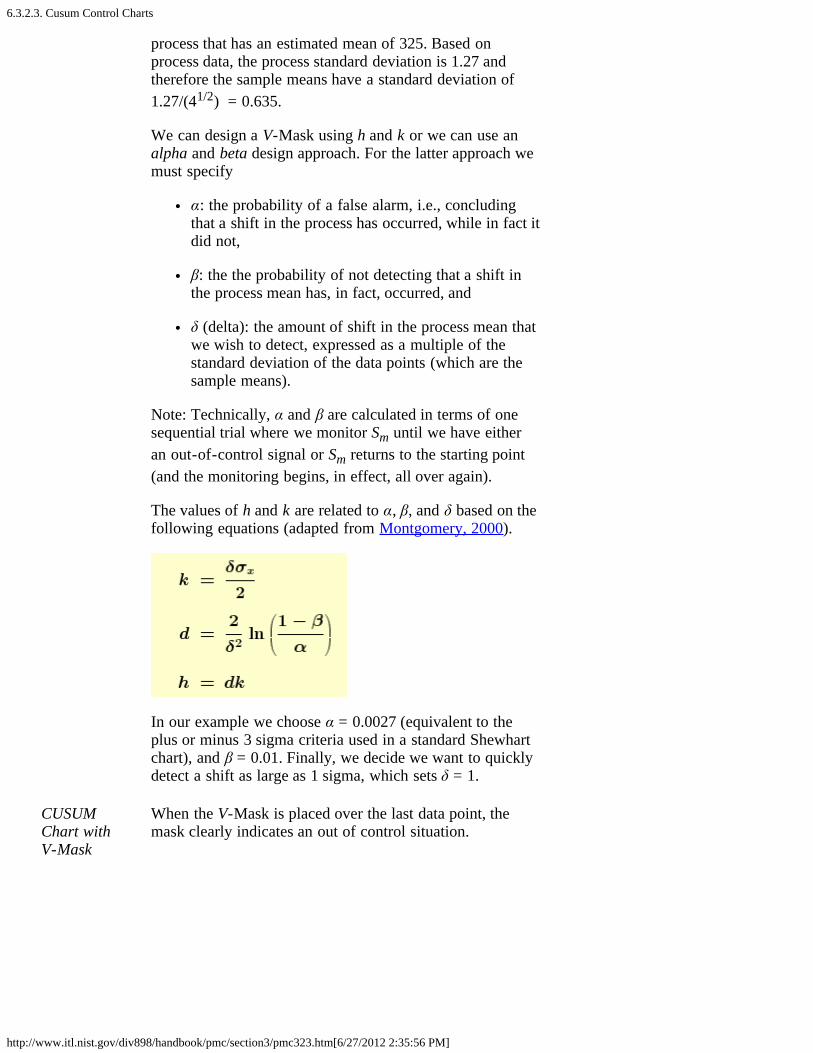
6.3.2.3. Cusum Control Charts
http://www.itl.nist.gov/div898/handbook/pmc/section3/pmc323.htm[6/27/2012 2:35:56 PM]
process that has an estimated mean of 325. Based onprocess data, the process standard deviation is 1.27 andtherefore the sample means have a standard deviation of1.27/(41/2) = 0.635.
We can design a V-Mask using h and k or we can use analpha and beta design approach. For the latter approach wemust specify
α: the probability of a false alarm, i.e., concludingthat a shift in the process has occurred, while in fact itdid not,
β: the the probability of not detecting that a shift inthe process mean has, in fact, occurred, and
δ (delta): the amount of shift in the process mean thatwe wish to detect, expressed as a multiple of thestandard deviation of the data points (which are thesample means).
Note: Technically, α and β are calculated in terms of onesequential trial where we monitor Sm until we have eitheran out-of-control signal or Sm returns to the starting point(and the monitoring begins, in effect, all over again).
The values of h and k are related to α, β, and δ based on thefollowing equations (adapted from Montgomery, 2000).
In our example we choose α = 0.0027 (equivalent to theplus or minus 3 sigma criteria used in a standard Shewhartchart), and β = 0.01. Finally, we decide we want to quicklydetect a shift as large as 1 sigma, which sets δ = 1.
CUSUMChart withV-Mask
When the V-Mask is placed over the last data point, themask clearly indicates an out of control situation.

6.3.2.3. Cusum Control Charts
http://www.itl.nist.gov/div898/handbook/pmc/section3/pmc323.htm[6/27/2012 2:35:56 PM]
CUSUMchart aftermoving V-Mask to firstout of controlpoint
We next move the V-Mask and back to the first point thatindicated the process was out of control. This is pointnumber 14, as shown below.
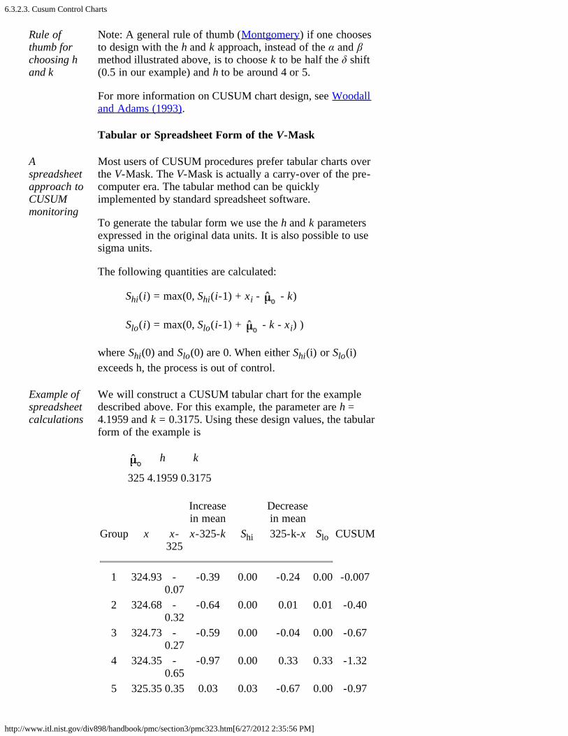
6.3.2.3. Cusum Control Charts
http://www.itl.nist.gov/div898/handbook/pmc/section3/pmc323.htm[6/27/2012 2:35:56 PM]
Rule ofthumb forchoosing hand k
Note: A general rule of thumb (Montgomery) if one choosesto design with the h and k approach, instead of the α and βmethod illustrated above, is to choose k to be half the δ shift(0.5 in our example) and h to be around 4 or 5.
For more information on CUSUM chart design, see Woodalland Adams (1993).
Tabular or Spreadsheet Form of the V-Mask
Aspreadsheetapproach toCUSUMmonitoring
Most users of CUSUM procedures prefer tabular charts overthe V-Mask. The V-Mask is actually a carry-over of the pre-computer era. The tabular method can be quicklyimplemented by standard spreadsheet software.
To generate the tabular form we use the h and k parametersexpressed in the original data units. It is also possible to usesigma units.
The following quantities are calculated:
Shi(i) = max(0, Shi(i-1) + xi - - k)
Slo(i) = max(0, Slo(i-1) + - k - xi) )
where Shi(0) and Slo(0) are 0. When either Shi(i) or Slo(i)exceeds h, the process is out of control.
Example ofspreadsheetcalculations
We will construct a CUSUM tabular chart for the exampledescribed above. For this example, the parameter are h =4.1959 and k = 0.3175. Using these design values, the tabularform of the example is
h k
325 4.1959 0.3175
Increasein mean
Decreasein mean
Group x x-325
x-325-k Shi 325-k-x Slo CUSUM
1 324.93 -0.07
-0.39 0.00 -0.24 0.00 -0.007
2 324.68 -0.32
-0.64 0.00 0.01 0.01 -0.40
3 324.73 -0.27
-0.59 0.00 -0.04 0.00 -0.67
4 324.35 -0.65
-0.97 0.00 0.33 0.33 -1.32
5 325.35 0.35 0.03 0.03 -0.67 0.00 -0.97
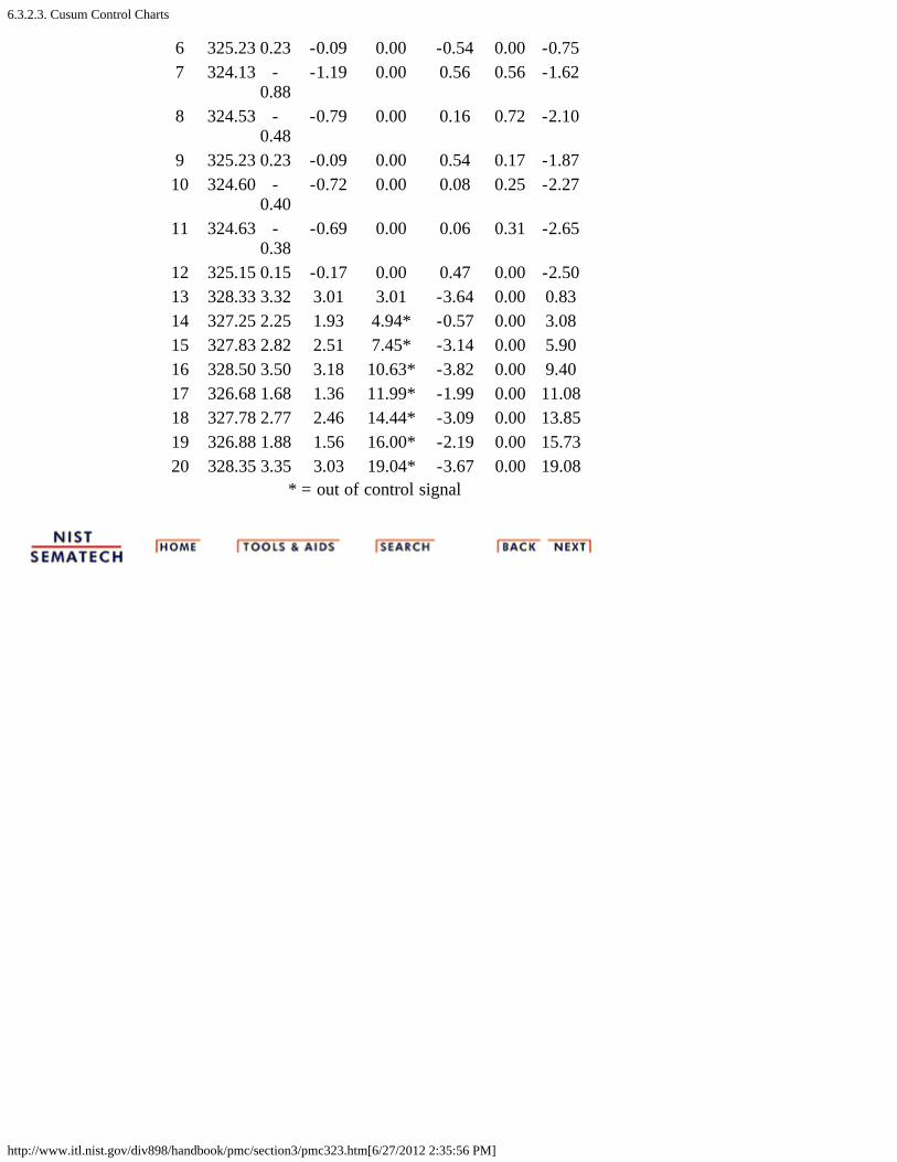
6.3.2.3. Cusum Control Charts
http://www.itl.nist.gov/div898/handbook/pmc/section3/pmc323.htm[6/27/2012 2:35:56 PM]
6 325.23 0.23 -0.09 0.00 -0.54 0.00 -0.757 324.13 -
0.88-1.19 0.00 0.56 0.56 -1.62
8 324.53 -0.48
-0.79 0.00 0.16 0.72 -2.10
9 325.23 0.23 -0.09 0.00 0.54 0.17 -1.8710 324.60 -
0.40-0.72 0.00 0.08 0.25 -2.27
11 324.63 -0.38
-0.69 0.00 0.06 0.31 -2.65
12 325.15 0.15 -0.17 0.00 0.47 0.00 -2.5013 328.33 3.32 3.01 3.01 -3.64 0.00 0.8314 327.25 2.25 1.93 4.94* -0.57 0.00 3.0815 327.83 2.82 2.51 7.45* -3.14 0.00 5.9016 328.50 3.50 3.18 10.63* -3.82 0.00 9.4017 326.68 1.68 1.36 11.99* -1.99 0.00 11.0818 327.78 2.77 2.46 14.44* -3.09 0.00 13.8519 326.88 1.88 1.56 16.00* -2.19 0.00 15.7320 328.35 3.35 3.03 19.04* -3.67 0.00 19.08
* = out of control signal
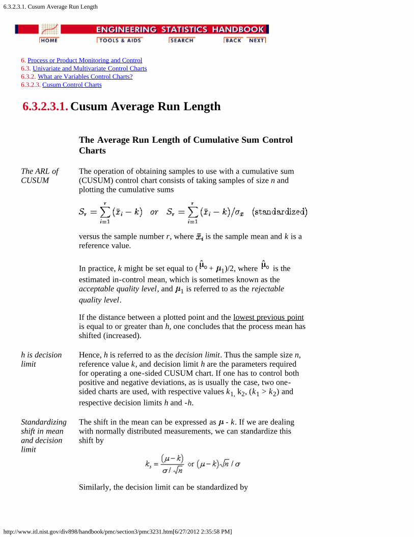
6.3.2.3.1. Cusum Average Run Length
http://www.itl.nist.gov/div898/handbook/pmc/section3/pmc3231.htm[6/27/2012 2:35:58 PM]
6. Process or Product Monitoring and Control 6.3. Univariate and Multivariate Control Charts 6.3.2. What are Variables Control Charts? 6.3.2.3. Cusum Control Charts
6.3.2.3.1. Cusum Average Run Length
The Average Run Length of Cumulative Sum ControlCharts
The ARL ofCUSUM
The operation of obtaining samples to use with a cumulative sum(CUSUM) control chart consists of taking samples of size n andplotting the cumulative sums
versus the sample number r, where is the sample mean and k is areference value.
In practice, k might be set equal to ( + 1)/2, where is theestimated in-control mean, which is sometimes known as theacceptable quality level, and 1 is referred to as the rejectablequality level.
If the distance between a plotted point and the lowest previous pointis equal to or greater than h, one concludes that the process mean hasshifted (increased).
h is decisionlimit
Hence, h is referred to as the decision limit. Thus the sample size n,reference value k, and decision limit h are the parameters requiredfor operating a one-sided CUSUM chart. If one has to control bothpositive and negative deviations, as is usually the case, two one-sided charts are used, with respective values k1, k2, (k1 > k2) andrespective decision limits h and -h.
Standardizingshift in meanand decisionlimit
The shift in the mean can be expressed as - k. If we are dealingwith normally distributed measurements, we can standardize thisshift by
Similarly, the decision limit can be standardized by

6.3.2.3.1. Cusum Average Run Length
http://www.itl.nist.gov/div898/handbook/pmc/section3/pmc3231.htm[6/27/2012 2:35:58 PM]
Determinationof the ARL,given h and k
The average run length (ARL) at a given quality level is the averagenumber of samples (subgroups) taken before an action signal isgiven. The standardized parameters ks and hs together with thesample size n are usually selected to yield approximate ARL's L0 andL1 at acceptable and rejectable quality levels 0 and 1 respectively.We would like to see a high ARL, L0, when the process is on target,(i.e. in control), and a low ARL, L1, when the process mean shifts toan unsatisfactory level.
In order to determine the parameters of a CUSUM chart, theacceptable and rejectable quality levels along with the desiredrespective ARL ' s are usually specified. The design parameters canthen be obtained by a number of ways. Unfortunately, thecalculations of the ARL for CUSUM charts are quite involved.
There are several nomographs available from different sources thatcan be utilized to find the ARL's when the standardized h and k aregiven. Some of the nomographs solve the unpleasant integralequations that form the basis of the exact solutions, using anapproximation of Systems of Linear Algebraic Equations (SLAE).This Handbook used a computer program that furnished the requiredARL's given the standardized h and k. An example is given below:
Example offinding ARL'sgiven thestandardizedh and k
mean shift Shewart(k = .5) 4 5
0 336 930 371.00.25 74.2 140 281.14.5 26.6 30.0 155.22.75 13.3 17.0 81.221.00 8.38 10.4 44.01.50 4.75 5.75 14.972.00 3.34 4.01 6.302.50 2.62 3.11 3.243.00 2.19 2.57 2.004.00 1.71 2.01 1.19
Using thetable
If k = .5, then the shift of the mean (in multiples of the standarddeviation of the mean) is obtained by adding .5 to the first column.For example to detect a mean shift of 1 sigma at h = 4, the ARL =8.38. (at first column entry of .5).
The last column of the table contains the ARL's for a Shewhartcontrol chart at selected mean shifts. The ARL for Shewhart = 1/p,where p is the probability for a point to fall outside established

6.3.2.3.1. Cusum Average Run Length
http://www.itl.nist.gov/div898/handbook/pmc/section3/pmc3231.htm[6/27/2012 2:35:58 PM]
control limits. Thus, for 3-sigma control limits and assumingnormality, the probability to exceed the upper control limit = .00135and to fall below the lower control limit is also .00135 and their sum= .0027. (These numbers come from standard normal distributiontables or computer programs, setting z = 3). Then the ARL = 1/.0027= 370.37. This says that when a process is in control one expects anout-of-control signal (false alarm) each 371 runs.
ARL if a 1sigma shifthas occurred
When the means shifts up by 1 sigma, then the distance between theupper control limit and the shifted mean is 2 sigma (instead of 3 ).Entering normal distribution tables with z = 2 yields a probability ofp = .02275 to exceed this value. The distance between the shiftedmean and the lower limit is now 4 sigma and the probability of <-4 is only .000032 and can be ignored. The ARL is 1 / .02275 =43.96 .
Shewhart isbetter fordetectinglarge shifts,CUSUM isfaster forsmall shifts
The conclusion can be drawn that the Shewhart chart is superior fordetecting large shifts and the CUSUM scheme is faster for smallshifts. The break-even point is a function of h, as the table shows.
6.3.2.4. EWMA Control Charts
http://www.itl.nist.gov/div898/handbook/pmc/section3/pmc324.htm[6/27/2012 2:35:59 PM]
6. Process or Product Monitoring and Control 6.3. Univariate and Multivariate Control Charts 6.3.2. What are Variables Control Charts?
6.3.2.4. EWMA Control Charts
EWMAstatistic
The Exponentially Weighted Moving Average (EWMA) is astatistic for monitoring the process that averages the data in away that gives less and less weight to data as they are furtherremoved in time.
Comparisonof Shewhartcontrolchart andEWMAcontrolcharttechniques
For the Shewhart chart control technique, the decisionregarding the state of control of the process at any time, t,depends solely on the most recent measurement from theprocess and, of course, the degree of 'trueness' of theestimates of the control limits from historical data. For theEWMA control technique, the decision depends on theEWMA statistic, which is an exponentially weighted averageof all prior data, including the most recent measurement.
By the choice of weighting factor, , the EWMA controlprocedure can be made sensitive to a small or gradual drift inthe process, whereas the Shewhart control procedure can onlyreact when the last data point is outside a control limit.
Definitionof EWMA
The statistic that is calculated is:
EWMAt = Yt + ( 1- ) EWMAt-1 for t = 1, 2, ..., n.
where
EWMA0 is the mean of historical data (target)Yt is the observation at time tn is the number of observations to be monitoredincluding EWMA00 < 1 is a constant that determines the depth ofmemory of the EWMA.
The equation is due to Roberts (1959).
Choice ofweightingfactor
The parameter determines the rate at which 'older' dataenter into the calculation of the EWMA statistic. A value of = 1 implies that only the most recent measurement influencesthe EWMA (degrades to Shewhart chart). Thus, a large valueof = 1 gives more weight to recent data and less weight toolder data; a small value of gives more weight to olderdata. The value of is usually set between 0.2 and 0.3
6.3.2.4. EWMA Control Charts
http://www.itl.nist.gov/div898/handbook/pmc/section3/pmc324.htm[6/27/2012 2:35:59 PM]
(Hunter) although this choice is somewhat arbitrary. Lucasand Saccucci (1990) give tables that help the user select .
Variance ofEWMAstatistic
The estimated variance of the EWMA statistic isapproximately
s2ewma = ( /(2- )) s2
when t is not small, where s is the standard deviationcalculated from the historical data.
Definitionof controllimits forEWMA
The center line for the control chart is the target value orEWMA0. The control limits are:
UCL = EWMA0 + ksewma LCL = EWMA0 - ksewma
where the factor k is either set equal 3 or chosen using theLucas and Saccucci (1990) tables. The data are assumed tobe independent and these tables also assume a normalpopulation.
As with all control procedures, the EWMA proceduredepends on a database of measurements that are trulyrepresentative of the process. Once the mean value andstandard deviation have been calculated from this database,the process can enter the monitoring stage, provided theprocess was in control when the data were collected. If not,then the usual Phase 1 work would have to be completedfirst.
Example ofcalculationofparametersfor anEWMAcontrolchart
To illustrate the construction of an EWMA control chart,consider a process with the following parameters calculatedfrom historical data:
EWMA0 = 50 s = 2.0539
with chosen to be 0.3 so that / (2- ) = .3 / 1.7 = 0.1765and the square root = 0.4201. The control limits are given by
UCL = 50 + 3 (0.4201)(2.0539) = 52.5884 LCL = 50 - 3 (0.4201) (2.0539) = 47.4115
Sampledata
Consider the following data consisting of 20 points where 1 -10 are on the top row from left to right and 11-20 are on thebottom row from left to right:
52.0 47.0 53.0 49.3 50.1 47.0 51.0 50.1 51.2 50.5 49.6 47.6 49.9 51.3 47.8 51.2 52.6 52.4 53.6 52.1
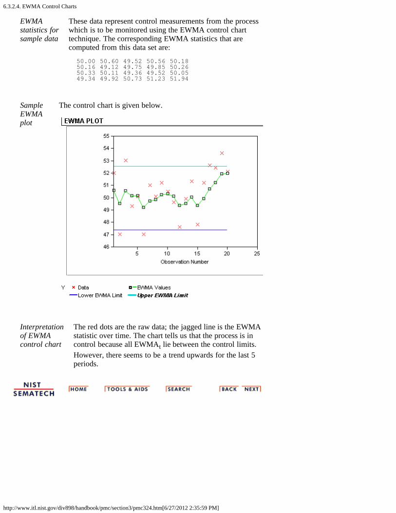
6.3.2.4. EWMA Control Charts
http://www.itl.nist.gov/div898/handbook/pmc/section3/pmc324.htm[6/27/2012 2:35:59 PM]
EWMAstatistics forsample data
These data represent control measurements from the processwhich is to be monitored using the EWMA control charttechnique. The corresponding EWMA statistics that arecomputed from this data set are:
50.00 50.60 49.52 50.56 50.18 50.16 49.12 49.75 49.85 50.26 50.33 50.11 49.36 49.52 50.05 49.34 49.92 50.73 51.23 51.94
SampleEWMAplot
The control chart is given below.
Interpretationof EWMAcontrol chart
The red dots are the raw data; the jagged line is the EWMAstatistic over time. The chart tells us that the process is incontrol because all EWMAt lie between the control limits.However, there seems to be a trend upwards for the last 5periods.

6.3.3. What are Attributes Control Charts?
http://www.itl.nist.gov/div898/handbook/pmc/section3/pmc33.htm[6/27/2012 2:36:00 PM]
6. Process or Product Monitoring and Control 6.3. Univariate and Multivariate Control Charts
6.3.3. What are Attributes Control Charts?
Attributesdata arisewhenclassifyingor countingobservations
The Shewhart control chart plots quality characteristics thatcan be measured and expressed numerically. We measureweight, height, position, thickness, etc. If we cannotrepresent a particular quality characteristic numerically, or ifit is impractical to do so, we then often resort to using aquality characteristic to sort or classify an item that isinspected into one of two "buckets".
An example of a common quality characteristic classificationwould be designating units as "conforming units" or"nonconforming units". Another quality characteristic criteriawould be sorting units into "non defective" and "defective"categories. Quality characteristics of that type are calledattributes.
Note that there is a difference between "nonconforming to anengineering specification" and "defective" -- anonconforming unit may function just fine and be, in fact,not defective at all, while a part can be "in spec" and notfucntion as desired (i.e., be defective).
Examples of quality characteristics that are attributes are thenumber of failures in a production run, the proportion ofmalfunctioning wafers in a lot, the number of people eatingin the cafeteria on a given day, etc.
Types ofattributecontrolcharts
Control charts dealing with the number of defects ornonconformities are called c charts (for count).
Control charts dealing with the proportion or fraction ofdefective product are called p charts (for proportion).
There is another chart which handles defects per unit, calledthe u chart (for unit). This applies when we wish to workwith the average number of nonconformities per unit ofproduct.
For additional references, see Woodall (1997) which reviewspapers showing examples of attribute control charting,including examples from semiconductor manufacturing suchas those examining the spatial depencence of defects.

6.3.3. What are Attributes Control Charts?
http://www.itl.nist.gov/div898/handbook/pmc/section3/pmc33.htm[6/27/2012 2:36:00 PM]
6.3.3.1. Counts Control Charts
http://www.itl.nist.gov/div898/handbook/pmc/section3/pmc331.htm[6/27/2012 2:36:01 PM]
6. Process or Product Monitoring and Control 6.3. Univariate and Multivariate Control Charts 6.3.3. What are Attributes Control Charts?
6.3.3.1. Counts Control Charts
Defectiveitems vsindividualdefects
The literature differentiates between defect and defective,which is the same as differentiating betweennonconformity and nonconforming units. This may soundlike splitting hairs, but in the interest of clarity let's try tounravel this man-made mystery.
Consider a wafer with a number of chips on it. The waferis referred to as an "item of a product". The chip may bereferred to as "a specific point". There exist certainspecifications for the wafers. When a particular wafer (e.g.,the item of the product) does not meet at least one of thespecifications, it is classified as a nonconforming item.Furthermore, each chip, (e.g., the specific point) at which aspecification is not met becomes a defect ornonconformity.
So, a nonconforming or defective item contains at leastone defect or nonconformity. It should be pointed out thata wafer can contain several defects but still be classified asconforming. For example, the defects may be located atnoncritical positions on the wafer. If, on the other hand, thenumber of the so-called "unimportant" defects becomesalarmingly large, an investigation of the production ofthese wafers is warranted.
Control charts involving counts can be either for the totalnumber of nonconformities (defects) for the sample ofinspected units, or for the average number of defects perinspection unit.
Poissonapproximationfor numbersor counts ofdefects
Let us consider an assembled product such as amicrocomputer. The opportunity for the occurrence of anygiven defect may be quite large. However, the probabilityof occurrence of a defect in any one arbitrarily chosen spotis likely to be very small. In such a case, the incidence ofdefects might be modeled by a Poisson distribution.Actually, the Poisson distribution is an approximation ofthe binomial distribution and applies well in this capacityaccording to the following rule of thumb:
The sample size n should be equal to or largerthan 20 and the probability of a single success,

6.3.3.1. Counts Control Charts
http://www.itl.nist.gov/div898/handbook/pmc/section3/pmc331.htm[6/27/2012 2:36:01 PM]
p, should be smaller than or equal to .05. If n 100, the approximation is excellent if np is
also 10.
IllustratePoissonapproximationto binomial
To illustrate the use of the Poisson distribution as anapproximation of a binomial distribution, consider thefollowing comparison: Let p, the probability of a singlesuccess in n = 200 trials, be .025.
Find the probability of exactly 3 successes. If we assumethat p remains constant then the solution follows thebinomial distribution rules, that is:
By the Poisson approximation we have
and
The inspectionunit
Before the control chart parameters are defined there is onemore definition: the inspection unit. We shall count thenumber of defects that occur in a so-called inspection unit.More often than not, an inspection unit is a single unit oritem of product; for example, a wafer. However,sometimes the inspection unit could consist of five wafers,or ten wafers and so on. The size of the inspection unitsmay depend on the recording facility, measuringequipment, operators, etc.
Suppose that defects occur in a given inspection unitaccording to the Poisson distribution, with parameter c(often denoted by np or the Greek letter ). In other words
Control chartsfor counts,using thePoissondistribution
where x is the number of defects and c > 0 is the parameterof the Poisson distribution. It is known that both the meanand the variance of this distribution are equal to c. Thenthe k-sigma control chart is
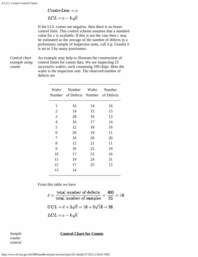
6.3.3.1. Counts Control Charts
http://www.itl.nist.gov/div898/handbook/pmc/section3/pmc331.htm[6/27/2012 2:36:01 PM]
If the LCL comes out negative, then there is no lowercontrol limit. This control scheme assumes that a standardvalue for c is available. If this is not the case then c maybe estimated as the average of the number of defects in apreliminary sample of inspection units, call it . Usually kis set to 3 by many practioners.
Control chartexample usingcounts
An example may help to illustrate the construction ofcontrol limits for counts data. We are inspecting 25successive wafers, each containing 100 chips. Here thewafer is the inspection unit. The observed number ofdefects are
Wafer Number Wafer NumberNumber of Defects Number of Defects
1 16 14 162 14 15 153 28 16 134 16 17 145 12 18 166 20 19 117 10 20 208 12 21 119 10 22 19
10 17 23 1611 19 24 3112 17 25 1313 14
From this table we have
Samplecountscontrol
Control Chart for Counts

6.3.3.1. Counts Control Charts
http://www.itl.nist.gov/div898/handbook/pmc/section3/pmc331.htm[6/27/2012 2:36:01 PM]
chart
Transforming Poisson Data
Normalapproximationto Poisson isadequatewhen themean of thePoisson is atleast 5
We have seen that the 3-sigma limits for a c chart, where crepresents the number of nonconformities, are given by
where it is assumed that the normal approximation to thePoisson distribution holds, hence the symmetry of thecontrol limits. It is shown in the literature that the normalapproximation to the Poisson is adequate when the mean ofthe Poisson is at least 5. When applied to the c chart thisimplies that the mean of the defects should be at least 5.This requirement will often be met in practice, but still,when the mean is smaller than 9 (solving the aboveequation) there will be no lower control limit.
Let the mean be 10. Then the lower control limit = 0.513.However, P(c = 0) = .000045, using the Poisson formula.This is only 1/30 of the assumed area of .00135. So onehas to raise the lower limit so as to get as close as possibleto .00135. From Poisson tables or computer software wefind that P(1) = .0005 and P(2) = .0027, so the lower limitshould actually be 2 or 3.
Transformingcount dataintoapproximatelynormal data
To avoid this type of problem, we may resort to atransformation that makes the transformed data match thenormal distribution better. One such transformationdescribed by Ryan (2000) is
which is, for a large sample, approximately normallydistributed with mean = 2 and variace = 1, where is
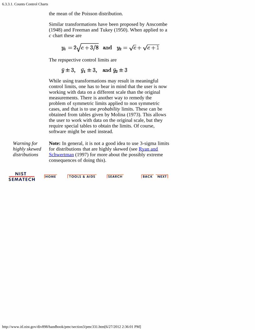
6.3.3.1. Counts Control Charts
http://www.itl.nist.gov/div898/handbook/pmc/section3/pmc331.htm[6/27/2012 2:36:01 PM]
the mean of the Poisson distribution.
Similar transformations have been proposed by Anscombe(1948) and Freeman and Tukey (1950). When applied to ac chart these are
The repspective control limits are
While using transformations may result in meaningfulcontrol limits, one has to bear in mind that the user is nowworking with data on a different scale than the originalmeasurements. There is another way to remedy theproblem of symmetric limits applied to non symmetriccases, and that is to use probability limits. These can beobtained from tables given by Molina (1973). This allowsthe user to work with data on the original scale, but theyrequire special tables to obtain the limits. Of course,software might be used instead.
Warning forhighly skeweddistributions
Note: In general, it is not a good idea to use 3-sigma limitsfor distributions that are highly skewed (see Ryan andSchwertman (1997) for more about the possibly extremeconsequences of doing this).

6.3.3.2. Proportions Control Charts
http://www.itl.nist.gov/div898/handbook/pmc/section3/pmc332.htm[6/27/2012 2:36:02 PM]
6. Process or Product Monitoring and Control 6.3. Univariate and Multivariate Control Charts 6.3.3. What are Attributes Control Charts?
6.3.3.2. Proportions Control Charts
p is thefractiondefective ina lot orpopulation
The proportion or fraction nonconforming (defective) in apopulation is defined as the ratio of the number ofnonconforming items in the population to the total number ofitems in that population. The item under consideration mayhave one or more quality characteristics that are inspectedsimultaneously. If at least one of the characteristics does notconform to standard, the item is classified as nonconforming.
The fraction or proportion can be expressed as a decimal, or,when multiplied by 100, as a percent. The underlyingstatistical principles for a control chart for proportionnonconforming are based on the binomial distribution.
Let us suppose that the production process operates in a stablemanner, such that the probability that a given unit will notconform to specifications is p. Furthermore, we assume thatsuccessive units produced are independent. Under theseconditions, each unit that is produced is a realization of aBernoulli random variable with parameter p. If a randomsample of n units of product is selected and if D is the numberof units that are nonconforming, the D follows a binomialdistribution with parameters n and p
Thebinomialdistributionmodel fornumber ofdefectivesin a sample The mean of D is np and the variance is np(1-p). The sample
proportion nonconforming is the ratio of the number ofnonconforming units in the sample, D, to the sample size n,
The mean and variance of this estimator are
and
6.3.3.2. Proportions Control Charts
http://www.itl.nist.gov/div898/handbook/pmc/section3/pmc332.htm[6/27/2012 2:36:02 PM]
This background is sufficient to develop the control chart forproportion or fraction nonconforming. The chart is called thep-chart.
p controlcharts forlotproportiondefective
If the true fraction conforming p is known (or a standardvalue is given), then the center line and control limits of thefraction nonconforming control chart is
When the process fraction (proportion) p is not known, itmust be estimated from the available data. This isaccomplished by selecting m preliminary samples, each ofsize n. If there are Di defectives in sample i, the fractionnonconforming in sample i is
and the average of these individuals sample fractions is
The is used instead of p in the control chart setup.
Example ofa p-chart
A numerical example will now be given to illustrate the abovementioned principles. The location of chips on a wafer ismeasured on 30 wafers.
On each wafer 50 chips are measured and a defective isdefined whenever a misregistration, in terms of horizontaland/or vertical distances from the center, is recorded. Theresults are
Sample Fraction Sample Fraction Sample FractionNumber Defectives Number Defectives Number Defectives
1 .24 11 .10 21 .402 .30 12 .12 22 .363 .16 13 .34 23 .484 .20 14 .24 24 .30

6.3.3.2. Proportions Control Charts
http://www.itl.nist.gov/div898/handbook/pmc/section3/pmc332.htm[6/27/2012 2:36:02 PM]
5 .08 15 .44 25 .186 .14 16 .16 26 .247 .32 17 .20 27 .148 .18 18 .10 28 .269 .28 19 .26 29 .1810 .20 20 .22 30 .12
Sampleproportionscontrolchart
The corresponding control chart is given below:

6.3.4. What are Multivariate Control Charts?
http://www.itl.nist.gov/div898/handbook/pmc/section3/pmc34.htm[6/27/2012 2:36:03 PM]
6. Process or Product Monitoring and Control 6.3. Univariate and Multivariate Control Charts
6.3.4. What are Multivariate Control Charts?
Multivariatecontrolcharts andHotelling's T 2 statistic
It is a fact of life that most data are naturally multivariate.Hotelling in 1947 introduced a statistic which uniquely lendsitself to plotting multivariate observations. This statistic,appropriately named Hotelling's T 2, is a scalar that combinesinformation from the dispersion and mean of several variables.Due to the fact that computations are laborious and fairlycomplex and require some knowledge of matrix algebra,acceptance of multivariate control charts by industry was slowand hesitant.
Multivariatecontrolcharts nowmoreaccessible
Nowadays, modern computers in general and the PC inparticular have made complex calculations accessible andduring the last decade, multivariate control charts were givenmore attention. In fact, the multivariate charts which display theHotelling T 2 statistic became so popular that they sometimesare called Shewhart charts as well (e.g., Crosier, 1988),although Shewhart had nothing to do with them.
Hotellingcharts forboth meansanddispersion
As in the univariate case, when data are grouped, the T 2 chartcan be paired with a chart that displays a measure of variabilitywithin the subgroups for all the analyzed characteristics. Thecombined T 2 and (dispersion) charts are thus a multivariatecounterpart of the univariate and S (or and R) charts.
Hotellingmean anddispersioncontrolcharts
An example of a Hotelling T 2 and pair of charts is givenbelow:
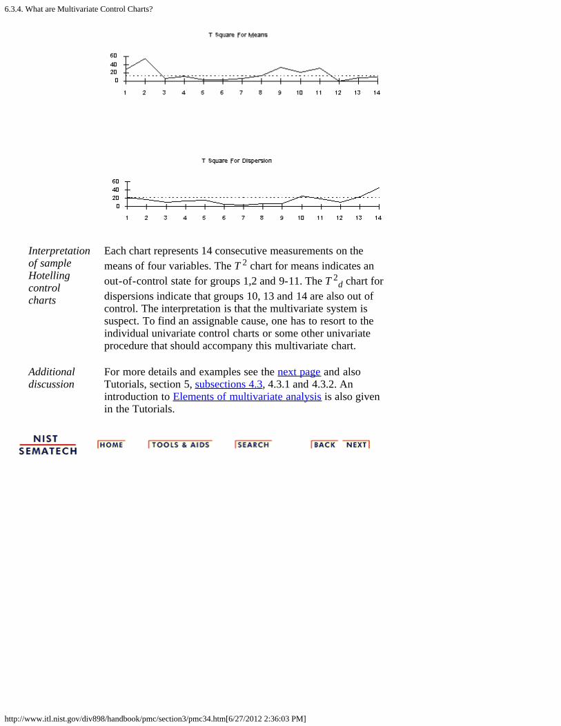
6.3.4. What are Multivariate Control Charts?
http://www.itl.nist.gov/div898/handbook/pmc/section3/pmc34.htm[6/27/2012 2:36:03 PM]
Interpretationof sampleHotellingcontrolcharts
Each chart represents 14 consecutive measurements on themeans of four variables. The T 2 chart for means indicates anout-of-control state for groups 1,2 and 9-11. The T 2
d chart fordispersions indicate that groups 10, 13 and 14 are also out ofcontrol. The interpretation is that the multivariate system issuspect. To find an assignable cause, one has to resort to theindividual univariate control charts or some other univariateprocedure that should accompany this multivariate chart.
Additionaldiscussion
For more details and examples see the next page and alsoTutorials, section 5, subsections 4.3, 4.3.1 and 4.3.2. Anintroduction to Elements of multivariate analysis is also givenin the Tutorials.
6.3.4.1. Hotelling Control Charts
http://www.itl.nist.gov/div898/handbook/pmc/section3/pmc341.htm[6/27/2012 2:36:04 PM]
6. Process or Product Monitoring and Control 6.3. Univariate and Multivariate Control Charts 6.3.4. What are Multivariate Control Charts?
6.3.4.1. Hotelling Control Charts
DefinitionofHotelling'sT 2
"distance"statistic
The Hotelling T 2 distance is a measure that accounts for thecovariance structure of a multivariate normal distribution. Itwas proposed by Harold Hotelling in 1947 and is calledHotelling T 2. It may be thought of as the multivariatecounterpart of the Student's-t statistic.
The T 2 distance is a constant multiplied by a quadratic form.This quadratic form is obtained by multiplying the followingthree quantities:
1. The vector of deviations between theobservations and the mean m, which isexpressed by (X-m)',
2. The inverse of the covariance matrix, S-1,
3. The vector of deviations, (X-m).
It should be mentioned that for independent variables, thecovariance matrix is a diagonal matrix and T 2 becomesproportional to the sum of squared standardized variables.
In general, the higher the T 2 value, the more distant is theobservation from the mean. The formula for computing the T 2
is:
The constant c is the sample size from which the covariancematrix was estimated.
T 2 readilygraphable
The T 2 distances lend themselves readily to graphicaldisplays and as a result the T 2-chart is the most popularamong the multivariate control charts.
Estimation of the Mean and Covariance Matrix
Mean andCovariancematrices
Let X1,...Xn be n p-dimensional vectors of observations thatare sampled independently from Np(m, ) with p < n-1, with
6.3.4.1. Hotelling Control Charts
http://www.itl.nist.gov/div898/handbook/pmc/section3/pmc341.htm[6/27/2012 2:36:04 PM]
the covariance matrix of X. The observed mean vector and the sample dispersion matrix
are the unbiased estimators of m and , respectively.
Additionaldiscussion
See Tutorials (section 5), subsections 4.3, 4.3.1 and 4.3.2 formore details and examples. An introduction to Elements ofmultivariate analysis is also given in the Tutorials.

6.3.4.2. Principal Components Control Charts
http://www.itl.nist.gov/div898/handbook/pmc/section3/pmc342.htm[6/27/2012 2:36:04 PM]
6. Process or Product Monitoring and Control 6.3. Univariate and Multivariate Control Charts 6.3.4. What are Multivariate Control Charts?
6.3.4.2. Principal Components Control Charts
Problemswith T 2
charts
Although the T 2 chart is the most popular, easiest to use andinterpret method for handling multivariate process data, andis beginning to be widely accepted by quality engineers andoperators, it is not a panacea. First, unlike the univariate case,the scale of the values displayed on the chart is not related tothe scales of any of the monitored variables. Secondly, whenthe T 2 statistic exceeds the upper control limit (UCL), theuser does not know which particular variable(s) caused theout-of-control signal.
Rununivariatechartsalong withthemultivariateones
With respect to scaling, we strongly advise to run individualunivariate charts in tandem with the multivariate chart. Thiswill also help in honing in on the culprit(s) that might havecaused the signal. However, individual univariate chartscannot explain situations that are a result of some problemsin the covariance or correlation between the variables. This iswhy a dispersion chart must also be used.
Anotherway tomonitormultivariatedata:PrincipalComponentscontrolcharts
Another way to analyze the data is to use principalcomponents. For each multivariate measurement (orobservation), the principal components are linearcombinations of the standardized p variables (to standardizesubtract their respective targets and divide by their standarddeviations). The principal components have two importantadvantages:
1. the new variables are uncorrelated (or almost)
2. very often, a few (sometimes 1 or 2) principalcomponents may capture most of the variability in thedata so that we do not have to use all of the p principalcomponents for control.
Eigenvalues Unfortunately, there is one big disadvantage: The identity ofthe original variables is lost! However, in some cases thespecific linear combinations corresponding to the principalcomponents with the largest eigenvalues may yieldmeaningful measurement units. What is being used in controlcharts are the principal factors.

6.3.4.2. Principal Components Control Charts
http://www.itl.nist.gov/div898/handbook/pmc/section3/pmc342.htm[6/27/2012 2:36:04 PM]
A principal factor is the principal component divided by thesquare root of its eigenvalue.
Additionaldiscussion
More details and examples are given in the Tutorials (section5).

6.3.4.3. Multivariate EWMA Charts
http://www.itl.nist.gov/div898/handbook/pmc/section3/pmc343.htm[6/27/2012 2:36:05 PM]
6. Process or Product Monitoring and Control 6.3. Univariate and Multivariate Control Charts 6.3.4. What are Multivariate Control Charts?
6.3.4.3. Multivariate EWMA Charts
Multivariate EWMA Control Chart
UnivariateEWMAmodel
The model for a univariate EWMA chart is given by:
where Zi is the ith EWMA, Xi is the the ith observation, Z0 isthe average from the historical data, and 0 < 1.
MultivariateEWMAmodel
In the multivariate case, one can extend this formula to
where Zi is the ith EWMA vector, Xi is the the ithobservation vector i = 1, 2, ..., n, Z0 is the vector of variablevalues from the historical data, is the diag( 1, 2, ... , p)which is a diagonal matrix with 1, 2, ... , p on the maindiagonal, and p is the number of variables; that is the numberof elements in each vector.
Illustration ofmultivariateEWMA
The following illustration may clarify this. There are pvariables and each variable contains n observations. Theinput data matrix looks like:
The quantity to be plotted on the control chart is
6.3.4.3. Multivariate EWMA Charts
http://www.itl.nist.gov/div898/handbook/pmc/section3/pmc343.htm[6/27/2012 2:36:05 PM]
Simplification It has been shown (Lowry et al., 1992) that the (k,l)thelement of the covariance matrix of the ith EWMA, , is
where is the (k,l)th element of , the covariance matrixof the X's.
If 1 = 2 = ... = p = , then the above expression simplifiesto
where is the covariance matrix of the input data.
Furthersimplification
There is a further simplification. When i becomes large, thecovariance matrix may be expressed as:
The question is "What is large?". When we examine theformula with the 2i in it, we observe that when 2i becomessufficiently large such that (1 - ) 2i becomes almost zero,then we can use the simplified formula.
Table forselectedvalues of and i
The following table gives the values of (1- ) 2i for selectedvalues of and i.
2i1 - 4 6 8 10 12 20 30 40 50
.9 .656 .531 .430 .349 .282 .122 .042 .015 .005
.8 .410 .262 .168 .107 .069 .012 .001 .000 .000
.7 .240 .118 .058 .028 .014 .001 .000 .000 .000
.6 .130 .047 .017 .006 .002 .000 .000 .000 .000
.5 .063 .016 .004 .001 .000 .000 .000 .000 .000
.4 .026 .004 .001 .000 .000 .000 .000 .000 .000
.3 .008 .001 .000 .000 .000 .000 .000 .000 .000
.2 .002 .000 .000 .000 .000 .000 .000 .000 .000
.1 .000 .000 .000 .000 .000 .000 .000 .000 .000
Simplifiedformuala notrequired
It should be pointed out that a well-meaning computerprogram does not have to adhere to the simplified formula,and potential inaccuracies for low values for and i can thus
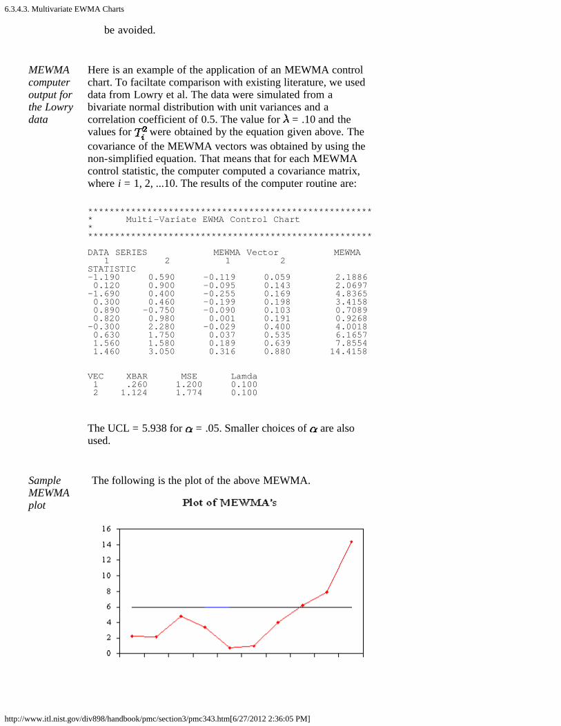
6.3.4.3. Multivariate EWMA Charts
http://www.itl.nist.gov/div898/handbook/pmc/section3/pmc343.htm[6/27/2012 2:36:05 PM]
be avoided.
MEWMAcomputeroutput forthe Lowrydata
Here is an example of the application of an MEWMA controlchart. To faciltate comparison with existing literature, we useddata from Lowry et al. The data were simulated from abivariate normal distribution with unit variances and acorrelation coefficient of 0.5. The value for = .10 and thevalues for were obtained by the equation given above. Thecovariance of the MEWMA vectors was obtained by using thenon-simplified equation. That means that for each MEWMAcontrol statistic, the computer computed a covariance matrix,where i = 1, 2, ...10. The results of the computer routine are:
****************************************************** Multi-Variate EWMA Control Chart ******************************************************
DATA SERIES MEWMA Vector MEWMA 1 2 1 2 STATISTIC-1.190 0.590 -0.119 0.059 2.1886 0.120 0.900 -0.095 0.143 2.0697-1.690 0.400 -0.255 0.169 4.8365 0.300 0.460 -0.199 0.198 3.4158 0.890 -0.750 -0.090 0.103 0.7089 0.820 0.980 0.001 0.191 0.9268-0.300 2.280 -0.029 0.400 4.0018 0.630 1.750 0.037 0.535 6.1657 1.560 1.580 0.189 0.639 7.8554 1.460 3.050 0.316 0.880 14.4158
VEC XBAR MSE Lamda 1 .260 1.200 0.100 2 1.124 1.774 0.100
The UCL = 5.938 for = .05. Smaller choices of are alsoused.
SampleMEWMAplot
The following is the plot of the above MEWMA.

6.3.4.3. Multivariate EWMA Charts
http://www.itl.nist.gov/div898/handbook/pmc/section3/pmc343.htm[6/27/2012 2:36:05 PM]

6.4. Introduction to Time Series Analysis
http://www.itl.nist.gov/div898/handbook/pmc/section4/pmc4.htm[6/27/2012 2:36:06 PM]
6. Process or Product Monitoring and Control
6.4. Introduction to Time Series Analysis
Timeseriesmethodstake intoaccountpossibleinternalstructurein the data
Time series data often arise when monitoring industrialprocesses or tracking corporate business metrics. The essentialdifference between modeling data via time series methods orusing the process monitoring methods discussed earlier in thischapter is the following:
Time series analysis accounts for the fact thatdata points taken over time may have an internalstructure (such as autocorrelation, trend orseasonal variation) that should be accounted for.
This section will give a brief overview of some of the morewidely used techniques in the rich and rapidly growing fieldof time series modeling and analysis.
Contentsfor thissection
Areas covered are:
1. Definitions, Applications and Techniques2. What are Moving Average or Smoothing
Techniques?1. Single Moving Average2. Centered Moving Average
3. What is Exponential Smoothing?1. Single Exponential Smoothing2. Forecasting with Single Exponential
Smoothing3. Double Exponential Smoothing4. Forecasting with Double Exponential
Smoothing5. Triple Exponential Smoothing6. Example of Triple Exponential
Smoothing7. Exponential Smoothing Summary
4. Univariate Time Series Models1. Sample Data Sets2. Stationarity3. Seasonality4. Common Approaches5. Box-Jenkins Approach6. Box-Jenkins Model Identification7. Box-Jenkins Model Estimation8. Box-Jenkins Model Validation9. Example of Univariate Box-Jenkins
Analysis

6.4. Introduction to Time Series Analysis
http://www.itl.nist.gov/div898/handbook/pmc/section4/pmc4.htm[6/27/2012 2:36:06 PM]
10. Box-Jenkins Model Analysis onSeasonal Data
5. Multivariate Time Series Models1. Example of Multivariate Time Series
Analysis
6.4.1. Definitions, Applications and Techniques
http://www.itl.nist.gov/div898/handbook/pmc/section4/pmc41.htm[6/27/2012 2:36:07 PM]
6. Process or Product Monitoring and Control 6.4. Introduction to Time Series Analysis
6.4.1. Definitions, Applications and Techniques
Definition Definition of Time Series: An ordered sequence of values of avariable at equally spaced time intervals.
Timeseriesoccurfrequentlywhenlooking atindustrialdata
Applications: The usage of time series models is twofold:
Obtain an understanding of the underlying forces andstructure that produced the observed dataFit a model and proceed to forecasting, monitoring oreven feedback and feedforward control.
Time Series Analysis is used for many applications such as:
Economic ForecastingSales ForecastingBudgetary AnalysisStock Market AnalysisYield ProjectionsProcess and Quality ControlInventory StudiesWorkload ProjectionsUtility StudiesCensus Analysis
and many, many more...
There aremanymethodsused tomodel andforecasttime series
Techniques: The fitting of time series models can be anambitious undertaking. There are many methods of modelfitting including the following:
Box-Jenkins ARIMA modelsBox-Jenkins Multivariate ModelsHolt-Winters Exponential Smoothing (single, double,triple)
The user's application and preference will decide the selectionof the appropriate technique. It is beyond the realm andintention of the authors of this handbook to cover all thesemethods. The overview presented here will start by looking atsome basic smoothing techniques:
Averaging MethodsExponential Smoothing Techniques.

6.4.1. Definitions, Applications and Techniques
http://www.itl.nist.gov/div898/handbook/pmc/section4/pmc41.htm[6/27/2012 2:36:07 PM]
Later in this section we will discuss the Box-Jenkins modelingmethods and Multivariate Time Series.

6.4.2. What are Moving Average or Smoothing Techniques?
http://www.itl.nist.gov/div898/handbook/pmc/section4/pmc42.htm[6/27/2012 2:36:08 PM]
6. Process or Product Monitoring and Control 6.4. Introduction to Time Series Analysis
6.4.2. What are Moving Average or SmoothingTechniques?
Smoothingdataremovesrandomvariationand showstrends andcycliccomponents
Inherent in the collection of data taken over time is someform of random variation. There exist methods for reducingof canceling the effect due to random variation. An often-used technique in industry is "smoothing". This technique,when properly applied, reveals more clearly the underlyingtrend, seasonal and cyclic components.
There are two distinct groups of smoothing methods
Averaging MethodsExponential Smoothing Methods
Takingaverages isthe simplestway tosmooth data
We will first investigate some averaging methods, such as the"simple" average of all past data.
A manager of a warehouse wants to know how much atypical supplier delivers in 1000 dollar units. He/she takes asample of 12 suppliers, at random, obtaining the followingresults:
Supplier Amount Supplier Amount
1 9 7 112 8 8 73 9 9 134 12 10 95 9 11 116 12 12 10
The computed mean or average of the data = 10. Themanager decides to use this as the estimate for expenditure ofa typical supplier.
Is this a good or bad estimate?
Meansquarederror is away tojudge how
We shall compute the "mean squared error":
The "error" = true amount spent minus the estimatedamount.The "error squared" is the error above, squared.
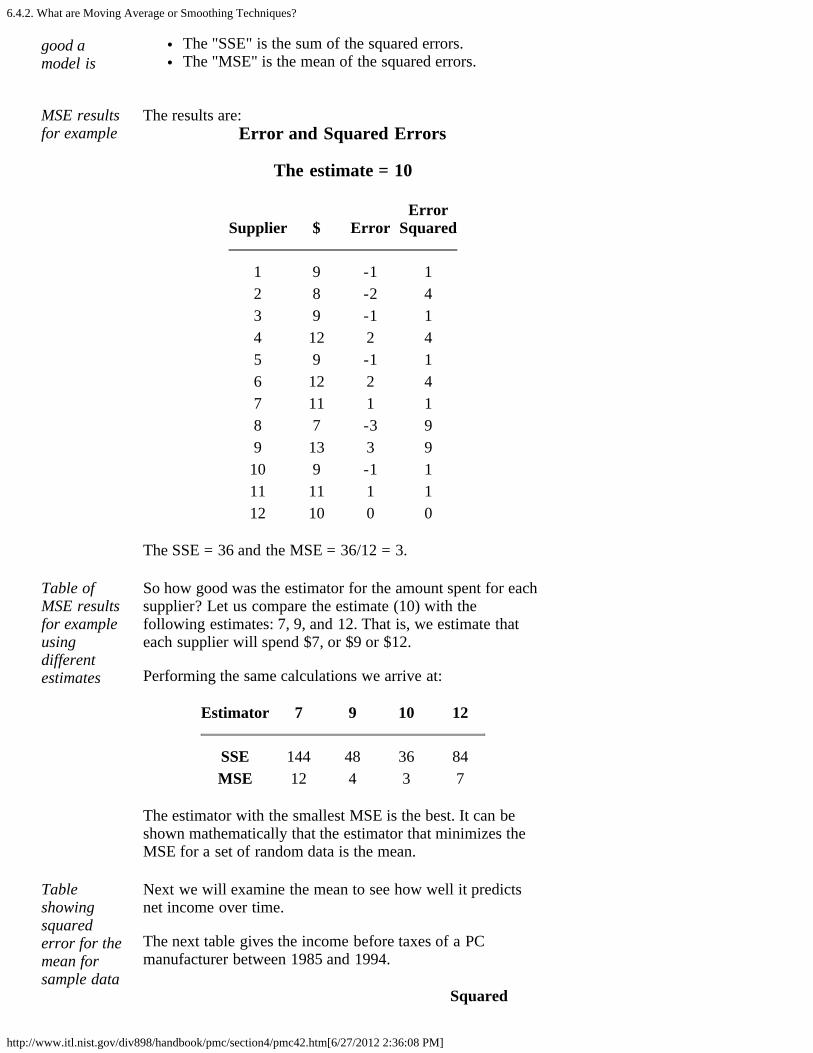
6.4.2. What are Moving Average or Smoothing Techniques?
http://www.itl.nist.gov/div898/handbook/pmc/section4/pmc42.htm[6/27/2012 2:36:08 PM]
good amodel is
The "SSE" is the sum of the squared errors.The "MSE" is the mean of the squared errors.
MSE resultsfor example
The results are:Error and Squared Errors
The estimate = 10
Supplier $ ErrorError
Squared
1 9 -1 12 8 -2 43 9 -1 14 12 2 45 9 -1 16 12 2 47 11 1 18 7 -3 99 13 3 910 9 -1 111 11 1 112 10 0 0
The SSE = 36 and the MSE = 36/12 = 3.
Table ofMSE resultsfor exampleusingdifferentestimates
So how good was the estimator for the amount spent for eachsupplier? Let us compare the estimate (10) with thefollowing estimates: 7, 9, and 12. That is, we estimate thateach supplier will spend $7, or $9 or $12.
Performing the same calculations we arrive at:
Estimator 7 9 10 12
SSE 144 48 36 84MSE 12 4 3 7
The estimator with the smallest MSE is the best. It can beshown mathematically that the estimator that minimizes theMSE for a set of random data is the mean.
Tableshowingsquarederror for themean forsample data
Next we will examine the mean to see how well it predictsnet income over time.
The next table gives the income before taxes of a PCmanufacturer between 1985 and 1994.
Squared

6.4.2. What are Moving Average or Smoothing Techniques?
http://www.itl.nist.gov/div898/handbook/pmc/section4/pmc42.htm[6/27/2012 2:36:08 PM]
Year $ (millions) Mean Error Error
1985 46.163 48.776 -2.613 6.8281986 46.998 48.776 -1.778 3.1611987 47.816 48.776 -0.960 0.9221988 48.311 48.776 -0.465 0.2161989 48.758 48.776 -0.018 0.0001990 49.164 48.776 0.388 0.1511991 49.548 48.776 0.772 0.5961992 48.915 48.776 1.139 1.2971993 50.315 48.776 1.539 2.3691994 50.768 48.776 1.992 3.968
The MSE = 1.9508.
The mean isnot a goodestimatorwhen thereare trends
The question arises: can we use the mean to forecast incomeif we suspect a trend? A look at the graph below showsclearly that we should not do this.
Averageweighs allpastobservationsequally
In summary, we state that
1. The "simple" average or mean of all past observationsis only a useful estimate for forecasting when there areno trends. If there are trends, use different estimatesthat take the trend into account.
2. The average "weighs" all past observations equally. Forexample, the average of the values 3, 4, 5 is 4. Weknow, of course, that an average is computed by addingall the values and dividing the sum by the number ofvalues. Another way of computing the average is byadding each value divided by the number of values, or
3/3 + 4/3 + 5/3 = 1 + 1.3333 + 1.6667 = 4.
The multiplier 1/3 is called the weight. In general:
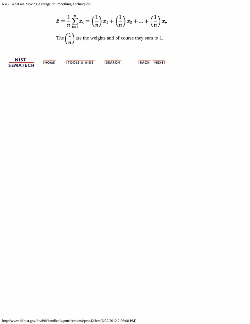
6.4.2. What are Moving Average or Smoothing Techniques?
http://www.itl.nist.gov/div898/handbook/pmc/section4/pmc42.htm[6/27/2012 2:36:08 PM]
The are the weights and of course they sum to 1.
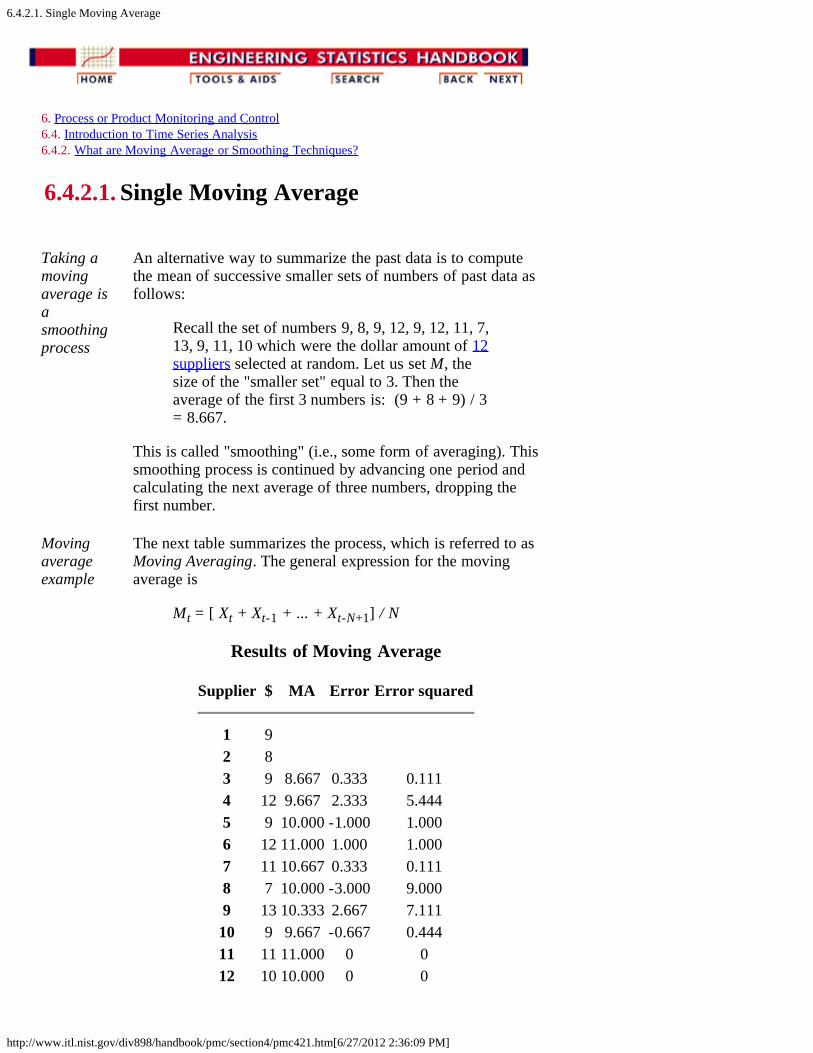
6.4.2.1. Single Moving Average
http://www.itl.nist.gov/div898/handbook/pmc/section4/pmc421.htm[6/27/2012 2:36:09 PM]
6. Process or Product Monitoring and Control 6.4. Introduction to Time Series Analysis 6.4.2. What are Moving Average or Smoothing Techniques?
6.4.2.1. Single Moving Average
Taking amovingaverage isasmoothingprocess
An alternative way to summarize the past data is to computethe mean of successive smaller sets of numbers of past data asfollows:
Recall the set of numbers 9, 8, 9, 12, 9, 12, 11, 7,13, 9, 11, 10 which were the dollar amount of 12suppliers selected at random. Let us set M, thesize of the "smaller set" equal to 3. Then theaverage of the first 3 numbers is: (9 + 8 + 9) / 3= 8.667.
This is called "smoothing" (i.e., some form of averaging). Thissmoothing process is continued by advancing one period andcalculating the next average of three numbers, dropping thefirst number.
Movingaverageexample
The next table summarizes the process, which is referred to asMoving Averaging. The general expression for the movingaverage is
Mt = [ Xt + Xt-1 + ... + Xt-N+1] / N
Results of Moving Average
Supplier $ MA Error Error squared
1 9 2 8 3 9 8.667 0.333 0.1114 12 9.667 2.333 5.4445 9 10.000 -1.000 1.0006 12 11.000 1.000 1.0007 11 10.667 0.333 0.1118 7 10.000 -3.000 9.0009 13 10.333 2.667 7.11110 9 9.667 -0.667 0.44411 11 11.000 0 012 10 10.000 0 0

6.4.2.1. Single Moving Average
http://www.itl.nist.gov/div898/handbook/pmc/section4/pmc421.htm[6/27/2012 2:36:09 PM]
The MSE = 2.018 as compared to 3 in the previous case.

6.4.2.2. Centered Moving Average
http://www.itl.nist.gov/div898/handbook/pmc/section4/pmc422.htm[6/27/2012 2:36:10 PM]
6. Process or Product Monitoring and Control 6.4. Introduction to Time Series Analysis 6.4.2. What are Moving Average or Smoothing Techniques?
6.4.2.2. Centered Moving Average
Whencomputinga runningmovingaverage,placing theaverage inthe middletimeperiodmakessense
In the previous example we computed the average of the first3 time periods and placed it next to period 3. We could haveplaced the average in the middle of the time interval of threeperiods, that is, next to period 2. This works well with oddtime periods, but not so good for even time periods. So wherewould we place the first moving average when M = 4?
Technically, the Moving Average would fall at t = 2.5, 3.5, ...
To avoid this problem we smooth the MA's using M = 2. Thuswe smooth the smoothed values!
If weaverage anevennumber ofterms, weneed tosmooth thesmoothedvalues
The following table shows the results using M = 4.
Interim StepsPeriod Value MA Centered
1 9 1.5 2 8
2.5 9.5 3 9 9.5
3.5 9.5 4 12 10.0
4.5 10.5 5 9 10.750
5.5 11.0 6 12
6.5 7 9
Final table This is the final table:
Period Value Centered MA
1 9

6.4.2.2. Centered Moving Average
http://www.itl.nist.gov/div898/handbook/pmc/section4/pmc422.htm[6/27/2012 2:36:10 PM]
2 8 3 9 9.54 12 10.05 9 10.756 12 7 11
Double Moving Averages for a Linear TrendProcess
Movingaveragesare stillnot able tohandlesignificanttrendswhenforecasting
Unfortunately, neither the mean of all data nor the movingaverage of the most recent M values, when used as forecastsfor the next period, are able to cope with a significant trend.
There exists a variation on the MA procedure that often does abetter job of handling trend. It is called Double MovingAverages for a Linear Trend Process. It calculates a secondmoving average from the original moving average, using thesame value for M. As soon as both single and double movingaverages are available, a computer routine uses these averagesto compute a slope and intercept, and then forecasts one ormore periods ahead.
6.4.3. What is Exponential Smoothing?
http://www.itl.nist.gov/div898/handbook/pmc/section4/pmc43.htm[6/27/2012 2:36:11 PM]
6. Process or Product Monitoring and Control 6.4. Introduction to Time Series Analysis
6.4.3. What is Exponential Smoothing?
Exponentialsmoothingschemesweight pastobservationsusingexponentiallydecreasingweights
This is a very popular scheme to produce a smoothed TimeSeries. Whereas in Single Moving Averages the pastobservations are weighted equally, Exponential Smoothingassigns exponentially decreasing weights as the observationget older.
In other words, recent observations are given relativelymore weight in forecasting than the older observations.
In the case of moving averages, the weights assigned to theobservations are the same and are equal to 1/N. Inexponential smoothing, however, there are one or moresmoothing parameters to be determined (or estimated) andthese choices determine the weights assigned to theobservations.
Single, double and triple Exponential Smoothing will bedescribed in this section.
6.4.3.1. Single Exponential Smoothing
http://www.itl.nist.gov/div898/handbook/pmc/section4/pmc431.htm[6/27/2012 2:36:11 PM]
6. Process or Product Monitoring and Control 6.4. Introduction to Time Series Analysis 6.4.3. What is Exponential Smoothing?
6.4.3.1. Single Exponential Smoothing
Exponentialsmoothingweights pastobservationswithexponentiallydecreasingweights toforecastfuture values
This smoothing scheme begins by setting S2 to y1, where Sistands for smoothed observation or EWMA, and y stands forthe original observation. The subscripts refer to the timeperiods, 1, 2, ..., n. For the third period, S3 = y2 + (1- )S2; and so on. There is no S1; the smoothed series starts withthe smoothed version of the second observation.
For any time period t, the smoothed value St is found bycomputing
This is the basic equation of exponential smoothing and theconstant or parameter is called the smoothing constant.
Note: There is an alternative approach to exponentialsmoothing that replaces yt-1 in the basic equation with yt, thecurrent observation. That formulation, due to Roberts (1959),is described in the section on EWMA control charts. Theformulation here follows Hunter (1986).
Setting the first EWMA
The firstforecast isveryimportant
The initial EWMA plays an important role in computing allthe subsequent EWMA's. Setting S2 to y1 is one method ofinitialization. Another way is to set it to the target of theprocess.
Still another possibility would be to average the first four orfive observations.
It can also be shown that the smaller the value of , themore important is the selection of the initial EWMA. Theuser would be wise to try a few methods, (assuming that thesoftware has them available) before finalizing the settings.
Why is it called "Exponential"?
Expand basic Let us expand the basic equation by first substituting for S

6.4.3.1. Single Exponential Smoothing
http://www.itl.nist.gov/div898/handbook/pmc/section4/pmc431.htm[6/27/2012 2:36:11 PM]
equationt-1
in the basic equation to obtain
St = yt-1 + (1- ) [ yt-2 + (1- ) St-2 ] = yt-1 + (1- ) yt-2 + (1- )2 St-2
Summationformula forbasicequation
By substituting for St-2, then for St-3, and so forth, until wereach S2 (which is just y1), it can be shown that theexpanding equation can be written as:
Expandedequation forS5
For example, the expanded equation for the smoothed valueS5 is:
Illustratesexponentialbehavior
This illustrates the exponential behavior. The weights, (1-) t decrease geometrically, and their sum is unity as shownbelow, using a property of geometric series:
From the last formula we can see that the summation termshows that the contribution to the smoothed value St becomesless at each consecutive time period.
Examplefor = .3
Let = .3. Observe that the weights (1- ) t decreaseexponentially (geometrically) with time.
Value weight
last y1 .2100 y2 .1470 y3 .1029 y4 .0720
What is the "best" value for ?
How doyou choose
The speed at which the older responses are dampened(smoothed) is a function of the value of . When is close to
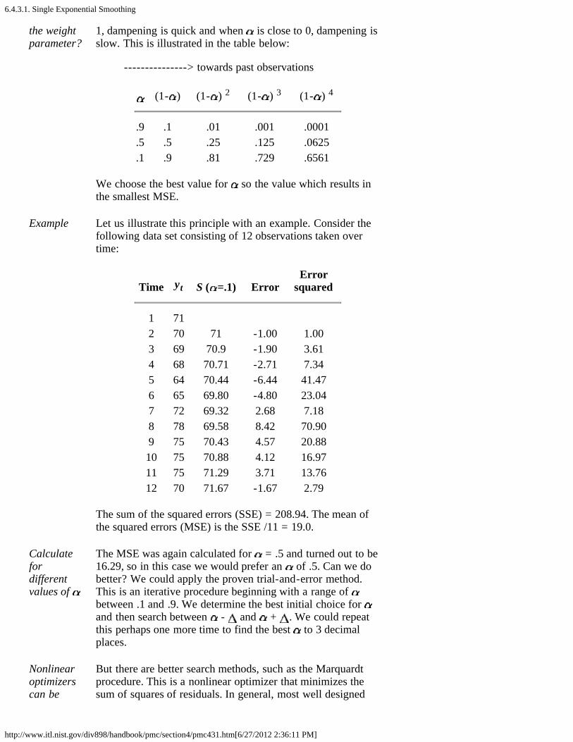
6.4.3.1. Single Exponential Smoothing
http://www.itl.nist.gov/div898/handbook/pmc/section4/pmc431.htm[6/27/2012 2:36:11 PM]
the weightparameter?
1, dampening is quick and when is close to 0, dampening isslow. This is illustrated in the table below:
---------------> towards past observations
(1- ) (1- ) 2 (1- ) 3 (1- ) 4
.9 .1 .01 .001 .0001
.5 .5 .25 .125 .0625
.1 .9 .81 .729 .6561
We choose the best value for so the value which results inthe smallest MSE.
Example Let us illustrate this principle with an example. Consider thefollowing data set consisting of 12 observations taken overtime:
Time yt S ( =.1) ErrorError
squared
1 71 2 70 71 -1.00 1.003 69 70.9 -1.90 3.614 68 70.71 -2.71 7.345 64 70.44 -6.44 41.476 65 69.80 -4.80 23.047 72 69.32 2.68 7.188 78 69.58 8.42 70.909 75 70.43 4.57 20.8810 75 70.88 4.12 16.9711 75 71.29 3.71 13.7612 70 71.67 -1.67 2.79
The sum of the squared errors (SSE) = 208.94. The mean ofthe squared errors (MSE) is the SSE /11 = 19.0.
Calculatefordifferentvalues of
The MSE was again calculated for = .5 and turned out to be16.29, so in this case we would prefer an of .5. Can we dobetter? We could apply the proven trial-and-error method.This is an iterative procedure beginning with a range of between .1 and .9. We determine the best initial choice for and then search between - and + . We could repeatthis perhaps one more time to find the best to 3 decimalplaces.
Nonlinearoptimizerscan be
But there are better search methods, such as the Marquardtprocedure. This is a nonlinear optimizer that minimizes thesum of squares of residuals. In general, most well designed
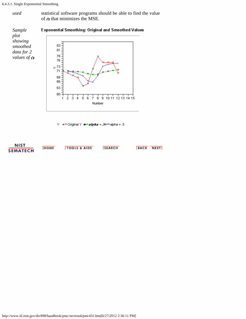
6.4.3.1. Single Exponential Smoothing
http://www.itl.nist.gov/div898/handbook/pmc/section4/pmc431.htm[6/27/2012 2:36:11 PM]
used statistical software programs should be able to find the valueof that minimizes the MSE.
Sampleplotshowingsmootheddata for 2values of
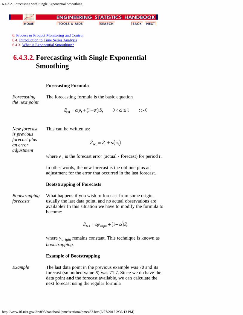
6.4.3.2. Forecasting with Single Exponential Smoothing
http://www.itl.nist.gov/div898/handbook/pmc/section4/pmc432.htm[6/27/2012 2:36:13 PM]
6. Process or Product Monitoring and Control 6.4. Introduction to Time Series Analysis 6.4.3. What is Exponential Smoothing?
6.4.3.2. Forecasting with Single ExponentialSmoothing
Forecasting Formula
Forecastingthe next point
The forecasting formula is the basic equation
New forecastis previousforecast plusan erroradjustment
This can be written as:
where t is the forecast error (actual - forecast) for period t.
In other words, the new forecast is the old one plus anadjustment for the error that occurred in the last forecast.
Bootstrapping of Forecasts
Bootstrappingforecasts
What happens if you wish to forecast from some origin,usually the last data point, and no actual observations areavailable? In this situation we have to modify the formula tobecome:
where yorigin remains constant. This technique is known asbootstrapping.
Example of Bootstrapping
Example The last data point in the previous example was 70 and itsforecast (smoothed value S) was 71.7. Since we do have thedata point and the forecast available, we can calculate thenext forecast using the regular formula

6.4.3.2. Forecasting with Single Exponential Smoothing
http://www.itl.nist.gov/div898/handbook/pmc/section4/pmc432.htm[6/27/2012 2:36:13 PM]
= .1(70) + .9(71.7) = 71.5 ( = .1)
But for the next forecast we have no data point (observation).So now we compute:
St+2 =. 1(70) + .9(71.5 )= 71.35
Comparison between bootstrap and regular forecasting
Tablecomparingtwo methods
The following table displays the comparison between the twomethods:
Period Bootstrapforecast
Data Single SmoothingForecast
13 71.50 75 71.514 71.35 75 71.915 71.21 74 72.216 71.09 78 72.417 70.98 86 73.0
Single Exponential Smoothing with Trend
Single Smoothing (short for single exponential smoothing) isnot very good when there is a trend. The single coefficient is not enough.
Sample dataset with trend
Let us demonstrate this with the following data set smoothedwith an of 0.3:
Data Fit
6.4 5.6 6.47.8 6.28.8 6.711.0 7.311.6 8.416.7 9.415.3 11.621.6 12.722.4 15.4
Plotdemonstrating
The resulting graph looks like:
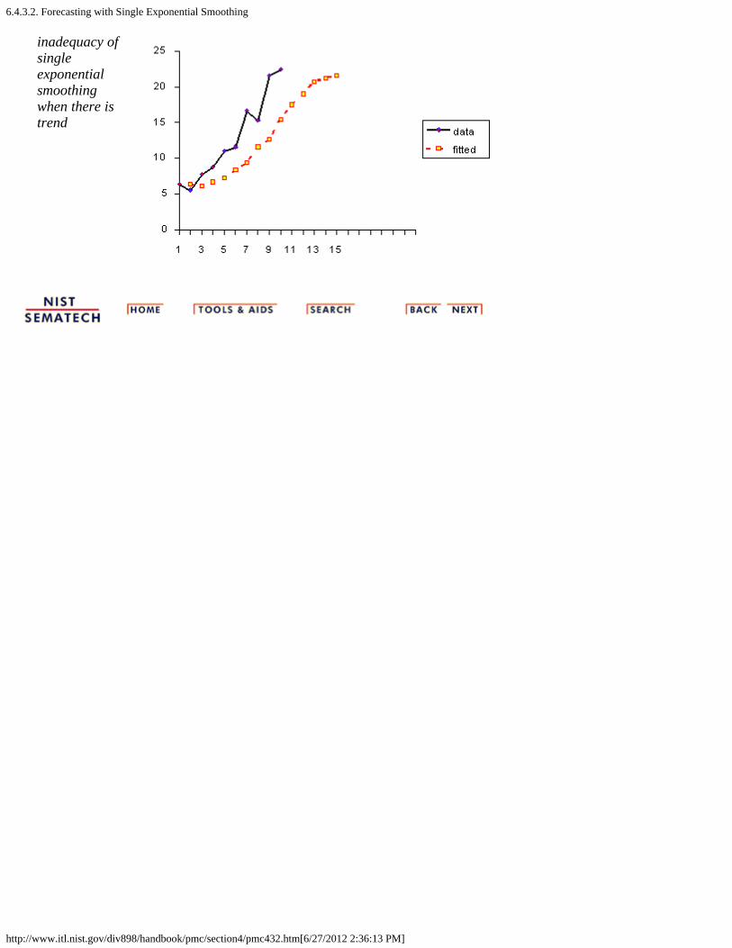
6.4.3.2. Forecasting with Single Exponential Smoothing
http://www.itl.nist.gov/div898/handbook/pmc/section4/pmc432.htm[6/27/2012 2:36:13 PM]
inadequacy ofsingleexponentialsmoothingwhen there istrend

6.4.3.3. Double Exponential Smoothing
http://www.itl.nist.gov/div898/handbook/pmc/section4/pmc433.htm[6/27/2012 2:36:13 PM]
6. Process or Product Monitoring and Control 6.4. Introduction to Time Series Analysis 6.4.3. What is Exponential Smoothing?
6.4.3.3. Double Exponential Smoothing
Doubleexponentialsmoothinguses twoconstantsand is betterat handlingtrends
As was previously observed, Single Smoothing does notexcel in following the data when there is a trend. Thissituation can be improved by the introduction of a secondequation with a second constant, , which must be chosen inconjunction with .
Here are the two equations associated with DoubleExponential Smoothing:
Note that the current value of the series is used to calculateits smoothed value replacement in double exponentialsmoothing.
Initial Values
Severalmethods tochoose theinitialvalues
As in the case for single smoothing, there are a variety ofschemes to set initial values for St and bt in doublesmoothing.
S1 is in general set to y1. Here are three suggestions for b1:
b1 = y2 - y1
b1 = [(y2 - y1) + (y3 - y2) + (y4 - y3)]/3
b1 = (yn - y1)/(n - 1)
Comments
Meaning ofthesmoothingequations
The first smoothing equation adjusts St directly for the trendof the previous period, bt-1, by adding it to the last smoothedvalue, St-1. This helps to eliminate the lag and brings St tothe appropriate base of the current value.

6.4.3.3. Double Exponential Smoothing
http://www.itl.nist.gov/div898/handbook/pmc/section4/pmc433.htm[6/27/2012 2:36:13 PM]
The second smoothing equation then updates the trend,which is expressed as the difference between the last twovalues. The equation is similar to the basic form of singlesmoothing, but here applied to the updating of the trend.
Non-linearoptimizationtechniquescan be used
The values for and can be obtained via non-linearoptimization techniques, such as the Marquardt Algorithm.
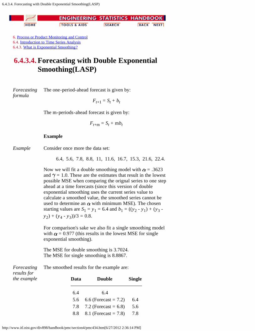
6.4.3.4. Forecasting with Double Exponential Smoothing(LASP)
http://www.itl.nist.gov/div898/handbook/pmc/section4/pmc434.htm[6/27/2012 2:36:14 PM]
6. Process or Product Monitoring and Control 6.4. Introduction to Time Series Analysis 6.4.3. What is Exponential Smoothing?
6.4.3.4. Forecasting with Double ExponentialSmoothing(LASP)
Forecastingformula
The one-period-ahead forecast is given by:
Ft+1 = St + bt
The m-periods-ahead forecast is given by:
Ft+m = St + mbt
Example
Example Consider once more the data set:
6.4, 5.6, 7.8, 8.8, 11, 11.6, 16.7, 15.3, 21.6, 22.4.
Now we will fit a double smoothing model with = .3623and = 1.0. These are the estimates that result in the lowestpossible MSE when comparing the orignal series to one stepahead at a time forecasts (since this version of doubleexponential smoothing uses the current series value tocalculate a smoothed value, the smoothed series cannot beused to determine an with minimum MSE). The chosenstarting values are S1 = y1 = 6.4 and b1 = ((y2 - y1) + (y3 -y2) + (y4 - y3))/3 = 0.8.
For comparison's sake we also fit a single smoothing modelwith = 0.977 (this results in the lowest MSE for singleexponential smoothing).
The MSE for double smoothing is 3.7024. The MSE for single smoothing is 8.8867.
Forecastingresults forthe example
The smoothed results for the example are:
Data Double Single
6.4 6.4 5.6 6.6 (Forecast = 7.2) 6.47.8 7.2 (Forecast = 6.8) 5.68.8 8.1 (Forecast = 7.8) 7.8
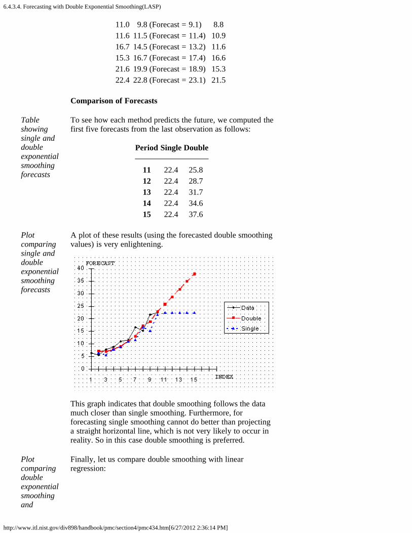
6.4.3.4. Forecasting with Double Exponential Smoothing(LASP)
http://www.itl.nist.gov/div898/handbook/pmc/section4/pmc434.htm[6/27/2012 2:36:14 PM]
11.0 9.8 (Forecast = 9.1) 8.811.6 11.5 (Forecast = 11.4) 10.916.7 14.5 (Forecast = 13.2) 11.615.3 16.7 (Forecast = 17.4) 16.621.6 19.9 (Forecast = 18.9) 15.322.4 22.8 (Forecast = 23.1) 21.5
Comparison of Forecasts
Tableshowingsingle anddoubleexponentialsmoothingforecasts
To see how each method predicts the future, we computed thefirst five forecasts from the last observation as follows:
Period Single Double
11 22.4 25.812 22.4 28.713 22.4 31.714 22.4 34.615 22.4 37.6
Plotcomparingsingle anddoubleexponentialsmoothingforecasts
A plot of these results (using the forecasted double smoothingvalues) is very enlightening.
This graph indicates that double smoothing follows the datamuch closer than single smoothing. Furthermore, forforecasting single smoothing cannot do better than projectinga straight horizontal line, which is not very likely to occur inreality. So in this case double smoothing is preferred.
Plotcomparingdoubleexponentialsmoothingand
Finally, let us compare double smoothing with linearregression:
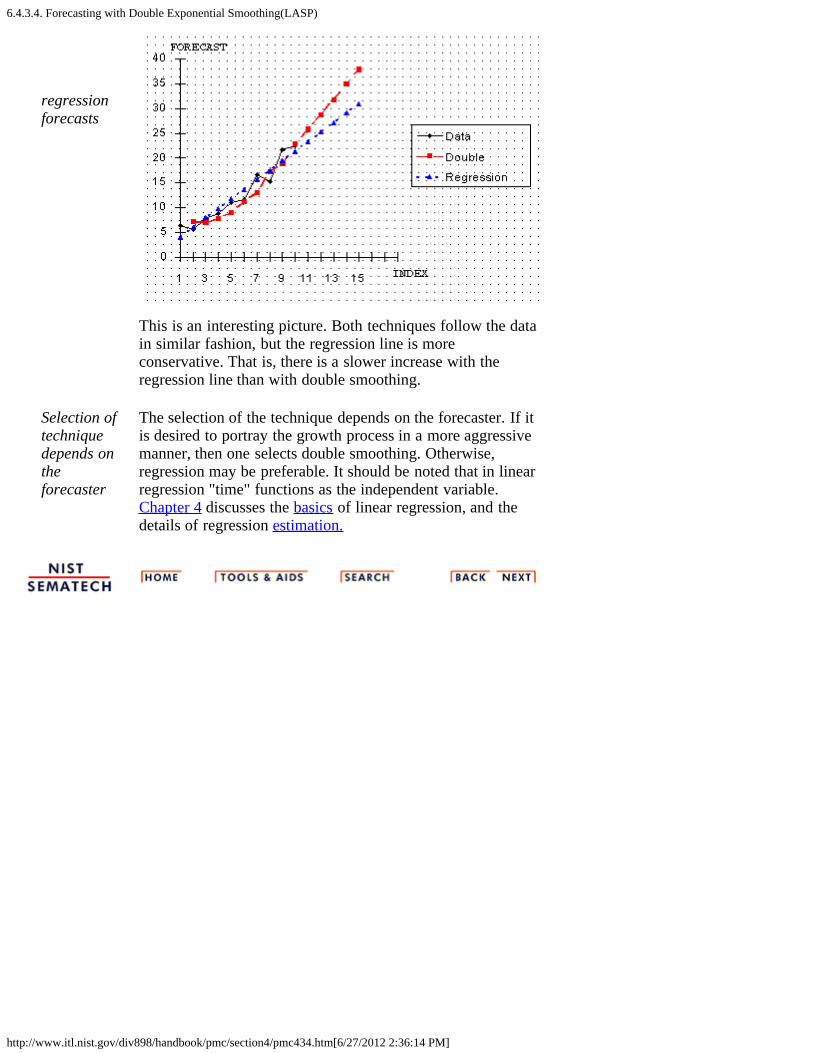
6.4.3.4. Forecasting with Double Exponential Smoothing(LASP)
http://www.itl.nist.gov/div898/handbook/pmc/section4/pmc434.htm[6/27/2012 2:36:14 PM]
regressionforecasts
This is an interesting picture. Both techniques follow the datain similar fashion, but the regression line is moreconservative. That is, there is a slower increase with theregression line than with double smoothing.
Selection oftechniquedepends ontheforecaster
The selection of the technique depends on the forecaster. If itis desired to portray the growth process in a more aggressivemanner, then one selects double smoothing. Otherwise,regression may be preferable. It should be noted that in linearregression "time" functions as the independent variable.Chapter 4 discusses the basics of linear regression, and thedetails of regression estimation.

6.4.3.5. Triple Exponential Smoothing
http://www.itl.nist.gov/div898/handbook/pmc/section4/pmc435.htm[6/27/2012 2:36:15 PM]
6. Process or Product Monitoring and Control 6.4. Introduction to Time Series Analysis 6.4.3. What is Exponential Smoothing?
6.4.3.5. Triple Exponential Smoothing
What happens if the data show trend and seasonality?
To handleseasonality,we have toadd a thirdparameter
In this case double smoothing will not work. We now introduce athird equation to take care of seasonality (sometimes calledperiodicity). The resulting set of equations is called the "Holt-Winters" (HW) method after the names of the inventors.
The basic equations for their method are given by:
where
y is the observationS is the smoothed observationb is the trend factorI is the seasonal indexF is the forecast at m periods aheadt is an index denoting a time period
and , , and are constants that must be estimated in such away that the MSE of the error is minimized. This is best left to agood software package.
Completeseasonneeded
To initialize the HW method we need at least one completeseason's data to determine initial estimates of the seasonal indicesI t-L.
L periodsin a season
A complete season's data consists of L periods. And we need toestimate the trend factor from one period to the next. Toaccomplish this, it is advisable to use two complete seasons; thatis, 2L periods.
6.4.3.5. Triple Exponential Smoothing
http://www.itl.nist.gov/div898/handbook/pmc/section4/pmc435.htm[6/27/2012 2:36:15 PM]
Initial values for the trend factor
How to getinitialestimatesfor trendandseasonalityparameters
The general formula to estimate the initial trend is given by
Initial values for the Seasonal Indices
As we will see in the example, we work with data that consist of6 years with 4 periods (that is, 4 quarters) per year. Then
Step 1:computeyearlyaverages
Step 1: Compute the averages of each of the 6 years
Step 2:divide byyearlyaverages
Step 2: Divide the observations by the appropriate yearly mean1 2 3 4 5 6
y1/A1 y5/A2 y9/A3 y13/A4 y17/A5 y21/A6
y2/A1 y6/A2 y10/A3 y14/A4 y18/A5 y22/A6
y3/A1 y7/A2 y11/A3 y15/A4 y19/A5 y23/A6
y4/A1 y8/A2 y12/A3 y16/A4 y20/A5 y24/A6
Step 3:formseasonalindices
Step 3: Now the seasonal indices are formed by computing theaverage of each row. Thus the initial seasonal indices(symbolically) are:
I1 = ( y1/A1 + y5/A2 + y9/A3 + y13/A4 + y17/A5 +y21/A6)/6 I2 = ( y2/A1 + y6/A2 + y10/A3 + y14/A4 + y18/A5 +y22/A6)/6 I3 = ( y3/A1 + y7/A2 + y11/A3 + y15/A4 + y19/A5 +y22/A6)/6 I4 = ( y4/A1 + y8/A2 + y12/A3 + y16/A4 + y20/A5 +y24/A6)/6
We now know the algebra behind the computation of the initialestimates.
The next page contains an example of triple exponentialsmoothing.

6.4.3.5. Triple Exponential Smoothing
http://www.itl.nist.gov/div898/handbook/pmc/section4/pmc435.htm[6/27/2012 2:36:15 PM]
The case of the Zero Coefficients
Zerocoefficientsfor trendandseasonalityparameters
Sometimes it happens that a computer program for tripleexponential smoothing outputs a final coefficient for trend ( ) orfor seasonality ( ) of zero. Or worse, both are outputted as zero!
Does this indicate that there is no trend and/or no seasonality?
Of course not! It only means that the initial values for trendand/or seasonality were right on the money. No updating wasnecessary in order to arrive at the lowest possible MSE. Weshould inspect the updating formulas to verify this.
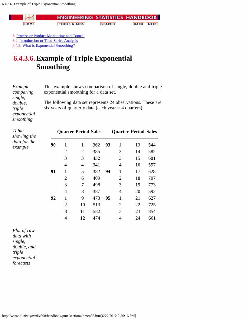
6.4.3.6. Example of Triple Exponential Smoothing
http://www.itl.nist.gov/div898/handbook/pmc/section4/pmc436.htm[6/27/2012 2:36:16 PM]
6. Process or Product Monitoring and Control 6.4. Introduction to Time Series Analysis 6.4.3. What is Exponential Smoothing?
6.4.3.6. Example of Triple ExponentialSmoothing
Examplecomparingsingle,double,tripleexponentialsmoothing
This example shows comparison of single, double and tripleexponential smoothing for a data set.
The following data set represents 24 observations. These aresix years of quarterly data (each year = 4 quarters).
Tableshowing thedata for theexample
Quarter Period Sales Quarter Period Sales
90 1 1 362 93 1 13 544 2 2 385 2 14 582 3 3 432 3 15 681 4 4 341 4 16 557
91 1 5 382 94 1 17 628 2 6 409 2 18 707 3 7 498 3 19 773 4 8 387 4 20 592
92 1 9 473 95 1 21 627 2 10 513 2 22 725 3 11 582 3 23 854 4 12 474 4 24 661
Plot of rawdata withsingle,double, andtripleexponentialforecasts
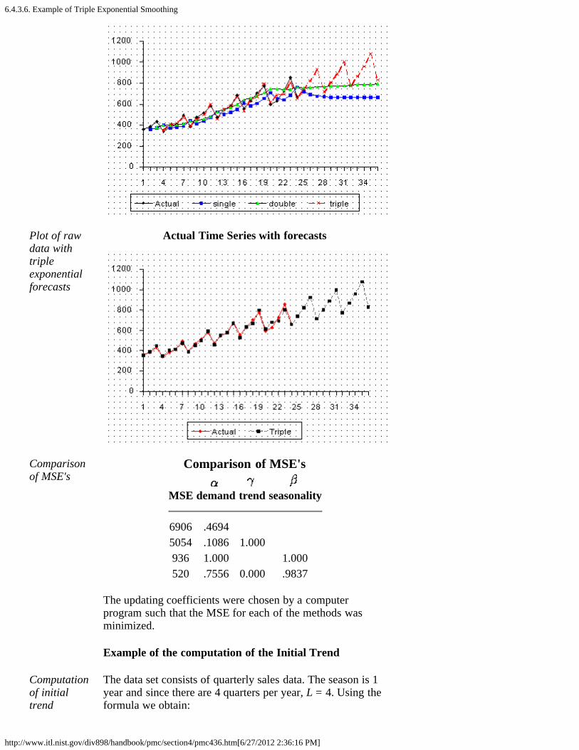
6.4.3.6. Example of Triple Exponential Smoothing
http://www.itl.nist.gov/div898/handbook/pmc/section4/pmc436.htm[6/27/2012 2:36:16 PM]
Plot of rawdata withtripleexponentialforecasts
Actual Time Series with forecasts
Comparisonof MSE's
Comparison of MSE's
MSE
demand
trend
seasonality
6906 .4694 5054 .1086 1.000 936 1.000 1.000520 .7556 0.000 .9837
The updating coefficients were chosen by a computerprogram such that the MSE for each of the methods wasminimized.
Example of the computation of the Initial Trend
Computationof initialtrend
The data set consists of quarterly sales data. The season is 1year and since there are 4 quarters per year, L = 4. Using theformula we obtain:
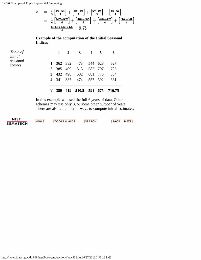
6.4.3.6. Example of Triple Exponential Smoothing
http://www.itl.nist.gov/div898/handbook/pmc/section4/pmc436.htm[6/27/2012 2:36:16 PM]
Example of the computation of the Initial SeasonalIndices
Table ofinitialseasonalindices
1 2 3 4 5 6
1 362 382 473 544 628 6272 385 409 513 582 707 7253 432 498 582 681 773 8544 341 387 474 557 592 661
380 419 510.5 591 675 716.75
In this example we used the full 6 years of data. Otherschemes may use only 3, or some other number of years.There are also a number of ways to compute initial estimates.

6.4.3.7. Exponential Smoothing Summary
http://www.itl.nist.gov/div898/handbook/pmc/section4/pmc437.htm[6/27/2012 2:36:17 PM]
6. Process or Product Monitoring and Control 6.4. Introduction to Time Series Analysis 6.4.3. What is Exponential Smoothing?
6.4.3.7. Exponential Smoothing Summary
Summary
Exponentialsmoothinghas provento be ausefultechnique
Exponential smoothing has proven through the years to bevery useful in many forecasting situations. It was firstsuggested by C.C. Holt in 1957 and was meant to be used fornon-seasonal time series showing no trend. He later offered aprocedure (1958) that does handle trends. Winters(1965)generalized the method to include seasonality, hence thename "Holt-Winters Method".
Holt-Winters has3 updatingequations
The Holt-Winters Method has 3 updating equations, eachwith a constant that ranges from 0 to 1. The equations areintended to give more weight to recent observations and lessweights to observations further in the past.
These weights are geometrically decreasing by a constantratio.
The HW procedure can be made fully automatic by user-friendly software.

6.4.4. Univariate Time Series Models
http://www.itl.nist.gov/div898/handbook/pmc/section4/pmc44.htm[6/27/2012 2:36:18 PM]
6. Process or Product Monitoring and Control 6.4. Introduction to Time Series Analysis
6.4.4. Univariate Time Series Models
UnivariateTimeSeries
The term "univariate time series" refers to a time series thatconsists of single (scalar) observations recorded sequentiallyover equal time increments. Some examples are monthly CO2concentrations and southern oscillations to predict el ninoeffects.
Although a univariate time series data set is usually given as asingle column of numbers, time is in fact an implicit variablein the time series. If the data are equi-spaced, the timevariable, or index, does not need to be explicitly given. Thetime variable may sometimes be explicitly used for plottingthe series. However, it is not used in the time series modelitself.
The analysis of time series where the data are not collected inequal time increments is beyond the scope of this handbook.
Contents 1. Sample Data Sets 2. Stationarity 3. Seasonality 4. Common Approaches 5. Box-Jenkins Approach 6. Box-Jenkins Model Identification 7. Box-Jenkins Model Estimation 8. Box-Jenkins Model Validation 9. SEMPLOT Sample Output for a Box-Jenkins Analysis
10. SEMPLOT Sample Output for a Box-Jenkins Analysiswith Seasonality

6.4.4.1. Sample Data Sets
http://www.itl.nist.gov/div898/handbook/pmc/section4/pmc441.htm[6/27/2012 2:36:19 PM]
6. Process or Product Monitoring and Control 6.4. Introduction to Time Series Analysis 6.4.4. Univariate Time Series Models
6.4.4.1. Sample Data Sets
SampleData Sets
The following two data sets are used as examples in the textfor this section.
1. Monthly mean CO2 concentrations.2. Southern oscillations.
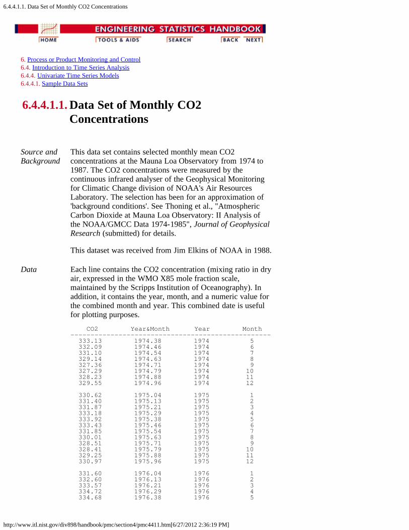
6.4.4.1.1. Data Set of Monthly CO2 Concentrations
http://www.itl.nist.gov/div898/handbook/pmc/section4/pmc4411.htm[6/27/2012 2:36:19 PM]
6. Process or Product Monitoring and Control 6.4. Introduction to Time Series Analysis 6.4.4. Univariate Time Series Models 6.4.4.1. Sample Data Sets
6.4.4.1.1. Data Set of Monthly CO2Concentrations
Source andBackground
This data set contains selected monthly mean CO2concentrations at the Mauna Loa Observatory from 1974 to1987. The CO2 concentrations were measured by thecontinuous infrared analyser of the Geophysical Monitoringfor Climatic Change division of NOAA's Air ResourcesLaboratory. The selection has been for an approximation of'background conditions'. See Thoning et al., "AtmosphericCarbon Dioxide at Mauna Loa Observatory: II Analysis ofthe NOAA/GMCC Data 1974-1985", Journal of GeophysicalResearch (submitted) for details.
This dataset was received from Jim Elkins of NOAA in 1988.
Data Each line contains the CO2 concentration (mixing ratio in dryair, expressed in the WMO X85 mole fraction scale,maintained by the Scripps Institution of Oceanography). Inaddition, it contains the year, month, and a numeric value forthe combined month and year. This combined date is usefulfor plotting purposes.
CO2 Year&Month Year Month-------------------------------------------------- 333.13 1974.38 1974 5 332.09 1974.46 1974 6 331.10 1974.54 1974 7 329.14 1974.63 1974 8 327.36 1974.71 1974 9 327.29 1974.79 1974 10 328.23 1974.88 1974 11 329.55 1974.96 1974 12 330.62 1975.04 1975 1 331.40 1975.13 1975 2 331.87 1975.21 1975 3 333.18 1975.29 1975 4 333.92 1975.38 1975 5 333.43 1975.46 1975 6 331.85 1975.54 1975 7 330.01 1975.63 1975 8 328.51 1975.71 1975 9 328.41 1975.79 1975 10 329.25 1975.88 1975 11 330.97 1975.96 1975 12 331.60 1976.04 1976 1 332.60 1976.13 1976 2 333.57 1976.21 1976 3 334.72 1976.29 1976 4 334.68 1976.38 1976 5

6.4.4.1.1. Data Set of Monthly CO2 Concentrations
http://www.itl.nist.gov/div898/handbook/pmc/section4/pmc4411.htm[6/27/2012 2:36:19 PM]
334.17 1976.46 1976 6 332.96 1976.54 1976 7 330.80 1976.63 1976 8 328.98 1976.71 1976 9 328.57 1976.79 1976 10 330.20 1976.88 1976 11 331.58 1976.96 1976 12 332.67 1977.04 1977 1 333.17 1977.13 1977 2 334.86 1977.21 1977 3 336.07 1977.29 1977 4 336.82 1977.38 1977 5 336.12 1977.46 1977 6 334.81 1977.54 1977 7 332.56 1977.63 1977 8 331.30 1977.71 1977 9 331.22 1977.79 1977 10 332.37 1977.88 1977 11 333.49 1977.96 1977 12 334.71 1978.04 1978 1 335.23 1978.13 1978 2 336.54 1978.21 1978 3 337.79 1978.29 1978 4 337.95 1978.38 1978 5 338.00 1978.46 1978 6 336.37 1978.54 1978 7 334.47 1978.63 1978 8 332.46 1978.71 1978 9 332.29 1978.79 1978 10 333.76 1978.88 1978 11 334.80 1978.96 1978 12 336.00 1979.04 1979 1 336.63 1979.13 1979 2 337.93 1979.21 1979 3 338.95 1979.29 1979 4 339.05 1979.38 1979 5 339.27 1979.46 1979 6 337.64 1979.54 1979 7 335.68 1979.63 1979 8 333.77 1979.71 1979 9 334.09 1979.79 1979 10 335.29 1979.88 1979 11 336.76 1979.96 1979 12 337.77 1980.04 1980 1 338.26 1980.13 1980 2 340.10 1980.21 1980 3 340.88 1980.29 1980 4 341.47 1980.38 1980 5 341.31 1980.46 1980 6 339.41 1980.54 1980 7 337.74 1980.63 1980 8 336.07 1980.71 1980 9 336.07 1980.79 1980 10 337.22 1980.88 1980 11 338.38 1980.96 1980 12 339.32 1981.04 1981 1 340.41 1981.13 1981 2 341.69 1981.21 1981 3 342.51 1981.29 1981 4 343.02 1981.38 1981 5 342.54 1981.46 1981 6 340.88 1981.54 1981 7 338.75 1981.63 1981 8 337.05 1981.71 1981 9 337.13 1981.79 1981 10 338.45 1981.88 1981 11 339.85 1981.96 1981 12 340.90 1982.04 1982 1 341.70 1982.13 1982 2 342.70 1982.21 1982 3 343.65 1982.29 1982 4 344.28 1982.38 1982 5 343.42 1982.46 1982 6 342.02 1982.54 1982 7 339.97 1982.63 1982 8
6.4.4.1.1. Data Set of Monthly CO2 Concentrations
http://www.itl.nist.gov/div898/handbook/pmc/section4/pmc4411.htm[6/27/2012 2:36:19 PM]
337.84 1982.71 1982 9 338.00 1982.79 1982 10 339.20 1982.88 1982 11 340.63 1982.96 1982 12 341.41 1983.04 1983 1 342.68 1983.13 1983 2 343.04 1983.21 1983 3 345.27 1983.29 1983 4 345.92 1983.38 1983 5 345.40 1983.46 1983 6 344.16 1983.54 1983 7 342.11 1983.63 1983 8 340.11 1983.71 1983 9 340.15 1983.79 1983 10 341.38 1983.88 1983 11 343.02 1983.96 1983 12 343.87 1984.04 1984 1 344.59 1984.13 1984 2 345.11 1984.21 1984 3 347.07 1984.29 1984 4 347.38 1984.38 1984 5 346.78 1984.46 1984 6 344.96 1984.54 1984 7 342.71 1984.63 1984 8 340.86 1984.71 1984 9 341.13 1984.79 1984 10 342.84 1984.88 1984 11 344.32 1984.96 1984 12 344.88 1985.04 1985 1 345.62 1985.13 1985 2 347.23 1985.21 1985 3 347.62 1985.29 1985 4 348.53 1985.38 1985 5 347.87 1985.46 1985 6 346.00 1985.54 1985 7 343.86 1985.63 1985 8 342.55 1985.71 1985 9 342.57 1985.79 1985 10 344.11 1985.88 1985 11 345.49 1985.96 1985 12 346.04 1986.04 1986 1 346.70 1986.13 1986 2 347.38 1986.21 1986 3 349.38 1986.29 1986 4 349.93 1986.38 1986 5 349.26 1986.46 1986 6 347.44 1986.54 1986 7 345.55 1986.63 1986 8 344.21 1986.71 1986 9 343.67 1986.79 1986 10 345.09 1986.88 1986 11 346.27 1986.96 1986 12 347.33 1987.04 1987 1 347.82 1987.13 1987 2 349.29 1987.21 1987 3 350.91 1987.29 1987 4 351.71 1987.38 1987 5 350.94 1987.46 1987 6 349.10 1987.54 1987 7 346.77 1987.63 1987 8 345.73 1987.71 1987 9
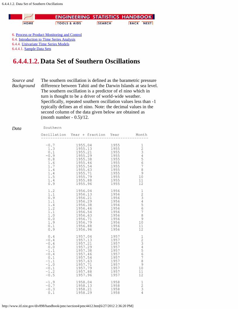
6.4.4.1.2. Data Set of Southern Oscillations
http://www.itl.nist.gov/div898/handbook/pmc/section4/pmc4412.htm[6/27/2012 2:36:20 PM]
6. Process or Product Monitoring and Control 6.4. Introduction to Time Series Analysis 6.4.4. Univariate Time Series Models 6.4.4.1. Sample Data Sets
6.4.4.1.2. Data Set of Southern Oscillations
Source andBackground
The southern oscillation is defined as the barametric pressuredifference between Tahiti and the Darwin Islands at sea level.The southern oscillation is a predictor of el nino which inturn is thought to be a driver of world-wide weather.Specifically, repeated southern oscillation values less than -1typically defines an el nino. Note: the decimal values in thesecond column of the data given below are obtained as(month number - 0.5)/12.
Data Southern
Oscillation Year + fraction Year Month----------------------------------------------
-0.7 1955.04 1955 1 1.3 1955.13 1955 2 0.1 1955.21 1955 3 -0.9 1955.29 1955 4 0.8 1955.38 1955 5 1.6 1955.46 1955 6 1.7 1955.54 1955 7 1.4 1955.63 1955 8 1.4 1955.71 1955 9 1.5 1955.79 1955 10 1.4 1955.88 1955 11 0.9 1955.96 1955 12 1.2 1956.04 1956 1 1.1 1956.13 1956 2 0.9 1956.21 1956 3 1.1 1956.29 1956 4 1.4 1956.38 1956 5 1.2 1956.46 1956 6 1.1 1956.54 1956 7 1.0 1956.63 1956 8 0.0 1956.71 1956 9 1.9 1956.79 1956 10 0.1 1956.88 1956 11 0.9 1956.96 1956 12 0.4 1957.04 1957 1 -0.4 1957.13 1957 2 -0.4 1957.21 1957 3 0.0 1957.29 1957 4 -1.1 1957.38 1957 5 -0.4 1957.46 1957 6 0.1 1957.54 1957 7 -1.1 1957.63 1957 8 -1.0 1957.71 1957 9 -0.1 1957.79 1957 10 -1.2 1957.88 1957 11 -0.5 1957.96 1957 12 -1.9 1958.04 1958 1 -0.7 1958.13 1958 2 -0.3 1958.21 1958 3 0.1 1958.29 1958 4

6.4.4.1.2. Data Set of Southern Oscillations
http://www.itl.nist.gov/div898/handbook/pmc/section4/pmc4412.htm[6/27/2012 2:36:20 PM]
-1.3 1958.38 1958 5 -0.3 1958.46 1958 6 0.3 1958.54 1958 7 0.7 1958.63 1958 8 -0.4 1958.71 1958 9 -0.4 1958.79 1958 10 -0.6 1958.88 1958 11 -0.8 1958.96 1958 12 -0.9 1959.04 1959 1 -1.5 1959.13 1959 2 0.8 1959.21 1959 3 0.2 1959.29 1959 4 0.2 1959.38 1959 5 -0.9 1959.46 1959 6 -0.5 1959.54 1959 7 -0.6 1959.63 1959 8 0.0 1959.71 1959 9 0.3 1959.79 1959 10 0.9 1959.88 1959 11 0.8 1959.96 1959 12 0.0 1960.04 1960 1 -0.2 1960.13 1960 2 0.5 1960.21 1960 3 0.9 1960.29 1960 4 0.2 1960.38 1960 5 -0.5 1960.46 1960 6 0.4 1960.54 1960 7 0.5 1960.63 1960 8 0.7 1960.71 1960 9 -0.1 1960.79 1960 10 0.6 1960.88 1960 11 0.7 1960.96 1960 12 -0.4 1961.04 1961 1 0.5 1961.13 1961 2 -2.6 1961.21 1961 3 1.1 1961.29 1961 4 0.2 1961.38 1961 5 -0.4 1961.46 1961 6 0.1 1961.54 1961 7 -0.3 1961.63 1961 8 0.0 1961.71 1961 9 -0.8 1961.79 1961 10 0.7 1961.88 1961 11 1.4 1961.96 1961 12 1.7 1962.04 1962 1 -0.5 1962.13 1962 2 -0.4 1962.21 1962 3 0.0 1962.29 1962 4 1.2 1962.38 1962 5 0.5 1962.46 1962 6 -0.1 1962.54 1962 7 0.3 1962.63 1962 8 0.5 1962.71 1962 9 0.9 1962.79 1962 10 0.2 1962.88 1962 11 0.0 1962.96 1962 12 0.8 1963.04 1963 1 0.3 1963.13 1963 2 0.6 1963.21 1963 3 0.9 1963.29 1963 4 0.0 1963.38 1963 5 -1.5 1963.46 1963 6 -0.3 1963.54 1963 7 -0.4 1963.63 1963 8 -0.7 1963.71 1963 9 -1.6 1963.79 1963 10 -1.0 1963.88 1963 11 -1.4 1963.96 1963 12 -0.5 1964.04 1964 1 -0.2 1964.13 1964 2 0.6 1964.21 1964 3 1.7 1964.29 1964 4 -0.2 1964.38 1964 5 0.7 1964.46 1964 6 0.5 1964.54 1964 7

6.4.4.1.2. Data Set of Southern Oscillations
http://www.itl.nist.gov/div898/handbook/pmc/section4/pmc4412.htm[6/27/2012 2:36:20 PM]
1.4 1964.63 1964 8 1.3 1964.71 1964 9 1.3 1964.79 1964 10 0.0 1964.88 1964 11 -0.5 1964.96 1964 12 -0.5 1965.04 1965 1 0.0 1965.13 1965 2 0.2 1965.21 1965 3 -1.1 1965.29 1965 4 0.0 1965.38 1965 5 -1.5 1965.46 1965 6 -2.3 1965.54 1965 7 -1.3 1965.63 1965 8 -1.4 1965.71 1965 9 -1.2 1965.79 1965 10 -1.8 1965.88 1965 11 0.0 1965.96 1965 12 -1.4 1966.04 1966 1 -0.5 1966.13 1966 2 -1.6 1966.21 1966 3 -0.7 1966.29 1966 4 -0.6 1966.38 1966 5 0.0 1966.46 1966 6 -0.1 1966.54 1966 7 0.3 1966.63 1966 8 -0.3 1966.71 1966 9 -0.3 1966.79 1966 10 -0.1 1966.88 1966 11 -0.5 1966.96 1966 12 1.5 1967.04 1967 1 1.2 1967.13 1967 2 0.8 1967.21 1967 3 -0.2 1967.29 1967 4 -0.4 1967.38 1967 5 0.6 1967.46 1967 6 0.0 1967.54 1967 7 0.4 1967.63 1967 8 0.5 1967.71 1967 9 -0.2 1967.79 1967 10 -0.7 1967.88 1967 11 -0.7 1967.96 1967 12 0.5 1968.04 1968 1 0.8 1968.13 1968 2 -0.5 1968.21 1968 3 -0.3 1968.29 1968 4 1.2 1968.38 1968 5 1.4 1968.46 1968 6 0.6 1968.54 1968 7 -0.1 1968.63 1968 8 -0.3 1968.71 1968 9 -0.3 1968.79 1968 10 -0.4 1968.88 1968 11 0.0 1968.96 1968 12 -1.4 1969.04 1969 1 0.8 1969.13 1969 2 -0.1 1969.21 1969 3 -0.8 1969.29 1969 4 -0.8 1969.38 1969 5 -0.2 1969.46 1969 6 -0.7 1969.54 1969 7 -0.6 1969.63 1969 8 -1.0 1969.71 1969 9 -1.4 1969.79 1969 10 -0.1 1969.88 1969 11 0.3 1969.96 1969 12 -1.2 1970.04 1970 1 -1.2 1970.13 1970 2 0.0 1970.21 1970 3 -0.5 1970.29 1970 4 0.1 1970.38 1970 5 1.1 1970.46 1970 6 -0.6 1970.54 1970 7 0.3 1970.63 1970 8 1.2 1970.71 1970 9 0.8 1970.79 1970 10
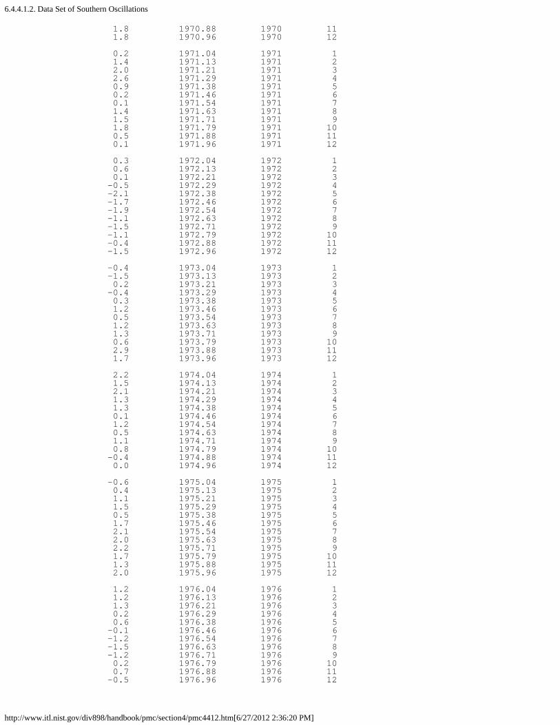
6.4.4.1.2. Data Set of Southern Oscillations
http://www.itl.nist.gov/div898/handbook/pmc/section4/pmc4412.htm[6/27/2012 2:36:20 PM]
1.8 1970.88 1970 11 1.8 1970.96 1970 12 0.2 1971.04 1971 1 1.4 1971.13 1971 2 2.0 1971.21 1971 3 2.6 1971.29 1971 4 0.9 1971.38 1971 5 0.2 1971.46 1971 6 0.1 1971.54 1971 7 1.4 1971.63 1971 8 1.5 1971.71 1971 9 1.8 1971.79 1971 10 0.5 1971.88 1971 11 0.1 1971.96 1971 12 0.3 1972.04 1972 1 0.6 1972.13 1972 2 0.1 1972.21 1972 3 -0.5 1972.29 1972 4 -2.1 1972.38 1972 5 -1.7 1972.46 1972 6 -1.9 1972.54 1972 7 -1.1 1972.63 1972 8 -1.5 1972.71 1972 9 -1.1 1972.79 1972 10 -0.4 1972.88 1972 11 -1.5 1972.96 1972 12 -0.4 1973.04 1973 1 -1.5 1973.13 1973 2 0.2 1973.21 1973 3 -0.4 1973.29 1973 4 0.3 1973.38 1973 5 1.2 1973.46 1973 6 0.5 1973.54 1973 7 1.2 1973.63 1973 8 1.3 1973.71 1973 9 0.6 1973.79 1973 10 2.9 1973.88 1973 11 1.7 1973.96 1973 12 2.2 1974.04 1974 1 1.5 1974.13 1974 2 2.1 1974.21 1974 3 1.3 1974.29 1974 4 1.3 1974.38 1974 5 0.1 1974.46 1974 6 1.2 1974.54 1974 7 0.5 1974.63 1974 8 1.1 1974.71 1974 9 0.8 1974.79 1974 10 -0.4 1974.88 1974 11 0.0 1974.96 1974 12 -0.6 1975.04 1975 1 0.4 1975.13 1975 2 1.1 1975.21 1975 3 1.5 1975.29 1975 4 0.5 1975.38 1975 5 1.7 1975.46 1975 6 2.1 1975.54 1975 7 2.0 1975.63 1975 8 2.2 1975.71 1975 9 1.7 1975.79 1975 10 1.3 1975.88 1975 11 2.0 1975.96 1975 12 1.2 1976.04 1976 1 1.2 1976.13 1976 2 1.3 1976.21 1976 3 0.2 1976.29 1976 4 0.6 1976.38 1976 5 -0.1 1976.46 1976 6 -1.2 1976.54 1976 7 -1.5 1976.63 1976 8 -1.2 1976.71 1976 9 0.2 1976.79 1976 10 0.7 1976.88 1976 11 -0.5 1976.96 1976 12
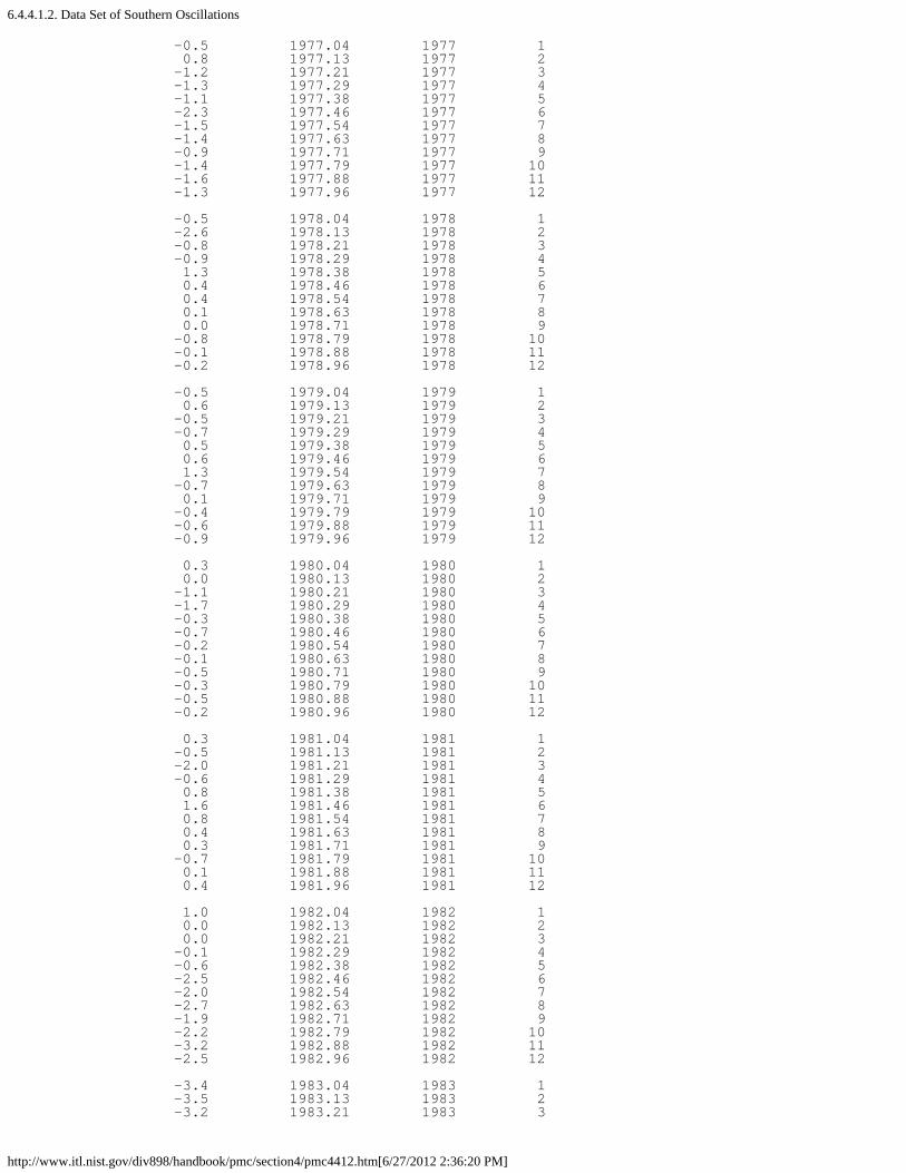
6.4.4.1.2. Data Set of Southern Oscillations
http://www.itl.nist.gov/div898/handbook/pmc/section4/pmc4412.htm[6/27/2012 2:36:20 PM]
-0.5 1977.04 1977 1 0.8 1977.13 1977 2 -1.2 1977.21 1977 3 -1.3 1977.29 1977 4 -1.1 1977.38 1977 5 -2.3 1977.46 1977 6 -1.5 1977.54 1977 7 -1.4 1977.63 1977 8 -0.9 1977.71 1977 9 -1.4 1977.79 1977 10 -1.6 1977.88 1977 11 -1.3 1977.96 1977 12 -0.5 1978.04 1978 1 -2.6 1978.13 1978 2 -0.8 1978.21 1978 3 -0.9 1978.29 1978 4 1.3 1978.38 1978 5 0.4 1978.46 1978 6 0.4 1978.54 1978 7 0.1 1978.63 1978 8 0.0 1978.71 1978 9 -0.8 1978.79 1978 10 -0.1 1978.88 1978 11 -0.2 1978.96 1978 12 -0.5 1979.04 1979 1 0.6 1979.13 1979 2 -0.5 1979.21 1979 3 -0.7 1979.29 1979 4 0.5 1979.38 1979 5 0.6 1979.46 1979 6 1.3 1979.54 1979 7 -0.7 1979.63 1979 8 0.1 1979.71 1979 9 -0.4 1979.79 1979 10 -0.6 1979.88 1979 11 -0.9 1979.96 1979 12 0.3 1980.04 1980 1 0.0 1980.13 1980 2 -1.1 1980.21 1980 3 -1.7 1980.29 1980 4 -0.3 1980.38 1980 5 -0.7 1980.46 1980 6 -0.2 1980.54 1980 7 -0.1 1980.63 1980 8 -0.5 1980.71 1980 9 -0.3 1980.79 1980 10 -0.5 1980.88 1980 11 -0.2 1980.96 1980 12 0.3 1981.04 1981 1 -0.5 1981.13 1981 2 -2.0 1981.21 1981 3 -0.6 1981.29 1981 4 0.8 1981.38 1981 5 1.6 1981.46 1981 6 0.8 1981.54 1981 7 0.4 1981.63 1981 8 0.3 1981.71 1981 9 -0.7 1981.79 1981 10 0.1 1981.88 1981 11 0.4 1981.96 1981 12 1.0 1982.04 1982 1 0.0 1982.13 1982 2 0.0 1982.21 1982 3 -0.1 1982.29 1982 4 -0.6 1982.38 1982 5 -2.5 1982.46 1982 6 -2.0 1982.54 1982 7 -2.7 1982.63 1982 8 -1.9 1982.71 1982 9 -2.2 1982.79 1982 10 -3.2 1982.88 1982 11 -2.5 1982.96 1982 12 -3.4 1983.04 1983 1 -3.5 1983.13 1983 2 -3.2 1983.21 1983 3
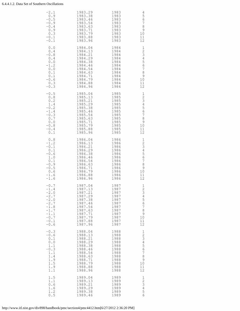
6.4.4.1.2. Data Set of Southern Oscillations
http://www.itl.nist.gov/div898/handbook/pmc/section4/pmc4412.htm[6/27/2012 2:36:20 PM]
-2.1 1983.29 1983 4 0.9 1983.38 1983 5 -0.5 1983.46 1983 6 -0.9 1983.54 1983 7 -0.4 1983.63 1983 8 0.9 1983.71 1983 9 0.3 1983.79 1983 10 -0.1 1983.88 1983 11 -0.1 1983.96 1983 12 0.0 1984.04 1984 1 0.4 1984.13 1984 2 -0.8 1984.21 1984 3 0.4 1984.29 1984 4 0.0 1984.38 1984 5 -1.2 1984.46 1984 6 0.0 1984.54 1984 7 0.1 1984.63 1984 8 0.1 1984.71 1984 9 -0.6 1984.79 1984 10 0.3 1984.88 1984 11 -0.3 1984.96 1984 12 -0.5 1985.04 1985 1 0.8 1985.13 1985 2 0.2 1985.21 1985 3 1.4 1985.29 1985 4 -0.2 1985.38 1985 5 -1.4 1985.46 1985 6 -0.3 1985.54 1985 7 0.7 1985.63 1985 8 0.0 1985.71 1985 9 -0.8 1985.79 1985 10 -0.4 1985.88 1985 11 0.1 1985.96 1985 12 0.8 1986.04 1986 1 -1.2 1986.13 1986 2 -0.1 1986.21 1986 3 0.1 1986.29 1986 4 -0.6 1986.38 1986 5 1.0 1986.46 1986 6 0.1 1986.54 1986 7 -0.9 1986.63 1986 8 -0.5 1986.71 1986 9 0.6 1986.79 1986 10 -1.6 1986.88 1986 11 -1.6 1986.96 1986 12 -0.7 1987.04 1987 1 -1.4 1987.13 1987 2 -2.0 1987.21 1987 3 -2.7 1987.29 1987 4 -2.0 1987.38 1987 5 -2.7 1987.46 1987 6 -1.8 1987.54 1987 7 -1.7 1987.63 1987 8 -1.1 1987.71 1987 9 -0.7 1987.79 1987 10 -0.1 1987.88 1987 11 -0.6 1987.96 1987 12 -0.3 1988.04 1988 1 -0.6 1988.13 1988 2 0.1 1988.21 1988 3 0.0 1988.29 1988 4 1.1 1988.38 1988 5 -0.3 1988.46 1988 6 1.1 1988.54 1988 7 1.4 1988.63 1988 8 1.9 1988.71 1988 9 1.5 1988.79 1988 10 1.9 1988.88 1988 11 1.1 1988.96 1988 12 1.5 1989.04 1989 1 1.1 1989.13 1989 2 0.6 1989.21 1989 3 1.6 1989.29 1989 4 1.2 1989.38 1989 5 0.5 1989.46 1989 6

6.4.4.1.2. Data Set of Southern Oscillations
http://www.itl.nist.gov/div898/handbook/pmc/section4/pmc4412.htm[6/27/2012 2:36:20 PM]
0.8 1989.54 1989 7 -0.8 1989.63 1989 8 0.6 1989.71 1989 9 0.6 1989.79 1989 10 -0.4 1989.88 1989 11 -0.7 1989.96 1989 12 -0.2 1990.04 1990 1 -2.4 1990.13 1990 2 -1.2 1990.21 1990 3 0.0 1990.29 1990 4 1.1 1990.38 1990 5 0.0 1990.46 1990 6 0.5 1990.54 1990 7 -0.5 1990.63 1990 8 -0.8 1990.71 1990 9 0.1 1990.79 1990 10 -0.7 1990.88 1990 11 -0.4 1990.96 1990 12 0.6 1991.04 1991 1 -0.1 1991.13 1991 2 -1.4 1991.21 1991 3 -1.0 1991.29 1991 4 -1.5 1991.38 1991 5 -0.5 1991.46 1991 6 -0.2 1991.54 1991 7 -0.9 1991.63 1991 8 -1.8 1991.71 1991 9 -1.5 1991.79 1991 10 -0.8 1991.88 1991 11 -2.3 1991.96 1991 12 -3.4 1992.04 1992 1 -1.4 1992.13 1992 2 -3.0 1992.21 1992 3 -1.4 1992.29 1992 4 0.0 1992.38 1992 5 -1.2 1992.46 1992 6 -0.8 1992.54 1992 7 0.0 1992.63 1992 8 0.0 1992.71 1992 9 -1.9 1992.79 1992 10 -0.9 1992.88 1992 11 -1.1 1992.96 1992 12

6.4.4.2. Stationarity
http://www.itl.nist.gov/div898/handbook/pmc/section4/pmc442.htm[6/27/2012 2:36:23 PM]
6. Process or Product Monitoring and Control 6.4. Introduction to Time Series Analysis 6.4.4. Univariate Time Series Models
6.4.4.2. Stationarity
Stationarity A common assumption in many time series techniques isthat the data are stationary.
A stationary process has the property that the mean,variance and autocorrelation structure do not change overtime. Stationarity can be defined in precise mathematicalterms, but for our purpose we mean a flat looking series,without trend, constant variance over time, a constantautocorrelation structure over time and no periodicfluctuations (seasonality).
For practical purposes, stationarity can usually bedetermined from a run sequence plot.
Transformationsto AchieveStationarity
If the time series is not stationary, we can often transformit to stationarity with one of the following techniques.
1. We can difference the data. That is, given the seriesZt, we create the new series
The differenced data will contain one less point thanthe original data. Although you can difference thedata more than once, one difference is usuallysufficient.
2. If the data contain a trend, we can fit some type ofcurve to the data and then model the residuals fromthat fit. Since the purpose of the fit is to simplyremove long term trend, a simple fit, such as astraight line, is typically used.
3. For non-constant variance, taking the logarithm orsquare root of the series may stabilize the variance.For negative data, you can add a suitable constantto make all the data positive before applying thetransformation. This constant can then be subtractedfrom the model to obtain predicted (i.e., the fitted)values and forecasts for future points.
The above techniques are intended to generate series with
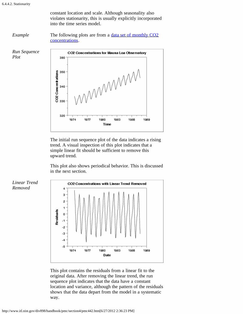
6.4.4.2. Stationarity
http://www.itl.nist.gov/div898/handbook/pmc/section4/pmc442.htm[6/27/2012 2:36:23 PM]
constant location and scale. Although seasonality alsoviolates stationarity, this is usually explicitly incorporatedinto the time series model.
Example The following plots are from a data set of monthly CO2concentrations.
Run SequencePlot
The initial run sequence plot of the data indicates a risingtrend. A visual inspection of this plot indicates that asimple linear fit should be sufficient to remove thisupward trend.
This plot also shows periodical behavior. This is discussedin the next section.
Linear TrendRemoved
This plot contains the residuals from a linear fit to theoriginal data. After removing the linear trend, the runsequence plot indicates that the data have a constantlocation and variance, although the pattern of the residualsshows that the data depart from the model in a systematicway.

6.4.4.2. Stationarity
http://www.itl.nist.gov/div898/handbook/pmc/section4/pmc442.htm[6/27/2012 2:36:23 PM]

6.4.4.3. Seasonality
http://www.itl.nist.gov/div898/handbook/pmc/section4/pmc443.htm[6/27/2012 2:36:24 PM]
6. Process or Product Monitoring and Control 6.4. Introduction to Time Series Analysis 6.4.4. Univariate Time Series Models
6.4.4.3. Seasonality
Seasonality Many time series display seasonality. By seasonality, wemean periodic fluctuations. For example, retail sales tend topeak for the Christmas season and then decline after theholidays. So time series of retail sales will typically showincreasing sales from September through December anddeclining sales in January and February.
Seasonality is quite common in economic time series. It is lesscommon in engineering and scientific data.
If seasonality is present, it must be incorporated into the timeseries model. In this section, we discuss techniques fordetecting seasonality. We defer modeling of seasonality untillater sections.
DetectingSeasonality
he following graphical techniques can be used to detectseasonality.
1. A run sequence plot will often show seasonality.
2. A seasonal subseries plot is a specialized technique forshowing seasonality.
3. Multiple box plots can be used as an alternative to theseasonal subseries plot to detect seasonality.
4. The autocorrelation plot can help identify seasonality.
Examples of each of these plots will be shown below.
The run sequence plot is a recommended first step foranalyzing any time series. Although seasonality cansometimes be indicated with this plot, seasonality is shownmore clearly by the seasonal subseries plot or the box plot.The seasonal subseries plot does an excellent job of showingboth the seasonal differences (between group patterns) andalso the within-group patterns. The box plot shows theseasonal difference (between group patterns) quite well, but itdoes not show within group patterns. However, for large datasets, the box plot is usually easier to read than the seasonalsubseries plot.
Both the seasonal subseries plot and the box plot assume that

6.4.4.3. Seasonality
http://www.itl.nist.gov/div898/handbook/pmc/section4/pmc443.htm[6/27/2012 2:36:24 PM]
the seasonal periods are known. In most cases, the analyst willin fact know this. For example, for monthly data, the period is12 since there are 12 months in a year. However, if the periodis not known, the autocorrelation plot can help. If there issignificant seasonality, the autocorrelation plot should showspikes at lags equal to the period. For example, for monthlydata, if there is a seasonality effect, we would expect to seesignificant peaks at lag 12, 24, 36, and so on (although theintensity may decrease the further out we go).
ExamplewithoutSeasonality
The following plots are from a data set of southernoscillations for predicting el nino.
RunSequencePlot
No obvious periodic patterns are apparent in the run sequenceplot.
SeasonalSubseriesPlot
The means for each month are relatively close and show noobvious pattern.
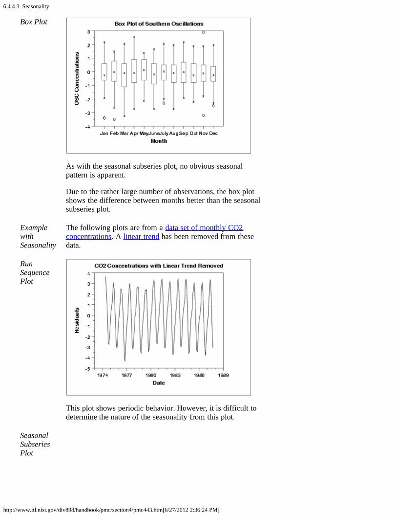
6.4.4.3. Seasonality
http://www.itl.nist.gov/div898/handbook/pmc/section4/pmc443.htm[6/27/2012 2:36:24 PM]
Box Plot
As with the seasonal subseries plot, no obvious seasonalpattern is apparent.
Due to the rather large number of observations, the box plotshows the difference between months better than the seasonalsubseries plot.
ExamplewithSeasonality
The following plots are from a data set of monthly CO2concentrations. A linear trend has been removed from thesedata.
RunSequencePlot
This plot shows periodic behavior. However, it is difficult todetermine the nature of the seasonality from this plot.
SeasonalSubseriesPlot
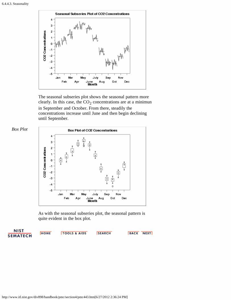
6.4.4.3. Seasonality
http://www.itl.nist.gov/div898/handbook/pmc/section4/pmc443.htm[6/27/2012 2:36:24 PM]
The seasonal subseries plot shows the seasonal pattern moreclearly. In this case, the CO2 concentrations are at a minimunin September and October. From there, steadily theconcentrations increase until June and then begin declininguntil September.
Box Plot
As with the seasonal subseries plot, the seasonal pattern isquite evident in the box plot.

6.4.4.3.1. Seasonal Subseries Plot
http://www.itl.nist.gov/div898/handbook/pmc/section4/pmc4431.htm[6/27/2012 2:36:25 PM]
6. Process or Product Monitoring and Control 6.4. Introduction to Time Series Analysis 6.4.4. Univariate Time Series Models 6.4.4.3. Seasonality
6.4.4.3.1. Seasonal Subseries Plot
Purpose Seasonal subseries plots (Cleveland 1993) are a tool fordetecting seasonality in a time series.
This plot is only useful if the period of the seasonality isalready known. In many cases, this will in fact be known. Forexample, monthly data typically has a period of 12.
If the period is not known, an autocorrelation plot or spectralplot can be used to determine it.
SamplePlot
This seasonal subseries plot containing monthly data of CO2concentrations reveals a strong seasonality pattern. The CO2concentrations peak in May, steadily decrease throughSeptember, and then begin rising again until the May peak.
This plot allows you to detect both between group and withingroup patterns.
If there is a large number of observations, then a box plot maybe preferable.
Definition Seasonal subseries plots are formed by
Vertical Response variable

6.4.4.3.1. Seasonal Subseries Plot
http://www.itl.nist.gov/div898/handbook/pmc/section4/pmc4431.htm[6/27/2012 2:36:25 PM]
axis:Horizontalaxis:
Time ordered by season. For example, withmonthly data, all the January values areplotted (in chronological order), then all theFebruary values, and so on.
In addition, a reference line is drawn at the group means.
The user must specify the length of the seasonal pattern beforegenerating this plot. In most cases, the analyst will know thisfrom the context of the problem and data collection.Sometimes the series will need to be detrended beforegenerating the plot, as was the case for the CO2 data.
Questions The seasonal subseries plot can provide answers to thefollowing questions:
1. Do the data exhibit a seasonal pattern?2. What is the nature of the seasonality?3. Is there a within-group pattern (e.g., do January and
July exhibit similar patterns)?4. Are there any outliers once seasonality has been
accounted for?
Importance It is important to know when analyzing a time series if there isa significant seasonality effect. The seasonal subseries plot isan excellent tool for determining if there is a seasonal pattern.
RelatedTechniques
Box Plot Run Sequence Plot Autocorrelation Plot
Software Seasonal subseries plots are available in a few general purposestatistical software programs. It may possible to write macrosto generate this plot in most statistical software programs thatdo not provide it directly. Seasonal subseries plots can begenerated using both Dataplot code and R code.

6.4.4.4. Common Approaches to Univariate Time Series
http://www.itl.nist.gov/div898/handbook/pmc/section4/pmc444.htm[6/27/2012 2:36:26 PM]
6. Process or Product Monitoring and Control 6.4. Introduction to Time Series Analysis 6.4.4. Univariate Time Series Models
6.4.4.4. Common Approaches to Univariate TimeSeries
There are a number of approaches to modeling time series.We outline a few of the most common approaches below.
Trend,Seasonal,ResidualDecompositions
One approach is to decompose the time series into a trend,seasonal, and residual component.
Triple exponential smoothing is an example of this approach.Another example, called seasonal loess, is based on locallyweighted least squares and is discussed by Cleveland (1993).We do not discuss seasonal loess in this handbook.
FrequencyBased Methods
Another approach, commonly used in scientific andengineering applications, is to analyze the series in thefrequency domain. An example of this approach in modelinga sinusoidal type data set is shown in the beam deflectioncase study. The spectral plot is the primary tool for thefrequency analysis of time series.
Detailed discussions of frequency-based methods areincluded in Bloomfield (1976), Jenkins and Watts (1968),and Chatfield (1996).
Autoregressive(AR) Models
A common approach for modeling univariate time series isthe autoregressive (AR) model:
where Xt is the time series, At is white noise, and
with denoting the process mean.
An autoregressive model is simply a linear regression of thecurrent value of the series against one or more prior valuesof the series. The value of p is called the order of the ARmodel.
AR models can be analyzed with one of various methods,
6.4.4.4. Common Approaches to Univariate Time Series
http://www.itl.nist.gov/div898/handbook/pmc/section4/pmc444.htm[6/27/2012 2:36:26 PM]
including standard linear least squares techniques. They alsohave a straightforward interpretation.
MovingAverage (MA)Models
Another common approach for modeling univariate timeseries models is the moving average (MA) model:
where Xt is the time series, is the mean of the series, At-iare white noise, and 1, ... , q are the parameters of themodel. The value of q is called the order of the MA model.
That is, a moving average model is conceptually a linearregression of the current value of the series against the whitenoise or random shocks of one or more prior values of theseries. The random shocks at each point are assumed to comefrom the same distribution, typically a normal distribution,with location at zero and constant scale. The distinction inthis model is that these random shocks are propogated tofuture values of the time series. Fitting the MA estimates ismore complicated than with AR models because the errorterms are not observable. This means that iterative non-linearfitting procedures need to be used in place of linear leastsquares. MA models also have a less obvious interpretationthan AR models.
Sometimes the ACF and PACF will suggest that a MAmodel would be a better model choice and sometimes bothAR and MA terms should be used in the same model (seeSection 6.4.4.5).
Note, however, that the error terms after the model is fitshould be independent and follow the standard assumptionsfor a univariate process.
Box-JenkinsApproach
Box and Jenkins popularized an approach that combines themoving average and the autoregressive approaches in thebook "Time Series Analysis: Forecasting and Control" (Box,Jenkins, and Reinsel, 1994).
Although both autoregressive and moving averageapproaches were already known (and were originallyinvestigated by Yule), the contribution of Box and Jenkinswas in developing a systematic methodology for identifyingand estimating models that could incorporate bothapproaches. This makes Box-Jenkins models a powerfulclass of models. The next several sections will discuss thesemodels in detail.
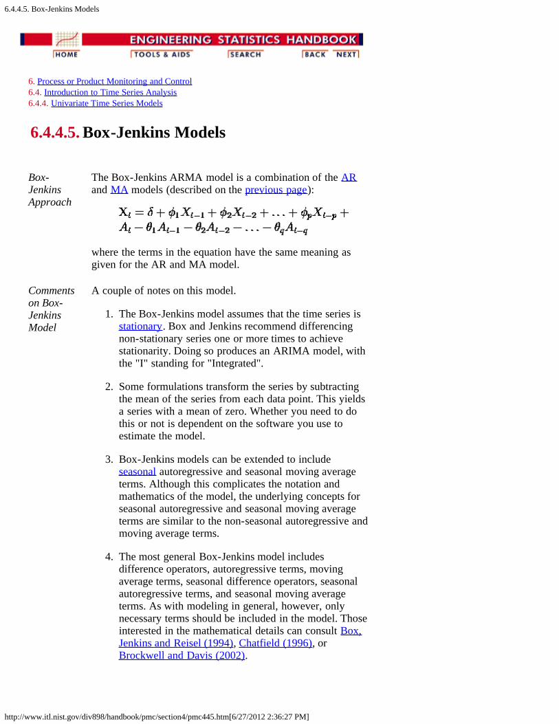
6.4.4.5. Box-Jenkins Models
http://www.itl.nist.gov/div898/handbook/pmc/section4/pmc445.htm[6/27/2012 2:36:27 PM]
6. Process or Product Monitoring and Control 6.4. Introduction to Time Series Analysis 6.4.4. Univariate Time Series Models
6.4.4.5. Box-Jenkins Models
Box-JenkinsApproach
The Box-Jenkins ARMA model is a combination of the ARand MA models (described on the previous page):
where the terms in the equation have the same meaning asgiven for the AR and MA model.
Commentson Box-JenkinsModel
A couple of notes on this model.
1. The Box-Jenkins model assumes that the time series isstationary. Box and Jenkins recommend differencingnon-stationary series one or more times to achievestationarity. Doing so produces an ARIMA model, withthe "I" standing for "Integrated".
2. Some formulations transform the series by subtractingthe mean of the series from each data point. This yieldsa series with a mean of zero. Whether you need to dothis or not is dependent on the software you use toestimate the model.
3. Box-Jenkins models can be extended to includeseasonal autoregressive and seasonal moving averageterms. Although this complicates the notation andmathematics of the model, the underlying concepts forseasonal autoregressive and seasonal moving averageterms are similar to the non-seasonal autoregressive andmoving average terms.
4. The most general Box-Jenkins model includesdifference operators, autoregressive terms, movingaverage terms, seasonal difference operators, seasonalautoregressive terms, and seasonal moving averageterms. As with modeling in general, however, onlynecessary terms should be included in the model. Thoseinterested in the mathematical details can consult Box,Jenkins and Reisel (1994), Chatfield (1996), orBrockwell and Davis (2002).
6.4.4.5. Box-Jenkins Models
http://www.itl.nist.gov/div898/handbook/pmc/section4/pmc445.htm[6/27/2012 2:36:27 PM]
Stages inBox-JenkinsModeling
There are three primary stages in building a Box-Jenkins timeseries model.
1. Model Identification2. Model Estimation3. Model Validation
Remarks The following remarks regarding Box-Jenkins models shouldbe noted.
1. Box-Jenkins models are quite flexible due to theinclusion of both autoregressive and moving averageterms.
2. Based on the Wold decomposition thereom (notdiscussed in the Handbook), a stationary process can beapproximated by an ARMA model. In practice, findingthat approximation may not be easy.
3. Chatfield (1996) recommends decomposition methodsfor series in which the trend and seasonal componentsare dominant.
4. Building good ARIMA models generally requires moreexperience than commonly used statistical methods suchas regression.
SufficientlyLongSeriesRequired
Typically, effective fitting of Box-Jenkins models requires atleast a moderately long series. Chatfield (1996) recommendsat least 50 observations. Many others would recommend atleast 100 observations.

6.4.4.6. Box-Jenkins Model Identification
http://www.itl.nist.gov/div898/handbook/pmc/section4/pmc446.htm[6/27/2012 2:36:28 PM]
6. Process or Product Monitoring and Control 6.4. Introduction to Time Series Analysis 6.4.4. Univariate Time Series Models
6.4.4.6. Box-Jenkins Model Identification
Stationarityand Seasonality
The first step in developing a Box-Jenkins model is todetermine if the series is stationary and if there is anysignificant seasonality that needs to be modeled.
Detectingstationarity
Stationarity can be assessed from a run sequence plot.The run sequence plot should show constant location andscale. It can also be detected from an autocorrelation plot.Specifically, non-stationarity is often indicated by anautocorrelation plot with very slow decay.
Detectingseasonality
Seasonality (or periodicity) can usually be assessed froman autocorrelation plot, a seasonal subseries plot, or aspectral plot.
Differencing toachievestationarity
Box and Jenkins recommend the differencing approach toachieve stationarity. However, fitting a curve andsubtracting the fitted values from the original data canalso be used in the context of Box-Jenkins models.
Seasonaldifferencing
At the model identification stage, our goal is to detectseasonality, if it exists, and to identify the order for theseasonal autoregressive and seasonal moving averageterms. For many series, the period is known and a singleseasonality term is sufficient. For example, for monthlydata we would typically include either a seasonal AR 12term or a seasonal MA 12 term. For Box-Jenkins models,we do not explicitly remove seasonality before fitting themodel. Instead, we include the order of the seasonal termsin the model specification to the ARIMA estimationsoftware. However, it may be helpful to apply a seasonaldifference to the data and regenerate the autocorrelationand partial autocorrelation plots. This may help in themodel idenfitication of the non-seasonal component ofthe model. In some cases, the seasonal differencing mayremove most or all of the seasonality effect.
Identify p and q Once stationarity and seasonality have been addressed,the next step is to identify the order (i.e., the p and q) ofthe autoregressive and moving average terms.
Autocorrelation The primary tools for doing this are the autocorrelation
6.4.4.6. Box-Jenkins Model Identification
http://www.itl.nist.gov/div898/handbook/pmc/section4/pmc446.htm[6/27/2012 2:36:28 PM]
and PartialAutocorrelationPlots
plot and the partial autocorrelation plot. The sampleautocorrelation plot and the sample partial autocorrelationplot are compared to the theoretical behavior of theseplots when the order is known.
Order ofAutoregressiveProcess (p)
Specifically, for an AR(1) process, the sampleautocorrelation function should have an exponentiallydecreasing appearance. However, higher-order ARprocesses are often a mixture of exponentially decreasingand damped sinusoidal components.
For higher-order autoregressive processes, the sampleautocorrelation needs to be supplemented with a partialautocorrelation plot. The partial autocorrelation of anAR(p) process becomes zero at lag p+1 and greater, sowe examine the sample partial autocorrelation function tosee if there is evidence of a departure from zero. This isusually determined by placing a 95% confidence intervalon the sample partial autocorrelation plot (most softwareprograms that generate sample autocorrelation plots willalso plot this confidence interval). If the softwareprogram does not generate the confidence band, it isapproximately , with N denoting the samplesize.
Order ofMovingAverageProcess (q)
The autocorrelation function of a MA(q) process becomeszero at lag q+1 and greater, so we examine the sampleautocorrelation function to see where it essentiallybecomes zero. We do this by placing the 95% confidenceinterval for the sample autocorrelation function on thesample autocorrelation plot. Most software that cangenerate the autocorrelation plot can also generate thisconfidence interval.
The sample partial autocorrelation function is generallynot helpful for identifying the order of the movingaverage process.
Shape ofAutocorrelationFunction
The following table summarizes how we use the sampleautocorrelation function for model identification.
SHAPE INDICATED MODEL
Exponential,decaying tozero
Autoregressive model. Use thepartial autocorrelation plot toidentify the order of theautoregressive model.
Alternatingpositive andnegative,decaying tozero
Autoregressive model. Use thepartial autocorrelation plot tohelp identify the order.

6.4.4.6. Box-Jenkins Model Identification
http://www.itl.nist.gov/div898/handbook/pmc/section4/pmc446.htm[6/27/2012 2:36:28 PM]
One or morespikes, rest areessentiallyzero
Moving average model, orderidentified by where plot becomeszero.
Decay, startingafter a fewlags
Mixed autoregressive andmoving average model.
All zero orclose to zero
Data is essentially random.
High values atfixed intervals
Include seasonal autoregressiveterm.
No decay tozero
Series is not stationary.
Mixed ModelsDifficult toIdentify
In practice, the sample autocorrelation and partialautocorrelation functions are random variables and willnot give the same picture as the theoretical functions.This makes the model identification more difficult. Inparticular, mixed models can be particularly difficult toidentify.
Although experience is helpful, developing good modelsusing these sample plots can involve much trial and error.For this reason, in recent years information-based criteriasuch as FPE (Final Prediction Error) and AIC (AikakeInformation Criterion) and others have been preferredand used. These techniques can help automate the modelidentification process. These techniques require computersoftware to use. Fortunately, these techniques areavailable in many commerical statistical softwareprograms that provide ARIMA modeling capabilities.
For additional information on these techniques, seeBrockwell and Davis (1987, 2002).
Examples We show a typical series of plots for performing theinitial model identification for
1. the southern oscillations data and2. the CO2 monthly concentrations data.

6.4.4.6.1. Model Identification for Southern Oscillations Data
http://www.itl.nist.gov/div898/handbook/pmc/section4/pmc4461.htm[6/27/2012 2:36:29 PM]
6. Process or Product Monitoring and Control 6.4. Introduction to Time Series Analysis 6.4.4. Univariate Time Series Models 6.4.4.6. Box-Jenkins Model Identification
6.4.4.6.1. Model Identification for SouthernOscillations Data
Example forSouthernOscillations
We show typical series of plots for the initial modelidentification stages of Box-Jenkins modeling for twodifferent examples.
The first example is for the southern oscillations data set.We start with the run sequence plot and seasonal subseriesplot to determine if we need to address stationarity andseasonality.
Run SequencePlot
The run sequence plot indicates stationarity.
SeasonalSubseries Plot

6.4.4.6.1. Model Identification for Southern Oscillations Data
http://www.itl.nist.gov/div898/handbook/pmc/section4/pmc4461.htm[6/27/2012 2:36:29 PM]
The seasonal subseries plot indicates that there is nosignificant seasonality.
Since the above plots show that this series does notexhibit any significant non-stationarity or seasonality, wegenerate the autocorrelation and partial autocorrelationplots of the raw data.
AutocorrelationPlot
The autocorrelation plot shows a mixture of exponentiallydecaying and damped sinusoidal components. Thisindicates that an autoregressive model, with order greaterthan one, may be appropriate for these data. The partialautocorrelation plot should be examined to determine theorder.
PartialAutocorrelationPlot
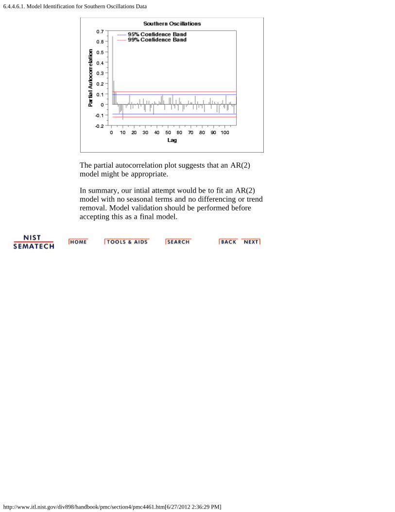
6.4.4.6.1. Model Identification for Southern Oscillations Data
http://www.itl.nist.gov/div898/handbook/pmc/section4/pmc4461.htm[6/27/2012 2:36:29 PM]
The partial autocorrelation plot suggests that an AR(2)model might be appropriate.
In summary, our intial attempt would be to fit an AR(2)model with no seasonal terms and no differencing or trendremoval. Model validation should be performed beforeaccepting this as a final model.
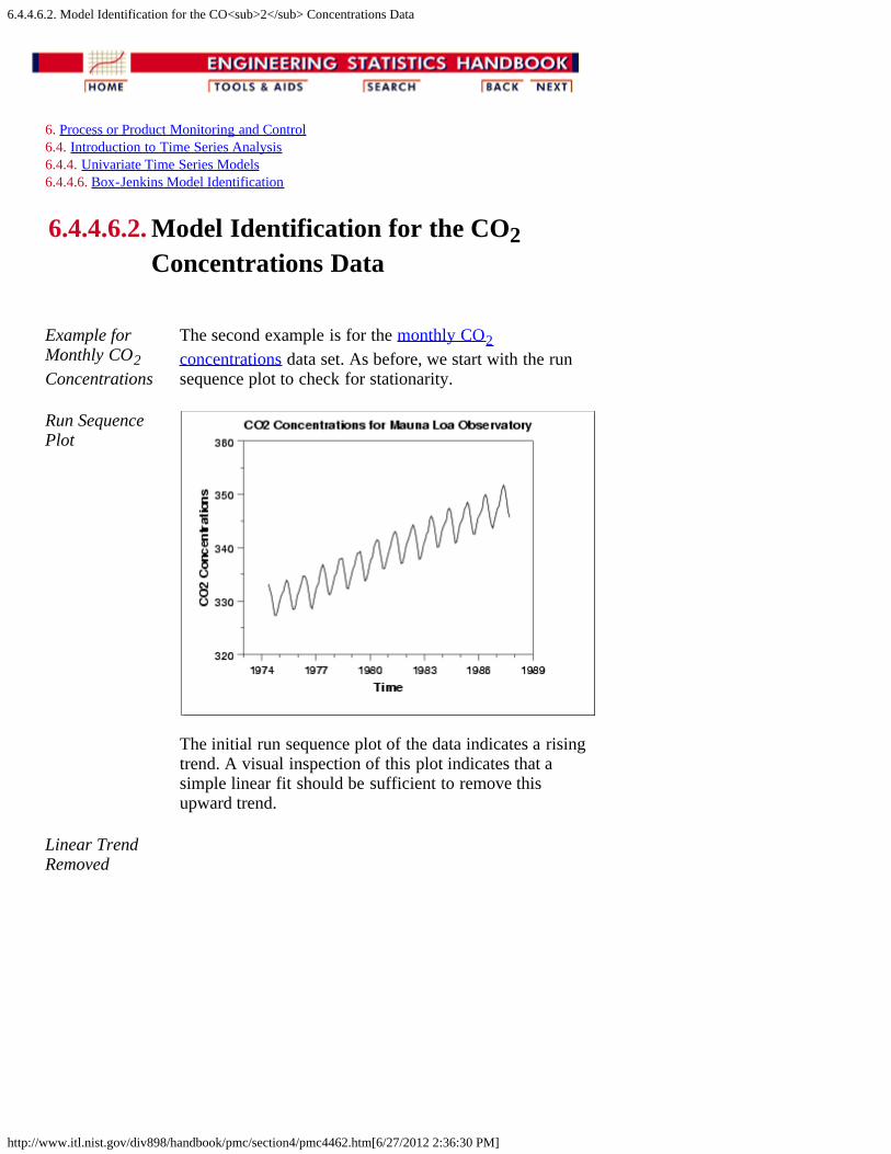
6.4.4.6.2. Model Identification for the CO<sub>2</sub> Concentrations Data
http://www.itl.nist.gov/div898/handbook/pmc/section4/pmc4462.htm[6/27/2012 2:36:30 PM]
6. Process or Product Monitoring and Control 6.4. Introduction to Time Series Analysis 6.4.4. Univariate Time Series Models 6.4.4.6. Box-Jenkins Model Identification
6.4.4.6.2. Model Identification for the CO2Concentrations Data
Example forMonthly CO2Concentrations
The second example is for the monthly CO2concentrations data set. As before, we start with the runsequence plot to check for stationarity.
Run SequencePlot
The initial run sequence plot of the data indicates a risingtrend. A visual inspection of this plot indicates that asimple linear fit should be sufficient to remove thisupward trend.
Linear TrendRemoved
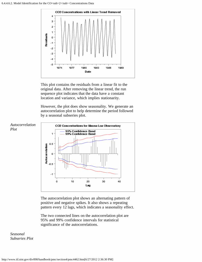
6.4.4.6.2. Model Identification for the CO<sub>2</sub> Concentrations Data
http://www.itl.nist.gov/div898/handbook/pmc/section4/pmc4462.htm[6/27/2012 2:36:30 PM]
This plot contains the residuals from a linear fit to theoriginal data. After removing the linear trend, the runsequence plot indicates that the data have a constantlocation and variance, which implies stationarity.
However, the plot does show seasonality. We generate anautocorrelation plot to help determine the period followedby a seasonal subseries plot.
AutocorrelationPlot
The autocorrelation plot shows an alternating pattern ofpositive and negative spikes. It also shows a repeatingpattern every 12 lags, which indicates a seasonality effect.
The two connected lines on the autocorrelation plot are95% and 99% confidence intervals for statisticalsignificance of the autocorrelations.
SeasonalSubseries Plot
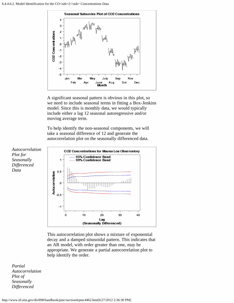
6.4.4.6.2. Model Identification for the CO<sub>2</sub> Concentrations Data
http://www.itl.nist.gov/div898/handbook/pmc/section4/pmc4462.htm[6/27/2012 2:36:30 PM]
A significant seasonal pattern is obvious in this plot, sowe need to include seasonal terms in fitting a Box-Jenkinsmodel. Since this is monthly data, we would typicallyinclude either a lag 12 seasonal autoregressive and/ormoving average term.
To help identify the non-seasonal components, we willtake a seasonal difference of 12 and generate theautocorrelation plot on the seasonally differenced data.
AutocorrelationPlot forSeasonallyDifferencedData
This autocorrelation plot shows a mixture of exponentialdecay and a damped sinusoidal pattern. This indicates thatan AR model, with order greater than one, may beappropriate. We generate a partial autocorrelation plot tohelp identify the order.
PartialAutocorrelationPlot ofSeasonallyDifferenced

6.4.4.6.2. Model Identification for the CO<sub>2</sub> Concentrations Data
http://www.itl.nist.gov/div898/handbook/pmc/section4/pmc4462.htm[6/27/2012 2:36:30 PM]
Data
The partial autocorrelation plot suggests that an AR(2)model might be appropriate since the partialautocorrelation becomes zero after the second lag. The lag12 is also significant, indicating some remainingseasonality.
In summary, our intial attempt would be to fit an AR(2)model with a seasonal AR(12) term on the data with alinear trend line removed. We could try the model bothwith and without seasonal differencing applied. Modelvalidation should be performed before accepting this as afinal model.
6.4.4.6.3. Partial Autocorrelation Plot
http://www.itl.nist.gov/div898/handbook/pmc/section4/pmc4463.htm[6/27/2012 2:36:31 PM]
6. Process or Product Monitoring and Control 6.4. Introduction to Time Series Analysis 6.4.4. Univariate Time Series Models 6.4.4.6. Box-Jenkins Model Identification
6.4.4.6.3. Partial Autocorrelation Plot
Purpose:ModelIdentificationfor Box-JenkinsModels
Partial autocorrelation plots (Box and Jenkins, pp. 64-65,1970) are a commonly used tool for model identification inBox-Jenkins models.
The partial autocorrelation at lag k is the autocorrelationbetween Xt and Xt-k that is not accounted for by lags 1through k-1.
There are algorithms, not discussed here, for computing thepartial autocorrelation based on the sample autocorrelations.See (Box, Jenkins, and Reinsel 1970) or (Brockwell, 1991)for the mathematical details.
Specifically, partial autocorrelations are useful inidentifying the order of an autoregressive model. The partialautocorrelation of an AR(p) process is zero at lag p+1 andgreater. If the sample autocorrelation plot indicates that anAR model may be appropriate, then the sample partialautocorrelation plot is examined to help identify the order.We look for the point on the plot where the partialautocorrelations essentially become zero. Placing a 95%confidence interval for statistical significance is helpful forthis purpose.
The approximate 95% confidence interval for the partialautocorrelations are at .
Sample Plot

6.4.4.6.3. Partial Autocorrelation Plot
http://www.itl.nist.gov/div898/handbook/pmc/section4/pmc4463.htm[6/27/2012 2:36:31 PM]
This partial autocorrelation plot shows clear statisticalsignificance for lags 1 and 2 (lag 0 is always 1). The nextfew lags are at the borderline of statistical significance. Ifthe autocorrelation plot indicates that an AR model isappropriate, we could start our modeling with an AR(2)model. We might compare this with an AR(3) model.
Definition Partial autocorrelation plots are formed by
Vertical axis: Partial autocorrelation coefficient atlag h.
Horizontalaxis:
Time lag h (h = 0, 1, 2, 3, ...).
In addition, 95% confidence interval bands are typicallyincluded on the plot.
Questions The partial autocorrelation plot can help provide answers tothe following questions:
1. Is an AR model appropriate for the data?2. If an AR model is appropriate, what order should we
use?
RelatedTechniques
Autocorrelation Plot Run Sequence Plot Spectral Plot
Case Study The partial autocorrelation plot is demonstrated in the Negizdata case study.
Software Partial autocorrelation plots are available in many generalpurpose statistical software programs.

6.4.4.6.3. Partial Autocorrelation Plot
http://www.itl.nist.gov/div898/handbook/pmc/section4/pmc4463.htm[6/27/2012 2:36:31 PM]

6.4.4.7. Box-Jenkins Model Estimation
http://www.itl.nist.gov/div898/handbook/pmc/section4/pmc447.htm[6/27/2012 2:36:31 PM]
6. Process or Product Monitoring and Control 6.4. Introduction to Time Series Analysis 6.4.4. Univariate Time Series Models
6.4.4.7. Box-Jenkins Model Estimation
UseSoftware
Estimating the parameters for the Box-Jenkins models is aquite complicated non-linear estimation problem. For thisreason, the parameter estimation should be left to a highquality software program that fits Box-Jenkins models.Fortunately, many commerical statistical software programsnow fit Box-Jenkins models.
Approaches The main approaches to fitting Box-Jenkins models are non-linear least squares and maximum likelihood estimation.
Maximum likelihood estimation is generally the preferredtechnique. The likelihood equations for the full Box-Jenkinsmodel are complicated and are not included here. See(Brockwell and Davis, 1991) for the mathematical details.
ModelEstimationExample
The Negiz case study shows an example of the Box-Jenkinsmodel-fitting.

6.4.4.8. Box-Jenkins Model Diagnostics
http://www.itl.nist.gov/div898/handbook/pmc/section4/pmc448.htm[6/27/2012 2:36:32 PM]
6. Process or Product Monitoring and Control 6.4. Introduction to Time Series Analysis 6.4.4. Univariate Time Series Models
6.4.4.8. Box-Jenkins Model Diagnostics
Assumptionsfor a StableUnivariateProcess
Model diagnostics for Box-Jenkins models is similar tomodel validation for non-linear least squares fitting.
That is, the error term At is assumed to follow theassumptions for a stationary univariate process. The residualsshould be white noise (or independent when theirdistributions are normal) drawings from a fixed distributionwith a constant mean and variance. If the Box-Jenkins modelis a good model for the data, the residuals should satisfythese assumptions.
If these assumptions are not satisfied, we need to fit a moreappropriate model. That is, we go back to the modelidentification step and try to develop a better model.Hopefully the analysis of the residuals can provide someclues as to a more appropriate model.
4-Plot ofResiduals
As discussed in the EDA chapter, one way to assess if theresiduals from the Box-Jenkins model follow theassumptions is to generate a 4-plot of the residuals and anautocorrelation plot of the residuals. One could also look atthe value of the Box-Ljung (1978) statistic.
An example of analyzing the residuals from a Box-Jenkinsmodel is given in the Negiz data case study.

Information Technology Laboratory Homepage
http://www.nist.gov/itl/[6/27/2012 2:36:39 PM]
TopicsBiometrics
Computer Security
Math
Networking
Statistics
Software
Usability
DivisionsApplied and ComputationalMathematics
Advanced Network Technologies
Computer Security
Information Access
Software and Systems
Statistical Engineering
Staff Directory
NewsNew Quantum Computing Algorithm Could Simulate GiantParticle Accelerators
NIST Releases Final Version of Revised Bluetooth Security Guide
NIST Will Hold ‘Big Data’ Workshop June 13-14
>> see all news ...
Conferences and EventsICT Supply Chain Risk Management (SCRM) Workshop -POSTPONEDJuly 11-12, 2012
Revised Draft FIPS 201–2 WorkshopJuly 25, 2012
Programs/ProjectsComplex Systems
Pervasive Information Technology
Virtual Measurements
Health Information Technology
Voting
Quantum
Cloud Computing
ContactCharles H. Romine, DirectorJames St. Pierre, Deputy Director
General Information:301-975-2900 Telephone301-975-2378 Facsimile
100 Bureau Drive, M/S 8900Gaithersburg, MD 20899-8900
Sign Up for ITL Newsletters &Bulletins:
NIST Home > Information Technology Laboratory Homepage
NIST Time NIST Home About NIST Contact Us A-Z Site Index
Popular LinksComputer Security Resource Center
Biometrics Resource Center
ITL Brochure - January 2012
NIST Voting Activities
Federal Processing InformationStandards (FIPS)
ANSI Accredited StandardsDevelopment
Current ITL Newsletter
ITL Bulletins
ITL SURF Program
Comments received in Response toInternet Policy Task ForceCybersecurity Green Paper
NIST Special Publication 500 Series
Comments received in Response toModels To Advance VoluntaryCorporate Notification toConsumers Regarding the Illicit Useof Computer Equipment by Botnetsand Related Malware FederalRegister Notice
NIST Digital Library of Mathematical FunctionsReceives IT Award 1 2 3 4
About ITL Publications Topic/Subject Areas Products/Services News/Multimedia Programs/Projects

Information Technology Laboratory Homepage
http://www.nist.gov/itl/[6/27/2012 2:36:39 PM]
Sign Up for NIST E-mail alerts:
The National Institute of Standards and Technology (NIST) is an agency of the U.S. Department of Commerce.
Privacy Policy / Security Notice / Accessibility Statement / Disclaimer / Freedom of Information Act (FOIA) / Environmental Policy Statement / No Fear Act Policy / NIST Information Quality Standards / Scientific Integrity Summary
Date created: August 24, 2010 | Last updated: May 23, 2012 Contact: Webmaster

6.4.4.9. Example of Univariate Box-Jenkins Analysis
http://www.itl.nist.gov/div898/handbook/pmc/section4/pmc449.htm[6/27/2012 2:36:40 PM]
6. Process or Product Monitoring and Control 6.4. Introduction to Time Series Analysis 6.4.4. Univariate Time Series Models
6.4.4.9. Example of Univariate Box-JenkinsAnalysis
Series F We analyze the series F data set in Box, Jenkins, and Reinsel,1994. A plot of the 70 raw data points is shown below.
The data do not appear to have a seasonal component or anoticeable trend. (The stationarity of the series was verifiedby fitting a straight line to the data versus time period. Theslope was not found to be significantly different from zero(p-value = 0.2).)
ModelIdentification
We compute the autocorrelation function (ACF) of the datafor the first 35 lags to determine the type of model to fit tothe data. We list the numeric results and plot the ACF (alongwith 95 % confidence limits) versus the lag number.
Lag ACF 0 1.000000000 1 -0.389878319 2 0.304394082 3 -0.165554717 4 0.070719321 5 -0.097039288 6 -0.047057692

6.4.4.9. Example of Univariate Box-Jenkins Analysis
http://www.itl.nist.gov/div898/handbook/pmc/section4/pmc449.htm[6/27/2012 2:36:40 PM]
7 0.035373112 8 -0.043458199 9 -0.004796162 10 0.014393137 11 0.109917200 12 -0.068778492 13 0.148034489 14 0.035768581 15 -0.006677806 16 0.173004275 17 -0.111342583 18 0.019970791 19 -0.047349722 20 0.016136806 21 0.022279561 22 -0.078710582 23 -0.009577413 24 -0.073114034 25 -0.019503289 26 0.041465024 27 -0.022134370 28 0.088887299 29 0.016247148 30 0.003946351 31 0.004584069 32 -0.024782198 33 -0.025905040 34 -0.062879966 35 0.026101117
The ACF values alternate in sign and decay quickly after lag2, indicating that an AR(2) model is appropriate for the data.
ModelFitting
We fit an AR(2) model to the data.
The model fitting results are shown below.
Source Estimate Standard Error------ -------- --------------φ1 -0.3198 0.1202

6.4.4.9. Example of Univariate Box-Jenkins Analysis
http://www.itl.nist.gov/div898/handbook/pmc/section4/pmc449.htm[6/27/2012 2:36:40 PM]
φ2 0.1797 0.1202
δ = 51.1286 Residual standard deviation = 10.9599
Test randomness of residuals:Standardized Runs Statistic Z = 0.4887, p-value = 0.625
Forecasting Using our AR(2) model, we forcast values six time periodsinto the future.
Period Prediction Standard Error 71 60.6405 10.9479 72 43.0317 11.4941 73 55.4274 11.9015 74 48.2987 12.0108 75 52.8061 12.0585 76 50.0835 12.0751
The "historical" data and forecasted values (with 90 %confidence limits) are shown in the graph below.

6.4.4.10. Box-Jenkins Analysis on Seasonal Data
http://www.itl.nist.gov/div898/handbook/pmc/section4/pmc44a.htm[6/27/2012 2:36:41 PM]
6. Process or Product Monitoring and Control 6.4. Introduction to Time Series Analysis 6.4.4. Univariate Time Series Models
6.4.4.10. Box-Jenkins Analysis on Seasonal Data
Series G This example illustrates a Box-Jenkins time series analysisfor seasonal data using the series G data set in Box, Jenkins,and Reinsel, 1994. A plot of the 144 observations is shownbelow.
Non-constant variance can be removed by performing anatural log transformation.
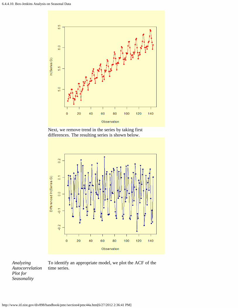
6.4.4.10. Box-Jenkins Analysis on Seasonal Data
http://www.itl.nist.gov/div898/handbook/pmc/section4/pmc44a.htm[6/27/2012 2:36:41 PM]
Next, we remove trend in the series by taking firstdifferences. The resulting series is shown below.
AnalyzingAutocorrelationPlot forSeasonality
To identify an appropriate model, we plot the ACF of thetime series.
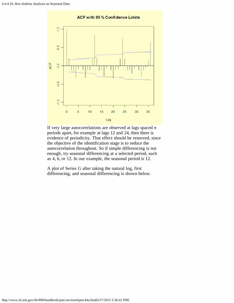
6.4.4.10. Box-Jenkins Analysis on Seasonal Data
http://www.itl.nist.gov/div898/handbook/pmc/section4/pmc44a.htm[6/27/2012 2:36:41 PM]
If very large autocorrelations are observed at lags spaced nperiods apart, for example at lags 12 and 24, then there isevidence of periodicity. That effect should be removed, sincethe objective of the identification stage is to reduce theautocorrelation throughout. So if simple differencing is notenough, try seasonal differencing at a selected period, suchas 4, 6, or 12. In our example, the seasonal period is 12.
A plot of Series G after taking the natural log, firstdifferencing, and seasonal differencing is shown below.

6.4.4.10. Box-Jenkins Analysis on Seasonal Data
http://www.itl.nist.gov/div898/handbook/pmc/section4/pmc44a.htm[6/27/2012 2:36:41 PM]
The number of seasonal terms is rarely more than one. If youknow the shape of your forecast function, or you wish toassign a particular shape to the forecast function, you canselect the appropriate number of terms for seasonal AR orseasonal MA models.
The book by Box and Jenkins, Time Series AnalysisForecasting and Control (the later edition is Box, Jenkinsand Reinsel, 1994) has a discussion on these forecastfunctions on pages 326 - 328. Again, if you have only a faintnotion, but you do know that there was a trend upwardsbefore differencing, pick a seasonal MA term and see whatcomes out in the diagnostics.
An ACF plot of the seasonal and first differenced natural logof series G is shown below.
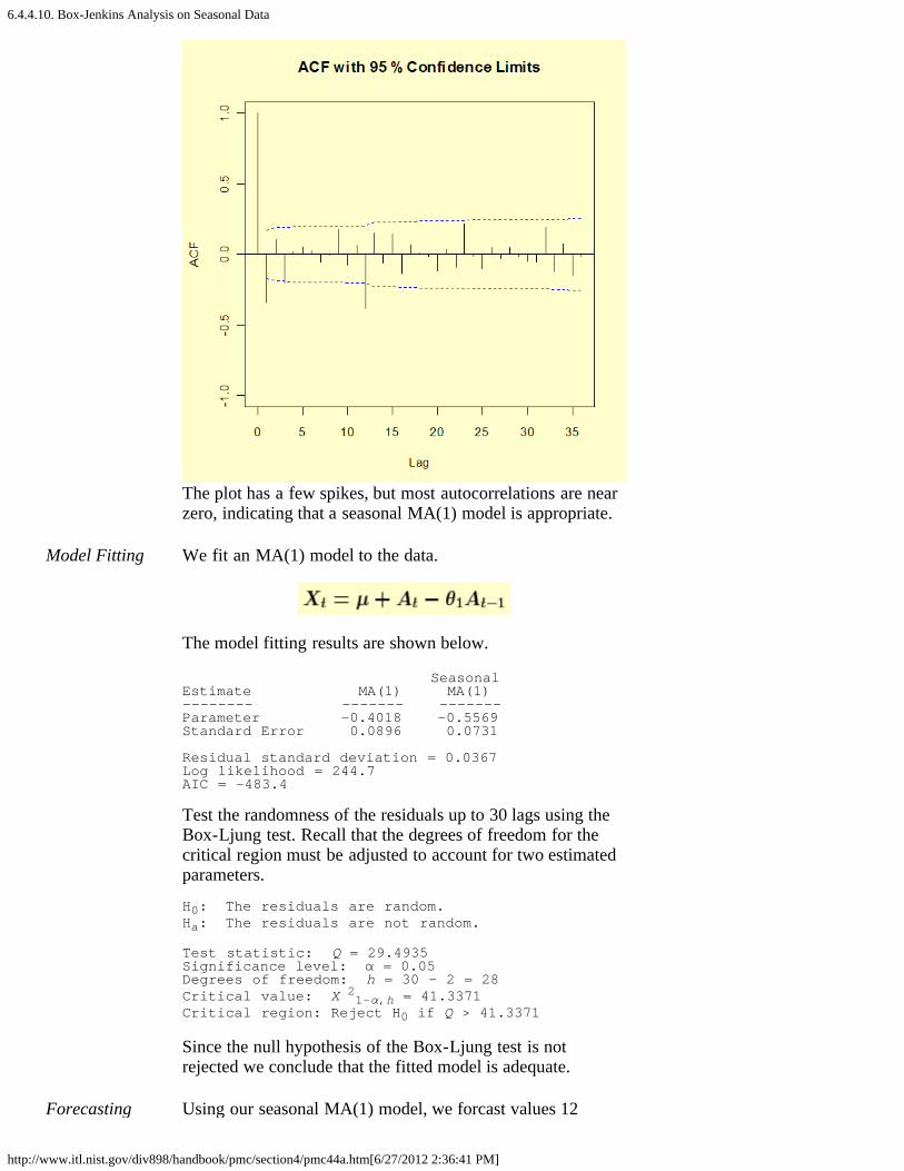
6.4.4.10. Box-Jenkins Analysis on Seasonal Data
http://www.itl.nist.gov/div898/handbook/pmc/section4/pmc44a.htm[6/27/2012 2:36:41 PM]
The plot has a few spikes, but most autocorrelations are nearzero, indicating that a seasonal MA(1) model is appropriate.
Model Fitting We fit an MA(1) model to the data.
The model fitting results are shown below.
SeasonalEstimate MA(1) MA(1)-------- ------- -------Parameter -0.4018 -0.5569Standard Error 0.0896 0.0731
Residual standard deviation = 0.0367 Log likelihood = 244.7AIC = -483.4
Test the randomness of the residuals up to 30 lags using theBox-Ljung test. Recall that the degrees of freedom for thecritical region must be adjusted to account for two estimatedparameters.
H0: The residuals are random.Ha: The residuals are not random.
Test statistic: Q = 29.4935Significance level: α = 0.05Degrees of freedom: h = 30 - 2 = 28Critical value: Χ 21-α,h = 41.3371 Critical region: Reject H0 if Q > 41.3371
Since the null hypothesis of the Box-Ljung test is notrejected we conclude that the fitted model is adequate.
Forecasting Using our seasonal MA(1) model, we forcast values 12

6.4.4.10. Box-Jenkins Analysis on Seasonal Data
http://www.itl.nist.gov/div898/handbook/pmc/section4/pmc44a.htm[6/27/2012 2:36:41 PM]
periods into the future and compute 90 % confidence limits.
Lower Upper Period Limit Forecast Limit ------ -------- -------- -------- 145 424.0234 450.7261 478.4649 146 396.7861 426.0042 456.7577 147 442.5731 479.3298 518.4399 148 451.3902 492.7365 537.1454 149 463.3034 509.3982 559.3245 150 527.3754 583.7383 645.2544 151 601.9371 670.4625 745.7830 152 595.7602 667.5274 746.9323 153 495.7137 558.5657 628.5389 154 439.1900 497.5430 562.8899 155 377.7598 430.1618 489.1730 156 417.3149 477.5643 545.7760
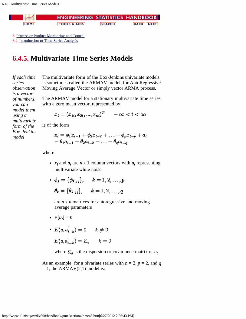
6.4.5. Multivariate Time Series Models
http://www.itl.nist.gov/div898/handbook/pmc/section4/pmc45.htm[6/27/2012 2:36:43 PM]
6. Process or Product Monitoring and Control6.4. Introduction to Time Series Analysis
6.4.5. Multivariate Time Series Models
If each timeseriesobservationis a vectorof numbers,you canmodel themusing amultivariateform of theBox-Jenkinsmodel
The multivariate form of the Box-Jenkins univariate modelsis sometimes called the ARMAV model, for AutoRegressiveMoving Average Vector or simply vector ARMA process.
The ARMAV model for a stationary multivariate time series,with a zero mean vector, represented by
is of the form
where
xt and at are n x 1 column vectors with at representingmultivariate white noise
are n x n matrices for autoregressive and movingaverage parameters
E[at] = 0
where a is the dispersion or covariance matrix of at
As an example, for a bivariate series with n = 2, p = 2, and q= 1, the ARMAV(2,1) model is:

6.4.5. Multivariate Time Series Models
http://www.itl.nist.gov/div898/handbook/pmc/section4/pmc45.htm[6/27/2012 2:36:43 PM]
with
Estimationofparametersandcovariancematrixdifficult
The estimation of the matrix parameters and covariancematrix is complicated and very difficult without computersoftware. The estimation of the Moving Average matrices isespecially an ordeal. If we opt to ignore the MAcomponent(s) we are left with the ARV model given by:
where
xt is a vector of observations, x1t, x2t, ... , xnt at time t
at is a vector of white noise, a1t, a2t, ... , ant at time t
is a n x n matrix of autoregressive parameters
E[at] = 0
where Σa is the dispersion or covariance matrix
A model with p autoregressive matrix parameters is anARV(p) model or a vector AR model.
The parameter matrices may be estimated by multivariateleast squares, but there are other methods such as maximiumlikelihood estimation.
Interestingpropertiesofparametermatrices
There are a few interesting properties associated with the phior AR parameter matrices. Consider the following examplefor a bivariate series with n =2, p = 2, and q = 0. TheARMAV(2,0) model is:
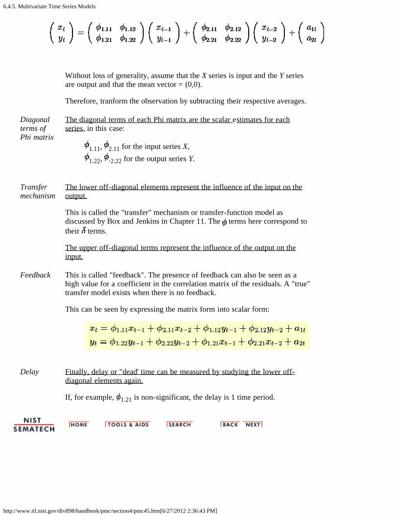
6.4.5. Multivariate Time Series Models
http://www.itl.nist.gov/div898/handbook/pmc/section4/pmc45.htm[6/27/2012 2:36:43 PM]
Without loss of generality, assume that the X series is input and the Y seriesare output and that the mean vector = (0,0).
Therefore, tranform the observation by subtracting their respective averages.
Diagonalterms ofPhi matrix
The diagonal terms of each Phi matrix are the scalar estimates for eachseries, in this case:
1.11, 2.11 for the input series X,
1.22, .2.22 for the output series Y.
Transfermechanism
The lower off-diagonal elements represent the influence of the input on theoutput.
This is called the "transfer" mechanism or transfer-function model asdiscussed by Box and Jenkins in Chapter 11. The terms here correspond totheir terms.
The upper off-diagonal terms represent the influence of the output on theinput.
Feedback This is called "feedback". The presence of feedback can also be seen as ahigh value for a coefficient in the correlation matrix of the residuals. A "true"transfer model exists when there is no feedback.
This can be seen by expressing the matrix form into scalar form:
Delay Finally, delay or "dead' time can be measured by studying the lower off-diagonal elements again.
If, for example, 1.21 is non-significant, the delay is 1 time period.
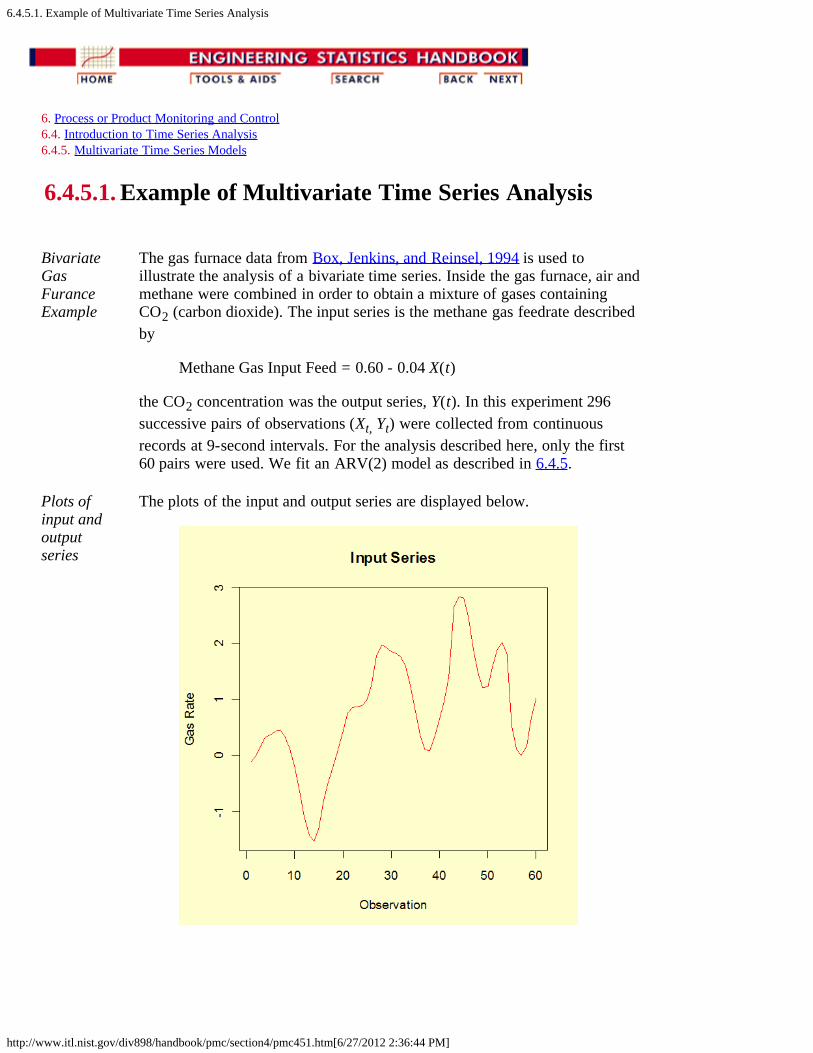
6.4.5.1. Example of Multivariate Time Series Analysis
http://www.itl.nist.gov/div898/handbook/pmc/section4/pmc451.htm[6/27/2012 2:36:44 PM]
6. Process or Product Monitoring and Control 6.4. Introduction to Time Series Analysis 6.4.5. Multivariate Time Series Models
6.4.5.1. Example of Multivariate Time Series Analysis
BivariateGasFuranceExample
The gas furnace data from Box, Jenkins, and Reinsel, 1994 is used toillustrate the analysis of a bivariate time series. Inside the gas furnace, air andmethane were combined in order to obtain a mixture of gases containingCO2 (carbon dioxide). The input series is the methane gas feedrate describedby
Methane Gas Input Feed = 0.60 - 0.04 X(t)
the CO2 concentration was the output series, Y(t). In this experiment 296successive pairs of observations (Xt, Yt) were collected from continuousrecords at 9-second intervals. For the analysis described here, only the first60 pairs were used. We fit an ARV(2) model as described in 6.4.5.
Plots ofinput andoutputseries
The plots of the input and output series are displayed below.

6.4.5.1. Example of Multivariate Time Series Analysis
http://www.itl.nist.gov/div898/handbook/pmc/section4/pmc451.htm[6/27/2012 2:36:44 PM]
ModelFitting
The scalar form of the ARV(2) model is the following.
The equation for xt corresponds to gas rate while the equation for ytcorresponds to CO2 concentration.
The parameter estimates for the equation associated with gas rate are thefollowing.
Estimate Std. Err. t value Pr(>|t|) a1t 0.003063 0.035769 0.086 0.932 φ1.11 1.683225 0.123128 13.671 < 2e-16φ2.11 -0.860205 0.165886 -5.186 3.44e-06φ1.12 -0.076224 0.096947 -0.786 0.435 φ2.12 0.044774 0.082285 0.544 0.589
Residual standard error: 0.2654 based on 53 degrees of freedomMultiple R-Squared: 0.9387Adjusted R-squared: 0.9341 F-statistic: 203.1 based on 4 and 53 degrees of freedom p-value: < 2.2e-16
The parameter estimates for the equation associated with CO2 concentrationare the following.
Estimate Std. Err. t value Pr(>|t|) a2t -0.03372 0.01615 -2.088 0.041641 φ1.22 1.22630 0.04378 28.013 < 2e-16φ2.22 -0.40927 0.03716 -11.015 2.57e-15φ 0.22898 0.05560 4.118 0.000134

6.4.5.1. Example of Multivariate Time Series Analysis
http://www.itl.nist.gov/div898/handbook/pmc/section4/pmc451.htm[6/27/2012 2:36:44 PM]
1.21φ2.21 -0.80532 0.07491 -10.751 6.29e-15
Residual standard error: 0.1198 based on 53 degrees of freedomMultiple R-Squared: 0.9985 Adjusted R-squared: 0.9984 F-statistic: 8978 based on 4 and 53 degrees of freedomp-value: < 2.2e-16
Box-Ljung tests performed for each series to test the randomness of the first24 residuals were not significant. The p-values for the tests using CO2concentration residuals and gas rate residuals were 0.4 and 0.6, respectively.
Forecasting The forecasting method is an extension of the model and follows the theoryoutlined in the previous section. The forecasted values of the next sixobservations (61-66) and the associated 90 % confidence limits are shownbelow for each series.
90% Lower Concentration 90% UpperObservation Limit Forecast Limit----------- --------- -------- --------- 61 51.0 51.2 51.4 62 51.0 51.3 51.6 63 50.6 51.0 51.4 64 49.8 50.5 51.1 65 48.7 50.0 51.3 66 47.6 49.7 51.8
90% Lower Rate 90% UpperObservation Limit Forecast Limit----------- --------- -------- --------- 61 0.795 1.231 1.668 62 0.439 1.295 2.150 63 0.032 1.242 2.452 64 -0.332 1.128 2.588 65 -0.605 1.005 2.614 66 -0.776 0.908 2.593
6.5. Tutorials
http://www.itl.nist.gov/div898/handbook/pmc/section5/pmc5.htm[6/27/2012 2:36:45 PM]
6. Process or Product Monitoring and Control
6.5. Tutorials
Tutorialcontents
1. What do we mean by "Normal" data? 2. What do we do when data are "Non-normal"? 3. Elements of Matrix Algebra
1. Numerical Examples 2. Determinant and Eigenstructure
4. Elements of Multivariate Analysis 1. Mean vector and Covariance Matrix 2. The Multivariate Normal Distribution 3. Hotelling's T2
1. Example of Hotelling's T2 Test 2. Example 1 (continued) 3. Example 2 (multiple groups)
4. Hotelling's T2 Chart 5. Principal Components
1. Properties of Principal Components 2. Numerical Example

6.5.1. What do we mean by "Normal" data?
http://www.itl.nist.gov/div898/handbook/pmc/section5/pmc51.htm[6/27/2012 2:36:46 PM]
6. Process or Product Monitoring and Control 6.5. Tutorials
6.5.1. What do we mean by "Normal" data?
The Normaldistributionmodel
"Normal" data are data that are drawn (come from) apopulation that has a normal distribution. This distribution isinarguably the most important and the most frequently useddistribution in both the theory and application of statistics. IfX is a normal random variable, then the probabilitydistribution of X is
Normalprobabilitydistribution
Parametersof normaldistribution
The parameters of the normal distribution are the mean andthe standard deviation (or the variance 2). A specialnotation is employed to indicate that X is normally distributedwith these parameters, namely
X ~ N( , ) or X ~ N( , 2).
Shape issymmetricand unimodal
The shape of the normal distribution is symmetric andunimodal. It is called the bell-shaped or Gaussiandistribution after its inventor, Gauss (although De Moivrealso deserves credit).
The visual appearance is given below.
6.5.1. What do we mean by "Normal" data?
http://www.itl.nist.gov/div898/handbook/pmc/section5/pmc51.htm[6/27/2012 2:36:46 PM]
Property ofprobabilitydistributionsis that areaunder curveequals one
A property of a special class of non-negative functions,called probability distributions, is that the area under thecurve equals unity. One finds the area under any portion ofthe curve by integrating the distribution between the specifiedlimits. The area under the bell-shaped curve of the normaldistribution can be shown to be equal to 1, and therefore thenormal distribution is a probability distribution.
Interpretationof
There is a simple interpretation of
68.27% of the population fall between +/- 1 95.45% of the population fall between +/- 2 99.73% of the population fall between +/- 3
Thecumulativenormaldistribution
The cumulative normal distribution is defined as theprobability that the normal variate is less than or equal tosome value v, or
Unfortunately this integral cannot be evaluated in closedform and one has to resort to numerical methods. But evenso, tables for all possible values of and would berequired. A change of variables rescues the situation. We let
Now the evaluation can be made independently of and ;that is,
where (.) is the cumulative distribution function of thestandard normal distribution ( = 0, = 1).
Tables for thecumulativestandardnormaldistribution
Tables of the cumulative standard normal distribution aregiven in every statistics textbook and in the handbook. A richvariety of approximations can be found in the literature onnumerical methods.
For example, if = 0 and = 1 then the area under the curvefrom - 1 to + 1 is the area from 0 - 1 to 0 + 1, whichis 0.6827. Since most standard normal tables give area to theleft of the lookup value, they will have for z = 1 an area of

6.5.1. What do we mean by "Normal" data?
http://www.itl.nist.gov/div898/handbook/pmc/section5/pmc51.htm[6/27/2012 2:36:46 PM]
.8413 and for z = -1 an area of .1587. By subtraction weobtain the area between -1 and +1 to be .8413 - .1587 =.6826.

6.5.2. What do we do when data are non-normal
http://www.itl.nist.gov/div898/handbook/pmc/section5/pmc52.htm[6/27/2012 2:36:47 PM]
6. Process or Product Monitoring and Control6.5. Tutorials
6.5.2. What to do when data are non-normal
Often it ispossible totransform non-normal dataintoapproximatelynormal data
Non-normality is a way of life, since no characteristic (height,weight, etc.) will have exactly a normal distribution. Onestrategy to make non-normal data resemble normal data is byusing a transformation. There is no dearth of transformations instatistics; the issue is which one to select for the situation athand. Unfortunately, the choice of the "best" transformation isgenerally not obvious.
This was recognized in 1964 by G.E.P. Box and D.R. Cox. Theywrote a paper in which a useful family of power transformationswas suggested. These transformations are defined only forpositive data values. This should not pose any problem becausea constant can always be added if the set of observationscontains one or more negative values.
The Box-Cox power transformations are given by
The Box-CoxTransformation
Given the vector of data observations x = x1, x2, ...xn, one wayto select the power is to use the that maximizes thelogarithm of the likelihood function
The logarithmof thelikelihoodfunction where
is the arithmetic mean of the transformed data.
Confidencebound for
In addition, a confidence bound (based on the likelihood ratiostatistic) can be constructed for as follows: A set of valuesthat represent an approximate 100(1- )% confidence bound for
is formed from those that satisfy

6.5.2. What do we do when data are non-normal
http://www.itl.nist.gov/div898/handbook/pmc/section5/pmc52.htm[6/27/2012 2:36:47 PM]
where denotes the maximum likelihood estimator for andΧ 2
1-α, 1 is the 100(1- ) percentile of the chi-square distributionwith 1 degree of freedom.
Example of theBox-Coxscheme
To illustrate the procedure, we used the data from Johnson andWichern's textbook (Prentice Hall 1988), Example 4.14. Theobservations are microwave radiation measurements.
Sample data .15 .09 .18 .10 .05 .12 .08.05 .08 .10 .07 .02 .01 .10.10 .10 .02 .10 .01 .40 .10.05 .03 .05 .15 .10 .15 .09.08 .18 .10 .20 .11 .30 .02.20 .20 .30 .30 .40 .30 .05
Table of log-likelihoodvalues forvarious valuesof
The values of the log-likelihood function obtained by varying from -2.0 to 2.0 are given below.
LLF LLF LLF
-2.0 7.1146 -0.6 89.0587 0.7 103.0322-1.9 14.1877 -0.5 92.7855 0.8 101.3254-1.8 21.1356 -0.4 96.0974 0.9 99.3403-1.7 27.9468 -0.3 98.9722 1.0 97.1030-1.6 34.6082 -0.2 101.3923 1.1 94.6372-1.5 41.1054 -0.1 103.3457 1.2 91.9643-1.4 47.4229 0.0 104.8276 1.3 89.1034-1.3 53.5432 0.1 105.8406 1.4 86.07141.2 59.4474 0.2 106.3947 1.5 82.8832-1.1 65.1147 0.3 106.5069 1.6 79.5521-0.9 75.6471 0.4 106.1994 1.7 76.0896-0.8 80.4625 0.5 105.4985 1.8 72.5061-0.7 84.9421 0.6 104.4330 1.9 68.8106
This table shows that = .3 maximizes the log-likelihoodfunction (LLF). This becomes 0.28 if a second digit of accuracyis calculated.
The Box-Cox transform is also discussed in Chapter 1 under theBox Cox Linearity Plot and the Box Cox Normality Plot. TheBox-Cox normality plot discussion provides a graphical methodfor choosing to transform a data set to normality. The criterionused to choose for the Box-Cox linearity plot is the value of that maximizes the correlation between the transformed x-valuesand the y-values when making a normal probability plot of the

6.5.2. What do we do when data are non-normal
http://www.itl.nist.gov/div898/handbook/pmc/section5/pmc52.htm[6/27/2012 2:36:47 PM]
(transformed) data.

6.5.3. Elements of Matrix Algebra
http://www.itl.nist.gov/div898/handbook/pmc/section5/pmc53.htm[6/27/2012 2:36:48 PM]
6. Process or Product Monitoring and Control 6.5. Tutorials
6.5.3. Elements of Matrix Algebra
Elementary Matrix Algebra
Basicdefinitionsandoperations ofmatrixalgebra -needed formultivariateanalysis
Vectors and matrices are arrays of numbers. The algebrafor symbolic operations on them is different from thealgebra for operations on scalars, or single numbers. Forexample there is no division in matrix algebra, althoughthere is an operation called "multiplying by an inverse". Itis possible to express the exact equivalent of matrix algebraequations in terms of scalar algebra expressions, but theresults look rather messy.
It can be said that the matrix algebra notation is shorthandfor the corresponding scalar longhand.
Vectors A vector is a column of numbers
The scalars ai are the elements of vector a.
Transpose The transpose of a, denoted by a', is the row arrangementof the elements of a.
Sum of twovectors
The sum of two vectors (say, a and b) is the vector of sumsof corresponding elements.
The difference of two vectors is the vector of differences ofcorresponding elements.
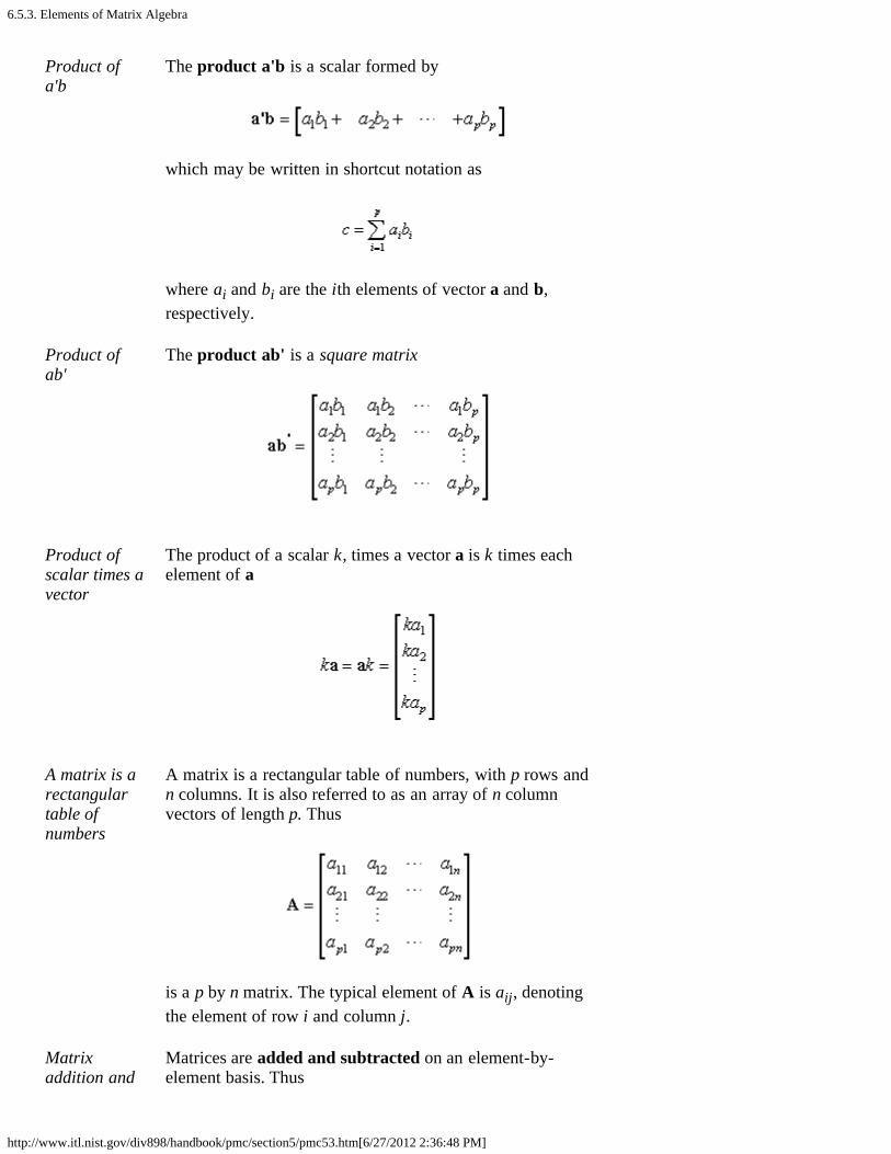
6.5.3. Elements of Matrix Algebra
http://www.itl.nist.gov/div898/handbook/pmc/section5/pmc53.htm[6/27/2012 2:36:48 PM]
Product ofa'b
The product a'b is a scalar formed by
which may be written in shortcut notation as
where ai and bi are the ith elements of vector a and b,respectively.
Product ofab'
The product ab' is a square matrix
Product ofscalar times avector
The product of a scalar k, times a vector a is k times eachelement of a
A matrix is arectangulartable ofnumbers
A matrix is a rectangular table of numbers, with p rows andn columns. It is also referred to as an array of n columnvectors of length p. Thus
is a p by n matrix. The typical element of A is aij, denotingthe element of row i and column j.
Matrixaddition and
Matrices are added and subtracted on an element-by-element basis. Thus
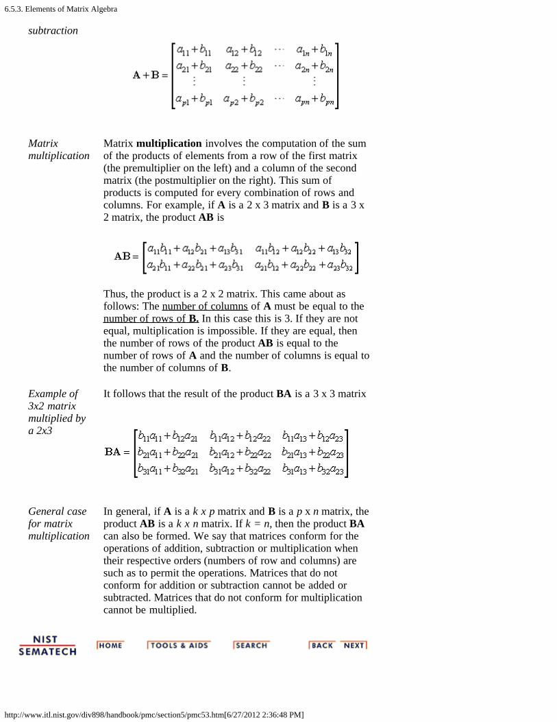
6.5.3. Elements of Matrix Algebra
http://www.itl.nist.gov/div898/handbook/pmc/section5/pmc53.htm[6/27/2012 2:36:48 PM]
subtraction
Matrixmultiplication
Matrix multiplication involves the computation of the sumof the products of elements from a row of the first matrix(the premultiplier on the left) and a column of the secondmatrix (the postmultiplier on the right). This sum ofproducts is computed for every combination of rows andcolumns. For example, if A is a 2 x 3 matrix and B is a 3 x2 matrix, the product AB is
Thus, the product is a 2 x 2 matrix. This came about asfollows: The number of columns of A must be equal to thenumber of rows of B. In this case this is 3. If they are notequal, multiplication is impossible. If they are equal, thenthe number of rows of the product AB is equal to thenumber of rows of A and the number of columns is equal tothe number of columns of B.
Example of3x2 matrixmultiplied bya 2x3
It follows that the result of the product BA is a 3 x 3 matrix
General casefor matrixmultiplication
In general, if A is a k x p matrix and B is a p x n matrix, theproduct AB is a k x n matrix. If k = n, then the product BAcan also be formed. We say that matrices conform for theoperations of addition, subtraction or multiplication whentheir respective orders (numbers of row and columns) aresuch as to permit the operations. Matrices that do notconform for addition or subtraction cannot be added orsubtracted. Matrices that do not conform for multiplicationcannot be multiplied.
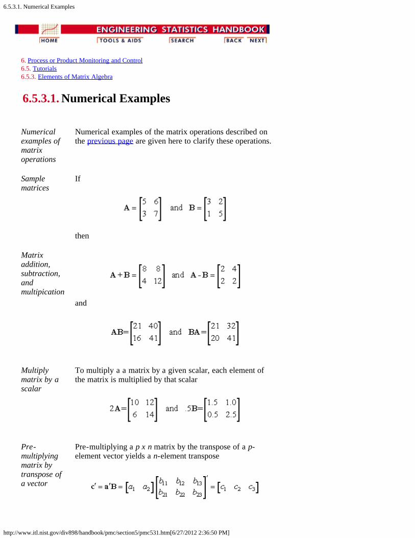
6.5.3.1. Numerical Examples
http://www.itl.nist.gov/div898/handbook/pmc/section5/pmc531.htm[6/27/2012 2:36:50 PM]
6. Process or Product Monitoring and Control 6.5. Tutorials 6.5.3. Elements of Matrix Algebra
6.5.3.1. Numerical Examples
Numericalexamples ofmatrixoperations
Numerical examples of the matrix operations described onthe previous page are given here to clarify these operations.
Samplematrices
If
then
Matrixaddition,subtraction,andmultipication
and
Multiplymatrix by ascalar
To multiply a a matrix by a given scalar, each element ofthe matrix is multiplied by that scalar
Pre-multiplyingmatrix bytranspose ofa vector
Pre-multiplying a p x n matrix by the transpose of a p-element vector yields a n-element transpose

6.5.3.1. Numerical Examples
http://www.itl.nist.gov/div898/handbook/pmc/section5/pmc531.htm[6/27/2012 2:36:50 PM]
Post-multiplyingmatrix byvector
Post-multiplying a p x n matrix by an n-element vectoryields an n-element vector
Quadraticform
It is not possible to pre-multiply a matrix by a columnvector, nor to post-multiply a matrix by a row vector. Thematrix product a'Ba yields a scalar and is called a quadraticform. Note that B must be a square matrix if a'Ba is toconform to multiplication. Here is an example of a quadraticform
Inverting amatrix
The matrix analog of division involves an operation calledinverting a matrix. Only square matrices can be inverted.Inversion is a tedious numerical procedure and it is bestperformed by computers. There are many ways to invert amatrix, but ultimately whichever method is selected by aprogram is immaterial. If you wish to try one method byhand, a very popular numerical method is the Gauss-Jordanmethod.
Identitymatrix
To augment the notion of the inverse of a matrix, A-1 (Ainverse) we notice the following relation
A-1A = A A-1 = I
I is a matrix of form
I is called the identity matrix and is a special case of adiagonal matrix. Any matrix that has zeros in all of the off-diagonal positions is a diagonal matrix.

6.5.3.1. Numerical Examples
http://www.itl.nist.gov/div898/handbook/pmc/section5/pmc531.htm[6/27/2012 2:36:50 PM]

6.5.3.2. Determinant and Eigenstructure
http://www.itl.nist.gov/div898/handbook/pmc/section5/pmc532.htm[6/27/2012 2:36:50 PM]
6. Process or Product Monitoring and Control 6.5. Tutorials 6.5.3. Elements of Matrix Algebra
6.5.3.2. Determinant and Eigenstructure
A matrixdeterminant isdifficult todefine but avery usefulnumber
Unfortunately, not every square matrix has an inverse(although most do). Associated with any square matrix is asingle number that represents a unique function of thenumbers in the matrix. This scalar function of a squarematrix is called the determinant. The determinant of amatrix A is denoted by |A|. A formal definition for thedeteterminant of a square matrix A = (aij) is somewhatbeyond the scope of this Handbook. Consult any goodlinear algebra textbook if you are interested in themathematical details.
Singularmatrix
As is the case of inversion of a square matrix, calculationof the determinant is tedious and computer assistance isneeded for practical calculations. If the determinant of the(square) matrix is exactly zero, the matrix is said to besingular and it has no inverse.
Determinantof variance-covariancematrix
Of great interest in statistics is the determinant of a squaresymmetric matrix D whose diagonal elements are samplevariances and whose off-diagonal elements are samplecovariances. Symmetry means that the matrix and itstranspose are identical (i.e., A = A'). An example is
where s1 and s2 are sample standard deviations and rij isthe sample correlation.
D is the sample variance-covariance matrix forobservations of a multivariate vector of p elements. Thedeterminant of D, in this case, is sometimes called thegeneralized variance.
Characteristicequation
In addition to a determinant and possibly an inverse, everysquare matrix has associated with it a characteristicequation. The characteristic equation of a matrix is formed

6.5.3.2. Determinant and Eigenstructure
http://www.itl.nist.gov/div898/handbook/pmc/section5/pmc532.htm[6/27/2012 2:36:50 PM]
by subtracting some particular value, usually denoted bythe greek letter (lambda), from each diagonal element ofthe matrix, such that the determinant of the resultingmatrix is equal to zero. For example, the characteristicequation of a second order (2 x 2) matrix A may bewritten as
Definition ofthecharacteristicequation for2x2 matrix
Eigenvalues ofa matrix
For a matrix of order p, there may be as many as pdifferent values for that will satisfy the equation. Thesedifferent values are called the eigenvalues of the matrix.
Eigenvectorsof a matrix
Associated with each eigenvalue is a vector, v, called theeigenvector. The eigenvector satisfies the equation
Av = v
Eigenstructureof a matrix
If the complete set of eigenvalues is arranged in thediagonal positions of a diagonal matrix V, the followingrelationship holds
AV = VL
This equation specifies the complete eigenstructure of A.Eigenstructures and the associated theory figure heavily inmultivariate procedures and the numerical evaluation of Land V is a central computing problem.

6.5.4. Elements of Multivariate Analysis
http://www.itl.nist.gov/div898/handbook/pmc/section5/pmc54.htm[6/27/2012 2:36:51 PM]
6. Process or Product Monitoring and Control 6.5. Tutorials
6.5.4. Elements of Multivariate Analysis
Multivariateanalysis
Multivariate analysis is a branch of statistics concernedwith the analysis of multiple measurements, made on one orseveral samples of individuals. For example, we may wishto measure length, width and weight of a product.
Multiplemeasurement,orobservation,as row orcolumnvector
A multiple measurement or observation may be expressedas
x = [4 2 0.6]
referring to the physical properties of length, width andweight, respectively. It is customary to denote multivariatequantities with bold letters. The collection of measurementson x is called a vector. In this case it is a row vector. Wecould have written x as a column vector.
Matrix torepresentmore thanone multiplemeasurement
If we take several such measurements, we record them in arectangular array of numbers. For example, the X matrixbelow represents 5 observations, on each of three variables.
Byconvention,rowstypicallyrepresent
In this case the number of rows, (n = 5), is the number ofobservations, and the number of columns, (p = 3), is thenumber of variables that are measured. The rectangulararray is an assembly of n row vectors of length p. This arrayis called a matrix, or, more specifically, a n by p matrix. Its

6.5.4. Elements of Multivariate Analysis
http://www.itl.nist.gov/div898/handbook/pmc/section5/pmc54.htm[6/27/2012 2:36:51 PM]
observationsand columnsrepresentvariables
name is X. The names of matrices are usually written inbold, uppercase letters, as in Section 6.5.3. We could just aswell have written X as a p (variables) by n (measurements)matrix as follows:
Definition ofTranspose
A matrix with rows and columns exchanged in this manneris called the transpose of the original matrix.
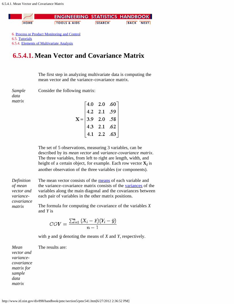
6.5.4.1. Mean Vector and Covariance Matrix
http://www.itl.nist.gov/div898/handbook/pmc/section5/pmc541.htm[6/27/2012 2:36:52 PM]
6. Process or Product Monitoring and Control 6.5. Tutorials 6.5.4. Elements of Multivariate Analysis
6.5.4.1. Mean Vector and Covariance Matrix
The first step in analyzing multivariate data is computing themean vector and the variance-covariance matrix.
Sampledatamatrix
Consider the following matrix:
The set of 5 observations, measuring 3 variables, can bedescribed by its mean vector and variance-covariance matrix.The three variables, from left to right are length, width, andheight of a certain object, for example. Each row vector Xi isanother observation of the three variables (or components).
Definitionof meanvector andvariance-covariancematrix
The mean vector consists of the means of each variable andthe variance-covariance matrix consists of the variances of thevariables along the main diagonal and the covariances betweeneach pair of variables in the other matrix positions.
The formula for computing the covariance of the variables Xand Y is
with and denoting the means of X and Y, respectively.
Meanvector andvariance-covariancematrix forsampledatamatrix
The results are:
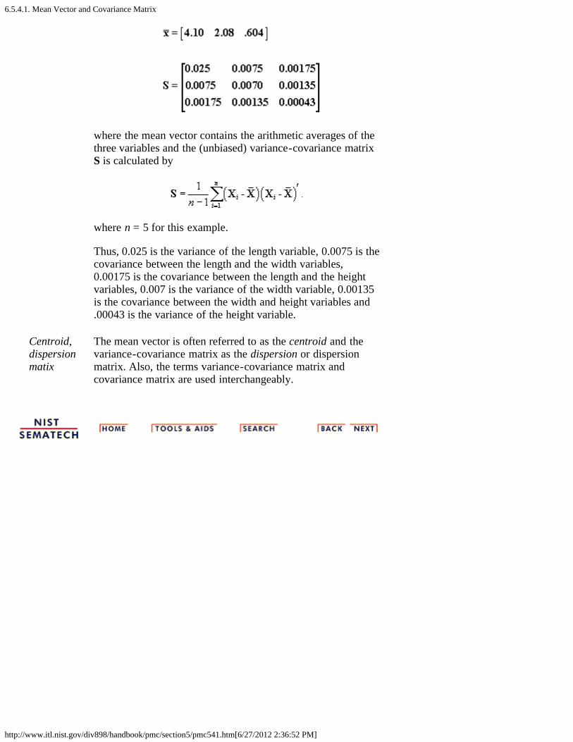
6.5.4.1. Mean Vector and Covariance Matrix
http://www.itl.nist.gov/div898/handbook/pmc/section5/pmc541.htm[6/27/2012 2:36:52 PM]
where the mean vector contains the arithmetic averages of thethree variables and the (unbiased) variance-covariance matrixS is calculated by
where n = 5 for this example.
Thus, 0.025 is the variance of the length variable, 0.0075 is thecovariance between the length and the width variables,0.00175 is the covariance between the length and the heightvariables, 0.007 is the variance of the width variable, 0.00135is the covariance between the width and height variables and.00043 is the variance of the height variable.
Centroid,dispersionmatix
The mean vector is often referred to as the centroid and thevariance-covariance matrix as the dispersion or dispersionmatrix. Also, the terms variance-covariance matrix andcovariance matrix are used interchangeably.
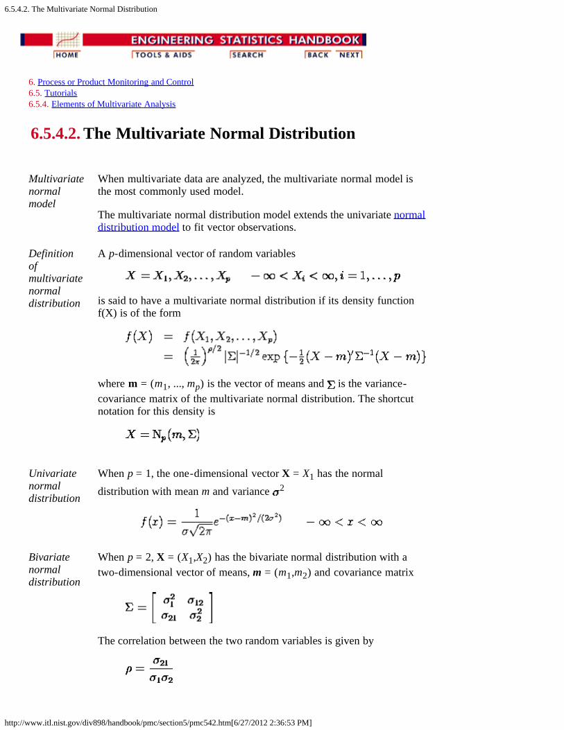
6.5.4.2. The Multivariate Normal Distribution
http://www.itl.nist.gov/div898/handbook/pmc/section5/pmc542.htm[6/27/2012 2:36:53 PM]
6. Process or Product Monitoring and Control 6.5. Tutorials 6.5.4. Elements of Multivariate Analysis
6.5.4.2. The Multivariate Normal Distribution
Multivariatenormalmodel
When multivariate data are analyzed, the multivariate normal model isthe most commonly used model.
The multivariate normal distribution model extends the univariate normaldistribution model to fit vector observations.
Definitionofmultivariatenormaldistribution
A p-dimensional vector of random variables
is said to have a multivariate normal distribution if its density functionf(X) is of the form
where m = (m1, ..., mp) is the vector of means and is the variance-covariance matrix of the multivariate normal distribution. The shortcutnotation for this density is
Univariatenormaldistribution
When p = 1, the one-dimensional vector X = X1 has the normaldistribution with mean m and variance 2
Bivariatenormaldistribution
When p = 2, X = (X1,X2) has the bivariate normal distribution with atwo-dimensional vector of means, m = (m1,m2) and covariance matrix
The correlation between the two random variables is given by

6.5.4.2. The Multivariate Normal Distribution
http://www.itl.nist.gov/div898/handbook/pmc/section5/pmc542.htm[6/27/2012 2:36:53 PM]

6.5.4.3. Hotelling's <i>T</i> squared
http://www.itl.nist.gov/div898/handbook/pmc/section5/pmc543.htm[6/27/2012 2:36:54 PM]
6. Process or Product Monitoring and Control 6.5. Tutorials 6.5.4. Elements of Multivariate Analysis
6.5.4.3. Hotelling's T squared
Hotelling'sT2
distribution
A multivariate method that is the multivariate counterpart ofStudent's-t and which also forms the basis for certainmultivariate control charts is based on Hotelling's T2
distribution, which was introduced by Hotelling (1947).
Univariatet-test formean
Recall, from Section 1.3.5.2,
has a t distribution provided that X is normally distributed,and can be used as long as X doesn't differ greatly from anormal distribution. If we wanted to test the hypothesis that = 0, we would then have
so that
Generalizeto pvariables
When t2 is generalized to p variables it becomes
with
S-1 is the inverse of the sample variance-covariance matrix,S, and n is the sample size upon which each i, i = 1, 2, ..., p,is based. (The diagonal elements of S are the variances andthe off-diagonal elements are the covariances for the p
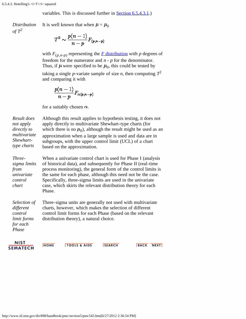
6.5.4.3. Hotelling's <i>T</i> squared
http://www.itl.nist.gov/div898/handbook/pmc/section5/pmc543.htm[6/27/2012 2:36:54 PM]
variables. This is discussed further in Section 6.5.4.3.1.)
Distributionof T2
It is well known that when = 0
with F(p,n-p) representing the F distribution with p degrees offreedom for the numerator and n - p for the denominator.Thus, if were specified to be 0, this could be tested bytaking a single p-variate sample of size n, then computing T2
and comparing it with
for a suitably chosen .
Result doesnot applydirectly tomultivariateShewhart-type charts
Although this result applies to hypothesis testing, it does notapply directly to multivariate Shewhart-type charts (forwhich there is no 0), although the result might be used as anapproximation when a large sample is used and data are insubgroups, with the upper control limit (UCL) of a chartbased on the approximation.
Three-sigma limitsfromunivariatecontrolchart
When a univariate control chart is used for Phase I (analysisof historical data), and subsequently for Phase II (real-timeprocess monitoring), the general form of the control limits isthe same for each phase, although this need not be the case.Specifically, three-sigma limits are used in the univariatecase, which skirts the relevant distribution theory for eachPhase.
Selection ofdifferentcontrollimit formsfor eachPhase
Three-sigma units are generally not used with multivariatecharts, however, which makes the selection of differentcontrol limit forms for each Phase (based on the relevantdistribution theory), a natural choice.
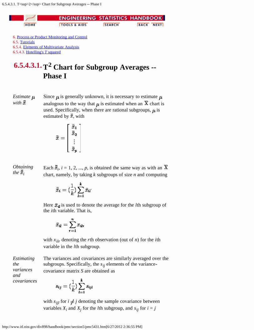
6.5.4.3.1. T<sup>2</sup> Chart for Subgroup Averages -- Phase I
http://www.itl.nist.gov/div898/handbook/pmc/section5/pmc5431.htm[6/27/2012 2:36:55 PM]
6. Process or Product Monitoring and Control 6.5. Tutorials 6.5.4. Elements of Multivariate Analysis 6.5.4.3. Hotelling's T squared
6.5.4.3.1. T2 Chart for Subgroup Averages --Phase I
Estimate with
Since is generally unknown, it is necessary to estimate analogous to the way that is estimated when an chart isused. Specifically, when there are rational subgroups, isestimated by , with
Obtainingthe i
Each i, i = 1, 2, ..., p, is obtained the same way as with an chart, namely, by taking k subgroups of size n and computing
.
Here is used to denote the average for the lth subgroup ofthe ith variable. That is,
with xilr denoting the rth observation (out of n) for the ithvariable in the lth subgroup.
Estimatingthevariancesandcovariances
The variances and covariances are similarly averaged over thesubgroups. Specifically, the sij elements of the variance-covariance matrix S are obtained as
with sijl for i j denoting the sample covariance betweenvariables Xi and Xj for the lth subgroup, and sij for i = j

6.5.4.3.1. T<sup>2</sup> Chart for Subgroup Averages -- Phase I
http://www.itl.nist.gov/div898/handbook/pmc/section5/pmc5431.htm[6/27/2012 2:36:55 PM]
denotes the sample variance of Xi. The variances (= siil)for subgroup l and for variables i = 1, 2, ..., p are computed as
.
Similarly, the covariances sijl between variables Xi and Xj forsubgroup l are computed as
.
CompareT2 againstcontrolvalues
As with an chart (or any other chart), the k subgroupswould be tested for control by computing k values of T2 andcomparing each against the UCL. If any value falls above theUCL (there is no lower control limit), the correspondingsubgroup would be investigated.
Formulafor plottedT2 values
Thus, one would plot
for the jth subgroup (j = 1, 2, ..., k), with denoting a vectorwith p elements that contains the subgroup averages for eachof the p characteristics for the jth subgroup. ( is theinverse matrix of the "pooled" variance-covariance matrix, , which is obtained by averaging the subgroup variance-covariance matrices over the k subgroups.)
Formulafor theuppercontrollimit
Each of the k values of given in the equation above wouldbe compared with
Lowercontrollimits
A lower control limit is generally not used in multivariatecontrol chart applications, although some control chartmethods do utilize a LCL. Although a small value for might seem desirable, a value that is very small would likelyindicate a problem of some type as we would not expectevery element of to be virtually equal to every element in
.
Delete out-of-controlpoints oncecausediscoveredand
As with any Phase I control chart procedure, if there are anypoints that plot above the UCL and can be identified ascorresponding to out-of-control conditions that have beencorrected, the point(s) should be deleted and the UCLrecomputed. The remaining points would then be comparedwith the new UCL and the process continued as long as

6.5.4.3.1. T<sup>2</sup> Chart for Subgroup Averages -- Phase I
http://www.itl.nist.gov/div898/handbook/pmc/section5/pmc5431.htm[6/27/2012 2:36:55 PM]
corrected necessary, remembering that points should be deleted only iftheir correspondence with out-of-control conditions can beidentified and the cause(s) of the condition(s) were removed.

6.5.4.3.2. <i>T</i><sup>2</sup> Chart for Subgroup Averages -- Phase II
http://www.itl.nist.gov/div898/handbook/pmc/section5/pmc5432.htm[6/27/2012 2:36:56 PM]
6. Process or Product Monitoring and Control 6.5. Tutorials 6.5.4. Elements of Multivariate Analysis 6.5.4.3. Hotelling's T squared
6.5.4.3.2. T2 Chart for Subgroup Averages -- Phase II
Phase IIrequiresrecomputingSp and anddifferentcontrollimits
Determining the UCL that is to be subsequently applied to futuresubgroups entails recomputing, if necessary, Sp and , and using aconstant and an F-value that are different from the form given for thePhase I control limits. The form is different because differentdistribution theory is involved since future subgroups are assumed to beindependent of the "current" set of subgroups that is used in calculatingSp and . (The same thing happens with charts; the problem is simplyignored through the use of 3-sigma limits, although a different approachshould be used when there is a small number of subgroups -- and thenecessary theory has been worked out.)
Illustration To illustrate, assume that a subgroups had been discarded (with possiblya = 0) so that k - a subgroups are used in obtaining and . We shalllet these two values be represented by and to distinguish themfrom the original values, and , before any subgroups are deleted.Future values to be plotted on the multivariate chart would then beobtained from
with denoting an arbitrary vector containing the averages forthe p characteristics for a single subgroup obtained in the future. Eachof these future values would be plotted on the multivariate chart andcompared with
Phase IIcontrollimits
with a denoting the number of the original subgroups that are deletedbefore computing and . Notice that the equation for the controllimits for Phase II given here does not reduce to the equation for thecontrol limits for Phase I when a = 0, nor should we expect it to sincethe Phase I UCL is used when testing for control of the entire set ofsubgroups that is used in computing and .

6.5.4.3.3. Chart for Individual Observations -- Phase I
http://www.itl.nist.gov/div898/handbook/pmc/section5/pmc5433.htm[6/27/2012 2:36:57 PM]
6. Process or Product Monitoring and Control 6.5. Tutorials 6.5.4. Elements of Multivariate Analysis 6.5.4.3. Hotelling's T squared
6.5.4.3.3. Chart for Individual Observations --Phase I
Multivariateindividualcontrolcharts
Control charts for multivariate individual observations canbe constructed, just as charts can be constructed forunivariate individual observations.
Constructingthe controlchart
Assume there are m historical multivariate observations to betested for control, so that Qj, j = 1, 2, ...., m are computed,with
Controllimits
Each value of Qj is compared against control limits of
with B( ) denoting the beta distribution with parameters p/2and (m-p-1)/2. These limits are due to Tracy, Young andMason (1992). Note that a LCL is stated, unlike the othermultivariate control chart procedures given in this section.Although interest will generally be centered at the UCL, avalue of Q below the LCL should also be investigated, asthis could signal problems in data recording.
Deletepoints ifspecialcause(s) areidentifiedandcorrected
As in the case when subgroups are used, if any points plotoutside these control limits and special cause(s) that weresubsequently removed can be identified, the point(s) wouldbe deleted and the control limits recomputed, making theappropriate adjustments on the degrees of freedom, and re-testing the remaining points against the new limits.

6.5.4.3.3. Chart for Individual Observations -- Phase I
http://www.itl.nist.gov/div898/handbook/pmc/section5/pmc5433.htm[6/27/2012 2:36:57 PM]
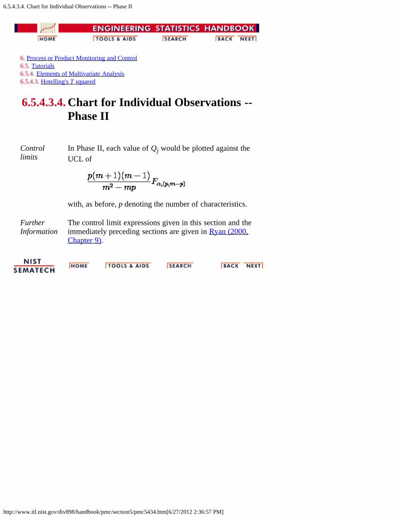
6.5.4.3.4. Chart for Individual Observations -- Phase II
http://www.itl.nist.gov/div898/handbook/pmc/section5/pmc5434.htm[6/27/2012 2:36:57 PM]
6. Process or Product Monitoring and Control 6.5. Tutorials 6.5.4. Elements of Multivariate Analysis 6.5.4.3. Hotelling's T squared
6.5.4.3.4. Chart for Individual Observations --Phase II
Controllimits
In Phase II, each value of Qj would be plotted against theUCL of
with, as before, p denoting the number of characteristics.
FurtherInformation
The control limit expressions given in this section and theimmediately preceding sections are given in Ryan (2000,Chapter 9).

6.5.4.3.5. Charts for Controlling Multivariate Variability
http://www.itl.nist.gov/div898/handbook/pmc/section5/pmc5435.htm[6/27/2012 2:36:58 PM]
6. Process or Product Monitoring and Control 6.5. Tutorials 6.5.4. Elements of Multivariate Analysis 6.5.4.3. Hotelling's T squared
6.5.4.3.5. Charts for Controlling MultivariateVariability
Nosatisfactorycharts formultivariatevariability
Unfortunately, there are no charts for controlling multivariatevariability, with either subgroups or individual observations,that are simple, easy-to-understand and implement, andstatistically defensible. Methods based on the generalizedvariance have been proposed for subgroup data, but suchmethods have been criticized by Ryan (2000, Section 9.4)and some references cited therein. For individualobservations, the multivariate analogue of a univariatemoving range chart might be considered as an estimator ofthe variance-covariance matrix for Phase I, although thedistribution of the estimator is unknown.

6.5.4.3.6. Constructing Multivariate Charts
http://www.itl.nist.gov/div898/handbook/pmc/section5/pmc5436.htm[6/27/2012 2:36:58 PM]
6. Process or Product Monitoring and Control 6.5. Tutorials 6.5.4. Elements of Multivariate Analysis 6.5.4.3. Hotelling's T squared
6.5.4.3.6. Constructing Multivariate Charts
Multivariatecontrolcharts notcommonlyavailable instatisticalsoftware
Although control charts were originally constructed andmaintained by hand, it would be extremely impractical to tryto do that with the chart procedures that were presented inSections 6.5.4.3.1-6.5.4.3.4. Unfortunately, the well-knownstatistical software packages do not have capability for thefour procedures just outlined. However, Dataplot, which isused for case studies and tutorials throughout this e-Handbook, does have that capability.
6.5.5. Principal Components
http://www.itl.nist.gov/div898/handbook/pmc/section5/pmc55.htm[6/27/2012 2:36:59 PM]
6. Process or Product Monitoring and Control 6.5. Tutorials
6.5.5. Principal Components
Dimensionreduction tool
A Multivariate Analysis problem could start out with asubstantial number of correlated variables. PrincipalComponent Analysis is a dimension-reduction tool thatcan be used advantageously in such situations. Principalcomponent analysis aims at reducing a large set ofvariables to a small set that still contains most of theinformation in the large set.
Principalfactors
The technique of principal component analysis enables usto create and use a reduced set of variables, which arecalled principal factors. A reduced set is much easier toanalyze and interpret. To study a data set that results in theestimation of roughly 500 parameters may be difficult, butif we could reduce these to 5 it would certainly make ourday. We will show in what follows how to achievesubstantial dimension reduction.
Inversetransformaionnot possible
While these principal factors represent or replace one ormore of the original variables, it should be noted that theyare not just a one-to-one transformation, so inversetransformations are not possible.
Original datamatrix
To shed a light on the structure of principal componentsanalysis, let us consider a multivariate data matrix X, withn rows and p columns. The p elements of each row arescores or measurements on a subject such as height, weightand age.
Linearfunction thatmaximizesvariance
Next, standardize the X matrix so that each column mean is0 and each column variance is 1. Call this matrix Z. Eachcolumn is a vector variable, zi, i = 1, . . . , p. The main ideabehind principal component analysis is to derive a linearfunction y for each of the vector variables zi. This linearfunction possesses an extremely important property;namely, its variance is maximized.
Linearfunction iscomponent ofz
This linear function is referred to as a component of z. Toillustrate the computation of a single element for the jth yvector, consider the product y = z v' where v ' is a columnvector of V and V is a p x p coefficient matrix that carriesthe p-element variable z into the derived n-element variabley. V is known as the eigen vector matrix. The dimension of
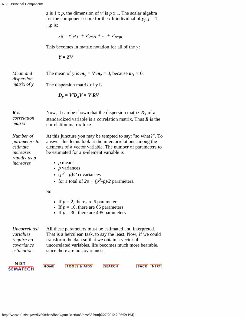
6.5.5. Principal Components
http://www.itl.nist.gov/div898/handbook/pmc/section5/pmc55.htm[6/27/2012 2:36:59 PM]
z is 1 x p, the dimension of v ' is p x 1. The scalar algebrafor the component score for the ith individual of yj, j = 1,...p is:
yji = v'1z1i + v'2z2i + ... + v'pzpi
This becomes in matrix notation for all of the y:
Y = ZV
Mean anddispersionmatrix of y
The mean of y is my = V'mz = 0, because mz = 0.
The dispersion matrix of y is
Dy = V'DzV = V'RV
R iscorrelationmatrix
Now, it can be shown that the dispersion matrix Dz of astandardized variable is a correlation matrix. Thus R is thecorrelation matrix for z.
Number ofparameters toestimateincreasesrapidly as pincreases
At this juncture you may be tempted to say: "so what?". Toanswer this let us look at the intercorrelations among theelements of a vector variable. The number of parameters tobe estimated for a p-element variable is
p meansp variances(p2 - p)/2 covariancesfor a total of 2p + (p2-p)/2 parameters.
So
If p = 2, there are 5 parametersIf p = 10, there are 65 parametersIf p = 30, there are 495 parameters
Uncorrelatedvariablesrequire nocovarianceestimation
All these parameters must be estimated and interpreted.That is a herculean task, to say the least. Now, if we couldtransform the data so that we obtain a vector ofuncorrelated variables, life becomes much more bearable,since there are no covariances.

6.5.5.1. Properties of Principal Components
http://www.itl.nist.gov/div898/handbook/pmc/section5/pmc551.htm[6/27/2012 2:37:00 PM]
6. Process or Product Monitoring and Control 6.5. Tutorials 6.5.5. Principal Components
6.5.5.1. Properties of Principal Components
Orthogonalizing Transformations
Transformationfrom z to y
The equation y = V'z represents a transformation, where yis the transformed variable, z is the original standardizedvariable and V is the premultiplier to go from z to y.
Orthogonaltransformationssimplify things
To produce a transformation vector for y for which theelements are uncorrelated is the same as saying that wewant V such that Dy is a diagonal matrix. That is, all theoff-diagonal elements of Dy must be zero. This is calledan orthogonalizing transformation.
Infinite numberof values for V
There are an infinite number of values for V that willproduce a diagonal Dy for any correlation matrix R. Thusthe mathematical problem "find a unique V such that Dyis diagonal" cannot be solved as it stands. A number offamous statisticians such as Karl Pearson and HaroldHotelling pondered this problem and suggested a"variance maximizing" solution.
Principalcomponentsmaximizevariance of thetransformedelements, oneby one
Hotelling (1933) derived the "principal components"solution. It proceeds as follows: for the first principalcomponent, which will be the first element of y and bedefined by the coefficients in the first column of V,(denoted by v1), we want a solution such that the varianceof y1 will be maximized.
Constrain v togenerate aunique solution
The constraint on the numbers in v1 is that the sum of thesquares of the coefficients equals 1. Expressedmathematically, we wish to maximize
wherey1i = v1' zi
and v1'v1 = 1 ( this is called "normalizing " v1).

6.5.5.1. Properties of Principal Components
http://www.itl.nist.gov/div898/handbook/pmc/section5/pmc551.htm[6/27/2012 2:37:00 PM]
Computation offirst principalcomponentfrom R and v1
Substituting the middle equation in the first yields
where R is the correlation matrix of Z, which, in turn, isthe standardized matrix of X, the original data matrix.Therefore, we want to maximize v1'Rv1 subject to v1'v1= 1.
The eigenstructure
Lagrangemultiplierapproach
Let
>introducing the restriction on v1 via the Lagrangemultiplier approach. It can be shown (T.W. Anderson,1958, page 347, theorem 8) that the vector of partialderivatives is
and setting this equal to zero, dividing out 2 and factoringgives
This is known as "the problem of the eigenstructure ofR".
Set of phomogeneousequations
The partial differentiation resulted in a set of phomogeneous equations, which may be written in matrixform as follows
The characteristic equation
Charactersticequation of R isa polynomial of
The characteristic equation of R is a polynomial ofdegree p, which is obtained by expanding the determinantof

6.5.5.1. Properties of Principal Components
http://www.itl.nist.gov/div898/handbook/pmc/section5/pmc551.htm[6/27/2012 2:37:00 PM]
degree p
and solving for the roots j, j = 1, 2, ..., p.
Largesteigenvalue
Specifically, the largest eigenvalue, 1, and its associatedvector, v1, are required. Solving for this eigenvalue andvector is another mammoth numerical task that canrealistically only be performed by a computer. In general,software is involved and the algorithms are complex.
Remainig peigenvalues
After obtaining the first eigenvalue, the process isrepeated until all p eigenvalues are computed.
Fulleigenstructureof R
To succinctly define the full eigenstructure of R, weintroduce another matrix L, which is a diagonal matrixwith j in the jth position on the diagonal. Then the fulleigenstructure of R is given as
RV = VL
where
V'V = VV' = I
and
V'RV = L = D y
Principal Factors
Scale to zeromeans and unitvariances
It was mentioned before that it is helpful to scale anytransformation y of a vector variable z so that its elementshave zero means and unit variances. Such a standardizedtransformation is called a factoring of z, or of R, andeach linear component of the transformation is called afactor.
Deriving unitvariances forprincipalcomponents
Now, the principal components already have zero means,but their variances are not 1; in fact, they are theeigenvalues, comprising the diagonal elements of L. It ispossible to derive the principal factor with unit variancefrom the principal component as follows
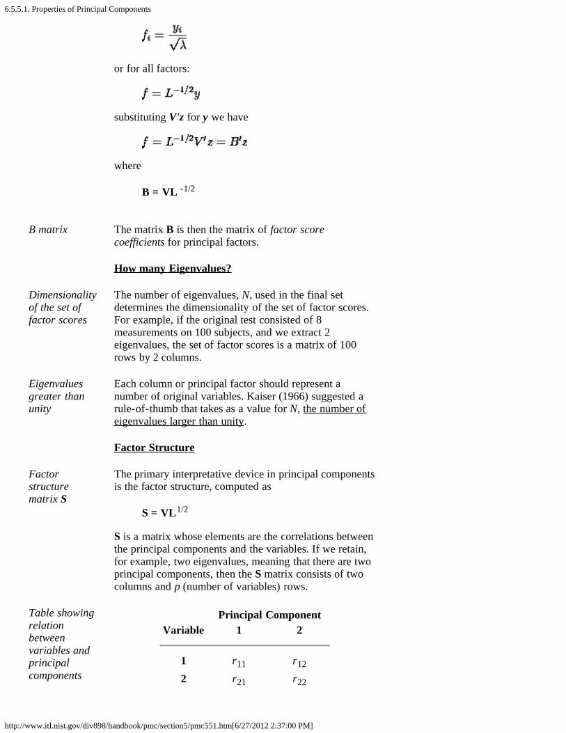
6.5.5.1. Properties of Principal Components
http://www.itl.nist.gov/div898/handbook/pmc/section5/pmc551.htm[6/27/2012 2:37:00 PM]
or for all factors:
substituting V'z for y we have
where
B = VL -1/2
B matrix The matrix B is then the matrix of factor scorecoefficients for principal factors.
How many Eigenvalues?
Dimensionalityof the set offactor scores
The number of eigenvalues, N, used in the final setdetermines the dimensionality of the set of factor scores.For example, if the original test consisted of 8measurements on 100 subjects, and we extract 2eigenvalues, the set of factor scores is a matrix of 100rows by 2 columns.
Eigenvaluesgreater thanunity
Each column or principal factor should represent anumber of original variables. Kaiser (1966) suggested arule-of-thumb that takes as a value for N, the number ofeigenvalues larger than unity.
Factor Structure
Factorstructurematrix S
The primary interpretative device in principal componentsis the factor structure, computed as
S = VL1/2
S is a matrix whose elements are the correlations betweenthe principal components and the variables. If we retain,for example, two eigenvalues, meaning that there are twoprincipal components, then the S matrix consists of twocolumns and p (number of variables) rows.
Table showingrelationbetweenvariables andprincipalcomponents
Principal ComponentVariable 1 2
1 r11 r12
2 r21 r22
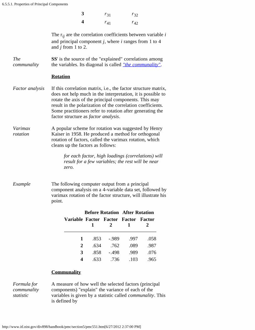
6.5.5.1. Properties of Principal Components
http://www.itl.nist.gov/div898/handbook/pmc/section5/pmc551.htm[6/27/2012 2:37:00 PM]
3 r31 r32
4 r41 r42
The rij are the correlation coefficients between variable iand principal component j, where i ranges from 1 to 4and j from 1 to 2.
Thecommunality
SS' is the source of the "explained" correlations amongthe variables. Its diagonal is called "the communality".
Rotation
Factor analysis If this correlation matrix, i.e., the factor structure matrix,does not help much in the interpretation, it is possible torotate the axis of the principal components. This mayresult in the polarization of the correlation coefficients.Some practitioners refer to rotation after generating thefactor structure as factor analysis.
Varimaxrotation
A popular scheme for rotation was suggested by HenryKaiser in 1958. He produced a method for orthogonalrotation of factors, called the varimax rotation, whichcleans up the factors as follows:
for each factor, high loadings (correlations) willresult for a few variables; the rest will be nearzero.
Example The following computer output from a principalcomponent analysis on a 4-variable data set, followed byvarimax rotation of the factor structure, will illustrate hispoint.
Before Rotation After RotationVariable Factor
1Factor
2Factor
1Factor
2
1 .853 -.989 .997 .0582 .634 .762 .089 .9873 .858 -.498 .989 .0764 .633 .736 .103 .965
Communality
Formula forcommunalitystatistic
A measure of how well the selected factors (principalcomponents) "explain" the variance of each of thevariables is given by a statistic called communality. Thisis defined by

6.5.5.1. Properties of Principal Components
http://www.itl.nist.gov/div898/handbook/pmc/section5/pmc551.htm[6/27/2012 2:37:00 PM]
Explanation ofcommunalitystatistic
That is: the square of the correlation of variable k withfactor i gives the part of the variance accounted for bythat factor. The sum of these squares for n factors is thecommunality, or explained variable for that variable(row).
Roadmap to solve the V matrix
Main steps toobtainingeigenstructurefor acorrelationmatrix
In summary, here are the main steps to obtain theeigenstructure for a correlation matrix.
1. Compute R, the correlation matrix of the originaldata. R is also the correlation matrix of thestandardized data.
2. Obtain the characteristic equation of R which is apolynomial of degree p (the number of variables),obtained from expanding the determinant of |R- I|= 0 and solving for the roots i, that is: 1, 2, ..., p.
3. Then solve for the columns of the V matrix, (v1, v2,..vp). The roots, , i, are called the eigenvalues (orlatent values). The columns of V are called theeigenvectors.

6.5.5.2. Numerical Example
http://www.itl.nist.gov/div898/handbook/pmc/section5/pmc552.htm[6/27/2012 2:37:02 PM]
6. Process or Product Monitoring and Control 6.5. Tutorials 6.5.5. Principal Components
6.5.5.2. Numerical Example
Calculationof principalcomponentsexample
A numerical example may clarify the mechanics of principalcomponent analysis.
Sample dataset
Let us analyze the following 3-variate dataset with 10 observations. Eachobservation consists of 3 measurements on a wafer: thickness, horizontaldisplacement and vertical displacement.
Compute thecorrelationmatrix
First compute the correlation matrix
Solve for theroots of R
Next solve for the roots of R, using software
value proportion
1 1.769 .5902 .927 .8993 .304 1.000

6.5.5.2. Numerical Example
http://www.itl.nist.gov/div898/handbook/pmc/section5/pmc552.htm[6/27/2012 2:37:02 PM]
Notice that
Each eigenvalue satisfies |R- I| = 0.The sum of the eigenvalues = 3 = p, which is equal to the trace ofR (i.e., the sum of the main diagonal elements).The determinant of R is the product of the eigenvalues.The product is 1 x 2 x 3 = .499.
Compute thefirst columnof the Vmatrix
Substituting the first eigenvalue of 1.769 and R in the appropriateequation we obtain
This is the matrix expression for 3 homogeneous equations with 3unknowns and yields the first column of V: .64 .69 -.34 (again, acomputerized solution is indispensable).
Compute theremainingcolumns ofthe V matrix
Repeating this procedure for the other 2 eigenvalues yields the matrix V
Notice that if you multiply V by its transpose, the result is an identitymatrix, V'V=I.
Compute theL1/2 matrix
Now form the matrix L1/2, which is a diagonal matrix whose elementsare the square roots of the eigenvalues of R. Then obtain S, the factorstructure, using S = V L1/2
So, for example, .91 is the correlation between variable 2 and the firstprincipal component.
Compute thecommunality
Next compute the communality, using the first two eigenvalues only
6.5.5.2. Numerical Example
http://www.itl.nist.gov/div898/handbook/pmc/section5/pmc552.htm[6/27/2012 2:37:02 PM]
Diagonalelementsreport howmuch of thevariability isexplained
Communality consists of the diagonal elements.
var 1 .86622 .84203 .9876
This means that the first two principal components "explain" 86.62% ofthe first variable, 84.20 % of the second variable, and 98.76% of thethird.
Compute thecoefficientmatrix
The coefficient matrix, B, is formed using the reciprocals of thediagonals of L1/2
Compute theprincipalfactors
Finally, we can compute the factor scores from ZB, where Z is Xconverted to standard score form. These columns are the principalfactors.
Principalfactorscontrolchart
These factors can be plotted against the indices, which could be times. Iftime is used, the resulting plot is an example of a principal factorscontrol chart.
6.6. Case Studies in Process Monitoring
http://www.itl.nist.gov/div898/handbook/pmc/section6/pmc6.htm[6/27/2012 2:37:03 PM]
6. Process or Product Monitoring and Control
6.6. Case Studies in Process Monitoring
DetailedExamples
The general points of the first five sections are illustrated inthis section using data from physical science and engineeringapplications. Each example is presented step-by-step in thetext, and is often cross-linked with the relevant sections of thechapter describing the analysis in general.
Contents:Section 6
1. Lithography Process Example2. Aerosol Particle Size Example

6.6.1. Lithography Process
http://www.itl.nist.gov/div898/handbook/pmc/section6/pmc61.htm[6/27/2012 2:37:04 PM]
6. Process or Product Monitoring and Control 6.6. Case Studies in Process Monitoring
6.6.1. Lithography Process
LithographyProcess
This case study illustrates the use of control charts inanalyzing a lithography process.
1. Background and Data2. Graphical Representation of the Data3. Subgroup Analysis4. Shewhart Control Chart5. Work This Example Yourself
6.6.1.1. Background and Data
http://www.itl.nist.gov/div898/handbook/pmc/section6/pmc611.htm[6/27/2012 2:37:04 PM]
6. Process or Product Monitoring and Control 6.6. Case Studies in Process Monitoring 6.6.1. Lithography Process
6.6.1.1. Background and Data
Case Study for SPC in Batch Processing Environment
Semiconductorprocessingcreatesmultiplesources ofvariability tomonitor
One of the assumptions in using classical Shewhart SPC chartsis that the only source of variation is from part to part (orwithin subgroup variation). This is the case for most continuousprocessing situations. However, many of today's processingsituations have different sources of variation. Thesemiconductor industry is one of the areas where theprocessing creates multiple sources of variation.
In semiconductor processing, the basic experimental unit is asilicon wafer. Operations are performed on the wafer, butindividual wafers can be grouped multiple ways. In thediffusion area, up to 150 wafers are processed in one time in adiffusion tube. In the etch area, single wafers are processedindividually. In the lithography area, the light exposure is doneon sub-areas of the wafer. There are many times during theproduction of a computer chip where the experimental unitvaries and thus there are different sources of variation in thisbatch processing environment.
The following is a case study of a lithography process. Fivesites are measured on each wafer, three wafers are measured ina cassette (typically a grouping of 24 - 25 wafers) and thirtycassettes of wafers are used in the study. The width of a line isthe measurement under study. There are two line widthvariables. The first is the original data and the second has beencleaned up somewhat. This case study uses the raw data. Theentire data table is 450 rows long with six columns.
Software The analyses used in this case study can be generated usingboth Dataplot code and R code.
Case studydata: waferline widthmeasurements
Raw Cleaned Line LineCassette Wafer Site Width Sequence Width===================================================== 1 1 Top 3.199275 1 3.197275 1 1 Lef 2.253081 2 2.249081 1 1 Cen 2.074308 3 2.068308

6.6.1.1. Background and Data
http://www.itl.nist.gov/div898/handbook/pmc/section6/pmc611.htm[6/27/2012 2:37:04 PM]
1 1 Rgt 2.418206 4 2.410206 1 1 Bot 2.393732 5 2.383732 1 2 Top 2.654947 6 2.642947 1 2 Lef 2.003234 7 1.989234 1 2 Cen 1.861268 8 1.845268 1 2 Rgt 2.136102 9 2.118102 1 2 Bot 1.976495 10 1.956495 1 3 Top 2.887053 11 2.865053 1 3 Lef 2.061239 12 2.037239 1 3 Cen 1.625191 13 1.599191 1 3 Rgt 2.304313 14 2.276313 1 3 Bot 2.233187 15 2.203187 2 1 Top 3.160233 16 3.128233 2 1 Lef 2.518913 17 2.484913 2 1 Cen 2.072211 18 2.036211 2 1 Rgt 2.287210 19 2.249210 2 1 Bot 2.120452 20 2.080452 2 2 Top 2.063058 21 2.021058 2 2 Lef 2.217220 22 2.173220 2 2 Cen 1.472945 23 1.426945 2 2 Rgt 1.684581 24 1.636581 2 2 Bot 1.900688 25 1.850688 2 3 Top 2.346254 26 2.294254 2 3 Lef 2.172825 27 2.118825 2 3 Cen 1.536538 28 1.480538 2 3 Rgt 1.966630 29 1.908630 2 3 Bot 2.251576 30 2.191576 3 1 Top 2.198141 31 2.136141 3 1 Lef 1.728784 32 1.664784 3 1 Cen 1.357348 33 1.291348 3 1 Rgt 1.673159 34 1.605159 3 1 Bot 1.429586 35 1.359586 3 2 Top 2.231291 36 2.159291 3 2 Lef 1.561993 37 1.487993 3 2 Cen 1.520104 38 1.444104 3 2 Rgt 2.066068 39 1.988068 3 2 Bot 1.777603 40 1.697603 3 3 Top 2.244736 41 2.162736 3 3 Lef 1.745877 42 1.661877 3 3 Cen 1.366895 43 1.280895 3 3 Rgt 1.615229 44
6.6.1.1. Background and Data
http://www.itl.nist.gov/div898/handbook/pmc/section6/pmc611.htm[6/27/2012 2:37:04 PM]
1.527229 3 3 Bot 1.540863 45 1.450863 4 1 Top 2.929037 46 2.837037 4 1 Lef 2.035900 47 1.941900 4 1 Cen 1.786147 48 1.690147 4 1 Rgt 1.980323 49 1.882323 4 1 Bot 2.162919 50 2.062919 4 2 Top 2.855798 51 2.753798 4 2 Lef 2.104193 52 2.000193 4 2 Cen 1.919507 53 1.813507 4 2 Rgt 2.019415 54 1.911415 4 2 Bot 2.228705 55 2.118705 4 3 Top 3.219292 56 3.107292 4 3 Lef 2.900430 57 2.786430 4 3 Cen 2.171262 58 2.055262 4 3 Rgt 3.041250 59 2.923250 4 3 Bot 3.188804 60 3.068804 5 1 Top 3.051234 61 2.929234 5 1 Lef 2.506230 62 2.382230 5 1 Cen 1.950486 63 1.824486 5 1 Rgt 2.467719 64 2.339719 5 1 Bot 2.581881 65 2.451881 5 2 Top 3.857221 66 3.725221 5 2 Lef 3.347343 67 3.213343 5 2 Cen 2.533870 68 2.397870 5 2 Rgt 3.190375 69 3.052375 5 2 Bot 3.362746 70 3.222746 5 3 Top 3.690306 71 3.548306 5 3 Lef 3.401584 72 3.257584 5 3 Cen 2.963117 73 2.817117 5 3 Rgt 2.945828 74 2.797828 5 3 Bot 3.466115 75 3.316115 6 1 Top 2.938241 76 2.786241 6 1 Lef 2.526568 77 2.372568 6 1 Cen 1.941370 78 1.785370 6 1 Rgt 2.765849 79 2.607849 6 1 Bot 2.382781 80 2.222781 6 2 Top 3.219665 81 3.057665 6 2 Lef 2.296011 82 2.132011 6 2 Cen 2.256196 83 2.090196 6 2 Rgt 2.645933 84 2.477933
6.6.1.1. Background and Data
http://www.itl.nist.gov/div898/handbook/pmc/section6/pmc611.htm[6/27/2012 2:37:04 PM]
6 2 Bot 2.422187 85 2.252187 6 3 Top 3.180348 86 3.008348 6 3 Lef 2.849264 87 2.675264 6 3 Cen 1.601288 88 1.425288 6 3 Rgt 2.810051 89 2.632051 6 3 Bot 2.902980 90 2.722980 7 1 Top 2.169679 91 1.987679 7 1 Lef 2.026506 92 1.842506 7 1 Cen 1.671804 93 1.485804 7 1 Rgt 1.660760 94 1.472760 7 1 Bot 2.314734 95 2.124734 7 2 Top 2.912838 96 2.720838 7 2 Lef 2.323665 97 2.129665 7 2 Cen 1.854223 98 1.658223 7 2 Rgt 2.391240 99 2.19324 7 2 Bot 2.196071 100 1.996071 7 3 Top 3.318517 101 3.116517 7 3 Lef 2.702735 102 2.498735 7 3 Cen 1.959008 103 1.753008 7 3 Rgt 2.512517 104 2.304517 7 3 Bot 2.827469 105 2.617469 8 1 Top 1.958022 106 1.746022 8 1 Lef 1.360106 107 1.146106 8 1 Cen 0.971193 108 0.755193 8 1 Rgt 1.947857 109 1.729857 8 1 Bot 1.643580 110 1.42358 8 2 Top 2.357633 111 2.135633 8 2 Lef 1.757725 112 1.533725 8 2 Cen 1.165886 113 0.939886 8 2 Rgt 2.231143 114 2.003143 8 2 Bot 1.311626 115 1.081626 8 3 Top 2.421686 116 2.189686 8 3 Lef 1.993855 117 1.759855 8 3 Cen 1.402543 118 1.166543 8 3 Rgt 2.008543 119 1.770543 8 3 Bot 2.139370 120 1.899370 9 1 Top 2.190676 121 1.948676 9 1 Lef 2.287483 122 2.043483 9 1 Cen 1.698943 123 1.452943 9 1 Rgt 1.925731 124 1.677731 9 1 Bot 2.057440 125 1.807440 9 2 Top 2.353597 126

6.6.1.1. Background and Data
http://www.itl.nist.gov/div898/handbook/pmc/section6/pmc611.htm[6/27/2012 2:37:04 PM]
2.101597 9 2 Lef 1.796236 127 1.542236 9 2 Cen 1.241040 128 0.985040 9 2 Rgt 1.677429 129 1.419429 9 2 Bot 1.845041 130 1.585041 9 3 Top 2.012669 131 1.750669 9 3 Lef 1.523769 132 1.259769 9 3 Cen 0.790789 133 0.524789 9 3 Rgt 2.001942 134 1.733942 9 3 Bot 1.350051 135 1.08005110 1 Top 2.825749 136 2.55374910 1 Lef 2.502445 137 2.22844510 1 Cen 1.938239 138 1.66223910 1 Rgt 2.349497 139 2.07149710 1 Bot 2.310817 140 2.03081710 2 Top 3.074576 141 2.79257610 2 Lef 2.057821 142 1.77382110 2 Cen 1.793617 143 1.50761710 2 Rgt 1.862251 144 1.57425110 2 Bot 1.956753 145 1.66675310 3 Top 3.072840 146 2.78084010 3 Lef 2.291035 147 1.99703510 3 Cen 1.873878 148 1.57787810 3 Rgt 2.475640 149 2.17764010 3 Bot 2.021472 150 1.72147211 1 Top 3.228835 151 2.92683511 1 Lef 2.719495 152 2.41549511 1 Cen 2.207198 153 1.90119811 1 Rgt 2.391608 154 2.08360811 1 Bot 2.525587 155 2.21558711 2 Top 2.891103 156 2.57910311 2 Lef 2.738007 157 2.42400711 2 Cen 1.668337 158 1.35233711 2 Rgt 2.496426 159 2.17842611 2 Bot 2.417926 160 2.09792611 3 Top 3.541799 161 3.21979911 3 Lef 3.058768 162 2.73476811 3 Cen 2.187061 163 1.86106111 3 Rgt 2.790261 164 2.46226111 3 Bot 3.279238 165 2.94923812 1 Top 2.347662 166 2.015662

6.6.1.1. Background and Data
http://www.itl.nist.gov/div898/handbook/pmc/section6/pmc611.htm[6/27/2012 2:37:04 PM]
12 1 Lef 1.383336 167 1.04933612 1 Cen 1.187168 168 0.85116812 1 Rgt 1.693292 169 1.35529212 1 Bot 1.664072 170 1.32407212 2 Top 2.385320 171 2.04332012 2 Lef 1.607784 172 1.26378412 2 Cen 1.230307 173 0.88430712 2 Rgt 1.945423 174 1.59742312 2 Bot 1.907580 175 1.55758012 3 Top 2.691576 176 2.33957612 3 Lef 1.938755 177 1.58475512 3 Cen 1.275409 178 0.91940912 3 Rgt 1.777315 179 1.41931512 3 Bot 2.146161 180 1.78616113 1 Top 3.218655 181 2.85665513 1 Lef 2.912180 182 2.54818013 1 Cen 2.336436 183 1.97043613 1 Rgt 2.956036 184 2.58803613 1 Bot 2.423235 185 2.05323513 2 Top 3.302224 186 2.93022413 2 Lef 2.808816 187 2.43481613 2 Cen 2.340386 188 1.96438613 2 Rgt 2.795120 189 2.41712013 2 Bot 2.865800 190 2.48580013 3 Top 2.992217 191 2.61021713 3 Lef 2.952106 192 2.56810613 3 Cen 2.149299 193 1.76329913 3 Rgt 2.448046 194 2.06004613 3 Bot 2.507733 195 2.11773314 1 Top 3.530112 196 3.13811214 1 Lef 2.940489 197 2.54648914 1 Cen 2.598357 198 2.20235714 1 Rgt 2.905165 199 2.50716514 1 Bot 2.692078 200 2.29207814 2 Top 3.764270 201 3.36227014 2 Lef 3.465960 202 3.06196014 2 Cen 2.458628 203 2.05262814 2 Rgt 3.141132 204 2.73313214 2 Bot 2.816526 205 2.40652614 3 Top 3.217614 206 2.80561414 3 Lef 2.758171 207
6.6.1.1. Background and Data
http://www.itl.nist.gov/div898/handbook/pmc/section6/pmc611.htm[6/27/2012 2:37:04 PM]
2.34417114 3 Cen 2.345921 208 1.92992114 3 Rgt 2.773653 209 2.35565314 3 Bot 3.109704 210 2.68970415 1 Top 2.177593 211 1.75559315 1 Lef 1.511781 212 1.08778115 1 Cen 0.746546 213 0.32054615 1 Rgt 1.491730 214 1.06373015 1 Bot 1.268580 215 0.83858015 2 Top 2.433994 216 2.00199415 2 Lef 2.045667 217 1.61166715 2 Cen 1.612699 218 1.17669915 2 Rgt 2.082860 219 1.64486015 2 Bot 1.887341 220 1.44734115 3 Top 1.923003 221 1.48100315 3 Lef 2.124461 222 1.68046115 3 Cen 1.945048 223 1.49904815 3 Rgt 2.210698 224 1.76269815 3 Bot 1.985225 225 1.53522516 1 Top 3.131536 226 2.67953616 1 Lef 2.405975 227 1.95197516 1 Cen 2.206320 228 1.75032016 1 Rgt 3.012211 229 2.55421116 1 Bot 2.628723 230 2.16872316 2 Top 2.802486 231 2.34048616 2 Lef 2.185010 232 1.72101016 2 Cen 2.161802 233 1.69580216 2 Rgt 2.102560 234 1.63456016 2 Bot 1.961968 235 1.49196816 3 Top 3.330183 236 2.85818316 3 Lef 2.464046 237 1.99004616 3 Cen 1.687408 238 1.21140816 3 Rgt 2.043322 239 1.56532216 3 Bot 2.570657 240 2.09065717 1 Top 3.352633 241 2.87063317 1 Lef 2.691645 242 2.20764517 1 Cen 1.942410 243 1.45641017 1 Rgt 2.366055 244 1.87805517 1 Bot 2.500987 245 2.01098717 2 Top 2.886284 246 2.39428417 2 Lef 2.292503 247 1.798503
6.6.1.1. Background and Data
http://www.itl.nist.gov/div898/handbook/pmc/section6/pmc611.htm[6/27/2012 2:37:04 PM]
17 2 Cen 1.627562 248 1.13156217 2 Rgt 2.415076 249 1.91707617 2 Bot 2.086134 250 1.58613417 3 Top 2.554848 251 2.05284817 3 Lef 1.755843 252 1.25184317 3 Cen 1.510124 253 1.00412417 3 Rgt 2.257347 254 1.74934717 3 Bot 1.958592 255 1.44859218 1 Top 2.622733 256 2.11073318 1 Lef 2.321079 257 1.80707918 1 Cen 1.169269 258 0.65326918 1 Rgt 1.921457 259 1.40345718 1 Bot 2.176377 260 1.65637718 2 Top 3.313367 261 2.79136718 2 Lef 2.559725 262 2.03572518 2 Cen 2.404662 263 1.87866218 2 Rgt 2.405249 264 1.87724918 2 Bot 2.535618 265 2.00561818 3 Top 3.067851 266 2.53585118 3 Lef 2.490359 267 1.95635918 3 Cen 2.079477 268 1.54347718 3 Rgt 2.669512 269 2.13151218 3 Bot 2.105103 270 1.56510319 1 Top 4.293889 271 3.75188919 1 Lef 3.888826 272 3.34482619 1 Cen 2.960655 273 2.41465519 1 Rgt 3.618864 274 3.07086419 1 Bot 3.562480 275 3.01248019 2 Top 3.451872 276 2.89987219 2 Lef 3.285934 277 2.73193419 2 Cen 2.638294 278 2.08229419 2 Rgt 2.918810 279 2.36081019 2 Bot 3.076231 280 2.51623119 3 Top 3.879683 281 3.31768319 3 Lef 3.342026 282 2.77802619 3 Cen 3.382833 283 2.81683319 3 Rgt 3.491666 284 2.92366619 3 Bot 3.617621 285 3.04762120 1 Top 2.329987 286 1.75798720 1 Lef 2.400277 287 1.82627720 1 Cen 2.033941 288

6.6.1.1. Background and Data
http://www.itl.nist.gov/div898/handbook/pmc/section6/pmc611.htm[6/27/2012 2:37:04 PM]
1.45794120 1 Rgt 2.544367 289 1.96636720 1 Bot 2.493079 290 1.91307920 2 Top 2.862084 291 2.28008420 2 Lef 2.404703 292 1.82070320 2 Cen 1.648662 293 1.06266220 2 Rgt 2.115465 294 1.52746520 2 Bot 2.633930 295 2.04393020 3 Top 3.305211 296 2.71321120 3 Lef 2.194991 297 1.60099120 3 Cen 1.620963 298 1.02496320 3 Rgt 2.322678 299 1.72467820 3 Bot 2.818449 300 2.21844921 1 Top 2.712915 301 2.11091521 1 Lef 2.389121 302 1.78512121 1 Cen 1.575833 303 0.96983321 1 Rgt 1.870484 304 1.26248421 1 Bot 2.203262 305 1.59326221 2 Top 2.607972 306 1.99597221 2 Lef 2.177747 307 1.56374721 2 Cen 1.246016 308 0.63001621 2 Rgt 1.663096 309 1.04509621 2 Bot 1.843187 310 1.22318721 3 Top 2.277813 311 1.65581321 3 Lef 1.764940 312 1.14094021 3 Cen 1.358137 313 0.73213721 3 Rgt 2.065713 314 1.43771321 3 Bot 1.885897 315 1.25589722 1 Top 3.126184 316 2.49418422 1 Lef 2.843505 317 2.20950522 1 Cen 2.041466 318 1.40546622 1 Rgt 2.816967 319 2.17896722 1 Bot 2.635127 320 1.99512722 2 Top 3.049442 321 2.40744222 2 Lef 2.446904 322 1.80290422 2 Cen 1.793442 323 1.14744222 2 Rgt 2.676519 324 2.02851922 2 Bot 2.187865 325 1.53786522 3 Top 2.758416 326 2.10641622 3 Lef 2.405744 327 1.75174422 3 Cen 1.580387 328 0.924387
6.6.1.1. Background and Data
http://www.itl.nist.gov/div898/handbook/pmc/section6/pmc611.htm[6/27/2012 2:37:04 PM]
22 3 Rgt 2.508542 329 1.85054222 3 Bot 2.574564 330 1.91456423 1 Top 3.294288 331 2.63228823 1 Lef 2.641762 332 1.97776223 1 Cen 2.105774 333 1.43977423 1 Rgt 2.655097 334 1.98709723 1 Bot 2.622482 335 1.95248223 2 Top 4.066631 336 3.39463123 2 Lef 3.389733 337 2.71573323 2 Cen 2.993666 338 2.31766623 2 Rgt 3.613128 339 2.93512823 2 Bot 3.213809 340 2.53380923 3 Top 3.369665 341 2.68766523 3 Lef 2.566891 342 1.88289123 3 Cen 2.289899 343 1.60389923 3 Rgt 2.517418 344 1.82941823 3 Bot 2.862723 345 2.17272324 1 Top 4.212664 346 3.52066424 1 Lef 3.068342 347 2.37434224 1 Cen 2.872188 348 2.17618824 1 Rgt 3.040890 349 2.34289024 1 Bot 3.376318 350 2.67631824 2 Top 3.223384 351 2.52138424 2 Lef 2.552726 352 1.84872624 2 Cen 2.447344 353 1.74134424 2 Rgt 3.011574 354 2.30357424 2 Bot 2.711774 355 2.00177424 3 Top 3.359505 356 2.64750524 3 Lef 2.800742 357 2.08674224 3 Cen 2.043396 358 1.32739624 3 Rgt 2.929792 359 2.21179224 3 Bot 2.935356 360 2.21535625 1 Top 2.724871 361 2.00287125 1 Lef 2.239013 362 1.51501325 1 Cen 2.341512 363 1.61551225 1 Rgt 2.263617 364 1.53561725 1 Bot 2.062748 365 1.33274825 2 Top 3.658082 366 2.92608225 2 Lef 3.093268 367 2.35926825 2 Cen 2.429341 368 1.69334125 2 Rgt 2.538365 369
6.6.1.1. Background and Data
http://www.itl.nist.gov/div898/handbook/pmc/section6/pmc611.htm[6/27/2012 2:37:04 PM]
1.80036525 2 Bot 3.161795 370 2.42179525 3 Top 3.178246 371 2.43624625 3 Lef 2.498102 372 1.75410225 3 Cen 2.445810 373 1.69981025 3 Rgt 2.231248 374 1.48324825 3 Bot 2.302298 375 1.55229826 1 Top 3.320688 376 2.56868826 1 Lef 2.861800 377 2.10780026 1 Cen 2.238258 378 1.48225826 1 Rgt 3.122050 379 2.36405026 1 Bot 3.160876 380 2.40087626 2 Top 3.873888 381 3.11188826 2 Lef 3.166345 382 2.40234526 2 Cen 2.645267 383 1.87926726 2 Rgt 3.309867 384 2.54186726 2 Bot 3.542882 385 2.77288226 3 Top 2.586453 386 1.81445326 3 Lef 2.120604 387 1.34660426 3 Cen 2.180847 388 1.40484726 3 Rgt 2.480888 389 1.70288826 3 Bot 1.938037 390 1.15803727 1 Top 4.710718 391 3.92871827 1 Lef 4.082083 392 3.29808327 1 Cen 3.533026 393 2.74702627 1 Rgt 4.269929 394 3.48192927 1 Bot 4.038166 395 3.24816627 2 Top 4.237233 396 3.44523327 2 Lef 4.171702 397 3.37770227 2 Cen 3.04394 398 2.24794027 2 Rgt 3.91296 399 3.11496027 2 Bot 3.714229 400 2.91422927 3 Top 5.168668 401 4.36666827 3 Lef 4.823275 402 4.01927527 3 Cen 3.764272 403 2.95827227 3 Rgt 4.396897 404 3.58889727 3 Bot 4.442094 405 3.63209428 1 Top 3.972279 406 3.16027928 1 Lef 3.883295 407 3.06929528 1 Cen 3.045145 408 2.22914528 1 Rgt 3.51459 409 2.696590
6.6.1.1. Background and Data
http://www.itl.nist.gov/div898/handbook/pmc/section6/pmc611.htm[6/27/2012 2:37:04 PM]
28 1 Bot 3.575446 410 2.75544628 2 Top 3.024903 411 2.20290328 2 Lef 3.099192 412 2.27519228 2 Cen 2.048139 413 1.22213928 2 Rgt 2.927978 414 2.09997828 2 Bot 3.15257 415 2.32257028 3 Top 3.55806 416 2.72606028 3 Lef 3.176292 417 2.34229228 3 Cen 2.852873 418 2.01687328 3 Rgt 3.026064 419 2.18806428 3 Bot 3.071975 420 2.23197529 1 Top 3.496634 421 2.65463429 1 Lef 3.087091 422 2.24309129 1 Cen 2.517673 423 1.67167329 1 Rgt 2.547344 424 1.69934429 1 Bot 2.971948 425 2.12194829 2 Top 3.371306 426 2.51930629 2 Lef 2.175046 427 1.32104629 2 Cen 1.940111 428 1.08411129 2 Rgt 2.932408 429 2.07440829 2 Bot 2.428069 430 1.56806929 3 Top 2.941041 431 2.07904129 3 Lef 2.294009 432 1.43000929 3 Cen 2.025674 433 1.15967429 3 Rgt 2.21154 434 1.34354029 3 Bot 2.459684 435 1.58968430 1 Top 2.86467 436 1.99267030 1 Lef 2.695163 437 1.82116330 1 Cen 2.229518 438 1.35351830 1 Rgt 1.940917 439 1.06291730 1 Bot 2.547318 440 1.66731830 2 Top 3.537562 441 2.65556230 2 Lef 3.311361 442 2.42736130 2 Cen 2.767771 443 1.88177130 2 Rgt 3.388622 444 2.50062230 2 Bot 3.542701 445 2.65270130 3 Top 3.184652 446 2.29265230 3 Lef 2.620947 447 1.72694730 3 Cen 2.697619 448 1.80161930 3 Rgt 2.860684 449 1.96268430 3 Bot 2.758571 450

6.6.1.1. Background and Data
http://www.itl.nist.gov/div898/handbook/pmc/section6/pmc611.htm[6/27/2012 2:37:04 PM]
1.858571
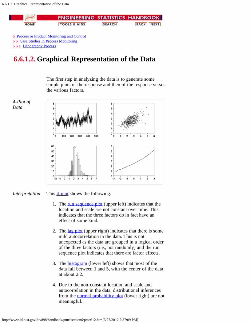
6.6.1.2. Graphical Representation of the Data
http://www.itl.nist.gov/div898/handbook/pmc/section6/pmc612.htm[6/27/2012 2:37:09 PM]
6. Process or Product Monitoring and Control 6.6. Case Studies in Process Monitoring 6.6.1. Lithography Process
6.6.1.2. Graphical Representation of the Data
The first step in analyzing the data is to generate somesimple plots of the response and then of the response versusthe various factors.
4-Plot ofData
Interpretation This 4-plot shows the following.
1. The run sequence plot (upper left) indicates that thelocation and scale are not constant over time. Thisindicates that the three factors do in fact have aneffect of some kind.
2. The lag plot (upper right) indicates that there is somemild autocorrelation in the data. This is notunexpected as the data are grouped in a logical orderof the three factors (i.e., not randomly) and the runsequence plot indicates that there are factor effects.
3. The histogram (lower left) shows that most of thedata fall between 1 and 5, with the center of the dataat about 2.2.
4. Due to the non-constant location and scale andautocorrelation in the data, distributional inferencesfrom the normal probability plot (lower right) are notmeaningful.
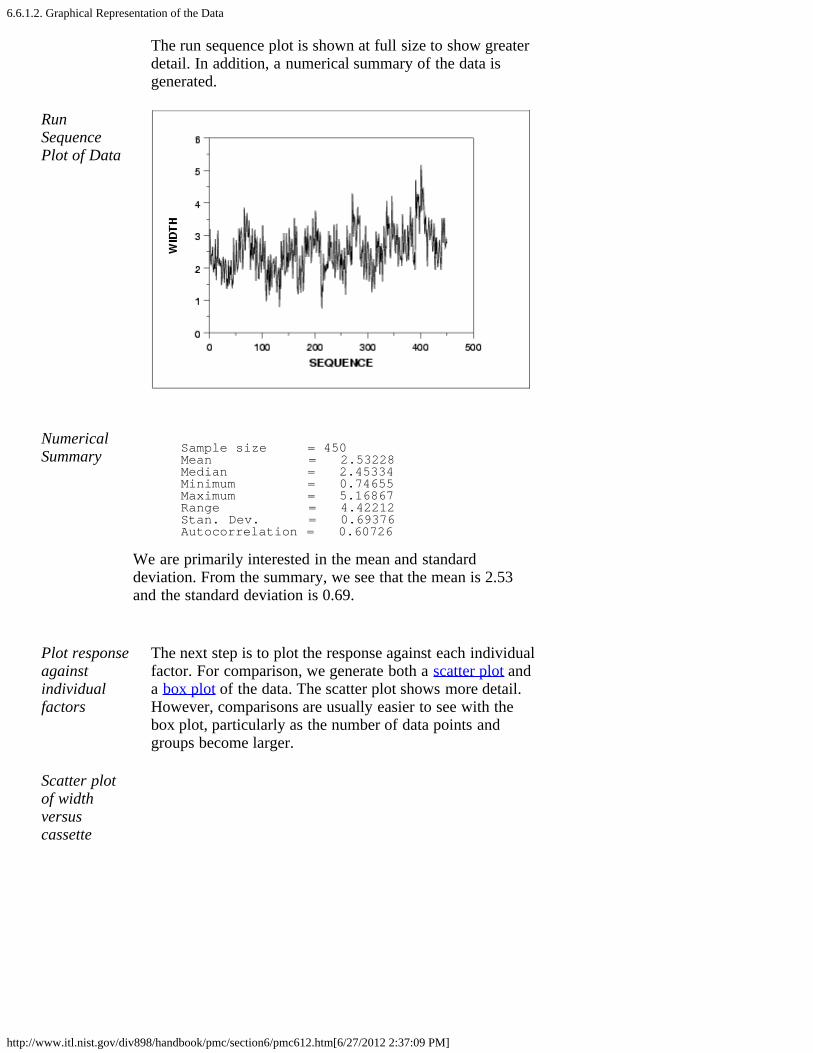
6.6.1.2. Graphical Representation of the Data
http://www.itl.nist.gov/div898/handbook/pmc/section6/pmc612.htm[6/27/2012 2:37:09 PM]
The run sequence plot is shown at full size to show greaterdetail. In addition, a numerical summary of the data isgenerated.
RunSequencePlot of Data
NumericalSummary Sample size = 450
Mean = 2.53228 Median = 2.45334 Minimum = 0.74655 Maximum = 5.16867 Range = 4.42212 Stan. Dev. = 0.69376 Autocorrelation = 0.60726
We are primarily interested in the mean and standarddeviation. From the summary, we see that the mean is 2.53and the standard deviation is 0.69.
Plot responseagainstindividualfactors
The next step is to plot the response against each individualfactor. For comparison, we generate both a scatter plot anda box plot of the data. The scatter plot shows more detail.However, comparisons are usually easier to see with thebox plot, particularly as the number of data points andgroups become larger.
Scatter plotof widthversuscassette

6.6.1.2. Graphical Representation of the Data
http://www.itl.nist.gov/div898/handbook/pmc/section6/pmc612.htm[6/27/2012 2:37:09 PM]
Box plot ofwidth versuscassette
Interpretation We can make the following conclusions based on the abovescatter and box plots.
1. There is considerable variation in the location for thevarious cassettes. The medians vary from about 1.7 to4.
2. There is also some variation in the scale.3. There are a number of outliers.
Scatter plotof widthversus wafer

6.6.1.2. Graphical Representation of the Data
http://www.itl.nist.gov/div898/handbook/pmc/section6/pmc612.htm[6/27/2012 2:37:09 PM]
Box plot ofwidth versuswafer
Interpretation We can make the following conclusions based on the abovescatter and box plots.
1. The locations for the three wafers are relativelyconstant.
2. The scales for the three wafers are relatively constant.3. There are a few outliers on the high side.4. It is reasonable to treat the wafer factor as
homogeneous.
Scatter plotof widthversus site

6.6.1.2. Graphical Representation of the Data
http://www.itl.nist.gov/div898/handbook/pmc/section6/pmc612.htm[6/27/2012 2:37:09 PM]
Box plot ofwidth versussite
Interpretation We can make the following conclusions based on the abovescatter and box plots.
1. There is some variation in location based on site. Thecenter site in particular has a lower median.
2. The scales are relatively constant across sites.3. There are a few outliers.
DOE meanand sd plots
We can use the DOE mean plot and the DOE standarddeviation plot to show the factor means and standarddeviations together for better comparison.
DOE meanplot
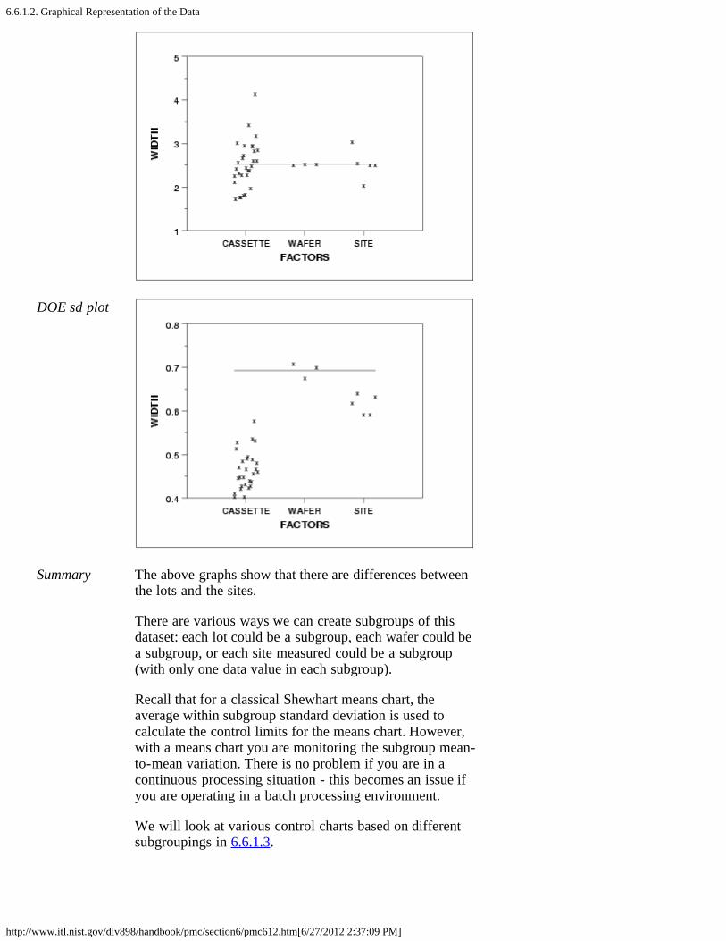
6.6.1.2. Graphical Representation of the Data
http://www.itl.nist.gov/div898/handbook/pmc/section6/pmc612.htm[6/27/2012 2:37:09 PM]
DOE sd plot
Summary The above graphs show that there are differences betweenthe lots and the sites.
There are various ways we can create subgroups of thisdataset: each lot could be a subgroup, each wafer could bea subgroup, or each site measured could be a subgroup(with only one data value in each subgroup).
Recall that for a classical Shewhart means chart, theaverage within subgroup standard deviation is used tocalculate the control limits for the means chart. However,with a means chart you are monitoring the subgroup mean-to-mean variation. There is no problem if you are in acontinuous processing situation - this becomes an issue ifyou are operating in a batch processing environment.
We will look at various control charts based on differentsubgroupings in 6.6.1.3.

6.6.1.2. Graphical Representation of the Data
http://www.itl.nist.gov/div898/handbook/pmc/section6/pmc612.htm[6/27/2012 2:37:09 PM]

6.6.1.3. Subgroup Analysis
http://www.itl.nist.gov/div898/handbook/pmc/section6/pmc613.htm[6/27/2012 2:37:10 PM]
6. Process or Product Monitoring and Control 6.6. Case Studies in Process Monitoring 6.6.1. Lithography Process
6.6.1.3. Subgroup Analysis
Controlcharts forsubgroups
The resulting classical Shewhart control charts for eachpossible subgroup are shown below.
Site assubgroup
The first pair of control charts use the site as the subgroup.However, since site has a subgroup size of one we use thecontrol charts for individual measurements. A movingaverage and a moving range chart are shown.
Movingaveragecontrol chart
Movingrange controlchart

6.6.1.3. Subgroup Analysis
http://www.itl.nist.gov/div898/handbook/pmc/section6/pmc613.htm[6/27/2012 2:37:10 PM]
Wafer assubgroup
The next pair of control charts use the wafer as thesubgroup. In this case, the subgroup size is five. A meanand a standard deviation control chart are shown.
Mean controlchart
SD controlchart
There is no LCL for the standard deviation chart because ofthe small subgroup size.
Cassette assubgroup
The next pair of control charts use the cassette as thesubgroup. In this case, the subgroup size is 15. A mean anda standard deviation control chart are shown.
Mean controlchart
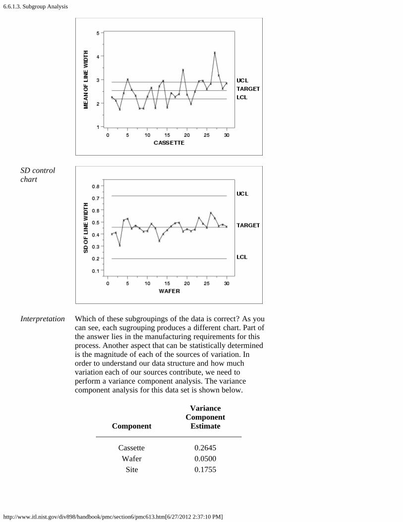
6.6.1.3. Subgroup Analysis
http://www.itl.nist.gov/div898/handbook/pmc/section6/pmc613.htm[6/27/2012 2:37:10 PM]
SD controlchart
Interpretation Which of these subgroupings of the data is correct? As youcan see, each sugrouping produces a different chart. Part ofthe answer lies in the manufacturing requirements for thisprocess. Another aspect that can be statistically determinedis the magnitude of each of the sources of variation. Inorder to understand our data structure and how muchvariation each of our sources contribute, we need toperform a variance component analysis. The variancecomponent analysis for this data set is shown below.
Component
VarianceComponent
Estimate
Cassette 0.2645Wafer 0.0500Site 0.1755

6.6.1.3. Subgroup Analysis
http://www.itl.nist.gov/div898/handbook/pmc/section6/pmc613.htm[6/27/2012 2:37:10 PM]
VarianceComponentEstimation
If your software does not generate the variance componentsdirectly, they can be computed from a standard analysis ofvariance output by equating mean squares (MS) to expectedmean squares (EMS).
The sum of squares and mean squares for a nested, randomeffects model are shown below.
Degrees of Sum ofSource Freedom Squares Mean Squares-------------------- ---------- --------- ------------Cassette 29 127.40293 4.3932 Wafer(Cassette) 60 25.52089 0.4253Site(Cassette, Wafer) 360 63.17865 0.1755
The expected mean squares for cassette, wafer withincassette, and site within cassette and wafer, along with theirassociated mean squares, are the following.
4.3932 = (3*5)*Var(cassettes) + 5*Var(wafer) + Var(site)0.4253 = 5*Var(wafer) + Var(site)0.1755 = Var(site)
Solving these equations, we obtain the variance componentestimates 0.2645, 0.04997, and 0.1755 for cassettes, wafers,and sites, respectively.
All of the analyses in this section can be completed using Rcode.
6.6.1.4. Shewhart Control Chart
http://www.itl.nist.gov/div898/handbook/pmc/section6/pmc614.htm[6/27/2012 2:37:11 PM]
6. Process or Product Monitoring and Control 6.6. Case Studies in Process Monitoring 6.6.1. Lithography Process
6.6.1.4. Shewhart Control Chart
Choosingthe rightcontrolcharts tomonitortheprocess
The largest source of variation in this data is the lot-to-lotvariation. So, using classical Shewhart methods, if we specifyour subgroup to be anything other than lot, we will be ignoringthe known lot-to-lot variation and could get out-of-controlpoints that already have a known, assignable cause - the datacomes from different lots. However, in the lithographyprocessing area the measurements of most interest are the sitelevel measurements, not the lot means. How can we getaround this seeming contradiction?
Chartsources ofvariationseparately
One solution is to chart the important sources of variationseparately. We would then be able to monitor the variation ofour process and truly understand where the variation is comingfrom and if it changes. For this dataset, this approach wouldrequire having two sets of control charts, one for theindividual site measurements and the other for the lot means.This would double the number of charts necessary for thisprocess (we would have 4 charts for line width instead of 2).
Chart onlymostimportantsource ofvariation
Another solution would be to have one chart on the largestsource of variation. This would mean we would have one setof charts that monitor the lot-to-lot variation. From amanufacturing standpoint, this would be unacceptable.
Useboxplottype chart
We could create a non-standard chart that would plot all theindividual data values and group them together in a boxplottype format by lot. The control limits could be generated tomonitor the individual data values while the lot-to-lot variationwould be monitored by the patterns of the groupings. Thiswould take special programming and management interventionto implement non-standard charts in most floor shop controlsystems.
Alternateform formeancontrolchart
A commonly applied solution is the first option; have multiplecharts on this process. When creating the control limits for thelot means, care must be taken to use the lot-to-lot variationinstead of the within lot variation. The resulting control chartsare: the standard individuals/moving range charts (as seenpreviously), and a control chart on the lot means that isdifferent from the previous lot means chart. This new chart

6.6.1.4. Shewhart Control Chart
http://www.itl.nist.gov/div898/handbook/pmc/section6/pmc614.htm[6/27/2012 2:37:11 PM]
uses the lot-to-lot variation to calculate control limits insteadof the average within-lot standard deviation. Theaccompanying standard deviation chart is the same as seenpreviously.
Meancontrolchartusing lot-to-lotvariation
The control limits labeled with "UCL" and "LCL" are thestandard control limits. The control limits labeled with "UCL:LL" and "LCL: LL" are based on the lot-to-lot variation.
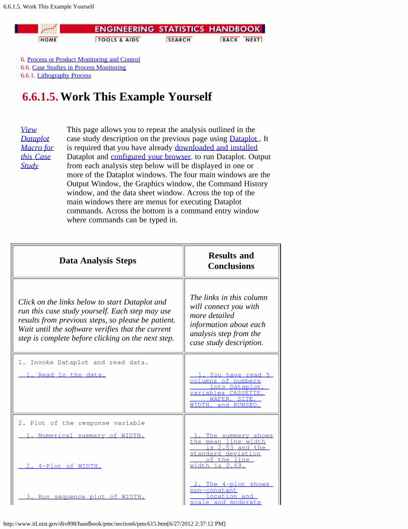
6.6.1.5. Work This Example Yourself
http://www.itl.nist.gov/div898/handbook/pmc/section6/pmc615.htm[6/27/2012 2:37:12 PM]
6. Process or Product Monitoring and Control 6.6. Case Studies in Process Monitoring 6.6.1. Lithography Process
6.6.1.5. Work This Example Yourself
ViewDataplotMacro forthis CaseStudy
This page allows you to repeat the analysis outlined in thecase study description on the previous page using Dataplot . Itis required that you have already downloaded and installedDataplot and configured your browser. to run Dataplot. Outputfrom each analysis step below will be displayed in one ormore of the Dataplot windows. The four main windows are theOutput Window, the Graphics window, the Command Historywindow, and the data sheet window. Across the top of themain windows there are menus for executing Dataplotcommands. Across the bottom is a command entry windowwhere commands can be typed in.
Data Analysis Steps Results andConclusions
Click on the links below to start Dataplot andrun this case study yourself. Each step may useresults from previous steps, so please be patient.Wait until the software verifies that the currentstep is complete before clicking on the next step.
The links in this columnwill connect you withmore detailedinformation about eachanalysis step from thecase study description.
1. Invoke Dataplot and read data.
1. Read in the data. 1. You have read 5 columns of numbers into Dataplot, variables CASSETTE, WAFER, SITE, WIDTH, and RUNSEQ.
2. Plot of the response variable
1. Numerical summary of WIDTH.
2. 4-Plot of WIDTH.
3. Run sequence plot of WIDTH.
1. The summary shows the mean line width is 2.53 and the standard deviation of the line width is 0.69.
2. The 4-plot shows non-constant location and scale and moderate

6.6.1.5. Work This Example Yourself
http://www.itl.nist.gov/div898/handbook/pmc/section6/pmc615.htm[6/27/2012 2:37:12 PM]
autocorrelation.
3. The run sequence plot shows non-constant location and scale.
3. Generate scatter and box plots against individual factors.
1. Scatter plot of WIDTH versus CASSETTE.
2. Box plot of WIDTH versus CASSETTE.
3. Scatter plot of WIDTH versus WAFER.
4. Box plot of WIDTH versus WAFER.
5. Scatter plot of WIDTH versus SITE.
6. Box plot of WIDTH versus SITE.
7. DOE mean plot of WIDTH versus CASSETTE, WAFER, and SITE.
8. DOE sd plot of WIDTH versus CASSETTE, WAFER, and SITE.
1. The scatter plot shows considerable variation in location.
2. The box plot shows considerable variation in location and scale and the prescence of some outliers.
3. The scatter plot shows minimal variation in location and scale.
4. The box plot shows minimal variation in location and scale. It also show some outliers.
5. The scatter plot shows some variation in location.
6. The box plot shows some variation in location. Scale seems relatively constant. Some outliers.
7. The DOE mean plot shows effects for CASSETTE and SITE, no effect for WAFER.
8. The DOE sd plot shows effects for CASSETTE and SITE, no effect for WAFER.
4. Subgroup analysis.
1. Generate a moving mean control chart.
2. Generate a moving range control chart.
3. Generate a mean control chart for WAFER.
1. The moving mean plot shows a large number of out-of- control points.
2. The moving range plot shows a large number of out-of-
6.6.1.5. Work This Example Yourself
http://www.itl.nist.gov/div898/handbook/pmc/section6/pmc615.htm[6/27/2012 2:37:12 PM]
4. Generate a sd control chart for WAFER.
5. Generate a mean control chart for CASSETTE.
6. Generate a sd control chart for CASSETTE.
7. Generate an analysis of variance. This is not currently implemented in DATAPLOT for nested datasets.
8. Generate a mean control chart using lot-to-lot variation.
control points.
3. The mean control chart shows a large number of out-of- control points.
4. The sd control chart shows no out-of-control points.
5. The mean control chart shows a large number of out-of- control points.
6. The sd control chart shows no out-of-control points.
7. The analysis of variance and components of variance calculations show that cassette to cassette variation is 54% of the total and site to site variation is 36% of the total.
8. The mean control chart shows one point that is on the boundary of being out of control.
6.6.2. Aerosol Particle Size
http://www.itl.nist.gov/div898/handbook/pmc/section6/pmc62.htm[6/27/2012 2:37:13 PM]
6. Process or Product Monitoring and Control 6.6. Case Studies in Process Monitoring
6.6.2. Aerosol Particle Size
Box-JenkinsModelingof AerosolParticleSize
This case study illustrates the use of Box-Jenkins modelingwith aerosol particle size data.
1. Background and Data2. Model Identification3. Model Estimation4. Model Validation5. Work This Example Yourself

6.6.2.1. Background and Data
http://www.itl.nist.gov/div898/handbook/pmc/section6/pmc621.htm[6/27/2012 2:37:14 PM]
6. Process or Product Monitoring and Control 6.6. Case Studies in Process Monitoring 6.6.2. Aerosol Particle Size
6.6.2.1. Background and Data
Data Source The source of the data for this case study is Antuan Negizwho analyzed these data while he was a post-doc in theNIST Statistical Engineering Division from the IllinoisInstitute of Technology.
DataCollection
These data were collected from an aerosol mini-spray dryerdevice. The purpose of this device is to convert a slurrystream into deposited particles in a drying chamber. Thedevice injects the slurry at high speed. The slurry ispulverized as it enters the drying chamber when it comes intocontact with a hot gas stream at low humidity. The liquidcontained in the pulverized slurry particles is vaporized, thentransferred to the hot gas stream leaving behind dried small-sized particles.
The response variable is particle size, which is collectedequidistant in time. There are a variety of associatedvariables that may affect the injection process itself andhence the size and quality of the deposited particles. For thiscase study, we restrict our analysis to the response variable.
Applications Such deposition process operations have many applicationsfrom powdered laundry detergents at one extreme to ceramicmolding at an important other extreme. In ceramic molding,the distribution and homogeneity of the particle sizes areparticularly important because after the molds are baked andcured, the properties of the final molded ceramic product isstrongly affected by the intermediate uniformity of the baseceramic particles, which in turn is directly reflective of thequality of the initial atomization process in the aerosolinjection device.
AerosolParticleSizeDynamicModelingand Control
The data set consists of particle sizes collected over time.The basic distributional properties of this process are ofinterest in terms of distributional shape, constancy of size,and variation in size. In addition, this time series may beexamined for autocorrelation structure to determine aprediction model of particle size as a function of time--sucha model is frequently autoregressive in nature. Such a high-quality prediction equation would be essential as a first stepin developing a predictor-corrective recursive feedback

6.6.2.1. Background and Data
http://www.itl.nist.gov/div898/handbook/pmc/section6/pmc621.htm[6/27/2012 2:37:14 PM]
mechanism which would serve as the core in developing andimplementing real-time dynamic corrective algorithms. Thenet effect of such algorthms is, of course, a particle sizedistribution that is much less variable, much more stable innature, and of much higher quality. All of this results in finalceramic mold products that are more uniform and predictableacross a wide range of important performancecharacteristics.
For the purposes of this case study, we restrict the analysis todetermining an appropriate Box-Jenkins model of the particlesize.
Software The analyses used in this case study can be generated usingboth Dataplot code and R code.
Case studydata
115.36539114.63150114.63150116.09940116.34400116.09940116.34400116.83331116.34400116.83331117.32260117.07800117.32260117.32260117.81200117.56730118.30130117.81200118.30130117.81200118.30130118.30130118.54590118.30130117.07800116.09940118.30130118.79060118.05661118.30130118.54590118.30130118.54590118.05661118.30130118.54590118.30130118.30130118.30130118.30130118.05661118.30130117.81200118.30130117.32260117.32260117.56730117.81200117.56730117.81200117.81200117.32260116.34400116.58870116.83331116.58870

6.6.2.1. Background and Data
http://www.itl.nist.gov/div898/handbook/pmc/section6/pmc621.htm[6/27/2012 2:37:14 PM]
116.83331116.83331117.32260116.34400116.09940115.61010115.61010115.61010115.36539115.12080115.61010115.85471115.36539115.36539115.36539115.12080114.87611114.87611115.12080114.87611114.87611114.63150114.63150114.14220114.38680114.14220114.63150114.87611114.38680114.87611114.63150114.14220114.14220113.89750114.14220113.89750113.65289113.65289113.40820113.40820112.91890113.40820112.91890113.40820113.89750113.40820113.65289113.89750113.65289113.65289113.89750113.65289113.16360114.14220114.38680113.65289113.89750113.89750113.40820113.65289113.89750113.65289113.65289114.14220114.38680114.63150115.61010115.12080114.63150114.38680113.65289113.40820113.40820113.16360113.16360113.16360113.16360113.16360112.42960113.40820113.40820

6.6.2.1. Background and Data
http://www.itl.nist.gov/div898/handbook/pmc/section6/pmc621.htm[6/27/2012 2:37:14 PM]
113.16360113.16360113.16360113.16360111.20631112.67420112.91890112.67420112.91890113.16360112.91890112.67420112.91890112.67420112.91890113.16360112.67420112.67420112.91890113.16360112.67420112.91890111.20631113.40820112.91890112.67420113.16360113.65289113.40820114.14220114.87611114.87611116.09940116.34400116.58870116.09940116.34400116.83331117.07800117.07800116.58870116.83331116.58870116.34400116.83331116.83331117.07800116.58870116.58870117.32260116.83331118.79060116.83331117.07800116.58870116.83331116.34400116.58870116.34400116.34400116.34400116.09940116.09940116.34400115.85471115.85471115.85471115.61010115.61010115.61010115.36539115.12080115.61010115.85471115.12080115.12080114.87611114.87611114.38680114.14220114.14220

6.6.2.1. Background and Data
http://www.itl.nist.gov/div898/handbook/pmc/section6/pmc621.htm[6/27/2012 2:37:14 PM]
114.38680114.14220114.38680114.38680114.38680114.38680114.38680114.14220113.89750114.14220113.65289113.16360112.91890112.67420112.42960112.42960112.42960112.18491112.18491112.42960112.18491112.42960111.69560112.42960112.42960111.69560111.94030112.18491112.18491112.18491111.94030111.69560111.94030111.94030112.42960112.18491112.18491111.94030112.18491112.18491111.20631111.69560111.69560111.69560111.94030111.94030112.18491111.69560112.18491111.94030111.69560112.18491110.96170111.69560111.20631111.20631111.45100110.22771109.98310110.22771110.71700110.22771111.20631111.45100111.69560112.18491112.18491112.18491112.42960112.67420112.18491112.42960112.18491112.91890112.18491112.42960111.20631112.42960112.42960112.42960112.42960

6.6.2.1. Background and Data
http://www.itl.nist.gov/div898/handbook/pmc/section6/pmc621.htm[6/27/2012 2:37:14 PM]
113.16360112.18491112.91890112.91890112.67420112.42960112.42960112.42960112.91890113.16360112.67420113.16360112.91890112.42960112.67420112.91890112.18491112.91890113.16360112.91890112.91890112.91890112.67420112.42960112.42960113.16360112.91890112.67420113.16360112.91890113.16360112.91890112.67420112.91890112.67420112.91890112.91890112.91890113.16360112.91890112.91890112.18491112.42960112.42960112.18491112.91890112.67420112.42960112.42960112.18491112.42960112.67420112.42960112.42960112.18491112.67420112.42960112.42960112.67420112.42960112.42960112.42960112.67420112.91890113.40820113.40820113.40820112.91890112.67420112.67420112.91890113.65289113.89750114.38680114.87611114.87611115.12080115.61010115.36539115.61010115.85471
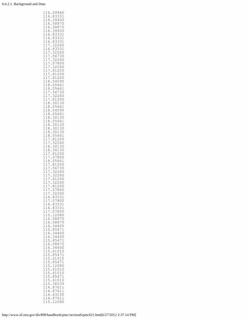
6.6.2.1. Background and Data
http://www.itl.nist.gov/div898/handbook/pmc/section6/pmc621.htm[6/27/2012 2:37:14 PM]
116.09940116.83331116.34400116.58870116.58870116.34400116.83331116.83331116.83331117.32260116.83331117.32260117.56730117.32260117.07800117.32260117.81200117.81200117.81200118.54590118.05661118.05661117.56730117.32260117.81200118.30130118.05661118.54590118.05661118.30130118.05661118.30130118.30130118.30130118.05661117.81200117.32260118.30130118.30130117.81200117.07800118.05661117.81200117.56730117.32260117.32260117.81200117.32260117.81200117.07800117.32260116.83331117.07800116.83331116.83331117.07800115.12080116.58870116.58870116.34400115.85471116.34400116.34400115.85471116.58870116.34400115.61010115.85471115.61010115.85471115.12080115.61010115.61010115.85471115.61010115.36539114.87611114.87611114.63150114.87611115.12080

6.6.2.1. Background and Data
http://www.itl.nist.gov/div898/handbook/pmc/section6/pmc621.htm[6/27/2012 2:37:14 PM]
114.63150114.87611115.12080114.63150114.38680114.38680114.87611114.63150114.63150114.63150114.63150114.63150114.14220113.65289113.65289113.89750113.65289113.40820113.40820113.89750113.89750113.89750113.65289113.65289113.89750113.40820113.40820113.65289113.89750113.89750114.14220113.65289113.40820113.40820113.65289113.40820114.14220113.89750114.14220113.65289113.65289113.65289113.89750113.16360113.16360113.89750113.65289113.16360113.65289113.40820112.91890113.16360113.16360113.40820113.40820113.65289113.16360113.40820113.16360113.16360112.91890112.91890112.91890113.65289113.65289113.16360112.91890112.67420113.16360112.91890112.67420112.91890112.91890112.91890111.20631112.91890113.16360112.42960112.67420113.16360112.42960

6.6.2.1. Background and Data
http://www.itl.nist.gov/div898/handbook/pmc/section6/pmc621.htm[6/27/2012 2:37:14 PM]
112.67420112.91890112.67420111.20631112.42960112.67420112.42960113.16360112.91890112.67420112.91890112.42960112.67420112.18491112.91890112.42960112.18491

6.6.2.2. Model Identification
http://www.itl.nist.gov/div898/handbook/pmc/section6/pmc622.htm[6/27/2012 2:37:15 PM]
6. Process or Product Monitoring and Control 6.6. Case Studies in Process Monitoring 6.6.2. Aerosol Particle Size
6.6.2.2. Model Identification
Check forStationarity,Outliers,Seasonality
The first step in the analysis is to generate a run sequenceplot of the response variable. A run sequence plot canindicate stationarity (i.e., constant location and scale), thepresence of outliers, and seasonal patterns.
Non-stationarity can often be removed by differencing thedata or fitting some type of trend curve. We would thenattempt to fit a Box-Jenkins model to the differenced data orto the residuals after fitting a trend curve.
Although Box-Jenkins models can estimate seasonalcomponents, the analyst needs to specify the seasonal period(for example, 12 for monthly data). Seasonal components arecommon for economic time series. They are less common forengineering and scientific data.
Run SequencePlot
Interpretationof the RunSequence Plot
We can make the following conclusions from the runsequence plot.
1. The data show strong and positive autocorrelation.
2. There does not seem to be a significant trend or anyobvious seasonal pattern in the data.
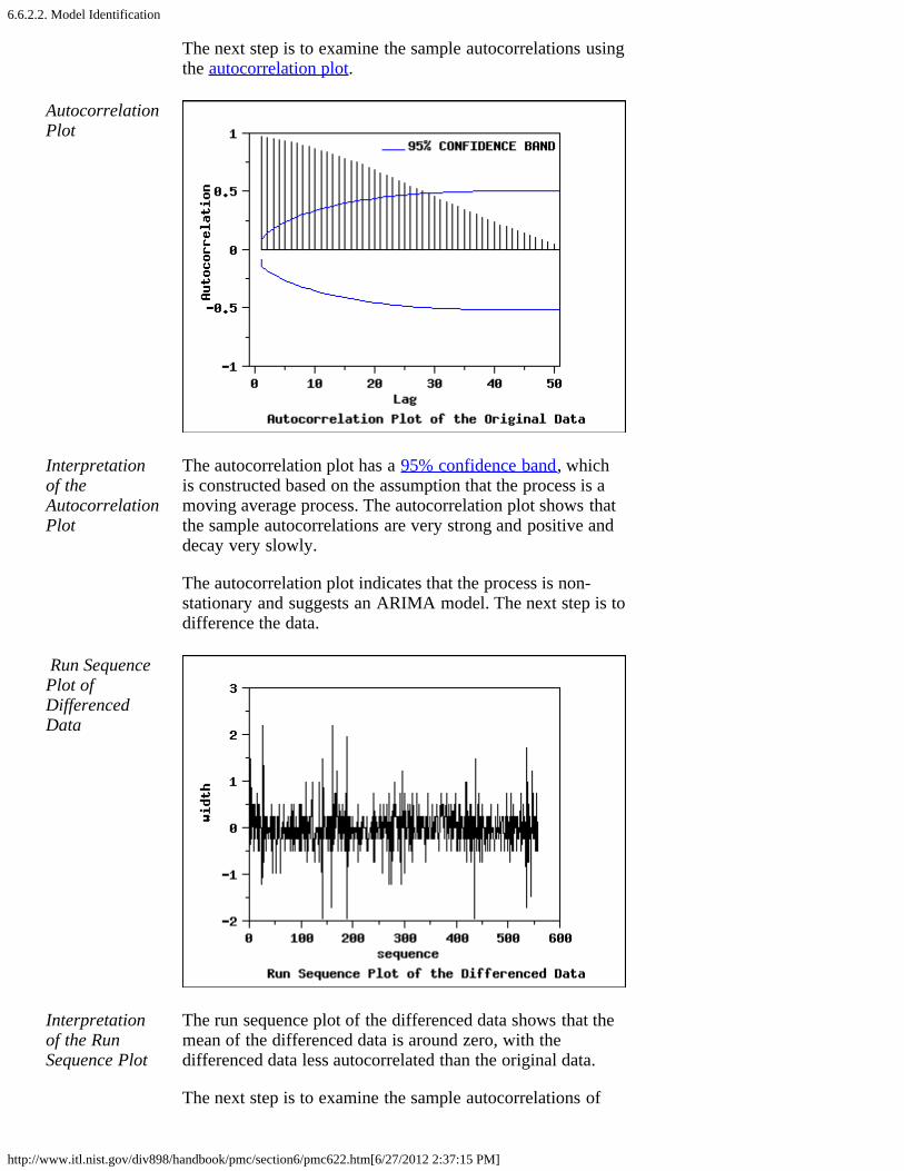
6.6.2.2. Model Identification
http://www.itl.nist.gov/div898/handbook/pmc/section6/pmc622.htm[6/27/2012 2:37:15 PM]
The next step is to examine the sample autocorrelations usingthe autocorrelation plot.
AutocorrelationPlot
Interpretationof theAutocorrelationPlot
The autocorrelation plot has a 95% confidence band, whichis constructed based on the assumption that the process is amoving average process. The autocorrelation plot shows thatthe sample autocorrelations are very strong and positive anddecay very slowly.
The autocorrelation plot indicates that the process is non-stationary and suggests an ARIMA model. The next step is todifference the data.
Run SequencePlot ofDifferencedData
Interpretationof the RunSequence Plot
The run sequence plot of the differenced data shows that themean of the differenced data is around zero, with thedifferenced data less autocorrelated than the original data.
The next step is to examine the sample autocorrelations of
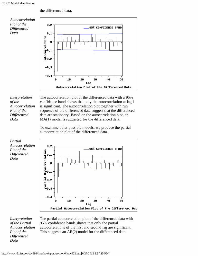
6.6.2.2. Model Identification
http://www.itl.nist.gov/div898/handbook/pmc/section6/pmc622.htm[6/27/2012 2:37:15 PM]
the differenced data.
AutocorrelationPlot of theDifferencedData
Interpretationof theAutocorrelationPlot of theDifferencedData
The autocorrelation plot of the differenced data with a 95%confidence band shows that only the autocorrelation at lag 1is significant. The autocorrelation plot together with runsequence of the differenced data suggest that the differenceddata are stationary. Based on the autocorrelation plot, anMA(1) model is suggested for the differenced data.
To examine other possible models, we produce the partialautocorrelation plot of the differenced data.
PartialAutocorrelationPlot of theDifferencedData
Interpretationof the PartialAutocorrelationPlot of theDifferencedData
The partial autocorrelation plot of the differenced data with95% confidence bands shows that only the partialautocorrelations of the first and second lag are significant.This suggests an AR(2) model for the differenced data.

6.6.2.2. Model Identification
http://www.itl.nist.gov/div898/handbook/pmc/section6/pmc622.htm[6/27/2012 2:37:15 PM]
AkaikeInformationCriterion (AICand AICC)
Information-based criteria, such as the AIC or AICC (seeBrockwell and Davis (2002), pp. 171-174), can be used toautomate the choice of an appropriate model. Many softwareprograms for time series analysis will generate the AIC orAICC for a broad range of models.
Whatever method is used for model identification, modeldiagnostics should be performed on the selected model.Based on the plots in this section, we will examine theARIMA(2,1,0) and ARIMA(0,1,1) models in detail.

6.6.2.3. Model Estimation
http://www.itl.nist.gov/div898/handbook/pmc/section6/pmc623.htm[6/27/2012 2:37:16 PM]
6. Process or Product Monitoring and Control 6.6. Case Studies in Process Monitoring 6.6.2. Aerosol Particle Size
6.6.2.3. Model Estimation
AR(2)ModelParameterEstimates
The following parameter estimates were computed for the AR(2) model based on thedifferenced data.
Parameter Standard 95 % ConfidenceSource Estimate Error Interval------ --------- -------- ----------------Intercept -0.0050 0.0119 AR1 -0.4064 0.0419 (-0.4884, -0.3243)AR2 -0.1649 0.0419 (-0.2469, -0.0829) Number of Observations: 558Degrees of Freedom: 558 - 3 = 555 Residual Standard Deviation: 0.4423
Both AR parameters are significant since the confidence intervals do not contain zero.
The model for the differenced data, Yt, is an AR(2) model:
with = 0.4423.
It is often more convenient to express the model in terms of the original data, Xt, ratherthan the differenced data. From the definition of the difference, Yt = Xt - Xt-1, we canmake the appropriate substitutions into the above equation:
to arrive at the model in terms of the original series:
MA(1)ModelParameterEstimates
Alternatively, the parameter estimates for an MA(1) model based on the differenced dataare the following.
Parameter Standard 95 % ConfidenceSource Estimate Error Interval------ --------- -------- ----------------Intercept -0.0051 0.0114 MA1 -0.3921 0.0366 (-0.4638, -0.3205) Number of Observations: 558Degrees of Freedom: 558 - 2 = 556 Residual Standard Deviation: 0.4434

6.6.2.3. Model Estimation
http://www.itl.nist.gov/div898/handbook/pmc/section6/pmc623.htm[6/27/2012 2:37:16 PM]
The model for the differenced data, Yt, is an ARIMA(0,1,1) model:
with = 0.4434.
It is often more convenient to express the model in terms of the original data, Xt, ratherthan the differenced data. Making the appropriate substitutions into the above equation:
we arrive at the model in terms of the original series:

6.6.2.4. Model Validation
http://www.itl.nist.gov/div898/handbook/pmc/section6/pmc624.htm[6/27/2012 2:37:17 PM]
6. Process or Product Monitoring and Control 6.6. Case Studies in Process Monitoring 6.6.2. Aerosol Particle Size
6.6.2.4. Model Validation
Residuals After fitting the model, we should check whether the modelis appropriate.
As with standard non-linear least squares fitting, the primarytool for model diagnostic checking is residual analysis.
4-Plot ofResiduals fromARIMA(2,1,0)Model
The 4-plot is a convenient graphical technique for modelvalidation in that it tests the assumptions for the residuals ona single graph.
Interpretationof the 4-Plot
We can make the following conclusions based on the above4-plot.
1. The run sequence plot shows that the residuals do notviolate the assumption of constant location and scale. Italso shows that most of the residuals are in the range (-1, 1).
2. The lag plot indicates that the residuals are notautocorrelated at lag 1.
3. The histogram and normal probability plot indicate thatthe normal distribution provides an adequate fit for thismodel.
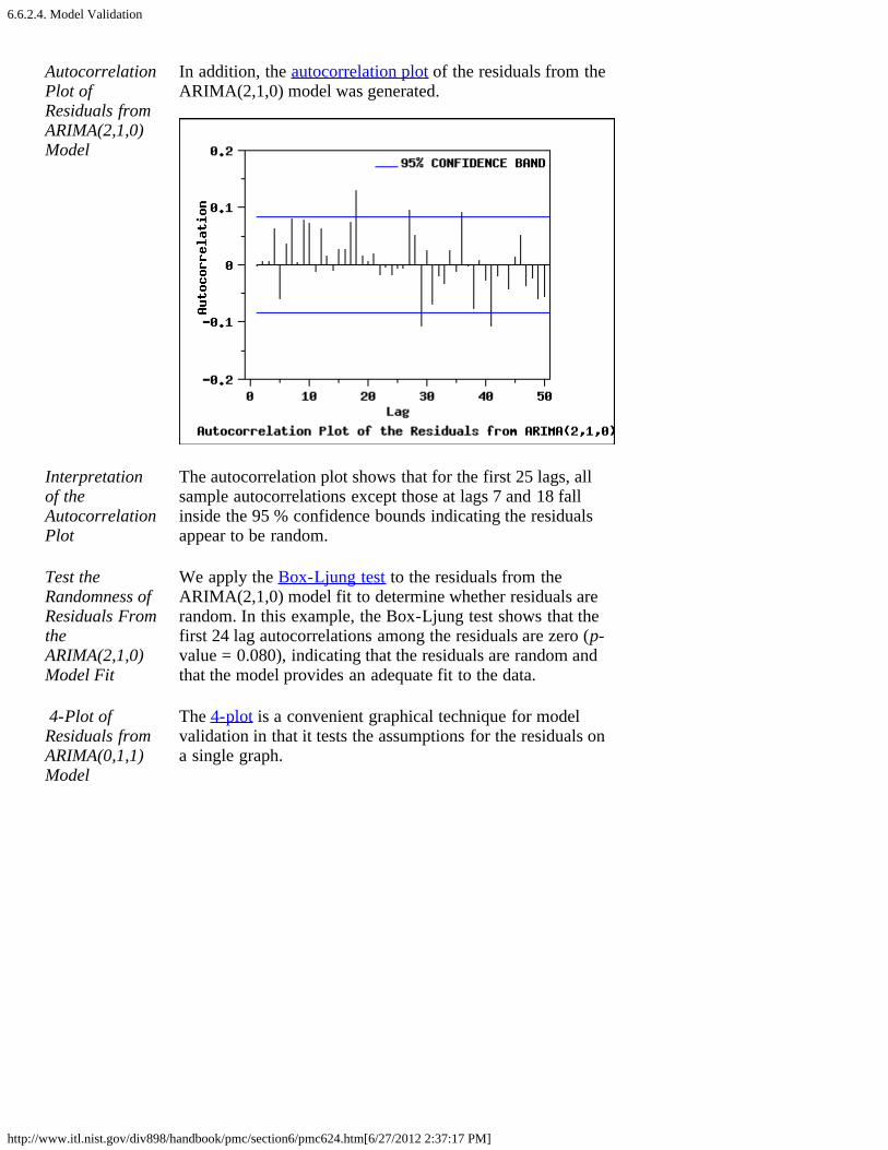
6.6.2.4. Model Validation
http://www.itl.nist.gov/div898/handbook/pmc/section6/pmc624.htm[6/27/2012 2:37:17 PM]
AutocorrelationPlot ofResiduals fromARIMA(2,1,0)Model
In addition, the autocorrelation plot of the residuals from theARIMA(2,1,0) model was generated.
Interpretationof theAutocorrelationPlot
The autocorrelation plot shows that for the first 25 lags, allsample autocorrelations except those at lags 7 and 18 fallinside the 95 % confidence bounds indicating the residualsappear to be random.
Test theRandomness ofResiduals FromtheARIMA(2,1,0)Model Fit
We apply the Box-Ljung test to the residuals from theARIMA(2,1,0) model fit to determine whether residuals arerandom. In this example, the Box-Ljung test shows that thefirst 24 lag autocorrelations among the residuals are zero (p-value = 0.080), indicating that the residuals are random andthat the model provides an adequate fit to the data.
4-Plot ofResiduals fromARIMA(0,1,1)Model
The 4-plot is a convenient graphical technique for modelvalidation in that it tests the assumptions for the residuals ona single graph.

6.6.2.4. Model Validation
http://www.itl.nist.gov/div898/handbook/pmc/section6/pmc624.htm[6/27/2012 2:37:17 PM]
Interpretationof the 4-Plotfrom theARIMA(0,1,1)Model
We can make the following conclusions based on the above4-plot.
1. The run sequence plot shows that the residuals do notviolate the assumption of constant location and scale. Italso shows that most of the residuals are in the range (-1, 1).
2. The lag plot indicates that the residuals are notautocorrelated at lag 1.
3. The histogram and normal probability plot indicate thatthe normal distribution provides an adequate fit for thismodel.
This 4-plot of the residuals indicates that the fitted model isadequate for the data.
AutocorrelationPlot ofResiduals fromARIMA(0,1,1)Model
The autocorrelation plot of the residuals from ARIMA(0,1,1)was generated.

6.6.2.4. Model Validation
http://www.itl.nist.gov/div898/handbook/pmc/section6/pmc624.htm[6/27/2012 2:37:17 PM]
Interpretationof theAutocorrelationPlot
Similar to the result for the ARIMA(2,1,0) model, it showsthat for the first 25 lags, all sample autocorrelations expectthose at lags 7 and 18 fall inside the 95% confidence boundsindicating the residuals appear to be random.
Test theRandomness ofResiduals FromtheARIMA(0,1,1)Model Fit
The Box-Ljung test is also applied to the residuals from theARIMA(0,1,1) model. The test indicates that there is at leastone non-zero autocorrelation amont the first 24 lags. Weconclude that there is not enough evidence to claim that theresiduals are random (p-value = 0.026).
Summary Overall, the ARIMA(0,1,1) is an adequate model. However,the ARIMA(2,1,0) is a little better than the ARIMA(0,1,1).

6.6.2.5. Work This Example Yourself
http://www.itl.nist.gov/div898/handbook/pmc/section6/pmc625.htm[6/27/2012 2:37:18 PM]
6. Process or Product Monitoring and Control 6.6. Case Studies in Process Monitoring 6.6.2. Aerosol Particle Size
6.6.2.5. Work This Example Yourself
ViewDataplotMacro forthis CaseStudy
This page allows you to repeat the analysis outlined in thecase study description on the previous page using Dataplot . Itis required that you have already downloaded and installedDataplot and configured your browser. to run Dataplot. Outputfrom each analysis step below will be displayed in one ormore of the Dataplot windows. The four main windows are theOutput Window, the Graphics window, the Command Historywindow, and the data sheet window. Across the top of themain windows there are menus for executing Dataplotcommands. Across the bottom is a command entry windowwhere commands can be typed in.
Data Analysis Steps Results andConclusions
Click on the links below to start Dataplot andrun this case study yourself. Each step may useresults from previous steps, so please be patient.Wait until the software verifies that the currentstep is complete before clicking on the next step.
The links in this columnwill connect you withmore detailedinformation about eachanalysis step from thecase study description.
1. Invoke Dataplot and read data.
1. Read in the data. 1. You have read one column of numbers into Dataplot, variable Y.
2. Model identification plots
1. Run sequence plot of Y.
2. Autocorrelation plot of Y.
3. Run sequence plot of the differenced data of Y.
1. The run sequence plot shows that the data show strong and positive autocorrelation.
2. The autocorrelation plot indicates significant autocorrelation and that the data are not stationary.

6.6.2.5. Work This Example Yourself
http://www.itl.nist.gov/div898/handbook/pmc/section6/pmc625.htm[6/27/2012 2:37:18 PM]
4. Autocorrelation plot of the differenced data of Y.
5. Partial autocorrelation plot of the differenced data of Y.
3. The run sequence plot shows that the differenced data appear to be stationary and do not exhibit seasonality.
4. The autocorrelation plot of the differenced data suggests an ARIMA(0,1,1) model may be appropriate.
5. The partial autocorrelation plot suggests an ARIMA(2,1,0) model may be appropriate.
3. Estimate the model.
1. ARIMA(2,1,0) fit of Y.
2. ARIMA(0,1,1) fit of Y.
1. The ARMA fit generates parameter estimates for the ARIMA(2,1,0) model.
2. The ARMA fit generates parameter estimates for the ARIMA(0,1,1) model.
4. Model validation.
1. Generate a 4-plot of the residuals from the ARIMA(2,1,0) model.
2. Generate an autocorrelation plot of the residuals from the ARIMA(2,1,0) model.
3. Perform a Ljung-Box test of randomness for the residuals from the ARIMA(2,1,0) model.
4. Generate a 4-plot of the residuals from the ARIMA(0,1,1) model.
5. Generate an autocorrelation plot of the residuals from the ARIMA(0,1,1) model.
6. Perform a Ljung-Box test of randomness for the residuals from the ARIMA(0,1,1) model.
1. The 4-plot shows that the assumptions for the residuals are satisfied.
2. The autocorrelation plot of the residuals indicates that the residuals are random.
3. The Ljung-Box test indicates that the residuals are random.
4. The 4-plot shows that the assumptions for the residuals are satisfied.
5. The

6.6.2.5. Work This Example Yourself
http://www.itl.nist.gov/div898/handbook/pmc/section6/pmc625.htm[6/27/2012 2:37:18 PM]
autocorrelation plot of the residuals indicates that the residuals are random.
6. The Ljung-Box test indicates that the residuals are not random at the 95% level, but are random at the 99% level.

6.7. References
http://www.itl.nist.gov/div898/handbook/pmc/section7/pmc7.htm[6/27/2012 2:37:19 PM]
6. Process or Product Monitoring and Control
6.7. References
Selected References
Time Series Analysis
Abraham, B. and Ledolter, J. (1983). Statistical Methods for Forecasting,Wiley, New York, NY.
Box, G. E. P., Jenkins, G. M., and Reinsel, G. C. (1994). Time SeriesAnalysis, Forecasting and Control, 3rd ed. Prentice Hall, Englewood Clifs,NJ.
Box, G. E. P. and McGregor, J. F. (1974). "The Analysis of Closed-LoopDynamic Stochastic Systems", Technometrics, Vol. 16-3.
Brockwell, Peter J. and Davis, Richard A. (1987). Time Series: Theory andMethods, Springer-Verlang.
Brockwell, Peter J. and Davis, Richard A. (2002). Introduction to TimeSeries and Forecasting, 2nd. ed., Springer-Verlang.
Chatfield, C. (1996). The Analysis of Time Series, 5th ed., Chapman & Hall,New York, NY.
DeLurgio, S. A. (1998). Forecasting Principles and Applications, IrwinMcGraw-Hill, Boston, MA.
Ljung, G. and Box, G. (1978). "On a Measure of Lack of Fit in Time SeriesModels", Biometrika, 65, 297-303.
Nelson, C. R. (1973). Applied Time Series Analysis for ManagerialForecasting, Holden-Day, Boca-Raton, FL.
Makradakis, S., Wheelwright, S. C. and McGhee, V. E. (1983). Forecasting:Methods and Applications, 2nd ed., Wiley, New York, NY.
Statistical Process and Quality Control
Army Chemical Corps (1953). Master Sampling Plans for Single, Duplicate,Double and Multiple Sampling, Manual No. 2.
Bissell, A. F. (1990). "How Reliable is Your Capability Index?", AppliedStatistics, 39, 331-340.
Champ, C.W., and Woodall, W.H. (1987). "Exact Results for Shewhart

6.7. References
http://www.itl.nist.gov/div898/handbook/pmc/section7/pmc7.htm[6/27/2012 2:37:19 PM]
Control Charts with Supplementary Runs Rules", Technometrics, 29, 393-399.
Duncan, A. J. (1986). Quality Control and Industrial Statistics, 5th ed.,Irwin, Homewood, IL.
Hotelling, H. (1947). Multivariate Quality Control. In C. Eisenhart, M. W.Hastay, and W. A. Wallis, eds. Techniques of Statistical Analysis. NewYork: McGraw-Hill.
Juran, J. M. (1997). "Early SQC: A Historical Supplement", QualityProgress, 30(9) 73-81.
Montgomery, D. C. (2000). Introduction to Statistical Quality Control, 4thed., Wiley, New York, NY.
Kotz, S. and Johnson, N. L. (1992). Process Capability Indices, Chapman &Hall, London.
Lowry, C. A., Woodall, W. H., Champ, C. W., and Rigdon, S. E. (1992). "AMultivariate Exponentially Weighted Moving Average Chart",Technometrics, 34, 46-53.
Lucas, J. M. and Saccucci, M. S. (1990). "Exponentially weighted movingaverage control schemes: Properties and enhancements", Technometrics 32,1-29.
Ott, E. R. and Schilling, E. G. (1990). Process Quality Control, 2nd ed.,McGraw-Hill, New York, NY.
Quesenberry, C. P. (1993). "The effect of sample size on estimated limits for and X control charts", Journal of Quality Technology, 25(4) 237-247.
Ryan, T.P. (2000). Statistical Methods for Quality Improvement, 2nd ed.,Wiley, New York, NY.
Ryan, T. P. and Schwertman, N. C. (1997). "Optimal limits for attributescontrol charts", Journal of Quality Technology, 29 (1), 86-98.
Schilling, E. G. (1982). Acceptance Sampling in Quality Control, MarcelDekker, New York, NY.
Tracy, N. D., Young, J. C. and Mason, R. L. (1992). "Multivariate ControlCharts for Individual Observations", Journal of Quality Technology, 24(2),88-95.
Woodall, W. H. (1997). "Control Charting Based on Attribute Data:Bibliography and Review", Journal of Quality Technology, 29, 172-183.
Woodall, W. H., and Adams, B. M. (1993); "The Statistical Design ofCUSUM Charts", Quality Engineering, 5(4), 559-570.
Zhang, Stenback, and Wardrop (1990). "Interval Estimation of the ProcessCapability Index", Communications in Statistics: Theory and Methods,19(21), 4455-4470.

6.7. References
http://www.itl.nist.gov/div898/handbook/pmc/section7/pmc7.htm[6/27/2012 2:37:19 PM]
Statistical Analysis
Anderson, T. W. (1984). Introduction to Multivariate Statistical Analysis,2nd ed., Wiley New York, NY.
Johnson, R. A. and Wichern, D. W. (1998). Applied Multivariate StatisticalAnalysis, Fourth Ed., Prentice Hall, Upper Saddle River, NJ.