1585 - food merchandising trendbook
TRANSCRIPT

food merchandising TRENDBOOK

TABLE OF CONTENTS1. MERCHANDISE YOUR MERCHANDISE2. THE FIVE KEY ELEMENTS3. HOW TO IMPLEMENT THE ELEMENTS4. LAY OF THE landscaping 5. [ trend watch ] SAY HELLO TO SIMPLE6. LET'S TALK texture 7. [ trend watch ] CLOSE TO HOME + HOME GROWN8. color ME INTRIGUED9. COLOR THEORY:101 10. [ trend watch ] SAVOR THE FLAVOR11. communication: A SIGN OF THE TIMES 12. [ trend watch ] SMALL MINDED13. WHAT'S IN STORE FOR décor14. [ trend watch ] CUSTOMIZABLE CONCEPTS15. THE FINAL SCORE
food merchandising TRENDBOOK
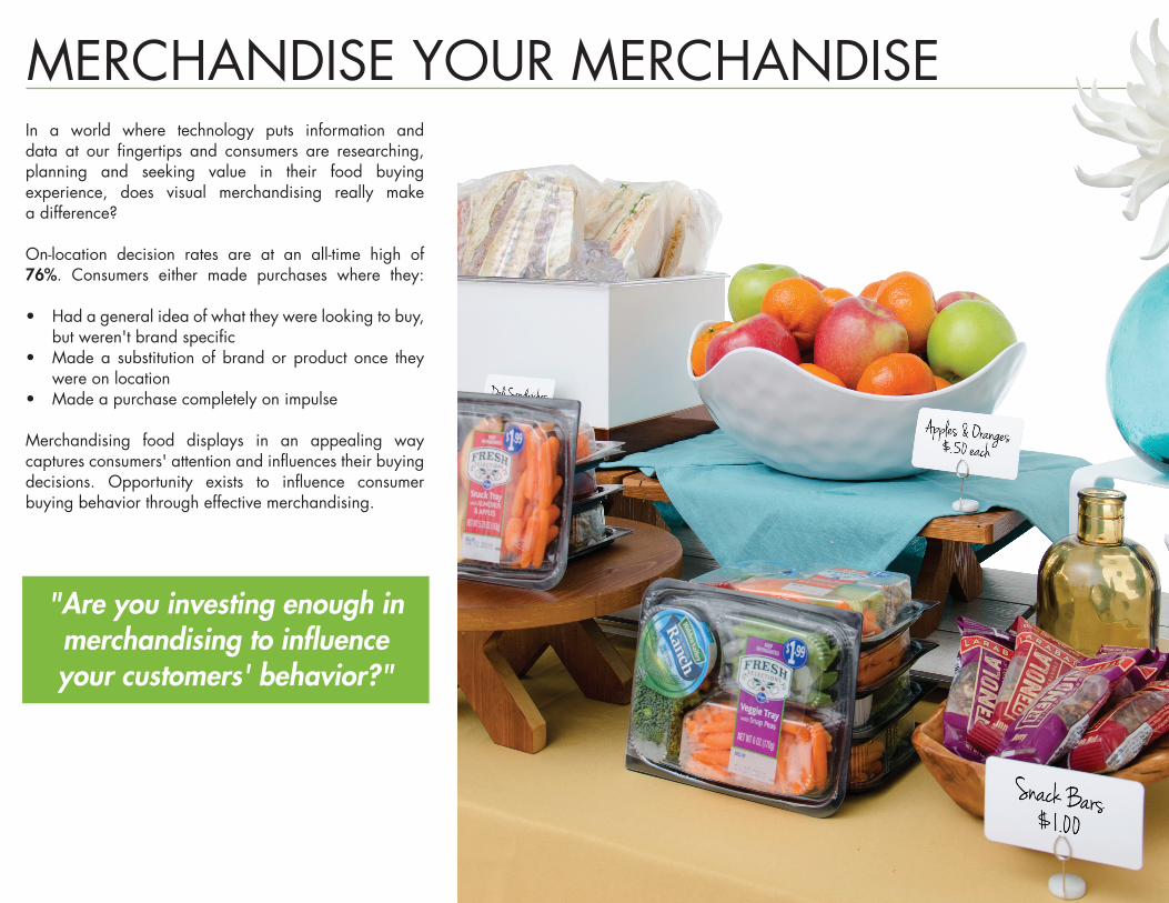
In a world where technology puts information and data at our fingertips and consumers are researching, planning and seeking value in their food buying experience, does visual merchandising really make a difference?
On-location decision rates are at an all-time high of 76%. Consumers either made purchases where they:
• Had a general idea of what they were looking to buy, but weren't brand specific
• Made a substitution of brand or product once they were on location
• Made a purchase completely on impulse
Merchandising food displays in an appealing way captures consumers' attention and influences their buying decisions. Opportunity exists to influence consumer buying behavior through effective merchandising.
MERCHANDISE YOUR MERCHANDISE
"Are you investing enough in merchandising to influence your customers' behavior?"

5
Buying decisions are made three to four feet away from a display so the display must be impactful enough from a distance to draw in the consumer.
What makes a display impactful? The incorporation of the five key elements.
landscaping: the ups and downs of merchandisingThe shape, form and elevation of an area.
1
color: the soul of merchandisingUsed to attract attention, create associations and command emotional responses.
3
3 communication: the storyteller of merchandisingSharing information or knowledge through a common system of signs, symbols or photos within a display.
4
texture: the touch and feel of merchandisingAn item’s physical structure with respect to size, shape, appearance and feel, actual or implied.
2
1
2
décor: the finishing touches of merchandisingThe enrichment of displays by the addition of elements that contribute style and interest.
5
4
THE FIVE KEY ELEMENTS

1 START WITH A FOUNDATION ADD RISERS FOR texture & landscaping2
INCORPORATE color3 FINISH WITH décor PIECES & communication4
HOW TO IMPLEMENT THE ELEMENTSOne way to create an effective visually merchandised display is through the use of a Progressive Set.
Progressive Sets ensure that each element is represented throughout the display in a coordinated way.
MERCHANDISING TIPProgressive Sets, which are
step-by-step guides for creating a display that effectively
implements the 5 Elements of Merchandising, are great tools, especially for businesses with
multiple locations.
DESIGNED TO TURN passive lookers INTO active buyers

LAY OF THE landscaping
ASYMMETRICAL BALANCEAn asymmetrically designed display may be considered unbalanced or free formed while still having a sense of organization or harmony through the repetition of certain elements.
BALANCEBalance is the distribution of the visual weight of objects, colors, texture, and space.
The concept and implementation of landscaping can increase consumer interest by creating an intriguing composition. Landscaping works in all dimensions - lateral, vertical and longitudinal. A variety of configurations can work within a display:
SYMMETRICAL BALANCESymmetry is found when all elements of the design are equally divided. Both sides of a display share the same shape, form, height, grouping, etc.
REPETITIONThe repetition of elements of design creates unity within a display.
Turkey Wrap
Shrimp & Salmon Cakes
Quiche
Greek Cucumber Salad
Dill Poached
Salmon Brussels Sprouts
Pasta Salad
Grilled Chicken Breast

SAY HELLO TO SIMPLESimplistic displays work best when the products you're merchandising are bold enough to be the star.
Think of the customer buying experience – don’t overwhelm their senses. Simple color palettes, textures and display pieces can work together to build the perfect display.
[ trend watch ]
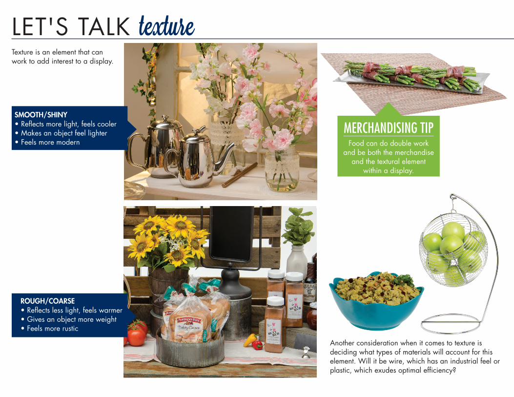
LET'S TALK texture
ROUGH/COARSE•Reflects less light, feels warmer•Gives an object more weight•Feels more rustic
SMOOTH/SHINY•Reflects more light, feels cooler•Makes an object feel lighter•Feels more modern
Another consideration when it comes to texture is deciding what types of materials will account for this element. Will it be wire, which has an industrial feel or plastic, which exudes optimal efficiency?
Texture is an element that can work to add interest to a display.
MERCHANDISING TIPFood can do double work
and be both the merchandise and the textural element
within a display.

CLOSE TO HOME + HOME GROWNThe NRA’s “What’s Hot Culinary Forecast” for 2015 surveyed more than 1,300 chefs and these were their top trends to watch for in 2015:
• Locally sourced meats and seafoods• Locally grown produce• Environmental sustainability• Natural ingredients.
Local as an expectation isn’t new, but it’s expanding. Diners are wanting to know the origins of their food.
[ trend watch ]

color ME INTRIGUED
COMPLEMENTARY CHORDSA complementary scheme is comprised of two colors that are opposite one another on the wheel. Complementary schemes work best when warm colors are paired with cool colors and one is dominant while the other is for accent.
SPLIT COMPLEMENTARY CHORDSSimilar to complementary, this scheme pairs one color with two opposing colors on the color wheel.
TRIADIC CHORDSAs the name suggests, this scheme uses three colors that are evenly spaced out around the color wheel. Visual contrast is present, but there’s still a level of balance and harmony.
MONOCHROMATIC CHORDSMonochromatic schemes are created by using variations of one color.
HARMONIOUS CHORDSHarmonious schemes are created using colors that are adjacent to each other on the color wheel. Typically one color is more dominant in the display and the other color or colors are supporting.
Color can help to set a specific mood, draw customer attention or even make a strategic statement. It can be one of the most powerful merchandising elements if used correctly.
Color chords show the relation of colors across the color wheel that combine to make a successful merchandising display. Dive deeper into color theory on the following page.
COOL
WARM
COOL
WARM
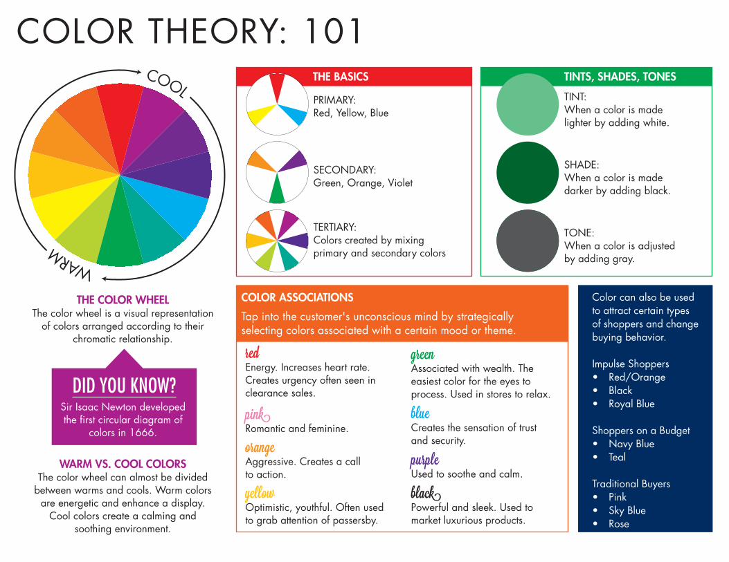
TINT: When a color is made lighter by adding white.
SHADE: When a color is made darker by adding black.
TONE: When a color is adjusted by adding gray.
Color can also be used to attract certain types of shoppers and change buying behavior.
Impulse Shoppers• Red/Orange• Black• Royal Blue
Shoppers on a Budget• Navy Blue• Teal
Traditional Buyers• Pink• Sky Blue• Rose
PRIMARY: Red, Yellow, Blue
SECONDARY: Green, Orange, Violet
TERTIARY: Colors created by mixing primary and secondary colors
WARM VS. COOL COLORSThe color wheel can almost be divided
between warms and cools. Warm colors are energetic and enhance a display.
Cool colors create a calming and soothing environment.
redEnergy. Increases heart rate. Creates urgency often seen in clearance sales.
greenAssociated with wealth. The easiest color for the eyes to process. Used in stores to relax.
blueCreates the sensation of trust and security.
purpleUsed to soothe and calm.
blackPowerful and sleek. Used to market luxurious products.
pinkRomantic and feminine.
orangeAggressive. Creates a call to action.
yellowOptimistic, youthful. Often used to grab attention of passersby.
Tap into the customer's unconscious mind by strategically selecting colors associated with a certain mood or theme.
TINTS, SHADES, TONESTHE BASICS
COLOR ASSOCIATIONS
COLOR THEORY: 101
THE COLOR WHEELThe color wheel is a visual representation
of colors arranged according to their chromatic relationship.
DID YOU KNOW?Sir Isaac Newton developed the first circular diagram of
colors in 1666.

SAVOR THE FLAVOR
[ trend watch ]
From sweet heat to bitter bites, consumers, especially millennials, are craving adventure in their eating experiences.
After years of suffering from restless palate syndrome, consumers are looking for items that use bold flavors and have multicultural influences.
Sweet and spicy, pickled and pungent, smokey and savory – flavor innovations are taking center stage.

communication: A SIGN OF THE TIMES
At its core, display signage has one purpose: to communicate with the customer. Keep this in mind when developing communication pieces for a display.
LOCATION, LOCATION, LOCATIONThe placement of signage within a presentation assists in the customer buying experience. Strategically placed signage can guide the shopper through the display from start to finish.
THE RIGHT LOOKSelect signage that fits the presentation’s overall theme. Rustic displays with weathered wood fixtures would need more casual signs and sign holders. Think handwritten chalkboard signage. An elegant dessert display set up at a catered event might call for more clean, modern signage options.
Signage can also serve as an opportunity to reinforce brand concepts. Whether it’s for a private label product or more general merchandise, communication pieces help to maintain a certain level of consistency throughout your location in order to strengthen brand messaging.
MENU LABELING: 101Americans consume one-third of their
calories away from home. Clearly displaying this information on
signage at a salad or hot food bar will soon be a requirement.
Get a head start and help your customers make more informed choices.
Visit fda.gov to learn more.

SMALLMINDED
[ trend watch ]
Little is big and petite plates present the perfect portion size. Dishes that fall between an appetizer and an entrée are on the rise. One reason for the smaller sizes? Sharing. Younger customers enjoy the more experiential way of sharing plates. Another reason for the downsize is that Americans are looking for healthier options and smaller portion sizes are a step in that direction.
MERCHANDISING TIPMake the most of your
mini entrées. Stack them to provide added elevation
to your display.

WHAT'S IN STORE FOR décorEffectiveness of decorative items add perceived value for your customer and subtly persuades them to purchase. Décor elevates the display experience by putting the cherry on top of your theme.
Gone are the days when décor was considered to be only an enhancement. Décor pieces are playing a more integral role in displays by having a dual purpose: fashion and function. Retro bread boxes turn into displayware when merchandise is housed inside. These items are able to act as attention-grabbing elements that captures the passive looker’s interest while also serving a functional purpose.

clean glam fresh
CUSTOMIZABLE CONCEPTS
[ trend watch ]Choosing merchandising options that allow for varying levels of customization will work in your favor. Base display pieces that can easily be transformed by adjusting secondary elements (color, texture, décor, communication) make merchandising that much easier.

Merchandising Score Card Meets Areas of Elements Expectations Improvement Neutral Notes
Landscaping _______ _______ _______ _________________________________
Color _______ _______ _______ _________________________________
Texture _______ _______ _______ _________________________________
Communication _______ _______ _______ _________________________________
Décor _______ _______ _______ _________________________________
Completed your assessment and need assistance or recommendations for improving visual merchandising? Contact a merchandising specialist at 800.543.7374 or [email protected]
THE FINAL SCORE
Now that you have a better understanding of the five elements of merchandising, you can evaluate your displays using the Merchandising Score Card.
Grade each display based on the incorporation of each element and whether or not it meets your expectations or if there’s still room for improvement.