1 building a good presentation prof. greg steffan electrical & computer engineering university...
TRANSCRIPT

1
Building a Good Presentation
Prof. Greg Steffan
Electrical & Computer Engineering
University of Toronto
2
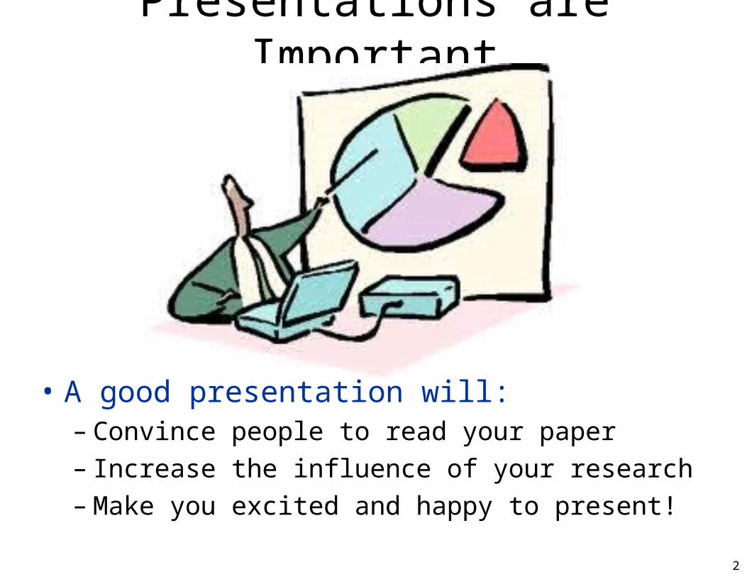
Presentations are Important
• A good presentation will:– Convince people to read your paper– Increase the influence of your research– Make you excited and happy to present!

3
This Presentation• Contained within:
– Rules/guidelines for building a good presentation– Examples and counter-examples– My personal opinions
• Ignore if you disagree, unless I’m your advisor
• Not contained:– How to decide the content– How to deliver a presentation
• Legend: means this is a counter-example means this is a good example

4
Building A Good Slide Master

Dragon Fly
• Avoid overly-busy background art

6
Master Slide Style• Avoid dark backgrounds
– Those are meant for dark presentation rooms– Academic presentations are rarely in the dark
• Keep any art/background minimal– Footer: consider your name, university, talk title
• White background with no art is fine!– Audience can instead focus on your content
7
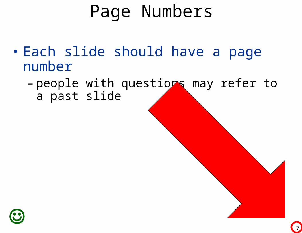
Page Numbers
• Each slide should have a page number– people with questions may refer to a past slide

8
Fonts
• Never use fonts with serifs! – Meant for books/papers, not presentations
• Use sans-serif fonts– Eg., Arial, Calibri, Comic Sans

9
Bullet Colour
• Bullets are hard to digest if all one colour– Sub-bullets blend in with top bullets
• Blah blah blah blah blah blah blah– Blah blah blah blah blah blah blah
• Blah blah blah blah blah blah blah– Blah blah blah blah blah blah blah
10
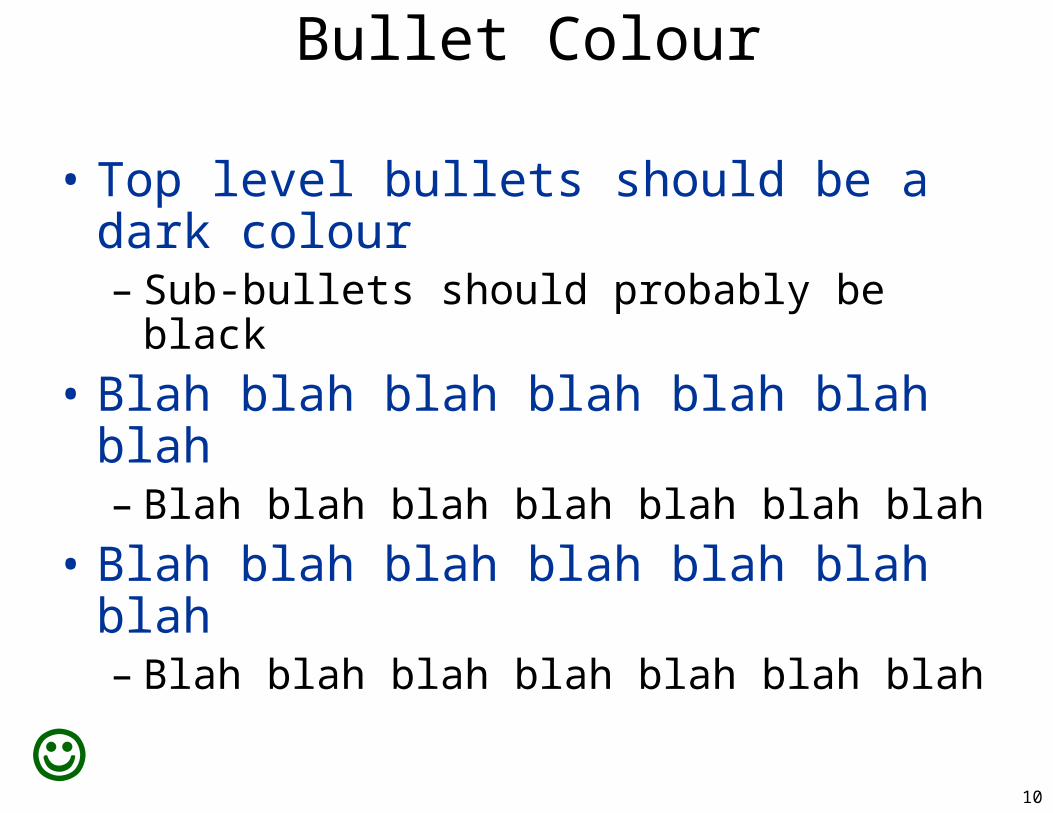
Bullet Colour
• Top level bullets should be a dark colour– Sub-bullets should probably be black
• Blah blah blah blah blah blah blah– Blah blah blah blah blah blah blah
• Blah blah blah blah blah blah blah– Blah blah blah blah blah blah blah
11
Organizing Your Talk

12
Never Start With an Outline (Boring!)
• Introduction• Background• Implementation• Methodology• Results• Conclusion
Consider avoiding an outline slide entirely!
Any outline should be very specific to talk content
13
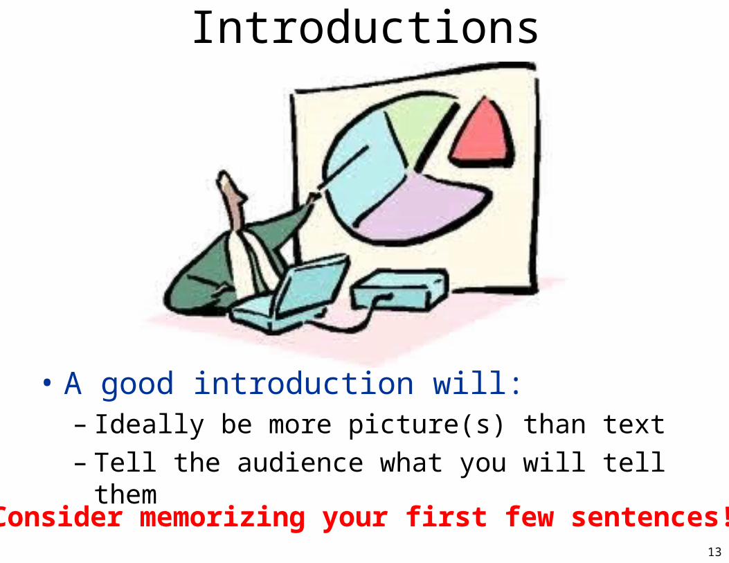
Introductions
• A good introduction will:– Ideally be more picture(s) than text– Tell the audience what you will tell them
Consider memorizing your first few sentences!

14
Segregate Sections of Your Talk Using Simple Separator
Slides Like This One

15
Optimizing Text Slides

16
Wall-of-Text• Nobody likes a wall-of-text, because it is
difficult to digest, and the audience spends all of their time reading your slides rather than listening to what you are saying, and you have important things to say.– Instead you should try to condense your main
ideas into a breakdown of points that each fit on a single line, ideally without wrapping around
– Even better would be to use pictures and even fewer or no words at all

17
Wall-of-Text →Points• Avoid “wall of text”
– Difficult to digest– Audience reads rather than listening
• Condense your ideas:– Single-line points – Rule-of-thumb: avoid lines that wrap-around
• Even better:– Use pictures – Eliminate words(?)

18
Wall-of-Text→Points→PicturesWall-of-Text
• Nobody likes a wall-of-text, because it is difficult to digest, and the audience spends all of their time reading your slides rather than listening to what you are saying, and you have important things to say.
– Instead you should try to condense your main ideas into a breakdown of points that each fit on a single line, ideally without wrapping around
– Even better would be to use pictures and even fewer or no words at all
Wall-of-Text -> Points
• Avoid “wall of text”
• difficult to digest
• audience reads rather than listening
• Condense your ideas:
• Single-line points
• avoid wrapping-around
• Even better:
• use pictures
• no words(?)
Wall-of-text->Points -> Pictures
• Pictures are easiest to digest– Audience can focus on what you say
• But don’t eliminate all descriptive text– Slides end up online too– So they should stand-alone to some extent
• Pictures are easiest to digest– Audience can focus on what you say
• But don’t eliminate all descriptive text– Slides end up online too– So they should stand-alone to some extent

19
Repeating Your Title• Repeating your title
– Does your first bullet match your title?– Then you’re doing it wrong!

20
With Wrap-Around• Avoiding lines that wrap around can be
done with a little-reorganization– Presentations that do so are more readable
• Blah blah blah blah blah blah blah blah blah– Blah blah blah blah blah blah blah blah blah
blah blah blah blah blah blah
• Blah blah blah blah blah blah blah blah blah blah– Blah blah blah blah blah blah blah

21
Avoiding Wrap-Around• Avoid lines that wrap around
– Doable with a little-reorganization– Presentation becomes more readable
• Blah blah blah blah blah blah blah– Blah blah blah blah blah blah – blah blah blah blah blah blah blah
• Blah blah blah blah blah – blah blah blah blah blah– Blah blah blah blah blah blah blah

22
Punchline• Blah blah blah blah blah blah blah
– Blah blah blah blah blah blah blah
• Blah blah blah blah blah blah blah– Blah blah blah
• Blah blah blah blah blah blah blah– Blah blah blah blah blah blah blah
• Blah blah blah blah blah blah blah– Blah blah blah blah blah blah blah– blah blah blah blah
Most slides should have punchline(s)The key thing(s) to know, at the bottom, in colour

23
Optimizing Result Slides

24
This is a Bad Result Slide

25
Show One Graph at a Time

26
Label Axes Readably
This is the X Axis (units)
Th
is is
the
Y A
xis
(un
its)

27
(Maybe) Which Way is Better?
This is the X Axis (units)
Th
is is
the
Y A
xis
(un
its)
Be
tter

28
Where Should We Look?
This is the X Axis (units)
Th
is is
the
Y A
xis
(un
its)
Be
tter
Please Look Here
Now Look Here
29
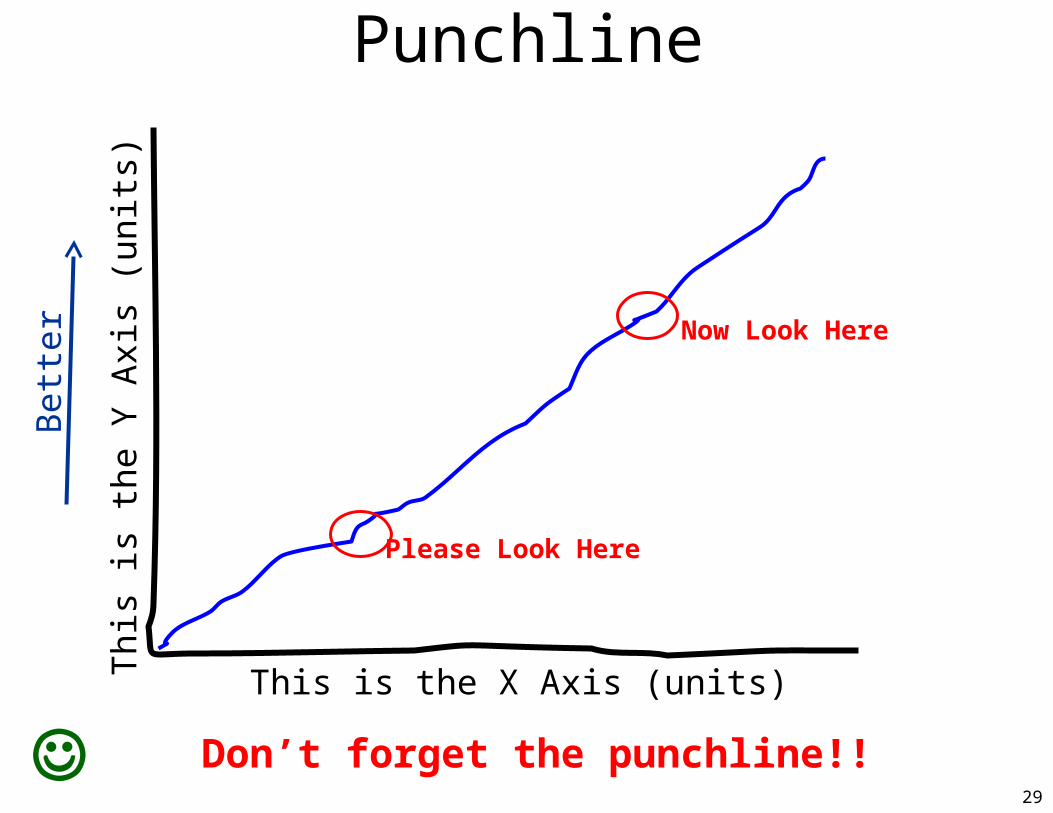
Punchline
This is the X Axis (units)
Th
is is
the
Y A
xis
(un
its)
Be
tter
Please Look Here
Now Look Here
Don’t forget the punchline!!
30
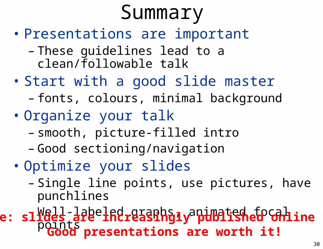
Summary• Presentations are important
– These guidelines lead to a clean/followable talk
• Start with a good slide master– fonts, colours, minimal background
• Organize your talk– smooth, picture-filled intro– Good sectioning/navigation
• Optimize your slides– Single line points, use pictures, have punchlines– Well-labeled graphs, animated focal points
Note: slides are increasingly published online too!Good presentations are worth it!