0202 iat 102 graphic design. 0202 typography typeface spacing
TRANSCRIPT

02
IAT 102 Graphic Design
02
Typography
Typeface
Spacing
Typography
Content and images taken from: Lupton’s Thinking with Type, Megg’s History of Graphic Design and Jubert’s Typography and Graphic Design

Gutenberg’s moveable Type in Europe (1453-1455 A.D.)
metal type
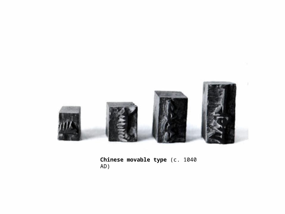
Chinese movable type (c. 1040 AD)
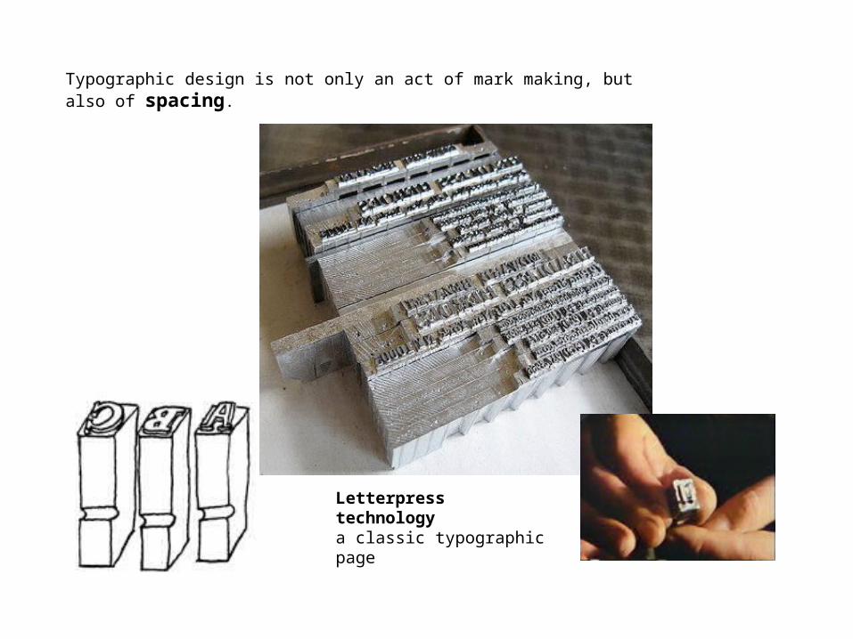
Letterpress technology a classic typographic page
Typographic design is not only an act of mark making, but also of spacing.
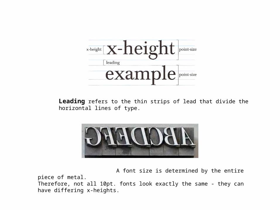
Leading refers to the thin strips of lead that divide the horizontal lines of type.
A font size is determined by the entire piece of metal.Therefore, not all 10pt. fonts look exactly the same - they can have differing x-heights.
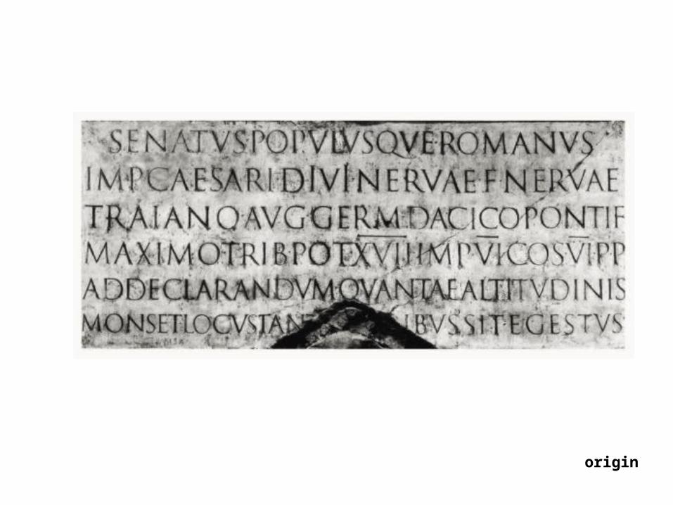
origin
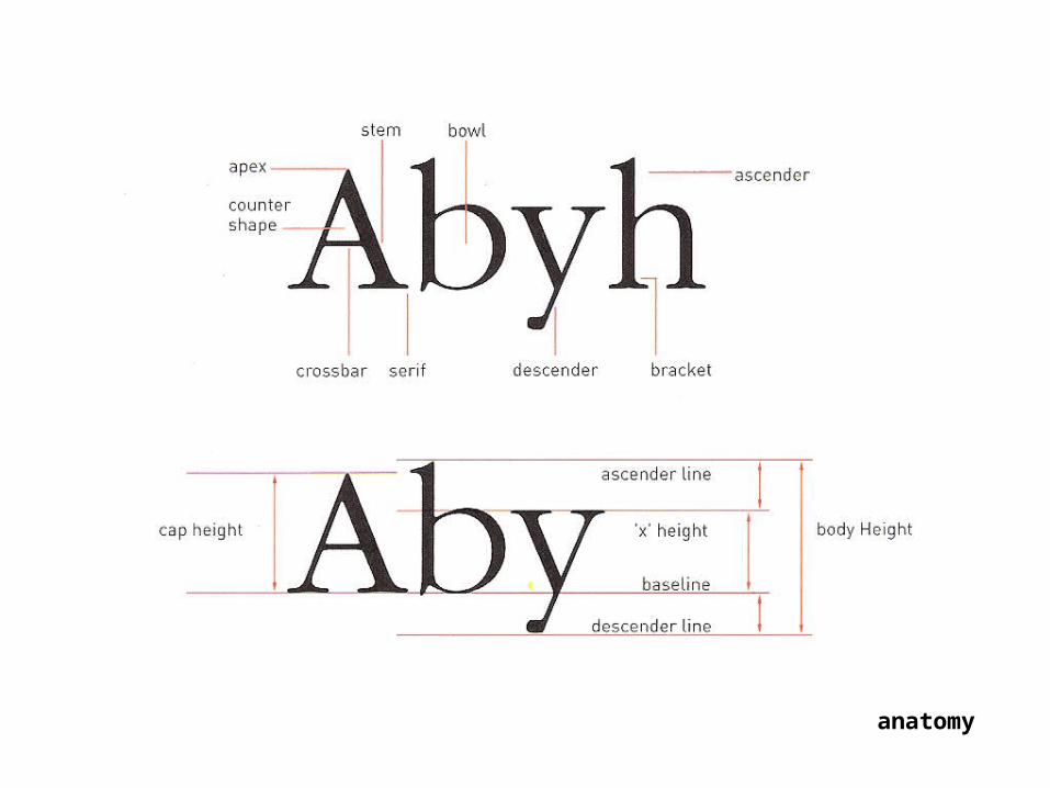
Letter
anatomy
Typeface
Content and images taken from: Craig’s Designing with Type and Saffer’s Designing for Interaction
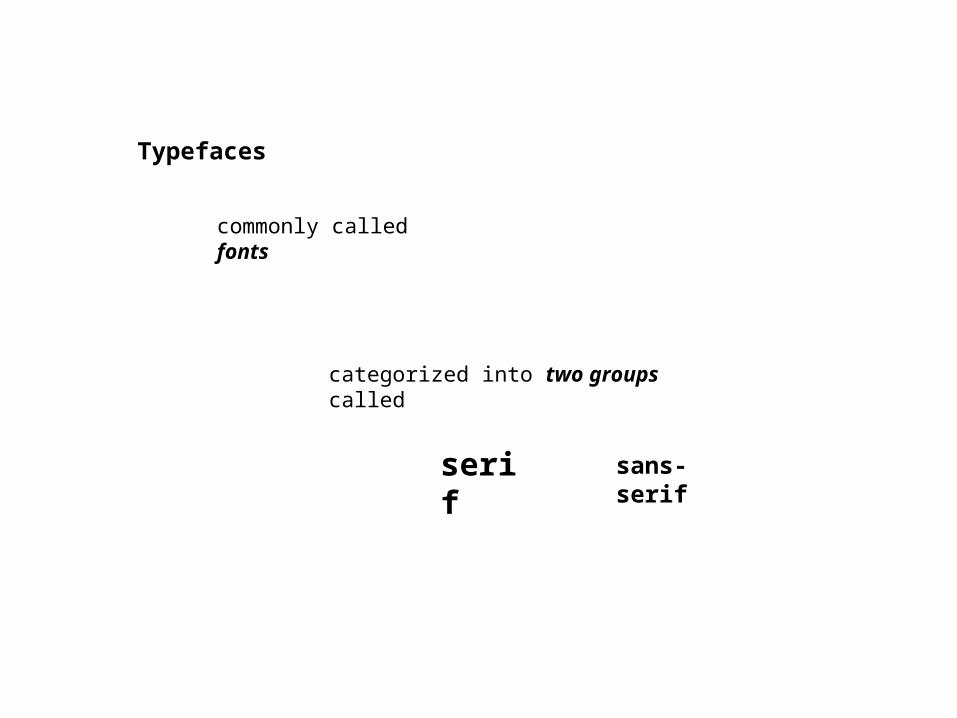
Typefaces
commonly called fonts
categorized into two groups called
serif sans-serif
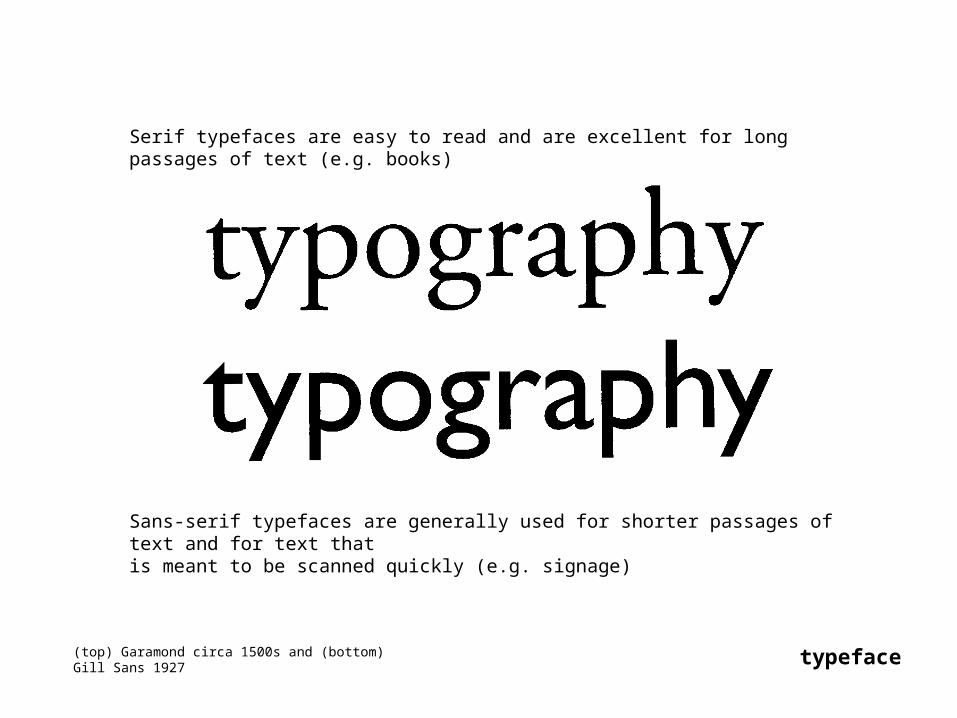
(top) Garamond circa 1500s and (bottom) Gill Sans 1927 typeface
Serif typefaces are easy to read and are excellent for long passages of text (e.g. books)
Sans-serif typefaces are generally used for shorter passages of text and for text that is meant to be scanned quickly (e.g. signage)
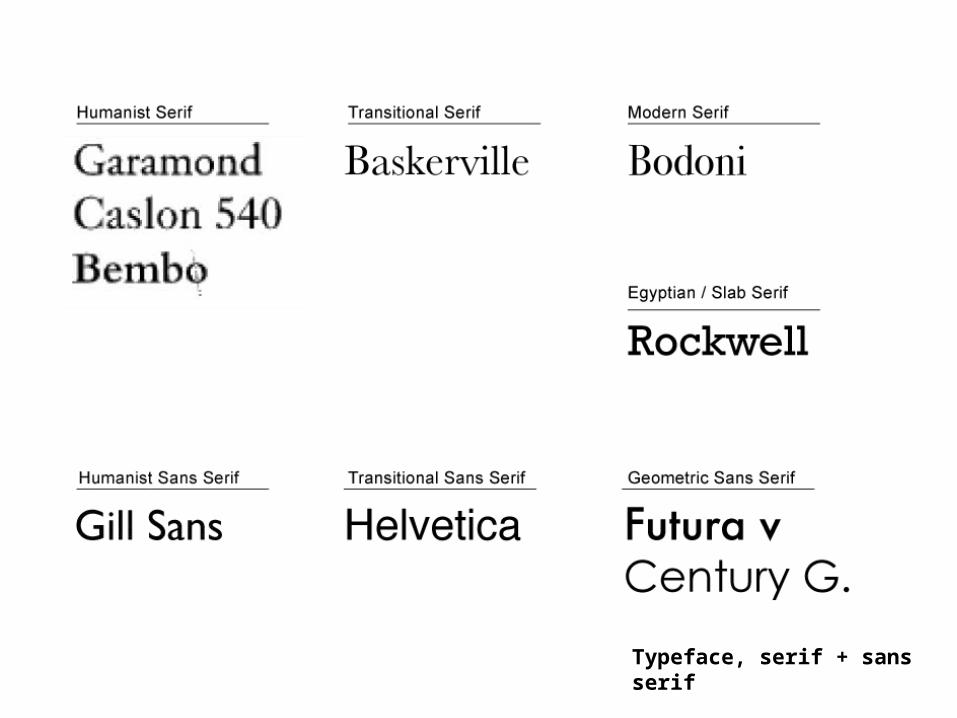
Typeface, serif + sans serif
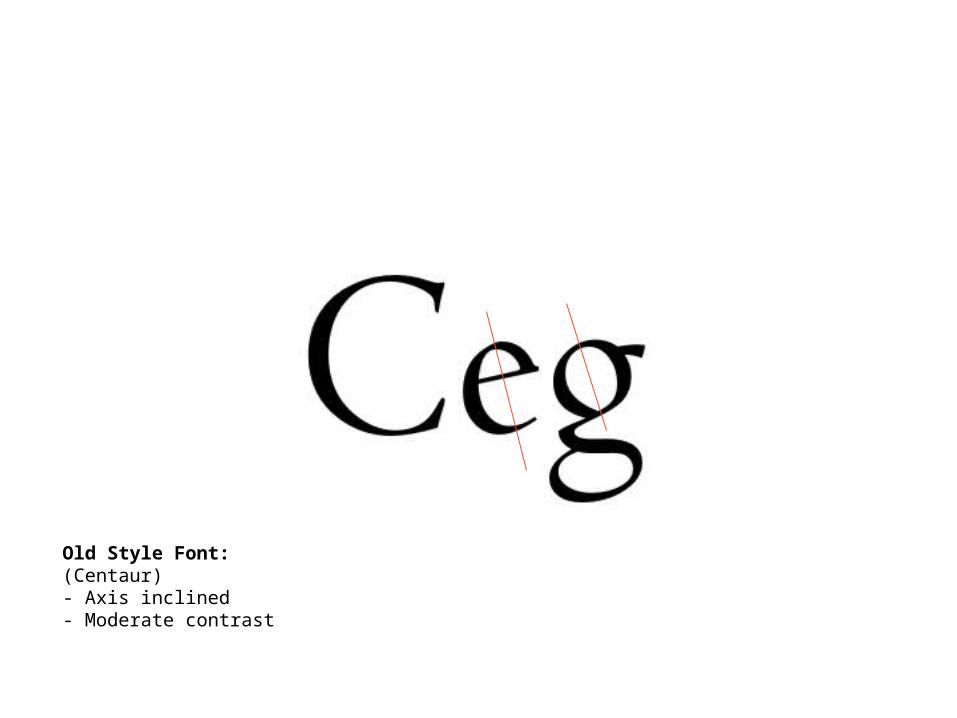
Old Style Font:(Centaur)- Axis inclined- Moderate contrast
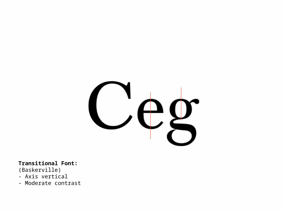
Transitional Font:(Baskerville)- Axis vertical- Moderate contrast
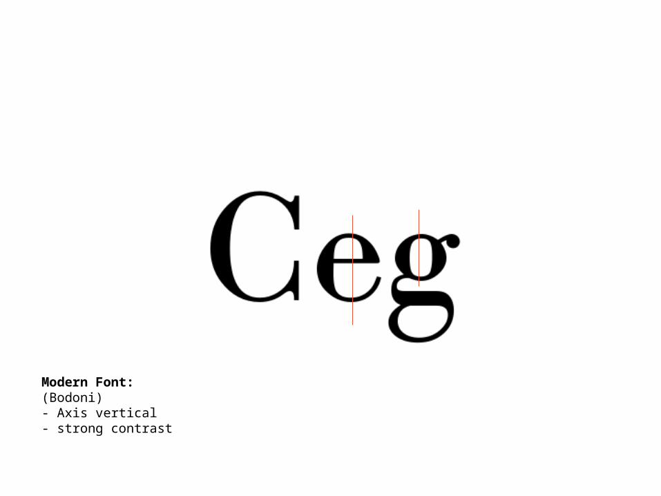
Modern Font:(Bodoni)- Axis vertical- strong contrast

Egyptian Font:(Rockwell)- low contrast- strong serifs
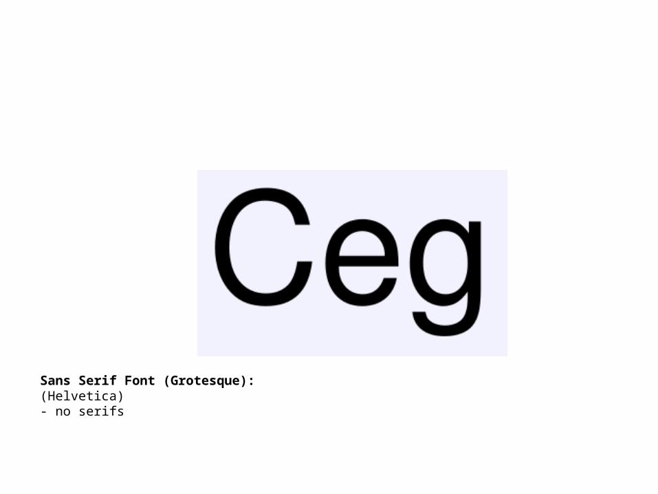
Sans Serif Font (Grotesque):(Helvetica)- no serifs

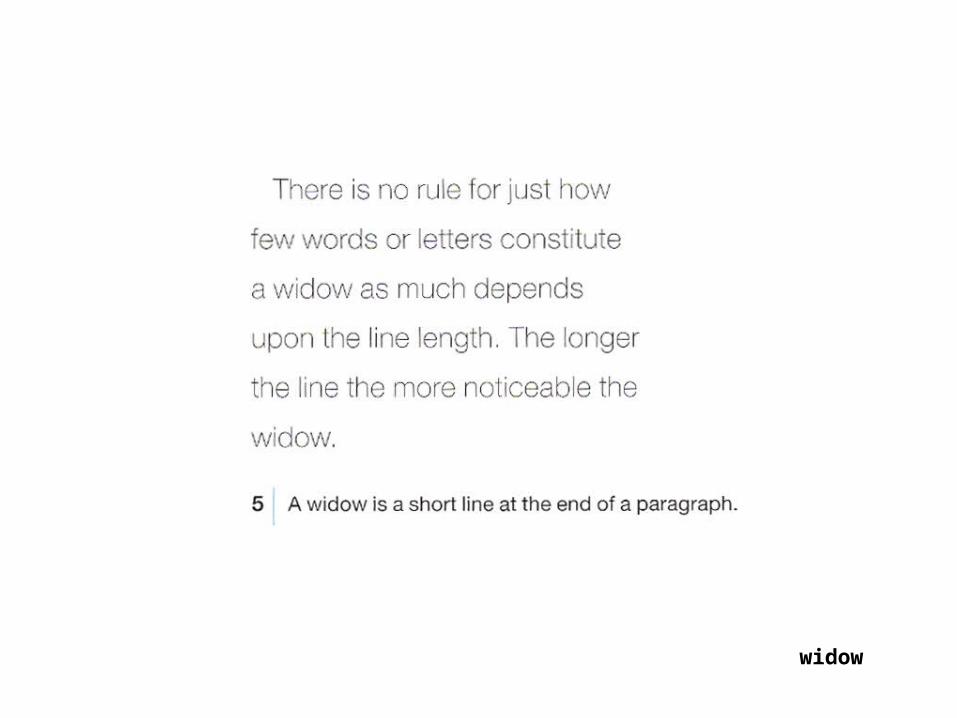
widow

widow
A single line on the top of a page is also called widow
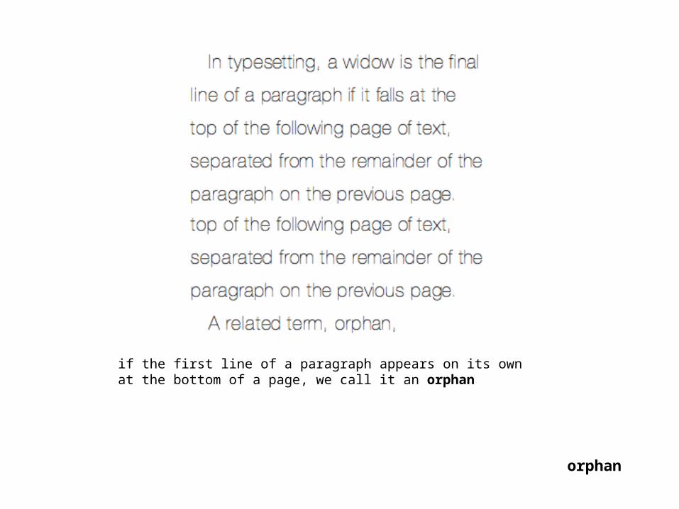
orphan
if the first line of a paragraph appears on its own at the bottom of a page, we call it an orphan

widows and orphans
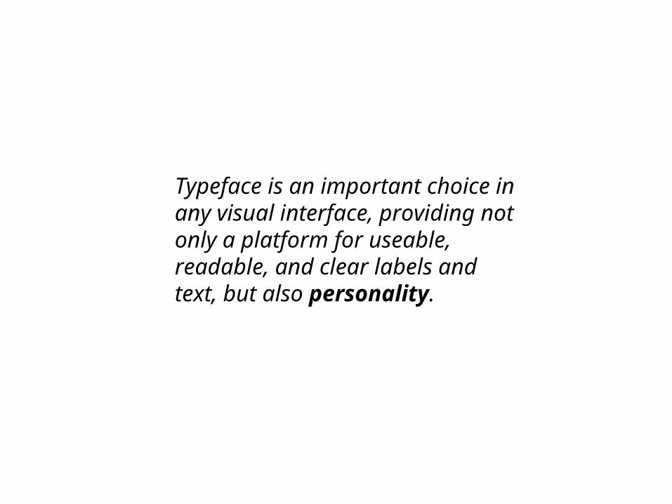
Typeface is an important choice in any visual interface, providing not only a platform for useable, readable, and clear labels and text, but also personality.
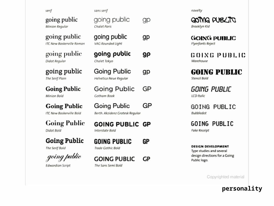
personality
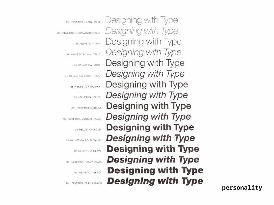
personality


“Typography is mostly an act of dividing a limited space.”
Willi Baumeister, 1923.
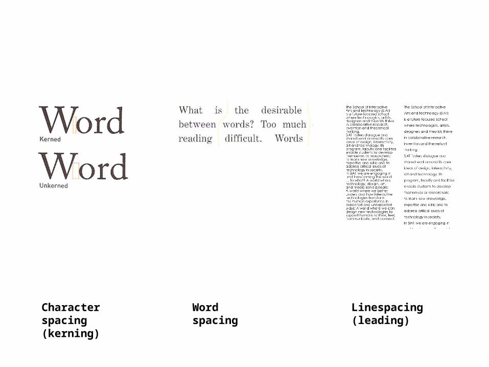
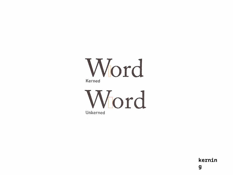
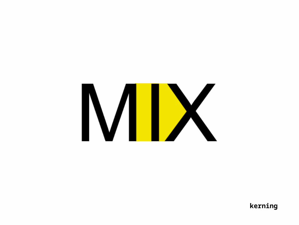
Word spacingCharacter spacing (kerning)
Linespacing (leading)
kerning
kerning

kerning
kerning
kerning

kerning
kerning
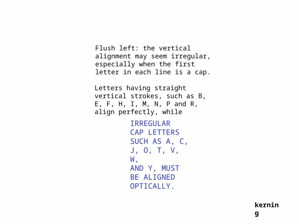
Flush left: the vertical alignment may seem irregular, especially when the first letter in each line is a cap.
Letters having straight vertical strokes, such as B, E, F, H, I, M, N, P and R, align perfectly, while
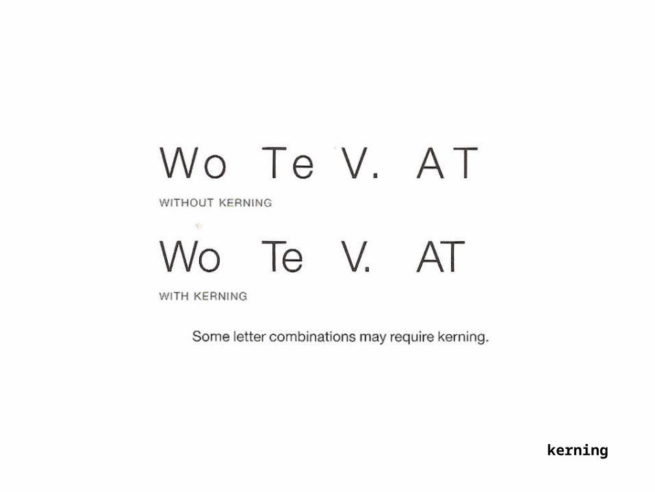
IRREGULARCAP LETTERSSUCH AS A, C,J, O, T, V, W,AND Y, MUST BE ALIGNED OPTICALLY.
kerning
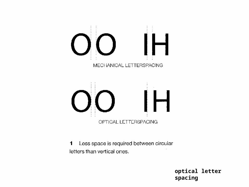
optical letter spacing
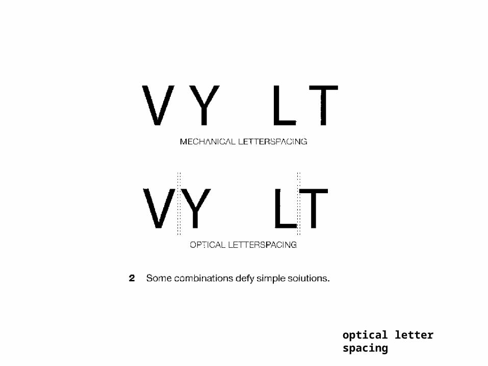
optical letter spacing
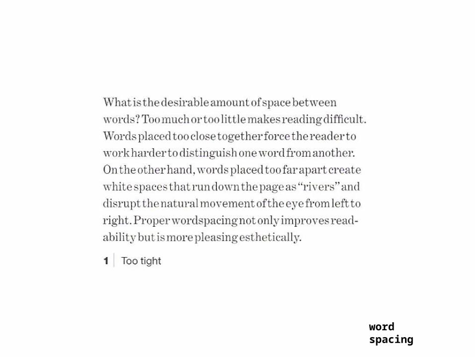
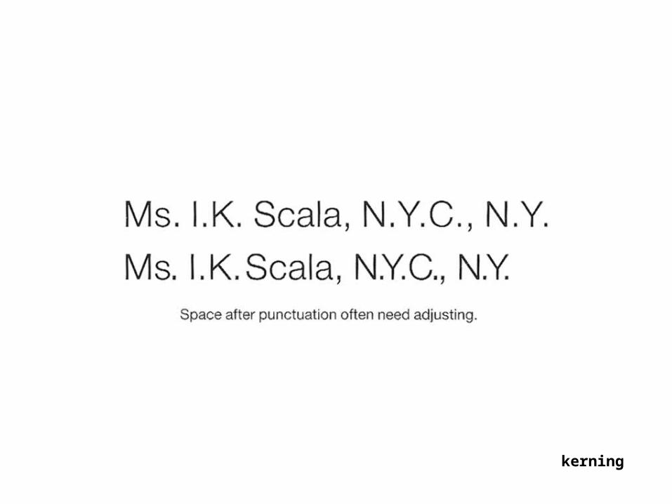
word spacing
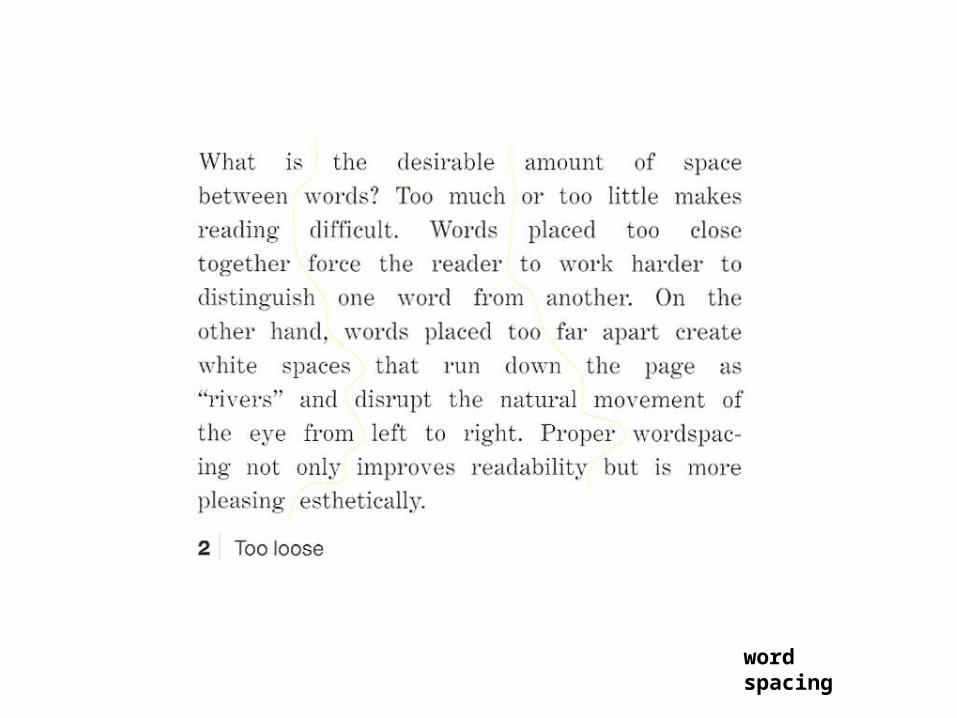
word spacing
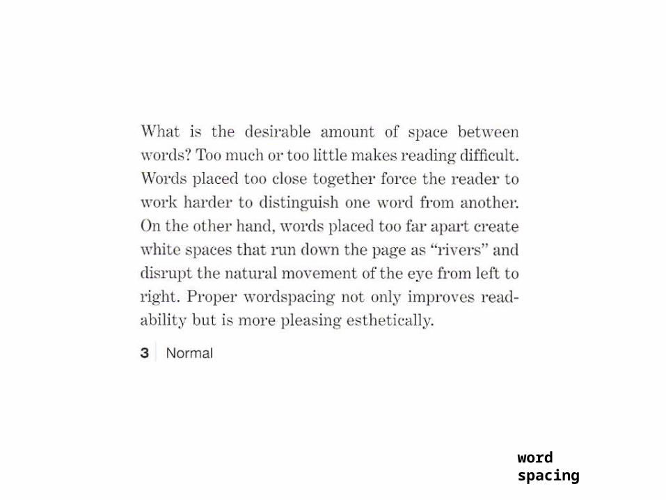
word spacing
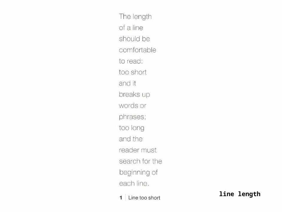
line length
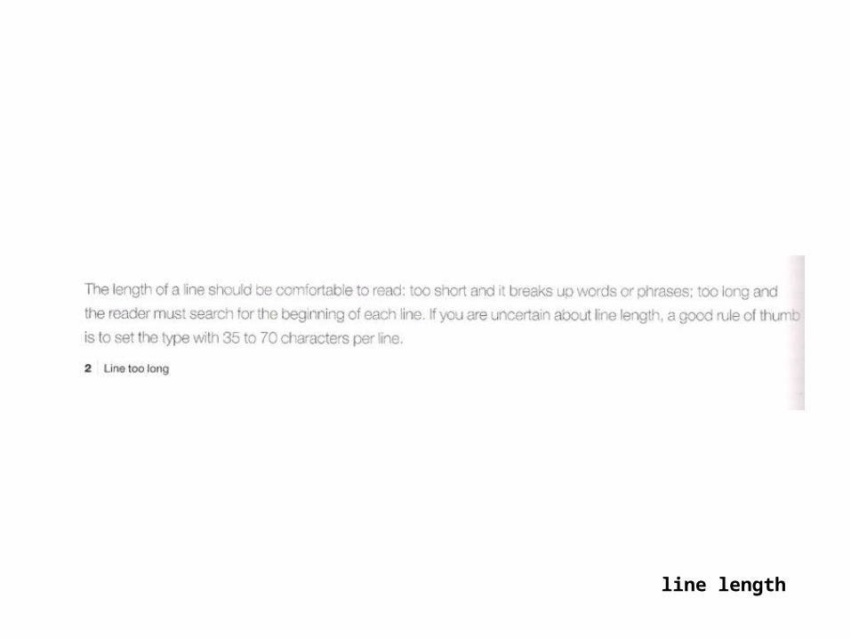
line length
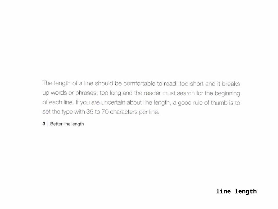
line length
Announcements:
-Pop Quiz next week
-Recognize fonts, Lupton, classification p. 42
-Read Sturken, Practices of looking

fin