yellow, gold - prince edward island arts site/unit1...yellow, gold meaning • yellow is sunshine....
TRANSCRIPT

Yellow, GoldMeaning
• Yellow is sunshine.
• It is a warm color that, like red, has conflicting symbolism. On the one hand it denotes happiness and joy
but on the other hand it's the color of cowardice and deceit.
• For years yellow ribbons were worn as a sign of hope as women waited from their men to come marching
home from war. Today, they are still used to welcome home loved ones.
Variations
• A cousin to yellow (and orange and brown) is gold.
• While green may be the color of money (N.A. money, that is) gold is the color of riches.
• While 'all that glitters is not gold' the color gold still suggests grandeur, and perhaps on the downside, the
excesses of the rich.
• Glittery gold denotes richness from money while an earthy, orange gold can suggest more emotional
riches from family and friends.
How to Use
• Use the color to lift sp irits and project optimism.
• Because of the high visibility of bright yellow, it is often used for hazard signs and some emergency
vehicles.
• Use ye llow to perk up a more subdued palette of blues and grays.
• Use lemon yellow with orange to carry out a healthy, summery, citrus theme.
• Yellow Goes With...
Take a look at yellow on the color wheel.
Adjacent colors = orange, red are harmonizing colors (adjacent) often work well together but if too close in
value they can appear washed out or not have enough contrast
Complementary colors = purple, red-purple, blue-purple are opposite each other on the color wheel are said to
clash — not always a bad combination if used carefully
Yellow Color Combos
These color palettes feature shades of yellow. Although I've made a few suggestions here and there about the
'amount' of each color to use, experiment. For best results don't use even amounts of each color in the palette.
Choose one or two dominant colors and use the rest for accents. Keep in mind that due to the differences
between color in print and on the Web that these colors may not appear the same on paper as they appear here
on the screen.
These aren't just random color combinations. Each of these are based on actual historic and modern formulas
used in posters, packaging, ads, and other design work over the past century. For a much more comprehensive
selection of color combinations refer to The Designer's Guide to Color Combinations by Leslie Cabarga.
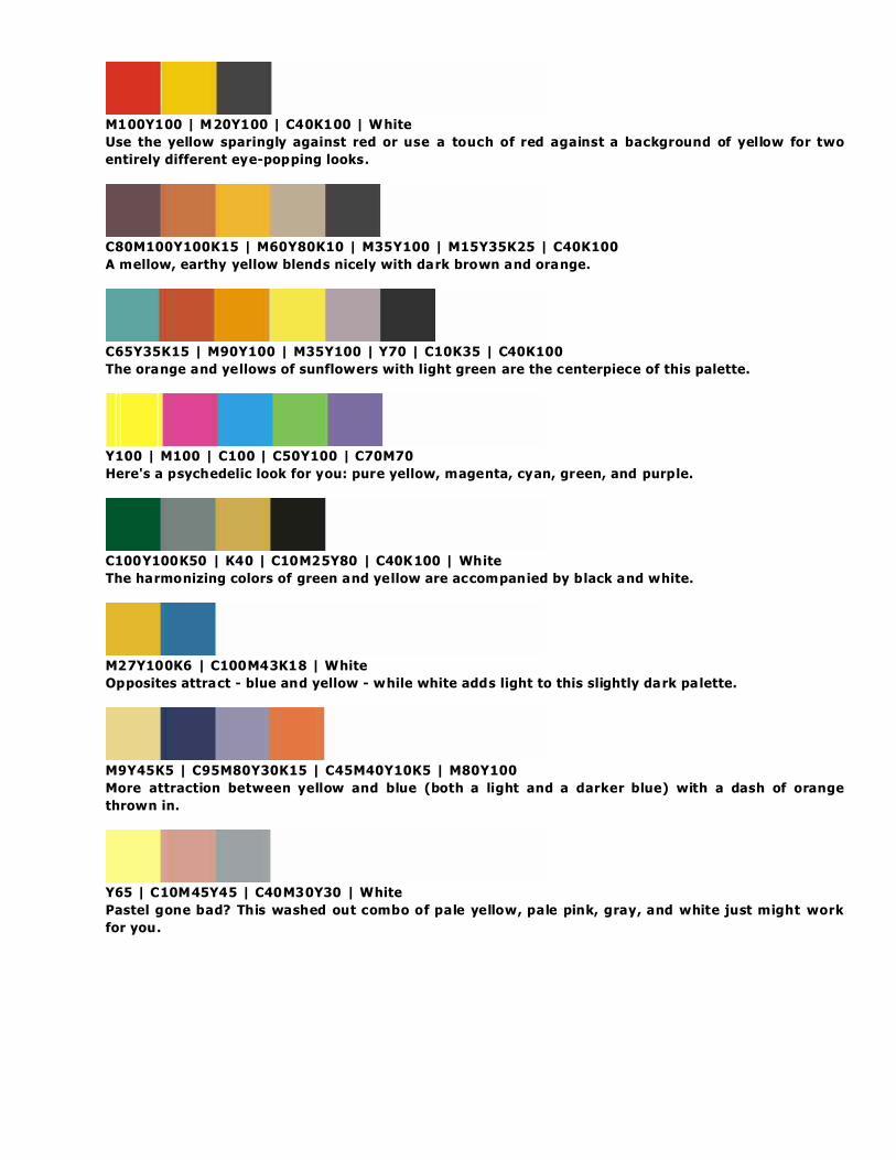
M100Y100 | M20Y100 | C40K100 | White
Use the yellow sparingly against red or use a touch of red against a background of yellow for two
entirely different eye-popping looks.
C80M100Y100K15 | M60Y80K10 | M35Y100 | M15Y35K25 | C40K100
A mellow, earthy yellow blends nicely with dark brown and orange.
C65Y35K15 | M90Y100 | M35Y100 | Y70 | C10K35 | C40K100
The orange and yellows of sunflowers with light green are the centerpiece of this palette.
Y100 | M100 | C100 | C50Y100 | C70M70
Here's a psychedelic look for you: pure yellow, magenta, cyan, green, and purple.
C100Y100K50 | K40 | C10M25Y80 | C40K100 | White
The harmonizing colors of green and yellow are accompanied by black and white.
M27Y100K6 | C100M43K18 | White
Opposites attract - blue and yellow - while white adds light to this slightly dark palette.
M9Y45K5 | C95M80Y30K15 | C45M40Y10K5 | M80Y100
More attraction between yellow and blue (both a light and a darker blue) with a dash of orange
thrown in.
Y65 | C10M45Y45 | C40M30Y30 | White
Pastel gone bad? This washed out combo of pale yellow, pale pink, gray, and white just might work
for you.

Seven colors in shades of yellow, brown, and green combine for this Victorian era color scheme.
[See more Victorian Color Palettes]

A rather tame mix of colors for the 1960s (compared to other color combos of the time) it does have
a nice bright yellow.