workshop design development budaörs. technical concepts
TRANSCRIPT

Workshop Design DevelopmentBudaörs
Technical Concepts
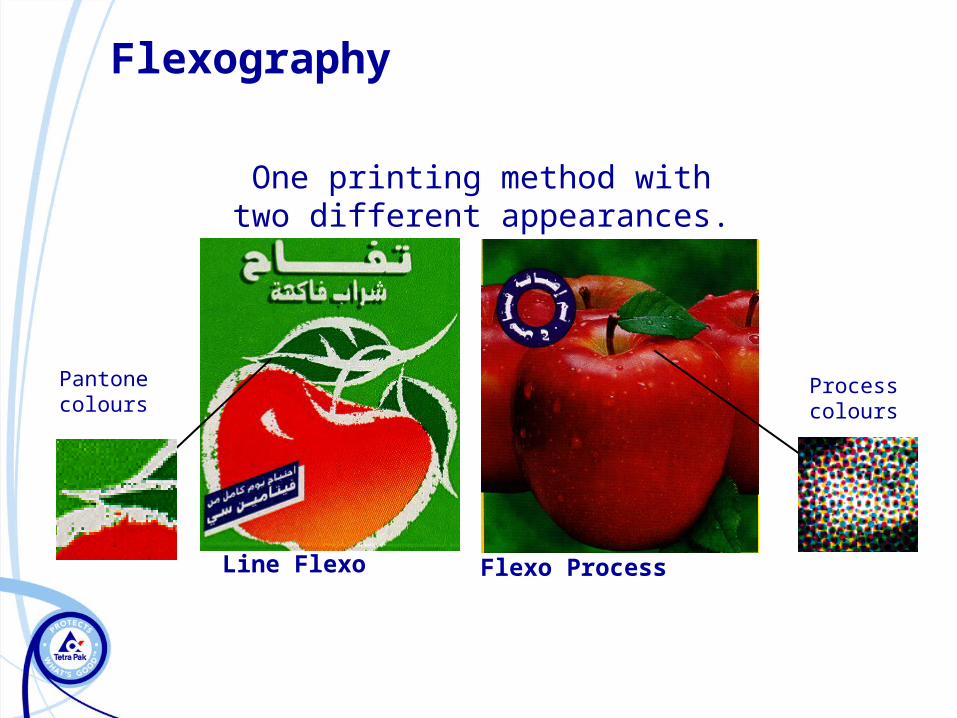
Flexography
One printing method withtwo different appearances.
Line Flexo Flexo Process
Pantone colours Process colours

Flexo line vs. Flexo process
► Duplex board► 6 spot colours from Pantone U
guide (2 overprinted)► Screen ruling: 24lines/cm (61
lpi)► Line printing of individual
colours► Approval: pdf file + Pantone
guide
► Claycoated board► CMYK + 2 spot colours from
Pantone C guide► Screen ruling: 48lines/cm (122
lpi)► Photographic images in a
predictable way► Approval: Epson proof
Flexo line Flexo process

Printing techniques
+ =
Flexo line
21
+ + + =
Flexo process
C M Y K

12
Spot Color Printing

CMYK
Process Color Printing

Flexography vs. offset
► Register moving: 0,1mm
► Screen ruling: 100lpc/133 lpi
► Nice highlights
Flexo Offset► Register moving: 0,2-0,3mm
► Screen ruling: 24-48lpc/61-122 lpi
► Highlights cannot be so light

Flexography vs. offset
Offset Flexo

Summary
Flexo line
Offset/Gravure
Flexo process
Qua
lity
ResolutionHigh resolution (54->)Spot color printing Medium resolution (48)

Flexo printing – the details
1. Text
2. Dot size
3. Line thickness/text size
4. Trapping/registration
5. Barcode
6. Colour/ink
7. Keyline
8. Artwork submission
9. Back panel
10. Co-production

1. Text
Texts in multiple colours will create misregister issues. Contour lines may be a solution.
Texts against a background colour may require a contour line to disguise misregister.

Positive Texts
In the exampleit’s possible to
visualize the resultsachieved in case ofregister variation.
For this reason we donot recommend theuse of positive texts,
lines or outlinesusing 2 or more colors.

Negative Texts
In the exampleit’s possible to
visualize the resultsachieved in case ofregister variation.
For this reason we donot recommend the
use of negative texts,lines or outlines over
2 or more colors.

Outlines
There are three different types of outlines we can apply.The outline is a resource used to avoid the “ghost” effect
in texts, when register variation occurs. See the examples below.
• Negative text and outline in 1 color
• Positive text in 1 color and white outlinewith transparence
• Positive text in 1 color and white outline

2. Dot size
Below 2 % (in file) you cannot reproduce dots on cliché. The minimum dots will become some 15% in printing.
100%
20%
5 cm
100%
20%
It is not possible to fade down to 0%
FL-min. percentage = 20% ±5
FP-min. percentage = 13% ±3

Dot gain
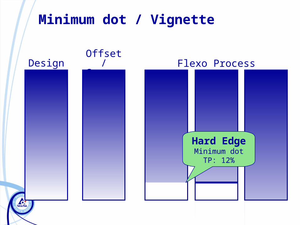
Minimum dot / Vignette
Offset/Gravure Flexo ProcessDesign
Hard EdgeMinimum dot
TP: 12%
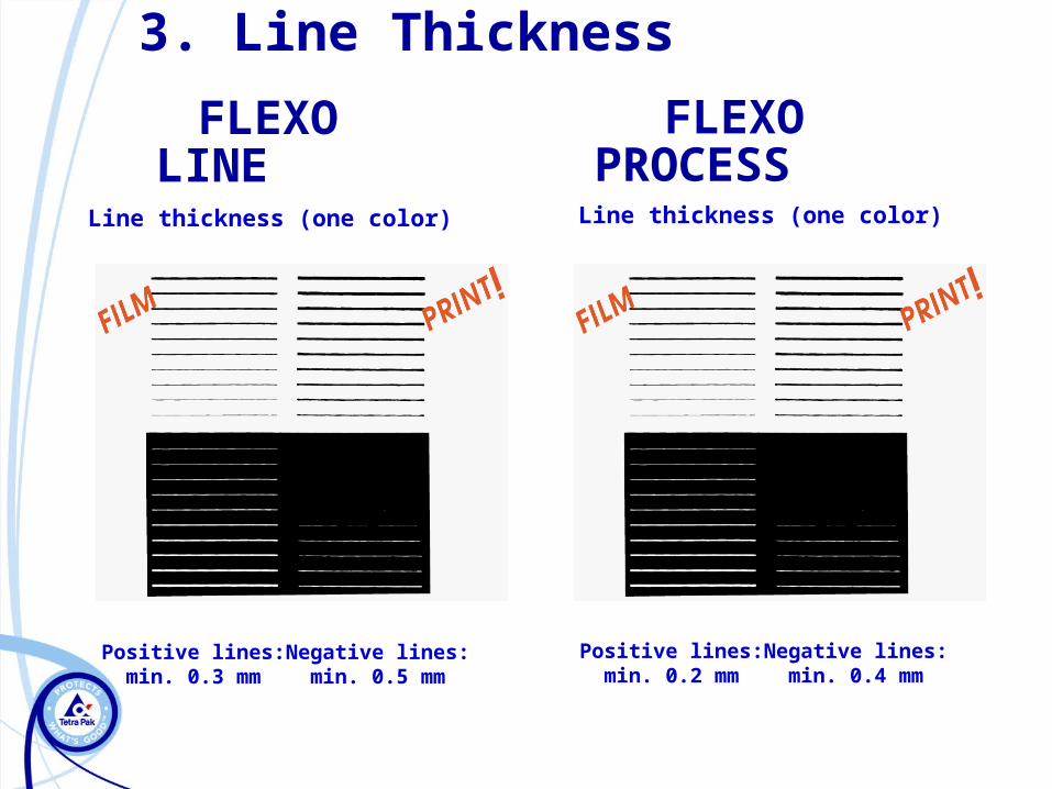
Positive lines:min. 0.3 mm
Negative lines:min. 0.5 mm
Positive lines:min. 0.2 mm
Negative lines:min. 0.4 mm
Line thickness (one color) Line thickness (one color)
FLEXO LINE
FLEXO PROCESS
3. Line Thickness

Text Size
Positiveand negativetextwillgroworfill in dueto theratherhighprintcylinderimpression inflexographicprinting. Thisis mostnoticebleusing serif typefaces
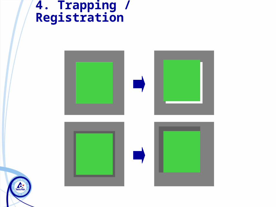
4. Trapping / Registration

8 610400 021677OK
8 610400 021677NO
8 610400 021677OK
8 610400 021677NO
Print direction
80 - 200 %
Cro
ss d
irecti
on
m
in.
120 %
5. Barcode

6. Colour/ink
– Pantone matching system (PMS) is the most widely used custom colour system
– Tetra Pak use the Pantone Formula Guide as a standard reference– The PMS-guide consists of approximately 1000 specific ink colours– As there can be direct contact with food, colours should be
approved by FDA (some colours cannot be used, p.e. Rhodamine Red)

Flexo Printing – Grey Balance
► With grey balance we mean « white design elements » within a design such as cream, milk flow, vanilla cream etc.
► A grey shade in an image is created by the same amount of cyan-magenta-yellow. The grey shade in Flexo is therefore quite a dark one due to the min. printed dot of 13 % (13 % cyan + 13 % magenta + 13 % of yellow = 39 % ink coverage)
► In some cases to give the impression of grey only black is used
► But the grey balance can also be replaced by a Pantone colour
► Using a Pantone colour has the advantage of reproducing a clear, neat and fresh shade
► A single, light/clear colour leaves also the impression of a less hard break
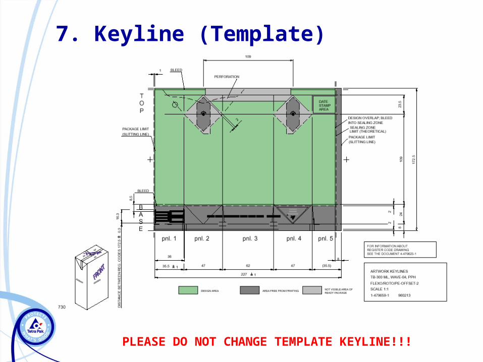
7. Keyline (Template)
PLEASE DO NOT CHANGE TEMPLATE KEYLINE!!!

►The folder should contain:• Artwork in Illustrator format
• Images in Photoshop (eps)
8. Artwork submission

Necessary to define PANTONE colour to avoid problem...
...problem:different colour between screen PANTONE
and screen PROCESS color
M+Y PANTONE

Resolution of PSD file must be 300 dpi

Too many links: EPS, TIFF or PSD files

Too many masks and other effects on the layers!
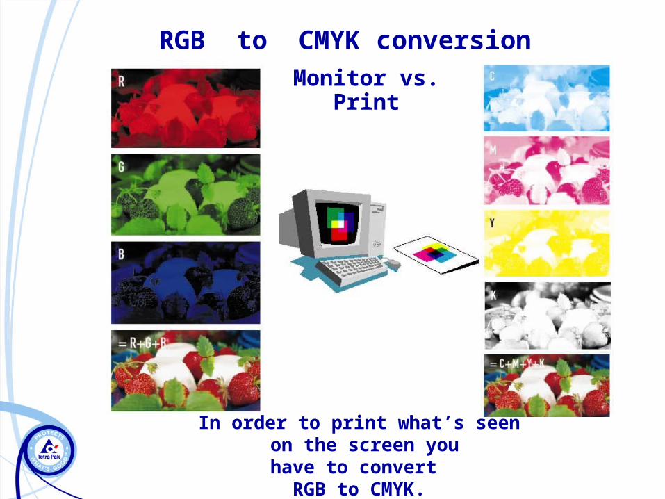
Monitor vs. Print
RGB to CMYK conversion
In order to print what’s seen on the screen youhave to convert
RGB to CMYK.

Design considerations
A number of considerations has to be taken into account when creating a design
• Keyline
• EAN/UPC code
• Date stamp
• Opening
• Number of colours
• Logotypes
• Texts/lines

Design considerations
• Texts and lines should have a minimum size to be printable – see print specifications
•Avoid printing text and lines negative in more than one colour
• Avoid texts with serifs
•Contour lines

Design considerations
Opening
• There are a number of opening alternatives. Check with customer which one applies for the specific package.
Date stamp area• Position• Space• Position of text
Logotypes• Tetra Pak logotype on design ?• Recycling logos ?• Space On Pack - SOP? (check with customer)
Design considerations
Colour
•Co – print
•We cannot mix process colours with a special PMS colour as proofs will not reflect the true print result.

Avoid concentric
elements in different colors!
Avoid drop shadows in
different colours!
Misregister showing
white areas!The optimum is to put both the outline and the
drop shadow in the dark colour
Printing limitations

Art Work – Final check
Keyline
Font’s (or outlined text)
Barcode
Linked images
Image resolution
Printing technique
Number of inks
Pantone numbers
PDF or Jpeg preview

8. Back panel
►Pictures and letters have to fit on the back match
►Avoid small letters on the back match
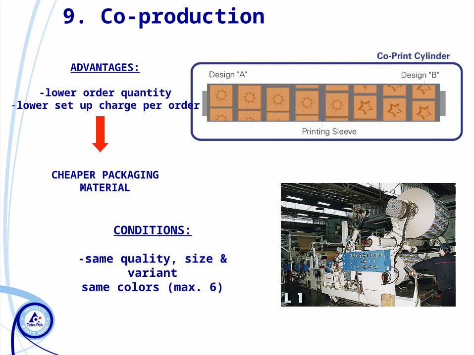
9. Co-production
CONDITIONS:
-same quality, size & variantsame colors (max. 6)
ADVANTAGES:
-lower order quantity-lower set up charge per order
CHEAPER PACKAGINGMATERIAL
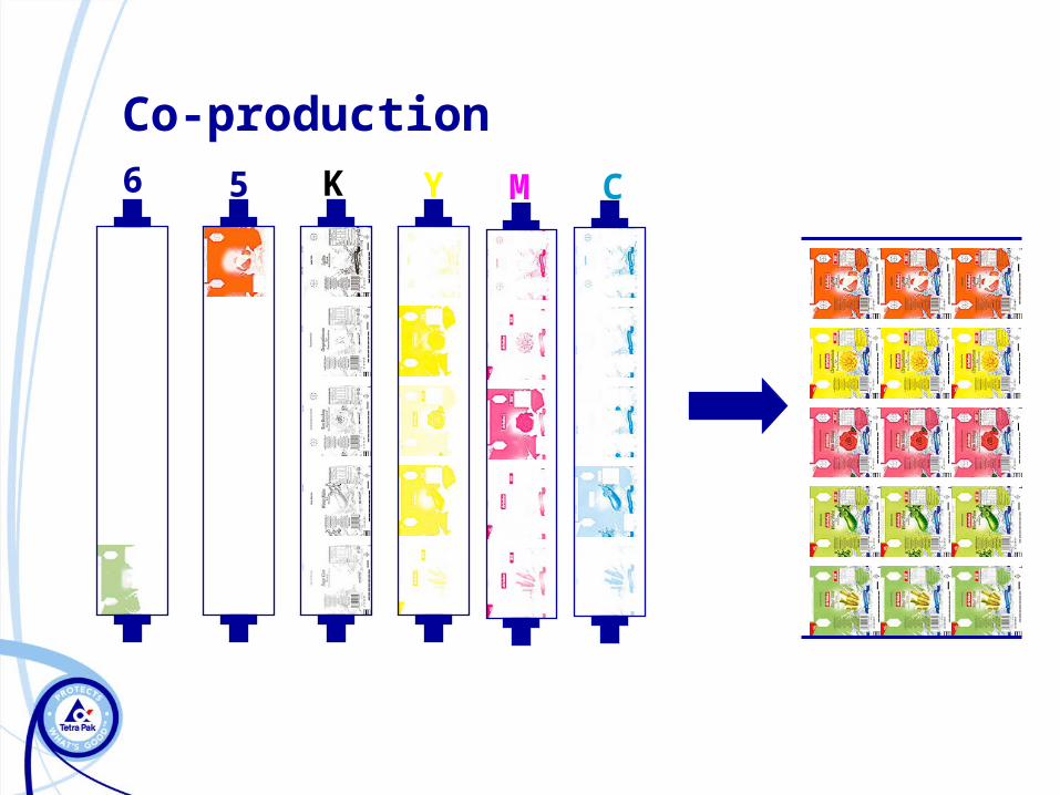
Co-production
56 CMYK

Pre-evaluation
►Tetra Pak is willing to support you with a pre-evaluation of the design from printing point of view before you send artwork for printing.
►Send us a Pdf of your draft and we are happy to comment on this.

Thank you!