withstanding the global economic crisis
TRANSCRIPT
June 17, 2011
Document of the World Bank
Report No. 60249-EG
Arab Republic of EgyptPoverty in Egypt 2008-09
Withstanding the Global Economic Crisis
Social and Economic Development GroupMiddle East and North Africa Region
Pub
lic D
iscl
osur
e A
utho
rized
Pub
lic D
iscl
osur
e A
utho
rized
Pub
lic D
iscl
osur
e A
utho
rized
Pub
lic D
iscl
osur
e A
utho
rized

CURRENCY EQUIVALENTS(Exchange Rate as of January 1, 2011)
Currency UnitLE 1
US$ 1
===
Egyptian Pound (LE)0.17235.8045
FISCAL YEAR July 1- June 30
ABBREVIATIONS AND ACRONYMS
CAPMAS Central Agency for Public Mobilization and Statistics (national statistics agency)CPI Consumer Price Index GASC General Authority of Supply Commodities HIECS Household Income, Expenditures and Consumption Surveys HIECPS Household Income, Expenditures and Consumption Panel Surveys LE Livre égyptienne (French for Egyptian pound, the national currency) LFSS Labor Force Sample Survey
Vice President: Shamshad AkhtarCountry Director: A. David CraigSector Director: Manuela V. FerroSector Manager: Bernard FunckTask Team Leader: Ruslan Yemtsov / Daniela Marotta

Authors’ note:
The original aim of this poverty analysis, prepared in collaboration with Egypt’s Ministry of Economic Development, was to help inform the country’s development strategy and guide World Bank assistance in support of that strategy over the coming years. Egypt has undergone extraordinary changes in the past few weeks, just as the final version of this report was being prepared for publication. This objective remains nevertheless valid, although the timeframe for addressing some of the most critical issues, such as the high rate of extreme poverty, vulnerability, and food insecurity may now be accelerated.
The authors believe that the analysis presented in this note, while being based on data that precede the actual onset of the current political crisis, reveals deep tensions in the society that are linked to the high level of vulnerability and the lack of an efficient and flexible social assistance system. It is important to assess the limitations of the past strategies to develop new policies that will address pressing social concerns of the population: we hope that this paper will contribute to this debate.
Standard Disclaimer: This volume is a product of the staff of the International Bank for Reconstruction and Development / The World Bank. The findings, interpretations, and conclusions expressed in this paper do not necessarily reflect the views of the Executive Directors of The World Bank or the governments they represent. The World Bank does not guarantee the accuracy of the data included in this work. The boundaries, colors, denominations, and other information shown on any map in this work do not imply any judgment on the part of The World Bank concerning the legal status of any territory or the endorsement or acceptance of such boundaries.


PREFACE AND ACKNOWLEDGEMENTS
This report was prepared by a team led by Ruslan Yemtsov (TTL, Lead Economist, World Bank). The team comprised key Egyptian poverty experts, Heba El-Laithy (Professor at Cairo University), and Hala Abou-Ali (Assistant Professor at Cairo University); and World Bank economists Sherine Al-Shawarby (Senior Economist) and Daniela Marotta (Economist), both of the Middle East North Africa Social and Economic Development Department (MNSED).
Egypt has undergone exceptional changes in the time between this report was prepared and its publication. The conclusions of the report remain however still very much valid and relevant. During the preparation of the report, the team worked closely with the Ministry of Economic Development on the technical and presentational aspects of the findings, and they are grateful to His Excellency Minister Osman M. Osman (Ministry of Economic Development), Prof. Mohamad F. Sakr (Principal Advisor to the Minister) and Dr. Ashraf El Araby (Advisor to the Minister).
The team also wishes to express its sincere gratitude for the close cooperation and generosity in sharing information provided by CAPMAS, in particular: General Abo-Bakr El Guindy (Director), Miss Ghada Mostafa Abdalla (General Director), Mr. Ahmad Kamal Abedel Aziz (Central Administration Director), and Mr. Mohamad. M. Morsy (Director of Statistics Sector).
The team is grateful to the advice provided by the World Bank peer reviewers: Nobuo Yoshida (Senior Economist, PRMPR), Andrew Dabalen (Senior Economist, AFTP3) and Ken Simler (Senior Economist ECSP3). Valuable inputs from Tara Vishwanath (Lead Economist, MNSED) provided at different stages of the report preparation are gratefully acknowledged. Special thanks go also to Richard Adams for providing inputs. Helpful comments were received from Santiago Herrera (Lead Economist for Egypt, MNSED).
The team also benefited from the feedback and guidance by Ritva Reinikka (at the time of the report Sector Director, MNSED), Farrukh Iqbal (Sector Manager, MNSED) and Bernard Funck (Sector Manager, MNSED).
Finally, the team benefited from the overall guidance and leadership in the country dialogue provided by A. David Craig (Country Director, MNCO3).


ARAB REPUBLIC OF EGYPT POVERTY IN EGYPT 2008-09: WITHSTANDING THE GLOBAL ECONOMIC CRISIS
TABLES OF CONTENTS
PREFACE AND ACKNOWLEDGEMENTS�
EXECUTIVE SUMMARY ............................................................................................................................................. I�INTRODUCTION ........................................................................................................................................................ 1�CHAPTER 1. CHANGING POVERTY IN EGYPT: WHY AND HOW? ............................................................................ 2�
1.1. POVERTY INCIDENCE IN 2008/09 .................................................................................................................... 2�
1.2. THE EVOLUTION OF POVERTY BETWEEN 2004/05 AND 2008/09 ..................................................................... 5�
1.3. STRUCTURAL CHANGES IN THE ECONOMY AND POVERTY .............................................................................. 8�
1.4. OTHER DIMENSIONS OF LIVING STANDARDS ................................................................................................. 12�
1.5. CONCLUSIONS .............................................................................................................................................. 13�
CHAPTER 2. COPING WITH SHOCKS: EVOLUTION OF POVERTY DURING THE CRISIS YEAR .............................. 14�2.1. ECONOMIC SHOCKS AND POVERTY CHANGES DURING 2008/09 .................................................................... 14�
2.2. VULNERABLE GROUPS EXPERIENCED THE LARGEST INCREASES IN POVERTY RISKS ...................................... 17�
2.3. EMPLOYMENT HAS NOT PROTECTED AGAINST THE RISKS OF POVERTY ......................................................... 18�
2.4. PANEL DATA PERSPECTIVE: MANY EGYPTIANS ARE JUST A SHOCK AWAY FROM POVERTY ........................... 19�
2.5. CAUSES FOR FALLING INTO POVERTY OR ESCAPING POVERTY: A PANEL PERSPECTIVE ................................. 23�
2.6: WHO ARE THE NEW POOR? ........................................................................................................................... 25�
CHAPTER 3. SOCIAL POLICIES DURING THE CRISIS AND THEIR EFFECTS ON POVERTY ..................................... 27�3.1. SOCIAL POLICY RESPONSES TO THE CRISIS ................................................................................................... 27�
3.2. HOW THE POLICY CHANGES AFFECTED THE POOR ........................................................................................ 29�3.3. HOW WELL WAS THE EXPANDED SOCIAL SAFETY NET TARGETED TO THE POOR? ......................................... 30�
CHAPTER 4. CONCLUSIONS.................................................................................................................................... 33�4.1. WAY FORWARD IN POVERTY MONITORING ................................................................................................... 34�
ANNEXES ................................................................................................................................................................ 36�ANNEX 1. DATA ...................................................................................................................................................... 37�ANNEX 2. POVERTY MONITORING: UPDATING POVERTY LINES IN EGYPT ................................................................ 41�ANNEX 3. HOW WELL DO NATIONAL ACCOUNTS AND SURVEY DATA AGREE IN EGYPT? .......................................... 47�ANNEX 4. DECOMPOSING POVERTY CHANGES OVER TIME: PRINCIPLES AND APPLICATION TO EGYPT SURVEYS 2004/05-2008/09 ..................................................................................................................................................... 50�
REFERENCES .......................................................................................................................................................... 53�

FIGURES FIGURE 1.1: STAPLES AFFECTED BY INFLATION (MONTHLY RATES, YEAR-ON-YEAR BASIS) ........................................... 4 FIGURE 2.1: QUARTERLY GDP GROWTH, INFLATION RATE AND REMITTANCES IN EGYPT, 2004-2009 ......................... 14�FIGURE 2.2: CHANGE IN THE POVERTY RATE (LOWER POVERTY LINE) BY QUARTER AND REGION ................................ 16�FIGURE 2.3: POVERTY RATE BY NUMBER OF CHILDREN IN THE HOUSEHOLD................................................................. 17�FIGURE 2.4: POVERTY BY AGE ...................................................................................................................................... 18�FIGURE 2.5: POVERTY RISK BY TYPE OF EMPLOYMENT ................................................................................................. 18�FIGURE 2.6: POVERTY BY SECTOR OF EMPLOYMENT .................................................................................................... 19�FIGURE 2.7: TRAJECTORIES OF HOUSEHOLDS WITH RESPECT TO POVERTY LINES, AND MAIN TYPES OF DYNAMICS, 2005 –2009 .................................................................................................................................................................. 22�FIGURE 2.8(A): MAIN EVENTS ASSOCIATED WITH FALLING INTO POVERTY, 2005–2008 AND 2008–2009 ..................... 24�
TABLES TABLE 1.1: INDICATORS OF POVERTY IN EGYPT 2008/09 ............................................................................................... 2�TABLE 1.2: POVERTY INCIDENCE BY REGION, 2008/09 ................................................................................................... 5�TABLE 1.3: INCIDENCE RATES FOR DIFFERENT POVERTY LINES AND LEVEL OF INEQUALITY, 2004/5-2008/09 ............... 5�TABLE 1.4: GROWTH AND REDISTRIBUTION DECOMPOSITION OF POVERTY CHANGES (USING LOWER POVERTY LINE) .... 7�TABLE 1.5: FULL DECOMPOSITION OF POVERTY CHANGES (USING LOWER POVERTY LINE), 2004/05-2008/09 ............... 8�TABLE 1.6: DECOMPOSITION OF GROWTH IN PER CAPITA VALUE ADDED, EGYPT, 2004-2009 ........................................ 9�TABLE 1.7: EMPLOYMENT BY SECTOR OF ECONOMIC ACTIVITY, 2004-2009 .................................................................. 9�TABLE 1.8: POVERTY RISKS FOR POPULATION OF EGYPT BY SECTOR OF EMPLOYMENT, 2004-2009 ............................. 10�TABLE 1.9: POVERTY AND SECTOR OF EMPLOYMENT OF HOUSEHOLD HEAD, 2004-2009 ............................................. 11�
TABLE 2.1: CHANGES IN THE POVERTY RATE (P0) AND POVERTY GAP (P1) SHOWN BY DIFFERENT SURVEYS, 2004-2009 .................................................................................................................................................................... 15�TABLE 2.2: MOBILITY MATRIX 2008-2009 USING INCOME DATA (LE) ......................................................................... 20�TABLE 2.3: POVERTY TRANSITIONS, 2005–2008 AND 2008–2009................................................................................ 21�TABLE 2.4: PROFILE OF POPULATION BY POVERTY DYNAMICS, 2005–2009 .................................................................. 22�TABLE 2.5: DISTRIBUTION OF MAIN POVERTY GROUPS BY REGIONS OF EGYPT, 2005–2009 ......................................... 23�TABLE 2.6: DISTRIBUTION OF POVERTY GROUPS BY EMPLOYMENT OF HOUSEHOLD HEAD ........................................... 26�
TABLE 3.1: BUDGET ALLOCATIONS FOR SOCIAL SPENDING (PERCENT OF GDP) ........................................................... 28�TABLE 3.2: COVERAGE ( PERCENT) OF THE POOR AND NON-POOR BY SOCIAL PROTECTION, 2004/5-2008/9 ................. 30�TABLE 3.3: POVERTY-REDUCING IMPACT OF FOOD SUBSIDIES, 2008/09 ....................................................................... 31�
BOXES BOX 1.1: THE MEASUREMENT OF POVERTY IN EGYPT .................................................................................................... 3�BOX 1.2: BREAKING 2004/05-2008/09 INTO TWO SUB-PERIODS: HOW THE NEW ANALYSIS DIFFERS FROM THE PREVIOUS REPORT ......................................................................................................................................................... 6�

i
EXECUTIVE SUMMARY
i. This report assesses the poverty and welfare changes in Egypt between 2008 and 2009 and presents a comprehensive picture of the evolution of poverty between 2004/05 and 2008/09.The report investigates the main factors affecting the poor during the complex and turbulent period between 2008 and 2009 by analyzing Household Income, Expenditure and Consumption Survey (HIECS) data for 2008/091, and panel survey data from the HIECS for February 2008 and February 2009 (HIECPS). It presents a in depth analysis of the evolution of poverty over this one-year survey period with respect to both exogenous shocks to the economy (such as the sudden acceleration in food prices), and the country’s persistent internal poverty dynamics. The report also presents a comprehensive picture of the evolution of poverty between 2004/05, the period for which the last HIECS sample is available, and 2008/09 to assess the impact of the economic slowdown and inflation shock on the gains in terms of poverty reduction achieved in three previous years of sustained growth.
ii. Poverty in Egypt decreased between 2005 and 20082, due in large part to rapid economic growth, although high inflation during this period had detrimental effects on the extreme poor. The incidence of poverty and near poverty in Egypt fell by about 20 percent during that high-growth period (World Bank 2009). At the same time, however, the incidence of extreme poverty (the inability to meet basic food needs) also increased by about 20 percent, as high inflation and rising food prices eroded the purchasing power of the population.
iii. The sudden economic slowdown in the context of accelerating inflation in 2008/2009reversed the gains in poverty reduction achieved during the period of rapid growth. By the end of 2008, the standard of living of the poor and near poor, which had been rising, was falling again as a result of the economic downturn. The crisis created additional strain by affecting the demand for labor. As a result, poverty increased markedly between 2008 and 2009. Despite the reduction in absolute poverty between 2005 and 2008, overall, between 2004/05 and 2008/09,3 extremepoverty and absolute poverty actually increased: as many as 5.1 million Egyptians were severely food deprived in 2008/09 (double the number in 2004/05), and absolute poverty increased from 19.6 to 22.0 percent. In contrast, the numbers of near poor declined between 2004/05 and 2008/09 (from 21 to 19.2 percent), as many of the near poor fell into poverty. The analysis finds that in the period 2008/09, 31 million Egyptians (around 40 percent of the population) were poor or near poor.
1 The survey was conducted between April 2008 and March 2009 by the Central Agency for Public Mobilization and Statistics (CAPMAS). Originally designed to compare changes in poverty between two distinct periods, 2004/05 and 2008/09, the concurrence of the global economic crisis and the availability of quarterly data turned the survey into an instrument to track poverty changes over a year of the crisis itself. Therefore, when the survey period is compared with the earlier survey period, the years will be written as 2004/05 and 2008/09. When the analysis focuses on the changes within the crisis period, the years will be written as 2008–2009. 2 The period of reference is February 2005-February 2008, based on panel data analysis. 3 The report team, working jointly with CAPMAS, attempted to build as comparable a set of poverty indicators as possible between the data from 2004/05 and 2008/09, since some of the measures of poverty, extreme poverty, and near poverty had changed between the two periods because of the new survey design. HIECS was redesigned after the 2004/05 survey to provide for increased coverage, enhanced quality, and better use of data from the Labor Force Sample Survey (LFSS).

ii
iv. The increase in poverty closely followed the accelerating inflation during 2008. While Egypt managed to sustain positive economic growth over 2008–2009, inflation (mostly driven by the increase in the relative price of food) was sufficient to cut the real incomes of the poor and near poor by 20 percent, thereby overpowering the effects of growth. At the peak of food price inflation, poverty rapidly increased from around 19 percent of the population in the second quarter of 2008 to about 25 percent in the third quarter. As inflation flattened out by the first quarter of 2009, living standards again approached their pre-crisis levels. Since food prices had increased faster than non-food prices, extreme poverty (based on the cost of purchasing minimum food bundle) increased more than near poverty during that year. Improvements in the distribution of incomes (slight fall in Gini index) slowed the increase of poverty only marginally. To confirm the primary role of price (particularly food price) changes in increasing poverty, the report decomposes—for the first time in Egypt—the sources of these changes into growth, inequality, and inflation.
v. Vulnerable groups have been particularly affected by the economic turbulence. A detailed comparison of employment profiles of the poor in 2004/05 and 2008/09 demonstrates that many poor were marginalized in the growth process, retreating from the fastest growing sectors. This exacerbated their vulnerability to food price hikes and other economic shocks. Informal sector workers and those with low education suffered long-lasting damage. Cuts in already low real earnings pushed many of their families into poverty. Families with children and youth were hardest hit by the crisis, especially those with many children, as well as those dependent on remittances. Poverty increased most in rural Upper Egypt, where poverty reached its highest level since 1995/96. As a result, deep poverty in Egypt became even more concentrated in rural Upper Egypt. At the same time, the slowdown in job creation limited employment opportunities for migrant workers from overpopulated rural areas.
vi. The loss of employment during the year of the crisis was the most prominent cause of households falling into poverty. Panel data comparing households in February 2008 and February 2009 show that a reduction in employment rates within the family was driving households into poverty in more than one third of the cases. This was in sharp contrast to the previous wave of panel data (February 2005–February 2008), when movements into poverty were linked to demographic factors, namely the increase in the number of dependants; on the other side, employment and higher earnings contributed instead to pulling families out of poverty. The population’s vulnerability to sudden employment losses in the crisis period was due to the absence of any unemployment insurance mechanisms to protect the near poor, who typically work in the informal sector in low-earnings occupations. The 2008–2009 period was also characterized by a dramatic reduction in the chance of getting out of poverty, as the poor found themselves trapped in low-productivity occupations with few prospects for improvement.
vii. Despite these setbacks, some of the gains from the rapid growth between 2005 and 2008 were sustained over the crisis period. Panel data show that although some households that had escaped poverty during the high-growth period had become poor again by 2009, the majority of the gainers managed to avoid this fate. For this group of gainers (about 7.5 percent of the population) the growth over 2005–2008 resulted in sustained improvement in their living standards.
viii. Policies aimed at helping households withstand the effects of the crisis were however not sufficient to prevent an increase in poverty. During the crisis, Egypt dramatically expanded its subsidized food program, and increased budget support to subsidized bread. The data show that without this expansion, the poverty incidence would have been at least 3 percent higher (i.e., it would have affected 25 percent of population instead of the observed 22 percent). But this

iii
increased support was not at all targeted and was extremely costly (at least 1 percent of GDP). Cash social assistance programs were also expanded and helped some of the poor to avoid extreme poverty, but they remained too small to have a visible effect on national averages.
ix. The new poor and the chronic poor require different policy responses. About half of poverty in Egypt is chronic or near chronic, while the other half is transient. The food crisis in mid-2008 pushed about 6 percent of the population into poverty who had not been poor before, and many more fell into poverty because of loss of employment. The February 2009 panel data show that the new poor are younger than the chronic poor and are much more likely to work outside of agriculture. Therefore, targeting that focuses on a subset of chronic poor (as currently happens) will most likely miss the transient poor—those most likely to be susceptible to economic shocks.
x. The crisis exposed underlying vulnerabilities in Egypt’s social protection system. Thestudy found that the food crisis, combined with the effects of the global economic crisis, stalled and even temporarily reversed the progress in poverty reduction that had marked the 2005–2008 period. This suggests that the current system of universal subsidies cannot protect households from shocks. The crisis revealed that Egypt does not have a scalable targeted social protection system that could adequately protect the poor and those in danger of falling into poverty if another crisis hits.
xi. Reform of the system of universal subsidies will present opportunities to strengthen the effectiveness of subsidies for the poor, and free up resources to protect households from economic shocks. The predominant social protection system consists of universal energy and food subsidies. Energy subsidies, which are largely regressive, represent the largest burden on the budget (around 6 percent of GDP), and bread subsidies account for around 1.5 percent of GDP. By contrast, the cash transfer program—the only one targeted to the poor and vulnerable—amounts to a very small 0.1 percent of GDP.
xii. Food subsidies play a critical role in the living standards of the population, but because they are universal, they poorly addressed the impact of rising food prices on poverty. The report finds that if there were no food subsidies, the incidence of poverty in Egypt over 2008–2009 would have been considerably higher (i.e., from 22 to 31 percent, based on 2008/09 prices). However, the food subsidy system is costly and inefficient. If leakages were eliminated and coverage narrowed, the Government of Egypt could save up to 73 percent of the cost of food subsidies. This could be achieved by (a) shortening the distribution process, thereby reducing the scope for leakage; and (b) introducing well-targeted interventions such as cash transfers or school feeding programs. Improving the efficiency of public spending in this manner would also open up resources and policy options to build a comprehensive program of social protection that can address the diverse needs of the poor and vulnerable in the country.
xiii. The vulnerability of the population to food price shocks necessitates a flexible system of social assistance to address the needs of diverse groups. This means, at one level, protecting the working poor from losses in real earnings and employment. It also means targeting employment programs for the rural poor to address the wide spatial disparities in poverty between rural and urban areas. The challenge of unemployment, especially among youth and new labor force entrants, dictates the need for training programs, as well as programs to create new jobs.
xiv. Finally, the adverse effects of food price shocks on the real incomes of Egypt’s poor point to the need for further analytical work on labor markets, in particular wage policy, as part of the social risk management framework. These efforts could be better informed by the

iv
newly re-designed HIECS, which offers increased coverage, enhanced quality, and better use of Labor Force Sample Survey (LFSS) data; and by wider efforts aimed at providing analytical inputs into policymaking.

1
INTRODUCTION
1. This report is the second poverty monitoring assessment produced by the World Bank in collaboration with Egyptian authorities. The first report, Economic Growth, Inequality and Poverty: Social Mobility in Egypt (World Bank 2009), traced household living standards during the period of high economic growth, early 2005 to early 2008, before the global economic started to impact food, fuel, and commodity prices in the country. The previous analysis was made possible by the decision of the Egyptian authorities to ensure continuous data collection to assess social dynamics, specifically by allowing a panel component. This new report, prepared at the Government’s request, extends the analysis to the period following the onset of the global crisis. That request was motivated by early signs of the economic slowdown observed in the first quarter of 2008, and concerns about its impact on poverty.
2. At first glance, Egypt faced the global crisis relatively well. Despite an abrupt economic slowdown, from 7 percent growth in 2008 to 4.7 percent in 2009, growth remained positive. Indeed, by the last quarter of 2009, the Egyptian economy showed signs of rebounding, and since then has been growing at 5 percent and above each quarter. However, the recovery has been incomplete and uneven: remittances fell during the crisis period, especially in the last quarter of 2008 and the first quarter of 2009; employment growth stalled; and the unemployment rate again started to rise (LFSS 2009-). These changes came during a period of accelerating inflation, which peaked at 20 percent (annual average) in the summer of 2008.
3. The sudden slowdown in the context of accelerating inflation reversed the gains in terms of poverty reduction achieved during the period of rapid growth. The Government responded rapidly to the global turmoil by scaling up existing social protection programs, adjusting wages and pensions, and putting together a stimulus package intended to accelerate job creation. In addition, to address the inflation shock and the food price crisis in the first half of 2008, the Government increased spending on bread and flour subsidies, and widened the coverage of ration cards that provide access to subsidized food. To evaluate how successful these efforts were in sustaining the progress in poverty reduction, this report analyzes the most recent survey data collected by CAPMAS. These include data from the new full cross-sectional Household Survey (HIECS 2008/09), as well as two sets of panel data taken from the HIECS, for February 2008 and February 2009. This wealth of data makes possible two types of comparisons: between the full Household Surveys from 2004/05 and 2008/09, showing poverty changes before and after the period of rapid growth, with a closer look at the evolution of poverty during the crisis year; and between the two panels, showing poverty transitions and an analysis of the events driving them.
4. The report is structured as follows. Chapter 1 starts with a long-term view of poverty reduction in Egypt, and describes the new poverty profile that emerged from the 2008/09 HIECS. (Annexes 1 and 2 focus on the underlying data and methodology used to determine the survey’s poverty lines.) The chapter also discusses the links between growth and poverty changes. Chapter 2 presents, for the first time, the evolution of poverty by quarters, based on the LFSS and the profile of the new poor—i.e., households that fell into poverty during 2008–2009. Chapter 2 also focuses on poverty dynamics during the crisis year, and looks at how households coped with shocks. Chapter 3 looks at the safety nets and their role in helping households to avoid poverty. It also discusses how poverty monitoring can help to make the social protection system stronger. The concluding chapter summarizing the findings and proposes specific ways to bring survey data to new levels of relevance for policy purposes.

2
CHAPTER 1. CHANGING POVERTY IN EGYPT: WHY AND HOW?
This chapter describes the poverty profile in 2008/09 and compares the main features of poverty in 2008/09 with 2004/05, the period for which previous HIECS data were collected. Poverty in Egypt increased from 19.6 percent in 2004/05 to 22 percent in 2008/09, and extreme poverty passed from 3.8 to 6.7 percent of the population, the highest level in the last 15 years. To understand the evolution of poverty, this chapter analyses:(i) the structural changes in the economy between 2004/05 and 2008/09 and how the growth process affected the living standards of the poor through their employment profile (ii)the relative role of growth, inflation and redistribution in driving poverty changes. The main finding is that the inflation shock from rising food prices in 2008 appears to have overpowered the gains from rapid growth over 2004–2009, especially for the extreme poor. However, although the food price shock was the main channel for the poverty increase, it was the pattern of economic growth, which largely bypassed the poor that made them so vulnerable.
1.1. POVERTY INCIDENCE IN 2008/09
5. Poverty, especially extreme poverty, remains a major challenge for Egypt. Table 1.1 indicates that extreme poverty, i.e., the inability to afford basic food needs, reached during 2008/09 its highest level in the last 15 years: 6.7 percent on average, and 9.6 percent in rural areas. This means that 5.1 million Egyptians were severely deprived of basic food needs in 2008/09. Of these, 4.6 million lived in rural areas. Overall, around 16 million Egyptians were below the lower poverty line, and 30 million below the upper poverty line (please refer to Box 1.1 for the definition of extreme, lower and upper poverty line. More than half of the population in rural areas remains poor and near poor—a dishearteningly stable share over the last 15 years.
Source: Staff estimates, based on HIECS 2008/09. **Note: the number of poor includes the extreme poor
6. While poverty in Egypt appears to be shallow (the monetary deficit of a poor person is just above 1 Egyptian pound), there are pockets of deep poverty, particularly in rural areas that are causes of major concerns. The poverty gap measure in Egypt (P1=1.1 percent for the food poverty line, 4.2 percent for the lower poverty line) implies that an average extreme poor person is 16 percent below the food poverty line,4 while an average poor person is 19 percent below the lower poverty line. In terms of
4 This can be estimated by dividing P1 by P0 (1.1/6.7).
Table 1.1: Indicators of poverty in Egypt 2008/09
Percent of people below… Poverty gap (P1) for those below…
Squared poverty gap (P2) for those below…
Extreme (food)
line
Lowerpoverty
line
Upper poverty
line
Extreme (food)
line
Lowerpoverty
line
Upper poverty
line
Extreme (food)
line
Lowerpoverty
line
Upper poverty
line Urban 2.6 10.6 24.6 0.4 1.9 5.4 0.1 0.5 1.8 Rural 9.6 30.0 52.7 1.5 5.9 12.8 0.4 1.8 4.5
Total 6.7 22.0** 41.2 1.1 4.2 9.8 0.3 1.3 3.4

3
daily per capita values, this means that an average poor person has a deficit of just LE1.17 to attain at least the poverty standard, which in turns indicates that, on average, poverty remains shallow. However, there are many poor who fall way below that average gap, and there are pockets of deep poverty. The index of poverty severity (squared poverty gap), a very sensitive indicator of the existence of such pockets, shows that poverty severity in rural areas is three times higher than in urban areas.
Box 1.1: The measurement of poverty in Egypt Living standards in Egypt are monitored with Household Income, Expenditures and Consumption Surveys (HIECS), conducted by the Central Agency for Public Mobilization and Statistics (CAPMAS). These surveys have been the main (and the only official) data source for measuring poverty and inequality in Egypt. The latest survey, covering a representative sample of 48,000 households for the period April 2008-March 2009, was preceded by three HIECS surveys since 1995/96, each covering a 12-month period. There was also one intermittent panel survey in 2008 (on a sub-sample of 2004/05 survey), which was used in the previous poverty report (World Bank 2009).
To measure poverty in 2008/09, the team updated the three national poverty lines developed for the 2004/05 survey (World Bank 2007): (i) the extreme (food scarcity) poverty line, reflecting the cost of the minimum food basket; (ii) the lower poverty line, considered the main poverty threshold; (iii) and the upper poverty line, which is used to identify the near or moderately poor. Each poverty line was adjusted to reflect household location, size and composition (Annex 2)
To account for an uneven and volatile inflation during 2008/09, the team applied different poverty lines on a month-by-month basis. Inflation over the period was significant and volatile, accelerating to 15 percent per annum in 2007, rising to more than 20 percent annually during spring and summer 2008, and decelerating again until mid-2009 (Figure 1.1). Inflation over the period was also very uneven: the food component within the CPI was growing much faster than the CPI (Annex 2), and the cost of the minimum food basket increased much faster than overall inflation. Over the period 2004/09, the CPI increased by 47 percent (close to the increase in the GDP deflator), while the food index rose by a whopping 64 percent, and non-food prices by “only” 29 percent. The cost of the poverty basket, which weights food products higher than the CPI,5 increased by 52 percent. To account for the uneven pace of these changes, it was necessary in 2008/09 to differentiate the value of poverty line on a month-by-month basis.6
5 Food in the poverty basket accounts for 74 percent. 6 To ensure consistency and accuracy in the measurement of poverty, it appeared important to take into account differences in the evolution of prices. As noted in the text, food prices were increasing at a different rate than other components of the poverty basket, and unevenly from one month to the next. The regional differences in price increases were also significant. The poverty lines were updated monthly to reflect such changes. For technical details and a description of alternative methodologies that could be used to update the poverty line, see Annex 2.

4
Source: CAPMAS.
Estimated household-specific poverty lines can be averaged to produce per capita figures. The average annual value of the food poverty line (extreme poverty) for 2008/09 was estimated at LE 1656 of food consumed per person per year (USD 295); the lower (main) poverty line at about LE 2216 (USD 395); and the upper poverty line at LE 2806 (USD 500). Households with consumption below the lower poverty line are deemed poor (including the extremely poor), and those below the upper poverty line comprise the near poor. Using the entire 12-month survey period, Table 1.1 presents the percentages of people whose consumption falls short of the three poverty lines.
7. Poverty in Egypt still exhibits regional disparities. Table 1.2 reports the poverty incidence in Egypt by region. It shows that 19.2 percent of Egyptians are near poor, that 22 percent are poor, of which 6.7 percent are extreme poor. It also shows sharp regional differences. While the Metropolitan region continues to show the lowest poverty risk, the Upper Rural region still has extremely widespread and deep poverty, with 70 percent of the population living in poverty or near poverty. In fact, 46 percent of Upper Rural Egyptians are poor, of which 18 percent of the population are extremely poor, and 24 percent are near poor. Thus the Upper Rural region accounts for 72 percent of all extreme poor in the country, 56 percent of the poor, and 33 percent of the near poor, although its share of the population is just 27 percent. Overall, rural areas in Egypt (Lower and Upper) have the highest incidence of both poverty and near poverty: more than 20 percent of rural population is in a rather narrow band between the lower and upper poverty lines.
Figure 1.1: Staples affected by inflation (monthly rates, year-on-year basis)

5
Table 1.2: Poverty incidence by region, 2008/09
Headcount Rates (P0) Distribution of Distribution of Population
Extreme (food)
poverty Poverty
NearPoverty
Extreme poor
Poor Near Poor
Metropolitan 1.1 6.0 10.3 2.8 4.6 9.1 17.0 Lower Urban 0.7 6.8 14.2 1.2 3.6 8.6 11.5 Lower Rural 2.7 16.6 21.8 12.5 24.0 36.1 31.8 Upper Urban 6.8 21.7 19.7 11.6 11.3 11.8 11.5 Upper Rural 18.1 46.1 23.9 71.5 55.8 33.2 26.6 Borders Urban 1.0 4.5 10.9 0.1 0.2 0.6 1.0 Borders Rural 4.3 20.5 24.4 0.3 0.5 0.7 0.5 Total 6.7 22.0 19.2 100.0 100.0 100.0 100.0
Source: Staff estimates based on HIECS 2008/09. Number of poor includes extreme poor. Note: Poverty column includes poor and extreme poor.
1.2. THE EVOLUTION OF POVERTY BETWEEN 2004/05 AND 2008/09
8. This section starts with a direct comparison of two rounds (2004/05 and 2008/09) of cross-sectional data, using the main definitions of poverty and living standards for each period. Annex 2 discusses in detail how the two sets of poverty lines were made comparable.
9. The gains in terms of poverty achieved during the period of sustained growth were reversed during the crisis year. As a result, poverty actually increased between 2004/05 and 2008/09, passing from 19.6 to 22 percent of the population. Table 1.3 compares overall poverty rates for the two periods. The results are truly stunning, especially if we consider the panel results from February 2008, which showed that poverty and near poverty (but not extreme poverty) has fallen by nearly 20 percent from February 2005 levels. The poverty reduction gains realized during three years of high growth, February 2005 to February 2008, and documented in the previous report, seem to have been quickly eroded by the end of 2008, following the global food price and global economic crisis.
Table 1.3: Incidence rates for different poverty lines and level of inequality, 2004/5-2008/09
Headcount Rates (P0)
Extreme (food) Poverty Near Poverty Inequality (Gini) 2004/5 2008/9 2004/5 2008/9 2004/5 2008/9 2004/5 2008/9
Urban 1.7 2.6 10.1 10.6 15.9 14.0 34.0 33.3 Rural 5.4 9.6 26.8 30.0 24.9 22.8 22.0 21.6 Total 3.8 6.7 19.6 22.0 21.0 19.2 31.3 30.7
Source: Staff estimates, based on HIECS 2004/05 and 2008/09. Note: Poverty column includes poor and extreme poor.
10. The increase in poverty was not the same for different types of poor, with extreme poor being affected the most. The poorest took the hardest hit, with extreme poverty increasing from 3.8 to 6.7 percent. The incidence of near poverty, on the other hand, decreased. The risk of poverty (when netting out extreme poverty) dropped in both urban and rural areas. Due to population growth and the increasing

6
extreme poverty rate, overall the number of poor increased by 3 million people (to 16.5 million), out of which 2.4 million were the new extreme poor. Interestingly, Table 1.3 also suggests that despite the distributional change against the extreme poor, inequality decreased (as shown by a borderline statistically significant fall in the Gini index). This fall in inequality is in sharp contrast with 2005–2008, when inequality increased (Box 1.2)
Box 1.2: Breaking 2004/05-2008/09 into Two Sub-periods: How the New Analysis Differs from the Previous Report
This new report follows the previous analysis, “Economic growth, inequality and poverty in Egypt” (World Bank 2009). The previous work explored the Household Income, Expenditure and Consumption Panel Survey (HIECPS) conducted by CAPMAS to trace household consumption and living standards over 2005–2008. The panel survey is a one month (February) sub-sample of the large HIECS (12 months survey over 2004/05), which was revisited in February 2008. This particular timing of the data collection pre-determined the report findings: it followed an episode of rapid growth (between 2005 and the beginning of 2008) and preceded the spike in food prices that was observed since the spring of 2008. Hence, not surprisingly the previous analysis reflected benefits of fast growth without the subsequent losses due to food crisis. The analysis presented in the current report observes instead changes in income distribution based on the new round of panel survey, collected in February 2009. It was therefore possible to decompose the observed dynamics into two sub periods: one of rapid growth (2005–2008) and the period of food crisis with growth slowdown (2008– 2009).
In many ways the trends revealed by the previous report (both in terms of poverty reduction and inequality) appear either annulled or reversed in the new analysis presented here. Due to rapid economic growth, Egypt achieved impressive poverty reduction over 2005–2008, reversing the trend of worsening poverty outcomes over 2000–2005. But this poverty reduction has been reversed rapidly with the food price shock in 2008. In the same way, the previous report observed an increase in inequality in the period of rapid growth 2005–2008, which was reversed during the 2008/09 crisis period; so when two periods are combined, we observe a small overall reduction. This close relationship between inequality and growth is not new: the previous poverty assessment report (2007) noted that the period of economic slowdown 1999/2000-2004/5 was also combined with falling inequality, while rapid growth over 1994/05–1999/2000 was linked to an increasing Gini index.
It is important to go beyond the simple link growth-poverty-inequality when assessing the impact of these changes on the poor. From this perspective, both periods show a common feature: a large degree of vulnerability and instability in households’ living standards. Even in the period of high growth over 2005–2008, and despite a steady increase in per capita average consumption by 3 percent per year, some households experienced much faster growth, while others were exposed to large losses. As a result, for each 4 poor persons escaping poverty during these three years there were 3 initially non-poor who fell into poverty. This high degree of instability and exposure to the risk of falling into poverty was exacerbated by the food crisis and growth slowdown.
Sources: Arab Republic of Egypt A Poverty Assessment Update: Joint report with the Ministry of Economic Development, Report No. 39885 – EG (World Bank 2007); Economic growth, inequality and poverty in Egypt: Joint report with the Ministry of Economic Development, Report No. 48093 – EG (World Bank 2009)
11. These poverty changes can be decomposed to assess the relative role of growth changes versus distribution changes.7 As shown in Table 1.3, the poorest of the poor lost, but the position of those close to the poverty line slightly improved. In aggregate, therefore, the changes in distribution favored the poor and near poor, contributing to poverty reduction in both urban and rural areas (as can be seen from the negative sign of the redistribution coefficient in Table 1.4).8 A fall in average consumption, i.e., negative growth, pushed poverty up by 3.6 percent, and by 4.5 percent in rural areas (see Annex 4).
7 A standard decomposition of poverty changes is the Datt-Ravallion decomposition, shown in Table 1.4. 8 The redistribution term is negative, suggesting that, in the absence of other factors, changes in distribution would have reduced poverty in Egypt by 1.3 percentage points.

7
Table 1.4: Growth and redistribution decomposition of poverty changes (using lower poverty line) Change in poverty incidence (percent)
2004/5 2008/9 Actual change
Growth Redistribution
Interaction
Urban 10.06 10.58 +0.52 +1.28 -0.90 +0.14Rural 26.84 29.99 +3.15 +4.45 -1.50 +0.20 Total 19.56 22.02 +2.46 +3.61 -1.31 +0.15 Source: Staff estimates, based on HIECS 2004/05 and 2008/09.
12. Inflation was the main factor behind increasing poverty in Egypt from 2004 to 2009. To reflect the role of the food price shock (inflation, for simplicity) alongside growth, the change in poverty has been decomposed further into three components: (i) growth, (ii) inequality (or redistribution) and (iii) inflation, using the Shapley-Owen-Shorrocks decomposition (Table 1.5; see Annex 4 for technical details). Table 1.5 compares two separate methodologies to decompose poverty changes—Datt-Ravallion and Shapley-Owen-Shorrocks. In both cases, the total change in poverty remains the same (+2.46 percentage points), but the role of individual components is different in each case.9 Looking at the Shapley-Owen-Shorrocks decomposition in nominal values, the difference between the inflation component, reflecting the food price shock,10 and the growth component, i.e., the increase in nominal consumption per capita,11 results in an increase in poverty of 4 percent (out of an actual change of 2.46). This change (4 percent increase) can be considered a “pure” effect of the food crisis and accompanying food price inflation. Most of the increase in poverty was due to relative price shifts (faster growth in the cost of the poverty basket): about 3.76 percent increase in poverty can be accounted for by this factor. The distributional change is, in all cases, poverty reducing. An additional interesting finding from these decompositions is the relatively weak role of growth compared to redistribution. Why was this the case? Which particular features of growth in Egypt did not help households’ ability to withstand price shocks? An attempt to answer this question is presented in the next section.
9 The Shapley-Owen-Shorrocks appeared to be the most suited methodology in the case of Egypt data, since it changes into each of the three separate factors (growth, inequality and inflation) sum up to determine overall poverty changes . The Datt-Ravallion methodology has instead a residual, which represents the interaction between the three factors. In the case of Egypt, this residual appeared to be quite relevant, making therefore difficult to single out the role of each component separately. 10 A +28 percent increase in poverty. 11 A 24 percent reduction

8
Table 1.5: Full decomposition of poverty changes (using lower poverty line), 2004/05-2008/09Change in the incidence of poverty 04/05-08/09 (percent) due to:
Actual changeP0
Growth Redistribution Inflation Residual
I. Nominal
Datt-Ravallion +2.46 -16.49 -2.27 +36.59 -15.37
Shapley-Owen-Shorroks +2.46 -24.21 -1.40 +28.07 0.00
II. Real*
Datt-Ravallion +2.46 -0.01 -2.21 +2.29 +2.39
Shapley-Owen-Shorroks +2.46 -0.39 -0.92 +3.76 0.00
Source: Staff estimates based on HIECS 2004/05 and 2008/09. *Note: Results are presented in both absolute nominal values and real values. To express changes in real value, monthly regional CPI is applied to the entire 2008/09 data set, and the mean average consumption is therefore expressed in 2004/05 prices. Inflation from this real perspective is the excess increase of poverty line above the CPI nominal values.
1.3. STRUCTURAL CHANGES IN THE ECONOMY AND POVERTY
13. As described in the previous section, the acceleration of inflation from 10 to more than 20 percent a year completely wiped out the effects of sustained economic growth12 on poverty in Egypt between 2004 and 2009. Such a strong impact of food prices on poverty, despite preceding robust growth, occurred because the pattern of economic growth did not favor the poor. This can be seen by looking at changes in productive employment and productivity, and at their interaction with other sources of livelihood for the poor.
14. Between 2004 and 2009, there was a large increase in GDP per capita, almost all of it due to increased productivity. GDP per capita growth13 can be decomposed into growth associated with changes in output per worker, growth associated with changes in employment rates, and growth associated with changes in the size of the working age population (Table 1.6). The decomposition shows that the falling rate of employment contributed negatively to growth. This seemingly contradicts data on “elasticities” of employment with respect to value added (as used, for example, by Favaro et al. 2009), but in reality there is a simple explanation for this. While between 2004 and 2009, overall employment increased (hence elasticities of number of employed with respect to growth were positive), the rate of employment fell—reflecting the demographic pressures of an increasing number of new job seekers entering the labor market.14
12 Real GDP per capita increased by 17.8 percent over the survey period. 13 In this case, we use GVA (Gross Value Added) per capita data from National Accounts and employment data from the cross-sectional HIECS 14 In assessing changes to employment, we are relying on the HIECS employment module, which asks survey respondents about their main employment activities over a period of time preceding survey. This is different from the LFSS survey, which is typically used to monitor unemployment changes based on the “stock” of employment in any given week. That said, HIECS produces higher estimates of overall employment than does LFSS, so we are not omitting any major component of the labor market. LFSS data were not available for similar analysis or for the team to use to carry out robustness checks.

9
Table 1.6: Decomposition of growth in per capita value added, Egypt, 2004-2009 LE (2002) To total change in per
capita value added growthTotal Growth in per capita GDP (value added) 922.58 100
Growth linked to output per worker 1,266.83 137.31
Growth linked to changes in employment rate -417.24 -45.23
Growth linked to changes in the share of population of working age
72.99 7.91
Source: National Accounts (SNA) data from Ministry of Economic Development, employment data from HIECS, population data from CAPMAS.
15. However, the sectors contributing most to national value added over 2004-2009 accounted for a falling share of employment, offering therefore less prospects for workers to benefit from increased productivity. The crisis resulted in sudden fall in employment rate during the second half of 2008 and in early 2009. Overall unemployment rose during the year only moderately from 8.4 percent to 9.4 percent.15 However, this statistics hides the fact that there were important changes in the allocation of labor across sectors (Table 1.7), which affected the employed. Some sectors, such as construction, did add to the employment creation. On the other hand, the sectors that were driving the increase in the value added at the national level such as manufacturing and transport/communications16 accounted for a falling share of the overall employment offering as a result fewer prospects to new workers to benefit from the increased productivity in these sectors. Many of them faced the choice between losing a job or reallocate towards less gainful activities in lower-productivity sectors.
Table 1.7: Employment by sector of economic activity, 2004-2009
Source: SNA data from Ministry of Economic Development, employment data from HIECS, Population from CAPMAS.
16. Economic growth during 2004 and 2009 was concentrated in few sectors where the poor had little participation and therefore it contributed modestly to improve the living standards of the poor. In the disaggregation presented here, an increase in output per worker is only an approximate measure of labor productivity, as there are other factors that might intervene, such as changes in the capital-labor
15 Data from LFSS, CAPMAS. 16 Transport and communications saw an increase in output per worker of more than 55 percent, against an average increase in value added per worker of 25 percent, between 2004 and 2009. Manufacturing was the second higher productivity sector, with an increase of output per worker of over 30 percent.
2004/5 2008/9 % change 2004/5 2008/9 % changeAgriculture and hunting 10,236 9,433 -7.84 23.24 19.48 -16.18Mining and Utilities 268 436 62.73 0.61 0.90 48.01Manufacturing 2,767 2,694 -2.63 6.28 5.56 -11.44Construction 1,849 2,424 31.13 4.20 5.01 19.27Commerce 3,320 3,534 6.47 7.54 7.30 -3.16Transport, Storage and Communications 1,617 1,463 -9.51 3.67 3.02 -17.69Finance, insurance and real estate 406 423 4.24 0.92 0.87 -5.19Government Services 5,525 6,140 11.13 12.55 12.68 1.07Total 25,988 26,549 2.16 59.00 54.83 -7.08
Total employment Employment/pop. of working age

10
ratio due to investment over the years.17 Moreover, the increase in output per worker does not necessarily imply an increase in average wages.18 It will therefore be important in future analysis to look further into the growing sectors and identify whether the changes in output per worker have indeed affected earnings, and whether the poor have had access to this wage employment. A large number of studies have found that movements of the labor force from low- to high-productivity sectors are an important factor behind poverty reduction (Gutierrez et al. 2008). These movements are combined with changes in incomes, which have a direct effect on poverty—i.e., if the poor are concentrated in sectors where productivity is increasing, they are likely to benefit from such changes. The economic growth in Egypt did not help the poor to the extent it could potentially have done between 2004 and 2009, since it was concentrated in a few sectors where they had little participation, as shown in Table 1.8. This unevenly distributed economic growth also left a large share of the growing population and labor force without any employment.
Table 1.8: Poverty risks for population of Egypt by sector of employment, 2004-2009 Poverty Headcount
RateDistribution of the
PoorDistribution of
Population 2004/5 2008/9 2004/5 2008/9 2004/5 2008/9
Agriculture 26.8 31.1 20.0 19.1 14.6 13.5 Mining 9.2 12.7 0.0 0.1 0.1 0.1 Manufacturing 14.6 17.1 3.0 3.0 4.0 3.8 Electricity 9.2 10.1 0.1 0.2 0.3 0.4 Construction 24.7 29.4 3.3 4.3 2.6 3.2 Trade, hotels and restaurants
15.4 16.8 3.7 3.5 4.7 4.6
Transport, storage, comm.. 11.7 17.0 1.4 1.5 2.3 1.9 Finance and real estate 4.9 6.2 0.1 0.2 0.6 0.6 Government and other services
10.9 11.8 4.4 4.3 7.9 8.0
Out of employment 19.9 22.1 63.9 63.9 62.9 63.7 Total 19.6 22.0 100.0 100.0 100.0 100.0
Source: Staff estimates, based on HIECS. Note: Poverty = lower poverty line, 12-month average.
17. The poor have not become more connected with the process of value creation. Table 1.9 shows that the main shift in the employment profile of the poor has been the reallocation from one low-productivity, high-poverty sector, agriculture, to another high-poverty sector, construction. The share of poor employed in agriculture declined from 20 to 19 percent over the period, while it increased from 3.3 to 4.3 percent in construction and remained stable in other sectors. In addition, changes in poverty risks
17 A recent paper by Herrera et al. 2010 (World Bank Policy Research Working Paper 5451) shows, by applying a growth decomposition exercise, how Egyptian growth in the past two decades has been in fact driven mostly by capital accumulation. 18 From a theoretical point of view, it is the (unobserved) marginal product of labor and not the (observed) average product of labor that determines wages. Only in the case of simple Cobb-Douglas technology the average product is proportional to the marginal product. And even in this case, other forces such as bargaining power, minimum wages or monoposony power may drive a wedge between marginal product and wages. If increases in productivity make countries and firms more competitive, and widen their market, labor demand is likely to increase and with it wages. However, if firms or countries face a fixed demand, increases in productivity mean that fewer workers are needed to produce the same amount of output, labor demand may decrease and with it wages.

11
do not suggest any link between a sector’s higher contribution to nationwide value added and the living conditions of the poor employed in that sector. For example, transport, storage, and communication showed spectacular increases in the value added per worker employed in that sector over the period, but poverty among those employed in that sector actually increased (from 11.7 to 17.0 percent).
18. To understand the disconnect between processes of value creation and changes in living standards, and explain why the economic growth over 2004-2009 had a very moderate poverty reduction impact, Table 1.9 presents the same profile, but now looks at the main sector of livelihood of each household head.
Table 1.9: Poverty and sector of employment of household head, 2004-2009 Poverty Headcount
RateDistribution of the
PoorDistribution of
Population 2004/5 2008/9 2004/5 2008/9 2004/5 2008/9
Agriculture 30.6 34.6 39.1 39.7 25.0 25.3 Mining 6.6 9.6 0.1 0.2 0.2 0.4 Manufacturing 14.4 15.0 7.7 6.4 10.5 9.3 Electricity 13.5 12.4 0.8 0.8 1.2 1.4 Construction 21.9 25.1 7.7 8.5 6.9 7.4 Trade, hotels and restaurants
15.1 15.5 9.1 7.5 11.7 10.7
Transport, storage, comm.. 14.1 17.0 5.4 4.6 7.5 6.0 Finance and real estate 5.3 6.6 0.4 0.4 1.3 1.3 Government and other services
16.6 17.1 18.8 17.1 22.1 22.0
Out of employment 15.8 20.2 11.0 14.8 13.6 16.2 Total 19.6 22.0 100.0 100.0 100.0 100.0
Source: Staff estimates using HIECS. Note: Poverty = lower poverty line, 12-month average.
19. Agriculture remains the main source of livelihood for the poor. Although only 13 percent of Egyptians are employed in agriculture (i.e., 21 percent of the total labor force), agriculture constitutes the main source of livelihood for 25 percent of them (table 1.9). For the poor, this role is even larger (almost 40 percent of poor rely on agriculture), and has actually increased despite agriculture’s falling share in the overall employment and value added of the economy. This contrasting development was due to the shrinking of other income opportunities for the poor, which caused them to fall back on agriculture as the main source of income.
20. Construction and agriculture were the two sectors that suffered most from poverty increases, yet these sectors accounted for an increasing share of livelihoods among the poor. The poor moved away from high-value added sectors and from relying on gainful employment altogether (the share of poor households without employment income increased from 11 to 14.8 percent). The under-employment and therefore the lower productivity of workers in poor households within each sector was an additional reason for the limited impact of economic growth on reducing poverty. Many working poor have low skills and often are underemployed (work less than full time),19 generally in low-end jobs, which means
19 Underemployment among the poor was discussed in detail in Economic Growth, Inequality and Poverty in Egypt, World Bank 2009.

12
that their take-home pay might have not been affected by sectoral growth to the extent that the value added per worker would suggest.
21. These results show a relatively low mobility of the poor from low-productivity to high-productivity sectors, which means that employment was not the main poverty-reducing channel over 2004-2009. The poor mostly remained in the same sectors over the period, and the role of high value-added and expanding sectors as a source of livelihood for the poor actually shrank to less than a quarter. The increased productivity and economic growth therefore largely bypassed the working poor, who have not experienced changes in their living standards commensurate to the value-added growth in the sectors of their employment. This analysis also highlights very slim employment base of poor households, which leaves them exposed to shocks.
1.4. OTHER DIMENSIONS OF LIVING STANDARDS
Asset ownership
22. A possible alternative way to assess quality and evolution of living standards is to look at asset ownership in households. In the case of Egypt and HIECS, this measure was very accurately reported and well checked by interviewers.
23. The observations reveal some improvement in living standards between 2004 and 2009, but not for all types of assets. Housing conditions clearly improved: number of rooms per household, a very slowly changing but extremely important indicator, increased from 3.59 to 3.72—a statistically significant change. There was an increase in the share of households with a private flush toilet (from 43 to 46 percent), and an improvement in the connection to sewerage. Ownership of other assets was mixed. For example, car ownership barely increased (from 5.2 percent of households in 2004 to just 5.7 percent in 2009), while cell phone ownership exploded, going from 14 to 71.5 percent. The same explosion occurred for washing machines—from 16 to 72 percent. More households also had refrigerators in 2009 (89 versus 80 percent), but still only about 5 percent of households had air conditioners.
24. Asset ownership is a highly inertial indicator, and it will not show significant deterioration during a crisis unless there is an asset-destroying disaster. Its stability, therefore, does not automatically mean stable welfare. Its relatively rapid change shows that households were able to invest in some durables between 2004 and 2009, but it does not necessarily follow that they were less poor.
Malnutrition
25. Extreme poverty, representing the inability to provide for food, at near 7 percent of population, is very similar to the child malnutrition rate reported by the Egypt Demographic and Health Survey (EDHS; see El-Zanaty and Way 2009), the latest in a series of a nationally representative population and health surveys conducted in Egypt by the Ministry of Health during the summer of 2008. The weight-for-height index provides a measure of wasting, or acute malnutrition, and reflects the effects on a child’s nutritional status of recent food shortages or recent episodes of diarrheal or other illness that contribute to malnutrition. Overall, the 2008 EDHS results indicated that 7 percent of children under age five were wasted. Reflecting the effects of both chronic and short-term malnutrition, 6 percent of children under age

13
five were underweight for their age. Both of these figures closely correspond to the extreme poverty rate measured by the HIECS 2008/09.20
26. As with other measures discussed here, the trends are not in one direction, but are mixed. The weight-for-height index of malnutrition increased in 2008 compared with 2005 figures (wasting increased from 4 to 7 percent, the highest on record based on Demographic and Health Survey instrument), most likely linked to increasing poverty. On the other hand, the underweight indicator improved (the percentage of children with low weight-for-height decreased from 9 to 7 percent).
1.5. CONCLUSIONS
27. This chapter has presented evidence that poverty in Egypt increased between 2004/05 and 2008/09. The inflation shock from rising food prices in 2008 appears to have overpowered the gains from rapid growth over 2004–2009, especially for the extreme poor. Although the food price shock was the main channel for the poverty increase, it was the pattern of economic growth, which largely bypassed the poor, that made them so vulnerable.
28. The analysis reported here, which compares data from two full cross-sectional surveys, is certainly rich and informative. However, it compares 12-month averages, which hide the complex dynamics happening month to month in response to the food price shocks. The next chapter will look inside the survey period to dissect those averages. Moreover, the analysis so far has focused only on changes in different parts of the distribution (poor as a group versus all non-poor as a group), ignoring the fact that people might have moved up or down the income or welfare ladder (e.g. moving from poverty but also falling into poverty). Longitudinal changes (i.e., panel data) capture the actual movements of households, which further informs the dynamics of poverty changes. Chapter 2 also looks in detail at the results of the panel data.
20 The 2008 EDHS also indicates that there is considerable chronic malnutrition among Egyptian children. Overall, the 2008 EDHS found that 29 percent of children under age five were stunted, and 14 percent were severely stunted.

14
CHAPTER 2. COPING WITH SHOCKS: EVOLUTION OF POVERTY DURING THE CRISIS YEAR
The crisis period saw a sudden acceleration in food prices, changes in the rate and composition of employment, and an abrupt fall in remittances. The collision of these factors caused poverty to increase considerably, especially in rural Upper Egypt, among families with three or more children, and among the elderly. During the high-growth period, employment and higher earnings had enabled many people to move out of poverty. The crisis considerably reduced the movement out of poverty. Widespread loss of employment also created a class of new poor, whose numbers rose to 6 percent of the population.
2.1. ECONOMIC SHOCKS AND POVERTY CHANGES DURING 2008/09
29. The economic developments over the entire period 2004-2009 are summarized below in Figure 2.121.Following a period of steady economic growth (2004 till mid- 2008) , Egypt faced a series of economic shocks which all collided to depress living standards, and were particularly harmful to the poor: the slowdown in economic growth in the second half of 2008, which followed the global downturn in the world economy, a simultaneous and related fall in remittances, and finally a sudden acceleration in prices, mostly driven by exogenous factors such as the commodities price shock.
Figure 2.1: Quarterly GDP growth, inflation rate and remittances in Egypt, 2004-2009
Source: CAPMAS and Ministry of Economic Development
21 As reflected by the HIECS and panel surveys. The quarters when these surveys were conducted are highlighted (darker narrow columns = panel surveys, wider columns in pink = HIECS).
25
45
65
85
105
125
145
165
185
205
225
0%
1%
2%
3%
4%
5%
6%
7%
8%
Remittances,�LE/qu
arter/pe
r�capita
CPI�an
d�GDP�per�cap
ita�q/o/q�indices
HIECS Panel CPI GDP�per�capita Remittances,�const.�2002�LE

15
30. The period between the second half of 2008 and 2009 saw a combination of rising inflation, slowdown in growth and abrupt fall in remittances. Figure 2.1 shows several developments over the quarters of the second HIECS period. First, as already discussed, inflation peaked to an unprecedented level at the start of the survey period, and remained exceptionally high for two quarters. GDP per capita growth rate decelerated during the period to 2 percent per quarter from 5 to 6 per quarter over 2005–2008. The same period witnessed a rapid growth in remittances (doubling in real terms), which peaked at LE 200/person /quarter in the spring of 2008 (more than 10 percent of household income), but fell abruptly during the subsequent quarters.
31. Employment growth stalled. Other developments have also affected living standards. Employment growth stalled even in absolute terms (employment was flat during 2008-first quarter of 2009), and unemployment, according to LFSS, started to rise again (to 9.4 percent in the first quarter of 2009), after the period of reduction. There were even temporary employment losses in some sectors. According to the LFSS results,22 there was 7 percent reduction in employment in manufacturing in the first quarter of 2009 (compared to first quarter of 2008), and a 15 percent drop in the restaurants and hotel sectors—both on the front line in terms of exposure to global trends. These losses were soon recovered (at least in absolute figures), but their impacts on affected families lingered. The epicenter of the economic crisis per se was the first quarter of FY09 (2nd quarter of HIECS 2008/09), when several factors collided to depress living standards. Hence, one would expect this quarter to be different from all other quarters of HIECS 2008/09 in terms of living standards. This indeed shows up strongly in Table 2.1. This table reports the poverty rate (using the lower poverty line) and the poverty gap, by urban and rural area, from each quarter23 of the HIECS; it also reports results from 2008 February round of the panel survey (HIECPS).
Table 2.1: Changes in the poverty rate (P0) and poverty gap (P1) shown by different surveys, 2004-2009 2004-05 2008 2008 2008 2008 2009
Jul 04-June 05 Feb Apr-June July-Sept Oct-Dec Jan-Mar HIECS 1-4 QQ Panel 1st Q HIECS 2nd Q HIECS 3rd Q HIECS 4th Q HIECS
Poverty headcount, percent of population below lower poverty line Urban 10.1 8.6 9.7 10.8 10.1 11.8Rural 26.8 26.5 26.5 34.0 31.7 26.9Total 19.6 18.9 19.6 24.7 23.1 20.4
Poverty depth, percentUrban 2.3 1.8 1.8 1.9 1.8 2.0Rural 5.6 5.5 5.3 6.9 6.2 5.0Total 4.2 4.0 3.8 4.9 4.5 3.7
Source: Staff estimates, using HIECS and HIECPS. Note: Poverty = lower poverty line; 2004/05 = 12-month average.
32. The evolution of poverty closely followed the patterns of these exogenous changes. In the first quarter of the new HIECS survey (the last quarter of FY08, April-June), poverty was already moving up slightly compared with the panel survey of February 2008. But over the next quarter of the panel survey—July- September 2008—poverty skyrocketed, especially in rural areas, where it rose by up to 10
22 These results are published on the CAPMAS website, www.capmas.gov.eg 23 Sampling of HIECS allows such comparisons: each month is in fact an independent representative sample; large sample size (48,000) makes each quarter data fully reliable for the analysis of poverty by urban and rural and by region.

16
percentage points). Since then, poverty has fallen, but not irreversibly—urban areas in the last quarter showed an increasing incidence and depth of poverty.
33. The spatial dynamics of poverty shows the most disadvantaged regions were hard hit by the crisis. Moving now on to poverty dynamics over space, Figure 2.2 depicts the evolution of poverty by region. The new survey design for 2008/09 (for more details please see Annex 1) allows rather precise estimates of poverty by regions and quarters. Poverty in rural Upper Egypt, which is the poorest region in the country, increased from an already high 40 percent to 50 percent, while the Lower Urban and Metropolitan regions did not experience any noticeable change. Upper Egypt appears to be more exposed than other regions to increased poverty risks during the crisis, which may seem surprising for a region that is remote and isolated from global markets. It is also rather counterintuitive, given that rural dwellers (farmers) might actually benefit from increased food prices. Why did the food crisis affect them so negatively?
Figure 2.2: Change in the poverty rate (lower poverty line) by quarter and region
Source: HIECS. Note: Poverty = lower poverty line; 2004/05 = 12-motnhs average
34. The factors that led to a deterioration of living standards during the crisis—rapid increases in food prices, slower absorption of new entrants into gainful employment, and a fall in remittances, play a decisive role in the already disadvantaged regions. Upper Egypt is the poorest region in the country, and food constitutes the largest part of consumption for its population. Moreover, food prices in the region rose faster than anywhere else in the country (see Annex 2). In addition, the region gained little from increased food prices, since the poorest half of rural population in Upper Egypt relies on extremely small land plots (or are landless), and are net food consumers (World Bank 2009b). The region also appears to have experienced a reduction of remittances flows from its migrant workers in the cities and abroad, which constitute an essential source of livelihood from many Upper Egyptian families (Figure 2.1). Finally, the region has large cohorts of youth becoming adults every year, and this has cost implications. When children become adults, the cost to the family of meeting their minimum needs increases (adults have a higher cost of living than children; see Annex 2). When these adults find employment and move out of their parents’ households, poverty falls. But if they stay with their families
0.0
5.0
10.0
15.0
20.0
25.0
30.0
35.0
40.0
45.0
50.0
apr�june july�sept oct�dec jan�mar
2004�05 2006�7 2008 2009
Poverty�rate�in�percent�of��po
pulation
National�average
Metropolitan
Lower�Urban
Lower�Rural
Upper�Urban
Upper�Rural

17
and the opportunities for their gainful employment are limited, this may push the near poor family into poverty. In Upper Egypt, weak diversification of the rural economy makes it difficult for new entrants to find employment. At the same time, their opportunities to migrate for work were further curtailed by the crisis. As a result, many new entrants during this period were employed as additional (mostly unpaid, low-productivity) workers in the agriculture sector.
2.2. VULNERABLE GROUPS EXPERIENCED THE LARGEST INCREASES IN POVERTY RISKS
35. Poverty increases closely followed the evolution of food inflation. However, inflation affected diverse groups differently. Figure 2.3 shows the evolution of poverty risks in families with and without children. It is striking how sharply poverty increased in families with 3 and more children during the crisis (July-September 2008). These families also account for a significant share of all children in Egypt, so the overall risks to children increased.
Figure 2.3: Poverty rate by number of children in the household
Source: HIECS and HEICPS (February 2008). Note: Poverty = lower poverty line; 2004/05 = 12-month average.
36. Since families with many children were hit the hardest by the crisis, children as a group saw their situation worsen to an unprecedented level. Figure 2.4 presents an unusual age profile of poverty: it presents the poverty rate, by quarter, for each age group in the population. The figure clearly shows that among children, 6-14 year olds and youth (15-19 years old) had the highest risk of poverty. Poverty risk has not only increased during the crisis, but it also remained above the benchmark level even after the crisis, in the last quarter of the survey (red dotted line compared to solid line).
37. The profile reveals that not only families with children and young adults were exposed to increased poverty risks. The elderly, traditionally a category with a low poverty rate, showed a remarkably rapid increase in poverty during the crisis.
15
20
25
30
35
40
45
50
feb apr�june july�sept oct�dec jan�mar
2004�05 2006�7 2008 2009
no�chirdren
1
2
3�or�more�children

18
Figure 2.4: Poverty by age
Source: HIECS and HIECPS (February 2008). Note: Poverty = lower poverty line; 2004/05 = 12-month average.
2.3. EMPLOYMENT HAS NOT PROTECTED AGAINST THE RISKS OF POVERTY
38. Poverty changed for all employment groups in a parallel fashion during the crisis, with all parts of the labor force exposed to increasing risk. All groups experienced losses from which they had barely recovered by the end of the survey period (Figure 2.5). However, the group that experienced the highest exposure to poverty and the highest absolute increase in poverty rates was unpaid family workers. This group did not recover after the end of the crisis and remained poorer than it was before.
Figure 2.5: Poverty risk by type of employment
Source: HIECS and HEICPS (February 2008). Note: Poverty = lower poverty line; 2004/05 = 12-month average for each population group.
10.0
12.0
14.0
16.0
18.0
20.0
22.0
24.0
26.0
28.0
30.0
0�5 6�14 15�19 20�24 25�29 30�34 35�39 40�44 45�49 50�54 55�59 60�64 65+
2008�feb
2008�apr�june
2008�july�sept
2008�oct�dec
2009�jan�mar
2004/5
10.0
15.0
20.0
25.0
30.0
35.0
apr�junejuly�sept oct�dec jan�mar
2004�05 2006�07 2008 2009
wage�earner
self�employed�hiring�others
self�employed�working�alone
unpaid�worker
unemployed
out�of�labor�force
out�of�working�age

19
39. Despite a spike in terms of poverty risk at the peak of the crisis, many employment groups preserved their ranks in terms of poverty risks at the end of the crisis. Most groups (employees in public, private, and “outside establishments” ,i.e., not allocated to any sector) were also able to return to at least their pre-crisis level of poverty risk (Figure 2.6). Hence, changes in poverty risk by employment status did not operate differently for different groups: all were exposed to the same effects of falling real wages and the delayed adjustment of wages to the inflation shocks. It is important to look at the actual complexity of causes that made some of the employed become poor, and at the factors that helped some employed groups to withstand the sudden deterioration of the economic environment. The next section will present a mobility analysis from a panel perspective, which will help disentangle the main events behind the poverty dynamics.
Figure 2.6: Poverty by sector of employment
Source: HIECS 2004/05-2008/09, only for employed.
2.4. PANEL DATA PERSPECTIVE: MANY EGYPTIANS ARE JUST A SHOCK AWAY FROM POVERTY
40. This section looks at the panel data in detail to analyze poverty dynamics. Panel data for 2005–2008 were the main source for the previous joint World Bank and Ministry of Economic Development report (Box 1.1 and World Bank 2009), which analyzed the factors that helped households to withstand already accelerating inflation, and to benefit from growth. For this analysis, the new round of panel data for February 2009, which followed the same households, is compared with the 2005 and 2008 data to analyze how the crisis affected their living standards.
41. The analysis presented here relies on income-based rather than poverty-based indicators, due to data issues. Unfortunately, as discussed in Annex 1, there as some issues in the new panel survey regarding comparable and consistent estimates of the consumption variable, based on which poverty can be measured. Therefore, the work presented here had to rely instead on income data as a basis to construct a poverty indicator, in spite of the limitations of this approach. 24 As shown in Marotta and Yemtsov.
24 As a consequence, the poverty rates reported here are not comparables in terms of numbers with the rates reported in the other parts of this report However, as explained in the text the evolution of poverty and the direction of the movements in and out of poverty are comparable between the income-based and consumption based poverty measure.
5.0
10.0
15.0
20.0
25.0
30.0
35.0
apr�june july�sept oct�dec jan�mar
2004�05 2006�7 2008 2009
government
public
private
outside�establishnent

20
(2010), income data in the panel exhibit the same dynamics and have correlates that are identical to consumption data. The panel income data therefore tell a story that is similar to consumption-based results for the part of the panel where we are confident in underlying welfare indicators (2005–2008).25
42. The evolution of poverty is highly comparable between income-based and consumption-based indicators. According to the panel data, the poverty headcount, defined as the number of Egyptians with incomes (rather than consumption expenditure) below the lower poverty line, moved from about 15.5 percent in February 2005 to about 13.8 percent in February 2008. Yet, following the global crisis, poverty increased to 16.8 percent in February 2009, above the initial level of February 2005. This means that poverty evolution between 2005 and 2009 is the same whether using income-based poverty measures from the panel data, or consumption-based poverty measures from the large HIECS cross-sections dataset.
43. Panel data show that many households were just a shock away from poverty. Looking at the transitions between incomes quintiles (using the mobility matrix in Table 2.2 below), it can be observed that, apart from the lowest and the highest quintiles, only about one third of the households in the middle quintiles in 2008 were in the same position one year later (cells highlighted in yellow), while another third experienced a movement down in their income classification.
Table 2.2: Mobility matrix 2008-2009 using income data (LE)
quin
tiles
inco
me
2008
quintiles income 2009 1st the poorest 1 2 3 4 5
1 60.65 24.8 10.17 3.89 0.49 2 25.57 36.01 23.93 11.38 3.10 3 11.44 23.31 29.93 26.06 9.26 4 3.88 13.47 25.08 35.57 22.00 5 1.41 4.21 11.12 22.10 61.16
5th the richest
Source: Authors’ calculations, based on HIECPS data. Note: Quintiles are for real income per capita, ranked from the poorest (1st) to the richest (5th) quintile. Each number in this table presents a percent of the n-th quintile population which either remained in the same quintile one year later (diagonal highlighted in yellow) or moved to a new quintile (upward mobility = green, downward = pink). All rows sum up to 100, the population of each quintile.
44. The calculations reveal quite a high level of instability, and show how exposed are households to shocks that might send them into poverty, especially considering the highly compressed distribution (i.e., a move from near poverty to poverty might happen with only a small change in terms of Egyptian pounds). And indeed, out of non-poor population in quintiles 2, 3 and 4 (60 percent of population, all
25 It is believed in Egypt by researchers that income data from HIECS are not very reliable. Moreover, respondents report total annual values of their income, making it difficult to assess the real value when the inflation rate varies. However, the report team believes that the panel data are an exception. Over three rounds of the survey, CAPMAS interviewers paid a total of 30 visits to each participating household, and the trust established surely affected the accuracy of responses. Further, their work on validating income data demonstrated consistency with their best possible estimates of consumption (Marotta et al. 2010). The issue of the proper deflator for annual values is, however, intractable, and figures reported below should be taken as approximations, not exact estimates.

21
above the poverty line) in 2008, 14 percent were in the lowest poorest quintile26 just one year later, in 2009. The risk of becoming poor in just 12 months is therefore very high (one in six). On the other hand, a remarkable 40 percent of those in the lowest quintile moved up the income ladder and escaped poverty, despite the environment of crisis and inflation shock. As before, for the many households who moved into poverty, many escaped. It is therefore important to look at these movements more closely.
Table 2.3: Poverty transitions, 2005–2008 and 2008–2009 2008 2009
not income poor
income poor
Total not income poor
income poor
Total
2005
not income poor
76.6 7.9 84.5
2008
not income poor
78.0 8.2 86.2
income poor
9.6 5.9 15.5 income poor
5.2 8.6 13.8
Total 86.2 13.8 100.0 Total 83.2 16.8 100.0
Source: Authors’ calculations, based on HIECPS panel data. Note: Income poor = lower poverty line. 45. During the period of economic growth, almost 10 percent of the households managed to escape poverty. The left panel of Table 2.3 shows movements in and out of poverty during the growth episode (from 2005 vertically to 2008 horizontally); the right panel shows the most recent mobility (from 2008 vertically to 2009 horizontally), in a period of economic slowdown. In both panels, the numbers in the cells represent percentages of the population in households that made a certain type of transition. The cells highlighted in yellow show the households that preserved their position as non-poor (left top) or poor (bottom left). The upper left cell in the first panel reveals that 76.6 percent of the households that started as non-poor in 2005 and remained non-poor in 2008, but that 7.9 percent fell into poverty. The next row (below) in this panel shows that 9.6 percent of population that were in poverty in 2005 managed to escape poverty by 2008. In the same period, 5.9 percent stayed poor. The overall poverty incidence moved from 15.5 percent in 2005 (number in bold) to 13.8 in 2008.
46. The impact of the crisis on poverty dynamics: a marginal increase in poverty but a considerable decrease in the chance to escape poverty. The next (right) panel shows how the crisis impacted poverty dynamics: by keeping more people in poverty (8.6 percent of population remained poor, against only 5.9 percent between 2005 and 2008), it reduced (nearly halved) the flow out of poverty (from 9.6 who escaped poverty between 2005 and 2008 to just 5.2 percent). The crisis only marginally increased the flow into poverty (7.9 percent fell into poverty during 2005–2008, while 8.2 percent who made this transition in 2008-2009).
47. Building on transitions presented in Table 2.3, it is possible to appreciate the complexity of potential trajectories for households around the poverty line, which are summarized in Figure 2.7. Even though this picture is stylized and a simplification, a maze of possible dynamics appears. Based on whether the households were in poverty at all three observation points (2005, 2008 and 2009), or moved in and out of poverty in 2009, it can be possible to distinguish the chronic poor, the non-poor, and the new poor. An additional group can also be isolated—those who moved out of poverty between 2005 and
26 This number comes from the following calculation looking at the mobility matrix in Table 2.2: (25.6+11.4+3.9 / 3)

22
2008 (they were the main gainers from the growth process) and remained non-poor in 2009 (green line in Figure 2.7). The size of this group relative to all who escaped poverty in 2008 is indicative of the sustainability of the poverty reduction process described in the previous report (World Bank 2009).
Figure 2.7: Trajectories of households with respect to poverty lines, and main types of dynamics, 2005 –2009
Source: Authors’ estimates, based on HIECPS data from 2005, 2008, and 2009.
48. Table 2.4 gives a sense of the size of these groups. It shows that among 16.8 percent who were poor in February 2009, only a minority, 4.1 percent (about a quarter of all poor) were in poverty in all three years. In addition, 12.8 percent were the new poor and “near chronic” poor (which means they were poor in two out of the three observation points). Half (6 percent) had never been poor before; and half had been temporarily out of poverty but were trapped back into poverty in 2009. Among the non-poor, as many as 7.4 percent escaped poverty during the growth episode. Hence, a majority of those who managed to escape poverty between 2005 and 2008 secured their gains during the crisis.
Table 2.4: Profile of population by poverty dynamics, 2005–2009 Group Description Percent of
populationNever poor Income above lower PL in 20005,08 and 09 70.5Temporarily poor Fell into poverty in 2005–8, but moved out in 09 5.2Escaped poverty Escaped poverty in 2005–8 and remained non-poor 7.4New poor Poor in 2009, but non poor in 2005 and 08 6.0Near chronic poor Poor in 2009, not poor in either 2005 or 08 6.8Chronically poor Income below lower PL in 2005, 08 and 09 4.1Total households 100.0
Source: HIECPS data 2005, 2008, 2009. Note: PL = poverty line (lower poverty line and income); gray = those who were poor in 2009.
49. How was the increasing poverty during the crisis distributed among different groups? The availability of a panel makes it possible to look at actual changes in the poverty gap, depending on whether households were in poverty before the crisis or fell into poverty during the crisis. This analysis shows that the poverty deficit of the near and chronic poor remained constant, despite inflation shock. All of the poverty “cost” of the food crisis in Egypt is accounted for by the transitory poor (and more than
Non�poor
Non�poor
Gainers�in�2005�08
Gainers�in�2005�08
Chronic�poorChronic�poor
New�poor
New�poor
2005 2008 2009

23
half of this loss by the new poor). It follows that a more efficient strategy to minimize the overall nationwide poverty cost of the commodities crisis would have been to protect the new poor rather than try to alleviate its impact on the chronic poor.
50. Poverty in Egypt has both a structural core and an additional feature: transient poverty linked to the high vulnerability of the population. The crisis increased poverty by severely delaying the process of escaping from poverty. It literally destroyed some part of poverty reduction (returning some of those who escaped into poverty), but its main damage was that it exposed new groups to poverty (as much as 6 percent of population), thereby increasing the overall vulnerability of population even further.
51. Rural Upper Egypt is home to most of the chronic poor as well as many of the new poor. Table 2.5 shows that even though Rural Upper region accounts for 24.7 of the total population of Egypt (bottom row), it is home to 70.5 of the chronic poor and 60.1 percent of near chronic poor. The table also suggests that among the new poor, Rural Upper Egypt is over-represented. Urban areas of Low Egypt, on the contrary, seem almost completely spared from new poverty.
Table 2.5: Distribution of main poverty groups by regions of Egypt, 2005–2009
Metropolitan Urban Low
Rural Low
Urban Upper Rural Upper Frontier Total
Never poor 23.2 14.5 34.8 11.9 14.0 1.7 100.0 Temporarily poor 14.5 3.9 25.0 11.1 45.1 0.4 100.0 Escaped poverty 9.2 5.4 33.1 12.3 39.2 0.9 100.0 New poor 9.6 0.9 34.0 10.6 43.6 1.3 100.0 Near chronic poor
10.5 2.5 18.6 9.0 60.1 2.5 100.0
Chronically poor 3.2 1.8 6.7 17.8 70.5 0.0 100.0 All population 19.1 11.1 31.8 11.8 24.7 1.5 100.0
Source: HIECPS data 2005, 2008, 2009. Note: PL = poverty line (lower poverty line and income); gray = those who were poor in 2009.
The panel data provide strong evidence that within the space of a few months, Egypt may have lost all gains in poverty reduction it made over three years of robust growth, 2005–2008.
2.5. CAUSES FOR FALLING INTO POVERTY OR ESCAPING POVERTY: A PANEL PERSPECTIVE
52. This section presents some of the events that contributed to drive a certain household into poverty or helped it escape from poverty by triggering changes in the living standards of its members.These events include changes in the number of dependants (demographic events), job gains or losses (employment events), or income changes (labor earnings or transfers, including changes in remittances). Following Klasen and Woolard (2006), these changes are based on a sequential procedure which decomposes changes in real income by equivalent adult by main components. This distinction between welfare changes as the result of economic events and demographic events is of considerable relevance from a policy point of view.
53. Demographic factors appear to be relevant in driving households into poverty, particularly in the period of high economic growth. Figure 2.8 provides an overview of what is the “biggest contributing event” associated with a movement (2.8a) into and (2.8b) out of poverty in the period of rapid growth (2005–2008) and the period of shocks (2008-2009). Figure 2.8 (a) shows that during 2005–2008, a staggering 76 percent of households that fell into poverty did so because of a change in
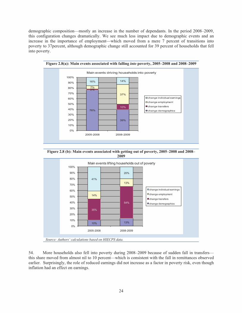
24
demographic composition—mostly an increase in the number of dependants. In the period 2008–2009, this configuration changes dramatically. We see much less impact due to demographic events and an increase in the importance of employment—which moved from a mere 7 percent of transitions into poverty to 37percent, although demographic change still accounted for 39 percent of households that fell into poverty.
Figure 2.8(a): Main events associated with falling into poverty, 2005–2008 and 2008–2009
Figure 2.8 (b): Main events associated with getting out of poverty, 2005–2008 and 2008–2009
Source: Authors’ calculations based on HIECPS data.
54. More households also fell into poverty during 2008–2009 because of sudden fall in transfers—this share moved from almost nil to 10 percent—which is consistent with the fall in remittances observed earlier. Surprisingly, the role of reduced earnings did not increase as a factor in poverty risk, even though inflation had an effect on earnings.
76%
39%
2%
10%
7%
37%
16% 14%
0%
10%
20%
30%
40%
50%
60%
70%
80%
90%
100%
2005-2008 2008-2009
Main events driving households into poverty
change individual earnings
change employment
change transfers
change demographics
10% 13%
35%
54%
14%
13%41%
20%
0%
10%
20%
30%
40%
50%
60%
70%
80%
90%
100%
2005-2008 2008-2009
Main events lifting households out of poverty
change individual earnings
change employment
change transfers
change demographics

25
55. During the period of growth, a change in earnings was the most significant single factor associated with the household moving out of poverty. Turning to the reasons for escaping poverty (Figure 2.8b), changes also appear to be dramatic.27 Some elements remained stable: only around 10 percent of households that came out of poverty in both periods did so because of a change in household demographics—migrating members, for example; and around 15 percent continued to escape poverty because of finding new employment.28
56. In 2008-09, the role of earnings changes as an upward force diminished from 40 percent to 20 percent, and if we consider the diminishing flows out of poverty—in fact it diminished by almost 4 times. Hence, inflation did have an impact on poverty—not so much by pushing more non-poor into poverty, but by closing the earnings route of escape from poverty and trapping the poor in low-productivity, low-earnings occupations with no prospects of improvement.
57. In the new environment, transfers started playing the main role as an uplifting factor (more than half of all cases). Fewer households were receiving the transfers as a result of global slowdown, but in the environment of depressed labor demand, the receipt of transfers was the factor that continued to pull households out of poverty.
2.6: WHO ARE THE NEW POOR?
58. The new poor are a significant part of the households, representing 6 percent of them. In this section, we attempt to identify the main characteristics of this group, and the differences between the new poor and those who were already poor or non-poor. In particular, the analysis aims to identify any particular traits that might have made them more vulnerable than other groups to jobs losses or food price inflation. Table 2.6 looks at some key features of the profile of the new poor versus other groups, by type of employment and main source of livelihood (proxied by the status of household head in 2008, prior to the crisis). The table represents a dynamic poverty profile and provides insights on the main vulnerability factors.
59. The profile of the new poor. Most of the new poor in 2009 were salaried workers, employed in “out of establishments” (not allocated to any sector in particular) or in agriculture and in rural areas. In this way, their profile is similar to the characteristics of the chronic poor, but somewhat sharper (agricultural workers are less prevalent among the chronic poor). Some parts of government employment were also affected by new poverty, as well as those employed in services, construction, and manufacturing. Especially in manufacturing and services (public), workers had a distinctly higher risk of becoming new poor than of being in chronic poverty. A great share of the new poor had little or no education. Overall, the new poor seem to come from sectors hit by the crisis. Many of their characteristics are similar to those of an average family in terms of size, number of earners in the household, and housing conditions. This suggests that the loss of employment and cuts in real earnings affected those who were not structurally poor.
27 The overall size of the pool escaping poverty is much smaller now, falling from 260 cases between 2005and 2008 to 160 between 2008 and 2009. 28 Again, even though the shares are the same, fewer households actually found new employment in 2008/09.

26
Table 2.6: Distribution of poverty groups by employment of household head
Never poor
Escaped poverty
Temporarily poor
New poor
Nearchronic poor
Chronically poor
All
By type of job Government 25.6 10.7 12.7 12.8 10.4 6.0 20.6 Public 3.9 3.4 2.8 1.8 2.9 2.7 3.5 Private 29.9 23.5 29.0 17.1 22.2 21.6 27.4 Out of establishment
40.1 62.2 54.6 67.3 64.4 68.3 47.9
Other 0.6 0.3 0.9 1.0 2.2 1.3 0.6 By sector
Agriculture 19.5 34.0 24.1 32.5 34.8 26.5 22.9 Mining 0.3 0.0 0.0 0.9 0.7 0.0 0.3 Manufacturing 8.6 9.1 7.8 10.7 7.9 7.9 8.7 Electricity 1.2 0.8 0.0 1.0 1.3 0.0 1.0 Construction 5.5 3.3 6.4 10.6 7.5 10.4 6.0 Trade 9.9 10.5 12.5 5.7 10.8 13.2 10.0 Hotels & restaurants
1.5 2.6 1.0 0.3 0.0 1.7 1.4
Transportation 6.1 7.0 8.6 4.8 5.6 6.1 6.1 Finance 2.2 2.2 0.0 0.0 1.8 1.1 1.8 Services 25.4 11.9 21.1 22.6 17.3 17.8 23.1 Reliance on transfers
20.0 18.7 18.6 10.9 18.9 15.4 18.8
Total 100.0 100.0 100.0 100.0 100.0 100.0 100.0 Source: Staff estimates, based on HIECPS data 2005, 2008, 2009. Note: Poverty = lower poverty line and income. Gray = those who were poor in 2009, employment figures from 2008.
60. This simple analysis suggests that there is no straightforward way to identify and target those affected by economic shocks. An effective social assistance program would therefore need to rely on more elaborate mechanisms and more detailed information to assess the needs of beneficiaries. The next chapter looks at the existing social assistance programs in Egypt and how well they performed during the crisis.

27
CHAPTER 3. SOCIAL POLICIES DURING THE CRISIS AND THEIR EFFECTS ON POVERTY
The crisis highlighted the imbalanced nature of Egypt’s safety net. While food subsidies had an important poverty-reduction impact, 30 percent of food subsides continued to go the richest 40 percent of the population and another 25 percent to be lost through leakage. At the same time, about 27 percent of the four poorest deciles did not benefit from targeted ration cards, and targeted cash transfer programs had a minimal impact. Reform of the system is critical to ensure its sustainability and increase its ability to protect the poor, and those in danger of falling into poverty, in the event of another crisis.
3.1. SOCIAL POLICY RESPONSES TO THE CRISIS29
61. The social safety net in Egypt uses considerable resources. Most social safety net programs include non-contributory transfer programs targeted in some manner to the poor or vulnerable (World Bank 2008). In Egypt, social safety net programs include in-kind subsidies—most importantly, food and energy subsidies. They also include targeted cash transfer programs such as the social solidarity pension, which provides help to families without able-bodied male members. Budget resources allocated for these programs amounted to 9.7 percent of GDP (or 28.9 percent of total government spending) in FY10—considerably more than the resources allocated for education and health combined.
62. Spending on social safety net in Egypt is unbalanced. In spite of several rounds of reforms to energy subsidies, which are available for all consumers and producers, still represent the largest burden on the budget (around 6 percent of GDP). Bread subsidies, available for purchase by all Egyptians, are the second largest item in Egypt’s safety net (accounting for around 1.5 percent of GDP). Spending on ration card subsidies, provided only to registered households, comprises only about 0.5 percent of GDP. In contrast, spending on cash transfers, which benefit mostly the poor and vulnerable, amounts to a very small 0.1 percent of GDP (Table 3.1).
29 This section draws heavily on the policy note, “Macroeconomic policies in the face of the food crisis,” prepared by Sherine Al-Shawarby for the inter-agency assessment mission in November 2008. It also draws heavily on two reports on food subsidies in Egypt World Bank 2010a and 2010b), prepared as part of the PER .

28
Table 3.1: Budget allocations for social spending (percent of GDP) FY04 FY05 FY06 FY07 FY08 FY09Subsidies, Grants and social benefits 5.10* 5.52 11.15 7.85 10.30 12.20of which Subsidies 2.13 2.56 8.78 7.24 9.39 9.00 to G.A.S.C. (food) 1.69 2.08 1.52 1.26 1.83 2.00 to petrol materials Na Na 6.76 5.39 6.72 6.00 Other 0.44 0.48 0.50 0.59 0.84 1.00Grants 0.31 0.34 0.35 0.35 0.43 0.40Social Benefits 2.65 2.62 2.00 0.22 0.45 2.80 Governmentt contributions to insurance funds
2.47 2.45 1.78 0.00 0.29 2.60
Social solidarity pension 0.10 0.10 0.15 0.14 0.10 0.11 Misc. social programs 0.08 0.07 0.07 0.08 0.06 0.09Other 0.00 0.00 0.02 0.04 0.03 0.00
Source: Staff calculations based on fiscal data published in The Financial Monthly (Ministry of Finance, various issues). Note: Data on subsidies are not comparable before and after FY05, since data on energy subsidies were added in the accounting budget only in FY06.
63. To mitigate social stress associated with the food crisis, public spending increased through FY08-09. To offset the social impact of higher inflation, President Mubarak announced, in early May 2008, a 30 percent increase in base salaries for civil servants, effective May 2008, and called on the private sector to follow suit. This move was accompanied by a 20 percent increase in pensions beginning in FY09 (July 2008). Also in 2008/2009, all those born between 1988 and 2005 were accepted as new beneficiaries into the ration card system, as were specific groups, such as the recipients of government cash assistance transfers (social solidarity pension), widows, divorced women, women heading households, and chronically sick persons. In August 2008, the Government also increased the amounts of rice, sugar, and edible oil distributed via ration cards. As Figure 3.1 shows, the fiscal cost of food subsidies increased during the entire period, and rose sharply from 1.3 to 2 percent of GDP between 2006/07 and 2008/09. The rising cost of Egypt’s food subsidies can be attributed to several factors, including: (i) increased international commodity prices; (ii) exchange rate depreciation; (iii) increased numbers and/or quantities of subsidized food items; and (iv) expansion of ration card coverage.
64. Initially, these measures were supposed to be fully financed in FY09. However the global financial crisis delayed the use of some of the resources originally allocated. They would have been financed by: (i) the phase-out of energy subsidies for non-energy intensive industrial consumers (LE 7.5 billion); (ii) the abolition of tax breaks for energy–intensive companies in Free Zones; (iii) higher cigarette taxes (LE 1.3 billion); (iv) higher vehicle licensing fees (LE 1.1 billion); (v) higher fees for the use of raw materials used in cement (LE 1 billion); and (vi) elimination of selected income tax exemptions (LE 3.5 billion). However, some of these measures, such as the phase-out of the energy subsidy, had to be postponed due to the global financial crisis. At the same time, the continued increase in food prices induced a new round of import tariff reductions on food items in 2008, bringing the weighted average tariff rate to 6.5 percent, down from 9.1 percent in September 2004.

29
Figure 3.1: Fiscal Budget Cost of Food Subsidies
Sources: Staff calculations, based on Ministry of Finance budget data and General Authority of Supply Commodities (GASC) data. Picture borrowed from AL-Shawarby (2010)
65. Even before the global crisis hit, the Government had taken strong measures to improve the cash transfer programs. The Government increased both the number of beneficiary households in the social solidarity pension system and their monthly cash assistance payment. It also extended additional cash assistance to the beneficiary families with children enrolled in school (LE 20/child for a maximum of four children). However, the number of beneficiaries remained much below the estimated poverty headcount, and the amount of the cash transfers remained well below what was needed to lift many of the recipients from poverty. At the same time, Egypt introduced other important innovations to targeted social transfers. It piloted CCT (Conditional Cash Transfers) programs and invested in a new targeting system. It also changed the eligibility criteria for cash transfers from demographic to income based criteria, with the approval of the parliament. Unfortunately, these changes have so far hardly affected the real flow of resources to the poor.
3.2. HOW THE POLICY CHANGES AFFECTED THE POOR
66. Table 3.2 presents the household-level perspective on the effect of the social policy measures. The table shows the coverage indicators, which are key to understanding the impact of transfers on the poor (Grosh et al. 2008). These indicators measure the percentage of population living in households that receive different types of subsidies and transfers; and percentages of the poor and non-poor that have access to formal and informal social protection programs and arrangements. If all households benefit from a certain type of transfer, the coverage ratio is 100 percent. The left and middle columns show the average coverage ratios for all households, the poor (lower poverty line), and the non-poor. The right-hand column presents changes in coverage from 2004/05 to 2008/09

30
Table 3.2: Coverage ( percent) of the poor and non-poor by social protection, 2004/5-2008/9 2004-005 2008-09 Change in
coverage All
families Poor Non-
poor All
families Poor Non-
poor for the poor
for the non-poor
All social protection 91.1 92.5 75.1 94.2 97.1 93.4 +4.6 +18.3All food subsidy programs 91.0 92.4 74.8 94.1 96.9 93.3 +4.5 +18.5
subsidies for ration cards (food)
58.5 62.7 57.8 67.6 76 66.2 +13.0 8.4
subsidies for baladi bread 75.6 71.7 76.6 80.9 77.2 81.9 +0.8 +16.4All social assistance 3.9 3.8 4.7 7.0 12.1 5.6 +8.3 +0.9
Social Solidarity pensions 2.7 2.6 3.5 4.3 7.2 3.4 +4.6 -0.1social assistance transfers 0.8 0.8 0.6 2.4 4.6 1.7 +3.8 +1.1other government transfers 0.4 0.4 0.7 0.5 0.5 0.5 +0.1 -0.2
All private and informal transfers
10.0 9.8 11.4 14.4 17.1 13.6 +7.3 +2.2
intra-family transfers 6.8 6.5 10.1 10.2 9.0 10.6 +2.5 +0.5zakat 3.4 3.5 1.4 4.5 8.6 3.4 +5.1 +2.0transfers from NGOs 0.6 0.6 0.9 0.8 1.2 0.7 +0.6 -0.2
Source: HIECS 2004/5-2008/9. Note: Energy subsidies are excluded, as they are not regarded as a social program.
67. Most poor in Egypt are covered by some type of help, either public or private. Table 3.2 shows that 97.1 percent of the poor in 2008/09 had at least one form of support. This coverage is basically provided by access to food subsidies: subsidized baladi bread and ration-card foods covered 96.9 percent of the poor. Public cash social assistance covered 12.1 percent of the poor, and all forms of private networks covered 17 percent.
68. The coverage of the poor expanded significantly, especially for ration cards and targeted assistance. Table 3.2 shows the increase in coverage of targeted cash assistance programs between 2004/05 and 2008/09, from 3.8 to 12.1 percent of the poor. This was much higher than the increase in coverage of the non-poor (from 4.7 to 5.6 percent), indicating an improvement in targeting. The increase in the coverage of the poor was also relatively higher than of the non-poor for other forms of assistance. For example, the increase in the share of households holding ration cards was higher among the poor (from 71.7 to 78 percent) than among the non-poor (from 76.6 to 81.5 percent). In other words, for each new non-poor household that received a ration card, there were 6 new poor beneficiary households. The next section looks at the effect of improved targeting on the amount of support the poor are getting, and on their living standards.
3.3. HOW WELL WAS THE EXPANDED SOCIAL SAFETY NET TARGETED TO THE POOR?
69. The coverage ratio tells only whether the poor are receiving a certain transfer, not its impact on their welfare. That will depend on the generosity of the transfer, which is a function of its budget. Here the story is less inspiring than in the case of coverage.

31
70. The cash transfers programs have a very marginal poverty-reduction impact. The budget devoted to targeted social assistance remains miniscule (less than 0.l percent of GDP) compared to the spending on food subsidies (2 percent of GDP), and still covers only a small fraction of the poor (only 12 percent). Thus, the impact of all targeted cash social assistance programs on poverty in 2008/09 was hardly visible: using the ADePT methodology, the programs were found to reduce poverty from the 22.7 percent it would have been without the programs, to 22 percent—hardly a material impact.30
71. The poverty-reduction impact of food subsidies, on the other hand, remained important and increased during the crisis. While food subsidies provide only a small proportion of total per capita consumption in Egypt, they have an important impact on poverty. Table 3.3 suggests that food subsidies lifted about 9 percent of the Egyptian population out of poverty. In other words, if there were no food subsidies, the incidence of poverty in Egypt in 2008/09 would have increased from 22 to 31 percent. Since baladi bread is by far the most important subsidized food, it accounts for most of the poverty-reduction impact. Based on 2008/09 prices, if the subsidy on baladi bread alone were eliminated, poverty would increase by 6 percentage points.
72. The poverty impact of food subsidies increased over time. Using the same methodology, food subsidies were estimated to have reduced poverty incidence in Egypt by about 7 percentage points in 2004/05 (World Bank 2007). With the new round of the survey in 2008/09, the poverty reduction effect of food subsidies was up to 9.4 percent. One can argue that the expansion of food subsidies prior to 2008/09 contributed about 2.4 percent to poverty reduction. Hence, without the expansion of food subsidies, poverty during the 2008/09 crisis would have been almost 25 percent, and not 22 percent observed.
Table 3.3: Poverty-reducing impact of food subsidies, 2008/09 Poverty
headcount P0 Poverty gap P1 Poverty P2 severity
Actual poverty indices 22.02 4.24 1.26 simulated poverty in case there is no
baladi bread and wheat flour subsidies
27.85 6.26 2.14
impact on poverty -5.83 -2.02 -0.98 ration cards food subsidies 25.59 5.25 1.66 impact on poverty -3.57 -1.01 -0.40 all food subsidies 31.46 7.60 2.75 impact on poverty -9.42 -3.36 -1.50
Source: HIECS 2004/05-2008/09
73. This poverty reduction impact, however, had an unnecessarily high cost. A recent study found that Egypt’s food subsidy system suffers from high system leakage and unduly wide coverage (World Bank, 2010). More than 25 percent of the food subsidies are diverted away from their intended uses (e.g., waste throughout the supply chain, the use of baladi bread as animal or fish feed, the sale of subsidized foods at a higher price on the black market or in open markets. Another 30 percent of food subsidies go to the richest 40 percent of the population. At the same time, about 27 percent of the four poorest deciles do not benefit from ration cards, and 13 percent do not benefit from bread and wheat flour subsidies. Thus, the crisis highlighted the imbalanced nature of Egypt’s safety net. While the pro-poor social cash assistance programs are not very generously funded (less than 0.1 percent of GDP), 2 percent of GDP is spent on untargeted food subsidies that may dampen but do not prevent poverty increases, and at huge cost.
30 Estimates calculated using ADePT SP, www.worldbank.org/adept.

32
74. Reform of Egypt’s food subsidy system is urgently needed. Given the far-reaching coverage and long-standing nature of the food subsidy system, the nature and timing of reforms are critical to ensure their sustainability.31 In the short term, some of the needed reforms may be politically and socially difficult, especially at times of global food price spikes; but some others can be implemented with no public resistance, such as reducing leakages away from the intended uses. Therefore, while continuing to utilize existing programs, the Government should (i) move baladi bread subsidies to the end of the supply chain, to eliminate incentives for agents to leak subsidized flour (LE 160 per ton) to the black market (where it currently sells for around LE1300). The Government should also (ii) use third party monitoring of stores that sell subsidized foods, to ensure that beneficiaries are getting their full share of benefits from their ration cards. In addition, the Government could introduce well-targeted temporary interventions (cash transfers, school feeding, etc.), limited to affected vulnerable populations.
75. In the medium term, the Government should strengthen social safety nets to mitigate the negative implications of any future crisis. The safety nets could be strengthened by (i) gradually eliminating the non-needy (the richest 20 or 40 percent of the population) from the system, using various targeting methods (geographic, income-based, self-selection), thus enabling the poor to receive more benefits without increasing the burden on the fiscal budget; (ii) replacing food subsidies with food coupons, which are less costly, more effective in transferring income, and more self-targeting (if the use of coupons is limited to less preferred foods); and (iii) improving the targeting, delivery, and monitoring and evaluation of existing cash transfer programs. The process of reform will face many obstacles, and finding the right path and achieving social buy-in will require that key agencies and the public develop a shared vision of what problems need to be solved. A well-planned communication strategy will be an important part of that effort.
31 Drawing on other countries’ experience, the World Bank (2010) presents some broad policy options that directly address these issues, and that would ultimately support a more comprehensive and effective social safety net system.

33
CHAPTER 4. CONCLUSIONS
Despite robust economic growth during 2004–2008, the number of extreme poor more than doubled between 2004/05 and 2008/09. Further, absolute poverty increased from 19.6 to 22.0 percent, and 6 percent of the non-poor population became new poor during this period. The main factors were loss of employment and the devastating effects of food inflation, which were not well managed by the social protection system. Improved household survey data will help to improve targeting. As a way forward, a deeper understanding of the country’s poverty dynamics will depend on improved data consistency across time and surveys, extended coverage of other (non-consumption) aspects of well-being and expanded access to data to enable broad debate and research on poverty.
76. The analysis confirms that poverty remains a serious problem in Egypt. The previous work (World Bank 2009) demonstrated that despite robust economic growth, which helped to reduce poverty, the risk of extreme poverty (inability to meet basic food needs) increased by almost 20 percent between February 2005 and 2008. The current analysis shows a further increase of extreme poverty: 5.1 million people in Egypt could be considered severely deprived of basic needs (food) in 2008/09—almost double the 2.6 million extremely poor seen in 2004/05. Absolute poverty also increased between the two periods, from 19.6 to 22.0 percent, using comparable poverty lines.
77. The main factor in increasing poverty during the year of the crisis was the rapidly changing cost of meeting basic food needs. All of the absolute poverty increase can be accounted for by inflation. The acceleration of inflation, from 10 percent per year to 20 percent per year in the second half of 2008, was a major factor in reversing the poverty reduction process triggered by economic growth. The time trend of poverty almost exactly coincided with the trend of food price increases, which peaked in July-September 2008. Poverty then receded within the next two to three quarters to its pre-food crisis level; but overall, the gains in poverty reduction were irreversibly tarnished by this episode.
78. The damaging effect of food inflation on the poor was a result of the increasing disconnect between the poor and growth. Economic growth over 2004-2009 was primarily concentrated in sectors that do not employ the poor, and where employment relative to population has been shrinking: i.e., manufacturing, transport, and communications. The poor and near poor also have not fully benefited from the increased productivity in agriculture and construction, where most of the poor are employed.
79. Vulnerability is still very high among households that are close to the poverty line (near poor). The number of near poor fell somewhat during 2008-2009. However, the analysis of panel data comparing living standards of the same households in February 2008 and February 2009 demonstrates that vulnerability has not decreased. The impact of accelerating food price inflation on poverty was so strong primarily because many middle-class households were just one shock away from poverty. As many as 6 percent of the non-poor population became new poor during this period. The report estimated the likelihood of households in the 2nd -4th quintile (middle class) falling into poverty during that year as 14 percent.
80. The report shows that increased employment losses during the crisis was the factor that pushed households into poverty. The main effects of economic turmoil on poverty reduction were through stalling the escape from poverty that increased earnings would have made possible. Despite this highly worrying picture of newly emerging poverty traps, there are also positive elements observed in the new period. The majority of households that managed to climb out of poverty in the period of high growth

34
(2005–2008) were resilient to shocks, and stayed out of poverty despite inflation. This shows that rapideconomic growth is the only sustainable way to help people move out of poverty.
81. Panel data also show how the welfare costs of the food price shock affected households differently. Most of the increase in the poverty deficit due to the crisis was associated with the new poor who fell into poverty. The chronically poor did not experience large deterioration in the course of the crisis, but their prospects for moving out of poverty were curtailed. Hence, the crisis increased the duration of poverty. Both types of welfare losses—acute falls of the non-poor into poverty, and the trapping of households in poverty—were not well managed by the existing safety nets.
82. The report concludes with the analysis of safety nets. They expanded during the crisis at considerable cost (more than 1 percent of GDP), but were not targeted to the poor and were unable to fully mitigate the poverty increase. The crisis made apparent that Egypt does not have a proper set of safety nets that could protect the vulnerable or could be scaled up during the crisis to alleviate the impact on the structurally poor. Instead, a large amount of resources are absorbed by a costly system of food subsidies that is only capable of ensuring that the poor are not starving, but that cannot move them out of poverty or protect the near poor from falling into poverty. Egypt has taken important steps to improve targeting and coverage of the poor by social assistance transfers, but needs to do a great deal more.
83. The analysis presented in the report shows that Egypt in 2008-09 also faced the challenge of job creation. Data reveal that a population of 80 million is sustained by a little more than 20 million employed—each of whom therefore has to support another 3 persons, on average. The predominant model of household livelihood in Egypt is a one-earner arrangement, making families extremely vulnerable to employment losses or a reduction in earnings. Analyzing employment growth is therefore key to better understanding the factors of poverty dynamics. However, the main source of data on employment, the Labor Force Sample Survey (LFSS), remains out of reach for researchers. It will be critically important to include these data—both informal sector and firm-level data—to enrich the analysis with of the factors affecting employment at the next stage of poverty analysis.
4.1. WAY FORWARD IN POVERTY MONITORING
84. Egypt has achieved progress in making its main household survey data more timely, more reliable, and more accessible to policymakers. CAPMAS is making unparalleled efforts in working with the World Bank to improve the quality and coverage of the survey data. CAPMAS has also made changes to its data access policies and has started to pilot systematic data sharing with analysts from academia.
85. These changes are very timely. Household survey data provide unique insights into the dynamics of poverty and the effects of policies on the poor. As shown in this report, the new data (poverty rates by quarters) allow a level of analysis that was not thought possible. However, the data still do not provide complete certainty with regard to survey results. As noted in the report, there are consistency issues in several dimensions that need to be addressed to increase the credibility of results. For instance, the report established that poverty increased over 2008-2009. But the widening gap between surveys estimates of consumption and macroeconomic data casts some doubt on the magnitude of this increase.
86. Looking in more depth at specific ways to increase the potential for using survey data to inform policymaking, we identify the following areas where the joint work of CAPMAS and the World Bank can help to bring the survey data to new levels of relevance for policy purposes:

35
i. Improve consistency across time and surveys. There are large differences across existing sources for the same indicator. Examples include employment by sector from LFSS and HIECS; and large and increasing differences between national accounts and surveys. Why does this matter? This lack of consistency makes it difficult to link poverty with changes in labor market policies, or to draw definitive conclusions about the direction and magnitude of change. This report addresses some of these issues analytically. But the most reliable approach would be to identify and adopt consistent data collection practices. The unavailability of LFSS data for the analysis (beyond the few summary tables published by CAPMAS), and the too-abbreviated labor module of HIECS, has so far made it difficult to reconcile some of these differences.
ii. Separate short-term, seasonal, and long-term trends. The survey data reflect changes both between surveys and within the survey period. This report presents, for the first time, poverty rate fluctuations across quarters. Yet, there is still no clear understanding of seasonal patterns in living standards. As a result, it is difficult to separate policy (or crisis) effects from seasonal fluctuations of the economy. More frequent surveys, joint analysis of seasonality, and the use of the new panel data, can help address this issue.
iii. Expand coverage of non-consumption aspects of well-being. Beyond a few education and employment variables, the HIECS contains little data that would allow for the analysis of poverty determinants or represent different dimensions of poverty. New joint work by CAPMAS and the World Bank, which expands the scope of the HIECS and panel surveys by including new modules, is best way to address this gap.
iv. Expand access to data to enable broad debate and research on poverty. CAPMAS has started to make progress in this area, but much remains to be done to ensure that the benefits of this public good fully accrue to Egyptian society.
87. These issues represent compelling reasons for the World Bank to continue being engaged in this work. At the next stage, there will be increased attention to the specific data issues discussed above, as well as serious investment in improving the capacity of CAPMAS to monitor poverty changes over time. More attention will also be paid to disseminating data for policy analysis.

36
ANNEXES

37
ANNEX 1. DATA
Living standards in Egypt are monitored by means of the Household Income, Expenditures and Consumption Surveys (HIECS). Conducted every five years since 1995, these large-scale surveys have been the main (and the only official) source for poverty and inequality data in Egypt. In 2007, the authorities decided to make data collection more frequent. The new 2008/09 survey contained a number of improvements.
HIECS 2004/05 and 2008/09
The main differences between the 2004/05 and the 2008/09 surveys are: (i) a change in the sampling method; and (ii) a change in the method for collecting food diary data.
i. The 2008/09 survey was conducted on an almost identical number of households (48,658) as the 2004/05 survey, but sampling errors were reduced dramatically and the precision of estimates greatly increased. This improved accuracy was due largely to the timely provision of data from the 2006 Population Census, for which CAPMAS decreased the number of households in each sampling segment from about 40 to about 20, thus increasing the number of areas sampled from 1,200 to 2,526. The new sample was also more widely distributed throughout the country and reflected new construction and development, even in slum areas. This increased coverage may well have captured a larger share of the poor population and therefore resulted in a higher poverty estimate even if no change in the poverty level has occurred.
ii. The second major change was a decision to reduce the food consumption diary to 15 days instead of 30 days, as in the 2004/05 survey, to lighten the burden on respondents and encourage more cooperation.
CAPMAS also improved the questionnaire and added several important questions which allowed for measurement of the informal sector—including questions on participation in (contributions to) the pension, social security system, and health insurance systems.
In principle, the procedures for quality control were identical for both surveys, and consisted of:
a) Implementing manual field editing and checking after finishing data collection for households.
b) Setting up a program for the Survey Technical Committee (supervision) and survey staff for visiting field work in all governorates (each 15 days).
c) Re-interviewing a sample of households by Quality Control Department, and examining the differences with original responses.
d) For the purpose of quality assurance, internal consistency checks were performed and tables of results generated for each survey round, to assess the plausibility of mean household expenditure on major commodity groups and the variability of that expenditure over major geographic regions.

38
The implementation of these procedures was stricter in 2008/09 than in 2004/05, which most likely resulted in more consistency over time (survey quarters). All of these changes improved the quality of the 2008/09 data, but at the same time may also result in producing different results.
Panel survey (HIECPS) 2005/08/09
In February 2008, the authorities revisited the households interviewed for the February 2005 panel (part of HIECS 2004/05), using the same questionnaire as in 2005 (Household Income, Expenditure and Consumption Panel Survey [HIECPS]). In February 2009, CAPMAS conducted a third round of the panel. This new round, while providing some crucial new estimates, also contained a number of inconsistencies from the earlier panels (see below).
The sampling remained representative and reflected remarkable efforts to keep attrition low. The monthly sample of HIECS 2004/05 included about 4,000 addresses drawn randomly in a two-stage stratified sample, with about 40 households per sample unit. Out of target sample for 2005, 3,903 had valid addresses. When they were revisited in 2008, 3,690 households participated in the survey, of which 3,553 were the same as those interviewed in 2005 and 137 were new households (at the old addresses); 213 households were not found or refused to be re-interviewed in 2008. In 2009, CAPMAS interviewers collected data from 3,643 households, of which 3,448 were from the same panel of addresses as in 2008 and 2005, and 42 were new households (at the old addresses). Thus a balanced panel of 3,406 of the same households was interviewed continuously since 2005. The attrition between 2005 and 2009 was systematic but not large; and following the methodology discussed in Kalton and Brick (2000), a simple model corrected for this effect.
Even though the sampling was fully adequate and the survey instrument remained unchanged, something happened in the field during survey implementation that made consumption data from the HIECS 2009 round very different from the previous round. The main issue was the accuracy of food records in the 2009 survey data—non-food consumption grew between 2008 and 2009, while food consumption fell. This inconsistency is particularly evident in the fall of the food share between 2008 and 2009, when the average food share fell from 47 percent to just 39 percent. This fall of food share is inconsistent with falling total consumption: as households became poorer, their food share should increase, not fall. Yet the 2009 data showed a dramatic reduction both in spending on bread and in the quantities of bread consumed, and this held for both subsidized and free market bread. However, the cross-section, which was conducted at the same time, showed no reduction of any kind. In fact, food prices increased morebetween the 2005 and 2008 panels (by 48 percent) than between 2008 the 2009 panels (14 percent), and in this period, the panel revealed a stable relationship between food and non-food consumption. However, a fall in food consumption at the same time that non-food spending increases is a puzzling phenomenon that does not have an economic explanation.
There is nothing from other sources of data to suggest that Egyptian households reduced their food consumption between 2008 and 2009. The food crisis resulted in the rapid increase of food prices, but there was no disruption in supply or consumption of food. The increased price of bread made many turn to the subsidized bread outlets, which could not cope with the increased demand, creating long queues and provoking riots in some places in the summer of 2008. But February 2009 was not affected by these events.
The team concluded that the reported fall in the food consumption in the 2009 panel was due to interviewers’ fatigue. The same team of interviewers had to simultaneously carry out the new large HIECS cross section and re-visit panel households from the 2004/05 sample that now resided in other

39
sample units. This fatigue resulted in part of the food diary being skipped, which in turn resulted in lower overall consumption being reported. With lax quality control (compared to the main cross section), these problems were not identified soon enough to be corrected.
For the data analysis, therefore, the team has chosen to look at other parts of the data that do not have similar problems. This means that they have to come from a single interview, rather than multiple visits. The data also have to represent a comprehensive measure of living standards. Household total income (which includes all in-kind consumption and owner-occupied rent) is an example of such variable. It was neglected in the past based on the presumption that it is very problematic compared to accurate consumption. It is of course a very different measure therefore comparing poverty status by income and consumption for the same household is not very useful, but one can get insights into the overall distribution.
Income poverty shows a lower incidence than consumption poverty, but the time evolution of poverty is strikingly similar to that of the consumption series. There is lower incidence of chronic poverty, but its share in total poverty each year is similar to what we see in consumption data. Overall, poverty is almost the same in 2009 as it was in 2005. Interestingly, the Gini index for per capita income is also very similarly trended with consumption data: from 32.2 in 2005 to 33.3 in 2008 and to 32.7 in 2009.
Table A1.1 below shows the same regional snapshot of poverty, using income measures. There is striking resemblance to consumption data, especially in some sensitive areas of Egypt (i.e., poverty increased in 2009 in rural Upper Egypt).
Table A1.1. Income poverty, number of poverty spells, and chronic poverty by region, 2005, 2008, 2009---------------------------------------------------------------------------------- Region |Income poor 05 Income poor 08 Income poor 09 Number of % chronic Poverty spells poor
------------+--------------------------------------------------------------------- Metrop | .0663187 .0626845 .0699675 .1989707 .0068356 Urban Lower | .0511972 .0349821 .0267827 .112962 .0065534 Rural Lower | .1064761 .0771984 .112137 .2958115 .0085515 Urban Upper | .1884971 .1343905 .1625666 .4854543 .0613421 Rural Upper | .3217545 .3282688 .3858588 1.035882 .1156432 Frontier | .0953427 .0594184 .1479968 .3027579 0 Total | .1552778 .1381645 .1686195 .4620618 .0405185
Source: HIECPS, 2005, 2008, 2009.
Given the sensitivity of income data, information on the multiple sources of income for each household member was collected during the last interview of the survey. Consumption totals were often used to prompt more accurate responses. The questionnaire was the same one used in 20005. Evidently, the fall in food consumption shown in the 2009 panel affected the incidence of such prompting, which could perhaps reflect some indirect effort of falling incomes.
The team is continuing the work on imputations based on the parts of consumption (i.e., non-food consumption) that were adequately collected. This work will lead to the construction of imputed variables. However, to avoid issues of interpretation, the team has decided to report only actual (non-imputed data) in this study.

40
Conclusions
The panel surveys have generated unprecedented data on chronic poverty and social mobility in Egypt; and the instrument has improved over time, allowing for the analysis of new issues (e.g., informal sector), which makes it a valuable tool for policymakers. The results suggest that panel data in Egypt can be used to follow longer-term processes, and that this type of data collection should be continued. At the same time, the latest panel round showed that surveys can be implemented in a way that challenges their consistency over time. This strongly supports the decision of CAPMAS to further improve the quality of its data collection and processing. The World Bank is providing technical assistance for this effort.

41
ANNEX 2. POVERTY MONITORING: UPDATING POVERTY LINES IN EGYPT
Poverty lines. Details of the poverty line methodology used in Egypt are given in World Bank (2002), World Bank (2007) and El-Laithy et al. (2003). Poverty lines are based on valuing (in local prices) the cost of minimum caloric intake, and on using the actual consumption patterns to estimate the non-food minimum associated with just meeting the food requirement (via regression techniques). To update the poverty line, the team relied on the existing set of poverty lines used with the 2004/05 survey. The lines differed by location and demographic composition of households. Three steps were involved in calculating them, and two steps in updating them.
Setting the poverty lines in 2004/05 Caloric Requirements. Nutritional needs of individuals are the starting point to construct food poverty lines. Using tables from WHO, caloric needs are separately specified for urban and rural individuals, by sex and 13 age categories. For individuals over 18 years of age, WHO's recommended daily allowances are differentiated by weight and activity levels. The estimates used in this paper assume an average weight of 70 kg for men over 18 years of age, and 60 kg for women. Urban individuals are assumed to need 1.8 times the average basal metabolic rate (BMR) and rural individuals are assumed to need 2.0 times the average BMR. Thus, each household has its own caloric requirements depending on its location, age and gender decomposition.
Food Poverty Line. Once the minimum caloric needs have been estimated, the next step is to determine the cost of obtaining the minimum level of calories. Cost is determined by how the calories are obtained, on average, by the first two quintiles, rather than by pricing out the cheapest way of obtaining the calories or following a recommended diet. For the bottom two quintiles (poorest 40 percent of households ranked by nominal per capita consumption), the average quantities of all food items were constructed. Total calories generated by this bundle are calculated using the caloric content of every food item. The bundle was priced using unit prices prevailing in each region. Dividing the cost of the chosen bundle by calories generated by it, the costs per calorie in each region were obtained. The household-specific food poverty line was derived by the multiplying calorie requirements for all household members by the relevant cost of calories. The food poverty line takes into account the gender and age composition of the household as well as its region. The food poverty line was also used define extreme poverty; households whose total actual consumption was below their food poverty line were considered extreme poor.
This stage, or the food poverty line, can be explained mathematically as follows: let Z denote the actual food consumption vector of the reference group of households initially considered poor; i.e., the first two quintiles. The corresponding caloric values are represented by the vector k, and the food energy intake of the reference group is then kz = k.Z'. Let the cost of this bundle for the region r be Pr , and caloric requirements of household h be Ch; thus the cost of one calorie in region r is given by (kz /Pr). The food poverty line for household h is then given by Zf =(kz /Pr)* Ch , Thus the relative quantities in the diet of the poor are preserved in setting the poverty line.
Non-food Poverty Line. While the cost of the minimum food bundle is derived from estimated physiological needs, there is no equivalent methodology for determining the minimum non-food bundle. Following Engel’s law, food shares are regressed against a logarithm of total household expenditure relative to the food poverty line and its square. That is
ihfzixfzixis ���� ���� 2))/(log()/log( + �, (1)

42
where si denotes food share of household i, xi is its actual consumption, zf is the food poverty line, hi is the vector of household demographic characteristics (location, logarithm household size and its square, age and gender composition—share of small and older children, share of adult males and females, and share of elderly), and � is an error term.
The non-food allowance for each household can be estimated in two ways: (i) by regressing the food share against total expenditures, and identifying the non-food share in the expenditure distribution of households in which expenditure on food is equivalent to the food poverty line; or (ii) by identifying the share of non-food expenditure for households in which total expenditure is equivalent to the food poverty line. The former approach yields an upper bound of the poverty line, while the latter yields a lower bound, since it defines the total poverty line in terms of those households that had to displace food consumption to allow for non-food expenditures, considered to be a minimum indispensable level of non-food requirements.
Thus the lower poverty line = (2-Si)*Zf (2).
The upper poverty line is obtained by solving equation (1) iteratively. This is the line based on the consumption pattern of households that just meet their basic nutritional requirements.
Household-specific poverty lines are estimated (households with the same gender and age composition in each region have the same poverty lines). Obviously this approach takes into account location, age and gender composition as well as economies of scale, as food shares and hence non-food estimates vary according to household size, age and gender composition. Hence, differences in food shares result from the addition of members of specific age and gender.
Updating the poverty lines:
For consistency, the cost of one calorie in 2004/05 was updated to reflect price increases with the food component of the CPI for 2008/09. Regional differences in price increases were significant, and there was a visible catch-up in the prices in Upper Egypt, which was traditionally characterized by low prices in the consumer basket.
We used the regional food CPI published monthly by CAPMAS—Table A2.1 provides a summary—to derive the average monthly cost of one calorie. As an alternative, the team also re-estimated average calorie cost at the bottom of the distribution, as shown in Table A2.2, alternatives IV and V.

43
Table A2.1. Average of monthly price indices by main CPI regions, for HIECS 2008/09 (2004/05=100)
2008/09 CPI food Cost of living
for poor CPI all
Cairo 160.7 151.7 145.6
Alexandria 163.2 152.8 146.7
Canal 164.4 152.8 146.6 Frontier 163.1 152.2 146.8 Lower Urban 163.7 152.5 147.0 Upper Urban 160.9 149.8 144.7 Lower Rural 172.2 157.5 151.1
Upper Rural 165.9 153.1 149.1 Average 164.3 152.8 147.2
Source: CAPMAS.
In the original 2004/05 method, following Engel’s law, food shares were regressed against a logarithm of total household expenditure, and an logarithm of household size, share of small and older children, share of adult males and females, and share of elderly. This approach was also attempted and one of the alternatives included in the re-estimation (alternatives II and IV). The other alternative was to use the 2004/05 regression, re-estimate the poverty line for each household based on its composition in 2004/05 prices, and then update them using non-food CPI differentiated by month and region (alternatives I and V). As the simplest naive alternative (III) we also used “pure” inflation adjustments, ignoring different composition of the basket. The CPI index disaggregated by region as well as by food and non-food was used to bring the consumption values recorded in 2008/09 survey to 2004/05 average prices. Thus each household had its own price deflator, depending on the structure of its consumption in the 2008/09 survey. Alternative III used the actual 2004/05 poverty lines for each household and compared them to this deflated consumption. Table A2.2 summarizes all attempted alternatives, corresponding poverty lines and headcount indices (percent of population below the poverty line).

44
Table A2.2. Poverty line updates in Egypt and corresponding poverty indices, 2008/08
Updating food poverty line Updating non-food poverty line Poverty
incidence, P(0) Poverty lines
LE/ person/year Alternatives Food Lower Food Total
I
1a. Inflate calorie cost of 2004/05 by applying food CPI (disaggregated by region and month level), and then estimate household specific food poverty line by multiplying the updated cost by caloric requirements of each HH.
1b. Use regression coefficients of 2005 to estimate household specific non-food poverty line in 2004/05 prices and then update using non-food CPI.
6.74 22.50 1656 2232
1a rev. Same as above. 1b rev. Same as above, but use 3-month lag for non-food CPI to reflect recall period of the survey.
6.74 22.02 1656 2216
II 2a. Same as 1a.
2b. Based on 2008/09 data, we estimate food share using regression and thus obtain the non-food component of the poverty line.
6.74 25.68 1656 2313
III
3a. Deflate food consumption of 2008/09 by food CPI and non-food by non-food CPI and directly apply 2004/05 food poverty lines (cost of calories).
4a. Deflate food consumption of 2008/09 by food CPI and non-food by non-food CPI and directly apply 2004/05 lower poverty lines (as usual, CPI is disaggregated by region and month).
4.28 19.67 1600 2190
IV
4a. Use the 2005 food basket and 2008-09 median unit prices (by month and region) to estimate the cost of calorie in 2008/09, then estimate household specific food poverty line by multiplying the updated cost by caloric requirements.
4b. Based on 2008/09 data, we re-estimated food share using regression and thus obtain the non-food component of poverty line.
6.05 24.35 1648 2298
V 5a.Same as 4a.
5b. Use regression coefficients of 2005 to estimate household specific non-food poverty line of 2005 and then update use non- food CPI.
6.05 21.56 1648 2224
Source: World Bank staff estimates.
The main selected approach is highlighted in the table. Most of the variants produce very close estimates in terms of actual poverty lines, but since the distribution is so compressed, these small changes in the poverty lines produce noticeable differences in the headcount index.
We select alternative I (modified with the lagged inflation to reflect the fact that non-food consumption in the survey does not apply to the current month, but reflects purchases made over a number of months preceding the survey and thus done at lower prices) as the most comparable to 2004/05.
Figure A2.1 illustrates the regional differences in per capita average values across alternatives. There are some important differences across both regions and alternatives. While in 2004/05 the highest poverty lines were in metropolitan regions, in 2008/09 the CPI inflation was actually higher in rural areas, so the poverty lines went up in those areas. But recalculating the food poverty lines anew (alternatives 4 and 5) also generates higher values for metropolitan regions.

45
FigureA2.1. Average per capita poverty lines for different alternatives, by region
Source: World Bank staff estimates, based on HIECS.
Table A2.3 illustrates the economies of scale that are present implicitly in the adopted methodology. Table A 2.3: Average of monthly lower poverty lines per capita for different household structures, by region
HH size/HH structure Metro politan
LowerUrban
LowerRural
Upper Urban
Upper Rural
Border Urban
Border Rural
AllEgypt
2: one adult male and one adult female 2261 2161 2304 2105 2089 2175 2095 2193
4: one adult male, one adult female and two children 2033 1969 2055 1919 1961 1994 1960 2005
5: one adult male, one adult female and three children 1990 1928 2004 1898 1900 1925 1941 1957
3: one adult female and two children 2316 2092 2211 2224 2165 2315 2178 2201
5: two adult males, one adult female and two children 2296 2224 2314 2208 2265 2257 2166 2276
5: one adult male, two adult females and two children 2169 2111 2194 2100 2124 2134 2184 2152
5: one adult female and four children 1947 1918 1969 1884 1904 1894 1965 1927
Source: World Bank staff estimates, based on HIECS 2008/09 (alternative 5).
If we compare the per capita lower poverty line for a household of four (two children and two adults, average poverty line = LE2005) with the poverty line for a household of five (three children and two adults = LE1957), we see some modest gains in meeting basic needs with increased household size.
The impact of household composition is much stronger than the impact of household size, as can be seen by comparing the lower poverty lines for two households of the same size (five persons): it is LE 1957 for
1500
1600
1700
1800
1900
2000
2100
2200
2300
2400
2500
food_pl lower_pl food_pl lower_pl food_pl lower_pl food_pl lower_pl food_pl lower_pl food_pl lower_pl
Alternative�1 Alternative�one�with�lagged�CPI
Alternative�2 Alternative�3�(in�2008/9�prices)
Alternative�4 Alternative�5
Metropolitan Lower�Urban Lower�Rural Upper�Urban Upper�Rural

46
a household with three children and two adults, and LE 2257 for a household with two children, two adult males and an adult female.
Main living standards indicator. Expenditures are typically a better guide than consumption to the longer-term well-being of a household (or its “permanent income”), as the household will exercise some consumption smoothing and use savings (positive and negative) to deal with erratic incomes (Deaton 1997). Moreover, expenditures can generally be more accurately captured, particularly among the poor, who have relatively constant and well-known expenditures on relatively few items, while their incomes can be very erratic und unpredictable (Ravallion 1992, Deaton 1997, Klasen 2000). In our previous analysis of the 2005-2008 dynamics of poverty,32 we relied exclusively on consumption. The consumption aggregate included all spending on consumer goods and services (durables included), as well as imputed rents, own production and in-kind transfers received by households. However, there was less scrutiny of the imputed part of the consumption and estimates of poverty line based on actual consumption. For rents, for instance, the poverty line would take a simple average between households whose living conditions may be equivalent but access to subsidized rental accommodations and therefore measured consumption different. This is an issue to explore at subsequent stages of revising poverty lines methodology.
Discussion and outstanding issues. Egyptian users of poverty data seem to be satisfied with complex and incontestable methodology for calculating and updating the poverty lines. While in general the methodology is sound, it has a number of features that need to be looked at. Egypt uses three poverty lines to monitor poverty: food, lower and upper. The food poverty basket was estimated back in 2000 and since then has been updated using the food component of CPI. This approach may no longer be accurate if the consumption structure (ways to satisfy basic needs) has changed. Of the two full poverty lines, the lower line represents the minimal defensible threshold of total consumption. It consists of barely sufficient allowances for non-food consumption and is estimated based on actual spending of households that do not meet their basic nutritional needs and therefore are extremely poor. The more adequate upper poverty line is a more consistent concept, in a sense that it captures a subsistence minimum that meets key basic needs. But there is a reluctance to call the upper poverty line threshold a "poverty line" in Egypt (instead near poverty term is used), and policymakers prefer to rely on lower poverty line in describing poverty. In the international perspective (as we saw in Chapter 1), the upper line is similar to the US$2 a day threshold, which is more adequate to a country as Egypt. Describing the real poor as "near poor," however, can undermine the credibility of the analysis. Poverty lines were developed to provide consistent poverty comparisons in a situation with relatively stable prices. Rapid changes in prices reveal the difficulty of operating within these constructs and ensuring consistency in comparisons over time. Complicated, essentially household-specific methods of setting poverty lines are difficult to use for social policy. Ways to simplify the calculation of poverty lines without the loss of precision could be considered at the next stage of joint poverty work by the Ministry of Economic Development, CAPMAS, and the World Bank.
There is potential to both simplify the poverty lines and to make them more consistent. There is also a large agenda for measuring living standards with the existing data. Egypt has changed its methodology of poverty measurement several times (1995/6, 1999/2000) each time improving it while ensuring the comparability of data. In the next stage, the work should focus on increasing the simplicity, transparency, and comprehensiveness of the poverty measures.
32 Consumption was also exclusively used for the three previous Egypt Poverty Assessments (World Bank 2002, 2007 and 2009).

47
ANNEX 3. HOW WELL DO NATIONAL ACCOUNTS AND SURVEY DATA AGREE IN
EGYPT?
Aggregate expenditure figures computed based on household surveys typically fall short, sometimes by a large margin, of private consumption figures computed based on national accounts (NA). Egypt is no exception in this respect (Figure A3.1).
Figure A3.1. Per capita Consumption over Time in France, United States and Egypt
Egypt
Source: France and US: Stiglitz, Sen and Fitoussi, Report by the Commission on the Measurement of Economic Performance and Social Progress, 2010. Egypt: Ministry of Economic Development.
Note: Data from household surveys and national accounts (NAs).
100
150
200
250
300
350
FY96 FY97 FY98 FY99 FY00 FY01 FY02 FY03 FY04 FY05 FY06 FY07� FY08 FY09
Per�Capita�HH�Consumstion� (SNA)
Per�Capita�HH�Consumstion� (HIECS)

48
From this perspective, data from Egypt are not worrisome. However, the gap between national accounts and surveys should be taken into account when comparing poverty lines from the surveys with national accounts data. The household survey for 2004/05 showed a level of LE 2600 for the nominal per capita private consumption, as opposed to LE 5,500 calculated from the national accounts (NAs) data. Currently, however, the estimate from survey is around LE3,800 versus around LE10,000 from national accounts. The gap between the two sources has been increasing since 1996, but in the latest period it increased sharply. The most puzzling phenomenon is that no matter which deflators we use, the three years of really rapid robust growth that increased consumption by at least 15 percent in real terms over 2005-2008, seem to have evaporated completely in household survey by mid-2008 (see fig. A3.2).
Figure A3.2.: Mean per capita household consumption LE from national accounts of Egypt and surveys, 1996-2009
Source: HIECS and CAPMAS.
National accounts estimates of consumption are typically, although not always, larger than survey-based estimates. Furthermore, there is a tendency, both across countries and over time within important countries, for the NA estimate of consumption to grow more rapidly than the survey-based estimate (Deaton 2003). There are four main reasons why data from these two sources might not agree:
i. It is likely that in developing (primarily) rural economies, grain consumed by farm animals owned by farm households is difficult to distinguish from human consumption in the NAs, leading to over-estimation in those data; properly designed household surveys will indicate a more accurate level.
ii. Household surveys may underestimate expenditure. There are numerous problems in obtaining credible estimates from standard survey instruments (see, for example, the discussion in Deaton 1997). Lack of compliance by well-off sampled households is a well-known concern among those implementing surveys; it is not uncommon for the rich to systematically refuse to participate in the survey, or be impossible to interview for other reasons. One expects that they will be replaced by more compliant but less well-off respondents.
0
0.5
1
1.5
2
2.5
3
0
2000
4000
6000
8000
10000
12000
1996 2000 2005 2009
LE�per�capita,�current
HH
NAs
ratio�SNA/HHS

49
iii. Even aside from measurement error, there is a difference in coverage. Probably the most important difference is that national accounts include spending on goods and services by unincorporated businesses and non-profit organizations (such as charities, religious groups, clubs, trade unions, political parties). The invariance principle implies that a movement of an activity from the public to the private sector, or vice versa, should not change our measure of economic performance, unless the switch between public and private provision affects the quality of or access to the service. This is where a purely market-based measure of income meets its limits, and where a measure that corrects for differences in institutional setup may be warranted for comparisons over time or across countries. Adjusted household disposable income and actual final consumption are measures that go some way towards accommodating the invariance principle, at least where “social transfers in kind” by government are concerned.
National accounts systems generally draw a distinction between two concepts of household consumption:
� Final consumption expenditure is simply the expenditure incurred by households on consumption products, plus some imputed expenditure items such as the imputed rents that house owners pay to themselves. The methods for estimating this component may differ between the household survey and national accounts.
� Actual final household consumption adds to final consumption expenditure the value of social transfers in kind that households receive from governments. The value of these transfers is essentially measured by the costs that the government incurs to provide them to citizens. National accounts draw a further distinction between “social benefits in kind” and “transfers of individual non-market goods and services.” Social benefits in kind correspond, for instance, to pharmaceutical products that are reimbursed by the government. This consumption is recorded in government final consumption expenditure but in household actual final consumption. Transfers of individual non-market goods and services correspond, for instance, to the operating costs of schools and hospitals.
It is evident that when the levels or growth rates from these two data sources differ, there can be no presumption that the NAs are right and the surveys are wrong, or vice versa, since they are not really measuring the same thing, and both are prone to errors. In other words, the household perspective provides different and policy-relevant information in addition to GDP.

50
ANNEX 4. DECOMPOSING POVERTY CHANGES OVER TIME: PRINCIPLES AND
APPLICATION TO EGYPT SURVEYS 2004/05-2008/09
We follow common practice in assuming that a person (or household) is poor if his (or its) income (or expenditure) falls on or below a suitable minimum level (“the poverty line”). Suppose, for the moment, that the poverty line z is the same for all individuals, and that F denotes the distribution function for income over the whole population. Then the proportion of the population in poverty (the so-called poverty rate or headcount ratio) is given by F(z). Since the distribution function is completely characterized by its mean, �, and Lorenz curve, L, the poverty rate can also be expressed as.
Given a fixed poverty line, economic growth is typically expected to lead to a reduction in the poverty rate
The poverty rate may be decomposed sequentially into effect of growth (change in �) with fixed Lorenz curve (L) – (3a), and effect of shift in Lorenz curve (or inequality) assessed at the new mean � (3b),assuming constant z:
In essence, this is the growth-redistribution decomposition proposed by Datt and Ravallion (1992), although they define both contributions in terms of the marginal change from the initial values. Extending their procedure to include changes in the poverty line yields contributions for the growth, redistribution, and poverty standard effects given respectively by:
Applying this framework to poverty changes in Egypt involves a number of difficulties. One problem concerns the fact that the terms in (4) are unlikely to sum to the observed total change in poverty, so an extra residual or interaction term, E, is needed to maintain the decomposition identity:

51
This problem will be of limited significance in practice, if the decomposition (4) is approximately exact, and E is not too large. However, our results suggest that the residual term E can be large. To overcome this problem, we rely on a complete decomposition proposed by Shorrocks (1999), which he labeled S-O-S (Shapley-Owen-Shorrocks).
The Datt and Ravallion procedure discussed above defines the contribution of each factor to be the change in poverty associated with that factor, starting from the initial position. When equation (4) is applied to the Egypt data using nominal values, the increase in per capita consumption accounts for a 16 point reduction in the poverty rate, the decrease in inequality reduces poverty by 2 points, and the higher poverty standard (due to inflation) increases the poverty rate by 36 points. The problem with this assignment of contributions is that these three components together account for an 18 point rise in the poverty rate, much above the 2.4 points rise actually recorded. This occurs because there are complex interactions among factors. There is therefore a large negative residual (15.37 percentage points) that represents the “interactions” among growth, inflation and distribution. The existence of such a large residual makes it difficult to assign a role to the main three factors of poverty dynamics.
The SOS decomposition has two major advantages. First, it is exact. In the present context, this means that the sum of the per capita income, inequality and poverty line effects is equal to the observed change in poverty. Second, it is symmetric, so that the factors are treated in an even-handed manner: in particular, the contributions do not depend on the order in which the factors are considered. This property is achieved by doing decomposition for each possible sequence of change in the factors (e.g., changing first the mean; then assessing the role of inequality at the new mean; then, with the new mean and L, looking at the impact of z –; followed by moving L first, then changing z, and only then changing �, etc.).
Applied to the poverty system in 4a-4c, the introduction of these three factors in turn—growth, inequality and inflation—produces six possible sequence pathways (defined in table 4.1 left columns). Averaging across these pathways gives the SOS decomposition. Table A4.1 also shows the Datt-Ravallion results.
Table A4.1a.: Nominal decomposition results poverty changes between 2004/05 and 2008/09
order in which factors are introduced contribution to the change in Poverty 2004/05-2008/09 due to
Growth inequality inflation Growth Inequality inflation residual total 1 2 3 -15.935 -0.379 18.770 0 2.456 1 3 2 -15.935 -1.302 19.693 0 2.456 2 1 3 -14.042 -2.272 18.770 0 2.456 3 1 2 -33.272 -2.272 38.000 0 2.456 2 3 1 -32.830 -1.302 36.588 0 2.456 3 2 1 -33.272 -0.860 36.588 0 2.456
average Shapley-Owen-Shorrocks -24.21 -1.40 28.07 0 2.46 Datt-Ravallion method -16.49 -2.27 36.59 -15.37 2.46

52
Table A4.1b.: Real decomposition results: poverty changes between 2004/05 and 2008/09
order in which factors are introduced contribution to the change in
Poverty 2004/05-2008/09 due to
growth inequality inflation growth Inequality inflation residual total
1 2 3 0.049 -2.261 4.668 0 2.456 1 3 2 0.049 -0.168 2.574 0 2.456 2 1 3 -0.062 -2.210 4.728 0 2.456 3 1 2 -1.350 -2.210 6.016 0 2.456 2 3 1 0.336 -0.168 2.288 0 2.456 3 2 1 -1.350 1.518 2.288 0 2.456
average Shapley-Owen-Shorrocks -0.39 -0.92 3.76 0.00 2.46 Datt-Ravallion method -0.01 -2.21 2.29 2.39 2.46

53
REFERENCES
Central Agency for Public Mobilization and Statistics (CAPMAS). Household Income, Expenditure and Consumption Survey 2004/2005 and 2008/09.
Datt, G. and M. Ravallion. 1992. Growth and redistribution components of changes in poverty measures — a decomposition with applications to Brazil and India in the 1980s. Journal of Development Economics 38, 275-296.
Dessus, S., S. Herrera and R. de Hoyos. 2008. The Impact of Food Inflation on Urban Poverty and Its Monetary Cost: Some Back-of-the-Envelope Calculations. Policy Research Working Paper Series 4666, World Bank
El-Laithy, H., M. Lokshin and A. Banerji. 2003. Poverty and Economic Growth in Egypt, 1995-2000.Policy Research Working Paper Series 3068, World Bank.
El- Zanaty, F. and A. Way. 2009. Egypt Demographic and Health Survey 2008. Ministry of Health, El- Zanaty and Associates, and Macro International.
Favaro, E., L. Garrido and T. Stucka. 2009. The Global Crisis and the Egyptian Economy. Volume 2: Macro Policy Notes. MENA Region, World Bank.
Grosh et al. 2008. For protection and promotion: the design and Implementation of effective safety nets. World Bank.
Gutierrez C., C. Orecchi, P. Paci and P. Serneels. 2008. Does Employment Generation Really Matter for Poverty Reduction? Policy Research Working Paper Series 4432, World Bank.
Haddad, L. and Akhter U. Ahmed. 2002. Avoiding Chronic and Transitory Poverty: Evidence from Egypt, 1997-99. IFPRI Food Consumption and Nutrition Division, Discussion Paper 133 (May).
Kalton, G. and M. Brick. 2000. Weighting in household panel surveys, in D. Rose (ed.), Researching Social and Economic Change: The Uses of Household Panel Studies, pp. 96-112, London: Routledge.
Marotta, D. And Yemtsov, R. (2010) “Determinants of households’ income mobility and poverty dynamics in Egypt” Paper presented at the 5th IZA-World Bank conference on Employment and Development, Cape Town, May 2010
Ravallion, Martin, S. Chen and P. Sangraula. 2009. Dollar a Day Revisited. Policy Research Working Paper 4620. World Bank.
Shorrocks, A. F. 1999. Decomposition procedures for distributional analysis: A unified framework based on the Shapley value. Mimeo, University of Essex.
Van Kerm, P., 2006. Comparisons of Income Mobility Profiles. IRISS Working Paper Series 2006-03, IRISS at CEPS/INSTEAD.
Woorland I. and S. Klasen. 2002. Income mobility and household dynamics in South Africa. Paper prepared for the 27th General Conference of the International Association for Research in Income and Wealth Djurhamn. Stockholm Archipelago, Sweden.

54
World Bank. 2002. Arab Republic of Egypt: Poverty Reduction in Egypt, Diagnosis and Strategy (in two volumes). Joint report with the Ministry of Planning, Egypt. World Bank. 2005. Egypt—Toward a More Effective Social Policy: Subsidies and Social Safety Net. MNSED Report 33550-EG.
World Bank. 2007. Arab Republic of Egypt A Poverty Assessment Update, Report No. 39885- EG. Joint report with the Ministry of Economic Development, Egypt.
World Bank. 2009. Economic growth, inequality and poverty in Egypt. Joint report with the Ministry of Economic Development and World Bank Country Office, Egypt.
World Bank. 2009b. Upper Egypt: Pathways to Shared Growth. MNSED Report No. 49086-EG.
World Bank. 2010. Egypt’s food subsidies: Benefit incidence and leakages. MNSED.