with fluid grids for desktop, tablet and ... - web design...
TRANSCRIPT

Responsive Web Design
With fluid grids for desktop, tablet and mobile.
Tim Davison@knaboboy
A Brief History
� The pre-design era
� The canonical screen size
� The (non) impact of mobiles
� The Epoch (25 May 2010)
How do we cope with users having a range of different size devices?

A Definition
� Flexible grid-based layout
� Flexible images and media
� Media queries
The ingredients:
“Responsive Web Design”
http://www.alistapart.com/articles/responsive-web-design/ by Ethan Marcotte

Flexible Grid-based Layout
A layout based on proportions rather than absolute. Think in percentages rather than pixels.
result = target / context
Width: 900px; /* of a 960 wide frame */
Width: 93.75%; /* 900px / 960px */
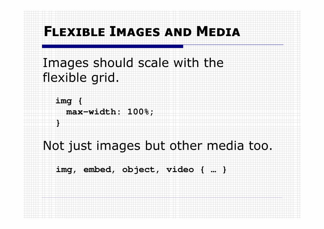
Flexible Images and Media
Images should scale with the flexible grid.
img {
max-width: 100%;
}
Not just images but other media too.
img, embed, object, video { … }

Media Queries
Content-based break-points.
Despite the fluid grid, the design will eventually fail � but …
@media screen and (min-width: 841px) {
… } /* 841 or larger */
@media screen and (max-width: 480px) {
… } /* 480 or smaller */

Another Definition
“Our understanding of ‘responsive design’should be broadened to cover any
approach that delivers elegant visual experiences regardless of the size of the user’s display and the limitations or
capabilities of the device.”
Jeffrey Zeldman 06/07/2011

Adaptive Web Design
� Fixed layouts and image sizes.
� Pros and Cons.
“An advantage of a responsive approach is that, regardless of what
the break points are, things will generally work _in between_ them”.
Dan Cederholm 29/12/2011

FAQ
�What is the relationship between Responsive Web Design and designing for a mobile user?
�When should we start making our designs responsive?
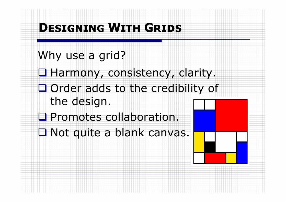
Designing With Grids
� Harmony, consistency, clarity.
� Order adds to the credibility of the design.
� Promotes collaboration.
� Not quite a blank canvas.
Why use a grid?

Grid Systems for the Web
� Design tool
� Column based
� CSS framework
� e.g. 960gs
960 grid system: http://960.gs/ by Nathan Smith

The 960 Grid System
� Available as a Drupal base theme
� CSS framework for template files
� 12 or 16 columns, fixed 960px
� Container classes - .container-12
� Grid classes - .grid-4
960 base theme: http://drupal.org/project/ninesixty

Sample Wireframe
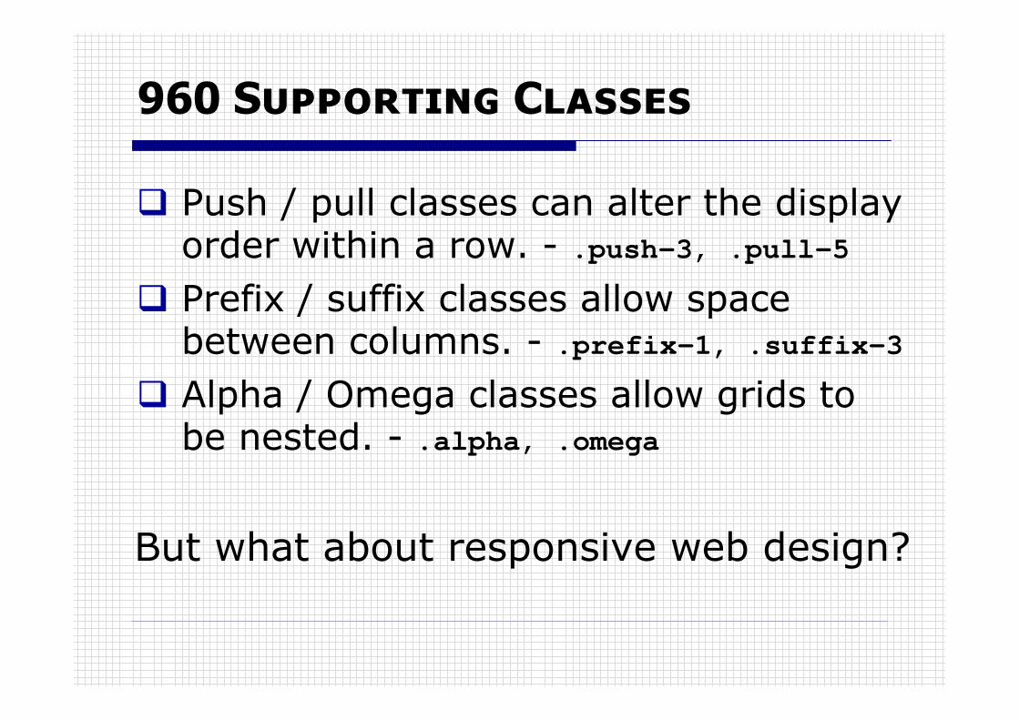
960 Supporting Classes
� Push / pull classes can alter the display order within a row. - .push-3, .pull-5
� Prefix / suffix classes allow space between columns. - .prefix-1, .suffix-3
� Alpha / Omega classes allow grids to be nested. - .alpha, .omega
But what about responsive web design?
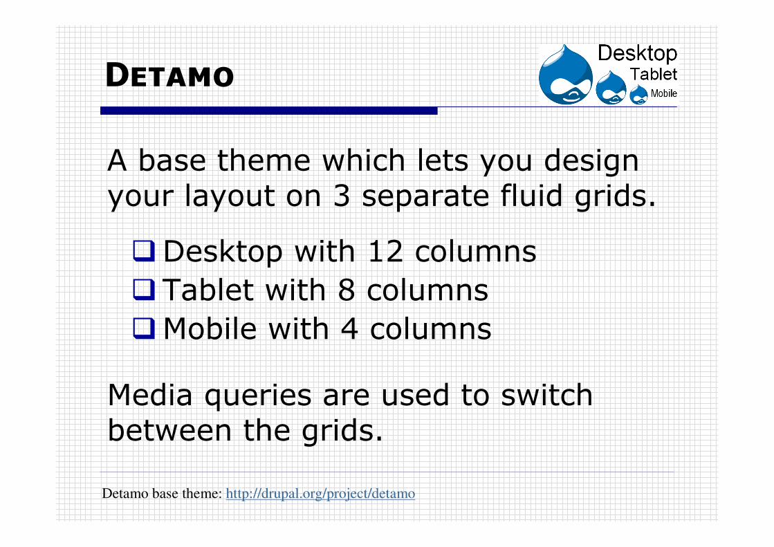
Detamo
�Desktop with 12 columns
�Tablet with 8 columns
�Mobile with 4 columns
A base theme which lets you design your layout on 3 separate fluid grids.
Media queries are used to switch between the grids.
Detamo base theme: http://drupal.org/project/detamo

The 3 Grids
All columns are 60px with 10pxgutters on each side.
Nominal sizes• 960px• 640px• 320px

Desktop Wireframe

Tablet Wireframe
or

Mobile Wireframe

The CSS
.mobile-1 .mobile-2 … .mobile-4
.tablet-1 .tablet-2 … .tablet-8
.desktop-1 .desktop-2 … .desktop-12
.tablet-1 { width: 9.375%; }
Container classes.full{
…
} /*centres content and sets fluid width*/
Grid classes

Supporting Classes
Push and pull
Prefix and suffix
Hiding
.tablet-push-4 {left: 50%;}
.desktop-pull-1 {left: -8.33333%;}
.tablet-prefix-1 {padding-left: 12.5%;}
.desktop-suffix-6 {padding-right: 50%;}
.tablet-hidden {display: none !important;}
.mobile-hidden {display: none !important;}

Nested Grid Classes
.mobile-2-of-4
.tablet-3-of-6
.desktop-5-of-8
.tablet-2-of-8 {
margin-left: 1.6129%;
margin-right: 1.6129%;
width: 22.5806452%;
}
/* Removes margins as 960 */
.desktop-alpha
.tablet-omega

The HTML
…
<div id="sidebar-left"
class="desktop-3 tablet-4 mobile-4">
<?php print render($page['sidebar_first']);?>
</div>
…
Only one grid is active at any time.
Your page.tpl.php might have…

What about?
� Feature phones
� Internet Explorer

An Example
Take an existing 960 based theme.
Domicile theme: http://drupal.org/project/domicile by emmajane

Replace Grid Classes
Demo site: http://bit.ly/tSgUDQ

Add Tablet Classes
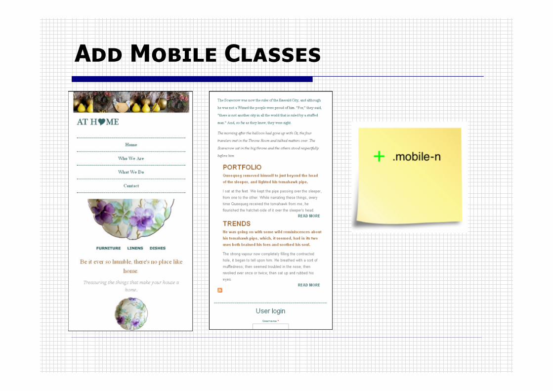
Add Mobile Classes

Finish Off
� Troubleshoot layout
� Tweak CSS as required
And that’s all there is to do to makea fixed width layout responsive.

Finally
Any Questions?
Tim Davison@knaboboy