wired magazine - university of minnesota duluthrost0039/art3907_02_pagelayout.pdf · wired magazine...
TRANSCRIPT

WIRED magazine
whattheyare/whattheycouldbe
audience: theaveragereaderofWIREDmagazineis: /betweentheagesof30–50 /hasanincomeof75,000orgreater /worksinthecomputerorhightechindustry
history: WIREDmagazinehasbeeninproductionsince 1989.thecontentandreadershipofthemagazine startedasmainlyconcernedwiththecomputing industrybuthassincechangedtobroadertechnology topics.theyhavemaintainedthesameoveralldesignbut...
competition:MacWorld,PCMagazine,Science.Mostcompetitionis ismorecomputerorscience-relatedandnotasdesign aware.thereis nodirectcompetitionintermsthebreadth oftopicscovered.
positioning: thegoalofthisredesignistoincreasereadership bothinnumbersandinscope.asnotedabove, currentlythereadershipsisbetweentheagesof 30and50,withreader’saverageincomeat75,000. thegoalistoattractmorereadersbetweentheages of20–30withtheincomestartingat30,000.

Wired’s banner is made up of blocks of black and white space using the typeface ... they ...
Wired uses mainly photography on their front cover that either parodies their main article or refers to products they review.
The main typeface used for the front cover is Hoefler Bold, Roman and Italic. They focus on building a hierarchy of main feature, and other departments and features of interest.The text is right and left justified, dependent on the side displayed.
other parts of cover: date/issue done in the typeface ..., periodic graphic references to issue and additional features.
attributes/current:
whattheyare
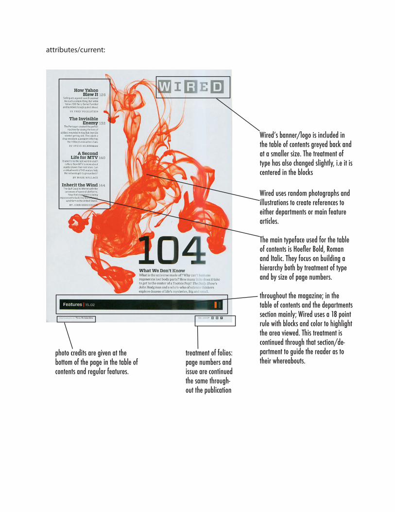
Wired’s banner/logo is included in the table of contents greyed back and at a smaller size. The treatment of type has also changed slightly, i.e it is centered in the blocks
Wired uses random photographs and illustrations to create references to either departments or main feature articles.
The main typeface used for the table of contents is Hoefler Bold, Roman and Italic. They focus on building a hierarchy both by treatment of type and by size of page numbers.
throughout the magazine; in the table of contents and the departments section mainly; Wired uses a 18 point rule with blocks and color to highlight the area viewed. This treatment is continued through that section/de-partment to guide the reader as to their whereabouts.
photo credits are given at the bottom of the page in the table of contents and regular features.
treatment of folios: page numbers and issue are continued the same through-out the publication
attributes/current:
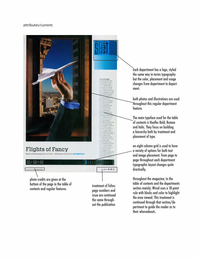
Each department has a logo, styled the same way in terms typography but the color, placement and usage changes from department to depart-ment.
both photos and illustrations are used throughout this regular department feature.
The main typeface used for the table of contents is Hoefler Bold, Roman and Italic. They focus on building a hierarchy both by treatment and placement of type.
an eight column grid is used to have a variety of options for both text and image placement. from page to page throughout each department typographic layout changes quite drastically.
throughout the magazine; in the table of contents and the departments section mainly; Wired uses a 18 point rule with blocks and color to highlight the area viewed. This treatment is continued through that section/de-partment to guide the reader as to their whereabouts.
photo credits are given at the bottom of the page in the table of contents and regular features.
treatment of folios: page numbers and issue are continued the same through-out the publication
attributes/current:
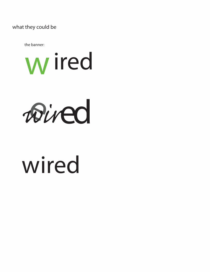
wwhattheycouldbe
thebanner:
ired
e edwirwired

whattheycouldbe
thelayouts:squareformat:thecover
wire
d
otherpiecestoincludeinpresentation:
conceptsforlayoutsofallareas:cover,spine,masthead,tableofcontents,regularfeature,edito-rialcontent
magazineformat:overallsize,papertype(i.e.matteorglossy,#s,color),pagecount
generaltypographicspecifics:typechoices,styl-ings,sizes,spacing(tracking,kerningandleading)andstylesforbodycopy,headers,folios,runningheads,pagenumbers,photocredits,etc.
colorusage:oncoverandinsidepagesforbars,images,type,etc.
insidebannertreatementandsecondarylogode-velopment:i.e.forregularfeatures/departments
illustration/photographictreatment
02 | 07 2007 29

Atadistance,thesecolorfulmasterpieceslooklikevibratingmandalas.Upclose,yourealizeeachburstofhueisatinybindi,thedecorativedotsmanyIndianwomenwearovertheirthird-eyechakratoinvokefocusanddevotion.ArtistStacyGreenebuysrawma-terialsforherpointillistcollagesinHindu-populatedneighborhoodsinNewYorkandhasfriendsbringbackmorefromIndia.
10/12x18
bindi pop art
whatareweconcernedwith:
1.evennessofcolor:designoftype,spacingbetweenletters,spacingbetweenwords,spacingbetweenlines.kerning,tracking,leading
2.linelength(66characteror40to50formultiplecolumn,12-15formarginalnotes)
3.Toolittlekerningispreferabletotoomuch
4.leading:distanceofonebase-linetothenext
5.indents,paragraphspacing
Whatdoyouwanttoavoid:
hyphenationruleswidows,orphans

settingupthepage:1.decideonpagedimensions:seeBringhurstpages146-149(fourthandfifthmostcommonchosenandforprinterpurposes)
2.decideontypearea:howmuchspacedoesthetypeuse.whatarethemargins
3.setupcolumns:figureouttotalpicadimen-sions;6picaperinchandusecharton149asperyourtotalsize.thisincludessizeofcolumnsandguttersize.soIhave45px60p
40ptotalcolumn+5p/4columns=1p3=8pcol-umnwidthwitha1p3gutter
4.Depthofgridfields:separatingcolumnsintofieldshorizontally.taketotaldepth(10inor60pica),divideevenly(modularstructure)orwithaproportionalgraduatedstructure(10horizontalfieldsof8por9,12,15,18,21)
56/8=7gridfields+4p/6=8ptperspacebtwngridfields/betweenillustrations
fourth/3:41:1.3339x12
textblockis7.5x10
topmargin.5outside1inside.5bottom1.5
5columnsof8px60psplitwithagutterof1p3