winners book - transform magazine
TRANSCRIPT

1
WINNERS BOOK

2

3
TYPE
Best brand development project to reflect a changed mission, values or positioning Best brand consolidationBest rebrand of a digital property
SECTOR
Best visual identity from the education sectorBest visual identity from the energy and utilities sector Best visual identity from the engineering and manufacturing sector Best visual identity from the financial services sectorBest visual identity from the FMCG sector Best visual identity from the food and beverage sector Best visual identity from the healthcare and pharmaceuticals sector Best visual identity from the industrial and basic materials sector Best visual identity from the lifestyle and wellbeing sector Best visual identity from the professional services sector Best visual identity from the property, construction and facilities management sectorBest visual identity from the public sectorBest visual identity from the retail sectorBest visual identity from the sports, travel, leisure and tourism sector Best visual identity from the technology, media and telecommunications sectorBest visual identity from the transport and logistics sector
Best overall visual identity
Grand prix
The challenges of the past year have been great as companies of all sizes have worked to mitigate the impact of the Covid-19 pandemic. That’s why this year’s Transform Awards winners are incredibly deserving of their recognition. They have championed communications, design and strategic brand development in the most difficult of landscapes.
And they have achieved great things. Our judges were amazed by the work crafted by the likes of Volkswagen, Tencent Music Entertainment, Mindfront, Walmart, Hangho Land, Boke and many more. They were impressed with the quality of the design work as well as the thoroughness and effectiveness of the strategic processes.
Each and every one of this year’s Transform Awards winners is helping to set the standard for excellence in rebranding and brand development. I’m proud to share the winners of the Transform Awards. Congratulations to every winner. Your success is well and truly deserved.
Welcome
JudgesWinners
CONTENT
Best use of a visual property Best brand architecture solutionBest use of copy style or tone of voice Best brand experience Best use of packagingBest wayfinding or signageBest use of audio brandBest use of typographyBest place or nation brand
PROCESS
Best external stakeholder relations during a brand development project Best internal communication during a brand development project Best implementation of a brand development project Best localisation of an international brand
STRATEGY
Best creative strategy Best brand evolution Best strategic or creative development of a new brand Best development of a new brand within an existing brand portfolio Best naming strategy
48
101112141516161717
18
18
20
21
222324
25
26
27
2829
303132
32333435
36
36
37
38
404142
44
45
46
48
Brittany GolobEditor in chief, Transform magazine

4
THE JUDGES
Niamh Byrne Former head of marketing Citi
Niamh is an international marketer with experience in the mobile telecom and technology sectors. She joined Citi as head of regional customer and digital experience in 2015, with responsibility for the overall customer experience in 18 markets across APAC and EMEA. Niamh’s focus was on building a customer-first, mobile-first culture, delivering personalised, consistent and compelling omnichannel customer experiences across all markets, with a particular focus on building a new mobile experience.
Vickie Chiu Brand director, Asia-Pacific JLL
Vickie is the brand director for Asia-Pacific at JLL where she led the strategy for JLL’s award-winning brand campaign, ‘Stories of Ambition.’ Overseeing 14 markets, she is a regional authority on brand excellence and creative copy. With over 12 years of experience in brand, marketing and communications, she has worked in the education, architecture and construction sectors. Prior to joining JLL in 2016, she was head of marketing at ISG in London.
Claudia Cristovao Head of brand studio, Asia-Pacific Google
Claudia has over 20 years of experience in brand management and creative direction. She started her career at Wieden + Kennedy before becoming creative director of Montreal-based Sid Lee. She then held creative director roles at Beacon Leo Burnett and AKQA. Now, Claudia is head of the brand studio at Google where she oversees the company’s creative work across the Asia-Pacific region.
Michael Friedberg Head of commercial marketing/ market strategy IBM Digital Business Group
With almost 20 years of experience in marketing, primarily focused on the tech sector, Michael has seen a huge amount of change. His roles have reflected the challenges that customers face as they digitally transform to meet the ever demanding needs of their customers, patients and citizens. Michael runs two teams. One identifies the needs of the market and designs marketing programmes that deliver a world-class client experience and the other allow sellers to use data analytics, digital and social tools, and digital content.
Mohammad Fauzi Group creative director Sedgewick Richardson
Mohammad is a brand designer with experience in corporate graphics, brand identity, environmental design and digital. He has built brands locally and across the Asia-Pacific region in a wide variety of sectors. Mohammad’s approach to brand design is a strategic one, often driving the discovery of unique solutions to multidisciplinary design problems. Sitting at the helm of Sedgwick Richardson SEA’s creative team, he oversees branding projects for Singapore’s blue-chip corporate brands.
Kirsten Johnston CEO JWDK
With over 20 years of experience, Kirsten continues to bring value to business through effective strategy and design. Originally trained in graphic design, Kirsten has worked across six nations and founded brand design agency JWDK in London in 2003. She successfully expanded her firm to China in 2014 and now resides in Shanghai, serving international clients as well as Chinese property developers and state-owned entities. Kirsten holds an international MBA and is chair of the marketing focus group at the British Chamber of Commerce Shanghai.

5
THE JUDGES
Kris C.Y. Leung Associate director, corporate communications and client relations Vigers Group
Kris is responsible for corporate communications, marketing, research and client relationship management in a surveyor firm headquartered in Hong Kong. He has worked in marketing for over 10 years, following graduation from Northumbria University. Throughout his career, Kris has been responsible for developing brands and improving their relationships with the public. Kris is a member of the Chartered Institute of Marketing and the Hong Kong Public Relations Professionals’ Association.
Hillman Lam General manager trip.com
Hillman is the general manager for Trip.com, Hong Kong and Taiwan, a member of Ctrip International Ltd. Prior to Trip.com, he accumulated marketing experience with Zuji, Plaza Premium Lounge and Hong Kong Airlines. Hillman has built an extensive network across the media and travel industries, honing his expertise in marketing, partnerships and business development. His unique insight of travel, combined with his experience in e-commerce, drives his focus on delivering innovative, customer-driven solutions.
Eric Leong Global brand marketing director GP Batteries
As global brand marketing director of GP Batteries, Eric Leong is responsible for overseeing the branding and marketing communications of one of the world’s leading battery makers across key markets, including Europe, the Americas and Asia. Prior to joining GP Batteries, Eric worked in the travel and hospitality sector at Genting Cruise Lines and has extensive advertising and strategy experience in agencies across the region including Hong Kong, Singapore and his native Australia.
Kalle Siebring General manager, communications, Asia & Oceania Nissan Motor Company
Kalle has 15 years of cross-cultural experience in communications management, change management, public relations, B2B marketing, corporate and crisis communications, internal communications, storytelling, training, online communications and branding. He has worked across multiple sectors in Europe and Asia. Kalle is currently responsible for reputation management, communications strategy, employee communications and budgeting across 20 plus markets in Asia-Pacific at Nissan.

6
THE JUDGES
Fiona Tin Senior marketing manager, fragrance and beauty products division Chanel Hong Kong and Macau
Fiona joined Chanel as marketing lead of the fragrance and beauty products division in Hong Kong and Macau in 2020. She has over 20 years of experience in advertising, beauty, jewellery and luxury watches. Before Chanel, Fiona led the marketing and communications department in the global head office of TimeVallée. Prior to that, Fiona was the brand marketing director for Pandora Jewellery Asia-Pacific. Under her leadership, the brand achieved the highest level of awareness in Hong Kong and Singapore.
Pallas Yang Regional PR lead, Greater China Booking.com
Pallas has over 18 years of experience in corporate communication, brand marketing and PR. She has a deep understanding of the Chinese market and its consumers, which she has brought to her work in brand marketing and corporate communications within the TMT, FMCG and retail sectors. At Booking.com, she manages the company’s ambitious plans for China by overseeing its PR and content communications. Pallas has previous experience at JD.com, Tencent and in agencies Ogilvy and FleishmanHillard.
Siew Ting Foo Vice president and global head of marketing strategy and planning, print category HP
Siew Ting is an experienced global marketing and communications leader. At HP, she leads a team focused on innovative marketing, data-driven communications and growth strategies. Siew Ting has over 20 years of consumer marketing experience, where she has developed global brands through leadership of cross-cultural teams and the implementation of insightful and ambitious brand strategies.

7
We believe in Creative Retail
Great retail born from Greater Stories
We create impactful brand experiences through the power of Storytelling.
FOLLOW US ON WECHAT
Altaviachina
in Altavia china

8
THE WINNERS
CONTENT
Best use of a visual propertyGold – Volkswagen Group China and MetaDesign China LimitedSilver – Tencent Music Entertainment Group and SuperunionBronze – Mindfront and FutureBrand ChinaBronze – The Coca-Cola Company and LabbrandHighly commended – Sealy Australia and Traffic
Best brand architecture solutionGold – Varuna Group and BOD ConsultingSilver – Shui On Work X and Labbrand
Best use of copy style or tone of voice Gold – Crocs and LabbrandSilver – Hoi An South Development and PurpleAsia
Best brand experience Gold – AXA and ProphetSilver – Nike (Japan) and AKQABronze – Coronation and Handle BrandingBronze – First Sentier Investors and THEREHighly commended – Volkswagen Group China and MetaDesign China Limited
Best use of packaging Gold – Blu and Sedgwick RichardsonSilver – Kotex Pawket and Chi-MuBronze – The Coca-Cola Company and LabbrandHighly commended – Enoulite and SuperunionHighly commended – Mars Food and ShinyBay
Best wayfinding or signage Silver – The Star Entertainment Group and THERE
Best use of audio brand Gold – Petronas with Dragon Rouge and Sixième SonSilver – SPD Bank and MetaThink Consultancy
Best use of typographyGold – JEN by Shangri-La and Design Bridge
Best place or nation brand Gold – By The Bay and Sedgwick Richardson
PROCESS
Best external stakeholder relations during a brand development projectGold – Bayer Elevit and Ylab
Best internal communication during a brand development projectGold – Volkswagen Group China and MetaDesign China LimitedSilver – Great Eagle Holdings Limited
Best implementation of a brand development project Gold – Mindfront and FutureBrand ChinaSilver – Volkswagen Group China and MetaDesign China LimitedBronze – Yinlu and YlabHighly commended – Beijing FANUC and Superunion
Best localisation of an international brand Gold – Walmart and ProphetSilver – Nestlé and YlabSilver – Volkswagen Group China and MetaDesign China LimitedBronze – BE-KIND and Creative Capital China
STRATEGY
Best creative strategy Gold – BOKE and JWDKSilver – Enoulite and SuperunionSilver – Tencent Music Entertainment and SuperunionBronze – HTX and Sedgwick RichardsonHighly commended – Labbrand Group and LabbrandHighly commended – Walmart and Prophet
Best brand evolutionGold – Tencent Music Entertainment Group and SuperunionSilver – Mobvista and FutureBrand ChinaSilver – Volkswagen Group China and MetaDesign China LimitedBronze – Coherent and MerchantCantosBronze – Toongabbie Christian College and Handle BrandingHighly commended – Mars Food and ShinyBay
Best strategic or creative development of a new brandGold – By The Bay and Sedgwick RichardsonSilver – Coronation and Handle BrandingSilver – Nestlé and YlabBronze – Hangho Land (Xiamen) Co., Ltd. and JWDKHighly commended – Plaza Premium Group
Best development of a new brand within an existing brand portfolio Gold – Mobvista and FutureBrand ChinaSilver – Lenskart and Brand Provoke ConsultantsBronze – Hormel and Creative CapitalBronze – Nanoco and PurpleAsiaHighly commended – VOYAH Automobile Technology Company and LabbrandHighly commended – HerO and MetaThink Consultancy
Best naming strategy Gold – Hangho Land (Xiamen) Co., Ltd and JWDKSilver – VOYAH Automobile Technology Company and LabbrandSilver – Nespresso and LabbrandBronze – Mindfront and FutureBrand ChinaHighly commended – NesQino and Labbrand

9
THE WINNERS
TYPE
Best brand development project to reflect changed mission, values or positioningGold – MB Bank and ProphetSilver – BOKE and JWDKBronze – Kexing Biopharm and MetaThink ConsultancyHighly commended – LYNK Global and Studio EverywhereHighly commended – Volkswagen Group China and MetaDesign China Limited
Best brand consolidationGold – Mobvista and FutureBrand ChinaSilver – Coronation and Handle Branding
Best rebrand of a digital propertySilver – SHUHE Group and Brandesse
SECTOR
Best visual identity from the education sector Gold – Athena Academy and Chi-MuSilver – Toongabbie Christian College and Handle Branding
Best visual identity from the energy and utilities sector Gold – Horizon Oil and THERESilver – Contemporary Amperex Technology Co and MetaThink Consultancy
Best visual identity from the engineering and manufacturing sector Gold – DVOYAH Automobile Technology Company and LabbrandSilver – BOE and Prophet
Best visual identity from the financial services sector Silver – AXA and Prophet
Best visual identity from the FMCG sector Gold – Blu and Sedgwick Richardson
Best visual identity from the food and beverage sector Gold – SUN ART Retail Group Limited and PinbrandSilver – Coronation and Handle BrandingBronze – Admiral Hotel Manila - MGallery and PurpleAsiaBronze –YAU and Design Bridge
Best visual identity from the healthcare and pharmaceuticals sector Gold – Mindfront and FutureBrand ChinaSilver – Kexing Biopharm and MetaThink ConsultancyBronze – Fazzdoc and Creative Capital Jakarta
Best visual identity from the industrial and basic materials sector Gold – Rheinmetall and LabbrandSilver – Beijing FANUC and Superunion
Best visual identity from the lifestyle and wellbeing sector Silver – MEUS NOVA and Room 1707
Best visual identity from the professional services sector Gold – Chapman Tripp and IcebergSilver – Coherent and MerchantCantosBronze – Labbrand Group and Labbrand
Best visual identity from the property, construction and facilities management sectorGold – By The Bay and Sedgwick RichardsonSilver – Zhangjiang Hi-Tech and MetaThink ConsultancyBronze – Hongqiao CMSK and JWDKHighly commended – Refico and PurpleAsia
Best visual identity from the public sector Gold – HTX and Sedgwick Richardson
Best visual identity from the retail sector Gold – Walmart and ProphetSilver – walk&rest and Hauns branding design and strategy ltdBronze – MEUS NOVA and Room 1707
Best visual identity from the sports, travel, leisure and tourism sector Gold – Hangho Land (Xiamen) Co., Ltd. and JWDKSilver – Ovolo Hotels and THERE Bronze – JEN by Shangri-La and Design BridgeHighly commended – Ticket Planet and Chi-Mu
Best visual identity from the technology, media and telecommunications sector Gold – Tencent Music Entertainment and SuperunionSilver – BOKE and JWDKBronze – Mobvista and FutureBrand ChinaHighly commended – HTX and Sedgwick Richardson
Best visual identity from the transport and logistics sector Gold – Varuna Group and BOD ConsultingGold – Volkswagen Group China and MetaDesign China LimitedSilver – Goodyear and Traffic
Best overall visual identityWinner – Tencent Music Entertainment and Superunion
Grand prixWinner – Volkswagen Group China and MetaDesign China Limited

10
Best use of a visual propertyGold – Volkswagen Group China and MetaDesign China LimitedAs part of its carbon-neutral strategy, Volkswagen Group introduced ID, its first range of all-electric vehicles. To support the new line, it worked with MetaDesign China on the implementation of a brand refresh across China, focusing on a young audience of urban dwellers. The biggest rebrand in the group’s history in China, the new approach marries a stripped back typography design with high-impact, high-saturation photography. The image strategy is designed to be human and authentic as it moves away from artificially composed images and toward a storytelling style. Also gone are outdated renderings of families and young professionals, bringing in a refreshing sense of credibility to the brand. Judges called this approach “visually stunning” because of its simplicity and impact.
Silver – Tencent Music Entertainment Group and SuperunionIn this competitive category, Tencent Music Entertainment Group made waves with its rebrand. Superunion introduced a new visual identity that featured a logo that is well on its way to becoming a national icon. “Modern and stunning,” said one judge of the versatile visual strategy.
Bronze – Mindfront and FutureBrand ChinaWith audiences in Australia and China, Mindfront needed a consistent approach that could also be tailored to the needs of its regions. It worked with FutureBrand on a black-and-white image style that offered coherence, while allowing different subjects, crops and layouts to localise the brand. Judges praised the simplicity of this approach in the face of a difficult challenge.
Bronze – The Coca-Cola Company and LabbrandIn support of the Porsche Carrera Cup Asia, Coca-Cola and Labbrand introduced an on-pack celebration of the Porsche 911. The spirit of auto racing is delivered effectively in the Coca-Cola visual style. Judges were impressed with the way the two brands were integrated without sacrificing either company’s brand equity.
CONTENT
Highly commended – Sealy Australia and Traffic

11
Gold – Varuna Group and BOD ConsultingVaruna Group’s expansion from logistics into supply chain consulting and warehouse services required the brand to refocus on its architecture. It had to build credibility among its new audiences. To do so, it worked with BOD Consulting on a rebrand that moved away from the focus on logistics and toward a more integrated supply chain management approach. The visual identity was updated, introducing an ownable icon that serves as the visual link across the brand architecture. By altering the colour of the icon, Varuna Group’s subdivisions each have their own identity, while retaining connections to the masterbrand. “A smart consolidation of business under a new modern identity,” said one judge praising the way the brand rose to the considerable challenge.
Silver – Shui On Work X and LabbrandCommercial property developer Shui On Land worked with Labbrand on a comprehensive rebrand that introduced a new copy style, brand architecture, positioning and strapline. Judges thought the approach made for Shui on Land into a much more memorable organisation.
Best brand architecture solution

12
Gold – Crocs and LabbrandCrocs wanted to localise its global strapline, ‘Come as you are,’ to build stronger emotional connections with Chinese consumers. Rather than simply translating the positioning, it carried out extensive research into the footwear landscape in China. It compared those findings to the copy style employed by major FMCG and retail brands and interpreted its own positioning by transcreating it into Chinese. Working with Labbrand throughout the project, Crocs was able to better engage with the Chinese market. It then used the keywords ‘comfort,’ ‘ease’ and ‘freedom’ to inform its visual style and copy strategy. The result is a brand strategy truly driven by the tone of voice. One judge called it a “good articulation of the brand spirit,” with another praising the creation of a style specific to China.
Silver – Hoi An South Development and PurpleAsiaThe Hoiana Hotel in Vietnam worked with PurpleAsia on a deft, clever copy style that uses an ‘x’ device to juxtapose two ideas across the visual identity. ‘Sweet x sour’ and ‘rain x shine’ are just two of the messages deployed across the brand’s touchpoints. Judges loved this elegant solution, particularly in its simple, luxurious applications.
CONTENT
Best use of copy style or tone of voice

13

14
CONTENT
Gold – AXA and ProphetAxa wanted to transform its relationship with customers from simply paying out claims to being a partner in insurance. To do so, it needed to humanise its brand. And there was no better way to do that then by putting a human face on the company. Thus, Emma was born. The digital assistant is more than just a Q&A function. Emma has been designed by Prophet to transform the Axa experience. Emma operates across the user journey, communicating with customers and engaging them with their insurance options and coverage. This seamlessly transitioned the company from transactional to relationship-based. One judge praised the “very thorough and well-built strategy,” while another said, “This is a really insightful execution that is hugely empathetic toward the user experience.”
Silver – Nike (Japan) and AKQANike Japan translated a strong customer base into a digital community of magazine contributors with the support of AKQA. Designed to capitalise on the popularity and brand love for its Air Max shoe, Nike capitalised on the creativity of its community and printed a VR-enabled magazine for distribution across its Japanese portfolio. Judges thought this approach was on-brand and perfect executed during the pandemic.
Best brand experience
Bronze – Coronation and Handle BrandingSupporting the redevelopment of the Paper Mill into a premier destination for food and drink in western Sydney, the Paper Mill Food worked with Handle Branding on the delivery of a versatile brand that capitalised on the food hall experience to bring consistency, personality and verve to the brand. One judge’s praise rang out simply, “Clean, classy and connected.”
Bronze – First Sentier Investors and THEREGlobal asset management firm First Sentier Investors used its relocation to create an better working environment. There’s approach focused on transience and imperfection, delivered in an elegant, clean way. “The simplicity and elegance behind it is outstanding,” praised one judge.
Highly commended – Volkswagen Group China and MetaDesign China Limited

15
CONTENT
Gold – Blu and Sedgwick RichardsonSats’ food division achieved the unthinkable. It transformed the simple commodity of bottled water into a brand expression and premium experience. Blu water is an in-flight brand that previously had a wide range of inconsistent packaging styles and design expressions. Sedgwick Richardson decided to leave the old, ineffectual brand in the past, carrying forward only the name ‘Blu.’It built sustainability, health, delight and practicality into the packaging design. Focusing on the idea of ‘simply pure,’ the new visual identity is uncluttered. The ‘B’ in the wordmark ends in a single drop of water, delivering an ownable asset to the brand. The new, sustainable packs are versatile enough to work across the range of in-flight settings, but consistent in their design style and use of materials. It’s a brilliant update that transformed Blu from an ignored add-on to a premium brand in its own right.
Silver – Kotex Pawket and Chi-MuKotex worked with Chi-Mu to develop its Pawket sub-brand of pocket-sized sanitary pads. The image of a cat’s paw is rendered across the range, allowing for cute, happy social media content and on-pack messaging. Kotex Vietnam adopted the Packet branding on the basis of its success in China. Judges praised the way Kotex engaged its customers in a fun, creative way.
Bronze – The Coca-Cola Company and LabbrandCoca-Cola and Labbrand collaborated on a collectible pack as a tie-in to the Porsche Carrera Cup Asia. The packaging renders Porsche’s 911 assets and auto racing visual cues in Coca-Cola’s iconic style. It’s a laudable creative approach that harnesses the best of both brand’s assets. “Nicely done!” added one judge.
Best use of packaging
Highly commended – Enoulite and SuperunionHighly commended – Mars Food and ShinyBay

16
CONTENT
Best wayfinding or signage
Gold – Petronas with Dragon Rouge and Sixième SonMalaysia’s national oil and gas company, Petronas, needed to harness its brand around the concept of progress. To engage its large employee base, it turned to Dragon Rouge and Sixième Son for support in the development of a new audio brand. Because the brand’s operations had expanded, it required an audio brand that could flex across multiple media, partnerships and formats. Together, Dragon Rouge and Sixième Son developed an audio brand strategy around the concepts of ‘progress,’ ‘passion’ and ‘optimistic spirit.’ By cohesively approaching the brand development, the audio was married seamlessly to the visual strategy, resulting in a stronger brand. Judges praised this collaborative approach as it delivered a brand that is consistent and could capitalise on all of Petronas’ communications.
Best use of audio brand
Silver – SPD Bank and MetaThink ConsultancyTo support the shift to digital banking, SPD Bank worked with MetaThink Consulting on an audio brand that would bring a sense of vitality and energy to the company. Judges thought this approach helped SPD put digital at the heart of its communications to great effect.
Silver – The Star Entertainment Group and THEREThe Star Sydney’s brand update was designed to create a more accessible resort that delivers a more enjoyable experience to visitors. There crafted the wayfinding system based on a series of animated totems placed around the venue. It also streamlined the signage, including simplified metro-style maps and limited written content to improve accessibility for non-English speakers. The new style is not only simpler, it is delivered in keeping with the visual identity and lends a more elegant feel to the Star’s wayfinding.
17
CONTENT
Best use of typography
Best place or nation brand
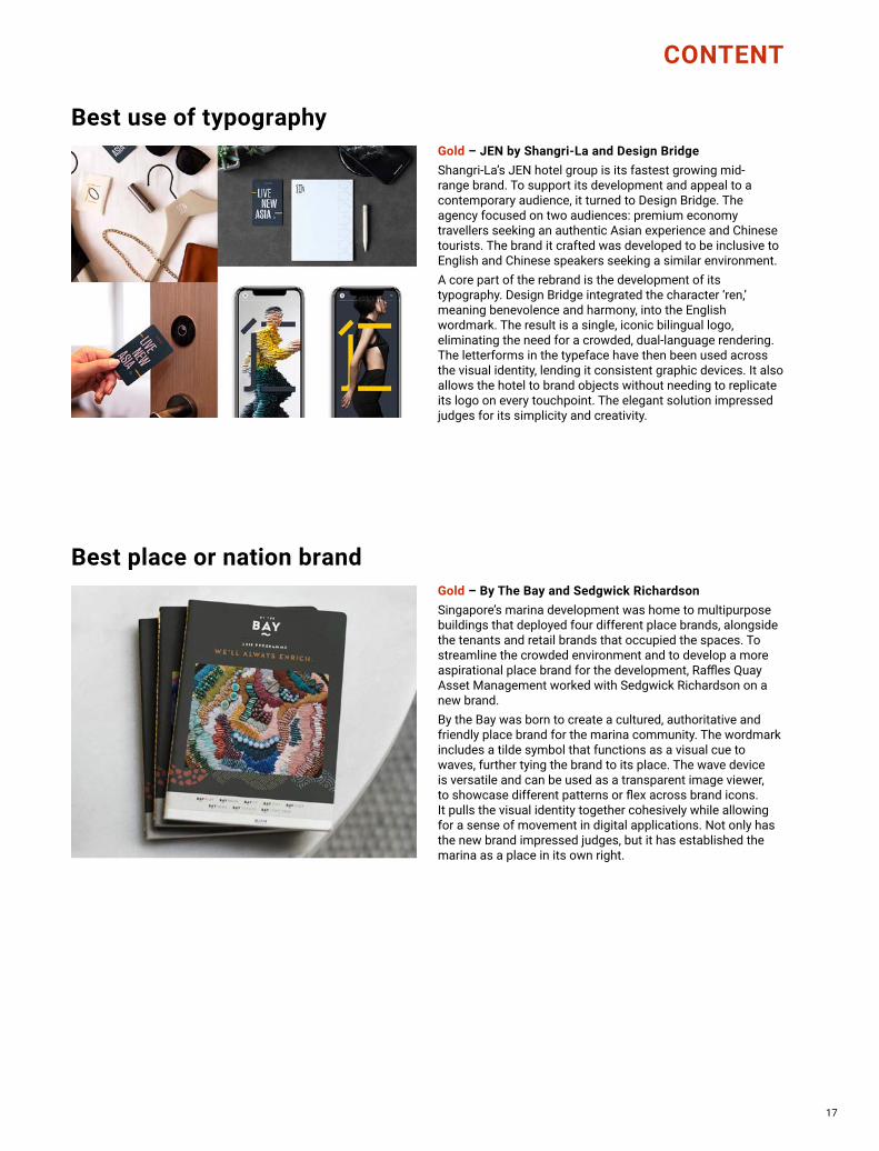
Gold – JEN by Shangri-La and Design BridgeShangri-La’s JEN hotel group is its fastest growing mid-range brand. To support its development and appeal to a contemporary audience, it turned to Design Bridge. The agency focused on two audiences: premium economy travellers seeking an authentic Asian experience and Chinese tourists. The brand it crafted was developed to be inclusive to English and Chinese speakers seeking a similar environment.A core part of the rebrand is the development of its typography. Design Bridge integrated the character ‘ren,’ meaning benevolence and harmony, into the English wordmark. The result is a single, iconic bilingual logo, eliminating the need for a crowded, dual-language rendering. The letterforms in the typeface have then been used across the visual identity, lending it consistent graphic devices. It also allows the hotel to brand objects without needing to replicate its logo on every touchpoint. The elegant solution impressed judges for its simplicity and creativity.
Gold – By The Bay and Sedgwick RichardsonSingapore’s marina development was home to multipurpose buildings that deployed four different place brands, alongside the tenants and retail brands that occupied the spaces. To streamline the crowded environment and to develop a more aspirational place brand for the development, Raffles Quay Asset Management worked with Sedgwick Richardson on a new brand. By the Bay was born to create a cultured, authoritative and friendly place brand for the marina community. The wordmark includes a tilde symbol that functions as a visual cue to waves, further tying the brand to its place. The wave device is versatile and can be used as a transparent image viewer, to showcase different patterns or flex across brand icons. It pulls the visual identity together cohesively while allowing for a sense of movement in digital applications. Not only has the new brand impressed judges, but it has established the marina as a place in its own right.

18
PROCESS
Gold – Bayer Elevit and YlabTo combat a lack of education and understanding around prenatal care and nutrition, Bayer redeveloped its Elevit brand. The prenatal vitamin brand prioritises the health of mothers and their babies. But, it needed to better communicate its value to Chinese consumers. It worked with Ylab to launch a campaign designed to ‘Give every baby a great start,’ particularly in China’s smaller cities. With a slew of public events, influencer engagements, media partners and in-store applications, Elevit raised awareness around the causes of birth defects and the things mothers can do to combat them. The Elevit visual identity was broadened to include the ‘9.12 defect-free baby plan’ communications. As a result, sales increased massively, thereby ensuring better nutrition for mothers and their babies.
Silver – Great Eagle Holdings LimitedThrough the redesign of its office environment, Great Eagle Holdings engaged its staff in a six-month internal communications campaign. The strategy delivered better awareness of the transformation, more positive sentiment levels and a better working culture.
Best external stakeholder relations during a brand development project
Best internal communication during a brand development projectGold – Volkswagen Group China and MetaDesign China LimitedVolkswagen Group China’s launch of its first all-electric range, ID, required the brand to reconsider its visual strategy and positioning. It worked with MetaDesign on a rebrand that would better communicate with a young, modern audience. Throughout the process, it engaged its internal audience to ensure the rebrand would be embraced and implemented effectively. The extensive change management programme introduced the new visual identity, brand guidelines and purpose. Twenty-five training sessions and an employee roadshow were implemented to support the rollout of the new brand. Volkswagen also deployed a brand hotline to support employees through the change. The new brand has been successfully delivered, but the hard work Volkswagen put in to transform its business from the inside out will yield a stronger brand in the long term.

19
HOMESMILE
20
PROCESS
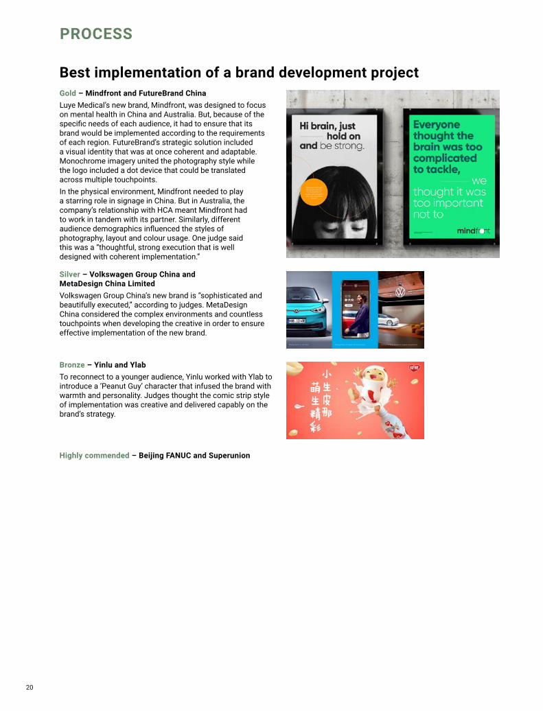
Gold – Mindfront and FutureBrand ChinaLuye Medical’s new brand, Mindfront, was designed to focus on mental health in China and Australia. But, because of the specific needs of each audience, it had to ensure that its brand would be implemented according to the requirements of each region. FutureBrand’s strategic solution included a visual identity that was at once coherent and adaptable. Monochrome imagery united the photography style while the logo included a dot device that could be translated across multiple touchpoints.In the physical environment, Mindfront needed to play a starring role in signage in China. But in Australia, the company’s relationship with HCA meant Mindfront had to work in tandem with its partner. Similarly, different audience demographics influenced the styles of photography, layout and colour usage. One judge said this was a “thoughtful, strong execution that is well designed with coherent implementation.”
Silver – Volkswagen Group China and MetaDesign China LimitedVolkswagen Group China’s new brand is “sophisticated and beautifully executed,” according to judges. MetaDesign China considered the complex environments and countless touchpoints when developing the creative in order to ensure effective implementation of the new brand.
Bronze – Yinlu and YlabTo reconnect to a younger audience, Yinlu worked with Ylab to introduce a ‘Peanut Guy’ character that infused the brand with warmth and personality. Judges thought the comic strip style of implementation was creative and delivered capably on the brand’s strategy.
Highly commended – Beijing FANUC and Superunion
Best implementation of a brand development project

21
Gold – Walmart and ProphetWalmart has had success in China, outcompeting other international hypermarket chains capably. But, it noticed that consumers across the country were more digitally savvy than Walmart customers outside of China. Walmart took a creative approach. It capitalised on the prominence of e-commerce without sacrificing the in-store experience. Prophet discovered that Walmart’s interiors were visually crowded and failed to capitalise on the products consumers preferred to select in-store, like fresh produce. It decided to take the brand back. A softer, branded, colour palette was introduced, revolutionising the feel of the shopping experience. It heroed produce and the pharmacy while visually linking to the e-commerce experience. Judges loved it. One said, “A highly well-thought through solution achieving one of the hardest things in retail: simplicity.”
Silver – Nestlé and YlabNestea had to make an impact with consumers in one of the countries from whence tea originated. To invigorate the Gen Z market across China, Nestea worked with Ylab on a social-first approach that integrated experiential and individualised elements to the brand. Judges praised Nestlé’s insights into its target audience.
Silver – Volkswagen Group China and MetaDesign China LimitedTo launch its electric ID range, Volkswagen Group China worked with MetaDesign China on a localised brand that would change perceptions of VW among young consumers. A new colour strategy and image style relied on high-saturation, vibrant graphics that depicted a more modern idea of consumers’ lifestyles than had previously been used.
Bronze – BE-KIND and Creative Capital ChinaBe-Kind worked with Creative Capital to maximise its existing strength in the Chinese market. It developed a Chinese New Year campaign, complete with gift packaging, social engagement and a more lifestyle-driven brand image.
Best localisation of an international brand
PROCESS

22
STRATEGY
Best creative strategyGold – BOKE and JWDKTo both reinforce its market-leading position in China and compete in the international gaming market, Boke needed to implement a corporate brand that would improve its reputation and increase brand awareness. It worked with JWDK on a strategy centred around ‘untamed freedom.’ The visual identity, which had long been derived from the company’s first game, Poker City, was rebuilt from the ground up. The resulting identity is clean and strong but still full of character. It establishes Boke as a masterbrand separate from individual games’ identities. The design is welcoming and visually rich, despite the simple red-and-white rendering. Judges loved the energy and craft that was put into the new brand. Its ability to stand on its own, and in collaboration with its gaming brands makes the introduction of a corporate brand a huge success.
Silver – Enoulite and SuperunionEnoulite’s architecture was reorganised around key physical milestones in the development of an infant, positioning the brand as central to a baby’s growth. Superunion used that ethos in clear packaging as well, simplifying the on-pack messaging and purchasing decision making process. Judges thought the impact this strategy made on the target audience was impressive.
Silver – Tencent Music Entertainment and SuperunionTencent Music Entertainment had a wide reach across China, but its brand failed to captivate imaginations and precluded growth. The group worked with Superunion to introduce a new brand that is well on its way to becoming an icon. The adaptable, immediately recognisable logo has strong ties to the company’s music roots and allows it to engage successfully in new endeavours.
Bronze – HTX and Sedgwick RichardsonSingapore’s security service, HTX needed to position Singapore as ‘the safest place on Earth.’ It worked with Sedgwick Richardson on a creative strategy inspired by technology, science, design and possibility. Judges thought the execution and purpose were exciting and resonated well with the target audience.
Highly commended – Labbrand Group and LabbrandHighly commended – Walmart and Prophet

23
Highly commended – Mars Food and ShinyBay
Gold – Tencent Music Entertainment Group and SuperunionThe best-known music streaming service in China, Tencent Music Entertainment’s brand was all but ignored. To have a stronger voice in the arts and entertainment landscape, the company turned to Superunion to redevelop its visual identity. Instead of relying on music industry tropes, the new brand was positioned around the power of music. It was designed to emphasise the immersive power of music, in all its glorious diversity.The resulting visual identity is immediately impactful, largely recognisable and well on its way to becoming iconic. It also has the ability to adapt and flex across different touchpoints and usage requirements. Particularly evocative is the way the ‘M’ can embrace different genres of music through changing visual treatments. “The new brand is outstanding and distinctive,” said one judge. “It talks to the target audience and is relevant to popular culture.”
Silver – Mobvista and FutureBrand ChinaMobvista’s creative approach to its brand architecture allowed its corporate brand to speak with a stronger voice without cannibalising any of its product brands. Judges thought this strategic approach, by Futurebrand, was excellent.
Silver – Volkswagen Group China and MetaDesign China LimitedVolkswagen China’s brand evolution – by MetaDesign – impressed judges across the board. Its image strategy positioned the company toward a different audience while also embracing its electric future. “Amazing creative and innovation,” said one judge. Another added, “A very clever execution.”
Bronze – Coherent and MerchantCantosInsurer Coherent needed a brand that would communicate its personality in a more creative, ownable way. MerchantCantos implemented a new strategy focusing on ‘igniting change.’ The new colour palette is striking, distinctive and unique. Judges were impressed with the clarity of messaging and the consistency of brand purpose between the old and new brands.
Bronze –Toongabbie Christian College and Handle BrandingTo better resonate in Australia’s competitive private school landscape, Toongabbie Christian College worked with Handle Branding on a brand evolution. Handle built a comprehensive brand, including a new wordmark, copy style, iconography system and typeface. Judges praised the thorough strategic process.
STRATEGY
Best brand evolution

24
Gold – By The Bay and Sedgwick RichardsonBy the Bay is visually impactful and has excellent adaptability. Its predecessor suffered from a confusing brand landscape. The property development on Singapore’s marina included multiuse spaces with retail and hospitality tenants rubbing shoulders with corporate offices and workplaces. In unifying the site visually, Sedgwick Richardson crafted a new place brand.Focusing the identity on a wave mark that allows for consistency across many implementations, Sedgwick Richardson transformed the area from a property development into a desirable location in its own right. “Building a community is a smart way of branding a commercial district,” said one judge. Another added, “The results are not only creatively outstanding, but work exceptionally well across multiple mediums.”
Silver – Coronation and Handle BrandingAustralia’s Paper Mill Food was designed to be a lifestyle-focused social food space in western Sydney. Handle Branding introduced a master brand system that communicates about the site’s history while also offering space for its individual food brands to grow. Judges thought the design was vibrant, beautiful and delivered on the creative strategy.
Silver – Nestlé and YlabCrafting a localised brand for Nestea in China, Nestle and Ylab focused on Generation Z consumers. Integrating the packaging design into the social strategy has enabled Nestea to embed itself within youth culture. Judges thought the approach to the target audience was commendable, reflected by the strong sales results.
Bronze – Hangho Land (Xiamen) Co., Ltd. and JWDKThe Lohkah Hotel & Spa in Xiamen takes a different approach to typical luxury resort branding. It uses a unique brown and red colour palette to great effect when implemented alongside individual images of food, drink and hospitality offerings. Judges thought the creative approach by JWDK was best in class in its execution and response to the brief.
Highly commended – Plaza Premium Group
STRATEGY
Best strategic or creative development of a new brand

25
Best development of a new brand within an existing brand portfolio
Highly commended – VOYAH Automobile Technology Company and LabbrandHighly commended – HerO and MetaThink Consultancy
Gold – Mobvista and FutureBrand ChinaMobile advertising brand Mobvista needed to redefine its group strategy and better care for its family of sub-brands. It turned to FutureBrand for the introduction of a new corporate brand and a new product brand, to replace Mobvista – which was once a product brand. Futurebrand upgraded Mobvista to masterbrand status, developing the brand architecture beneath it including Integral, GameAnalytics and new brand Nativex. This strategy allowed the company to speak to its broad audiences more effectively, without sacrificing any of the value of its product brands. The new visual identity integrates the corporate architecture with consistent wordmark design. However, individuality is retained through a flexible graphic device and unique product brand colours that align with the masterbrand. It is a seamless result that allows Mobvista a stronger base from which to grow.
Silver – Lenskart and Brand Provoke ConsultantsIntroducing a sense of fun into a clinical category, Lenskart worked with Brand Provoke on the Aqualens brand and positioning. Designed to be accessible, confident and approachable, the new identity is colourful and engaging while also meeting users needs with ease.
Bronze – Hormel and Creative CapitalResponding to the need to tell the brand’s story through its packaging, Creative Capital worked on a new strategy and packaging design for Hormel’s beef jerky range in China. The pack’s design and messaging is aligned to its digital channels, prompting lifestyle associations with the snack range.
Bronze – Nanoco and PurpleAsiaNanoco had to better engage with a B2B construction audience in response to the explosion in property developments across Vietnam. It worked with PurpleAsia on NanoHome, a sub-brand designed to address all home lighting needs. Appealing to both homeowners and the property trade, the new brand is simple, elegant and clearly communicative of its offer.
STRATEGY

26
STRATEGY
Best naming strategyGold – Hangho Land (Xiamen) Co., Ltd and JWDKPreviously known as the Pushang Hotel and Spa, Hangho Land’s resort in Xiamen was redeveloped to target a young, affluent audience of domestic tourists. The name – Lohkah – derives from the Sanskrit word ‘loka’ meaning ‘world, universe, dimension or plane of existence.’ JWDK thought this approach would resonate with those looking for a peaceful, luxury experience. The name was rendered only in Latin script to lend it a sense of international sophistication. Furthermore, the ‘O’ features a distinctive shape inspired by the Chinese character for sun (ri), which offers a clever wayfinding and communications device. The visual identity is delivered cleanly with a unique colour palette and distinctive use of imagery. Judges thought the naming strategy had an excellent rationale behind it and praised the easy-to-pronounce solution.
Silver – Nespresso and LabbrandTo localise the Nespresso brand to the Chinese audience, Labbrand developed the name Nong Yu Ka Fei. It’s an easy to understand solution for the local audience while also harking back to Nespresso’s coffee heritage. “A gutsy move,” said one judge, who also praised the bold strategy.
Silver – VOYAH Automobile Technology Company and LabbrandChinese brand Dongfeng Motor Corporation had to launch its electric vehicle brand to a local and international audience. It worked with Labbrand on Voyah, a name that evokes the idea of a voyage and uses yachting- and flight-inspired imagery to be brought to life. Judges thought this was a fantastic solution for a Chinese brand with global aspirations.
Bronze – Mindfront and FutureBrand ChinaFor Chinese and Australian healthcare provider Luye Medical, mental health services are becoming increasingly important. To support this area of care, it worked with FutureBrand on the introduction of Mindfront. The play on words reflects the phrase, ‘always front of mind.’ Judges called it audacious and clever with one praising the brand’s support for a growing community.
Highly commended – nesQino and Labbrand

27
TYPE
Gold – MB Bank and ProphetMB Bank, one of the largest financial groups in Vietnam, initiated a transformation programme in partnership with Prophet, to become a digital-first, customer-centric bank. To compete against foreign brands entering the Vietnamese market, MB Bank focused on simplifying its brand. Prophet created a digital-first strategy, putting the user experience at the heart of the brand’s positioning. This allowed it to use its clean UX design across all brand touchpoints. OOH advertising uses simple, friendly imagery alongside the brand’s colours, straightforward messaging and clever visual devices. Judges loved the approach to putting the customer experience first. “Not an easy industry,” said one judge, “But MB Bank seems to know what it is doing!”
Best brand development project to reflect a changed mission, values or positioning
Bronze – Kexing Biopharm and MetaThink ConsultancyTo refocus on its core purpose of creating pharmaceuticals, Kexing Biopharm worked with MetaThink on a rebrand. Moving away from a tired, inconsistent visual strategy, the new brand has a strong voice and clear guidelines for use across all brand touchpoints. Judges were impressed by the impactful change made through the rebrand.
Highly commended – LYNK Global and Studio EverywhereHighly commended – Volkswagen Group China and MetaDesign China Limited
Silver – BOKE and JWDKBoke’s corporate brand redevelopment by JWDK transforms the brand from a local gaming app to an international entertainment company. By crafting Boke into a quality masterbrand, using simple, engaging design, the new company is able to better compete in a competitive global market. One judge praised the “nice, energetic, coherent design.”

28
TYPE
Silver – Coronation and Handle BrandingBecause the Paper Mill Food was designed to play host to a number of food options under the same umbrella, its brand had to be both unifying and broad enough to flex across different sub-brands. Handle Branding’s elegant, clean approach is eye-catching and well-targeted to the key audience.
Best brand consolidationGold – Mobvista and FutureBrand ChinaMobvista needed clarity in its own structure in order to better communicate with its growing audience. FutureBrand developed a masterbrand strategy that would better organise the company’s hierarchy while introducing a stronger visual identity in the process. The result is a brand architecture system that heroes the Mobvista corporate brand, without cannibalising its subsidiary product brands. The company is united through the brands’ wordmark designs, but individualism is still inherent through the use of colour and graphic devices. Judges thought the strategic approach was best in class, indicating a clear understanding of the brand’s positioning and what it could potentially achieve.
29
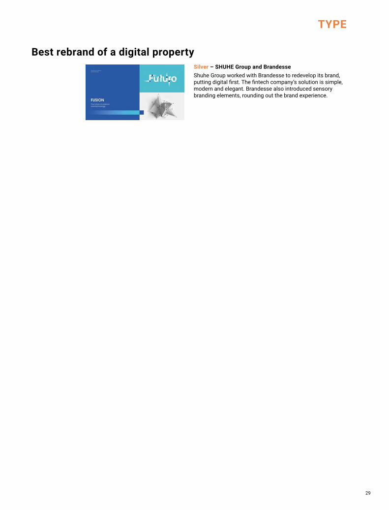
Best rebrand of a digital propertySilver – SHUHE Group and BrandesseShuhe Group worked with Brandesse to redevelop its brand, putting digital first. The fintech company’s solution is simple, modern and elegant. Brandesse also introduced sensory branding elements, rounding out the brand experience.
TYPE

30
SECTOR
Gold – Athena Academy and Chi-MuAn English-language school with 10 locations across China, Athena Academy needed to engage with its existing community while also preparing the foundations for future growth. It worked with Chi-Mu on a new brand that unifies the visual language, makes the design more accessible and introduces flexibility to the system. One of the most striking changes is the update of the brand’s colour from a muted teal to a bright turquoise. It instantly refreshes the brand’s image and lends the company an ownable asset in the process. The introduction of an owl brand mascot also adds an element of personality, while unifying Athena’s many varied communications.
Silver – Toongabbie Christian College and Handle BrandingToongabbie Christian College worked with Handle Branding on a comprehensive refresh that delivers clearer messaging, a stronger positioning and better assets for achieving brand awareness. The result is authoritative and professional, arming Toongabbie with the tools it needs to shine in a competitive market
Best visual identity from the education sector

31
Gold – Horizon Oil and THEREHorizon Oil boasted little in the way of excellent brand design. Its logo comprised of an on-the-nose horizon device and clichéd colour palette. But, with strong roots in the Asia-Pacific oil and gas landscape, it could achieve more. It turned to There to look beyond its horizons.The agency developed a brand highlighting the many complex areas of Horizon’s operations. But, it rendered these in a simplified manner, turning to modern patterns and colours to unleash the brand’s power. The solution is straightforward, but absolutely impactful. Beautiful graphic design is married with transparent messaging and a stripped-back digital user experience.
Silver – Contemporary Amperex Technology Co and MetaThink ConsultancyLithium-ion battery brand Contemporary Amperex Technology turned to MetaThink for a striking visual identity that puts energy at the heart of the brand. The neon ‘energy cube’ is distinctive and adaptable, giving the company a much stronger identity.
SECTOR
Best visual identity from the energy and utilities sector

32
SECTOR
Gold – VOYAH Automobile Technology Company and LabbrandDongfeng had both a challenge and an opportunity at hand when launching its electric vehicle line. The state-owned enterprise had to communicate with both a Chinese and a global audience, while establishing itself as a leader in the emerging category. It worked with Labbrand on a concept designed around voyaging. The Voyah brand is verbally evocative and contains visual references to yachting, the mythical roc bird and intelligent tech. In application, it is near faultless. The brand icon is readymade for automobile placement and inspires a sense of uplifting motion and credibility. Judges thought this professional, impactful strategy was executed to an exceedingly high standard. One called it a “great new brand in response to a strategic market opportunity,” with others praising both the brand’s Chinese roots and its international wings.
Silver – BOE and ProphetB2B display and sensor technology brand BOE is a major player in healthcare services and mobile device manufacture. It worked with Prophet on a modern rebrand that better communicate’s the company’s purpose and value. Judges thought this strategy would ultimately improve the brand’s levels of awareness and relevance for its customers.
Best visual identity from the engineering and manufacturing sector
Best visual identity from the financial services sectorSilver – AXA and ProphetTo humanise the insurance industry by redeveloping the online user journey, Axa introduced Emma. The character is designed to create a conversational relationship with customers, replacing the transactional-based approach common in the sector. Prophet delivered a “great brand experience,” and “humanised design.”

33
SECTOR
Gold – Blu and Sedgwick RichardsonWith multiple packaging types and a wide portfolio of design options, Blu was failing to achieve distinctiveness as a brand in its own right. Airline meal provider Sats’ food division turned to Sedgwick Richardson to redevelop its water offering. And Sedgwick Richardson delivered a rebrand worthy of acclaim.The new approach introduces a consistent visual identity – cleverly including a droplet of water in the wordmark – for use across the brand’s touchpoints. The packaging system offers flexibility, while still showcasing a level of coherence previously missing from Blu. Sustainability is at the heart of the new approach, with recyclable materials and messaging helping Blu to deliver a premium experience. Judges loved the design, saying that it delivered credibility and a greater sense of desirability on the part of consumers. “Love it,” said one simply.
Best visual identity from the FMCG sector

34
Gold – SUN ART Retail Group Limited and PinbrandHomesmile biscuits was not an industry success for Haomai. But, having been sold to RT-Mart, it got a new lease on life. To compete, it had to transform an insignificant brand one that communicated better with younger consumers. Pinbrand worked with the retail group on a stronger brand positioning communicating the benefits of the product and a brand character that infused the packaging with personality.The resulting visual identity is exciting, cute and friendly. Its brand architecture is clearer because of a clever use of colour that also facilitates its potential for spinoff sister brands. Judges loved the energy that was poured into the brand. The imaginative design strategy and character creation made this brand a standout winner.
Silver – Coronation and Handle BrandingThe Paper Mill Food had to captivate the imaginations of the young and connected in western Sydney. Handle Branding introduced a visual identity that harks back to the site’s paper production heritage, while staying true to modern design tenets. “Gorgeous!” said one judge.
SECTOR
Best visual identity from the food and beverage sector
Bronze – Admiral Hotel Manila - MGallery and PurpleAsiaMGallery Hotel’s bar, Ruby Wong’s, needed to stand out in a competitive Manila neighbourhood. It worked with PurpleAsia on a richly rendered visual identity that infuses the brand with intrigue, mystery and depth. “The visual is outstanding,” said one judge. Another praised the sophisticated concept for the visual identity.
Bronze –YAU and Design BridgeA collaboration between Brooklyn Brewery and Carlsberg Hong Kong Yao, the brand’s Brooklyn-inspired identity failed to captivate the local audience. Design Bridge developed a localised system highlighting the vibrant culture within Hong Kong. Bright colours evoke the city’s famous neon lights and brand characters introduce friendly diversity into the system.

35
Bronze – Fazzdoc and Creative Capital JakartaIndoensian healthcare facilitation app Fazzdoc worked with Creative Capital on a visual identity that would build users’ trust in the medical system. It is informative, comforting and straightforward, deploying a simple user journey and warm colour palette. Judges thought the visual identity was approachable, modern and relevant.
Silver – Kexing Biopharm and MetaThink ConsultancyKexing Biopharm worked with MetaThink on a stronger, more ownable brand. Moving away from industry stereotypes, the new approach has character. It is accessible and deploys uncommon colours to great effect. Judges called it “brave,” with one praising it for being “simple and memorable.”
Gold – Mindfront and FutureBrand ChinaLuye Medical launched Mindfront to better deliver mental health services to its community. But, there were different needs to consider for each of its major audiences in Australia and China. Everything from the name to the image strategy had to be localised to best suit each place. FutureBrand took on the challenge with a visual identity that puts mental healthcare first.Its layering system links to the graphic device in the wordmark and emphasises that key message. It also allows the brand to retain consistency even across diverging markets. The image style is unified by a black and white style, but subjects and individuals’ demographics differ across countries. The visual identity is an elegant solution that doesn’t compromise to fulfil a challenging objective. Judges praised everything from the design to the strategy to the brave approach to brand management.
SECTORBest visual identity from the healthcare and pharmaceuticals sector

36
Gold – Rheinmetall and LabbrandRheinmetall has a long heritage in the automotive industry, providing emissions-reducing components to manufacturers worldwide. To respond to disruptive trends in the industry including electric vehicles and autonomous cars, Rheinmetall needed a stronger platform for communication. It worked with Labbrand on a visual identity that would represent its three core operations: emission reduction, efficiency and e-mobility.Using a lens device to layer images in triplicate, the brand is able to communicate this three-fold message in a simple way. The approach avoids clutter and takes the graphic lens device one step further by using it as an visual messaging system, not just a windowpane. It is a clever solution that taps into a useful design element to better communicate in a challenging environment.
SECTORBest visual identity from the industrial and basic materials sector
Best visual identity from the lifestyle and wellbeing sectorSilver – MEUS NOVA and Room 1707Meus Nova’s brand was transformed in China to improve perceptions of luxury home interiors across the country. It worked with Room 1707 on a wordmark derived from the interiors’ designs themselves. The modern solution creates a rich brand world.
Silver – Beijing FANUC and SuperunionResponding to a shift in manufacturing practices to include smarter technologies, Beijing Fanuc needed its brand to better communicate its potential. It worked with Superunion on a cube-based rebrand that professionalised the visual identity while deepening its ability to work across greater touchpoints. “Very distinct and unique for manufacturing,” said one judge. Another added, “Love a good mascot!”

37
Best visual identity from the professional services sectorGold – Chapman Tripp and IcebergA longstanding and prestigious law firm in New Zealand, Chapman Tripp wanted to signal its focus on the future by capitalising on its brand equity. It turned to Iceberg to craft an updated visual identity and website. To challenge the perceptions of the legal industry as being risk-averse and unimaginative, Iceberg took a huge risk. It delivered an algorithm-enabled digital identity that is in constant flux. The resulting graphics are spiralised, moving images that use Chapman Tripp’s hero colour of orange alongside a distinctive indigo. The logo was redeveloped in a circular style, reflecting the ‘slice of life’ strategy used for the photography. Judges thought the way Chapman Tripp capitalised on its existing identity in a transition to a new approach was commendable. One praised the clear thinking and coherent strategy deployed by Iceberg.
Silver – Coherent and MerchantCantosFor insurer, Coherent, differentiation was the name of the rebrand game. It worked with MerchantCantos on a colourful update that focused on the driving force of ‘igniting change.’ One judge was impressed by the new clarity in brand messaging. “Nicely done!” put another simply in praise of the updated brand values.
Bronze – Labbrand Group and LabbrandLabbrand Group needed to better differentiate between its umbrella brand and the growing portfolio of products and services it offered. It introduced the SpringPillar cultural transformation programme to support this shift. Judges liked the strategic process and sophisticated creative work.
SECTOR

38
SECTORBest visual identity from the property, construction and facilities management sectorGold – By The Bay and Sedgwick RichardsonSingapore’s marina was home to a property development that featured a cold, impersonal corporate brand. What it needed was a sense of community to help make give it a sense of place. To create this, developer RQAM worked with Sedgwick Richardson on the By The Bay brand. The place brand is infused with local personality. It can adapt across different uses, colours and partnerships while still retaining its distinctiveness. Its beauty is in its simplicity too, allowing tenants’ brands to shine without getting lost in the fray. “It’s everyone’s favourite,” said one judge. Others praised the beautiful creative, strong understanding of the target audience and clear strategy, even likening it to renowned international places like Rio’s Copacabana Beach.
Silver – Zhangjiang Hi-Tech and MetaThink ConsultancyFostering businesses of all sizes in their development, Zhangjiang Hi-Tech had to inspire greatness in science, technology and digital across its campus. It worked with MetaThink on a property brand that seamlessly integrated wayfinding and aspirational imagery.
Bronze – Hongqiao CMSK and JWDKMultiuse property Aspire by CMSK in Hongqiao needed a brand that would sing the site’s praises and indicate its competitive advantages to potential tenants. JWDK crafted an aviation-inspired brand – due to the site’s location near Hongqiao Airport – while integrating digital into the wayfinding with ease.
Highly commended – Refico and PurpleAsia
39
SECTOR
SR_TransformAward_2020_Ad_FA.indd 1SR_TransformAward_2020_Ad_FA.indd 1 6/1/21 11:14 AM6/1/21 11:14 AM

40
SECTOR
Best visual identity from public sectorGold – HTX and Sedgwick RichardsonPart of the Ministry of Home Affairs, HTX was created to protect Singapore from technological security threats. Instead of simply focusing on its mission, the brand would communicate HTX’s purpose: making Singapore the safest place on earth. To communicate this, Sedgwick Richardson put energetic messaging and exciting, futuristic imagery to use across the visual identity. It turned the ‘X’ into a graphic device, translating it into related shapes and patterns, adding depth to the brand. “The strategy and execution are beautiful,” said one judge. Another added that it featured “A bold design that is well-implemented across channels.”

41
Best visual identity from public sector
SECTOR
Best visual identity from retail sectorGold – Walmart and ProphetWalmart set a lofty objective for itself. It has seen success across China, where international competitors have struggled. But, it did not want to rest on its laurels. It sought to create an in-store experience that was integrated into its e-commerce offer, thereby simplifying both in the process.Prophet delivered on the concept of ‘modern value.’ To do so, it ‘took the brand back’ by focusing on value, not price, and highlighting the quality of its food products. The visual identity achieves this ably by translating Walmart’s colour palette from bright and bold to friendlier, warmer tones. It introduced personable icons and subtler in-store pricing and messaging to craft a more pleasant in-store experience that reflected the digital shopping environment. “A highly well-thought-through solution achieving one of the hardest things in retail: simplicity! I love this,” said one judge.
Silver – walk&rest and Hauns branding design and strategy ltdSouth Korean shoe brand walk&rest needed to localise its brand to connect to Chinese consumers on an emotional level. It worked with Hauns Branding on a visual identity that focused on different life stages. Judges thought the warm, fun and cheerful approach was excellent. “This captures the essence of the brand,” one said.
Bronze – MEUS NOVA and Room 1707Meus Nova’s new approach to its visual identity used its home interiors solutions as visual inspiration. Designed to open a broader conversation about the value of quality home interiors in China, the Room 1707-designed brand has made an impact on judges as well. “A really insightful approach to Chinese culture. Well done!” lauded one judge.

42
SECTOR
Best visual identity from the sports, travel, leisure and tourismGold – Hangho Land (Xiamen) Co., Ltd. and JWDKHangho Land’s resort development in Xiamen needed to appeal to affluent, geographically mobile young Chinese consumers. To achieve this, JWDK developed a strategy that transformed preexisting notions of luxury. Naming the resort Lohkah enabled JWDK to harness spirituality and sun-based icons in its visual identity. The brand’s brown and red colour palette is distinctive and utterly unique. It deploys simple images of natural objects alongside clean, stripped back messaging. The result is luxurious, modern and digitally friendly while still communicating a rich, indulgent experience. Judges thought the beauty of the visual identity was authentic to the brand’s purpose and cleverly responded to the company’s objectives.
Silver – Ovolo Hotels and THERE Ovolo Hotels is experience-driven by nature. But it partnered with There to infuse that positioning into its visual identity. The phrase ‘Wonder. Full’ inspires a rich world of beautiful, curious, joyous lifestyle imagery. The brand is rife with personality and authenticity as it clearly engages with its Millennial target audience.
Bronze – JEN by Shangri-La and Design BridgeTo create stronger emotional connections with the JEN brand, Shangri-La and Design Bridge focused on discovering the new face of Asia. The urban, contemporary design is digitally enabled and speaks to aspirational travellers design sensibilities.
Highly commended – Ticket Planet and Chi-Mu

43
JWDK_halfpagepage_ad_HR_outlined.indd 1 2021/1/5 5:08 PM

44
SECTORBest visual identity from the technology, media and telecommunications sectorGold – Tencent Music Entertainment and SuperunionTencent Music Entertainment had a huge customer base but was flying under the radar in terms of brand awareness and perception. In order to solidify its positioning as a leader in the music, arts and entertainment landscape in China, it worked with Superunion on a rebrand.The new visual identity is instantly iconic. The wordmark is bold, confident and suitable for the sector. The identity is flexible and draws in different graphics to communicate across genre and audience. It is a clever, deceptively simple solution that will enable Tencent Music to expand across different types of platforms and content. “Special and unique,” praised one judge. “This is easily identified now.”
Silver – BOKE and JWDKBoke’s introduction of a corporate brand facilitated its transformation into a competitive, global gaming brand. JWDK introduced an authoritative brand for Boke that retained elements of its playfulness and gaming roots. “Powerful and consistent,” said one judge. Another added, “Strong and memorable.”
Bronze – Mobvista and FutureBrand ChinaMobvista’s approach to its brand architecture is elegant and authoritative. FutureBrand used colour intelligently across the visual identity while also deploying a clear brand hierarchy that enabled the masterbrand and its products to sit comfortably alongside each other.
Highly commended – HTX and Sedgwick Richardson

45
SECTOR
Best visual identity from the transport and logistics sectorGold – Varuna Group and BOD ConsultingVaruna Group’s brand architecture solution is a shining example of best practice in rebranding post-acquisition. The logistics company had integrated warehousing and supply chain services into its umbrella, but lacked the credibility to engage with audiences in those sectors. BOD Consulting created a brand unified behind a single symbol.The diamond-like shape helps clarify the brand architecture, aligning the company’s sub-brands under the Varuna Group umbrella. “A new and unique brand system is in place for the logistics company, now!” said one judge. Another praised the “powerful binding identity” for its ability to bring the brand architecture together, infusing it with credibility and authority along the way.
Gold – Volkswagen Group China and MetaDesign China LimitedVolkswagen Group China’s brand evolution in China in support of the launch of its electric ID range has impressed judges across multiple categories. Its visual identity was subtly transformed, but the results are hugely impactful. MetaDesign lent only a light touch to the classic VW wordmark, but it streamlined the logo and used a set of connecting lines to draw customers across the identity. Where it really succeeds is in its image strategy. Doing away with clichéd perspectives of family life and modern professionals, VW introduces a new kind of lifestyle imagery. It focuses on young urbanites photographed against high-saturation backgrounds. The result is striking and won judges over with ease. “A strong localisation of the brand for a younger audience while staying true to the masterbrand,” one judge said.
Silver – Goodyear and TrafficGoodyear worked with Traffic to translate its racing successes to brand clout across the Asia-Pacific region and Australia. The Eagle F1 tyres branding is infused with racing imagery and energy to captivate customers’ imaginations. “A unique and communicable brand that leverages the masterbrand identity well for a new product launch,” said judges.

46
Best overall visual identity
Winner – Tencent Music Entertainment and SuperunionTencent Music Entertainment (TME) was already in an enviable position in the Chinese entertainment market. Its massive subscriber base loved the product. But its brand was not broadly recognised and failed to captivate users’ imaginations. Superunion’s strategy was to allow TME to take the stage.It translated the existing wordmark into an instant icon. Using the shape of the ‘M,’ it derived the concept of ‘infinite wings,’ which then help the visual identity flex across the brand’s multiple touchpoints. The left ‘wing’ of the M is replaced by ears, blocks, eyes and other images to flex across TME’s portfolio. And, it speaks to the variety of music on offer with the integration of genre-derived imagery. Intending to bring the power of music to people, TME does not fall short of its promise. Judges have been impressed with its visual identity across every category in this year’s awards. They called it, “Special,” “unique,” “creative,” “modern” and “stunning.” It is a very deserving winner of the ‘Best overall visual identity’ award.

47

48
Grand prix
Winner – Volkswagen Group China and MetaDesign China LimitedVolkswagen’s global vision of a carbon-neutral future has made strides in China, where the all-electric range of cars, ID, has been introduced. But, to ensure Chinese consumers understood the brand’s quality and aspired to its promise of a carbon-free future, it had to localise its brand.MetaDesign focused on imagery first and foremost. Instead of the staid, CGI imagery of the past, MetaDesign would infuse the VW brand with authenticity, youth and urban grittiness. High-saturation images of young, people form an intriguing library of images. This people-first approach was reflected in the copy style and internal communications strategy, which brought VW’s employees along the transformation journey. A large-scale implementation strategy followed, to ensure every element of the brand’s experience was delivering on the new purpose.The project is comprehensive, intelligent and strategic to its core. Judges praised it across every category. Some were impressed by the thoroughness of the internal communications campaign, others by the refreshing image style. Some praised the focus on a singular message and commitment to innovation. In every category, it made an impact, which makes it a clear standout and this year’s ‘ Grand prix’ winner.

49
METADESIGN
O P E N I N G F O R E N T R I E S8 F E B R UA RY
Register your interest: [email protected]
#TransformAwards
transformmagazine.net
transform_magazine
@transformevents