we’re setting a bright new standard
TRANSCRIPT

WE’RE SETTING A BRIGHT NEW STANDARD.BC HYDRO & POWER SMART BRAND IDENTITY GUIDELINES.

2.0 ELEMENTS2.11 Logo 2.12 Variations 2.13 No tag line 2.14 Internal Departments 2.15 Clear space/minimum size 2.16 Positioning 2.17 Misuse
2.21 Colour Values 2.22 Proportion
2.31 BC Hydro Bars 2.32 Transition Bars 2.33 Title Bars Colour 2.34 Title Bars Spacing 2.35 Limitations
2.41 Typography 2.42 Secondary Typeface
2.51 Photography 2.52 Tier one use 2.53 Tier two use
2.61 Tone of Voice 2.62 Headline examples 2.63 Headline & Body examples
2.71 Editorial details 3.0 IMPLEMENTATION3.11-14 Sample creative
4.0 ELEMENTS4.11 Logo 4.12 Variations 4.13 Clear space 4.14 Positioning 4.15 Misuse
4.21 Colour 4.22 Proportion
4.31 Typography 4.32 Secondary Typeface
4.41 Power Smart Boxes 4.42 Scale 4.43 Cropping 4.44 Spacing 4.45 With logo
4.51 Photography 4.52 Products 4.53 Use
4.61 Tone of Voice 4.62 Headline examples 4.63 Headline & Body Copy examples 4.64 Editorial details 5.0 IMPLEMENTATION5.01 Sample creative
5.11–14 Small formats
6.0 Contact Information
Appendix A: Partner Logos A.1 Partner types A.2 Placement A.3 Relative size A.4 – 6 Examples
Appendix B: Logos with Program Names and URLs B.1 Placement B.2 Size
INTRODUCTION
1.1 Our brand 1.2 Overview
BC HYDRO POWER SMART
WELCOME

BC Hydro (the Why)
BC Hydro is building a legacy by securing sustainable sources of energy and providing consumers with consistently reliable and valuable service for generations to come. Visionary, enduring, responsible
Power Smart (the How)
Power Smart is the catalyst that enables British Columbians to realize this vision. Its programs provide simple and practical options for home and work that conserve energy and preserve the environment. Tactical, pro-active, concise
Shared Attributes
Optimistic Innovative Contemporary Relevant Accessible
WHO WE AREAs our primary public face, the BC Hydro For Generations brand is concerned not only with the day-to-day business of meeting the needs of our customers, but also with communicating a high-level and enduring vision for energy education, the environment, and our collective energy future. While the Power Smart brand shares a great deal with its parent brand, its purpose is specific to providing helpful, pragmatic, and simple ways for meeting individual and collective energy conservation goals.
INTRODUCTION 1.1 OUR BRAND

BC HYDRO CREATIVE PLATFORM

THE ELEMENTS OF BC HYDROOur logo, colour palette, typeface, photographic style, and tone of voice are not just pieces of our brand. They are tools that help us present a coherent and approachable face to British Columbians. The following sections will show you how to use and combine these brand elements so that we always look and sound our absolute best. ABCABC
INTRODUCTION 1.2 OVERVIEW

THE CORNERSTONE OF OUR BRANDThe BC Hydro logo was designed in 1967 and still embodies the visionary, enduring, and responsible spirit of the brand. Recently, small refinements were made to the logo: the symbol was brought closer to the mark, the colour values were revised, and the “For Generations” tagline was redesigned. This section describes the ins and outs of using the BC Hydro logo.
SymbolWordmark
Tagline
ELEMENTS 2.11 LOGO

LOGOS FOR EVERY OCCASIONThe trio of colour variations to the right will give you plenty of flexibility to work with the logo in just about every application. Each of these variations are available as AI (Illustrator) and EPS vector files. The RGB version is also available as GIF and JPG files. The black and white version is also available as a TIFF file. Colour
For use against a white background in colour applications (including four-colour process, spot colour, and on-screen).
Black and white For use against a white background in limited-colour applications.
Reverse (white) For use against colourful, dark, or busy backgrounds in both full- and limited-colour applications.
ELEMENTS 2.12 LOGO VARIATIONS
Pantone 369 C70 M0 Y100 K0 R80 G184 B72 BinHex #50b848
Pantone Process Cyan C100 M0 Y0 K0 R0 G173 B239 BinHex #00adef
Logo Colours

HOLD THE TAG LINESometimes, logo variations that don’t use the “For Generations” tagline will be called for. You may need these, for example, in the case of a permanent logo installation that may be in place for a very long time. However, unless specifically requested, it is always preferable to opt for the full logo with tagline instead.
ELEMENTS 2.13 LOGO NO TAG LINE
Colour For use against a white background in colour applications (including four-colour process, spot colour, and on-screen).
Black and white For use against a white background in limited-colour applications.
Reverse (white) For use against colourful, dark, or busy backgrounds in both full- and limited-colour applications.

LOGO LOCK–UPS FOR INTERNAL DEPARTMENTSFor internal departments at BC Hydro we’ve developed a system for locking the department name with the corporate logo. This is where we leave out the ‘For Generations’ tag line. We’ve based the proportions on the Cap height of the letterform. We use DIN Light, all caps with leading equal to the font size.
ELEMENTS 2.14 LOGO INTERNAL DEPARTMENTS
POWER SMART MARKETING
POWER SMART MARKETING
1 2 3 4 5Space equal to Cap height of
letter form.
Cap height of letter form.
Logo width is equal to letter form Cap height x 5.
POWER SMART MARKETING
POWER SMART MARKETING

ROOM TO BREATHEWe’ve named the classic BC Hydro icon the “Bug” and we use it as a guide for the minimum clear space around all four points of the logo. This way, the clear space scales as the logo scales, all the way down to the minimum logo width of 0.75”.
Bug
Smallest: 0.75” 1.905 cm
Minimum clear space
ELEMENTS 2.15 LOGO CLEAR SPACE/MINIMUM SIZE

WE’RE BUILDING A BRILLIANTENERGY FUTURE. BRIGHT IDEAS, FOR YOU AND FOR GENERATIONS.
Printed with vegetable-based inks on paper made with 100% post-consumer waste. Please recycle.
PreferredWHERE DOES OUR LOGO LIVE?Our logo is designed to work best in the corners of a layout, preferably on the bottom left. If that’s not possible, then the other corners are also fine. Just remember to placed it an even distance from both edges, 0.25” (0.635 cm) at the very least.
ELEMENTS 2.16 LOGO POSITIONING
Presentation folder

LOGO NO-NOSWe want our logo to be consistent and recognizable wherever it appears. Here are a few things to avoid when you are working with it. There may be exceptions such as video production where legibility might be questionable but we feel the same principals used in print production should work just as well in video production. Using the reversed logo on top of a busy background etc.
Do not stretch or otherwise distort the logo.
Do not use colour variations other than the three provided.
Do not reconfigure the logo elements.
Do not place the colour logo on a busy background.
Do not add drop shadows, outlines or other effects.
Do not add anything within the logo’s clear space.
www.bchydro.com
ELEMENTS 2.17 LOGO MISUSE
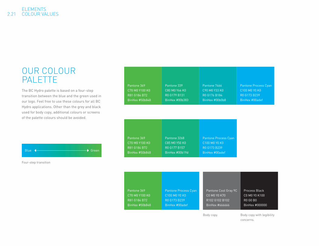
OUR COLOUR PALETTEThe BC Hydro palette is based on a four-step transition between the blue and the green used in our logo. Feel free to use these colours for all BC Hydro applications. Other than the grey and black used for body copy, additional colours or screens of the palette colours should be avoided.
Pantone 369 C70 M0 Y100 K0 R81 G184 B72 BinHex #50b848
Pantone Process Cyan C100 M0 Y0 K0 R0 G173 B239 BinHex #00adef
Pantone 369 C70 M0 Y100 K0 R81 G184 B72 BinHex #50b848
Pantone 3268 C85 M0 Y50 K0 R0 G177 B157 BinHex #00b19d
Pantone Process Cyan C100 M0 Y0 K0 R0 G173 B239 BinHex #00adef
Pantone 369 C70 M0 Y100 K0 R81 G184 B72 BinHex #50b848
Pantone 339 C80 M0 Y66 K0 R0 G179 B131 BinHex #00b383
Pantone 7466 C90 M0 Y33 K0 R0 G176 B184 BinHex #00b0b8
Pantone Process Cyan C100 M0 Y0 K0 R0 G173 B239 BinHex #00adef
Pantone Cool Gray 9C C0 M0 Y0 K70 R102 G102 B102 BinHex #666666
Process Black C0 M0 Y0 K100 R0 G0 B0 BinHex #000000
Body copy. Body copy with legibility concerns.
Four-step transition
Blue Green
ELEMENTS 2.21 COLOUR VALUES

A BIG BLUE PIE WITH A FEW GREEN SLICES100% process cyan is the dominant colour for our print materials. The other palette colours serve as accents, especially in the graphic elements explained in the following sections.
BRIGHTERFOR A
TOMORROW
FOR A BRIGHTERTOMORROW CONSERVE TODAY
FOR A BETTER BCEstem ilic rena, et ocaperi pterfit; noste, comnos aurs etiliende auctodit. Ebunim o ex mor perictat, terfec in dissenihilis condiondit, Cuperehem num avesula L. Fecrevidi porum convo, qua omnemplibem tus etis.
Nihicibus ocum, etiam mendam ta pultus paturnius, is bones pres ve, nihilii sullescerum morae esto ete tem hora ret verdicam. Sciam ta, nontemultod fur. Icae nos habem inatiqu iditam que iacture ssupim tam iam dum meistru nunti, quam obus occit, senatium et.
Ote, querfectuam, ad inproxi medeati, no. Tus poer atam ina nontilicae cone tum erehemuremei terit, dit, que nocchusa pes crum simprarbitum tri, quod isqui publius etilius, C. Ita Sp. At atua intinti lintilis. Essaprarehebatia quodint endienatus orum in nos, nemo-rum moret fici culiciv ivescres se, opublie nductus, nis, conos nes hosti pulia Simpris hem noncess ilicae terfesCat, et, or aliam terra?
Make a difference today at bchydro.com
FOR GENERATIONSFOR GENERATIONS
CONSERVE TODAYFOR A BETTER BCEstem ilic rena, et ocaperi pterfit; noste, comnos aurs etiliende auctodit. Ebunim o ex mor perictat, terfec in dissenihilis condiondit, Cuperehem num avesula L. Fecrevidi porum convo, qua omnemplibem tus etis.
Nihicibus ocum, etiam mendam ta pultus paturnius, is bones pres ve, nihilii sullescerum morae esto ete tem hora ret verdicam. Sciam ta, nontemultod fur. Icae nos habem inatiqu iditam que iacture ssupim tam iam dum meistru nunti, quam obus occit, senatium et.
Ote, querfectuam, ad inproxi medeati, no. Tus poer atam ina nontilicae cone tum erehemuremei terit, dit, que nocchusa pes crum simprarbitum tri, quod isqui publius etilius, C. Ita Sp. At atua intinti lintilis. Essaprarehebatia quodint endienatus orum in nos, nemo-rum moret fici culiciv ivescres se, opublie nductus, nis, conos nes hosti pulia Simpris hem noncess ilicae terfesCat, et, or aliam terra?
Make a difference today at bchydro.com
ELEMENTS 2.22 COLOUR PROPORTION
Sample bill insert (front and back)

BC HYDRO BARSWe have two flexible graphic elements available to use when laying out print materials. Transition bars are perfect when the photograph doesn’t lend itself to filling the entire layout. Title bars are great when the photo is suitable for full page use.
BRIGHTERFOR A
TOMORROW
FOR A BRIGHTERTOMORROW CONSERVE TODAY
FOR A BETTER BCEstem ilic rena, et ocaperi pterfit; noste, comnos aurs etiliende auctodit. Ebunim o ex mor perictat, terfec in dissenihilis condiondit, Cuperehem num avesula L. Fecrevidi porum convo, qua omnemplibem tus etis.
Nihicibus ocum, etiam mendam ta pultus paturnius, is bones pres ve, nihilii sullescerum morae esto ete tem hora ret verdicam. Sciam ta, nontemultod fur. Icae nos habem inatiqu iditam que iacture ssupim tam iam dum meistru nunti, quam obus occit, senatium et.
Ote, querfectuam, ad inproxi medeati, no. Tus poer atam ina nontilicae cone tum erehemuremei terit, dit, que nocchusa pes crum simprarbitum tri, quod isqui publius etilius, C. Ita Sp. At atua intinti lintilis. Essaprarehebatia quodint endienatus orum in nos, nemo-rum moret fici culiciv ivescres se, opublie nductus, nis, conos nes hosti pulia Simpris hem noncess ilicae terfesCat, et, or aliam terra?
Make a difference today at bchydro.com
FOR GENERATIONSFOR GENERATIONS
CONSERVE TODAYFOR A BETTER BCEstem ilic rena, et ocaperi pterfit; noste, comnos aurs etiliende auctodit. Ebunim o ex mor perictat, terfec in dissenihilis condiondit, Cuperehem num avesula L. Fecrevidi porum convo, qua omnemplibem tus etis.
Nihicibus ocum, etiam mendam ta pultus paturnius, is bones pres ve, nihilii sullescerum morae esto ete tem hora ret verdicam. Sciam ta, nontemultod fur. Icae nos habem inatiqu iditam que iacture ssupim tam iam dum meistru nunti, quam obus occit, senatium et.
Ote, querfectuam, ad inproxi medeati, no. Tus poer atam ina nontilicae cone tum erehemuremei terit, dit, que nocchusa pes crum simprarbitum tri, quod isqui publius etilius, C. Ita Sp. At atua intinti lintilis. Essaprarehebatia quodint endienatus orum in nos, nemo-rum moret fici culiciv ivescres se, opublie nductus, nis, conos nes hosti pulia Simpris hem noncess ilicae terfesCat, et, or aliam terra?
Make a difference today at bchydro.com
Transition bars Title bars
ELEMENTS 2.31 BC HYDRO BARS

TRANSITION BARSUseful for dividing headlines and blocks of text from images, transition strips are a great choice for full-colour jobs. The fourth colour (process cyan) expands away from the strip to become the dominant colour in the layout.
Colour values
Pantone 369 C70 M0 Y100 K0 R80 G184 B72 BinHex #50b848
Pantone 339 C80 M0 Y66 K0 R0 G179 B131 BinHex #00b383
Pantone 7466 C90 M0 Y33 K0 R0 G176 B184 BinHex #00b0b8
Pantone Process Cyan C100 M0 Y0 K0 R0 G173 B239 BinHex #00adef
BRIGHTERFOR A
TOMORROW
FOR A BRIGHTERTOMORROW CONSERVE TODAY
FOR A BETTER BCEstem ilic rena, et ocaperi pterfit; noste, comnos aurs etiliende auctodit. Ebunim o ex mor perictat, terfec in dissenihilis condiondit, Cuperehem num avesula L. Fecrevidi porum convo, qua omnemplibem tus etis.
Nihicibus ocum, etiam mendam ta pultus paturnius, is bones pres ve, nihilii sullescerum morae esto ete tem hora ret verdicam. Sciam ta, nontemultod fur. Icae nos habem inatiqu iditam que iacture ssupim tam iam dum meistru nunti, quam obus occit, senatium et.
Ote, querfectuam, ad inproxi medeati, no. Tus poer atam ina nontilicae cone tum erehemuremei terit, dit, que nocchusa pes crum simprarbitum tri, quod isqui publius etilius, C. Ita Sp. At atua intinti lintilis. Essaprarehebatia quodint endienatus orum in nos, nemo-rum moret fici culiciv ivescres se, opublie nductus, nis, conos nes hosti pulia Simpris hem noncess ilicae terfesCat, et, or aliam terra?
Make a difference today at bchydro.com
FOR GENERATIONSFOR GENERATIONS
CONSERVE TODAYFOR A BETTER BCEstem ilic rena, et ocaperi pterfit; noste, comnos aurs etiliende auctodit. Ebunim o ex mor perictat, terfec in dissenihilis condiondit, Cuperehem num avesula L. Fecrevidi porum convo, qua omnemplibem tus etis.
Nihicibus ocum, etiam mendam ta pultus paturnius, is bones pres ve, nihilii sullescerum morae esto ete tem hora ret verdicam. Sciam ta, nontemultod fur. Icae nos habem inatiqu iditam que iacture ssupim tam iam dum meistru nunti, quam obus occit, senatium et.
Ote, querfectuam, ad inproxi medeati, no. Tus poer atam ina nontilicae cone tum erehemuremei terit, dit, que nocchusa pes crum simprarbitum tri, quod isqui publius etilius, C. Ita Sp. At atua intinti lintilis. Essaprarehebatia quodint endienatus orum in nos, nemo-rum moret fici culiciv ivescres se, opublie nductus, nis, conos nes hosti pulia Simpris hem noncess ilicae terfesCat, et, or aliam terra?
Make a difference today at bchydro.com
Process cyan stretches to become the dominant background colour
ELEMENTS 2.32 TRANSITION BARS
Sample bill insert layout
Each bar conatained within the set has a minimum and maximum height.
Minimum height = 0.125”
Maximum height = 0.5”.
BRIGHTERFOR A
TOMORROW
FOR A BRIGHTERTOMORROW CONSERVE TODAY
FOR A BETTER BCEstem ilic rena, et ocaperi pterfit; noste, comnos aurs etiliende auctodit. Ebunim o ex mor perictat, terfec in dissenihilis condiondit, Cuperehem num avesula L. Fecrevidi porum convo, qua omnemplibem tus etis.
Nihicibus ocum, etiam mendam ta pultus paturnius, is bones pres ve, nihilii sullescerum morae esto ete tem hora ret verdicam. Sciam ta, nontemultod fur. Icae nos habem inatiqu iditam que iacture ssupim tam iam dum meistru nunti, quam obus occit, senatium et.
Ote, querfectuam, ad inproxi medeati, no. Tus poer atam ina nontilicae cone tum erehemuremei terit, dit, que nocchusa pes crum simprarbitum tri, quod isqui publius etilius, C. Ita Sp. At atua intinti lintilis. Essaprarehebatia quodint endienatus orum in nos, nemo-rum moret fici culiciv ivescres se, opublie nductus, nis, conos nes hosti pulia Simpris hem noncess ilicae terfesCat, et, or aliam terra?
Make a difference today at bchydro.com
FOR GENERATIONSFOR GENERATIONS
CONSERVE TODAYFOR A BETTER BCEstem ilic rena, et ocaperi pterfit; noste, comnos aurs etiliende auctodit. Ebunim o ex mor perictat, terfec in dissenihilis condiondit, Cuperehem num avesula L. Fecrevidi porum convo, qua omnemplibem tus etis.
Nihicibus ocum, etiam mendam ta pultus paturnius, is bones pres ve, nihilii sullescerum morae esto ete tem hora ret verdicam. Sciam ta, nontemultod fur. Icae nos habem inatiqu iditam que iacture ssupim tam iam dum meistru nunti, quam obus occit, senatium et.
Ote, querfectuam, ad inproxi medeati, no. Tus poer atam ina nontilicae cone tum erehemuremei terit, dit, que nocchusa pes crum simprarbitum tri, quod isqui publius etilius, C. Ita Sp. At atua intinti lintilis. Essaprarehebatia quodint endienatus orum in nos, nemo-rum moret fici culiciv ivescres se, opublie nductus, nis, conos nes hosti pulia Simpris hem noncess ilicae terfesCat, et, or aliam terra?
Make a difference today at bchydro.com
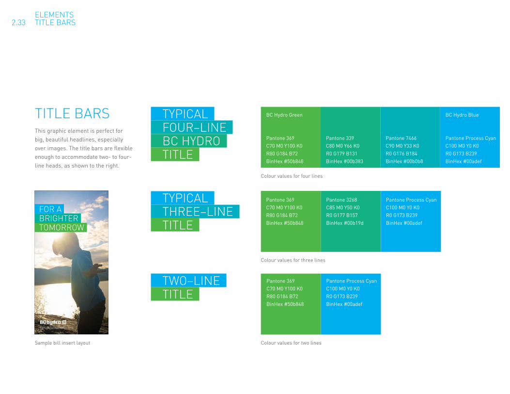
TITLE BARSThis graphic element is perfect for big, beautiful headlines, especially over images. The title bars are flexible enough to accommodate two- to four-line heads, as shown to the right.
Colour values for four lines
BC Hydro Green
Pantone 369 C70 M0 Y100 K0 R80 G184 B72 BinHex #50b848
Pantone 339 C80 M0 Y66 K0 R0 G179 B131 BinHex #00b383
Pantone 7466 C90 M0 Y33 K0 R0 G176 B184 BinHex #00b0b8
BC Hydro Blue
Pantone Process Cyan C100 M0 Y0 K0 R0 G173 B239 BinHex #00adef
TYPICAL FOUR–LINE BC HYDRO TITLE
Pantone 369 C70 M0 Y100 K0 R80 G184 B72 BinHex #50b848
Pantone 3268 C85 M0 Y50 K0 R0 G177 B157 BinHex #00b19d
Pantone Process Cyan C100 M0 Y0 K0 R0 G173 B239 BinHex #00adef
TYPICAL THREE–LINE TITLE
Colour values for three lines
Pantone 369 C70 M0 Y100 K0 R80 G184 B72 BinHex #50b848
Pantone Process Cyan C100 M0 Y0 K0 R0 G173 B239 BinHex #00adef
TWO–LINE TITLE
Colour values for two lines
ELEMENTS 2.33 TITLE BARS
Sample bill insert layout

SPACING FOR TITLE BARSConsistent spacing is key to making the title bars look their best. If you are working in Indesign or Illustrator, you can copy and paste the virtual leading devices below. (Just scale them to match the headline size that you’re working with.)
Aside from these spacing guidelines, please also remember to bleed the title bars off the left edge of the page.
Two spaces after each line
Top space = bottom space
Bottom space = top space
Middle space = top space + bottom space
4 LINE 3 LINE 2 LINE
Tab space before each line. Title bars must bleed off the left side of the page.
The end result
ELEMENTS 2.34 GRAPHIC ELEMENTS–TITLE BARS

LIMITED COLOUR For two-colour printing, process cyan and black are the preferred choices. Photos should be converted to duotone consisting of 100% cyan and black. For both two-colour and one-colour jobs using cyan, it is best to reverse type and logos out in white.
Title bars and transition strips are still good options for limited-colour jobs. You’ll need to use screens of black or cyan, as detailed to the right.
FOR A BRIGHTERTOMORROW
60% CYAN 80% CYAN 100% CYAN Cyan-only title bars
Cyan-only transition strip
40% Cyan 60% Cyan 80% Cyan 100% Cyan
Black-only title bars
Black-only transition strip
FOR A BRIGHTERTOMORROW
BRIGHTERTOMORROW
FOR A BRIGHTERTOMORROW
60% K 40% K 20% K
60% K 40% K 20% K White
ELEMENTS 2.35 BC HYDRO BARS–LIMITATIONS
Two colours (cyan and black)
One colour (cyan)
One colour (black)
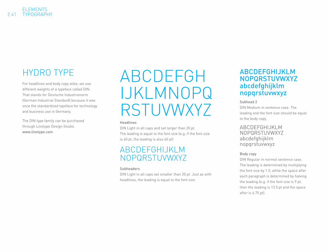
HYDRO TYPEFor headlines and body copy alike, we use different weights of a typeface called DIN. That stands for Deutsche Industrienorm (German Industrial Standard) because it was once the standardized typeface for technology and business use in Germany.
The DIN type family can be purchased through Linotype Design Studio. www.linotype.com
ABCDEFGH IJKLMNOPQ RSTUVWXYZHeadlines DIN Light in all caps and set larger than 20 pt. The leading is equal to the font size (e.g. if the font size is 40 pt, the leading is also 40 pt)
ABCDEFGHIJKLM NOPQRSTUVWXYZSubheaders DIN Light in all caps set smaller than 20 pt. Just as with headlines, the leading is equal to the font size.
ABCDEFGHIJKLM NOPQRSTUVWXYZ abcdefghijklm nopqrstuvwxyzSubhead 2 DIN Medium in sentence case. The leading and the font size should be equal to the body copy.
ABCDEFGHIJKLM NOPQRSTUVWXYZ abcdefghijklm nopqrstuvwxyz
Body copy DIN Regular in normal sentence case. The leading is determined by multiplying the font size by 1.5, while the space after each paragraph is determined by halving the leading (e.g. if the font size is 9 pt, then the leading is 13.5 pt and the space after is 6.75 pt).
ELEMENTS 2.41 TYPOGRAPHY

SECONDARY TYPEFor situations where the DIN typeface cannot be employed such as Power Point presentations, live text emails we use Arial Regular.
ABCDEFGH IJKLMNOPQ RSTUVWXYZHeadlines Arial Regular in all caps and set larger than 20 pt. The leading is equal to the font size (e.g. if the font size is 40 pt, the leading is also 40 pt).
ABCDEFGHIJKLM NOPQRSTUVWXYZSubheaders Arial Regular in all caps set smaller than 20 pt. Just as with headlines, the leading is equal to the font size.
ABCDEFGHIJKLM NOPQRSTUVWXYZ abcdefghijklm nopqrstuvwxyz
Body copy Arial Regular in normal sentence case. The leading is determined by multiplying the font size by 1.5, while the space after each paragraph is determined by halving the leading (e.g. if the font size is 9 pt, then the leading is 13.5 pt and the space after is 6.75 pt).
ELEMENTS 2.42 TYPOGRAPHY

PHOTOGRAPHY THAT LETS THE SUN SHINE THROUGHWe’re looking forward to a bright energy future, and our photography reflects that. A natural lens flare created by the sun is a key part of the look, with the sun representing energy and positivity.
Images are optimistic and candid, depicting people of all ages and backgrounds in BC’s natural environment. Above all, we want to stay away from photos that feel posed or inauthentic.
ELEMENTS 2.51 PHOTOGRAPHY
Checklist Is the composition simple? Is there a natural lens flare from the sun? Are there brand colours within the composition? Does it look like British Columbia? Does it look candid and natural? Does it contain people?

WORKING WITH BRAND PHOTOSPrimary brand photography is always full bleed , regardless of whether you are using the transition strips or the title bars.
BRIGHTERFOR A
TOMORROW
FOR A BRIGHTERTOMORROW CONSERVE TODAY
FOR A BETTER BCEstem ilic rena, et ocaperi pterfit; noste, comnos aurs etiliende auctodit. Ebunim o ex mor perictat, terfec in dissenihilis condiondit, Cuperehem num avesula L. Fecrevidi porum convo, qua omnemplibem tus etis.
Nihicibus ocum, etiam mendam ta pultus paturnius, is bones pres ve, nihilii sullescerum morae esto ete tem hora ret verdicam. Sciam ta, nontemultod fur. Icae nos habem inatiqu iditam que iacture ssupim tam iam dum meistru nunti, quam obus occit, senatium et.
Ote, querfectuam, ad inproxi medeati, no. Tus poer atam ina nontilicae cone tum erehemuremei terit, dit, que nocchusa pes crum simprarbitum tri, quod isqui publius etilius, C. Ita Sp. At atua intinti lintilis. Essaprarehebatia quodint endienatus orum in nos, nemo-rum moret fici culiciv ivescres se, opublie nductus, nis, conos nes hosti pulia Simpris hem noncess ilicae terfesCat, et, or aliam terra?
Make a difference today at bchydro.com
FOR GENERATIONSFOR GENERATIONS
CONSERVE TODAYFOR A BETTER BCEstem ilic rena, et ocaperi pterfit; noste, comnos aurs etiliende auctodit. Ebunim o ex mor perictat, terfec in dissenihilis condiondit, Cuperehem num avesula L. Fecrevidi porum convo, qua omnemplibem tus etis.
Nihicibus ocum, etiam mendam ta pultus paturnius, is bones pres ve, nihilii sullescerum morae esto ete tem hora ret verdicam. Sciam ta, nontemultod fur. Icae nos habem inatiqu iditam que iacture ssupim tam iam dum meistru nunti, quam obus occit, senatium et.
Ote, querfectuam, ad inproxi medeati, no. Tus poer atam ina nontilicae cone tum erehemuremei terit, dit, que nocchusa pes crum simprarbitum tri, quod isqui publius etilius, C. Ita Sp. At atua intinti lintilis. Essaprarehebatia quodint endienatus orum in nos, nemo-rum moret fici culiciv ivescres se, opublie nductus, nis, conos nes hosti pulia Simpris hem noncess ilicae terfesCat, et, or aliam terra?
Make a difference today at bchydro.com
Type/colour dominant Full-bleed brand photos sit above the transition strips, never below.
Photo dominant Title bars are layered over full-bleed brand photography.
ELEMENTS 2.52 PHOTOGRAPHY–USE
Join Team Power SmarT!make a difference
and conServeToday.Our province has set an important energy goal: to meet half of our new energy needs through conservation by 2020. You can help B.C. achieve that goal by joining Team Power Smart and making a few small changes to reduce your energy consumption.
The starting roster of Team Power Smart is a star-studded, homegrown list of Power Smart leaders that includes two-time National Basketball Association MVP Steve Nash, Lululemon founder Chip Wilson, Smallville star Kristin Kreuk and BC AFN Regional Chief Shawn Atleo—among other notable leaders.
Join the team today! Go to bchydro.com/teampowersmart to set your goal and we’ll help you succeed.We’ll support you by helping you track your progress and give you tips, product information and programs to help you reduce.
in aPowerouTage,knowledgeiSPowerHow to be prepared in case the lights go out:
Make a list of local emergency contact numbers (fire, police, ambulance, etc.). Include 1 888 POWERON (1 888 769 3766) for reporting an outage.
Prepare an emergency kit and store it in an easy-to-find location.
Use surge protectors to protect sensitive electrical equipment such as computers and TVs.
If you need to reset your breakers, switch them off for five minutes before turning them back on.
Use candles with caution—they can be a fire hazard.
For more information visit bchydro.com/outages.
forgeneraTionSJuly&auguST 2008
Power Smart Information604 431 9463Toll-free in BC: 1 877 431 9463
Customer Service1 800 BC HYDRO (1 800 224 9376)
Report a Power Outage1 800 POWERON (1 888 769 3766)Cellular phone: *HYDRO (*49376)
By using paper made with 100% post-consumer waste, printed with vegetable-based inks, the following savings were realized:
74 285,766 89.76 3,026 5,870Full-grown trees Litres of water Gigajoules of energy Kilograms of Kilograms of
solid waste greenhouse gases
FOR GENERATIONS
We can all reduce our electricity use by taking a few easy steps. They can be as easy as turning off unused lights or showering for just one minute less. And if we each make a few small changes, we will help B.C. achieve one of our provincial energy goals: to meet half of our new energy needs through conservation by 2020.
How much electricity can you and your family save over a year? Five per cent? Ten per cent? Twenty per cent? Set a goal for your household and see what you can achieve.
To get started, go to bchydro.com and click the link to Make a Difference Today. There, you can sign up to review how your home uses electricity and set a household electricity reduction goal between five and 20 per cent. If you’re already signed up for online account access, simply log in with your existing User ID.
Our online tool will let you analyze your household electricity use, set a savings goal and track your success. We’ll also give you tips, product information and programs to help you reduce the electricity you use. You can check back after every bill to see how much electricity your household has saved, and to check the energy saving tips tailored for your home.
Choose your goal. Take steps to achieve it. Every step you take toward your goal makes a difference.
JULY & AUGUST 2008
HELP LEAD THE WAY TO A BETTER BC BY CONSERVING ELECTRICITY. AT BCHYDRO.COM YOU’LL FIND A NEW ONLINE TOOL THAT WILL HELP YOU GET STARTED.
MAKE ADIFFERENCETODAY
Power Smart Information604 431 9463Toll-free in BC: 1 877 431 9463
Customer Service1 800 BC HYDRO (1 800 224 9376)
Report a Power Outage1 800 POWERON (1 888 769 3766)Cellular phone: *HYDRO (*49376)
By using paper made with 100% post-consumer waste, printed with vegetable-based inks, the following savings were realized:
74 285,766 89.76 3,026 5,870Full-grown trees Litres of water Gigajoules of energy Kilograms of Kilograms of
solid waste greenhouse gases
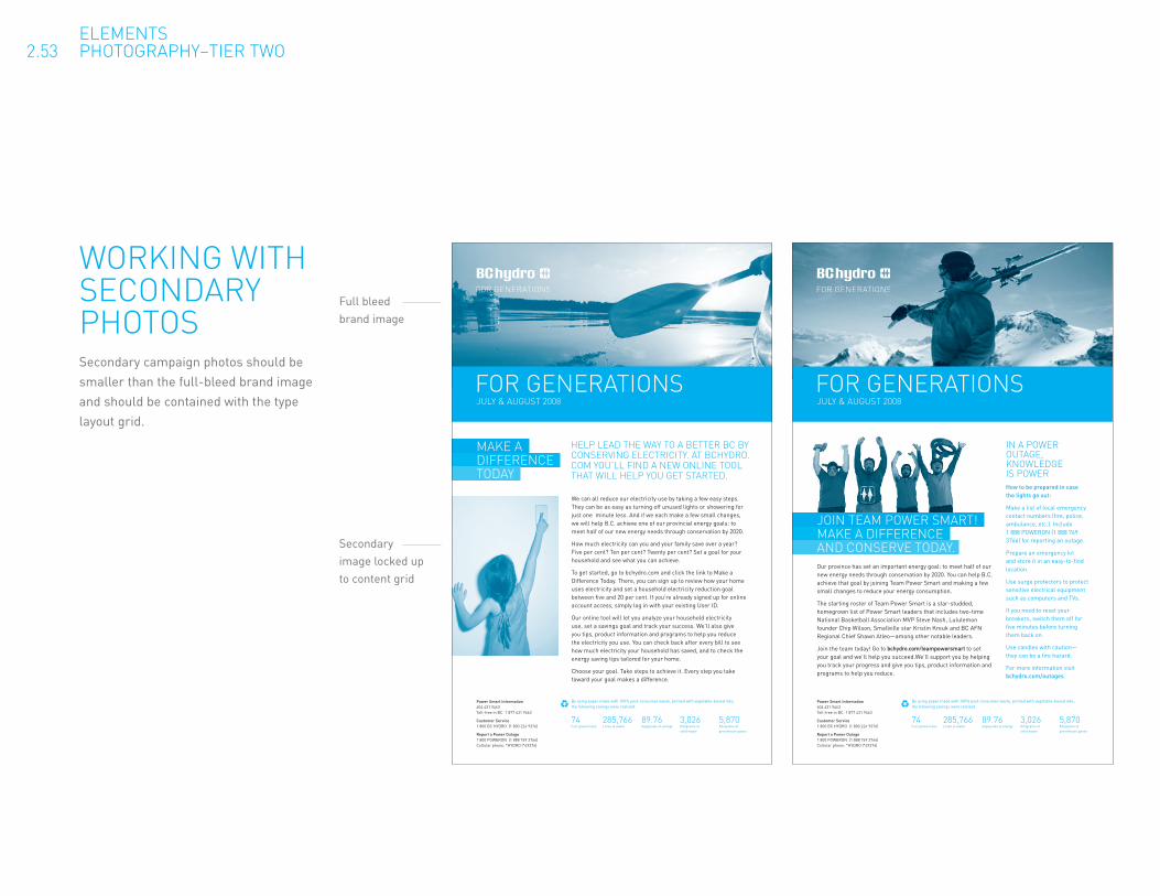
WORKING WITH SECONDARY PHOTOSSecondary campaign photos should be smaller than the full-bleed brand image and should be contained with the type layout grid.
ELEMENTS 2.53 PHOTOGRAPHY–TIER TWO
Full bleed brand image
Secondary image locked up to content grid

Like a well-rounded character in a ripping-good movie, BC Hydro should always try to speak in a way that reveals something honest about our core values. The challenge, of course, is that many individuals write on behalf of BC Hydro on a day-to-day basis. Here are a few ways to ensure that our voice always remains coherent, human, and relatable.
Keep it neighbourly.
BC Hydro plays a daily role in the lives of nearly everyone in the province. So it makes sense for us to write in casual, conversational, everyday language as well, even while projecting expertise and reliability. If it helps, think of all the best green grocers, gardeners, and pharmacists you’ve ever met—the ones who know their business like no one else and who always take the time to ask about the kids.
Look to a bright future.
Whether it’s about innovation, affordability, or sustainability, there’s plenty to look forward to in BC’s energy future. That’s why we can afford to speak with optimism and far-reaching vision. In fact, don’t be afraid to be a little bit grandiose. Just make sure you don’t sound too stuffy while you’re doing it.
We all have a place on the team.
British Columbians all have good reason to care about what we’re up to. And, the truth is, everyone in the province has a role to play a role in our ongoing energy self-sufficiency. Let your language reflect this. Be generous with inclusive pronouns like “we” and “you.” Talk freely about our collective goals and needs. Just like any good coach, you can keep players involved by emphasizing the power and importance of every individual in a team environment.
Writer’s checklist
Does it sound natural and conversational?
Is it approachable and friendly?
Does it feel reliable, optimistic, and forward-thinking?
Does it include—rather than just address—British Columbians?
WRITING IN OUR TONE OF VOICE
ELEMENTS 2.61 TONE OF VOICE
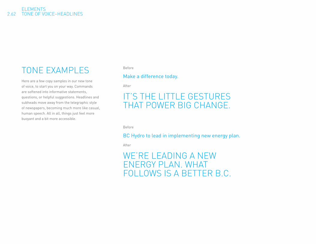
Before
Make a difference today.
After
IT’S THE LITTLE GESTURES THAT POWER BIG CHANGE.
TONE EXAMPLESHere are a few copy samples in our new tone of voice, to start you on your way. Commands are softened into informative statements, questions, or helpful suggestions. Headlines and subheads move away from the telegraphic style of newspapers, becoming much more like casual, human speech. All in all, things just feel more buoyant and a bit more accessible.
ELEMENTS 2.62 TONE OF VOICE–HEADLINES
Before
BC Hydro to lead in implementing new energy plan.
After
WE’RE LEADING A NEW ENERGY PLAN. WHAT FOLLOWS IS A BETTER B.C.

TONE EXAMPLESHere are some examples including body copy.
BEFORE
Are we connected? Call us today to update your contact numbers and you could win a $250 gift certificate!
AFTER
WE SHOULD CHAT SOMETIME. WHAT’S YOUR NUMBER AGAIN? Sometimes we might need to call you—in an emergency, for instance—but we can’t without your current contact details. Why not call us with the info today? You could win a $250 gift certificate just for saying hello.
BEFORE
Keep contributing to a brighter energy future in B.C. Re-enrol in the Conservation Research Initiative today.
AFTER
SOMETIMES WE NEED YOU TO PROVIDE THE POWER.The Conservation Research Initiative is making great strides towards a greener, brighter energy future. But we can’t continue to succeed without your support. Please consider re-enrolling today to make a difference tomorrow.
ELEMENTS 2.63 TONE OF VOICE–HEADLINES & BODY
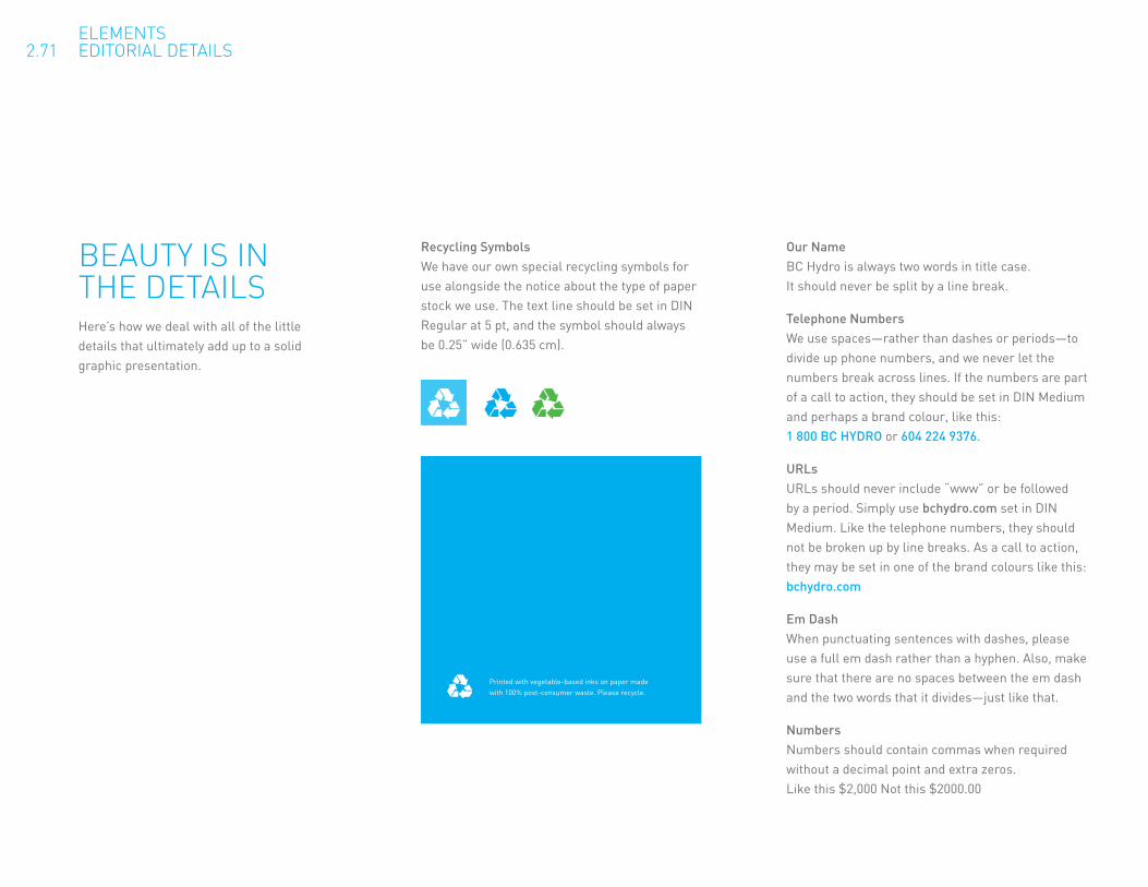
BEAUTY IS IN THE DETAILSHere’s how we deal with all of the little details that ultimately add up to a solid graphic presentation.
Our Name BC Hydro is always two words in title case. It should never be split by a line break.
Telephone Numbers We use spaces—rather than dashes or periods—to divide up phone numbers, and we never let the numbers break across lines. If the numbers are part of a call to action, they should be set in DIN Medium and perhaps a brand colour, like this: 1 800 BC HYDRO or 604 224 9376.
URLs URLs should never include “www” or be followed by a period. Simply use bchydro.com set in DIN Medium. Like the telephone numbers, they should not be broken up by line breaks. As a call to action, they may be set in one of the brand colours like this: bchydro.com
Em Dash When punctuating sentences with dashes, please use a full em dash rather than a hyphen. Also, make sure that there are no spaces between the em dash and the two words that it divides—just like that.
Numbers Numbers should contain commas when required without a decimal point and extra zeros. Like this $2,000 Not this $2000.00
Recycling Symbols We have our own special recycling symbols for use alongside the notice about the type of paper stock we use. The text line should be set in DIN Regular at 5 pt, and the symbol should always be 0.25” wide (0.635 cm).
ELEMENTS 2.71 EDITORIAL DETAILS
Printed with vegetable-based inks on paper made with 100% post-consumer waste. Please recycle.

NON-CAMPAIGN ADSWhile these two ads communicate the same basic information, their approach is completely different. The “before” version feels negative and pessimistic. The “after” version is much more optimistic and personal, positioning BC Hydro as a pro-active force that equips, informs, and empowers British Columbians.
Before After
PROTECT YOUR HOME AND PREVENTPOWER OUTAGES BY KEEPING TABSON THE TREES AROUND YOU.Trees falling on or touching power lines are one of the primary causes of power outages. They’re also a significant safety hazard. In fact, a tree closeto power lines can become a conductor of electricity – and a safety risk toanyone touching it.
That’s why it’s so critical to regularly monitor the trees on your property toensure they are healthy, and that they’re a safe distance from power lines. If you see trees or branches that look unhealthy or unstable, or that are in contact with the service wires leading to your house, have them examinedand removed by a certified tree professional.
If a tree poses a risk to power lines on the street, or if you have any questions or safety concerns, please call us at 1 800 224-9376(1 800 BC Hydro) or visit www.bchydro.com
IMPLEMENTATION 3.11 SAMPLE CREATIVE

NON-CAMPAIGN ADSWhile these two ads communicate the same basic information, their approach is completely different. The “before” version is dark and hard to read. The “after” version is much more optimistic and personal, positioning BC Hydro as a pro-active force that equips, informs, and empowers British Columbians.
CONSERVE TODAY FOR A BRIGHTER TOMORROWTum nonsent am, velenibh elit laore cortie consed tismodigna aliquat. Ut nullam, quisisl et, ver iure tate dolum quat, vel eugue del incing erat ing etuero commy nissed delit vulput iure tetuera essisit atie con et, sequatuero dolortinci bla consed magna alis augue ea feummod te conse minci bla feugue corper ad essendit vulla faci.
Ed delendit elessis nulput non elese commodip eraesti nciduip eugait lam, quis num dio dolorem non vel utet lorer incil doluptatie dit adiamet ilit wiscilla core commodigna feu facing eum nit lore ea cortis dunt atinit autat. Ut augait, se faccumsandre do eliquis aliqui blan volesseniam iniat, quismod oloborer senit et nulla adigna consed et, commy num ad tis nullum illa core tet adiamco nsequis nonsequ isismod esent amet volore et, vel dolor adio diatincilla facipsummy nim nullametum volobore dolorpe rcillamcommy non venit alit, verat nulla am ad mincil ulput dolor il dolorem nullum zzrit nim ilit lore faccumsandit venisi.
For more complete detaails, please visit bchydro/standingoffer
FOR GENERATIONS
Before After
IMPLEMENTATION 3.12 SAMPLE CREATIVE

Before After
TALL ZONEVirtually any stronghealthy tree is acceptable in this zone.
MEDIUM ZONEThe maximum height of treesgrowing in this zone should be 12 metres
LOW ZONETrees planted in this area should have a maximum matureheight of six metres.
10 m from pole
Max ht.12 m
5 m from pole
Max ht.6 m
PLANTING THE RIGHT TREE IN THE RIGHT PLACE CAN PROTECTYOU AND YOUR PROPERTY. GET TOKNOW THE THREE TREE ZONES.
Each year many power outages are causedby trees and limbs coming into contact with, or falling on power lines. Tree and power line contacts also pose a safety hazard and canbe prevented if the right tree is planted in the right place.
For more information on landscape planning and a list of acceptable trees for the variouszones and climates in BC call 1 800 BCHYDROand ask for a copy of Planting Near Power Linesor go to bchydro.com.
KNOW THE THREE TREE ZONES.
All illustrations are two dimensional with solid colours derived from our new colour palette. See page x for detailed colour info.
IMPLEMENTATION 3.13 SAMPLE CREATIVE
ILLUSTRATION STYLEBelow is a before version of an ad containing illustrations and a photo. There is no need for a photo when illustrations are communicating the idea. The ad needs to be simplified and the style of illustration needs to be two dimensional and solid colours. If diagrams are ever needed please contact BC Hydro Customer Communications to acquire brand appropriate art work.

Before After
Join Team Power SmarT!make a difference
and conServeToday.Our province has set an important energy goal: to meet half of our new energy needs through conservation by 2020. You can help B.C. achieve that goal by joining Team Power Smart and making a few small changes to reduce your energy consumption.
The starting roster of Team Power Smart is a star-studded, homegrown list of Power Smart leaders that includes two-time National Basketball Association MVP Steve Nash, Lululemon founder Chip Wilson, Smallville star Kristin Kreuk and BC AFN Regional Chief Shawn Atleo—among other notable leaders.
Join the team today! Go to bchydro.com/teampowersmart to set your goal and we’ll help you succeed.We’ll support you by helping you track your progress and give you tips, product information and programs to help you reduce.
in aPowerouTage,knowledgeiSPowerHow to be prepared in case the lights go out:
Make a list of local emergency contact numbers (fire, police, ambulance, etc.). Include 1 888 POWERON (1 888 769 3766) for reporting an outage.
Prepare an emergency kit and store it in an easy-to-find location.
Use surge protectors to protect sensitive electrical equipment such as computers and TVs.
If you need to reset your breakers, switch them off for five minutes before turning them back on.
Use candles with caution—they can be a fire hazard.
For more information visit bchydro.com/outages.
forgeneraTionSJuly&auguST 2008
Power Smart Information604 431 9463Toll-free in BC: 1 877 431 9463
Customer Service1 800 BC HYDRO (1 800 224 9376)
Report a Power Outage1 800 POWERON (1 888 769 3766)Cellular phone: *HYDRO (*49376)
By using paper made with 100% post-consumer waste, printed with vegetable-based inks, the following savings were realized:
74 285,766 89.76 3,026 5,870Full-grown trees Litres of water Gigajoules of energy Kilograms of Kilograms of
solid waste greenhouse gases
FOR GENERATIONS
We can all reduce our electricity use by taking a few easy steps. They can be as easy as turning off unused lights or showering for just one minute less. And if we each make a few small changes, we will help B.C. achieve one of our provincial energy goals: to meet half of our new energy needs through conservation by 2020.
How much electricity can you and your family save over a year? Five per cent? Ten per cent? Twenty per cent? Set a goal for your household and see what you can achieve.
To get started, go to bchydro.com and click the link to Make a Difference Today. There, you can sign up to review how your home uses electricity and set a household electricity reduction goal between five and 20 per cent. If you’re already signed up for online account access, simply log in with your existing User ID.
Our online tool will let you analyze your household electricity use, set a savings goal and track your success. We’ll also give you tips, product information and programs to help you reduce the electricity you use. You can check back after every bill to see how much electricity your household has saved, and to check the energy saving tips tailored for your home.
Choose your goal. Take steps to achieve it. Every step you take toward your goal makes a difference.
JULY & AUGUST 2008
HELP LEAD THE WAY TO A BETTER BC BY CONSERVING ELECTRICITY. AT BCHYDRO.COM YOU’LL FIND A NEW ONLINE TOOL THAT WILL HELP YOU GET STARTED.
MAKE ADIFFERENCETODAY
Power Smart Information604 431 9463Toll-free in BC: 1 877 431 9463
Customer Service1 800 BC HYDRO (1 800 224 9376)
Report a Power Outage1 800 POWERON (1 888 769 3766)Cellular phone: *HYDRO (*49376)
By using paper made with 100% post-consumer waste, printed with vegetable-based inks, the following savings were realized:
74 285,766 89.76 3,026 5,870Full-grown trees Litres of water Gigajoules of energy Kilograms of Kilograms of
solid waste greenhouse gases
IMPLEMENTATION 3.14 SAMPLE CREATIVE
SECONDARY PHOTOGRAPHYTo the right you can see a two colour example of some tips sheets layouts. The dominant brand photography is full bleed at the top while the secondary photography is contained within the columns of the design.

POWER SMART CREATIVE PLATFORM

THE ELEMENTS OF POWER SMARTOur Power Smart brand has become synonymous with proactive energy conservation here in BC. Just as with the BC Hydro parent brand, Power Smart’s logo, colour palette, typeface, photographic style, and tone of voice are the major avenues by which British Columbians get to know what we’re all about. The following sections will show you how to use and combine these elements so that we are always communicating coherently and honestly about the spirit of Power Smart.
ABC
INTRODUCTION 4.0 ELEMENTS

ELEMENTS 4.11 LOGO
THE CORNERSTONE OF OUR BRANDThe Power Smart logo has been redesigned for a more contemporary and approachable look. The letterforms in the wordmark are organic and plant-like, underlining the eco-friendly spirit of the brand; when combined with the BC Hydro parent logo and classic symbol, the vision of a sustainable energy future becomes clear.
SymbolParent logo
Wordmark

LOGOS FOR EVERY OCCASIONThe trio of colour variations to the right will give you plenty of flexibility to work with the logo in just about every application. Each of these variations is available as AI (Illustrator) and EPS vector files. The RGB version is also available as GIF and JPG files. The black and white version is also available as a TIFF file.
ELEMENTS 4.12 LOGO–VARIATIONS
Colour For use against a white background in colour applications (including four-colour process, spot colour, and on-screen).
Black and white For use against a white background in limited-colour applications.
Reverse (white) For use against colourful, dark, or busy backgrounds in both full- and limited-colour applications.

ELEMENTS 4.13 LOGO CLEAR SPACE / MINIMUM SIZES
ROOM TO BREATHEThe minimum clear space around all four points of the logo is a square with sides equal to the x-height of the P in “Power Smart.” This way, the clear space scales as the logo scales, all the way down to the minimum logo width of 0.75”.
Minimum clear space
Smallest size:
0.75” 1.905cm

PreferredWHERE DOES OUR LOGO LIVE?Our logo is designed to work best in the corners of a layout, preferably on the bottom left. If that’s not possible, then the other corners are also fine. Just remember to placed it an even distance from both edges, 0.25” (0.635 cm) at the very least.
ELEMENTS 4.14 LOGO POSITIONING
Presentation folder

LOGO NO-NOSWe want our logo to be consistent and recognizable wherever it appears. Here are a few things to avoid when you are working with it. There may be exceptions such as video production where legibility might be questionable but we feel the same principals used in print production should work just as well in video production. Using the reversed logo on top of a busy background etc.
Do not stretch or otherwise distort the logo.
Do not use colour variations other than the three provided.
Do not reconfigure the logo elements.
Do not place the colour logo on a photograph or other busy background.
Do not add dropshadows, outlines or other effects.
Do not add anything within the logo’s clear space.
www.bchydro.com
ELEMENTS 4.15 LOGO MISUSE

SMART COLOUR PALETTEThe colour palette for Power Smart is based around two dominant pairs: a green pair and a blue pair. Magenta is used for a bold splash of colour or to highlight vital information in a layout.
Feel free to use all five of these colours for any Power Smart application–although there are a few restrictions in terms of how they are used side by side, as shown on the following page.
Other than the grey and black used for body copy, additional colours or screens of the palette colours should be avoided.
Pantone 369 C70 M0 Y100 K0 R81 G184 B72 BinHex #58A61B
Pantone 2985 C60 M0 Y0 K0 R68 G199 B244 BinHex #5BC6E8
Pantone Process Cyan C100 M0 Y0 K0 R0 G173 B239 BinHex #00ADEF
Rubine Red C0 M100 Y30 K0 R237 G12 B110 BinHex #00b0b8
To be used sparingly only as an accent colour. Not for headlines.
Cool Gray 9 C0 M0 Y0 K70 R102 G102 B102 BinHex #4D4F53
Body copy colour.
ELEMENTS 4.21 COLOUR
Pantone 382 C35 M0 Y100 K0 R179 G210 B52 BinHex #BED600
Pantone Process Black C0 M0 Y0 K100 R0 G0 B0 BinHex #000000
Body copy colour with legibility concerns.

ELEMENTS 4.22 COLOUR PROPORTION
THE PERFECT BALANCEEvery Power Smart application is dominated by one of the two main colour pairs, depending on the audience. Residential communications feature the green pair more prominently, while business communications feature the blue pair. Usually, this means that the cover page uses the dominant colour pair.
Here’s the tricky part. You can use both pairs in any one application–no matter who the audience is–but never on the same layout. For example, in the case of a trifold brochure, if all three panels on one side of the sheet use the blue pair, then all three panels on the other side would use the green pair.
By no means do you have to use all four colours in every application. In fact, white space and negative space are an important part of the Power Smart look, lending a welcoming and non-congested feel to materials. Small applications such as postcards and bookmarks will often benefit from a more restricted palette of just two or three colours.
Rubine Red is strictly optional, and only ever appears on a white background
The two lighter colours are generally used for headlines on top of the darker background colours.
The two darker colours are generally used for background colours.

ELEMENTS 4.31 TYPOGRAPHY
SMART TYPEFor headlines and body copy alike, we use different weights of a typeface called DIN. That stands for Deutsche Industrienorm (German Industrial Standard) because it was once the standardized typeface for technology and business use in Germany.
All headlines should be in either green or blue. All body copy should normally be grey, but may be black when you have concerns about legibility (such as in newspapers).
ABCDEFGH IJKLMNOPQ RSTUVWXYZHeadlines DIN Black in all caps, set larger than 20pt. You can determine the leading by multiplying the font size by 0.92 (e.g. if the font size is 40pt, then the leading is 37pt).
ABCDEFGHIJKLM NOPQRSTUVWXYZSubhead 1 DIN Black in all caps, set below 20pt. The leading is equal to the font size.
ABCDEFGHIJKLM NOPQRSTUVWXYZ abcdefghijklm nopqrstuvwxyzSubhead 2 DIN Medium in sentence case. The leading and the font size should be equal to the body copy.
ABCDEFGHIJKLM NOPQRSTUVWXYZ abcdefghijklm nopqrstuvwxyzBody copy DIN Regular in sentence case. The leading is determined by multiplying the font size by 1.5, while the space after each paragraph is determined by halving the leading (e.g. if the font size is 9pt, then the leading is 13.5pt and the space after is 6.75pt).

SECONDARY TYPEFor situations where the DIN typeface cannot be employed such as Power Point presentations, live text web sites and emails we use Arial Regular.
ABCDEFGH IJKLMNOPQ RSTUVWXYZHeadlines Arial Regular in sentence case. Please do not try to recreate the look of the all–caps headlines. The leading is equal to the font size (e.g. if the font size is 40 pt, the leading is also 40 pt).
ABCDEFGHIJKLM NOPQRSTUVWXYZSubheaders Arial Regular in all caps set smaller than 20 pt. Just as with headlines, the leading is equal to the font size.
ABCDEFGHIJKLM NOPQRSTUVWXYZ abcdefghijklm nopqrstuvwxyz
Body copy Arial Regular in normal sentence case. The leading is determined by multiplying the font size by 1.5, while the space after each paragraph is determined by halving the leading (e.g. if the font size is 9 pt, then the leading is 13.5 pt and the space after is 6.75 pt).
ELEMENTS 4.31 TYPOGRAPHY

ELEMENTS 4.41 BOXES
POWER SMART BOXESWe have at our disposal three clever little boxes—graphic devices that can be used in any Power Smart application. All three act like containers to block off space for text, product images, or the logo. They’re designed to lock up with one another, as described to the right.
Feel free to use any of the Power Smart colours for these devices. If you are using the boxes over a photo or a solid colour, you can also make them white.
Just remember that not every application needs to use these devices, and that type and colour alone can often be more effective. In any case, use the boxes with moderation—preferably no more than 2 in a single application.
Single tail Used alone or locked up to either of the others
Double tail Used only when locked up to either of the others
Single nook Used only in combination with the single-tail box, with the three straight sides bleeding off the composition
ELEMENTS 4.42 BOXES SCALE
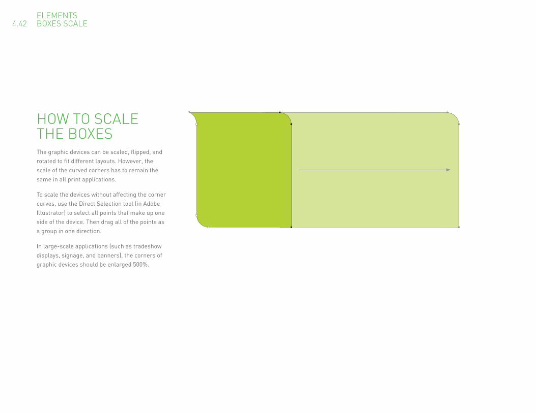
HOW TO SCALE THE BOXESThe graphic devices can be scaled, flipped, and rotated to fit different layouts. However, the scale of the curved corners has to remain the same in all print applications.
To scale the devices without affecting the corner curves, use the Direct Selection tool (in Adobe Illustrator) to select all points that make up one side of the device. Then drag all of the points as a group in one direction.
In large-scale applications (such as tradeshow displays, signage, and banners), the corners of graphic devices should be enlarged 500%.

ELEMENTS 4.43 BOXES CROPPING
CROPPING THE BOXESThe single- and double-tailed boxes are designed to be used uncropped, or cropped along one side only. The single-nook box, on the other hand, should always bleed off the composition on all three straight sides. (It is also always used in conjunction with the single-tail box, as shown in the example.)
The point of the tail lines up with the point of the nook

ELEMENTS 4.44 BOXES SPACING
DISTANCES BETWEEN THE BOXES AND THE EDGE OF THE PAGEWhen the boxes are locked together in a layout, allow a 1/16” (0.16 cm) space between them. If you are placing text, product images, or the Power Smart logo inside of a box, allow a 1/4” (0.635 cm) margin.
In full-bleed print applications, the tail should point off of the edge of the page; the space between the straight edge of the box and the page edge should be 1/4” (0.635cm).
When designing for print jobs that don’t allow for a full-bleed, the tail should run parallel to the edge of the page. In such a case, the distance between the straight edge of the box and the page edge should be 1/2” (1.27cm).
In large-scale applications (such as tradeshow displays, signage, and banners), these measurements should be multiplied by five.
1/4" 1/16" 1/2"
Spacing for bleed applications (preferred) Spacing for non-bleed applications
1/4" 1/4"
Text area Text areaEd
ge o
f pag
e
Edge
of p
age

ELEMENTS 4.45 BOXES LOGO
BOXING UP THE LOGOOnly the single-tailed box can contain the logo in isolation. In these cases, the logo must be set within a 1/4” (0.64 cm) margin and must be made no smaller than 1 3/4” (4.45 cm). If you need the logo to be smaller, simply use it on its own without the box.
Remember that when the box is locked-up with another graphic device, they should be spaced 1/16" apart.
In large-scale applications (such as tradeshow displays, signage, and banners), these measurements should be multiplied by five.
1/4"
1/4"
1/4"
1/4"
1/4"1 3/4"
1/16"
Spacing within the graphic device Spacing between graphic devices

ELEMENTS 4.51 PHOTOGRAPHY
PHOTOGRAPHY FOR OUR ENERGY FUTUREJust like the BC Hydro brand photography, Power Smart images reflect a bright and optimistic energy future, with a natural lens flare embodying that positivity. The difference is that Power Smart is all about the practical things we do in our homes and businesses to realize our vision. To zero in on the practical, photos should depict the natural and built landscapes of British Columbia in a bright and authentic style, without depicting any people.
Checklist Is the composition simple? Is there a natural lens flare from the sun? Are there brand colours within the composition? Does it look like British Columbia? Does it not contain people?

ELEMENTS 4.52 PHOTOGRAPHY PRODUCTS
PRODUCTSProduct photography pops up a lot in Power Smart materials, so consistency is important. All product images are monotones in either process cyan or the darker green, depending on the dominant colour of the layout. Products are then clipped to sit on a white background, as shown in the examples.
Pantone 369Pantone Process Cyan
A blue-dominated layout for business customers use 100% cyan for the monotone product images.
Green-dominated layouts for residential customers use the darker green. Convert to CMYK for four colour applications.
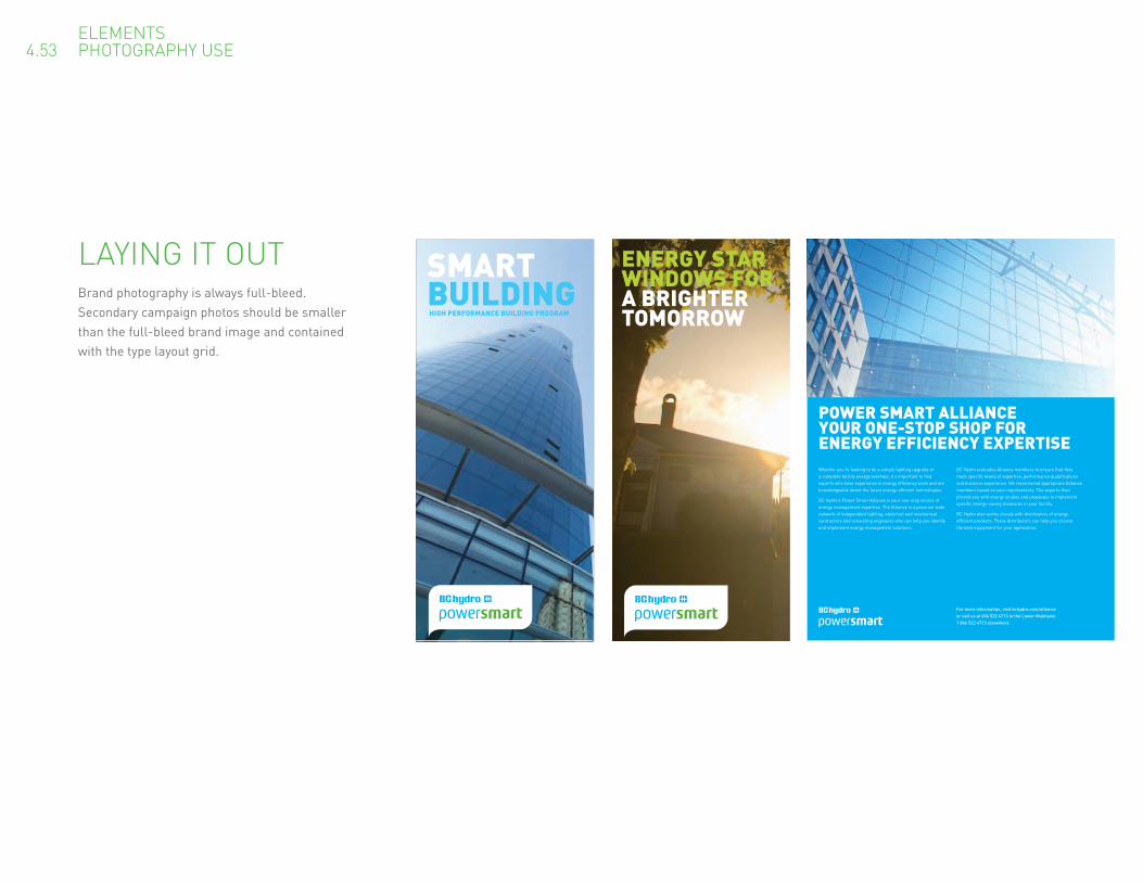
LAYING IT OUTBrand photography is always full-bleed. Secondary campaign photos should be smaller than the full-bleed brand image and contained with the type layout grid.
ELEMENTS 4.53 PHOTOGRAPHY USE
ENERGY STAR WINDOWS FORA BRIGHTER TOMORROW
SMARTBUILDINGHIGH PERFORMANCE BUILDING PROGRAM

ELEMENTS 4.61 TONE OF VOICE
WRITING IN OUR TONE OF VOICEThe voice of Power Smart is not a radical departure from the voice of BC Hydro as a whole—it’s just as approachable, optimistic, and responsible, for example. Still, there are some key differences. Power Smart is constantly offering practical info and energy-saving tips. Sounds pretty simple, but it can be trickier that it seems. Here are a few things to keep in mind to make sure that customers are getting the most out of our good advice.
You’re here to help. When writing in the voice of Power Smart, think of yourself as BC Hydro’s resourceful little sidekick. You may not be the visionary, but you’re still looking out for people, and you’re standing at the ready with everything that people might need to meet their conservation goals. It’s not about being a bossy know-it-all. It’s about warm, eager expertise.
Get right down to the nuts and bolts. Power Smart is practical and efficient in spirit. That should be reflected in how we speak. Aim for lean, informative, action-oriented copy, with just enough chit chat to keep things friendly. For headlines, seek out lively, colourful verbs.
It’s all about positive actions. Saving energy is a lot of things: smart, modern, forward-thinking, innovative, comfortable, convenient, economical, and empowering. But it is never a burden, a drab responsibility, an expensive inconvenience, or an endless series of prohibitions. So go ahead and build advice around positive actions—making clever choices, adopting better and easier ways of doing things, or opting for new technologies. And try not to scold poor energy behaviour. A disappointed or paternal tone is likely to turn folks away.
Writer’s checklist Is it useful and informative? Is it direct and concise, but not pushy or abrupt? Does it make saving energy simple and attractive? Does it sill sound true to BC Hydro as a whole?

ELEMENTS 4.62 TONE OF VOICE EXAMPLES
Before
Lighting for the holiday season.
After
SHOW YOUR BRILLIANCEBefore
Power Smart–insulation draft proofing.
After
THE DRAFT STOPS HEREBefore
Experience the comfort of a Power Smart home.
After
SMART LIVING
HEADLINE EXAMPLES.These copy samples should give you some idea of the how the voice of Power Smart compares to the voice of BC Hydro. Headlines and subheads are shorter and more energetic, with strong action words and concrete, colourful nouns. Information is presented as efficiently as possible, without sacrificing warmth. And notice that the energy-saving advice is not so much about avoiding, stopping, installing or buying, as it is about taking advantage of brilliant new options.

ELEMENTS 4.63 TONE OF VOICE EXAMPLES
Before
The Offer
After
SMART INCENTIVES FOR SMART BUILDINGS
HEADLINE EXAMPLES.Some more examples icluding body copy.
Before
Reduce hot water use To reduce hot water use, install low-flow (9.0 litres per minute) showerheads, do laundry in cold water and install ENERGY STAR qualified dishwashers and clothes washers.
After
IF YOU USE LESS, YOU’LL SAVE MORE Less hot water means more energy savings in your pocket. Low-flow showerheads, cold-water laundry detergents, and ENERGY STAR washers are all great tools for reducing.

ELEMENTS 4.64 TONE OF VOICE EDITORIAL STANDARDS
BEAUTY IS IN THE DETAILSHere’s how we deal with all of the little details that ultimately add up to a solid presentation.
Our Name Power Smart is always two words in title case. It should never be split by a line break.
Telephone Numbers We use spaces—rather than dashes or periods—to divide up phone numbers, and we never let the numbers break across lines. If the numbers are part of a call to action, they should be set in DIN Medium and perhaps a brand colour, like this: 1 800 BC HYDRO or 604 224 9376.
URLs Website addresses don’t need to be prefaced with a “www.” To avoid confusion, they should they break across lines. Simply set them in DIN Medium and, if they are in a call to action, a brand colour. Just like this: bchydro.com/powesmart.
Em Dash When punctuating sentences with dashes, please use a full em dash rather than a hyphen. Also, make sure that there are no spaces between the em dash and the two words that it divides—just like that.
Numbers Numbers should contain commas when required without a decimal point and extra zeros. Like this $2,000 Not this $2000.00
Recycling Symbols We have our own special recycling symbols for use alongside the notice about the type of paper stock we use. The text line should be set in DIN Regulat at 5 pt, and the symbol should always be 0.25” square (0.635 cm).
Printed with vegetable-based inks on paper made with 100% post-consumer waste. Please recycle.

IMPLEMENTATION 5.0 SAMPLE CREATIVE
SAMPLE CREATIVEHere’s a direct mail calendar designed in a unique fold out format. There are no photographs used here, instead typography and colour are used in a clear and effective way.

BIG SAVINGSARE HIDING IN YOUR HOMELOOK INSIDE TO FIND THEM
MANAGING YOUR ENERGY CONSUMPTION WITH POWER SMARTWith British Columbia’s robust economy and growing population, we need to upgrade and expand our infrastructure and invest in more clean, renewable energy. BC Hydro is committed to helping our customers achieve their conservation goals, and we will continue to offer and enhance our Power Smart programs, tools and incentives.
We recently applied to the B.C. Utilities Commission to make changes to our rates over the next two years. Beginning April 1, 2008, you will notice a rate increase that reflects the higher cost of meeting the rising demand for electricity. The vast majority of our customers will see an average bill increase of $5 or less a month each year over the next two years.
We recognize that any rate increase can be a challenge to our customers. However, by taking some simple steps to conserve energy around your home, you can offset some of this rate increase. We have also applied to the Commission for a residential conservation rate to help customers conserve.
CONSERVING ENERGYLIGHTENS YOUR BILLConservation is one of the best ways to lighten your bill. And it’s easier than you think to conserve. The no-cost and low-cost tips inside are just some of the great ways to discover that life in a Power Smart home can be more affordable, more comfortable, and a little easier on the planet. For more conservation tips, details on our Power Smart programs, or to join Team Power Smart, visit bchydro.com/powersmart
WHAT CAN I DO AROUND MY HOME TO SAVE?
TURN OFF LIGHTS WHEN NOT IN USE
SKIP THE HEAT-DRY FEATURE ON YOUR DISHWASHER
USE A POWERBAR FOR YOUR TV AND VIDEO GAME CONSOLE, THEN SWITCH IT OFF WHEN NOT IN USE
GET RID OF AN OLD SECOND FRIDGE THROUGH BC HYDRO’S REFRIGERATOR BUY-BACK PROGRAM
SHORTEN YOUR SHOWER TIME BY A MINUTE
INSTALL A PROGRAMMABLE THERMOSTAT TO AUTOMATICALLY TURN DOWN THE HEAT BY 4-5°C AT NIGHT AND WHEN NOT HOME
REPLACE YOUR HALOGEN TORCHIERE (FLOOR LAMP) WITH A COMPACT FLUORESCENT (CFL) TORCHIERE
INSTALL A LOW-FLOW SHOWERHEAD
INSTALL AERATORS ON YOUR MOST FREQUENTLY USED FAUCETS
REPLACE OLD-STYLE LIGHT BULBS WITH CFLS
SET YOUR FRIDGE TO 4°C IF IT IS NOW AT 3°C
INSTALL A MOTION SENSOR ON A MAIN OUTDOOR LIGHT
INSTALL AN INSULATING BLANKET ON AN OLDER WATER HEATER
SWITCH OFF YOUR COMPUTER WHEN NOT IN USE
WASH CLOTHES IN COLD WATER
HANG DRY LAUNDRY
When implemented, these tips will provide varying energy savings based on the type of home you live in and the heating you use. For tips and savings specific to where you live, visit bchydro.com/powersmartor call us at 1 800 BC HYDRO (1 800 224-9376)
UNPLUG CHARGERS WHEN THE DEVICES ARE NOT CHARGING
REPLACE AN INCANDESCENT NIGHTLIGHT WITH AN LED
SEAL EXTERIOR WALLS, DOORS AND WINDOWS AGAINST COLD DRAFTS
PLANT LEAFY TREES TO HELP SHADE AND COOL YOUR HOME IN THE SUMMER
IN THE WINTER, LET THE SUN HEAT YOUR HOME NATURALLY
SET YOUR THERMOSTAT 1°C LOWER DURING HEATING HOURS
TURN OFF LIGHTS WHEN NOT IN USE
SKIP THE HEAT-DRY FEATURE ON YOUR DISHWASHER
INSTALL A PROGRAMMABLE THERMOSTAT TO AUTOMATICALLY TURN DOWN THE HEAT BY 4-5°C AT NIGHT AND WHEN NOT HOME
REPLACE OLD-STYLE LIGHT BULBS WITH CFLS
HANG DRY LAUNDRY
REPLACE AN INCANDESCENT NIGHTLIGHT WITH AN LED
SET YOUR THERMOSTAT 1°C LOWER DURING HEATING HOURS
INSTALL A MOTION SENSOR ON A MAIN OUTDOOR LIGHT
INSTALL AN INSULATING BLANKET ON AN OLDER WATER HEATER
When implemented, these tips will provide varying energy savings based on the type of home you live in and the heating you use. For tips and savings specific to where you live, visit bchydro.com/powersmartor call us at 1 800 BC HYDRO (1 800 224-9376)
PLANT LEAFY TREES TO HELP SHADE AND COOL YOUR HOME IN THE SUMMER
USE A POWERBAR FOR YOUR TV AND VIDEO GAME CONSOLE, THEN SWITCH IT OFF WHEN NOT IN USE
GET RID OF AN OLD SECOND FRIDGE THROUGH BC HYDRO’S REFRIGERATOR BUY-BACK PROGRAM
REPLACE YOUR HALOGEN TORCHIERE REPLACE YOUR HALOGEN TORCHIERE REPLACE YOUR HALOGEN TORCHIERE (FLOOR LAMP) WITH A COMPACT (FLOOR LAMP) WITH A COMPACT (FLOOR LAMP) WITH A COMPACT FLUORESCENT (CFL) TORCHIEREFLUORESCENT (CFL) TORCHIEREFLUORESCENT (CFL) TORCHIERE
SET YOUR FRIDGE TO 4°C IF IT IS NOW AT 3°C
WASH CLOTHES IN COLD WATER
IN THE WINTER, LET THE SUN HEAT YOUR HOME NATURALLY
IMPLEMENTATION 5.11 SAMPLE CREATIVE
SAMPLE CREATIVEHere’s a conservation tips brochure utilising an illustration. If diagrams are ever needed please contact BC Hydro Customer Communications to acquire brand appropriate art work.

IMPLEMENTATION 5.12 SAMPLE CREATIVE
Brochure covers before Brochure covers after
ENERGY STAR WINDOWS FORA BRIGHTER TOMORROW
SMARTBUILDINGHIGH PERFORMANCE BUILDING PROGRAM
SAMPLE CREATIVEHere are some brochure covers utilizing the brand photography. Business and residential layouts ensure a full bleed photo with enough clear space for readable headlines.

HIGH-PERFORMANCE BUILDING PROGRAM FOR SMALL TO MEDIUM COMMERCIAL BUILDINGS
BUILDINGSWITH SMARTSHIGH-PERFORMANCE BUILDINGS MEAN LOWER OPERATING COSTS, MORE COMFORTABLE TENANTS, AND A SMALLER ENVIRONMENTAL FOOTPRINT—NOT TO MENTION THEIR ENHANCED MARKET VALUE.
If you’re like many building developers and owners in today’s competitive market, you’ve been looking for ways to make your projects stand out from the pack. You’ve probably also noticed that savvy commercial tenants are demanding more from their offi ces, retail spaces, warehouses, and other facilities: more comfort, more visual appeal and, increasingly, more energy effi ciency.
Lighting can account for half of the total electricity use in commercial buildings. That’s a major expense. With great lighting design—a key part of high-performance building—your project will simply cost less to operate and maintain, while also enjoying a smaller environmental footprint. High-performance lights create bright and appealing spaces where occupants enjoy spending time, whether it’s for work, study or leisure. All of which will ultimately enhance the value of your investment.
BC Hydro wants to help you create and install high-performance lighting in your next development project. Through our High-Performance Building Program for Small to Medium Commercial Buildings, we offer the tools and incentives your team needs to make it happen. We can help you fi gure out how to take advantage of free, natural sunlight during the day, and how to light your project effi ciently and effectively around the clock. Plus our fi nancial incentives won’t just reduce the payback period; they’ll also reward you for your actual electricity savings, above and beyond what you save on the power bill itself.
BENEFITSFOR OWNERSIf you opt for high-performance lighting in your next development project, you can look forward to:
• Enhanced marketability and higher asset value
• Lower power bills and maintenance costs
• Comfortable, satisfi ed tenants that will stay with you longer
• Reduced environmental impact.
AND BENEFITS FOR USERSWhether it’s for work or for play, life inside of a high-performance building means:
• More affordable lighting and fewer maintenance headaches
• Attractive, comfortable surroundings
• Improved productivity
• A smaller environmental footprint.
SAVING ENERGY AND SAVING MONEY GO HAND IN HAND. WITH POWER SMART, IT’S EASIER THAN EVER TO DISCOVER WAYS TO SAVE AT HOME.Loads of British Columbians are striving to save energy. Some just want reduce the size of their household utility bills. Others don’t like the idea of paying good money for energy that goes to waste. And a growing number are looking for simple, straightforward ways to lighten their impact on the environment.
The great thing about energy conservation is that you don’t need to choose a reason—it makes sense however you look at it. All it takes is a few easy, low-cost steps, and you’re well on your way to making a real difference.
Whatever your conservation goals, Power Smart is here to help you reach them, starting with the energy-saving and waste-busting tips inside. Though some are big and some are small, they’re all excellent ways to discover that life in a Power Smart home can be more affordable, more comfortable, and a little easier on the planet.
BC HYDRO POWER SMART TIPS
ENERGY SMARTS AROUND YOUR HOME
THE FACTS ON ELECTRICITY USEWondering where the electricity gets used in your home? It varies from household to household, but the typical single-family house, duplex, or townhouse in B.C. looks something like this:
• On average, keeping a electrically heated home warm costs $460 per year, while keeping hot water on tap costs around $188—the two biggest energy expenses. Fuel-heated homes typically spend about $123 to run electric space heaters.
• Kitchen appliances are the next biggest users, costing between $125 and $166 annually.
• Computers and TVs can be surprisingly energy-hungry, averaging $115 to $160.
• Keeping the lights on usually runs between $94 and $117.
• Laundry room appliances average $42 to $55 per year.
• The needs of other devices—electric blankets, answering machines, coffee makers, and so on—vary dramatically, but typically cost $21 to $37 in total each year.
SEEK OUT THE ENERGY STARThe ENERGY STAR symbol lets you know that your appliances and other home products are among the most energy-smart on the market. Seek it out to use less energy, save money and help protect the environment.
IMPLEMENTATION 5.13 SAMPLE CREATIVE
Fact sheets before Fact sheets after
SAMPLE CREATIVEHere are some tips sheets that are copy heavy. The use of our typgraphic hierarchy ensure maximum readability.

6.0 CONTACT US
PLEASE CALL IF YOU HAVE ANY QUESTIONS.Unsure about any part of this graphic standards manual? Don’t hesitate to give us a ring—we’ll do our best to clear things up.
BC Hydro Customer Communications 604 623 3695

PARTNER LOGOS LOGOS WITH PROGRAM NAMES AND URLs
APPENDIX A APPENDIX B
BC Hydro often works in cooperation with government, media, retailers, and other corporate partners. This supplementary standards guide shows you how to use partner logos alongside our own logos in both BC Hydro and Power Smart communications.
A.1 Partner types A.2 Placement A.3 Relative size A.4 – 6 Examples
B.1 Placement B.2 Size

PARTNERS COME IN ALL SHAPES AND SIZESWe work with seven basic types of partners. There is a subtly different logo treatment for each partner type, so it’s important to clearly identify every partner. Please note that only recognized partners should have their logos included in our communications.
PARTNER LOGOS A.1 PARTNER TYPES
Government
Includes all levels of government that support BC Hydro, whether federal, provincial, or municipal.
Corporate
Includes all corporate partners that do not clearly fall under any of the other categories.
Retailers
We partner with retailers who offer energy efficient products and give practical advice about about conservation. (Note that any taglines must always be locked up with the retailer logos.)
Retailer Sub-brands
Some retailers have established their own in-house brands for eco-friendly products and programs. We don’t generally include these logos. A single sub-brand logo may appear next to a retailer logo in rare cases, but never when more than one retailer is involved. An enabling partner logo may also be included alongside a retailer and sub-brand logo.
Enabling Partners
Like our own Power Smart program, these programs and organizations are dedicated to promoting smart energy choices and a sustainable future.
Media
Our media partners help to educate and inform British Columbians about energy.
Manufacturers
We sometimes feature specific energy efficient products or product lines. It’s enough to mention these in the copy; including the logo isn’t necessary.

CorporateGovernmentPLACING THE LOGOSEach type of logo has a preferred position in relation to our own logo and to the other elements in the layout.
PARTNER LOGOS A.2 PLACEMENT
Single page
Partner logo goes in a clear space, usually opposite our own logo.
Single page
Partner logo goes in a clear space, usually opposite our own logo.
Our logo
Partner logo
Multiple pages
Partner logo goes in a clear area on the back page.
Multiple pages
Partner logo goes in a clear space on the front page, usually opposite our own logo.
Front FrontBack Back
Retailers Enabling Partners Media
Single or multiple page
Partner logo is placed near the relevant copy on the page.
Single or multiple page
Partner logo is treated as a sign-off. It usually goes at the bottom of the page and should be unobtrusive.
Retailer Sub-brand
Single or multiple page
Partner logo is placed next to the relevant retailer logo.
Single or multiple page
Partner logo is placed near the relevant copy on the page.

RELATIVE SIZENaturally, we want our own logo to be primary in all of our communications, so that our customers can easily understand who is talking to them.
For this reason, the size of partner logos relative to our own is important. For most partner types, the partner logo should be roughly 30 per cent of the size or visual weight of our own logo. In the case of media partners, this drops to 25 per cent. Retailer logos should be about 60 per cent of the size of our logo.
The Power Smart logo is used in these examples, but these guildelines also apply to the BC Hydro corporate logo.
PARTNER LOGOS A.3 RELATIVE SIZE
Retailer 60 per cent visual weight
Retailer with tagline 60 per cent visual weight
(A retailer’s tagline is included when calculating
the logo’s relative size.)
Government, corporate, enabling partner 30 per cent visual weight
Media 25 per cent visual weight
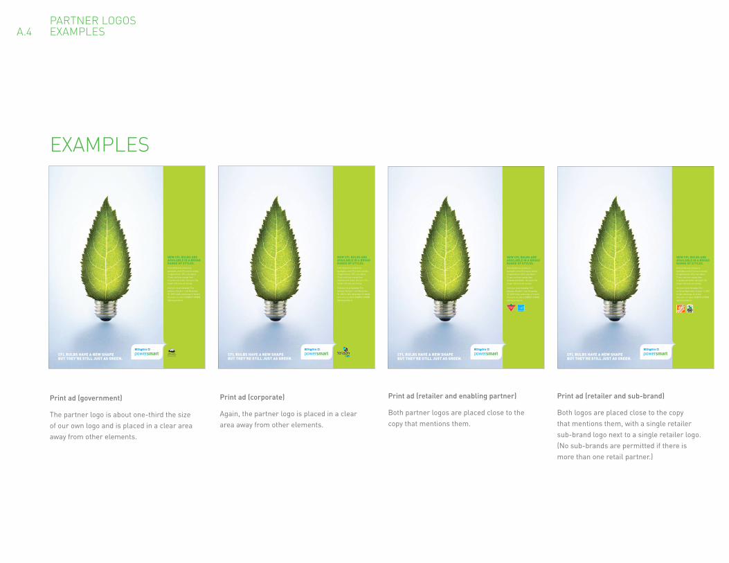
PARTNER LOGOS A.4 EXAMPLES
Print ad (government)
The partner logo is about one-third the size of our own logo and is placed in a clear area away from other elements.
Print ad (corporate)
Again, the partner logo is placed in a clear area away from other elements.
Print ad (retailer and enabling partner)
Both partner logos are placed close to the copy that mentions them.
Print ad (retailer and sub-brand)
Both logos are placed close to the copy that mentions them, with a single retailer sub-brand logo next to a single retailer logo. (No sub-brands are permitted if there is more than one retail partner.)
CFL BULBS HAVE A NEW SHAPEBUT THEY’RE STILL JUST AS GREEN.
From bathroom vanities to spotlights, new CFLs suit a variety of applications. CFLs use about 75 per cent less energy than incandescent bulbs, last up to 10x longer and save you money.
Visit your local Canadian Tire between October 1 and November 30, 2009 totake advantage of instant discounts on select ENERGY STAR® lighting products.
NEW CFL BULBS ARE AVAILABLE IN A BROAD RANGE OF STYLES.
CFL BULBS HAVE A NEW SHAPEBUT THEY’RE STILL JUST AS GREEN.
From bathroom vanities to spotlights, new CFLs suit a variety of applications. CFLs use about 75 per cent less energy than incandescent bulbs, last up to 10x longer and save you money.
Visit your local Canadian Tire between October 1 and November 30, 2009 to take advantage of instant discounts on select ENERGY STAR® lighting products.
NEW CFL BULBS ARE AVAILABLE IN A BROAD RANGE OF STYLES.
CFL BULBS HAVE A NEW SHAPEBUT THEY’RE STILL JUST AS GREEN.
From bathroom vanities to spotlights, new CFLs suit a variety of applications. CFLs use about 75 per cent less energy than incandescent bulbs, last up to 10x longer and save you money.
Visit your local Canadian Tire between October 1 and November 30, 2009 totake advantage of instant discounts on select ENERGY STAR® lighting products.
NEW CFL BULBS ARE AVAILABLE IN A BROAD RANGE OF STYLES.
CFL BULBS HAVE A NEW SHAPEBUT THEY’RE STILL JUST AS GREEN.
From bathroom vanities to spotlights, new CFLs suit a variety of applications. CFLs use about 75 per cent less energy than incandescent bulbs, last up to 10x longer and save you money.
Visit your local Canadian Tire or Home Depot after October 1, 2009to take advantage of instant discounts on select ENERGY STAR® lighting products.
NEW CFL BULBS ARE AVAILABLE IN A BROAD RANGE OF STYLES.
EXAMPLES

AD# P86484_PS_AN_A21 APR 2008 1000 100% V1 Integrated Production Studio APPROVED BY
BIG
AD
WRITER
PROD
PROOFREAD
FILE NAME P86484_PS_AN_A.indd DESCRIPTION PS Player Profile NSP ads
CLIENT BC Hydro COLOURS C M Y K
DOCKET BHY GEN P86484
TRIM 11.4375” x 10.375” DA jp PIC INFO hires
BLEED na AD Tim SEPS RUN
LIVE na PR gr OUTPUT
PAGE 1 FONTS DIND D B C A N A D A • 16 0 0 - 7 7 7 H O R N B Y S T, VA N C O U V E R , B C , C A N A D A V 6 Z 2 T 3 • T 6 0 4 6 8 7 7 911 • F 6 0 4 6 4 0 4 3 4 4
JOIN TEAMPOWER SMART
“ IT’S ABOUT BEING AWARE OF LITTLE THINGS YOU CAN DO. IN THE BIGGER SCOPE OF THINGS, YOU CAN MAKE A DIFFERENCE.”
Everyone knows that Andrea Neil is a natural at soccer.
She did, after all, retire from the Vancouver Whitecaps as
one of the most celebrated players in Canadian history.
Turns out that Andrea is also a natural at energy conservation.
Since joining Team Power Smart, she’s been eagerly coaching
people on one simple, but powerful idea: that small gestures
are just as important around the home as they are on the field.
Little things, like flicking off the lights when you leave a room,
or unplugging cell phone chargers when their job is done.
Can unplugging a charger really make a difference?
If everyone in BC did it for a year, we would save enough
electricity to power Swangard Stadium for over 150 years.
That much savings, with less effort than it takes to kick a ball.
Make a difference today.
Set your goal and we’ll help you succeed.
Join Team Power Smart at bchydro.com
PARTNER LOGOS A.5 EXAMPLES
Print ad (enabling partner)
The partner logo is near the relevant copy. Our own logo gets a more prominent placement.
Print ad (media)
The partner logo is treated as a sign-off at the bottom of the ad. It gets about one-quarter of the visual weight of our logo.
P99411_Basement_E04 JUN 2009 1500 100% V3 Integrated Production Studio APPROVED BY
BIG
AD
WRITER
PROD
PROOFREAD
FILE NAME P99411_Basement_E.indd DESCRIPTION Electronics Ads - Basement
CLIENT BCHydro COLOURS C M Y K
DOCKET BHY GEN P99411TRIM 7.3125" x 9.785" DA lmf/sh/mf PIC INFO Hi Res
BLEED none AD lisa SEPS RUN
LIVE PR ad OUTPUT
PAGE PB FONTS Helvetica Neue
D D B C a n a D a • 16 0 0 - 7 7 7 H o r n B y S t, Va n C o U V E r , B C , C a n a D a V 6 Z 2 t 3 • t 6 0 4 6 8 7 7 911 • F 6 0 4 6 4 0 4 3 4 4
At some point, you need to clear your basement of all those things that are costing you. Like that 3rd or 4th TV set that’s collecting dust and drawing electricity on standby mode. By taking it to the nearest Return-It location, you can keep it off your bill and out of the landfill. So start there, and move on to other basement dwellers if you feel so inclined.
Find your nearest Return-It location at electronicsrecyclingbc.caJoin Team Power Smart at bchydro.com
FREE YOUR BASEMENT OF FREELOADERS.
In partnership with

PARTNER LOGOS A.6 EXAMPLES
Brochure (government and retailer)
In this multi-page example, our own logo goes on the front page. On the back, the retailer logos are placed near the relevant copy, and the government logo goes in a clear area on the bottom.
Front Television spot (retailer)
The retailer logos are 60 per cent of the size of our own logo. Note that our logo appears on its own in this sequence.
BIG SAVINGS ARE HIDING IN YOUR HOME LOOK INSIDE TO FIND THEM
Available at these retailers
1 2
3
Back
MANAGING YOUR ENERGY CONSUMPTION WITH POWER SMARTWith British Columbia’s robust economy and growing population, we need to upgrade and expand our infrastructure and invest in more clean, renewable energy. BC Hydro is committed to helping our customers achieve their conservation goals, and we will continue to offer and enhance our Power Smart programs, tools and incentives.
We recently applied to the B.C. Utilities Commission to make changes to our rates over the next two years. Beginning April 1, 2008, you will notice a rate increase that reflects the higher cost of meeting the rising demand for electricity. The vast majority of our customers will see an average bill increase of $5 or less a month each year over the next two years.
We recognize that any rate increase can be a challenge to our customers. However, by taking some simple steps to conserve energy around your home, you can offset some of this rate increase. We have also applied to the Commission for a residential conservation rate
to help customers conserve.
ENERGY SAVING PRODUCTS MAKE A DIFFERENCEEvery little bit helps, buying energy saving appliances for your home can add up to significant savings for you and your family. Available at Canadian Tire and Home Depot stores across British Columbia.
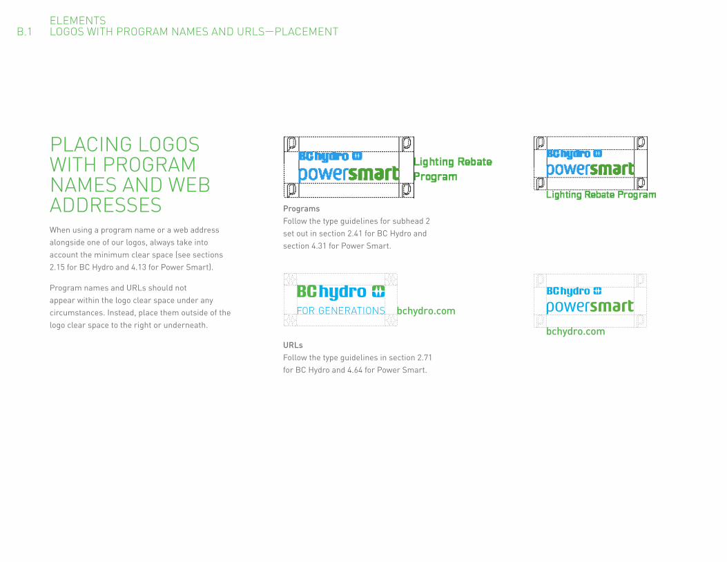
PLACING LOGOS WITH PROGRAM NAMES AND WEB ADDRESSESWhen using a program name or a web address alongside one of our logos, always take into account the minimum clear space (see sections 2.15 for BC Hydro and 4.13 for Power Smart).
Program names and URLs should not appear within the logo clear space under any circumstances. Instead, place them outside of the logo clear space to the right or underneath.
ELEMENTS B.1 LOGOS WITH PROGRAM NAMES AND URLS—PLACEMENT
ProgramsFollow the type guidelines for subhead 2 set out in section 2.41 for BC Hydro and section 4.31 for Power Smart.
URLsFollow the type guidelines in section 2.71 for BC Hydro and 4.64 for Power Smart.
bchydro.com
bchydro.com

ELEMENTS B.2 LOGOS WITH PROGRAM NAMES AND URLS—SIZE
bchydro.com
PenProgram name has approximately 60 per cent of the logo’s visual weight. Web address is less prominent than the logo.
PinProgram name has approximately 60 per cent of the logo’s visual weight. Web address is less prominent than the logo.
Lighting Rebate Program
Lighting Rebate Program
bchydro.com
Minimum sizeLogo: 0.75” wide (1.905cm)URL/program: 7ptbchydro.com
SIZING LOGOS WITH PROGRAM NAMES AND WEB ADDRESSESYou should also consider size when combining program names and web addresses with our logos. This is especially important on small-scale applications like pins and pens.
In all cases, follow the minimum logo size of 0.75” (1.905 cm). The program name or URL should also be no smaller than 7 pt.
In terms of relative size, both program names and web addresses should be less prominent than the logo. Program names should have roughly 60 per cent of the logo’s visual weight.