wbs thesis guide to chart
TRANSCRIPT

Waseda Business School
A Thesis Guide to Chart and Table

Well,actually..

Waseda Business School
A Thesis Guide to Chart and Table

Source :http://www.waseda.jp/wbs/student/degree_
thesis_mba_fulltime_global_en_2.html
4
Wait,Why we need
guide?

Admit it, The formal guide is s*#%~…
5
6
That’s why,let’s excel on what can be change immediately :

Shall westart then?
7

The Basic Design
Principal
Finding The Right
Chart
Chart & Table
Design Tips
1 2 3
4 Simple Approach
5 Shades of Data
Big Chart of Chart
It Start with F… for Flat
Meaningful Color Contrast
Label is love. Label is life.
Don’t hesitate with the Others
Hide Behind The Bar
Ordering The Pie, Plus Doughnut
Schrödinger Table
God Save The Attachment Picture

4 Simple Approach (by Dona Wong)
Finding The Right Chart
Source : http://www.businessweek.com/
Use lines for trends,
vertical bars for discrete quantities,
horizontal bars for ranking,
and pies for shares of the whole.
10
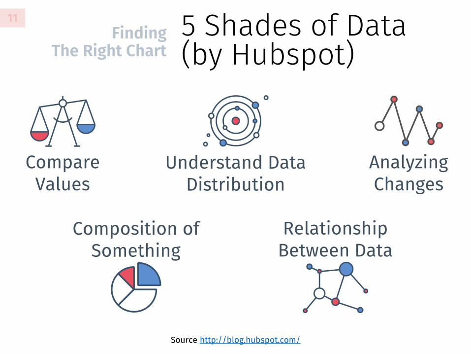
5 Shades of Data (by Hubspot)
Finding The Right Chart
Compare Values
Composition of Something
Understand Data Distribution
Analyzing Changes
Relationship Between Data
Source http://blog.hubspot.com/
11

Big Chart of Chart (by Andrew Abela)
Finding The Right Chart
Source: Choosing a good chart2 (PDF)
12

It start with F…for FLAT
The Basic Design Principle
Flat style is an effective way to conveying your points.
Simple to create, & less distraction for reader.
Also, its not a recent trend, Dona Wong from WSJ has been doing it for a years.
14

It start with F…for FLAT
The Basic Design Principle
NO SHADOW
15
The four point on the left is what flat style consist of. Arguably, you can use little hint of shadow or gradients, but for now let just stick with the basic
Hubspot have an article that will guide you step by step on achieving the essence of flat style design.

Meaningful Color Contrast
The Basic Design Principle
Being academic paper (or final report if you believe MBA shouldn’t write thesis), doesn't mean its should be boring.
Use color sparingly, and give accent color as focal point among your data.
16
0
1
2
3
4
5
UserAmount
Matchbility Pricing Usability
Pref
eren
ce
Matching App Comparison
Our Product Next Leading Brand
The other guy

Label is love.Label is life.
The Basic Design Principle
The audience is not Sherlock. Please named your data.
Don’t let them lost on guessing did the X-axis killed the Y-axis?
17

Don’t hesitate with the Other
The Basic Design Principle
Be gentle to your audience, show them relevant data only. Limit your
result chart up to 5 value, and named Other for the rest.
18

Hide BehindThe Bar
Chart & Table Design Tips
Make the bar wider, make people see it, even from far.
The bar width is your focus, not the empty space between the bar. 0
2
4
6
8
10
2011 2012 2013 2014
WBS Student Satisfaction
20

Ordering Pie, Plus Doughnut
Chart & Table Design Tips
A simple rule on ranking the pie chart: order them from biggest to smallest, and move clockwise from 12 o’clock.
Also keep the data up to 4-5 variable.
21
Sosial Media Users
Personbook Slowgram
Quitter Mytube
Others

Ordering Pie, Plus Doughnut
Chart & Table Design Tips
When your data onlyconsist of 2 variable (Yes/No, Male/Female)Doughnut chart might give better impact on selling your sweet data.
Survey Participant
63%Female
22

Schrödinger Table Chart & Table Design Tips
23
ImportantPoint Case A Case B Case C
Financial Situation 111 222 333
StrengthsPut long text here
Put long text here
Put long text here
Weakness Another Text Another Text Another Text
OrganizationalStructure
Complicated Text Here
Complicated Text Here and some more.
Complicated Text Here
Who said you need a vertical line to called a table, Table?

God Save The Picture Attachment
Chart & Table Design Tips
Either for copyright reason or using other font in your chart as protest to Waseda, copying your chart from excel then paste as picture in Word might be life saving tips.
24

God Save The Picture Attachment
Chart & Table Design Tips
25


Hard copy book
Available to purchase at http://www.amazon.co.jp/
The Wall Street Journal Guide to Informations Graphics by Dona M. Wong.A simple and professional guideline of presenting data to beginners. The book will teach you more about how to coloring you chart, labeling your data and arrange you graphic.
Find it on Waseda Commerce Library, Block G(Japanese version only)
27
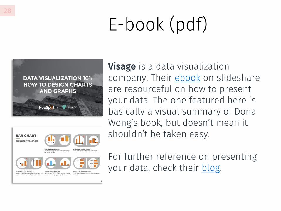
E-book (pdf)28
Visage is a data visualization company. Their ebook on slideshareare resourceful on how to present your data. The one featured here is basically a visual summary of Dona Wong’s book, but doesn’t mean it shouldn’t be taken easy.
For further reference on presenting your data, check their blog.
Download this presentations
as .pptx
+Install Fira Sans, free font from Mozilla to recreate beautiful
slide like this.
BONUS

by
Amil Ramdhan (WBS 2014) @arapunya