watercolor sketching for travelers - peter mcreynolds
DESCRIPTION
At last, an easier, faster kind of watercolor! Anytime, anyplace, but especially while traveling. Learn about “au premier coup” (“in just one pass”) watercolor sketching from an expert. Find out just what you need and where to get the better stuff for less. Get the good brushes, good paints and good papers without going broke. This book shares scores of beautiful examples, all in stunning full color. Learn to make your own lovely little paintings. See how to safely store and attractively display them for family and friends. This is great skill for any age, seven to ninety seven, individually or together as a family. This offers excellent information for those just looking to learn about making art at home. There’s great advice also for those wanting to visually enhance their scrapbooks and journals in a most personal and creative wayTRANSCRIPT

1

2
Thanks again to my patient wife, Rosemarie. Thanks also to
family: Susan, David and Linda for their generous and substantial
help.
All rights reserved
No part of this publication may be reproduced or used in any form
or by any means, graphic, electronic, or mechanical without
written permission of the publisher. All images are the sole
property of the author and may not be used without his permission.
Copyrighted
Published by Speaking of Art
McReynolds Holdings LLC
Laguna Beach, California
2011
The publisher and the author maintain a web site at
Speaking-of-Art.com

3
Watercolor Sketching for Travelers Peter McReynolds

4
Table of Contents
Chapter 1 Why Travel Sketch in Watercolor
Chapter 2 Example, A Short Sojourn in Slovenia
Chapter 3 Watercolor Paintboxes for Travelers
Chapter 4 Watercolor Brushes for Travelers
Chapter 5 Watercolor Papers for Travelers
Chapter 6 Colors Choices, your Personal Palette
Chapter 7 A Traveler’s Overall Kit
Chapter 8 Example, San Francisco’s Golden Gate
Chapter 9 Some Watercolor Sketching Methods
Chapter 10 Exercises, Sketching Nature’s Shapes
Chapter 11 Exercises, Sketching Architectural Shapes
Chapter 12 Exercises, Sketching Figural Shapes
Chapter 13 Exercises, Sketching from Your Photographs
Chapter 14 Display and Storage of Sketches
Chapter 15 Example, My Local Municipal Park
References
Glossary
5
Why Travel Sketch in Watercolor
Sketch to Make Mementos
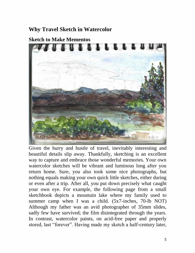
Given the hurry and hustle of travel, inevitably interesting and
beautiful details slip away. Thankfully, sketching is an excellent
way to capture and embrace those wonderful memories. Your own
watercolor sketches will be vibrant and luminous long after you
return home. Sure, you also took some nice photographs, but
nothing equals making your own quick little sketches, either during
or even after a trip. After all, you put down precisely what caught
your own eye. For example, the following page from a small
sketchbook depicts a mountain lake where my family used to
summer camp when I was a child. (5x7-inches, 70-lb NOT)
Although my father was an avid photographer of 35mm slides,
sadly few have survived; the film disintegrated through the years.
In contrast, watercolor paints, on acid-free paper and properly
stored, last “forever”. Having made my sketch a half-century later,

6
with each new viewing I recall languid August afternoons, floating
in a wooden canoe through low green tangles and coils of alizarin-
pink water lilies. Sunny warmth seems again to suffuse the back of
my shirt. Slowly my fingers trail in the water, tracing above trout
idly hovering over the shallow bottom. I hear the soft hum of
myriad tiny insects tending the lilies. Then my mother’s voice calls
me back to shore. What a feeling to recall such memories! And,
it’s a great way to practice your sketching. Grab a brush and start
on your very own irreplaceable memories.
Sketch for the Simple, Playful Pleasure of It
Painting with POPS, Burlingame. 4x10-inches. NOT
As children, we might have played with our food. Suppertimes,
when we saw the lava of burnt-umber gravy filling the pale ochre,
mashed potato volcano’s crater, it was irresistible to stir it all up
and see everything come to a common burnt sienna. And didn’t we
notice that frozen peas had a deeper, more vibrant green than did
the canned ones? As adults, there’s still a sumptuous pleasure to
painting, a tactile reward in pushing around a loaded brush,
watching the trail of vibrant color floating behind, blending
unpredictably but brilliantly with colors from the previous strokes.
In the sketch above of painters working in a municipal rose garden,

7
note the clarity and luminous depth of the colors. The vibrancy of
watercolor is stunning. Scrumptious, like expensive candy.
With watercolors, it’s quite pleasurable to simply take in all those
wonderful, luminous colors, many with mysterious old names,
reminiscent of fairy tales. The following are a few, although some
are no longer available. Dragon’s Blood. Dragons? Alizarin
Madder Lake. Madder is a swamp plant. Here a lake is a medieval
chemical process. Lapis Lazuli. Also called ultramarine or beyond-
the-sea. The best is still mined in a remote corner of Afghanistan.
Caput Mortuum. Literally, dead-head, meaning the dregs. Vert
Emeraude. Emeralds! Mummy. Ugh, actually ground from ancient
mummies. Indian Yellow Genuine. Processed from the urine of
cows fed only mango leaves. Etc. The romance of color names
continues on and is especially true for travelers. There are well
more than a dozen names for various blues based just on location,
starting with Alexandria blue, Antwerp blue, … on through Vienna
blue. And, this is not counting the four heavenly contributions of:
blue celeste, celestial blue and two more named cerulean blue.
You could mount a pilgrimage to a dozen European cities or more,
making a point of sketching with their namesake blues!
Rich watercolors are glorious, seductive, and intoxicating on
paper. Study the next scan, from my 24-pan Winsor & Newton box.
Buying colors still makes me feel like a kid in a candy store.
Colors are downright fun. I can get an irresistible urge to go
outdoors and paint!

8
Sometimes I just have to grab my little travel kit, drive up the
highway a bit until there’s a place to safely pull over, get out… and
sketch. Just as I did in the next image showing a series of timber-
covered ridges climbing over valleys filled with mist. Note those
brilliant, rich colors. Coming home with a sketch like this is like
coming home carrying a fishing rod and straw hamper with cooling
fly-caught trout. What a rush!
280 Rest Stop. 4x6-inches. 140-lb NOT
Sketch as a Meditative Practice
We’re all aware that some meditative practices incorporate a
discipline of sitting periods that require a quiet, laser-sharp focus
of the mind. Perhaps surprisingly, simple sketching can provide
many of the same benefits, albeit in a mundane way. To best
sketch, you have to shift mental gears and, instead of a cursory
glance, give your subject a really careful, close look. And no, this
isn’t what we usually do. To personally experience this right now,
let’s exploit something our bodies and minds seem wired to do.
Find some interesting, complicated landscape scene. After your

9
first and usual glance, then give it another look. However, this
second time, with your arm outstretched, mindfully and silently
trace your pointing index finger around some salient feature of that
same scene. Steadily concentrate. Say, first you glance at a house
across the street and then look again, the second time slowly
moving the tip of your finger around the outline of the roof and
chimney. Oh my, in an instant, there’s a deeper, even profound
appreciation of that feature! With this different way of looking, in
just seconds you more truly saw, more fully apprehended.
Famously, this experience, this jump in visual cognition, is
difficult to describe in words. But, it is quite real; you actually feel
it yourself. Psychologists would say that your vision moved from
the left side of your brain to the right side. Whatever this shift is, it
is a skill that a good sketcher needs to exploit. Thankfully, it is
easier to learn (with just a little practice) than it is to tell.
This cognitive shift in vision is so important that it warrants a
curious anecdote. A coworker of my wife had returned from a
group excursion down the Colorado River, along the bottom of the
Grand Canyon. The whole office was enjoying lunch and passing
around the photo prints the traveler just had received back from the
film developer. Suddenly several viewers let out gasps of disbelief.
There it sat, and also in several subsequent snapshots. It was plain
as your own nose, only a dozen steps off the riverside trail.
Unbeknownst to the hikers, and even to the man who had pointed
the camera, an adult mountain lion had been caught tarrying too
long and was trapped between the water and the steep slope of
rough talus swooping immediately up the side of the canyon.
Apparently the cagey cat had decided better to wait sitting
absolutely motionless and let the chattering humans simply wander
by, mere yards away. No point in bounding up the scree field and
creating a lot of stupid commotion. No sense provoking gales of
panicky shrieking. Nobody had noticed the large cat because
nobody expected one. Everybody expected more no-cat. It’s a
guess as to why even the burros only quietly trudged by. Maybe
tired and laden with sleeping bags, guitars, cold steaks, etc., they

10
simply thought, “There’s that lucky darn cat again. He never has
anything to carry in this heat!”
In sum, just imagine the difference if our friend had first
attentively contemplated that scene and had even traced the tip of
his finger around the shapes in the stones. Instead, his mind was on
autopilot, seeing in the viewfinder only the expected sweep of
canyon rocks. Just as we would. Thus, for sketching, we need
instead to saunter along and look very, very carefully. We need to
open our minds as well as our eyes. Of course, we won’t see a
mountain lion every time.
Sketch for the Pleasant Social Company
Many people enjoy congregating with like-minded others. I know I
do. I made the next sketch below, one bright morning, working
with other sketchers of a group called Peninsula Outdoor Painters,
far out on San Francisco bay’s huge empty salt flats. In every
locality I’ve become familiar with, there are organizations for
sketchers or artists. Some of these are rather formal with elected
presidents and other officers. They feature contests and awards and
rules. A few groups even require prospective members to apply to
be nominated by current members and / or to be “juried in”, to go
through some process certifying one’s work as of sufficient
quality. For example, I enormously admire the work of London’s
The Wapping Group of Artists. It’s just 25 artists, chosen by their
peers. (http://the wappinggroupofartists.co.uk) Their work is
consistently excellent, always a great treat to view.

11
Railroad Trestle, Palo Alto. 5x12-inches. 140-lb Cotman NOT.
At the other extreme are groups of sketchers motivated solely by
the fun. Years ago I knew an old, long-retired newspaper man who,
in his nineties, attended demonstrations at the same artists’ society
as did I. Upon deeper acquaintance, one-on-one, he would regale
me with stories from a much different group, at another place and a
different time. He said he had been a participant in the Denver
Businessman’s Sketch Club in the 1930s. He stealthily shared some
of his old oil sketches. Barely dressed and attractive people were
depicted lounging on low-lying branches of trees in the Colorado
Front Range above Denver. Apparently fueled by beer and BBQ,
young enthusiasts of plein aire fun, weekends repaired to the
countryside with paint, boards, palettes and friends. Nowadays I
know of no current “Businessmen’s Sketch Club”, but much of the
fun can still be found, albeit much tamer, in today’s specifically
outdoor painting groups. These largely forego unneeded
formalities; there’re no officers, bylaws, prizes, artist-of-the-year
competitions, etc. Their focus is entirely on the immediate
pleasures of sketching outdoors among simpatico friends. Picnics
with painting! Thus, between these two extremes described, formal
art societies and loosely organized sketch clubs, one can find a
compatible local group offering support and companionship.
What is Travel Watercolor Sketching?
The travel sketching suggested here is making small pictures on
paper with watercolor paint and ordinary graphite pencil. The
results are small-scale and personal souvenirs, visual mementos of
travels, people and places. In sometimes contrast to many
snapshots, sketches should be carefully done, with more mindful
and focused attention. The sketches might be only the size of
postcards. Ideally they are made sur le motif. That is, real time,
right in front of the subject. Or a sketch can be completed later at
your leisure, away from perhaps distracting crowds or other
activities. Maybe finished back in your hotel room that evening,

12
with or without the aid of the tiny color screen on your digital
camera.
The sketch below is of just one beautiful spot along the famous 17-
Mile Drive of Carmel, California. (4x6-inches, 210-lb rough
Nujabi. Collection of David McReynolds.) This road is a twisting,
two-lane blacktop, busy with locals, visitors and tourist buses,
especially on weekends. Although there are many auto turnouts
and viewing points with limited parking, there is little real
opportunity for the leisurely activity of sketching.
When sightseeing with others, I often use a simple system of
making brief pencil notes augmented with a few reference
snapshots taken at the scene. Later, with paintbox and paper, I
combine recall, notes and photos to make an image to my liking.
Remember, sketching isn’t to replace photos, but to create a
more personal memory of your experience. Also, a sketch can be a
very unique gift, meaning more to the recipient than a commercial
postcard. Further, I have found myself, and read as well, that
sketching enhances the memory compared to just a quick photo,
probably because the mind necessarily will have had a more
13
attentive experience. This is just one more benefit of sketching to
get excited about.
Why Specifically Watercolors?
Besides using watercolors, I continue to paint extensively in oils
and other media. Thus, I’ve learned through much personal
experience that your best travel sketching kit is: a small block of
paper, a tiny half-pan box of watercolors, plus one or two good
travel brushes. Why?
Nothing is flammable; everything can be “carry-on”.
The color box can be as tiny as a cell phone, the paper block
no larger than a man’s wallet, and the travel brush the size
and appearance of a fountain pen.
Your outfit needs neither batteries nor power plug.
Your kit costs much less than the average camera.
It isn’t obsolete every other year. I use some of my mother’s
paints and brushes from half a century ago!
Watercolor supplies are available around the world.
Watercolors wash off with soap and water.
You can create your personal postcards and mail them while
still traveling.
Sketchers make friends. If I looked open to the idea, I’ve
been approached by nice people, friendly and curious as to
what I’m doing and how.
Sketches are lovely to have. And, to give as gifts!
They’re permanent. On acid-free paper they can last
“forever”. Sketches by Britain’s JMW Turner, from two
centuries ago, are fine! Mine won’t suffer, stored in cool, dry,
dim, and acid-free environments.
Watercolors are easy! That’s my belief after years of using
other media: oils, pastels, etc. See for yourself!
Lastly, in my local city park, a young woman recently
exhibited a completely unanticipated reaction to my
sketching. Whilst being dragged away by her frowning male

14
companion she enthused, “Wow, mister, that is just totally
hot!” Watercolors are hot!
Calm Morning, Crystal Springs Lake. 4x6-inches 140-lb NOT
15
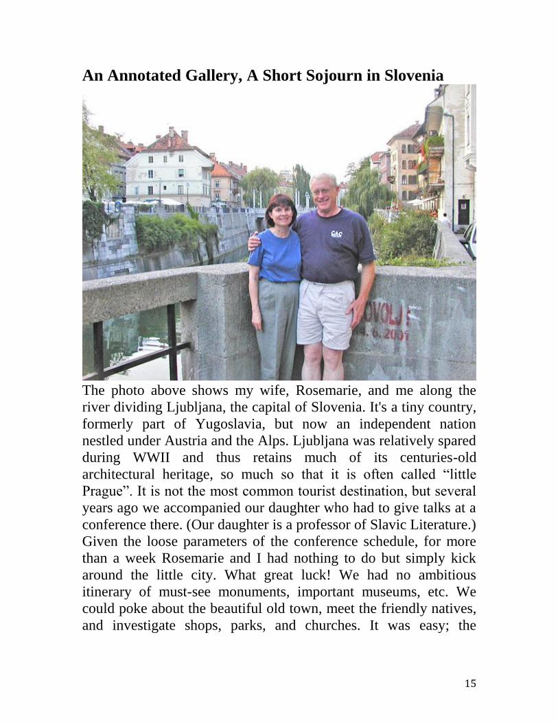
An Annotated Gallery, A Short Sojourn in Slovenia
The photo above shows my wife, Rosemarie, and me along the
river dividing Ljubljana, the capital of Slovenia. It's a tiny country,
formerly part of Yugoslavia, but now an independent nation
nestled under Austria and the Alps. Ljubljana was relatively spared
during WWII and thus retains much of its centuries-old
architectural heritage, so much so that it is often called “little
Prague”. It is not the most common tourist destination, but several
years ago we accompanied our daughter who had to give talks at a
conference there. (Our daughter is a professor of Slavic Literature.)
Given the loose parameters of the conference schedule, for more
than a week Rosemarie and I had nothing to do but simply kick
around the little city. What great luck! We had no ambitious
itinerary of must-see monuments, important museums, etc. We
could poke about the beautiful old town, meet the friendly natives,
and investigate shops, parks, and churches. It was easy; the

16
Slovenes obviously liked Americans. And of course, I could
quietly sketch.
The sketch above (4x6-inches. Canson 140-lb NOT block) looks at
the tiny and busy central square at the heart of Ljubljana. It was
high summer and very warm. The enormous bishop’s palace peeks
over the far rooftops. Although the populace is Slavic, Slovenia
has always looked to the west and historically is a Roman Catholic
country. The building on the left houses the town’s main
department store. It looks a holdover from a 1950s American small
town. They sell cloth by the bolt, spools of thread, etc. I wish I had
asked to sketch inside because the store interior is embellished
with beautiful, life-size Art Nouveau figure sculptures. But like
most people, I have only so much nerve.
A large bronze of an admired local poet, hovered over by a muse,
dominates the middle of the square. Because a small watercolor
postcard sketch takes me about twenty to thirty minutes, and I did
several, I spent quite bit of time around this plaza. And because I
didn’t just take photographs and move on, I did a lot of people
watching at the same time. For example, I did not miss the

17
tumultuous arrival of several busloads of chanting, saffron-robed
monks from Germany. Although Ljubljana is less a less crowded
European destination, in no way is it a neglected backwater. There
were, albeit in smaller numbers, interesting visitors from all over
the world. Plein aire sketching often offers a lot of subsidiary fun.
Sketchers slow down and smell the roses. And, they make local
friends and chat. They leisurely sample the local food. Etc.
Like many places, centuries ago Ljubljana had rulers whose castle
cum fortress crowns a steep local hill. It could be seen from
everywhere in town and of course, for the castle’s purpose, vice
versa. As always, my subject above was the beautiful scene. (4x6-
inches. Strathmore 140-lb NOT) Also, specifically here, I admired
the old, four-and five-story buildings, the forest above and even the
collection of small, colorful automobiles lining the street. Via a
mottled wash of cerulean blue bleaching towards the sun, I
depicted the sky as hammered by heat for days. In contrast, the
deep, cool forest rested in dark blues and greens. I wish that I also
had had time to paint around the castle itself but even ten days are
too few to see an entire city, much less to sketch it all. I did

18
reconnoiter the
castle where several
young docents
eagerly practiced
their limited
English. One young
man even offered
me a cursory
reading of his latest
novel, in his best
quick English oral
translation. Again,
instead of taking a
brief and fast
commercial tour of
many famous sights,
I enjoy spending the
entire time at one
interesting, friendly
place. Walk about
and meet the
ordinary people.
Sketch everything!
Divided by that one river, Ljubljana offers many beautiful bridges.
It is a city of bridges. Although all sturdy and reliable, none of
them looked boring and merely utilitarian. How could you not like
a town whose people would go the extra steps to provide a bridge
with a serious complement of large, bronze, guardian dragons, and
that bridge not located in the political center of the city? The above
obviously is Ljubljana’s Dragon Bridge. (4x6-inches. Strathmore
140-lb NOT) My problem was to depict both a sense of the
imposing size and majesty of the dragons as well as to note our
presence in the city. The dragons are perhaps twice as tall as a
person. There are four of them; one at each corner of the bridge.

19
Plus, in between, there’s a supporting posse of other bronze
dragonalia i.e. lizardly lamps and other Arthur Rackham-like
fairytale whatnot. With the small scale of a postcard sketch I did
not try to detail everything, such as the gang of cat-sized creatures
guarding the bridge lamps in the background. Nor would I want to.
By simplifying them, I’ve maintained primary interest in the
foreground. The viewer’s interest is not scattered.
I couldn’t encompass the entire bridge experience in a single view
of the whole. A key part of making a sketch is deciding what not to
include. By focusing
on just one buttress
with people
standing in front, I
think I made a good
compromise. My
wife, in the white
sunhat, patiently
waits; our daughter
looks ahead for the
next interesting
thing. Both are cut
off to make the
composition I
desired. Human
figures always come
forward and objects
at the bottom of the
image seem closer
still. Being able to
rearrange things is
an advantage of
travel sketching
over passively
accepting what might be included with in a camera’s frame.

20
I made the next sketch
(4x6inches. 140-lb
NOT) from the little
town center called
Three Bridges. It looks
north to the 3-star
Union Hotel up the
street. We had a
wonderful stay there.
During our visit
Slovenia was great,
with its “little Prague”
capital, bucolic
countryside, Julian
Alps, low prices, and
evident affection for
Americans. Of course
Slavic food is quite
good and readily
available. It’s much like
that of the rest of
northern and eastern Europe; there’s a historical emphasis on root
vegetables and red meats. However, much of the population enjoys
a lighter, Italian cuisine; Slovenia was, for some four hundred
years, connected with Venice. An old-fashioned department store
is at the right; the shockingly bright, salmon-colored Franciscan
church is on the left. The bronze poet-patriot and his almost
airborne muse occupy the center left. Most of the time, this town
center was crowded with people, locals and summer tourists. Here
I sketched only a few so as to focus here on the town, not the
visitors.
The next sketch above (4x6-inches. Canson 140-lb NOT) shows a
lovely side street, complete with neighborhood fountain, pressed
hard up against the steep hill capped by Ljubljana’s castle. Note
the generally cool, receding colors of the forest complementing the

21
warm, advancing colors in the foreground. All the colors were
mixed on the paper itself, not on the kit’s palette, which thing in
any case is minimal in a traveler’s little sketch box. If colors are
pre-mixed first on a palette, the color effect can be boring flat areas
more like the Sunday comics. If pure colors first meet wet-in-wet
on the paper, the effect is much more interesting and convincing of
realism.
Perhaps
surprisingly, this
complex-looking
forest more or less
painted itself via
wet-in-wet daubs
here and there. The
splashing of water in
the fountain was
best indicated, not
by adding opaque
white paint, but
simply by scratching
down to bare white
paper with a small,
sharp object. Note
the warm light
reflected off the
pavement at the
edge of the fountain.
I learned to include
this via study of
Sargent’s brilliant
watercolors of
Italian fountains. Study of the masters always pays well.
Although the next sketch (4x6-inches. Canson 140-lb NOT) is
simply titled “Ljubljana”, it is again at the town center and again of
the 1950s-era department store on the right and the bright red

22
Franciscan church across the street. However, this time our view is
angled sharply up towards the rooftops. I wanted to capture the
store’s engaging, bonnet-shaped marquee (gold gilt on black
wrought iron) over the front door as well as the life-size-plus
statuary on the roof. Almost every public or commercial building
supported its own platoon of such airborne heroic figures. As
usual, that day the sky was in fact clear, however I chose to invent
clouds both to add visual interest and to provide a tonal contrast
against which to depict the usually white marble figures. Don’t
hesitate to either subtract unimportant or confusing objects or to
add useful and generic things like clouds.
The sketch below (4x6-inches. Strathmore 140-lb NOT) depicts a
street scene. I couldn’t
resist that old wooden
oriel, that windowed
bump-out, on the side
of the building,
historically facilitating
a family’s hidden
surveillance up and
down the street.
Unfortunately, I feel I
made several small
mistakes? For scale, I
included figures, but
painted one smack in
the middle of the path,
directly underneath the
oriel and even in
almost the identical
hue. Also, although I
failed to convey
enough of this, the
pathway was directly
alongside the river as suggested by the drooping willow. (Which

23
prevents the eye from sliding out of the image.) I remember
struggling with this problem and that I finally gave up. Lastly,
although I can’t put my finger on it, somehow now I’m not
completely happy with the colors I used on the spot. Perhaps those
caput mortuum or maroon shadows?
Oh well, keeping it all in proportion, this sketch clearly remains a
lovely and enjoyable memory of Ljubljana. My sketches aren’t
100% perfect and yours won’t be either. So please don’t forgo
sketching because of either pride or timidity. Besides, often the
sketcher is unduly harsh in criticizing his or her work. I see many
errors that no one else notices. You probably will judge your work
too harshly too. But don’t let it discourage you!
The next sketch is
mischievous. (4x6-
inches. Canson 140-lb
NOT) On a side street,
directly across from
the archbishop’s palace
and just down the
street from the
cathedral itself, I found
a row of nightclubs.
This one in particular
possessed a
provocative if
inscrutable sign over
the doorway. I have no
idea what “CRNI”
means, but the overall
message of the black
cat’s insolent stance is
unmistakable. (On a
map of Slovenia I later
found a tiny town
called Crni Vrh?)

24
Behind the dome and one bell tower of the cathedral, I tried to
indicate the failing light of early evening. When the light falls so
rapidly, a sketch can be finished later with the aide of a camera’s
view screen, while one’s memory is still fresh. I worked to put
some red and some blue into that otherwise flat-black sign. (Look
closely to see those colors.) Certainly the sign’s local (intrinsic)
color was plain black, but a black area on a sketch or painting
usually appears just plain dead. I’ve seen the same black-paint
trick on some Sargent watercolors. It’s justified as an inclusion of
reflected neighboring colors.
Ljubljana is built around a modest river that drains from the Julian
Alps before dividing the city in two. On each side a broad, tree-
lined promenade fronts upon the water’s prim concrete channel.
The city went through a brilliant, master-planned reconstruction at
the beginning of the 20 Century, said following a devastating
earthquake. Every few hundred meters a pretty bridge spanned the
steady, quiet flow.
In this sketch (4x6-inches. Canson 140-lb NOT) I used a deep
ultramarine blue for the gloom under the shadowed end of the far

25
bridge. This is, of course, much exaggerated but serves the purpose
of the sketch. Likewise in the nearer willows dripping over the
water, in person the darks seemed in fact more a prosaic gray. But,
maybe our eyes initially fail us? There again a deep blue looks
convincing and boldly complements the gold ochre color of many
of the multistory residential buildings fronting the river. Finally,
note the dull reddish tiny “Corot spots” on the underside of the
distant bridge subliminally pulling your eye there. This also is
intended to subtly enhance the overall image. It’s not exactly a
falsehood and you probably didn’t see it until I pointed it out.
Remember, a sketch or a painting is not necessarily just the
objective facts. You can and even should change things, add or
subtract things, if those changes that make the final image accord
more with your personal idea of the place.
If possible while traveling, I recommend getting out of the cities.
In Slovenia, for a short while, near the country’s little airport, we
stayed at an inn within a tiny rural hamlet surrounded by grain
fields and hop yards. Every few miles at most, a church steeple
rose above the fields. We could take in a half dozen churches in a

26
glance from our third floor window. This church was right next-
door, just beyond a field of hops. (6x9-inches. Canson 140-lb NOT
block) I think this sketch captures the beautiful but heavy
atmosphere of the hot and humid day’s early evening. Notice how
one can depict things with the edge of a small pocketknife blade or
other sharp object. (Traveling abroad, use a credit card.) With an
edge I scratched in the tall poles used to string the hops. Typically,
paint will preferentially collect in a channel of damaged paper and
deepen in tone. Contrarily, if the flat of the card is used instead of
an edge, a squeegee effect results and lightens the area. I remember
reading once that some famous artist, brushes already filling both
hands, was said to push the (oil) paint around with his nose! The
point is, be inventive. don’t be restricted to what you think you’re
supposed to do, what “professionals” would do. Think instead
what is needed and what at hand might work. Most of all, have
fun! No one need enjoy your work but you yourself. And
especially, enjoy the process, not just the product. That is, enjoy
the very act of sketching, not just any resulting sketches that you
feel turn out particularly well.
Where can one keep dozens of such little travel memory
watercolor sketches? How can one display them or share them with
friends? I’ve attended wonderfully successful gallery exhibits, with
perhaps a hundred tiny paintings displayed, none bigger than these.
There were scores of little pictures hung in a single row at eye
level. However, my home, like most, is neither big enough nor
bare enough to carry off this idea. Instead, often I buy well-made
memory albums intended for sharing photographs or postcards.
There are two caveats: is the album acid-free and will the album
mechanically accept your sketches? Check before you buy. Often
the albums are either not acid-free or their slots, pockets or
whatever, intended to hold the standard-sized photos and
postcards, are too small to hold your sketches without damage.
Below is an album holding many sketches from our trip to
Slovenia. The sketch shown is 4x6-inches. There is no plastic
cover or the like over the watercolors. An upside is that the bare

27
sketches can be better seen and appreciated; a downside is that
they are vulnerable to soiling if touched by admiring hands.

28
Watercolor Paintboxes for Travelers
If you are going to sketch in watercolors while traveling then
you’re going to have to carry around a small amount of low-impact
painting gear. Wisely chosen, it can be inexpensive yet still quite
competent. It should cost much less than a camera kit. Because
there’s a chance you may misplace it, it makes little sense to buy
the pricey, very best. Obviously, you’ll need some paints, some
brushes and some paper. Not so obviously, you’ll use other things
as well, for example, clean water for yourself and for your
sketching. Additionally, you’ll need a small (about 3 to 6 fluid
ounces), empty watertight vessel of some sort to carry away water
dirtied while cleaning brushes, etc. Other chapters cover all these
ancillary needs and more.
Thankfully, a major portion, the core of your little sketching outfit,
can be housed conveniently in a small paintbox kit. "In the good
old days", most artists made their own paintbox, the proverbial
studio in a cigar box. Interestingly, today many experienced
painters still enjoy making their own, custom paintboxes. You
could too; I admit it is a lot of fun. Some stores, e.g.
JudsonArt.com, even provide the materials and hardware to help
you make your own little cigar box kit. However, you don’t need
to make your own and I don’t recommend starting that way if
you’re brand new to watercolor sketching.
Do-It-Yourself, Make Your Own Paintbox / Kit
Still, if you insist on making your own kit, today there are better
ways to start than with a cigar box, especially if you use the
recommended pans or half-pans of paint rather than tube paints.
The photos below show one of my own favorite kits. The paintbox
is a miniscule “Tiny Tin” Altoids can, crammed with six half-pans
of moist watercolors. My trusty Pentel 0.9mm automatic pencil on
the right gives the scale. (The usual 0.5 mm pencils, even the
larger 0.7 mm ones, seem better suited for accountants and

29
engineers. This 0.9 mm model’s lead is just barely big enough to
provide an interesting mark.)
The largest item is the open 4x6 watercolor postcard paper pad. It
is shown open here for scale. When closed, a 4x6-inch postcard
block or pad is little larger than a man’s folding pocket wallet. On
top of the paper is an Arches round red sable travel brush. This
brush and similar are available online or from major art supply
stores. For rinsing the brushes I have here a 35-mm film container.
You can substitute any of those tiny plastic tubs that restaurants
and grocery stores use today to provide sides of salsa, salad
dressing, etc. I habitually embarrass others by pocketing mine
upon leaving a restaurant. Just wash it thoroughly before adding to
your kit.
Note that there is no water reservoir shown, no special water
bottle. Today, one can better rely on the ubiquitous throwaway (but
recyclable) personal plastic water bottle. Like the brush, the
individual half-pans of color can be purchased online or from a
large art store. Major manufacturers offer literally as many as one
hundred-plus different colors. Here I’ve followed a popular palette
scheme: a warm and a cool hue from each of the three primary
colors, two blues, two reds and two yellows. For example, the tin
contains a cool, bluish red and a warm, almost orange-red. Note
the tiny piece of paper with six, sample swatches, included in the
tin for reference.
30
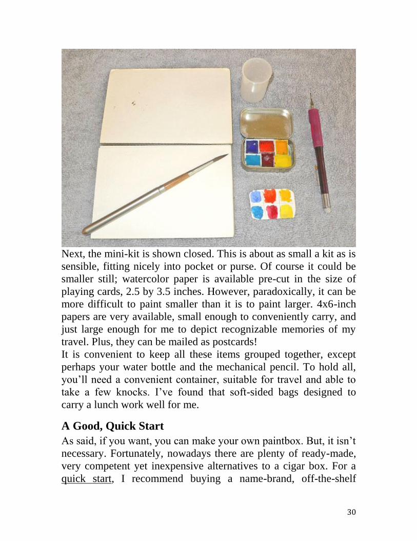
Next, the mini-kit is shown closed. This is about as small a kit as is
sensible, fitting nicely into pocket or purse. Of course it could be
smaller still; watercolor paper is available pre-cut in the size of
playing cards, 2.5 by 3.5 inches. However, paradoxically, it can be
more difficult to paint smaller than it is to paint larger. 4x6-inch
papers are very available, small enough to conveniently carry, and
just large enough for me to depict recognizable memories of my
travel. Plus, they can be mailed as postcards!
It is convenient to keep all these items grouped together, except
perhaps your water bottle and the mechanical pencil. To hold all,
you’ll need a convenient container, suitable for travel and able to
take a few knocks. I’ve found that soft-sided bags designed to
carry a lunch work well for me.
A Good, Quick Start
As said, if you want, you can make your own paintbox. But, it isn’t
necessary. Fortunately, nowadays there are plenty of ready-made,
very competent yet inexpensive alternatives to a cigar box. For a
quick start, I recommend buying a name-brand, off-the-shelf

31
watercolor paintbox with an included selection of moist half-pan
colors. With each of the several following choices illustrated
below, you won’t go wrong. Certainly I haven’t shown all the good
possible choices; there must be others that are as good and as
inexpensive. However, I’ve also run into some very bad choices.
Typically the bad ones have a name like your all-in-one art studio
in a box. In my experience, although cheaper, their quality is
discouragingly poor. Literally discouraging, they perform so badly
you’ll judge watercolor to be very difficult and might feel like
quitting. But it’s only the cheap, poor-quality tools that are
discouraging. Give yourself a fair chance; purchase instead one of
the paintboxes mentioned below or a good equivalent.
The first several of the recommended paintboxes are from one of
the world’s premier artist’s paint manufacturers, England’s Winsor
& Newton. This firm has offered excellent watercolor supplies for
almost two hundred years. The retail prices of these suggested
boxes vary from less than fifteen up to about fifty dollars when
discounted on the Internet, perhaps twice that in a local brick and
mortar store. Some have a usable round brush included.
Unfortunately, typically the included round is so small as to be
suitable only for tiny, picayune details. The particular, metal-cased
brush shown below is an excellent design, but it is simply too
small, unless you are a vacationing entomologist recording the
anatomical details of the local bees. I strongly recommend that you
immediately buy an additional brush as described in the chapter on
brushes. Perhaps you can buy a Cotman 3/8-inch flat, from a local
art and crafts store.
The number of included half-pans of paints ranges from eight to
fourteen. A half-pan holds a volume roughly that of the common
sugar cube. The paint is “semi-moist”, meaning that it looks and
feels dry, but the addition of a drop of water quickly brings up
some concentrated wet paint. As appropriate for traveling, the
overall paintbox sizes range from tiny to merely quite small, in no
case much larger than a child's sandwich. Each of the Winsor &
Newton offerings is in its Cotman line of so-called student-grade

32
paints. Winsor & Newton also offers a more expensive Artist’s line
of colors, but these Cotman offerings are plenty good enough.
Your sketches won’t suffer noticeably as a result. I use both
Cotman and Artist’s watercolor paints all the time and I am hard
pressed to note a decisive difference except that the Artist’s line of
Winsor & Newton offers even more (over a hundred) quite
beautiful colors.
The first W&N half-pan paintbox, here shown open, is probably
their barest-bones and lowest priced. It comes with a spectrum of
twelve Cotman half-pans of color, certainly enough for postcards
memorializing an extended trip abroad. As can be seen, there are a
warm and a cool hue in each of the three primary colors.
Additionally, there are warm and cool green half-pans as well as
some earth colors, notably very useful burnt sienna. Unfortunately,
the box wastes space by including that almost useless white. A
violet would be much more useful. The open lid serves as a mixing
area with three wells. The paintbox includes a Cotman travel brush

33
in which the brush is stored in its own handle for protection. Like
those of almost all the other paintboxes in this genre, this brush is
really too small except for depicting the finest detail. But, it works
and is at least decent in quality.
Shown next below, first closed, then open for business, is another
offering from the Winsor & Newton Cotman line of half-pan
watercolor paintboxes, their “Mini PLUS” model. When closed, it
is little bigger than the average PC computer mouse! Holding only
eight, well-chosen half-pans, this is close to the smallest broadly
available good paintbox, certainly among those at such a
reasonable price. (Superb, even smaller ones can be had for $100
or more.) Note… thankfully no useless white. This paintbox
includes, as typical, that decent but too-small Cotman travel brush,
this time nestling cleverly in a recess in the top of the case.

34
The photos hardly do justice to the tiny size of this unit; closed, it
is little bigger than the tiniest cellphone.
The next paintbox is another in the “Cotman PLUS” series from
Winsor & Newton, this one called the “Pocket PLUS”. It is shown
below, first closed and then open for business. Instead of just eight
half-pans, it contains twelve and, paradoxically, costs less and is
more widely available in stores than the previous mini. It is a very
competent unit, with a slightly larger and more useful travel brush,
albeit not the “folding” kind, not one that nests in its own handle,
protecting the hairs. I store this brush in a segment of plastic soda
straw.

35
The Winsor & Newton Cotman watercolor paintbox below is the
“Field PLUS” model. At sight, it is considerably bigger than the
previous units, the “Mini PLUS” and the “Pocket PLUS”. It

36
contains twelve half-pans. Beyond that, it seems to offer more
tools: many more mixing areas, two tiny rinse cups and a miniscule
water bottle. (Caution: the bottle stopper looks an unreliable fit for
packing water in your luggage.) All this is admirably nested inside.
However, a common recyclable water bottle and two used plastic
condiment cups are practical and are more easily replaced if lost.
There are fully twelve mixing wells, probably at least six too many
for sketching.
There is still another, even larger member of this “PLUS” set, the
“Painter PLUS”, more suitable for a studio with its larger size and
up to twenty-four colors in one of the variations offered.

37
The photos below show another very reasonably priced and
eminently pocket-able paintbox by a quality manufacturer in
France, Raphael. When open, it reveals a nice selection of ten half-
pan colors adjacent to a handy, pre-printed color wheel. (Note:
there’s no seldom used white!) Included is one of the better
brushes in this class, maybe not surprising because Raphael is a
maker of fine brushes. Still, I would have liked a longer handle and
would have preferred a nesting design. However, this box also is
about the least expensive in the class and is widely available.

38
I do see a problem in the mechanical design of the box, that
bending plastic “hinge” between the two half shells. Upon the very
first opening, the “hinge” is already blanched white, the beginning
of plastic strain failure. This will soon totally fail. Raphael should
have used a better, two-part rotating hinge for mere pennies more.
However, a couple of rubber bands would still hold the box
together.
39
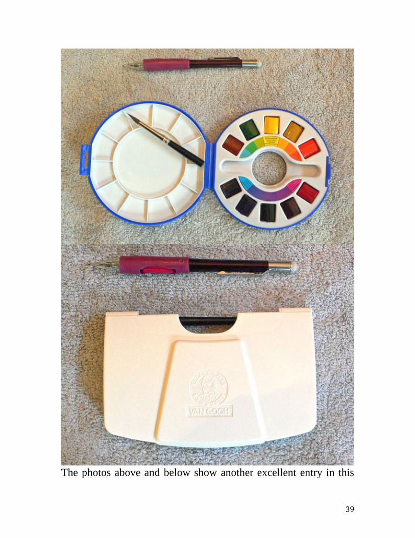
The photos above and below show another excellent entry in this

40
class of inexpensive yet competent travel watercolor paintboxes,
this time in the van Gogh (student grade) product line from Talens
of the Netherlands. It includes a good assortment of eleven half-
pan colors, plus white. The box is well-designed with a reasonable
count of five mixing wells and a real, two-piece hinge enabling the
half shells to easily lie quite flat, a very important property when
sketching in the field. (For example, to rest reliably on you thigh.)
The included brush has artificial hairs and is too small, but it is a
good, nesting design. It’s okay. Note the useful, removable sponge.
The next small, traveler’s watercolor paintbox is a very clever
design from Sennelier of France, makers of excellent paints.
Closed, it is roughly the usual size of the genre, about the size of a
4x6-inch postcard block, yet it easily contains 14 half-pans. And it
doesn’t waste space on seldom-used white. In the open view, this

41
is obvious in the sample color key provided above the colors, a
very handy device. (I always make my own color key if one is not
provided.) Lovely rose madder replaces the white. (Top row, third
from right.) The Sennelier box provides adequate mixing wells and
a good brush, albeit not of the self-nesting or traveling kind. A
soda straw cut to proper length provides some protection. Note the
handy thumb hole, for holding the box aloft in one hand while
sketching with the other. (This is something I prefer not to do
although many others might. Instead, I try to find some flat surface
to hold everything. I often carry a lightweight plastic board to
balance on my lap as a desk.)

42
A unique feature of Sennelier’s design is a small hole behind each
half-pan (not visible from above), enabling one to poke out the
individual pans as needed. This is a boon when refilling the unit;
some pans become cemented in due the honey and gum resin
content of the paints. Sennelier is a manufacturer of high quality
art supplies including paints in all media as well as brushes. Their
watercolors are no exception. This box and the next, the German
Lukas box made from light metal, are rather more expensive than
the preceding ones, pushing fifty dollars or more even on the
Internet. However, while you can make do with less, this Sennelier
kit is superb and, realistically, you’ll really never need to acquire a
better paintbox even if you sketch for the rest of your life. It’s
superb.
Two identical paintboxes are shown in a single photo below, one
box is open, the other closed. They are yet another choice for
small, traveler’s sketchbox, albeit a little more expensive. They are
from Lukas and are typical of the German offerings. These boxes
come with 12 colors included. As such, they can cost a hundred

43
dollars list, perhaps half that on the Internet. In the one shown, I
replaced white and added three useful colors from open stock and
now have 14 hues in a decent folding box of light metal. (In the
closed box, I added even more, six more colors down the empty
middle rank to total an amazing 20 hues in such a compact
package. That’s very close to being too many.) Two enameled
surfaces hinge out level to offer capacious mixing wells. Although
metal boxes can be a little pricier than the plastic alternatives, they
seem sturdier and less likely to break. (An aside… custom-made,
small, half-pan paintboxes of enameled heavy brass can be bought
for hundreds of dollars.) Lukas, Schmincke and others offer a series
of this light-metal type, with size increasing with the count of half-
pans, up to an astounding, patently excessive, 48 colors. Similar
boxes are offered in whole-pans. However, the whole-pan variants
can be quite heavy. They are beautiful to use, unless you have to
walk and carry them for any distance. Perhaps they’re not for
backpacking.
In sum, there are many good choices for a watercolor traveler’s

44
paintbox. Any one of those shown here, if augmented with a better
brush or two, could form the core of an excellent traveler’s
sketching kit. Finding the better brushes is the subject of a separate
chapter covering just brushes.
45
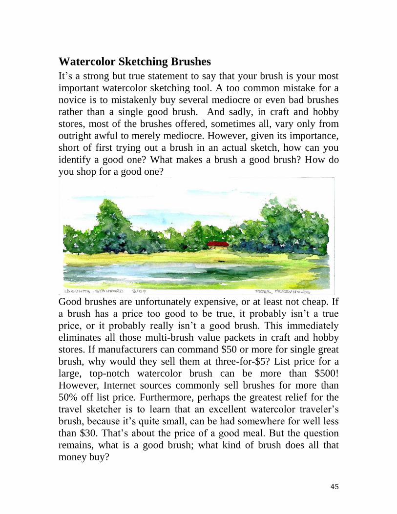
Watercolor Sketching Brushes
It’s a strong but true statement to say that your brush is your most
important watercolor sketching tool. A too common mistake for a
novice is to mistakenly buy several mediocre or even bad brushes
rather than a single good brush. And sadly, in craft and hobby
stores, most of the brushes offered, sometimes all, vary only from
outright awful to merely mediocre. However, given its importance,
short of first trying out a brush in an actual sketch, how can you
identify a good one? What makes a brush a good brush? How do
you shop for a good one?
Good brushes are unfortunately expensive, or at least not cheap. If
a brush has a price too good to be true, it probably isn’t a true
price, or it probably really isn’t a good brush. This immediately
eliminates all those multi-brush value packets in craft and hobby
stores. If manufacturers can command $50 or more for single great
brush, why would they sell them at three-for-$5? List price for a
large, top-notch watercolor brush can be more than $500!
However, Internet sources commonly sell brushes for more than
50% off list price. Furthermore, perhaps the greatest relief for the
travel sketcher is to learn that an excellent watercolor traveler’s
brush, because it’s quite small, can be had somewhere for well less
than $30. That’s about the price of a good meal. But the question
remains, what is a good brush; what kind of brush does all that
money buy?

46
Quick Start Suggestion
If you’re just getting started and so far have only the one, too-small
round brush included with one of those satisfactory, off-the-shelf
paintboxes mentioned previously in this book, then a good initial
step would be to supplement that with a decent small watercolor
wash (flat) brush. An inexpensive example is a 3/8-inch flat from
Cotman, available from most art supply stores and often from
chain hobby and craft outlets. With just these two brushes, you
could, in fact, paint nice postcards all around the world.
Properties of a Fine Brush
There are several essential properties of a fine watercolor brush.
First, although it won’t be obvious until after the passage of both
much use and time, a better brush has a relatively longer service
life. In fact, after more than half a century, I’m still using some of
my mother’s excellent sable brushes. Given the same use, and
absent unusual abuse, a good, albeit more expensive brush will
outlast a cheaper brush several-fold over. As with many things in
life, you get what you pay for. Again, in plain words, quality
brushes can command a stiff price.
But maybe durability alone isn’t motive enough to buy an
expensive brush. A second strength is that a better brush holds
much more liquid paint. Sometimes, in a quaint way, this is called
“having a good belly”. What otherwise might require several trips
from the wet paint source in the paintbox to the paper, could be
accomplished with one drink with a good brush. This is more
important than it might seem. For example, a brush with a good
belly of paint, requiring only a single fill, is much better at
producing a seamless, unbroken watercolor sky wash. A start and
stop approach with a bad brush can be obvious in a patchy final
result.
Third, a better brush comes to a sharper point in the case of a
round brush, or to a thinner, straighter chisel edge in the case of a
flat brush. This makes for a brush that is a more articulate tool in
your hands; you have greater and finer control over the marks you
47
make. And, because of its superior wear resistance; a good brush
will continue to be sharp long after the discount ones have
degenerated to little more than blunt, cotton swabs.
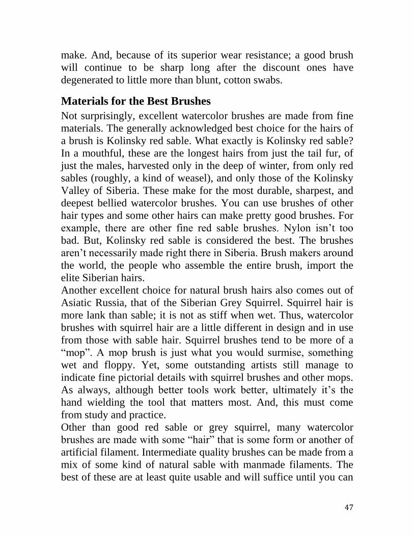
Materials for the Best Brushes
Not surprisingly, excellent watercolor brushes are made from fine
materials. The generally acknowledged best choice for the hairs of
a brush is Kolinsky red sable. What exactly is Kolinsky red sable?
In a mouthful, these are the longest hairs from just the tail fur, of
just the males, harvested only in the deep of winter, from only red
sables (roughly, a kind of weasel), and only those of the Kolinsky
Valley of Siberia. These make for the most durable, sharpest, and
deepest bellied watercolor brushes. You can use brushes of other
hair types and some other hairs can make pretty good brushes. For
example, there are other fine red sable brushes. Nylon isn’t too
bad. But, Kolinsky red sable is considered the best. The brushes
aren’t necessarily made right there in Siberia. Brush makers around
the world, the people who assemble the entire brush, import the
elite Siberian hairs.
Another excellent choice for natural brush hairs also comes out of
Asiatic Russia, that of the Siberian Grey Squirrel. Squirrel hair is
more lank than sable; it is not as stiff when wet. Thus, watercolor
brushes with squirrel hair are a little different in design and in use
from those with sable hair. Squirrel brushes tend to be more of a
“mop”. A mop brush is just what you would surmise, something
wet and floppy. Yet, some outstanding artists still manage to
indicate fine pictorial details with squirrel brushes and other mops.
As always, although better tools work better, ultimately it’s the
hand wielding the tool that matters most. And, this must come
from study and practice.
Other than good red sable or grey squirrel, many watercolor
brushes are made with some “hair” that is some form or another of
artificial filament. Intermediate quality brushes can be made from a
mix of some kind of natural sable with manmade filaments. The
best of these are at least quite usable and will suffice until you can

48
afford the better sables. Still another good choice is “oriental”
brushes, mostly from Japan. For example, those brushes intended
for sumi-e painting can be very well constructed with sturdy
bamboo handles and ferrules. Many are made with excellent hair
from badgers, badgers being yet another member of the weasel
family. As an aside, traditionally the best brushes for men’s old-
fashioned shaving soap kits are made with badger hair.
What else is there to a good brush? Besides a well-assembled head
of good hair, a good brush also should have a quality hardwood
handle and a sturdy, seamless, rustproof metal ferrule (the tubular
structure clasping the hairs into a secure bundle at the end of the
handle). But, don’t worry about handles and ferrules, because by
far most of the expense of a brush is in the quality of hair and the
expert hand-labor building that hair bunch into a proper head. That
is, manufacturers of quality brushes never seem to stint on the
handle and ferrule.

49
Designs / Shapes of Brushes
There are a great many designs or shapes of brushes: flats, brights,
filberts, cat-tongues, mops, fitches, rounds, riggers, pointers, liners,
chisels, and more. Fortunately, for the sketcher traveling light, only
a few types need be considered: flats, rounds and perhaps mops. A
flat (also called a wash) has a shape like a closed book, much like
everybody’s idea of a common housepainter’s brush. The ferrule
holds the hairs in a thick, long row so the tips come to a sharp and
straight edge line. A flat is extremely versatile. Holding it as would
a housepainter, you can rapidly paint broad, regular areas of color.
Such areas are called washes. The flat’s chisel edge paints can
paint lines. With a sharp corner, one can jab down tiny spots of
paint. There’s nothing that can’t be accomplished with a good flat
and that’s probably why many expert watercolorists swear that’s
all they use. Although increasing sizes of flats are sometimes
denominated by a progression of numbers, for example, 0, 4, 8,
etc., typically they are noted by the length of that chisel edge, in
metric or English units, e.g. ¼ inch, etc. A 3/8-inch is an excellent
travel flat.
A round is a brush with a cylinder of hairs pulled up into a
diminishing cone shape that comes to a sharp point. A round is
also extremely versatile; many of the world’s best watercolorists
say they require nothing more than a couple of examples of this
one articulate shape. Like flats, rounds come in a hierarchy of
sizes from a very small 0000, to a huge size 24, large enough to
paint furniture! Travel sketchers need only one or two brushes,
maybe a 4 round and an 8 round? But, perhaps a small mop as
well? Because the price of fine brushes decreases dramatically
with diminishing size and because travel sketchers need only small
brushes to paint only relatively little sizes of paper, a traveler
needn’t break the bank to obtain the very finest kinds of brush.
As said, the shape of a mop brush is just what it sounds like; an
extra-large head of rather floppy hairs, coming more to a loose
baggy shape, sometimes without much of a sharp edge or point.

50
Larger numbers, from “0” on up, denote larger mops. A “6” mop is
already quite large for a travel brush.
Travel versus Studio Brushes
Beyond the materials used in constructing brushes, and beyond the
design or shape of the working head of hairs, good watercolor
brushes can be defined into two further categories: travel brushes
and studio brushes. Travel brushes generally are much shorter
overall and smaller than studio brushes. This agrees with a
presumption that travelers will be working solely close-up on
smaller sizes of paper and also will desire a small luggage volume
to encompass the entirety of their sketching paraphernalia:
sketchbooks, finished sketches, paintbox, brushes, et al.
Watercolor sketching probably is only an adjunct to their trip, not
the main purpose. Were painting the main reason for traveling,
perhaps they should be moving in a portable studio as some artists
have done in the past. Both Claude Monet and John S. Sargent
famously even used dedicated small boats, sometimes just a hired
gondola, but at other times a purpose-constructed floating studio.
Today some artists travel our back roads in custom-outfitted
minivans, not just for sleeping and eating, but also for use as
mobile studios. In such cases, why worry about the size of one’s
brushes?
The photo below shows two of my favorite travel brushes, both
from Arches and available on the Internet, if not at your local art
supply store. At the bottom are Siberian squirrels, one brush open,
the other closed. This shows how the case, like an open cigar tube,
also functions as the needed extension of the handle. That is, the
brush stores inside its cap, much like an old-fashioned fountain
pen. The squirrel’s ferrule is the classic design used in Brittany; a
split quill from the feather of a sea bird (or plastic), wrapped in
gold wire (or other rustproof wire). Because squirrel fur is
relatively lank, the brush can function effectively as a mop.
However, it also has an excellent point like a good round. The two
brushes at the top, one open and the other closed, are rounds made

51
with Kolinsky red sable. When traveling light with only small
paper blocks and a small set of half-pan colors, I really need only
two of these brushes, one of each type.
If you don’t like travel brushes that fold or collapse or otherwise
reduce in size, then a set of modestly sized, ordinary watercolor
brushes like that shown below may be your answer. Isabey,
Raphael and other manufacturers offer small sets like this, here
with the largest single brush a size 8, plenty big enough for small
sketches.
52
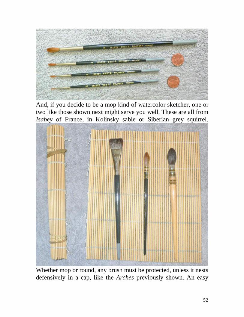
And, if you decide to be a mop kind of watercolor sketcher, one or
two like those shown next might serve you well. These are all from
Isabey of France, in Kolinsky sable or Siberian grey squirrel.
Whether mop or round, any brush must be protected, unless it nests
defensively in a cap, like the Arches previously shown. An easy

53
and inexpensive solution is a bamboo rollup. They are available
purpose-made from art supply stores. Or like these for half the
price, they are simply a common kind of dining table placemat (or
an even smaller sushi roller) that I secure with rubber bands.
“Oriental” Brushes
A less common but quite satisfactory watercolor brush, travel or
not, is the so-called “oriental” brush from Japan. These are
available where Japanese-style painting supplies are sold, e.g. for
sumi-e classes. Although the brush handles appear a little different
from the brushes shown so far, in fact the business ends and the
manner of use are the same. Of the four shown in the photo below,
the middle two have been wetted to appear as they would in use,
two good, quite large rounds made with some kind of red weasel
fur.
Don’t be put off by the disheveled “bad hair day” look of the two
dry brushes. To judge any brush by its appearance, first wet it then
give it a mild shake or quick snap as if to flick off an insect sitting
on the hairs. The brush should come to a good, pointy shape. In
fact, to use a brush in sketching and painting, first rinse the brush

54
in clean water. Then give it this good shake before dipping it into
the desired color. For a drier effect, give it a second, gentler shake
after getting the color but before touching the paper. Messy? Yes,
but we’re sketching outdoors!
Care of Brushes
It requires only some minimal amount of common-sense care to
maintain fine watercolor brushes for a lifetime. When you open the
packaging around your new brush, gently rinse the brush first in
clean water before trying to bend the hair. (A new brush arrives
with a kind of hairdo done by the manufacturers in water-soluble
glue. They must fear you might be disappointed otherwise by the
natural, “psycho” appearance of even the finest brushes unless
wetted.)
Subsequently after each painting session, thoroughly but gently
rinse the brush in clean water until no further color comes out of
the ferrule. Then pat the brush dry with paper toweling before
laying it flat on a clean surface to finish drying. I like to also gently
shape the hairs to a good point between my fingers before setting it
down to dry. Do not stand the drying brush on its fur; in fact,
NEVER stand a brush on its head under any circumstances. The
sight of a good brush standing, working-end down in a water glass,
head of hairs shoved to the side, can make an artist ill. Often that is
the terminal ruin of the brush; the bunch of hairs will take a
permanent set to one side. This kind of “permanent” is not good
for a brush!
Moths and other insects that attack paper, woolen fabric, etc. also
pose a danger to fine brushes. After all, an insect can’t distinguish
between a sable watercolor brush and a sable fur coat. Brushes can
be stored in a drawer with cedar wood. Perhaps surprisingly, good
brushes can have other natural enemies. I was shocked to see my
newly adopted, feral-rescue, adult cat attempt to chew on the heads
of some Winsor & Newton Series 7 Kolinsky red sable brushes
standing upright in a jar! Thankfully, Betty is a very smart and

55
well-behaved cat. After I gently explained the situation to her, she
never again even thought of gnawing my valuable brushes.
Unfortunately, additional natural enemies of fine brushes are the
other humans in your household. A watercolor brush must never be
used for anything else but your watercolors. No matter how much
others may profess that
they know all about
brushes, they should
never be allowed to use
yours. With your good
brushes, they could:
apply shoe dyes or nail
polish, scrub bath tiles
and boots, clean
cooking pots, etc.
People who don’t
sketch will never
understand fine brushes
or your close
relationship to them.
So, if necessary, you
must hide your best
brushes, perhaps
underneath the sweaters
in your dresser drawer,
along with some cedar
wood blocks.
Brushes are particularly
vulnerable to mechanical damage during your travels. Because of
this, I prefer to carry travel or so-called “travel” or “folding
brushes”, like those shown, which can store inside their caps when
not in use. An alternative is the bamboo roll-up. The roll-up’s open
structure also provides needed ventilation, facilitating drying of
wet brushes. Some otherwise unprotected tiny brushes, shown
included in paintboxes, can be slipped into soda straws that are cut

56
to the same length. For example, I keep my smaller “oriental”
brushes slipped into soda straws. I’m always on the lookout to
recycle mundane items, like water bottles, soda straws, disposable
condiment saucers, recyclable jars, well-made cigar boxes, paper
sacks, old toothbrushes, etc. to some second life serving art. (FYI.
Recycled plastic soda pop bottles seem better than plastic plain
water bottles. The extra strength is probably needed due the
carbonization pressure of the soda.)

57
Watercolor Papers for Travelers
Paper is one of the two most important material things in
watercolor painting and sketching. The other critical element is
your brush. Perhaps surprisingly, the watercolor paint itself is not
as crucial; in a pinch you could sketch with coffee and food
coloring! You can’t watercolor sketch with regular paper. You
can’t use drawing paper, sketching paper, computer printing paper,
writing paper, newsprint, etc. They don’t lie flat when wet. Also,
whether soaking wet, merely damp or bone dry, the other papers
simply are not strong enough. You need special, heavy paper made
for watercolor.
Quick start. To begin practicing your brushwork and color
mixing, buy a pad of Strathmore 400 Series watercolor paper (not
the 300 Series), about the price of a fast-food cheeseburger. Or
Fabriano Studio papers. Or Winsor & Newton’s Cotman line of
paper. As you progress, you will become familiar with better, more
expensive papers offered by these same manufacturers.
How the Finest Art Papers Are Made
Paper is manufactured in different ways today. Suffice it here to
describe very roughly how some of the best watercolor papers are
made. Perhaps surprisingly, excellent papers today are made much
the same very simple way as they were made five hundred years
ago. This means that, if you want, you can make your own paper.
In fact, I have purchased small hobby kits for making or recycling
my own paper. It’s fun, informative and inexpensive!
First, you make a sort of watery pre-paper mush by mixing finely
chopped cotton rags (and perhaps recycled good paper) with water
to a consistency of potato soup. If desired, gelatin can be dissolved
in the soup to make a harder, less porous and less absorbent final
paper. This is called volume-sizing the paper. Then place this
liquid in a shallow tub larger than the final desired paper sheet.
Take a very fine screen, for example a small window screen, and
hold it under an open frame (much like an empty picture frame)
58
called the deckle, of the same size. Now, tightly holding these two
pinched together, slide them under the soup and troll gently back
and forth while slowly lifting through the mixture until you obtain
an even layer of the chopped fibers on the screen, more or less
corralled inside the deckle. When the layer of fibers is of a desired
thickness, lift the screen and deckle through the soup. After most
of the water has drained through the porous screen, take off the
deckle. Note atop the screen’s frame, a ragged edge of wet mush
remaining due to inevitable leaking through the narrow gap
between the deckle and the screen. This effect is called deckling.
Cover all with a tight felt cloth and carefully turn over. Gently lift
off the screen, leaving the paper behind, atop the felt. Then, place
another felt on the exposed paper and press to complete the
draining. Finally, hang the damp paper sheet like laundry to finish
drying. One last thing, at the end of the process, just before it is
completely dry, you can pass the paper through a hot ironing
(pressing) if you wish a smoother surface. Fortunately, you don’t
have to start chopping up old dress shirts for rag, because you can
purchase excellent readymade watercolor papers at a reasonable
price.
Practical Travel Sizes of Watercolor Sketch Paper
There are a few more things to know in order to make an informed
purchase of your watercolor sketch paper. Watercolor paper comes
not only in molded single sheets up to 30x40-inches in size but
also in wide and continuous machine-made rolls of arbitrary
length. Of course, for travel sketching one needs only much
smaller pieces. About the smallest useable size is roughly 3.5x5-
inches. That is, small postcard size. At the other extreme, about the
largest convenient size for my travel sketching is roughly 11x14-
inches. In between, there are many available ready-made sizes.
Some are square (6x6-inches and 8x8-inches) and some are rather
eccentric (e.g. 4x10-inches for landscape). All are available in
three finishes: rough, cold (not so rough, smoother), and hot-
pressed (very smooth). Of course, one is free to custom-cut

59
whatever size one wishes from the larger sheets. This is a good
idea; I cut many of my sketch papers in offbeat sizes, for example
to fit old photo frames bought from thrift stores, antique shops, etc.
There are some restrictions if you plan to mail any sketches as
postcards. The US Postal Service has a web site giving the current
rules for what can and what cannot be mailed. Check first; rules
change. (Abroad, simply mail at an official post office.) A first-
class US postcard requires less postage than a regular letter.
Postcards must be at least 3.5 inches tall by 5 inches wide by at
least 0.007 inches thick … but no more than 4.25 inches tall by 6
inches wide by 0.16 inches thick. This is board-like, about a sixth
of an inch thick! Don’t assume that smaller, postcard-sized
sketches are somehow easier to do. Personally, I believe that they
are actually more difficult to do than are those on, say, 6x9-inch
blocks.
The photo shows some watercolor postcard brands I currently use.
They come in blocks, pads or individual sheets within a pochade

60
folio, a sort of large envelope. I use postcard size (roughly 4x6-
inches) more than any other for travel sketching. And if I’m in a
hurry, this size being the most useful, it is the only one I carry.
For example, one summer, visiting Boise, Idaho, I had the
evenings free for my own painting. After a quick dinner, I would
drive miles up the scenic canyon of the Boise River, finding
picturesque scenes for sketching. Returning to my hotel, I would
post the results home from the front desk. Thereafter I received
special treatment, or at least friendly notice. To the staff, I became
the interesting artist in room 202! Note that the sketch contains my
pencil notes and was subjected to Post Office handling; routing
information was printed on the front by some machine in the postal
service process. For a memory album, personally, I like these
effects. But if you don’t like them, then just bring home your
sketches safely in your luggage.
Because here I still see some notation as to colors, I can say that I
must have started this quickly in failing, early evening light. Then
in darkness, I must have taken it back to my hotel room to finish.
Viewing this, I can sense again the setting sun behind my back as it

61
illuminates the bare sienna hills in the far distance. I can recall the
high, dark-umber bluffs of eroding ancient volcanic flows
deepening the gloom enclosing the cool river muttering at my feet.
I suppose an expert photographer might have captured all this as
well. However, with a camera I would have simply pressed the
shutter and left. Sketching, I had to pause and open both my eyes
and my mind in order to carefully see, jot down, to take in that
magnificent and magical scene. This printed the image indelibly in
my memory.
These were much more enjoyable evenings than if I had spent
them plopped in front of the TV in my hotel room. Even if the days
had been winter short or the weather inclement, nonetheless I
could have painted from the warm and dry interior of my rental car
or inside my room. Yes, I even have watercolors inside hotel
rooms! That’s excellent practice. Maybe there’s a coffee table
book there, “Traveler’s Hotel Rooms”.
As said, for travel sketching, more than any other painting ground
or support, I use the postcard-size, 140-pound, cold-pressed block
or pad. And, if I am out strolling aimlessly about with no particular
plans, then that is the paper I will take with me, along in a tiny
sketch kit. However, when packing for a trip I include several
others types. The photo shows my favorite sizes and formats,
usually all in 140-pound, cold-pressed paper. For a week or two
stay, I pack a couple of postcard-size blocks, a larger, 6x9-inch
block, maybe a single, eccentric 4x10-inch landscape block and, of
course, a small 6x12-inch watercolor sketchbook. Don’t get a plain
“sketchbook”; the weaker paper won’t do. You’ll need a
sketchbook made expressly for watercolors.
With these, I can sketch anything I wish. If the paper is in small
blocks, there’s no tedious and messy wet preparation of stretching
with gluey taping. Because I can finish within a half hour or so,
there’s no anxiety about moving shadows, cows going back to their
barn, boats hoisting anchor and the like. If I am working in my
sketchbook, I have at most only a few sketches accumulated.
Misplacing it wouldn’t be a huge loss. I’m not journaling for

62
months in a fancy, embossed-leather, hardbound book. I’m just
walking about having fun while making individual quick sketches.
Most importantly, I’m enjoying myself and getting more familiar
with the place and its people.
If I have a more ambitious idea and if I don’t want to mail the
sketches home as postcards, I often opt for 6x9-inch, cold-pressed
watercolor paper blocks. They’re not much bigger to carry than the
postcard size and offer the same 2-to-3 aspect ratio, attractive for
either landscape or portrait (vertical) format. However, although
only a little larger than the postcard size, they offer more than
twice the area to paint and thus can accommodate that much more
narrative detail. In my opinion, this is about as small as a painting
can be and yet still be hung framed on a wall, to be comfortably
read by standing viewers. Paintings or sketches smaller than 6x9
usually look better in small, tabletop frames or collected into
albums.
The next sketch shows the beach in winter at Coyote Point County
Park, a public picnic area within an open forest, and yacht basin

63
facility on San Francisco Bay near my home. (6x9 Canson 140-
pound, cold-pressed block) One day I’d like to sketch an entire 4x6
pochade folio of ten views around this pleasant retreat. Or, maybe
it should be larger? Pochade collections from many of my local
county parks are another project on my long sketches to-do list.
I’ve heard people frequently lament, they have “nothing to paint”.
If we open our minds and our eyes, nothing could be further from
fact.
Another excellent choice for a traveler’s watercolor sketch paper is
an extreme landscape format block (e.g. from Sennelier of France).
It’s roughly 10x4-inches. Like the postcard sizes, these blocks also
are quite handy for travelers. An example is below. (4”x10” on
140-pound, cold-pressed block.) Arches offers larger blocks in
cold-press and rough at roughly 20x6-inches.

64
This format, although a great pleasure to paint, can be a small
problem to display. A few years ago, Kodak introduced a similar,
but slightly smaller, 35 mm print color film format. This inspired a
few makers of frames, albums, etc. to produce compatible
products. Unfortunately, they are no longer made and, at any rate,
were slightly smaller and required cutting the watercolors down
slightly. (Sometimes the frames still can be found at thrift stores
and the like.) Nowadays, I often varnish the sketches and simply
place them in bookcases, folding them slightly to stand like
miniature screens or scrolls.
If I were willing to forgo the convenience of a paper block, I could
cut down my own wide papers from large stock and in exactly the
correct sizes for available albums and frames. This is worth
emphasizing. If, while traveling, you have room for a small,
lightweight drawing board on which to tape down individual small
sheets of paper, then you will be free to use paper cut to any
dimensions you choose. I use recycled, 15-inch-square, lightweight
boards of corrugated plastic. Remember that if you don’t use a
sketchbook and leave your works inside it, then you should also
bring a small, light portfolio in which to carry safely your
completed sketches. An ordinary paper file folder will do short-
term, in a pinch.
Sometimes I find a good use for this ultra-wide format turned up,
in portrait format. In the midst of a grove of redwood trees, I found
this old timer with the intriguing hole. (Redwood Tree. 4x10-

65
inches. Sennelier cold-pressed block. Collection of David
McReynolds.)

66
The fourth of my favorite traveler’s formats is a small watercolor
sketchbook.
My sketchbooks are inexpensive, 6x12 inches with cold-pressed,
140-pound paper and less than two-dozen, spiral-bound pages.
Strathmore 400 Series. Larger would be too much for my
convenient travel. They’re not smaller because in smaller sizes I’d
rather use a sheet, pad or block. Spiral-bound means that it will lie
truly flat on my lap; other types of sketchbook binding do not.
With so few pages, it isn’t too large. I don’t want to carry a whole
history around and, because these books are quite inexpensive, I
can have a shelf full of them rather than one, albeit beautifully

67
bound tome. My sketchbooks are working books. Also, I use the
sketchbook mainly for recording practice fragments such as this
flowerpot and a water glass with the old rose on the page shown
below.
Thickness of Paper
Besides differing in length and width, watercolor papers differ in a
so-called “weight”. Typically, watercolor paper thickness and
strength are indirectly indicated by the actual weight of a ream
(500 standard-size sheets) of that paper. That is, a stack of 500
sheets of 70-pound paper, about the thinnest usable for watercolor
sketching, weighs just that. Under aggressive handling, paper
thinner than 70-pound paper is too prone to damage. Very
importantly, lighter weight papers are more prone to buckling
when wetted by water or paint. Paper cockling and buckling can
make sketching almost impossible. 1111-pound paper, about the
thickest available, is almost a board made of paper. For travel
sketching, paper in weights from 90 to 200 or so pounds is best, is
the most practical. Papers of these weights can easily withstand
moderate erasing, scraping, sanding, scratching, etc.
Surface Sizing
As mentioned, paper can be sized in bulk when it is still in the wet
pulp stage. Sizing reduces the absorption and increases the
hardness. Besides sizing in bulk or volume, paper can be surface-
sized, the sizing applied just to the surface of the final paper.
Sizing prevents the watercolor paint from sinking much past the
surface further into the paper’s interior. Thus, sizing can make the
colors appear more brilliant, more intense. Regardless of the paper,
some watercolorists alternatively obtain this less permeable surface
by applying a thinned wash of white or other light-colored acrylic
paint, or thinned acrylic medium, and letting it dry thoroughly
before using. Dried acrylics will not dissolve when again wetted;
their drying is permanent, irreversible. Acrylic medium is
approximately acrylic paint without a pigment. It’s water clear, or

68
clear when dry. Some artists recommend using a thin wash of
white acrylic gesso, however gesso contains abrasive pigments and
this abrasive rapidly will wear out your valuable watercolor
brushes!
A paper with a dried light wash of acrylic will look bright and any
applied watercolors will seem to float more brilliantly atop the
surface. If the paper you wish to surface size if already toned, then
a thin wash of just clear acrylic medium is preferred. Note that the
wash must be thinned. Any wash of acrylic without thinning would
completely seal the paper and the paint would simply dry atop an
impervious plastic surface, much like a kitchen countertop. Then
the slightest wipe of the hand could completely remove your
sketch. Artists, who paint watercolors on such supports, typically
also apply a final varnishing to seal and protect the work.
Surface Pressing
The paper surface roughness, or complementarily its smoothness,
is important. A smooth surface will support finer detail but is also
less forgiving of rough treatment. Contrarily, a rougher surface
won’t support the finest detail but lends itself to a more
impressionistic appearance and is more forgiving of rough
handling. The paper’s surface texture results from how the paper is
finally dried. If the paper is ironed between hot metal rollers for
greater smoothness, then the surface is called “hot”, as in hot
pressed. “Rough” paper results if it’s dried only pressed loosely
between coarse-textured felts. Treatment in between is called
“cold” or “NOT” as in not ironed. Cold-press paper surface is a
good compromise for watercolor sketching.
Toned Papers
Paper having a noticeable overall color, paper that is distinctly not
white, is called toned paper. Of course it cannot be too strong a
color or it will be too difficult to paint over with transparent paint.
Further, cool colors require extra emphasis when painting on a
warm-toned paper and vice versa. Most toned papers are warm

69
light tans, but cool pale greens or blues are used also. All are
commercially available. Besides setting an overall mood, toned
papers also facilitate color harmony.
At larger retailers you can find heavy paper suitable for watercolor,
already toned by the manufacturer. Or you can tone paper yourself,
especially when traveling light. It can be as simple as applying a
light color wash on ordinary watercolor paper and letting it
thoroughly dry before further painting. The sketch below was done
over paper toned simply with strong coffee! Confession. I like to
have a separate small block of paper that I give a warm tone via the
morning coffee. It means carrying two little blocks, one with virgin
white paper, and one with the top sheet toned. Two blocks may
seem burdensome but that’s better than carrying a package of
variously toned commercial paper sheets. I suppose teas should
work a similar effect. Or, some teas might make a cooler, pale
greenish tone? Let’s look into that!
Above is a sketch I made of a street scene. I wanted to capture the
old-world twilight of this town in the former Yugoslavia. Although
I used the red, blue and green watercolors right from my kit, the
70
underlying coffee, although remaining dry and not mixing,
somewhat neutralized those overlying colors as expected. (4x6 on
140-lb, Canson cold block with brewed coffee. Collection LS
Chaffin.) Note that I also used a sepia-colored pen. An obvious
caveat or caution is that homemade colors like coffee are not to be
completely trusted as archival. That is, under harsh, bright lighting
or corrosive vapors in the air or simply the passage of many years,
this coffee toning might fade somewhat. Then again, it might not if
kept away from sunlight. But regardless of method or materials,
watercolor work should be kept away from bright light and bad air,
acidic smog, acrid tobacco, auto exhaust fumes, etc. So should we!
Color Response of Paper
Perhaps unexpectedly, different paper types can respond quite
differently to various colors. And, this is something you should
manage in advance. Many factors can influence this. As previously
noted, some papers are pre-toned with a pale wash, usually a warm
color but sometimes a cool one. Obviously, this affects the both the
overall color scheme and the paper’s response to applied colors,
e.g. on a warm toned paper, it will be more difficult to make a cool
blue statement. Some papers are not deliberately toned but never
the less still have a faint color, typically a warm, pale beige tint. In
addition to any color of its own, a paper may also affect applied
colors via uneven absorption, even an absorption affecting some
paints more than others. Thus, despite being evenly applied, your
colors may end up spotty and biased. Examine the first scan below.
I made two color keys to be included in a Lukas paintbox of mine.
The key, on the left, is on a national brand, but cheaper watercolor
paper, purchased at a chain craft store. The key on the right was
made on 140-lb Cotman NOT paper. Both papers are acid-free.
While an excellent paper, the Cotman paper is Winsor & Newton’s
less expensive, student grade paper, not its best Artist’s grade.
A careful perusal reveals that, on the average, the colors on the
right, on the Cotman paper, are notably more vibrant, more vivid,
this despite the vagaries of my non-scientific test application. The

71
second scan, of the reverse sides, shows that, depending on the
color, the paint partially bled through the other, cheaper paper.
Which paper would you rather use? It’s possible that a thinned
wash of acrylic might seal the cheaper paper to an extent that the
variable and mottled bleed-through is stopped and uniform color
brilliance is restored. However, what then remains of the
advantage of the paper’s lower cost? This is an excellent argument
for buying and using only better watercolor papers.

72

73
Deciphering the Paper’s Label
The above scan zoomed in on a small part of the label attached to a
pad of good, toned paper from Italy. Reading it is straightforward
and reveals all one needs to know. Paramount for the buyer to
ascertain is the property, “acid free”, sometimes stated as “neutral
pH”. Note that the Italian word, “blocco”, does not mean the same
as the English, “block”. This was in fact a pad, not a block; the
sheets were glued on only one side. “Trawing” is simply a
charming mistake in spelling. Despite these minor errors, the soft
and pale, cool-blue paper is superb.
Finally, here’s a last word about papers. Use papers you like. Pick
them for their appearance, for their working characteristics, etc.
Make your only caveat that they be archival, acid-free. Once you
like a paper for its appearance, for how it reacts to your techniques,
paints, etc., then it doesn’t matter one whit whether it is hand-
made, mould-made, cotton, linen, heaven knows what, as long as it
is acid-free. Sargent notoriously used materials that were just good
enough. In oils, he painted on cotton duck canvas, not on fancy
imported linen. His paints couldn’t be fugitive, but that was
enough. Beyond that, Sargent didn’t seem to care. Neither should
we. Don’t be seduced by such irrelevant blandishments, as maybe
the paper is said cast from nests of free-range wasps. Fancy custom
papers are beautiful art in their own right, but our focus here is on
the traveler’s sketch.
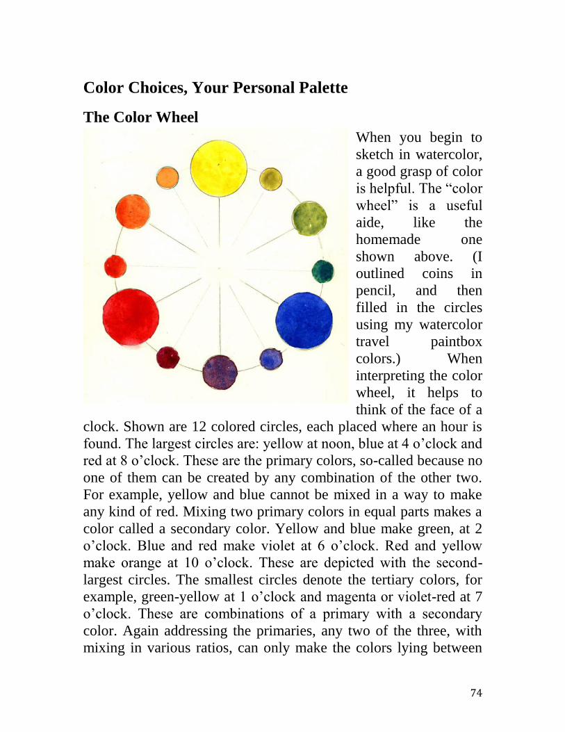
74
Color Choices, Your Personal Palette
The Color Wheel
When you begin to
sketch in watercolor,
a good grasp of color
is helpful. The “color
wheel” is a useful
aide, like the
homemade one
shown above. (I
outlined coins in
pencil, and then
filled in the circles
using my watercolor
travel paintbox
colors.) When
interpreting the color
wheel, it helps to
think of the face of a
clock. Shown are 12 colored circles, each placed where an hour is
found. The largest circles are: yellow at noon, blue at 4 o’clock and
red at 8 o’clock. These are the primary colors, so-called because no
one of them can be created by any combination of the other two.
For example, yellow and blue cannot be mixed in a way to make
any kind of red. Mixing two primary colors in equal parts makes a
color called a secondary color. Yellow and blue make green, at 2
o’clock. Blue and red make violet at 6 o’clock. Red and yellow
make orange at 10 o’clock. These are depicted with the second-
largest circles. The smallest circles denote the tertiary colors, for
example, green-yellow at 1 o’clock and magenta or violet-red at 7
o’clock. These are combinations of a primary with a secondary
color. Again addressing the primaries, any two of the three, with
mixing in various ratios, can only make the colors lying between

75
them on a chord of the color wheel. For example, combinations of
blue at 4 o’clock and red at 8 o’clock can only generate the violet
evening colors between red and blue. Primaries red and blue will
never make a green, much less a bright, fierce yellow.
Secondary and Tertiary Colors
All hues (colors) on the wheel can be approximated from mixing
just those three primaries. And the tiniest watercolor travel
paintbox could contain just these three half-pans. Well, that is sort
of true. If the very smallest size of paintbox is of paramount
importance for you then a three-color box can work. However,
there’s a drawback. When one mixes primaries to make the
secondary and tertiary colors, say mixing red and blue to make
violet, then something will be sacrificed. That something is the
intensity (chroma) of the violet color. Paint manufacturers can
make violets from intrinsically violet pigments, rather than
mixtures of red and blue pigments and such native violets can be
stronger, more vivid than the mixed ones.
This is illustrated in the top row
of this scan where a bright red
mixed with a brilliant blue
produces a nice, in fact, a quite
beautiful violet. However, in the
bottom row are five different
violets picked at random from an assortment of tube colors. The
two spots at the right are close in hue to the mixed violet yet
noticeably more vibrant. A useful convention is to place the most
vivid colors at the very edge of the color wheel and to locate the
less vivid ones in the interior. The mixed violet could be found
roughly close to the straight-line chord cutting across the color
wheel from the bright red to the brilliant blue from whence it was
mixed. And this is what is done; conventionally the duller, more
neutral colors are in the interior of the color wheel circle, located
farther or nearer the circumference in proportion to their
neutralization.

76
Color Neutralization
As mentioned, a color formed by mixing other colors may not be
as vivid as an intrinsically hued pigment. If less vibrant, a color is
called neutralized. Thus a palette, capable of producing strong,
vivid colors around the entire color wheel, can’t be only the three
primaries: red, yellow and blue. A workable choice of half-pan
colors for a paintbox might be all twelve colors shown in the color
wheel above. Nonetheless, very often a sketcher, particularly a
travel sketcher, requires only a neutralized paint, not a vivid one.
For example, in landscape painting the pure green hues available
from the manufacturers do not make a realistic, a believable scene.
In fact, many landscape painters reject any use of pure,
manufacturers’ greens, instead arguing for all the various needed
greens to be made by mixing colors. If you’re after realism,
neutralized greens are the more believable vegetation in nature.
Painting flowers is an important exception. Flowers have forever
challenged manufacturers to produce the most vivid colors
imaginable.
This figure shows the mutual
neutralization of red and green.
Any two colors that lie
diametrically across the color
wheel from each other, like red and green, are called color
complements. An efficient way to neutralize a color, to reduce its
vividness or chroma, is to mix into it some of its complement. The
more admixed, the stronger the neutralization. Thus a little bit of
red into a lot of green, grayed the green and, along the way,
darkened it. A little green browned the red and darkened it.
Complements can be mixed in proportions so that the darkest, most
colorless gray / black is the result. Many artists prefer these dark
neutralizations to purpose-manufactured black or gray paints. Their
belief is that intrinsically black pigment placed on a painting

77
appears like a “dead” spot, floating on the surface like some
superficial scum, whereas a very dark, neutralized color seems to
have a transparent depth, like the deepest shadow at night. Then
your eye doesn’t stop at the front surface of your sketch, but looks
through the paper, searching for what might lie behind.
This next
illustration is
the same color
wheel as before
but now with
the addition of
dime-sized
paper buttons
painted with a
handful of
manufactured
neutral colors.
Because these
colors are not
as intense in
chroma as the
manufactured
primaries, I’ve
placed them
inside of the color wheel’s outer circle. For example, Winsor &
Newton’s indigo (a beautiful, neutralized blue) is shown inside the
more vivid primary blue. A very dull green, Davy’s gray, is almost
at the very center of the wheel. Just across the center from Davy’s
gray is burnt umber, a very neutral red. People usually call burnt
umber “brown”, but so-called browns are simply heavily
neutralized reds and oranges. It is a helpful organizing scheme to
recognize that high chroma, brilliant hues lie properly on the rim of
the color wheel. Neutral colors, the so-called grays and browns, are
best not thought of as separate, independent colors, but as
derivative colors obtained via neutralization, from the bright,

78
fundamental hues along the edge of the color wheel. Thus, there is
no “warm brown” but, instead, a strongly neutralized orange.
Commercial marketing labels for color pose a constant frustration.
Our mind’s eye can almost imagine a fabric colored “Root Beer
with Cream”, but “Bohemian Taupe” seems only marketing fluff,
having little information content for painters compared with maybe
“tint of burnt sienna”.
The sketch following the color wheel below is of a scene in San
Mateo’s Central Park. Note that all the colors are somewhat to
heavily neutralized. Further, although the drawing and brushwork
could be considered a little abstract, the colors look believably
natural. However, the sketch was not painted with any
manufactured neutral colors, but instead with initially bright, vivid
colors neutralized during the painting process via mixing wet-in-
wet with their complements right on the damp paper.
Color Temperature
Another useful parameter for describing and working with a color
is its so-called temperature. A color is either warm or cool.

79
Imagine a diameter drawn across the color wheel roughly from 1
o’clock to 7 o’clock. Any colors on this line and to its left are said
to be warm. For example, red is warm. Colors to the right are cool,
for example blue-green is cool. But colors also can be warm or
cool not only in this absolute sense, but warm or cool relative to
each other. For example, consider violet on the color wheel. If a
violet is more to the red side, say 6:30 o’clock, then it is said to be
a warm violet (magenta). If a violet is more to the blue side, say
5:30 o’clock, it is a cool violet (mauve). This description can be
extended to all colors. On one side of primary yellow, an orangey
yellow is a warm yellow; on the other side of primary yellow, a
lemony greenish yellow is cool.
Note: Strongly neutralized warm colors are the browns of ordinary
language; strongly neutralized cool colors are our grays. When
complements meet at the very center of the color wheel, the result
is dead gray or black without either hue or temperature.
This temperature categorization is not just the profitless exercise in
nomenclature it might seem; color temperature has useful
implications for sketching and painting. For one thing, all else
being equal, for two items depicted in blues, one a warmer blue,
the other a cooler blue, will not seem at quite the same distance
from the viewer. The warmer blue will slightly “come forward”,
that is, it will seem closer. The lesson is, “Warms advance; cools
recede.” For another thing, in realistic representations, complexity
is convincing. For example, at a distance, a redwood tree’s canopy
overall averages a cool green, however, the tree seems more real if
it’s spiced with small amounts of other, warmer greens. And, even
a tiny touch here and there of bright reds and violets!
Opaque versus Transparent Colors
“Transparent watercolor” is the most popular kind of watercolor
and is our subject here. This method and material for painting is
distinguished from opaque watercolor, body color, and gouache
watercolor. The differences spring from different degrees of the
paint opacity and the exploitation thereof. Imagine a cartoon figure

80
drawn in black ink on white paper. If you paint over that drawing
with some watercolor paints, for example alizarin crimson, the
lines underneath can still be seen quite clearly. It is as if only a
sheet of clear red cellophane covered the drawing. On paint tubes
and pans, a letter T, signifying the relative transparency of the
paint, categorizes alizarin crimson as “transparent”. However, if
instead you paint over that ink drawing with cadmium red, then the
drawing would be somewhat obscured, partially covered up by
even a thin layer of paint. Thus, this paint is denoted as “opaque”
via a letter O, often on the label. In fact, different so-called
transparent watercolor paints are, at one extreme, as cellophane-
transparent as alizarin crimson and Prussian blue, to as opaque at
the other extreme as yellow ochre and cerulean blue. And, there
are other pigments with various opacities in between. So why are
some whole palettes or paint sets called “transparent watercolors”?
Partly because it’s just relative. Manufacturers offer other, related
kinds of paint. Gouache paints are frankly meant to be completely
covering. To this end, opaque chalk is added to the pigments.
Another variant is “body color” in which the manufacturer
achieves greater opacity simply by extremely heavy loading with
pigment.
An analogy with
layered sheets of
colored, transparent
glass or cellophane
at least partially
illustrates the
making of a sketch
in transparent
watercolors. As light
enters, alizarin
crimson filters out
much light with wavelengths other than bluish-red. The white
paper then reflects much of the surviving light back, again through
the alizarin crimson color, for still more filtering out of other-than-

81
bluish-red colors. Note the role played by the white support; it
doubles the passage of the light through the filtering process.
Prussian blue performs in a similar, transparent color manner.
However, cerulean blue works quite differently. Much of the
incident white light strikes the facing surface of opaque pigment
particles. Here, pigment particles absorb the non-blue components
of the light and directly reflect only the blue fraction immediately
back to the viewer.
A logical question is, why include a distinctly opaque paint like
cerulean blue in a transparent watercolor palette? First, some artists
believe that there is no transparent substitute for the exact color of
cerulean blue; they believe cerulean is artistically necessary.
Second, even if there is a decent substitute… well, watercolor and
watercolor standards aren’t all that consistent! And needn’t be;
watercolor is not pure optical physics. Perhaps it could better be
called mostly transparent watercolor. To repeat: opaque versus
transparent is only relative. The scan below gives an idea of the
range of transparency. For both the red and the blue, the opaque
hues are the top row, the transparent hues in the bottom row.
Cadmium red above is somewhat opaque compared to alizarin
below. Genuine cerulean blue is much more opaque than Prussian
blue. Here the cerulean blue is in a very thin layer; in a thicker
application, the letters would not be seen at all.
Colors, Genuine versus Hue
The look of a watercolor paint is associated with its
pigment’s chemical and physical composition. This isn’t a perfect,
one-to-one association. That cadmium yellow lemon from Winsor
& Newton might not look exactly identical to cadmium yellow
lemon from Talens shouldn’t be a surprise. However, they should
be quite close because both manufacturers produce highest quality
paints. But even high-quality companies try to make available
additional, less-expensive lines of paint with appearances similar
to those using the expensive pigments. Cadmiums are some of the
more expensive pigments, so substitute pigments result in a

82
significantly less expensive product. If a substitute is used for
cadmium, then a high-end manufacturer will call the result,
“cadmium yellow hue”. Similarly, a genuine color should be so
labeled, for example, “rose madder true” or “rose madder
genuine”. Besides price, sometimes an important difference is that,
due the typical use of industrial dyes rather than mineral pigments,
the hue substitute usually will be more transparent. Typically the
hue has a different tinting power, i.e. will be notably weaker or
stronger than the true color when combined in mixes with other
colors.
As seen, many watercolor paints are identified by their distinctive
fundamental, even iconic pigment or dye, such as ultramarine blue
(“across the sea”). Ultramarine is a mineral, Lapis Lazuli, mined
even today in the remotest parts of Afghanistan. It was so
expensive that Michelangelo could not afford it. His patron, Pope
Julius II, obtained it himself to only dole out to the artist. However,
many other colors have a more plastic recipe, are formulated in
different ways from diverse ingredients, and can vary widely in
composition and appearance from manufacturer to manufacturer.
Examples are: sap green and Naples yellow. The best information
about any specific formulation comes directly from the maker,
often on a web site.
Two Special “Colors”: Black and White
For a physicist, neither black nor white is a color. A color is an
effect, a sensation in the human eye / brain triggered by a
particular narrow band of consecutive wavelengths of visible light
(electromagnetic radiation). Reds are relatively long wavelengths
clustered at one end of the range to which the human eye responds.
Blue-violets are at the other end, relatively short wavelengths. If all
the visible wavelengths are equally present impinging on the eye,
then the sensation in the brain is a “white”. If no light of any
visible wavelength is present, then the sensation is “black”.
Radiation (light) not quite still in the visible range and just off in
the longer wavelengths is called infrared. Although most human
83
eyes cannot register it, it can be felt on the skin. At the other end of
the visible spectrum or range, radiation of wavelengths just shorter
than blue-violet is called ultraviolet. Skin can be burned by
ultraviolet radiation. It can also rapidly bleach out dye-based
watercolors.
Black As described, black paints can be expected to absorb light of all
colors. It can be used as a paint in its own right, say to depict black
shoes, or it can be used to deaden or neutralize paints of other
colors. Some people condemn this neutralizing with black; others
use it to great effect. Claude Monet decried its use; John S. Sargent
said he couldn’t work without some black paint. And they argued
over this while they painted outdoors together! Monet told Sargent
he had no black paint to lend; Sargent replied well, that just
finished him for the day. Amusingly, this is a typical artistic
contretemps; for every rule, there is a brilliantly successful
contradiction. Try black yourself. Play with it. Mix it with other
colors and see if you like the results. Always question the accepted
wisdom and rules. The best answers come from your own
experiments; after all, what is the worst thing that can happen? A
single caveat is to pay close attention to advice on permanence. I
sometimes carry black in my own paint kit; most often I do not.
White As described, a paint that’s really white simply reflects all colors.
But, in transparent watercolor practice, that’s the role that the
underlying paper properly should play. However, in real practice,
white paint sometimes is used to recover the white of paper after it
has been lost, perhaps after some small mistake. For this task, the
white paint typically included in readymade paintboxes, “Chinese
white” (zinc oxide), performs quite poorly. Further, in the act of
applying it, one usually muddies it up with the underlying paint to
be covered. However, in expert hands, this behavior can be
constructively exploited. Some white objects, such as boat sails or
hot Mediterranean villages in the distance, can be made a more
convincingly off-white by thinned Chinese white mixed with

84
another, very pale color. As with black paint, experiment with
Chinese white yourself.
Monterey Bay. 5”x7”, 140-lb, NOT. Collection of LS Chaffin.
In contrast to Chinese white, diluted opaque titanium white in an
acrylic base can make a decent small repair, if you’ve lost the
white of the paper. But, acrylics must be used with extreme care in
transparent watercolor painting. Further, while use of thin repair
washes of acrylic may be justified at home or in a studio, acrylic
white isn’t worth including in my efficient travel sketchbox.
Because it seems so unnecessary, I do not carry any kind of
white paint in my tiny travel kits. Aside from recovering the
white of the paper, the best white for making small and brilliant
highlights might be a dash of dry, white chalk, for example, a
small dry pastel stick. Sargent, and other great watercolorists like
JMW Turner, used chalk to great effect for this purpose and more. The marine sketch above illustrates the huge role that the
untouched white of the paper can play in transparent watercolor
sketching. (Note also the tiny, almost unseen “Corot spots” of
bright red color.) For examples of watercolor paintings that make
brilliant use of the paper’s untouched native white surface, see

85
works by Charles Reid on the Internet, perhaps surprisingly, even
his figural watercolor paintings.
If the paper is pre-colored or toned, then that tone color plays
a large role in the sketch. (Unfortunately “tone” is easily confused
with a color darkened and neutralized with black paint.) Toned
papers can be any hue, warm or cool, although almost always a
very light color. An overall tone hue tends to pull color things
together; it builds color harmony. That is, if the sketch otherwise is
a mess of colors, looks like a spilled bag of assorted jellybeans,
then a colored paper could
have diminished that bad
effect. Also, an overall
tone tends to shift all
colors from what they
would otherwise be on a
white background.
This sketch was done on a
warm, orange-yellow
paper. This made it
difficult to state that
paper’s cool color-wheel
complements. This warm
background automatically
somewhat neutralized the
cool blue-greens for the
tree’s foliage, making the
painted canopy appear
more natural. In contrast,
the warm paper also made
it easier to state warm
colors. This makes the warm burnt sienna of the redwood’s bark
almost seem exaggerated.
Tones, Tints, & Shades
Tones
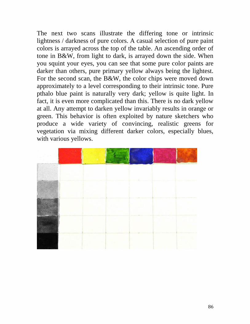
86
The next two scans illustrate the differing tone or intrinsic
lightness / darkness of pure colors. A casual selection of pure paint
colors is arrayed across the top of the table. An ascending order of
tone in B&W, from light to dark, is arrayed down the side. When
you squint your eyes, you can see that some pure color paints are
darker than others, pure primary yellow always being the lightest.
For the second scan, the B&W, the color chips were moved down
approximately to a level corresponding to their intrinsic tone. Pure
pthalo blue paint is naturally very dark; yellow is quite light. In
fact, it is even more complicated than this. There is no dark yellow
at all. Any attempt to darken yellow invariably results in orange or
green. This behavior is often exploited by nature sketchers who
produce a wide variety of convincing, realistic greens for
vegetation via mixing different darker colors, especially blues,
with various yellows.

87
Formally, what is a tone? In one usage, already mentioned, it is the
intrinsic lightness or darkness of a color. Think of a B&W
photograph of that color. Another use of the word is to label a
darker color mixed from a lighter one by adding the color black, as
in a tone of green. As with adding whites to make tints and getting
shifts like a warm red becoming a cooler pink, mixing black with a
color typically not only darkens the other color but also alters it.
This alteration can be almost unnoticed as when a tone of blue is
made. It can be desirable as when a tone of green is made to depict
foliage. As mentioned, it can be so strong as to result in a wholly
different color as when a tone of yellow is attempted, resulting in a
green. Yellow plus black makes a green!
Tints
Formally, what is a tint? A tint of a color or hue is that color
lightened by the addition of pure white. For example, pink is a tint
of red. Often a color is not simply lightened by tinting; pink is also
somewhat colder than the parent red. An attractive and useful
variation on tinting is to use not exactly white, but a very light
color analogous to that hue being tinted. For example, instead of
adding Chinese white to tint cadmium red, add a very pale yellow-
orange. A warmer version of pink is the result.

88
The attribute, “tinting strength”, while related, is a little different
idea. When colors are mixed, some, like stronger food spices, go a
lot farther than others. For example, if white is added to cerulean
blue, just a little added white quickly results in a very pale, chalky
blue. A very little cadmium yellow suffices to make cerulean blue
into a green. Cerulean blue has little tinting power. In contrast,
Prussian blue is very strong in tinting. It takes a lot of white to
produce a pale Prussian blue. However, tinting strength is relative.
Although cadmium yellow has much tinting strength it can be
overwhelmed when used with Prussian blue to make a green. The
safest approach when mixing colors is to start conservatively,
trying very tiny exploratory amounts at first to gauge the relative
tinting strengths.
Shades
If a color is mixed simultaneously with both black and white, that
is, is mixed with a neutral gray, then the result is called a shade of
the original hue. Ordinarily, when a color is mixed with its color
wheel complement, both colors not only neutralize or lose hue
vibrancy, they also darken. Thus, in order to generate a neutralized
color, yet avoid any automatic darkening, add a gray, rather than a
complementary color. Again, as with tinting, use of a faintly
colored, very light gray might produce a more attractive shade for
your sketch than would the addition of a cold gray mixed from just
black and white.
Selecting Your Palette (Choosing Your Own Set of Colors)
The Commercial Introductory Paintbox Choice
Art often names that clean flat surface where you can mix different
colors, the “palette”. For example, in the photo below of an
introductory level paintbox, the inverted white lid, with four
mixing wells, can be called a palette. (a van Gogh paintbox from
Talens.) However, the word is ambiguous. Art also refers to your
personal choice of a set of colors as your “palette”. As seen
directly in the twelve half-pans or, better from the color swatches
on the paper, this paintbox came with a useful selection of colors.

89
There are the primary colors: yellow, two reds and two blues.
There are the secondary colors: orange, violet and even two greens.
Finally, besides a black, there are two neutralized browns, so-
called earth colors including that very useful reddish-orange, burnt
sienna. Art calls some colors earth colors because historically they
derive literally from the very dirt prevalent in several regions of
ancient Italy. For example, fierce heating of the mineral soil
around Umbria resulted in a brown (dark neutralized red) called
burnt umber. The colors stem from one or another crystalline
forms of iron oxide plus traces of other minerals, e.g. manganese
oxides, at different ratios, occurring in the soil. With the greens,
blues and earth colors, this paintbox offers a choice of colors, a
palette, leaning towards landscape sketching. See the scan
following of a sketch done on a local hiking trail. In contrast, a
palette intended for sketching people’s faces offers an extended
choice of warm colors for skin hues.
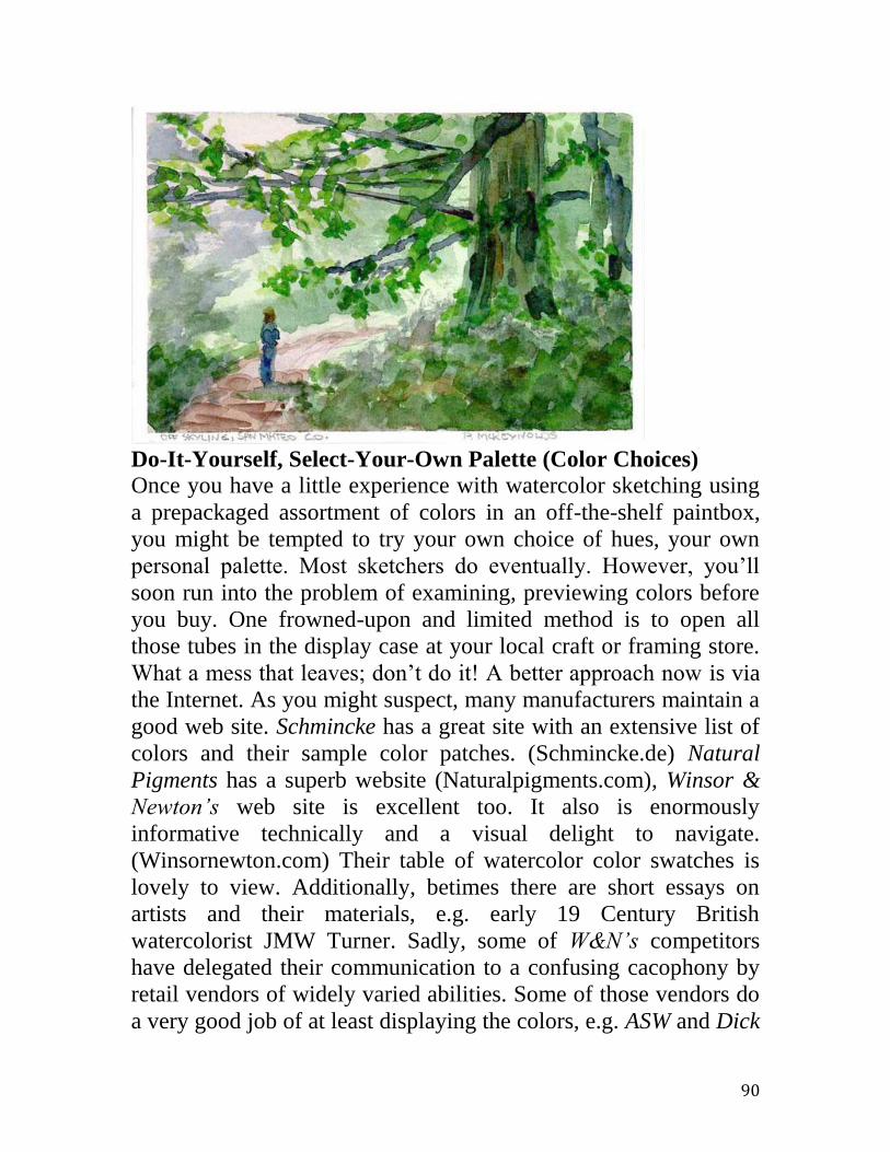
90
Do-It-Yourself, Select-Your-Own Palette (Color Choices)
Once you have a little experience with watercolor sketching using
a prepackaged assortment of colors in an off-the-shelf paintbox,
you might be tempted to try your own choice of hues, your own
personal palette. Most sketchers do eventually. However, you’ll
soon run into the problem of examining, previewing colors before
you buy. One frowned-upon and limited method is to open all
those tubes in the display case at your local craft or framing store.
What a mess that leaves; don’t do it! A better approach now is via
the Internet. As you might suspect, many manufacturers maintain a
good web site. Schmincke has a great site with an extensive list of
colors and their sample color patches. (Schmincke.de) Natural
Pigments has a superb website (Naturalpigments.com), Winsor &
Newton’s web site is excellent too. It also is enormously
informative technically and a visual delight to navigate.
(Winsornewton.com) Their table of watercolor color swatches is
lovely to view. Additionally, betimes there are short essays on
artists and their materials, e.g. early 19 Century British
watercolorist JMW Turner. Sadly, some of W&N’s competitors
have delegated their communication to a confusing cacophony by
retail vendors of widely varied abilities. Some of those vendors do
a very good job of at least displaying the colors, e.g. ASW and Dick
91
Blick. Others do not. None rises to the level of the Natural
Pigments or Winsor & Newton sites; they offer almost an
education.
Yet another Internet choice for detailed opinion about pigments
and paints, in general and by different brands, is a range of
independent experts. An example of a good one is Hilarypage.com.
On these sites you will read of faults that the manufacturers don’t
volunteer but, nevertheless, might impinge upon the success of
your use. Although most artists necessarily work alone, it is
amazing how many of them are willing to share their thoughts. A
good start is to do an Internet search based upon the name of the
hue, e.g. mineral violet. This kind of check is especially important
with colors of more plastic composition, e.g. modern Naples
yellow. The composition of even straight-forward, ostensibly
single pigment colors such as cadmium yellow can vary slightly
from maker to maker. More complex colors like lovely jaune
brillant #2 can vary considerably.
A Quiet or Neutral, Landscape Palette The Neutrals
Black (better, Payne’s Gray)
Burnt Umber
Burnt Sienna
English Red (or Indian Red)
Alizarin (or Rose Madder)
Raw Sienna (or Yellow Ochre)
Indigo (or Prussian Blue)
Terre Verte (or Davy’s Gray)
Caput Mortuum (or Permanent Magenta) The Vivids
Cadmium Yellow Lemon
Cadmium Red Medium
Ultramarine Blue (or Cobalt Blue)
May Green (or Sap Green)
Dioxazine Violet

92
The above table shows fourteen colors that form a good and
generous choice for a realistic landscape and townscape palette.
It’s common for watercolorists to have a different palette or color
set for different general topics, say, one for concentrating on
landscape, another one targeting portraits, yet another for still life.
For travel sketching, a landscape palette seems a good choice. The
neutrals list can depict almost any natural scene with at most a
minimum amount of color adjustment. However, many people, I
included, find that a sketch done entirely in neutrals, while
possibly quite faithful, lacks a certain snap or pizzazz. Apparently,
19 Century French landscape artist Corot also felt so. Thus he gets
credit for a device in painting named the Corot Spot, a very small
and localized touch of vivid color, in an otherwise neutral scene,
little more than subliminally accentuating the topic or focus of the
painting. Perhaps it is the relatively bright red smock on just one of
the fishermen in the small boat at the lower left eye of the painting.
You usually don’t pay it explicit attention but, if you momentarily
hold your thumb over it, you can appreciate its crucial role. The
brilliant British watercolorist, Trevor Chamberlain, is just one
modern master of the Corot Spot whose work you can admire on
the Internet.
Note: You don’t expect to use black very often as a color in its
own right; few things in nature are actually black. And, you don’t
often desire to darken a color via admixing black. However,
mixing black with other colors can produce unique and attractive
third colors, for example, black mixed with yellows or greens can
produce useful landscape greens.
Most of the neutral colors are old, even ancient pigments, natural
metal oxides obtained simply from raw dirt or baked dirt from the
vicinity of some renaissance town. This explains the names, for
example, Raw Sienna, Pozzuoli Earth, etc. Some have little tinting
power, are weak when mixed with others. For example, in mixes,
Terre Verte is quite puny. Other colors are bully strong, almost
overwhelmingly so in mixes, for example, the iron oxide, Caput
Mortuum (literally “dead head”, meaning the dregs).

93
The above choice of palette is informed by an appreciation of the
Munsell color wheel that postulates that more likely there are five
primary colors rather than the usually accepted count of three.
Roughly, Munsell added a violet and a green to the usual red,
yellow and blue, basing this opinion partly upon a study of retinal
fatigue, those visual after-images defining color complements.
That is, for example, what color do you see on a white wall after
staring for a few minutes at lemon yellow? At any rate, the
addition in a lightweight kit of both neutralized and vivid hues in
violet and green certainly helps me more than does the presence of
either black or white. In this palette choice I have no white and
possibly include any black almost solely as a modifier.
With minor variations and compromises, a naturalistic palette like
this easily can be built (online, if not from your local store) from
any major manufacturer’s half-pan offerings; Winsor & Newton,
Sennelier, Lukas, etc. If you are motivated by historical integrity,
smaller online vendors offer other coherent kits as well. For
example, on the Internet, the site, naturalpigments.com (Natural
Pigments), sells readymade paintboxes outfitted with half-pans of
now unusual yet historically authentic pigments reflecting topic

94
goals more exactly, such as 18th
Century landscapers, and even
specific landscape artists.
The photo above illustrates my choice of naturalistic palette. As
always, I made sample patches of the colors (as in the list above) to
facilitate sketching. The neutralized colors are lovely, even in tiny
swatches. But remember, here quality makes a difference. These
are artist grade paints. The cheapest grades of neutral colors, those
less than student grade, those in oddball “your whole studio” kits,
can look dull and muddy. Before you even start, all your effort
would be condemned to look sad and dreary. Don’t skimp on
materials, brushes, paints or papers. There is a quality to fine
transparent watercolor that isn’t captured by the usual parameters
of description. There’s more to it than just hue and chroma.
Vivacity? Clarity? I feel that this brilliant vitality explains much of
transparent watercolors attraction.
The following scan better shows the sample sheet. It makes me
want to run right out and plein-aire sketch this very minute! As an
aside, just as the
scan is more
faithful than the
photograph, the
face-to-face
reality of a
good watercolor
is even better
still. Seeing in
person, a
Sargent
watercolor for
example, is a transforming experience. Watercolors can be
breathtaking!

95
Extreme Minimal Palettes
Sometimes people seek to create the least, the smallest palette
technically possible, a short list of colors that is the minimal
necessary yet still sufficient for their targeted use. Generally, the
least palette would have to include the usual three primaries, a
yellow, a red and a blue. The color experts at Winsor & Newton
have given this some good thought and recommend, from their line
of about five-score colors: Winsor Lemon, Winsor Blue (red
shade) and Permanent Rose. Per Winsor & Newton, this is the
smallest set of colors one should use in general. A somewhat less
restricted set of six is their selection: Winsor Lemon, Winsor
Yellow, French Ultramarine, Winsor Blue (green shade),
Permanent Rose and Scarlet Lake. This latter set is just a fine-
tuned example of the common suggestion to take both a warm and
a cool version of each of the three primary colors. While such a
small set of colors no doubt can be carried in a small package,
remember that the real limiting item in size for travel always is the
paper to be painted upon. That reasonably cannot be reduced
beneath about postcard size. At roughly that size, you can cram at
least twenty half-pan colors in a tiny box! Therefore, in
consideration of travel palettes, extreme miniaturization of your
color set should take a distant second place to what are the specific
colors. And, acquiring and accumulating sets of colors and tiny
paintbox kits can become almost an addiction, an expensive
obsession. Still further, it can be a distraction; the most expensive
paints or the most optimal palette is not what stands between me
and any success. Remember, your most critical item is your brush
and, next in line, is the quality of the paper. Your paints are the
third most important item in your kit. For the moment, you should
obtain or build a small enough and good enough set of colors and
just start painting. Paint. Paint. Paint!

96
A Watercolor Sketcher’s Overall Kit
Nothing in sketching is worse than to walk some distance only to
arrive at your possibly remote site and then discover that you have
forgotten some key, absolutely necessary item of your kit. I have
done this myself more than once. The very best way to avoid this
disappointment is to keep your sketching kit ready to go in a small,
dedicated knapsack or the like. The next best thing is to at least
have a complete written list of all the things that you will need.
With such a list, you will more confidently pack your kit just prior
to leaving. Note that there are two rough categories of things you
must have. First, are the absolute essentials you need for sketching
itself, for example, a good brush. Second, are those items you need
simply because you are there. For example, sun screen.
Harbor, Coyote Point. 7x10-inches. 140-lb Arches NOT.
Sketching Kit
You’ll need:
your color box, enough of each color,
97
a couple of brushes and
watercolor paper (sheets, pads, or blocks).
A small sketchbook.
A paper file folder, to carry your work home. Be optimistic.
Water, for sketching, but also for you. Twelve to eighteen
ounces is enough for me. But people and conditions vary.
Two small cups, e.g. empty plastic sauce cups. To clean a
brush, I first gently wipe it, then swish it thru a “first stage”
cup. After wiping it again, I swish it thru a “second stage”
cup. This conserves water yet provides a clean rinse. A
vigorous shake can replace wiping.
A small spray bottle and a tiny water dropper. (My droppers
are ex-medical, e.g. for a cat’s eardrops.) The first dampens
paper, the second wets paint pans, creates blooms, etc.
A small, wide-mouth plastic jar with a tight lid. This carries
away dirty rinse water. As my little rinse cups get dirty, I
empty them into this. Don’t pollute!
A few paper towels.
A plastic bag for your damp “garbage”, e.g. soiled wipes.
A small sponge. For daubing, etc.
Masking tape
A light sketching board. Mine are about 16x16-inch stiff,
plastic. Anything water-resistant, flat, stiff and lightweight.
A 0.9mm automatic pencil with an eraser on the end. 0.9mm
is not as easy to find as 0.5mm, but worth the effort. The
0.9mm lead is the smallest that makes an interesting mark.
The eraser is “wrong” but works for me.
A small wax candle for masking details, e.g. a birthday
candle.
A few soft pastel pieces. At least a white one for brilliant
highlights. I sometimes carry six half-sticks: white and a light
tint of each of the five primaries (per Munsell). Carried on
cushioning cotton, in an Altoids tin.
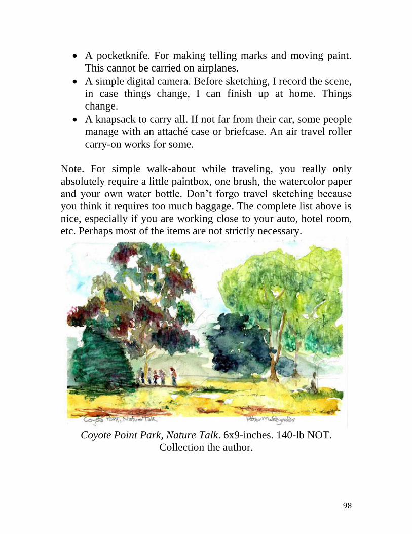
98
A pocketknife. For making telling marks and moving paint.
This cannot be carried on airplanes.
A simple digital camera. Before sketching, I record the scene,
in case things change, I can finish up at home. Things
change.
A knapsack to carry all. If not far from their car, some people
manage with an attaché case or briefcase. An air travel roller
carry-on works for some.
Note. For simple walk-about while traveling, you really only
absolutely require a little paintbox, one brush, the watercolor paper
and your own water bottle. Don’t forgo travel sketching because
you think it requires too much baggage. The complete list above is
nice, especially if you are working close to your auto, hotel room,
etc. Perhaps most of the items are not strictly necessary.
Coyote Point Park, Nature Talk. 6x9-inches. 140-lb NOT.
Collection the author.

99
Personal Kit
Of course your painting kit isn’t going to go out on its own. You’ll
be going along too and that means that there are some extra items
that you could need for yourself.
Bring water for your own needs, not just the sketching.
Comfortable shoes. You’ll not only be walking, but probably
standing for considerable periods of time. Perhaps in a damp
area.
Weather can change. Your outer clothing should incorporate
the multiple-layer method, including a windproof jacket.
A wide-brimmed hat to keep the sun from broiling your
brains.
A plastic garbage bag, closed corners cut off, is an effective
lightweight rain poncho.
Lots of sunscreen.
Insect repellant.
If you need prescription glasses, don’t forget them!
If you like sunglasses, make sure that they are color-neutral.
And, outdoors, sunglasses are almost a necessity.
Darker, neutral-colored clothing to avoid projecting color
bias onto your work.
A loud whistle. If security is an issue, paint in groups. In fact,
it’s always better to sketch with others.
Your cell phone. Charge it before leaving home.
Just-enough cash and your basic ID, certainly your driver’s
license if you drove!
I often bring a lightweight folding chair.
A small amount of toilet tissue. You never know.
Some take an umbrella, not for rain, but for keeping the sun
off their work. Sargent sometimes employed three at once!
Others merely stay under any shade. I’m a shade tree guy.
With possibly most of the above, a knapsack is needed. Or
for some people, a rolling trolley.

100
As said, this isn’t to insist that all this is absolutely necessary for
the traveling or accidental sketcher. Often, I’ve gone out from my
hotel as just another tourist with the exception of including a tiny
paintbox, a brush, a postcard paper block and the ubiquitous plastic
water bottle. And a hat! However, no matter where I find myself, if
I’m going out intending several hours of sketching, I carry only as
much of this list as needed.

101
A Local Landmark, The Golden Gate Bridge
A good preparation for travel sketching is creating your own
coherent set of watercolor sketches about a common hometown
theme, perhaps about a recognizable local landmark. Call it
practice and exploring. Although many of us might judge our own
locations dull or prosaic, this is almost never true. Everyone lives
near something that others would deem interesting and iconic.
Among worthy topics might be: a local mountain range, a river,
seaside villages, rolling prairies, silos and barns, etc. Because I live
nearby, it was natural for me to select the Golden Gate Bridge in
Northern California, spanning the water from San Francisco
northwards.
Above is a sketch of the bridge. (Strathmore 4x6-inches. 140-lb
NOT). The view is from the north, inside The Gate, looking south
past a picturesque rock, towards a Coast Guard rescue station
located on a tiny spit of land immediately under the bridge’s north
tower. In the late afternoon the fog is sliding in through The Gate.
The light slants in from the west (right). The city beyond is

102
dissolved into misty blues. Because it is now easily accessible
public parkland, this spot is an excellent site for sketching. Behind
you, and within a short walking distance, are a museum, a good
restaurant and hotel all housed in the former fort’s old buildings.
Technically, note the pinholes in the paper. I no longer pin my
papers to a small wooden board while sketching; I now use
ordinary masking tape. It is easily sufficient to prevent buckling in
paper as thin as 70-pound, at least in small postcard sizes. I don’t
use those special masking tapes targeting painting. The
commercial house painter’s version has a fierce bright blue that
throws my color sense off. The pale white, special “fine art”
version of masking tape, as promised, doesn’t harm delicate
watercolor papers, but mostly because it doesn’t seem to stick to
anything at all. Try ordinary masking tape first.
The next sketch (Canson 4x6-inches. 140-lb cold block) is a view
from a point barely inside The Gate, on the bay and almost
immediately below the (unseen) bridge’s south tower. It’s a view
eastwards towards San Francisco’s Presidio district, one end of the
city’s waterfront and downtown. The water here is very rough
when strong winds clash with an extremely powerful tidal current
racing home towards the open ocean. There is no beach here, only
little more than a narrow path pressed against a wall of rock.
Breaking waves frequently soak the pedestrian. Because here The
Gate is less than a mile wide, this is an excellent place to observe
vessels of all kinds, from little kayaks to enormous cruise liners,
entering and leaving the bay. Note that I taped the paper to the
board not only avoiding pinholes but also obtaining a pleasing
white surround and slight vignette effect. This also leaves a white
paper band for notes in pencil. I don’t recall a bank of fog
conveniently behind the city skyline. However, inventing one must
have made sense at the time because the light colors make the dark
cityscape legible. The violet shadows and pale green water are
realistic; the ceaselessly active surf beats a constant froth of air
bubbles into the water.

103
The quick sketch below (4x6-inches. 140-lb, NOT Canson block)
depicts the south shore outside the bridge as the bay moves inland
and narrows toward the decisive choke point of The Gate. The
large rocks swimming in the foreground are well known to local
mariners. The smaller, farther one is called Seal Rock due its
suggestive shape and is known to be a haunt of striped bass.
Obviously, these rows of semi-submerged rocks have been a
hazard to shipping since the bay was discovered. This sketch, like
many of mine, is a view from a long footpath stretching for miles
from the ocean back to the bridge and continuing inside the gate. It
is quite popular with joggers and day hikers, thus I was not too
isolated. Elevated high above the water and rocks and moving in
and out of brush and forest, the trail offers wonderful views, not
only of the bridge, but also of the steep, rocky and uninhabited
north side of the narrowing waterway.

104
In retrospect I feel I’ve made the rocky fingers stretching into the
water too orderly, too regularly spaced. Even if that is the factual
reality in front of me, I should have varied this a bit. A common
error in sketching is automatically putting things down exactly as
they are, rather than as they might better be. Once again, I’ve
portrayed the sky in the background as lighter than fact in order for
the viewer to more easily read the bridge, the focus or principal
subject of the scene. Also, although the sketch was quickly and
otherwise loosely done, the bridge itself was rather carefully drawn
in order to be sufficiently convincing. I’ve painted this scene many
times, in both watercolor and oil, and the water here on the south
side of The Gate has always been this sort of jade or pea green.
However inviting, the water’s edge here is unreachable by foot, to
the benefit of local marine wildlife such as otters and harbor seals.
The sketch below (4x6-inches. 140-lb, NOT block) is from an
easily reached public beach on the south shore, about a mile
outside the Gate. It is part of a federal park system and offers car
parking, picnicking, etc. It is so accessible, one doesn’t have a
reasonable excuse to not sketch here. Note that simply the white

105
paper plus a very little bit of sky and sand colors suffice to credibly
indicate the overturning surf. Oddly, even many otherwise
successful painters often do a poor job of depicting breaking wave
action. Ocean surf is very easy to overwork. Especially with
breaking waves, as in Zen, your “better” may remarkably be
simply your quieter “less”. In the distance, straight burnt sienna
nicely indicates the striking red-orange Franciscan chert rock
formations. Almost, I also dabbed a little burnt umber, wet-in-wet,
here and there.
As I often have to do, I invented the clouds. The sky here in the
Bay Area is frequently an empty blue bowl. San Francisco’s
weather can be so mild that it becomes visually boring. I placed the
fictional clouds more to the right (south) to indicate subtly the
direction of the sunlight. One can see remnants of the original
pencil layout. If pencil marks are objectionable, erasing can almost
eliminate them just prior to applying any paint. Personally, I
usually like the pencil left intact, but this is entirely your choice. A
caveat is that heavy pencil marks can generate dark gray smears if
your washes are rubbed in and very wet. Also, perhaps remarkably,

106
light pencil lines usually can be erased after the paint is thoroughly
dry.
The next view shows the bridge from inside the bay, from a small,
narrow beach on the south shore, in front of the Marina District
and its great meadow, right next to the St. Francis Yacht Club.
(4x6-inches. 140-lb NOT.) It is late afternoon and the light, from
the upper left and almost contre jour, dulled all appearances.
Unlike its signature red-orange local color, the bridge appeared to
me as almost simply a dull dark neutral. A falsely bright red-
orange in the sketch would appear odd under this lighting,
although the viewer may not guess why. As always when striving
for realism, sketch it as it looks, not as you think it should be.
Sketch patches of light and dark. Sketch patches of colors. Don’t
sketch things. Don’t sketch houses and cars, boats and trees, etc.
I’ve exaggerated the light background fog to help show the bridge.
Further, I’ve also extended it up on the left (south) to help indicate
the direction of the light.
At one point, a young man, deep in some pensive thought, slowly
and deliberately stepped across the sand. This was one of those

107
happy accidents and I eagerly included him in the scene. He
accurately appears lost in thought. People who do best at including
figures are those who consistently fill their sketchbooks with rapid
gestural drawings of people. Even during business meetings,
feigning note-taking, I sometimes surreptitiously sketch others in
pencil. Family times, such as watching television together, afford
an easy opportunity to practice sketching figures. Even when
alone, you can try rapidly sketching figures appearing on the
television. Different kinds of programs offer differing model
speeds. The figures change much more quickly in basketball games
than they do on Sunday morning roundtable news reviews! Thus,
you can always have someone to sketch.
This next sketch (6x9-inches. 140-lb Canson cold block) is again
outside The Gate, but very close to the bridge. I could hear the
continuous roar of the traffic. I wanted the bridge to be believable
so I made my preliminary pencil sketch with more care than usual
for a quick travel sketch. So-called architectural topics like bridges
often require extra care in drawing. I also left intact the preliminary

108
pencil of the bridge to suggest more convincing detail. Because of
the close proximity, I made the rest of the sketch also more clear
and with more vibrant color. The sky was left almost, but not
completely blank, with just a wipe of pale cerulean blue here and
there. (More evident when the sketch is viewed in person, however
difficult to capture in this digital scan.) As always, this pale
treatment shows the darker topic, the bridge, to be seen with
greater clarity. This is called counter-change.
My geologist friends tell me that the striking red-colored bedrock
is called Franciscan chert. These bright outcrops appear here and
there throughout San Francisco and environs. The north bridge
tower is firmly fastened directly into this stony red massif. By
contrast, the bridge’s south tower has to sit atop an enormous
concrete pier reaching, down through weaker, muddy stuff before
reaching its own firm bedrock. The trees, firs and cypresses, were
sketched with a couple of cool greens then daubed wet-in-wet with
the ultramarine blue of the sea. This makes not only convincing
evergreens and color harmony but also a striking color contrast to
the warm tones of burnt sienna and burnt umber of the Franciscan
chert.
The watercolor sketch below (4x6-inches. 140-lb, cold pad) shows
the bridge from the ocean, looking back from Land’s End near the
site of the former Sutro’s Baths spa, destroyed a century ago by
fire. This is the point on the south shore where the land suddenly
turns sharply to the south. After here, one finally faces out to the
Pacific Ocean rather than across the width of the Golden Gate. I’ve
invented another fog bank so that the bridge could be seen. This is
not farfetched; ocean fog often invades the bay via other gaps
besides The Gate. Overall, because the sun was behind my back,
the scene is shown in a high key to appear sun-struck.
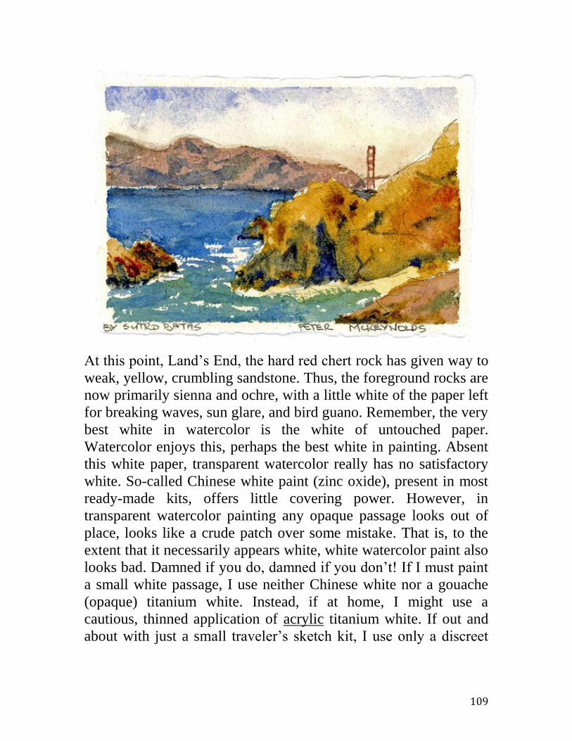
109
At this point, Land’s End, the hard red chert rock has given way to
weak, yellow, crumbling sandstone. Thus, the foreground rocks are
now primarily sienna and ochre, with a little white of the paper left
for breaking waves, sun glare, and bird guano. Remember, the very
best white in watercolor is the white of untouched paper.
Watercolor enjoys this, perhaps the best white in painting. Absent
this white paper, transparent watercolor really has no satisfactory
white. So-called Chinese white paint (zinc oxide), present in most
ready-made kits, offers little covering power. However, in
transparent watercolor painting any opaque passage looks out of
place, looks like a crude patch over some mistake. That is, to the
extent that it necessarily appears white, white watercolor paint also
looks bad. Damned if you do, damned if you don’t! If I must paint
a small white passage, I use neither Chinese white nor a gouache
(opaque) titanium white. Instead, if at home, I might use a
cautious, thinned application of acrylic titanium white. If out and
about with just a small traveler’s sketch kit, I use only a discreet

110
swipe of dry white chalk. For this purpose, in my kit I include a
tiny piece of white dry pastel.
Here is a (4x6-inches.
70-lb HOT) sketch of
the bridge from just
inside the Gate, on the
south side. There’s a
scrap of a park, little
used and almost
hidden, just off the toll
plaza with only a
single picnic table,
access to the bridge’s
clean restrooms and
this wonderful view.
This sketch differs
from the others. First,
it has a portrait, or
taller-than-wide,
format that is
somewhat uncommon
for a postcard. Second,
it is painted on a
warm-toned, 70-pound,
hot-pressed paper cut
down to postcard size.
Use of toned paper tends to facilitate color harmony, tends to help
to bring the sketch together color-wise.
Yes, besides buying ready-made blank watercolor postcards from
either a local art supply or an online store, you can easily make
your own. This saves you a little money but more importantly,
enables a wider choice of papers. The ready-made postcards seem
to be all 140-pound, cold-pressed white. So for something
different, I keep an eye out for other papers to use. Sometimes I
actually post my postcards; sometimes I do not. There’s a sort of

111
risky, frisky thrill in entrusting your handiwork to a government
agency, but the authenticity offered by a little travel grime and an
official, perhaps even foreign postmark, can be worth it. Although
some of my postcards have taken as much as three months to make
it from Eastern Europe to my home, honestly, they have never
failed to straggle in eventually, every single one!
What can you do with all of your postcards on a theme? One
choice would be to cover a wall with a multitude of little frames.
Another, perhaps more sensible, choice would be to frame several
of them at a time in one of those larger frames with a mat cut to
hold several images at the same time. Still another choice would be
to sketch and gather them in a pochade portfolio like the one in the
photo above. This particular one from India is handmade from
cotton and hemp. It comes with ten blank, individually mold-made
and fully deckled 4x6 postcards for you to fill with your travel
watercolor sketches. This Nujabi paper from India is about 210-lb
weight, rough and without size. The great absorbency, due the lack
of sizing, can make it a little difficult use. The paint can seem to
fall endlessly into the paper and the potential strength or chroma of
the colors thereby can be much reduced. Alternatively, you can
size each sheet via a wash of dilute transparent acrylic medium,
112
well prior to use. Trouble, yes. However, the rewards might be
worth it. Sized and not, I’ve filled several of these pochades and
given them as special gifts to good friends and family.
Note. The central sketch in the photo above shows again how
easily a little sky and sand color depict a crashing surf. You need
no special “surf colors”!
113
Some Useful Techniques for Watercolor Sketching
Confession. Not everything in a painting or sketch has been
meticulously constructed, tiny color dot by tiny color dot, using
some amazingly pointy and microscopic brush. Frequently
painters, especially watercolorists, use large scale “tricks” to
plausibly suggest entire sets of things with perhaps one single but
deft stroke. Sargent has been described as painting (in oils) the
buttons on a portrait subject’s clothing as follows. On a single
brush he would carefully dip into perhaps three different colors of
paint. Approaching the canvas, he would abruptly stab the brush
into the proper location, then, with an exaggerated twist, quickly
withdraw the brush. Depending, as it seems, heavily upon
fortuitous accident, this gamble failed more often than it
succeeded. Portraying ten buttons might require fifty hopeful
thrusts and forty disappointed scrapings amid much muttered, mild
cursing. Point is… tricks are not some lazy shortcut; they may be
the best, practical way to achieve a needed effect.
The fact that even very fine-textured effects are often NOT
obtained via incredibly laborious work with a tiny brush can be a
surprise and I suggest, sometimes a real disappointment. A man,
who had just obtained an oil painting of mine depicting the central
California coast, phoned to express his amazement over the
“hundreds of tiny flowers” I must have painted within an ocean of
ice plant spilling from the road down to the sea. He was a technical
type, an engineer by training, so I thought he’d enjoy an
explanation of how it was done. No, I did not place a tiny carmine
dot for each flower. I first carefully covered the coarse surface with
a very fluid wash of carmine red. Naturally, the thin, runny paint
settled deeply into thousands of irregular pores. After this had
almost dried, I then briskly covered most, but not all, of the rough
surface with the various greens and browns representing the
foliage. For this I used drier, stiffer paints and only a light pressure
on the brush, enabling me to skip over many of those miniscule,
carmine-filled pores. Viola! Apparently a few score tiny “flowers”

114
remaining, peeking out. Although I had expected from the man
some mild expression of admiration for this clever method, instead
there followed only a cool, brief conversation on a different topic.
He was clearly disappointed, had wanted to hear instead of an
achingly laborious effort. For the same general reason, you must
never divulge how little time and work it can take to make a really
nice travel sketch!
Salt and Other Sprinkles
Perhaps the most common trick or shortcut for obtaining some
watercolor texture effects is sparsely sprinkling certain materials,
typically table salt, into wet paint. The hygroscopic (water
absorbing) property of the tiny crystal grains pulls the wet paint
close and very locally takes up, absorbs most of the water content.
This has the effect of concentrating the pigment in the immediate
vicinity of each grain, thus leaving a darker freckle of color upon
drying, surrounded by a paler halo of reduced color. It doesn’t
have to be salt, although salt has advantages. It is readily available,
even on the table at a café. Yes, sugar works, except that dried
sugar might attract ants and other insects; neither the salt nor the
sugar ever goes completely away. Ground black pepper and ground
coffee work too but leave a decidedly brown cast to the resulting
freckles. As does tea, although tea leaves, due their larger and
varying shapes, work a more interesting variant of the texture. Of
course, the tea and all the other choices must be dry when dropped
into the paint on the paper. Otherwise, the water of the local wet
paint would not be absorbed, thus the nearby color would not be
concentrated into the desired freckle. And, whatever is sprinkled
into the wet paint must again be dry before finally removed.
Otherwise, the freckling effect will be smeared and the still-wet
paint may simply flow again, healing over any created texture.
While sitting in the café nursing your coffee and pastry, feel free to
experiment with anything on the table as a sprinkle. For example,
newspaper or paper napkin shredded into fine, random confetti can
make an otherwise featureless sky into something more interesting,

115
as in the sketch below, Julian Alps, from memory. (140-lb NOT
Strathmore 400) First, I made an even wash of cerulean blue.
While this was still wet, but not too wet (it’s a matter of judgment
informed by experimentation) the confetti was gently and unevenly
dropped onto the paper. Next, a light, even weight was applied,
e.g. a book, dinner plate, etc. However, not too heavy a weight; too
much pressure and the confetti would simply blot up all the blue,
leaving again an almost even wash. The pressure must be gauged
such as to make thicker piles of confetti press more into the paper
than other, thinner patches of confetti. Thus, the blue is unevenly
removed, yielding the desired random variegation.
The next scan shows the completed sketch. After the sky was dry, I
added a violet alpine skyline with a mix of cerulean blue reddened
by alizarin. No sprinkles for this effect, but I did use another trick,
tilting the sketch back and forth to move the paint around until it
dried. This caused the gradient of tone from bottom to top as well
as the sharply defined edge, giving an effect of smoky mountain
valleys. After the paint was nearly dry, I could have softened the
hard edge with the tip of a clean, damp brush. Even now, I still
could soften it with a damp, cotton swab. However, I wanted a
sharp edge although admittedly, a softened skyline appears to roll

116
over and away, heightening an illusion of space and distance.
Generally, “Hard edges advance; soft edges retreat.” is the maxim.
But, it’s your decision for the effect you wish.
To create the middle ground of trees and vegetation, I first daubed
in splashes of a variety of greens, blues, yellows, and even a little
red. I dabbed here and there, minimizing any deliberate color
mixing as possible. Then, while all was still wet, I sprinkled red
pepper flakes. (I’m continuing the conceit that we are sitting in a
café, perhaps in Sicily. So of course there’s a small jar of red
pepper flakes.) Even before the mid-ground pepper flakes were
dry, I dropped in a foreground of burnt umber, green, violet, and,
once again, cerulean blue. I’ve added at least a tiny bit of this blue
to every area of the sketch, for color harmony. While this earth
mess / mix was still wet I also sprinkled ground black pepper and
table salt. (Any waiter would think me a dangerous nut!) An
obvious caveat for travel sketching is the longer time taken for
everything to dry. Only after all was bone dry, did I use a sharp
edge (blade, credit card, etc.) to carefully pick off all the debris,

117
back down to just paper and paint. Voila’, a credible mountain
scene with almost zero brushwork per se.
Blooms
When a drop of clean water is plopped into a patch of wet paint on
paper, a “bloom” or “back run” can result. The wet color seems to
flee the drop of added water (an effect opposite to that of sprinkled
salt). This centrifugal effect can be very useful to depict some
forms in nature, for example, some clouds or the canopies of
deciduous trees. The quick plein aire above is of a mountain lake
nestled in a long wrinkle in the earth, created by California’s
notorious San Andreas Fault. (5”x7” 140-lb Fabriano NOT) Look
closely at the trees on the opposite shore. I made those convincing
shapes simply by first placing uniform blobs of color, waiting a bit
for the proper drying (surface water gone, only a slight sheen left),
then dripping a small drop of clear water onto each spot. That
moved some pigment towards the edges, painting a tree canopy as

118
seen from a distance. Variations of this create different soft effects.
As always, experiment with this yourself.
Dark-to-Light
Most watercolorists paint “light-to-dark”. That is, a light-to-dark
sketch slowly progresses as each light wash after previous, now
dried, light wash accumulates on the paper, much like adding to a
stack of colored but transparent cellophane sheets, until the desired
end result is obtained. Waiting for successive washes to thoroughly
dry could consume an entire day, regardless of whether it’s a small
sketch on a postcard block or an enormous painting on an imperial
sheet. Thus, some travel painters proceed in the opposite direction,
dark-to-light, particularly when doing rapid sketches. Today,
Charles Reid is perhaps the most notable American exponent of the
dark-to-light approach in watercolor. For oil painters it is the usual
practice. In a nutshell, it can be done in oil because oil is
“forgiving”. Errors in oil can be corrected, even light passages
painted opaquely over dark ones. In watercolor this is almost
impossible, light paint will never cover up dark paint. Therefore,
the usual light-to-dark method proceeds cautiously in watercolor,
step-by-step, avoiding any sudden, irreversible dark mistake.
Obviously then, the opposite path, dark-to-light, is inherently risky.
The plein-aire sketch below was done dark-to-light. (7”x10”, 140-
lb Arches NOT. Collection Susan Oddo.) Immediately after I did
the early evening sky washes, I laid down the very darkest
passages along the water’s far edge. The difference between the
darkest water and the light sky set the possible range of values for
the rest of the picture. Note that the variegated sky washes were
done vertically, rather than horizontally, to enhance the look of a
failing afternoon and arriving evening.
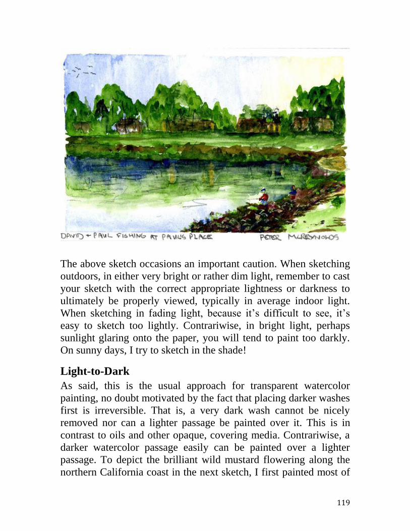
119
The above sketch occasions an important caution. When sketching
outdoors, in either very bright or rather dim light, remember to cast
your sketch with the correct appropriate lightness or darkness to
ultimately be properly viewed, typically in average indoor light.
When sketching in fading light, because it’s difficult to see, it’s
easy to sketch too lightly. Contrariwise, in bright light, perhaps
sunlight glaring onto the paper, you will tend to paint too darkly.
On sunny days, I try to sketch in the shade!
Light-to-Dark
As said, this is the usual approach for transparent watercolor
painting, no doubt motivated by the fact that placing darker washes
first is irreversible. That is, a very dark wash cannot be nicely
removed nor can a lighter passage be painted over it. This is in
contrast to oils and other opaque, covering media. Contrariwise, a
darker watercolor passage easily can be painted over a lighter
passage. To depict the brilliant wild mustard flowering along the
northern California coast in the next sketch, I first painted most of

120
the foreground in various light and bright yellows. (7”x10”, 140-lb
Fabriano NOT) After the yellows dried, I went over much of that
with assorted blues, the resulting yellow-over-blue mixtures
formed most of the different greens. The reverse does not work;
the result would be very different if I first had put down a lot of
dark blue and then had gone over that with some light yellows.
Note: Much of the rest was done wet-in-wet, for example, the
vegetation at the edge of the cliff, beyond the mustard field. Colors
are mixed right on the paper. The rocks in the water and the far
bluff are also wet-in-wet. As is best, the breaking water is not an
application of white paint, but is reserved (unpainted) white paper,
with most edges softened later with a damp brush. Note the cooler
greens in the distance to suggest separation of planes. Note also the
soft, the un-sharp horizon to also suggest distance. A sharp horizon
fails to recede.

121
Wet-in-Wet
Wet-in-wet painting requires tight, dynamic control. To even
partially control the mixing of an added color with the underlying
and still wet color, you must gauge the dampness of the paper from
second to second. Too dry and there is no mixing. Too wet and
everything blends into an amorphous, neutralized mess. Thus, even
the weather, via the
humidity, plays a strong
role. The sketch below
is mostly wet-in-wet.
(6”x4”, 140-lb NOT
Canson) The sky, blue-
green for color
harmony, was done top-
down segueing into
clear water. The
farthest, viridian trees
were also simply color
dropped into water-
dampened paper.
Coming forward, the
middle-distance trees
first were painted in
alizarin with viridian
later dropped in wet on
the tops. The wet
alizarin thus fled
appropriately to the
bottom edge of the canopies. Finally, the rare, deciduous redwood
at the left was done in warmer greens to come forward. However,
deep blues and more alizarin were repeatedly dropped into parts of
the foliage, resulting in persuasive variegation plus darker,
shadowed tones to come more forward still. (Both darker tones and
stronger contrasts advance, seem closer.)

122
Employing “Tools”
In the sketch above, note the vegetation depicted in the foreground.
(7x10-inches. 140-lb Cotman NOT.) If you didn’t know better, you
might think that this required a lot of detailed brushwork. Nope.
First, from the tip of my brush, I dabbed a few colors into the wet
green. Blues, burnt sienna, red, etc. Second, I worked those areas
over with both the point of my pencil and with the flat of a
pocketknife blade. (The corner of a credit card will do.) Drawing
paint away from the spot with a pencil point allowed extra pigment
to settle darkly back into grooves of damaged paper. When I wiped
the blade flat on the paper with a lot of pressure, I removed most of
the paint making very light “leaves”. Thus, besides a brush, there
are many tools to move paint. And, it isn’t always about applying
more color; often it’s about artfully reducing or moving some
paint.
Elsewhere in the sketch I’ve also moved paint without using a
brush. For example, the deep blue afternoon shadows in the rocky

123
cleft at the upper left, were simply scribbled about with the point
of my pencil. The fog is not a positive application of some whitish
light paint but instead mostly the negative removal of bluish sky
pigment via damp blotting out with dry tissue. (See section on
“dabbing”, etc.)
Scratch Out
Scratching out
may be only
another case of
using non-brush
tools, but it is so
important that it
warrants special
attention. The
two scans are
before and after
some scratching
out. The second
shows sun
sparkle off the
water and some mild surf breaking near the shore, both effects
achieved via using a sharp blade to scrape away dry paint down to
white paper.
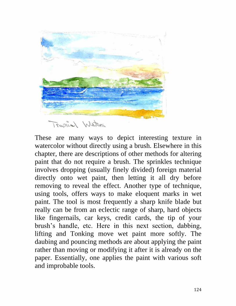
124
These are many ways to depict interesting texture in
watercolor without directly using a brush. Elsewhere in this
chapter, there are descriptions of other methods for altering
paint that do not require a brush. The sprinkles technique
involves dropping (usually finely divided) foreign material
directly onto wet paint, then letting it all dry before
removing to reveal the effect. Another type of technique,
using tools, offers ways to make eloquent marks in wet
paint. The tool is most frequently a sharp knife blade but
really can be from an eclectic range of sharp, hard objects
like fingernails, car keys, credit cards, the tip of your
brush’s handle, etc. Here in this next section, dabbing,
lifting and Tonking move wet paint more softly. The
daubing and pouncing methods are about applying the paint
rather than moving or modifying it after it is already on the
paper. Essentially, one applies the paint with various soft
and improbable tools.

125
Dabbing, Lifting and Tonking
These techniques remove paint from the paper, either wet paint or
re-wetted paint, of course to some pictorial purpose. The sketch
below is from memory. (I’ve sketched there numerous times.) At
Davenport, on the Northern California coast, as the land eroded
into the sea, it left a unique and picturesque finger pointing upright
in the surf. Here, on top of a rather complete pencil under-sketch, I
brushed in a wash of cerulean blue for sky, with a little alizarin for
fog at the horizon. (Note the admixture of a red, alizarin, with the
blue to make a neutralized violet, rather than fog’s completely
neutral gray. I always prefer some color rather than dead neutral
blacks and grays.) I then had to let this dry thoroughly in order to
be able to scan it. However, outdoors, I would have dabbed the
paint immediately in order to more easily and evenly lift out the
areas intended to depict the dissipating fog. (140-lb NOT
sketchbook)
The sketch’s next scan shows some of the blue and alizarin lifted,
via dabbing the re-wetted paint with a dry paper napkin, to indicate
morning fog burning off under the climbing sun. The same
technique produced the sky and fog layer in the sketch of the same
subject under the “Employing Tools” section. There the effect is
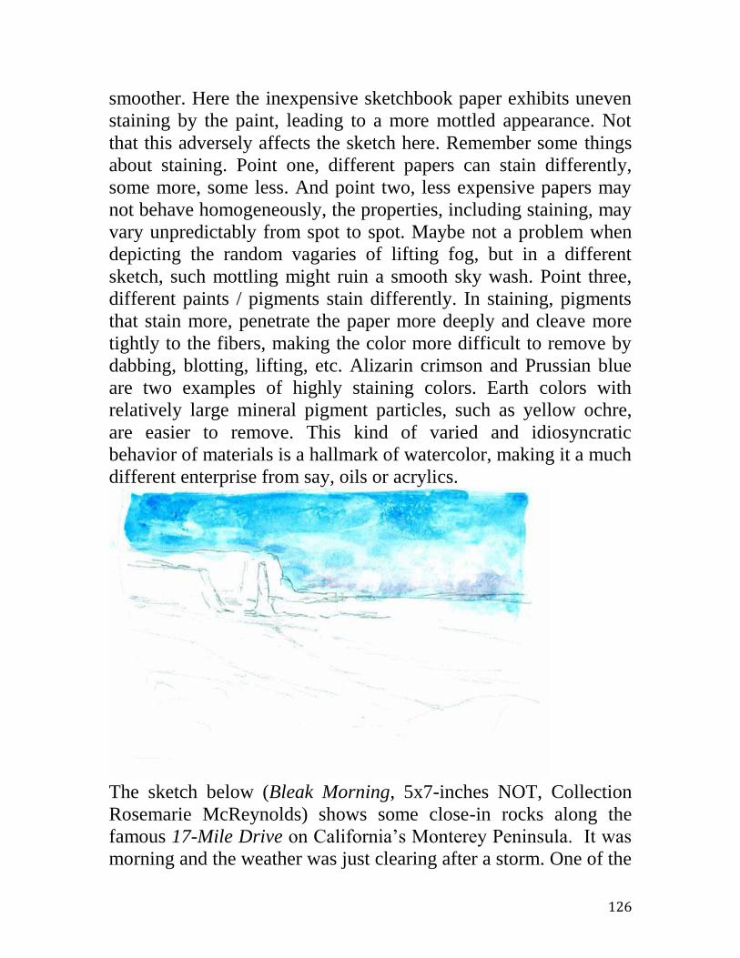
126
smoother. Here the inexpensive sketchbook paper exhibits uneven
staining by the paint, leading to a more mottled appearance. Not
that this adversely affects the sketch here. Remember some things
about staining. Point one, different papers can stain differently,
some more, some less. And point two, less expensive papers may
not behave homogeneously, the properties, including staining, may
vary unpredictably from spot to spot. Maybe not a problem when
depicting the random vagaries of lifting fog, but in a different
sketch, such mottling might ruin a smooth sky wash. Point three,
different paints / pigments stain differently. In staining, pigments
that stain more, penetrate the paper more deeply and cleave more
tightly to the fibers, making the color more difficult to remove by
dabbing, blotting, lifting, etc. Alizarin crimson and Prussian blue
are two examples of highly staining colors. Earth colors with
relatively large mineral pigment particles, such as yellow ochre,
are easier to remove. This kind of varied and idiosyncratic
behavior of materials is a hallmark of watercolor, making it a much
different enterprise from say, oils or acrylics.
The sketch below (Bleak Morning, 5x7-inches NOT, Collection
Rosemarie McReynolds) shows some close-in rocks along the
famous 17-Mile Drive on California’s Monterey Peninsula. It was
morning and the weather was just clearing after a storm. One of the

127
challenges was to portray a convincing perspective in the exposed
rocks trailing out in the fog-bound, tide-drained shallows. That is,
to make each farther rock seem still farther away. Here it is
accomplished via aerial perspective. The colors fade in tone and in
intensity or chroma and also tend to cool and blue with increasing
distance and with increasing intervening moisture in the air above
the albeit mild surf. With a great deal of effort, I could have mixed
each of these receding colors.
Instead, as I also often do in oils, I remembered Sir Henry Tonks,
British contemporary and associate of John Singer Sargent. I
carefully “tonked” the rocks, tonked them the more, the farther out
they stood. That is, I quickly painted them all and painted them
pretty much in the same colors and intensities. Then, while they
were still wet, but rapidly drying, I firmly pressed an absorbent
scrap of paper against the farther rocks. This to flatten and remove
much (but not all) of the paint I had just applied. I pressed the
hardest and the longest on the furthest rocks. And, pressed less and
less with the closer and closer rocks. Voila’! Here’s a convincingly

128
modulated range of color saturation, a simulacrum of aerial
perspective through intervening distance and humidity. Tonking
can be understood as careful dabbing or lifting out to some specific
effect. I’ve read that Sir Henry used newspaper to tonk his oils.
However, watercolor requires cleaner, more absorbent stuff.
Daubing and Pouncing
Daubing and pouncing artfully add more paint to the paper, but in
a decidedly non-brush manner. Watercolorists typically employ a
sponge; however other things will work as well a sponge. A caveat
is that whatever you use, that it makes random deposits of paint so
as to muffle the artifice. To this purpose, natural sponges often are
stipulated, the idea being that a manufactured, e.g. mundane
kitchen sponge will betray itself via paint marks that are
undesirably regular. Personally, I have not found this to be a
problem. Nonetheless, very small natural sponges suitable for
small travel watercolor kits are quite inexpensive, even at hobby or
framing stores.
In another scan of a previously shown sketch about dabbing skies

129
(Davenport Beach, 140-lb NOT Strathmore 400), I’ve now added
the middle ground and the foreground. The “vegetation” of the
foreground was added by daubing in shapeless colors with a small,
natural sponge. After the greens, yellows and blues and a little
alizarin were in place but still wet, I used a pencil point and the
screwdriver blade of my trusty pocket tool to indicate believable
vegetation: leaves, stems and flowers. Notice the blue “plants”. I
doubt if cerulean blue could be actually there, but I add a little of
the sky colors throughout a landscape for the artificial purpose of
color harmony. You likely would not have noticed unless I
confessed. The sketch just looks better!
Pen and Wash
An attractive and interesting variation on watercolor sketching
combines watercolors with ink line drawing. It isn’t suitable for
every topic. For example, it doesn’t seem attractive for people’s
faces! But, I like it for older and eccentric architectural subjects.
The scan below is an example. (Twilight in Ljubljana. Collection
of LS Chaffin. 4x6-inches, 140-lb NOT) It is a quick method,
enabling one to rapidly make a convincing sketch. The watercolors
and the ink line are put down separately, one allowed to dry
completely before the other is applied. Many people might feel it is
natural to establish an ink drawing first, to be filled in later with
the washes. (Most people feel more confident, more in charge with
a linear medium, e.g. pencil or pen.) However, if the washes,
which are more difficult to control, are done first, then the ink line
can conform better to the prior reality of the washes. This is a
quick method of sketching. Pressed for time, a few rapid washes
can suffice until the line is added later back in your hotel room.
A more interesting sketch can be done with a more variable ink
line. A constant width, such as that from a ballpoint pen, can be
boring and inarticulate. Felt tip markers offer some advantage and
at a good price plus convenience. With a broad chisel point, the
line width can be varied widely as appropriate. With markers one
also has a choice of colors. In many cases a hard black may be

130
suitable, but in others, as here, a sort of sepia or dark brown seems
be better. When traveling, I carry both black and sepia pens.
Finally, it seems better to err on the side of too little line. Too
much can look mannered.
Pencil Under-sketch
The scan below shows a studio work in progress. It is about 11x15-
inches, rather large for my watercolors. Also, the under-drawing is
more complete than typical because it is a recognizable subject,
well known to my intended viewers. The scene is out the back of a
family residence in San Francisco’s historically Italian-American
neighborhood, North Beach. The view stretches across
Fisherman’s Wharf, past Alcatraz Island (a former federal prison
housing gangster Al Capone among others) and on to the dry
vineyard hills of Solano County. The expected familiarity with this
almost iconic scene necessitated a detailed and careful sketch
before applying even the first washes of color. Errors as little as
some out-of-place windows, much less added or subtracted

131
architectural features, would have elicited disappointed comment if
noticed or caused vague unease if not explicitly recognized. For
my intended viewers, this scene is as familiar as a family face.
Even in less stringent cases, those of an individual touring abroad,
of smaller images, smaller sketches, accuracy can be aided via an
initial pencil drawing. I know, I’ve been on the other side. I recall
viewing an exhibit of paintings made around San Francisco by a
well regarded, visiting British painter. Whether he only had
worked from a photo of the Golden Gate Bridge or had seen it
partially obscured on a foggy day, in fact, his painting showed the
north end fastened into the rock in a patently wrong way. Upon
viewing this, one’s reaction might be to nervously giggle in
embarrassment over the artist’s mistake. As if he had painted a
milk cow terminated with a dinosaur’s tail. Never “fake it” with
iconic subjects.
Sizing
Watercolor papers vary in the amount of sizing incorporated
during manufacture. The sizing can be nonexistent as with
homemade papers or some papers imported from Asia. Then it can
132
seem as if one is painting on dry cotton, perhaps because that is
indeed the case. The paint just falls into the paper making it
difficult to make a strong statement in intensity or tone. At the
other extreme, the sizing can be almost overwhelming in the case
of some inexpensive papers. Then it feels like one is painting on
white plastic. The paint does not absorb, but seems to rest entirely
on the surface. A lot of sizing does make the hues look more
brilliant but also makes the paint more vulnerable to mechanical
accident such as simply rubbing off the surface. In that case it
might help to varnish the sketch after completion. In the first
situation, that of too little or no sizing, if desired, the paper can be
amended before painting by painting an even coat of either very
diluted acrylic medium or clear acrylic gesso. I use the plain
medium because I don’t like the extra tooth added to the paper via
an abrasive in the gesso; I worry that the abrasive will wear down
my expensive brushes without adding any effect I desire.
In short, with papers I deem too soft and absorbent, I make a light
wash of water-diluted acrylic medium maybe an hour before
painting. With papers I notice to be very “hard”, i.e. to have a great
deal of sizing, I generally finish the painting or sketch with a final
watercolor varnish no sooner than several days after completion.
Hopefully this prevents any paint from simply wiping off.
Use of Brushes
Good use and care of brushes is pretty straightforward. In use,
don’t push a brush on the paper. Lean the handle forward in the
desired direction and pull it, drag it. Use the point of a good round
as little as possible to avoid wearing it down. Instead, lightly press
the belly of the brush almost level into the paper. Don’t use that
sharp point unless you need to make the finest statement. Same
with a good flat brush; don’t use the straight chisel edge unless you
absolutely need it.
After use, always clean a brush. This is as simple as a thorough
rinsing in clean water. You don’t need soap. Use your watercolor
brushes only for watercolors. Never use a good brush for masking

133
fluids. Never use one for acrylic paints. Only use good brushes for
your watercolors. (Beware: some otherwise excellent gouache
paint, still called “opaque watercolor”, nowadays may have an
acrylic base.) Never let others use your brushes. No matter what
they say, they won’t appreciate the brushes’ quality and
vulnerability. Never stand a brush on its head; never stand one
hairs-down onto a surface. That includes standing them, hair down,
in a drinking glass. Don’t soak your brushes interminably in water;
the glue in the ferrule can soften and the brush will simply float
apart.
Final Caveat
A last caveat… even though many of these “tricks” can produce
perhaps amazingly convincing effects, they should be used
judiciously. When used too often or too heavily, your work might
take on an obvious appearance as just a slick confection, a
pastiche’ of such tricks. I personally believe the best watercolors
are done as much as possible with just a brush, but in the most
skillful hands.

134
Exercises, Sketching Nature’s Shapes
Whether you are just beginning with watercolor sketching,
returning to watercolor after a long hiatus, or just bumbling along
and enjoying the world, sketching organic (natural) shapes is fun
and an excellent exercise. You can begin by sketching things as
simple as a single, unlovely potato placed on a kitchen counter.
You can do this, all by your self, indoors, in the middle of a cold,
blustery day. You can be a rank beginner, quite understandably
unsure of your ability to satisfactorily depict anything at all. You
might be intimidated by the thought of others harshly judging your
first efforts. Perhaps worse than the discouraging opinion of others,
you might dread disappointing yourself. However remember, no
one else need ever see what those exact potatoes really looked like
and vegetables do vary enormously.
Any first sketching results are truly a success if they look only
vaguely potato-shaped and are just sort of potato-colored. Who
knows, who’s to judge? And, the same is true for sketching other
small and humble, natural, around-the-home subjects. After
potatoes, you can progress to other, more complex and exciting
roots like fresh carrots. I’m not being sarcastic; this isn’t insulting
baby stuff. Famous and enormously skilled watercolorist, Charles
Reid, often incorporates carrots and other modest vegetables in his
still life and his watercolor work is rightly judged to be absolutely
marvelous. Then, there are all the other fruits and vegetables to
learn to sketch, available at a market: oranges and apples, tomatoes
and bananas, cauliflower and red lettuce. How exciting, one could
paint for weeks!
A very first thing to start out with might be a pile of some homely,
dumpy potatoes. Let’s get started! I’ve placed three spuds together
simply because I feel like it. An odd number is usually more
interesting than an even number. I’ve also arranged them as
asymmetrically as possible, symmetry, like even numbers, is often
boring. I didn’t place them in a fancy and expensive studio lights
set-up; they’re simply sitting on a white paper napkin, atop a small

135
box on my breakfast room table. You don’t need special lights or
equipment. Charles Reid often paints kitchen stuff on his breakfast
room table.
I’m going to use my plastic Cotman, student-grade, full pans
watercolor kit. There’s nothing expensive or arcane here. I can’t
say I won’t get started because I haven’t spent a lot of money to
date.
Next, I roughly sketched the three potatoes. No, I didn’t first
arrange some fancy light source; there’s just the overhead ceiling
light. No, I didn’t first make some special kind of drawing, such as
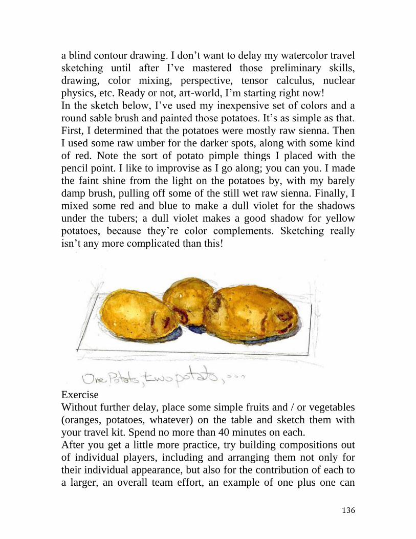
136
a blind contour drawing. I don’t want to delay my watercolor travel
sketching until after I’ve mastered those preliminary skills,
drawing, color mixing, perspective, tensor calculus, nuclear
physics, etc. Ready or not, art-world, I’m starting right now!
In the sketch below, I’ve used my inexpensive set of colors and a
round sable brush and painted those potatoes. It’s as simple as that.
First, I determined that the potatoes were mostly raw sienna. Then
I used some raw umber for the darker spots, along with some kind
of red. Note the sort of potato pimple things I placed with the
pencil point. I like to improvise as I go along; you can you. I made
the faint shine from the light on the potatoes by, with my barely
damp brush, pulling off some of the still wet raw sienna. Finally, I
mixed some red and blue to make a dull violet for the shadows
under the tubers; a dull violet makes a good shadow for yellow
potatoes, because they’re color complements. Sketching really
isn’t any more complicated than this!
Exercise
Without further delay, place some simple fruits and / or vegetables
(oranges, potatoes, whatever) on the table and sketch them with
your travel kit. Spend no more than 40 minutes on each.
After you get a little more practice, try building compositions out
of individual players, including and arranging them not only for
their individual appearance, but also for the contribution of each to
a larger, an overall team effort, an example of one plus one can

137
equal more than two. That is, try sketching a real composition. For
example, try pairing orange carrots with Italian red onions, a mild
contrast of colors and of shapes. A way to make all this more fun is
to arrange inert still-life components into social arrangements or
tableau vivant. Extraordinary painter Thomas Buechner, in his
book, How I Paint… (see bibliography), demonstrates this with
anthropomorphic groupings of simple fruits and vegetables
evocative of street crime a la West Side Story. For example, in one
beautiful painting, a dominant and thuggish pear has already
knocked another pear down and now menaces a third, intervening,
good citizen pear. I know, I shouldn’t laugh. However, they are
only pears and the overall point is… art should be fun too! I
suspect Mr. Buechner would appreciate that.
The next two scans, my Care for You, show first a quick pencil
under-sketch and then the completed watercolor. On a small
cardboard box I arranged a banana around the mandarin orange in
a sort of protective and affectionate embrace. I believe most
viewers would have wordlessly sensed the gist of the message even
without that bit of explanation.
Exercise
The next time you go grocery shopping, spend a few minutes more
in the produce section looking for such possibilities. Such story-
telling or narrative arrangements can make your sketch practice
more fun.

138
The sketch below shows a lemon and two tomatoes arranged in a
friendly group. The sketch was an exercise in depicting round and
ovoid shapes.

139
Best Friends. 140-lb NOT sketchbook.
I have relatives and friends who periodically pass on (unsolicited
of course) aesthetic advice and what they feel are insightful, even
cunning, art business tips. Usually, they report running across
“really great, truly fabulous art” that they are certain should
motivate me. It sells so well. Invariably, their gushing, almost
manic praise of others emphasizes, “Her paintings look so
amazingly real, just like actual photographs!” My advice to the
beginner is, if you must share your watercolor efforts, then just
inform friends and family that, unfortunately, you have already
eaten those particular potatoes, lemons or tomatoes. But yes, how
sad they missed it, missed seeing the work in progress while
standing before the actual subjects in your kitchen. However, they
can rest assured, your sketch does look precisely like those
inspiring but now-consumed fruits and vegetables. It’s just like a
real photograph!

140
Exercises, Sketching Man’s Architectural Shapes
If you intend to watercolor sketch on your travels, almost
immediately you must address depicting architectural subjects.
That is, you’ll need to successfully sketch manmade things, like
tables and chairs. Also, bigger things like bridges and buildings.
Further, when appropriate, you’ll want to include mobile objects
like boats, trains, cars, and so on. Fortunately, this is much easier
than you might suspect. A few examples and a little practice will
suffice to learn some archetypes: boxes, cylinders, cones, disks,
etc. And, once you’ve done a few of these, you’ll successfully
carry the ideas forever in your head. Also encouraging is the fact
that you can get started right in your home. You don’t have to
begin with a real tugboat crossing the bay or an actual horse barn
among the oaks; you can start with soup cans and cereal boxes in
your kitchen and even the kitchen itself. For realistic travel
sketching, what you’ll most need to learn is to really truly see and
then to report accurately on the paper just what you saw, not what
you believe you should have seen. You need to see what Claude
Monet saw, not what Pablo Picasso would have you believe he
saw. Along the way, you easily will acquire a practical and
sufficient grasp of the sometimes intimidating, art-theory subject
called perspective.
What you should learn and practice in this chapter are two things.
First, how to sketch simple geometric shapes like round balls, boxy
rectangular parallelepipeds, cones with pointy ends, etc. Second,
how to see these simpler geometric shape residing inside most
seemingly more complicated, real-life objects such as an
automobile composed of three adjacent boxes, a fir tree shaped like
a fuzzy cone, deciduous trees looking much like scruffy,
misshapen balls, etc.
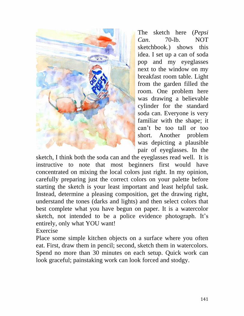
141
The sketch here (Pepsi
Can. 70-lb. NOT
sketchbook.) shows this
idea. I set up a can of soda
pop and my eyeglasses
next to the window on my
breakfast room table. Light
from the garden filled the
room. One problem here
was drawing a believable
cylinder for the standard
soda can. Everyone is very
familiar with the shape; it
can’t be too tall or too
short. Another problem
was depicting a plausible
pair of eyeglasses. In the
sketch, I think both the soda can and the eyeglasses read well. It is
instructive to note that most beginners first would have
concentrated on mixing the local colors just right. In my opinion,
carefully preparing just the correct colors on your palette before
starting the sketch is your least important and least helpful task.
Instead, determine a pleasing composition, get the drawing right,
understand the tones (darks and lights) and then select colors that
best complete what you have begun on paper. It is a watercolor
sketch, not intended to be a police evidence photograph. It’s
entirely, only what YOU want!
Exercise
Place some simple kitchen objects on a surface where you often
eat. First, draw them in pencil; second, sketch them in watercolors.
Spend no more than 30 minutes on each setup. Quick work can
look graceful; painstaking work can look forced and stodgy.

142
Candy Dishes. 70-lb. NOT
I sketched the still life sketch above, flowers and candy plates, on
my breakfast room table. (Looking at his instruction books, I
suspect that Charles Reid makes most of his watercolors after
breakfast. There’s flowers, bowls, cereal boxes, etc.) My primary
task here was to believably portray the nearly circular dish of
Depression glass. Like all round objects, when seen from an angle,
the plate presents itself more as an ellipse. Viewed from almost
level with the table, it would appear as a mere line segment. From
directly above, it would look just like it is in the abstract, a circular
object.

143
From my
Kitchen.
70-lb. NOT
Here is a
view from
inside my
kitchen,
looking
outside
through the
French
doors, to a
redwood
deck and
flowering
plants
beyond. I
made this
sketch to
challenge
myself to
plausibly
depict
sharply
rectilinear
objects. If the doors were not straight and plumb, if they were not
also properly set within a square and plumbed-up room, then the
sketch would have obviously failed. Sure, I might be living in a
curvy house of maybe adobe, wherein each wall zoomed and
swayed as in some carnival fun house, but that isn’t likely. Any
viewer would mistrust such an image. No, the viewer expects his
or her own reality, or at least a reasonable facsimile thereof. And,
reality typically resides in rectilinear housing. Therefore at home I
practice sketching rooms and their contents to develop the
necessary skill. The next sketch is Sawdust Accumulator. Aragon

144
High. 70-lb. NOT. Note that the subject consists largely of a big
rectangular box atop two truncated and upside down pyramids. I
always try to visualize seemingly complicated things as just
assemblies of simpler shapes like kindergarten blocks. This is the
central point of this chapter.
In good weather I can venture outdoors and still do my “around the
house” sketching exercises. I live but a few doors down from a
public high school. Weekends I can roam the campus, watercolors
and sketchbook in hand, and find plenty of scenes and objects
profitable for
practice.
There are
windows and
doorways in
the buildings.
There’s
equipment on
the sports
fields and
miscellaneous
equipment
parked here
and there
over the
weekend.
Local parks
and schools
provide a
plethora of
weekend
sketching
opportunities
for us to take
advantage of!

145
The Blue
Bathroom. 70-lb.
NOT.
About a hundred
years ago, after a
near fatal
automobile
accident, California
artist Albert de
Rome turned to
watercolor
sketching while
recuperating for
weeks in a San
Francisco hospital
room. And, 60
Minutes TV news
correspondent,
Morley Safer, is
well known, while
traveling on
business, to spend
evenings in his
hotel room sketching in watercolor. Yes, sketching the closet, the
bathroom, his shoes, etc. Like some character in a comedy film,
you can be so shy about your beginning work, that at first you lock
yourself in the bathroom with your tiny watercolor travel kit.
That’s okay. In fact, that’s great! Start there. You’ve got nothing to
lose, you can’t go wrong. Shown is my own Blue Bathroom, from
an early sketchbook.
Exercise
Sketch a corner of your bathroom, perhaps the sink, the tub or the
shower stall. Note that there’s typically a lot of white. That’s an
advantage of watercolor to exploit. On white paper, watercolor
excels in whites.

146
Exercises, Figural Shapes
Unless, for example, you’re sketching ancient dead Pompeii on
some rare day that no tourists are allowed to visit, humans should
often be in your travel scenes. Admittedly, if you’ve never done it
before, sketching people might seem intimidating. What could help
is to realize that your sketched figures need not be great portraits.
Sure, it would be wonderful, like famous watercolorist Charles
Reid, to sketch a recognizable face, say that of a beachcomber in
Jamaica, a sketch that everyone agrees really captures the likeness.
But, that’s neither likely to happen nor a prerequisite for enjoying
traveling with watercolors. Don’t fret; get over it. Don’t delay
starting in travel sketching; settle for the less ambitious success of
depicting quite believable people who fit well into your scene.
Thankfully, achieving this more modest goal is surprisingly easy.
Although sketching people is not difficult, some homework, or
practice, is necessary. The really good watercolorists, that I have
studied, keep sketchbooks handy and fill them with quick notes on
people (and everything else) when possible. This is just like my
musician friends who are frequently picking away at their
instruments and who don’t expect to play superbly, if playing but
just one or two hours a week, solely during formal concerts. They
constantly pick and you should often sketch, for two reasons. First,
no one reaches his or her best without constant practice. Second,
the skilled simply love to practice!
Getting Started with Figures
I always have handy a sketchbook to fill with all kinds of quick,
pictorial notes. Below is a scan from a page. At the local indoor
mall, I escape the house during bad weather. I exercise by walking
and I just enjoy the people watching. Because the shopping
subjects can be briskly moving I have at most a few seconds to
draw.

147
Here is another page of rapid sketches of passing people. Later,
either back at home or sitting in the mall food court with a cup of
coffee and a pastry, I can finish the drawings with watercolors. I
make no effort to faithfully copy the original clothing colors but
rather I choose them for the overall needs of a sketch. Typically, I
have first the color, its hue and tone, of the background behind the
figure. I wouldn’t make the Belgian cathedral bright blue just to go
well with a figure’s jacket. It should be the other way around; I
would pick colors for the figures to either blend with the
background or stand apart from it, via so-called counter-change.
Here, I just whimsically made up the colors.

148
Simply getting started is the biggest difficulty that most people
have with including figures in their sketches. That is, actually
putting down the beginning indications of people. I assume that
you would start with your pencil, as would I. Loosely speaking, I
employ two approaches to sketching a figure: gestural drawing and
“pillow people”. This work shows gestural drawings underlying
the subsequent watercolor.
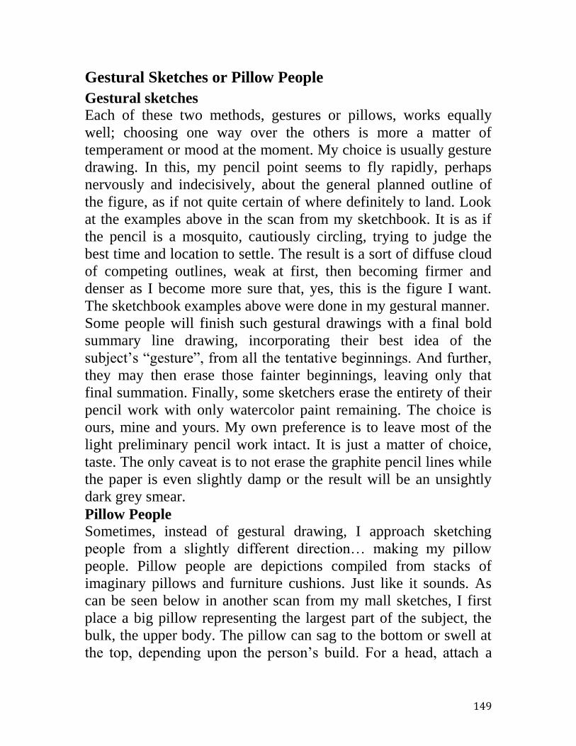
149
Gestural Sketches or Pillow People
Gestural sketches
Each of these two methods, gestures or pillows, works equally
well; choosing one way over the others is more a matter of
temperament or mood at the moment. My choice is usually gesture
drawing. In this, my pencil point seems to fly rapidly, perhaps
nervously and indecisively, about the general planned outline of
the figure, as if not quite certain of where definitely to land. Look
at the examples above in the scan from my sketchbook. It is as if
the pencil is a mosquito, cautiously circling, trying to judge the
best time and location to settle. The result is a sort of diffuse cloud
of competing outlines, weak at first, then becoming firmer and
denser as I become more sure that, yes, this is the figure I want.
The sketchbook examples above were done in my gestural manner.
Some people will finish such gestural drawings with a final bold
summary line drawing, incorporating their best idea of the
subject’s “gesture”, from all the tentative beginnings. And further,
they may then erase those fainter beginnings, leaving only that
final summation. Finally, some sketchers erase the entirety of their
pencil work with only watercolor paint remaining. The choice is
ours, mine and yours. My own preference is to leave most of the
light preliminary pencil work intact. It is just a matter of choice,
taste. The only caveat is to not erase the graphite pencil lines while
the paper is even slightly damp or the result will be an unsightly
dark grey smear.
Pillow People
Sometimes, instead of gestural drawing, I approach sketching
people from a slightly different direction… making my pillow
people. Pillow people are depictions compiled from stacks of
imaginary pillows and furniture cushions. Just like it sounds. As
can be seen below in another scan from my mall sketches, I first
place a big pillow representing the largest part of the subject, the
bulk, the upper body. The pillow can sag to the bottom or swell at
the top, depending upon the person’s build. For a head, attach a
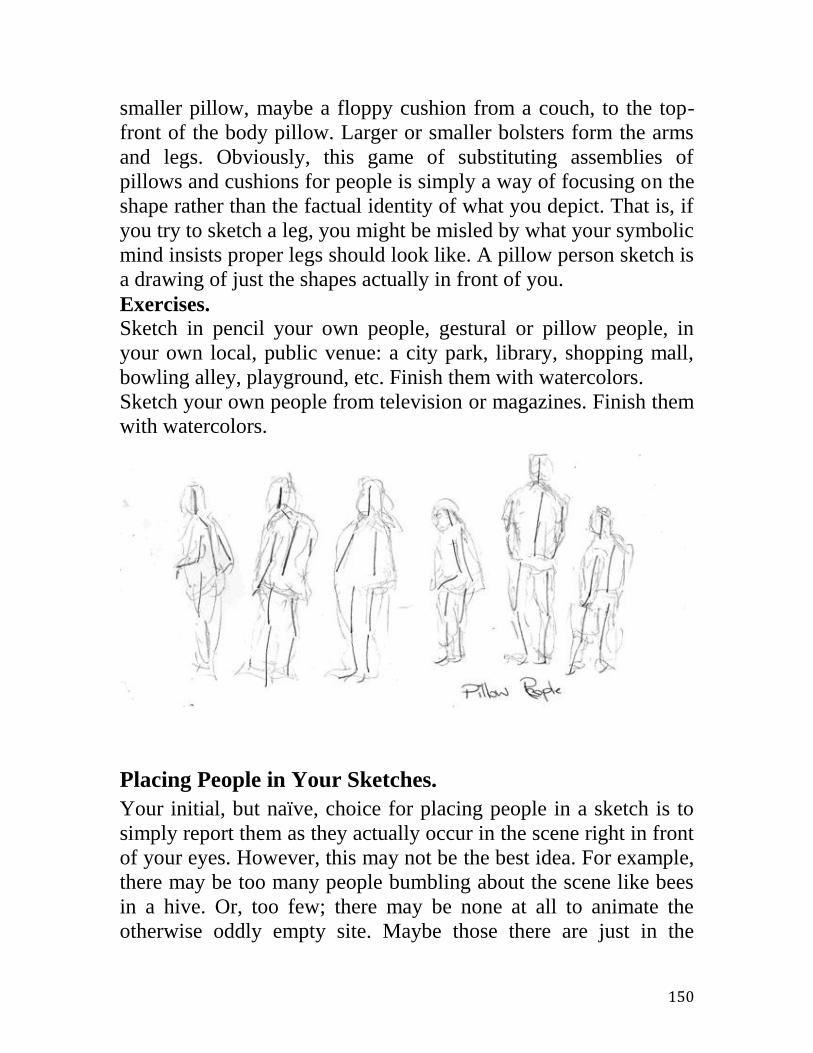
150
smaller pillow, maybe a floppy cushion from a couch, to the top-
front of the body pillow. Larger or smaller bolsters form the arms
and legs. Obviously, this game of substituting assemblies of
pillows and cushions for people is simply a way of focusing on the
shape rather than the factual identity of what you depict. That is, if
you try to sketch a leg, you might be misled by what your symbolic
mind insists proper legs should look like. A pillow person sketch is
a drawing of just the shapes actually in front of you.
Exercises.
Sketch in pencil your own people, gestural or pillow people, in
your own local, public venue: a city park, library, shopping mall,
bowling alley, playground, etc. Finish them with watercolors.
Sketch your own people from television or magazines. Finish them
with watercolors.
Placing People in Your Sketches.
Your initial, but naïve, choice for placing people in a sketch is to
simply report them as they actually occur in the scene right in front
of your eyes. However, this may not be the best idea. For example,
there may be too many people bumbling about the scene like bees
in a hive. Or, too few; there may be none at all to animate the
otherwise oddly empty site. Maybe those there are just in the

151
wrong places, e.g. blocking your view of Yosemite Falls or the
Eiffel Tower. The point is, for the purposes of your sketch, you
may need to add or subtract people, perhaps just to move some
around to a better spot. This is okay, is not dishonest; this is part of
your “artistic license”. Three reasons for placing or moving people
in your sketch are: to animate the scene, to provide proper scale
and to support believable visual perspective.
Scale
Recently I was showing someone a nearly perfect marine
watercolor hanging in a public building. (Not my own.) It had won
a prize. It was an ocean salmon trawler painted resting almost
broadside in a familiar harbor. It’s a wonderful painting with
almost everything right. Almost. Suddenly, I heard a snort, then a
derisive hoot. My companion, with some years of experience at
sea, pointed contemptuously to the figure depicted on deck. This
was far too small relative to the open passageway behind it in the
painting. Was this boat manned by some seagoing kindergarten?
After this, nothing else could be noticed in the painting; all was
negatively overwhelmed by this one error. It was either a giant
boat or a miniature crew. Yes, what a hoot. Unfortunately, a
negative detail usually makes for a bad total experience. I felt very
bad for the artist who otherwise had accomplished an excellent
painting.
Yet, it was easy to avoid. How had the artist gotten all of the other
relationships, the relative scales (like the height of the masts to the
length of the waterline), so plausible, but then made the crew this
tiny creature, relative to the open door, maybe a foot tall?
Therefore, the first thing about the people in your sketches is that
they be in the proper, believable scale relative to the other objects.
Proper scale is easy; it only requires attention. In the three loose
sketches below, a figure in a dingy, the first two are evidently too
large or too small. Only the third looks able to man the oars.
Because it isn’t obvious whether the boat is small or large, I sized
the figure relative to those oars. Abroad with your sketching kit,

152
handy references for scaling your figures are doorways, chairs,
autos, etc. In one form or another, these handy yardsticks are
everywhere.
Perspective and People
Placing the people in perspective in your work is a little more
complicated than sketching them in scale. Consider the crude
sketch below. A street, with a single fronting building, moves
towards a large body of water in the background. Pedestrians move
towards that distant place. There’s nothing extraordinary here.

153
The next sketch below shows the same scene, but annotated. A
dark blue horizontal line emphasizes the horizon. Know it or not,
every scene has a horizon. Recognizing that, if not explicitly
indicating it, is a critical element in making any sketch. Around
any large body of water, the far shore is an excellent estimate of
that horizon line. What an artist or a sketcher should also know is
that the horizon line also determines the eye level of the painting.
This is the imaginary flat and horizontal sheet that passes through
both the artist’s two eyes and the distant horizon. Not so
incidentally, this also determines the best height to hang a picture
on the wall, for the scene to read with proper perspective. The
viewer’s eye-level should be roughly the same as the artist’s; the
viewer should be looking over the artist’s shoulder, so to speak.
If all of the depicted passersby populating the scene are as tall as
the sketcher and if they are all standing on the same level surface,
then all should share the same eye-level and thus all the heads
should be at the same level. In reality it’s plus or minus a bit for
varying individual’s heights. My red cartoon face, drawn level
with the horizon, illustrates this idea. Of course, in many if not
most of your travel sketches, you may not directly see any far
horizon, such as an opposite shore on a large lake. However, even
in a crowded city scene, if you simply guess at where the distant
horizon behind all the people and buildings might be, you probably
will be close enough for your sketches to read properly. Same with
people, and buildings for that matter, standing at different levels
and at different angular orientations, your guess informed by a
little experience will be good enough. As a bonus, note the dark
green arrows / lines in the cartoon. Rectilinear buildings set level
have edges that appear to converge to common points on the
horizon. Here I’ve shown the edges of the roof and of all of the
windows and doors properly aligned. Finally, note that the
pedestrian shown nearest the building’s door is in believable scale
and that the others, closer to the lake, diminish in height
accordingly.

154
Exercises.
Look for proper scaling of any people in the artwork of others, at
exhibits, in books, etc. Look for a horizon line / eye level in the
artwork. Are the figures in proper perspective? Is the picture hung
close to the best level? That is, are your own eyes anywhere near
the horizon of the scene?
Do the same as above but in the photography of others. Note that
professional photographers often deliberately use a low eye-level,
as if a poodle took the photo. At work, they are almost always seen
shooting on their knees, looking up at the subjects towering over
them. Pros must know that this introduces a mild perspective
distortion thought flattering to the subjects. Fashion models look
leggier; athletes look more imposing, brides look trimmer, etc.
155
Exercise: Sketching From Your Photographs
Okay, right at the start, let’s admit it. Many people think of
painting or sketching from a photograph as at best childish, at
worst, somehow cheating. There, with that statement now behind
us, we can get on with it. Sketching from photos may not be ideal,
but it sure is better than doing absolutely nothing. Yes, there are a
lot of caveats. Black and white prints have no color, but that’s not
the end of the world. You can choose your own colors in that case.
Color photos typically distort color, often making both reds and
greens luridly exaggerated. That’s intentional. Early on, film
manufacturers determined that most photo customers, especially
amateurs, preferred artificially strengthened colors. Thus, if
accuracy is an issue, a film photographer has to seek out special
natural color films. A digital photographer has to set his camera to
record in the actual, honest colors, not in artificially heightened
ones, the default setting in many cameras and printers.
Camera lenses suffer another color defect called flare. Flare dulls
colors. For example, if you take a photo of a small but strongly red
rose against the larger background of the bush’s deeply green
foliage, you will be very disappointed in the final printed image.
Yes, the lens will send most of the red color to the film location of
the rose and will send most of the green to the bush places. But,
not all colors will go to the right places. Unfortunately, to some
extent, the camera lens splatters some red light all over the green
bush image and splashes some green light onto the rose bloom’s
red image.
Three-dimensional perspective is flattened in photos. Lenses
selling for less than hundreds or even thousands of dollars, also
introduce noticeable geometric errors with upsetting names like
“pincushion”, “barrel distortion”, etc. We are so accustomed to
these issues in amateur photography that we routinely overlook, for
example, wobbly buildings teetering in a tourist’s photo print.
Of course, many of these issues can be corrected when you make a
watercolor sketch from your photo. You can restore the sharpness
156
of a rose bush’s reds and greens to the levels remembered from
nature. In a broad landscape, you even can make the reds and
greens either photograph exaggerated or make them as naturally
gentle as you recall. As for the camera’s geometric distortions, you
know that in reality the edges of the house are both straight and
upright, and can sketch them so. So, unless you slavishly copy
photos, errors and all, you can use those pictures you took under a
Tuscan summer sun to make watercolors in your gloomy Illinois
winter kitchen, when nothing else seems attractive. Still, I believe
sketching from photos should be a last resort, when there is
nothing else to do.
My remaining caveat is to sketch from your own photos. Legally,
you can sketch from the photos of others as long as the resulting
sketches are only for your own, personal use. You can sketch from
newspapers, magazines, travel flyers in the mail, etc. But, your
sketched copies cannot be sold or exhibited without the explicit
permission of the photo’s owner. Ethically, even in your own,
private use, you should practice giving proper attribution. For
example, in a few cases I couldn’t resist trying to copy a gorgeous
painting by Sargent. However, I signed it with my own name, not
as “John S Sargent”. And, I also wrote right on the work itself,
“after John S Sargent”. Additionally, I did the painting in a
different size and in a different medium, e.g. oils instead of
watercolor. I do the same with the photographs of others,
regardless of where found, magazine, newspaper, etc. I sign my
own name and add, “After so and so”. Copying it as if it were your
own original work is plagiarism, plain and simple. Writing a play
for your community theater group, would you claim as a creation
of your own genius, dialogue like, “Romeo? Romeo? Wherefore
art thou”?
Preserving Old Memories
An excellent use of your watercolor sketching exercises with
photographs can be saving old and fading family memories. A
personal case in point for me is a small collection of my father’s

157
now failing Kodachrome slides of family vacations. Dad took these
more than half a century ago, a mile high in California’s mountains
around a large and remote mountain lake. Those were halcyon
times spent in a pristine place. No wide highway sped there to feed
a ski lodge or a crowded RV park. Sadly, there’s little like it
anymore left in California.
As mentioned, the old slides are rapidly and surely failing. The
remaining colors are shifting far to the blue and the fine details are
dissolving into some molecular mist. In 1950 one probably
assumed that these films could last forever. Isn’t that why we take
these photos? Alas, film in ordinary practice is not immortal.
However, sketches made with non-fugitive modern watercolors, on
acid-free paper should last a very long time. Those of WMJ Turner
from the early 1800s are still intact and looking very well. So an
obvious thought occurs, why not preserve treasured images in a
dedicated watercolor folio? If I do this, then at the same time I’m
indoors practicing my sketching on a dreary day and also
accomplishing this larger, worthwhile task. Most of us have some
old family photos whose image could be preserved in this way:
family vacations, reunions, an old family homestead, etc.
The photos below give you an idea of what Dad’s slides now are
like. Some were, albeit well-intentioned, cross-eyed fractured by
Kodak’s image-splitting 35mm 3D camera accessory, necessitating
an untangling of what the whole image must have been like. A
very few slides are okay today, but could decay tomorrow. Some
images are fuzzily out-of-focus. Remember, prior to instant or
digital photography, there was no immediate review of an image;
thus one could return from vacation unaware that the recording of
a treasured scene could be faulty. Lastly, through the intervening
half century and more, some slides have developed problems due
errors in the original handling and developing. For example, some
of them seem to have accidental swipes of some sort of now dried
processing gel or cement that, at first was transparent but now
obscures the underlying image.
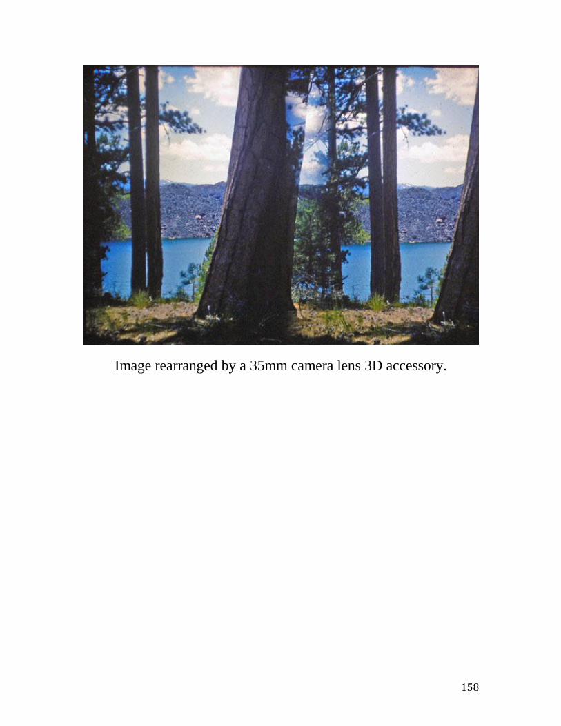
158
Image rearranged by a 35mm camera lens 3D accessory.

159
Image
accidentally
contaminated
during initial
1955
processing.
On the
following
pages are
some of the
sketches made
from photos.

160
Cinder Cone.
8x5-inches on
140-lb Strathmore
400 NOT.
The sketch above
employs several
somewhat unusual
methods. First,
after laying in the
principal washes, I
deliberately
“overworked” the
piece including
several overall
washes with
diluted coffee, this
to create an aged
and softened,
woodblock print
look. Second, the
light glinting off
the water was
made by razor
scrapes at the very
end, not some
white paint. Third, some of the foliage at the bottom was made
with marks of soft pastel, soft pastel having the same ingredients as
watercolor, pure pigment and gum arabic. This pastel business is a
trick used by Sargent, Turner and others. When travel sketching, I
carry no liquid masking fluid of any kind. As odd liquids, they
attract suspicion at airports. Further, masking liquids are notorious
for ruining brushes, so much so that some advise carrying a

161
second, dedicated brush sacrificed for that purpose. Why bother?
Soft pastels can work wonderfully for very small effects and
corrections.
Bluff Above the Lake. 6x9-inches. 140-lb Strathmore 400 NOT.
This approximates the scene in the 35-mm slide print above
wherein the image was split and confused by the mirrors in the
camera’s 3D lens attachment. The goal, besides the preservation of
the memory in the failing film slide, was to untangle the cross-eyed
view into something like the original scene. The original image
was photographed in horizontal or landscape orientation in the then
prevalent 35-mm Leica 2-to-3 (24x36-mm) format. Thus, I chose a
2-to-3 format for the sketch (6x9-inches) and arrayed the items in
the scene proportionally along the x- and y-axes. Easier done than
said. The tiny white highlights, both in the distant lava flows as
well as the closer tree trunk, were too small and numerous to
depict by conserving the white paper with masking fluid. Instead,
after the colors were almost dry, I picked the highlights out with a
small, sharp knife blade. I used a small fan brush to drybrush in
much of the sparse, bright grass. (Drybrush uses very little water or
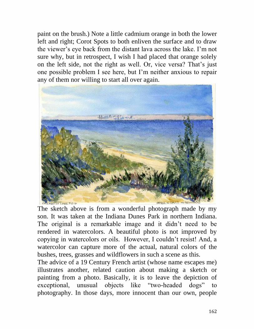
162
paint on the brush.) Note a little cadmium orange in both the lower
left and right; Corot Spots to both enliven the surface and to draw
the viewer’s eye back from the distant lava across the lake. I’m not
sure why, but in retrospect, I wish I had placed that orange solely
on the left side, not the right as well. Or, vice versa? That’s just
one possible problem I see here, but I’m neither anxious to repair
any of them nor willing to start all over again.
The sketch above is from a wonderful photograph made by my
son. It was taken at the Indiana Dunes Park in northern Indiana.
The original is a remarkable image and it didn’t need to be
rendered in watercolors. A beautiful photo is not improved by
copying in watercolors or oils. However, I couldn’t resist! And, a
watercolor can capture more of the actual, natural colors of the
bushes, trees, grasses and wildflowers in such a scene as this.
The advice of a 19 Century French artist (whose name escapes me)
illustrates another, related caution about making a sketch or
painting from a photo. Basically, it is to leave the depiction of
exceptional, unusual objects like “two-headed dogs” to
photography. In those days, more innocent than our own, people
163
generally believed that photographs were quite difficult to
manipulate. Thus, a photo of an exceptional thing was thought to
be the “truth”, but anyone with pencil or brush could easily invent
any oddity, even the sight of downtown Chicago, clear across the
lake, smothered up to its neck in thick lake fog. However, now in
our day of digital photography and photo editing software, we’ve
grown up and wisely have learned to mistrust photos as well. Here
in this case, the fog was honestly there!
Finally, there’s a potentially fatal danger in sketching from
photographs, your own or anybody else’s. That is, it’s too easy to
end up with something totally different from a sketch. With the
photo in front of you, you are almost irresistibly absorbed by too
much detail and the watercolor work easily becomes too labored as
you are pulled into rendering the entirety, every single bit.
Although it is often mistakenly given as the explanation, the
problem is not that there is too much detail in the photo. In fact, the
actual scene behind the photo (and theoretically available to you,
were you there outdoors sketching in person) obviously must
contain almost infinitely more detail than that modest print. No, the
problem is really that you have too much time to spend with the
photo. Truth be told, in nature, sketching plein air, you might have
contended with dubious passersby, a moderately upset stomach,
blowing sand, changing light, a hot sun or a cold wind, flies and
wasps, suspicious dogs, etc. “Are these bees those Africanized
ones?” “Oh my, what did I just step in?” “Why is she staring?”
With plein air, a successful sketcher quickly assesses the gist of the
scene top down, edits it severely, quickly and fluidly indicates a
graceful liquid summary, then gratefully beats a hasty retreat into
the nearest cheery coffee shop that promises pastries and a clean
restroom. And yes, it’s still enormously fun and rewarding!
Thus, if you want to develop your skills at watercolor sketching,
but indoors staring at a photograph, with the entire afternoon
available, then you must exercise a severe discipline. You must
imagine yourself outdoors at the same scene and give yourself only
a brief thirty minutes at most. Otherwise you’ll not be practicing

164
for watercolor sketching; you’ll instead be laboriously rendering a
photo into the closest imitation of that photographic print. At best,
your watercolor will look exactly like the print. That’s an
admirable skill, copying things, but it is absolutely not watercolor
sketching. And, the end result, good or bad, will look just like
whatever it is, not a sketch. How can you tell if it’s a sketch? One
question to ask yourself is, if you see a small mistake do you very
much desire to carefully fix it? A “yes” answer suggests that it is
more likely not a sketch.
165
Storing and Sharing Your Watercolor Sketches
Acid-free. Perhaps the most important consideration in storing and
displaying your watercolor sketches is that originally they be done
on acid-free paper. Furthermore, their subsequent immediate
physical environment, mainly their frames, albums, etc. also must
be totally acid-free. Any acid present, from any source, will
immediately begin to oxidize your sketches. Albeit slowly, paper
exposed to acid fumes starts to turn brown and brittle. (Like the
rusting of iron, this oxidation is precisely just a very slow,
flameless burning of the paper.) But, you ask, where would this
harmful acid come from? If there is any wood in near contact with
your sketches, then it should be assumed that harmful acid is
present as well. Wood produces acid, just breathes it out. Absent
any knowledge to the contrary, the presence of inexpensive paper
also indicates acids. After all, most common paper is made from
pulped wood. Ever handy newsprint is very bad. So, unless the
paper explicitly is said to be “acid-free”, assume that it is not. Let
acid-free be your inflexible mantra here.
Besides acid-free, there are a few other environmental conditions
that should be met. Your watercolor sketches on display, in glazed
frames or not, should not be exposed to very bright light such as
direct sunlight. Sketches and paintings should not be subject to
very high humidity (almost condensing humidity, as in a kitchen or
bathroom). Nor should watercolors be exposed to other vapors and
fumes, e.g. tobacco smoke. Besides kitchens and bathrooms,
watercolors, even in a good frame, should not be hung on a home’s
uninsulated exterior wall. Frequently such walls are prone to local
water condensation. (A museum study in Britain determined that
corrosive fumes from the visitors were attacking the open paintings
in their galleries, fumes from wet woolen clothing and from what
was obliquely referred to as digestive gases.)

166
Storing Watercolor Sketches
Watercolors sketches and paintings (and indeed any art on paper,
e.g. quality photo prints, etchings, etc.) are best stored flat in a dark
and acid-free environment of moderate temperature and humidity.
However, the temptation is almost irresistible to simply slide
watercolors into a common paper office file folder and slip all into
a (probably wooden) furniture drawer. Please don’t. Inexpensive
acid-free storage portfolios are available, at least on the Internet.
At a minimum, store your sketches in a dark place, flat between
two over-size sheets of acid-free, inexpensive watercolor paper.
Another option is a box lined with cheap but acid-free paper. Of
course, watercolors should never be folded or even rolled.
An easy and very inexpensive quick start to storing at least your
smaller travel sketches is to use recycled flat plastic boxes.
Nowadays, we all are inundated with quite usable, if flimsy,
disposable plastic containers. I use some that originally held salad
greens, but now, carefully washed clean, easily hold stacks of
watercolors up to and including those 6x9-inches in size. Such
boxes are no doubt not “archival” in that they may very slowly
outgas plasticizers but they are good enough in the short term. (See
photo below, sketches in clean plastic boxes formerly holding
food.)

167
Displaying Watercolor Sketches
There are many ways to publically display, to share, your finished
watercolor sketches. Small sketches can be shared easily and
inexpensively via ready-made photo albums. Or, they can be
shared in portfolios or pochades. They even can be varnished and
simply displayed on their own, like little oil paintings. They can be
framed to display either on a wall or atop furniture. Nowadays,
they can be computer scanned and displayed in tiny, TV-like
digital LCD frames, copied as “prints” on paper, or even printed
onto cloth as with tee shirts.
Sharing Watercolor Sketches via a Photo Album
A conventional photo album makes a great way to store and share
your watercolor travel sketches, provided the following conditions

168
are met: the album’s construction materials are acid-free, the
album is made to hold standard sizes (usually 4x6 photo prints)
and your travel sketches were done also on standard-sized paper,
e.g. 4x6 blocks. The photo shows 4x6 watercolor postcard sketches
in a standard album designed for 4x6 photo prints. A caution about
using such albums is that often the pockets are very precisely cut to
hold only cards very tightly cut to just 4x6-inch photo print size.
Commercial postcards as well as postcard-size watercolor pads and
blocks can vary in size through a small range. Some are slightly
larger than 4x6-inches and thus won’t fit in a precisely made
album.
The next pictures below show two albums capable of holding
either postcards or photo prints. The publisher, Chronicle Books,
resurrected an old Arts & Crafts tourist design for these albums.
They don’t have plastic pockets requiring an exact photo print size

169
and shape as do many photo print albums. The albums below
(shown closed and open) simply have clusters of die-cut slits to fit
the corners. These can accommodate forgivingly a range of
postcard sizes, at the expense of hiding the extreme corners of the
sketch. The first album is a one-picture-per-sheet model. The
second, a larger album of the same family design, can hold three
postcards per sheet. (Note, for the viewers’ ease, the grouping on
the same sheet of all three postcards, are all in either portrait or all
in landscape.) Albums like these can be found on the Internet if not
locally.
The
watercolor
postcard
sketch
below is
from a trip
to Slovenia.

170
These watercolor postcards below are from visits to Chicago.

171
Sharing Watercolor sketches via a Portfolio / Pochade
The photo below shows the use of both readymade, inexpensive
photo frames and of small watercolor paper portfolios or pochades.
The tiny portfolio shown here is from Nujabi, a paper source in
India. (Similar products are available from France and Japan.)
Each portfolio typically comes with ten postcard-size, blank
watercolor papers. These acid-free Nujabi cards are effectively
without sizing, about 210-lb weight, rough surface, and with all
four deckle edges intact. They are handmade and come with a
hemp tie in that handmade cotton and hemp paper portfolio. If you
can find them, they are lovely and typically quite a bargain. These
are from the Internet.
In the case shown I have filled one with sketches made along
California’s Pacific Coast just south of San Francisco. Regardless
of size, portfolios are particularly suitable for a set of images about

172
a common topic or theme. My largest such portfolio is a
“Watercolor Pochette” from Moulin de Larroque in France, filled
with ten sheets of handmade, 9x13-inch, 200-lb paper. Beautiful!
Lovely paper. I can’t decide yet what to sketch for this: views of
the many San Francisco Bay Area bridges, Coastal scenes, forest
scenes … what?
Frameless Display
Although to many watercolorists it is heresy, watercolors need not
always be displayed in a frame behind glass or acrylic. Just like
paintings in oil or acrylic, watercolor on paper can be varnished.
Varnishing provides some protection, albeit not nearly as much as
an intervening glass window. Typically, varnishing also somewhat
alters the appearance of the sketch. The colors darken slightly and
increase in chroma or hue intensity. The physical optics
responsible is familiar to anyone who has wetted a dusty dry
pebble to bring out better the native colors and patterns of the

173
stone. Like the thin layer of water between the air and the pebble,
the varnish interposes a clear layer with optical properties
intermediate to those of the sketch and those of the air. The
resulting less extreme and abrupt changes in optical properties
enables more of the underlying light to escape off the sketch. This
significant change in the ultimate appearance of the sketch can and
should be anticipated at the start.
There are at least two ways to varnish a watercolor painting or
sketch. One way is to use the same organic, solvent-based art
varnish intended for oils or acrylics, and apply it as usual, either by
spray or via a soft brush. One caveat is that, if too much varnish is
applied (easily done), the sketch can take on an unintended and
unattractive yellow, almost a jaundiced, bilious hue. Another
caution is that, once a watercolor is varnished with an ordinary art
varnish, then it cannot reasonably be removed. It’s forever.
Another approach, once a watercolor sketch is thoroughly dry, uses
the natural resin, gum arabic, as a water-based varnish. This
varnish is a diluted water solution of gum arabic (already a
common component of watercolor paints). If a soft brush is used to
varnish, then not only must the sketch be absolutely dry, the
application brushing must be done with a very light, sable touch
and done deftly, with no return strokes, so as to not stir up the
underlying soluble, albeit dried, paint. More safely, the gum arabic
also can be aerosol sprayed. If the gum was not sufficiently diluted
in water, then the coating will appear both yellow and be prone to a
kind of surface checking, like dried mud. A commercial solution of
gum Arabic should be diluted with clean water in a ratio of about
3- to 5-parts water to each part gum solution. Caution: a watercolor
can easily be ruined if this water-based varnishing goes wrong.
All this is not unique to watercolor; painters in oil face the same
question, to varnish or not to varnish. As it does with watercolors,
varnish protects an oil-painted surface and also alters its optical
properties, hence its appearance. Some artists were adamantly
opposed to varnish, for example, East Coast Impressionist Child
Hassam and Seldon Gile of the California Society of Six. As a

174
result, in person, their paintings have a pale and dusty look.
Ironically, the photographic reproductions of their work, the only
images available to most people, often do not suffer this pastel and
powdery appearance; subtly photography has elided this effect. For
me, an unvarnished oil painting is one of the rare and unfortunate
instances where the work might not look better in person.
Miniature Screens
If you frame a watercolor, the protective benefits of the glass
window can be worth the downside. But, if there is no frame and
you varnished the watercolor, then more options for display are
available. For the exaggerated landscape formats I enjoy, often I’ll
make a kind of miniature screen. I do this by making several
shallow creases, very lightly cutting the back of the paper. Then
after gently folding it accordion-style into those same thirds or
quarters, I simply stand the sketch, much like a miniature oriental
screen, in a sheltered spot like in a bookcase. The two small
screens below are about ten inches wide, each slightly folded into
quarters to stand inside bookcases.
Rest Stop, 280. 4.5x10-inches. 140-lb NOT
Looking south from a rest stop on Highway 280.

175
View from the Dam, Crystal Springs. 4.5x10-inches. 140-lb NOT
Looking west, from the dam, past the emergency overflow, Crystal
Springs.
From my Window. 4.5x10-inches. 140-lb NOT

176
Rosemarie above 280. 3x4-inches. 140-lb NOT
The above is a tiny varnished watercolor notecard placed on a
miniature easel.

177
Acrylic Frames without Mats
Quick start. The photos below show watercolors displayed in
readymade plastic frames made for displaying photo prints without
mats. Plastic hobby shops, TAP Plastics among others, sell them in
the usual small photo print sizes, 4x6, 5x7, 8x10, etc. I even have
some in very wide 4x10 landscape format. Unlike some
conventional photo albums wherein a slightly too large sketch
simply won’t fit, these acrylic frame dimensions are generous,
hence forgiving of slight variations in sketch sizes. With the
frequent albeit small disagreements between metric and English
dimensions, this is appreciated. And, unlike those other frames,
there’s no 0.25-inch cutoff loss around the edges. The photo below
shows a sketch displayed in an acrylic photo frame. A fold in the
acrylic sheet at the back acts as a stand, either in landscape format
(here) or portrait. Each frame can stand in either landscape or
portrait orientation. The sketches slip in and out with great ease,
unlike those in conventional picture frames. Thus, it is easy to
rotate a collection in and out, changing as desired. For example, try

178
rotating through four sketches of a family vacation spot, one for
each season of the year.
Conventionally Framed Watercolor Sketches
Besides those minimalist acrylic frames shown above, more
conventional ones can display your sketches also. You can have a
shop professionally frame them or you can do it yourself. Where I
live, I can put my sketches in the usual kinds of frames, for
roughly a fourth the cost that a commercial framer needs to charge.
Given a few caveats, framing watercolor in roughly the same
quality that framing shops offer is neither expensive nor difficult.
The photo below shows a 6x9-inch plein-aire watercolor sketch I
did in a mountain valley behind my town. Not only is it my own
sketch but I also framed it myself. I simply bought the ready-made
frame and a ready-cut, acid-free mat. (See next section about
mats.) I first removed the acidic papers and fake photo image that

179
shipped with the new frame and replaced all that with my sketch
behind the mat and a further sheet of blank and inexpensive yet
acid-free watercolor paper behind the sketch. This extra, blank
sheet of watercolor paper serves as a barrier to acid vapors. Voila’,
a nice framing. Personally, for about a dollar more, I also like to
replace the frame’s heavy yet fragile glass with a safer sheet of thin
acrylic from the local plastics hobby store.
Matting
A well-chosen mat and frame make a sketch look better, simply by
providing a color and texture segue between the sketch and the
surrounding wall. Choosing a good mat for style and colors is an
aesthetic, an artistic decision best made by you. Additionally,
matting can serve an essential technical purpose. Properly
implemented, a mat prevents the glass window from actually
touching the sketch. Such contact can damage a watercolor in at
least two ways, mechanical and chemical. Because watercolor
paints contain sugars (e.g. honey) and gum arabic, a sticky natural
gum or sap, a sketch can simply adhere or stick to the window,
180
especially after the passage of time. This can appear like a defect
and can cause the sketch paper to tear if the framing is opened up
to remedy the problem. Contact between the window and the
sketch also can lead to chemical problems. The glass or acrylic
surface can retain oily manufacturing residues and chlorites and
other oxidizers left over from its last cleaning. These cleaners can
damage the paper and pigments of the sketch. Because, a mat is
needed minimally to hold the sketch away from the frame and
window surface, if you wish, the mat could hide entirely within the
frame around the edges and not be seen. However, most of the time
a mat is prominently visible because it was selected to also
enhance the appearance of the sketch via some harmonious color
or design. Finally, It is of the utmost importance that the mat
material be entirely acid-free. Perhaps surprisingly, some
readymade mats are sold that are not acid-free. This obviates their
most important purpose. Most chain store craft or framing stores
sell inexpensive pre-cut, acid-free mats in a variety of sizes, colors
and styles. Always check the label for “acid-free.

181
Fog, Monterey Municipal Wharf. 4x6-inches. 140-lb. NOT.
The sketch above sits in an off-the-shelf photo frame. The (almost
invisible) white mat used is a pre-cut commercial one sized for a
5x7-inch work. In this instance I first glued the 4x6-inch sketch
onto a sheet of watercolor paper that I had deeply toned with burnt
sienna. I then framed this combination within the larger 5x7 mat
and placed that mat into a standard tabletop photo frame. Feel free
to take such liberties with your own watercolors.
Glazed or Not
A framed oil painting usually has no glass. Framed watercolors are
different. A frame for art on paper (photos, prints, watercolors,
etc.) usually incorporates a transparent protective window made of
glass. (Acrylic is a little more expensive.) A window mechanically
protects watercolors and other works on paper by imposing a
protective barrier to environmental hazards like: spittle, insect
spots, tobacco smoke, volatile kitchen grease, etc. An important
decision when selecting a protective window is added UV filtration
182
or not. That is, whether or not the glass type also removes more of
the higher energy, the ultraviolet light next to the visible light
spectrum. This is desirable because ultraviolet greatly accelerates
color fading. Ultraviolet occurs in large quantities in sunlight and
also, perhaps unexpectedly, to some extent indoors from some
fluorescent fixtures. Some beautiful historic watercolor pigments
(e.g. rose madder genuine) are so fugitive, so susceptible to
bleaching, that museums reduce even the usual visible kind of light
in their galleries. Thankfully, in contrast to many older paints,
modern watercolor pigments are highly resistant to fading by
ordinary visible light. However some relatively fugitive colors are
so unique and gorgeous that they are still available. Lovely as
watercolor paints are, take a walk through a nursery to admire the
flowers, such as fuchsias. Their unequalled, but sadly transient
beauty brings despair to color chemists.
Non-glare or Regular Glass
Another choice to be made is whether the window should be non-
glare or regular material. Non-glare glass reduces annoying
reflections from the window’s front surface. You’ve seen such
glare before when you saw not only the painting but also yourself
reflected in the glass. It is as if you were standing on a sidewalk
before a shop window, seeing the offered goods but also yourself
and the street scene reflected back in the glass. Non-glare glass is
slightly frosted on its front surface, where most reflection takes
place. This renders the glass very slightly merely translucent at the
expense of perfect transparency. Personally, I find that a non-glare
window unacceptably degrades the image behind, particularly with
small or finely detailed works. Of course, the choice is yours.
Glass or Acrylic Glazing
Yet another framing decision to be made is between a glazing of
glass or of acrylic (or another kind of transparent and rigid plastic
sheet). Frames come from the store with plain window glass, the
cheapest, default choice of the overseas manufacturer. But, I prefer

183
thin acrylic sheets. This plastic is both significantly lighter in
weight and is relatively shatterproof. If a picture frame is dropped,
usually a glass window will shatter into dangerous sharp shards.
These can slash the paper artwork. However, perhaps the most
important reason for selecting the shatterproof window is for
human safety, particularly for children who are usually lower than
the adults.
Backing the Sketch
For protection, mechanical and chemical, something always has to
be sandwiched behind the sketch’s watercolor paper. If the frame
is an inexpensive photo frame from a craft or framing chain store,
the backing included will always be common (not acid-free)
paperboard. It may be necessary to retain this piece if it also
incorporates the metal wall hanger or the foot brace for standing
the frame. In this case you must prevent any acid from reaching the
sketch via two interposed materials. Next to the sketch, place one
or more blank sheets of inexpensive, acid-free watercolor paper.
Between this layer and the included, likely acidic, backing, place a
layer of kitchen aluminum foil that will act as a complete vapor
barrier. (The acid commonly migrates as a very weak but
ultimately still damaging gas or vapor.)
Sketch Edge Wrapped
To complete the isolation of the watercolor from any acid in the
framing one can wrap the edges of the combined window / mat /
sketch / backing sandwich with more metal foil or tape. The tape
or foil, of course, should not be visible from the front. If desired,
special acid-free, "barrier" tapes are available.
Hanging on the Wall or Just Sitting Around
On the Internet, investigate the much sought-after watercolors of
Trevor Chamberlain, David Curtis, John Yardley, etc. They are
relatively small in size. For example, 7x10-inches up to 10x14-
inches are very common sizes. You can either hang such small

184
works, sometimes in groups, on the lesser walls around your home
or you can stand them on furniture. In other words, good art can
come in small packages!
Ready-made Frames, Standard and Not
A great variety of off-the-shelf, ready-made, glazed frames are
available from framing and art / hobby stores. Motivated almost
entirely by photographic print sizes, these imports come in
standard sizes, for example, for 5x7-inch prints. If you find frames
that you like in frame shops, then you can always find watercolor
paper cut in standard sizes to fit those frames. For example, 8x10-
inch frames are available, as are watercolor in 8x10-inch pads. The
converse is sometimes not true. 7x10-inch is a nice, very popular
size in Europe for watercolor paper blocks, yet in the US I have
never found ready-made photo frames in that size. I could still use
an off-shelf photo frame for my 7x10-inch sketches, but I’d have to
cut the sketches down. Thus, before buying a lot of paper blocks, it
is advisable to see if suitable frames are freely available. For
example, there are plenty of 5x7-inch frames to go with the
popular 5x7-inch size watercolor paper blocks. Be advised that the
opening in a frame is somewhat smaller than advertised. For
example, a 5x7-inch frame’s opening is a quarter-inch-less all
around. That is, the opening is actually4.5 x 6.5-inches. The
quarter-inch overlap retains the image and glass in the frame.
Below is a photo showing some small, ready-made photo frames,
in a range of standard sizes, quite suitable for watercolor sketches.
Note that these three are all of a similar style, roughly Arts &
Crafts. In fact, off-the-shelf photo frames come in a variety of
coherent styles, Southwestern, Modern, Driftwood, Rustic, etc.
Note further that these frames can be used either with or without a
mat. Ready-made and acid-free mats are sold in the same stores
with standard-sized openings. Again, there is the caveat that the
mat openings, like the frame openings, are actually smaller than
stated, again to hold the image. The mats’ exterior sizes are

185
typically over-generous, allowing one to cut down the mat to fit a
range of overall frame sizes.
Another possibility for using already-made frames is to acquire
your own small inventory of small, custom-sized, used frames
from thrift stores, garage sales and the like. An upside of this
method is obtaining at reasonable cost, frames of very interesting
sizes and appearances. This is not surprising because typically used
frames are erstwhile custom framing pieces and sometimes even
beautiful antiques. A downside is storing these frames, their acrylic
windows, and an a-priori cut sheet of paper for each specific
frame, if you desire a sketch that properly fills the frame.
Additionally, to use such idiosyncratic frames for travel sketching
probably requires one to carry a motley gaggle of odd paper sheets.
Or alternatively, one could make a list of the odd sizes and a small
ruler, with which to measure off those odd sizes onto the sheets of
a large-enough travel sketchbook.
My own
approach is to
mat a standard-
sized sketch with
a mat of
standard-sized
interior picture
opening, but then
to cut down that
mat’s outside to
fit the eccentric
dimensions of the
recycled frame.
Don’t forget, a
mat has two
sizes, the interior
one for the
picture opening and the exterior one for the frame opening. As
mentioned, the exterior opening is quite generous, often allowing

186
you to cut the mat down to fit a custom frame. The photo below
shows an example. The mat’s interior opening fit my sketch, but
the outside dimensions were too large for this old frame. However,
I liked the height-to-width of the frame relative to the sketch, so I
cut down the outside of the mat. Also mentioned, unless the frame
is a bona fide museum piece, I like to replace its heavy glass
window with a thin acrylic sheet. Despite these minor bothers,
some of my favorite watercolors are framed in unique, old and
oddly formatted frames that years ago were made originally to hold
photos of 19 Century dental school graduating classes, beloved
puppy litters, etc. Check your
local thrift store for some
gems.
Another option is to affix the
sketch onto a thin but stiff
backing that then alone can
be hung on a wall. That
backing could be augmented
with a kind of foot brace to
enable standing alone on a
surface like a standard photo
frame. Again, experiment!
187
The Effect of Ambient Lighting upon Viewing Sketches
All light that appears white isn’t necessarily the same, despite the
testimony of our eyes. White light from different sources is
different. Light that seems white in one room, coming from a
tungsten bulb, is not the same as light judged as white in another
room, coming instead from a fluorescent tube. And, neither
tungsten light nor fluorescent tube light is the same as light
outdoors from our sun. Furthermore, noonday light directly from
our sun, is not the same as noonday light coming indirectly from
the sky to the north. All these differences can have an enormous
impact on the appearance of our sketches. Unfortunately!
Sketches made while traveling typically will be made out of doors,
sometimes not in full sunlight. At the height of day, sunlight has
equal amounts of all the colors in the visible spectrum, from deep
red to far blue-violet. The whole mix, if all parts are equally
present, appears white to the eye and in the mind. Thus, your
sketch is made with colors selected and employed in a lighting
consisting of all the colors equally. Of course, a sketch made under
light from the direction of north will be more cool blue and work
done early or late in the day will be more warm or yellow, but you
should recognize and accommodate this.
However, much later, when any completed sketch is shared via a
frame on the wall, in an album on the table, whatever, it almost
certainly will be seen indoors. There indoors the light may appear
white to you but it is not the same white as the sunlight under
which the sketch was made. Tungsten bulb light can be
significantly warmer (low in blues and high in reddish yellows)
than the sunlight present when your travel sketch was originally
made. Indoor light can even have a strong green cast with older
fluorescent lighting. Modern LED lighting is quite cold, obviously
blue. LED lighting is admittedly extreme today but in indoor
lighting, “white” light usually is strongly skewed one way or
another, so much so that cameras taking photos are well known to
have to account for this with countervailing corrections.

188
Heat Wave. 5x7-inches. 140-lb NOT. Collection Susan Oddo
The effect of false whites upon the appearance of your watercolor
sketches, which (unlike a camera) have no ability to compensate,
can be very strong. I made the sketch above outdoors during a
summer heat wave near Chicago. Before my eyes, enormous
billows of warm, wet air rose like pale sienna balloons off the dark,
burnt umber of the plowed farmland. The warm, moist air pushed
into a blue sky already crowded with whiter clouds. You can
apprehend this above because the digital image scanner I used
employs a color-balanced light source, like the sunlight, for
illumination. Unfortunately, because of the interplay and fine
balance between blue, white and yellow, this sketch is difficult to
appreciate in most room light, that is, in tungsten or fluorescent
light, light other than the true daylight under which it was first
made. (A purist would note that a little color error also occurs in
scanners and computer monitors. In my experience, this is
relatively small.) In fact, the bolus of rising warm air often cannot
be seen when this sketch is viewed indoors! I have no quick or
inexpensive solution; my only advice here is to have some ability
189
to enjoy your sketches with the true daylight white under which
they were made. If you are willing, you can buy color-balanced,
true white light bulbs to use for indoor viewing of watercolors
made outdoors.
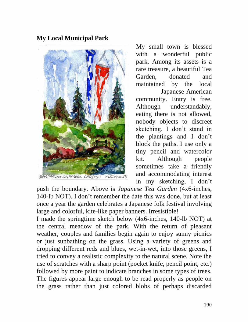
190
My Local Municipal Park
My small town is blessed
with a wonderful public
park. Among its assets is a
rare treasure, a beautiful Tea
Garden, donated and
maintained by the local
Japanese-American
community. Entry is free.
Although understandably,
eating there is not allowed,
nobody objects to discreet
sketching. I don’t stand in
the plantings and I don’t
block the paths. I use only a
tiny pencil and watercolor
kit. Although people
sometimes take a friendly
and accommodating interest
in my sketching, I don’t
push the boundary. Above is Japanese Tea Garden (4x6-inches,
140-lb NOT). I don’t remember the date this was done, but at least
once a year the garden celebrates a Japanese folk festival involving
large and colorful, kite-like paper banners. Irresistible!
I made the springtime sketch below (4x6-inches, 140-lb NOT) at
the central meadow of the park. With the return of pleasant
weather, couples and families begin again to enjoy sunny picnics
or just sunbathing on the grass. Using a variety of greens and
dropping different reds and blues, wet-in-wet, into those greens, I
tried to convey a realistic complexity to the natural scene. Note the
use of scratches with a sharp point (pocket knife, pencil point, etc.)
followed by more paint to indicate branches in some types of trees.
The figures appear large enough to be read properly as people on
the grass rather than just colored blobs of perhaps discarded

191
laundry. I don’t include people depicted larger, closer than about
this because I don’t want to intrude. These subjects had no idea I
included them and their images are not detailed enough to be
recognizable and hence require a model’s permission. Also, I don’t
go to the park to sketch portraits; I go to the park to sketch the
wider, overall scene.
Looking at this now, I notice that I do not include dates in the
pencil margins. Maybe that would be a good idea? An art and
antiques dealer / friend, once chided me over this omission. She
claimed that the lack would make a dealer’s work more difficult,
and perhaps even lower any prices, after my departure from this
world.
When I began to sketch the volleyball game shown below (4x6-
inches, 140-lb NOT), I immediately knew I faced two problems,
two depictions too easy to overdo. One is the transparent nature of
the volleyball net. It somewhat blocks your vision, but you can
also partly see through it. I didn’t want to literally make it a
plethora of tiny, crisscrossing lines; instead I made it a light blur of

192
neighboring colors. I think I made a good compromise; the viewer
effortlessly accepts it as a game net. The other common problem is
the American flag. We all know what one looks like and demand
reasonable accuracy, perhaps too much. However, if I had used
even a bit more bright blue and vivid red it would have seemed
cartoonish. Contrariwise, less blue and red might have struck false
as well. At any rate, to ameliorate the flag’s vivid red, I also used
the same color to describe one player’s shirt and the guy lines of
the volleyball net. Hold your finger over those other red passages
and see if the flag red then doesn’t seem a bit over the top. How,
you ask, does one learn such “tricks”? My only answer is my
personal one, constant trial and error. This requires my willingness,
even eagerness to experiment and to accept that many times a
failure results. In this book, I haven’t included the one out of two
attempts that I found disappointing. A watercolorist can be like the
fly fisherman who often returns home empty-handed, without a
trout. We’re out there to enjoy nature and the fun of trying. Don’t
expect us to either succeed every time or to share all our failures.

193
The paper used in the sketch below, Baseball, (5x7-inches, 80-lb
HOT) differs materially from the other papers in this series. First,
it is very smooth due the hot-press drying at the end of its
manufacture. Hot-pressed paper is generally held to be a little more
difficult to use. I suspect this opinion is due the fact that smoother,
harder papers are less forgiving; they show more obviously any
erasing and reworking. Second, the paper is toned or colored; it
was already lightly colored prior to my use. In this case, the
paper’s color is the warm, pale yellow seen both in the sky and of
course in the margin forming the sketch’s vignette. As expected,
the paper color works to bring color harmony to the sketch as a
whole. I depicted the trees wet-in-wet, dropping in various reds
and blues onto some greens and yellows.
The fencing above the diamond backstop is simply the original
graphite pencil under-drawing, as are the marks for the overhead
lighting. In some of the lighting, paint for the foliage accumulated
along the line of paper damaged by the pencil and serendipitously
darkened those lines. That lone bird soaring in the upper left, one

194
of those ubiquitous seagulls, is also just a quick, calligraphic
gesture with my 0.9mm HB automatic pencil. Did I cheat? No.
All’s fair in love and sketching. My overarching goal was to have
fun making a nice sketch to remind me of that warm spring day,
the enthusiastic amateurs diving for flying balls to the cheers of
friends and family in the little grandstand.
In my municipal park, there’s a handsome senior center sitting
across a rustic path from the beautiful Japanese Tea Garden. Of
course, the center hosts frequent, scheduled indoor events, but in
good weather it also holds affairs on either an outdoor stage or the
large patio sketched below. Walking by with my ever-present,
pocket-size watercolor sketching outfit, I saw a crowd watching a
demonstration by a tango club, a group apparently dedicated to that
dramatic Argentine dance. How could I resist? Thus, the
cartoonish Sunday Tango Group (4x6-inches. 140-lb NOT).
Although I was at the back of the ad hoc audience, I sketched the
scene as if I were standing in front. I wanted to sketch the dance,
not the onlookers. Such editing is easily achieved in a sketch, if not
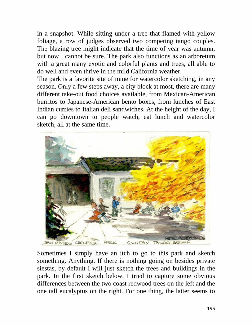
195
in a snapshot. While sitting under a tree that flamed with yellow
foliage, a row of judges observed two competing tango couples.
The blazing tree might indicate that the time of year was autumn,
but now I cannot be sure. The park also functions as an arboretum
with a great many exotic and colorful plants and trees, all able to
do well and even thrive in the mild California weather.
The park is a favorite site of mine for watercolor sketching, in any
season. Only a few steps away, a city block at most, there are many
different take-out food choices available, from Mexican-American
burritos to Japanese-American bento boxes, from lunches of East
Indian curries to Italian deli sandwiches. At the height of the day, I
can go downtown to people watch, eat lunch and watercolor
sketch, all at the same time.
Sometimes I simply have an itch to go to this park and sketch
something. Anything. If there is nothing going on besides private
siestas, by default I will just sketch the trees and buildings in the
park. In the first sketch below, I tried to capture some obvious
differences between the two coast redwood trees on the left and the
one tall eucalyptus on the right. For one thing, the latter seems to

196
have more and more noticeably reddish foliage. Eucalyptus trees
also appear to hold their foliage in rotund if sagging bunches, as
cheerleaders hold their round, quivering pom-poms at a football
game. When you sketch, you stare and open your mind as well as
your eyes.
There are only three kinds of redwood tree left in the world and
two of those are native to California. The coast redwood is the
height champion at
close to 400 feet in
some groves of
northern California.
The giant sequoia is
the heaviest and, at
over 250 feet tall, is
also quite impressive.
It grows in
California’s Sierra
Nevada range of
mountains at
elevations between
4,000 to 7,000 feet.
Just one branch of the
largest is bigger than
any entire tree east of
the Mississippi River.
The third type of
redwood, the Dawn
Redwood from China,
stands apart by being a
deciduous conifer. The
park contains a
magnificent specimen, whose portrait sketch is included elsewhere
in this book. Curious about what I was sketching in this park, I
learned all this about my tall and noble subjects. Yes, parks are
great for sketching and learning; find one near you.
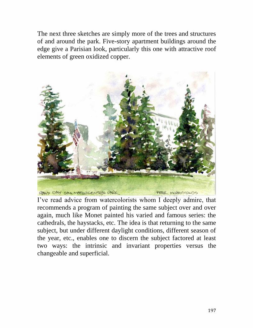
197
The next three sketches are simply more of the trees and structures
of and around the park. Five-story apartment buildings around the
edge give a Parisian look, particularly this one with attractive roof
elements of green oxidized copper.
I’ve read advice from watercolorists whom I deeply admire, that
recommends a program of painting the same subject over and over
again, much like Monet painted his varied and famous series: the
cathedrals, the haystacks, etc. The idea is that returning to the same
subject, but under different daylight conditions, different season of
the year, etc., enables one to discern the subject factored at least
two ways: the intrinsic and invariant properties versus the
changeable and superficial.

198
Certainly I’ve come to see parks and people more clearly and
deeply, the more I sketch in my local park. But, I also respect my
college German professor’s admonition, “Never read the same
book twice.” Yes, I believe this too, even though I’ve broken the
rule more than once if I thought a book was good and if I believed
there was more it could offer. Did Frau Bohr really mean Der
Steppenwolf should be read but once even if that was by a callow
eighteen-year-old? No. I steer myself through this dichotomy by
acknowledging the wisdom of both aphorisms. I read the daily
newspaper once, and then not even all of it. However, I’ve read
Hermann Hesse’s Siddhartha more than once and may well read it
yet again. There’s always more to learn from Hesse. He was also
an avid sketcher in watercolor. He attributed his very sanity to
months-long solitary forays through northern Italy, traveler’s
watercolor sketching kit in hand. In my kitchen I’ll paint raw
potatoes over and over, albeit different kinds, because I then learn

199
about more than potatoes. I learn about nature and about people. I
learn about watercolors, light and sketching.

200
References / Sources of Information:
Easily Available Magazines / Periodicals
In the United States there still are popular magazines devoted to
painters in watercolor: Watercolor, Watercolor Artist, and
Watercolor Magic, to name just three. There are also two monthly
popular and amateur magazines more generally devoted to the non-
professional making of art, chiefly painting: American Artist and
The Artist Magazine. Some, not all, of the content is of interest and
use to a traveling sketcher in watercolor.
Internet
Specific watercolorists accomplished in landscapes, well worthy of
study, living or deceased, can be searched on the Internet to see
reproduced examples of their work. Some in this category include:
Alice Schille, John Singer Sargent, Winslow Homer, John Whorf,
Alice Ravenel Huger-Smith, John Marin, Charles Reid, Trevor
Chamberlain, John Yardley, David Curtis, etc. Groups of artists
maintain shared web site that are rewarding to visit, e.g. The
Wapping Group of Artists and The Royal Society of Marine Artists.
Search for these on the web and look for a “Gallery” tab to see
representative works. These are artists, whose paintings aren’t
available face-to-face for the average person. They reside in
galleries, museums or private collections. There is a particularly
fine and extensive web site for the work, both oils and watercolors,
of Sargent. Just search for John Singer Sargent.
There are more and more free sources of information on the
Internet about different technical aspects of watercolor and
sketching. Some sites are very good. One is Handprint.com
supplied by Bruce MacEvoy, artist and technician. Here you’ll find
reasoned opinions on a variety of topics such as good brands of
paint or who are / were the artists in watercolor more profitable to
study. Some manufacturers maintain good web sites offering a lot
of good technical information. Many watercolorist groups provide
informative web sites. Videos, both good and not so good, can be
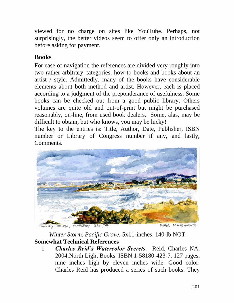
201
viewed for no charge on sites like YouTube. Perhaps, not
surprisingly, the better videos seem to offer only an introduction
before asking for payment.
Books
For ease of navigation the references are divided very roughly into
two rather arbitrary categories, how-to books and books about an
artist / style. Admittedly, many of the books have considerable
elements about both method and artist. However, each is placed
according to a judgment of the preponderance of usefulness. Some
books can be checked out from a good public library. Others
volumes are quite old and out-of-print but might be purchased
reasonably, on-line, from used book dealers. Some, alas, may be
difficult to obtain, but who knows, you may be lucky!
The key to the entries is: Title, Author, Date, Publisher, ISBN
number or Library of Congress number if any, and lastly,
Comments.
Winter Storm. Pacific Grove. 5x11-inches. 140-lb NOT
Somewhat Technical References
1 Charles Reid’s Watercolor Secrets. Reid, Charles NA.
2004.North Light Books. ISBN 1-58180-423-7. 127 pages,
nine inches high by eleven inches wide. Good color.
Charles Reid has produced a series of such books. They

202
are something of a categorical dilemma being clearly
almost formulaic how-to yet filled with wonderful
illustrations. Reid is a top-notch original in watercolor, a
delight to view. (I once read a disappointed review
complaining bitterly that this book held no actual secrets. I
laughed out loud.)
2 Charles Reid’s Watercolor Solutions. Reid, Charles.
2008. North Light Books. ISBN 978-1-58180-991. 127
pages, eleven inches high by eight and a half inches wide.
Beautifully illustrated in color. Yet another short book of
watercolor tips. Don’t we ever learn? I guess not. I know I
don’t; I’ve bought them all. Just a pleasure to read and
view.
3 Joy of Watercolor. (Also: A complete course in
watercolor using your sketchbook as a workbook.)
Millard, David. 1992. Watson-Guptill. ISBN 0-8230-
2566-7. 144 page paperback. Illustrated in color. Eleven
inches high by eight inches wide. In some ways odd. Are
we supposed to copy the illustrations or not? How else are
we personally to visualize a small village in Wales? Still, a
reader will be well entertained and informed. Nice
sketches!
4 Painting Flowers in Watercolors. Reid, Charles. 2001.
North Light Books. ISBN 1 58180-027-4. 144 pages, 11.5
inches high by 8.5 inches wide. Generously illustrated in
good color. A how-to book addressing florals and still life.
A common topic, except that Reid’s paintings are quite
uncommonly good. Also unusual for this genre in that the
book is organized around an excellent course of exercises.
In short, a real how-to by an outstanding artist. Reid
promotes an alla prima approach, carried over from oils
and very suitable for travel sketching.
5 Solving the Mystery of Watercolor. Taylor, David and
Ranson, Ron. 2002. International Artist Publishing. 127
pages. Good color illustration, reproductions of Australian

203
Taylor’s (mostly) excellent paintings. 8.5 inches high by
11 inches wide (landscape format). A look at current
watercolor painting “down under”. What’s the mystery?
Apparently the beautiful color harmonies are. Nice work.
6 Watercolor Artist’s Bible. (Also: An essential reference
for the practicing artist.) Scott, Marylin. 2005. Chartwell
Books. ISBN 0-7858-1943-6. 192 pages, eight inches high
by 7 inches wide. Well, copiously color illustrated. A true
how-to, from what colors, brushes, etc. to scratching out
and using masking fluid. Some very good “technical
stuff”.
7 Watercolor Journeys. (Also: Create your own travel
sketchbook.) Schilling, Richard. 2003. North Light Books.
127 pages. Black and white plus color. Lots of
illustrations. 8.5 inches high by 11 inches wide. The
subtitle honestly tells it all. Largely a how-to by an
American dentist who periodically runs away to sea
signing aboard cruise ships, doing dentistry for passage
and visiting ports of call all over the world. Perhaps not
always great art but an always interesting and inspiring
story. A very pleasurable read.

204
Aquatic Park to The Gate. 4x6-inches. 140-lb NOT
Artist References
These can provide a broader perspective, See the great variety of
works in watercolor, now and in the past.
1 Albert Thomas DeRome 1885 – 1959. (Also: Being a story
of his life and a picture diary of his oils and watercolors.)
Nelson-Rees, Walter A. 1988. WIM Fine Arts. ISBN 0-
938842-06-4. 11 inches high by 15 inches wide. 164-page
hardbound. Written and published by one-time art gallery
operators / dealers. Nelson-Rees and his partner James Coran
would discover relatively ignored but deserving and deceased
California artists, sometimes writing entire, well-produced
books about them. DeRome was a trained artist who initially
found employment in the 1920s as a traveling candy
salesman whose territory included the upper halves of
California and Nevada. In those days there was no color

205
snapshot film. Instead, DeRome, making his rural sales
rounds, stopped his auto frequently and made many small
sketches in watercolors and oils. Most are nice but just
reportorial. Competent, not brilliant landscape.
2 Alice Schille. Gerdts, William H. 2001. Hudson Hills Press.
ISBN 1-555-181-3. Beautifully produced, 216-page book.
Ten by ten inches. Copiously illustrated in excellent color.
Well-written bio of a superb American watercolorist active
late 19 into early 20 centuries. Interesting to see her style
change through the years. I like her earlier work more, but
you decide. Does it sometimes seem like an artist chases after
whatever is the latest successful style?
3 American Drawings and Watercolors in The Metropolitan
Museum of Art. John Singer Sargent. Herdrich, Stephanie
et al. 2000. The Metropolitan Museum of Art, New York.
ISBN 0-87099-952-4. Eleven inches high by nine inches
wide, 426 pages. Hardbound. Beautifully illustrated in color.
All-encompassing work on Sargent drawings and
watercolors, i.e. his oeuvre on paper. Excellent.
4 California Watercolors, 1850 – 1970. (Also: An Illustrated
History & Biographical Dictionary.) McClelland, Gordon T.
and Last, Jay T. 2002. Hillcrest Press. ISBN 0-914589-10-5.
231-page, eleven inches high by eight inches wide.
Extraordinarily well done. Color illustrated. Includes
extensive coverage of the mid-Twentieth-Century, so-called
California watercolor style.
5 David Curtis, a personal view. (Also: The landscape in
watercolour.) Curtis, David. 1996. David &Charles. ISBN 0-
7153-0287-6. Well done, 128-page, 12 inches high by 9
inches wide book. Illustrated in excellent color. In the
canonical how-to, art book form, but really most useful for
the excellent reproductions of masterful watercolors in the
contemporary British style. David Curtis and Trevor
Chamberlain are friends who sometimes paint together.
206
Interesting to see the approach of each to the same subject,
i.e. a canal in Venice.
6 John Yardley, a personal view. (Also: Watercolour.)
Yardley, John. 1996. David & Charles. ISBN 0-07153-0333-
3. Good 128-page, 12 inches high by 9 inches wide book.
Well-illustrated in excellent color. In the formulaic how-to,
art book form, but really useful for the excellent
reproductions of masterful watercolors in the modern British
style. That is, purportedly a how-to book, but really best
enjoyed for the images by a master.
7 L.P. Latimer: California Watercolor Painter. Harrison,
Alfred C. Jr. 2005. North Point Gallery. ISBN 0-9770382-0-
3. 46-page, ten inches high by seven inches wide monograph
on this Northern California, turn of the 19 Century landscape
watercolorist. Very competent depictions of redwood trees,
no doubt most useful for an artist member of San Francisco’s
Bohemian Club.
8 Landscapes in Watercolour. Philcox, Theodora. 2002. AVA
Publishing SA. ISBN 2-88479-004-7. 127-page paperback.
8.5 inches high by 7.5 inches wide. Beautifully illustrated in
color. Tour of contemporary masters of watercolor landscape,
mainly Europeans. From color-dense opaque works to thin,
almost Zen, transparent paintings. Some are quite
inspirational.
9 Masters of Color and Light. (Also: Homer, Sargent and the
American Watercolor Movement.) Ferber, Linda S. and
Gallati, Barbara Dayer. 1998. Brooklyn Museum of Art.
ISBN 1-56098-572-0. 223-page, eleven inches wide by nine
inches wide paperback. Many color illustrations.
Accompanied an exhibit. Title says it all, Homer, Sargent and
other Americans, e.g. Thomas Moran, William Trost
Richards, etc. A historical review and study of watercolor in
the US.
10 Maurice Prendergast. Wattenmaker, Richard J. 1994. Harry
n. Abrams. ISBN 0-8109-3726-3. 12 inches high by 9 inches

207
wide. 160-page hardbound. Excellent production in a series
called The Library of American Art. Prendergast was a true
genius, an original in watercolor. His Venetian scenes and his
work with mothers and children are very skilled and
especially delightful.
11 My Italian Sketchbook. Asch, Florine. 2002. Flammerion.
ISBN 2-0803-0452-6. 8.5 inches high by 11 inches wide. 133
pages. Hardbound. Color illustrated. Charming. Not really a
working sketchbook, but a single book in sketchbook format,
no doubt back-filled from several of the author’s actual
sketchbooks done while touring Italy for two years. Very
quick watercolor and ink line sketches. More an example of
what can be rather easily done. Inspiring.
12 Obata’s Yosemite. (Also: The Art and Letters of Chiura
Obata from his Trip to the High Sierra in 1927.) Driesbach,
Janice T, and Landauer, Susan. 1993. Yosemite Association.
ISBN 0-939666-67-7. 151-page paperback. Ten inches high
by ten inches wide. Beautifully produced with excellent color
reproductions of Obata’s watercolors in the Japanese style.
These paintings, reminiscent of Japanese woodblock prints,
offer yet another worthwhile and beautiful thread in
American watercolor to contrast with today’s dominant
Midwestern Style.
13 Sargent Watercolors. Hoopes, Donelson F. 1970. Watson-
Guptill. ISBN 0-8230-4641-9. Eleven inches high by ten
inches wide. 87-page paperback. Color, 32 plates of images
selected by and commented upon by Hoopes. His scholarly
short text on Sargent and his watercolors of the turn of the 20
Century are excellent. In a common format with Hoopes’
book on Homer, both part of Watson-Guptill’s American art
series.
14 Through Japan with Brush and Ink. Obata, Chiura. Charles
E. Tuttle Company. Library of Congress 68-29543. 167-page,
approximately seven-inch-square hardbound. Almost a
prototype, albeit in Japanese monochrome style, of what one

208
might hope to generate in watercolor from travels. Two pages
per sketch; image on one, identification, notes and comments
on the other. Just about ideal. Obata, a Professor of Art at the
University of California, Berkeley, in his later years
journeyed back to his native Japan. There he traveled about
making these sketchbook notations.
15 Trevor Chamberlain, a personal view. (Also: light and
atmosphere in watercolour.) Chamberlain, Trevor with Gair,
Angela. 1999. David & Charles. ISBN 0-7153-0845-9. Well
done 128-page, 12 inches high by 9 inches wide book.
Copiously illustrated in excellent color. Written in the
canonical form of the how-to art book, including such topics
as what colors, what papers, etc. that Chamberlain
supposedly uses. One should read it simply to be inspired by
the stunning watercolors. Gorgeous stuff. Chamberlain is a
currently active British artist.
16 Watercolors of John Singer Sargent. Little, Carl. 1998.
University of California Press. ISBN 0-520-21969-4. 160-
page, 10.5 inches high by 10 inches wide paperback.
Beautifully illustrated in color. A review and discussion of
Sargent’s watercolors. Organized roughly by topic? Venice,
In the Mountains, Florida, etc.
17 Winslow Homer Watercolors. Hoopes, Donelson F. 1976.
Watson-Guptill. ISBN 0-8230-2326-5. Eleven inches high by
ten inches wide. 87-page paperback. Color, 32 plates of
images select by and commented upon by Hoopes, with his
scholarly brief text on the iconic American watercolorist of
the end of the 19 Century. Excellent.

209
Watercolor Glossary
Acid-Free. A necessity. Ordinary paper, made from wood pulps, is
acidic. Acidic means it has a pH less than 7.0. (pH values range
between 0 and 14. A pH of more than 7 means increasingly basic;
less than 7 means increasingly acidic.) Vinegar is mildly acidic.
Lye is extremely basic. Neutral pH means pH = 7, neither acidic
nor basic. In between. Problem is… both acids and strong bases eat
things up. Even weakly acidic means your art-on-paper will
disintegrate, given time. Paper products may be made acid-free (or
pH = 7.0) via the addition of dissolved chemical buffers such as
calcium carbonate. (Just like in stomach-acid lozenges.) Papers
made from raw materials other than wood, such as cotton fibers,
may have an intrinsically less acidic or more neutral pH. Acidic
papers can decompose rather rapidly, on the order of only perhaps
months. The acid decomposition is a slow oxidation, a slow
flameless burning.
Block. A block is one form for using watercolor paper, generally
in smaller sizes, from as little as about 3 by 5 inches to as much as
about 18 by 24 inches. The sheets of paper, with all deckled edges
removed, are stacked and all four edges firmly glued together. The
advantage is much less buckling when the paper is wetted,
hopefully obviating any need for taping to prevent cockling. After
use, each sheet must be individually cut out from the block.
Blooms. A watercolor effect, accidental or deliberate, wherein one
moves paint by dropping pure water onto wet paint already on the
paper. Perhaps contrary to intuition, the pigment or dye will appear
to flee from the region of less concentration to a place of higher
concentration. A bloom is sometimes a disappointing accident,
sometimes a clever way to produce convincing clouds, tree
canopies, etc.
Chroma is the vividness or pure intensity of a color (of a hue).
Cadmium lemon is a higher chroma yellow than is raw sienna.
Cold-pressed paper possesses a medium smoothness. During
manufacture, as the paper is squeezed dry, it is not hot pressed but

210
simply is allowed to dry against the smooth felts pressing water
from the paper sheets. Thought to be the all-around most versatile
watercolor paper surface. Sometimes denoted as a NOT surface.
As in "not pressed".
Composition. The rules of composition are a loose collection of
arbitrary and sometimes-contradictory strictures intended to
improve a work. They are too numerous to reasonably enumerate.
Faithfully obeying all such rules often produces, at best, an
unsatisfying, clichéd’, even hackneyed piece. Typically, an
outstanding art piece brilliantly violates at least one common rule
of composition. Composition rules often involve the placement of
picture elements. Examples are, “Place nothing of interest too near
an edge!” and “Have no more than one focus of interest!”
Compositional rules also include color choices. “Have but one
dominant color hue!” or “Employ the fewest colors possible!”
Conservation. Conserving a piece means making it both as close
to the original and long-lived as possible.
Covering or covering power is the ability of a paint type to cover
up what is underneath. Opacity.
Deckle. Papers with a ragged edge formed during the molding are
said to possess a deckle, or to be deckled. Strictly, the deckle is
part of the mold in papermaking. It usually is an open wooden
frame corralling the paper pulp as it drains atop a porous screen.
Inevitably there are gaps between the mold parts, the leaking pulp
resulting in random deckling. A paper sheet’s deckle is often
thought desirable and can be preserved even through the final
framing of the picture.
Elephant is a very large size of watercolor paper sheet, roughly 26
by 40 inches.
English or Stitch is a method of watercolor painting wherein
adjacent areas of different hue or tone are simultaneously painted
without running together because a very thin borderline of blank,
dry paper is left separating them. When the painting is dry, the
areas are “stitched together” via finally painting over that thin

211
separation. The ability to paint adjacent, differing areas while still
wet, enables a faster plein aire sketch. The border is finished later.
Ethyl alcohol can be added to the water wetting the watercolor
paints to speed the drying in very cold and / or humid conditions.
Artists have been known to carry clear, potable spirits in a small
flask ostensibly for this purpose. Vodka and gin are popular
examples.
Ferrule. The ferrule is that part of a brush that holds the hairs in
place. Typically, it is a thin-walled, nickel-coated brass cylinder,
although stainless steel or other non-rusting materials are used as
well.
Flags are hairs out of place in a damaged watercolor brush. Flags
can result in paint being deposited where it is not intended.
Flat. A design of a brush’s assembled hairs. The ferrule clasps the
hairs into a flat, spade-like shape. Flats are broadly useful brushes
preferred by many painters, particularly for washes and large
works.
Foxing is a term for spot-like brownish blemishes on works on
paper (e.g. watercolor sketches) due fungal attack, acid oxidation,
or other contaminant problems.
Fugitive colors fade quickly, particularly when exposed to
corrosive chemical vapors or gases as well as strong light.
Glaze. A thin wash of transparent color laid over a completely dry,
previous layer. Among other purposes, glazes are useful for
achieving color harmony.
Glycerin can be added in very tiny amounts to slow the drying of
watercolors in very hot and dry conditions. Added to watercolor
paint, glycerin works an effect opposite to that of ethyl alcohol.
Gouache paints are watercolor paints intended to be opaque.
Gouache hues have a heavy loading of pigments. Gouache tints
have added opaque white or light pigments. Gouache paints
generally are made with pigments rather than dyes, because higher
covering power is desirable. Most gouache paints are resoluble so
that any subsequent layer will dissolve / disturb the underlying,
previous paint layers. However, fast-drying acrylic-based gouaches

212
now are also available, so that opaque layers easily and safely may
be superimposed.
Gum Arabic is a natural resinous exudate from certain bushes. It’s
somewhat akin to tree pitch. It is added to watercolor paints to aid
in the adhesion of paint to paper. It also improves transparency and
brilliance.
Hardbound. Watercolor sketchbooks can purchased with the
individual sheets bound in signatures sewn to a spine, as in quality
hardbound books. Hardbound sketchbooks are the sturdiest but
cannot lie as flat as spiral-bound ones, making it a little difficult to
work both pages, across the gutter, into a single sketch. Fancier
than spiral-bound, but more difficult to work with.
Hog bristle. A brush made with stiff hairs from a hog’s back.
More for oils, they are seldom useful for anything in watercolor
except for scrubbing out color prior to lifting.
Hot-pressed is a smoother paper surface. During manufacture, as
the paper is drying, it is passed between smooth, hot metal rollers.
HOT papers are thought a little more difficult to use by beginners.
It is suitable for fine, detailed work.
Hue is the “color” of a pigment. Yellow is the common hue of all
yellows whether bright and formulated from cadmiums, or dull and
made from iron oxides (sienna), etc.
Impasto is a build up of paint above the support surface. More
common in oils. Additives are available for achieving a very small
impasto effect in watercolors. Seldom used.
Imperial is a large size of watercolor paper sheet, about 22 by 30
inches.
Kolinsky is the name of a valley in Siberia whose native sables (a
sort of weasel) possess red fur very suitable for soft brushes. The
very best Kolinsky red sable brushes are said made only from the
tail, of only the male and only harvested in the dead of winter,
when presumably the fur is most lush. One hopefully imagines a
sort of humane and sustained farming operation.
Lake is a pigment made by chemically precipitating a dye onto a
tiny, colorless (white) host pigment particle such as clay. The dye,

213
typically a vegetable dye, is said to be laked to make the resulting
color. An ancient process.
Lifting is a way to remove paint from the paper. Typically the
paint is first wetted then lifted out via pressing on an absorbent
material, e.g. tissue paper. Lifting is akin to extreme Tonking.
Light to Dark / Dark to Light… refers to two contrary methods
for proceeding with a painting. Most watercolorists recommend
starting with the lightest deposits of paint and then proceeding to
the darker passages. This is yet another rule sometimes broken
with great success. For example, watercolorist Charles Reid and
others, paint from dark to light. Light-to-dark can be time-
consuming, too much so for travelers.
Lignin is a component of wood pulps leading to acidic paper.
Liner is a design of brush hairs, with relatively long hair held by
the ferrule in a very narrow cylindrical shape. A liner is useful for
applying long, continuous strokes or lines of paint.
Madder is a marsh plant whose roots for centuries have provided
brilliant, but unfortunately fugitive, reddish dyes.
NOT describes paper of a medium smoothness. “NOT” is not
pressed. Also called cold-pressed.
Opaque. Meaning one cannot see through it. Typical of paints
made with pigments rather than dyes. Physically, the colors of the
incident light are modified by selective reflection off the face of
the tiny pigment particles (tiny, but huge compared to dye
molecules). For example, red pigments absorb the complementary
green wavelength of light and reflect back just the red. Cadmium
red and cerulean blue are two good examples of opaque colors.
Ox Gall is a natural, reactive material that can be added in very
small quantities to watercolor paints to aid in paint flow via
increasing the wetting of the paper.
Pad. Pads are one form for using watercolor paper. The sheets are
stacked, typically with deckled edges removed, and one common
edge firmly taped or glued together.
Pan colors refer to watercolor paints kept in solid but semi-moist
cake form in small pans arranged in a palette box. Pans can be of

214
several sizes: tiny mini-pans, quarter-pans, half-pans, full-pans and
giant pans. Pans are generally more practical than tubes for
travelers. Immediately prior to use, pan colors must be activated by
application of a small amount of water.
Paper Stretching. The larger and thinner a sheet of paper is, the
more it tends to buckle and wrinkle when wetted. Buckling makes
sketching very difficult to outright impossible. This buckling is
greatly reduced if the paper is first held in place around the edges
while wet, then, still restrained, allowed to dry taut. This is usually
done via taping or stapling down the edges to a rigid board. For
travelers, buckling can be avoided more simply by a combination
of using blocks instead of free sheets and increasing the weight of
the paper as the size increases. For example, 300-pound paper is
available in 12 by 16 inch blocks. Of course, thicker paper is more
expensive.
Perspective is depicting the appearance of depth in space. In
geometrical perspective, either one-, two- or three-point, achieves
the illusion of 3 dimensions via the appropriate converging of lines
(parallel in space) to one, two or three different points at infinity.
Aerial perspective uses two tricks. One trick is the dimming of
images, in both clarity and chroma as they recede. The second trick
is the cooling of colors with distance, typically becoming more
blue.
Pochade is French for literally a “small board”, supposedly to
paint upon. Pochades are generally, any small painting itself or a
small painting support, e.g. piece of paper, with or without
painting. A small container with a reduced painting kit and capable
of holding a painting in progress, sometimes is called a pochade
box.
Red Sable. See Kolinsky, although not all red sable brushes are
from the Kolinsky region.
Rigger is a more extreme liner brush. It is a round brush with only
a few, very long hairs. Painters of marine subjects invented riggers
to facilitate depicting the fine rigging of sailing vessels.

215
Rough is a paper surface notably rougher than cold-pressed.
Rough is difficult to use for beginners. Also, rough is more
suitable for larger works than smaller.
Round is a design of brushes. In these brushes, the ferrule holds
the hairs in a round or cylindrical shape, typically rising to a sharp
point. It is a broadly useful brush preferred by many painters,
particularly for small to moderately sized works.
Scratch out is carefully removing not only the paint, but also often
the top layer of paper, with a very sharp implement to restore the
appearance of white paper. Scratching out is useful in very small
amounts on small areas, for example to depict the sparkle of
sunlight on distant open water.
Sedimentation is an effect of some mineral pigmented paints, e.g.
yellow ochre or ultramarine blue. As the paint is drying, more
pigment particles settles into the small pores of the paper than on
the high points leaving a finely freckled appearance. Intentionally
developed and desired in some instances.
Sheet. The largest watercolor papers are available only as loose,
individual sheets. Larger sheets commonly can have either two or
four deckled edges preserved.
Siberian Squirrel. Not surprisingly, much as with Kolinsky sable
brushes, that frigid part of Russia also provides the best grey
squirrel tail fur for brushes. A squirrel brush is more lank than a
similarly constructed sable brush. Here also, one imagines Siberian
tail fur farms, albeit with the useful squirrels kept strictly separate
from the red weasels.
Sized paper contains added starches, glues or gelatins. Papers are
sized to increase strength and reduce absorption. The starches, etc.
can be added either to the shredded “soup” of paper manufacturing
precursors prior to finishing (bulk or volume sizing) or added only
to the outer skin of the ultimate molded paper (surface sizing).
Because sizing makes the surface less absorbent for wet paint, any
paint lies closer to the surface making the colors both more
brilliant and easier to lift or remove.

216
Spiral Bound. Watercolor sketchbooks with the covers and paper
sheets bound together via a stiff wire spiraling through a multitude
of holes along one edge. Among sketchbooks, spiral bound ones
can lie the flattest, a desirable feature. Also, individual sheets are
quite easy to cut out. Often, spiral-bound is not as robust as
hardbound.
Stipple is a technique for applying paint to the paper wherein the
bristles or hairs of a lightly laden brush are stabbed vertically into
the paper. The result is an uneven distribution with close and tiny
spots like pimples of extra color.
Tint. A tint of a color is both lighter and has less chroma, due to
the addition of white, either white pigment or white paper showing
through thin paint.
Tone. A tone of a color is darker, due either to the addition of
black pigment or to the addition of the color’s complement.
Tonking is the partial removal of paint via blotting, done to some
esthetic purpose.
Tooth is the surface roughness of a paper noted by the user. Tooth
can be increased via thin washes of gesso.
Transparent means one can see through it, even read type letters
through it like clear glass, tinted or not. Typical of paints colored
by dyes rather than by reflecting pigments. Alizarin crimson and
Prussian blue are two good examples.
Tube watercolor paints are available in small aluminum tubes
from 5 ml on up (ml = milliliter or cubic centimeter, about the
volume of a sugar cube). Watercolor paint in tubes is already wet,
albeit extremely concentrated. Tubes are generally more practical
for bigger, studio work needing larger quantities of paint available
for immediate use.
Varnish. Contrary to much opinion, watercolor works on paper
usefully can be varnished, although they seldom are. One choice of
material is a dilute water solution of gum arabic. It must be dilute,
perhaps no more than 1 in 5 (water to commercial preparation)
otherwise a thick layer of the gum will form and subsequently
check like dried mud as it dries. The underlying watercolor must
217
be completely dry or the wet varnishing will drag up the preceding
paint. The profit of such varnishing is a modicum of protection for
the painting and enhanced brilliance in the colors, much as with a
colorful pebble when wetted.
Wash is an even application of a color mix over a relatively large
area, e.g. a clear blue sky in a landscape. Often, a wash is a single
color, but washes can be variegated with smooth, almost
imperceptible segues from one color to another. Washes also can
be modified via glazing.
Weight is the strength and thickness of watercolor papers, It is
denoted indirectly by the number of pounds a ream (500 sheets)
weighs. Watercolor paper is available from light (and a little
unsatisfactory) at 70 pounds up to 1111 pounds, a weight for a
paper that is more like a wooden board. The most common and
practical weights are between 140 and 300 pounds.
Wet-in-Wet is the technique of applying wet paint onto paper
already wetted with previous paint. This is useful for mixing colors
right on the paper, rather than first on a palette.

218
About the Author
Peter McReynolds is an award-winning artist working successfully
in several media: watercolors, oils, pastels, pencils, etc. He’s
written a great deal on art. It runs in the family. Peter’s mother and
father were both avid amateurs in art. His father, an Asian
languages scholar, enjoyed Japanese sume-e watercolors; his
mother painted seascapes in oils. Peter’s paternal grandmother was
an avid painter of the desert in the American Southwest. His
maternal grandmother and her sisters were accomplished
professional marine artists in their day, teaching, exhibiting, and
selling. Peter has been making art his entire life. Early in grammar
school, he was happiest while coloring “outside the lines”. Peter
has had several excellent teachers. He’s devoured scores and
scores of books about art, both from his very extensive personal
collection and those in the local library.
Peter’s favorite medium today is transparent watercolors, in a
representational but loose style, meaning that it shares with the
viewer the infinite complexity and beauty of our world. Peter’s
working method is a quick, wet-in-wet a premier coup. Typically,
his work is relatively small, 11 by 15-inches or less. This reflects
an intention to be enjoyed in a typical home and fits with a
preference for painting outdoors when possible, en plein aire.
Large influences on him typically have come from the various
American regional movements around the United States.
Movements like: Connecticut’s Old Lyme, Indiana’s Hoosier
Impressionism, New Mexico’s Taos Ten and, most of all,
California Impressionism as well as the works of outstanding
individual American watercolorists: John Sargent, Alice Ravenal
Huger-Smith, Alice Scheele, Winslow Homer, John Whorf… The
list is endless!
Peter continues to most enjoy wandering through city and
countryside with board and small kit to watercolor sketch sur le
motif.

219