visualization in meteorology—a survey of techniques and ...kirby/publications/kirby-110.pdf ·...
TRANSCRIPT

Visualization in Meteorology—A Survey ofTechniques and Tools for Data Analysis Tasks
Marc Rautenhaus , Michael B€ottinger, Stephan Siemen, Robert Hoffman, Robert M. Kirby ,
Mahsa Mirzargar , Niklas R€ober, and R€udiger Westermann
Abstract—This article surveys the history and current state of the art of visualization in meteorology, focusing on visualization
techniques and tools used for meteorological data analysis. We examine characteristics of meteorological data and analysis tasks,
describe the development of computer graphicsmethods for visualization in meteorology from the 1960s to today, and visit the state of
the art of visualization techniques and tools in operational weather forecasting and atmospheric research.We approach the topic from
both the visualization and themeteorological side, showing visualization techniques commonly used in meteorological practice, and
surveying recent studies in visualization research aimed at meteorological applications. Our overview covers visualization techniques
from the fields of display design, 3D visualization, flow dynamics, feature-based visualization, comparative visualization and data fusion,
uncertainty and ensemble visualization, interactive visual analysis, efficient rendering, and scalability and reproducibility. We discuss
demands and challenges for visualization research targetingmeteorological data analysis, highlighting aspects in demonstration of
benefit, interactive visual analysis, seamless visualization, ensemble visualization, 3D visualization, and technical issues.
Index Terms—Visualization, meteorology, atmospheric science, weather forecasting, climatology, spatiotemporal data, survey
Ç
1 INTRODUCTION
METEOROLOGY, the “study of the atmosphere and its phe-nomena” [1], is a recurrent application domain in
research on visualization and display design, and one ofgreat societal significance. Likewise, from the meteorologi-cal point of view, visualization is an important and ubiqui-tous tool in the daily work of weather forecasters andatmospheric researchers. As put by senior meteorologist M.McIntyre in 1988, human visual perception is the “most pow-erful of data interfaces between computers and humans” [2]. Inmodern meteorology, data from in-situ and remote sensingobservations and from numerical simulation models arevisualized [1], [3]; typical tasks include the analysis of data(frequently using multiple heterogeneous data sources) tounderstand the weather situation or a specific atmosphericprocess, decision making, and the communication of forecasts
and research results. In recent years, an increase in observa-tion density, numerical model resolutions, the number ofsimulated parameters, diversity of data sources, and use ofensemble methods to characterize model output uncertaintyhas resulted in increased data size and complexity and,hence, in higher challenges for visualization.
A number of overview articles have explored aspects ofvisualization in meteorology. Early surveys by Papathomas,Schiavone, and Julesz [4], [5] reported on the usage of com-puter graphics techniques for the visualization of meteorolog-ical data in the 1980s. Subsequent summaries by B€ottingeret al. [6], Middleton et al. [7], and Nocke et al. [8] described,fromameteorological research point of view, tools and techni-ques used inweather and climate research; Nocke [9] recentlyprovided a situation analysis of scientific data visualization inclimate research. Monmonier [10] provided a history ofmeteorological map making, and Trafton and Hoffman [11]discussed activities in cognitive engineering to improvemete-orological display technology. Recently, Stephens et al. [12]reviewed how probabilistic information is communicated inclimate and weather science, and Nocke et al. [13] exploredthe usage of visual analytics to analyze climate networks.None of these articles, however, provided a comprehensiveoverview of current visualization techniques and tools inmeteorology and of the state of the art of visualizationresearch aimed at advancingmeteorological visualization.
Such an overview is the purpose of the present article.Our objective is to provide the visualization researcherwith a summary of visualization techniques and tools thatare in current use at operational meteorological centers andin meteorological research environments, to survey theresearch literature related to visualization in meteorology,and to identify important open issues in meteorologicalvisualization research. As illustrated in Fig. 1a, visualization
� M. Rautenhaus and R. Westermann are with the Computer Graphics &Visualization Group, Technische Universit€at M€unchen, Garching 85748,Germany. E-mail: {marc.rautenhaus, westermann}@tum.de.
� M. B€ottinger and N. R€ober are with the Deutsches KlimarechenzentrumGmbH, Hamburg 20146, Germany. E-mail: {boettinger, roeber}@dkrz.de.
� S. Siemen is with the European Centre for Medium-Range WeatherForecasts, Reading RG2 9AX, United Kingdom.E-mail: [email protected].
� R. Hoffman is with the Institute for Human and Machine Cognition,Pensacola, FL 32502. E-mail: [email protected].
� R.M. Kirby is with the Scientific Computing and Imaging Institute,University of Utah, Salt Lake City, UT 84112. E-mail: [email protected].
� M. Mirzargar is with the Computer Science Department, University ofMiami, Miami, FL 33146. E-mail: [email protected].
Manuscript received 24 Feb. 2017; revised 24 Nov. 2017; accepted 25 Nov.2017. Date of publication 4 Dec. 2017; date of current version 26 Oct. 2018.(Corresponding author: Marc Rautenhaus.)Recommended for acceptance by E. Gobbetti.For information on obtaining reprints of this article, please send e-mail to:[email protected], and reference the Digital Object Identifier below.Digital Object Identifier no. 10.1109/TVCG.2017.2779501
3268 IEEE TRANSACTIONS ON VISUALIZATION AND COMPUTER GRAPHICS, VOL. 24, NO. 12, DECEMBER 2018
1077-2626� 2017 IEEE. Personal use is permitted, but republication/redistribution requires IEEE permission.See ht _tp://www.ieee.org/publications_standards/publications/rights/index.html for more information.

techniques for data analysis, decision making, and commu-nication overlap; to limit the scope of our survey, we focuson visualization for data analysis tasks. While effective visu-alization techniques for communication and decision mak-ing are equally important, they provide enough material foroverviews on their own (e.g., cf. Stephens et al. [12] andSchneider [14]).
We structure the article as follows. To make the readeraware of domain-specific requirements for visualization,characteristics of meteorological analysis tasks and data aredescribed in Section 2, followed by a brief history ofmeteoro-logical visualization in Section 3. Section 4 describes the stateof the art in visualization in the application domain, consid-ering operational forecasting and meteorological researchenvironments. The reader is provided with an overview ofvisualization in day-to-day meteorological practice andmade aware of challenges. The state of the art in visualizationresearch that is related to meteorology is surveyed inSection 5, which highlights techniques with the potential toimprove on current practice. A summary of Sections 2, 3, 4,and 5 is followed by a discussion of what we view as beingthe most important open issues in meteorological visualiza-tion in Section 6; the article is concluded in Section 7.
2 METEOROLOGICAL DATA AND ANALYSIS TASKS
Meteorological phenomena and processes encompass awide range of spatiotemporal scales, from small-scale tur-bulence to global climate (illustrated in Fig. 1b). Visualiza-tion requirements depend on the purpose of the analysis,the scale of the process to be analyzed, and the characteris-tics of the data used. For instance, meteorologists aiming atunderstanding weather (the condition of the atmosphere atany particular place and time [1]) may focus on visualizingthe development of a particular storm; researchers in-vestigating climate (the “statistical weather” of a particularregion over a specified time interval, usually over at least 20to 30 years [15, Ann. 3]) could focus on visualizing statisticalquantities (e.g., a change in mean summer precipitation).
2.1 Weather Forecasting versus AtmosphericResearch
Due to different requirements for visualization techniquesand tools, Papathomas et al. [4] and Koppert el al. [16]
distinguished between the use of visualization in operationalweather forecast settings versus atmospheric research settings.Operational forecasting focuses on atmospheric processes atmesoscale and synoptic scale (cf. Fig. 1b), covering tasksfrom nowcasting (prediction of, e.g., thunderstorms in thenext two hours) over medium-range forecasting (five to sevendays into the future) to seasonal forecasting (statistical charac-teristics of the next months) [17, App. I-4]. The operationalcomputational chain at weather centers covers the assimila-tion of routine observations (e.g., surface stations, satellites)into numerical weather prediction (NWP) models, thenumerical prediction itself, post-processing, and visualiza-tion of observations and NWP data [3], [18]. Despite increas-ingly automated procedures, the human forecaster and,thus, visualizations interpreted by the forecaster, continueto play a crucial role [3]; forecasting results depend on theforecaster’s ability to envision a dynamic mental model of theweather from available data visualizations [11], [19]. Thismodel reflects his/her understanding of qualitative/con-ceptual information (e.g., images of the internal structureand dynamics of storm clouds), as well as of numericalinformation (e.g., data about winds, air pressure changes,etc.) [19].
Innes and Dorling [3] provided an overview of typicalforecaster tasks. A forecaster follows specific objectives(weather prediction for a particular place, time, and pur-pose), and is subject to time constraints. For example, a com-mon task is to estimate the uncertainty of NWP output;often using ensemble predictions (Section 2.3) to judge amodel’s uncertainty and to gain information about potentialforecast scenarios and the risk of severe weather events.Another example is the application of knowledge aboutmodel characteristics (e.g., systematic errors and biases) toimprove the forecast. Forecasters inspect and integrate agreat number of complex visualizations and data sources;estimates are in the range of eight or more different datatype displays for forecasts in non-severe situations [19].Because the pertinent information usually is not displayedin any one single visualization, forecasters must mentallyintegrate that information into a coherent whole to makea prediction about the future weather. In this respect, one ofthe challenges today is the sheer volume of NWP outputthat needs to be explored and interpreted [3].
Fig. 1. Overview of the survey with links to the corresponding sections. (a) Visualization in meteorology is relevant for the overlapping areas of dataanalysis, decision making and communication. In this survey, we focus on data analysis. (b) Different scales of atmospheric processes are analyzedby weather forecasters and atmospheric researchers; data to be visualized originates from numerical models and observations. Forecasting is mainlyconcerned with the meso and synoptic scales; atmospheric research considers all scales. (c) Surveyed visualization research.
RAUTENHAUS ET AL.: VISUALIZATION IN METEOROLOGY—A SURVEY OF TECHNIQUES AND TOOLS FOR DATA ANALYSIS TASKS 3269
In meteorological research environments, the objectivesof a scientist can include many other things in addition to“understand and predict the weather”; e.g., field observa-tions are analyzed, and numerical models are developedand evaluated. In contrast to operational environments,visualization requirements are not necessarily known andfixed a priori. Processes from the microscale to climate vari-ation (cf. Fig. 1b) are targeted; the increased diversity ofdata and analysis tasks requires an increased diversity ofvisualization techniques. Time is a much less limiting factor;a researcher has more time to create, interact with, andinterpret a visualization.
2.2 Heterogeneity of Data Sources
Modern meteorology employs data from atmosphericobservations and numerical computer model output (datafrom laboratory experiments and idealized mathematicalmodels are used as well). Data come in different modalities;also, coordinate systems differ. For example, pressure isused as the standard vertical coordinate, but geometricheight and potential temperature are also frequentlyencountered [1].
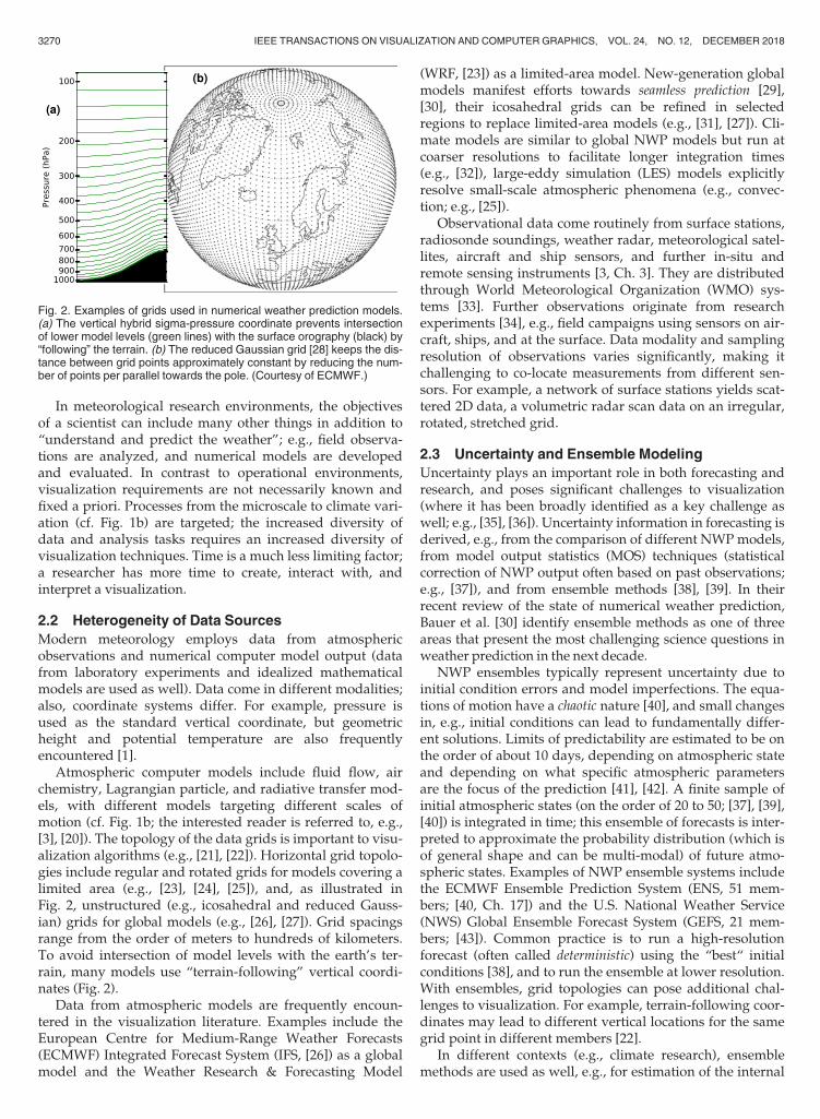
Atmospheric computer models include fluid flow, airchemistry, Lagrangian particle, and radiative transfer mod-els, with different models targeting different scales ofmotion (cf. Fig. 1b; the interested reader is referred to, e.g.,[3], [20]). The topology of the data grids is important to visu-alization algorithms (e.g., [21], [22]). Horizontal grid topolo-gies include regular and rotated grids for models covering alimited area (e.g., [23], [24], [25]), and, as illustrated inFig. 2, unstructured (e.g., icosahedral and reduced Gauss-ian) grids for global models (e.g., [26], [27]). Grid spacingsrange from the order of meters to hundreds of kilometers.To avoid intersection of model levels with the earth’s ter-rain, many models use “terrain-following” vertical coordi-nates (Fig. 2).
Data from atmospheric models are frequently encoun-tered in the visualization literature. Examples include theEuropean Centre for Medium-Range Weather Forecasts(ECMWF) Integrated Forecast System (IFS, [26]) as a globalmodel and the Weather Research & Forecasting Model
(WRF, [23]) as a limited-area model. New-generation globalmodels manifest efforts towards seamless prediction [29],[30], their icosahedral grids can be refined in selectedregions to replace limited-area models (e.g., [31], [27]). Cli-mate models are similar to global NWP models but run atcoarser resolutions to facilitate longer integration times(e.g., [32]), large-eddy simulation (LES) models explicitlyresolve small-scale atmospheric phenomena (e.g., convec-tion; e.g., [25]).
Observational data come routinely from surface stations,radiosonde soundings, weather radar, meteorological satel-lites, aircraft and ship sensors, and further in-situ andremote sensing instruments [3, Ch. 3]. They are distributedthrough World Meteorological Organization (WMO) sys-tems [33]. Further observations originate from researchexperiments [34], e.g., field campaigns using sensors on air-craft, ships, and at the surface. Data modality and samplingresolution of observations varies significantly, making itchallenging to co-locate measurements from different sen-sors. For example, a network of surface stations yields scat-tered 2D data, a volumetric radar scan data on an irregular,rotated, stretched grid.
2.3 Uncertainty and Ensemble Modeling
Uncertainty plays an important role in both forecasting andresearch, and poses significant challenges to visualization(where it has been broadly identified as a key challenge aswell; e.g., [35], [36]). Uncertainty information in forecasting isderived, e.g., from the comparison of different NWPmodels,from model output statistics (MOS) techniques (statisticalcorrection of NWP output often based on past observations;e.g., [37]), and from ensemble methods [38], [39]. In theirrecent review of the state of numerical weather prediction,Bauer et al. [30] identify ensemble methods as one of threeareas that present the most challenging science questions inweather prediction in the next decade.
NWP ensembles typically represent uncertainty due toinitial condition errors and model imperfections. The equa-tions of motion have a chaotic nature [40], and small changesin, e.g., initial conditions can lead to fundamentally differ-ent solutions. Limits of predictability are estimated to be onthe order of about 10 days, depending on atmospheric stateand depending on what specific atmospheric parametersare the focus of the prediction [41], [42]. A finite sample ofinitial atmospheric states (on the order of 20 to 50; [37], [39],[40]) is integrated in time; this ensemble of forecasts is inter-preted to approximate the probability distribution (which isof general shape and can be multi-modal) of future atmo-spheric states. Examples of NWP ensemble systems includethe ECMWF Ensemble Prediction System (ENS, 51 mem-bers; [40, Ch. 17]) and the U.S. National Weather Service(NWS) Global Ensemble Forecast System (GEFS, 21 mem-bers; [43]). Common practice is to run a high-resolutionforecast (often called deterministic) using the “best“ initialconditions [38], and to run the ensemble at lower resolution.With ensembles, grid topologies can pose additional chal-lenges to visualization. For example, terrain-following coor-dinates may lead to different vertical locations for the samegrid point in different members [22].
In different contexts (e.g., climate research), ensemblemethods are used as well, e.g., for estimation of the internal
Fig. 2. Examples of grids used in numerical weather prediction models.(a) The vertical hybrid sigma-pressure coordinate prevents intersectionof lower model levels (green lines) with the surface orography (black) by“following” the terrain. (b) The reduced Gaussian grid [28] keeps the dis-tance between grid points approximately constant by reducing the num-ber of points per parallel towards the pole. (Courtesy of ECMWF.)
3270 IEEE TRANSACTIONS ON VISUALIZATION AND COMPUTER GRAPHICS, VOL. 24, NO. 12, DECEMBER 2018

variability in long term climate projections [44], [45] and fordecadal climate predictions [46]. Here, ensembles based onperturbed physics and on multiple models are commonlyencountered (e.g., [47], [48]).
3 HISTORY OF VISUALIZATION IN METEOROLOGY
Traditionally, meteorologists and forecasters have employeda variety of hand-drawn 2D meteorological charts and dia-grams. In his (pre-computer era) book on meteorologicalanalysis, Saucier [49] classified depictions in usage in the1950s into meteorological maps, cross-section charts, verticalsounding charts, and time-section charts. These 2D depic-tions of meteorological observations (their historical evolu-tion was described by Monmonier [10]) typically includedcontour lines, wind vectors, barbs, or streamlines.
3.1 Computer-Based Visualization 1960-1990
As reported by Papathomas et al. [4], the earliest computer-based visualization tool specific to meteorology was theNational Center for Atmospheric Research (NCAR)Graphics package developed in the late 1960s. As a notableexample, Washington et al. [50] presented 2D contour linesof simulation data from the NCAR general circulationmodel [51] displayed on a cathode ray tube screen. The firstcomputer animated movies of atmospheric simulationswere created in the 1970s. Grotjahn and Chervin [52]described the creation of (still monochrome) movies atNCAR. They already used 3D perspective views; an exam-ple is shown in Fig. 3a. At the same time, interest in “true”3D displays grew and methods were developed to generatestereoscopic projections, first of observational (mainly satel-lite) data [53], [54], [55], [56], but also of simulation data [57].
At the University of Wisconsin-Madison, the Man com-puter Interactive Data Access System (McIDAS), a pioneering
workstation system to process and view meteorologicalobservation data, had been developed since 1973 [58],[59], [60]. In the mid-1980s, a stereographic terminal wasdeveloped, and Hibbard [56], [61] reported on extensiveexperiments with monochrome 3D stereo visualization. Inthe 1980s, high attention was given to psychophysicalaspects, specifically visual perception (cf. [4], [5], [57]). Inthis line, Hibbard [56] discussed challenges of 3D visuali-zation and perception, including the correct usage ofvisual cues to create an illusion of depth, choosing a goodaspect ratio to avoid misleading angles and slopes in thedisplay, system performance and user handling. He pre-sented 3D views of satellite cloud images, wind trajecto-ries, contour surfaces, and radar data, noting that thedisplays required improvement in particular with respectto spatial perception (the “location problem” as he calledit), use of color, combined display of multiple variables,and efficiency for better interactivity. In a similar effort,Haar et al. [62] presented 3D displays for satellite andradar data, discussing application to pilot briefing, fore-casting and research, and teaching.
McIDAS was extended to handle simulation data andcolor [64]. Figs. 3b and c show examples from Hibbard et al.[63], who described its application to a model study. Inaddition to the techniques for observations presented byHibbard [56], they used isosurfaces of potential vorticity todepict the tropopause on top of a topographic map and con-tour lines of surface pressure. Particle trajectories were ren-dered as shaded tubes. Hibbard et al. [63], [65] stressed theneed for an interactive system to create such visualizations,as adjustments still required several hours to recompute animage. Also in the late 1980s, Wilhelmson et al. [66] raisedattention (cf. [7]) with story-boarded 3D animation movies.Fig. 3d shows an image from the 1989 video “Study of aNumerically Modeled Severe Storm”. Creating the moviewas a major undertaking, requiring multiple scientific ani-mators, script writers, artistic consultants, and postproduc-tion personnel over an 11-month period [66].
Further details on visualization activities up to the late1980s can be found in earlier surveys [4], [5], [7].
3.2 Interactive Workstations
Since around 1990, workstations with increasingly powerfulgraphics accelerators enabled the development of interac-tive visualization tools. To create an interactive McIDASsystem, Hibbard et al. developed the Vis5D software [67],[68], [69], [70]. It became a major 3D visualization tool inmeteorology in subsequent years [7], [67]. For instance,Vis5D was used at the German Climate Computing Center(DKRZ) [6], coupled with ECMWF’s Metview meteorologi-cal workstation [71], and used as basis for a 3D forecastingworkstation (cf. Section 5.2). Fig. 4 shows a screenshot of thelast Vis5D release, described by Hibbard [67]. Data could bedisplayed interactively as 2D contour lines or pseudo-colorson horizontal and vertical sections, as 3D isosurfaces, andas volume rendering. Wind data could be depicted as vectorglyphs, streamlines and path lines. A topographical mapcould be displayed as geo-reference. Vis5D provided sup-port for comparing multiple datasets, multiple displayscould be “grouped” and synchronized. Development ofVis5D ceased in the early 2000s [67].
Fig. 3. Examples of 3D renderings in the 1970s and 1980s. (a) Simulatedparticle trajectories in an early computer generated 3D animation pro-duced on film. (Reprinted from [52], # 1984 American MeteorologicalSociety. Used with permission.) (b) Numerical simulation of the“Presidents’ Day Cyclone”, visualized by the 4D McIDAS system. Shownis a potential vorticity isosurface (representing the dynamic tropopause),rendered above contour lines of the surface pressure field. (c) Particletrajectories from the same simulation, colored according to their regionof origin. (Reprinted from [63], # 1989 American Meteorological Soci-ety. Used with permission.) (d) Image from the 1989 movie “Study of aNumerically Modeled Severe Storm”. (From redrock.ncsa. illinois.edu/AOS/image_89video.html. Courtesy of R. B. Wilhelmson.)
RAUTENHAUS ET AL.: VISUALIZATION IN METEOROLOGY—A SURVEY OF TECHNIQUES AND TOOLS FOR DATA ANALYSIS TASKS 3271

A number of further 3D visualization tools appeared inthe 1990s, mostly general-purpose, commercial, and not pri-marily targeted at meteorology. Systems used in the atmo-spheric sciences were listed by Schr€oder [72], B€ottinger et al.[6], and Middleton et al. [7]. Examples include the commer-cial systems Application Visualization System (AVS) [73], [74],Iris Explorer [75], the IBM Data Explorer [76], [77] (DX; latermade open-source as OpenDX; discontinued in 2007), andamira [78] (now Avizo). However, these tools were primarilyused by visualization specialists, as B€ottinger et al. [6] andMiddleton et al.[7] pointed out. Atmospheric scientists intheir daily work relied mainly on command-driven 2D plot-ting and analysis tools [6], [7].
4 VISUALIZATION IN METEOROLOGY TODAY
Today, the well established meteorological charts and dia-grams listed at the beginning of Section 3 (see [10], [49]) arestill in the center of both operational forecast visualizationand visual data analysis in meteorological research.
Operational meteorology is still dominated by 2D visuali-zation, despite the efforts with respect to interactive 3D visu-alization in the 1980s and 1990s. Major reasons include thatforecasters aremainly concernedwith horizontal movementsof weather features (for which depiction on a 2D map isappropriate), the clarity of 2D maps with respect to spatialperception and conveyance of quantitative information, andhistorical reasons (forecasters have traditionally been trainedwith 2D visualization). 2D images also integrate well withGeographic Information Systems used by emergency servicesand are established to communicate weather information tothe public. In recent years, feature-based and ensemble visu-alizationmethods have gained increased importance.
In meteorological research, visualization techniques andtools are much more diverse than those encountered inoperational settings, reflecting the (in comparison to fore-casting) larger diversity of scientific questions being investi-gated. Similar to operational forecasting, 2D visualizationsdominate meteorological research environments, although3D techniques are more common than in forecasting.
In the following, we survey the state of the art in visuali-zation in operational environments (e.g., at national meteo-rological centers) and meteorological research settings.
Major visualization tasks are listed in Table 1, which pro-vides a summary and a categorization of visualization tech-niques employed in practice, grouped by operationalmeteorology and research.
4.1 Analysis of Observation and Simulation Data
The depiction of observation and numerical model data onmaps plays a central role in meteorology. As shown inFig. 5a, surface data are routinely plotted using contourlines to depict pressure, wind barbs to show wind flow, andglyphs to depict station observations and analyzed featuresincluding, e.g., fronts. The styling of the glyphs is mandatedby the WMO [17]; they represent aspects of the observations(e.g., precipitation type and cloud cover). Upper level dataare plotted on standardized pressure level charts [17],including the 500 hPa level often used as representative forlarge scale atmospheric flow at mid-troposphere (cf. Figs. 7and 9). For specific purposes, vertical coordinates otherthan pressure are used (cf. Section 2.2), including potentialvorticity (e.g., to display the height of the tropopause) andpotential temperature. Meteorological maps are created formany different scales, from local to global maps. From theearly days of hand-plotted maps, different cartographic pro-jections have played an important role due to their attemptsto conserve scale, angle, and area [79]. For example, a mapprojection widely used by European forecasters is the polarstereographic projection; it accurately portrays weather sys-tems moving over the North Atlantic.
Typically, multiple observed and/or forecast parametersare combined in a single image. Also, juxtaposition of differ-ent maps is heavily used, as shown in Fig. 5b in a screenshotof the NinJo workstation (the visualization software opera-tionally used, e.g., at the German Weather Service (DWD)).
Fig. 4. Screenshot of the Vis5D visualization tool, showing a displaycombining different visualization types available in the software: 2D con-tour lines, 2D color mapping, terrain, isosurface, and volume rendering.(Reprinted from [67, p. 674],# 2005, with permission from Elsevier.)
Fig. 5. Standard visualizations in weather forecasting. (a) Operationalsurface map, showing contour lines of surface pressure, analyzed fronts,and (b) station data depicted using WMO glyphs (# 2016 DeutscherWetterdienst. Used with permission.) (c) The NinJo forecasting worksta-tion features multiple views that offer a variety of 2D visualization meth-ods to depict observations and numerical prediction data. (Reprintedfrom [80],# 2010 Deutscher Wetterdienst. Used with permission.)
3272 IEEE TRANSACTIONS ON VISUALIZATION AND COMPUTER GRAPHICS, VOL. 24, NO. 12, DECEMBER 2018
Temporal evolution of spatial fields is usually inferred fromtime animation of the maps; time evolution of a forecast at aparticular location is displayed by means of a meteogram.Examples are shown, e.g., in Schultz et al. [81]. Temporalmovement of air masses is frequently visualized by 2Ddepiction of 3D trajectories (i.e., path lines; e.g., [82]), oftenfiltered and colored according to specific criteria. Verticalcross-sections, typically along a line between two locations,are used to analyze the vertical structure of the atmosphere.Domain specific diagrams frequently used in operationsinclude Skew–T diagrams and tephigrams to analyze verticalprofiles (e.g., observations from radiosonde ascents, anexample can be found in [81]), additional examples used in
research include Hovm€oller diagrams (space-time dia-grams; e.g., [83]) and Taylor diagrams (model evaluation,[84]). Also, results of statistical analyses including principalcomponent analysis, e.g., of recurring patterns in the climatesystem, are frequently plotted on maps (e.g., [37]).
In recent years, feature-based (also referred to asobject-based) visualization techniques have gained impor-tance in operational forecasting. Commonly analyzed fea-tures are convective storms and mesocyclones (e.g., [86],[87]), synoptic-scale extratropical cyclonic features (frontsand low pressure centers) [88], and tropical cyclones [89].Features are detected from satellite/radar observationsand from NWP output. Fig. 6a shows an example of the
TABLE 1Categorization and Summary of Visualization Techniques Commonly Used in Operational Weather Forecasting
and Meteorological Research, and Topics that have been Addressed in Visualization Research
Operational weather forecasting(examples of tasks: analyze weathersituation and its time evolution,
analyze and compare NWP modelsand observations, judge NWPuncertainty and estimate risk)
Meteorological research(examples of tasks: analyze observa-tions and model data w.r.t. many
possible objectives, e.g., analysis of aspecific feature, explorative analysis,
statistical analysis)
Research on met. visualization(published techniques to improve oncommon practice; they are mostly notdirectly available to meteorological
researchers in a commonvisualization tool)
Visual mappingof observations& simulations
2D depiction predominates (S4,S4.1): surface & upper-level maps(F5), cross-section charts, verticalprofiles (F7c), domain-specificglyphs and diagrams (F5-11),synthetic satellite images (F6b)
2D visualization as in forecasting(S4, S4.1), some 3D visualmapping (isosurfaces, volumerendering, streamlines andtrajectories/path lines, S4.4, F4,F13, F16), domain-specificdiagrams
Advice on color and mapmaking (S5.1), visual salience(S5.1), 2D flow displayimprovements (S5.1, F14), 3Dfeasibility studies forforecasting (S5.2, F15, F16), 3Dcloud rendering (S5.3)
Analysis of flow& temporalevolution
Animation (S4.1), meteograms(F10) and time-section charts (S3),overlay of time steps, wind barbs(F14a), streamlines, trajectories/path lines, Lagrangian particles
As in forecasting, criterion-basedtrajectory visualization, domain-specific diagrams includingHovm€oller diagrams (S4.1)
Approaches for streamlines andpath lines (S5.4), dynamic flowdisplays (S5.4), Lagrangiancoherent structures (S5.4),feature-based flow visualization(S5.5)
Detection & trackingof atmosphericfeatures
Time evolution (S4.1) and uncer-tainty (spaghettis, probabilities,S4.2) of, e.g., convective storms(F6), extratropical cyclonefeatures (e.g., fronts, F11),tropical cyclones
As in forecasting but with morediverse feature detection targetsand approaches (e.g., jet streams,clouds), often for statisticalanalysis (S4.1, S5.5)
Feature tracking in virtualreality, critical points, opticalflow, image-based techniques,feature-based flow visualization(S5.5)
Comparison & fusionof heterogeneous data
Side-by-side depiction, overlay(F5), regridding to common grid,difference plots, depiction ofmodel data as observations, e.g.,synthetic satellite images (S4.1,F6b)
As in forecasting but with morediverse data sources (S2.2)
IVA to compare model output,overlay, similarity measures,filling of spatiotemporal gaps indata from heterogeneoussources, segmentation,streamlines in multiresolutiondata (S5.6)
Analysis of uncertaintyin simulations
2D depiction (S4.2): stamp maps,spaghetti plots of contour lines(F7a) and features (F11), ensemblemean and standard deviation(F7b), ensemble probabilities,extreme forecast index (F8),clustering (F9), ensemblemeteograms (F10)
As in forecasting, distinct visualchannels (e.g., stippling), interac-tive approaches (ensemble spacenavigation, interactive ensemblestatistics, brushing and linking),3D approaches (e.g., depiction ofprobabilities, height mapping)(S4.2)
Perceptual design studies (S5.1,S5.7), visual abstractions asalternatives to spaghetti plots(S5.7, F18), interactiveexploration, linked views,abstract views, 3D spatial dis-plays (F16), time series, multi-modal distribution visualiza-tion, flow uncertainty (S5.7)
Usage of interactivityin workflows
Operational meteorologicalworkstations support interactive2D visualization (e.g., pan, zoom,map styling) (F5c, S4.3)
Command-driven 2D tools mostcommon due to flexibility andreproducibility (S4.3), someinteractive 3D analysis (S4.4),little IVA (F12, S5.8)
Linked views, brushing &linking, hypothesis generation,interactive statistical analysis(S5.8), IVA for comparativevisualization (S5.6)
Technical aspects Web-based remote visualization(OGC web services, S4.3),scalability challenges (S5.10, S6)
Increasing data volumes (scalability, data compression, remote render-ing, S4.3, S4.4, S5.10), reproducibility (S4.3, S5.10), efficient GPU-based3D rendering directly using model grids (S5.9), virtual reality (S5.3)
Links to sections and figures in this article are abbreviated with S and F, respectively.
RAUTENHAUS ET AL.: VISUALIZATION IN METEOROLOGY—A SURVEY OF TECHNIQUES AND TOOLS FOR DATA ANALYSIS TASKS 3273

DWD NowCastMIX and KONRAD systems (e.g., see theoverview by Joe et al. [90], and references therein), whichoutput the locations of thunderstorm cells, as well as theirtrack and probability fields for impact in the near future. Inresearch, uses of feature-based visualization also include sta-tistical data analysis, e.g., climatologies of feature occurrence[91], [92]. For comparative visualization, model output isvisualized in ways corresponding to observations, an exam-ple is rendering simulated clouds as seen from a satellite(e.g., [85], [93]). Such images are frequently used by forecast-ers; Fig. 6b shows an example of an approach using neuralnetworks for rendering to approximate the displayed cloud-top radiances.
4.2 Analysis of Simulation Uncertainty
Visualization of model uncertainties is of particular impor-tance in forecasting, but also in research for, e.g., climate pre-dictions. Early approaches date back to the 1960s [94], [95]; inoperational forecasting today, output from MOS techniquesand ensemble output (cf. Section 2.3) are visualized. Forexample, Fig. 6a displays uncertainty information from anoperational nowcasting MOS technique. The books by Wilks[37] and Inness and Dorling [3] contain overviews of generalmeteorological uncertainty visualization techniques; severalarticles described ensemble visualization products in use atnational weather centers [96], [97], [98], [99], [100], [101],[102]. A set of basic guidelines on how to communicate fore-cast uncertainty is available from the WMO [103]. Note thatall techniques in the above references (and presented in thissection) solely rely on 2D visualization.
A direct way to visualize ensemble output are small mul-tiples referred to as stamp maps (examples can be found in[3, Fig. 5.6] and [18, Fig. 2.9]). In stamp maps, individualdetails are not discernible, but differences in large-scale fea-tures (e.g., location and strength of a cyclone) can be recog-nized by the forecaster [96]. Alternatively, spaghetti plots asshown in Fig. 7a display selected contour values of allensemble members in a single image. Wilks [37] noted thatspaghetti plots have proven to be useful in visualizing thetime evolution of the forecast flow, with the contour linesdiverging as lead time increases. A disadvantage of spa-ghetti plots, however, is that they become illegible whenmembers diverge too much; also, care needs to be taken in
interpretation as the distance of the contour lines dependson the gradient of the underlying field [96].
Displays of summary statistics computed per modelgrid-point are also common. Typical visualizations includemaps of probabilities of the occurrence of an event, and ofensemble mean and standard deviation (the mean ison average more skillful than any single member; the stan-dard deviation or spread indicates forecast uncertainty [3]).Fig. 7b shows an example, indicating areas of a geopotentialheight forecast that are most affected by uncertainty (largespread). Probability maps (an example can be found in [105,Fig. 13.4]) are generated mainly for surface parameters rele-vant for weather warnings (e.g., wind speed, temperature,and precipitation). They are frequently computed over atime interval. For example, probabilities for extreme windgusts are computed over a 24 hour period at ECMWF, as itis considered more important to know that an extreme eventwill occur rather than when exactly it will occur [102]. Proba-bilities are also commonly computed for areas encompass-ing multiple grid boxes to determine whether an event canoccur somewhere in a given region. Similar depictions are alsoapplied to other types of meteorological diagrams. Forexample, Fig. 7c shows an ensemble vertical profile used bythe Hungarian Meteorological Service [104].
A display that summarizes regions in which severeweather events may occur are maps of the extreme forecastindex (EFI) [106], a measure that relates forecast probabilitiesto the model climate to detect forecast conditions thatlargely depart from “normal conditions”. The EFI is used,e.g., to generate warnings of extreme winds [107]. Fig. 8shows an example of an ECMWF forecast, indicatingextreme winds over large parts of Germany.
To identify similarities within ensemble members, theyare commonly objectively clustered [108], [109]. Fig. 9 showsan operational example from ECMWF. The 51 ensemble
Fig. 6. Visualizations in operational forecasting. (a) Storm cells detectedand tracked in combined observational and model data (red and purplecircles indicate convective cells, dotted lines expected tracks), visualizedtogether with lightning observation data (crosses colored by observationtime) and MOS-derived probabilities of severe precipitation (filled con-tours). (# 2011 Deutscher Wetterdienst. Courtesy of D. Heizenreder.)(b) Synthetic satellite image. Visible radiances are approximated using aneural network that takes NWP data as input. (Reprinted from [85], #2012 American Meteorological Society. Used with permission.)
Fig. 7. Ensemble forecast products. (a) “Spaghetti plot”, comparing con-tour lines of three isovalues of the 500 hPa geopotential height field ofan NCEP GEFS forecast at 144 lead time. (Courtesy of G. M€uller, www.wetterzentrale.de.) (b) ECMWF forecast product showing ensemblemean of 500 hPa geopotential height (contour lines) and normalizedstandard deviation of the same field (filled contours). (Courtesy ofECMWF.) (c) Ensemble vertical profile displaying temperature (yellow/magenta) and dewpoint (green) at a single location. Colors indicateranges of probability (0-25 percent, 25-75 percent, 75-100 percentbands). (Reprinted from [104]. Courtesy of I. Ih�asz, Hungarian Meteoro-logical Service.)
3274 IEEE TRANSACTIONS ON VISUALIZATION AND COMPUTER GRAPHICS, VOL. 24, NO. 12, DECEMBER 2018

members, as well as the high-resolution deterministic fore-cast, are grouped into a small number (a maximum of six)of clusters according to their similarity in 500 hPa geopoten-tial height over Europe in a given time window [108]. Theclusters are represented by the members closest to their cen-ter, and assigned to one of four large-scale weather regimes(color of the cluster frame in Fig. 9 [108]; forecast skill of theensemble depends on the weather regime [110]).
For point forecasts (i.e., for a specific location), ensemblemeteograms show time series of box plots (e.g., [37]) of fore-cast variables. Fig. 10 shows an operational example fromECMWF. Forecast information are accumulated into dailymean and displayed together with model climate informa-tion, showing how the current forecast weather deviatesfrom the “norm”. The overlaid boxplots show if the ensem-ble forecast contains more information than climatology (in
the example, cloud cover and temperature forecasts in thelast few days hardly differ from climatology). The diagramadditionally contains wind roses to display the distributionof wind direction. Wind roses are traditionally used toshow distributions of wind direction over a time period(e.g., [111], [112]); here, they are used to show both temporaland ensemble information (distribution of all members overone day), with wind directions clustered into octants. Inaddition, plume plots, a combination of spaghetti plots andprobability maps, are used to display the temporal evolu-tion of further meteorological quantities at the location ofinterest (an example can be found in [18, Fig. 2.17]).
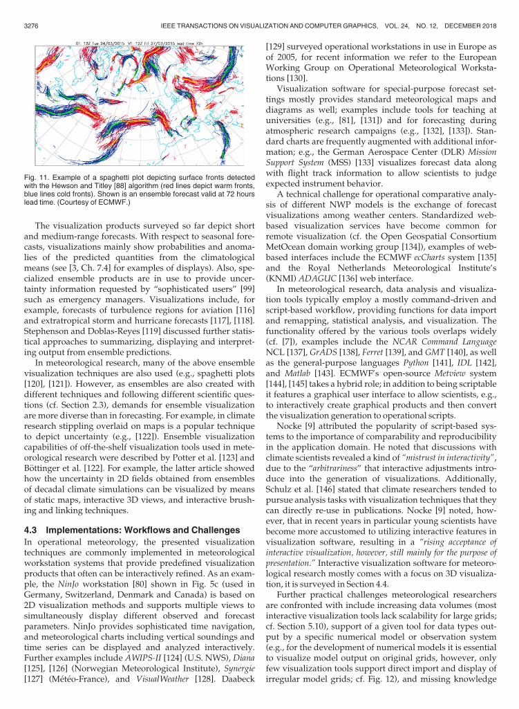
A feature-based method to visualize the evolution ofcyclonic features in ensemble forecasts [88], [113], [114], [115]is operated by the UKMet Office and ECMWF. The examplein Fig. 11 shows surface cold andwarm fronts detected in theindividual ensemble members as line features in a spaghettiplot. Alternative visualizations are available at ECMWF toview the individual ensemble member’s features (e.g., ani-mation). Further cyclonic features (e.g., center of low pres-sure systems, developingwaves) are also available.
Fig. 9. Example of a cluster product, based on 500 hPa geopotentialheight over Europe forecast by ECMWF. Three clusters (rows) of theensemble forecast are valid at (left) 192, (middle) 216, and (right) 240hours lead time. The clusters are represented by the member closest tothe cluster center. Note the different extent of the trough over northernEurope. The color of the frames corresponds to the large-scale weatherregime to which the cluster is most similar. (Courtesy of ECMWF.)
Fig. 8. The ECMWF extreme forecast index relates ensemble predic-tions to model climatology to detect anomalous weather conditions inthe forecast. Shown is the EFI computed at five days lead time for 31March 2015. On this day, storm “Niklas” hit central Europe with gale-force winds. Note how five days prior to the event the EFI predictedextreme winds over large parts of Germany. (Courtesy of ECMWF.)
Fig. 10. Example of an ECMWF 15-day ensemble meteogram, depictingtime series of surface parameters of a forecast initialized on 19 March2015 for Munich, Germany. The ensemble distribution is displayed bymeans of boxplots. This diagram relates forecast daily averages to themodel climate (colored background bars). Note how in the daily mean of10 m wind speed the possibility of high wind speeds on 31 March 2015(12-day forecast) is predicted (box plot whisker extending over 10 ms�1;the same event as in Fig. 8). (Courtesy of ECMWF.)
RAUTENHAUS ET AL.: VISUALIZATION IN METEOROLOGY—A SURVEY OF TECHNIQUES AND TOOLS FOR DATA ANALYSIS TASKS 3275
The visualization products surveyed so far depict shortand medium-range forecasts. With respect to seasonal fore-casts, visualizations mainly show probabilities and anoma-lies of the predicted quantities from the climatologicalmeans (see [3, Ch. 7.4] for examples of displays). Also, spe-cialized ensemble products are in use to provide uncer-tainty information requested by “sophisticated users” [99]such as emergency managers. Visualizations include, forexample, forecasts of turbulence regions for aviation [116]and extratropical storm and hurricane forecasts [117], [118].Stephenson and Doblas-Reyes [119] discussed further statis-tical approaches to summarizing, displaying and interpret-ing output from ensemble predictions.
In meteorological research, many of the above ensemblevisualization techniques are also used (e.g., spaghetti plots[120], [121]). However, as ensembles are also created withdifferent techniques and following different scientific ques-tions (cf. Section 2.3), demands for ensemble visualizationare more diverse than in forecasting. For example, in climateresearch stippling overlaid on maps is a popular techniqueto depict uncertainty (e.g., [122]). Ensemble visualizationcapabilities of off-the-shelf visualization tools used in mete-orological research were described by Potter et al. [123] andB€ottinger et al. [122]. For example, the latter article showedhow the uncertainty in 2D fields obtained from ensemblesof decadal climate simulations can be visualized by meansof static maps, interactive 3D views, and interactive brush-ing and linking techniques.
4.3 Implementations: Workflows and Challenges
In operational meteorology, the presented visualizationtechniques are commonly implemented in meteorologicalworkstation systems that provide predefined visualizationproducts that often can be interactively refined. As an exam-ple, the NinJo workstation [80] shown in Fig. 5c (used inGermany, Switzerland, Denmark and Canada) is based on2D visualization methods and supports multiple views tosimultaneously display different observed and forecastparameters. NinJo provides sophisticated time navigation,and meteorological charts including vertical soundings andtime series can be displayed and analyzed interactively.Further examples include AWIPS-II [124] (U.S. NWS), Diana[125], [126] (Norwegian Meteorological Institute), Synergie[127] (M�et�eo-France), and VisualWeather [128]. Daabeck
[129] surveyed operational workstations in use in Europe asof 2005, for recent information we refer to the EuropeanWorking Group on Operational Meteorological Worksta-tions [130].
Visualization software for special-purpose forecast set-tings mostly provides standard meteorological maps anddiagrams as well; examples include tools for teaching atuniversities (e.g., [81], [131]) and for forecasting duringatmospheric research campaigns (e.g., [132], [133]). Stan-dard charts are frequently augmented with additional infor-mation; e.g., the German Aerospace Center (DLR) MissionSupport System (MSS) [133] visualizes forecast data alongwith flight track information to allow scientists to judgeexpected instrument behavior.
A technical challenge for operational comparative analy-sis of different NWP models is the exchange of forecastvisualizations among weather centers. Standardized web-based visualization services have become common forremote visualization (cf. the Open Geospatial ConsortiumMetOcean domain working group [134]), examples of web-based interfaces include the ECMWF ecCharts system [135]and the Royal Netherlands Meteorological Institute’s(KNMI) ADAGUC [136] web interface.
In meteorological research, data analysis and visualiza-tion tools typically employ a mostly command-driven andscript-based workflow, providing functions for data importand remapping, statistical analysis, and visualization. Thefunctionality offered by the various tools overlaps widely(cf. [7]), examples include the NCAR Command LanguageNCL [137], GrADS [138], Ferret [139], and GMT [140], as wellas the general-purpose languages Python [141], IDL [142],and Matlab [143]. ECMWF’s open-source Metview system[144], [145] takes a hybrid role; in addition to being scriptableit features a graphical user interface to allow scientists, e.g.,to interactively create graphical products and then convertthe visualization generation to operational scripts.
Nocke [9] attributed the popularity of script-based sys-tems to the importance of comparability and reproducibilityin the application domain. He noted that discussions withclimate scientists revealed a kind of “mistrust in interactivity”,due to the “arbitrariness” that interactive adjustments intro-duce into the generation of visualizations. Additionally,Schulz et al. [146] stated that climate researchers tended topursue analysis tasks with visualization techniques that theycan directly re-use in publications. Nocke [9] noted, how-ever, that in recent years in particular young scientists havebecome more accustomed to utilizing interactive features invisualization software, resulting in a “rising acceptance ofinteractive visualization, however, still mainly for the purpose ofpresentation.” Interactive visualization software for meteoro-logical research mostly comes with a focus on 3D visualiza-tion, it is surveyed in Section 4.4.
Further practical challenges meteorological researchersare confronted with include increasing data volumes (mostinteractive visualization tools lack scalability for large grids;cf. Section 5.10), support of a given tool for data types out-put by a specific numerical model or observation system(e.g., for the development of numerical models it is essentialto visualize model output on original grids, however, onlyfew visualization tools support direct import and display ofirregular model grids; cf. Fig. 12), and missing knowledge
Fig. 11. Example of a spaghetti plot depicting surface fronts detectedwith the Hewson and Titley [88] algorithm (red lines depict warm fronts,blue lines cold fronts). Shown is an ensemble forecast valid at 72 hourslead time. (Courtesy of ECMWF.)
3276 IEEE TRANSACTIONS ON VISUALIZATION AND COMPUTER GRAPHICS, VOL. 24, NO. 12, DECEMBER 2018
about suitable visualization techniques. For example, Nocke[9] noted that researchers in the climate sciences are oftenfamiliar with one or two visualization tools only, an issueNocke et al. [147] approached with SimEnvVis, a frameworkthat supports the researcher in finding the most suitablevisualization technique for the task at hand.
4.4 Interactive (and) 3D Depiction: Mainly inResearch
While 2D visualization techniques dominate forecastingenvironments, 3D displays are used in rare occasions. Forexample, KNMI has developed Weather3DeXplorer (W3DX)[148], a 3D visualization framework based on the Visualiza-tion Toolkit (VTK, [149]). W3DX is used at KNMI to exploreoperational NWP models using immersive stereo projectionof, e.g., isosurfaces and path lines. 2D and 3D model datacan be visualized with radar and satellite observations andground-based measurements [150] for comparison. W3DXis used in the operational weather room for forecaster brief-ings and in research settings to study model behavior dur-ing severe weather events [151]. The W3DX website [148]lists a number of examples and presentation videos. In addi-tion, a number of projects have conducted feasibility studiesto evaluate the value of 3D techniques in forecasting. Wesurvey these visualization studies in Section 5.2.
In meteorological research, 3D visualization is more fre-quently used than in operational forecast environments,though from our experience still much less than 2D. Asstated in Section 3, Vis5D was the first popular and wide-spread tool in the 1990s, widely used into the 2000s. Morerecently, prominent tools include the Integrated Data Viewer(IDV), Vapor, and the general-purpose tool ParaView.
Besides their work on Vis5D, Hibbard et al. in the early1990s started work on the Visualization for Algorithm Develop-ment (VisAD) library [69], [152], with the goal of simplifyingthe visualization of multiple heterogeneous data types. TheVisAD Java implementation [153], [154] has become the basisfor a number of meteorological visualization tools [155], inparticular, the Unidata IDV [156], [157] and the latest version
of McIDAS [158]. IDV, for example, supports a variety of 2Dand 3D visualization methods similar to Vis5D, as well asbasic ensemble techniques (e.g., spaghetti plots) and meteo-rological charts including vertical soundings and observa-tion plots. IDV provides 3D stereo support and a “fly-through” option. For example, Yalda et al. [159] used IDV’s3D capabilities for interactive immersion learning.
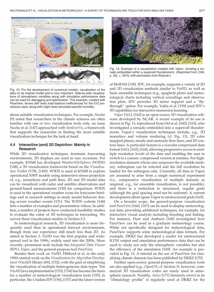
Vapor [161], [162] is an open-source 3D visualization soft-ware developed by NCAR. A recent example of its use isshown in Fig. 13, reproduced fromOrf et al. [160], [163], whoinvestigated a tornado embedded into a supercell thunder-storm. Vapor’s visualization techniques include, e.g., 3Disosurface and volume rendering (cf. Fig. 13), 2D colormapped planes, steady and unsteady flow lines, and 2D con-tour lines. A particular feature is a wavelet-compressed dataformat [161], [162], [164], allowing progressive access to mul-tiple resolution levels of the data and enabling the user toswitch to a coarser, compressed version at runtime. For high-resolution datasets whose size surpasses the available mem-ory, subregions can be selected and the full resolution beloaded for the subregion only. Currently, all data in Vaporare assumed to arise from a single numerical experiment(i.e., comparative visualization of multiple datasets asrequired, e.g., for ensemble visualization, is not possible),and there is a restriction to structured, regular grids(although the grid spacing need not be uniform). A currentdevelopment effort opens Vapor to unstructured grids [165].
On a broader scope, the general-purpose visualizationtool ParaView [166], [167] can be used to display meteorolog-ical data, providing additional techniques, for example, forinteractive visual analysis including brushing and linking.For instance, Dyer and Amburn [168] investigated howParaView can be used in a graduate meteorology course.While not specifically designed for meteorological data,ParaView supports some meteorological data formats. Forexample, DKRZ has developed a reader for unstructuredICON output and simulation performance data that can beused to study not only the atmospheric variables but alsothe efficiency of the simulation [169]. An example is pro-vided in Fig. 12. A tutorial on the use of ParaView for visu-alizing climate datasets has been published by DKRZ [170].
Further open-source general-purpose visualization toolsare also applied (e.g., OpenDX; cf. Section 3), however, com-mercial 3D visualization codes are rarely used in atmo-spheric research. Notably, Avizo [171] (formerly amira) in its“climatology profile” is regularly used at DKRZ for the
Fig. 12. For the development of numerical models, visualization of thedata on its original model grid is very important. Side-by-side visualiza-tions of atmospheric variables along with simulation performance datacan be used for debugging and optimization. This example, created withParaView, shows (left view) load balance inefficiencies for the 512 pro-cessors used, along with (right view) simulated specific humidity.
Fig. 13. Example of a visualization created with Vapor, showing a tor-nado embedded within a supercell thunderstorm. (Reprinted from [160,p. 33],# 2016, with permission from Elsevier.)
RAUTENHAUS ET AL.: VISUALIZATION IN METEOROLOGY—A SURVEY OF TECHNIQUES AND TOOLS FOR DATA ANALYSIS TASKS 3277

visualization of climate simulations (cf. the DKRZ tutorial[172]). For instance, R€ober et al. [173] used Avizo to visualizethe output of a small-scale simulation covering the city ofHamburg. Avizo was also used in a recent case study byTheußl et al. [174], who presented several visualizations of asimulated cyclonic storm over the Arabian Sea. Virtual-globe-based visualization has also been applied, for instance, tovisualize severe weather products [175] and satellite andsounding data [176], [177], to volume-render typhoon simula-tions [178], and to analyze the dispersion of volcanic ash andpossible encounters with aircraft [179]. Sun et al. [180] dis-cussed usage of virtual globes for climate research, andWanget al. [181] integrated amicroscale atmospheric model to visu-alize flow over complex terrain.
5 VISUALIZATION RESEARCH
Many aspects of meteorological visualization have beeninvestigated in the visualization community to advance thestate of the art in the application domain surveyed inSection 4; our objective for this section is to provide an over-view of techniques that are not yet commonly used in mete-orological practice. Our selection of articles is based onresearch that either directly targeted a visualization chal-lenge in meteorology, or that included a predominant casestudy that illustrates the application of a proposed methodto meteorological data. For instance, a number of studiesused a dataset of Hurricane Isabel, a WRF simulation thatwas first used in the IEEE visualization contest 2004 [182].In the following, we survey the literature in an annotated-bibliography style. For each of the categories used to sum-marize the state of the art in Section 4, Table 1 lists visualiza-tion topics that have been investigated in the literature.Links are provided to the sections in this section (an over-view of which is given in Fig. 1c), references to individualstudies are given in the text. Note that for each of thesetopics there is already a significant volume of published lit-erature that has not focused on atmospheric data. We pointout overview articles where applicable.
5.1 Display Design
The design of a meteorological visualization is crucial to thehuman ability to comprehend the displayed data and tobuild a mental model thereof [19], as manifested in a num-ber of studies that give advice on how to make meteorologi-cal maps and that investigate cognitive issues of howspecific visualization elements are perceived. For example,advice on how to use color in meteorological maps was
given by Hoffman et al. [183], Teuling et al. [184] and,recently, Stauffer et al. [185]. Stauffer et al. discussed the useof the perceptional linear hue-chroma-luminance (HCL)color space in meteorology, emphasizing benefits includingbetter readability and more effective conveyance of complexconcepts, but also noting the importance of considering thespecific task at hand for choosing effective colors. Furtherspecific guidance in meteorological map making, in particu-lar with respect to mapping uncertain variables, was pro-vided by Kaye et al. [186] and Retchless and Brewer [187].For instance, the latter study evaluated how combinationsof color and pattern can be used to map climate changeparameters with uncertainty. Dasgupta et al. [188] evalu-ated maps and further visualizations created by climate sci-entists, identifying a number of issues and offeringimprovements. They provided a list of design guidelines,discussing, amongst others, color and visual saliency. Stud-ies from the cognitive sciences and human-machine interac-tion have also addressed meteorological issues (for ageneral overview on implications of cognitive scienceresearch for the design of visual-spatial displays we refer to[189]). For example, Hegarty et al. [190] investigated theeffects of salience of the depiction of specific forecast varia-bles on a weather map on typical inference tasks. Theynoted that weather maps should be designed to make task-relevant information salient in a display. Trafton and Hoff-man [11] suggested improvements to meteorological visual-izations and tools, based on notions of human-centriccomputing. Bowden et al. [191] argued for increased usageof eye tracking as a method to study forecaster’s cognitiveprocesses when viewing meteorological displays. Theystudied a forecaster’s eye movements during the interpreta-tion of precipitation radar maps, showing that attention wasput on different parts of the display depending on theweather scenario.
A number of studies investigated display design withrespect to visualizing atmospheric flow, e.g., consideringvector glyphs, streamlines, and flow texture representations(e.g., [192], [193], [194]). Publications date back to sugges-tions to improve wind rose displays in the 1970s [195],[196]; a recent example is Martin et al. [194], who conducteda study investigating the user’s ability to determine magni-tude and direction of a wind field from wind barbs. Theyfound, e.g., that their observers had a tendency to underesti-mate wind speed in particular when asked to determine theaverage velocity over an area. Ware and Plumlee [197]investigated how 2D weather maps displaying three ormore variables can be improved. Alternative approaches todepict the wind vector field and multiple scalar variableswere explored, using static and animated displays with dif-ferent color, texture, and glyph schemes to target distinctperceptual channels. Ware and Plumlee [197] evaluated theirapproaches with a user study, noting, for instance, the effec-tiveness of a wind depiction by animated particle traces (inthis respect, cf. Beccario’s web implementation [198]). Fig. 14shows results from Pilar and Ware [199], who investigatedhow the 2D display of streamlines and wind barbs can beimproved. In their work, wind barbs (and alternativelyarrow glyphs) are placed along streamlines to combineadvantages of both approaches to visualize the flow field.The streamlines achieve a better spatial sampling of the flow,
Fig. 14. The improved wind barbs approach by Pilar and Ware [199]. Awind field depicted by (a) traditional wind barbs and (b) a combination ofstream lines and wind barbs. Small structures in the wind field that aremissed by the visualization in (a) are captured in (b). (Reprinted from[199],# 2013 IEEE. Used with permission.)
3278 IEEE TRANSACTIONS ON VISUALIZATION AND COMPUTER GRAPHICS, VOL. 24, NO. 12, DECEMBER 2018
capturing small scale structures sometimes missed by regu-larly placed wind barbs. They also have the advantage ofeverywhere being tangential to the flow (which wind barbsare only at their tip). Yet, the approach by Pilar and Ware[199] maintains the advantages of a glyph-based depiction offlow velocity and direction; also, the “traditional” wind barbdepiction that meteorologists are used to is maintained(Fig. 14b).
5.2 3D Visualization in Forecasting
Section 4.4 presented options that meteorological visualiza-tion tools offer with respect to 3D rendering. As noted, 3Dvisualization is used more often in atmospheric researchthan in forecasting, however, in both forecasting andresearch much less than 2D visualization. With respect toforecasting, a number of projects have conducted feasibilitystudies on using 3D visual mappings, investigating whether3D visualization can be of advantage in the weather room.
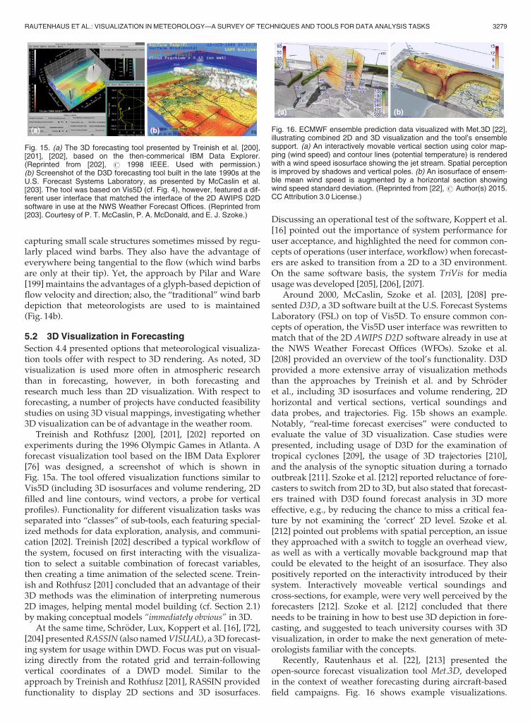
Treinish and Rothfusz [200], [201], [202] reported onexperiments during the 1996 Olympic Games in Atlanta. Aforecast visualization tool based on the IBM Data Explorer[76] was designed, a screenshot of which is shown inFig. 15a. The tool offered visualization functions similar toVis5D (including 3D isosurfaces and volume rendering, 2Dfilled and line contours, wind vectors, a probe for verticalprofiles). Functionality for different visualization tasks wasseparated into “classes” of sub-tools, each featuring special-ized methods for data exploration, analysis, and communi-cation [202]. Treinish [202] described a typical workflow ofthe system, focused on first interacting with the visualiza-tion to select a suitable combination of forecast variables,then creating a time animation of the selected scene. Trein-ish and Rothfusz [201] concluded that an advantage of their3D methods was the elimination of interpreting numerous2D images, helping mental model building (cf. Section 2.1)by making conceptual models “immediately obvious” in 3D.
At the same time, Schr€oder, Lux, Koppert et al. [16], [72],[204] presentedRASSIN (also namedVISUAL), a 3D forecast-ing system for usage within DWD. Focus was put on visual-izing directly from the rotated grid and terrain-followingvertical coordinates of a DWD model. Similar to theapproach by Treinish and Rothfusz [201], RASSIN providedfunctionality to display 2D sections and 3D isosurfaces.
Discussing an operational test of the software, Koppert et al.[16] pointed out the importance of system performance foruser acceptance, and highlighted the need for common con-cepts of operations (user interface, workflow) when forecast-ers are asked to transition from a 2D to a 3D environment.On the same software basis, the system TriVis for mediausagewas developed [205], [206], [207].
Around 2000, McCaslin, Szoke et al. [203], [208] pre-sented D3D, a 3D software built at the U.S. Forecast SystemsLaboratory (FSL) on top of Vis5D. To ensure common con-cepts of operation, the Vis5D user interface was rewritten tomatch that of the 2D AWIPS D2D software already in use atthe NWS Weather Forecast Offices (WFOs). Szoke et al.[208] provided an overview of the tool’s functionality. D3Dprovided a more extensive array of visualization methodsthan the approaches by Treinish et al. and by Schr€oderet al., including 3D isosurfaces and volume rendering, 2Dhorizontal and vertical sections, vertical soundings anddata probes, and trajectories. Fig. 15b shows an example.Notably, “real-time forecast exercises” were conducted toevaluate the value of 3D visualization. Case studies werepresented, including usage of D3D for the examination oftropical cyclones [209], the usage of 3D trajectories [210],and the analysis of the synoptic situation during a tornadooutbreak [211]. Szoke et al. [212] reported reluctance of fore-casters to switch from 2D to 3D, but also stated that forecast-ers trained with D3D found forecast analysis in 3D moreeffective, e.g., by reducing the chance to miss a critical fea-ture by not examining the ‘correct’ 2D level. Szoke et al.[212] pointed out problems with spatial perception, an issuethey approached with a switch to toggle an overhead view,as well as with a vertically movable background map thatcould be elevated to the height of an isosurface. They alsopositively reported on the interactivity introduced by theirsystem. Interactively moveable vertical soundings andcross-sections, for example, were very well perceived by theforecasters [212]. Szoke et al. [212] concluded that thereneeds to be training in how to best use 3D depiction in fore-casting, and suggested to teach university courses with 3Dvisualization, in order to make the next generation of mete-orologists familiar with the concepts.
Recently, Rautenhaus et al. [22], [213] presented theopen-source forecast visualization tool Met.3D, developedin the context of weather forecasting during aircraft-basedfield campaigns. Fig. 16 shows example visualizations.
Fig. 15. (a) The 3D forecasting tool presented by Treinish et al. [200],[201], [202], based on the then-commerical IBM Data Explorer.(Reprinted from [202], # 1998 IEEE. Used with permission.)(b) Screenshot of the D3D forecasting tool built in the late 1990s at theU.S. Forecast Systems Laboratory, as presented by McCaslin et al.[203]. The tool was based on Vis5D (cf. Fig. 4), however, featured a dif-ferent user interface that matched the interface of the 2D AWIPS D2Dsoftware in use at the NWS Weather Forecast Offices. (Reprinted from[203]. Courtesy of P. T. McCaslin, P. A. McDonald, and E. J. Szoke.)
Fig. 16. ECMWF ensemble prediction data visualized with Met.3D [22],illustrating combined 2D and 3D visualization and the tool’s ensemblesupport. (a) An interactively movable vertical section using color map-ping (wind speed) and contour lines (potential temperature) is renderedwith a wind speed isosurface showing the jet stream. Spatial perceptionis improved by shadows and vertical poles. (b) An isosurface of ensem-ble mean wind speed is augmented by a horizontal section showingwind speed standard deviation. (Reprinted from [22], # Author(s) 2015.CC Attribution 3.0 License.)
RAUTENHAUS ET AL.: VISUALIZATION IN METEOROLOGY—A SURVEY OF TECHNIQUES AND TOOLS FOR DATA ANALYSIS TASKS 3279

Met.3D combines interactive visualization similar to D3Dwith ensemble visualization; the tool supports GPU-acceler-ated 2D horizontal and vertical sections as well as 3D render-ing. In particular, the system closely reproduces the look of2D sections of the DLR MSS [133] (cf. Section 4.3), therebyaiming at the creation of a “bridge from 2D to 3D” to achieveacceptance with forecasters trained with the 2D MSS (Fig. 16;cf. [18], [22]). Met.3D introduces a number of state-of-the-artcomputer graphics techniques to the meteorological applica-tion, e.g., 3D spatial perception is increased by the usage ofshadows and vertical poles (Fig. 16a). The system’s ensemblesupport enables the user to animate through the ensemblemembers and to display ensemble statistics that are computedon-the-fly from the input data (e.g., mean and standard devia-tion; Fig. 16b). Rautenhaus et al. [214] applied Met.3D toforecastingWarmConveyor Belt features (airstreams in extra-tropical cyclones) and presented a detailed case study of howinteractive 3D ensemble visualization can be applied to practi-cal forecasting. Recent information can be found on the projectwebsite [215].
5.3 3D Volumetric Rendering
Visualization research has considered various furtheraspects of 3D rendering applied to atmospheric data.For example, a case study demonstrating the use of multi-dimensional transfer functions for rendering multivariate3D weather simulations on Cartesian grids was conductedby Kniss et al. [216], and a number of different renderingoptions for meteorological data including rainfall and cloudshave been presented by Song et al. [217]. They discussedresampling issues for the handling of different model gridsas well as data-dependent rendering options. Arthus et al.[218] presented an approach using 3D visualization to ana-lyze campaign observations, and Berberich et al. [219] imple-mented GPU-based direct volume rendering techniques viaVTK and OpenGL to visualize hurricane simulations. Theyconducted a user study to compare the effectiveness of directvolume rendering techniques and isosurface rendering, not-ing that their users preferred direct volume rendering. 3Dvisualization was also investigated with respect to virtualreality environments [67], [220], including a virtual work-bench for the analysis of cumulus clouds simulated by LESmodels [221] and usage of immersive virtual reality visuali-zation for teaching in meteorology classes [222], [223].Recently, Helbig et al. [224], [225] designedMEVA, a systemusing tools including ParaView and the Unity game engineto enable the exploration of heterogeneous data using multi-ple 3D virtual reality devices. In a case study, MEVA wasapplied to create 3D visualizations of WRF simulations of asupercell thunderstorm and to compare model output at dif-ferent resolutions and observations.
Realistic rendering of simulated and observed clouds hasnot commonly been used for meteorological analysis, exceptfor radiative-transfer-based methods to generate syntheticsatellite imagery from NWP output (cf. Section 4.1). Meteo-rological applications have mainly relied on isosurfaces (cf.Figs. 3 and 15) and volume rendering (cf. Figs. 4 and 13). Invisualization, early texture-based approaches were pro-posed in the 1980s by Gardner [226] and Max et al. [227],[228]. Physics-based rendering of cloud data was investi-gated by Riley et al. [21], [229], [230], who devised optical
and illumination models based on extinction and scatteringof simulated cloud particle properties. They discussed therendering of optical effects including backscatter glory andrainbows [230] and applied the methods to WRF simula-tions [21]. Ueng and Wang [231] used splatting of 2D bill-boards in combination with precomputed lightmaps torender clouds from Doppler radar data. Note that, however,the physical parameters most relevant for a realistic visuali-zation of a cloud (e.g., droplet size distributions to computecorrect scattering) are not resolved by most atmosphericmodels (except for specific small-scale simulations) andneed to be parametrized, imposing limits on achievablerealism. Cloud rendering has, however, been used for pub-lic media visualization. Trembilski [232] addressed the real-istic synthesis and rendering of clouds, and Hergenroetheret al. [233] presented an interpolation scheme to achievesmooth animation from a discrete set of time-varyingclouds. Also, real-time cloud rendering has been studied forapplications including computer games and flight simula-tors. Examples include the studies by Dobashi et al. [234],[235] and Harris et al. [236], [237], who introduced cloudbillboards and particle-based simulation of first-order scat-tering events in clouds. Hufnagel and Held [238] summa-rized the state of the art in this field.
5.4 Flow Dynamics
Flow visualization techniques including wind barb andarrow glyphs, and streamlines are accessible to meteorolo-gists as surveyed in Section 4; path lines (in meteorologyreferred to as trajectories) are usually computed usingLagrangian particle models (cf. Section 2.2; e.g., [82]). Manyadvanced techniques have been proposed in the visualiza-tion literature (cf., e.g., [239], [240]), however, only fewdirectly targeted atmospheric data (e.g., [241], [242], [243],[244], surveyed below). More frequently, flow visualizationstudies use an atmospheric dataset as one of multiple exam-ples. A complete list of these papers is outside the scope ofthis survey, but we provide links to topics that in our opin-ion are of interest to the meteorological community.
For instance, visual analysis of stream and path line data-sets is of interest when compared to Lagrangian analysis inmeteorology (e.g., see Sprenger and Wernli [82], whereimportance criteria are used to select air parcel path lines todetect regions and processes of relevance to the analysis).For example, Kendall et al. [245] used an approach relatedto Sprenger and Wernli [82] to visualize flow features basedon query trees that describe the geometry of integral linesby means of combined criteria. They integrated theirmethod into a scalable visual analysis software and appliedit to atmospheric and oceanographic datasets. The Hurri-cane Isabel dataset was used by Edmunds et al. [246] forautomatic stream surface seeding and by Guo et al. [247],who proposed an approach to improve brushing-and-linking techniques for path line rendering. Distancesbetween data samples at the positions of advected particlesare projected into 2D space for feature identification andselection; the method is applied to two atmospheric simula-tion examples. The aspect of analyzing scale interactions fortropical cyclone formation was discussed by Shen et al.[248], [249]. In their study, opacity is used to control stream-line transparency at different heights to visualize scale
3280 IEEE TRANSACTIONS ON VISUALIZATION AND COMPUTER GRAPHICS, VOL. 24, NO. 12, DECEMBER 2018

interactions, e.g., between the outflow of Hurricane Katrinaand the jet stream. As an alternative to Lagrangian flowvisualization, Maskey and Newman [244] investigated theuse of directional textures for visualizing atmospheric data.A conducted user study suggested the usefulness particu-larly for multivariate weather data.
The usage of animation to achieve dynamic flow visuali-zation has been investigated in 2D by Jobard, Lefer et al.[250], [251], [252]. Lefer et al. [251] used a so-called MotionMap to animate a dense set of colored streamlines, Jobardand Lefer [250] discussed challenges to update evenly-spaced streamlines when animating over time-varyingwind fields. Jobard et al. [252] animated arrow plots. In 3D,the potential of GPU particle tracing to interactively visual-ize time dependent climate simulation data was examinedby Cuntz et al. [241]. The article focuses on technical aspects,discussing, e.g., the method’s performance with respect toGPU computational power and bandwidth. Investigating adifferent animation aspect, Yu et al. [253] studied automaticstorytelling. Their method automatically computes a suit-able camera path to generate animations of time-varyingdatasets and is applied to the Hurricane Isabel dataset.
Finite-time Lyapunov exponent (FTLE) fields andLagrangian coherent structures (LCS) can be used as a toolto study the transport behavior of unsteady flow (meteoro-logical examples include [254], [255]). Discussing a completemeteorological analysis of Hurricane Isabel, Sapsis andHaller [256] used 3D visualizations of inertial LCS (ILCS).They depict attracting and repelling ILCS and demonstrateby comparison with conventional meteorological fields howthe structures can be used to identify, e.g., the eyewall ofthe hurricane. Recently, Guo et al. [257] extended the FTLEand LCS concepts to uncertain data (cf. Section 5.7), apply-ing their method to weather forecast data. Using a differentquantity, but also derived from temporal changes in 3D sim-ulation data, J€anicke et al. [258] presented a method basedon local statistical complexity to identify regions withanomalous temporal behavior. Applying the method to cli-mate simulation data, they compared their measure to tem-perature anomalies computed from long-term time series,finding that they were able to detect comparable regions.
5.5 Feature-Based Visualization
Methods for feature detection and tracking are used in oper-ational forecasting as summarized in Table 1; in atmo-spheric research, a primary application is statistical dataanalysis (cf. Section 4.1). In visualization, feature trackinghas been widely used for general flow visualization [259].Meteorological applications include the studies by Griffithet al. [260] and Heus et al. [261], who investigated the track-ing of cumulus clouds simulated by an LES model. Theyembedded feature tracking based on connected componentsinto a virtual reality environment, allowing the user to selectthe cloud to be tracked using a virtual workbench [221].Also investigating clouds, vortex detection methods wereapplied by Orf et al. [262] to detect and track features in sim-ulated 3D supercell thunderstorms. Recently, Doraiswamyet al. [242] presented a visualization framework to trackcloud movements via computer vision techniques appliedto satellite images. The authors used computational topol-ogy and optical flow techniques to analyze the multi-scale
characteristics of tropical convective phenomena, visualizingthe envelopes of cloud clusters and movement directions ofindividual clouds. In a similar line, Peng et al. [263] reportedon a GPU-accelerated approach for tracking features repre-sented by labeled regions in imagery datasets that largelyexceed GPU memory. They illustrate their method with alarge precipitation radar dataset, tracking regionswhere pre-cipitation exceeds a defined threshold. Further examplesinclude Lee et al. [243], who track events of the Madden-Julian Oscillation in a climate simulation, depicting theresults in a GoogleEarth based display, and Caban et al.[264], who introduced a feature-tracking method based ontextures to visualize dynamic changes in volumetric dataand track features in simulations of Hurricanes Bonnie andKatrina. Critical-point-based flow field visualization wasinvestigated by Wong et al. [265], who introduced a tech-nique based on vorticity to eliminate “less interesting” criti-cal points from atmospheric simulations. In a typhoonsimulation, they detected features characterized by strongshear and circulation and represented potential locations ofweather instability. Recently, Kern et al. [266] presented a 3Dmethod to detect and visualize jet-stream core lines in atmo-spheric flow.
5.6 Data Comparison and Fusion
Comparison of atmospheric data is a frequent challenge bothin operational forecasting and research (cf. Section 2). Tasksinclude comparing the same quantity but from differentsources (e.g., the evaluation of numerical models with obser-vations or the comparison of different numerical models), aswell as the comparison of structures in different fields (e.g.,temperature to humidity). A closely related task is the fusionof data from heterogeneous sources (often multimodal andpartially incomplete) to obtain a coherent picture of theatmosphere. There are approaches to data fusion in forecast-ing (e.g., [267]), also, the 2014 IEEE Visualization contest(analysis of volcanic ash dispersion by visualizing data frommultiple sources [182]) provides a representative example.
Comparison has also been addressed in the visualizationcommunity (for general references see [268], [269, Ch. 28]),with studies targeting comparison on data, image, and fea-ture levels [270]. Only few studies, however, have explicitlyconsidered meteorological data. For example, Nocke et al.[147] discussed the challenges of comparative visualizationof climate related model output and introduced the SimEnv-Vis framework to reduce obstacles for atmospheric research-ers to use unfamiliar visualization techniques. With respectto model comparison, Poco et al. [271], [272] proposed inter-active visual analysis (IVA; cf. Section 5.8) methods to com-pare the output of climate models based on coordinatedmultiple views and a proposed “visual reconciliation” work-flow. The user interacts with linked views of abstract similar-ity measures and data displays to iteratively explore modelsimilarities. The system has commonalities with approachesfrom the meteorological community. Here, an example isESMValTool [45], a script-based system designed to evaluateclimate models with observations based on a large numberof diagnostics and performance metrics. Visualizations gen-erated by the tool, however, are currently created with stan-dard software discussed in Section 4.3 (e.g., NCL), and arestatic. With respect to model evaluation, Wang et al. [273]
RAUTENHAUS ET AL.: VISUALIZATION IN METEOROLOGY—A SURVEY OF TECHNIQUES AND TOOLS FOR DATA ANALYSIS TASKS 3281

proposed a feature-based comparison method to verify pre-cipitation forecasts. They used Gaussian mixture models toextract rain bands from observations and forecast data anduse coordinated views for comparison.
The comparison of multiple fields is in the most simpleway approached by the overlay of, e.g., color, contour lines,and glyphs. Also, statistical approaches can be used to com-pute similarities (e.g., in a simple form the correlation coeffi-cient) [37]. With respect to overlay, Tang et al. [274] haveinvestigated the use of textures to overlay multiple parame-ters of climate data. Similarity measures for comparingmeteorological data have been used in a number of studies[275], [276], [277]. J€anicke et al. [276] proposed a local statis-tical complexity measure. They showed that it is able tohighlight regions of high spatio-temporal variability in anoverlay plot of simulated wind and evaporation, in whichstructures are otherwise hard to discern. Similarly, Nagarajet al. [277] presented a gradient-based local comparisonmeasure that is able to highlight, for instance, frontal struc-tures. A correlation measure combined with a proposed“multifield-graph“ was used by Sauber et al. [275]. Analyz-ing the Hurricane Isabel dataset, they demonstrated howthe approach allows to quickly identify fields and regionswith strong correlation.
A data fusion task has recently been posed in the contextof the IEEE Visualization 2014 contest. The works by
G€unther et al. [279] and Elshehaly et al. [280] presentedsolutions that fill spatiotemporal gaps between multiple sat-ellite observations and trajectory model output. Notably,Elshehaly et al. [280] proposed a GPU-accelerated workflowincorporating expert knowledge in an interactive process tofill gaps in the data and to provide a coherent view of theatmospheric processes. Fig. 17 shows a result of Kuhn et al.[278], who approached the contest dataset with topologicalmethods, extracting structures in the data that allow forclustering and comparison. For example, the temporal evo-lution of extremal structures is detected via segmentationand displayed in a space-time graph; Fig. 17 shows the tem-poral evolution of detected volcano eruption events. Relatedto data fusion is seamless prediction (cf. Section 2.2). Visuali-zation of such multi-scale data (cf. [269, Ch. 28]) has beenaddressed in for atmospheric data by Shen et al. [249] andTreinish [281]. For instance, Treinish [281] discussed flowvisualization and stream line seeding for multi-resolutionwind field simulations, including improved strategies forstreamline seeding based on vector field filtering.
5.7 Ensemble Visualization
The demands of meteorologists with respect to analyzingensemble datasets have in recent years providedmuchmoti-vation for visualization studies. From the visualization pointof view, ensemble visualization is part of uncertainty visuali-zation, a topic that has received significant attention [35],[36], [282], [283], [284], [285]. Irrespective of the applicationdomain that uses ensemble visualization, Obermaier and Joy[286] classified ensemble visualization tasks into two catego-ries, location-based methods and feature-based methods. The twoconcepts directly map to ensemble visualization techniquesused in meteorology. Location-based methods aim at visual-izing properties of an ensemble at fixed locations, with exam-ples including maps of mean and standard deviation (Fig. 7)and EFImaps (Fig. 8). Feature-based techniques, on the otherhand, focus on comparative visualization of featuresextracted from the individual ensemble members. Examplesinclude spaghetti plots of contour lines (Fig. 7) and frontalfeatures (Fig. 11).
A number of recent visualization studies have been pub-lished with direct reference to meteorology. The depictionof uncertainty is also of high importance for communicationand decision making; several studies have been publishedin this respect as well. For instance, Nadav-Greenberg et al.[287] investigated the effect of visualizations on under-standing and use of uncertainty in wind speed forecasts indecision making; Savelli and Joslyn [288] studied the effectof visualizing predictive intervals of temperature forecastsfor communication purposes. The articles by Kaye et al.[186] and Retchless and Brewer [187], providing advice onrepresenting and communicating uncertainty on meteoro-logical maps, have been surveyed in Section 5.1. For furtherlinks with respect to communication, we refer to Stephenset al. [12], who link uncertainty communication methodsfrom weather forecasting to climate change communication.
With respect to data analysis, a topic subject to a numberof studies has been the design of alternative depictions ofspaghetti plots. For example, Whitaker et al. [289] andMirzargar et al. [290] generalized boxplots to contour box-plots and curve boxplots as alternatives to spaghetti plots. As
Fig. 17. Topology-based segmentation for data fusion, as proposed byKuhn et al. [278]. The method fuses data from different atmosphericobservations and simulations; this example shows data from the 2014IEEE Visualization contest [182]. (Reprinted from [278, p. 44], # 2017Springer International Publishing AG. With permission of Springer.)
3282 IEEE TRANSACTIONS ON VISUALIZATION AND COMPUTER GRAPHICS, VOL. 24, NO. 12, DECEMBER 2018

shown in Fig. 18a, their figures highlight the median con-tour line and show percentiles and outliers of the originalensemble of contours or tracks. Similarly, Sanyal et al. [291]enhanced spaghetti plots by glyphs and confidence ribbonsto highlight the euclidean spread of 2D contour ensembles.Ferstl et al. [292] clustered 2D and 3D streamlines, pathlines, and feature tracks. They visualized the results as 2Dand 3D lobes that show a median line and the variability ofthe lines in the cluster (variability plots). Fig. 18b shows anextension of the method to arbitrary contour lines, pre-sented by Ferstl et al. [293], [294]. Contour lines were clus-tered for individual time steps as well as for time-dependent data, visualizing stacked plots that display thetemporal development of the clusters (i.e., forecast scenar-ios) in a single view [294].
Both Mirzargar et al. [290] and Ferstl et al. [292] appliedtheir method to the depiction of 2D hurricane track ensem-bles, an application that has received attention by a numberof further studies (also with respect to communication). Forinstance, Cox et al. [295] proposed an alternative display tothe official National Hurricane Center error cones. Based onthe current ensemble prediction and historical tracks, theyproduce synthetic hurricane tracks that dynamically appearand fade out. A user study confirmed that users were betterat estimating the hurricane strike probability at a given loca-tion. The method was further developed by Liu et al. [296],who used the storm tracks generated to estimate a time-dependent likelihood field for hurricane risk, allowing theuser to view a time animation of a risk ellipse encoding dif-ferent risk values. In a subsequent study, the authorsapproached the issue of larger risk ellipses being misinter-preted as larger size or strength of the hurricane [297],evaluating display alternatives based on sub-sampling hur-ricane positions. Ruginski et al. [298] further evaluated dis-play alternatives including the method by Cox et al. [295]with a non-expert user study.
Further studies investigated methods aimed at IVA ofensemble prediction data. Potter et al. [299] investigated theusage of multiple linked 2D views, concluding that the com-bination of standard statistical displays (spaghetti plots,maps of mean and standard deviation) with user interactionfacilitates clearer presentation and simpler exploration ofthe data. Similarly, Sanyal et al. [291] highlighted the posi-tive effect of interactivity and linked views on the user.Recently, Quinan and Meyer [300] proposed WeaVER, an
interactive tool to support meteorological analysis of ensem-ble data. WeaVER supports standard location-based techni-ques as well as interactive spaghetti plots, allowing the userto highlight selected contour lines in order to decreasevisual saliency of other members’ contours. Quinan andMeyer [300] also employed the contour boxplot technique[289], obtaining positive feedback about the technique fromcollaborating meteorologists. An approach using interactivebrushing and linking to analyze ensembles of scalar fieldswas presented by Demir et al. [301]. By providing a combi-nation of diagram techniques in a “multi-chart”, they enablethe user to interactively explore visual summaries of ensem-ble properties at different regions and at different solutions.Demir et al. [301] provided examples from the analysis ofan ECMWF forecast. A similar approach was presented byH€ollt et al. [302], who used linked views to facilitate theinteractive exploration of height field ensembles from oceanforecasts. Recently, Wang, Biswas et al. [303], [304] pro-posed methods to investigate ensembles generated by vary-ing spatial resolution and convective parametrizationparameters in the WRF model. Wang et al. introduced aNested Parallel Coordinates Plot to investigate parametercorrelations, Biswas et al. approached the sensitivity andaccuracy of simulated precipitation to input parametersinfluencing the parametrization and to model resolution.They combined abstract views displaying statistical quanti-ties from, e.g., multi-dimensional scaling and clusteringtechniques with map views, and described a number ofmeteorological findings made with the technique by a col-laborating atmospheric scientist. Kumpf et al. [305] pre-sented an interactive approach to cluster ECMWF ENSforecasts, focusing on visualization of the robustness of theclustering result with respect to slight changes in the useddata region. Specific to forecasting during atmospheric fieldcampaigns, Rautenhaus et al. [214] proposed an interactivemethod to predict and visualize in 3D an occurrence proba-bility for Warm Conveyor Belt features, using Lagrangianparticle trajectories for feature detection and transparentisosurfaces for probability visualization. The method is inte-grated into Met.3D (cf. Section 5.2), thereby achieving inter-active combination with further ensemble display methods.Recently, Demir et al. [306] approached the challenge of ren-dering an ensemble of 3D isosurfaces by displaying a meanisosurface surrounded by a spaghetti plot of silhouettes ofthe individual members’ surfaces.
With respect to 1D series of scalar data, Potter et al. [307]discussed variations of box plots that, compared to the clas-sic version (cf. Fig. 10), convey additional information on thedepicted probability distribution. They proposed enhancedplots depicting joint summaries of the distributions of twoparameters, showing joint data series of ensemble predic-tions of temperature and humidity. Lampe and Hauser [308]used a generalization of kernel density estimates to createsmooth depictions of probability information along timeseries (applying their technique to temperature time series).With respect to comparing entire ensembles to each other,K€othur et al. [309] proposed a correlation-based approachto visually compare time series of multiple ensembles ofpaleoclimate data.
In addition to the (mostly 2D) spaghetti plot alternativesdiscussed above, further work has investigated the
Fig. 18. Alternatives to spaghetti plots recently suggested in the litera-ture. (a) Whitaker et al. [289] proposed a generalization of box plots (cf.Fig. 10) to contour lines. (Reprinted from [289],# 2013 IEEE. Used withpermission.) (b) Ferstl et al. [293] clustered an ensemble of lines andproduced “variability plots”, depicting for each cluster a lobe that repre-sents the variability of the cluster’s lines around a medium line.(Reprinted from [293],# 2016 The Author(s).# 2016 The EurographicsAssociation and John Wiley & Sons Ltd. Used with permission.)
RAUTENHAUS ET AL.: VISUALIZATION IN METEOROLOGY—A SURVEY OF TECHNIQUES AND TOOLS FOR DATA ANALYSIS TASKS 3283

depiction of uncertain 2D and 3D isocontours from bothparametric and nonparametric uncertainty models (also cf.references listed in [310]). Here, examples with relation tometeorology include the drawing of uncertainty bands,fuzzy and random 2D contours [284], [311] and the usage ofkernel density estimates [310]. Pfaffelmoser and Wester-mann [312] investigated how visual ambiguities in spaghettiplots can be prevented. In 3D, normals on 3D isosurfaceshave been used as “3D error bars” [313], [314], and probabi-listic rendering approaches have been investigated to depictthe positional uncertainty of 3D isosurfaces [313], [315],[316]. Pfaffelmoser et al. [317] have proposed a glyph-basedapproach to depict the uncertainty of gradients in 2D scalarfields, revealing regions in which isocontours of an ensem-ble temperature forecast are stably oriented.
Methods to investigate the topological structure of uncer-tain forecasts were recently proposed by Mihai and Wester-mann [318] and Liebmann and Scheuermann [319] andapplied to temperature field ensembles from ECMWF fore-casts. For instance, Mihai and Westermann [318] analyzedthe stability of critical points, proposing summary mapsthat show how stable critical points are with respect to loca-tion and type. The modality of forecast distributions wassubject of an article by Bensema et al. [320], who classifiedsimulated temperature fields of a 50-member ensemble cli-mate simulation according to its modality, in particularhighlighting the stability of bimodal regions.
With respect to vector field ensembles, glyphs have beenused to display, e.g., uncertainty in wind fields [321]. Jaremaet al. [322] performed a local clustering of wind directions ofECMWF wind fields. They displayed the results usingglyphs per grid point (similar to the wind roses in Fig. 10but indicating the modality of the local distribution). Thedepiction of uncertain trajectory data has been investigatedby Boller et al. [323]. Considering uncertainty stemmingfrom the numerical advection scheme used to compute tra-jectories, they map uncertainty to line thickness. Furtherapproaches to visualizing ensemble trajectories to revealdifferences in the ensemble’s flow fields were presented byGuo et al. [324] and Ferstl et al. [292]. For instance, Guoet al. [324] used a Lagrangian metric to specify the distancebetween path lines computed from the ensemble members’wind fields, an improvement of which was recentlydescribed by Liu et al. [325], who used longest common sub-sequences to measure path lines distance. Results are visual-ized, e.g., via 3D volume rendering. Guo et al. [257] also
investigated uncertain FTLE and LCS methods to analyzetransport behavior in time-varying uncertain forecasts.
5.8 Interactive Visual Analysis
Meteorological analysis almost always builds on the combi-nation of multiple views on a dataset. IVA techniques [326],[327] add the ability to interactively emphasize data subsetsin multiple-view displays. ParaView, as shown in Fig. 12,provides support for some IVA techniques that can readilybe applied by meteorological researchers. Also, visualiza-tion experts at institutions including DKRZ have appliedthe SimVis framework [326] to climate research [328]. Nev-ertheless, IVA techniques are largely unknown to atmo-spheric researchers. Tominski et al. [329] conducted asurvey with 76 participants to evaluate the application ofIVA methods in the climate sciences. They found that state-of-the-art techniques are rarely applied.
A number of studies, however, have demonstrated thepotential of applying IVA techniques to atmospheric data. Inthe context of the IEEE Visualization 2004 contest, Doleischet al. [331] applied interactive brushing and linking andfocus+context techniques in SimVis to the exploration of theHurricane Isabel dataset. They showed how brushing inattribute space (i.e., the simulated parameters at the gridpoints) can highlight relevant features in a linked volumerendering (e.g., brushing of pressure and wind speed high-lights the hurricane’s eye), thereby facilitating interactiveexploration of features. Fig. 19 shows an example of similartechniques used by Kehrer, Ladst€adter et al. [330], [332], whoused SimVis with ECMWF reanalysis and ECHAM datasets.Without employing prior knowledge of the data, the interac-tive visual exploration techniques in the tool were used togenerate hypotheses about possible indicator parametersand regions for climate change. Similarly, Jin and Guo [333]coupled a map view with parallel coordinates and a self-organizing map to facilitate an interactive exploration of cli-mate change patterns. Qu et al. [334] applied IVA techniquesto air pollution observations from the city of HongKong, dis-cussing the effectiveness of polar plots, parallel coordinates,and a graph-like display for the analysis. Diehl et al. [335]presented a web-based system using linked views designedto provide forecast visualization formeteorologists inArgen-tina, proposing a “minimap timeline” that uses small depic-tions of the plotted meteorological maps. Kerren et al. [336]proposed an interactive viewer for long climate time series.The work by J€anicke et al. [337], [338] focused on applyingIVA techniques to analyze temporal variability in climatesimulations. By reducing the high-dimensional attribute vec-tors consisting of the simulated parameters to 2D [337], theyfacilitated brushing and linking able to identify and visualizedifferent seasonal patterns of precipitation changes in a cli-mate change simulation. Also, they showed how waveletanalysis can be applied to multivariate climate simulations,facilitating a visual analysis of changes in variability due toglobal warming [338].
These studies are closely related to statistical data analy-sis methods well established in meteorology [37]. A numberof visualization studies have considered how informationvisualization techniques can be used in the statistical analy-sis process, and how interactivity and graphical display canbe improved. For example, Steed et al. [339], [340]
Fig. 19. Example of IVA techniques applied to atmospheric data. Thegeopotential height field trend of the ECMWF ERA-40 reanalysis datasetis analyzed. The turquoise rectangle in (a) brushes outliers in the time-series view (selected outliers are shown in red). Linked views immedi-ately show where the brushed outliers are located in the (b) pressureand (c) latitude dimensions. (Reprinted from [330], # 2010 AmericanMeteorological Society. Used with permission.)
3284 IEEE TRANSACTIONS ON VISUALIZATION AND COMPUTER GRAPHICS, VOL. 24, NO. 12, DECEMBER 2018

approached the issue that atmospheric workflows ofteninvolve simultaneous statistical and graphical analysisand integrated an interactive parallel coordinates visualiza-tion with statistical computations. A case study of thetechnique’s application to an analysis of North Atlantic hur-ricane trends showed a significant speedup of the analysisprocess [339]. Radial depiction of information (for a generaloverview see [341]) was adapted by Li et al. [342], whoinvestigated the challenge of analyzing spatially distributedtime series of atmospheric surface observations to discoverclimate change patterns. Further studies have consideredcorrelation analysis [343], the application of diffusion mapsto create temporally and spatially compressed depictions ofNWP output [344], the adaptation of boxplots to sequencesof 2D maps and images to analyze time series of maps of cli-mate simulation output [345], and the usage of self-organiz-ing maps to visualize patterns in multivariate atmosphericdata [333], [346]. For example, Lundblad et al. [346] pro-posed a technique based on self-organizing maps to reducedimensionality of the multivariate forecast data in order toanalyze clusters, and described meteorological informationsystems using IVA methods to provide specific forecastingtechniques for ship and road traffic in Sweden [346], [347],[348]. The application of visual data mining techniques inclimate sciences has also been extensively discussed byNocke et al. [147], [349], [350]. For instance, Nocke et al.[349] discussed visualization of clusters computed in theanalysis of climate simulations by means of visual analysismethods. Recently, Nocke et al. [13] provided a review ofhow visual analytics techniques can be applied to the studyof climate networks. As is the case for the above discussedvisualization topics, further studies for interactive visualstatistical analysis have considered the common meteoro-logical datasets. For example, Staib et al. [351] demonstratedan enhancement of scatterplots by multi-dimensional focalblur using Hurricane Isabel.
Recently, big-data issues of IVA techniques have been dis-cussed. Wong et al. [352] described the application of severalinteractive visual analytics techniques to large-scale climatesimulation output, discussing computational aspects as wellas user feedback. Notably, they touch uponmajor challengesto facilitate visual analytics of large-scale datasets [353]. Inthis respect, Steed et al. [354] have approached the issue ofwhere the data to be analyzed is physically stored and pre-sented a web-based visual analytics framework for climatemodel data to minimize movements of the large data vol-umes. As described in Sections 5.6 and 5.7, IVA techniqueshave also increasingly been applied for comparative andensemble visualization. In this respect, Dasgupta et al. [355]have recently discussed lessons learned from a study inwhich IVAmethods for comparative visualization have beendeveloped (cf. [271], [272], discussed in Section 5.6). Theyargued that IVA techniques can play a key role in bridgingthe gap between relatively short simulation run-times andlong data analysis times.
5.9 Efficient Rendering
The specific grid and data topologies encountered in meteo-rology (cf. Section 2.2) pose computational challenges forrendering (see [21] for a discussion). Therefore, many exist-ing visualization tools require data resampling to a regular
grid structure (cf. Section 4.3). A number of studiesapproached the challenge of rendering nonuniform datafrom atmospheric models and observations. Djurcilov andPang [356] discussed various approaches to deal withincomplete data from point measurements or sparse mea-surement structures, including point rendering, scattereddata interpolation, and point cloud triangulation. Gerstneret al. [357] and Moreno et al. [358] discussed the generationof a multiresolution representation and the gridding of scat-tered observational data, respectively, and demonstratedcombined volume and terrain rendering to put the observa-tions in spatial context. Riley et al. [21] pointed out thatresampling introduces grid artifacts and can increase therequired memory. They presented a GPU volume-renderingalgorithm operating on the structured non-uniform gridsoutput by the WRF model, using approximate texture-mappings. Riley et al. applied their renderer to simulationsof a tornado outbreak and of Hurricane Isabel, and showedthe utility of rendering 3D Doppler radar data. Also usingtexture-mapping, Met.3D [22] (cf. Section 5.2) implementsvisualization algorithms that can handle the verticalECMWF hybrid sigma-pressure coordinate (cf. Fig. 2).Xie et al. [359], [360] described how the geodesic grids ofmodern weather and climate models can be efficiently vol-ume-rendered by single GPUs as well as by GPU clusters.Kri�stof et al. [361] presented a volume rendering approachusing an adaptive octree representation for operational 3DDoppler radar data. They tackled the challenge of temporalmisalignment via linear interpolation in time, and usedGPU raycasting to achieve interactive rendering.
5.10 Scalability and Reproducibility
Continuous data growth in weather forecasting and atmo-spheric research (e.g., [30], [362], [363]) poses significant chal-lenges to data processing and visualization (cf. Section 4.3).The computational power of computers has grown muchfaster than storage capacity and disk speed [363]. As a conse-quence, datasets increasingly need to be analyzed directly onthe supercomputers and also, increasingly smaller parts ofmodel results can be stored in a timely manner. Approachesto this challenge include remote and parallelized visualiza-tion, compression, and in-situ visualization (i.e., a part of thevisualization pipeline is run within the model code; e.g., theextraction of isosurface geometry). At DKRZ, e.g., remotevisualization servers integrated into the supercomputerenable users to interactively explore large data without theneed to transfer data. Similarly, ECMWF follows web-basedapproaches (cf. Section 4.3).
Vapor’s wavelet-based approach to data compressionwas described in Section 4.4; scientists working withgeneral-purpose tools including Python and ParaView haveaccess to big-data-analysis libraries developed in the corre-sponding communities. An example is ParaView Catalyst, alibrary for in-situ data processing and visualization forwhich Ayachit et al. [364] have recently demonstrated usein atmospheric modeling to significantly reduce visualiza-tion data output. In-situ capabilities have also been inte-grated in some numerical models; e.g., Olbrich et al. [365],[366], [367] demonstrated the in-situ extraction of isosurfa-ces and other 3D geometry from an LES model and facili-tated interactive 3D remote visualization via streaming.
RAUTENHAUS ET AL.: VISUALIZATION IN METEOROLOGY—A SURVEY OF TECHNIQUES AND TOOLS FOR DATA ANALYSIS TASKS 3285
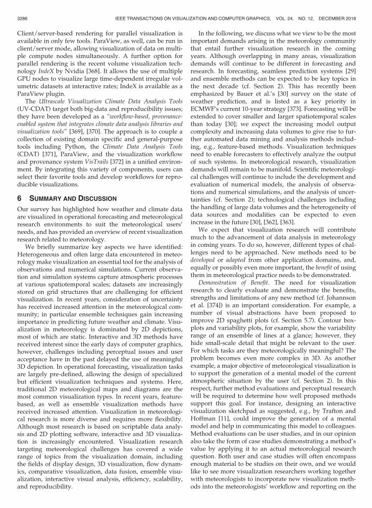
Client/server-based rendering for parallel visualization isavailable in only few tools. ParaView, as well, can be run inclient/server mode, allowing visualization of data on multi-ple compute nodes simultaneously. A further option forparallel rendering is the recent volume visualization tech-nology IndeX by Nvidia [368]. It allows the use of multipleGPU nodes to visualize large time-dependent irregular vol-umetric datasets at interactive rates; IndeX is available as aParaView plugin.
The Ultrascale Visualization Climate Data Analysis Tools(UV-CDAT) target both big-data and reproducibility issues;they have been developed as a “workflow-based, provenance-enabled system that integrates climate data analysis libraries andvisualization tools” [369], [370]. The approach is to couple acollection of existing domain specific and general-purposetools including Python, the Climate Data Analysis Tools(CDAT) [371], ParaView, and the visualization workflowand provenance system VisTrails [372] in a unified environ-ment. By integrating this variety of components, users canselect their favorite tools and develop workflows for repro-ducible visualizations.
6 SUMMARY AND DISCUSSION
Our survey has highlighted how weather and climate dataare visualized in operational forecasting and meteorologicalresearch environments to suit the meteorological users’needs, and has provided an overview of recent visualizationresearch related to meteorology.
We briefly summarize key aspects we have identified:Heterogeneous and often large data encountered in meteo-rologymake visualization an essential tool for the analysis ofobservations and numerical simulations. Current observa-tion and simulation systems capture atmospheric processesat various spatiotemporal scales; datasets are increasinglystored on grid structures that are challenging for efficientvisualization. In recent years, consideration of uncertaintyhas received increased attention in the meteorological com-munity; in particular ensemble techniques gain increasingimportance in predicting future weather and climate. Visu-alization in meteorology is dominated by 2D depictions,most of which are static. Interactive and 3D methods havereceived interest since the early days of computer graphics,however, challenges including perceptual issues and useracceptance have in the past delayed the use of meaningful3D depiction. In operational forecasting, visualization tasksare largely pre-defined, allowing the design of specializedbut efficient visualization techniques and systems. Here,traditional 2D meteorological maps and diagrams are themost common visualization types. In recent years, feature-based, as well as ensemble visualization methods havereceived increased attention. Visualization in meteorologi-cal research is more diverse and requires more flexibility.Although most research is based on scriptable data analy-sis and 2D plotting software, interactive and 3D visualiza-tion is increasingly encountered. Visualization researchtargeting meteorological challenges has covered a widerange of topics from the visualization domain, includingthe fields of display design, 3D visualization, flow dynam-ics, comparative visualization, data fusion, ensemble visu-alization, interactive visual analysis, efficiency, scalability,and reproducibility.
In the following, we discuss what we view to be the mostimportant demands arising in the meteorology communitythat entail further visualization research in the comingyears. Although overlapping in many areas, visualizationdemands will continue to be different in forecasting andresearch. In forecasting, seamless prediction systems [29]and ensemble methods can be expected to be key topics inthe next decade (cf. Section 2). This has recently beenemphasized by Bauer et al.’s [30] survey on the state ofweather prediction, and is listed as a key priority inECMWF’s current 10-year strategy [373]. Forecasting will beextended to cover smaller and larger spatiotemporal scalesthan today [30]; we expect the increasing model outputcomplexity and increasing data volumes to give rise to fur-ther automated data mining and analysis methods includ-ing, e.g., feature-based methods. Visualization techniquesneed to enable forecasters to effectively analyze the outputof such systems. In meteorological research, visualizationdemands will remain to be manifold. Scientific meteorologi-cal challenges will continue to include the development andevaluation of numerical models, the analysis of observa-tions and numerical simulations, and the analysis of uncer-tainties (cf. Section 2); technological challenges includingthe handling of large data volumes and the heterogeneity ofdata sources and modalities can be expected to evenincrease in the future [30], [362], [363].
We expect that visualization research will contributemuch to the advancement of data analysis in meteorologyin coming years. To do so, however, different types of chal-lenges need to be approached. New methods need to bedeveloped or adapted from other application domains, and,equally or possibly even more important, the benefit of usingthem in meteorological practice needs to be demonstrated.
Demonstration of Benefit. The need for visualizationresearch to clearly evaluate and demonstrate the benefits,strengths and limitations of any new method (cf. Johannsonet al. [374]) is an important consideration. For example, anumber of visual abstractions have been proposed toimprove 2D spaghetti plots (cf. Section 5.7). Contour box-plots and variability plots, for example, show the variabilityrange of an ensemble of lines at a glance; however, theyhide small-scale detail that might be relevant to the user.For which tasks are they meteorologically meaningful? Theproblem becomes even more complex in 3D. As anotherexample, a major objective of meteorological visualization isto support the generation of a mental model of the currentatmospheric situation by the user (cf. Section 2). In thisrespect, further method evaluations and perceptual researchwill be required to determine how well proposed methodssupport this goal. For instance, designing an interactivevisualization sketchpad as suggested, e.g., by Trafton andHoffman [11], could improve the generation of a mentalmodel and help in communicating this model to colleagues.Method evaluations can be user studies, and in our opinionalso take the form of case studies demonstrating a method’svalue by applying it to an actual meteorological researchquestion. Both user and case studies will often encompassenough material to be studies on their own, and we wouldlike to see more visualization researchers working togetherwith meteorologists to incorporate new visualization meth-ods into the meteorologists’ workflow and reporting on the
3286 IEEE TRANSACTIONS ON VISUALIZATION AND COMPUTER GRAPHICS, VOL. 24, NO. 12, DECEMBER 2018

added value. Such studies would increase the exchangebetween the meteorological and visualization communities,raise awareness and show users how novel visualizationdevelopments can have value for their work.
Availability and Training. To increase impact, new techni-ques also need to be more easily available to meteorologistsfor evaluation with their own data. Most visualization toolsused in meteorology are open-source (cf. Section 4.3). Thus,when developing a new visualization technique, the benefitof making it available to users may be worth the overheadof implementing into an existing tool. Also, more trainingneeds to be provided to change the ways meteorologistsexplore their data. Here, we agree with Szoke et al. [212]that increased teaching of advanced visualization conceptsin meteorological university courses will be helpful.
Interactive Visual Analysis and Further Not-Yet-CommonTechniques. With respect to development and adaptation ofmethods, we believe there is potential in bringing moreinteractive and further not-yet-common visualization tech-niques into meteorology. In particular in the areas of IVA,flow visualization, and 3D rendering, many techniqueshave been proposed in visualization research that have notyet been applied to meteorological data. For example, flowvisualization techniques (cf. [239], [240]) including integralline rendering, LCS, and feature-based methods may bebeneficial. Similarly, the use of IVA techniques (e.g., brush-ing and linking) and techniques from information visualiza-tion should be further investigated. In this respect,Dasgupta et al. [355], too, recently argued for an increaseduse of interactive, iterative, human-in-the-loop analysistechniques in climate research. There is, however, stillmuch skepticism of domain experts with respect to interac-tive and automated analysis techniques (e.g., [9], [355]; cf.Section 4.3); skepticism that we can confirm from our expe-rience with forecasters and atmospheric researchers. How-ever, we can also confirm Nocke’s [9] observation that inparticular young atmospheric researchers are increasinglyused to interactive usage of software. We hence expect inter-active visual analysis tools to become of increased impor-tance. An in our opinion important aspect for the success ofinteractive techniques will be transparency of the data flow,and further effort should be invested into the design ofmethods for data provenance and reproducible visualiza-tion—here, reproducibility still is a clear advantage ofscript-based systems (cf. Section 4.3).
Seamless Visualization and Data Fusion. A key to effectiveanalysis of future meteorological datasets will be visualiza-tion techniques and systems that are able to depict data atmultiple temporal and spatial resolutions (e.g., from seam-less prediction), and able to fuse data from heterogeneoussources (cf. the datasets from the IEEE SciVis contests 2014[375] and 2017 [376]). Challenges include dealing withmodel grids of differing resolutions, and also to dealingwith data of entirely different topology (as typical, e.g., forthe analysis of field campaign data). Visualizations need tomake resolution and data topology transparent; such seam-less visualization will enable forecasters and atmosphericresearchers to analyze data at different scales to obtain aholistic picture of a weather situation.
Uncertainty and Ensemble Visualization. Visualization ofuncertainty, in particular from ensemble forecasts, remains
a particular challenge. Due to a lack of analytic and visuali-zation methods, uncertainty is yet to be fully exploited; newtypes of visualization can have large potential value. Openissues range from the further improvement of establishedtechniques (e.g., spaghetti plots and clustering) to questionsincluding how to visualize ensemble variability and similar-ity for specific atmospheric features. For example, clusteringensemble members in a physically meaningful way is anextremely hard problem; clustering results depend onmany details of the chosen method. How can such methoduncertainty be visualized? With respect to features, ques-tions include [214]: Do features develop similarly to eachother in different members but shifted in space and time?Can feature variability be visually depicted in a singleimage? Another challenge is to compare entire ensembles. Aforecaster can be interested in how forecast scenarios differin subsequent ensemble prediction runs; a researcher maybe interested in the difference in ensemble properties withrespect to changing a model parameterization or assimilat-ing additional observation data.
3D Visualization.An example of the demonstration of ben-efit is the use of interactive 3D visualization. Several studieshave discussed benefits (cf. Section 5.2), including the argu-mentation that 3D depictions are much closer to conceptualmodels used bymeteorologists (e.g., [201]), thereby reducingthe time in which simulation data can be explored (e.g.,[214]), and minimizing the risk of missing critical features(e.g., [212]). Obviously, potential benefit depends on theactual analysis task and data to be visualized. In operationalforecasting, the horizontal movement of weather featurescan be well depicted on a 2D map (cf. Section 4). Neverthe-less, 3D visualization could be beneficial to capture fully thespatial structure of small and large-scale features includingconvective cells, fronts and the tropopause. This could beparticularly important for forecasting with a specific focus,such as planning a research flight. However, integration of3D visualization into forecasting means a change to longestablished working practices. Software that combines thepower of interactive 3D displays with traditional 2D maps(e.g., Met.3D [22]) might be able to ease the transition; firsttests at ECMWFhave shown that there is interest for analystsin viewing 2Dmaps in their 3D context.
We see many further open issues for 3D visualization, inparticular with respect to the design of meaningful visualiza-tions and their implementation as interactive graphicsalgorithms. For example, there are often large differencesbetween horizontal and vertical scales, and this posesdifficulties for meaningful 3D depictions. Which horizontalprojections should be used with which vertical scaling? Dis-tances perceived in the visualization may not physicallymake sense and may not be representative of reality. Also,an important aspect is to achieve good spatial perception inthe 3D view. It must be obvious where the features dis-played are located in space. In some cases (e.g., for visualiz-ing a front), a meaningful depiction of the atmospherecould resemble the look of a “miniature plastic model” sit-ting on the scientist’s desk. In other cases (e.g., for visualiza-tion of clouds), a photo-realistic look resembling a picturetaken from an airplane may be appropriate. Such visualiza-tions touch upon issues in real-time rendering with globalillumination; representative scenarios have just recently
RAUTENHAUS ET AL.: VISUALIZATION IN METEOROLOGY—A SURVEY OF TECHNIQUES AND TOOLS FOR DATA ANALYSIS TASKS 3287
been provided by the IEEE SciVis contest 2017 [376]. Also,the benefit of using the third visualization dimension for anon-spatial coordinate (e.g., time or ensemble member)could be further investigated.
Technological Challenges: Big Data and Data Modalities. Twotechnical factors will increasingly become challenging forvisualization (in particular with respect to achieving inter-activity): data sizes and the structure of the data (e.g., modelgrids). The continuously growing amount of data output bynumerical models and observation systems already requiresspecific strategies at institutions including DKRZ andECMWF (cf. Section 5.10); the increasing gap between dataproduction and storage [362], [363] has implications forvisual data analysis as well. It will be challenging to makeinteractive visualization techniques and systems scale withgrowing data volumes; of importance can be compressionand in-situ visualization approaches (cf. Section 5.10). It isof interest, e.g., to further investigate the application ofwavelet compression to meteorological data (cf. Section 4.4).With respect to in-situ visualization, the trade-off betweenspecifying “interesting” parts of a simulation before run-time and storing as much information as possible is chal-lenging. Approaches that automate visualization outputbased on further in-situ analyses could be beneficial.
With respect to grid topologies, new model generationsusing irregular grids with local mesh refinements (cf.Section 2) bring technical challenges in particular for real-timeand 3D rendering. For scientists, it is often importantto inspect data on the original model grid (cf. Section 4.3);interpolation to regular grids to simplify visualization algo-rithms and increase performancemay often not be acceptable.
7 CONCLUSION
We aimed at providing a comprehensive overview of visu-alization for data analysis in weather forecasting and mete-orological research, from the origins of computer-basedmethods in the 1960s (Section 3) to today. Visualizationresearch (Section 5) has approached many relevant topicsin meteorological visualization to improve upon the cur-rent state of the art in the application domain (Section 4).Nevertheless, our discussion (Section 6) revealed manyopen challenges that we expect to motivate future visuali-zation research with potentially large impact on meteoro-logical practice; topics include, e.g., demonstration ofbenefit, interactive visual analysis, seamless visualization,uncertainty, 3D rendering and big data. Cooperation andexchange between visualization researchers and meteorolo-gists will in this respect be fruitful for both communities;we expect exciting progress in meteorological visualizationin coming years.
ACKNOWLEDGMENTS
This work was partly supported by the European Unionunder the ERC Advanced Grant 291372 “SaferVis” and theERC Proof-of-Concept Grant “Vis4Weather”, and by theTransregional Collaborative Research Center SFB/TRR 165“Waves to Weather” funded by the German Research Foun-dation (DFG). The fifth and sixth authors acknowledge thesupport of US National Science Foundation (NSF) grantIIS-1212806.
REFERENCES
[1] C. D. Ahrens, Meteorology Today, 9th ed. Pacific Grove, CA, USA:Brooks Cole, Jul. 2008.
[2] M. E. McIntyre, “Numerical weather prediction: A vision of thefuture,”Weather, vol. 43, no. 8, pp. 294–298, 1988.
[3] P. M. Inness and S. Dorling, Operational Weather Forecasting.Hoboken, NJ, USA: Wiley-Blackwell, 2013.
[4] T. V. Papathomas, J. A. Schiavone, and B. Julesz, “Applications ofcomputer graphics to the visualization of meteorological data,”SIGGRAPH Comput. Graph., vol. 22, no. 4, pp. 327–334, 1988.
[5] J. A. Schiavone and T. V. Papathomas, “Visualizing meteorologi-cal data,” Bulletin Amer. Meteorological Soc., vol. 71, no. 7,pp. 1012–1020, 1990.
[6] M. B€ottinger, V. G€ulzow, and J. Biercamp, “Visualisierung alsWerkzeug zur Analyse von Klimasimulationsdaten,” in Umwel-tinformatik ’98: Vernetzte Strukturen in Informatik, Umwelt undWirtschaft, H. D. Haasis and K. C. Ranze, Eds., Marburg,Germany: Metropolis-Verlag, pp. 710–721, 1998.
[7] D. Middleton, T. Scheitlin, and B. Wilhelmson, “Visualization inweather and climate research,” in The Visualization Handbook,C. D. Hansen and C. Johnson, Eds. Cambridge, MA, USA:Academic Press, 2005, ch. 44, pp. 845–871.
[8] T. Nocke, T. Sterzel, M. B€ottinger, and M. Wrobel, “Visualizationof climate and climate change data: An overview,” in DigitalEarth Summit on Geoinformatics 2008: Tools for Global ChangeResearch, Ehlers, Ed. Heidelberg, Germany: Wichmann, 2008,pp. 226–232.
[9] T. Nocke, “Images for data analysis: The role of visualization inclimate research processes,” in Image Politics of Climate Change,B. Schneider and T. Nocke, Eds. Bielefeld, Germany: TranscriptVerlag, 2014.
[10] M. Monmonier, Air Apparent: How Meteorologists Learned to Map,Predict, and Dramatize Weather. Chicago, IL, USA: Univ. ChicagoPress, 1999.
[11] J. G. Trafton and R. R. Hoffman, “Computer-aided visualizationin meteorology,” in Proc. 6th Int. Conf. Naturalistic Decision Mak-ing Expertise Out Context, 2007, pp. 337–357.
[12] E. M. Stephens, T. L. Edwards, and D. Demeritt,“Communicating probabilistic information from climate modelensembles–lessons from numerical weather prediction,” WIREsClim Change, vol. 3, no. 5, pp. 409–426, Sep. 2012.
[13] T. Nocke, S. Buschmann, J. F. Donges, N. Marwan, H. J. Schulz,and C. Tominski, “Review: Visual analytics of climate networks,”Nonlinear Processes Geophysics, vol. 22, no. 5, pp. 545–570, 2015.
[14] B. Schneider, “Climate model simulation visualization from avisual studies perspective,” WIREs Clim Change, vol. 3, no. 2,pp. 185–193, Mar. 2012.
[15] Intergovernmental Panel on Climate Change, Ed., Climate Change2013 - The Physical Science Basis. Cambridge, U.K.: CambridgeUniv. Press, 2014.
[16] H. J. Koppert, F. Schr€oder, E. Hergenr€other, M. Lux, andA. Trembilski, “3D visualisation in daily operation at the DWD,”in Proc. 6th ECMWF Workshop Meteorological Oper. Syst., 1998,pp. 119–142.
[17] World Meteorological Organization. Manual on the global data-processing and forecasting system. (2012). [Online]. Available:https://www.wmo.int/pages/prog/www/DPFS/Manual/GDPFS-Manual.html
[18] M. Rautenhaus, “Interactive 3D visualization of ensemble weatherforecasts,” Ph.D. dissertation, Comput. Graph. Vis. Group, Techni-scheUniversit€atM€unchen,M€unchen, Germany, 2015.
[19] R. R. Hoffman, J. G. Trafton, P. J. Roebber, H. M. Mogil, andD. S. LaDue, Minding the Weather: How Expert Forecasters Think.Cambridge, MA, USA: MIT Press, Jul. 2017.
[20] M. Z. Jacobson, Fundamentals of Atmospheric Modeling, 2nd ed.Cambridge, U.K.: Cambridge Univ. Press, Jun. 2005.
[21] K. Riley, Y. Song, M. Kraus, D. S. Ebert, and J. J. Levit,“Visualization of structured nonuniform grids,” IEEE Comput.Graph. Appl., vol. 26, no. 1, pp. 46–55, Jan. 2006.
[22] M. Rautenhaus, M. Kern, A. Sch€afler, and R. Westermann,“Three-dimensional visualization of ensemble weather forecasts– Part 1: The visualization tool Met.3D (version 1.0),” Geosci.Model Develop., vol. 8, no. 7, pp. 2329–2353, 2015.
[23] W. C. Skamarock, et al., “A description of the advanced researchWRF version 3,” Nat. Center Atmospheric Res., Boulder,Colorado, USA, Tech. Rep. NCAR/TN-475+STR, 2008.
3288 IEEE TRANSACTIONS ON VISUALIZATION AND COMPUTER GRAPHICS, VOL. 24, NO. 12, DECEMBER 2018

[24] M. Baldauf, A. Seifert, J. F€orstner, D.Majewski,M. Raschendorfer,and T. Reinhardt, “Operational convective-scale numericalweather prediction with the COSMO model: Description andsensitivities,” Monthly Weather Rev., vol. 139, no. 12, pp. 3887–3905, 2011.
[25] J. M. Prusa, P. K. Smolarkiewicz, and A. A. Wyszogrodzki,“EULAG, a computational model for multiscale flows,” Comput.Fluids, vol. 37, no. 9, pp. 1193–1207, Oct. 2008.
[26] ECMWF, “IFS documentation – Cy40r1, Part III: Dynamics andnumerical procedures,” Eur. Centre Medium-Range WeatherForecasting, Reading, U.K., 2014.
[27] W. C. Skamarock, J. B. Klemp, M. G. Duda, L. D. Fowler,S.-H. Park, and T. D. Ringler, “A multiscale nonhydrostaticatmospheric model using centroidal Voronoi tesselations and C-grid staggering,” Monthly Weather Rev., vol. 140, no. 9, pp. 3090–3105, 2012.
[28] M. Hortal and A. J. Simmons, “Use of reduced Gaussian grids inspectral models,” Monthly Weather Rev., vol. 119, no. 4, pp. 1057–1074, Apr. 1991.
[29] B. Hoskins, “The potential for skill across the range of the seam-less weather-climate prediction problem: A stimulus for our sci-ence,” Quart. J. Roy. Meteorological Soc., vol. 139, no. 672, pp. 573–584, 2013.
[30] P. Bauer, A. Thorpe, and G. Brunet, “The quiet revolution ofnumerical weather prediction,” Nature, vol. 525, no. 7567, pp. 47–55, Sep. 2015.
[31] G. Z€angl, D. Reinert, P. R�ıpodas, and M. Baldauf, “The ICON(ICOsahedral non-hydrostatic) modelling framework of DWDand MPI-M: Description of the non-hydrostatic dynamical core,”Quart. J. Roy. Meteorological Soc., vol. 141, no. 687, pp. 563–579,May 2014.
[32] B. Stevens, et al., “Atmospheric component of the MPI-M earthsystem model: ECHAM6,” J. Advances Model. Earth Syst., vol. 5,no. 2, pp. 146–172, Jun. 2013.
[33] F. Branski, “Pioneering the collection and exchange of meteoro-logical data,” World Meteorological Org. Bulletin, vol. 59, no. 1,2010, Art. no. 12.
[34] G. Visconti, P.Di Carlo,W.H. Brune,M. Schoeberl, andA.Wahner,Eds., Observing Systems for Atmospheric Composition: Satellite, Air-craft, Sensor Web and Ground-Based Observational Methods and Strate-gies. NewYork,NY,USA: Springer, Oct. 2007.
[35] C. R. Johnson and A. R. Sanderson, “A next step: Visualizingerrors and uncertainty,” IEEE Comput. Graph. Appl., vol. 23, no. 5,pp. 6–10, Sep. 2003.
[36] G.-P. Bonneau, et al., “Overview and state-of-the-art of uncer-tainty visualization,” in Scientific Visualization, C. D. Hansen,M. Chen, C. R. Johnson, A. E. Kaufman, and H. Hagen, Eds.London, U.K.: Springer, 2014, pp. 3–27.
[37] D. S. Wilks, Statistical Methods in the Atmospheric Sciences, 3rd ed.Cambridge, MA, USA: Academic Press, Jun. 2011.
[38] T. Gneiting and A. E. Raftery, “Weather forecasting with ensem-ble methods,” Sci., vol. 310, no. 5746, pp. 248–249, 2005.
[39] M. Leutbecher and T. Palmer, “Ensemble forecasting,” J. Comput.Phys., vol. 227, no. 7, pp. 3515–3539, Mar. 2008.
[40] T. Palmer and R. Hagedorn, Eds., Predictability of Weather and Cli-mate. Cambridge, U.K.: Cambridge Univ. Press, Aug. 2006.
[41] E. N. Lorenz, “Atmospheric predictability experiments with alarge numerical model,” Tellus, vol. 34, no. 6, pp. 505–513, 1982.
[42] L. S. R. Froude, L. Bengtsson, and K. I. Hodges, “Atmosphericpredictability revisited,” Tellus A, vol. 65, Jun. 2013, Art. no. 19022.
[43] Global Climate&WeatherModelingBranch. Ensemble publicationand documentation page. 2016. [Online]. Available: http://www.emc.ncep.noaa.gov/GEFS/doc.php.Accessed on: Nov. 23, 2017.
[44] M. A. Giorgetta, et al., “Climate and carbon cycle changes from1850 to 2100 in MPI-ESM simulations for the coupled modelintercomparison project phase 5,” J. Adv. Model. Earth Syst.,vol. 5, no. 3, pp. 572–597, Jul. 2013.
[45] V. Eyring, et al., “ESMValTool (v1.0) – a community diagnosticand performance metrics tool for routine evaluation of earth sys-tem models in CMIP,” Geosci. Model Develop., vol. 9, no. 5,pp. 1747–1802, 2016.
[46] J. Marotzke, et al., “MiKlip—A national research project ondecadal climate prediction,” Bulletin Amer. Meteorological Soc.,vol. 97, pp. 2379–2394, Jun. 2016.
[47] M. Collins, B. Booth, G. Harris, J. Murphy, D. Sexton, andM. Webb, “Towards quantifying uncertainty in transient climatechange,” Climate Dyn., vol. 27, no. 2/3, pp. 127–147, 2006.
[48] C. Tebaldi and R. Knutti, “The use of the multi-model ensemblein probabilistic climate projections,” Philosoph. Trans. Roy. Soc.London A: Math. Phys. Eng. Sci., vol. 365, no. 1857, pp. 2053–2075,Aug. 2007.
[49] W. J. Saucier, Principles of Meteorological Analysis. New York, NY,USA: Dover, 1955.
[50] W. M. Washington, B. T. Olear, J. Takamine, and D. Robertson,“The application of CRT contour analysis to general circulationexperiments,” Bulletin. Amer. Meteorological Soc., vol. 49, pp. 882–888, 1968.
[51] A. Kasahara and W. M. Washington, “NCAR global general cir-culation model of the atmosphere,”Monthly Weather Rev., vol. 95,no. 7, pp. 389–402, Jul. 1967.
[52] R. Grotjahn and R. M. Chervin, “Animated graphics in meteoro-logical research and presentations,” Bulletin Amer. MeteorologicalSoc., vol. 65, no. 11, pp. 1201–1208, Nov. 1984.
[53] A. F. Hasler, “Stereographic observations from geosynchronoussatellites: An important new tool for the atmospheric sciences,” Bul-letin Amer.Meteorological Soc., vol. 62, no. 2, pp. 194–212, Feb. 1981.
[54] A. F. Hasler, M. des Jardins, and A. J. Negri, “Artificial stereopresentation of meteorological data fields,” Bulletin Amer. Meteo-rological Soc., vol. 62, no. 7, pp. 970–973, Jul. 1981.
[55] A. F. Hasler, H. Pierce, K. R. Morris, and J. Dodge,“Meteorological data fields “in perspective”,” Bulletin Amer.Meteorological Soc., vol. 66, no. 7, pp. 795–801, Jul. 1985.
[56] W. L. Hibbard, “Computer-generated imagery for 4-D meteoro-logical data,” Bulletin Amer. Meteorological Soc., vol. 67, no. 11,pp. 1362–1369, Nov. 1986.
[57] T. V. Papathomas, J. Schiavone, and B. Julesz, “Stereo animationfor very large data bases: Case study- meteorology,” IEEE Com-put. Graph. Appl., vol. 7, no. 9, pp. 18–27, Sep. 1987.
[58] E. Smith, “The McIDAS system,” IEEE Trans. Geosci. Electron.,vol. 13, no. 3, pp. 123–136, Jul. 1975.
[59] V. E. Suomi, R. Fox, S. S. Limaye, and W. L. Smith, “McIDAS III:A modern interactive data access and analysis system,” J. ClimateAppl. Meteorology, vol. 22, no. 5, pp. 766–778, May 1983.
[60] M. A. Lazzara, et al., “The man computer interactive data accesssystem: 25 years of interactive processing,” Bulletin Amer. Meteo-rological Soc., vol. 80, no. 2, pp. 271–284, Feb. 1999.
[61] W. L. Hibbard, “4-D display of meteorological data,” in Proc.Workshop Interactive 3D Graph., 1987, pp. 23–36.
[62] T. H. Von der Haar , A. C. Meade, R. J. Craig, and D. L. Reinke,“Four-dimensional imaging for meteorological applications,” J.Atmospheric Ocean. Technol., vol. 5, no. 1, pp. 136–143, Feb. 1988.
[63] W. L. Hibbard, D. Santek, L. Uccellini, and K. Brill, “Applicationof the 4-D McIDAS to a model diagnostic study of the presidents’day cyclone,” Bulletin Amer. Meteorological Soc., vol. 70, no. 11,pp. 1394–1403, Nov. 1989.
[64] W. Hibbard and D. Santek, “Visualizing large data sets in theearth sciences,” Comput., vol. 22, no. 8, pp. 53–57, Aug. 1989.
[65] W. Hibbard and D. Santek, “Interactivity is the key,” in Proc.Chapel Hill Workshop Volume Vis., 1989, pp. 39–43.
[66] R. B. Wilhelmson, et al., “A study of the evolution of a numeri-cally modeled severe storm,” Int. J. High Perform. C., vol. 4, no. 2,pp. 20–36, Jun. 1990.
[67] W. L. Hibbard, “Vis5D, Cave5D, and VisAD,” in The VisualizationHandbook, C. D. Hansen and C. Johnson, Eds. Cambridge, MA,USA: Academic Press, 2005, ch. 34, pp. 673–688.
[68] B. Hibbard and D. Santek, “The VIS-5D system for easy interac-tive visualization,” in Proc. 1st Conf. Vis., 1990, pp. 28–35.
[69] W. L. Hibbard, B. E. Paul, D. A. Santek, C. R. Dyer, A. L. Battaiola,and M. F. V. Martinez, “Interactive visualization of earth andspace science computations,” Comput., vol. 27, no. 7, pp. 65–72,Jul. 1994.
[70] W. L. Hibbard, et al., “Exploring coupled atmosphere-oceanmodels using Vis5D,” Int. J. High Perform. C., vol. 10, no. 2/3,pp. 211–222, Jun. 1996.
[71] J. Daabeck and B. Hibbard, “Large operational user of visual-ization,” SIGGRAPH Comput. Graph., vol. 37, no. 3, pp. 5–9, 2003.
[72] F. Schr€oder, Visualisierung Meteorologischer Daten. Berlin,Germany: Springer, 1997.
[73] C. Upson, et al., “The application visualization system: A compu-tational environment for scientific visualization,” IEEE Comput.Graph. Appl., vol. 9, no. 4, pp. 30–42, Jul. 1989.
[74] J. M. Favre and M. Valle, “AVS and AVS/Express,” in The Visual-ization Handbook, C. D. Hansen and C. Johnson, Eds. Cambridge,MA, USA: Academic Press, 2005, ch. 33, pp. 655–672.
RAUTENHAUS ET AL.: VISUALIZATION IN METEOROLOGY—A SURVEY OF TECHNIQUES AND TOOLS FOR DATA ANALYSIS TASKS 3289
[75] J. Walton, “NAG’s IRIS explorer,” in The Visualization Handbook,C. D. Hansen and C. Johnson, Eds. Cambridge, MA, USA: Aca-demic Press, 2005, ch. 32, pp. 633–654.
[76] G. Abram and L. Treinish, “An extended data-flow architecturefor data analysis and visualization,” in Proc. 6th Conf. Vis., 1995,pp. 263–270.
[77] D. Watson, “Meteorological data visualisation using IBM visuali-sation data explorer,” in Proc. 5th ECMWF Workshop Meteorologi-cal Oper. Syst., 1995, pp. 238–251.
[78] D. Stalling, M. Westerhoff, and H.-C. Hege, “Amira: A highlyinteractive system for visual data analysis,” in The VisualizationHandbook, C. D. Hansen and C. Johnson, Eds. Cambridge, MA,USA: Academic Press, 2005, ch. 38, pp. 749–767.
[79] W. R. Gregg and I. R. Tannehill, “International standard projec-tions for meteorological charts,” Monthly Weather Rev., vol. 65,no. 12, pp. 411–415, Dec. 1937.
[80] D. Heizenreder and S. Haucke, “Das meteorologische Visuali-sierungs- und Produktionssystem NinJo,” Promet, vol. 35,pp. 57–69, 2009.
[81] D. M. Schultz, et al., “ManUniCast: A real-time weather and air-quality forecasting portal and app for teaching,” Weather, vol. 70,no. 6, pp. 180–186, Jun. 2015.
[82] M. Sprenger and H. Wernli, “The LAGRANTO Lagrangian anal-ysis tool – version 2.0,” Geosci. Model Develop., vol. 8, no. 8,pp. 2569–2586, 2015.
[83] I. Glatt, et al., “Utility of Hovm€oller diagrams to diagnose Rossbywave trains,” Tellus A, vol. 63, no. 5, pp. 991–1006, Oct. 2011.
[84] K. E. Taylor, “Summarizing multiple aspects of model perfor-mance in a single diagram,” J. Geophys. Res., vol. 106, no. D7,pp. 7183–7192, Apr. 2001.
[85] V. Lakshmanan, R. Rabin, J. Otkin, J. S. Kain, and S. Dembek,“Visualizing model data using a fast approximation of a radia-tive transfer model,” J. Atmospheric Ocean. Technol., vol. 29, no. 5,pp. 745–754, Mar. 2012.
[86] S. Dance, E. Ebert, and D. Scurrah, “Thunderstorm strike proba-bility nowcasting,” J. Atmospheric Ocean. Technol., vol. 27, no. 1,pp. 79–93, 2010.
[87] V. K. Meyer, H. H€oller, and H. D. Betz, “Automated thunder-storm tracking: Utilization of three-dimensional lightning andradar data,” Atmospheric Chemistry Physics, vol. 13, no. 10,pp. 5137–5150, 2013.
[88] T. D. Hewson and H. A. Titley, “Objective identification, typingand tracking of the complete life-cycles of cyclonic features athigh spatial resolution,” Meteorological Appl., vol. 17, no. 3,pp. 355–381, 2010.
[89] C. Roy and R. Kovord�anyi, “Tropical cyclone track forecastingtechniques—A review,” Atmospheric Res., vol. 104/105, pp. 40–69, Feb. 2012.
[90] P. Joe, et al., “Automated processing of doppler radar data forsevere weather warnings,” in Doppler Radar Observations: WeatherRadar, Wind Profiler, Ionospheric Radar, and Other Advanced Appli-cations, J. Bech and J. L. Chau, Eds. Rijeka, Rijeka, Croatia:InTech, 2012, pp. 33–74.
[91] J. T. Dawe and P. H. Austin, “Statistical analysis of an LES shal-low cumulus cloud ensemble using a cloud tracking algorithm,”Atmospheric Chemistry Physics, vol. 12, no. 2, pp. 1101–1119, 2012.
[92] S. Limbach, E. Sch€omer, and H. Wernli, “Detection, tracking andevent localization of jet stream features in 4-D atmospheric data,”Geosci. Model Develop., vol. 5, no. 2, pp. 457–470, Apr. 2012.
[93] C. Keil, A. Tafferner, and T. Reinhardt, “Synthetic satellite imag-ery in the Lokal-Modell,” Atmospheric Res., vol. 82, no. 1/2,pp. 19–25, Nov. 2006.
[94] T. A. Gleeson, “Probability predictions of geostrophic winds,”J. Appl. Meteorology, vol. 6, no. 2, pp. 355–359, Apr. 1967.
[95] E. S. Epstein and R. J. Fleming, “Depicting stochastic dynamic fore-casts,” J. Atmospheric Sci., vol. 28, no. 4, pp. 500–511,May 1971.
[96] T. P. Legg, K. R. Mylne, and C. Woolcock, “Use of medium-rangeensembles at the Met Office I: PREVIN—A system for the pro-duction of probabilistic forecast information from the ECMWFEPS,”Meteorological Appl., vol. 9, no. 3, pp. 255–271, Sep. 2002.
[97] K. Mylne, “Predictability from a forecast provider’s perspective,”in Predictability of Weather and Climate, T. Palmer and R. Hage-dorn, Eds. Cambridge, U.K.: Cambridge Univ. Press, Aug. 2006,ch. 23, pp. 596–613.
[98] W. J. Tennant, Z. Toth, and K. J. Rae, “Application of the NCEPensemble prediction system to medium-range forecasting inSouth Africa: New products, benefits, and challenges,” WeatherForecasting, vol. 22, no. 1, pp. 18–35, Feb. 2007.
[99] D. R. Novak, D. R. Bright, and M. J. Brennan, “Operational fore-caster uncertainty needs and future roles,” Weather Forecasting,vol. 23, no. 6, pp. 1069–1084, Dec. 2008.
[100] T. Schumann, “Nutzung von Ensemble-Prognosen im Vorher-sagedienst,” Promet, vol. 35, pp. 23–29, 2009.
[101] M. Denhard, “Herausforderungen in der Interpretation undKommunikation von probabilistischen Vorhersagen,” Promet,vol. 37, pp. 72–78, 2011.
[102] A. Persson and E. Andersson, User Guide to ECMWF ForecastProducts, Version 1.1, European Centre for Medium-RangeWeather Forecasts (ECMWF), Reading, U.K., 2013.
[103] J. Gill, J. Rubiera, C.Martin, I. Cacic, K.Mylne, C. Dehui, G. Jiafeng,T. Xu, M. Yamaguchi, A. K. Foamouhoue, E. Poolman, andJ. Guiney,, Guidelines on Communicating Forecast Uncertainty, WorldMeteorological OrganizationWMO/TDNo. 1422, 2008.
[104] I. Ih�asz and D. Tajti, “Use of ECMWF’s ensemble vertical profilesat the Hungarian meteorological service,” ECMWF Newslett.,vol. 129, pp. 25–29, 2011.
[105] S. Theis and C. Gebhardt, “Grundlagen der Ensembletechnikund Wahrscheinlichkeitsaussagen,” Promet, vol. 35, pp. 104–110,2009.
[106] F. Lalaurette, “Early detection of abnormal weather conditionsusing a probabilistic extreme forecast index,” Quart. J. Roy. Mete-orological Soc., vol. 129, no. 594, pp. 3037–3057, Oct. 2003.
[107] T. I. Petroliagis and P. Pinson, “Early warnings of extreme windsusing the ECMWF extreme forecast index,” Meteorological Appl.,vol. 21, no. 2, pp. 171–185, Apr. 2014.
[108] L. Ferranti and S. Corti, “New clustering products,” ECMWFNewslett., vol. 127, pp. 6–11, 2011.
[109] F. Atger, “Tubing: An alternative to clustering for the classifica-tion of ensemble forecasts,” Weather Forecasting, vol. 14, no. 5,pp. 741–757, Oct. 1999.
[110] L. Ferranti, S. Corti, and M. Janousek, “Flow-dependent verifi-cation of the ECMWF ensemble over the Euro-Atlantic sector,”Quart. J. Roy. Meteorological Soc., vol. 141, pp. 916–924, Aug.2014.
[111] C. E. P. Brooks, C. S. Durst, and N. Carruthers, “Upper windsover the world: Part I. The frequency distribution of winds at apoint in the free air,” Quart. J. Roy. Meteorological Soc., vol. 72,no. 311, pp. 55–73, Jan. 1946.
[112] H. L. Crutcher, “On the standard vector-deviation wind rose,”J. Meteorological, vol. 14, no. 1, pp. 28–33, Feb. 1957.
[113] T. D. Hewson, “Objective identification of frontal wave cyclo-nes,”Meteorological Appl., vol. 4, no. 4, pp. 311–315, Dec. 1997.
[114] T. D. Hewson, “Objective fronts,” Meteorological Appl., vol. 5,no. 1, pp. 37–65, 1998.
[115] T. D. Hewson, “Tracking fronts and extra-tropical cyclones,”ECMWF Newslett., vol. 121, pp. 9–19, 2009.
[116] P. G. Gill and P. Buchanan, “An ensemble based turbulence fore-casting system,” Meteorological Appl., vol. 21, no. 1, pp. 12–19,Jan. 2014.
[117] L. S. R. Froude, L. Bengtsson, and K. I. Hodges, “The predictionof extratropical storm tracks by the ECMWF and NCEP ensembleprediction systems,” Monthly Weather Rev., vol. 135, no. 7,pp. 2545–2567, Jul. 2007.
[118] T. M. Hamill, M. J. Brennan, B. Brown, M. DeMaria, E. N. Rappa-port, and Z. Toth, “NOAA’s future ensemble-based hurricaneforecast products,” Bulletin Amer. Meteorological Soc., vol. 93,no. 2, pp. 209–220, 2012.
[119] D. B. Stephenson and F. J. Doblas-Reyes, “Statistical methods forinterpreting monte carlo ensemble forecasts,” Tellus A, vol. 52,no. 3, pp. 300–322, May 2000.
[120] Z. Toth, E. Kalnay, S. M. Tracton, R. Wobus, and J. Irwin, “A syn-optic evaluation of the NCEP ensemble,” Weather Forecasting,vol. 12, no. 1, pp. 140–153, Mar. 1997.
[121] R. S. Schumacher and C. A. Davis, “Ensemble-based forecastuncertainty analysis of diverse heavy rainfall events,” WeatherForecasting, vol. 25, no. 4, pp. 1103–1122, Mar. 2010.
[122] M. B€ottinger, H. Pohlmann, N. R€ober, K. Meier-Fleischer, andD. Spickermann, “Visualization of 2D uncertainty in decadal cli-mate predictions,” in Proc. Workshop Vis. Environ. Sci., 2015,https://diglib.eg.org/handle/10.2312/envirvis.20151083.001-005
[123] K. Potter, et al., “Visualization of uncertainty and ensemble data:Exploration of climate modeling and weather forecast data withintegrated ViSUS-CDAT systems,” J. Physics, vol. 180, no. 1,Jul. 2009, Art. no. 012089.
[124] Unidata. AWIPS II. (2017). [Online]. Available: http://www.unidata.ucar.edu/software/awips2
3290 IEEE TRANSACTIONS ON VISUALIZATION AND COMPUTER GRAPHICS, VOL. 24, NO. 12, DECEMBER 2018

[125] Norwegian Meteorological Institute. Diana. (2016). [Online].Available: https://diana.wiki.met.no
[126] L. Bergholt, “Diana—An opensource production and visualisa-tion package,” in Proc. 11th ECMWF Workshop MeteorologicalOper. Syst., 2008, pp. 150–152.
[127] Meteo France Int‘l. SYNERGIE web. (2017). [Online]. Available:http://www.mfi.fr/en/page/meteorological-information-systems/synergie-web-forecasting.php
[128] IBL software engineering. Visual weather. [Online]. Available:http://www.iblsoft.com/products/visualweather. Accessed on:Nov. 23, 2017.
[129] J. Daabeck, “Overview of meteorological workstation develop-ment in Europe,” in Proc. 21st Int. Conf. Interactive Inf. Process.Syst. Meteorology Oceanography Hydrology, 2005, https://ams.confex.com/ams/Annual2005/techprogram/paper_84056.htm
[130] EGOWS. European working group on operational [meteorologi-cal] workstations. (2017). [Online]. Available: https://en.wikipedia.org/wiki/EGOWS. Accessed on: Nov. 23, 2017.
[131] S. Limbach, M. Sprenger, E. Sch€omer, and H. Wernli, “IWAL—An interactive weather analysis laboratory,” Bulletin Amer. Mete-orological Soc., vol. 96, no. 6, pp. 903–909, 2014.
[132] R. Blakeslee, J. Hall, M. Goodman, P. Parker, L. Freudinger, andM. He, “The real time mission monitor: A situational awarenesstool for managing experiment assets,” in Proc. NASA Sci. Technol.Conf., 2007, https://ntrs.nasa.gov/search.jsp?R=20070031886
[133] M. Rautenhaus, G. Bauer, and A. D€ornbrack, “A web servicebased tool to plan atmospheric research flights,” Geosci. ModelDevelop., vol. 5, no. 1, pp. 55–71, Jan. 2012.
[134] Meteorology and Oceanography Domain Working Group. MetO-ceanDWG web. (2017). [Online]. Available: http://external.opengeospatial.org/twiki_public/MetOceanDWG/WebHome
[135] S. Lamy-Th�epaut, C. Sahin, and B. Raoult, “ecCharts service,”ECMWF Newslett., vol. 134, pp. 7–9, 2013.
[136] ADAGUC Consortium. Atmospheric data access for the geospa-tial user community. (2017). [Online]. Available: http://adaguc.knmi.nl
[137] University Corporation for Atmospheric Research. NCAR Com-mand Language. (2017). [Online]. Available: http://www.ncl.ucar.edu
[138] Center for Ocean-Land-Atmosphere Studies. Grid Analysis andDisplay System (GrADS). (2017). [Online]. Available: http://cola.gmu.edu/grads/
[139] NOAA Pacific Marine Environmental Laboratory. Ferret. (2017).[Online]. Available: http://www.ferret.noaa.gov/
[140] School of Ocean and Earth Science and Technology, University ofHawaii at Manoa. The Generic Mapping Tools. (2017). [Online].Available: https://www.soest.hawaii.edu/gmt/
[141] F. P�erez, B. E. Granger, and J. D. Hunter, “Python: An ecosystemfor scientific computing,” Comput. Sci. Eng., vol. 13, no. 2, pp. 13–21, Mar. 2011.
[142] Harris Geospatial Solutions. Interactive Data Language (IDL).(2017). [Online]. Available: http://www.harrisgeospatial.com/ProductsandSolutions/GeospatialProducts/IDL.aspx
[143] MathWorks, Inc. Matlab. (2017). [Online]. Available: http://www.mathworks.com/products/matlab
[144] European Centre for Medium-Range Weather Forecasts. Met-view. (2017). [Online]. Available: http://software.ecmwf.int/metview
[145] I. Russell, S. Siemen, F. Ii, S. Kert�esz, S. Lamy-Th�epaut, andV. Karhila, “Metview 4—ECMWF’s latest generation meteoro-logical workstation,” ECMWF Newslett., vol. 126, pp. 23–27, 2010.
[146] H.-J. Schulz, T. Nocke, M. Heitzler, and H. Schumann, “A designspace of visualization tasks,” IEEE Trans. Vis. Comput. Graph.,vol. 19, no. 12, pp. 2366–2375, Dec. 2013.
[147] T. Nocke, M. Flechsig, and U. B€ohm, “Visual exploration andevaluation of climate-related simulation data,” in Proc. WinterSimul. Conf.., Dec. 2007, pp. 703–711.
[148] Koninklijk Nederlands Meteorologisch Instituut. Weather3-DeXplorer. (2017). [Online]. Available: http://projects.knmi.nl/w3dx
[149] W. Schroeder, K. Martin, and B. Lorensen, Visualization Toolkit:An Object-Oriented Approach to 3D Graphics, 4th ed. Clifton Park,NY, USA: Kitware, 2006.
[150] M. Koutek, S. de Haan, F. Debie, S. Tjemkes, I. van der Neut, andP. de Valk, “3D exploration of weather data in combination withIASI l2 products for better understanding of potential applications,”presented at theEUMETSATConf., Geneve, Switzerland, 2014.
[151] M. Koutek, I. van der Neut, K. Lemcke, F. Debie, H. T. Pelkwijk,and R. van Westrhenen, “Exploration of severe weather eventsin virtual reality environments: Lessons learned from interactive3D visualization of meteorological models,” presented at the11th EMS Annu. Meet. 10th Eur. Conf. Appl. Meteorology, Berlin,Germany, 2011.
[152] W. Hibbard, C. R. Dyer, and B. Paul, “Display of scientific datastructures for algorithm visualization,” in Proc. 3rd Conf. Vis.,Oct. 1992, pp. 139–146.
[153] W. L. Hibbard, “Future directions in 3-D meteorological dis-play,” in Proc. 6th ECMWF Workshop Meteorological Oper. Syst.,1997, pp. 186–190.
[154] B. Hibbard, “VisAD: Connecting people to computations andpeople to people,” SIGGRAPH Comput. Graph., vol. 32, no. 3,pp. 10–12, Aug. 1998.
[155] D.Murray, B.Hibbard, T.Whittaker, and J. Kelly, “UsingVisAD tobuild tools for visualizing and analyzing remotely sensed data,” inProc. IEEE Int. Geosci. Remote Sens. Symp., 2001, pp. 204–206.
[156] D. Murray and J. McWhirter, “Evolving IDV—Creating bettertools for the community,” in Proc. 23th Conf. Int. Interactive Inf. Pro-cess. Syst. Meteorology Oceanography Hydrology, 2007, https://ams.confex.com/ams/87ANNUAL/techprogram/paper_120082.htm
[157] D. Murray, J. McWhirter, Y. Ho, and T. M. Whittaker, “IDV at 5:New features and future,” in Proc. 25th Conf. Int. Interactive Inf. Pro-cess. Syst. Meteorology Oceanography Hydrology, 2009, https://ams.confex.com/ams/89annual/techprogram/paper_150736.htm
[158] T. Achtor, T. Rink, T. Whittaker, D. Parker, and D. Santek,“McIDAS-V: A powerful data analysis and visualization tool formulti and hyperspectral environmental satellite data,” Proc.SPIE, vol. 7085, 2008, Art. no. 708509.
[159] S. Yalda, G. Zoppetti, R. Clark, and K. Mackin, “Interactiveimmersion learning: Flying through weather data onboard theGEOpod,” Bulletin Amer. Meteorological Soc., vol. 93, no. 12,pp. 1811–1813, Dec. 2012.
[160] L. Orf, R. Wilhelmson, and L. Wicker, “Visualization of a simu-lated long-track EF5 tornado embedded within a supercell thun-derstorm,” Parallel Comput., vol. 55, pp. 28–34, Jul. 2016.
[161] A. Norton and J. Clyne, “The VAPOR visualization application,”in High Performance Visualization, E. W. Bethel, H. Childs, andC. Hansen, Eds. Boca Raton, FL, USA: CRC Press, 2012, ch. 20,pp. 415–428.
[162] J. Clyne, P. Mininni, A. Norton, and M. Rast, “Interactive desk-top analysis of high resolution simulations: Application to turbu-lent plume dynamics and current sheet formation,” New J.Physics, vol. 9, no. 8, Aug. 2007, Art. no. 301.
[163] L. Orf, R. Wilhelmson, B. Lee, C. Finley, and A. Houston,“Evolution of a long-track violent tornado within a simulatedsupercell,” Bulletin Amer. Meteorological Soc., vol. 98, pp. 45–68,Jan. 2017.
[164] J. Clyne, “Progressive data access for regular grids,” in High Per-formance Visualization, E. W. Bethel, H. Childs, and C. Hansen,Eds. Boca Raton, FL, USA: CRC Press, 2012, ch. 8, pp. 145–169.
[165] M. I. Jubair, U. Alim, N. R€ober, J. Clyne, A. Mahdavi-Amiri , andF. Samavati, “Multiresolution visualization of digital earth datavia hexagonal box-spline wavelets,” in Proc. IEEE Sci. Vis. Conf.,2015, pp. 151–152.
[166] A. Henderson, J. Ahrens, and C. Law, The ParaView Guide. CliftonPark, NY, USA: Kitware, 2004.
[167] U. Ayachit, B. Geveci, K. Moreland, J. Patchett, and J. Ahrens,“The ParaView visualization application,” in High PerformanceVisualization, E. W. Bethel, H. Childs, and C. Hansen, Eds. BocaRaton, FL, USA: CRC Press, 2012, ch. 18, pp. 383–400.
[168] J. Dyer and P. Amburn, “Desktop visualization of meteorologicaldata using ParaView,” Kitware Source, vol. 14, pp. 7–10, Jul. 2010.
[169] N. R€ober, P. Adamidis, and J. Behrens, “Visualization and analy-sis of climate simulation performance data,” in Proc. EGU Gen.Assem. Conf. Abstracts, Apr. 2015, Art. no. 15 318.
[170] N. R€ober, Paraview Tutorial – For the Visualization of Earth-and Climate Science Data, Deutsches Klimarechenzentrum,Bundesstrasse 45a, 20146 Hamburg, Germany, p. 57, 2014,https://www.dkrz.de/mms/pdf/vis/paraview.pdf
[171] Fei. Avizo. [Online]. Available: http://www.fei.com/software/avizo3d/. Accessed on: Nov. 23, 2017.
[172] M. B€ottinger, C. Ulmen, and K. Meier-Fleischer. Avizo climatologyprofile tutorial by DKRZ. 2014. [Online]. Available: http://www.dkrz.de/pdfs/docs/Getting_started_with_Avizo_Green_8.1.pdf,Accessed on: Nov. 23, 2017.
RAUTENHAUS ET AL.: VISUALIZATION IN METEOROLOGY—A SURVEY OF TECHNIQUES AND TOOLS FOR DATA ANALYSIS TASKS 3291

[173] N. R€ober, M. Salim, A. Gierisch, M. B€ottinger, and H. Schl€unzen,“Visualization of Urban micro-climate simulations,” in Proc.Workshop Vis. Environ. Sci., 2013, pp. 1–5.
[174] T. Theubl, H. P. Dasari, I. Hoteit, and M. Srinivasan, “Simulationand visualization of the cyclonic storm chapala over the Arabiansea: A case study,” in Proc. 4th Saudi Int. Conf. Inf. Technol.,Nov. 2016, pp. 1–6.
[175] T. M. Smith and V. Lakshmanan, “Real-time, rapidly updatingsevere weather products for virtual globes,” Comput. Geosci.,vol. 37, no. 1, pp. 3–12, Jan. 2011.
[176] A. Chen, et al., “Visualization of A-train vertical profiles usingGoogle earth,” Comput. Geosci., vol. 35, no. 2, pp. 419–427,Feb. 2009.
[177] F. J. Turk, J. Hawkins, K. Richardson, and M. Surratt, “A tropicalcyclone application for virtual globes,” Comput. Geosci., vol. 37,no. 1, pp. 13–24, Jan. 2011.
[178] P. Liu, J. Gong, and M. Yu, “Graphics processing unit-baseddynamic volume rendering for typhoons on a virtual globe,” Int.J. Digit. Earth, vol. 8, no. 6, pp. 431–450, Jun. 2015.
[179] P. W. Webley, “Virtual globe visualization of ash–aviationencounters, with the special case of the 1989 Redoubt–KLMincident,” Comput. Geosci., vol. 37, no. 1, pp. 25–37, Jan. 2011.
[180] X. Sun, S. Shen, G. G. Leptoukh, P. Wang, L. Di, and M. Lu,“Development of a web-based visualization platform for climateresearch using Google earth,” Comput. Geosci., vol. 47, pp. 160–168, Oct. 2012.
[181] Y. Wang, G. Huynh, and C. Williamson, “Integration of GoogleMaps/Earth with microscale meteorology models and data visu-alization,” Comput. Geosci., vol. 61, pp. 23–31, Dec. 2013.
[182] IEEE Visualization 2004. Visualization 2004 Contest. 2004.[Online]. Available: http://vis.computer.org/vis2004contest/data.html, Accessed on: Nov. 23, 2017.
[183] R. R. Hoffman, M. Detweiler, J. A. Conway, and K. Lipton,“Some considerations in using color in meteorological displays,”Weather Forecasting, vol. 8, no. 4, pp. 505–518, Dec. 1993.
[184] A. J. Teuling, R. St€ockli, and S. I. Seneviratne, “Bivariate colourmaps for visualizing climate data,” Int. J. Climatology, vol. 31,no. 9, pp. 1408–1412, Jul. 2011.
[185] R. Stauffer, G. J. Mayr, M. Dabernig, and A. Zeileis, “Somewhereover the rainbow: How to make effective use of colors in meteo-rological visualizations,” Bulletin Amer. Meteorological Soc.,vol. 96, no. 2, pp. 203–216, Feb. 2015.
[186] N. R. Kaye, A. Hartley, and D. Hemming, “Mapping the climate:Guidance on appropriate techniques to map climate variablesand their uncertainty,” Geosci. Model Develop., vol. 5, no. 1,pp. 245–256, Feb. 2012.
[187] D. P. Retchless and C. A. Brewer, “Guidance for representinguncertainty on global temperature change maps,” Int. J. Climatol-ogy, vol. 36, no. 3, pp. 1143–1159, Mar. 2016.
[188] A. Dasgupta, J. Poco, Y. Wei, R. Cook, E. Bertini, and C. T. Silva,“Bridging theory with practice: An exploratory study of visuali-zation use and design for climate model comparison,” IEEETrans. Vis. Comput. Graph., vol. 21, no. 9, pp. 996–1014, Sep. 2015.
[189] M. Hegarty, “The cognitive science of visual-spatial displays:Implications for design,” Topics Cogn. Sci., vol. 3, no. 3, pp. 446–474, Jul. 2011.
[190] M. Hegarty, M. S. Canham, and S. I. Fabrikant, “Thinking aboutthe weather: How display salience and knowledge affect perfor-mance in a graphic inference task,” J. Exp. Psychology Learn. Mem-ory Cognition, vol. 36, no. 1, pp. 37–53, 2010.
[191] K. A. Bowden, P. L. Heinselman, and Z. Kang, “Exploring appli-cations of eye-tracking in operational meteorology research,”Bulletin Amer. Meteorological Soc., vol. 97, pp. 2019–2025, 2016.
[192] B. Jobard and W. Lefer, “Creating evenly-spaced streamlines ofarbitrary density,” in Proc. Vis. Sci. Comput., 1997, pp. 43–55.
[193] B. Jobard, et al., “Advanced flow representations applied to windvisualization,” in Proc. 8th ECMWF Workshop Meteorological Oper.Syst., 2001, pp. 172–178.
[194] J. P. Martin, J. E. Swan, R. J. Moorhead, Z. Liu, and S. Cai,“Results of a user study on 2D hurricane visualization,” Comput.Graph. Forum, vol. 27, no. 3, pp. 991–998, May 2008.
[195] M. P. Paterson and S. F. Benjamin, “Better than a wind rose,”Atmospheric Environ., vol. 9, no. 5, pp. 537–542, 1975.
[196] T. E. Graedel, “The wind boxplot: An improved wind rose,” J.Appl. Meteorology, vol. 16, no. 4, pp. 448–450, Apr. 1977.
[197] C. Ware and M. D. Plumlee, “Designing a better weather dis-play,” Inf. Vis., vol. 12, no. 3/4, pp. 221–239, 2013.
[198] C. Beccario. Earth: A global map of wind, weather, and oceanconditions. 2017. [Online]. Available: https://earth.nullschool.net, Accessed on: Nov. 23, 2017.
[199] D. H. F. Pilar and C. Ware, “Representing flow patterns by usingstreamlines with glyphs,” IEEE Trans. Vis. Comput. Graph.,vol. 19, no. 8, pp. 1331–1341, Aug. 2013.
[200] L. A. Treinish, “Weather forecasting for the 1996 olympics,” IEEEComput. Graph. Appl., vol. 16, no. 4, pp. 10–13, Jul. 1996.
[201] L. A. Treinish and L. P. Rothfusz, “Three-dimensional visualiza-tion for support of operational forecasting at the 1996 centennialolympic games,” in Proc. 13th IIPS Conf., 1997, pp. 2–8.
[202] L. A. Treinish, “Task-specific visualization design: A case study inoperational weather forecasting,” in Proc. Vis., 1998, pp. 405–409.
[203] P. T. McCaslin, P. A. McDonald, and E. J. Szoke, “3D visualiza-tion development at NOAA forecast systems laboratory,” ACMSIGGRAPH Comput. Graph., vol. 34, pp. 41–44, 2000.
[204] M. Lux and T. Fr€uhauf, “A visualization system for operationalmeteorological use,” in Proc. 6th Int. Conf. Central Eur. Comput.Graph. Vis., 1998, pp. 525–534.
[205] F. Schr€oder, “Animation meteorologischer Daten f€urMassenmedien,” in Dynamische Visualisierung, G. Buziek, D.Dransch, and W.-D. Rase, Eds. Berlin, Germany: Springer, 2000,pp. 159–174.
[206] H. Haase, et al., “Where weather meets the eye—A case study ona wide range of meteorological visualisations for diverse audi-ences,” in Proc. Data Vis., 1999, pp. 261–266.
[207] H. Haase, et al., “Meteorology meets computer graphics—A lookat a wide range of weather visualisations for diverse audiences,”Comput. Graph., vol. 24, no. 3, pp. 391–397, Jun. 2000.
[208] E. J. Szoke, U. H. Grote, P. T. McCaslin, and P. A. McDonald,“D3D: Overview, update, and future plans,” presented at the18th IIPS Conf., Orlando, Florida, 2002.
[209] A. I. Watson, J. D. Fournier, T. P. Lericos, and E. J. Szoke, “Theuse of D3D when examining tropical cyclones,” presented at the18th IIPS Conf., Orlando, Florida, 2002.
[210] D. B. Barjenbruch, E. Thaler, and E. J. Szoke, “Operational appli-cations of three dimensional air parcel trajectories using AWIPSD3D,” presented at the 18th IIPS Conf., Orlando, Florida, 2002.
[211] D. D. Nietfeld, “The synoptic environment of the 11 April 2001central plains tornado outbreak viewed in three dimensions,”presented at the 19th IIPS Conf., Long Beach, California, 2003.
[212] E. J. Szoke, U. H. Grote, P. T. McCaslin, and P. A. McDonald,“D3D update: Is it being used?” presented at the 19th IIPS Conf.,Long Beach, California, 2003.
[213] M. Rautenhaus, C. M. Grams, A. Sch€afler, and R. Westermann,“GPU based interactive 3D visualization of ECMWF ensembleforecasts,” ECMWF Newslett., vol. 138, pp. 34–38, 2014.
[214] M. Rautenhaus, C. M. Grams, A. Sch€afler, and R. Westermann,“Three-dimensional visualization of ensemble weather fore-casts—Part 2: Forecasting warm conveyor belt situations for air-craft-based field campaigns,” Geosci. Model Develop., vol. 8, no. 7,pp. 2355–2377, 2015.
[215] Met.3D contributors. Met.3D. 2017. [Online]. Available: http://met3d.wavestoweather.de, Accessed on: Nov. 23, 2017.
[216] J. Kniss, C. Hansen, M. Grenier, and T. Robinson, “Volume ren-dering multivariate data to visualize meteorological simulations:A case study,” in Proc. Symp. Data Vis., 2002, pp. 189–ff.
[217] Y. Song, J. Ye, N. Svakhine, S. Lasher-Trapp , M. Baldwin, andD. S. Ebert, “An atmospheric visual analysis and exploration sys-tem,” IEEE Trans. Vis. Comput. Graph., vol. 12, no. 5, pp. 1157–1164, Sep./Oct. 2006.
[218] D. K. Arthur, S. Lasher-Trapp , A. Abdel-Haleem , N. Klosterman,and D. S. Ebert, “A new three-dimensional visualization systemfor combining aircraft and radar data and its application to RICOobservations,” J. Atmospheric Ocean. Technol., vol. 27, no. 5,pp. 811–828,May 2010.
[219] M. Berberich, P. Amburn, R. Moorhead, J. Dyer, and M. Brill,“Geospatial visualization using hardware accelerated real-timevolume rendering,” in Proc. MTS/IEEE Biloxi - Marine Technol.Future: Global Local Challenges, Oct. 2009, pp. 1–5.
[220] S. Ziegler, R. J. Moorhead, P. J. Croft, and D. Lu, “The MetVRcase study: Meteorological visualization in an immersive virtualenvironment,” in Proc. IEEE Vis. Conf., 2001, pp. 489–596.
[221] M. Koutek, “Scientific visualization in virtual reality: Interactiontechniques and application development,” Ph.D. dissertation,Faculty Inf. Technol. Syst., Delft Univ. Technol., Delft, theNetherlands, 2003.
3292 IEEE TRANSACTIONS ON VISUALIZATION AND COMPUTER GRAPHICS, VOL. 24, NO. 12, DECEMBER 2018

[222] W. A. Gallus, D. N. Yarger, C. Cruz-Neira , and R. Heer, “Anexample of a virtual reality learning environment,” BulletinAmer. Meteorological. Soc., vol. 84, no. 1, pp. 18–20, Jan. 2003.
[223] W. A. Gallus, C. Cervato, C. Cruz-Neira , G. Faidley, and R. Heer,“Learning storm dynamics with a virtual thunderstorm,” BulletinAmer. Meteorological Soc., vol. 86, no. 2, pp. 162–163, Feb. 2005.
[224] C. Helbig, H.-S. Bauer, K. Rink, V. Wulfmeyer, M. Frank, andO. Kolditz, “Concept and workflow for 3D visualization of atmo-spheric data in a virtual reality environment for analyticalapproaches,”Environ. Earth Sci., vol. 72, no. 10, pp. 3767–3780, 2014.
[225] C. Helbig, L. Bilke, H.-S. Bauer, M. B€ottinger, and O. Kolditz,“MEVA—An interactive visualization application for validationof multifaceted meteorological data with multiple 3D devices,”PLoS One, vol. 10, no. 4, Apr. 2015, Art. no. e0123811.
[226] G. Y. Gardner, “Visual simulation of clouds,” SIGGRAPH Com-put. Graph., vol. 19, no. 3, pp. 297–304, Jul. 1985.
[227] N. Max, R. Crawfis, and D. Williams, “Visualizing wind veloci-ties by advecting cloud textures,” in Proc. IEEE Conf. Vis., 1992,pp. 179–184.
[228] N. Max, R. Crawfis, and D. Williams, “Visualization for climatemodeling,” IEEE Comput. Graph. Appl., vol. 13, no. 4, pp. 34–40,Jul. 1993.
[229] K. Riley, D. Ebert, C. Hansen, and J. Levit, “Visually accuratemulti-field weather visualization,” in Proc. IEEE Vis., 2003,pp. 279–286.
[230] K. Riley, D. S. Ebert, M. Kraus, J. Tessendorf, and C. Hansen,“Efficient rendering of atmospheric phenomena,” in Proc. 15thEurographics Conf. Rendering Techn., 2004, pp. 375–386.
[231] S.-K. Ueng and S.-C. Wang, “Interpolation and visualization foradvected scalar fields,” in Proc. IEEE Vis., Oct. 2005, pp. 615–622.
[232] A. Trembilski, “Two methods for cloud visualisation fromweather simulation data,” Visual Comput., vol. 17, no. 3, pp. 179–184, 2001.
[233] E. Hergenrother, A. Bleile, D. Middleton, and A. Trembilski,“The abalone interpolation: A visual interpolation procedure forthe calculation of cloud movement,” in Proc. 15th Brazilian Symp.Comput. Graph. Image Process., 2002, pp. 381–387.
[234] Y. Dobashi, K. Kaneda, H. Yamashita, T. Okita, and T. Nishita,“A simple, efficient method for realistic animation of clouds,” inProc. 27th Annu. Conf. Comput. Graph. Interactive Techn., 2000,pp. 19–28.
[235] Y. Dobashi, T. Yamamoto, and T. Nishita, “Interactive and realisticvisualization system for earth-scale clouds,” Proc. Pacific Graph.,2009, https://ime.ist.hokudai.ac.jp/~doba/papers/pg09_poster.pdf
[236] M. J. Harris and A. Lastra, “Real-time cloud rendering,” Comput.Graph. Forum, vol. 20, no. 3, pp. 76–85, Sep. 2001.
[237] M. J. Harris, W. V. Baxter, T. Scheuermann, and A. Lastra,“Simulation of cloud dynamics on graphics hardware,” in Proc.ACM SIGGRAPH/EUROGRAPHICS Conf. Graph. Hardware, 2003,pp. 92–101.
[238] R. Hufnagel and M. Held, “A survey of cloud lighting and ren-dering techniques,” in Proc. 20th Int. Conf. Comput. Graph. Vis.Comput. Vis., 2012, pp. 53–63.
[239] T. McLoughlin, R. S. Laramee, R. Peikert, F. H. Post, andM. Chen,“Over two decades of integration-based, geometric flow visual-ization,”Comput. Graph. Forum, vol. 29, no. 6, pp. 1807–1829, 2010.
[240] M. Edmunds, R. S. Laramee, G. Chen, N. Max, E. Zhang, andC. Ware, “Surface-based flow visualization,” Comput. Graph.,vol. 36, no. 8, pp. 974–990, Dec. 2012.
[241] N. Cuntz, M. Leidl, A. Kolb, C. Rezk-Salama , and M. B€ottinger,“GPU-based dynamic flow visualization for climate researchapplications,” in Proc. Simul. Vis., 2007, pp. 371–384.
[242] H. Doraiswamy, V. Natarajan, and R. S. Nanjundiah, “An explo-ration framework to identify and track movement of cloud sys-tems,” IEEE Trans. Vis. Comput. Graph., vol. 19, no. 12, pp. 2896–2905, Dec. 2013.
[243] T.-Y. Lee, P. C. Wong, S. Hagos, X. Tong, H.-W. Shen, andL. R. Leung, “Feature tracking and visualization of the Madden-Julian oscillation in climate simulation,” IEEE Comput. Graph.Appl., vol. 33, no. 4, pp. 29–37, Jul. 2013.
[244] M. Maskey and T. S. Newman, “Directional texture for visualiza-tion - new technique and application study,” in Proc. 19th Int.Conf. Inf. Vis., 2015, pp. 1–8.
[245] W. Kendall, J. Huang, and T. Peterka, “Geometric quantificationof features in large flow fields,” IEEE Comput. Graph. Appl.,vol. 32, no. 4, pp. 46–54, Jul. 2012.
[246] M. Edmunds, et al., “Automatic stream surface seeding: A fea-ture centered approach,” Comput. Graph. Forum, vol. 31, no. 3pt2,pp. 1095–1104, Jun. 2012.
[247] H. Guo, F. Hong, Q. Shu, J. Zhang, J. Huang, and X. Yuan,“Scalable lagrangian-based attribute space projection for multi-variate unsteady flow data,” in Proc. IEEE Pacific Vis. Symp.,Mar. 2014, pp. 33–40.
[248] B. W. Shen,W. K. Tao, and B. Green, “Coupling advanced model-ing and visualization to improve high-impact tropical weatherprediction,”Comput. Sci. Eng., vol. 13, no. 5, pp. 56–67, 2011.
[249] B.-W. Shen, B. Nelson, W.-K. Tao, and Y.-L. Lin, “Advanced vis-ualizations of scale interactions of tropical cyclone formation andtropical waves,” Comput. Sci. Eng., vol. 15, no. 2, pp. 47–59,Mar. 2013.
[250] B. Jobard and W. Lefer, “Unsteady flow visualization by animat-ing evenly-spaced streamlines,” Comput. Graph. Forum, vol. 19,no. 3, pp. 31–39, Sep. 2000.
[251] W. Lefer, B. Jobard, and C. Leduc, “High-quality animation of 2Dsteady vector fields,” IEEE Trans. Vis. Comput. Graph., vol. 10,no. 1, pp. 2–14, Jan./Feb. 2004.
[252] B. Jobard, N. Ray, and D. Sokolov, “Visualizing 2D flows withanimated arrow plots,” May 2012, https://arxiv.org/abs/1205.5204
[253] L. Yu, A. Lu, W. Ribarsky, and W. Chen, “Automatic animationfor time-varying data visualization,” Comput. Graph. Forum,vol. 29, no. 7, pp. 2271–2280, Sep. 2010.
[254] W. Tang, P. W. Chan, and G. Haller, “Lagrangian coherent struc-ture analysis of terminal winds detected by Lidar. Part I: Turbu-lence structures,” J. Appl. Meteorology Climatology, vol. 50, no. 2,pp. 325–338, Oct. 2010.
[255] F. J. Beron-Vera , M. J. Olascoaga, M. G. Brown, and H. Kocak,“Zonal jets as meridional transport barriers in the subtropicaland polar lower stratosphere,” J. Atmospheric Sci., vol. 69, no. 2,pp. 753–767, Sep. 2011.
[256] T. Sapsis andG.Haller, “Inertial particle dynamics in a hurricane,”J. Atmospheric Sci., vol. 66, no. 8, pp. 2481–2492, Aug. 2009.
[257] H. Guo, W. He, T. Peterka, H.-W. Shen, S. M. Collis, and J. J.Helmus, “Finite-time Lyapunov exponents and Lagrangiancoherent structures in uncertain unsteady flows,” IEEE Trans.Vis. Comput. Graph., vol. 22, no. 6, pp. 1672–1682, Jun. 2016.
[258] H. J€anicke, M. B€ottinger, X. Tricoche, and G. Scheuermann,“Automatic detection and visualization of distinctive structuresin 3D unsteady multi-fields,” Comput. Graph. Forum, vol. 27,no. 3, pp. 767–774, May 2008.
[259] F. H. Post, B. Vrolijk, H. Hauser, R. S. Laramee, and H. Doleisch,“The state of the art in flow visualisation: Feature extraction andtracking,” Comput. Graph. Forum, vol. 22, no. 4, pp. 775–792, 2003.
[260] E. J. Griffith, F. H. Post, M. Koutek, T. Heus, and H. J. J. Jonker,“Feature tracking in VR for cumulus cloud life-cycle studies,” inProc. 11th Eurographics Conf. Virtual Environ., 2005, pp. 121–128.
[261] T. Heus, H. J. J. Jonker, H. E. A. Van den Akker , E. J. Griffith,M. Koutek, and F. H. Post, “A statistical approach to the life cycleanalysis of cumulus clouds selected in a virtual reality environ-ment,” J. Geophys. Res., vol. 114, no. D6, 2009, Art. no. D06208.
[262] L. G. Orf, B. D. Semeraro, and R. B. Wilhelmson, “Vortex detec-tion in a simulated supercell thunderstorm,” Atmospheric Sci.Lett., vol. 8, no. 1, pp. 29–35, Jan. 2007.
[263] C. Peng, S. Sahani, and J. Rushing, “A GPU-accelerated approachfor feature tracking in time-varying imagery datasets,” IEEETrans. Vis. Comput. Graph., vol. 23, no. 10, pp. 2262–2274, Oct. 2017.
[264] J. J. Caban, A. Joshi, and P. Rheingans, “Texture-based featuretracking for effective time-varying data visualization,” IEEETrans. Vis. Comput. Graph., vol. 13, no. 6, pp. 1472–1479, Nov. 2007.
[265] P. C. Wong, H. Foote, R. Leung, E. Jurrus, D. Adams, andJ. Thomas, “Vector fields simplification-a case study of visualiz-ing climate modeling and simulation data sets,” in Proc. IEEEVis., Oct. 2000, pp. 485–488.
[266] M. Kern, T. Hewson, F. Sadlo, R.Westermann, andM. Rautenhaus,“Robust detection and visualization of jet-stream core lines inatmospheric flow,” IEEE Trans. Vis. Comput. Graph., vol. 24, no. 1,pp. 893–902, 2018.
[267] A. Tafferner, C. Forster, M. Hagen, C. Keil, T. Zinner, andH. Volkert, “Development and propagation of severe thunder-storms in the upper Danube catchment area: Towards an inte-grated nowcasting and forecasting system using real-time dataand high-resolution simulations,” Meteorology Atmospheric Phys-ics, vol. 101, no. 3/4, pp. 211–227, Oct. 2008.
RAUTENHAUS ET AL.: VISUALIZATION IN METEOROLOGY—A SURVEY OF TECHNIQUES AND TOOLS FOR DATA ANALYSIS TASKS 3293
[268] M. Gleicher, D. Albers, R. Walker, I. Jusufi, C. D. Hansen, andJ. C. Roberts, “Visual comparison for information visualization,”Inf. Vis., vol. 10, no. 4, pp. 289–309, Oct. 2011.
[269] C. D. Hansen, M. Chen, C. R. Johnson, A. E. Kaufman, andH. Hagen, Scientific Visualization: Uncertainty, Multifield, Biomedi-cal, and Scalable Visualization. Berlin, Germany: Springer, 2014.
[270] Q. Shen, A. Pang, and S. Uselton, “Data level comparison ofwind tunnel and computational fluid dynamics data,” in Proc.IEEE Vis., 1998, pp. 415–418.
[271] J. Poco, et al., “Visual reconciliation of alternative similarityspaces in climate modeling,” IEEE Trans. Vis. Comput. Graph.,vol. 20, no. 12, pp. 1923–1932, Dec. 2014.
[272] J. Poco, et al., “SimilarityExplorer: A visual inter-comparison toolfor multifaceted climate data,” Comput. Graph. Forum, vol. 33,no. 3, pp. 341–350, Jun. 2014.
[273] Y. H. Wang, C. R. Fan, J. Zhang, T. Niu, S. Zhang, and J. R. Jiang,“Forecast verification and visualization based on Gaussian mix-ture model co-estimation,” Comput. Graph. Forum, vol. 34, no. 6,pp. 99–110, Sep. 2015.
[274] Y. Tang, H. Qu, Y. Wu, and H. Zhou, “Natural textures forweather data visualization,” in Proc. 10th Int. Conf. Inf. Vis., 2006,pp. 741–750.
[275] N. Sauber, H. Theisel, and H. P. Seidel, “Multifield-Graphs: Anapproach to visualizing correlations in multifield scalar data,”IEEE Trans. Vis. Comput. Graph., vol. 12, no. 5, pp. 917–924, Sep./Oct. 2006.
[276] H. J€anicke, A. Wiebel, G. Scheuermann, and W. Kollmann,“Multifield visualization using local statistical complexity,” IEEETrans. Vis. Comput. Graph., vol. 13, no. 6, pp. 1384–1391, Nov. 2007.
[277] S. Nagaraj, V. Natarajan, and R. S. Nanjundiah, “A gradient-based comparison measure for visual analysis of multifielddata,” Comput. Graph. Forum, vol. 30, no. 3, pp. 1101–1110,Jun. 2011.
[278] A. Kuhn, W. Engelke, M. Flatken, H.-C. Hege, and I. Hotz,“Topology-based analysis for multimodal atmospheric data ofvolcano eruptions,” in Topological Methods in Data Analysis andVisualization IV, H. Carr, C. Garth, and T. Weinkauf, Eds. Berlin,Germany: Springer, 2017, pp. 35–50.
[279] T. G€unther, M. Schulze, A. Friederici, and H. Theisel,“Visualizing volcanic clouds in the atmosphere and their impacton air traffic,” IEEE Comput. Graph. Appl., vol. 36, no. 3, pp. 36–47, May 2016.
[280] M. Elshehaly, D. Gra�canin, M. Gad, H. G. Elmongui, andK. Matkovi�c, “Interactive fusion and tracking for multi-modalspatial data visualization,” Comput. Graph. Forum, vol. 34, no. 3,pp. 251–260, Jun. 2015.
[281] L. A. Treinish, “Multi-resolution visualization techniques fornested weather models,” in Proc. Vis., Oct. 2000, pp. 513–516.
[282] A. T. Pang, C. M. Wittenbrink, and S. K. Lodha, “Approaches touncertainty visualization,” Visual Comput., vol. 13, no. 8, pp. 370–390, Nov. 1997.
[283] A. M. MacEachren, et al., “Visualizing geospatial informationuncertainty: What we know and what we need to know,”Cartography Geographic Inf. Sci., vol. 32, no. 3, pp. 139–160,Jan. 2005.
[284] K. Brodlie, R. A. Osorio, and A. Lopes, “A review of uncertaintyin data visualization,” in Expanding the Frontiers of Visual Analyt-ics and Visualization, J. Dill, R. Earnshaw, D. Kasik, J. Vince, andP. C. Wong, Eds. London, U.K.: Springer, 2012, pp. 81–109.
[285] K. Potter, P. Rosen, and C. Johnson, “From quantification to visu-alization: A taxonomy of uncertainty visualization approaches,”in Uncertainty Quantification in Scientific Computing, vol. 377,A. Dienstfrey and R. Boisvert, Eds. Berlin, Germany: Springer,2012, pp. 226–249.
[286] H. Obermaier and K. I. Joy, “Future challenges for ensemble vis-ualization,” IEEE Comput. Graph. Appl., vol. 34, no. 3, pp. 8–11,May 2014.
[287] L. Nadav-Greenberg , S. L. Joslyn, and M. U. Taing, “The effect ofuncertainty visualizations on decision making in weather fore-casting,” J. Cogn. Eng. Decision Making, vol. 2, pp. 24–47, 2008.
[288] S. Savelli and S. Joslyn, “The advantages of predictive intervalforecasts for non-expert users and the impact of visualizations,”Appl. Cognit. Psychology, vol. 27, no. 4, pp. 527–541, Jul. 2013.
[289] R. T. Whitaker, M. Mirzargar, and R. M. Kirby, “Contour box-plots: A method for characterizing uncertainty in feature setsfrom simulation ensembles,” IEEE Trans. Vis. Comput. Graph.,vol. 19, no. 12, pp. 2713–2722, Dec. 2013.
[290] M. Mirzargar, R. T. Whitaker, and R. M. Kirby, “Curve boxplot:Generalization of boxplot for ensembles of curves,” IEEE Trans.Vis. Comput. Graph., vol. 20, no. 12, pp. 2654–2663, Dec. 2014.
[291] J. Sanyal, S. Zhang, J. Dyer, A. Mercer, P. Amburn, and R. Moor-head, “Noodles: A tool for visualization of numerical weathermodel ensemble uncertainty,” IEEE Trans. Vis. Comput. Graph.,vol. 16, no. 6, pp. 1421–1430, Nov./Dec. 2010.
[292] F. Ferstl, K. B€urger, and R. Westermann, “Streamline variabilityplots for characterizing the uncertainty in vector field ensembles,”IEEE Trans. Vis. Comput. Graph., vol. 22, no. 1, pp. 767–776,Jan. 2016.
[293] F. Ferstl, M. Kanzler, M. Rautenhaus, and R. Westermann,“Visual analysis of spatial variability and global correlations inensembles of Iso-contours,” Comput. Graph. Forum, vol. 35, no. 3,pp. 221–230, 2016.
[294] F. Ferstl, M. Kanzler, M. Rautenhaus, and R. Westermann,“Time-hierarchical clustering and visualization of weather fore-cast ensembles,” IEEE Trans. Vis. Comput. Graph., vol. 23, no. 1,pp. 831–840, Jan. 2017.
[295] J. Cox, D. House, andM. Lindell, “Visualizing uncertainty in pre-dicted hurricane tracks,” Int. J. Uncertainty Quantification, vol. 3,no. 2, pp. 143–156, 2013.
[296] L. Liu, M. Mirzargar, R. M. Kirby, R. Whitaker, and D. H. House,“Visualizing time-specific hurricane predictions, with uncer-tainty, from storm path ensembles,” Comput. Graph. Forum,vol. 34, no. 3, pp. 371–380, 2015.
[297] L. Liu, et al., “Uncertainty visualization by representative sam-pling from prediction ensembles,” IEEE Trans. Vis. Comput.Graph., vol. 23, no. 9, pp. 2165–2178, Sep. 2017.
[298] I. T. Ruginski, et al., “Non-expert interpretations of hurricaneforecast uncertainty visualizations,” Spatial Cognition Comput.,vol. 16, no. 2, pp. 154–172, Apr. 2016.
[299] K. Potter, et al., “Ensemble-Vis: A framework for the statisticalvisualization of ensemble data,” in Proc. Int. Conf. Data MiningWorkshops, 2009, pp. 233–240.
[300] P. S. Quinan and M. Meyer, “Visually comparing weather fea-tures in forecasts,” IEEE Trans. Vis. Comput. Graph., vol. 22, no. 1,pp. 389–398, Jan. 2016.
[301] I. Demir, C. Dick, and R. Westermann, “Multi-charts for compar-ative 3D ensemble visualization,” IEEE Trans. Vis. Comput.Graph., vol. 20, no. 12, pp. 2694–2703, Dec. 2014.
[302] T. H€ollt, et al., “Ovis: A framework for visual analysis of oceanforecast ensembles,” IEEE Trans. Vis. Comput. Graph., vol. 20,no. 8, pp. 1114–1126, Aug. 2014.
[303] J. Wang, X. Liu, H.-W. Shen, and G. Lin, “Multi-resolution cli-mate ensemble parameter analysis with nested parallel coordi-nates plots,” IEEE Trans. Vis. Comput. Graph., vol. 23, no. 1,pp. 81–90, Jan. 2017.
[304] A. Biswas, G. Lin, X. Liu, and H.-W. Shen, “Visualization oftime-varying weather ensembles across multiple resolutions,”IEEE Trans. Vis. Comput. Graph., vol. 23, no. 1, pp. 841–850,Jan. 2017.
[305] A. Kumpf, B. Tost, M. Baumgart, M. Riemer, R. Westermann,and M. Rautenhaus, “Visualizing confidence in cluster-basedensemble weather forecast analyses,” IEEE Trans. Vis. Comput.Graph., vol. 24, no. 1, pp. 109–119, 2018.
[306] I. Demir, J. Kehrer, and R. Westermann, “Screen-space silhou-ettes for visualizing ensembles of 3D isosurfaces,” in Proc. IEEEPacific Vis. Symp., 2016, pp. 204–208.
[307] K. Potter, J. Kniss, R. Riesenfeld, and C. R. Johnson, “Visualizingsummary statistics and uncertainty,” Comput. Graph. Forum,vol. 29, no. 3, pp. 823–832, 2010.
[308] O. D. Lampe and H. Hauser, “Curve density estimates,” Comput.Graph. Forum, vol. 30, no. 3, pp. 633–642, Jun. 2011.
[309] P. K€othur, C. Witt, M. Sips, N. Marwan, S. Schinkel, andD. Dransch, “Visual analytics for correlation-based comparisonof time series ensembles,” Comput. Graph. Forum, vol. 34, no. 3,pp. 411–420, Jun. 2015.
[310] K. P€othkow and H.-C. Hege, “Nonparametric models for uncer-tainty visualization,” Comput. Graph. Forum, vol. 32, no. 3,pp. 131–140, 2013.
[311] R. S. Allendes Osorio and K. W. Brodlie, “Contouring withuncertainty,” in Proc. 6th Theory Practice Comput. Graph. Conf.,2008, pp. 59–66.
[312] T. Pfaffelmoser and R. Westermann, “Visualizing contour distri-butions in 2D ensemble data,” in Proc. EuroVis-Short Papers, 2013,pp. 55–59.
3294 IEEE TRANSACTIONS ON VISUALIZATION AND COMPUTER GRAPHICS, VOL. 24, NO. 12, DECEMBER 2018

[313] K. P€othkow and H. C. Hege, “Positional uncertainty of Isocon-tours: Condition analysis and probabilistic measures,” IEEETrans. Vis. Comput. Graph., vol. 17, no. 10, pp. 1393–1406, Oct. 2011.
[314] B. Zehner, N. Watanabe, and O. Kolditz, “Visualization ofgridded scalar data with uncertainty in geosciences,” Comput.Geosci., vol. 36, no. 10, pp. 1268–1275, Oct. 2010.
[315] K. P€othkow, B. Weber, and H.-C. Hege, “Probabilistic mar.ingcubes,” Comput. Graph. Forum, vol. 30, no. 3, pp. 931–940, 2011.
[316] T. Pfaffelmoser, M. Reitinger, and R. Westermann, “Visualizingthe positional and geometrical variability of Isosurfaces in uncer-tain scalar fields,” Comput. Graph. Forum, vol. 30, no. 3, pp. 951–960, Jun. 2011.
[317] T. Pfaffelmoser, M. Mihai, and R. Westermann, “Visualizing thevariability of gradients in uncertain 2D scalar fields,” IEEE Trans.Vis. Comput. Graph., vol. 19, no. 11, pp. 1948–1961, Nov. 2013.
[318] M. Mihai and R. Westermann, “Visualizing the stability of criti-cal points in uncertain scalar fields,” Comput. Graph., vol. 41,pp. 13–25, Jun. 2014.
[319] T. Liebmann and G. Scheuermann, “Critical points of Gaussian-distributed scalar fields on simplicial grids,” Comput. Graph.Forum, vol. 35, no. 3, pp. 361–370, Jun. 2016.
[320] K. Bensema, L. Gosink, H. Obermaier, and K. Joy, “Modality-driven classification and visualization of ensemble variance,”IEEE Trans. Vis. Comput. Graph., vol. 22, no. 10, pp. 2289–2299,Oct. 2016.
[321] C. M. Wittenbrink, A. T. Pang, and S. K. Lodha, “Glyphs for visu-alizing uncertainty in vector fields,” IEEE Trans. Vis. Comput.Graph., vol. 2, no. 3, pp. 266–279, Sep. 1996.
[322] M. Jarema, I. Demir, J. Kehrer, and R.Westermann, “Comparativevisual analysis of vector field ensembles,” in Proc. IEEE Conf.Visual Analytics Sci. Technol., 2015, pp. 81–88.
[323] R. A. Boller, S. A. Braun, J. Miles, and D. Laidlaw, “Application ofuncertainty visualization methods to meteorological trajectories,”Earth Sci. Informat., vol. 3, no. 1/2, pp. 119–126,May 2010.
[324] H. Guo, X. Yuan, J. Huang, and X. Zhu, “Coupled ensemble flowline advection and analysis,” IEEE Trans. Vis. Comput. Graph.,vol. 19, no. 12, pp. 2733–2742, Dec. 2013.
[325] R. Liu, H. Guo, J. Zhang, and X. Yuan, “Comparative visualiza-tion of vector field ensembles based on longest common sub-sequence,” in Proc. IEEE Pacific Vis. Symp., Apr. 2016, pp. 96–103.
[326] H. Doleisch and H. Hauser, “Interactive visual exploration andanalysis of multivariate simulation data,” Comput. Sci. Eng.,vol. 14, no. 2, pp. 70–77, Mar. 2012.
[327] J. Kehrer and H. Hauser, “Visualization and visual analysis ofmultifaceted scientific data: A survey,” IEEE Trans. Vis. Comput.Graph., vol. 19, no. 3, pp. 495–513, Mar. 2013.
[328] N. R€ober, Visualization of Data Using SimVis in the Context of EarthSystem and Climate Research, Deutsches Klimarechenzentrum,Bundesstrasse 45a, 20146 Hamburg, Germany, p. 55, 2011,https://www.dkrz.de/mms/pdf/vis/simvis_tutorial.pdf
[329] C. Tominski, J. F. Donges, and T. Nocke, “Information visualiza-tion in climate research,” in Proc. 15th Int. Conf. Inf. Vis., Jul. 2011,pp. 298–305.
[330] F. Ladst€adter, et al., “Exploration of climate data using interac-tive visualization,” J. Atmos. Ocean. Technol., vol. 27, no. 4, pp.667–679, 2010.
[331] H. Doleisch, P. Muigg, andH. Hauser, “Interactive visual analysisof Hurricane Isabel with SimVis,” in Proc. IEEE Vis., 2004, http://vis.computer.org/vis2004contest/vrvis/IsabelWithSimVis.pdf
[332] J. Kehrer, F. Ladstadter, P. Muigg, H. Doleisch, A. Steiner, andH. Hauser, “Hypothesis generation in climate research withinteractive visual data exploration,” IEEE Trans. Vis. Comput.Graph., vol. 14, no. 6, pp. 1579–1586, Nov./Dec. 2008.
[333] H. Jin and D. Guo, “Understanding climate change patterns withmultivariate geovisualization,” in Proc. IEEE Int. Conf. Data Min-ing Workshops, 2009, pp. 217–222.
[334] H. Qu, W.-Y. Chan, A. Xu, K.-L. Chung, K.-H. Lau, and P. Guo,“Visual analysis of the air pollution problem in hong kong,” IEEETrans. Vis. Comput. Graph., vol. 13, no. 6, pp. 1408–1415, Nov. 2007.
[335] A. Diehl, et al., “Visual analysis of spatio-temporal data: Applica-tions in weather forecasting,” Comput. Graph. Forum, vol. 34,no. 3, pp. 381–390, Jun. 2015.
[336] A. Kerren, I. Jusufi, and J. Liu, “Multi-scale trend visualization oflong-term temperature data sets,” in Proc. SIGRAD Visual Com-put., 2014, pp. 91–94.
[337] H. J€anicke, M. B€ottinger, and G. Scheuermann, “Brushing of attri-bute clouds for the visualization of multivariate data,” IEEE Trans.Vis. Comput. Graph., vol. 14, no. 6, pp. 1459–1466,Nov./Dec. 2008.
[338] H. J€anicke, M. B€ottinger, U. Mikolajewicz, and G. Scheuermann,“Visual exploration of climate variability changes using waveletanalysis,” IEEE Trans. Vis. Comput. Graph., vol. 15, no. 6,pp. 1375–1382, Nov./Dec. 2009.
[339] C. A. Steed, J. E. Swan, T. J. Jankun-Kelly , and P. J. Fitzpatrick,“Guided analysis of hurricane trends using statistical processesintegrated with interactive parallel coordinates,” in Proc. IEEESymp. Visual Analytics Sci. Technol., 2009, pp. 19–26.
[340] C. A. Steed, G. Shipman, P. Thornton, D. Ricciuto, D. Erickson,and M. Branstetter, “Practical application of parallel coordinatesfor climate model analysis,” Procedia Comput. Sci., vol. 9, pp. 877–886, 2012.
[341] G. M. Draper, Y. Livnat, and R. F. Riesenfeld, “A survey of radialmethods for information visualization,” IEEE Trans. Vis. Comput.Graph., vol. 15, no. 5, pp. 759–776, Sep./Oct. 2009.
[342] J. Li, K. Zhang, and Z.-P. Meng, “Vismate: Interactive visualanalysis of station-based observation data on climate changes,”in Proc. IEEE Conf. Visual Analytics Sci. Technol., 2014, pp. 133–142.
[343] J. Sukharev, C. Wang, K.-L. Ma, and A. T. Wittenberg,“Correlation study of time-varying multivariate climate datasets,” in Proc. IEEE Pacific Vis. Symp., Apr. 2009, pp. 161–168.
[344] A. Fern�andez, A. M. Gonz�alez, J. D�ıaz, and J. R. Dorronsoro,“Diffusion maps for dimensionality reduction and visualiza-tion of meteorological data,” Neurocomput., vol. 163, pp. 25–37, 2015.
[345] M. G. Genton, C. Johnson, K. Potter, G. Stenchikov, and Y. Sun,“Surface boxplots,” Sci. Comput. Imaging Inst., vol. 3, no. 1, pp. 1–11, Mar. 2014.
[346] P. Lundblad, H. L€ofving, A. Elovsson, and J. Johansson,“Exploratory visualization for weather data verification,” inProc. 15th Int. Conf. Inf. Vis., Jul. 2011, pp. 306–313.
[347] P. Lundblad, O. Eurenius, and T. Heldring, “Interactive visuali-zation of weather and ship data,” in Proc. 13th Int. Conf. Inf. Vis.,Jul. 2009, pp. 379–386.
[348] P. Lundblad, J. Thoursie, andM. Jern, “Swedish roadweather vis-ualization,” in Proc. 14th Int. Conf. Inf. Vis., Jul. 2010, pp. 313–321.
[349] T. Nocke, H. Schumann, and U. B€ohm, “Methods for the visuali-zation of clustered climate data,” Comput. Statist., vol. 19, no. 1,pp. 75–94, Feb. 2004.
[350] T. Nocke, “Visuelles Data Mining und Visualisierungsdesign f€urdie Klimaforschung,” Ph.D. dissertation, Universit€at Rostock,Rostock, Germany, Faculty of Computer Science and ElectricalEngineering, 2007.
[351] J. Staib, S. Grottel, and S. Gumhold, “Enhancing scatterplots withmulti-dimensional focal blur,” Comput. Graph. Forum, vol. 35,no. 3, pp. 11–20, Jun. 2016.
[352] P. C. Wong, et al., “Visual analytics of large-scale climate modeldata,” in Proc. IEEE 4th Symp. Large Data Anal. Vis., Nov. 2014,pp. 85–92.
[353] P. C. Wong, H.-W. Shen, C. R. Johnson, C. Chen, and R. B. Ross,“The top 10 challenges in extreme-scale visual analytics,” IEEEComput. Graph. Appl., vol. 32, no. 4, pp. 63–67, Jul. 2012.
[354] C. A. Steed, et al., “Web-based visual analytics for extreme scaleclimate science,” in Proc. IEEE Int. Conf. Big Data, 2014, pp. 383–392.
[355] A. Dasgupta, J. Poco, E. Bertini, and C. T. Silva, “Reducing theanalytical bottleneck for domain scientists: Lessons from a cli-mate data visualization case study,” Comput. Sci. Eng., vol. 18,no. 1, pp. 92–100, Jan. 2016.
[356] S. Djurcilov and A. Pang, “Visualizing sparse gridded data sets,”IEEE Comput. Graph. Appl., vol. 20, no. 5, pp. 52–57, Sep. 2000.
[357] T. Gerstner, D. Meetschen, S. Crewel, M. Griebel, and C. Simmer,“A case study on multiresolution visualization of local rainfallfrom weather radar measurements,” in Proc. Vis., Nov. 2002,pp. 533–536.
[358] A. Moreno, A. G. Mujika, and A. Segura, “Visual analytics ofmulti-sensor weather information georeferenciation of dopplerweather radar and weather stations,” in Proc. Int. Conf. Inf. Vis.Theory Appl., Jan. 2014, pp. 329–336.
[359] J. Xie, H. Yu, and K.-L. Ma, “Interactive ray casting of geodesicgrids,” Comput. Graph. Forum, vol. 32, no. 3pt4, pp. 481–490, 2013.
[360] J. Xie, H. Yu, and K.-L. Ma, “Visualizing large 3D geodesic griddata with massively distributed GPUs,” in Proc. IEEE 4th Symp.Large Data Anal. Vis., 2014, pp. 3–10.
[361] P. Kristof, B. Benes, C. X. Song, and L. Zhao, “A system for large-scale visualization of streaming doppler data,” in Proc. IEEE Int.Conf. Big Data, Oct. 2013, pp. 33–40.
RAUTENHAUS ET AL.: VISUALIZATION IN METEOROLOGY—A SURVEY OF TECHNIQUES AND TOOLS FOR DATA ANALYSIS TASKS 3295

[362] J. M. Kunkel, M. Kuhn, and T. Ludwig, “Exascale storagesystems—An analytical study of expenses,” Supercomput. Fron-tiers Innovations, vol. 1, no. 1, pp. 116–134, Sep. 2014.
[363] M. Kuhn, J. Kunkel, and T. Ludwig, “Data compression for cli-mate data,” Supercomput. Frontiers Innovations, vol. 3, no. 1,pp. 75–94, Jun. 2016.
[364] U. Ayachit, et al., “ParaView catalyst: Enabling in situ data anal-ysis and visualization,” in Proc. 1st Workshop In Situ Infrastruc-tures Enabling Extreme-Scale Anal. Vis., 2015, pp. 25–29.
[365] S. Olbrich, H. Pralle, and S. Raasch, “Using streaming and paral-lelization techniques for 3D visualization in a high performancecomputing and networking environment,” in Proc. Int. Conf.High-Perform. Comput. Netw., 2001, pp. 231–240.
[366] N. Jensen, S. Olbrich, H. Pralle, and S. Raasch, “An efficient sys-tem for collaboration in tele-immersive environments,” in Proc.4th Eurographics Workshop Parallel Graph. Vis., 2002, pp. 123–131.
[367] S. Manten, M. Vetter, and S. Olbrich, “Evaluation of a scalable in-situ visualization system approach in a parallelized computa-tional fluid dynamics application,” in Proc. Virtual Realities, 2011,pp. 225–238.
[368] NVIDIA Corporation. NVIDIA IndeX. 2017. [Online]. Available:https://developer.nvidia.com/index, Accessed on: Nov. 23,2017.
[369] E. Santos, J. Poco, Y. Wei, S. Liu, B. Cook, D. N. Williams, andC. T. Silva, “UV-CDAT: Analyzing climate datasets from a user’sperspective,” Comput. Sci. Eng., vol. 15, no. 1, pp. 94–103, 2013.
[370] D. N. Williams, et al., “Ultrascale visualization of climate data,”Comput., vol. 46, no. 9, pp. 68–76, Sep. 2013.
[371] D. N. Williams, C. M. Doutriaux, R. S. Drach, and R. B. McCoy,“The flexible climate data analysis tools (CDAT) for multi-modelclimate simulation data,” in Proc. Int. Conf. Data Mining Work-shops, 2009, pp. 254–261.
[372] S. P. Callahan, J. Freire, E. Santos, C. E. Scheidegger, C. T. Silva,and H. T. Vo, “VisTrails: Visualization meets data management,”in Proc. ACM SIGMOD Int. Conf. Manage. Data, 2006, pp. 745–747.
[373] European Centre for Medium-Range Weather Forecasts, ECMWFStrategy 2016–2025, European Centre for Medium-RangeWeatherForecasts, Shinfield Road, Reading, U.K., 2016.
[374] J. Johansson, T.-S. S. Neset, and B.-O. Linn�er, “Evaluating climatevisualization: An information visualization approach,” in Proc.14th Int. Conf. Inf. Vis., 2010, pp. 156–161.
[375] IEEE SciVis Contest 2014 Team. 2014 IEEE Scientific Visualiza-tion Contest. 2013. [Online]. Available: http://www.viscontest.rwth-aachen.de, Accessed on: Nov. 23, 2017.
[376] IEEE SciVis Contest 2017 Team. SciVis contest 2017: Visualiza-tion of clouds and atmospheric processes. 2016. [Online]. Avail-able: https://www.dkrz.de/SciVis, Accessed on: Nov. 23, 2017.
Marc Rautenhaus received the MSc degreein atmospheric science from the University ofBritish Columbia, Vancouver, in 2007 and thePhD degree in computer science from the Tech-nical University of Munich, in 2015. He is a post-doctoral researcher in the Computer Graphicsand Visualization Group, Technical University ofMunich (TUM). Prior to joining TUM, he workedas a research associate in the German Aero-space Center’s Institute for Atmospheric Physics.His research interests focus on the intersection ofvisualization and meteorology.
Michael B€ottinger received the diploma (equi-valent to MSc degree) in geophysics from theUniversity of Hamburg, Germany, in 1988. Hestarted as a scientist in the field of climate model-ing in the Max Planck Institute for Meteorology. In1990, he joined the German Climate ComputingCenter (DKRZ), where he leads the Visualizationand Public Relations Group. His research isapplication oriented and focuses on scientificvisualization of climate model data.
Stephan Siemen received the PhD degree fromthe University of Essex, in 2002 working on theanalysis and visualization of Doppler weatherradar data. He joined ECMWF in 2003 and cur-rently heads the Development Section, ECMWF.He leads the development of ECMWF’s softwarefor desktop andweb based visualizations. Hismaininterest is the efficient visualization of ECMWF’slarge data sets of meteorological observations andglobal numerical weather forecasts.
Robert Hoffman received the PhD degree inexperimental psychology from the University ofCincinnati. He is a recognized world leader incognitive systems engineering and Human-Centered Computing. He was on the faculty ofthe Institute for Advanced Psychological Studiesat Adelphi University. He has been recognizedinternationally in psychology, remote sensing,human factors engineering, intelligence analysis,weather forecasting, and artificial intelligence–forhis research on the psychology of expertise, themethodology of cognitive task analysis, HCCissues for intelligent systems technology, and thedesign of macrocognitive work systems.
Robert M. Kirby received the MS and PhDdegrees in applied mathematics, and the MSdegree in computer science from Brown Univer-sity, Providence, in 1999, 2002, and 2001,respectively. He is a professor of computing andthe associate director of the School of Comput-ing, University of Utah, Salt Lake City, where heis also a faculty member within the ScientificComputing and Imaging Institute. His currentresearch interests include scientific computingand visualization.
Mahsa Mirzargar received the PhD degree fromthe University of Florida, in 2012. She is an assis-tant professor in the Department of ComputerScience, University of Miami. Prior to joining Uni-versity of Miami, she worked as a postdoctoralresearch associate in Scientific Computing andImaging (SCI) Institute, University of Utah. Herprimary research interests lie in scientific datavisualization, statistical analysis, and uncertaintyquantification.
Niklas R€ober received the master’s and PhDdegrees in computer science from the Universityof Magdeburg, and the MBA degree from the Uni-versity of Wales. He joined DKRZ, in 2009 as amember of the scientific staff. His research inter-ests include centered around the visualizationand analysis of climate model data, especiallythe visualization of extremely large, and unstruc-tured climate data sets.
R€udiger Westermann studied computer scienceat the Technical University Darmstadt andreceived the PhD degree in computer sciencefrom the University of Dortmund, both inGermany. In 2002, he was appointed the chair ofcomputer graphics and visualization with TUM.His research interests include scalable datavisualization and simulation algorithms, GPUcomputing, real-time rendering of large data, anduncertainty visualization.
" For more information on this or any other computing topic,please visit our Digital Library at www.computer.org/publications/dlib.
3296 IEEE TRANSACTIONS ON VISUALIZATION AND COMPUTER GRAPHICS, VOL. 24, NO. 12, DECEMBER 2018