visualising the evidence
TRANSCRIPT

visualising the evidence kate davis | @katiedavis | qut

data visualisation infographics visual thinking information design


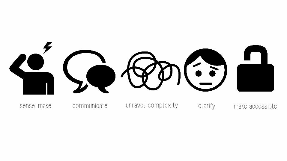
communicate sense-make make accessible unravel complexity clarify


i’m not a visual person

i don’t have a creative bone in my body

we’re wired for visualisation
blog.visual.ly/why-is-data-visualization-so-hot/


proliferation of tools drowning, not waving big data open data

visu
alis
atio
n

communicate data visually
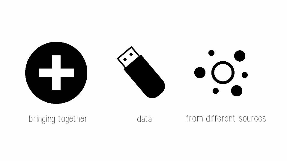
bringing together data from different sources
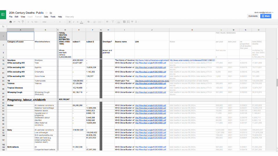

20th century death. Information is beautiful informationisbeautiful.net/visualizations/20th-century-death/

200 countries, 200 years, 4 minutes

info
grap
hics

communicate stories visually

infographics are stories that incorporate visualisations

video image interactive

the digital lives of american mums. nielsen nielsen.com/us/en/newswire/2012/digital-lives-of-american-moms.html
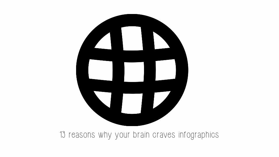
13 reasons why your brain craves infographics

16 useless infographics theguardian.com/news/datablog/gallery/2013/aug/01/16-useless-infographics

76%
of the extreme poor live in rural areas
16 useless infographics theguardian.com/news/datablog/gallery/2013/aug/01/16-useless-infographics
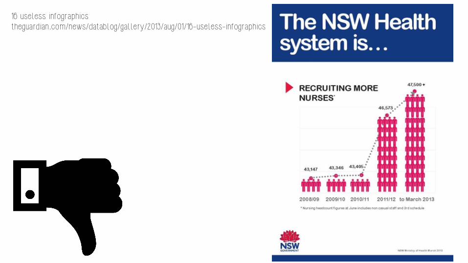
16 useless infographics theguardian.com/news/datablog/gallery/2013/aug/01/16-useless-infographics

info
rmat
ion
desi
gn

visu
al
thin
king

our thoughts are like this
or maybe like this and we try to make them like this

DOG

sense-make in pictures

communicate ideas in pictures


infographics sketchnotes mind maps diagrams visualisations

info
grap
hics

examples


tools

free & easy infographic tools piktochart
visua.ly infogr.am
visme canva
easel.ly
diy design you’ll need:
powerpoint / keynote maybe photoshop sources for icons
fonts

most useful thing you’ll learn about today:
the noun project

katedavis.info slides, resource
& tool lists, useful reading

process & play

good infographics start with
good data
good analysis
a good story
good information design
visual impact

1. organise your data find, sort, organise data
go to original sources
organise references

2. find your story what is it you want to say?
then pull out the data that tells your story

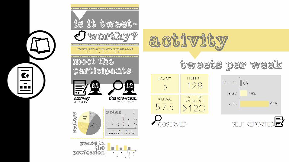
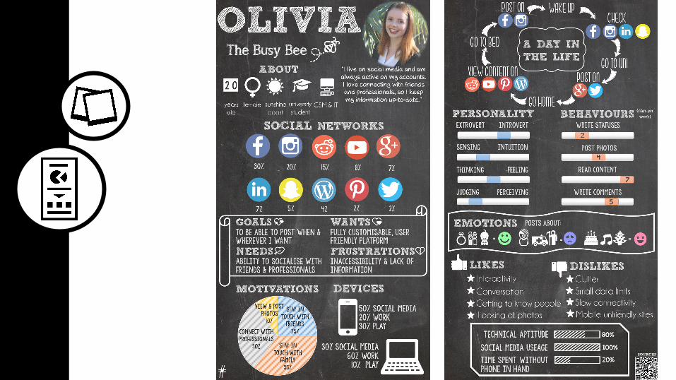
example story tell me a story about undergrad
IT students’ use of facebook
find 4 insights in the data

3. plan work out dimensions
create a (very rough) wireframe

activity how will you represent your
4 insights?
4. design how can you best
represent the data? graphs? numbers? images?

activity how will you represent your
4 insights?

4. design consider:
size, typography, colour, shapes, images, layout

activity design it!

activity share


thank you!
katedavis.info kate davis | @katiedavis | qut