visualisation of integrated patient-centric data as … · 2016-12-22 · recorded in paper notes...
TRANSCRIPT
Visualisation of Integrated Patient-Centric Dataas Pathways: Enhancing Electronic Medical
Records in Clinical Practice
Joao H Bettencourt-Silva1 Gurdeep S Mannu2 Beatriz de la Iglesia3
1 Clinical Informatics, Department of Medicine,University of Cambridge, CB2 0QQ, United Kingdom
[email protected] Nuffield Department of Population Health,
University of Oxford, OX3 7LF, United [email protected]
3 School of Computing Sciences,University of East Anglia, Norwich, NR4 7TJ, United Kingdom
Abstract. Routinely collected data in hospital Electronic Medical Records(EMR) is rich and abundant but often not linked or analysed for pur-poses other than direct patient care. We have created a methodology tointegrate patient-centric data from different EMR systems into clinicalpathways that represent the history of all patient interactions with thehospital during the course of a disease and beyond. In this paper, theliterature in the area of data visualisation in healthcare is reviewed anda method for visualising the journeys that patients take through care isdiscussed. Examples of the hidden knowledge that could be discoveredusing this approach are explored and the main application areas of visu-alisation tools are identified. This paper also highlights the challenges ofcollecting and analysing such data and making the visualisations exten-sively used in the medical domain.This paper starts by presenting the state-of-the-art in visualisation ofclinical and other health related data. Then, it describes an exampleclinical problem and discusses the visualisation tools and techniques cre-ated for the utilisation of these data by clinicians and researchers. Finally,we look at the open problems in this area of research and discuss futurechallenges.
Keywords: Visualisation, Big Data, Clinical Pathways, Data Mining, Knowl-edge Discovery, Data Quality, Decision Making, Medical Informatics
1 Introduction
Hospitals routinely collect data related to the interaction of patients with dif-ferent departments and medical specialties. Traditionally this information was

2 Bettencourt-Silva et al.
recorded in paper notes yet more recently there has been an increasing shifttowards the adoption of electronic medical records, as the statistics from theElectronic Medical Record Adoption Model (EMRAM) demonstrate (http://himss.eu/emram), yet in many cases, researchers may still need to collate infor-mation manually [1] and methodologies to facilitate this process are relatively un-explored [2]. Clinical data is typically complex and may pertain to diagnoses, ad-missions and discharges, prescriptions, treatments, biomarkers and blood tests,outcomes and other clinical findings. As a result, patients leave footprints onmany hospital systems, but such prints are not often connected to provide apathway indicative of their journey through care, nor are they presented at theaggregated level. In the context of important diseases such as cancer or stroke,the journey of patients from diagnosis to outcome would provide a unique per-spective that could aid clinicians to better understand disease processes andprovide valuable information on optimal treatment. Hence, an initial challengeis to gather data from multiple EMR systems and construct meaningful datastructures that can encompass all of the relevant information pertaining to agiven patient and a given disease over time. We have named such data struc-tures clinical pathways and have provided a methodology to build them [2,3].Note that some researchers refer to clinical pathways as the standardised andnormalised therapy pattern recommended for a particular disease [4]. Other re-searchers have focused on mining common pathways that show typical diseaseprogression based on hierarchical clustering and Markov chains [5]. Our path-ways relate to the journey followed by the patient through care and they mayalign with the recommended guidelines for a particular disease but may alsodeviate from it.
Visualisations of pathways, at the individual or aggregate level, when wellpresented and of high quality, could help clinicians to interact with such dataand give them a view of patients and disease progression that was otherwisehidden away in databases. This would enable them to utilise the power of thebig data in their environment, a very topical subject which currently holds muchpromise. For example, Shneiderman et al. [6] state that “while clinical trialsremain the work horse of clinical research there is now a shift toward the use ofexisting clinical data for discovery research, leading researchers to analyse largewarehouses of patient histories”. The visualisation of this big data is a criticaltopic and the specific subject of this paper.
In the context of medical data mining, clinical pathways, as we define them,require consistent pre-processing techniques, innovative data mining methodsand powerful and interactive visualisation techniques. They also present thechallenges of data privacy which has to always be maintained when dealing withpatients’ data. We discuss some of these challenges and present some solutionsin this paper, particularly focusing on the visualisation aspects.
This paper is organized as follows: to ensure a common understanding weprovide a short glossary in section 2; we examine work on visualisation of medicaldata that is relevant in the context of the problem we present in section 3;we then provide some background information about clinical pathways, their

Visualisation of Integrated Patient-Centric Data 3
construction, their visualisation and the challenges of such an approach in section4. We then discuss the processes of visualization of aggregated pathways insection 5 and their areas of application in section 6. Finally, we discuss problemsin the field and conclude with prospects for the future.
2 Glossary and Key Terms
Electronic Medical Record (EMR): can be characterised as “the complete set ofinformation that resides in electronic form and is related to the past, presentand future health status or health care provided to a subject of care” [7].
Medical Informatics: is the interdisciplinary study of the design, development,adoption and application of IT-based innovations in healthcare services delivery,management and planning [8]. Medical informatics is also called health care infor-matics, health informatics, nursing informatics, clinical informatics, or biomed-ical informatics.
Data Mining: is an analytic process designed to explore large amounts of data insearch of consistent patterns and/or systematic relationships between variables,and then to validate the findings by applying the detected patterns to new sub-sets of data [9].
Medical Patterns: these are frequently appearing sequences of treatments, di-agnoses, etc, that are associated with unusually positive or negative outcomes[10].
Visual Analytics: denotes the science of analytical reasoning facilitated by visualinteractive interfaces [11].
Data Quality: includes (physical) quality parameters such as: Accuracy, Com-pleteness, Update status, Relevance, Consistency, Reliability and Accessibility[12].
Clinical Pathway: in the context of this paper it is defined as an ordered setof patient-centric events and information relevant to a particular clinical con-dition [3]. It can be considered as a suitable data structure for routine dataextracted from EMRs that records the actual journey of the patient for a givencondition. Others have defined it as “a map of the process involved in managinga common clinical condition or situation” [13]. Hence in the second definitionthe clinical pathway may embody the ideal or recommended pathway and enu-merate regular medical behaviours that are expected to occur in patient carejourneys and may, therefore, serve as a checkpoint for the performance of theactual pathway.
Temporal abstraction: this refers to the task of creating interval-based concepts

4 Bettencourt-Silva et al.
or abstractions from time-stamped raw data. In the context of electronic clinicaldata, data summaries of time-oriented data can help for example when physi-cians are scanning a long patient record for meaningful trends [14].
Clinical guidelines: are systematically developed statements designed to helppractitioners and patients decide on appropriate healthcare for specific clini-cal conditions and/or circumstances [15]. They may articulate a desired clinicalpathway.
3 State-of-the-Art
One of the main characteristics of clinical data is its temporal nature. EMRsare composed of longitudinal event sequences which can sometimes be a con-current set of treatments for various conditions undertaken by a patient overtime. Another important characteristic is the complexity of the data, which caninclude many different data types, support many levels of granularity and isassociated with extensive domain knowledge that may be required for context.Additionally, the type of analysis we want to support may require techniquesthat take into account individual patients, or aggregate at the cohort level. Aswe are focusing on visualisation, we need to generate visual user interfaces thatcan represent such complexity efficiently and effectively without overwhelmingthe user. We need to provide query engines and mining methods that can dealwith the temporal and complex nature of the data with efficient interactions. Wealso need to ensure that the systems produced are evaluated effectively, which isdifficult when evaluation requires the involvement of busy medical practitioners.In this section, we review how researchers have tackled some of these problemsso far.
As a starting point, reviews and surveys on the subject of visualisation ofEMR data provide a good introduction to this topic. Turkay et al. [16] give arecent introduction to the visualisation of large biomedical heterogeneous datasets and point out the need for mechanisms to improve the interpretability andusability of interactive visual analyses. They also stress the challenge of inte-grating data from additional sources, such as the “microscopic” world (systemsbiology), the “omics” world or the “macroscopic” (public health informatics)world, as we move towards precision medicine.
Rind et al. [17] provide a survey comparing a number of state-of-the-artvisualisation research systems for EMR, and separately give examples of visu-alisations produced by commercial systems. They also give a summary of otherreviews of this subject. Roque et al. [18] also give comparisons of the key infor-mation visualisation systems for clinical data. Similarly, West et al. [19] providea systematic survey of works between 1996 and 2013. Their article is part ofa special issue dedicated to visual analytics to support the analysis of complexclinical data [20]. Lesselroth and Pieczkiewicz [21] discuss a number of strategiesfor visualising EMRs. More generically, methods for visualising time orienteddata have also been surveyed [22].

Visualisation of Integrated Patient-Centric Data 5
Time oriented clinical data has been considered to be important by a numberof researchers. Early work on visualisation of personal histories [23] produced asystem called Lifelines that used graphical time scales to produce a timelineof a single patient’s temporal events. Medical conditions could be displayed ashorizontal lines, while icons indicated discrete events, such as physician consul-tations. Line colour and thickness were used to illustrate relationships or thesignificance of events. Application of Lifelines to medical records was furtherexplored in [24]. Lifelines is the basis for many other systems that visualisetime oriented clinical data. The evolution of Lifelines produced a system calledLifelines2 [25] that displays multiple patient histories aligned on sentinel eventsto enable medical researchers to spot precursor, co-occurring, and after-effectevents.
Further work by the same team resulted in LifeFlow [26], which presents aprototype for the visualisation of event sequences involving millions of patients.LifeFlow was one of the first systems to provide an overview and enable theanswering of questions such as “what are the most common transfer patternsbetween services within the hospital”. Hence Lifeflow attempts to summariseall possible sequences, together with the temporal spacing of events within thesequences. It provides one visual abstraction that represents multiple timelinesso it addresses the problem of aggregation. In terms of the interaction capability,which has become a key issue in visualising clinical information, LifeFlow [26]provides zooming, sorting, filtering and enables further exploration of events byhoovering the cursor over parts of the visualisation. It also enables the user toselect non-temporal attributes as the basis for aggregation. This enables com-parison between different groups.
Shahar et al. [14] also worked with temporal clinical data. In particular theydiscuss the extraction of temporal abstractions from electronic data. Such tempo-ral abstractions combine a domain knowledge-base with interval-based concepts.A quoted example is the abstraction of Bone Marrow toxicity from raw individualhematological data. The domain knowledge in this case would establish the con-text such as following Bone Marrow Transplantation using a particular therapyprotocol. A simpler abstraction may be fever from multiple measures of raisedtemperature over time. Temporal abstractions can support intelligent decision-support systems or be used for the monitoring of clinical guidelines. However,Shahar et al. argue that temporal abstractions can only be truly useful in a clin-ical setting if they are accompanied by interactive visualisation and explorationcapabilities which can also take into account medical domain knowledge. Forthis, they developed a system called KNAVE-II, a development of a previoussystem [27]. The work does not provide, however, capabilities for aggregation ofpatients according to some dynamic criteria. In further work [28], the authorsprovided such capability under a system called VISITORS.
The issue of introducing context when evaluating patterns in a clinical settingis also important in other scenarios. For example, Duke et al. [29] present asystem for incorporating knowledge such as a patient’s relevant co-morbidities

6 Bettencourt-Silva et al.
and risk factors when evaluating drug-drug interactions to improve the specificityof alerts.
Analysis based on comparison of cohorts is also prevalent. Huang et al. [30]describe a system for exploratory data analysis through a visual interactive en-vironment to show disease-disease associations over time. The system simplifiesvisual complexity by aggregating records over time, clustering patients and filter-ing association between cohorts. The main visualisation methods used to studydisease trajectories over time are Sankey diagrams [31].
Wong et al. [32] proposed INVISQUE, an interactive visualisation to supportboth medical diagnosis and information analysis and discussed the key issuesthat need to be addressed when designing interactive visualisation systems forsuch purposes. CareVis [33] is another system, specifically designed to providevisualisation of medical treatment plans and patient data, including contextualinformation on treatment steps. It utilises a language called Asbru, designedto represent clinical guidelines and protocols in eXtensible Markup Language(XML). Challenges of the data include hierarchical decomposition, flexible exe-cution order, non-uniform element types and state characteristics of conditions.CareVis utilises multiple integrated views [34] to represent logical and temporalaspects of the treatment data. The views can be coupled with colour, brushingand navigation propagation, hence elements in one view can be linked to thesame elements in the other views allowing for interaction with the visualisation.
Another recent work using Asbru, following from CareVis, and specificallydesigned to analyse compliance with clinical guidelines is presented by Bodesin-sky et al. [35]. The authors use visualisation to integrate information aboutexecuted treatments with Computer Interpretable Guidelines. Combining viewsfrom observation, treatment and guidelines is becoming increasingly importantin the clinical setting.
Very recent work on visualisation of temporal queries, which enables clini-cians to extract cohorts of patients given temporal constraints is presented byKrause et al. [36]. Retrospective cohort extraction in the traditional way in-volves a long and complex process and requires involvement from doctors andSQL query specialists. SQL queries do not cater well for temporal constraintsand query engines may not optimise well such queries, making the process diffi-cult and inefficient. A system called COQUITO is proposed as a visual interfacefor building COhort QUeries with an ITerative Overview for specifying tempo-ral constraints on databases. The query mechanism is implemented by a visualquery user interface and provides real-time feedback about result sets. It alsoclaims to be backed by a Temporal Query Server optimized to support complextemporal queries on large databases. Another system for constructing visualtemporal queries is DecisionFlow [37]. DecisionFlow enables interactive querieson high-dimensional datasets (i.e. with thousands of event types).
Given the amount of complex data that needs to be visualised in the contextof medical systems, one common problem is the dense display that can resultand the difficulty this represents for the user. For example, Kamsu-Foguen etal. [38] discuss the need for intelligent monitoring systems that can help users

Visualisation of Integrated Patient-Centric Data 7
with the massive information influx. This may require the capturing of domainknowledge to form a physiological/process model as part of the expert interface.It may also require the use of machine learning to improve interaction of machinesand humans (e.g. reducing data input by inducing entries based on previousinteractions). The software proposed can integrate visual and analytical methodsto filter, display, label and highlight relevant medical information from patient-time oriented data. At the same time, it can learn from interactions betweenmedical staff and the system in a particular context, such as modification ofa prescription. It could then be used for instance to capture domain expertknowledge in respect to medical guideline compliance.
An issue that is also now receiving attention is the efficiency of visual ana-lytic algorithms as dataset grows. According to Stolper et al. [39] “in the contextof medical data, it is common to find datasets with tens of thousand of dis-tinct type of medical events, thousands or even millions of patients and multipleyears of medical data per patient.” There are typically delays in the workflowof analysts launching queries, inspecting results, refining queries and adjustingparameters and relaunching queries. In this scenario, Stolper et al. propose theuse of progressive visual analytics that enable analysts to explore meaningfulpartial results of an algorithm as they become available and interact with thealgorithm to prioritise subspaces of interest. The interface also enables the userto adjust parameters as algorithms are running, re-start the running but alsostore results obtained until that point so that the user can resume previous runif required.
There are parallels between information visualisation and data mining [40].Visual Data Mining can integrate the human in the data exploration processand can be seen as a hypothesis generation process based on visualisations [41].Data Mining analysis is also being applied to clinical data in conjunction withvisualisation techniques in order to extract knowledge, for example by identi-fying outliers and deviations in health care data [42]. For clinical pathways,pathway mining is also prominent and often associated with process mining us-ing clinical workflow logs to discover medical behaviour and patterns [4]. Pererand Wang [10] have integrated frequent pattern mining and visualisation so thatthe resulting algorithms can handle multiple-levels of detail, temporal context,concurrency and outcome analysis and visualise the resulting frequent event se-quences from EMR. This has resulted in a prototype system, Care Pathway Ex-plorer [43], which can correlate medical events such as diagnosis and treatmentswith patient outcome. The system has a user-centric visual interface which canrepresent the most frequent patterns mined as bubbles, with the size correspond-ing to number of times a particular event occurs. It also uses Flow Visualisationto see how the bubbles connect to each other.
Measuring the quality of the data to be used in an important issue, as rou-tinely collected data can be of variable quality. It would be very useful for anysystem that works with EMR to provide some quality measurements that can beused for the purposes of including or excluding records for further queries andclinical studies. For example, Tate et al. [44] elude to work in this area as part of

8 Bettencourt-Silva et al.
their attempt to construct a system that enables querying of large primary caredatabases to select GP practices for clinical trials based on suitability of patientbase and measures of data quality.
Another important topic is the visualisation of biological and “omics” data[16]. In systems biology, Jeanquartier et al. [45] carried out a large survey ofdatabases that enable the visual analysis of protein networks. Systems such as theNAViGaTOR 3 extend the basic concept of network visualisation to visual datamining and allow the creation of integrated networks by combining metabolicpathways, protein-protein interactions, and drug-target data [41]. Other tech-niques, such as multilevel glyphs, have been proposed as a multi-dimensionalway to visualise and analyse large biomedical datasets [46] and there is still ahigh demand for specialized and highly integrative visual analytic approachesin the biomedical domain [40], particularly as we move towards personalisedmedicine.
The evaluation of information visualisation tools is one of the open challengesin this area. Often carried out by controlled experiments and the production ofusability reports, this are however described by Shneiderman and Plaisant [47]as helpful but falling short of expectations. They describe a new paradigm forevaluation in the form of Multi-dimentional In-depth Long-term Case studies(MILCs) that may begin with careful steps to gain entry, permission and partic-ipation of subjects and be followed by intense discussions which provide key datafor evaluations. As MILCs provide multiple methods, given multiple perspectiveson tool usage, they are presented as providing a compelling case for validity andgenerality. However, they would require substantial investment in longitudinalethnographic studies of large groups which may not be forthcoming.
In the context of evaluation, Pickering et al. [48] recently proposed a step-wedge cluster randomised trial. This was to test the impact of their system,AWARE (Ambient Warning and Response Evaluation), on information manage-ment and workflow on a live clinical intensive care unit setting. Such trials arenot commonly conducted, but can give real measures of efficiency of data utili-sation and may be a good method of evaluation. They outcome was connectedwith time spent in data gathering with and without the system and measureswere gathered by direct observation and survey.
4 Visualisation of Patient-Centric Pathways
The development of patient-centric pathways and related visualisation tools wasfirst conceptualised as a way to plot and study biomarker trends over time forindividual patients with a specific condition. This was carried out in a casestudy on prostate cancer, where the Prostate Specific Antigen (PSA) was thebiomarker test used. The PSA is typically used to measure activity of the cells inthe prostate, both benign or malignant, and guidelines for the management andscreening or prostate cancer suggest that the PSA test can be read at certaintime points to help understand disease progression. As a result, a typical patient

Visualisation of Integrated Patient-Centric Data 9
will have several PSA readings during their journey through care and in theirpathways.
4.1 Pathways
A pathway is comprised of activities each containing the patient identifier, theevent code from a pre-defined dictionary of codes, the time when the activityoccurred (in days, zeroed at diagnosis date) and the value pertaining to thatspecific activity. For example, activity A4 at time 105 (days after diagnosis)describing the surgical removal of the prostate (event code S) for patient id8 would be described as A4 = (8, 105, S,“M61.1”. In this example, the valuepertaining to surgical activity code S is the procedure code for the type ofsurgical operation. We used the OPCS 4.5 Classification of Interventions andProcedures coding and, in this case, code M61.1 refers to a total excision ofprostate and its capsule. The activity in this example would, in turn, be part ofa pathway, illustrated in Table 1. The pathway data model is defined in moredetail in [3].
4.2 Development of a Graph Plotting System
A first support system was developed to plot the biomarker trends based on thepathways data model [3]. This allowed the computation of charts showing thecomplete PSA trend for each patient in the dataset. The resulting charts werethen divided by treatment type and this provided interesting results and posedadditional clinical questions. Analysis of the charts, working together with theclinical team, was critical to determine further system requirements and futuredevelopments, including a novel graphical representation of pathways data, de-scribed later. The data model can be revisited and data elements can be addedor removed, making this approach reproducible in other clinical domains andextensible to different levels of granularity.
The inspection of PSA trend plots made clear that these should contain ad-ditional information in order to explain, for example, why the biomarker valuesdropped from abnormal to normal levels at particular points in time. For exam-ple, the most significant drops in PSA should be associated with a particularradical treatment. This led to the development of a more sophisticated visuali-sation system, capable of interpreting the pathways and transforming them intomeaningful yet concise graphical representations. The purpose of such visual-izations is to summarise complex clinical information over large periods of timeinto a single graph.
A graph generating system was developed together with the pathways engine,and comprised an architecture similar to that of the Model-view-controller [49](MVC). In this implementation, the architecture, specific for building graphicalrepresentations of pathways, encompasses the following elements with specificpurposes:

10 Bettencourt-Silva et al.
Table 1. Annotated example of a pathway for patient id 8 with 7 activities and 4distinct data elements (code P - PSA test, D - Diagnosis, G - Histological GleasonGrade and S - Surgery).
Pathway Activity Time Code Value Description
P = 〈A1 = (8,−51, P, 13.6),A2 = (8, 0, D, 2),A3 = (8, 1, G,“4+3”),A4 = (8, 105, S,“M61.1”),A5 = (8, 106, G,“3+4”),A6 = (8, 183, P, 0.05),A7 = (8, 456, P, 0.05)〉
A1 -51 P 13.6 This patient’s first ac-tivity was a PSA test(values in ng/ml). Inthis case the reading wasabnormal (>4 ng/ml) 51days before diagnosis.
A2 0 D 2 Diagnosis event, valueshows tumour staging.In this case stage 2 in-dicates the tumour isconfined to the prostatecapsule. At this point,a biopsy was undertaken(poorly recorded in ourEMR systems at thetime).
A3 1 G 4+3 The result of the histo-logical assessment of theGleason grade, that is,the degree of cell differ-entiation, in this case aGleason sum of 7.
A4 105 S M61.1 The patient then under-went surgery, with anOPCS procedure code ofM61.1 indicating totalexcision of prostate andits capsule.
A5 106 G 3+4 The revised Gleasongrade with a more com-plete sample taken fromthe surgical operationwas still a Gleason sumof 7 but now predomi-nantly showing more oftype 3 than type 4.
A6 183 P 0.05 Post-treatment PSAtest was carried outshowing a value lessthan 0.1, denotingeffective treatment inreducing the amount ofPSA produced in thispatient.
A7 456 P 0.05 Follow-up PSA testreaffirming that thetreatment was suc-cessful around a yearafter the treatment wasperformed.

Visualisation of Integrated Patient-Centric Data 11
Fig. 1. Architecture of the graph generating system.
– the Data Model, responsible for maintaining the definitions and rules forthe interpretation of the pathways data using an extended dictionary thatcontains information on how events are drawn;
– the Plot Engine, a controller that communicates user or system requestsand is responsible for the interaction between the model, the view and thesystem;
– the Graphical User Interface (containing the view), that receives instructionsbased on the model and generates a graphical representation of a pathway.This dynamic interface can also allow users to interact with the graphs bycommunicating information back to the engine.
Figure 1 depicts the architecture of the system. Information available froma Data Store is transformed according to definitions set out by the Data Modeland it is then fed to the Plot Engine. In turn, the engine utilises rules on howto draw the graph that is ultimately sent to the Graphical User Interface.
4.3 Graphical Representation
Figure 2 shows the layout of a graph, or pathway plot, and the areas of the graphwhere information is displayed. The y-axis represents the biomarker values (in

12 Bettencourt-Silva et al.
this case, PSA) and the x-axis represents time, in days, zeroed at diagnosis date.The biomarker readings are plotted in the center and events (such as treatmentsor death) are marked with a vertical line (Line).
Treatments and other events can be colour-coded and, above the plot, thecorresponding pathway code (e.g. S for Surgery) is shown in the Line headingsarea. The footer area displays additional information pertaining to events (suchas Gleason grades, i.e. the level of cell differentiation seen in the biopsy, orpatient age at diagnosis) and the right column area on the right of the plotdisplays additional information on the patient that is not time-dependent, suchas deprivation score, additional diagnoses or alerts.
Fig. 2. The schematic layout of a pathway plot.
The graph generating system includes additional interaction capabilities andanalysis tools. Rather than relying on static graphical representations of thepathways, the MVC architecture embedded within the system, produces real-time plots of the pathways, as they are read from the database. Dynamic inter-actions were also introduced enabling users to zoom in, re-scale and navigate thepathway plot. This is particularly important as the scales of the plots may rendersome drawn objects too close to each other. A mechanism for graphical conflict

Visualisation of Integrated Patient-Centric Data 13
resolution (i.e. avoiding overlapping elements) was also introduced. Examples ofpathway plots produced by this system are given in section 6.
5 Visualization of Aggregated Pathways
We now explore how to aggregate pathways in a visualisation. The pathways datamodel enables the production of succinct sequences of activity codes. Truncat-ing the sequence strings (i.e. collapsing sequentially repeating elements into one)enables the aggregation of pathways with similar sequential activities. We devel-oped a web-based software, called ExploraTree, to produce and display an inter-active tree of the full cohort of prostate cancer patients based on the availabledata elements. The technologies used include HTML, CSS, JSON, JavaScriptand the InfoVis toolkit. The pathways engine was used to produce the correctdata format for a tree representation using JSON and the JavaScript InfoVistoolkit.
In order to accurately aggregate patients with similar sequences of activities,new data elements were introduced in the data dictionary. In the core datadictionary, a patient’s death was encoded by only one data element (code Z). Inthe new encoding, patients who died of prostate cancer were kept with code Zwhile those who died of other causes were identified with code Y and those whosurvived, with code X. This ensures that all patients have a terminal elementindicating whether they are alive at the end of their follow-up period. Because inthis cohort not all patients are followed-up the same amount of time, all terminalelements (X,Y,Z) were given additional child nodes that represent the amountof time the patients were followed-up in years (1 to 5 and ’+’ for over 5 years).The aggregated pathways tree is illustrated in Figure 3.
Figure 3 shows the cohort tree and highlighted sequence 〈P,D,H, P,X〉,that is, patients who started their pathway with one or more PSA tests (code P,n=1596), followed by a diagnosis of cancer (code D, n=1502), hormone therapy asfirst treatment (code H, n=747), other PSA test(s) (n=557) and finally were lastseen alive in this cohort (code X). 90% of patients with the highlighted pathway(n=266) were followed-up 3 or more years and one patient was followed-up lessthan one year.
This aggregation also allows comparing patients that followed similar path-ways but who died of prostate cancer (〈P,D,H, P, Z〉). In the case of patientswith a sequence prefix 〈P,D,H, P 〉, 9% (n=48) died of prostate cancer (code Z),13% died of other causes (code Y), 48% survived, and the remaining patientscontinued with other activities (H - Hormone Therapy, W - Active Surveillance,R - Radiotherapy, S - Surgery).
Visualising the cohort in this manner is important as it enables the selectionof subsets of data for specific clinical studies as well as an inspection of thesequential routes that patients take through care. The sequence highlighted inFigure 3 corresponds to the most common route (with most support on eachnode sequentially).

14 Bettencourt-Silva et al.
Fig. 3. CaP VIS ExploraTree software displaying a selected pathway (patients with thesame sequential activities). The selected pathway nodes are highlighted and terminalnodes are marked as red for patients that died and green for patients that were lastseen alive in this cohort.
It is possible to add more meaning to the visualisation and the pathways byintroducing additional data elements and remodeling the data dictionary. Forexample, instead of using a single code for diagnosis it is possible to have abreakdown of the tumour staging or Gleason grade at diagnosis so as to groupsimilar sequences with this information instead. However, due to the small sizeof this cohort, increasing granularity in the pathways dictionary would result infewer patients in each node. For this reason no additional changes were made tothe pathways dictionary used for the ExploraTree, but our approach is flexibleenough to allow such modifications.
6 Application Areas
This section lists four broad areas where visualisation tools have been appliedand are expected to be most useful. Pathway plots illustrating relevant examplesare given for each of the areas.
6.1 Decision Support and EMR Enhancement
Recommendations for further research in clinical decision support and expertsystems [50] suggest that software that integrates complex data and generatesgraphical representations is needed to support the analysis and understanding

Visualisation of Integrated Patient-Centric Data 15
of the data. Visualisations could also be used to enhance EMR systems as thesedo not typically provide visually meaningful summaries of patient-centric data.
The pathways software was developed so that additional clinical information,such as histopathology text reports, descriptive statistics, and graphical repre-sentation could all be available in one place. This created an environment thatenables evidence based medicine, supports decision making. Clinicians are ableto retrieve similar cases by searching the desired pathway sequences and visuallyinspect them, thereby gaining insights to support their decisions. In addition,other information derived from domain knowledge such as PSA kinetics (howfast PSA readings are doubling in time and rate of increase, both predictive ofoutcome) can be shown in the developed system before or after diagnosis andtreatment. The flexible pathways data model has also enabled other aspects tobe incorporated. For example, rules can be applied to measure adherence toguidelines.
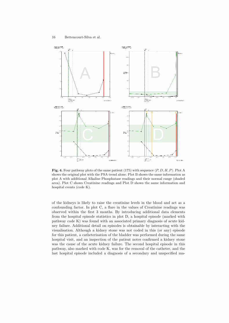
Figure 4 shows four pathway plots for the same patient, a 69 year old di-agnosed with tumour stage 3 prostate cancer and a Gleason sum of 9. Plot Ashows the original plot where the PSA is seen to have dropped after the patientunderwent hormone therapy (code H). The thick red line at the end of the path-way denotes when the patient died. When producing this pathway’s plots, thedictionary was extended so that the treatments retrieved from the local cancerregistry (and additional source of validation data) appear with a suffix “1” inthe vertical lines’ headings (code H1). In this case, regarding the date when thepatient first commenced hormone therapy, a time discrepancy of 51 days wasseen between the two data sources, where the hospital recorded the later date.Hence this serves to inform on data quality issues (further discussed in the nextsection). The discrepancy in dates in this case did not introduce uncertainty asthe effect of the treatment is seen in the subsequent PSA readings.
The pathway plot in Figure 4 then shows a PSA relapse in the last tworeadings. Shortly after the last PSA reading, the patient died of a pulmonaryembolism (ICD I26) and prostate cancer (ICD C61) as a secondary conditionleading to death. Shortly before death the patient was diagnosed with a sec-ondary and unspecified malignant neoplasm of inguinal and lower limb nodes(ICD C77.4). This was revealed by the additional data collected on hospitalepisodes and is presented in the visualisation.
Figure 4 Plot B shows an additional element of the pathway, a blood test,Alkaline Phosphatase (ALP) and its normal range in the shaded area. Whena patient’s advanced cancer metastasises to the bones, ALP can be increaseddue to active bone formation. Indeed studies have shown that prostate cancerpatients with a serum ALP reading of more than twice the normal upper limithad a significantly lower survival rate than their respective counterparts [51].This is observed in this pathway, although, an increased ALP could be due toother reasons such as an obstructed bile duct or liver disease.
Lastly, plots C and D supplement the pathway with another blood test, Cre-atinine. Creatinine has been reportedly associated with more advanced diseaseand decreased survival [52]. However, any condition that impairs the function
16 Bettencourt-Silva et al.
Fig. 4. Four pathway plots of the same patient (175) with sequence 〈P,D,H, P 〉. Plot Ashows the original plot with the PSA trend alone. Plot B shows the same information asplot A with additional Alkaline Phosphatase readings and their normal range (shadedarea). Plot C shows Creatinine readings and Plot D shows the same information andhospital events (code K).
of the kidneys is likely to raise the creatinine levels in the blood and act as aconfounding factor. In plot C, a flare in the values of Creatinine readings wasobserved within the first 3 months. By introducing additional data elementsfrom the hospital episode statistics in plot D, a hospital episode (marked withpathway code K) was found with an associated primary diagnosis of acute kid-ney failure. Additional detail on episodes is obtainable by interacting with thevisualisation. Although a kidney stone was not coded in this (or any) episodefor this patient, a catheterisation of the bladder was performed during the samehospital visit, and an inspection of the patient notes confirmed a kidney stonewas the cause of the acute kidney failure. The second hospital episode in thispathway, also marked with code K, was for the removal of the catheter, and thelast hospital episode included a diagnosis of a secondary and unspecified ma-

Visualisation of Integrated Patient-Centric Data 17
lignant neoplasm of inguinal and lower limb nodes and a pulmonary embolism,caused by the first. This level of information that can be added to the pathwaywould also allow, for example in other cases, to evaluate renal impairment andprostate cancer. Indeed, in this respect, it has been reported that renal impair-ment in men undergoing prostatectomy represents substantial and unrecognisedmorbidity [53].
The introduction of additional detail helped to explain the Creatinine flarefor this patient and provided interesting insights that would otherwise not beeasily explored. The pathway plots provided sufficient information for the in-terpretation of the pathway yet highlighted potential issues with the quality ofthe data. Indeed discrepancies in treatment dates across data sources may in-troduce additional challenges. As such, it is important to be able to differentiatebetween pathways that have sufficient information and provide an accurate rep-resentation of the patient’s history and those that do not. The evaluation of thecompleteness and utility of the generated pathways for investigating biomarkertrends is explored in more detail in the next section.
6.2 Data Quality
Methods for the evaluation of data quality dimensions are lacking [54] and vi-sualisation tools can play an important role in quality assurance. Since the de-velopment of the pathways framework, one of the first and foremost concernspertained to the quality of the data being visualised. For the first time sinceEMR systems were introduced in our hospital, it was possible to visualise inte-grated data and observe inconsistencies in the ways in which information hadbeen recorded over time. By expanding the data dictionary to include additionalinformation from an external data source, the regional Cancer Registry, it waspossible to identify incongruent data across sources.
Figure 5 shows a pathway plot of a patient with Gleason grade 7 prostatecancer who underwent a radical prostatectomy. Information from the CancerRegistry was obtained to validate treatment data and this is included with codeS1. In this case, the dates and details of the procedure are in agreement andthis patient could easily pass for having a complete record. When plotting thepathway, however, a visual inspection highlighted a significant drop in the PSAvalues for which there is no clear justification based on the information available.It is unlikely that the PSA values dropped below the 4 ng/ml normal thresholdwithout an intervention. This means that either the treatment date is incorrectin both sources or there is missing information as the patient is likely to havereceived treatment from another provider while the blood tests continued to beperformed by the same laboratory. In this case the plausibility and concordancedata quality dimensions were assessed with this visualisation.
Other data quality examples include mismatch of treatment dates (as seenearlier in Figure 4) and missing or implausible information. Based on the path-ways framework, rules can be devised to inspect individual pathways and de-termine how complete they might be. For example, in previous work [3] rulespertaining to the availability, positioning and substantiation of the drops in PSA

18 Bettencourt-Silva et al.
Fig. 5. A Pathway plot for a patient diagnosed with Gleason grade 7 prostate cancerwho underwent a radical prostatectomy (code S).
were proposed to determine which pathways would be eligible for further clinicalresearch.
6.3 Cohort Selection, Analysis and Research
Two of the preliminary interests in developing graphical representations of path-ways were to compare the shapes of the biomarker curves and also to be ableto aggregate patients with similar features. Having pathways expressed as se-quences of activity codes has helped to develop the ExploraTree tool, seen inFigure 3. Depending on how the data points and outcomes are modelled, thetrees produced will have varying degrees of granularity and clinical interest. Inthe example shown earlier, ExploraTree is aggregating patients with similar datapoints appearing sequentially in time. However, codes for PSA tests (P) couldbe further broken down into abnormal (say, A) and normal (N) PSA values andthis would create more clinically meaningful groups. The ExploraTree softwarecan then help to select relevant cohorts for research, to determine if there are

Visualisation of Integrated Patient-Centric Data 19
enough members in a particular group of interest and to facilitate recruitmentfor prospective studies.
Pathway plots allow more detailed and complex information to be presentedin a single graphical representation. This enables researchers to observe severaldata points together and to study new outcomes. For example, Figure 6 plotsHaemoglobin in addition to the PSA and shows normal perioperative bleedingwhen the patient underwent surgery. This information is not usually examinedtogether yet it enables the assessment of the effect that surgical procedures haveon patients and also, the length of time it takes for them to recover after surgery.The latter is an interesting current research question that arised from the visualinspection of the pathways. It is also possible to determine and study differentoutcomes such as hormone escaped, development of metastases or biochemicalrecurrence after treatment. Research on services and adherence to guidelinesis also possible using the pathway framework [3]. Integration of clinical EMRdata with “omics” data is also a topic that should deserve attention in futuredevelopments. Pathways with this additional information can be more valuablefor precision medicine and their visualisations should also help take knowledgeof clinical practice out of the hospitals and bring it to biologists, geneticists andother scientists.
6.4 Knowledge Discovery Support
Visualisation tools are often overlooked when working on knowledge discoveryproblems in healthcare. One of the most common barriers in machine learning inhealthcare is that the models and results produced are not intelligible and workin this area is becoming more topical [55]. Decision trees continue to be the goldstandard of intelligible models and more work is needed to create visualisationtools that describe complex models.
Data and process mining techniques are often suggested for the analysis ofworkflows and pathways, however, most of these techniques have been foundunsuitable when applied to heterogeneous routine clinical data. The evaluationof the quality of event logs in process mining relies on trustworthiness (recordedevents actually happened), completeness and well defined semantics [56]. Thesecan be achieved by selecting pathways with required data points using the path-ways framework. The visualisation system allows for the close inspection andcontextualisation of pathways, illustrating particular paths with similar features.It has been reported that a combination of visual analytics with automated pro-cess mining techniques would make possible the extraction of more novel insightsfrom event data [56] and further work in this area is needed.
The pathways framework through its graphical representations could also bean interesting way of representing a model, whereby an ideal pathway wouldbe presented and then compared to actual pathways and deviation could bemeasured, although further work in this area is required. Additional analysis ofthe shape of the curves represented (for example, clustering of biomarker trends)is also possible using this framework and some work has already been done inthis area using fusion methods [57].

20 Bettencourt-Silva et al.
Fig. 6. A Pathway plot showing the effect of a prostatectomy in the Haemoglobin andPSA readings. The green shaded area depicts the normal range for Haemoglobin.
7 Open Problems
Some of the main problems relating to the improvement of health and healthcarewith interactive visualisation methods are reviewed by Shneiderman et al. [6],Aigner et al. [58], Caban and Gotz [20], and West et al. [19]. Some of thesechallenges arise because healthcare must become more “predictive, preemptive,personalised and participative” [6]. Although the efforts described in section3 and our own efforts are directed to some of this challenges, most systemsdescribed to not provide completely satisfactory responses. The open problemssummarised from the papers above and from the work presented here include:
– An enduring problem in visualising clinical data is the scale and complexityof the data. Data is not only vast in terms of the number of records but it alsoincludes several different data types (e.g. numeric, categorical, text, images),semantic structures inherent of time data such as cycles and re-occurrencesand intertwining conditions and treatment processes. Visual techniques mustanalyse data in the context of this complexity and summarise it in order to

Visualisation of Integrated Patient-Centric Data 21
assist busy clinicians with getting timely information in the right format.This requires tools that enable the user to see the overall perspective withpowerful yet simple visualisations and then look for anomalies and drill fordetails of predictable risks early.
– The systems must be capable of scaling up to cohort analysis. Visualisingone patient’s trajectory can enable monitoring of treatment process for thatparticular patient. However, it is often necessary to scale the analysis to acohort of patients as clinicians can then compare responses of diverse patientsand assess effectiveness of therapy in the larger scale.
– Context and domain knowledge is very important in clinical decision makingso systems must be able to efficiently represent domain knowledge and reasonwith it to make temporal abstractions, to look at conditions in the contextof many clinical parameters such as co-morbidities, medication and history.It may also be desirable to compare cohorts across clinicians, time periodsand geographical locations.
– It is increasingly necessary to provide systems that can facilitate multi-disciplinary decision making. Such teams may involve nurses, social workers,physicians and patients. Hence the presentation of knowledge, flexible query-ing and analysis should accommodate the demands of multiple users withdifferent perspectives and needs. Visualisation tools should play an impor-tant role in delivering and interacting with patient data.
– It is often necessary to understand similarity in the context of heterogeneousdata but this is not a well developed area of research. Data mining tasks suchas classification, clustering, association rules and deviation detection needto be developed to work with heterogeneous temporal data and to produceintelligible results and meaningful visualisations.
– Data that is routinely collected is plagued by missing values, erroneous valuesand inaccuracies. Systems that analyse such data must be well equipped todeal with uncertainty. However, uncertainty is a well known open problemin computing. Issues of data quality take their own dimension in a timeoriented scenario and can require specific treatment [59]. It is necessary topre-process the data to uncover data quality issues and exclude dubious datafrom further analysis. It is also important to quantify data quality dimensionsby producing standard measures that can be presented (visually) alongsidethe data. In addition, presentation of uncertainty in a meaningful way, forexample in the context of risk, is still an open research area.
– Currently, according to Kopanitsa et al. [60], there is a gap in transformingknowledge from domain model to interface model. Hence there is a need toturn hard-coded user interfaces into generic methods by a process of stan-dardisation. Standardisation exists for data storage and exchange and theyprovide a good basis for further efforts. This may also make data more acces-sible to patients, which may be an important consideration for personalisedand participative medicine.
– The design of better interfaces was highlighted as a challenge early on [61]and continues to be an open issue. In particular application of cognitiveengineering methods [62] may be beneficial for informing design and for

22 Bettencourt-Silva et al.
uncovering information needs in clinical systems. There is a requirement foranalysing and understanding the process of visual interaction, for exampleby using logs. Interaction with the visualisation tools is key and must caterfor different types of users with different priorities as already discussed.
8 Conclusion and Future Outlook
A picture can arguably be worth a thousand words and in the case of the path-ways, a pathway plot is worth, on average, 188 activities using our prostatecancer cohort. For immediate decision-making by clinicians at the point of care,information should be brief and easily interpreted [63] and visualisation tools, ifwell designed, have a great potential to become part of clinical practice by sum-marising complex activities in one graphical representation. However, optimalvisualisation of clinical data is complex and several open problems remain.
In this paper, clinical pathways were used to demonstrate the potential ofvisualising routinely collected data using a case study on prostate cancer. Theunderlying data model enables the summarisation and extension of pathways aswell as the aggregation of similar sequences. It is also possible to capture and plotpathways with concurrent elements and to develop algorithms to further explorethe data and investigate quality issues. Furthermore, the pathways frameworkhas facilitated interpretation, communication and debate between experts. Morework is now needed to assess similar tools in other settings and domains. In thispaper, four key areas that hold promise in the future of visualisation in healthcarewere identified: decision support and EMR enhancement; data quality; cohortselection, analysis and research; and knowledge discovery. Further work in eachof these areas will bring clinical practice closer to the best available evidence andimprove the quality and utility of the big data that is available in EMR systems.
References
1. Mannu, G.S., Kyu, M.M., Bettencourt-Silva, J.H., Loke, Y.K., Clark, A.B., Met-calf, A.K., Potter, J.F., Myint, P.K.: Age but not abcd2 score predicts any level ofcarotid stenosis in either symptomatic or asymptomatic side in transient ischaemicattack. International Journal of Clinical Practice 69(9) (2015) 948–956
2. Bettencourt-Silva, J., De La Iglesia, B., Donell, S., Rayward-Smith, V.: On creatinga patient-centric database from multiple hospital information systems. Methodsof Information in Medicine 51(3) (2012) 210–220
3. Bettencourt-Silva, J.H., Clark, J., Cooper, C.S., Mills, R., Rayward-Smith, V.J.,de la Iglesia, B.: Building data-driven pathways from routinely collected hospitaldata: A case study on prostate cancer. JMIR Medical Informatics 3(3) (Jul-Sep2015) e26
4. Huang, Z., Lu, X., Duan, H.: On mining clinical pathway patterns from medicalbehaviors. Artificial Intelligence in Medicine 56(1) (2012) 35–50
5. Zhang, Y., Padman, R., Patel, N.: Paving the cowpath: Learning and visualiz-ing clinical pathways from electronic health record data. Journal of BiomedicalInformatics 58 (2015) 186 – 197

Visualisation of Integrated Patient-Centric Data 23
6. Shneiderman, B., Plaisant, C., Hesse, B.W.: Improving healthcare with interactivevisualization. Computer 46(5) (2013) 58–66
7. Potamias, G.: State of the art on systems for data analysis, information retrievaland decision support. INFOBIOMED project (Deliverable D1) (2006)
8. HiMSS: Healthcare information and management systems society(HiMSS). http://www.himss.org/clinical-informatics/medical-informatics Accessed: 2015-12-30.
9. Dell Ltd: Data mining techniques. http://documents.software.dell.com/
statistics/textbook/data-mining-techniques Accessed: 2015-12-30.
10. Perer, A., Wang, F.: Frequence: Interactive mining and visualization of temporalfrequent event sequences. In: Proceedings of the 19th International Conference onIntelligent User Interfaces. IUI ’14, New York, NY, USA, ACM (2014) 153–162
11. Thomas, J.J., Cook, K.A.: Illuminating the Path: The Research and DevelopmentAgenda for Visual Analytics. National Visualization and Analytics Ctr (2005)
12. Batini, C., Scannapieco, M.: Data Quality: Concepts, Methodologies and Tech-niques. Springer, Berlin, Heidelberg, New York (2006)
13. Hunter, B., Segrott, J.: Re-mapping client journeys and professional identities:A review of the literature on clinical pathways. International Journal of NursingStudies 45(4) (2008) 608 – 625
14. Shahar, Y., Goren-Bar, D., Boaz, D., Tahan, G.: Distributed, intelligent, interactivevisualization and exploration of time-oriented clinical data and their abstractions.Artif. Intell. Med. 38(2) (October 2006) 115–135
15. Field, M.J., Kathleen N. Lohr, E.: Guidelines for Clinical Practice. Institute ofMedicine, National Academy Press, Washington, D.C. (1992) An optional note.
16. Turkay, C., Jeanquartier, F., Holzinger, A., Hauser, H.: On Computationally-Enhanced Visual Analysis of Heterogeneous Data and Its Application in Biomedi-cal Informatics. In: Interactive Knowledge Discovery and Data Mining in Biomed-ical Informatics: State-of-the-Art and Future Challenges. Springer Berlin Heidel-berg, Berlin, Heidelberg (2014) 117–140
17. Rind, A., Wang, T.D., Aigner, W., Miksch, S., Wongsuphasawat, K., Plaisant,C., Shneiderman, B.: Interactive information visualization to explore and queryelectronic health records. Foundations and Trends in Human-Computer Interaction5(3) (2011) 207–298
18. Roque, F.S., Slaughter, L., Tkatsenko, A.: A comparison of several key informationvisualization systems for secondary use of electronic health record content. In:Proceedings of the NAACL HLT 2010 Second Louhi Workshop on Text and DataMining of Health Documents. Louhi ’10, Stroudsburg, PA, USA, Association forComputational Linguistics (2010) 76–83
19. West, V.L., Borland, D., Hammond, W.E.: Innovative information visualizationof electronic health record data: a systematic review. Journal of the AmericanMedical Informatics Association (2014)
20. Caban, J.J., Gotz, D.: Visual analytics in healthcare – opportunities and researchchallenges. Journal of the American Medical Informatics Association 22(2) (2015)260–262
21. Lesselroth, B.J., Pieczkiewicz, D.S.: Data visualization strategies for the electronichealth record. In Berhardt, L.V., ed.: Advances in Medicine and Biology. Vol-ume 16. Nova Science Publisher Inc. (2012) 107–140
22. Aigner, W., Miksch, S., Schuman, H., Tominski, C.: Visualization of Time-OrientedData. 1st edn. Human-Computer Interaction. Springer Verlag (2011)

24 Bettencourt-Silva et al.
23. Plaisant, C., Milash, B., Rose, A., Widoff, S., Shneiderman, B.: Lifelines: Visu-alizing personal histories. In: Proceedings of the SIGCHI Conference on HumanFactors in Computing Systems. CHI ’96, New York, NY, USA, ACM (1996) 221–227
24. Plaisant, C., Mushlin, R., Snyder, A., Li, J., Heller, D., Shneiderman, B.: Life-lines: using visualization to enhance navigation and analysis of patient records.Proceedings of the AMIA Symposium (1998) 76–80
25. Wang, T.D., Plaisant, C., Quinn, A.J., Stanchak, R., Murphy, S., Shneiderman,B.: Aligning temporal data by sentinel events: Discovering patterns in electronichealth records. In: Proceedings of the SIGCHI Conference on Human Factors inComputing Systems. CHI ’08, New York, NY, USA, ACM (2008) 457–466
26. Wongsuphasawat, K., Guerra Gomez, J.A., Plaisant, C., Wang, T.D., Taieb-Maimon, M., Shneiderman, B.: Lifeflow: Visualizing an overview of event se-quences. In: Proceedings of the SIGCHI Conference on Human Factors in Com-puting Systems. CHI ’11, New York, NY, USA, ACM (2011) 1747–1756
27. Shahar, Y., Cheng, C.: Intelligent visualization and exploration of time-orientedclinical data. In: Systems Sciences, 1999. HICSS-32. Proceedings of the 32nd An-nual Hawaii International Conference on. Volume Track4. (Jan 1999) 12 pp.–
28. Klimov, D., Shahar, Y., Taieb-Maimon, M.: Intelligent visualization and explo-ration of time-oriented data of multiple patients. Artificial Intelligence in Medicine49(1) (2010) 11 – 31
29. Duke, J.D., Bolchini, D.: A successful model and visual design for creating context-aware drug-drug interaction alerts. AMIA Annu Symp Proc 2011 (2011) 339–348
30. Huang, C.W., Lu, R., Iqbal, U., Lin, S.H., Nguyen, P.A.A., Yang, H.C., Wang,C.F., Li, J., Ma, K.L., Li, Y.C.J., Jian, W.S.: A richly interactive exploratory dataanalysis and visualization tool using electronic medical records. BMC MedicalInformatics and Decision Making 15(1) (2015) 1–14
31. Riehmann, P., Hanfler, M., Froehlich, B.: Interactive sankey diagrams. In: In-formation Visualization, 2005. INFOVIS 2005. IEEE Symposium on. (Oct 2005)233–240
32. Wong, B.L.W., Xu, K., Holzinger, A.: Interactive Visualization for InformationAnalysis in Medical Diagnosis. In: Information Quality in e-Health: 7th Conferenceof the Workgroup Human-Computer Interaction and Usability Engineering of theAustrian Computer Society, USAB 2011, Graz, Austria, November 25-26, 2011.Proceedings. Springer Berlin Heidelberg, Berlin, Heidelberg (2011) 109–120
33. Aigner, W., Miksch, S.: Carevis: Integrated visualization of computerized protocolsand temporal patient data. Artificial Intelligence in Medicine 37(3) (2006) 203 –218 Knowledge-Based Data Analysis in Medicine.
34. Aigner, W., Miksch, S.: Supporting protocol-based care in medicine via multiplecoordinated views. In: Coordinated and Multiple Views in Exploratory Visualiza-tion, 2004. Proceedings. Second International Conference on. (July 2004) 118–129
35. Bodesinsky, P., Federico, P., Miksch, S.: Visual analysis of compliance with clinicalguidelines. In: Proceedings of the 13th International Conference on KnowledgeManagement and Knowledge Technologies. i-Know ’13, New York, NY, USA, ACM(2013) 12:1–12:8
36. Krause, J., Perer, A., Stavropoulos, H.: Supporting iterative cohort constructionwith visual temporal queries. IEEE Trans Vis Comput Graph 22(1) (Jan 2016)91–100
37. Gotz, D., Stavropoulos, H.: Decisionflow: Visual analytics for high-dimensionaltemporal event sequence data. Visualization and Computer Graphics, IEEE Trans-actions on 20(12) (Dec 2014) 1783–1792

Visualisation of Integrated Patient-Centric Data 25
38. Kamsu-Foguem, B., Tchuent-Foguem, G., Allart, L., Zennir, Y., Vilhelm, C.,Mehdaoui, H., Zitouni, D., Hubert, H., Lemdani, M., Ravaux, P.: User-centered vi-sual analysis using a hybrid reasoning architecture for intensive care units. DecisionSupport Systems 54(1) (2012) 496 – 509
39. Stolper, C., Perer, A., Gotz, D.: Progressive visual analytics: User-driven visualexploration of in-progress analytics. IEEE Transactions on Visualization and Com-puter Graphics 20(12) (12 2014) 1653–1662
40. Sturm, W., Schreck, T., Holzinger, A., Ullrich, T.: Discovering Medical KnowledgeUsing Visual Analytics. In Buhler, K., Linsen, L., John, N.W., eds.: Eurograph-ics Workshop on Visual Computing for Biology and Medicine, The EurographicsAssociation (2015)
41. Otasek, D., Pastrello, C., Holzinger, A., Jurisica, I.: Visual Data Mining: EffectiveExploration of the Biological Universe. In: Interactive Knowledge Discovery andData Mining in Biomedical Informatics: State-of-the-Art and Future Challenges.Springer Berlin Heidelberg, Berlin, Heidelberg (2014) 19–33
42. Lavrac, N., Bohanec, M., Pur, A., Cestnik, B., Debeljak, M., Kobler, A.: Datamining and visualization for decision support and modeling of public health-careresources. Journal of Biomedical Informatics 40(4) (2007) 438 – 447 Public HealthInformatics.
43. Perer, A., Wang, F., Hu, J.: Mining and exploring care pathways from electronicmedical records with visual analytics. Journal of Biomedical Informatics 56 (2015)369 – 378
44. Tate, A., Beloff, N., Al-Radwan, B., Wickson, J., Puri, S., Williams, T., van Staa,T., Bleach, A.: Exploiting the potential of large databases of electronic healthrecords for research using rapid search algorithms and an intuitive query interface.Journal of the American Medical Informatics Association 21(2) (2014) 292–298
45. Jeanquartier, F., Jean-Quartier, C., Holzinger, A.: Integrated web visualizationsfor protein-protein interaction databases. BMC Bioinformatics 16(1) (2015) 1–16
46. Muller, H., Reihs, R., Zatloukal, K., Holzinger, A.: Analysis of biomedical datawith multilevel glyphs. BMC Bioinformatics 15(6) (2014) 1–12
47. Shneiderman, B., Plaisant, C.: Strategies for evaluating information visualizationtools: Multi-dimensional in-depth long-term case studies. In: Proceedings of the2006 AVI Workshop on BEyond Time and Errors: Novel Evaluation Methods forInformation Visualization. BELIV ’06, New York, NY, USA, ACM (2006) 1–7
48. Pickering, B.W., Dong, Y., Ahmed, A., Giri, J., Kilickaya, O., Gupta, A., Gajic,O., Herasevich, V.: The implementation of clinician designed, human-centeredelectronic medical record viewer in the intensive care unit: A pilot step-wedgecluster randomized trial. International Journal of Medical Informatics 84(5) (2015)299 – 307
49. Buschmann, F., Henney, K., Schimdt, D.: Pattern-oriented Software Architecture:On Patterns and Pattern Language. Volume 5. John Wiley & Sons (2007)
50. Berner, E.S.: Clinical Decision Support Systems: Theory and Practice. 2nd edn.Springer Publishing Company, Incorporated (2010)
51. Nakashima, J., Ozu, C., Nishiyama, T., Oya, M., Ohigashi, T., Asakura, H.,Tachibana, M., Murai, M.: Prognostic value of alkaline phosphatase flare in pa-tients with metastatic prostate cancer treated with endocrine therapy. Urology56(5) (2000) 843 – 847
52. Weinstein, S.J., Mackrain, K., Stolzenberg-Solomon, R.Z., Selhub, J., Virtamo, J.,Albanes, D.: Serum creatinine and prostate cancer risk in a prospective study.Cancer Epidemiology Biomarkers & Prevention 18(10) (2009) 2643–2649

26 Bettencourt-Silva et al.
53. HILL, A.M., Philpott, N., Kay, J., Smith, J., Fellows, G., Sacks, S.: Prevalence andoutcome of renal impairment at prostatectomy. British journal of urology 71(4)(1993) 464–468
54. Weiskopf, N.G., Weng, C.: Methods and dimensions of electronic health record dataquality assessment: enabling reuse for clinical research. Journal of the AmericanMedical Informatics Association 20(1) (2013) 144–151
55. Caruana, R., Lou, Y., Gehrke, J., Koch, P., Sturm, M., Elhadad, N.: Intelligiblemodels for healthcare: Predicting pneumonia risk and hospital 30-day readmission.In: Proceedings of the 21th ACM SIGKDD International Conference on KnowledgeDiscovery and Data Mining. KDD ’15, New York, NY, USA, ACM (2015) 1721–1730
56. Van Der Aalst, W., Adriansyah, A., de Medeiros, A.K.A., Arcieri, F., Baier, T.,Blickle, T., Bose, J.C., van den Brand, P., Brandtjen, R., Buijs, J., et al.: Processmining manifesto. In: Business process management workshops, Springer (2012)169–194
57. Mojahed, A., Bettencourt-Silva, J., Wang, W., de la Iglesia, B.: Applying clusteringanalysis to heterogeneous data using similarity matrix fusion (smf). In Perner, P.,ed.: Machine Learning and Data Mining in Pattern Recognition. Volume 9166 ofLecture Notes in Computer Science. Springer International Publishing (2015) 251–265
58. Aigner, W., Federico, P., Gschwandtner, T., Miksch, S., Rind, A.: Challenges oftime-oriented data in visual analytics for healthcare. In Caban, J.J., Gotz, D., eds.:IEEE VisWeek Workshop on Visual Analytics in Healthcare, IEEE, IEEE (2012)4
59. Gschwandtner, T., Gartner, J., Aigner, W., Miksch, S.: A taxonomy of dirty time-oriented data. In Quirchmayr, G., Basl, J., You, I., Xu, L., Weippl, E., eds.: LectureNotes in Computer Science (LNCS 7465): Multidisciplinary Research and Practicefor Information Systems (Proceedings of the CD-ARES 2012), Springer, Berlin /Heidelberg, Springer, Berlin / Heidelberg (2012) 58 – 72
60. Kopanitsa, G., Hildebrand, C., Stausberg, J., Englmeier, K., et al.: Visualizationof medical data based on ehr standards. Methods Inf Med 52(1) (2013) 43–50
61. Tang, P.C., Patel, V.L.: Major issues in user interface design for health pro-fessional workstations: summary and recommendations. International Journal ofBio-Medical Computing 34(14) (1994) 139 – 148 The Health Care ProfessionalWorkstation.
62. Thyvalikakath, T.P., Dziabiak, M.P., Johnson, R., Torres-Urquidy, M.H., Acharya,A., Yabes, J., Schleyer, T.K.: Advancing cognitive engineering methods to supportuser interface design for electronic health records. International Journal of MedicalInformatics 83(4) (2014) 292 – 302
63. Kay, J.D.: Communicating with clinicians. Annals of clinical biochemistry 38(2001) 103