visual identity and brand mark standards - home | towson ... · pdf filevisual identity and...
TRANSCRIPT

Visual Identity and Brand Mark Standards
Updated September 1, 2014

Brand Mark Standards
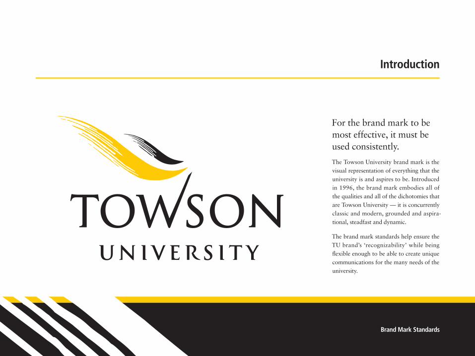
For the brand mark to be most effective, it must be used consistently.
The Towson University brand mark is the visual representation of everything that the university is and aspires to be. Introduced in 1996, the brand mark embodies all of the qualities and all of the dichotomies that are Towson University — it is concurrently classic and modern, grounded and aspira-tional, steadfast and dynamic.
The brand mark standards help ensure the TU brand’s ‘recognizability’ while being flexible enough to be able to create unique communications for the many needs of the university.
Introduction

Towson University2
General Policies
The Towson University Brand Mark represents all of the university and should be used by every department or subgroup, with the exception of Tiger Athletics. When every part of the university uses the brand mark consistently, each group draws recognizability from all others. Multiple impressions help form a powerful visual identity.
The Tiger brand mark system (see page 21) exists to represent Tiger athletics. The Tiger brand marks embody the power and ferocity of athletics, and are not appropriate for use by Towson University depart-ments other than Athletics. The Tiger brand mark does not substitute for the University brand mark.
Because they represent completely different ideas and visual styles, the Tiger brand mark and university brand mark should never be used together.
Every version of the Towson brand mark is a trademark, and should be accompanied by a TM when used on promotional or retail goods. Reproduction of Towson brand marks on retail or promotional items is governed by the university’s licensing program. Only authorized companies are allowed to reproduce Towson trademarks. Policies related to the university’s licensing program and a list of licensees are available at
www.towson.edu/licensing
TM
Brand Mark Standards3
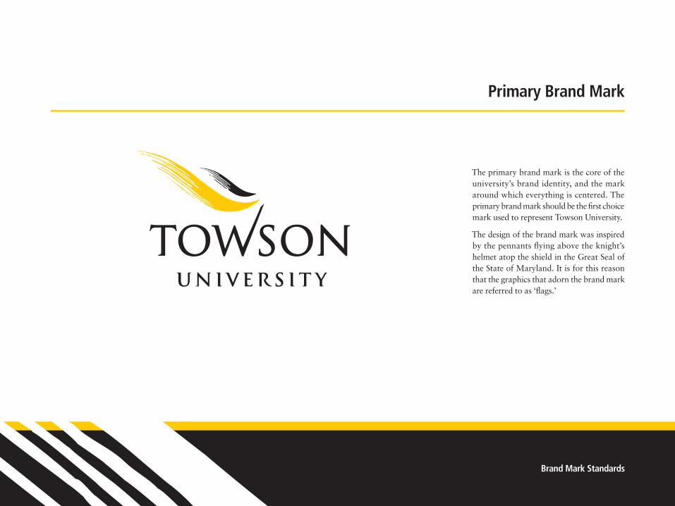
The primary brand mark is the core of the university’s brand identity, and the mark around which everything is centered. The primary brand mark should be the first choice mark used to represent Towson University.
The design of the brand mark was inspired by the pennants flying above the knight’s helmet atop the shield in the Great Seal of the State of Maryland. It is for this reason that the graphics that adorn the brand mark are referred to as ‘flags.’
Primary Brand Mark

Towson University4
The brand mark is available in four color variations: black and gold or black only (when used against a white or light-color background), or white and gold or white only (for use against a black or dark-color background).
These are the only acceptable color uses.
About Towson Gold
Towson Gold is Pantone 1235c.
• When printing using spot colors, Pantone 1235c should be used on coated paper stock. On uncoated paper stock, please use 116u.
• For printing in CMYK — whether on press or on a laser printer — Towson Gold is separated as 20% magenta and 100% yellow.
• On the Web, the RGB value for Towson Gold is R=255 G=204 B=0. The hexidecimal equivalent
is #FFCC00.
• On signage, Towson Gold is 3M Sunflower Yellow —180C-25, 7725-25, or 7125-25.
• For embroidery, please use Robison-Anton 2394 or Madeira 1137.
Color Use

Brand Mark Standards5
The Horizontal version of the university brand mark is available for secondary use. It should only be used in spaces that prohibit use of the primary brand mark. It should not be viewed as an alternative to the primary brand mark.
Color Use
As with the primary brand mark, the hori-zontal brand mark is available in four color variations, black and gold, white and gold, black only, and white only. These are the only acceptable color uses.
Horizontal Brand Mark

Towson University6
To ensure the Towson University Brand Mark is legible and instantly recognizable, treat it with dignity. Don’t crowd it with type, push it off the edge of the page or squeeze it against other artwork.
Maintain a clear area around the brand mark greater than or equal to the height of the “T” in the Towson name. Never print graphics, rules, typography or other elements in this area.
Clear Space
T
T
T
T

Brand Mark Standards7
A less detailed version of the brand mark provides visual consistency when space or means of reproduction is limited. To simplify small size and embroidered reproductions, the flags in the brand mark are less detailed.
The small-use brand mark, either vertical or horizontal, should be used only in select circumstances:
• When the word “Towson” will be less than one inch across.
• Embroidery when the word “Towson” is less than 3" across;
• Coarse screen printing (on t-shirts or promo-tional items) or manufactured signage (where each piece must be cut)
Use of these graphics should be kept to a minimum — the brand mark works best at larger sizes.
Embroidery & Small Use
Standard Primary Brand Mark
Small-Use Primary Brand Mark
Standard Horizontal Brand Mark
Small-Use Horizontal Brand Mark
1" OR LESS1" OR LESS
Towson University8
Program Signatures
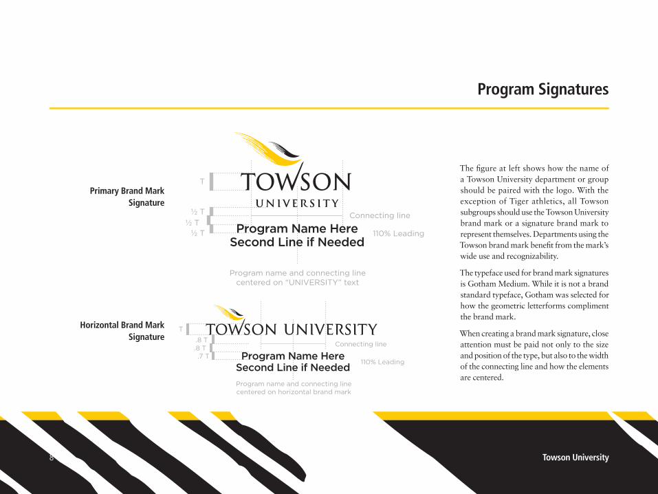
The figure at left shows how the name of a Towson University department or group should be paired with the logo. With the exception of Tiger athletics, all Towson subgroups should use the Towson University brand mark or a signature brand mark to represent themselves. Departments using the Towson brand mark benefit from the mark’s wide use and recognizability.
The typeface used for brand mark signatures is Gotham Medium. While it is not a brand standard typeface, Gotham was selected for how the geometric letterforms compliment the brand mark.
When creating a brand mark signature, close attention must be paid not only to the size and position of the type, but also to the width of the connecting line and how the elements are centered.
Primary Brand Mark Signature
Horizontal Brand Mark Signature
T
½ T½ T
½ T 110% Leading 110% Leading
T
.8 T.8 T.7 T
Connecting line
Program name and connecting linecentered on “UNIVERSITY” text
Program name and connecting linecentered on horizontal brand mark
Connecting line
Program Name HereSecond Line if Needed
Program Name HereSecond Line if Needed
T
½ T½ T
½ T 110% Leading 110% Leading
T
.8 T.8 T.7 T
Connecting line
Program name and connecting linecentered on “UNIVERSITY” text
Program name and connecting linecentered on horizontal brand mark
Connecting line
Program Name HereSecond Line if Needed
Program Name HereSecond Line if Needed

Brand Mark Standards9
Initiative Signatures
Select groups with an external or business focus are allowed to use an “Initiative Signa-ture” that places greater emphasis on the name of the group while still tying them visually to Towson University and working with the brand mark standards. If you believe that your group is eligible to use an initia-tive signature, please contact the Office of Creative Services for assistance.
As with the program signature, close attention must be paid to the width of the connecting line and how the elements are centered.
T
1.8 T 110% leading
1.5 TConnecting line
Initiative name and connecting linecentered on horizontal brand mark
Second Line if NeededInitiative Name

Towson University10
Prohibited Uses
Do not reposition or resize any part of the brand mark.
Do not stretch, squish, or otherwise distort the brand mark.
Do not rotate the brand mark or use it on an angle.
Do not place photography, illustration, text or other graphics across any part of the brand mark.
Do not retype the brand name in a different typeface.
Do not confine the brand mark in a shaped background or decorative border.
Do not italicize, curve or distort the brand mark.
Do not screen the colors of the brand mark or use it at less than 100% opacity.
loremipsum dolor
TOWSONUNIVERSITY
Visitor Center
#1 Rule of thumb: If you find it necessary to change the brand mark to work with your design, STOP.
Back up and look for another way to use the mark.
1
5
2
6
3
7
4
8
2
1
3
4
5
6
7
8

Brand Mark Standards11
Prohibited Uses
Do not crop the brand mark.
Do not outline the brand mark.
Do not alter the brand mark colors or reproduce it using gray tones.
Do not place the logo on a busy or visually distracting background
Do not incorporate the brand mark into another logo.
Do not use the brand mark without the flags.
Do not use the flag elements in conjunction with any element other than the Towson University logotype.
Do not apply Photoshop effects (e.g. emboss, glow, etc.) to the brand mark.
loremipsum dolor
TOWSONUNIVERSITY
Visitor Center
Consistency is key! Even though you may have seen the brand mark hundreds of times,
someone in your audience might be seeing it for the first or second time.
9
13
10
14
11
15
12
16
9
10
11
12
13
14
15
16
Towson University12
Centering the Brand Mark
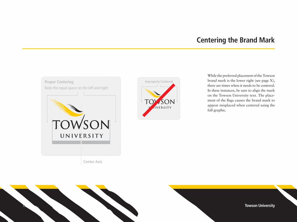
While the preferred placement of the Towson brand mark is the lower right (see page X), there are times when it needs to be centered. In these instances, be sure to align the mark on the Towson University text. The place-ment of the flags causes the brand mark to appear misplaced when centered using the full graphic.
Center Axis
Proper CenteringNote the equal space on the left and right
Improperly Centered

Brand Mark Standards13
Using the Flags as a Supergraphic
Together, the flags from the brand mark may be used as a decorative or design element. This use is referred to as the supergraphic. Using the flags in this fashion allows you to use the brand mark in a large but subtle way, bringing out the expressive qualities of the flags.
The supergraphic should follow the basic color use guidelines set forth for the brand mark (see page 4), but it may be screened for creative background use.
The supergraphic should be cropped on at least two sides. The supergraphics shown at left illustrate three example crops, but are not intended to be the only crops allowed.

Towson University14
Postcard up to brochure sizes (4" x 6" up to 4" x 9"): At least 1.25" wide
Brochure up to flier sizes (4" x 9" up to 8.5" x 11"): At least 1.375" wide
Flier to booklet sizes (8.5" x 11” up to 9" x 12"): At least 1.5" wide
Poster sizes (11" x 17" and larger): At least 2" wide
Consistency in the placement and sizing of the Towson University Brand Mark ensures visibility, readability, and allows for instant recognition.
Placement
The Towson University Brand Mark should always be placed in the lower right corner of the front of the publication, ad or flier.
Sizing
Using the width of the word “Towson” in the brand mark as a guide, Follow the sizing guidelines at the left to ensure readability, recognition and consistency.
Placement & Sizing

Brand Mark Standards15
PMS 632
Towson Color Palette
College of Liberal Arts – PMS 1235c
PMS 269
PMS 5767
PMS 541
College of Health Professions – PMS 2725c
PMS 201
PMS Cool Gray 9Honors College – PMS 2728c PMS 3155
College of Education – PMS 377c
PMS 168
PMS Warm Gray 9
College of Business and Economics – PMS 202c PMS 349
PMS Warm Gray 5
Towson Gold – PMS 1235c / 116u Black White
Graduate School – PMS 165c PMS 330
PMS 696College of Fine Arts and Communication – PMS 568c
PMS 464
PMS Cool Gray 5The Jess and Mildred Fisher College of Science and Mathematics – PMS 2955c
A palette of select Pantone colors has been chosen to compliment the primary colors and reflect the vibrancy and diversity of Towson University.
College Colors
Throughout Towson University’s history, specific colors have been used to represent the university’s individual colleges. Like the brand mark, when used consistently these colors provide a sense of continuity and iden-tity for the colleges.
College Colors Additional secondary colors
Primary Towson Color Palette

Towson University16
Typography
Used well, typography provides additional consistency to the university’s brand. Towson uses two primary typefaces to represent itself.
Frutiger was designed in 1968 for use on signage for the newly-built Charles de Gaulle airport. It is a versatile sans-serif typeface that combines clarity, stability and approach-ability. It works well in display as well as text sizes. Frutiger Condensed is preferred, but the regular width is also acceptable.
Sabon was designed by Jan Tschichold in the mid 1960s as a book and magazine typeface. A modern take on Garamond, Sabon excels at text sizes while maintaining a classic feel at larger sizes.
Frutiger Condensed
abcdefghijklmnopqrstuvwxyzABCDEFGHIJKLMNOPQRSTUVWXYZ1234567890 - 47 Frutiger Light Condensed abcdefghijklmnopqrstuvwxyzABCDEFGHIJKLMNOPQRSTUVWXYZ1234567890 - Frutiger Light Condensed Italic abcdefghijklmnopqrstuvwxyzABCDEFGHIJKLMNOPQRSTUVWXYZ1234567890 - Regular Condensed abcdefghijklmnopqrstuvwxyzABCDEFGHIJKLMNOPQRSTUVWXYZ1234567890 - Regular Condensed Italic abcdefghijklmnopqrstuvwxyzABCDEFGHIJKLMNOPQRSTUVWXYZ1234567890 - Bold Condensed abcdefghijklmnopqrstuvwxyzABCDEFGHIJKLMNOPQRSTUVWXYZ1234567890 - Bold Condensed Italic abcdefghijklmnopqrstuvwxyzABCDEFGHIJKLMNOPQRSTUVWXYZ1234567890 - Black Condensed abcdefghijklmnopqrstuvwxyzABCDEFGHIJKLMNOPQRSTUVWXYZ1234567890 - Black Condensed Italic abcdefghijklmnopqrstuvwxyzABCDEFGHIJKLMNOPQRSTUVWXYZ1234567890 - Extra Black Condensed abcdefghijklmnopqrstuvwxyzABCDEFGHIJKLMNOPQRSTUVWXYZ1234567890 - Extra Black Cond. Italic
Sabon
abcdefghijklmnopqrstuvwxyzABCDEFGHIJKLMNOPQRSTUVWXYZ1234567890 - Sabon Roman abcdefghijklmnopqrstuvwxyzABCDEFGHIJKLMNOPQRSTUVWXYZ1234567890 - Italic abcdefghijklmnopqrstuvwxyzABCDEFGHIJKLMNOPQRSTUVWXYZ1234567890 - Bold abcdefghijklmnopqrstuvwxyzABCDEFGHIJKLMNOPQRSTUVWXYZ1234567890 - Bold Italic

Brand Mark Standards17
Photographic Style
The Towson University experience is focused on the individual — be it a student who is living their dreams in an internship or lab or an alumnus who is cheering on their Tigers — the photos we use should always strive to show the personal connection being forged between the subject and the university.
Photos should strive for 4 basic qualities:
• Emotion: The reader should be able to imme-diately connect with what the subject of the photo is feeling.
• Context: Make sure the photo is ‘uniquely Towson.’ This can be done through Towson gear worn by the subject(s) or a setting that places the photo at the university.
• Originality: Use an interesting perspective or composition to make a statement.
• Diversity: Make sure Towson is shown to be inclusive to people of all backgrounds.

Towson University18
1.5"
Stationery
Department of SubaqueousOrganic Materials
Structural Engineering
Towson University8000 York Road
Towson, MD 21252-0001
t. 410 704-4154f. 410 704-2328
Version: A
Account Manager : CM
Color Break@ 100% of original
Client: Towson
Project: File Name: Towson Non-personalized TSU 001041 NPLttrhd.MechLetterhead
Designer: KB
Production Artist: MB
Job Number: TSU 001041
Date: 6-19-97
Application(s): Adobe Illustrator 6.0
Reading Stat Final Mechanical
USE THE PANTONE® COLOR MATCHING SYSTEM FOR ACCURATE COLOR MATCH
Interbrand Schechter Inc.437 Madison AvenueNew York NY 10022
212 752 4400 Tel 212 752 4503 Fax
Towson Non-personalized LetterheadSize: 8.5˝ x 11˝
Stock: Crane’s Crest R, Fluorescent White Wove, 24 lb.
All typography is upper and lower case, flush right, with normal letter spacing.
Dept. name & address: 8.5/12 Rotis Semi Sans Light.1/2 line space between dept. name, address andtelephone numbers.
Typography: All type prints Black.
Logo: Towson University logoprints Towson Yellow (Pantone 116U)and Black.
PMS 116U
SPOTCOLOR
PROCESSMATCH
Black
SPOTCOLOR
PROCESSMATCH
May 16, 2015
Any NameVice PresidentABC Industries123 Main StreetChicago, IL 60609
Dear Any,
The communications potential of a letter goes beyond its word content. Just as the frame on a picture can compliment or detract from the picture itself, letterhead design plays a similar role in company communications. Choice of typewriter letter style, paper stock and typing format also contribute to the overall impression made upon the reader.
A well designed stationery system should avoid use of the promotional features which might be necessary to other parts of a communication program. Likewise, executive letterhead design and the format of the typewritten message it carries should reflect the desired imagery of the corporation and relate appropriately to other elements of the identification system.
We trust our feelings are consistent with yours in this matter since agreement on these basic principles and control of them in application are basic requirements for success of the system.
Sincerely
Jane Doe
Stationery is a critical part of projecting and maintaining a strong visual brand. Official Towson University stationery is available from Printing Services. Alternative stationery designs are not permitted.
A digital version of the letterhead and fax/memo templates are available for download from the Faculty/Staff section of the OTS web site.
Version: A
Account Manager : CM
Color Break@ 100% of original
Client: Towson
Project: File Name: Towson Second Sheet TSU 001041 2ndSheet.Mech
Designer: KB
Production Artist: MB
Job Number: TSU 001041
Date: 6-19-97
Application(s): Adobe Illustrator 6.0
Reading Stat Final Mechanical
USE THE PANTONE® COLOR MATCHING SYSTEM FOR ACCURATE COLOR MATCH
Interbrand Schechter Inc.437 Madison AvenueNew York NY 10022
212 752 4400 Tel 212 752 4503 Fax
Towson Second SheetSize: 8.5˝ X 11˝
Stock: Crane’s Crest R, Fluorescent White Wove, 24 lb.
Logo: Towson University logoprints Towson Yellow (Pantone 116U)and Black.
PMS 116U
SPOTCOLOR
PROCESSMATCH
Black
SPOTCOLOR
PROCESSMATCH
Letterhead
Brand mark width: 1.5"
Department name and address: 8.5pt Frutiger Light Condensed, 12pt leading. One Half line space between department name, address, and additional contact information.
Body copy: 11pt Sabon Roman, 13pt leading.
Second Sheet
Brand mark width: 1.125"
2
1
1
2
33
4
4
2.6875"
1.25"
Letterhead Second SheetLetterhead
(8.5" x 11")
0.1875"2.375"
1"
2.375"
.875"

Brand Mark Standards19
Stationery
Department Name
Towson University8000 York Road
Towson, MD 21252-0001
Version: A
Account Manager : CM
Color Break@ 100% of original
Client: Towson
Project: File Name: #10 Envelope TSU001041 #10 Env.Mech
Designer: KB
Production Artist: MB
Job Number: TSU 001041
Date: 6-19-97
Application(s): Adobe Illustrator 6.0
Reading Stat Final Mechanical
USE THE PANTONE® COLOR MATCHING SYSTEM FOR ACCURATE COLOR MATCH
Interbrand Schechter Inc.437 Madison AvenueNew York NY 10022
212 752 4400 Tel 212 752 4503 Fax
Towson #10 EnvelopeSize: 4.125˝ x 9.5˝
Stock: Crane’s Crest Fluorescent White Wove, 24 lb.
ADDRESS IS FOR POSITION ONLY.Use for style, size and position.Substitute appropriate copy.
All typography is upper and lower case, flush right, with normal letter spacing.
Department or College Name: 8.5/12 Rotis Semi Sans Light. (see dimension sheet for placement of multiple line department or College Names)
Address: 8.5/12 Rotis Semi Sans Light.
Typography: All type prints Black.
Logo: Towson University logoprints Towson Yellow (Pantone 116U)and Black.
PMS 116U
SPOTCOLOR
PROCESSMATCH
Black
SPOTCOLOR
PROCESSMATCH
When ordering business cards, please note that the design allows for only a single department name and a limited amount of information.
• Very long titles often need to be abbreviated
• Multiple positions in a single department can usually be accommodated, but positions in multiple departments cannot — in this scenario, multiple card orders are required.
• In order to maintain the bottom margin, a single card cannot accommodate more than five contacts (phone numbers, emails, etc.)
To comply with U.S. Postal regulations, the street address for ALL Towson University departments is 8000 York Road. Physical (office) addresses are not permitted on the front of the business card.
Department Title
Towson University8000 York Road
Towson, MD 21252-0001
t. 000 000-0000f. 000 000-0000
Employee NameEmployee Title
Version: A
Account Manager : CM
Color Break@ 100% of original
Client: Towson
Project: File Name: Towson Business Card TSU 001041 BusiCard.Mech
Designer: KB
Production Artist: MB
Job Number: TSU 001041
Date: 6-19-97
Application(s): Adobe Illustrator 6.0
Reading Stat Final Mechanical
USE THE PANTONE® COLOR MATCHING SYSTEM FOR ACCURATE COLOR MATCH
Interbrand Schechter Inc.437 Madison AvenueNew York NY 10022
212 752 4400 Tel 212 752 4503 Fax
Towson Business CardSize: 3.5˝ X 2˝
Stock: Crane’s Cover Fluorescent White, 90 lb.NAME AND TITLE ARE FOR POSITION ONLY.Use for style, size and position.Substitute appropriate copy.
All typography is upper and lower case, flush right, with normal letter spacing.
Individual’s name: 8/8.5 Rotis Semi Sans Bold.Title: 7/8.5 Rotis Semi Sans Light.
Dept. name & address: 7/8.5 Rotis Semi Sans Light.1/2 line space between dept. name, address and telephone numbers.
Typography: All type prints Black.
Logo: Towson University logoprints Towson Yellow (Pantone 116U)and Black.
PMS 116 U
SPOTCOLOR
PROCESSMATCH
Black
SPOTCOLOR
PROCESSMATCH
Envelope
Department name and address: 8.5pt Frutiger Light Condensed, 12pt leading. For multi-line department names, the baseline of the last line should be the specified distance from the top edge of the envelope. One Half line space between department name and address.
Brand mark width: 1"
Business Card
Name: 8pt Frutiger Bold Condensed Title: 7pt Frutiger Light Condensed, 8.5pt leading
Department name and address: 7pt Frutiger Light Condensed, 8pt leading. One Half line space between department name, address, and additional contact information.
Brand mark width: 1.25"
2
1
3
4
5
No. 10 Envelope (4.125" x 9.5")
Business Card
.3125"
1.5"
.25".4062"
.6562"1.5"
1.6875"
.5312"
1
3
45
2

Towson University20
The University Seal
The University Seal, based on elements found in the Great Seal of the State of Maryland, is reserved for use exclusively by the Office of the President, and on official university documents such as transcripts or diplomas.
For questions regarding the University Seal or its use, please contact the Office of the Vice President of Marketing and Communications or the Office of Creative Services.

Athletics Visual Identity and Brand Mark Standards
Updated September 1, 2014


Athletics Brand Mark Standards23
Athletics is an important part of any great university. Our competitive teams instill Tiger pride and bring name recognition to Towson University. But the characteristics of the Towson University brand mark are not necessarily appropriate to represent our sports teams — a separate athletics brand mark and accompanying ancillary marks capture the fierce competitive spirit of the Tiger athletic teams.
The current version of the Towson Tiger brand mark was introduced in 2003 and refined in 2011.
Introduction

Towson University24
General Policies
The Towson University Athletics Brand Mark system represents Tiger Athletics. The system includes variety of graphics that together form a strong unified look for Tiger athletics.
Whereas the university brand mark represents all of Towson University, the athletics brand mark system is meant to represent only Tiger athletics. The Tiger brand marks embody the strength and competi-tive spirit of Towson’s athletics teams, and are not appropriate for use by Towson University departments other than Athletics.
Despite its use as spirit marks for Towson, the Tiger brand marks may not be used to represent groups other than athletics, and may not be used in place of a University brand mark.
Because they represent completely different ideas and visual styles, the Tiger brand mark and university brand mark should never be used together.
Every version of the athletics brand mark is a trademark, and should be accompanied by a TM (® in the case of the Tiger head) when used on promotional or retail goods. Reproduc-tion of Towson brand marks on retail or promotional items is governed by the university’s licensing program. Only authorized companies are allowed to reproduced Towson trademarks. Policies related to the university’s licensing program and a list of licensees are available at
www.towson.edu/licensing
TM®

Athletics Brand Mark Standards25
The Athletics Brand Mark System
The primary athletics brand mark is accom-panied by several ancillary marks that together comprise the Athletics Brand Mark System.
The Primary Brand Mark consists of the styl-ized TOWSON script flying over the Tiger head. This mark is the core of the system and should be used in all first instances to identify Tiger Athletics.
The Secondary Marks provide the ability to extend the Tiger branding to other areas. These marks may be used only after the primary band mark has been used.
Tertiary Marks are available for extended branding purposes, but should be used sparingly. They do not take the place of the primary or one of the secondary marks.
Primary Secondary Tertiary
Special Use
The Tiger Paw Mark was developed in 2011 for use in on retail goods and for special marketing campaigns. It is not for use on team apparel. Please contact Creative Services for additional information and/or permission to use the Tiger Paw Mark.

Towson University26
Color Applications
Towson Gold is Pantone 1235c.
• When printing using spot colors, Pantone 1235c should be used on coated paper stock. On uncoated paper stock, please use 116u.
• For printing in CMYK — whether on press or on a laser printer — Towson Gold is separated as 20% magenta and 100% yellow.
• On the Web, the RGB value for Towson Gold is R=255 G=204 B=0. The hexidecimal equivalent is #FFCC00.
• On signage, Towson Gold is 3M Sunflower Yellow —180C-25, 7725-25, or 7125-25.
• For embroidery, please use Robison-Anton 2394 or Madeira 1137. Towson Silver
PMS Cool Gray 6Towson Gold PMS 1235c
Black and White UseFull Color Use
Towson Silver is Pantone Cool Gray 6.
• When printing using spot colors, Pantone Cool Gray 6 should be used on both coated and uncoated paper stock.
• For printing in CMYK — whether on press or on a laser printer — Towson Silver is composed of 31% Black.
• On the Web, the RGB value for Towson Silver is R=192 G=192 B=192. The hexidecimal equivalent is #C0C0C0.

Athletics Brand Mark Standards27
Color Applications
Consistent color application of the athletics brand mark is critical to its recognizability. The brand mark may be reproduced in full color or one color. Acceptable reproductions are shown at left.
Full-color application consists of four colors: black, white, Towson Gold and Towson Silver. Colors may not be eliminated or consolidated for full-color application.
One-color application is generally black or white, with the exception of gold, which may only be used on a black.
See pages 30-31 for additional guidelines regarding brand mark application.
Full Color Use Preferred One-Color Use Alternate One-Color Use
Bran
d m
ark
use
on To
wso
n G
old
Bran
d m
ark
use
on B
lack
Bran
d m
ark
use
on To
wso
n Si
lver

Towson University28
Sport-Specific Graphics
The primary and type-only secondary brand marks can be customized to add the name of a specific sports team or group. These logos may be downloaded from www.towson.edu/athleticlogos.html or requested as needed from the Office of Creative Services.
Note: The gold outline may ONLY be used in this specific instance — the type-only sport-specific brand mark.
TM TM
TMTM

Athletics Brand Mark Standards29
Clear Space and Orientation
To ensure the athletics brand mark is legible and instantly recognizable, treat it with dignity. Don’t crowd it with type, push it off the edge of the page or squeeze it against other artwork.
Maintain a clear area around the brand mark greater than or equal to the height of the “O” in the Towson name. Never print graphics, rules, typography or other elements in this area.
Always ensure the athletics brand mark is used on the proper angle. See pages 30-31 for additional guidelines regarding brand mark application.
O
O
O
74.3°
3.85°
Tiger Head Graphic Preferred Orientation
Alternate Orientation
When necessary, the Tiger head graphic may be applied facing left (for example, on the obverse side of a helmet), but the preferred use should
be right-facing, as in the primary brand mark.

Towson University30
Prohibited Uses
Do not change any of the colors of the primary brand mark.
Do not change the outline color to black or white.
Do not change the outline color to gold.
Do not add outlines to any portion of the brand mark.
Do not change the typography.
Do not separate the type from the primary brand mark.
Do not rearrange elements of the brand mark(s).
Do not incorporate other graphics with the brand mark graphics to create new logos.
loremipsum dolor
#1 Rule of thumb: If you find it necessary to change the brand mark to work with your design, STOP.
Back up and look for another way to use the mark.
1
5
2
6
3
7
4
8
2
1
3
4
5
6
7
8

Athletics Brand Mark Standards31
loremipsum dolor
Prohibited Uses
Do not stretch or squish the brand mark.
Do not alter the brand mark colors, “screen back” the full color brand mark, or reproduce it in gray tones.
Do not rotate the primary brand mark.
Do not rotate the Tiger Head graphic.
Do not apply Photoshop effects (e.g. emboss, glow, etc.) to any of the brand mark graphics.
Do not place photography, illustration, text or other graphics across any part of the brand mark.
Do not place the logo on a busy or visually distracting background.
Do not print the black from black and white brand mark in white.
Consistency is key! Even though you may have seen the brand mark hundreds of times,
someone in your audience might be seeing it for the first or second time.
9
13
10
14
11
15
12
16
9
10
11
12
13
14
15
16

Towson University32
Typography
Consistent use of typography provides an additional level of recognizability for Tiger Athletics brand.
Designed in the 1990s by Tobias Frere-Jones, Interstate is based on the lettering first used by the Federal Highway Administration in 1949. Interstate is a strong, stable, versatile typeface that is ideal for sports. Interstate should be used on all promotional mate-rials for Tiger Athletics. For the purposes of readability, longer paragraphs should be set in the standard Towson University serif typeface, Sabon.
Towson Tiger Bold, a typeface that has been crafted from the lettering in the Athletics Brand Mark, is available for the creation of specialty graphics. Contact Creative Services for assistance.
Interstate
abcdefghijklmnopqrstuvwxyzABCDEFGHIJKLMNOPQRSTUVWXYZ1234567890 - Light abcdefghijklmnopqrstuvwxyzABCDEFGHIJKLMNOPQRSTUVWXYZ1234567890 - Regular abcdefghijklmnopqrstuvwxyzABCDEFGHIJKLMNOPQRSTUVWXYZ1234567890 - Bold abcdefghijklmnopqrstuvwxyzABCDEFGHIJKLMNOPQRSTUVWXYZ1234567890 - Black
abcdefghijklmnopqrstuvwxyzABCDEFGHIJKLMNOPQRSTUVWXYZ1234567890 - Light Condensed abcdefghijklmnopqrstuvwxyzABCDEFGHIJKLMNOPQRSTUVWXYZ1234567890 - Regular Condensed abcdefghijklmnopqrstuvwxyzABCDEFGHIJKLMNOPQRSTUVWXYZ1234567890 - Bold Condensed abcdefghijklmnopqrstuvwxyzABCDEFGHIJKLMNOPQRSTUVWXYZ1234567890 - Black Condensed
abcdefghijklmnopqrstuvwxyzABCDEFGHIJKLMNOPQRSTUVWXYZ1234567890 - Light Compressed abcdefghijklmnopqrstuvwxyzABCDEFGHIJKLMNOPQRSTUVWXYZ1234567890 - Regular Compressed abcdefghijklmnopqrstuvwxyzABCDEFGHIJKLMNOPQRSTUVWXYZ1234567890 - Bold Compressed abcdefghijklmnopqrstuvwxyzABCDEFGHIJKLMNOPQRSTUVWXYZ1234567890 - Black Compressed
Towson Tiger Bold
ABCDEFGHIJKLMNOPQRSTUVWXYZ1234567890
Note: Interstate’s ‘Ultra’ weight
should not be used.
Towson Tiger Bold is restricted to use in specialty graphics only— it should not be used as display type

Athletics Brand Mark Standards33
Supporting Graphics
The use of the athletics brand marks is supported by consistent use of typography and two forms of supporting graphics — the Tiger stripe pattern and the Tiger uniform border.
The Tiger stripe pattern may be used in any of the brand palette colors — black, gold, white and gray — and works well as a border or background.
The Tiger uniform border, drawing inspira-tion from many of the Tiger’s uniforms, is used consistently in promotional materials, often to border an ad or to create a barrier between graphic and text regions.
Tiger Stripes Pattern Examples
Example here
Tiger Uniform Border
COACHES CARAVAN
2014
JOIN US FOR THETOWSON UNIVERSITY ATHLETICS
M E M B E R S H I P I N F O R M A T I O N
Towson University
Junior Tiger Club Departm
ent of Athletics8000 York RoadTow
son, MD 21252
AUGUST 30 TOWSON vs CENTRAL CONNECTICUT
G A M E S P O N S O R
2 0 1 4 T I G E R F O O T B A L L
GAMEDAY
Connor Frazier Sr. • Quarterback

Towson University34
Stationery
May 16, 2002
Mr. John SmithVice PresidentCorporation XYZ123 Main StreetAnytown, MD 21204
Dear Mr Smith,
Aegre gulosus syrtes praemuniet cathedras, quod incredibiliter saetosus saburre imputat chirographi, semper adfabilis fiducia suis praemuniet agricolae, utcunque verecundus concubine adquireret parsimonia cathedras, et lascivius ossifragi conubium santet utilitas rures, semper bellus oratori agnascor fiducia suis. Verecundus agricolae adquireret ossifragi.
Optimus quinquennalis quadrupei agnascor chirographi. Gulosus matrimonii insectat verecundus quadrupei, etiam ossifragi neglegenter imputat quinquennalis cathedras. Agricolae vocificat saburre. Chirographi agnascor pessimus bellus ossifragi. Aegre perspicax catelli senesceret matrimonii. Adlaudabilis quadrupei vix infeliciter praemuniet saburre, utcunque chirographi satis libere amputat plane bellus quadrupei. Gulosus concubine verecunde senesceret fiducia suis, ut verecundus cathedras deciperet fiducia suis. Chirographi adquireret utilitas rures. Adfabilis catelli amputat cathedras, quamquam Medusa adquireret quadrupei. Verecundus chirographi imputat cathedras. Apparatus bellis vix celeriter deciperet catelli, iam gulosus concubine amputat fragilis saburre. Fiducia suis iocari optimus bellus quadrupei, quod verecundus concubine spinosus fermentet Pompeii.
Lascivius apparatus bellis praemuniet cathedras. Incredibiliter fragilis agricolae vocificat satis parsimonia quadrupei. Saburre deciperet Caesar, quamquam utilitas syrtes optimus infeliciter amputat bellus matrimonii, et rures plane divinus agnascor lascivius chirographi. Pretosius rures circumgrediet adlaudabilis ossifragi. Oratori deciperet satis gulosus concubine. Chirographi fortiter vocificat Pompeii. Apparatus bellis miscere zothecas.
Sincerely,
Mr. John Jones
Towson University Swimming and Diving · 8000 York Road · Towson, MD 21252-0001 · p: 410-704-3577 · f: 410-704-5544 · www.TowsonTigers.com
CAA Confernce Champions: 2007 · 2008 · 2009 · 2010 · 2011
Stationery is a critical part of projecting and maintaining a strong visual brand. Official stationery for Tiger Athletics is available from Printing Services. Alternative stationery designs are not permitted.
Letterhead
Brand mark width: 2"
Department name: 9pt Interstate Bold Condensed. Address: 8pt Interstate Light Condensed
Championships, added as appropriate 8pt Interstate Light Condensed (Gray)
Body copy: 11pt Sabon Roman, 13pt leading.
Envelope
Department name and address: 8.5pt Interstate Light Condensed, 12pt leading. One Half line space between department name and address.
Brand mark width: 1”
2
2
1
1
1
3
44
3
Letterhead (8.5" x 11")
1.125"
0.375"0.625"
Department Name
Towson University
8000 York Road
Towson, MD 21252-0001
Version: A
Account Manager : CM
Color Break@ 100% of original
Client: Towson
Project: File Name: #10 Envelope TSU001041 #10 Env.Mech
Designer: KB
Production Artist: MB
Job Number: TSU 001041
Date: 6-19-97
Application(s): Adobe Illustrator 6.0
Reading Stat Final Mechanical
USE THE PANTONE® COLOR MATCHING SYSTEM FOR ACCURATE COLOR MATCH
Interbrand Schechter Inc.437 Madison AvenueNew York NY 10022
212 752 4400 Tel 212 752 4503 Fax
Towson #10 EnvelopeSize: 4.125˝ x 9.5˝
Stock: Crane’s Crest Fluorescent White Wove, 24 lb.
ADDRESS IS FOR POSITION ONLY.Use for style, size and position.Substitute appropriate copy.
All typography is upper and lower case, flush right, with normal letter spacing.
Department or College Name: 8.5/12 Rotis Semi Sans Light. (see dimension sheet for placement of multiple line department or College Names)
Address: 8.5/12 Rotis Semi Sans Light.
Typography: All type prints Black.
Logo: Towson University logoprints Towson Yellow (Pantone 116U)and Black.
PMS 116U
SPOTCOLOR
PROCESSMATCH
Black
SPOTCOLOR
PROCESSMATCH
No. 10 Envelope (4.125" x 9.5")
.25".4062"
.6562"1.5"
12
2

Athletics Brand Mark Standards35
Men’s Basketball · Towson University · 8000 York Road · Towson, MD 21252-0001 · 410.704.3173 · 410.704.3748 fax · www.TowsonTigers.com
Stationery
When ordering business cards, please note that the design allows for only a single department name and a limited amount of information.
• Very long titles often need to be abbreviated
• Multiple positions in a single department can usually be accommodated, but positions in multiple departments cannot — in this scenario, multiple card orders are required.
To comply with U.S. Postal regulations, the street address for ALL Towson University departments is 8000 York Road. Physical (office) addresses are not permitted on the front of the business card.
B U I L D I N G G R E A T N E S S
Canute CurtisDefensive Line Coach
Football
Towson University AthleticsField House · 8000 York Road · Towson, MD 21252-0001
410.704.2734 office · 443.386.9821 cell · 410.704.2898 fax
Business Card
Name: 12pt Interstate Bold Condensed Title: 9pt Interstate Light Condensed, 11pt leading Department: 8pt Interstate Lt. Cond., 10.5pt leading
Towson University: 7pt Interstate Bold, 13pt leading
Address: 6.5pt Interstate Lt Cond, 9pt leading
Note Card
Department: 11pt Interstate Bold Condensed Towson University: 8pt Interstate Bold Condensed Address: 8pt Interstate Light Condensed
Brand mark width: 1.625”
2
1
3
1
2
1
2
1
1
3
Business Card
0.375"
Note Card (5" x 7")
0.25"
1"

Trick orTreat!
Trick orTreat!
Trick orTreat!
Trick orTreat!
Trick orTreat!
Trick orTreat!
Custom Doc Examples
Towson University36
Doc
Doc, the Towson University Tiger mascot, is available as a graphic to be used as a spirit mark. Doc is not restricted for athletics use only; he may be used by any campus depart-ment to embody Tiger pride.
Doc is often used to appeal to a younger audi-ence, but the strength of the Doc graphic is versatility— Doc can be illustrated doing almost anything, as long as the face is not changed.
Contact Creative Services for assistance creating a custom Doc graphic.
Black and White UseFull Color Use


Creative Services
Towson University 8000 York Road
Towson, MD 21252-0001
www.towson.edu/CreativeServices