visual analysis of network flow data with - purdue university
TRANSCRIPT

Visual Analysis of Network Flow Data with Timelines and Event Plots
Doantam Phan, John Gerth, Marcia Lee, Andreas Paepcke, Terry Winograd
Department of Computer Science, Stanford University
Abstract This paper describes Isis, a system that uses progressive multiples of timelines and event plots to support the iterative investigation of intrusions by ex-perienced analysts using network flow data. The visual representations have been designed to make temporal relationships apparent, allow visual classification of events with dynamic brushing, and enable users to organize their visualizations to reveal traffic structure and patterns by reordering rows. Isis combines visual affor-dances with SQL to provide a flexible tool for investigation. We present an anno-tated case study using anonymized data of a real intrusion that demonstrates the features of Isis.
Introduction
For the last two years we have been researching visual tools to aid network securi-ty investigations by working with the principal network analyst for the Electrical Engineering and Computer Science departments. Analysts use a variety of data sources to resolve incidents, including system logs, intrusion alerts, network flows, and full packet traces. Our tools target network flow data. They make use of a data source that produces 0.5 to 3 million flows per hour with daily accumula-tions in the tens of millions of events. Developing strategies for storage, retrieval, and display at these data volumes heavily influenced our design.
During incident handling, time is of the essence for analysts because they need to quickly isolate intrusions and because the sequencing of events in time is critical in reconstructing the methods and patterns of intrusion. As the analyst looks through time he frequently pivots to change the IP on which he is currently fo-cused. To support this iterative search process, our tool, Isis, provides analysts with two linked visual representations of temporal sequences of network flow traf-fic - the timeline and the event plot. In both representations, IP addresses act as categorical values for the vertical axis with time on the horizontal axis. Timelines show an aggregate value over all events, while event plots reveal the patterns of

2
individual events. These are examples of Bertin's reorderable matrices where rows are rearranged to reveal visual structure in the data through juxtaposition (Bertin 1983). The two representations support a common set of affordances to help the analyst look for temporal relationships in the data. The different levels of aggregation in the displays provide different opportunities to visually classify events with dynam-ic brushing and to create visual structures from the events. Small multiples of timelines are compact, which provide orientation, navigation and history at the expense of detail. In contrast, event plots provide enormous detail about the exact sequence of events and permit reordering of IP addresses to show their relation-ships. However, their unaggregated nature means they do not use space efficiently. The rest of the paper is organized as follows. First, we describe the network flow data and how it has been structured in a database to permit the analyst to issue ef-ficient queries. Next, we detail the evolution and design rationale of our system, Isis. We describe how an analyst interacts with our system in practice, by follow-ing an annotated case study of a typical intrusion incident. We conclude with a discussion of related work, and the benefits and limitations of our approach.
Network Flow Data
The data for our visualizations are the routed ICMP, UDP, and TCP network flows, captured by a sensor at the network gateway, and stored in a relational da-tabase. Each flow summarizes the time and duration of a network connection at the transport layer. Packet counts and bytes are stored, but the contents are not. To be useful for the analysis of network incidents, flows must be organized for fast searches over the tens of millions of daily flows. We use a MySQL database to store the flows, which provides the analyst with a flexible and familiar interface for specifying queries. Initially we directly mapped flow record fields to table col-umns, but this resulted in unsatisfactory performance. More importantly, it did not match up well with the analyst's needs so we modified the schema as described below. Because flows are relatively modest in size compared to the traffic they summarize, both the flow sensor and the database repositories can be housed on inexpensive commodity hardware. Flow Sensor Flow records can be uni-directional or bi-directional. Bi-directional flows collapse the two uni-directional flows of a conversation into one record, with separate fields for the port, packet and byte counts. We are using the open source Argus flow system (http://www.qosient.com/argus) configured to create bi-directional flows for routed ICMP, UDP, and TCP traffic. Each flow is defined by the 5-tuple

3
key of protocol, source/destination IP, source/destination port. The orientation of a flow is determined by the srcIP in the packet that created the flow. For long-running connections, a flow record is generated every 60 seconds, but any connec-tion which is idle for more than 300 seconds will be dropped. It is re-established as a new flow if subsequent packets are seen. Database Repository Many incidents begin with a report of anomalous behavior involving a local IP address. As a result, the analyst will issue a query for all the traffic associated with that focus IP. Once the analyst locates a suspect IP that contacted the focus, he will often want to retrieve the suspect IP's communication with other local IPs. We call this a pivot from the focus IP. The problem is that a SQL table con-structed with columns directly mapping raw flow record fields will have srcIP and dstIP columns. Obtaining all the traffic for a single IP would require queries with expensive OR or UNION clauses, because the investigation process is easier to reason about in terms of local and remote addresses. To improve query performance, we transform all the src/dst fields in flow records into local and remote columns in the database table. To preserve the critical orien-tation information of the src/dst relationship, we add a column which specifies the role played by the local IP in each flow. Because we capture some local traffic, there can be flows with two local addresses. In this case we arbitrarily choose the destination as the local IP. Since using local and remote designations makes a query about a flow's destination port more complex, we include it as a conveni-ence column. The database schema also incorporates metadata reflecting aspects of the structure of the network. Our local network is subdivided along lines reflecting the admin-istrative and technical groups. Since analysts are responsible for these logical subnets, called VLANS (for virtual LANS), the database allows queries to be re-stricted by VLAN. A similar segmentation is made for remote IPs because the In-ternet is divided into Autonomous System Numbers (ASNs) which define respon-sibility for IP address ranges. Since an ASN is roughly equivalent to an Internet Service Provider (ISP) and resolving network incidents is usually done at the ISP level, the database also associates ASNs with an IP address.
The Investigation Process
Network security incidents can be triggered in a variety of ways, by an automatic alert generated by Intrusion Detection Systems (IDS), by an e-mail complaint from an administrator at a remote network, or even by a user noticing that a ma-chine has started behaving oddly.

4
Once a report has been received, analysts assume a variety of roles (D'Amico, Whitley et al. 2005) while engaging in an iterative process of hypothesis genera-tion and evaluation: Triage to decide whether a report merits investigation; Esca-lation to determine method of compromise and its extent; Correlation to compare this incident with those of the past; Threat Analysis to search for attacker identity and motivation; Incident Response to recommend or implement a course of action; and Forensic Analysis to gather and preserve evidence. The network flows collected by the sensor show details of the times and extent of communications among machines and so are valuable for triage and escalation. If sufficiently fast access to historical data is available, they may also be used for correlation analysis. During an investigation, analysts are trying to identify flows that comprise an intrusion out of a vastly larger set of flows. By providing filter-ing, sorting, and compact visualization of the flows, Isis can help the analyst to build a mental model of the network activity so that he can distinguish intrusion flows from normal flows. As one might expect, we observed that an analyst typically begins an investigation focused on the IP thought to be compromised. The analyst would inspect all of its traffic looking for sources of possibly malicious traffic. The analyst would then pivot to focus on the suspect IPs and inspect their traffic. If that traffic indicated additional possible compromises, he would pivot again. This iterative analysis process may be described as follows:
1. Select a IP to focus on and look at its traffic by querying the database. 2. Inspect the composition of the traffic to determine it is related to the intrusion. 3. Compare traffic to other flows to discover attributes and temporal correlations. 4. If there is uninteresting data, refine the query by adding filters, and repeat #2. 5. If an interesting IP is found, pivot to it, changing focus, and repeat #1.
Flow Maps
Initially we tried to use flow maps, a type of node-link diagram (Phan, Xiao et al. 2005), to display network traffic. Each computer was mapped to a node and the width of an edge encoded the amount of traffic between the two computers. Flow maps were used to minimize the amount of edge clutter that would occur had we created an edge for each flow. However, we found that it was difficult to pivot with node-link diagrams. From an initial graph, the analyst could pivot on a part-ner IP node, and the system would add new nodes and edges to the pivot node. Unfortunately, repeated pivots would add too many nodes and the display would

5
become too cluttered. Analysts also found the intermediate nodes used to cluster outgoing edges in flow maps to be mea-ningless because the clustering was based on posi-tion of the destination node, and not on an attribute of the data. We tried data driven layouts, such as mapping a node's position to the geographic loca-tion to its ASN, this was not an effective use of screen space. We also tried creating meaningful
intermediate nodes that would break traffic into different components, such as port nodes. Unfortunately, this had the disadvantage of replicating the same IP in mul-tiple nodes and forced the analyst to visually collect traffic from disparate loca-tions. After using the flow map prototype with analysts on several intrusions, we rea-lized that it was critical to make the temporal relationships of flows apparent. For example, analysts wanted to look for correlations between a login and the begin-ning of malicious traffic. The problem was that an edge only indicated that two IPs had communicated, but not when they communicated. Unfortunately, it was difficult to add temporal cues to node-link diagrams. Animation was largely inef-fective as analysts had a hard time tracking movement and recalling trajectories (Tversky, Morrison et al. 2002). We had some success using an analog clock me-taphor seen in Figure 1. Nodes were positioned by the first time that they commu-nicated with a focus node at the center, but we later realized this layout was not flexible enough.
Progressive Multiples of Timelines and Event Plots
After our experiences with the flow map prototype, we decided that our visualiza-tions should:
• Make temporal relationships apparent • Allow users to classify events by their attributes and inspect event details • Support an iterative analysis process • Allow users to create visual structure in order to reveal traffic patterns
We developed a display where time is mapped left-to-right along the x-axis. Since the principal element of an investigation is the traffic to and from an IP address, we segmented the y-axis into rows, where each query for the traffic of a focus IP is visualized as a timeline. An example can be seen in Figure 2. The analyst can brush the timeline to inspect its data attributes or get details on demand. If they find suspicious connections, they can pivot on those connections to create new
Figure 1. A flow map wherenodes are radially mapped bythe first time they contacted a focus node at the center.

6
timelines. New rows are added sequentially to the display, which preserves the steps taken by the investigator. This history allows the analyst to backtrack and revisit earlier queries. Analysts can also reorder rows to compare the results of dif-ferent queries. We describe this technique as progressive multiples (Phan, Paepcke et al. 2006), a combination of progressive disclosure and small multiples (Tufte 1990) of timelines. Timelines are useful for overviews of network traffic, but when the investigation has narrowed to a small time window, the analyst needs to see unaggregated flows. Initially we provided the flow data as a sortable table, but analysts found it hard to extract temporal patterns from text. In response, we developed the event plot. An example can be seen in Figure 9. For each IP on the y-axis, each of its flows is shown as a mark on the x-axis. The event plot has a sidebar to support in-spection of traffic in several dimensions: port, ASN, VLAN, locality, and role. Brushing an IP in the main window highlights entries in the sidebar that appear in that IP's row. Likewise, brushing an entry in the sidebar highlights IPs that contain that value. The event plot allows the analyst to color marks by traffic type, to reorder the rows to reveal traffic patterns, and to adjust the horizontal spacing of the marks. We describe the features of timelines and event plots by presenting them in the context of the investigation of an anonymized version of a real intrusion.
A Case of Mysterious IRC Traffic
After looking at a routine summary of network activity, an analyst noticed that there was a high level of IRC traffic to a server in northern Europe from a local machine, 75.64.71.22. Since hackers often use an IRC channel to control a bot on a compromised host, she decided to look at the machine's traffic by providing the tool with a focus IP, time window, aggregation function, and filter string. The aggregation and filter are specified as SQL expressions. To ensure the entire query result fits on the screen events are binned and shown as bars. The height of the bars is controlled by the aggregation expression, which can be any expression that returns a non-negative scalar value, such as the min, max, or average of the number of packets. Figure 2 shows the result of a query of 75.64.71.22 with the aggregation: max(l_pkt + r_pkt) which maps the height of each bar to the flow in that bin with the largest total number of packets.
Figure 2.Timeline using an aggregation expression that shows the maximum totalpackets to and from the local IP that is suspected to be compromised.

7
The aggregation expression count(*) will count the rows satisfying a query and creates a timeline where the bar heights are proportional to the number of connec-tions in each bin. In network incidents, the existence of a connection is often as important as its size or duration so it is a common for an analyst to use this aggre-gation to begin exploring traffic. Figure 3 shows the result of a query of using count(*) to get an overview of the traffic spanning the last day.
To discover the extent of the IRC traffic, the analyst looks at the port distribution by asking for the tearoff window seen in Figure 4. After sorting the ports by the aggregate value, the analyst sees that port 6667, an IRC port, has approximately 63,000 flows. The analyst can see how activity on the port is distributed in the
timeline by brushing its cell. If they see a value of interest, they can create new timelines that filter traffic on these ports.
Brushing the cell containing port 6667 results in the timeline seen in Figure 5. Orange highlight-ing is overlaid on all of the existing timelines. The height indicates the proportion of traffic us-ing port 6667. Orange marks underneath the bins indicate the presence of port 6667 traffic, even if the height of the orange may not be visi-ble in the bar. As a result, the analyst can see that IRC traffic has been present over the whole time period.
Figure 5. A brushed timeline where the orange highlighting indicates the presence of connections to IRC servers on port 6667 that extends over the whole period. The analyst can bring up tearoff menus for several dimensions: partner IPs, ports, role, ASN, locality, or Vlan. From the IP tearoffs the analyst can also pivot to new IPs. Figure 6 shows a brush from the same tearoff menu for port 6666, which is another IRC port. This reveals a different connection to an IRC server that is cor-related with the spike in activity. Since the goal is to determine the first incidence
Figure 4. A tearoff menu thatshows the distribution of trafficby destination port.
Figure 3. Timeline using an aggregation expression that shows the total numberof connections to and from the local IP that is suspected to be compromised.

8
of IRC traffic, the analyst makes a mental note to come back and look at the traffic on port 6666 at a later time.
Figure 6. A brushed timeline where the orange highlighting indicates connections to IRC servers on a different port, 6666.
Figure 7 shows a progression of queries the analyst generates to discover the be-ginning of the IRC traffic. To determine when the IRC traffic began, she limits the traffic to port 6667 and changes the time window to be another day earlier, which produces row B, and shows the beginning of the IRC traffic. To look for the source of the compromise, she queries for all traffic in a two-hour window cen-tered on the beginning of the IRC traffic, resulting in row C. Since the focus IP is a web server, the analyst removes all web traffic served by the focus and restricts the traffic to be nonlocal, as local traffic is usually benign. This is done using the filter "not(l_role>0 and d_port=80) and locality=1", resulting in row D.
Figure 7. A progression of queries generated in the timeline display showing how the user has narrowed the time window from a two-day period to two-hour period. Timelines in the same folder share a common bin size and aggregate, which makes it easy to juxtapose rows and compare query results. Since the bin size of the larg-er folder is constrained by the earlier queries, the analyst moves row D to new folder on row E. The bin sizes are recalculated, and changes the binning to 30 seconds. Each folder has different bin sizes and aggregates so that the system can display a wider dynamic range of data.
Figure 8. An example of the sortable drill down table that is generated when the analyst looks at the raw data.
Now that the analyst has narrowed her focus to a two-hour window, she wants to see the individual flows. The analyst can create a drill down table to look at the

9
data, which has approximately ~1600 flows, as seen in Figure 8. Each row in the drill-down table describes a flow between the focus IP and partner IP. Since the analyst is looking for temporal patterns, she moves from the table view to the event plot seen in Figure 9 which provides a direct mapping from table rows to marks. Marks are placed along the x-axis according to a table row's timestamp and the event plot is initially ordered by numeric IP address. To facilitate visual classification and inspection of traffic, the system provides several affordances that allow the user to modify the size, shape, and color of the mark based on its flow attributes. To obtain additional detail about a mark, the user can hover over the mark, and a tooltip will display the full information for that flow. Each mark is mapped to one of three bin sizes (first quartile, middle quartiles, last quartile) depending upon the total number of packets exchanged between the two IP addresses. From the sidebar, the analyst can adjust the thresholds for the mark size to reduce visual clutter or highlight outliers.
The shape of the mark initially shows the role of the focus IP. If the connec-tion was initiated by the focus IP then it is the client and the mark is a trian-gle. Otherwise, the focus IP is a server and the mark is a circle. Being able to see when a computer switches from being a client to being a server is often a useful heuristic for localizing intru-sions. Since too many encodings can interfere with preattentive search, the analyst can choose to view all marks as squares. To isolate the initial intru-sion, she looks for an SSH connection that occurs before the start of traffic to the IRC servers. She can do this by us-ing the sidebar, which provides a breakdown of the traffic into its consti-tuent parts by the same dimensions as the tearoffs in the timeline display: ASN, Port, Vlan, Locality, and Role. She can control which dimension to inspect with the drop down menu. Hovering over port 22 (SSH) in the si-debar causes the system to highlight all the rows in the event plot that con-
Figure 9. An event plot generated of a two-hour time window containing ~1600events. Notice that many events lie off- screen, due to limited resolution.
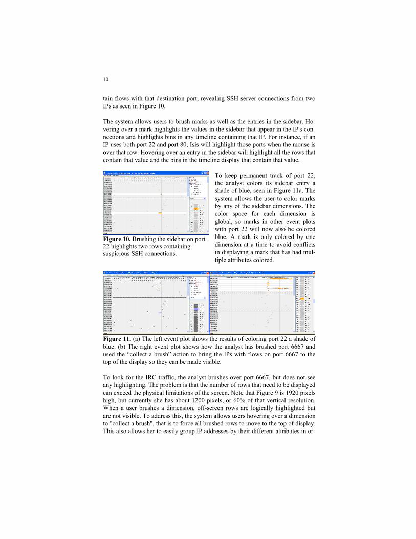
10
tain flows with that destination port, revealing SSH server connections from two IPs as seen in Figure 10. The system allows users to brush marks as well as the entries in the sidebar. Ho-vering over a mark highlights the values in the sidebar that appear in the IP's con-nections and highlights bins in any timeline containing that IP. For instance, if an IP uses both port 22 and port 80, Isis will highlight those ports when the mouse is over that row. Hovering over an entry in the sidebar will highlight all the rows that contain that value and the bins in the timeline display that contain that value.
To keep permanent track of port 22, the analyst colors its sidebar entry a shade of blue, seen in Figure 11a. The system allows the user to color marks by any of the sidebar dimensions. The color space for each dimension is global, so marks in other event plots with port 22 will now also be colored blue. A mark is only colored by one dimension at a time to avoid conflicts in displaying a mark that has had mul-tiple attributes colored.
Figure 11. (a) The left event plot shows the results of coloring port 22 a shade of blue. (b) The right event plot shows how the analyst has brushed port 6667 and used the “collect a brush” action to bring the IPs with flows on port 6667 to the top of the display so they can be made visible. To look for the IRC traffic, the analyst brushes over port 6667, but does not see any highlighting. The problem is that the number of rows that need to be displayed can exceed the physical limitations of the screen. Note that Figure 9 is 1920 pixels high, but currently she has about 1200 pixels, or 60% of that vertical resolution. When a user brushes a dimension, off-screen rows are logically highlighted but are not visible. To address this, the system allows users hovering over a dimension to "collect a brush", that is to force all brushed rows to move to the top of display. This also allows her to easily group IP addresses by their different attributes in or-
Figure 10. Brushing the sidebar on port 22 highlights two rows containing suspicious SSH connections.

11
der to organize the display visually. In Figure 11b, we see her collect the brushed rows for IRC port 6667.
Figure 12. An event plot where the analyst has colored SSH connections on port 22 in blue, web traffic on port 80 in yellow, and IRC traffic on port 6667 in red. She has also reordered the rows so that the flow of events can be more easily read in a left-to-right and top-to-bottom manner. At this point the analyst has a good idea of the intrusion sequence, but the display does not yet reflect this structure. After coloring the marks for port 6667 in red, she now searches for the prior download of the IRC tools themselves. The analyst knows that once an intruder logs in via SSH, he will usually download a set of ex-ploit tools via a web server or ftp. The analyst selects web traffic on port 80 in the sidebar and colors it yellow. The system allows her to reorder rows to create visu-
al structure out of the events. Figure 12 shows the results of the analyst moving the rows containing SSH traf-fic (port 22) and Web traffic (port 80) so that the image can be read top-to-bottom, left-to right. The juxtaposition allows her to compare the behavior of different IP addresses or group IP ad-dresses by their role in an intrusion. Up to this point the analyst has been working with the event plot scaled with a traditional continuous time axis.
Figure 13. A plot with the same data as Figure 12, changed from continuous toordinal time so as to evenly space marksacross the x-axis.

12
The advantage of continuous time is that the horizontal distance between marks is linearly related to the number of seconds between those flows. This allows her to get a sense of how events are clustered or distributed in time. Since intrusion events often occur in a small time interval, a continuous view of time can result in overplotting and reduced visibility. To reduce the effects of overplotting, the system can show events in an ordinal space. This distributes them evenly across the x-axis such that the distance be-tween the marks does not encode the number of seconds between events. Howev-er, because understanding the ordering of events is often more important than knowing the precise time at which they occurred, the ordinal view can be very useful. To make more space for the events, the analyst switches the view to be or-dinal, as seen in Figure 13. This reveals a gap between the SSH connections and the onset of IRC connections suggesting that there may be interesting events in the off-screen flows.
Scrolling down, the analyst discovers that the spacing is due to the presence of proxy scans from computers presumably controlled by the intruder which are mapping the compromised computer. Figure 14 shows an ordinal event plot where the rows have been reordered by the analyst to show the proxy scans.
Now that the analyst has established a sequence of events for the intrusion, she wants to precisely adjust the spacing of the marks so as to create a narrative. The system allows her to interactively edit and adjust the location of the temporal grid-lines to segment the event plot and make it easier to read visually. This allows her to create multiple regions with different horizontal distortion, similar to the tech-nique offered by Table Lens (Rao and Card 1994). The analyst completes the narrative in Figure 15 by adjusting gridlines to allocate more space to the events that make up the intrusion. The SSH connection in blue circles indicates a remote login from 69.42.69.18. The analyst concludes that it is
the IP that is likely to be responsible for the initial intrusion and that IRC bot tools were downloaded from 66.175.39.28 by the flow in yellow. The remaining connections in red are the client connections to the IRC serv-ers. The gray connections are the proxy scans. At this point, she will want to return to the timeline display to pivot upon the intruder IP to deter-mine if other computers have been af-fected and begin this process anew.
Figure 14. An ordinal event plot where the rows have been reordered to show a string of proxy scans from machines presumably controlled by the intruder.

13
This case study has demonstrated how an analyst is able to investigate intrusions using a combination of small multiples of timelines and event plots. Both repre-sentations make temporal relationships apparent; make it easy to visually classify events; and to create visual structure. The two displays are complementa-ry: timelines provide overviews, navigation through pivoting, and support itera-tion, whereas event plots allow the analyst to classify events and create visual structure through the reordering of rows.
Figure 15. The narrative event plot of the intrusion after adjusting the ordinal gridlines. The second row shows the blue server flows of the SSH compromise. The next row shows the large yellow triangle of the IRC bot download. Finally there are several rows of client IRC connections as red triangles. The remaining traffic in grey are proxy scans.
Related Work
There are many examples of applying visualization to improve monitoring and situational awareness of a network. Lakkaraju et al. describe a tool called NVisio-nIP, which visualizes flows using three levels of granularity: a galaxy view, which shows the whole network, a small multiples view which shows the information for a selected set of hosts, and a view which shows the behavior of one machine (Lakkaraju, Yurcik et al. 2004). Similarly, Yin et al. describe VisFlowConnect, which uses parallel coordinates to monitor the state of a network (Yin, Yurcik et al. 2004).

14
To represent time, some systems have used animation (Lakkaraju, Yurcik et al. 2004; Musa and Parish 2007) instead of allocating an axis. Among those with spatial layouts of time, PortVis (McPherson, Ma et al. 2004) visualizes port activi-ty with time on the y-axis and IDS Rainstorm (Abdullah, Lee et al. 2005) which visualizes alarms from an IDS for a large IP space in columns where the x-axis of each column is time. Livnat et al. describe polar layouts with time on the radius (Livnat, Agutter et al. 2005) while Radial Traffic Analyzer (Keim, Mansmann et al. 2006) uses an angular measure for time. Isis differs from the preceding visualizations in that its focus is incident investiga-tion using network flows. VIAssist (D'Amico, Goodall et al. 2007) is a framework also designed for escalation and correlation analysis. It integrates multiple data sources, visualizations, and supports collaboration among analysts. The timelines and event plots of Isis are not found in VIAssist, but could be incorporated into such a framework.
Among temporal event plots with categorical values on the vertical axis are the Gannt and PERT charts used in job shop and project scheduling. These differ in that events are the categorical variables whereas in Isis, events are the marks in our plots. This makes the event plot similar to the medical Event Chart (Lee, Hess et al. 2000) used to track disease progression and treatment. In the area of network security, Goodall et al. describe TNV which maps each IP address to a row to pro-duce a timeline of activity (Goodall, Lutters et al. 2005). Connections between IP addresses are drawn as lines among rows, in contrast to Isis, which maps an ag-gregate over connections for a specific IP address as a bar in a bin on a single timeline, or maps connections into marks along the x-axis of an event plot.
Future Work and Conclusions
The size of the datasets being visualized is constantly growing; for example, the traffic at the university's border is an order of magnitude larger than our data source. Given the volume of data, the visualization that runs on the analyst's workstation should offload calculation to a remote database. We have been able to conduct analyses spanning a few days, using queries that run over tens of millions of events and select tens of thousands for display. These queries take under a minute to complete. If an analyst needed to search a few billion rows, we have some preliminary evidence that this could be done by distributing a query across a clustered database server. However, even if the query eliminated 99.99% of the rows, it might still generate a result set of several hundred thousand events and a degree of overplotting that could easily overwhelm event plots with ordinal time. Incorporating methods that abstract flows into larger behaviors by Kannan (Kan-

15
nan, Jung et al. 2006), Xiao (Xiao, Gerth et al. 2006), or Karagiannis (Karagian-nis, Papagiannaki et al. 2005) holds promise for reducing clutter as well as adding useful information for the analyst. The timeline and event plot visualizations were developed for experienced ana-lysts with the goal of revealing temporal patterns through juxtaposition. The two representations are designed with Shneiderman's information-seeking mantra (Shneiderman 1996) in mind. Timelines provide overview, zooming, and filtering functions while event plots illuminate details. Their development benefited enormously from taking an evolutionary approach. For example, the initial deci-sion to allow the analyst to directly alter the WHERE clause of the SQL query was thought to be a temporary scaffolding to enable rapid prototyping of interface elements. However, we soon realized that selectively exposing SQL in parts of the interface provided flexibility for expert users. Designing tools for expert users that leverage their domain knowledge remains a difficult problem. Practices that work well for novices or for tools used occasio-nally can be inefficient and even annoying for those who must use them every day. The ad hoc nature of incident analysis suggests we should design each tool to do one thing well, knowing that the analyst will combine it with others. Network incident response is still more art than science and likely to remain that way for some time to come.
References
Abdullah, K., C. P. Lee, et al. (2005). "IDS RainStorm: Visualizing IDS alarms." IEEE Workshop on Visualization for Computer Security, 2005. (VizSEC 05). 1-10.
Bertin, J. (1983). Semiology of Graphics: Diagrams, Networks, Maps, University of Wisconsin Press. D'Amico, A., J. R. Goodall, et al. (2007). "Visual Discovery in Computer Network Defense." IEEE
Computer Graphics and Applications. D'Amico, A., K. Whitley, et al. (2005). Achieving Cyber Defense Situational Awareness: A Cognitive
Task Analysis of Information Assurance Analysts. Human Factors and Ergonomics Soc. 49th Ann. Meeting.
Goodall, J. R., W. G. Lutters, et al. (2005). "Preserving the Big Picture: Visual Network Traffic Analy-sis with TNV." IEEE Workshop on Visualization for Computer Security, 2005. (VizSEC 05).
http://www.qosient.com/argus Argus. Kannan, J., J. Jung, et al. (2006). "Semi-automated discovery of application session structure." Pro-
ceedings of the 6th ACM SIGCOMM on Internet measurement. Karagiannis, T., K. Papagiannaki, et al. (2005). "BLINC: multilevel traffic classification in the dark."
ACM SIGCOMM Computer Communication Review 35(4): 229-240.

16
Keim, D. A., F. Mansmann, et al. (2006). "Monitoring Network Traffic with Radial Traffic Analyzer." IEEE Symposium on Visual Analytics Science And Technology.
Lakkaraju, K., W. Yurcik, et al. (2004). "NVisionIP: netflow visualizations of system state for security situational awareness." Proceedings of the 2004 ACM workshop on Visualization and data mining for computer security: 65-72.
Lee, J. J., K. R. Hess, et al. (2000). "Extensions and Applications of Event Charts." The American Sta-tistician 54(1).
Livnat, Y., J. Agutter, et al. (2005). A Visualization Paradigm for Network Intrusion Detection. IEEE Workshop on Information Assurance and Security.
McPherson, J., K. L. Ma, et al. (2004). "PortVis: a tool for port-based detection of security events." Proceedings of the 2004 ACM workshop on Visualization and data mining for computer se-curity: 73-81.
Musa, S. and D. J. Parish (2007). "Visualising Communication Network Security Attacks." Informa-tion Visualization, 2007. IV'07. 11th International Conference: 726-733.
Phan, D., A. Paepcke, et al. (2006). Progressive Multiples for Communication-Minded Visualization. Graphics Interface.
Phan, D., L. Xiao, et al. (2005). "Flow Map Layout." IEEE Symposium on Information Visualization (INFOVIS): 219-224.
Rao, R. and S. K. Card (1994). "The table lens: merging graphical and symbolic representations in an interactive focus+ context visualization for tabular information." Proceedings of the SIGCHI conference on Human factors in computing systems.
Shneiderman, B. (1996). "The eyes have it: a task by data type taxonomy for information visualiza-tions." IEEE Symposium on Visual Languages: 336-343.
Tufte, E. R. (1990). Envisioning Information, Graphics Press. Tversky, B., J. B. Morrison, et al. (2002). "Animation: can it facilitate." International Journal of Hu-
man-Computer Studies 57(4): 247-262. Xiao, L., J. Gerth, et al. (2006). "Enhancing Visual Analysis of Network Traffic Using a Knowledge
Representation." IEEE Symposium on Visual Analytics Science And Technology: 107-114. Yin, X., W. Yurcik, et al. (2004). "VisFlowConnect: netflow visualizations of link relationships for se-
curity situational awareness." Proceedings of the 2004 ACM workshop on Visualization and data mining for computer security: 26-34.