visual aid presentation
DESCRIPTION
This is a presentation on visual aids given in my leading learning class.TRANSCRIPT

Kimberly BourqueHRE 7271
Presentation #1October 22, 2008
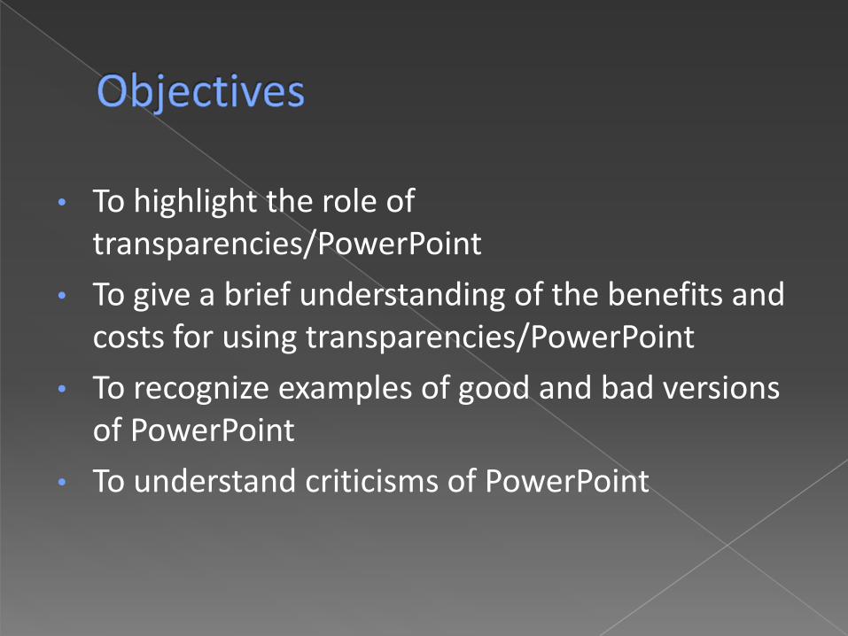
• To highlight the role of transparencies/PowerPoint
• To give a brief understanding of the benefits and costs for using transparencies/PowerPoint
• To recognize examples of good and bad versions of PowerPoint
• To understand criticisms of PowerPoint
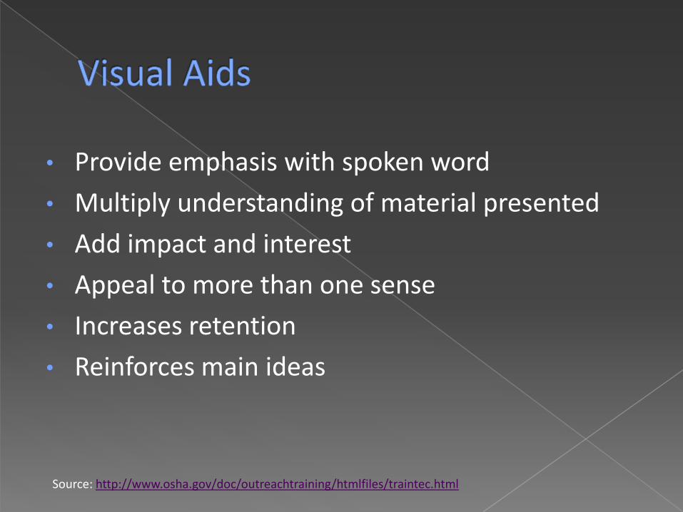
• Provide emphasis with spoken word
• Multiply understanding of material presented
• Add impact and interest
• Appeal to more than one sense
• Increases retention
• Reinforces main ideas
Source: http://www.osha.gov/doc/outreachtraining/htmlfiles/traintec.html

Pros
• Face-to-face contact with audience
• Projector – easy access for speaker
• Ability to modify information during presentations
• Does not require dark spaces
Cons
• Difficult to write on the transparency while on projector
• Text size too smallSources: http://www.plu.edu/libr/media/using_overhead.htmlhttp://www.osha.gov/doc/outreachtraining/htmlfiles/traintec.html

• Keep transparencies simple
• Practice using transparencies
• Do not stand in front of the projected image
• Cover the transparency when not in use
• Eight (8) words per line
• Twelve (12) lines per sheet
• Use block letters, not script
Sources: http://www.presentation-pointers.com/showarticle/articleid/259/http://www.oitcinterfor.org/public/spanish/region/ampro/cinterfor/temas/worker/doc/sind/v/viii/index.htm

Past
• Bullet pointed lists on overhead projectors
• 1984 – House software called “Presenter”
• 1987 – Acquired by Microsoft and developed into PowerPoint
• 1990s – Production of Windows
Source: http://stevensonconsulting.com/index.php?option=com_content&task=view&id=50&Itemid=2

• Fonts
• Size: 28 to 34 point (larger for titles)
• Type: Sans serif, avoid Fancy Fonts• Color: Proper contrast with background
• DO NOT TYPE IN ALL CAPS
• Backgrounds
• No harsh colors or patterns
• Use proper contrast with font color

• Layout
• Label each screen
• Do not make screens text heavy
• Limit font types and colors
• Consistent
• 7x7 Rule
• Limit clip art & animation features

• Presentation Tips
• Chek four speeling an grammer
• Do not read the presentation
• Practice the presentation
• Give a brief overview at the start
• Do not turn your back on the audience
Tip Sources: http://www.cheney268.com/training/PowerPoint/PowerPointTips.htmhttp://www.cob.sjsu/edu/splane_m/PresentationTips.htmlhttp://academictech.doit.wisc.edu/ORFI/pts/Modules/PTS_getStarted.htmhttp://library.med.utah.edu/ed/eduservices/handouts/PowerPoint_Web/ppp-tips.pdf

This can cause the participant to lose focus on material being presented.
When PowerPoint is bad, it can be really bad. For instance, too many words on a screen for no reason really make it hard for the participant to understand the connection of the information being presented.
Using hard to read fonts such as this one that can either be
way too small or just the right size can still prove to be a nightmare for participants

• Also bring up as many topics as possible in this one
screen so you can limit the number of screens you use
in your presentation
• Bad powerpoint really is an epidemic and should be stoped and now I am writing just to continue adding information on the screen since the autofit makes the words smaller on the page for me.
• After the training today we will conduct a meeting in the conference room
• Or reading text that was this color on this background •Wait, Let’s throw in some animation!
• Imagine trying to focus on words with this back ground image
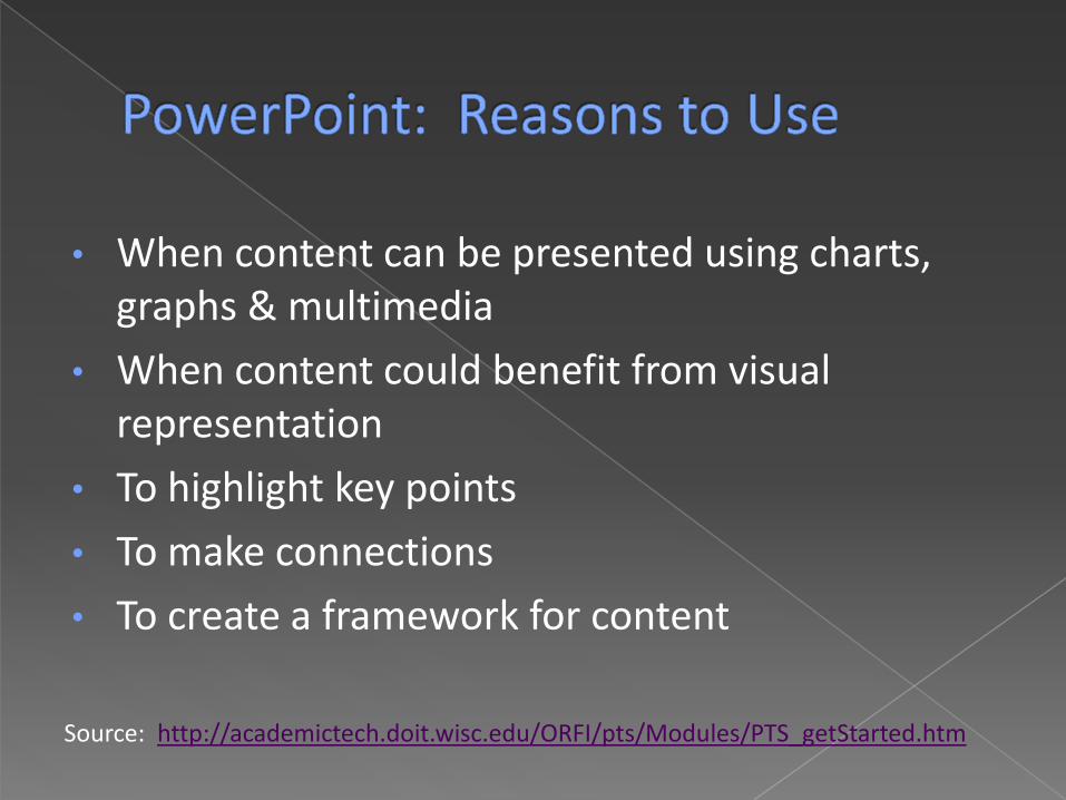
• When content can be presented using charts, graphs & multimedia
• When content could benefit from visual representation
• To highlight key points
• To make connections
• To create a framework for content
Source: http://academictech.doit.wisc.edu/ORFI/pts/Modules/PTS_getStarted.htm

• Becoming a PowerPoint hostage
• PowerPoint replacing attendance
• Sensory Overload
• PowerPoint making audiences dumb

• Not “Communicating”
• Transfer of Emotion
• It is Selling
Making a Great Presentation
• Use cue cards
• Reinforce words
• Make a written document
• Distribute handouts AFTER the presentation

• PowerPoint Phluff
• Bullet lists making us dumber?
• High-resolution Visuals
• Replace PowerPoint slides with real handouts

• Remember: PowerPoint is a supplemental
• Designer formats will not salvage a presentation
• Do not over-stimulate the audience
• Use paper handouts to reiterate point
• Do not use PowerPoint for overly complicated explanations

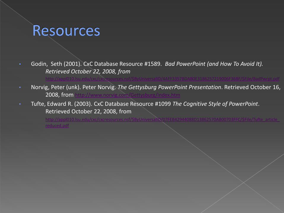
• Godin, Seth (2001). CxC Database Resource #1589. Bad PowerPoint (and How To Avoid It). Retrieved October 22, 2008, fromhttp://appl010.lsu.edu/cxc/cxcresources.nsf/$ByUniversalID/4AFF3357BDAB0E3186257219006F36BF/$File/BadPwrpt.pdf
• Norvig, Peter (unk). Peter Norvig. The Gettysburg PowerPoint Presentation. Retrieved October 16, 2008, from http://www.norvig.com/Gettysburg/index.htm
• Tufte, Edward R. (2003). CxC Database Resource #1099 The Cognitive Style of PowerPoint. Retrieved October 22, 2008, from http://appl010.lsu.edu/cxc/cxcresources.nsf/$ByUniversalID/07FEB42944088D13862570AB00703FFC/$File/Tufte_article_
reduced.pdf