edgarblogs.files.wordpress.com viewdigipak development diary. ... main image of the album and...
TRANSCRIPT

Digipak development diary
I began the creation of the digipak by starting with the front cover in which I place the main image of the album and magazine in the centre of the page and sizing it appropriately as well as cropping it to my desired taste.
In the next stage I created an appropriate background colour for the cover which was light blue as I thought it would help build contrast between the digipak and the actual content of the album in terms of lyrics and songs. I decided to place the artist name to the top right and the album title to the bottom left as this is a common convention in past and recent hip hop albums, creating more focus on the artist than the album; thus helping the artist to get more recognition amongst the mass audiences.

After that I finalised the cover by placing the parental advisory logo on the bottom right as this is another common convention for hip hop albums such as Nas – ‘Illmatic’ since they tend to hold explicit language within their lyrics, which is also the same for this album where some of the lyrics feature swear words to meet its respective target audience. I then decided to add an inner/outer glow effect for both pieces of text to make them appear more stylish on the front cover; another thing that helped support this was the process of me focusing the intensity of the background colour on the image in centre so that the colour brightens as it reaches the edges, allowing the text to be more prominent.
The creation of the back cover began with me placing the other image on to the same starting background colour to achieve a sense of consistency through album artwork. I placed the chosen image to the far right as the track listings would be on the far left, showing that the character was looking directly at the song names with its facial expression.
The next stage involved me placing the main text which was the track listing for the album songs. I placed the track listing to the far left as it’s a common convention seen on most album back covers

and because of the fact that the vast majority of the listeners will be reading from right to left. I also placed some extra information at the bottom left of the page which showed that all the songs were produced by Dexodus except the third song which was produced by Otacon, another artist/producer; I did this because I saw the same feature of MF DOOM’s ‘Mm…food’ album which I see as a new rising convention amongst album digipaks. Lastly for this stage I decided to stylize the main image by creating a ‘staggering wind’ effect on the character to make him appear more abstract which would then promote the album’s style and genre of abstract hip hop that’s out the box.
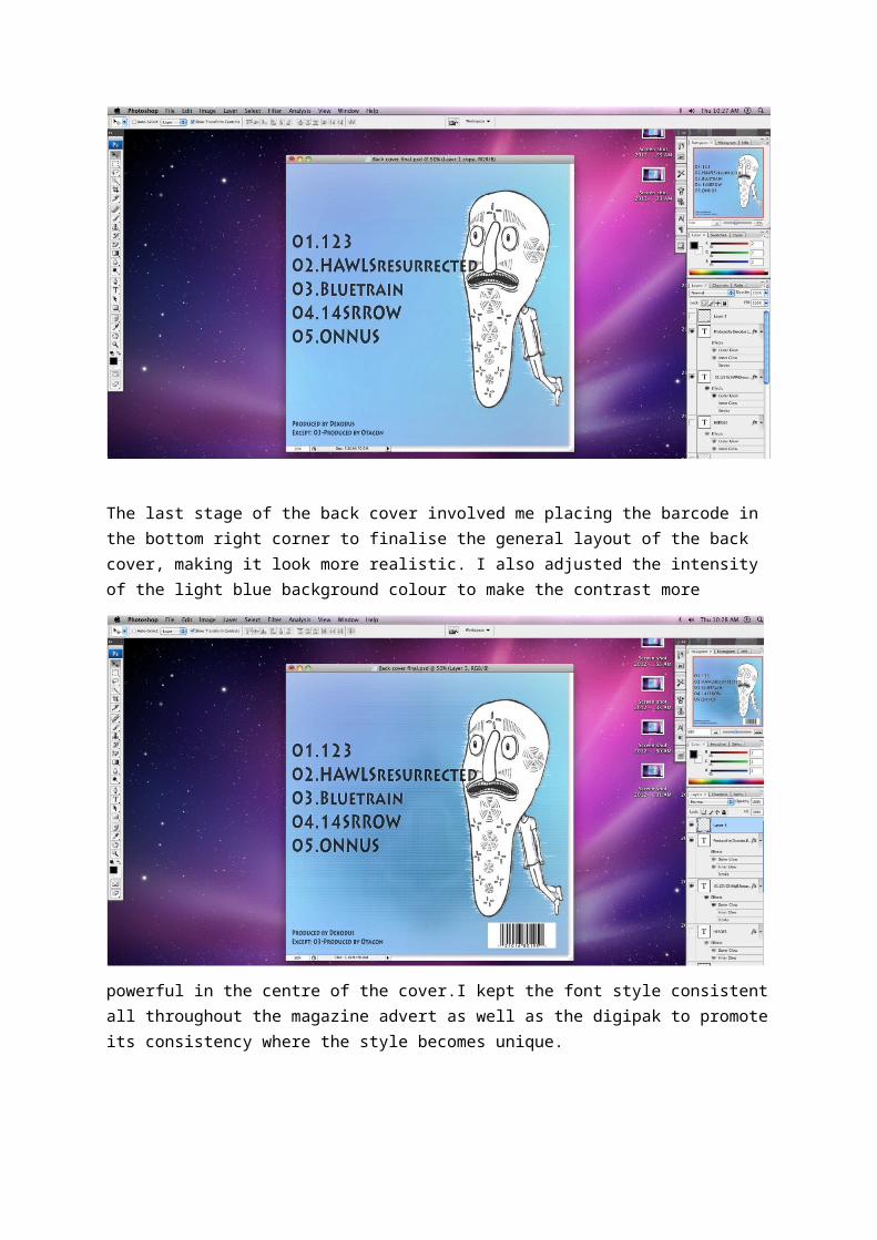
The last stage of the back cover involved me placing the barcode in the bottom right corner to finalise the general layout of the back cover, making it look more realistic. I also adjusted the intensity of the light blue background colour to make the contrast more powerful in the centre of the cover.I kept the font style consistent all throughout the magazine advert as well as the digipak to promote its consistency where the style becomes unique.
For the left part of the inside of the digipak I took the original front cover image, flipped it horizontally and stylized it with a glowing edges effect to essentially invert the look of the image overall. I did this to basically show the other side of the image concept wise and also by looking at the inside of the digipak which would should this as the other side of the front cover.
The right part of the inside of the digipak I basically did the same for the previous image, which was to flip the image horizontally and apply a glowing edges effect. Overall I think this was a good choice for the inside of the digipak as it still maintained the sense of consistency and also allowed more room for a new image concept with contrast, since the inside would essentially be the complete opposite of the outside which the colours switch from light to dark.