vertigo case study
TRANSCRIPT
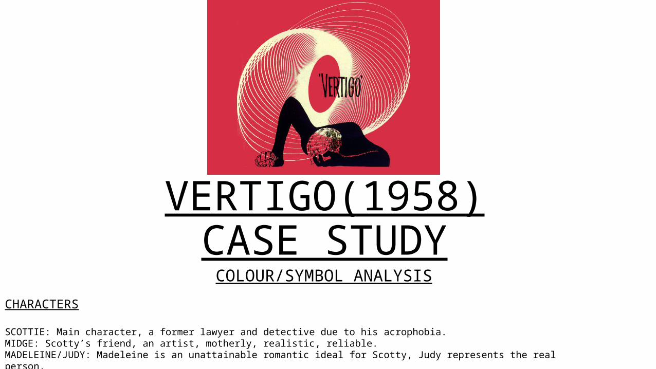
VERTIGO(1958)CASE STUDYCOLOUR/SYMBOL ANALYSIS
CHARACTERS
SCOTTIE: Main character, a former lawyer and detective due to his acrophobia. MIDGE: Scotty’s friend, an artist, motherly, realistic, reliable. MADELEINE/JUDY: Madeleine is an unattainable romantic ideal for Scotty, Judy represents the real person.

COLOURColour in Vertigo is used as a platform for symbolising the characters feelings and intentions. The colours used also often represent the situation that the charcaters are in or that they may be in due to their actions. Each colour used holds a separate meaning that can be linked with certain scenes.
Often the colours used are on opposing sides of the colour wheel, the colours in the scene may be blue and red if the character is in danger or if the atmosphere is calm the colours will be close on the wheel e.g purple and pink.
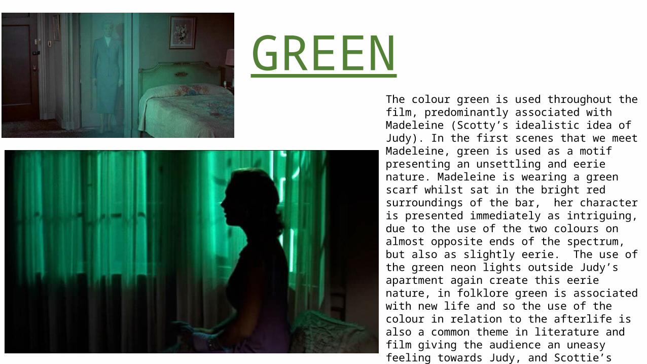
GREENThe colour green is used throughout the film, predominantly associated with Madeleine (Scotty’s idealistic idea of Judy). In the first scenes that we meet Madeleine, green is used as a motif presenting an unsettling and eerie nature. Madeleine is wearing a green scarf whilst sat in the bright red surroundings of the bar, her character is presented immediately as intriguing, due to the use of the two colours on almost opposite ends of the spectrum, but also as slightly eerie. The use of the green neon lights outside Judy’s apartment again create this eerie nature, in folklore green is associated with new life and so the use of the colour in relation to the afterlife is also a common theme in literature and film giving the audience an uneasy feeling towards Judy, and Scottie’s ideal of her as Madeleine.

REDRed is another common colour throughout the film, featuring with both female character, the title sequence, Scottie’s breakdown and in his nightmare.In literature red is traditionally associated with danger, passion or lust. Each of these explain the use of the colour with both the character of Madeleine and also Scottie’s illness. Madeleine is often presented surrounded by the colour and is Scottie’s ideal partner. His lust towards her creates for him an obsession that eventually turns into danger.
The use of red in Scottie’s nightmare, alongside the shot of Scottie’s breakdown featuring red roses, associates this colour with the illness. This could present Scottie’s feelings towards heights and creates an uneasy atmosphere for the audience.
Midge is placed in red, with red glasses when she unsuccessfully places herself within Scottie’s fantasy. Linking her character with the feelings Scottie has for Madeleine, and again repeating this sense of danger and uncertainty.
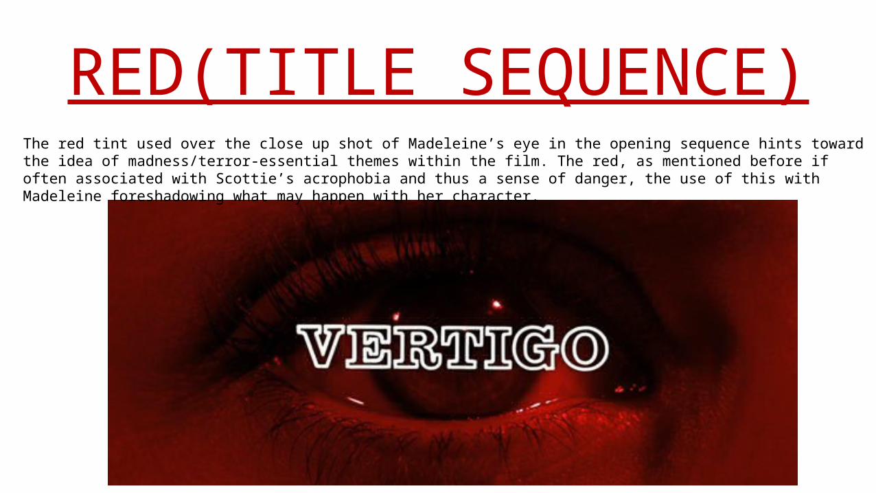
RED(TITLE SEQUENCE) The red tint used over the close up shot of Madeleine’s eye in the opening sequence hints toward the idea of madness/terror-essential themes within the film. The red, as mentioned before if often associated with Scottie’s acrophobia and thus a sense of danger, the use of this with Madeleine foreshadowing what may happen with her character.
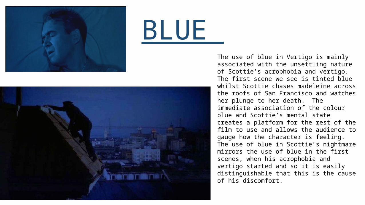
BLUE The use of blue in Vertigo is mainly associated with the unsettling nature of Scottie’s acrophobia and vertigo. The first scene we see is tinted blue whilst Scottie chases madeleine across the roofs of San Francisco and watches her plunge to her death. The immediate association of the colour blue and Scottie’s mental state creates a platform for the rest of the film to use and allows the audience to gauge how the character is feeling. The use of blue in Scottie’s nightmare mirrors the use of blue in the first scenes, when his acrophobia and vertigo started and so it is easily distinguishable that this is the cause of his discomfort.

PINK/YELLOW/ORANGEPinks, yellows and oranges are used usually in association with the female characters, mostly Midge. Midge is seen as the motherly, caring and reliable character in the film. Her want to help Scottie and her professions of painting and designing clothes presents her as a typically feminine character. As Scottie follows Madeleine she leads him to a flower market, the colours that surround her feature yellows, oranges and pinks although as mentioned in the previous slides, the colour is mostly green. Pinks, oranges and yellows are fairly delicate and subtle colours that can be associated with a stereotypically feminine nature, this may be the reason that Midge is often wearing or placed with this spectrum of colours. The contrast of these pastel colours with Midge and the bold, bright colours kept with Madeleine present the opposing nature of each character, one caring and quiet the other striking and powerful. The colours could also represent Scottie’s feelings towards the women, the powerful colours representing his desire for Madeleine whereas the calming colours with Midge could present the safety or comfort he feels around her. These colours also feature briefly in Scottie’s nightmare although they quickly turn to white, this could present how Scottie feels Midge is slipping away from him.