uxpin mastering the power of nothing
TRANSCRIPT
7/24/2019 Uxpin Mastering the Power of Nothing
http://slidepdf.com/reader/full/uxpin-mastering-the-power-of-nothing 1/30

7/24/2019 Uxpin Mastering the Power of Nothing
http://slidepdf.com/reader/full/uxpin-mastering-the-power-of-nothing 2/30
White Space in Web UI Design
Mastering the Power of Nothing

7/24/2019 Uxpin Mastering the Power of Nothing
http://slidepdf.com/reader/full/uxpin-mastering-the-power-of-nothing 3/30
Copyright © 2015 by UXPin Inc.
All rights reserved. No part of this publication text may be uploaded
or posted online without the prior written permission of the publisher.
For permission requests, write to the publisher, addressed “Attention:
Permissions Request,” to [email protected].

7/24/2019 Uxpin Mastering the Power of Nothing
http://slidepdf.com/reader/full/uxpin-mastering-the-power-of-nothing 4/30
Index
Introduction to White Space 6
Empty Causes 8
Macro and Micro White Space 10
Passive and Active Space 14
How to Apply White Space 18
White Space & Minimalism 25
Conclusion 29

7/24/2019 Uxpin Mastering the Power of Nothing
http://slidepdf.com/reader/full/uxpin-mastering-the-power-of-nothing 5/30

7/24/2019 Uxpin Mastering the Power of Nothing
http://slidepdf.com/reader/full/uxpin-mastering-the-power-of-nothing 6/30
Introduction to White Space
Your design lives within a finite screen. There is only so much that
can be said, done, and offered within that tiny box, and so every last
pixel is valuable real estate.
Source: “bureauhub architecture…” Forgemind ArchiMedia. Creative Commons.
7/24/2019 Uxpin Mastering the Power of Nothing
http://slidepdf.com/reader/full/uxpin-mastering-the-power-of-nothing 7/30
White Space in Web UI Design: Mastering the Power of Nothing 7
Of course even amateur designers know not to overload a single
page, but when it comes to exactly how much white space to include,
sometimes even seasoned designers might draw a blank.
White space, or “negative space” as it’s also known – the two terms
are used interchangeably – refers to any screen space between ex-
isting elements. It doesn’t need to to be white, or even blank (if, for
example, you’re using a patterned, colored, or textured background).
Negative space creates a vacuum of content, which then draws more
attention to the existing content.
In this book, we’ll discuss the how to apply one the most powerful
tools in a designer’s toolbox: nothing at all. If you find this book help-
ful, feel free to share with anyone else who might enjoy it.
Jerry Cao
co-written by Kamil Zieba, Krzysztof Stryjewski, and Matt Ellis
7/24/2019 Uxpin Mastering the Power of Nothing
http://slidepdf.com/reader/full/uxpin-mastering-the-power-of-nothing 8/30
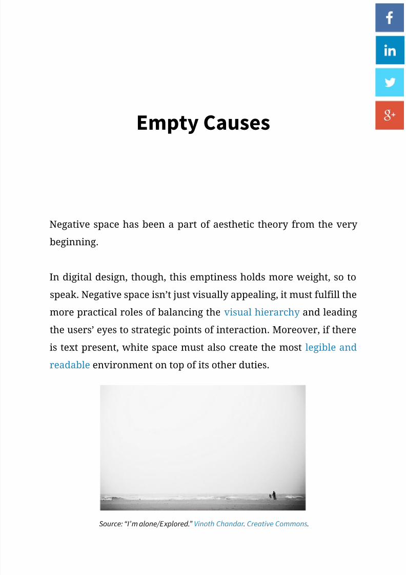
Empty Causes
Negative space has been a part of aesthetic theory from the very
beginning.
In digital design, though, this emptiness holds more weight, so to
speak. Negative space isn’t just visually appealing, it must fulfill the
more practical roles of balancing the visual hierarchy and leading
the users’ eyes to strategic points of interaction. Moreover, if there
is text present, white space must also create the most legible and
readable environment on top of its other duties.
Source: “I’m alone/Explored.” Vinoth Chandar . Creative Commons.

7/24/2019 Uxpin Mastering the Power of Nothing
http://slidepdf.com/reader/full/uxpin-mastering-the-power-of-nothing 9/30
White Space in Web UI Design: Mastering the Power of Nothing 9
In general, white space directly affects the following areas:
• Eye-scanning – The space between bigger elements (macro white
space) affects how the user scans the page, and when used prop-
erly can guide the user’s sight to notice whichever elements you
want. This is helpful for creating a brand identity and increasing
user interactions.
• Legibility – The space between smaller elements (micro) like let-
ters, lines of texts, list items, and sometimes icons will affect how
clearly and quickly each can be read and possibly selected.
• Aesthetics – When looking at the big picture, white space plays
a big part in the visual organization (and therefore aesthetics) of
the interface. For example, random clustering of content rarely
looks good.
• Luxury – Generous white space infuses your page with an air of
elegance and sophistication.
To better understand how to apply it, we can categorize the different
types of white space (macro and micro), as well as the different waysto use them (passive and active).

7/24/2019 Uxpin Mastering the Power of Nothing
http://slidepdf.com/reader/full/uxpin-mastering-the-power-of-nothing 10/30
White Space in Web UI Design: Mastering the Power of Nothing 10
Macro and Micro White Space
Where and how white space is used on a page will affect its role. To
simplify this, we can break these types up into macro and micro.
1. Macro White Space
Macro white space refers to the spacing between large elements.
This is the spacing used for:
• General composition
• Separating different elements
• Text columns
• Margins
• Padding
• Space within actual graphics/images
Macro white space heavily affects the user’s visual flow, either
gently nudging or forcefully push their attention where you want.
The rule here is that larger distances push harder. You want to
strike a balance, however, because too much white space violates
Gestalt Principles and weakens the relationships between objects.
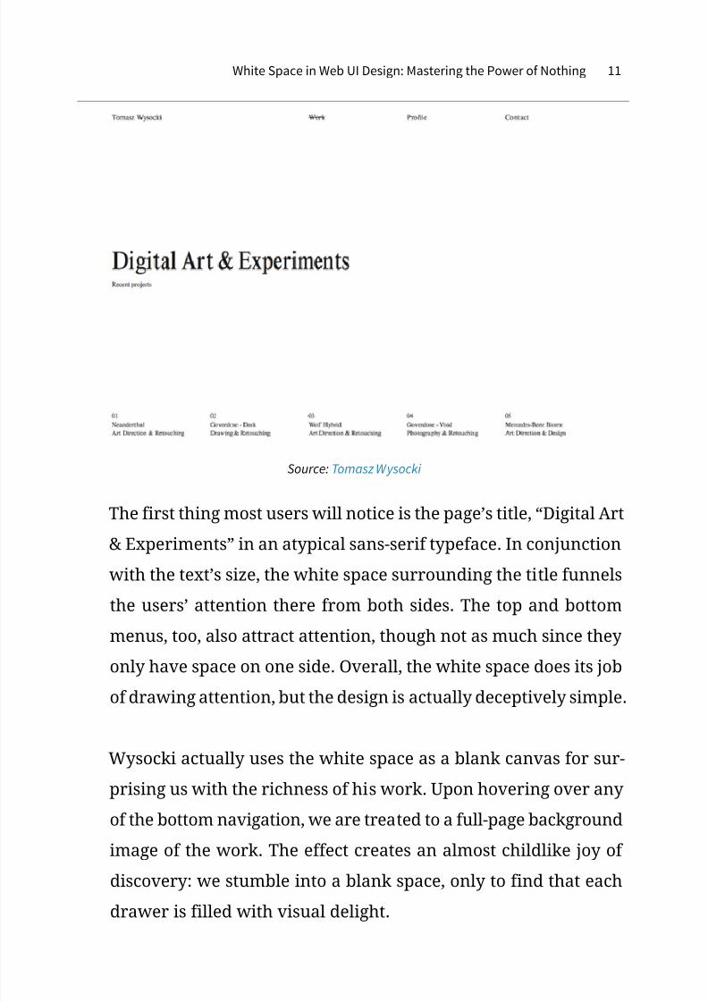
Let’s look at art director Tomasz Wysocki’s site for an example of
how white space entices user interaction.
7/24/2019 Uxpin Mastering the Power of Nothing
http://slidepdf.com/reader/full/uxpin-mastering-the-power-of-nothing 11/30
White Space in Web UI Design: Mastering the Power of Nothing 11
Source: Tomasz Wysocki
The first thing most users will notice is the page’s title, “Digital Art
& Experiments” in an atypical sans-serif typeface. In conjunction
with the text’s size, the white space surrounding the title funnels
the users’ attention there from both sides. The top and bottom
menus, too, also attract attention, though not as much since they
only have space on one side. Overall, the white space does its job
of drawing attention, but the design is actually deceptively simple.
Wysocki actually uses the white space as a blank canvas for sur-
prising us with the richness of his work. Upon hovering over any
of the bottom navigation, we are treated to a full-page background
image of the work. The effect creates an almost childlike joy of
discovery: we stumble into a blank space, only to find that each
drawer is filled with visual delight.

7/24/2019 Uxpin Mastering the Power of Nothing
http://slidepdf.com/reader/full/uxpin-mastering-the-power-of-nothing 12/30
White Space in Web UI Design: Mastering the Power of Nothing 12
You can see below how dramatically the screen transforms upon
hover:
Source: Tomasz Wysocki
By using white space as a tool for luring users into his work, Wysoc-
ki creates an experience that is strangely addictive. After the first
work appears, we want to see what else he’s hidden from us – it
feels counterintuitive from a discoverability standpoint (sinceyou’d want to reveal the most important content), but it works
because it’s executed with the perfect level of intrigue.
2. Micro White Space
On the other hand, when designers mention micro white space,
they are referring to the space between smaller elements, or the
elements within greater elements. These include:
7/24/2019 Uxpin Mastering the Power of Nothing
http://slidepdf.com/reader/full/uxpin-mastering-the-power-of-nothing 13/30
White Space in Web UI Design: Mastering the Power of Nothing 13
• Letters
• Lines of Text
• Paragraphs
• List Items
• Buttons & Icons
Micro white space is used mostly for the overall clarity of the site,
specifically legibility of typography (how clearly you can distin-
guish each letter). When adding space in and around text, you’ll
want to strike the balance between just enough to aid clarity, but
not so much that it distracts from more important elements. It’s
usually a good idea to set the line height (vertical space between
lines) to around 1.5x your type size.
As we mentioned when discussing the Gestalt principles in our Web
UI Design for the Human Eye, putting elements in close proximity
also suggests they function similarly. Micro white space can help
suggest a relationship between buttons or links, and mimicking
this spacing elsewhere reinforces a pattern, which increases rec-
ognition (and learnability) with use.
While macro and micro are the types of white space, each can be
used either passively or actively, which we’ll explain now.

7/24/2019 Uxpin Mastering the Power of Nothing
http://slidepdf.com/reader/full/uxpin-mastering-the-power-of-nothing 14/30
White Space in Web UI Design: Mastering the Power of Nothing 14
Passive and Active Space
The application of white space all depends upon context.
As we said above, the more space used, the stronger the pull. But
you don’t always want the strongest pull possible for every element
on a page, not to mention how much screen real estate that would
consume.
Let’s look at how passive and active space help create balance in
negative space.
1. Passive Space
Think of passive white space as the bare minimum.
Without enough white space, a site becomes illegible and frustrat-
ing to navigate, as effort is required to make sense of the jumble.
Passive white space is however much white space is required to
make the site comprehensible.
Source: Resonate ‘15
7/24/2019 Uxpin Mastering the Power of Nothing
http://slidepdf.com/reader/full/uxpin-mastering-the-power-of-nothing 15/30
White Space in Web UI Design: Mastering the Power of Nothing 15
In the above example, take a look at the spacing between the
words/links at the top navigation bar. Also, look at the text at the
bottom and the spacing between the letters, words, and lines. Do
you notice anything out of the ordinary? You shouldn’t, they’re all
spaced so as not to draw attention. That’s passive spacing.
For macro white space, passive spacing means adding enough
borders and margins to clarify the distinctions between elements
and avoid confusion. For example, putting enough space between
a login navigation bar and a site navigation bar at the top of the
screen.
For micro white space, this means spacing out letters, lines of text,
and paragraphs to maximize readability, and spacing items in a list
or menu to make them individually easy to spot when scanning
(in other words, removing clutter).
Passive applications should feel organic and natural. In fact, the
main purpose of passive white space is that it goes unnoticed.
What makes it passive is that it doesn’t draw attention to itself. Itsimply looks “normal.”
The moment when enough space is used that it starts to stand out,
then it becomes active.

7/24/2019 Uxpin Mastering the Power of Nothing
http://slidepdf.com/reader/full/uxpin-mastering-the-power-of-nothing 16/30
White Space in Web UI Design: Mastering the Power of Nothing 16
2. Active Space
Using white space actively is attempting to influence your user’s
visual flow. Surrounding an element with a large amount of white
space is a great way to get it noticed.
Source: 1000: Chrome Experiments
There are actually a lot of elements on the above page: navigation
tabs, social media links, even legal information. However, the mostprominent is clearly the interactive “1000” graphic that’s dead cen-
ter. By shrinking and pushing the other elements to the corners,
the designers at Chrome Experiments actively maximize the space
around the element they want the users to interact with most.
Likewise, minimizing the amount of space between a smaller
line and the one proceeding may be a good way to “hide” it, as is
7/24/2019 Uxpin Mastering the Power of Nothing
http://slidepdf.com/reader/full/uxpin-mastering-the-power-of-nothing 17/30
White Space in Web UI Design: Mastering the Power of Nothing 17
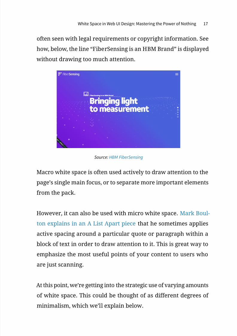
often seen with legal requirements or copyright information. See
how, below, the line “FiberSensing is an HBM Brand” is displayed
without drawing too much attention.
Source: HBM FiberSensing
Macro white space is often used actively to draw attention to the
page’s single main focus, or to separate more important elements
from the pack.
However, it can also be used with micro white space. Mark Boul-
ton explains in an A List Apart piece that he sometimes applies
active spacing around a particular quote or paragraph within ablock of text in order to draw attention to it. This is great way to
emphasize the most useful points of your content to users who
are just scanning.
At this point, we’re getting into the strategic use of varying amounts
of white space. This could be thought of as different degrees of
minimalism, which we’ll explain below.

7/24/2019 Uxpin Mastering the Power of Nothing
http://slidepdf.com/reader/full/uxpin-mastering-the-power-of-nothing 18/30
White Space in Web UI Design: Mastering the Power of Nothing 18
How to Apply White Space
Every website uses space differently based on the purpose of the
content.
Source: Raphael Malka
For example, a landing page may leave plenty of negative space be-
cause the focus is mostly on a call-to-action button (download button
or “Learn More” type of button, as you can see above).
Source: Over Clothing
7/24/2019 Uxpin Mastering the Power of Nothing
http://slidepdf.com/reader/full/uxpin-mastering-the-power-of-nothing 19/30
White Space in Web UI Design: Mastering the Power of Nothing 19
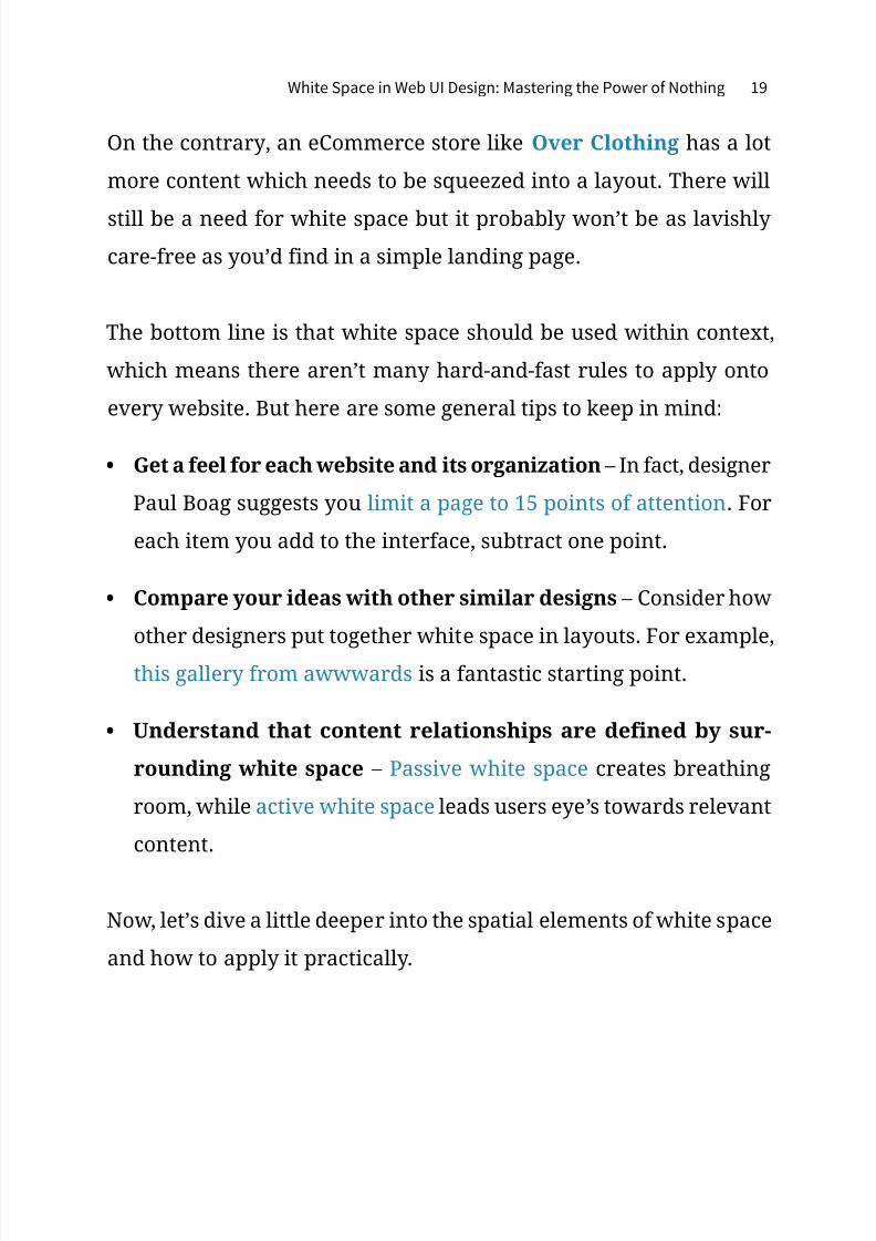
On the contrary, an eCommerce store like Over Clothing has a lot
more content which needs to be squeezed into a layout. There will
still be a need for white space but it probably won’t be as lavishly
care-free as you’d find in a simple landing page.
The bottom line is that white space should be used within context,
which means there aren’t many hard-and-fast rules to apply onto
every website. But here are some general tips to keep in mind:
• Get a feel for each website and its organization – In fact, designer
Paul Boag suggests you limit a page to 15 points of attention. For
each item you add to the interface, subtract one point.
• Compare your ideas with other similar designs – Consider how
other designers put together white space in layouts. For example,
this gallery from awwwards is a fantastic starting point.
• Understand that content relationships are defined by sur-
rounding white space – Passive white space creates breathing
room, while active white space leads users eye’s towards relevant
content.
Now, let’s dive a little deeper into the spatial elements of white space
and how to apply it practically.

7/24/2019 Uxpin Mastering the Power of Nothing
http://slidepdf.com/reader/full/uxpin-mastering-the-power-of-nothing 20/30
White Space in Web UI Design: Mastering the Power of Nothing 20
1. Spatial Design Features
Composition is the gestalt. It’s the whole website which arises from
the sum of its parts. To fully understand what works and why, you
must study white space from a compositional and microscopic level.
Source: Themes Kingdom
Themes Kingdom is a good example because their layout uses a vari-
ety of different spatial elements for different reasons. The negative
space found between top navigation links (shown above) feels more
compact than the space between block elements on the bottom of
the homepage. Nav links are crammed into a closely-packed navbar,the text is smaller, and the links feel like a more subtle piece of the
header. On the other hand Themes Kingdom uses many big links
with extra padding lower on the page. These links feel more spa-
cious and captivating in comparison to the smaller navbar.
Although the navigation links are smaller, they still come across
as one large collection of links. White space for grouped elements

7/24/2019 Uxpin Mastering the Power of Nothing
http://slidepdf.com/reader/full/uxpin-mastering-the-power-of-nothing 21/30
White Space in Web UI Design: Mastering the Power of Nothing 21
should be used to convey similarities of links. To forge a close
relationship between content it’s a good idea to float elements
side-by-side. Take for example the various theme category links
found directly underneath the header. These links are quaint yet
distinct featuring thin line icons for aesthetic appeal.
As described in Web UI Design for the Human Eye, the laws of
Gestalt dictate that objects in closer proximity will appear as one
“unit” whereby the white space acts as a visual cue.
Source: Themes Kingdom
But other items like the theme gallery widget are meant to be
spaced out. More space between the text and images (combined
with a contrasting color) forces visitors to draw their attention to
that gallery widget since nothing else is distracting. It’s a handy
little technique for links, buttons, or featured content where you’d
like to see more user interactivity.

7/24/2019 Uxpin Mastering the Power of Nothing
http://slidepdf.com/reader/full/uxpin-mastering-the-power-of-nothing 22/30
White Space in Web UI Design: Mastering the Power of Nothing 22
Portfolio sites are another great source of white space inspiration
since designers take great care to frame their work with taste and
sensibility. A great website design wraps all of this visual infor-
mation in a spectacular gift box.
Source: Drew Wilson
While there are many great examples available, we recommend
checking out Drew Wilson’s website. The white space on his port-
folio is based entirely on the content structure to enhance certain
blocks of text & imagery.
His layout is also meant to be a single-page design. Without extra
pages, all of the content is forced into a small layout which requires
a keen sense of white space and compositional balance.
You should notice that his website doesn’t just rely on typography,
color, space, animation, or any other single design technique. All

7/24/2019 Uxpin Mastering the Power of Nothing
http://slidepdf.com/reader/full/uxpin-mastering-the-power-of-nothing 23/30
White Space in Web UI Design: Mastering the Power of Nothing 23
of these principles are combined together so that they fit quite
naturally into the overall layout.
2. Pragmatic Application
Although each website design is unique, you should always pair
white space with other design techniques that work well off each
other.
Here’s some more tips for practically applying white space:
• Variety is a good thing – Some areas may need less white space,
others may need a lot more. Go with the flow and rely on your
designer’s intuition.
• Prioritize legibility and readability – Before you start design-
ing, create an interface inventory to assess the scope of your
content. Once you’re done, try creating some rough content
wireframes to assess how much space is required for legibility
(how well you can discern the letters and words) and readabil-
ity (how well you can scan the content).
• Break out of the vacuum – Use contrasting colors, disparative
font sizes, and asymmetrical white space to add extra style
into a layout. Understand that white space is a reactive design
element and affects the perception of all surrounding elements.
The application of white space is both aesthetic and pragmatic. It af-fects digital design just like it would affect a painting – but a website
7/24/2019 Uxpin Mastering the Power of Nothing
http://slidepdf.com/reader/full/uxpin-mastering-the-power-of-nothing 24/30
White Space in Web UI Design: Mastering the Power of Nothing 24
is not a painting. A website is meant to be touched, clicked, scrolled,
and used by as many people as possible.
Pragmatic white space creates a structure around content which is
vital to the success of any design. Take a peek at why whitespace
matters to learn more about designing space for content.
7/24/2019 Uxpin Mastering the Power of Nothing
http://slidepdf.com/reader/full/uxpin-mastering-the-power-of-nothing 25/30
White Space in Web UI Design: Mastering the Power of Nothing 25
White Space & Minimalism
The more white space you use, the more minimalistic your page be-
comes since you’ll need to remove elements to prevent clutter.
Minimalism is a design philosophy that’s neither good nor bad – it
simply states that you remove any noise so users can focus on the
content. As you trim away the bells and whistles, the remaining con-
tent stands proud amidst the elegance of space.
Minimalism affects your site in a couple ways: the amount of elements
present, and the perception of luxury.
1. Amount of Elements
The less elements you have on your page, the more powerful each
individual element becomes.
If you have only one thing on your page, even tucked away in
the corner, it will become the sole focus of your user. If you have
a hundred tiny things, your users will either begrudgingly sift
through them for their point of interest, or more realistically, just
give up from choice paralysis.
This is relevant because the easiest way to increase the white space
at your disposal is reducing the number of elements on the page.
But we know that’s much easier said than done. Minimalism as aphilosophy applies to any site – you never want to fill the screen

7/24/2019 Uxpin Mastering the Power of Nothing
http://slidepdf.com/reader/full/uxpin-mastering-the-power-of-nothing 26/30
White Space in Web UI Design: Mastering the Power of Nothing 26
with anything the user doesn’t need. Minimalism as an aesthetic,
however, is not appropriate for every site since content-heavy
sites won’t be able to support the bare look.
When it comes to minimalism, remember that the aesthetic is the
byproduct and not the goal. The only way you’ll achieve the right
level of minimalism is to subtract just enough interface objects
until the design almost fails, then test the design with users, stop-
ping when you hit the tipping point.
Source: voghi
The site for the Italian fashion brand voghi keeps it simple and
beautiful. There are only two clickable elements on the screen: the
hamburger menu at the side and the arrow at the bottom. With
the contact information minimized at the right, the lack of com-
peting visuals focus the attention on the gorgeous graphic, which
then leads attention to the arrow.

7/24/2019 Uxpin Mastering the Power of Nothing
http://slidepdf.com/reader/full/uxpin-mastering-the-power-of-nothing 27/30
White Space in Web UI Design: Mastering the Power of Nothing 27
How you balance the significance of your items is up to you. Some
pages have only one clickable link to ensure the user goes where
the designer wants. Other sites have many menus of pulldown
submenus to ensure that the user chooses exactly the option they
want. As Kayla Knight suggests, you could consider removing ta-
glines, “Featured Content”, and simplifying your navigation. Of
course, that all depends on your brand and product.
2. Perception of Luxury
Minimalism has become synonymous with luxury, and its use im-
mediately conjures an atmosphere of sophistication, fashion, and
elegance. Fashion websites are notorious users of minimalism in
their digital designs – but it’s rare to find those same designs for
bargain or mass-market firms.
The perception of luxury has a direct correlation to the amount
of white space:
• Heavy white space is seen as luxurious, high-end, or sophisti-
cated, and as such expensive.
• Balanced white space is seen as, well, balanced – affordable
but still quality.
• Little white space is seen as cheap, low-quality, and the clutter
is also displeasing to look at.

7/24/2019 Uxpin Mastering the Power of Nothing
http://slidepdf.com/reader/full/uxpin-mastering-the-power-of-nothing 28/30
White Space in Web UI Design: Mastering the Power of Nothing 28
Source: Amazon
Compare the fashion website voghi we first examined to this screen-
shot from Amazon. Amazon is more cluttered and includes more
navigation options and promotions. Both sites sell high-end fashion
products, but which do you think a typical fashionable user would
prefer? What about a reasonable, price-saver type of shopper?
This applies to macro and micro space, but also – and most impor-
tantly – to the images used within the site itself. Browsing the pho-tography from fashion websites, you’ll notice more artistry applied
than the average photography from, say, an electronics website.
Ultimately, you’ll always want to start first and foremost with the
needs of your users. Research your users, create useful personas,
then consider how white space can frame content so they can best
accomplish their goals.

7/24/2019 Uxpin Mastering the Power of Nothing
http://slidepdf.com/reader/full/uxpin-mastering-the-power-of-nothing 29/30
White Space in Web UI Design: Mastering the Power of Nothing 29
Conclusion
As a visual art, design can’t neglect one of its most fundamental ar-
tistic principles. Nor should it – the power of white space goes far
beyond aesthetics and can be used strategically to further the more
business-related goals of interaction design.
At the bare minimum level, its use facilitates the basic functions of
a site or app like readability and navigation. But in the hands of anexpert, the smart use of white space transforms otherwise plain in-
terfaces into designs that users want to interact with.
Create an interface in UXPin (7-30 day free trial)

7/24/2019 Uxpin Mastering the Power of Nothing
http://slidepdf.com/reader/full/uxpin-mastering-the-power-of-nothing 30/30