user interface design systems analysis and design, 6 th edition dennis, wixom, and roth © 2015 john...
TRANSCRIPT

© 2015 JOHN WILEY & SONS. ALL RIGHTS RESERVED.
User Interface DesignSYSTEMS ANALYSIS AND DESIGN, 6 T H EDITION
DENNIS, WIXOM, AND ROTH
1

© 2015 JOHN WILEY & SONS. ALL RIGHTS RESERVED.
Learning Objectives Explain the concept of usability with regard to the user interface.
Describe several fundamental user interface design principles.
Explain the process of user interface design.
Explain ways to understand the perspectives of the users of the user interface.
Describe ways to define the structure of the user interface.
Explain the standards that should be established for the user interface.
Describe various ways to prototype the user interface.
Discuss ways to evaluate and test the user interface.
Discuss special concerns associated with touch-screen-enabled user interfaces.
Be able to design a highly usable user interface.
2

© 2015 JOHN WILEY & SONS. ALL RIGHTS RESERVED.
Key Definitions System Interface: “connections” with other systems, where systems exchange information with each other. Designed as a part of program design.
User Interface: “connections” with users. Focus of this chapter.◦ The navigation mechanism provides the way for users to tell the system what to do◦ The input mechanism defines the way the system captures information◦ The output mechanism defines the way the system provides information to users or other systems
3

© 2015 JOHN WILEY & SONS. ALL RIGHTS RESERVED.
Key Definitions, con’t. Graphical user interface (GUI): most common type of interface in use today.
4

© 2015 JOHN WILEY & SONS. ALL RIGHTS RESERVED.
Usability Concept The system is easy to use and easy to learn
Tasks are completed more efficiently and with more accuracy
Mistakes with system are reduced
User satisfaction with new system is increased
Adoption of system is more likely
5

© 2015 JOHN WILEY & SONS. ALL RIGHTS RESERVED.
Interface Design PrinciplesGENERAL GUIDELINES FOR USER INTERFACE DESIGN
6

© 2015 JOHN WILEY & SONS. ALL RIGHTS RESERVED.
Principles for User Interface Design Layout
Content awareness
Aesthetics
Usage level
Consistency
Minimize user effort
7
© 2015 JOHN WILEY & SONS. ALL RIGHTS RESERVED.
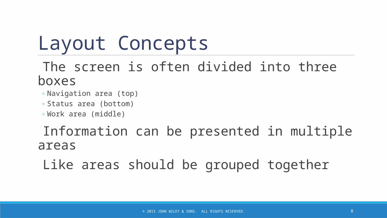
Layout Concepts The screen is often divided into three boxes
◦ Navigation area (top)◦ Status area (bottom)◦ Work area (middle)
Information can be presented in multiple areas Like areas should be grouped together
8

© 2015 JOHN WILEY & SONS. ALL RIGHTS RESERVED.
More Layout Concepts Areas and information should minimize user movement from one to another
Ideally, areas will remain consistent in◦ Size◦ Shape◦ Placement for entering data◦ Reports presenting retrieved data
9

© 2015 JOHN WILEY & SONS. ALL RIGHTS RESERVED.
Model Layout for Web Pageo Note use of multiple layout areas
for site navigation
10

© 2015 JOHN WILEY & SONS. ALL RIGHTS RESERVED.
Content Awareness All interfaces should have titles Menus should show
◦ where you are◦ where you came from to get there
It should be clear what information is within each area
Fields and field labels should be selected carefully Use dates and version numbers to aid system users
11

© 2015 JOHN WILEY & SONS. ALL RIGHTS RESERVED.
Content Awarenesso Note the use of highlighting to
indicate menu selections
o Breadcrumbs provide additional clues on navigational path
12
© 2015 JOHN WILEY & SONS. ALL RIGHTS RESERVED.
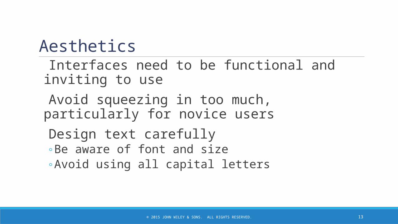
Aesthetics Interfaces need to be functional and inviting to use Avoid squeezing in too much, particularly for novice users Design text carefully
◦ Be aware of font and size◦ Avoid using all capital letters
13

© 2015 JOHN WILEY & SONS. ALL RIGHTS RESERVED.
More Aesthetics Colors and patterns should be used carefully
◦ Test quality of colors by trying the interface on a black/white monitor
◦ Use colors to separate or categorize items
14

© 2015 JOHN WILEY & SONS. ALL RIGHTS RESERVED.
Usage Level Some people will be frequent, heavy users of the system
Frequent users desire ease of use – quick and easy completion of job tasks
Other people may use the system infrequently
Infrequent users desire ease of learning – quick and easy ways to figure out what to do.
15

© 2015 JOHN WILEY & SONS. ALL RIGHTS RESERVED.
Usage Level User interface design should anticipate the types of users expected.
For systems primarily used by frequent users, include ways to perform tasks directly (hot keys, short-cut keys, etc.).
For systems primarily used by infrequent users, include careful menu designs, tool tips, and extensive help systems.
For systems with both user types, incorporate both user preferences in design as much as possible
16

© 2015 JOHN WILEY & SONS. ALL RIGHTS RESERVED.
Consistency Elements are the same throughout the application Enables users to predict what will happen Reduces learning curve Considers elements within an application and across applications
Pertains to many different levels◦ Navigation controls◦ Terminology◦ Report and form design
17

© 2015 JOHN WILEY & SONS. ALL RIGHTS RESERVED.
Example ofInconsistent ElementsNote the different button styles, colors, and font styles.
18

© 2015 JOHN WILEY & SONS. ALL RIGHTS RESERVED.
Minimize Effort Three clicks rule
◦ Users should be able to go from the start or main menu of a system to the information or action they want in no more than three mouse clicks or three keystrokes
19

© 2015 JOHN WILEY & SONS. ALL RIGHTS RESERVED.
Special Issues of Touch Screen Design Ideal for information display but not data entry.
Place content at top and navigation controls at bottom so finger does not obscure content area.
Place labels on top of navigation controls.
Size objects correctly for “fat fingers.”
Include adequate spacing between objects.
20

© 2015 JOHN WILEY & SONS. ALL RIGHTS RESERVED.
Special Issues of Touch Screen Design, con’t. Consider needs of left-handed and right-handed users.
Bright colors/backgrounds can help reduce glare and hide fingerprints.
Use each device’s standardized gesture interactions to enhance the user’s ease of learning and ease of use.
21

© 2015 JOHN WILEY & SONS. ALL RIGHTS RESERVED.
Android Device Common Hand Gestures
22

© 2015 JOHN WILEY & SONS. ALL RIGHTS RESERVED.
User Interface Design ProcessTHE PATH TO A SUCCESSFUL USER INTERFACE
23

© 2015 JOHN WILEY & SONS. ALL RIGHTS RESERVED.
User Interface Design Processo Understand the Users
o Organize the Interface
o Define Standards
o Develop Prototypes
o Evaluation / Testing
24

© 2015 JOHN WILEY & SONS. ALL RIGHTS RESERVED.
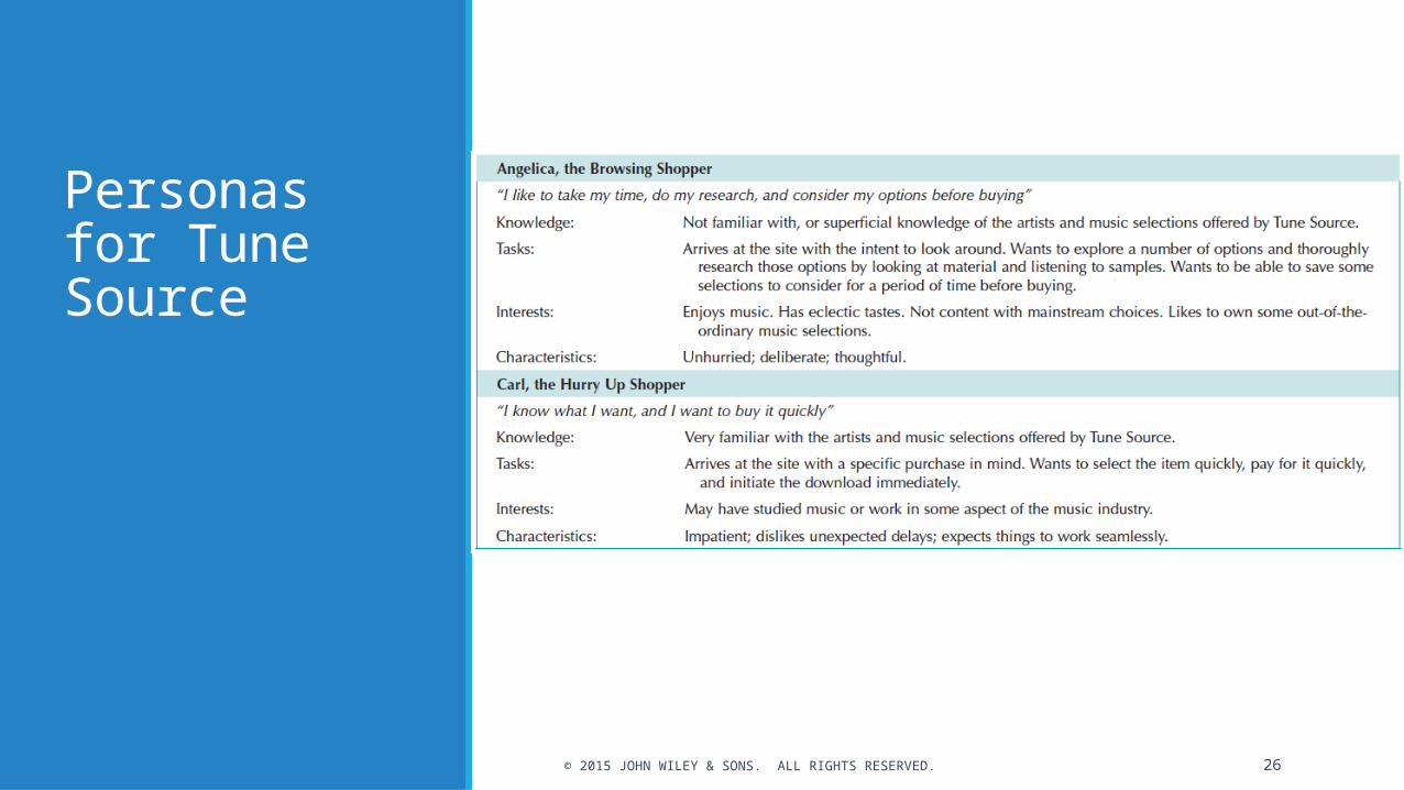
Understand the Users Users likely will have very different goals and intentions when
using the system.
Use personas to develop characterizations of various user groups.o Interestso Typical behaviorso Goals and objectiveso Expectations
Plan a user interface that will be satisfying for that particular user group.
25
© 2015 JOHN WILEY & SONS. ALL RIGHTS RESERVED.
Personas for Tune Source
26

© 2015 JOHN WILEY & SONS. ALL RIGHTS RESERVED.
Understand the Users, con’t. Use scenarios outline the steps that the users perform to
accomplish some part of their work.
Presented in a simple narrative tied to the related DFD.
Document the most common paths through the use case so interface designs will be easy to use for those situations.
27

© 2015 JOHN WILEY & SONS. ALL RIGHTS RESERVED.
Use Scenarios for Tune Source
28

© 2015 JOHN WILEY & SONS. ALL RIGHTS RESERVED.
Organize the Interface Define the basic components of the interface and how they work
together to provide functionality to users.
Use Interface Structure Diagram (ISD)
Shows how all screens, forms, and reports are related
Shows how user moves from one to another
Similar to DFD in using boxes and lineso Boxes denote screenso Lines show movement from one to another
Different from DFD in having no standard rules or format
29

© 2015 JOHN WILEY & SONS. ALL RIGHTS RESERVED.
Interface Structure Diagram for Tune Source
30

© 2015 JOHN WILEY & SONS. ALL RIGHTS RESERVED.
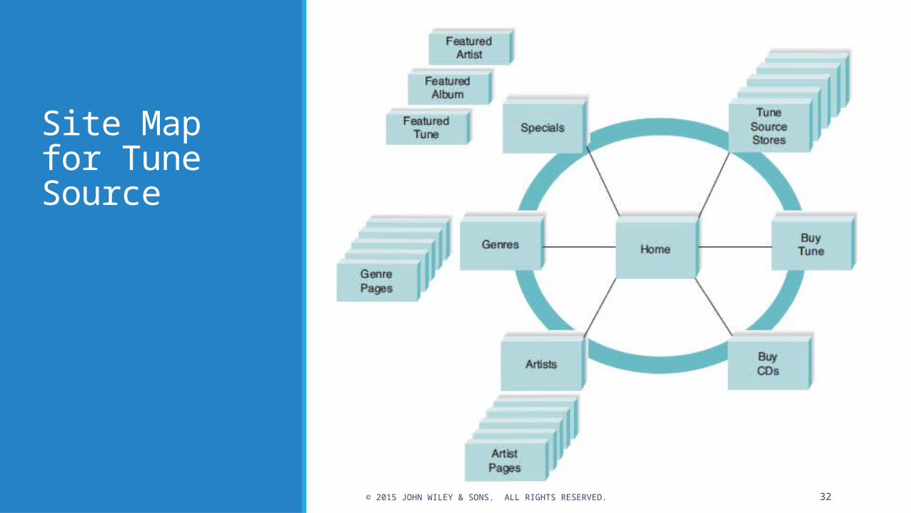
Organize the Interface, con’t. For Web sites, use site map.
Show how all the information on the site fits together.
Helps establish the hierarchy of information on the site.
31
© 2015 JOHN WILEY & SONS. ALL RIGHTS RESERVED.
Site Map for Tune Source
32

© 2015 JOHN WILEY & SONS. ALL RIGHTS RESERVED.
Define Standards Clarify decisions on all key interface elements to ensure
consistency:o Basic common elements across individual screens, forms, and reports
within the applicationo Interface metaphor (e.g., calendar, checkbook, shopping cart)o Interface objects (e.g., customer/client; employee/associate)o Interface actions (e.g., buy/purchase/check out; exit/quit)o Interface icons (pictures) representing status or actions (e.g., trashcan for
delete; disk for save)o Interface templates (layout guide for all screens)
33

© 2015 JOHN WILEY & SONS. ALL RIGHTS RESERVED.
Interface Design Prototyping A mock-up or simulation of screens, forms, or reports
Common methods include:o Paper sketcheso Wireframe diagramso Storyboardingo Wireflow diagramso HTML prototypeo Language prototype
34

© 2015 JOHN WILEY & SONS. ALL RIGHTS RESERVED.
Wireframe Diagram for Tune Source
35

© 2015 JOHN WILEY & SONS. ALL RIGHTS RESERVED.
Storyboard Example
36

© 2015 JOHN WILEY & SONS. ALL RIGHTS RESERVED.
Language Prototype Example
37

© 2015 JOHN WILEY & SONS. ALL RIGHTS RESERVED.
Interface Evaluation Methods Heuristic evaluation
o Compare design to checklist
Walkthrough evaluationo Team simulates movement through components
Interactive evaluationo Users try out the system
Formal usability testingo Expensiveo Detailed use of special lab testing
38

© 2015 JOHN WILEY & SONS. ALL RIGHTS RESERVED.
Navigation DesignPROVIDING A SEAMLESS INTERACTION
39

© 2015 JOHN WILEY & SONS. ALL RIGHTS RESERVED.
Basic Principles of Navigation Design Assume users
o Have not read the manualo Have not attended trainingo Do not have external help readily at hand
All controls should be clear and understandable and placed in an intuitive location on the screen.
40

© 2015 JOHN WILEY & SONS. ALL RIGHTS RESERVED.
Basic Principles of Navigation Design Prevent mistakes
oLimit choicesoNever display commands that can’t be used (or “gray them
out”)oConfirm actions that are difficult or impossible to undo
Simplify recovery from mistakes Use consistent grammar order (action-object, object-
action)
41
© 2015 JOHN WILEY & SONS. ALL RIGHTS RESERVED.
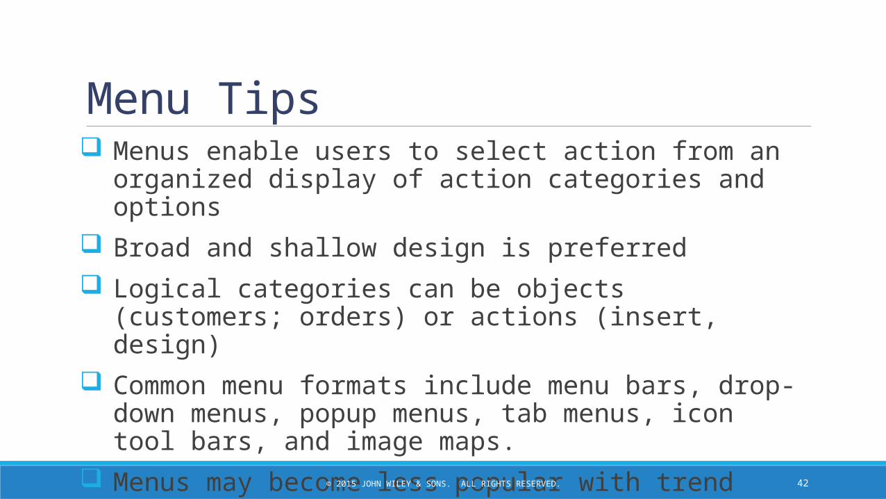
Menu Tips Menus enable users to select action from an organized display of
action categories and options
Broad and shallow design is preferred
Logical categories can be objects (customers; orders) or actions (insert, design)
Common menu formats include menu bars, drop-down menus, popup menus, tab menus, icon tool bars, and image maps.
Menus may become less popular with trend toward touchscreens
42

© 2015 JOHN WILEY & SONS. ALL RIGHTS RESERVED.
Message Tips Common message types include:
o Error messageo Confirmation messageo Acknowledgment messageo Delay messageo Help message
Strive for clear, concise, and complete messages
Should be grammatically correct and free of jargon and abbreviations (unless they are the users’)
Avoid negatives and humor (it gets old)
43
© 2015 JOHN WILEY & SONS. ALL RIGHTS RESERVED.
Input DesignENTERING NEW DATA INTO THE SYSTEM
44

© 2015 JOHN WILEY & SONS. ALL RIGHTS RESERVED.
Basic Principles of Input Design The goal is to simply and easily capture accurate information for
the system
Reflect the nature of the inputs
Find ways to simplify their collection
45
© 2015 JOHN WILEY & SONS. ALL RIGHTS RESERVED.
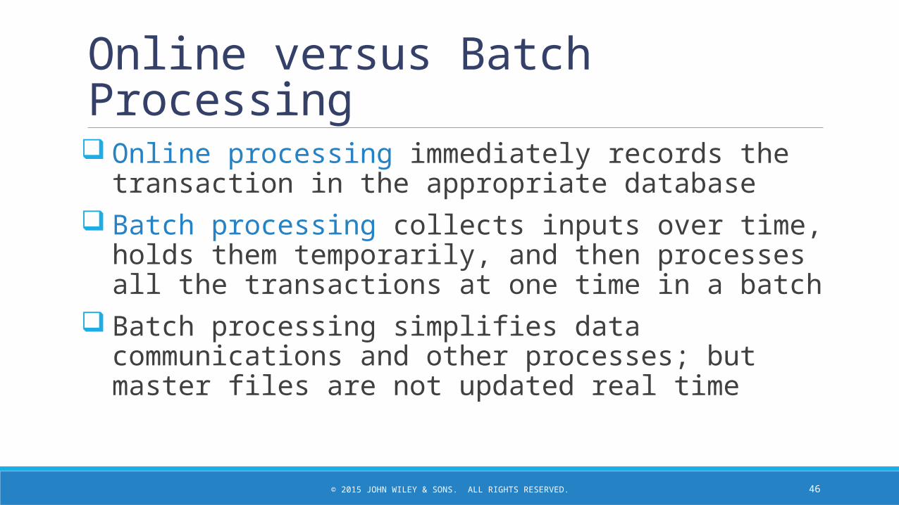
Online versus Batch Processing Online processing immediately records the transaction in
the appropriate database Batch processing collects inputs over time, holds them
temporarily, and then processes all the transactions at one time in a batch
Batch processing simplifies data communications and other processes; but master files are not updated real time
46

© 2015 JOHN WILEY & SONS. ALL RIGHTS RESERVED.
Capture Data at the Source Reduces duplicate work
Reduces processing time
Decreases cost
Decreases probability of error
47

© 2015 JOHN WILEY & SONS. ALL RIGHTS RESERVED.
Source Data Automation Can be obtained by using the following technologies:
o bar code readers / scannerso optical character recognitionomagnetic stripe readerso smart cardsoRFID (Radio Frequency Identification) tags
48

© 2015 JOHN WILEY & SONS. ALL RIGHTS RESERVED.
Minimize Keystrokes Keyboard entry is slow and error-prone
Never ask for information that can be obtained other wayso Lookupso Dropdown listso Default values
49

© 2015 JOHN WILEY & SONS. ALL RIGHTS RESERVED.
Input TipsUtilize selection controls whenever possible to minimize keystrokes.
50

© 2015 JOHN WILEY & SONS. ALL RIGHTS RESERVED.
Input Validation Apply a judicious amount of input validation to ensure accuracy.
Types include:o Completeness checko Format checko Range checko Check digit checko Consistency checko Database checks
51
© 2015 JOHN WILEY & SONS. ALL RIGHTS RESERVED.
Output DesignCONVEYING THE INFORMATION THE USER NEEDS
52
© 2015 JOHN WILEY & SONS. ALL RIGHTS RESERVED.
Basic Output Design Principles Understand report usage
o Reference or cover-to-cover?o Frequency?o Real-time or batch reports?
Manage information loado All needed information, no more
Minimize bias
Utilize various report types (detail, summary, exception, graphical) and media to satisfy users’ output requirements.
53