usability study on human machine...
TRANSCRIPT

CHALMERS UNIVERSITY OF TECHNOLOGY Department of Industrial and Materials Science Gothenburg, Sweden 2019
Usability study on Human Machine Interface In Volvo Cars body factory Bachelor’s thesis in Mechanical Engineering
ELLY NORDIN OLOV NYDÉN


BACHELOR THESIS 2019:05
Usability study on Human Machine Interface In Volvo Cars body factory
ELLY NORDIN OLOV NYDÉN
IMXS20 Department of Industrial and Materials Science
CHALMERS UNIVERSITY OF TECHNOLOGY Gothenburg, Sweden 2019

Usability study on Human Machine Interface In Volvo Cars body factory ELLY NORDIN OLOV NYDÉN Chalmers University of Technology © ELLY NORDIN, OLOV NYDÉN Supervisor: Anders Kullberg, Volvo Cars Supervisor: Liang Gong, Chalmers University of Technology Examiner: Åsa Fast-Berglund, Chalmers University of Technology Bachelor’s Thesis 2019:05 Department of Industrial and Materials Science Chalmers University of Technology SE-412 96 Gothenburg Sweden Telephone +46 (0)31 772 13 78 Cover: [Screenshot of the Human Machine Interface] Gothenburg, Sweden 2019

PREFACE AND ACKNOWLEDGEMENTS
For the opportunity to do this degree project we thank our supervisor Anders Kullberg at Volvo Cars. He had for some time been curious about, and seen the need for mapping the user experience of the Human Machine Interface (HMI) at Volvo Cars body factory in Gothenburg. HMI, with the interaction between humans and technology, where both technical and humanistic knowledge and aspects have to be taken into consideration suited our personal interest very well.
The scope of the degree project is 15 credits and the project has been performed on site at Volvo Cars body factory in Torslanda, Gothenburg. The project is the completion of the 180 credit Mechanical Engineering program at Chalmers University of Technology.
For support, tips and guidance during the work, the authors would like to thank our supervisor at Volvo, Anders Kullberg. We would also like to thank all the employees we have come in contact with at Volvo Cars for their friendly reception, willingness to cooperate and to answer our never-ending questions.
For academic guidance, we would like to thank our supervisor from Chalmers, Liang Gong, and our examiner Åsa Fast-Berglund.


ABSTRACT
In Volvo Cars body factory in Torslanda, Gothenburg, much of the production is automated. Robots, fixtures and other technical equipment are organized in ‘robot cells’. In order to monitor and control the production in the cells, devices called Human Machine Interface (HMI) is used. These are in the form of touch screens, located at each cell.
An assessment regarding the usability of the HMI has been done, the results of which is presented in this report. The aim has been to document the level of usability and the user experience of the HMI. In order to do this, a user study has been carried out where user groups have been identified and the user’s needs, wishes and reasons for using the HMI has been investigated. The project has been delimited to the part of the body factory that manufactures Volvo's 60-models, as the version of HMI in this part is the latest developed.
Data has been collected via observations and semi-structured interviews. This data formed the basis for the creation of mock-ups of an altered HMI, used in test sessions with users. The test sessions aimed at evaluating previously collected data and the alterations made of the HMI.
Seven user groups have been identified, and it can be seen that the HMI has a vast content, used to varying degrees by the different user groups. Overall, the HMI has been seen to have a high level of usability. However, for the user group ‘machine operators’, problematic matters regarding the use of the HMI has been seen. In connection to this, the study shows that the usability can be further improved.
Data collected and results from user tests show that areas with improvement potential are how clear and easily interpreted information and choices are presented in the HMI, and how training of the HMI is performed. By improving these areas, the authors believe that the usability can be improved, with subsequent positive effects for the business.
Keywords: Human Machine Interface, Human Machine Interaction, HMI, Usability, User experience, User study, Usability study

ABBREVIATIONS
AXXOS Software used for monitoring and optimizing production.
Cluster 60 The production lines that manufacture the car models V60 and XC 60
CI Contextual Inquiry
Methodology used to obtain information about the context of use.
CPU Central Processing Unit
A unit inside a computer that performs most of the processing.
GUI Graphical User Interface
Device with graphical icons and visual indicators, allowing interaction with electronic devices.
HMI Human Machine Interaction / Human Machine Interface
Humans and machines communicating information and commands to each other.
PLC Programmable Logic Controller
Unit that process inputs, and triggers outputs based on pre-programmed parameters.
SCADA Supervisory Control and Data Acquisition
System for monitoring and controlling a process.
VCC Volvo Car Corporation
International company that manufactures cars.

Table of Contents 1. INTRODUCTION .................................................................................................................. 1
1.1 Background ...................................................................................................................... 1
1.2 Aim ................................................................................................................................... 1
1.3 Specification of issue under investigation ........................................................................ 2
1.4 Delimitations .................................................................................................................... 2
2. THEORETICAL FRAME OF REFERENCE ........................................................................ 3
2.1 HMI as concept and technical solution ............................................................................ 3
2.1.1 Definition of HMI ..................................................................................................... 3
2.1.2 Automation ................................................................................................................ 4
2.1.3 Technology ................................................................................................................ 5
2.1.4 Design ........................................................................................................................ 6
2.1.5 Administration ........................................................................................................... 8
2.2 Human aspects .................................................................................................................. 9
2.2.1 Human cognition ....................................................................................................... 9
2.2.2 Usability .................................................................................................................. 11
2.2.3 User Experience ...................................................................................................... 12
3. METHODOLOGY AND PROCESS ................................................................................... 14
3.1 Project planning .............................................................................................................. 14
3.2 Research phase ............................................................................................................... 14
3.2.1 Literature review ..................................................................................................... 14
3.2.2 Identifying user groups and collecting demographic data ...................................... 15
3.2.3 Observation ............................................................................................................. 15
3.2.4 Interviews and interpretation ................................................................................... 15
3.3 Design phase .................................................................................................................. 15
3.4 Evaluation phase ............................................................................................................ 16
4. IMPLEMENTATION AND FINDINGS ............................................................................. 17
4.1 Research phase ............................................................................................................... 17
4.1.1 Literature review ..................................................................................................... 17
4.1.2 Identifying user groups ............................................................................................ 17

4.1.3 Machine operator training ....................................................................................... 24
4.1.4 Training material ..................................................................................................... 24
4.1.5 Observations ............................................................................................................ 26
4.1.6 Interviews ................................................................................................................ 30
4.2 Design phase .................................................................................................................. 35
4.2.1 Visioning sessions ................................................................................................... 35
4.2.2 Personas ................................................................................................................... 36
4.3 Evaluation phase ............................................................................................................ 36
4.3.1 Mock-ups ................................................................................................................. 36
5. RESULTS FROM TEST SESSIONS .................................................................................. 42
5.1 Usability and user experience ........................................................................................ 42
5.2 Results from measurements ........................................................................................... 45
5.3 Results from System Usability Scale ............................................................................. 46
6. DISCUSSION AND RECOMMENDATIONS ................................................................... 47
6.1 Results discussion .......................................................................................................... 47
6.2 Method discussion .......................................................................................................... 49
7. CONCLUSION .................................................................................................................... 51
REFERENCES ......................................................................................................................... 52
APPENDIX

1
1. INTRODUCTION
The following introduction will present the framework for the report. Background, aim, specification of issues and delimitations is presented in order to orientate the reader on the subject and the scope.
1.1 Background
Volvo Cars has a factory in Torslanda, Gothenburg. One part of the factory is the body factory. A body factory is where ingoing parts are assembled into complete car bodies. It can be said that it is here the structure and likeness of a finished car is accomplished.
The body factory is a highly automated plant, with more than 300 robots involved in the assembly process (“Volvo Cars’ new plant…”, 2014). In order to enable the robots’ work there are also a huge number of fixtures and other equipment. Throughout the factory these robots, with all appurtenant technical equipment, operate in fenced cells. The fences are there to ensure the safety of humans.
Naturally personnel need to monitor and interact with the technical equipment in the robot cells. This is done via Human Machine Interface (HMI) in the form of 17” touch screens with integrated computers. The HMIs are located throughout the factory and each cell is allocated with at least one HMI.
There are many categories of personnel involved in the production, and each category can be seen as a user group of the HMI. Each group has different roles in the factory and therefore different tasks, reasons and goals when using the HMI.
With today’s high level of competition it is essential for any business to keep disruptions in the production to a minimum. If a problem should arise it is just as important that it can be fixed quickly. In other words, it is desirable that preventive and predictive maintenance, as well as corrective maintenance, is handled in the best possible way. The way these task are handled can all be improved by having an HMI that have a high level of usability. In order to develop an HMI with high usability, the organization and the developers need to understand who the users are and what goals, needs and wishes they have.
1.2 Aim
The aim of the thesis is to assess and document the level of usability and the user experience of the HMI in the body factory. The resulting document will present what is good and what could be improved in the HMI, seen from the point of view of typical users in the factory. In

2
any future alteration of the HMI, this could provide added understanding and lead to increased efficiency in the production.
1.3 Specification of issue under investigation
In connection to the aim, the main issues for the thesis are presented below.
• What groups of employees are there that come in contact with the HMI, and how is the
distribution, in terms of numbers, between the groups?
• How is the distribution among the concerned employees in terms of age, gender and
period of employment?
• What are the users’ reasons, needs and wishes when interacting with the HMI?
• Do users feel that the HMI help them to accomplish their tasks in a more efficient
way, and if so - in what way?
• Is the amount of information presented by the HMI appropriate and is it readily
accessible?
• From the users’ point of view: how could the HMI be improved?
• What vision does Volvo Cars have for the HMI? What is the HMI meant to achieve?
• What vision do the users have for the HMI?
• Do the company’s and the users’ vision correspond?
1.4 Delimitations
Available time for the thesis work was 20 weeks, carried out at 50 % rate. To fulfill its intended purpose and due to the limited timeframe delimitations were set, as presented below.
• Only the HMI and its users in the body factory at Torslanda were studied • Only the HMI and user involved with cluster 60 were studied • Only users and the HMI on robot cells, not HOP-stations (Hang On Parts) • The hardware connected to the HMI was not a primary focus • No actual changes of any on-line HMI were done

3
2. THEORETICAL FRAME OF REFERENCE
In this section, the theoretical frame of reference is presented. The content is meant to increase the reader's understanding of the report's results and discussion.
2.1 HMI as concept and technical solution
This section presents theory that concerns HMI as concept, technical aspects and design-principles for HMI.
2.1.1 Definition of HMI
The abbreviation HMI can refer either to Human-Machine Interaction or Human-Machine Interface. Below the historical development of the two is briefly presented, and where in the difference between the two lies.
Interaction Every machine that is powered by something else than the user’s own muscle-power needs to be controlled by the user. This control is in order to have the machine operating when, and perform what, the user wants. A lever, a start/stop-button or more advanced mechanisms all have in common that they allow the user and the technical equipment to interact with each other. Ever since humans first started to use machines there has therefore been a need for users and machines to interact, i.e. exchange information and instructions (Hollnagel, 2011). Hollnagel (2011) uses the first modern locomotive, Stephenson’s “Rocket” built in 1830, as an historical example. For a locomotive to fulfill its intended purpose it has to be controlled by humans and in the same time be able to convey its technical status to the user, and is therefore an early example of human-machine interaction.
Looking at the historical development of HMI, it can be seen that one research area that paved the way for today’s HMI is Human factors (or human factors engineering), which emerged around 1945 (Hollnagel, 2011). Human factors is a broad field, its content concerns human performance, capabilities and limitations as well as how to design systems that are efficient, safe, comfortable and preferable enjoyable for humans to use (MacKenzie, 2013). Hollnagel (2011) state that human factors arose as a way to “engineer” humans and the human factor into systems that had become increasingly complex. This due to the technological development that had led to a point where it was no longer the technology, but the human, which was the limiting factor in a system.
HMI as a discipline can be considered to have arisen in 1969, when the first issue of the journal International Journal of Man-machine Studies (IJMMS) was published. As the title of the journal implies though, the field was at the time called Man-Machine Interaction

4
(Hollnagel, 2011). Later, in the 1980s, studies concerning interaction with machines received great focus as computers became increasingly powerful, accessible and beneficial for both companies and ordinary people (MacKenzie, 2013. Hollnagel, 2011). When interaction is specifically referring to computers, it is called HCI (Human Computer Interaction) (MacKenzie, 2013. Hollnagel, 2011. Johannsen, 2009).
Johannsen (2009) presents that the major difference between HMI and HCI is that an HMI always relates to a dynamic process or to real-time constraints, whereas an HCI does not.
Interface All interaction between humans and any form of machine need to be carried out in some way, in order to have effect. The term ‘interface’ refers to the methods, mechanisms and devices that are used in order to enable this. Many different methods and techniques are used, but what they all have in common is that they allow the user to communicate information to the machine and the machine to communicate information to the user (Barker, Mackay, and Rawtani, 2005. Johannsen, 2009. Zhang, 2010). An interface-device can consist of buttons, keyboard, images, mouse, audio, video, screen, software, etc.
2.1.2 Automation
Companies today act on a highly competitive and often global market. Because of this, customers have increasingly high demands for high quality products at the right price delivered at the right time (Bellgran & Säfsten, 2010). Beyond that, customers also want varied and modified products, in order to meet their personal needs. This makes the ability to have a flexible production process highly desirable (Bellgran & Säfsten, 2010). As a way to increase the flexibility and to meet these demands manufacturing processes are generally becoming more and more automated. But in spite of increased levels of automation there are still humans involved in virtually all processes, either in an active or a supervisory role. These processes, that are partially automated but also have human workers, can therefore be called semi-automated (Oliff, Liu, Kumar, and Williams, 2018). Johannsen (2009) presents the term Human-Machine System (HMS), a concept that includes all parts and aspects of a system: human users, the Human Machine Interface and the machines.
In many companies automation can be found in every department and in every part of a product's life cycle, from product development to final assembly and delivery to the customer. Every operation that has been automated can be said to have come about in order to, in one way or another, be beneficial and have positive effects for humans. In order for it to be so, the automated process must be reliable, safe to use, cost-effective and accepted by those who work with the equipment in question. One factor in order to achieve these things is that the interplay and the interaction between humans and technology is well functioning and efficient (Zhang, 2010). By combining the strengths of machines and humans, powerful and efficient systems can be achieved. This since machines are powerful, fast and tireless while humans are

5
adaptive, intelligent and versatile. And it is humans who control and maintain processes and systems, based on information received via the HMI (Barker et al., 2005). This is where the HMI is very important, ensuring that the task at hand can be achieved as efficiently and reliably as possible (Hollnagel, 2011).
A consequence of automation can be seen to be increasingly complex robots, machinery and processes. This in turn leads to great amounts of information and data, which needs to be collected, managed and processed. The data and information is needed in order to monitor, control and diagnose the system and its equipment, and to react based on prevailing circumstances (Kumar & Kumar, 2016. Oliff et al., 2018. Johannsen, 2009). When more complex and sophisticated equipment and control-systems are being used, the requirements on effective cooperation and communication between humans and machines also increase (Johannsen, 2009).
2.1.3 Technology
Interaction between human and machine can be divided in two separate parts: one human (user) part and one technical (machine) part. For the part of the machine, the interaction generally consists of the three components I/O (Input / Output), CPU (Central Processing Unit) and one or more displays. The human part is made up of three components as well, namely: cognition, sensory and musculoskeletal. The latter three thus concern the users’ ability to perceive signals about the systems current status, cognitively process the information and to physically act on it (Zhang, 2010).
For visual interface-screens, the two most common types today are Graphical User Interface (GUI) and Web User Interface (WUI). GUI receives input from one or more technical components and presents the output information graphically directly to an interface device. When using WUI you have the same forms of input, but instead get the output in the form of web-pages that can be opened on any interface-device with access to the internet (Zhang, 2010).
At present, and for some time to come, the most commonly used mode of presentation in HMI is visualization and graphics (Johannsen, 2009). Visual displays are often component-oriented, visualizing the topography of the process in question. Additional views can be used in order to convey functional knowledge. Although, the use of audio as a way for HMI to indicate and state information is becoming increasingly important. This since the use of audio can be a way to avoid visual overload for the user (Johannsen, 2009). The use of multiple forms of communication and technological applications in the same interface leads to multimedia and multimodal devices. It can be seen that the use of multiple techniques in HMI will become increasingly important and popular in the future (Johannsen, 2009). Johannsen (2009) exemplifies visual, auditory, mimic, gestural, haptic and vibration as different ways of conveying information.

6
2.1.4 Design
In order to have an efficient semi-automated process both machines and HMI needs to be designed with human needs in mind, i.e. human-centered design. Human-centered design is when the design process is strongly influenced by human cognitive processes, human capabilities, human needs and human task and goal orientation (Johannsen, 2009). Johannsen (2009) mean that this requires input from three different research areas: cognitive science and ergonomics, automation and systems engineering, and information and communication engineering.
For humans to use a modern HMI is a cognitive exertion in a much higher degree that it is a physical (Barker et al., 2005. Kumar & Kumar, 2016). Because of this it is important to design HMIs that minimize the cognitive workload for the user (Kumar & Kumar, 2016). Unlike physical tools, where humans by the visual attributes of the tool often can understand how it is meant to be used, an HMIs structure does not necessarily convey the function and purpose of different menus and buttons in the same way (Barker et al., 2005). As an example, Barker et al. (2005) mean that in the same way as a well-designed hammer fits the user’s hand, a well-designed HMI should fit the user’s mental picture of how a task should be performed.
In order to achieve a high level of usability for an HMI there are several design principles. Zhang (2010) choose to present six such, below listed as a-f.
a. Structure. The entire HMI architecture must be structured, as well as every single view. Make meaningful divisions of HMI’s content, so that the user can recognize and distinguish between different types of information. Related things are put together and unrelated things are clearly separated.
b. Simplicity. It should be simple for the user, in a clear and human-centered way, to read out information from the HMI and to give commands to the system via the HMI. Common tasks should be simplified through the use of HMI.
c. Visibility. All necessary information and various options for the current situation must be clearly visible. A user-friendly HMI does not distract the user with superfluous and irrelevant information.
d. Feedback. The user should get relevant feedback from the HMI when actions are carried out, the systems status change, errors accrue or when abnormal conditions arise. The feedback should be presented in a form that is clear, concise and familiar to the user.

7
e. Tolerance. The HMI should tolerate a certain amount of misuse and mistakes, by giving the user the ability to undo steps and actions. The HMI should further prevent errors from accruing by tolerating different inputs and sequences.
f. Reuse. As a way to reduce what users need to think about and remember, the design of the HMI should reuse internal and external behaviors and apply them in a consistent way.
Zhang (2010)
Barker et al. (2005) on their part present five design principles, namely: Consistency, Feedback, Verification, Organization and Choice of elements. The content in these is basically the same as what Zhang (2010) presents, except for the added principle of Choice of elements. With ‘choice of elements’ Barker et al. (2005) mean that if multiple elements is used in the HMI, e.g. touch screen and a point and click device, this should be done with care and ensured that it is beneficial to the user.
Kumar and Kumar (2016) highlights that one thing that should be taken into consideration when designing an HMI is that the average person can hold seven, plus or minus two, objects in working memory at the same time. If an HMI’s architecture requires more than this from the user, the cognitive load will increase, which degrades the user experience and increases the risk of errors being committed by the user. This shows that it is important to choose which, and how, information is presented to the user. Excessive or poorly categorized information on an interface increases the cognitive load. Other things that can be experienced as mentally exhausting are difficult-to-interpret schematics and low visibility (Kumar & Kumar, 2016).
Something that is highly debated is how color coding and different forms and shapes can be used to convey information to the user in the best way (Barker et al., 2005). The human brain processes colors in parallel, while shapes are serially processed. Shapes should therefore be used carefully and well thought out. Regarding colors, the human mind finds it difficult to handle and interpret the meaning of more than four colors simultaneously. Because of this, colors should be used sparingly and in a consistent way. How information and buttons are grouped, and how or if they are color-coded, could be the most important thing when designing an HMI, according to Barker et al. (2005).
Besides the design of the actual interface, Barker et al. (2005) point out three more factors to keep in mind, in order for the HMI to fulfill its purpose in the long run. These three are training, maintenance and operator performance. ‘Training’ comprises providing the users with sufficient training regarding the HMI, and also instructions to make sure personnel feel comfortable with carrying out the tasks for which they are responsible. ‘Maintenance’

8
concerns the hardware - to ensure the HMI’s performance and reliability. ‘Operator performance’ refers to the broad goal of having motivated users, preventing fatigue, ensuring safety and maintaining speed and accuracy from the users.
Every artifact, i.e. all objects that have been designed by humans, can be viewed as having been developed to fulfill a specific purpose or objective. This could also imply that all artifacts are created with a specific user, or user-group, in mind. The same can be said about HMI : that every HMI is designed specifically for the users present in the environment and processes that the HMI is intended for (Hollnagel, 2011). Although, every HMI is often handled by several different groups of users, e.g. operators, technicians, maintenance staff, foremen or managers. These user-groups often have different, but in part also overlapping goals, objectives and needs when using the HMI (Barker et al., 2005. Johannsen, 2009).
2.1.5 Administration
Depending on the conditions and structure of a company, the best suited architectural design of HMI can vary. Zhang (2010) presents the three that are most commonly used in industry: adaptive, supervisory, and distributed.
An adaptive HMI changes its behavior and content depending on the prevailing conditions. The three things that affect the HMI - the user, the system, and the context - are all three in constant change. The adaptation of the HMI is done in order to optimally satisfy a number of predetermined constraints. Depending on the conditions, these changes can thus vary. The aim of an adaptive HMI is to always provide the user with the most relevant information possible, in the best possible way and at the most opportune time (Zhang, 2010).
When a system or process enters an abnormal position, this often leads to an increase in input data to the HMI. In order to avoid cognitive overload, an adaptive HMI can then filter the information and show only what is relevant to guide the user in its actions (Zhang, 2010).
Adapting humans is very difficult. An adaptive HMI must therefore compensate this by being flexible and adapt based on the user’s actions. This can mean preventing the user from acting incorrectly in a situation, by guiding to correct information and choices (Zhang, 2010).
A supervisory HMI is typically used when the distance between a central control room and the equipment is considerable. The software that is used with supervisory HMI should make it possible for one person to single-handedly monitor a whole plant or factory on the interface-device. Input data is transmitted over a network, e.g. Ethernet, a Control Area Network (CAN) or similar. Distance and the amount of data generated makes it a requirement to have rapid updating of visual content in the interface (Zhang, 2010).

9
Benefits with a supervisory HMI is that the administration is done centrally, allowing relatively fast installations, and that data can be collected and logged in a central database which makes it easy to create reports of the system (Zhang, 2010).
In the third type, distributed HMI, users can view and control any machine or component in the system from any one of the available interface-devices. This is achieved by having several servers that the machines, controllers and interfaces via internet all are connected to. By this peer-to-peer architecture technical components can be accessed regardless of their current position. The distributed HMI then offer the possibility to have interface-devices that via web browser software can access the systems data. Furthermore, this setup has the advantage that the contents of all interfaces can be managed from a central location and that updates also can be handled and released centrally (Zhang, 2010).
2.2 Human aspects
This section presents human aspects that are important for theoretical understanding of HMI.
2.2.1 Human cognition
Oliff et al. (2018) argues that in human-machine systems there is a gap in performance between the automated part and the humans, which causes disturbance, uncertainty and instability in the process. This is because, with humans, it always differs between any two individuals in how they perform a certain task and how they interpret information. The main reason for these differences is that each person has different cognitive resources (Oliff et al., 2018).
Cognition is described by Encyclopedia Britannica as follows:
Cognition, the states and processes involved in knowing, which in their completeness include perception and judgment. Cognition includes all conscious and unconscious processes by which knowledge is accumulated, such as perceiving, recognizing, conceiving, and reasoning. Put differently, cognition is a state or experience of knowing that can be distinguished from an experience of feeling or willing.
Cognition (2019)
In order to design a successful HMI it is important to understand human cognition. Having knowledge about areas such as human perception, behavior and mental models makes it possible to design an HMI that is perceived as user-friendly (Zhang, 2010. Barker et al., 2005).

10
The way in which an HMI convey information is important. Rao and Kopparapu (2018) exemplifies with two extreme cases how HMIs can differ in their designed in this aspect. In one extreme, the interface is designed entirely to fit the "machine's language" or in the other extreme designed to fit only the "user's language". An HMI that is very machine friendly would force the user to receive information, give commands and handle the HMI in ways that does not feel natural. Vice versa would a human-friendly interface, which was entirely built according to human cognitive capabilities, but regardless of technical limitations for the machine, make the interaction natural for the human but non-functional for the machine. None of the two is a good alternative, nor realistic. Instead, the aim should be to meet the needs derived from human cognitive processes as much as possible, within the limits of what is technically possible (Rao & Kopparapu, 2018).
Something that historically has had a major positive effect on the cognitive load, when using HMI, is the introduction of Graphical User Interface (GUI). GUI allows the user to make selections in the form of menus. Previously, it was generally necessary to communicate commands to a machine in a text-based form. Text-based commands requires that the user knows and remembers a text command, while menus mean that users only needed to visually recognize a desired function in order to communicate with a machine (McKenzie, 2013).
People's cognitive basis for behavior and action vary from person to person (Zhang, 2010). One commonly used way to distinguish different categories of human behavior is that which was developed by Jens Rasmussen in 1986. Rasmussen presented three levels of control of human action: Skill-based -, Rule-based -, and Knowledge-based behavior (Rasmussen, 1986. Zhang, 2010).
Skill-based behavior is when a task is carried out without conscious control of the action. The task is performed smooth, fast and well-rehearsed. Skill-based performance requires minimum capacity from the human short-term memory, thus leaving the individual free to have partial focus on other things besides the task at hand. A person acting at skill-based level may have difficulty explaining how it knows what to do and where information is obtained about the current status of the task (Rasmussen, 1986).
Rule-based behavior requires conscious action and active decision-making. Interpretation of information and subsequent actions are based on rules and experience. Rules may be derived from associating the current situations with similar tasks or procedures. Rules have often been learned through trial and error, where the user has drawn conclusions from previously failed or successful implementations. With Rule-bases behavior, the performance as a whole is goal-oriented, but the execution of it is consciously done step-by-step. To define a boundary between Rule-based- and Skill-based behavior is difficult, and what category a person belong in depends on level of training (Rasmussen, 1986).
Knowledge-based behavior is used when a person encounters new tasks or problems, which the person lacks experience, know-how and rules for. In this mode, full mental capacity is

11
used to solve the current task. Knowledge-based behavior is goal-controlled, in that the goal is clearly formulated, an analysis of the situation is conceived and a conscious plan is made for how to achieve the goal (Rasmussen, 1986).
2.2.2 Usability
Zhang (2010) state that a product that is difficult to use will not be used. With this in mind, some terms that undoubtedly need to be taken into account in connection with HMI are ‘useful’, ‘usability’, ‘utility’ and ‘user friendly’.
‘User friendly’ is a commonly used term when talking about technical equipment handled by humans. As Nielsen (1993) point out though, users have no need for machines to be friendly with them. What users want are machines that do not prevent them from getting their work done. A better term is ‘usability’. Regarding usability, Gulliksen & Göransson (2002) argue that everyone probably has a sense and perception of what usability mean. But to concretely and precisely describe usability is considerably more difficult.
In ISO 9241-210 (2010), “Ergonomics of human-system interaction: Human-centred design for interactive systems”, usability is defined as the “extent to which a system, product or service can be used by specified users to achieve specified goals with effectiveness, efficiency and satisfaction in a specified context of use”.
The wording in the ISO-standard thus highlights that a product’s usability should be viewed in relation to a specific group of users, who perform a specific task, in a given context. What is assessed is the degree of effectiveness, efficiency and satisfaction. Regarding the assessed areas, ‘effectiveness’ can according to Adikari, McDonald & Campbell (2011) be summarized as how well an intended goal can be fulfilled, by using a given product. ‘Efficiency’ refers to the ability to fulfill the intended goal with a minimum of effort. Degree of ‘satisfaction’ is the overall attitude towards the product and how users perceive the product in general.
Nielsen (1993) states that, until a system is accepted to a sufficiently high degree, usability can be seen as a narrow concern. “Accepted” in this respect, mean that a given system is good enough to meet all the needs and requirements of users and other stakeholders. According to Nielsen (1993), this acceptance can be divided into two parts: social acceptability and practical acceptability. Practical acceptability means that a system meets requirements such as reliability, support, compatibility and cost. Social acceptance concern people’s view of the system and how willing people are to use the system in their work.
Once a system has been accepted, Nielsen (1993) state that the next step is to get the system to be ‘useful’, meaning that that the system can be used to achieve a predetermined and specific goal. Useful, and usefulness, consists of the two concepts ‘utility’ and ‘usability’ (Nielsen 1993). Utility concern the matter whether the functionality of the system in principle

12
is capable of doing what is needed and intended. Usability on the other hand, focuses on how well the users can use the systems functionality.
Usability is not a property in itself, but is achieved by being attractive to users in a number of areas (Nielsen 1993). There are many definitions of usability, and different views on what attributes usability is made up of (Adikari & McDonald. 2007). In their research, Adikari and McDonald (2007) have found that the eight most commonly used attributes are: learnability, memorability, functional correctness, efficiency, error tolerance, flexibility and satisfaction.
Another approach and division is presented by Nielsen (1993), who choose to present five attributes for usability, listed and described below:
Efficiency: A system should be efficient to use. Once a user has learned how to use the system, it should enable high productivity
Errors: The error rate for a system should be low, leading to that the user makes few errors when using the system. Errors made must be easy to recover from, and catastrophic errors must be impossible to do in the system.
Learnability: A system should be easy to learn to use. Time from training until users can operate a system in its intended environment should be short.
Memorability: How a system is handled should be easy to remember, once learned. Users who only occasionally use a system should not need to learn again to any great extent.
Satisfaction: A system should be pleasant to use. Users should be subjectively satisfied with the system and the use of it.
2.2.3 User Experience
Usability may be an extensive and multifaceted concept, but user experience (UX) is even more extensive. While usability cover to what extent a system in itself is efficient, productive and easy to learn, UX focuses on, as the name implies, the user’s experience of using a system. Something noteworthy is that UX includes both ‘use’ and ‘anticipated use’. Anticipated use means that before a person has even come into contact with a system, this person has expectations of, and an experience of, the system (Adikari et al 2011).
ISO 9241-210 (2010) defines user experience as: “a person’s perceptions and responses resulting from the use and/or anticipated use of a product, system or service.”

13
Apart from the definition, ISO 9241-210 (2010) further declare the two quotes below:
“user experience includes all the users’ emotions, beliefs, preferences, perceptions, physical and psychological responses, behaviours and accomplishments that occur before, during and after use” “user experience is a consequence of brand image, presentation, functionality, system performance, interactive behaviour and assistive capabilities of the interactive system, the user’s internal and physical state resulting from prior experiences, attitudes, skills and personality, and the context of use.”
ISO 9241-210 (2010)
These quotes from the ISO standard are consistent with what Adikari et al (2011) found when studying literature and comparing several different views and definitions of UX. Adikari et al (2011) found disparities between different UX-models studied, but also many similarities. As a general view, Adikari et al (2011) state that UX is seen as a concept for supplementing purely functional concepts and analysis methods that exist when it comes to user interaction. Central to UX is, according to Adikari et al (2011), to focus on the emotional, sensual, social and cultural aspects of people’s relationships with technology.
UX can thus be said to concern "how a system feels for a user", or "the user’s sense and experience of a system". The view on which different dimensions that together gives the overall experience is what distinguishes between different views on UX. From the literature review made by Adikari et al (2011), various dimensions that three different research teams consider important are presented below. Number 1 is from McCarthy and Wright. Both number 2 and 3 are different views from Preece, Rogers and Sharp. Number 4 is from Hassenzahl and Tractinsky.
1. Connecting, Interpreting, Reflecting, Appropriating, Recounting, and Anticipating.
2. Satisfying, Enjoyable, Fun, Entertaining, Helpful, Motivating, Aesthetically pleasing, Supportive of creativity, Rewarding and Emotionally fulfilling.
3. Engaging, Pleasurable, Exciting, Cognitively stimulating, Provocation, Surprising, Challenging, Enhancing sociability, Boring, Frustrating, Annoying and Cutesy.
4. Complexity, Purpose, Usability, Functionality, Organizational/Social setting, Meaningfulness of the activity, Voluntariness

14
3. METHODOLOGY AND PROCESS
The project was carried through with an adapted form of Contextual Inquiry (CI) as structural methodology. Contextual Inquiry is an integrated part of Contextual Design, which arose in 1988 (Holtzblatt & Beyer, 2014). The aim of CI is to understand the users’ inner motivation and needs, and from that identify problematic areas with a given product. Motivation and needs are things that the users often cannot articulate or are consciously aware of themselves (Holtzblatt & Beyer, 2014). CI is conducted by going out in the field to observe and interview the users. The focus during data collection is to understand what the users are trying to accomplish, how they go about it at present and what obstacles they encounter (Beyer, 2010).
The authors argue that CI fits the circumstances well. This because the goal of CI corresponds well with the purpose of the current study, and that the use of CI focuses on a small number of users, which the authors consider fitting for this project.
3.1 Project planning
Initially, a project plan was created. The plan included background, aim, clarification of the issue, delimitations, rough picture of suitable methodology, and timeline in the form of a Gantt-schedule for the project. The purpose of making the project plan was to create an overall and common picture of the scope of the work, clarify focus areas and expenditure of time.
The authors considered it appropriate to divide the project into three phases; a research phase, a design phase and an evaluation phase. This division is in line with what is generally recommended for all kinds of user-centered studies (Gulliksen & Göransson, 2002. Holtzblatt & Beyer, 2014).
3.2 Research phase
The methods used during the research phase were literature review, demographic mapping, observation and interviews. The section below describes the four methods.
3.2.1 Literature review
At the start of the project a literature review was conducted. This was done in order to gain increased theoretical knowledge regarding HMI, usability and user studies, and to get a picture of the current research situation.

15
3.2.2 Identifying user groups and collecting demographic data
Identifying user groups and mapping the demographic distribution was important in order for the continued work to be done in a rewarding and representative manner. User groups were identified through conversations with people around the factory. Demographic data regarding these user groups was then obtained via contact with the department for Human Resources.
3.2.3 Observation
Observations of the environment, the users, the machines and the HMI was made during regular production on site in the body factory. This approach of collecting data is well in line with the fact that contextual inquiries advocate that the performers of a study should immerse themselves in the environment of the users (Holtzblatt & Beyer, 2014). Being physically present and having an understanding of a workplace symbols, attitudes and culture, Davidson and Patel (1991) refer to this as "go native".
3.2.4 Interviews and interpretation
Interviews were held with a number of users from each identified user group. Each interview was succeeded by an interpretation session. The approach to interviews was based on what is presented by Holtzblatt and Beyer (2014). Important elements in contextual inquiry are: context, partnership, interpretation, focus, accomplishment, connection, identity and sensation (Holtzblatt & Beyer, 2014).
After all interviews had been held, the interview material was processed in their entirety. Common arisen opinions, issues and experiences were identified by building an adapted form of affinity chart, as described by Holtzblatt & Beyer (2014).
3.3 Design phase
Based on the obtained data, personas were created for the largest user groups. Personas were created as it is a design tool used to create understanding and empathy for different user groups (Nielsen, L. 2018).
Throughout the design phase, the authors held visioning sessions, as described by Holtzblatt & Beyer (2014). This was in order to come up with alterations of the HMI that would increase its usability, based on the data that had emerged. Design changes that had been visioned were then evaluated, and a few were selected for further testing.

16
3.4 Evaluation phase
Simple digital mock-ups of the altered HMI were used in test sessions held with users. Since the alterations made were based on what had emerged during observations and interviews, the authors wanted to evaluate the new HMI design and get feedback from users. It is difficult for users to respond to an abstract concept presented to them, but by using mock-ups response and feedback can effectively be communicated (Beyer, 2010).
The test sessions were prepared in detail and standardized, so that the outcome of different test sessions would be comparable. The purpose of the test sessions was to validate, or reject, the benefits of the changes made. In order to quantitatively evaluate the altered HMI, the System Usability Scale (SUS) was used. SUS is a tool for measuring usability that was originally developed by John Brook in 1986 (U.S. Dept. of Health and Human Services, 2019). It consists of a questionnaire with 10 questions, each question having five response options. The response options are on a scale between the extremes “Strongly agree” and “Strongly disagree”. Half of the ten statements are positive and half are negative. The SUS questionnaire used was retrieved from U.S. Dept. of Health and Human Services (2019) and is shown in Appendix 9. After converting the participants’ responses into numerical values, a value between 0 and 100 is obtained, where 100 means that the system has the best possible usability. Research show that a system with a value above 68 can be considered to have usability above average (U.S. Dept. of Health and Human Services, 2019).

17
4. IMPLEMENTATION AND FINDINGS
This section describes how the methods used were handled and practically carried out. Findings from the different stages of the project are also presented here.
4.1 Research phase
This section presents the procedures during the research phase and findings from its various methodical parts.
4.1.1 Literature review
The search for literature was mainly made via the website for the library of Chalmers University of Technology (Chalmers Library, 2019). Searches made via the library’s website result in searching in a large number of external databases. As a student at Chalmers University, you generally have access to read material in full-text in these external databases. In addition to searches online, articles were also found via the reference lists of previously read articles.
Material was chosen with conscious source criticism. Scientific articles, conference articles, books and e-books were the forms of publication that were primarily sought after. The main key-words that were used when searching online were: HMI, usability, usability study, user experience, UX, Human Machine Interface, Human Machine Interaction, Contextual inquiry.
Roughly 40 articles and conference articles were read, and roughly 10 books were assessed. Out of these, 18 were considered rewarding and suitable for the project, and are used in the report.
4.1.2 Identifying user groups
On site at VCC Torslanda, the authors initially spoke to various people to identify which different personnel categories that use the HMI. This procedure started with talking to the project supervisor at the VCC, who told about other relevant people to contact regarding the matter. Each contacted person would then share its view and experience of what personnel categories that used the HMI, and also give names of other relevant people to ask. This way of meeting new people continued until no new categories of personnel was mentioned.
To examine the demographic distribution within the various categories of personnel identified, data from VCCs employment archives was studied. These were obtained via contact with the department for Human Resources. The aim of this was to find out the number

18
of people in the different user groups as well as age distribution, gender and period of employment. To distinguish between different groups, their organizatial codes were used.
The different personnel categories identified as user groups of the HMI are listed in chart 1 below:
Chart 1. Identified user groups
Role Organizational code Machine operators 765xx Line mechanics 765xx Team leaders 765xx Maintenance personnel 76910; -10; -20; -30; -40 Production technician 76700; 76710 Geometry personnel (“Equipment Assurance & Process technique" and "Plant Production Verification") 81742; 81743 Maintenance and equipment engineers 81232; 81233
The body shop is divided into different "lines". Each line is composed of a number of cells, where the cells are either fully automated, i.e. only robots handle the product, or cells where both robots and machine operators handle the product.
On each line there is a team that manages and monitors the production. Each team consists of a team leader, a number of machine operators and, if necessary, a line mechanic.
The team leader is responsible for operation and planning. The team leaders assist the machine operators if they for any reason temporarily need to leave their position. The team leader also assist machine operators in case of malfunctions.
For machine operators, the primarily task is to load sheets of metal into fixtures in the cells. Machine operators should also make sure that the equipment in the cells they are assigned to is in order, so that the production stays up and running. Usually, machine operators are the ones who detect and are first on site when the production is disrupted. It is therefore highly desirable that machine operators are able to handle the HMI in a sufficiently high degree, in order to quickly get production going again.
The task of a line mechanic is to manage the cells where no people work, and to support and assist machine operators on the whole line. Line mechanics generally have a little more in-depth knowledge of the technical equipment and its needs than what a “normal” machine operator has. If a line mechanic is unable to fix a problem, they contact maintenance personnel for assistance. Line mechanics has been removed on many lines, as the goal is for machine operators and team leader to possess sufficient knowledge to manage without this personnel category.

19
Team leaders, machine operators and line mechanics are the ones who work closest to the production and thus the closest to the HMIs. These groups together have the organizational code 765xx, and can in future tables be presented as one common group: ‘Production’.
If a problem arises that neither machine operator, line mechanic or team leader can solve, maintenance personnel are called to the site. Maintenance personnel have great and detailed knowledge of the HMI, technical equipment and in many cases about PLC and programming. The personnel working in the maintenance department are divided into different specialist groups, but since everyone in maintenance are users of the HMI, they have in the report been merged and viewed as one common group.
Another group, production technicians, does not work, as previously mentioned groups, in the direct production. Production technicians’ task is rather to follow up and optimize production. This is done by reading out and analyzing data from a number of technical systems used in the factory.
The personnel from the department for geometry are responsible for controlling and adjusting equipment, details and products to ensure correct geometry. They are therefore not permanently stationed or directly involved in manufacturing.
Maintenance and equipment engineers (M&E engineers) are office staff, who are responsible for planning, optimizing and improving all technical aspects of the production. Examples of different areas of responsibility are welding, glue, HMI, and PLC. Primarily, M&E engineers come in contact with the HMI when working on various projects carried out in the factory. Several people in this category are both users and developers of the HMI.
Number of people, age and gender distribution within the groups described above is shown in chart 2 and chart 3:
Chart 2. Gender distribution and number of people
Role Number Men (number of)
Women (number of)
Production 375 258 117 Maintenance personnel 112 104 8 Production technician 13 11 2 Geometry personnel 36 34 2 M&E engineers 30 28 2 Total 566 435 131

20
Chart 3. Age distribution Role Age21-30 Age31-40 Age41-50 Age51-60 Age>60 MedianageProduction 161 83 73 44 14 Bornin-86Maintenancepersonnel 33 19 16 27 17 Bornin-72Productiontechnician 5 3 3 2 0 Bornin-86Geometrypersonnel 4 2 13 17 0 Bornin-71M&Eengineers 1 3 8 11 7 Bornin-67Total: 204 110 113 101 38
Distribution in number of users between the different groups is shown in diagram 1.
Diagram 1. Distribution of users
The largest group is ‘production’ (machine operators, line mechanics and team leaders), with its 375 people, which is 66 % of the total number of users. The second largest group is maintenance personnel, with its 112 people, which is 20 % of the total number of users. These two groups are the ones working closest to the production, and together constitute 86 % of the total number of HMI users.
Production technicians makes up 2 % of the users with their 13 people, geometry makes up 7 % of users with their 36 people and M&E makes up 5 % of users with their 30 people. These groups together make up 14% of the users.
66%
20%
2%
7%5%
Distributionofusers
Production
Maintenancepersonnel
Productiontechnicians
Geometrypersonnel
M&Eengineers

21
The age distribution of all users working in cluster 60 (cl60) is shown in diagram 2, in percent.
Diagram 2. Age distribution for all users working in cluster 60
The majority of users (36 %) are 21-30 years old. The age groups 31-40, 41-50 and 51-60 years are fairly evenly distributed with 19 %, 20 % and 18 %. The group of people over 60 years is only 7 %. The percentage is calculated based on the total of 566 persons.
The age distribution for those who work closest to production i.e. machine operators, team leaders and line mechanics is shown in diagram 3.
Diagram 3. Age distribution for Machine operators, Line mechanics and Team leaders
36%
19%
20%
18%
7%
Agedistributionincl60
21-30 31-40 41-50 51-60 >60
43%
22%
19%
12%4%
AgedistributionforMachineoperators,Linemechanics,Teamleaders
21-30
31-40
41-50
51-60
>60

22
In the group with machine operators, team leaders and line mechanics, 43 % are 21-30 years, 22 % 31-40 years, 19 % 41-50 years, 12 % 51-60 years and 4 % 60 years or more. The percentage is calculated based on 375 persons.
Diagram 4 presents the age distribution for those who work as maintenance personnel.
Diagram 4. Age distribution for Maintenance personnel
Out of the maintenance personnel, 30 % are 21-30 years, 17 % 31-40 years, 14 % 41-50 years and 15 % are 60 years or older. The percentage is calculated based on a total of 112 people.
The age distribution of those who work as production technicians is presented in diagram 5.
Diagram 5. Age distribution for Production technicians
30%
17%
14%
24%
15%
AgedistributionforMaintenancepersonnel
21-30
31-40
41-50
51-60
>60
39%
23%
23%
15%0%
AgedistributionforProductiontechnician
21-30
31-40
41-50
51-60
>60

23
Of production technicians, 39 % are 21-30 years, 23 % 31-40 years and 41-50 %, 15 % 51-60 years and 0 % are 60 years or older. The percentage is calculated based on a total of 13 people.
Of those who work with geometry, the age distribution is presented in diagram 6.
Diagram 6. Age distribution for Geometry personnel
In the geometry department, the age distribution differs from the aforementioned groups. The largest group, with 47 %, is here 51-60 years instead of being 21-30 years as it has been in the aforementioned groups. Those who are 21-30 years old make up 11 % and 31-40 make up 6 %. The group with 41-50 years is also large and is 36 %, while no one is over 60 years old. The percentage is calculated on a total of 36 people.
The age distribution for M&E engineers is presented in diagram 7.
Diagram 7. Age distribution for Maintenance and equipment engineers
11%
6%
36%
47%
0%
AgedistributionforGeometrypersonnel
21-30
31-40
41-50
51-60
>60
3%10%
27%
37%
23%
AgedistributionforMaintenanceandequipmentengineers
21-30
31-40
41-50
51-60
>60

24
As for geometry, the age range 51-60 years is the largest, with 37 %. 3 % are 21-30 years, 10 % are 31-40 years, 27 % are 41-50 years and 23 % are 60 years and older. The percentage is calculated based on 30 people.
4.1.3 Machine operator training
To gain an increased understanding of the work done in the body factory, and to have personal practical experience of the work, the authors participated in the same one-day training that new machine operators attend. With the machine operator training, closer contact and understanding of a robot cell, possible work tasks performed by an operator and use of an HMI were obtained. In addition to the authors, there were three other operators who attended the training. There were also two educational leaders present the whole day. The training was held in a separate room, where a number of robots had been installed in a cell.
The purpose of the education was to explain VCC’s visions regarding working methods, safety and to teach the correct approach when correcting production disturbances.
The duration of employment for the three participating machine operators varied. The one most newly employed had worked six month, and the one with most experience had been employed for two years. All three had ‘break and lock-competence’, which means that they were allowed to go into robot cells.
When talking to the educational leaders regarding the HMI, it came to light that there existed a training material for the HMI, in the form of a PowerPoint presentation. However, this training material was not intended to be presented directly to machine operators, so it had not been reviewed during the current day’s operator training.
4.1.4 Training material
For own education, and because it seemed relevant, the training material for the HMI was obtained and studied. It is titled "Basic HMI training for machine operators" and was created in January of 2017. The material present that the idea is that all team leaders should be assigned the material, so that they can use the content to train the machine operators in their respective teams.
According to the material, there are a number of defined training levels (referred to as "steps") for machine operators. These levels specify what machine operators are allowed to do with the HMI. “Step 0” means that the machine operator must not touch the HMI at all, but instead focus on learning the line and balance. With "step 1", the operator is allowed to troubleshoot with the HMI, but not enter the cell. With "step 2", the operator may troubleshoot with the HMI, perform electrode replacements and carry out lighter forms of remedial maintenance such as correct sensors. With step 2, everything is still performed in ‘auto’ mode, and you

25
must not put the station in ‘manual’ mode. The highest level, "Step 3", is considered to concern team leaders, and requires training from maintenance personnel.
Worth noting is that the material expresses that the HMI should only be used to perform initial troubleshooting, and that ‘Andon’, which is a function to call for assistance, should always be used for calling team leader or line mechanic to come and fix the fault.
The material largely consists of photos, taken of an actual HMI. These photos provide information about the HMI’s architecture, different color codes, various menus, and how the HMI should be handled when troubleshooting common errors.
Something that was noted in the material is that some buttons on the photos of the HMI have been crossed over with red crosses, with text explaining that machine operators should not use these buttons. These crossed out buttons can be seen in figure 1 and figure 2.
After studying the educational material, many questions and concerns had been raised. This, because it was perceived that the message and content of the material were in many cases contradictory, and did not match the view on the HMI given by the project supervisor.
The buttons shown in figure 1 below are shown in the toolbar. The toolbar is first displayed on the second view that normally is displayed when using the HMI, namely when the current cell is schematically displayed. The toolbar is then shown in every view in the continued use of the HMI. Figure 2 is on the HMI shown in the view of the robot’s interface, a view that is frequently used by machine operators.
Figure 1. Crossed out buttons in toolbar Figure 2. Crossed out buttons in robot's menu ‘interface’
26
4.1.5 Observations
Some initial observations were made during the operator training, but observations were primarily made later on during the project, in the ordinary production. The primary observation was performed during three full subsequent days, in the ordinary production. During those days the authors circulated among various robot cells, to observe activities and to see in what situations and how users handled the HMI. Additional observations were also made continuously throughout the whole project period, whenever the authors spent time on the factory floor. During observations, conversation often arose with the people working. When circumstances allowed, the personnel were often very keen to talk and to show how they used the HMI.
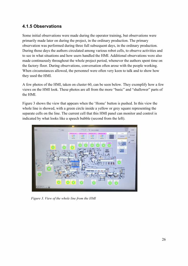
A few photos of the HMI, taken on cluster 60, can be seen below. They exemplify how a few views on the HMI look. These photos are all from the more “basic” and “shallower” parts of the HMI.
Figure 3 shows the view that appears when the ‘Home’ button is pushed. In this view the whole line is showed, with a green circle inside a yellow or grey square representing the separate cells on the line. The current cell that this HMI panel can monitor and control is indicated by what looks like a speech bubble (second from the left).
Figure 3. View of the whole line from the HMI

27
Figure 4 shows the view of a cell, with its constituent parts. The cell shown below contains four robots and two fixtures.
Figure 4. View of a cell from the HMI
During the operator training, described in section 4.1.3, it had been observed that the HMIs were untouched until a fault occurred in the cell. When an error occurred, one of the machine operators went to the HMI to check the error, i.e. troubleshoot. The errors that occurred were usually linked to one of the robots, but some errors on the fixtures also occurred. When there was a robot that had problems, the machine operators often went, as the first step in the troubleshooting, to the pendant (the robot’s hand-held control unit). They then read a little on the pendant, went to the HMI and looked for a while there, and then looked questioningly at the educational leader. On several occasions, the education leader had to come and press the pendant in order to remedy the problem. It seemed that the pendants are used relatively frequently when fixing errors, but that there is uncertainty about what machine operators are allowed to do with the pendants. In the case of faults in the fixtures though, troubleshooting and remedy was handled via the HMI. One person would then enter into the cell while another stood looking at the HMI to guide the colleague to the fault.
During the observations in the ordinary production it was seen that the HMI is a frequently used aid in the factory. The HMI was primarily seen to be used for troubleshooting and when planning or performing preventive maintenance. In the majority of the situations that were observed, the HMI was sufficient in order to find out what and where the problem was.
Something that was observed, and seen as problematic, was that the attitude regarding the use of the HMI varies in the factory. Machine operators’ interest, willingness and commitment regarding the HMI, and to keep the production as undisturbed as possible, was seen to vary. It was quite often observed how machine operators stood passive and waited for someone else to come and solve problems that arose. It was considered that this variation in attitude to a large extent concerned whole work teams, i.e. was there a lack of interest and unwillingness

28
to handle the HMI, this often concerned a large part of the team, to varying degrees. At first glance, this could to some extent be seen to reflect the attitude of the various teams’ team leaders.
In addition to using the HMI, it has been observed that the employees’ human senses are important in troubleshooting and remedial actions. When a problem arises, and parts of, or a whole cell stops, the noise level naturally changes. Due to the relatively high and intense sound level in the factory, many employees wear earplugs or headphones. It was frequently observed that it took a while before the machine operator or other personnel noticed that an error had occurred. When talking to the person in question, it was often stated that he or she had not heard or seen that the cell’s activity had decreased or stopped. Since the HMIs, together with the cell’s ‘stacklights’ in many cases are located some distance away from the place where a machine operator is positioned to perform its task, these indicators can also be difficult to notice.
One thing that confused the authors was that the HMI sometimes flashed temporarily, apparently to indicate an error, and then stopped flashing after a little while, without any active action having been performed. When users were asked about it, different users gave different answers.
In some places, small "cheat sheets" had been placed next to HMIs. The notes concerned how the HMI indicates if it is safe to enter a cell or not. Photo of such a note is shown in figure 5. As can be seen, there is only a small difference between OK ("okay to enter the cell") and NOK ("not okay to enter the cell").
Figure 5. "Cheat sheet" placed next to an HMI

29
When a stop was due to a robot’s fault, it was repeatedly observed that employees, often machine operator, would use an HMI a little, and then proceeded with troubleshooting and remedial actions using the robot’s pendant. The HMI was in these cases used to identify which robot that was failing, by viewing the overview of the cell. On the pendant, the person could then get an overview of the cause of the problem, and often the problem could be addressed with just one button press on the pendant.
In connection with these observations it emerged that the general view is that machine operators are not allowed to handle the pendants. But it also emerged that there is great uncertainty about what actually applies to the pendants, and that many machine operators use the pendants to the extent that they "dare". The problem with this that was observed, and raised by employees, is that people can handle the pendant without understanding the consequences of their actions. For example, the pendant of a welding robot may ask if the electrodes have been replaced. If the user then presses "yes" time and time again, it will results in the electrode being so formatted (grinded) that it has no peak left. The quality of the welding points has then gradually deteriorated, and what was originally a "simple" task has resulted in damage to several products and a more difficult and time consuming problem.
A specific situation worth mentioning is a long-lasting stop (about 15 minutes) that was observed, which proved to be caused by something as simple as a triggered safety arc (an arc that when broken triggers the safety alarm). On this occasion, troubleshooting was carried out using the HMI, without being able to locate the source of error. Not even when maintenance personnel arrived could the error be located. In the end, the persons at the scene found that the error was in an adjacent cell, where an arc unknowingly had been broken. Because the fault was in the adjacent cell, the cause of error was not shown on the HMI where troubleshooting was carried out, but only that a stopping error made operation in the current cell impossible. Therefore, since the error was so difficult to identify, the stop was significantly longer than it needed to be.
A seemingly small matter, but which caused great irritation among the users, was the power saving feature found on the HMI. The power saving function is activated after a preset time span, regardless of whether the HMI has been used during this time or not. Users can thus work at an HMI, when the screen is suddenly dimmed. In order to wake the screen, the user must then press the ‘Home’ button twice, the first press to return to the home screen and then again to wake the screen. This results in the user losing the page that he worked on and must click in to that page again.
An observation that is not directly linked to the HMI concern documentation of operational disturbances. Team leaders and line mechanics are responsible for logging and documenting all forms of operational disturbances that have occurred on the entire line. This is done in a system called AXXOS. AXXOS is accessed via a desktop computer, referred to as the "line computer", which is located at each line. It was observed that team leaders and line mechanics
30
periodically had to sit for some time at the line computer and work their way through the operational disturbances that had occurred. During conversations, it emerged that this was often a task that was done with insufficient information, since it was not they themselves who had been present at the majority of the operational disturbances.
4.1.6 Interviews
Before interviews were scheduled, interview questions were prepared. The questions that were formulated had the purpose of investigating a number of different areas, concerning the usability and users experience of the HMI. Areas explored were: personal background information, use and usability, information flow, perceived positive and negative aspects of the current HMI, visual screen experience, architecture and structure, menus and buttons.
In order to book interviews with suitable participants, managers were contacted in the various departments where HMI users had been identified. As far as possible, interviewees were chosen so that participants were representative for their user group, in regards to age within the group and level of experience.
The interviews were conducted in Swedish. An exception was one interview that was held in English, as the participant did not master the Swedish language to a sufficient extent. During the interviews, one of the authors acted as an interviewer, i.e. talked to the interviewee, while the other listened attentively and took notes from the conversation.
The duration of the interviews varied between forty to sixty minutes. The interviews started off in a secluded room. After about half the interview, depending on whether the circumstances allowed it, the interviewee and the authors moved out to the factory floor, to continue the interview in front of an HMI. This way, the interviewees could physically show different things that were addressed during the conversation.
The interviews were semi-structured. This means that the questions asked are of an open nature, thus giving the interviewees opportunity to answer in an open and freely articulated way (Davidson & Patel, 1991). The participants were allowed to deviate from the subject matter of the question and talk about associated subjects or events. The questions and areas that were prepared by the authors were only used to bring the interview forward if necessary, or when the conversation deviated to far from intended subject areas.
At the beginning of each interview, the interviewees were informed that participation was voluntary and anonymous, and that the material would only be used for the purpose of the report. After approval from the participant, the interviews were audio recorded, in order to be able to listen through the material afterwards.
31
After each interview, an interpretation session was held. During these sessions, notes from the interviews were discussed and analyzed. Also observations and reflections made by the authors during the interviews were debated.
In total, twenty-one interviews were conducted. What categories of personnel and how many persons from each of these that were interviewed and their age are presented in chart 4 below:
Chart 4. Distribution of interviewed users
Role Number of
interviewees Age in interviewees Machine operator 6 28, 30, 31, 39, 42, 53 Line mechanic 2 54, 56 Team leader 2 35, 40 Maintenance personnel 4 40, 42, 51, 64 Production technician 1 59 Geometry personnel 1 50 Maintenance and equipment engineers 5 33, 41, 43, 52, 59
When all interviews had been held, a sort of affinity chart was put together. This was a way to combine and compare the interview material in its entirety. This process began by first putting notes from the interviews into a single document. These notes were then arranged into groups, based on different themes identified in the material. Appendix 2 shows the affinity chart that was compiled. Below, in the rest of this section, a summary of what emerged during the interviews is presented.
It should be pointed out that the interviews show that the HMI is a well-accepted and well-used tool in the factory. None of the interviewees has been completely ignorant of the HMI, but the degree of issues that has been expressed has varied. Most of the respondents think that the HMI has high usability, i.e. it is easy to use and to a large extent meet the needs of the users.
In the production, the HMI is mainly used for troubleshooting and remedying, to monitor the status of the equipment and to monitor how many details there are in different parts of the line. For production personnel, the HMI is as much a source of information as a guiding and practical tool. The other user groups use most of the functions that the production personnel use. However, they also utilize more advanced and special pages in the HMI, which are more specific to the tasks that these groups of users perform.
Almost all interviewees highlighted the HMI’s visual structure as one of its greatest strengths. In connection to the visual structure, it is positive that the HMI has touch function, so that one touches what one sees. Another thing that by users is considered to contribute to HMI’s usability is that the HMIs are standardized, i.e. that the basic architecture is the same

32
throughout the factory. Because of this, users do not have to learn new functions when they are repositioned to work at another cell or line.
A small but important positive matter raised by a number of users is the physical buttons that are positioned separately from the touch panel. This enables the users to use these controls regardless of which view is displayed on the screen.
In general, the users think that the use of color coding in the HMI is relevant and helpful, and that the "red thread" is especially helpful. The red thread allows users to get direct guidance to the source of error by following the components and buttons that are red on the HMI. The other color coding, with green - “okay”, and yellow - “warning”, is also perceived as clear and relevant.
In connection to color coding, however, there is a problematic area in the HMI that has been frequently raised by users, namely the color codes shown for sensors and clamps. The color coding of the sensors is seen to differ from how the rest of the HMI uses color coding. This means that users have had to specifically learn how the colors are displayed on the sensors and what the different colors mean. Furthermore, the function of sensors and clamps, and different positions for them, are perceived as difficult to understand by many users. For example, several users have pointed out the two sentences that describe a sensor’s status. The two sentences read “alarm sensor not affected” and “alarm sensor not unaffected”. In order to be able to make the right decision in a given situation, as a user you have to know which sensors are meant to be active at what details, and which sensors should not be active.
One matter that was often raised, and where there were different opinions, was the use of the SCADA view. Especially the user groups machine operators, team leaders, and line mechanics had strong opinions regarding SCADA. They all thought that SCADA was an appreciated and useful part of the HMI, but the different groups used SCADA in different ways and for different purposes. However, several of the respondents saw problems with how other groups were using SCADA, and considered that their use had negative effects on production. Common to all user groups was that the placement and access of SCADA was considered to be too complicated in the current HMI.
Since education and training can be considered to be a part of a system’s usability, this area was explored during the interviews. Most of the machine operators stated that they had received short training on the HMI from a team leader or a line mechanic, based on the training material mentioned in section 4.1.3.2. However, many machine operators felt that this education had not been very rewarding and decisive in achieving the knowledge they now had regarding the HMI. Most respondents stated that they had mainly learned the use of the HMI via "learning by doing" and by mimicking how colleagues do. Some machine operators stated that they had not received any training on the HMI at all, and stated as a reason that there were uncertainties about who was responsible for the training on the HMI.

33
Interviewees have been asked the question “how do you think new users experience the first meeting with the HMI?”. Many have considered that the HMI’s visual structure gives a good first impression. But the majority believes that a great deal of understanding of the equipment and of the processes in the cell is required in order to be able to use the HMI in an efficient and satisfactory way. In connection with this, some users have mentioned the help page that exists in the HMI. This help page has been considered to contain too little to be rewarding. In addition, it has been found that very few users even know that this help page exists.
Most users find that the HMI is good for troubleshooting, but that the HMI could be better at guiding users to what measures should be taken to correct errors. On the same theme, a number of users have stated that they think the HMI is very good at informing that something is wrong, but worse at conveying the cause of the error. Because of this, many users consider that much knowledge and experience often is required in order to act based on the information obtained from the HMI.
Users who stated that they are comfortable and knowledgeable about the HMIs find that the large amount of information available in the HMI is a positive aspect and very helpful in the daily work. Among more advanced users, one thing that was particularly appreciated was that the HMI can display sequence and transition conditions. However, other users have stated that the large amount of information makes the use of the HMI difficult. This opinion is most common among machine operators, where several users find that it can be hard and tiresome to sift through the information and to know what is relevant to the current situation. Users have stated that they experience that the HMI shows more information than what is actually needed, e.g. when troubleshooting, the HMI also shows everything that could have been faulty, but is not. Because of this, some users find the HMI difficult to interpret, and that it takes a lot of energy to read through everything on each view before making a decision.
Many machine operators are restrictive in using the HMI, and only use the features and views they feel comfortable with. It sounds positive and reasonable in itself, but several machine operators have stated that this restrictive attitude makes them very unmotivated to learn more about the HMI, and by extension the production as a whole. Among machine operators, both more restrictive users and users who express that they feel comfortable and knowledgeable about HMI, many have stated that they perform actions and push buttons on the HMI to the extent that they “dare”.
Another area highlighted by the more restrictive users has been that users are worried about making mistakes on the HMI, causing a stop in the production. Some users have also expressed their own and colleagues’ concerns about causing costly damage to equipment through their handling of the HMI, e.g. causing two robots to collide. Much of this concern has been seen to originate in uncertainty regarding the two modes ‘Auto’ and ‘Manual’. Something as basic as the procedure of putting a robot into service position has during the interviews been seen to be an action where there are many different opinions and

34
interpretations about how it should be done. Most have said that this should be done in ‘Auto’, but several other users have stated that they always do so in ‘Manual’.
Conversely, from the problem with restrictive users, concerns have been expressed about users who use the HMI more than they perhaps ought to. Several users believe that there should be passwords or different levels in the HMI, which would allow different user groups to access different parts of the HMI. The main reason for these proposals has been to want to limit users who “dare to much” from causing errors and to aggravate already occurring errors.
Things that users experience as minor annoyances when using the HMI are listed below in the bulleted list:
● That one cannot wake the HMI from the power saving function through a touch anywhere on the screen.
● That the SCADA view cannot be zoomed by "pinching" with the fingers on the screen.
● That the image of the SCADA view does not adapt to the screen when zooming out.
● That the visual images of a line or cell are not always displayed "the correct way", i.e. the image shown on the HMI is displayed from the same direction as the user sees in the physical reality.
● That one does not get verification which buttons are pressed, when there are buttons that remain in a certain mode when pressed.
● That one does not receive verification if an entered password was correct or not.
Compared to the older model of HMI that has been used in the body factory, one difference that has been repeatedly mentioned is the difference between how to order all robots in a cell into service position simultaneously. Many find that this function has disappeared, while others say it has only been placed elsewhere in the HMI. Having this function more easily accessible has been expressed as a wish. Another wish that has been raised is an extension of this function, namely being able to put an entire line in service mode simultaneously. As a reason, it has been stated that this would greatly facilitate, for example, service or projects carried out on weekends.
The desire to integrate parts of other systems into the HMI has been highlighted by a number of users. According to some users, connecting the AXXOS system to the HMI could provide more reliable logging of operational disturbances and relieve team leaders and line mechanics. Many users have also had ideas about moving the "Re-" functions found on the pendant into the HMI.

35
From user groups that do not belong to production, wishes related to professional-specific aids have been expressed. Maintenance staff has expressed wishes to connect MAXIMO to the HMI. With MAXIMO in the HMI, spare parts could then be ordered for broken components directly via the HMI. Geometry personnel would like features in the HMI that command specific components to specific locations, enabling personnel to more easily perform measurements.
Data and findings from interviews were compared with the design principles and attributes for usability, presented in chapter 2.1.4 and 2.2.2. Figure 6 below shows the design principles presented by Zhang (2010), and the attributes for usability presented by Nielsen (1993). The authors have in figure 6 highlighted the different terms with green or yellow color. Based on data from the interviews, terms marked with green have been seen to be good, whereas terms marked as yellow have been seen to be able to improve.
Figure 6. Areas of design and usability, highlighted as “Good” or “Can be improved”
4.2 Design phase
The work and outcome from the design phase is presented below.
4.2.1 Visioning sessions
In order to come up with proposals for design changes, visioning sessions were held. In the visioning sessions, the authors imagined different scenarios, where users would perform certain tasks. Based on what had emerged in the affinity chart, various invented changes of the HMI were then discussed. For each change, the authors discussed how it might affect the usability and the user’s experience. Based on what effects different suggestions might have on users, the various proposals were then documented or rejected. After a few sessions, the authors chose what changes were to be passed on to user testing. The chosen changes were then combined in three different scenarios.

36
4.2.2 Personas
When creating personas, the combined data and material obtained during observations, interviews and demographic mapping was used. For each of the largest and most frequent HMI user groups, the data was mixed in order to create "average characters", which would represent the user group. The creation of the characters was thus based on a mixture of different users from the respective user group. As far as possible, the personas were put together only with things expressed by different users that the authors had come into contact with. However, a certain amount of imagination was required to weave the characters into "complete" persons.
Since the number of machine operators is so large, two personas were made for this group. For the user groups team leaders, line mechanics, maintenance personnel and geometry personnel, one persona per group was made. The personas can be viewed in Appendix 1.
4.3 Evaluation phase
This section presents the procedures during the evaluation phase.
4.3.1 Mock-ups
Based on the three scenarios determined during visioning sessions, digital mock-ups were created of the altered HMI. To start with, different HMIs were filmed in the factory, during ongoing production. From these films screenshots were then taken. After importing the images to a computer, Adobe Photoshop was used to produce the decided design changes. The resulting images were then taken into Microsoft PowerPoint, where internal hyperlinks were created. The hyperlinks made it possible to click on the places where there were buttons, moving the slideshow on to the corresponding view.
The three scenarios that were to be tested concerned: electrode replacement as a preventive maintenance, remedying a faulty clamp in a fixture, and fix a welding fault. These three scenarios were chosen because the tasks included in them are frequently performed in the production. Furthermore, these tasks meant that several views and actions on the HMI must be used by the test participants - views and actions that had been identified as problematic and possible to improve. The three scenarios combined gave the opportunity to test changes in a number of selected areas, all in order to increase the HMI’s usability. The areas, purposes and what was changed in the HMI is presented on the next page, in figure 7. More detailed documentation of the scenarios is presented in Appendix 3. A few pictures of the altered HMI that was used in the scenarios can be seen on the subsequent pages, figures 8, 9, 11, 12, and 13.

37
Area Purpose Tested by
Give the user more -, and more easily interpreted feedback from the HMI.
● Increased sense of security when using the HMI
● Pop up window: “Robot är i serviceläge” (“Robot is in service position”)
● Pop up window: “OK att beträda cellen” (“OK to enter cell”)
Move external functions into the HMI
● Enable more standardized working methods
● Time saving and increased efficiency
● Move the pendants function "Reweld" to the HMI
● Add parts of AXXOS into the HMI, in the form of a menu “Vad har du gjort?” (What have you done?)
Clarity and “plain language” ● Simplify how to carry out actions
● Increased sense of
security when using the HMI
● Add a menu “Vad vill du göra?” (“What do you want to do?”)
● The menu “Vad har du gjort?” (What have you done?)
● Add a button “Gå in i cell” (“Go into cell”)
Sensors and clamps ● Easier to interpret and understand sensors and clamps
● Use the same color coding as in the rest of the HMI
Reduce redundant information
● Reduce the risk of cognitive overload
● Increased sense of security when using the HMI
● For robot alarms, only list the current fault
● Show alarms “earlier”
Figure 7. Areas, purposes and what was changed in mock-ups of the HMI

38
Figure 8 below shows a robot’s home screen with the menu “Vad vill du göra?” (“What do you want to do”), where the most frequently performed tasks are shown as ready-made buttons. If the task that is to be performed is not present there, the user can press the button "Other", which opens an extended pop up window with more options and a search function.
This change is intended to test a clearer and simpler way of communicating commands to the HMI. With the change, the number of button presses required is also reduced, and the choices are one view earlier in the system than what the corresponding selection is today.
The picture also shows the pop-up window “Robot är i serviceläge” (“Robot is in service position”), which appears when pressing a service button, ordering the robot to go into service position. The reason for this pop-up is to give the user clear feedback when the robot is in service position.
Figure 8. Shows the changes “What do you want to do?” and “Robot is in service position”.
Figure 9 below shows the button “Svetsa igen” (“Reweld”) in the ready-made list under “What do you want to do?”. This and some other ‘Re’-functions (‘Re-dress’, ‘Re-position’ among others) are currently only possible to perform via the pendants. But since these ‘Re’-functions have been seen to often be a quick and easy way to fix certain problems, the choice was made to implement them into the HMI. In figure 9, a robot alarm “Svetsfel” (“a welding fault”) can also be seen at the bottom of picture. This, and any other alarms, has been moved from the robots alarm menu to the robots home screen. This means that the information is presented to the user earlier, and that two clicks are eliminated compared to today’s HMI.
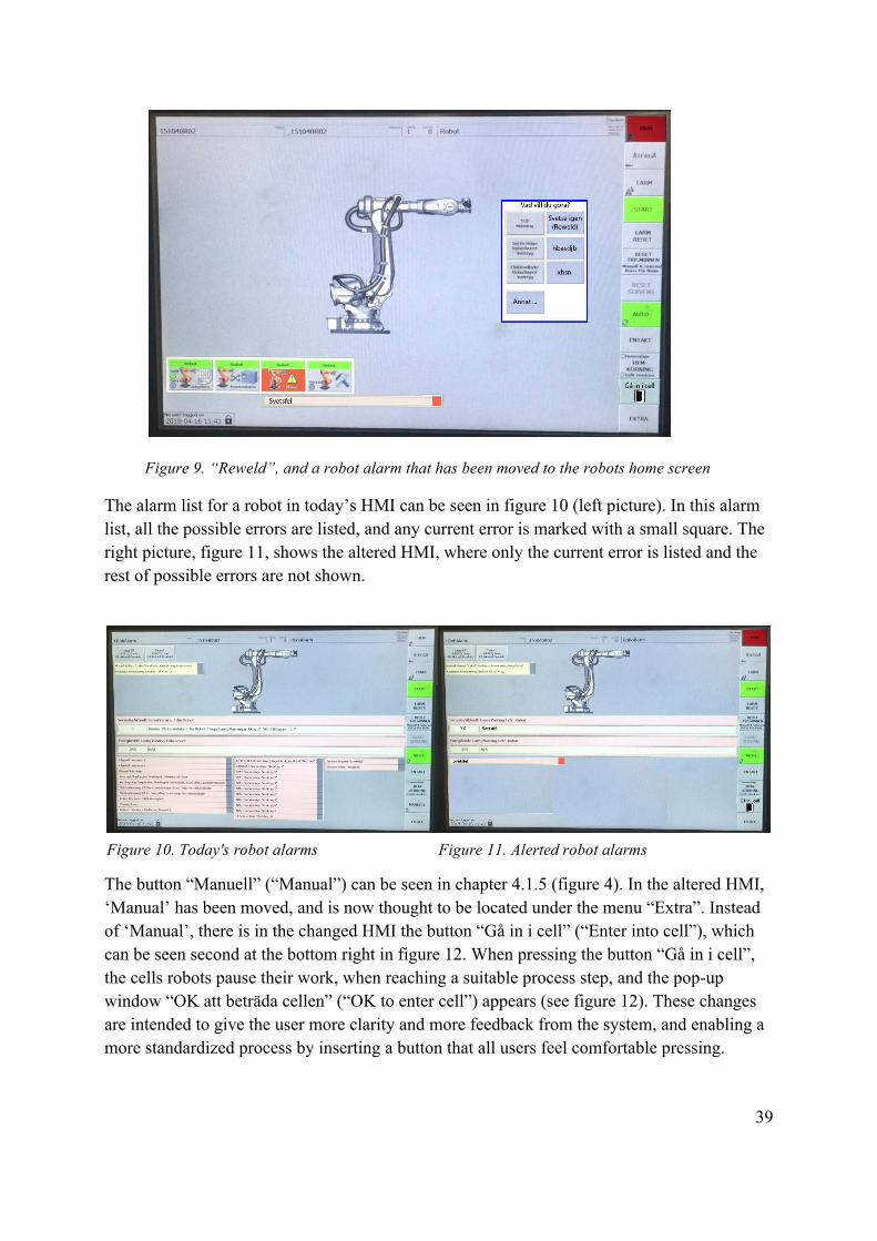
39
Figure 9. “Reweld”, and a robot alarm that has been moved to the robots home screen
The alarm list for a robot in today’s HMI can be seen in figure 10 (left picture). In this alarm list, all the possible errors are listed, and any current error is marked with a small square. The right picture, figure 11, shows the altered HMI, where only the current error is listed and the rest of possible errors are not shown.
The button “Manuell” (“Manual”) can be seen in chapter 4.1.5 (figure 4). In the altered HMI, ‘Manual’ has been moved, and is now thought to be located under the menu “Extra”. Instead of ‘Manual’, there is in the changed HMI the button “Gå in i cell” (“Enter into cell”), which can be seen second at the bottom right in figure 12. When pressing the button “Gå in i cell”, the cells robots pause their work, when reaching a suitable process step, and the pop-up window “OK att beträda cellen” (“OK to enter cell”) appears (see figure 12). These changes are intended to give the user more clarity and more feedback from the system, and enabling a more standardized process by inserting a button that all users feel comfortable pressing.
Figure 10. Today's robot alarms Figure 11. Alerted robot alarms

40
Figure 12. "Go into cell" and "OK to enter cell"
In figure 13 sensors can be seen with green background color. The idea of this change is that a sensor is shown as green when its associated clamp is in the position that the current situation requires. If not, it will appear as red. In the existing HMI, another color coding for the sensors is used, and a fairly high level of knowledge and understanding is required in order to be able to read out the status of sensors and clamps. Figure 13 also shows the pop up window “Vad har du utfört?” (“What have you done?”). This pop-up window is meant to connect AXXOS with the HMI.
Figure 13. Green color coding of sensors in a fixture, and pop-up “What have you done?”

41
4.3.2 Test sessions
In order to evaluate the altered HMI, test sessions were held with ten persons. Participants were selected from the four user groups that work most frequently with the HMI, namely: machine operators, line mechanics, team leaders and maintenance personnel. The reason why tests were only conducted with these groups of personnel is that data collected had shown that these are the groups of users where the experience of usability varies the most. It is also these user groups that experience the most issues when using the HMI. The number and distribution of test participants is presented in chart 5 below.
Chart 5. Number and distribution of test participants Role Number of participants Machine operator 5 Line mechanic 2 Team leader 2 Maintenance personnel 1
In the tests session, each participant was asked to act out three scenarios that were presented to him or her. Manuscripts for how test participants verbally were introduced to the test sessions and the scenarios they were to perform are shown in Appendix 4 and Appendix 5.
For each scenario, timing and observations were made of a number of different things, such as total time to complete the task and total number of touches on the screen. The goal of the altered HMI was, however, to improve the users’ experience of using the HMI, i.e. a subjective experience. The measurements made were therefore mainly to see if the practical use of the HMI differed greatly between different users.
After the participant had acted out the three scenarios, the usability was assessed using System Usability Scale (SUS). The SUS questionnaire was given to the participants and they got to read the questions themselves and fill out their answers. After the SUS was completed, interviews were conducted with the test participant. These interviews were semi-structured and centered on the scenarios that had been acted out.
The test sessions were held in Swedish. Swedish versions of manuscripts, SUS questions and interview questions were therefore uses. The duration of the sessions varied between thirty and sixty minutes. Location for the test sessions was team areas in connection with the participants’ workstation. These locations were chosen mainly for logistical reasons, as it shortened the time that participants were kept from the regular work. It was also beneficial since the environment, sound and other sensory impressions made the test sessions more realistic.

42
5. RESULTS FROM TEST SESSIONS
This section presents results and feedback received on the altered HMI and its new functions.
5.1 Usability and user experience
During the tests, it was observed how the test participants implemented the scenarios and how they reacted to the information they received from the HMI. Some of the test participants were very quick in their actions while it took a little longer for others. Based on how the participants verbally explained their thoughts and actions, it could be deduced that the difference in time was mainly due to how carefully the participants studied each view before deciding how to act.
Some test participants notices small status indications during the test, which due to the authors’ ignorance had remained unchanged when creating the mock-ups. In the factory’s active HMI, these indications apparently mean that the status and the situation is not as the scenario was meant to show. The participants who noted this became hesitant and obviously puzzled by the conflicting information that the HMI now seemed to provide. In contrast, one of the test participants asked, after completing all three scenarios, what changes compared to the current HMI that had been made. This participant had then clicked on all the changes made, but did not realize that the features were new. It was observed during several sessions that participants did not notice one or more changes that had been made. In particular, the changes made in the robot’s alarm list and in the color coding of the sensors, were unnoticed.
Regarding the new button "Go into cell", the interviews that were held during the test sessions showed that this button was considered to be a positive new feature by most test participants. It was appreciated that the button clearly stated its purpose and in what situation it was meant to be pressed.
During the course of the project, the majority of users have stated that the button ‘Manual’ should be pressed before a cell is entered. Despite that "Go into cell" had the same position on the screen as "Manual" normally has, there were several test participants who tried to perform the scenarios without pressing this new button.
Some participants felt that the button "Go into cell" should be shown together with the pop-up window "Robot is in service position", to give direct guidance that it is the next button that ought to be pressed. Other participants, however, argued that "Go into cell" must be placed in the fixed toolbar, as users sometimes enter a cell with other intention than to carry out service on a robot.

43
Several participants considered that the menu "What do you want to do" in a good way gave the users the opportunity to "early" in the HMI specify which task was to be performed. Many participants stated that, with this menu, less knowledge was required in order to be able to make decisions about continued action. This since available options was presented in a single menu, instead of the user needing to actively click into other views.
It was also appreciated that the buttons that were in the menu "What do you want to do" in plain text indicated its function e.g. "Electrode replacement" or "Reweld". One participant also pointed out that it is important to describe functions in plain text as many employees do not have Swedish as their native language.
It turned out, however, that the authors had missed that when changing electrodes, it must be possible to choose which tool the task concerns. This was pointed out to be a flaw with this new feature.
In the two scenarios where a robot was involved, none of the ten participants spontaneously mentioned the change made in the view with the robot’s alarm list, where a lot of text and lists had been removed. After the scenarios had been carried out, the view was shown again during the interview, and the participants were asked if they noticed any change. Even then, the majority of the test participants could not see any change in this view. When the difference compared to the current HMI was mentioned by the test leader, many participants said that they usually only read the text that is at the top of this view, and do not bother about the lists below. After the change was noted, some participants expressed that the change was good, as they did not care about the lists anyway. Other participants wanted to keep the alarm lists, in order to exclude related errors. One participant considered that it might be good to keep the lists, as they could be used by new users to learn which errors may possibly arise.
As a whole for the altered HMI, it was appreciated that sought-after information or function was presented after fewer touches on the screen than in the current HMI. This was mentioned particularly in scenario 3, where alarms from the robot had been moved, and was now presented on the robot’s home screen. Test participants thought that this area of change could facilitate learning of the HMI for new users, and save time when troubleshooting.
The pop-up windows “Robot is in service position” and “OK to enter cell” was greatly appreciated by several test participants. What was stated to be positive was that the HMI was so clear in the feedback that was given in regards to these two situations. One user also commented the green frame of the pop-ups, connecting it to the color coding used in the rest of the HMI, where green means "ok" or something positive. Some participants believed that this level of clarity when it comes to confirmation and feedback is important in order for users to dare to press and use the HMI more. However, some users attempted to enter the cell directly when the pop-up "Robot is in service position" appeared, as they interpreted it as being ok to enter the cell. As an extension of this function, one participant thought that it

44
would be good if "Robot is in service position" also appeared when a robot goes to service position on its own, e.g. in case of an unplanned electrode replacement.
The menu “What have you done?”, which is meant to connect the HMI with AXXOS, was considered by several participants to be a feature with great potential. Line mechanics and team leaders were especially positive. The main reason for the change being considered positive was that the person who discovers and corrects an error is given the opportunity to report it directly in AXXOS. Many participants felt that this change would save time, and eliminate the risk of forgetting which measures were performed before they were reported.
Although many were positive about the change, several participants argued that details such as what ready-made buttons are included, if there is a search function and if it is possible to enter text would have to be clarified. One participant was particularly skeptical, and considered that reporting in AXXOS requires a computer with a keyboard.
The change regarding how sensors are shown, where the use of color coding to a greater extent than before follows the rest of the HMI, was considered an improvement by all the participants. The participants felt that this change could reduce confusion about sensors, and make it easier to learn and use the views of fixtures. However, some users were uncertain whether this change was possible to implement, as there are so many different combinations and situations for clamps and its sensors.
The change that produced the strongest views was to have access to the function “Reweld” in the HMI. All participants felt that the change would shorten the time spent on troubleshooting, in cases where it is correct to press reweld. This since the user would not have to move to the concerned robot’s pendant, but could complete the whole process via the HMI.
Some participants regarded it as only positive to be given the opportunity to press reweld. Many were, however, skeptical about the reweld button because they feared that people who do not have sufficient knowledge will use it all too easily. For example, one user stated that the button can be used to "trick the system", but that it can lead to quality errors and damaged details. Several participants felt that if the button reweld could only be pressed once, it might be beneficial to have it in the HMI. Another participant suggested that a pop-up window could appear with text describing what should be investigated before the button reweld is pressed.
A summary of observations and interviews is that users with average knowledge of the current HMI and the users with a lower level of knowledge appreciate the increased degree of clarity and guidance given by the altered HMI. These users have appreciated plain text, clarity and that buttons and information express things in term of "events" and "actions" that the users can relate to and act upon. The test participants who themselves stated that they have good knowledge of the HMI have also appreciated, or at least have not been bothered by, this increased clarity.

45
5.2 Results from measurements
The measurements that were made during the various scenarios showed that the time required to perform the tasks was relatively similar for all the test participants. Also, how long it took for users to make a decision when the new functions were displayed on the HMI was relatively similar for all users. The measurement results for the three different scenarios are briefly described below. For tables with all measured values, see Appendix 6 to Appendix 8.
Scenario 1 (electrode replacement) was completed by all but one participant. The participant who chose not to complete the task considered that the new function was inadequate, as choices between different welding tools could not be made. The times to complete scenario 1 varied between 0 minutes 30 seconds and 2 minutes 23 seconds. Scenario 1 was the scenario where the shortest and longest time for completion differed the most. However, most users needed between 1 and 2 minutes to perform the scenario, while the users with the shortest and longest time for completion were seen to be two exceptions.
To complete scenario 1 according to the intended "path" through the HMI seven click were needed. One participant completed the scenario in just five clicks, as the person never entered the robots alarm list. Four of the ten participants clicked the intended seven times. For four participants, the number of clicks varied between eight and fourteen. The participants who clicked more than the seven intended all did so in order to double check the error or to just explore the HMI.
Scenario 2 (a faulty clamp) was completed by all ten participants. The time to perform this scenario ranged from 36 seconds to 1 minute 2 seconds. Scenario 2 was the scenario where the least difference between the participants handling of the HMI could be seen. The intended path for scenario 2 required five clicks, which all ten participants did follow.
Scenario 3 (a welding fault) was completed by seven participants. The three test participants who chose not to complete the task considered that it would be wrong to press ‘reweld’ directly, without having examined the cause of the welding error first. It is worth noting that the three who chose not to press reweld were two line mechanics and one team leader. For those who chose to press reweld, it took between 26 seconds and 47 seconds to perform the task. Intended number of clicks in scenario 3 was three. The robot alarm had in this scenario been moved out from the robots alarm list, but two participants chose to enter the original alarm list anyway, which made them click five times in total. Five participants used the intended three clicks, two participants used five clicks, and three participants chose not to complete the scenario.

46
5.3 Results from System Usability Scale
The outcome from SUS filled in by participants after the scenarios were done can be seen in chart 6.
Chart 6. Outcome from SUS
No. Test participant Born Years in TA
Own perceived knowledge of HMI SUS tot
1 Machine operator -97 4 Very good 67,5 2 Machine operator -96 2 Not so good 90 3 Machine operator -95 2 Good 100 4 Team leader -84 4 Very good 72,5 5 Team leader -76 3 Very good 100 6 Line mechanic -65 6,5 Very good 50 7 Line mechanic -63 2 Good 90 8 Machine operator -90 6 Good 100 9 Maintenance -92 8 Very good 95 10 Machine operator -92 2 Very good 92,5
Total 857,5 Average 85,75
The overall score from the SUS is high, with the average of 85.75. Three test participants, from two different personnel categories, gave the altered HMI 100 points. Four participants’ answers, from three different personnel categories, resulted in scores between 90 - 99. The result that clearly differs the most from the others is that from a line mechanic, who graded the altered HMI 50 points.

47
6. DISCUSSION AND RECOMMENDATIONS
In this section, the findings and result that the project has led to are discussed. Thereafter, the methodology that has been used is discussed.
6.1 Results discussion
At the start of the project, the authors believed that the findings would mainly lead to proposals of concrete changes regarding various views and menus, but that did not become the case. In terms of the design principles stated by Zhang (2010), collected data has shown that the HMI has good design in terms of the more physical and concrete aspects. ‘Structure’, ‘Visibility’ and ‘Reuse’ are principles considered to be of high quality in VCC's HMI and contribute to good usability. What emerged as areas of improvement are instead the design principles that can be considered to be linked to more subjective experiences, namely ‘Simplicity’ and ‘Feedback’. Generally, for the project’s findings and result, the matters that contribute to lowering the usability of the HMI are linked to cognitive and human aspects.
Referring to ISO 9241-210 (2010), where usability is defined, it is interpreted that an HMI should be able to be used effectively, to achieve specific targets for specific user groups, in order to be considered to have high level of usability. One problem with this has been seen to be that the user groups identified in the body factory have different, and for certain groups unclear and vaguely specified goals. Despite these differences, the HMI is the same for all user groups. For users in the groups that generally have a higher degree of knowledge, regarding both the HMI and about the physical components of the production, the project has shown that the HMI has a high degree of usability. User groups that, during observations, interviews and test sessions, have been seen to have sufficient degree of knowledge are line mechanics, team leaders, maintenance personnel, geometry personnel, production technicians and maintenance and equipment engineers. Users within these user groups have admittedly expressed several things they experience as minor flaws in the HMI, but of such a nature that it is judged not to affect the usability to any great extent.
However, for many users in the largest user group, machine operators, the usability has been seen to be lower. For the HMI to be able to have high usability for all user groups, the authors believe that HMI needs to be designed and built based on the needs of the users with the lowest level of knowledge. Since the work as machine operator requires least experience and least technical knowledge, of the professional roles that have been relevant to this study, the authors believe that the needs of machine operators are what should set the level for how the HMI should be designed.
Results from test sessions have shown that one way to achieve higher usability is to "simplify" the HMI and to an even greater extent than today use human-centered design and

48
having the HMI to communicate in the "user’s language". The System Usability Scale (SUS) that users filled in in connection with the test sessions resulted in an average score of 85.75 for the altered HMI. Seen to the fact that U.S. Dept. of Health and Human Services (2019) state that systems with scores above 68 can be considered to have usability above average, the authors argue that the changes that were made of the HMI were relevant and favorable in order to increase the usability.
The authors, however, believe that simplification of the HMI in some respects can be difficult, as different things can be limited by what is technically possible, for example in terms of program code and how different components communicate. Another, perhaps even more advantageous way to improve the usability is to invest in more, and more standardized, education and training of the HMI. Just ‘Learnability’, that a system is easy and quick to learn, is one of the five attributes that Nielsen (1993) presents as essential for achieving high usability. Unfortunately, for many of the users on whom the project’s results are based upon, this is not the case with today’s HMI. But on the other hand, Barker et al. (2005) state that one factor for achieving high usability with an HMI is that the users’ need for training in the HMI is met.
The routines regarding what, and how, the HMI is taught today is considered to be deficient by many users. The authors therefore wonder whether the ‘learnability’ would be considered to be higher, if education and training was improved.
To be able to have meaningful education and achieve standardized use of the HMI, the authors argue that it should first be determined who is expected to do what, and who is allowed to do what. During the project many users in the user group machine operators have expressed similar things as "I use the HMI to the extent that I dare" and "I think that we operators are not meant to do this, but I myself and many others do it anyway". Since many machine operators stated that they mainly learn to use the HMI through "trial and error" and by looking at how colleagues do, the authors consider that this can ultimately lead to an all too varied and purely incorrect handling of the HMI. Determining the users’ powers and restrictions, in combination with appropriate training, the authors believe would lead to increased usability and standardize the way the HMI is used in the body factory.
In the test sessions, benefits of adding new functions to the HMI were investigated, in the form of AXXOS and the pendant’s "Reweld" function. The majority of the test participants appreciated having access to AXXOS in the HMI, and the authors believe that this is something that should be explored further by VCC. The Reweld function, on the other hand, is a sensitive matter, whether it is placed on the pendant or if it is included in the HMI. Regardless of where Reweld is located, the authors consider that the conditions for using this function should be clarified.
Two concrete things that were expressed by the majority of the users that the authors have come into contact with are the power saving function and the SCADA view. The power

49
saving function currently causes a lot of frustration among the users, and the authors believe that it is a function that should be discussed and, if possible, improved.
The SCADA view is highly appreciated by all user groups, although it has been seen that different users and different groups are interested in its information for somewhat different reasons. The technical deficiencies that have been found to exist with SCADA, e.g. that the view all too often freezes and too often shows several minutes old data, the authors believe would be highly appreciated and favorable if they could be solved.
One way to increase the usability, that could be interesting to explore further, is to "separate" the content of the HMI depending on which user is handling it. During the interviews, many thoughts emerged about increasing the use of passwords in the HMI, in order to regulate which users have access to which functions. The authors’ view on passwords, however, is that it can create a feeling among users to not be trusted, and adversely affect the users’ desire to learn more about the HMI. Another way to separate content, which the authors considered during the entire project, is to have two (or more) display modes of the HMI. For example, there could be two buttons with the texts "view less content" and "view all content", where the former means that predetermined information and functions are hidden on the screen. These two choices could be fully optional to choose and switch between, so that the users themselves can decide how much of the content in the HMI they want to see and manage, based on their own judgment and skill level.
6.2 Method discussion
The authors have experienced that it is difficult to conduct a study on usability, and in particular the inevitable part that concerns user experience. To make an initial assessment of a system, based on presented design principles, the authors consider this to be the easiest part of the process. However, the authors consider that this assessment depends to some extent on personal interpretation and level of knowledge and experience regarding the system at hand. To further collect and document data from users has been perceived to be more difficult and demanding. This since it concerns qualitative data in the form of opinions, thoughts and experiences of what is studied. It has been seen that as a user it can be difficult to express and describe these things. The authors have also reflected that a user study in many aspects can be difficult to carry out on already existing products, where the users have used the product for a long time before the study is carried out. During this project, this long-term use has to some extent shown that the users have become so accustomed to the system that they have "become blind" to the system deficiencies and problem areas.
For the authors personally, it has sometimes been difficult, since we are not familiar with the production and the HMI, to fully understand things that users have expressed. But, if we had had more experience and been more familiar with production and HMI, then a problem might

50
have been that we also had "become blind" and not been able to relate to problems experienced by users.
Regarding the validity of the study and the methods used, the authors consider that these have been relevant and implemented in a rewarding way in order to achieve the aim of the study. However, since Contextual Inquiry was used as an overall methodology, the authors have reflected that a more in-depth analysis of the users’ private life, opinions, habits and attitudes could have yielded an even more comprehensive result.
One thing that is regrettable is that the authors found the System Usability Scale (SUS) tool only after the first round of interviews was completed. It would have been very interesting and rewarding to have a SUS result from the first round of interviews, concerning the body factory’s current HMI, so that it could be compared to the SUS results obtained for the altered HMI.
What the authors see as the main question regarding the reliability of the study is whether the result would had been the same if other users had been participating than the ones that now did. Selection of which users participate in the study has not been fully controlled by the authors, which has affected how well the participants represent the demographic data.
Users have been kept from their regular work to participate in the study, and which individuals who at the time had the opportunity to do so, the authors have not been able to control. The participants who came to participate are nevertheless considered to correspond to the demographic data to a satisfactory degree.
One shortcoming with the demographic data is that the authors did not manage to find out the period of employment for employees. For those users who actively participated in the study, this has been asked, but for the user groups as a whole, period of employment has not been studied.
The authors are aware of the data collected from users, in the form of subjective opinions and experiences, may have been interpreted incorrectly by the authors. The overall picture that emerged when data from different users was combined is also largely dependent on the authors’ interpretations of the data. However, since the authors throughout the project has been aware of this and kept it in mind, the authors considered that the result has not been affected by it to such an extent that the result is misleading.

51
7. CONCLUSION
The study shows that the HMI in many aspects has a high level of usability. The architecture and the visual structure of the HMI have been identified as its main advantages. Areas with improvement potential have been seen to be to what degree human-centered communication is used and how training of the HMI is performed. By developing these two areas, the authors believe that the usability can be improved, with subsequent positive effects for the business.
Seven different user groups have been identified. The age of users ranges from 21 years to 65 years, with the largest number of users in the range 21-30 years. The majority of users are men. The reasons for the different user groups to use the HMI differ to some extent, since their areas of responsibility differ. But what all users have in common is the need to be able to effectively monitor and control different components, machines and the production as a whole. Some users want the possibility to control and monitor at an even more detailed level than what is possible today, but a majority finds it desirable to clarify and simplify the way in which the HMI communicates.
The largest user group is machine operators, and it is also within this group that the usability has been seen possible to improve the most. This is mainly due to the fact that the user group machine operators have the lowest level of knowledge and least experience among the user groups.
Regarding the study’s question about whether the amount of information presented by the HMI is appropriate, no clear conclusion has been able to be drawn. This is since the users’ experience of the HMI’s content is strongly linked to how much knowledge and experience different users have. What has been seen is that the content of the HMI is vast, which is advantageous for some users but problematic and limiting for others. The users who experience problems find that in many situations a great deal of knowledge is required from the user in order to be able to use the HMI efficiently.
Acceptance of the HMI has nevertheless been found to be total, and users feel that the HMI is helpful when performing their tasks. However, the study has shown that users to a large extent are self-taught when it comes to handling the HMI, and that the use of the HMI varies in different parts and between different work teams in the factory. Furthermore, it has been found that opinions vary regarding what machine operators are expected to do and what this user group is allowed to do with the HMI. Opinions and attitudes about which user groups should handle which situations also differ between different users and user groups. Overall, this varied view on a number of different matters has shown that there is no unified vision for how the HMI should be used in order to be as favorable as possible for the business.

52
REFERENCES
Adikari, S., Mcdonald, C. (2007). User and usability modeling for HCI/HMI: A research design. In 2nd International Conference on Information and Automation, ICIA. 14-17 December, 2006, Colombo, Sri Lanka, pp. 151 - 154. doi: 10.1109/ICINFA.2006.374099.
Adikari, S., McDonald, C., Campbell, J. (2011). User Experience in HMI : An Enhanced Assessment Model. 5th International Conference on Information and Automation for Sustainability (ICIAFs): Sustainable Development through Effective Man-machine Co-existence, 2010, Colombo, Sri Lanka, pp. 304-310. ISBN: 9781424485512
Barker, M., Mackay, S., Rawtani, J. (2005). Practical Batch Process Management. p. 86-92. Retrieved from: https://www.sciencedirect.com
Bellgran, M., Säfsten, K. (2010). Production Development – Design and Operation of Production Systems. London: Springer.
Beyer, H. (2010). User-Centered Agile Methods. Synthesis Lectures on Human-Centered Informatics. 2010 3:1, pp. 1-71.
Chalmers Library. (2019). http://www.lib.chalmers.se/en/
Cognition (2019). In Encyclopaedia Britannica Online. Downloaded from: https://www.britannica.com
Davidson, B. Patel, R. (1991). Forskningsmetodikens grunder: att planera, genomföra och rapportera en undersökning (3rd edition). Lund: Studentlitteratur AB
Gulliksen, J. Göransson, B. (2002). Användarcentrerad systemdesign. Lund: Studentlitteratur
Hollnagel, E. (2011). The Diminishing Relevance of Human-Machine Interaction. In Boy, G.A, The Handbook of Human-Machine Interaction: A Human-Centered Design Approach. Retrieved from: https://ebookcentral.proquest.com
Holtzblatt, K. Beyer, H. (2014). Contextual Design: Evolved. Synthesis Lectures on Human-Centered Informatics. 7(4), October, 2014, pp. 1-91. doi: 10.2200/S00597ED1V01Y201409HCI024
ISO 9241-210. (2010). Ergonomics of human-system interaction: Human-centred design for interactive systems. Retrieved from: https://www.iso.org
Johannsen, G. (2009). HUMAN-MACHINE INTERACTION. CONTROL SYSTEMS, ROBOTICS AND AUTOMATION. Vol (XXI). Retrieved from: https://www.eolss.net

53
Kumar, J., Kumar N. (2016). Measurement of Efficiency of Auditory vs Visual Communication in HMI: A Cognitive Load Approach. In International Conference on Advances in Human Machine Interaction (HMI - 2016), 03-05 March, 2016, Doddaballapur, Bangalore, India
MacKenzie, I.S. (2013). Human-Computer Interaction: An Empirical Research Perspective. Retrieved from: https://library.books24x7.com
Nielsen, J. (1993). Usability Engineering. Retrieved from: https://www.sciencedirect.com
Nielsen, L. (2018). EDITORIAL: DESIGN PERSONAS: NEW WAYS, NEW CONTEXTS. Persona Studies, Vol(4, no. 2). Retrieved from: https://ojs.deakin.edu.au/index.php/ps/index
Oliff, H., Liu, Y., Kumar, M., Williams, M. (2018). A Framework of Integrating Knowledge of Human Factors to Facilitate HMI and Collaboration in Intelligent Manufacturing. Procedia CIRP, 2018, Stockholm, Vol: 72, p. 135-140. doi: 10.1016/j.procir.2018.03.047
Rao, P.V.S., Kopparapu, S.K. (2018). Friendly Interfaces Between Humans and Machines. Retrieved from: https://www.springer.com doi: 10.1007/978-981-13-1750-7
Rasmussen, J. (1986). INFORMATION PROCESSING AND HUMAN-MACHINE INTERACTION: AN APPROACH TO COGNITIVE ENGINEERING. NEW YORK: Elsevier Science Publishing Co.
U.S. Dept. of Health and Human Services. (2019). System Usability Scale (SUS). www.usability.gov The Research-Based Web Design & Usability Guidelines, Enlarged/Expanded edition. Washington: U.S. Government Printing Office, 2006.
Volvo Car Group. (2014). Volvo Cars’ new plant in Torslanda increases manufacturing capacity from 200,000 to 300,000 cars a year. Retrieved from: https://www.media.volvocars.com/global/en-gb/media/pressreleases/145369/volvo-cars-new-plant-in-torslanda-increases-manufacturing-capacity-from-200000-to-300000-cars-a-year
Zhang, P. (2010). Advanced Industrial Control Technology. Retrieved from: https://library.books24x7.com

54

Appendix

Appendix 1 Page 1 of 6
Persona #1

Appendix 1 Page 2 of 6
Persona #2

Appendix 1 Page 3 of 6
Persona #3

Appendix 1 Page 4 of 6
Persona #4

Appendix 1 Page 5 of 6
Persona #5

Appendix 1 Page 6 of 6
Persona #6

Appendix 2 Page 1 of 4
Affinity chart
Allmänt
Everyone has learned the HMI by pressing around. Currently, it is the most common way of training / education and learning how it works in the cells.
For lines where there are buffers, you need to have SCADA to keep track of how much is in buffer.
Line mechanics and team leaders think that it should be established what operators are not allowed to use in HMI.
During planned stops, the HMIs are not used so much.
On cl90 there is a red "you are here" marking.
Different user groups have different ambitions with the HMIs.
Positive
Generally speaking, few users have expressed direct criticism or concern about using the HMIs, most find that it is a good tools that is really needed.
Same HMI everywhere (with slightly different "dialects", and that at 90 it is the older hardware that limits).
User-level adapted, more visually and clearly earlier and more advanced further down in HMI. Good that the earliest levels and SCADA are so visual, easy to get an overview. Good with level building, good submenus. You find that what you have learned to handle is user-friendly and clear.
Clear and visual tool - red thread, speech bubbles, good and understandable images and figures that help, saves time, large and clear - good, good that the physical buttons flash in different colors when it is possible to restore and not.
Easy to handle / maneuver in - especially if you are used to computers, smartphones or ipads, good with touch - you press where it lights up / where the error is.
You get a lot of information from the HMIs. You get good information from the HMIs, not only when troubleshooting, see how the status is in the cell, if there are deviations from the regular state. Good that you get so much info about everything, eg what it is for the model so you can follow it.
Informs that it is a problem and where it is, shows where it is a stop, good at troubleshooting. Almost no other tool needs troubleshooting, you want as much information as possible. Stacklights attract attention well.
The physical buttons are good that there are, so you can use them from all views.
Good to see transition conditions / sequence transitions.
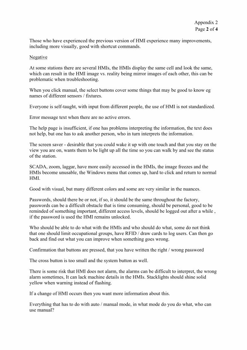
Appendix 2 Page 2 of 4
Those who have experienced the previous version of HMI experience many improvements, including more visually, good with shortcut commands.
Negative
At some stations there are several HMIs, the HMIs display the same cell and look the same, which can result in the HMI image vs. reality being mirror images of each other, this can be problematic when troubleshooting.
When you click manual, the select buttons cover some things that may be good to know eg names of different sensors / fixtures.
Everyone is self-taught, with input from different people, the use of HMI is not standardized.
Error message text when there are no active errors.
The help page is insufficient, if one has problems interpreting the information, the text does not help, but one has to ask another person, who in turn interprets the information.
The screen saver - desirable that you could wake it up with one touch and that you stay on the view you are on, wants them to be light up all the time so you can walk by and see the status of the station.
SCADA, zoom, laggar, have more easily accessed in the HMIs, the image freezes and the HMIs become unusable, the Windows menu that comes up, hard to click and return to normal HMI.
Good with visual, but many different colors and some are very similar in the nuances.
Passwords, should there be or not, if so, it should be the same throughout the factory, passwords can be a difficult obstacle that is time consuming, should be personal, good to be reminded of something important, different access levels, should be logged out after a while , if the password is used the HMI remains unlocked.
Who should be able to do what with the HMIs and who should do what, some do not think that one should limit occupational groups, have RFID / draw cards to log users. Can then go back and find out what you can improve when something goes wrong.
Confirmation that buttons are pressed, that you have written the right / wrong password
The cross button is too small and the system button as well.
There is some risk that HMI does not alarm, the alarms can be difficult to interpret, the wrong alarm sometimes, It can lack machine details in the HMIs. Stacklights should shine solid yellow when warning instead of flashing.
If a change of HMI occurs then you want more information about this.
Everything that has to do with auto / manual mode, in what mode do you do what, who can use manual?

Appendix 2 Page 3 of 4
The information can feel overwhelming, difficult to interpret, you want to double check several places before you feel sure, you need some understanding to interpret, sometimes information is missing eg welding robot if it is tools 1 or 2 that need service. There are a lot of irrelevant facts / non-facts that raise the user's attention and render the information superfluous.
You use what you are comfortable with, the rest do not care about.
The HMIs are not always perceived as pedagogic, you need to get some education or someone explains before you dare to do new things.
Color coding on sensors, sensors and clamps can be difficult to understand, what is what in HMI vs. reality.
The fear of making mistakes so that it will be longer stop. You dare not push because you do not know what is happening.
Many submenus and keystrokes to get where you want. Too many buttons, everything is not relevant to everyone - you do not want everything visible.
If it is not possible to restore and start, you want to know the root cause.
Some tasks that are done with the HMI, people usually have that two people must agree on how it is done in the HMI before it is performed. Otherwise, the risk is great that something goes wrong. Is the HMI guiding you how to solve problems?
People do not believe in physical manuals and instructions, because these have to be updated and nobody does that.
Risk of making HMI so good that important skills and knowledge are lost along the way.
If you change clamps manually and forget which clamps you have changed, it may take a long time to find which ones are in the wrong position - have description that in this detail these buckles should be "like this"?
If you add more things to the HMI, this must be done so that it does not get too much, ie more buttons that no one knows what they mean.
Process times could be set before, but operators learned this and changed to be able to get more rest, so you had to remove it, authorization via personnel card?
You want a verification when you press a button, so that it doesn't happen right away, this can create more security.
The HMI says it is wrong, not why it is wrong.
Bring down all robots into service position at the same time - this function should be more easily accessible or perhaps even a service button that results in the entire line going down for service.
Improvements

Appendix 2 Page 4 of 4
Make clearer with flashing alarm texts, such as sonar rings.
The pendant's "simple" buttons into HMI to avoid looking at two systems and to avoid running around.
Be able to order broken detail from the HMI, ie MAXIMO into the HMI.
Intermediate indication for electrode change, or that they do not need to warn so early. Wants to get numerical value in the HMI on how much remains on the electrodes. Reading access for other cells in the line.
Measurement modes in HMI so that geometry can read what it should be and then check that it is correct.
Have AXXOS in the HMI so you do not have to log in afterwards.
Want to be able to read out the PLC memory in the HMI.
Would be good to be able to read the alarm dialog in HMI.
More automatically generated from PLC, to minimize the risk of human error and low confidence.
More feedback on how the system works in the factory, so you can update and improve all the time.
Want a single point of change so that a small change can be made on all HMIs at the same time instead of being done on each one. IP-rated screens so you don't have to buy the expensive ones and can move more easily if needed. Portable HMIs.
High resolution data displayed to tell more about the status of the machines and prevent errors.

Appendix 3 Page 1 of 5
Documentation of scenario 1
Scenario 1
1. The production line is at stands still, because it’s “full forward”. The cell that the operator is stationed at indicates a yellow alarm. The operator has been asked by the team leader to perform preventive maintenance.
Cause: Warning that electrode replacement will soon be needed on the welding robot.
Task / Measure: Perform electrode replacement, as preventive maintenance.
Why test this scenario and this task:
● Replacing electrodes as preventive maintenance is a task that is often performed. To change electrodes, the concerned robot needs to be ordered into ‘service mode’.
Observations and interviews have revealed that there are uncertainties and different opinions about how a robot is put in service mode in the right way. This has been seen to create some concern among operators and thus a reluctance to carry out electrode replacement.
● When a person enters a cell, the button ‘manual’ must be pressed as a safety measure. The ‘manual’ button is generally not allowed for operators to use, as it is used to manually run various components of the cell. That ‘manual’, as an exception, should be pressed when entering a cell, has been seen to create uncertainty and anxiety among operators.
● At present, all downtime must be documented in the line computer. This documentation is done retrospectively and, according to information, is often incomplete and scanty. This makes it difficult to evaluate and improve on the basis of the documentation that is currently being done.
● When a robot alarms, all the errors that can occur are listed, and the current error is marked with a small box. This, that you see all the things that are not malfunctioning, can be considered to be information that is irrelevant.
Changes of the HMI being tested in scenario 1:
● Change the approach to order a robot into service mode, to make it clearer and more accessible. This by introducing a menu, "What do you want to

Appendix 3 Page 2 of 5
do?"
● Remove the need to press ‘manual’ when cell is to be entered. This, by introducing a new button "Enter into cell", with the subsequent pop-up box confirming that it is safe to enter the cell.
● Before production in the cell can be restarted, a pop-up box on the HMI will ask "What have you done?". Here are the most common measures selectable as ready-made buttons, otherwise you have to search in a list.
● In the robot's alarm list, only the cause or causes of error that are currently active are displayed.
What is measured during scenario 1:
● Time to complete the task.
● How long time the view with "What do you want to do?" is shown before the user makes an action.
● How long time the view with "What have you done?" is shown before the user makes an action.
● How long time the user has the view with alarms for the robots showing.
● Total number of button presses on the HMI.
● How many times “wrong” button is pressed.

Appendix 3 Page 3 of 5
Documentation of scenario 2
Scenario 2
2. There has occurred an unplanned stop in the cell that the operator is stationed at.
Cause: A clamp does not close properly, because a detail is in a slightly incorrect position.
Task / Measure: Enter the cell and adjust the detail.
Why test this scenario and this task:
● That sensors connected to clamps do not give a signal, which then causes a stop in the cell, has been seen to be a common scenario. Different status of the sensors has different color coding than what the other components shown in the HMI have. Commonly pointed out in the literature studied is that color coding used in HMI should be used consistently throughout the architecture.
Changes of the HMI being tested in scenario 2:
● Sensors that are meant to be in a particular position, but are not, indicate this by being displayed as red on the HMI.
What is measured during scenario 2:
● Time to complete the task.
● How long time the view with different sensors for a fixtures is shown before the user makes a choice.
● How many sensors the user presses before the faulty sensor is pressed.
● Total number of button presses on the HMI.
● How many times “wrong” button is pressed.

Appendix 3 Page 4 of 5
Documentation of scenario 3
Scenario 3
3. There has occurred an unplanned stop in the cell that the operator is stationed at.
Cause: A welding robot has stopped due to welding failure.
Task / Measure: The operator presses "reweld" on the HMI.
Why test this scenario and this task:
● Welding error is a common cause for down time in cells with welding robots. This can often be remedied by pressing ‘reweld’ on the robot's pendant. Generally, operators are not allowed to handle the pendants, but exceptions are made for some simpler and smaller measures. There are still uncertainties and different opinions about what operators are allowed to do on the pendants.
● It is reported that users at present sometimes press reweld on the pendant several times, without this addressing the problem. This can worsen the problem, and make it harder for the maintenance personnel to correct the error.
● If the reweld function is moved from the pendant to the HMI, and can only be activated once, this uncertainty and problem is avoided. In addition, it enables a more efficient way of remedying this type of stop.
Changes of the HMI being tested in scenario 3:
● Welding errors are displayed as alarms in the robot's error list.
● Modified error list, where only current errors are displayed (as in scenario 1).
● The user is given, on the HMI, the possibility to press reweld once for a specific robot.
What is measured during scenario 3:
● Time to complete the task.

Appendix 3 Page 5 of 5
● How long time the user has the original view with alarms for the robot showing.
● How long time the view with the ‘reweld’-button is shown before the user press it.
● Total number of button presses on the HMI.
● How many times “wrong” button is pressed.

Appendix 4 Page 1 of 2
Manuscript - introduction to participants
Page 1 of 2
Manuscript - introduction to participants
Hi!
Thank you so much for coming here today. I want to start by giving you some information about what you are going to do here today, and giving you time to ask questions. Our names are Elly and Olov, and we are students from Chalmers.
We have been here in TA during this spring, conducting our degree project, which is to evaluate the usability of the HMIs. Based on interviews that we have held with people in different work roles, we have now come up with some suggestions on what could be altered in the HMIs, to increase their usability.
It is these proposed changes that we now ask you to participate in testing. We carry out exactly the same test with several people, and will then summarize and evaluate what people think and feel about the changed HMI.
The result from the tests as a whole will be used in our thesis report. Your participation here today is completely voluntary and anonymous. We want to emphasize that this is not a test of you or your performance, but what we are interested in assessing is the HMI.
The role of the test leaders
I am here to lead the test and observe how to use the HMI to solve the tasks. Elly / Olov will also observe, and is responsible for taking notes and to measure some things.
During this session, I want you to think aloud when you work to complete the tasks. I will not be able to offer any suggestions or tips, but occasionally I can ask you to clarify what you have said or ask what you were looking for or what you expected to happen.

Appendix 4 Page 2 of 2
Page 2 of 2
The role of the test participant
● I will ask you to act out a few scenarios, where you will be performing some tasks. The tasks are of the kind that often occurs in the actual production here in TA. When performing the tasks, you will be using an HMI.
● We have made some changes to the HMI, and these are the changes we are now evaluating by doing these tests.
● We cannot do this test on one of the usual HMI panels. Instead, you will see an HMI on the computer here, in the form of a PowerPoint presentation. We have set up so that you can click on menus and buttons in the HMI as usual. But since the computer does not have a touch screen, you will be using the mouse to navigate and to click on things, instead of touching with your finger.
● There is no right or wrong in these tests. If you have any questions or concerns during the test, please feel free to tell me.
● If you ever feel lost or unable to complete a task with the information you have received, tell me so. If this happens, I will ask you what you would have done in a real situation, and then put you on the right track or move on to the next test scenario. It may also occur that I ask you other things during the test.
● When using HMI, do it as you would if it was in a real situation in the factory. I ask you to try to work through the tasks based on the information you get on the HMI.
● We will record your voice this session, so that we can go back and listen, if there is something we miss during the test.
● After you have done the tasks, we will ask some summary questions about what you have done here today.
Do you accept to participate in the test?
Do you have any questions before we start?

Appendix 5
Manuscript - scenarios
Scenario 1
This is the first scenario:
On the balance you are stationed at, it is currently a stop, because it is full forward in the line.
You have been asked by your team to perform preventive maintenance, if needed.
Do you have any questions? If not, you can start now.
Scenario 2
This is the second scenario:
On the balance you are stationed at there has occurred an unplanned stop. You are to troubleshoot and fix the error.
Do you have any questions? If not, you can start now.
Scenario 3
This is the third and last scenario:
On the balance you are stationed at there has occurred an unplanned stop. You are to troubleshoot and fix the error.
Do you have any questions? If not, you can start now.

Appendix 6
Measurements made during scenario 1 (electrode replacement)
Participant no 1 2 3 4 5 6 7 8 9 10
Total time [minutes, seconds ] 2,23 1,54 2,11 1,54 1,06 -- 1,04 0,30 0,57 1,27
“What do you want to do?” [seconds] 28 7 16 10 6 -- 9 4 7
--
“What have you done?” [seconds] 9 5 8 11 6 -- 6 4 5 9
“robot-alarm” [seconds] 8 4 5 13 4 -- 4 0 4 5
Total number of touches on the screen 8 7 14 7 9 -- 7 5 7 7
Number of times the “wrong” button is pressed 1 0 7 0 2 -- 0 0 0 0

Appendix 7
Measurements made during scenario 2 (a faulty clamp)
Participant no 1 2 3 4 5 6 7 8 9 10
Total time [minutes, seconds ] 1,02 0,4 0,41 0,57 0,51 0,44 0,46 0,43 0,47 0,36
View with sensors [seconds] 6 4 3 5 4 3 4 3 3 3
Number of sensors pressed 2 0 0 0 0 0 0 0 0 0
Total number of touches on the screen 5 5 5 5 5 5 5 5 5 5
Number of times the “wrong” button is pressed 0 0 0 0 0 0 0 0 0 0

Appendix 8
Measurements made during scenario 3 (a welding fault)
Participant no 1 2 3 4 5 6 7 8 9 10
Total time [minutes, seconds ] 0,26 0,47 0,24 -- 0,26 -- -- 0,38 0,36 0,26
View with original robot alarm [seconds] 6 0 3 -- 0 -- -- 0 5 0
“What do you want to do?” [seconds] 8 10 5 -- 4 -- -- 11 6 3
Total number of touches on the screen 3 3 5 -- 3 -- -- 3 5 3
Number of times the “wrong” button is pressed 0 0 2 -- 0 -- -- 0 2 0
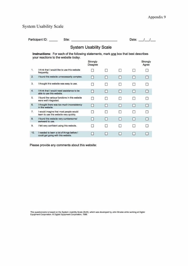
Appendix 9
System Usability Scale