usability guidance for improving the user interface and...
TRANSCRIPT

Usability Guidance for Improving the User Interface and Adoption of
Online Personal Health Records
Kirsten Peters, M.S. Michael Niebling, M.S.
Cassandra Slimmer, B.S. Thomas Green, M.S.
Jayson M. Webb, Ph.D. Robert Schumacher, Ph.D.
User Centric, Inc.
February 2009
User Centric, Inc.
2 Trans Am Plaza Dr. - Suite 100
Oakbrook Terrace, IL 60181
+1.630.320.3900
www.UserCentric.com
© Copyright 2009 – User Centric, Inc.

Version 1.1 © Copyright 2009 – User Centric, Inc. 2
Revision History:
Version 1.0: Initial release
Feb 2, 2009
Version 1.1: Section 4.4: Added Factor Analysis to USE survey data.
Feb 24, 2009
Sections 4.3-4.5: Corrected statistical reporting and clarified some of the
language to reduce confusion some readers have reported. There were no
resulting material changes to findings or conclusions.
Note: In conversations with the team from Microsoft at the 2009 TEPR
Conference in Palm Springs, User Centric became aware that Microsoft does not
claim or promote that HealthVault is a PHR per se. Microsoft considers
HealthVault a robust data platform with which third-party PHRs and other medical
information sources interact. Nevertheless, many in the industry and media
consider HealthVault’s user interface to be a PHR and one worthy of evaluation
and comparison.
Technical Contact:
Robert Schumacher, Ph.D.
2 Trans Am Plaza Dr. - Suite 100
Oakbrook Terrace, IL 60181
+1.630.320.3900

Version 1.1 © Copyright 2009 – User Centric, Inc. 3
Usability Guidance for Improving the User Interface and Adoption of Online
Personal Health Records
1. Abstract
During December 2008 and January 2009, the user experience research firm User Centric conducted an
independent comparative usability study of two existing online personal health record applications,
Google Health and Microsoft HealthVault. (Neither Google nor Microsoft commissioned or participated in
this study in any manner.) During this study, 30 participants completed key tasks using each PHR
application and provided qualitative feedback, ratings and preference data on five specific dimensions:
Overall usability, utility (usefulness of features), security, privacy and trust. Participants performed up to
seven tasks on both Google Health and Microsoft HealthVault, which included three tasks that explored
each application’s unique features. Midway through the study, a third PHR application,
MyMedicalRecords.com, was added to gather additional qualitative data.
The majority of study participants found PHRs to be useful and stated that they had an interest in building
their own PHRs after the study. Overall, participants indicated that they found Google Health more usable
because navigation and data entry of health information was easier than on the other applications.
Participants said that the Google Health application utilized more familiar medical terminology and
provided a persistent health information profile summary.
Based on an analysis of the study data, User Centric has identified the following trends:
Usability
Overall, participants liked how the Google Health interface allowed them to quickly enter medical
information. The left hand navigation, tabs, and profile summary all contributed to a fairly smooth user
experience for data entry, which is a critical PHR task. However, there was still room for improvement.
Participants had trouble attaching dates to health information, figuring out where to start, and finding
where they could add another family member.
In general, participants had more trouble with the Microsoft HealthVault interface. The most troublesome
elements were the confusing navigation, the presentation of all terms in medical jargon, and the
inconsistency between different data entry elements. However, reaction to Microsoft HealthVault was not
completely negative – even though they struggled to enter their health information, several participants
still reacted favorably to the very high level of detail the system allowed them to enter. In addition,
participants liked the ability to add details to an item immediately after adding the item itself. This
represented an efficient flow that Google Health did not provide.
Utility
Participants found PHRs to be fairly desirable by the end of the study. The PHRs’ baseline functionality
was appealing, and both Google Health and Microsoft HealthVault each had a few well-received
exclusive features.

Version 1.1 © Copyright 2009 – User Centric, Inc. 4
Google Health’s preference on this dimension is likely due to two factors. First, participants sometimes
seemed to confuse utility with usability, even though researchers specifically asked about “usefulness of
features.” This, along with Google Health’s better ease of use, would explain a shift in participants’ utility
preference. Second, Google Health included the highly desirable drug interaction feature, which was
ranked most appealing out of all the features in the post-test questionnaire. This was the only outstanding
feature among the six PHR-exclusive features, so it may also have boosted the perception of Google
Health’s utility.
Security, Privacy and Trust
The key contributors to Microsoft HealthVault’s more frequent preference on security, privacy and trust
were a strong brand image, professional-looking visual design and a higher perceived information
content.
However, even though participants more commonly preferred Microsoft HealthVault for these dimensions,
when rating the two PHRs they scored Google Health almost equally as highly. Google Health’s high
rating is likely due to its brand reputation and its up-front presentation of the terms of use and legal
agreements. One important negative, though, was Google’s strong positioning in the search and e-mail
domains; it is likely that this contributed to Microsoft HealthVault’s overall preference here.
Overall
User Centric’s comparative study found that neither Google Health nor Microsoft HealthVault were perfect
applications; each had flaws in the user experience which were seen to reduce participants’ willingness to
adopt PHR technology. However, participants preferred Google Health over Microsoft HealthVault on the
whole, mainly due to Google Health’s greater ease of use. Although features, security, privacy and trust
certainly did influence participants’ overall evaluations, it is critical to note that their major difficulties with
both applications - and their strongest criticisms - were related to the user experience. Improvements to
the user experience therefore represent the largest opportunity for improving the patient’s experience with
a PHR.
Based on this usability study, User Centric has identified several best practices to be included in a
working model for PHR interfaces that facilitates user adoption.

Version 1.1 © Copyright 2009 – User Centric, Inc. 5
2. Background
In January 2009, President Obama announced an initiative to convert all medical records used by
hospitals and physicians to electronic health records (or EHRs) by the year 2014. As this initiative takes
shape and medical records become more digitized, Personal Health Records (or PHRs) will become an
important intermediary between doctors’ digital version of medical records and an individual’s knowledge
of their own health history.
EHRs are becoming an increasingly common tool for physicians and hospitals, where EHRs are thought
to improve most physicians’ efficiency in practicing medicine and help provide more standardized care to
all patients (Arnst, 2006). These benefits have generally accelerated the rate of EHR adoption, and
companies such as Google and Microsoft are already starting to capitalize on this trend by creating free
or subscription-based PHRs. As PHRs become more prevalent, it will be important to gain a clearer
understanding of which functions and features are likely to be adopted by the population at large.
In a recent report, key industry analysts predicted that providing patients with access to their electronic
health records would enhance the doctor-patient relationship and reduce overall healthcare costs
(Kalorama Information, 2008). One approach for providing access to patient records is through a
Personal Health Record (or PHR), which is a software application or tool that is maintained by individuals
based on their personal knowledge about their health and/or the health of their dependents. PHRs can be
used to collect and track past and current health information including conditions, symptoms,
medications, allergies, immunizations, and emergency contact information (AHIMA, 2009a; AAFP, 2006).
Health care professionals and marketers are starting to realize the benefits of PHRs and are increasingly
focused on how to increase PHR acceptance by improving their functionality. For example, in a
presentation given in April of 2008 at the Center for Disease Control’s National Center for Health
Marketing, the first recommendation for achieving these goals was to conduct formal user testing and
market research on existing PHR systems to determine user needs, preferences, behaviors and concerns
(Nall, 2008).
Currently, more than 60 online PHR applications are available for consumers to choose from (AHIMA,
2009b). Major software organizations such as Google and Microsoft are starting to capitalize on the
increasing popularity of PHRs by creating their own free or subscription-based online health record
applications. Unfortunately, online PHRs vary widely in their capabilities and interfaces, which may make
it difficult for individuals to choose the best tool for their needs.
In order to gain a better understanding of which features are necessary for a PHR application to be
accessible and accepted by the population at large, User Centric chose to examine two prominent PHRs
through a usability test. Google Health and Microsoft HealthVault were selected for usability testing due to
the widespread attention given to each tool.

Version 1.1 © Copyright 2009 – User Centric, Inc. 6
3. Methodology
During December 2008 and January 2009, User Centric conducted a comparative usability study of two
existing online Personal Health Records (PHRs): Google Health and Microsoft HealthVault. (Neither
Google nor Microsoft commissioned or participated in this study in any manner.) The homepages for both
applications are shown below in Figure 1.
Figure 1: Homepages of Google Health (left) and Microsoft HealthVault (right) as they initially appear to users.
The goal of the usability study was to understand which functions and features were most preferred by
participants and to observe which areas were associated with the most errors or missteps on the part of
participants. Data collected from both PHRs included both quantitative and qualitative measures on five
specific dimensions: overall usability, utility (usefulness of features), security, privacy and trust.
Over the course of 4 days, User Centric tested 30 participants during 75 to 90 minute sessions at its user
research facility in Oakbrook Terrace, Illinois. Participants were recruited from the Chicago metro area
using an online recruitment screener developed by User Centric. Participants qualified for the study
based on their current use of online tools to manage some aspects of their personal life (e.g., bank
accounts, online bill payment, online calendars for personal schedules). Participants included 13 men and
17 women with a varied age distribution. 2 of the participants were aged 18-21, 10 were aged 22-30, 7
were aged 31-40, 3 were aged 41-50, 4 were aged 51-60 and 4 were aged 61 to 65.
Upon arrival, participants were required to sign a consent form and a non-disclosure agreement with User
Centric. Participants were briefed on the study goals and procedures and were encouraged to try to
complete specific tasks in the way they normally would. They were also encouraged to “think aloud”
during the tasks and to express their opinions – both positive and negative – about their experience
during the session. Participants were then asked a series of warm-up questions to understand their
current habits and interests in storing and managing personal information online. Next, a standardized
description of a PHR was read to participants in order to assess each participant’s initial interest in
creating a PHR profile.
Before the tasks began, each participant was provided unique test accounts to use when creating new
PHR profiles on each application. All participants were also provided a fictional health profile, developed

Version 1.1 © Copyright 2009 – User Centric, Inc. 7
by User Centric, that included both chronic and acute medical conditions as well as common
immunizations, test results, medications, and general demographic information.
Participants were asked to complete seven tasks on each of the Google Health and Microsoft HealthVault
PHR applications. The first four tasks were common to both PHRs: Create a new PHR profile and enter
health information, add a child’s health profile to the PHR, link from the PHR to a physician’s online health
record, and update the PHR profile with a new condition. The remaining three tasks for each application
addressed unique features of the PHR. The tasks specific to Google Health were: Locate a doctor, find
out about potential drug interactions, and learn more information about a specific medical condition. The
tasks specific to Microsoft HealthVault were: Download information from a medical device, upload a
medical document to the PHR, and share the PHR profile with family and friends.
During the tasks, researchers observed participants’ interaction with the PHR applications, noted any
participant errors or missteps, and recorded participants’ comments and feedback. Following each task,
participants were asked for additional feedback about their experience. After the last five tasks,
researchers also asked participants whether they found the feature highlighted in that task to be valuable
or useful.
The order that participants used the Google and Microsoft PHR applications was counterbalanced across
participants to reduce preference bias related to presentation order. Due to time constraints, not all
participants completed all tasks, although a concerted effort was made to collect data from an equal
number of participants during the PHR-specific tasks.
After completing all tasks for each PHR, participants provided feedback about their overall experience
and using a 7-point Likert scale to provide ratings for the PHR application’s usability, utility, security,
privacy and trust. The USE questionnaire, a standardized usability survey, was also administered after
using each PHR to gather quantitative feedback about that PHR’s usefulness, satisfaction, and ease of
use.
After completing tasks on both the Google Health and Microsoft HealthVault applications, participants
were asked to discuss their overall experience and general interest in PHRs. Participants also provided
forced-choice preferences between the two PHRs on the five dimensions (usability, utility, security,
privacy and trust), and were asked which PHR they preferred overall and what specifically motivated their
choice.
A third PHR, MyMedicalRecords.com (MMR), was added midway through the study in order to assess the
site’s claims that it is “the most user-friendly personal health record on the market”
(MyMedicalRecords.com, 2007a). User Centric was also interested in determining if participants’
comments regarding the Google and Microsoft PHR applications applied to other PHRs. The last 12 study
participants (out of 30) were able to interact briefly with an existing PHR profile on MMR once they had
completed their exploration of the first two PHRs. After an initial freeform exploration, participants were
asked to complete two tasks: Adding an allergy to their profile and linking information from their Google
Health profile to their MMR profile. After interacting with the MMR application for several minutes,
participants were asked to indicate which PHR they preferred overall: MMR or their earlier PHR
preference (either Google Health or Microsoft HealthVault).

Version 1.1 © Copyright 2009 – User Centric, Inc. 8
Finally, all participants completed a survey on the usefulness of potential PHR features (e.g., sharing
information with a physician, learning about side effects to medications), awarding ratings for each of
these items on a 7-point Likert scale. At the end of their sessions, participants were compensated for their
time.
4. Findings from Usability Testing with Google Health and Microsoft
HealthVault
User Centric’s usability testing generated a number of preliminary findings about participants’ reactions to
two PHRs: Google Health and Microsoft HealthVault. This section will detail the interaction issues and
trends that were observed during individual sessions.
This section will cover: Initial reactions, usability test findings, PHR-specific feedback, the USE and
features questionnaires, and a discussion of MyMedicalRecords.com. The test findings will be addressed
as they relate to User Centric’s five dimensions of interest: usability, utility, security, privacy, and trust.
4.1 Initial Reaction to PHRs
Based on participants’ responses to the warm-up questions at the beginning of their sessions, only 23%
of the participants were familiar with the concept of a PHR. However, after listening to a standardized
description of a PHR, 76% of the participants indicated they were interested in building a PHR or
managing their family members’ personal health information by using online tools. Participants listed a
number of reasons for this interest, including the ability to manage all of their family’s records in one
location and the time-saving benefits of sharing of medical information with their physician or health
insurance provider.
12 out of 30 participants indicated that they felt secure about storing their own or family members’
personal information online based on their positive experiences with online banking sites. They extended
this level of trust to health information as well. 28 out of 30 participants also indicated they would trust
online sources for health-related guidance and suggestions. (16 participants mentioned they currently use
Web sites such as WebMD to check symptoms or research health topics.) However, 10 participants said
they would not rely on a Web site to be their primary source of information.
4.2 Usability Test Findings
Participants completed the same set of tasks for both the Google Health and Microsoft HealthVault PHR
applications. These two applications were chosen as representative stimuli to explore participants’
attitudes about PHRs on five specific dimensions (usability, utility, security, privacy, and trust), so User
Centric’s analysis and discussion of task-specific findings will focus on these core dimensions and
integrate information from both PHR applications.
Version 1.1 © Copyright 2009 – User Centric, Inc. 9
4.2.1 Usability
Participants preferred Google Health’s ‘simple’ home page.
Overall, participants’ impressions of Google Health’s home page were more favorable than those of
Microsoft HealthVault’s. Although participants were not directly asked to compare the two, 15 participants
volunteered that they favored Google Health’s home page, citing reasons such as “it was easier to
access,” “it was less cluttered” or “it was easy to navigate.”
In comparison, while 5 participants liked the way that Microsoft HealthVault “contained more information”
than Google Health, most participants did not perceive the extra information as a benefit. Instead, they
viewed this additional information more negatively because it made Microsoft HealthVault’s home page
“very busy.”
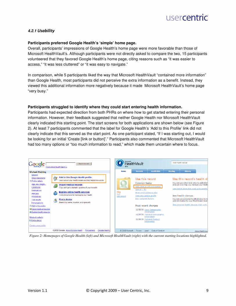
Participants struggled to identify where they could start entering health information.
Participants had expected direction from both PHRs on where how to get started entering their personal
information. However, their feedback suggested that neither Google Health nor Microsoft HealthVault
clearly indicated this starting point. The start screens for both applications are shown below (see Figure
2). At least 7 participants commented that the label for Google Health’s ‘Add to this Profile’ link did not
clearly indicate that this served as the start point. As one participant stated, “If I was starting out, I would
be looking for an initial ‘Create [link or button]’.” Participants also commented that Microsoft HealthVault
had too many options or “too much information to read,” which made them uncertain where to focus.
Figure 2: Homepages of Google Health (left) and Microsoft HealthVault (right) with the current starting locations highlighted.

Version 1.1 © Copyright 2009 – User Centric, Inc. 10
Entering medical information was a click-intensive process on both Google Health and Microsoft
HealthVault.
Once participants entered a health history item (e.g., condition, medication, procedure), most said they
expected to enter additional related details like dates, dosage, causes, and status. In Google Health,
however, participants almost always had to click to additional screens to enter any details beyond the
item’s name. While entering details about a condition like asthma, for example, participants expressed
frustration that they could not edit information on asthma from the homepage. They instead needed to
click on a link in the left navigation menu or in the Profile Summary to access a separate Conditions page
and then select the ‘Edit’ link on their Asthma condition to add details for it.
The only exception to this issue within Google Health was the ability to add a test result (e.g., a total
cholesterol result) via a popup window. After entering the name of the test result, participants could
immediately enter the test details via the popup. Participants reacted positively to this mode of data entry
and said they would have preferred to enter the rest of their health information on Google Health in the
same way (see Figure 3).
Figure 3: Adding a total cholesterol test result item in Google Health
Similarly, 8 participants commented positively on how Microsoft HealthVault allowed them to use the
same screen to enter a health item and quickly populate detail fields (See Figure 4).

Version 1.1 © Copyright 2009 – User Centric, Inc. 11
Figure 4: Adding a medication using Microsoft HealthVault
However, the sheer amount of information requested by Microsoft HealthVault often overwhelmed some
participants. Although some fields were clearly marked ‘Optional’, researchers observed at least 14
participants suffering from cognitive overload while reviewing all the fields. Participants often struggled to
decide which fields to populate and which to leave blank. Other participants in the study felt discouraged
because they did not have sufficient medical knowledge to fill in all the fields on various screens.
In general, while both PHR applications were affected by different problems, participants were frustrated
by the level of effort required to enter their medical information.
Participants appreciated the confirmation provided by Google Health after profile information was
entered.
After entering medical information, participants indicated they liked the visible confirmation provided by
Google Health’s Profile Summary (seen in Figure 5) because it increased their confidence that they had
entered their health data correctly.

Version 1.1 © Copyright 2009 – User Centric, Inc. 12
Figure 5: Google Health’s Profile Summary
In contrast, participants found that after entering a health item in Microsoft HealthVault, they still needed
to return to the Health Info or Home tab to view the different information types.
Straightforward navigation on Google Health made adding medical information simpler.
Overall, most participants found that adding information was a rapid process when they used Google
Health due to the relatively simple navigation. Participants said they liked to the ability to quickly navigate
between the top menu tabs while entering new medical information. These tabs can be seen below
(Figure 6).
Figure 6: Google Health’s navigation tabs
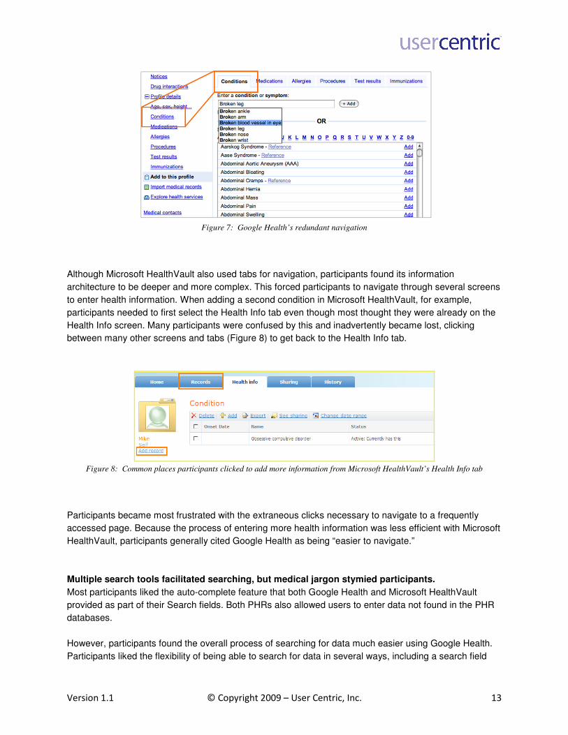
Participants liked the option of accessing their medical information using either the top menu tabs or the
persistent left-hand menu (Figure 7). As one participant said, “[This] site was more user friendly [because
of] the left navigation bar and the tabs versus having to click back to the home page to add more health
conditions.” Participants generally found Google Health’s redundant navigation model supportive of their
needs, regardless of their past experience with PHR applications. They also found it easy to locate the
”Add” button adjacent to the search field, which they used for adding multiple conditions.
Version 1.1 © Copyright 2009 – User Centric, Inc. 13
Figure 7: Google Health’s redundant navigation
Although Microsoft HealthVault also used tabs for navigation, participants found its information
architecture to be deeper and more complex. This forced participants to navigate through several screens
to enter health information. When adding a second condition in Microsoft HealthVault, for example,
participants needed to first select the Health Info tab even though most thought they were already on the
Health Info screen. Many participants were confused by this and inadvertently became lost, clicking
between many other screens and tabs (Figure 8) to get back to the Health Info tab.
Figure 8: Common places participants clicked to add more information from Microsoft HealthVault’s Health Info tab
Participants became most frustrated with the extraneous clicks necessary to navigate to a frequently
accessed page. Because the process of entering more health information was less efficient with Microsoft
HealthVault, participants generally cited Google Health as being “easier to navigate.”
Multiple search tools facilitated searching, but medical jargon stymied participants.
Most participants liked the auto-complete feature that both Google Health and Microsoft HealthVault
provided as part of their Search fields. Both PHRs also allowed users to enter data not found in the PHR
databases.
However, participants found the overall process of searching for data much easier using Google Health.
Participants liked the flexibility of being able to search for data in several ways, including a search field

Version 1.1 © Copyright 2009 – User Centric, Inc. 14
with auto-complete and a scrollable alphabetical list which allowed them to filter by the first letter (see
Figure 9). The latter was useful for those participants who preferred to scan available conditions,
medications, procedures, test result types, or immunizations.
Figure 9: Auto-complete functions on Google Health (left) and Microsoft HealthVault (right).
Depending on the type of health information participants entered (e.g., conditions, medications), Microsoft
HealthVault provided two different methods of data entry. For example, it sometimes provided an open
field with the auto-complete functionality. In other cases, it provided a drop-down list of choices.
Unfortunately, participants often felt that their choice was constrained by the items in the Microsoft
HealthVault drop-down list, because it used different phrasing than expected. Some of the medical jargon
was also very confusing to participants, who were not sure which of the drop-down list options to select.
For example, many participants looked for “flu shot” in the drop down list of immunizations but often did
not recognize “influenza” as a related label for the same topic. One participant noted that it would be
useful to have both flu shot and influenza available in the same list.
In general, participants expected to easily match their medical “term” with the contents of drop-down lists.
They did not feel that the current terminology displayed in the lists adequately supported their varied and
often limited understanding of medical jargon.
Simple medical language was strongly preferred over technical jargon.
Both PHRs often used medical terminology that was more technical than participants were comfortable
with. This phenomena often reflected a gap between participants’ level of knowledge and the specific
medical terminology used in the PHR. Of the two PHR applications, Google Health tended to use more
familiar medical language and often provided more than one label for the same topic to aid recognition by
laypeople.
When entering information into Microsoft HealthVault, participants tended to struggle more. They had
difficulty entering both the title of a health item as well as its details. Specifically, participants had difficulty
figuring out which medical terms to select as well as the relevant level of medical accuracy to use in
HealthVault. Although several participants wanted to be as medically accurate as possible, they were not
always able to make distinctions between the myriad medical conditions listed by the PHR. For example,
many participants indicated they felt uncomfortable guessing which type of influenza vaccine they had

Version 1.1 © Copyright 2009 – User Centric, Inc. 15
been given. One participant commented, “A physician or nurse could do this, but it’s not for an everyday
user.”
.
Figure 10: Microsoft HealthVault drop down list of immunizations
Ability to add an additional health profile was facilitated in Microsoft HealthVault via persistent
linking on most screens.
Participants were much more successful in adding a fictional relative’s health information to their PHR
when using Microsoft HealthVault because a “Add Record” link was consistently located on almost every
page. In contrast, eight participants were unable to locate Google Health’s ‘Create a new profile’ link,
which was located at the bottom of the left-side menu with text that appeared paler than the rest of the
items in the menu.
Figure 11: ‘Create a new profile’ link of the left-side menu of Google Health

Version 1.1 © Copyright 2009 – User Centric, Inc. 16
However, the consistency of Microsoft HealthVault’s “Add Record” link may have been part of the reason
some participants incorrectly interpreted the link’s purpose. During the first task, some participants
incorrectly assumed that this link would allow them to add additional health information to their existing
PHR, but quickly realized its true purpose during their sessions.
4.2.2 Utility
The usability study also identified many features that participants found useful and which might help
motivate them to adopt a PHR for their own use.
Most participants thought PHRs would be beneficial for tracking a chronic condition.
Throughout the usability sessions, participants indicated they saw value in using a PHR to keep track of
their health history, especially if one had a chronic condition that may involve frequent changes in
treatment and status. Additional results related to participants’ perception of PHR value will be discussed
in a later section.
Ability to store health information for family members was highly valued.
The ability to easily store health records for more than one individual (e.g., dependents or spouse) was
considered very important to participants. However, none of the three PHRs we tested truly provided this
functionality in a seamless manner. Participants ended up providing value judgments based on the ideal
interaction they imagined this function would produce.
Participants wanted to link PHR health information with their physician’s records.
Participants also indicated a strong desire to link the health information stored in their PHR with their
physicians’ records. Participants said they would ideally want this to be a two-way channel. Specifically,
participants wanted the ability to automatically download information from their doctor’s electronic health
records to make data entry of their PHR easier and more accurate and also wanted to be able to share
their PHR with their doctor in order to reduce the amount of time spent filling out paperwork during office
visits.
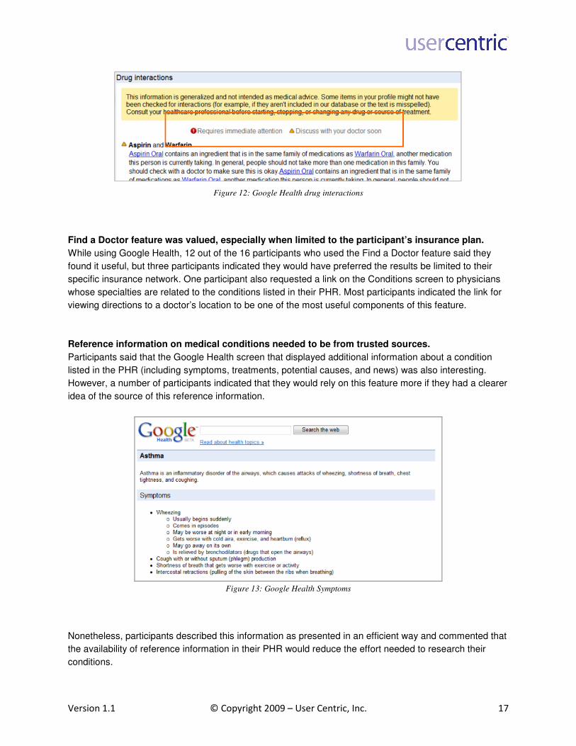
Google Health’s Drug Interactions feature was perceived as very helpful.
The Drug Interactions page of Google Health was one of the most appreciated features that participants
encountered in the study. Participants found the two levels of warning (Figure 12) to be very useful and
seemed to trust the information. (This included the few participants who understood, by way of the
disclaimer, to consult their doctor.) One participant, for example, pointed out that the interaction between
prescriptions and over-the-counter drugs might be omitted from conversations between patients and
physicians, which is why PHRs should contain this type of critical information.
Version 1.1 © Copyright 2009 – User Centric, Inc. 17
Figure 12: Google Health drug interactions
Find a Doctor feature was valued, especially when limited to the participant’s insurance plan.
While using Google Health, 12 out of the 16 participants who used the Find a Doctor feature said they
found it useful, but three participants indicated they would have preferred the results be limited to their
specific insurance network. One participant also requested a link on the Conditions screen to physicians
whose specialties are related to the conditions listed in their PHR. Most participants indicated the link for
viewing directions to a doctor’s location to be one of the most useful components of this feature.
Reference information on medical conditions needed to be from trusted sources.
Participants said that the Google Health screen that displayed additional information about a condition
listed in the PHR (including symptoms, treatments, potential causes, and news) was also interesting.
However, a number of participants indicated that they would rely on this feature more if they had a clearer
idea of the source of this reference information.
Figure 13: Google Health Symptoms
Nonetheless, participants described this information as presented in an efficient way and commented that
the availability of reference information in their PHR would reduce the effort needed to research their
conditions.

Version 1.1 © Copyright 2009 – User Centric, Inc. 18
Ability to upload documents to Microsoft HealthVault was considered potentially helpful for
entering past medical history.
Participants noticed the featured offered by Microsoft HealthVault that allows users to upload a medical
documents directly to their profile. 11 of the 17 participants who used this feature found it very useful,
especially for those who anticipated storing documents from their children’s medical history or copies of
their own diagnostic scans.
Ability to share a personal PHR with family members and physicians was important for some
participants.
12 out of the 16 participants who saw the feature indicated that Microsoft HealthVault’s ability to share
their PHR had value. Participants anticipated that this feature would be especially useful when caring for
a parent or elderly relative who had a separate PHR. However, most participants did not find it useful to
share their PHR information with a friend or someone else outside their family.
Uploading information from a medical device to Microsoft HealthVault was generally considered
useful.
Participants were briefly exposed to the HealthVault feature that allows users to upload information from a
medical device directly into the PHR. (Due to time constraints, little session time was devoted to gathering
feedback on this topic.) 13 out of 18 participants who interacted with this feature considered it useful. For
example, one participant said “This would be very helpful. If I had diabetes, I could use it for glucose
testing. Or I could use it with weight scales or blood pressure.” However, one participant expressed
concern this feature would only be valuable if they were able to enter multiple device readings at once.
This participant expected that single data uploads would likely require too much time and would be
inconvenient.
4.2.3 Security, Privacy, Trust
Participants rarely expressed concerns related to security, privacy, or trust while completing their tasks
and providing feedback. In general, participants seemed to have difficulty differentiating between these
three dimensions and rarely mentioned concerns specific to any one of them. However, researchers did
record some notable observations and feedback related to these three dimensions.
Participants wanted transparent sources for the medical knowledge provided on Google Health.
When reviewing the drug interactions and reference information about medical conditions in Google
Health, 4 out of the 22 participants who used this feature expressed concerns regarding the source of this
reference information. It was not immediately clear what the source of the information was, which made
them wary of relying on this information. These participants said they were looking for the name of a
known medical company or an endorsement by a known medical organization. Some of these
participants were concerned that the medical information provided might have been accumulated from
various Internet sources that may or may not have been reliable.

Version 1.1 © Copyright 2009 – User Centric, Inc. 19
Some participants had security concerns about linking their PHR to a physician’s EHR.
Although sharing information with a physician was one of the most popular features discussed in this
study, 6 of the 30 participants did mention some apprehension about the privacy or security of this link.
For example, one participant said that “basic health information doesn't bother me, but personal info is
worrisome.” Another participant said “I would need some sort of agreement or contract. The information is
confidential.”
4.3 PHR-Specific Questions and Ratings
After completing the tasks on each PHR, participants were asked to provide their general qualitative
impressions about their overall experience with that PHR. Participant responses generally focused on
either usability issues encountered during their sessions or features that were considered especially
useful (or not useful), which further emphasizes the importance of these two dimensions on overall
preference.
During individual post-PHR ratings, Google Health rated higher on the dimensions of ease of use
and utility while Microsoft HealthVault was rated higher on the dimensions of privacy and trust.
Participants were asked to use a 7-point Likert scale to rate the PHR across the same five dimensions:
ease of use, utility, security, privacy, and trust. The results of these ratings are shown in Figure 14.
Figure 14: Participants' average ratings on the five dimensions for each PHR
Ratings were higher for Google Health for ease of use and utility, although there was a larger difference
between the two PHR applications on the dimension of ease of use. The average ratings for security,
privacy and trust were very close for the two PHR applications although Google Health received higher
ratings for security and Microsoft HealthVault received higher ratings for privacy and trust.
This suggests that although the direction of participants’ preference was in favor of Google Health, the
magnitude of this difference was relatively small – both Google Health and Microsoft HealthVault
applications were perceived as fairly secure, private and trustworthy.

Version 1.1 © Copyright 2009 – User Centric, Inc. 20
4.4 USE Questionnaires
After completing the tasks and ratings for each PHR, participants were also given the USE questionnaire,
a standardized instrument designed to collect subjective feedback on usability and related concepts. The
USE questionnaire has been iteratively developed by usability practitioners and academics to establish a
consistent methodology for the collection of subjective user ratings (Lund, 1998).
The USE Questionnaire showed that Google Health was rated as being easier to learn, generally
more useful, and easier to use than Microsoft HealthVault.
Figure 15 shows average ratings for the 29 items on the USE questionnaire. Google Health had higher
average ratings than Microsoft HealthVault on all but one question, where the two were equal. The 29
questions were grouped into 4 categories based on the results of a factor analysis and an overall average
rating was computed for each category. Each of the 4 categories had high internal consistency among
the individual questions (Chronbach’s α > 0.9 in each case). The names for the categories were
generated based on the wording of the questions contained in each. Google Health had higher average
ratings than Microsoft HealthVault for each of the categories, and the differences were statistically
significant beyond the p=0.05 level for 3 of the 4 categories.
Figure 15: USE questionnaire average ratings. The 29 questions are grouped into 4 categories (Easy to Learn, Useful, Easy to
Use, Effective) based on the results of a factor analysis. Average ratings are shown for each category. A * means the difference
between the average category ratings for Google Health and Microsoft HealthVault were statistically significant beyond the
p=0.05 level. Questions within each category are sorted by descending average rating for Google Health.

Version 1.1 © Copyright 2009 – User Centric, Inc. 21
Google Health was compared to Microsoft HealthVault for each of the 4 rating categories using both a
matched-pairs t-test and a Wilcoxon matched-pairs signed-ranks test, which produces a z score. Table 1
summarizes the results of these two types of tests. The p values are for two-tailed tests in both cases.
Google Microsoft Matched-pairs t-test
Wilcoxon matched-pairs
signed-ranks test
M SD M SD t (df) p z p
Easy to Learn* 5.60 1.00 4.97 1.32 t(29)=2.72 0.011 z=2.35 0.019
Useful* 5.06 1.23 4.43 1.36 t(29)=2.60 0.014 z=2.39 0.017
Easy to Use* 4.85 1.27 3.89 1.54 t(29)=3.25 0.003 z=2.78 0.005
Effective 4.43 1.56 4.11 1.72 t(29)=1.57 0.128 z=1.02 0.307
Table 1. Summary of statistical tests on the difference between average category ratings for Google and Microsoft. A *
indicates that the difference was significant beyond the p=0.05 level.
The Effectiveness category of questions had the lowest overall average rating, and had the single
question with the overall lowest average ratings for both products, ‘I feel I need to have it.’ This might
reflect the perceived value of PHR functionality relative to current life circumstances. Participants who
reported having had fewer chronic health-related issues generally saw PHRs as less compelling than
those with chronic conditions, dependents, or multiple medications.
Easy to Use ratings showed the biggest difference between the two PHR applications in terms of the
average category rating difference relative to the standard deviations. In addition, the lowest overall
average rating for Microsoft HealthVault was given in the Easy to Use category. The advantage for
Google Health was consistent across all 10 items in this category. As the next section on final
impressions and overall preferences suggests, participants found Google Health to be more familiar and
straightforward and direct overall preference ratings of Ease of Use were consistent with the Ease of Use
category ratings presented here.
4.5 Final Impressions and Overall Preferences
Once participants had the opportunity to review both PHR tools, they were asked to compare their
experiences using both. While most participants started their session naïve to the concept of PHRs, most
left their session perceiving some value in the concept, with 60% of the participants interested in building
their own profiles online.
Near the end of their session, participants were asked to select which PHR they preferred overall on each
of the five dimensions: Overall ease of use, utility, security, privacy and trust. The preference results are
shown in Figure 16 below.

Version 1.1 © Copyright 2009 – User Centric, Inc. 22
Figure 16: Overall preferences
Google Health was perceived significantly easier to use.
Most participants preferred Google Health (80%) to Microsoft HealthVault in terms of perceived ease of
use, χ2(1,N=30)=10.80, p=0.001. Participants commented that they found Google Health’s terminology to
be more familiar, its navigation to be clearer and its overall process of entering data to be more
straightforward. They also perceived the overall flow within the Google Health as more efficient than
Microsoft HealthVault.
Participants found perceived utility in Google Health’s features.
In terms of utility, Google Health (70%) was preferred to Microsoft Health, χ2(1,N=30)=4.80, p=0.028).
Participants most often indicated they found the most value in the drug interactions feature and the
reference information about a condition (e.g. asthma).
Preferences towards Microsoft HealthVault in terms of security, privacy and trust were not
statistically significant beyond the p=0.05 level.
HealthVault had a preferential edge in the three remaining dimensions, although the results were not
statistically significant beyond the p=0.05 level. Participants preferred Microsoft HealthVault in terms of
security (60%), χ2(1,N=30)=1.20, p=0.27, privacy (66%), χ
2(1,N=30)=2.79, p=0.06, and trust (60%),
χ2(1,N=30)=1.20, p=0.27). Participants gave similar reasons (e.g., brand, prior experience) for preferring
Microsoft HealthVault for each of these areas.
In a few cases, people gave similar reasons for picking HealthVault for security and privacy: “I don’t trust
Google” or “I’m more familiar with [Google or Microsoft]” or they may have had experience with Microsoft
from a software security standpoint. Overall, however, familiarity with Microsoft’s brand was the primary
reason for participants’ preferences here. Also, some participants felt Google Health would be less secure
or private because it was linked with search and e-mail through the Google Web application suite.

Version 1.1 © Copyright 2009 – User Centric, Inc. 23
Google Health was preferred overall.
When asked which PHR they preferred overall, participants chose Google Health, 19 to 11 (63%),
χ2(1,N=30)=2.13, p=0.14. This result is not statistically significant beyond the p=0.05 level, but it does
suggest that earlier results regarding ease of use and usefulness could be important for overall
preference. Regarding their overall preference for Google Health, 15 of the 19 participants indicated ease
of use as the deciding factor and others indicated they preferred Google Health because of the
usefulness of its features. Only two participants based their overall preference choice on trust or
familiarity with a brand.
Patterns in preference selections were evident.
There was an interesting pattern in the preference data which seems to support a connection between
ease of use and utility. If participants chose the same PHR for ease of use and utility, they always chose
that PHR overall. Meanwhile, if participants chose different PHRs for ease of use and utility, whichever
PHR they preferred for security, privacy and trust was the same PHR they preferred overall. Only two
participants violated this “rule,” and they chose the PHR they preferred for ease of use.
Figure 17: Pattern in preference data explained
Finally, there was a pattern in preferences based on age as well. As shown in Figure 18 below, younger
participants (18-40 years old, n=19) were more likely to choose Google Health as both easier to use and
preferred overall as compared to older participants (41-70 years old, n=11). A possible explanation here
is that younger individuals are more familiar with Google’s common Web application interface, which
made Google Health easier to learn and in turn influenced participants’ overall preferences. It is also
telling that the age effect is larger in ease of use than in overall preference – this supports the conclusion
that ease of use is a strong component of overall preference, but not the only component.

Version 1.1 © Copyright 2009 – User Centric, Inc. 24
Figure 18: Pattern related to overall preference and age group
4.6 Features Questionnaire
After completing the forced-choice preferences and providing final impressions, participants were given a
questionnaire that asked them to rank how useful they would find several features. The questionnaire
included all six of the PHR-exclusive features shown in testing, several features shared by both PHRs,
and a few hypothetical features. The results of these ratings are shown in Figure 19 below.
Figure 19: Usefulness ratings of exclusive, shared and hypothetical features
Overall, Google Health’s exclusive features had higher average ratings, which supported its overall utility
preference. The most appealing feature was “Receiving automated drug interaction warnings from the
Version 1.1 © Copyright 2009 – User Centric, Inc. 25
PHR,” which only Google Health supported. Although the other exclusive features had similar ratings, the
inclusion of the drug interactions may have been enough to push Google Health over the top when
participants gave their overall preference between the two PHRs (it was chosen as more useful by 21 of
the 30 participants).
The least desirable features highlighted an interesting trend which may be related to the perceived quality
of information. Three of the lowest-ranked features were “allowing others to modify a record,” “getting
automated treatment recommendations,” and “reading others’ comments about doctors or medications.”
Since all three of these features are similar in that they involve finding information from external sources
other than healthcare practitioners, it could be the case that participants simply were not confident in the
quality of medical information they would obtain by using a PHR.
Finally, participant interest was positive for most of the hypothetical features, The hypothetical features
“Learning about medication side effects” and “Customizing views” were seen as especially desirable. This
is important information to consider for those interested in creating a better PHR interface.
5. Qualitative Participant Feedback on MyMedicalRecords.com
Midway through the study, researchers at User Centric learned of a third PHR, known as
MyMedicalRecords.com (MMR), that had been commonly advertised as an easy to use tool with features
that many of the earlier participants had expressed interest in (MyMedicalRecords.com, 2007b).
Therefore, User Centric decided to add tasks related to this third PHR to the end of the remaining
usability sessions and capture qualitative feedback.
After they explored the first two PHRs, the last 12 participants were able to briefly interact with MMR.
However, since participants’ exposure to MMR was limited compared to their more thorough exploration
of Google Health and Microsoft HealthVault, the three applications cannot be directly compared. Figure
20 below shows the MMR members’ home page.

Version 1.1 © Copyright 2009 – User Centric, Inc. 26
Figure 20: MyMedicalRecords.com members’ home page.
The folder icons, page break, and the link to add medical information are highlighted.
Upon initial inspection of both the initial landing page and the members’ home page, 4 out of 12
participants had positive reactions, saying the page seemed “formal” or “polished.” However, 8
participants did not prefer the home page’s visual presentation, saying it seemed “busy” or “unorganized.”
Participants struggled to figure out how to enter medical information.
When participants were asked to add an item to their existing MMR profile, many indicated they expected
to be able to add health information through one of the twelve folder icons shown in the middle of the
home page. 9 out of 12 participants expressed frustration on this task, since the link to add medical
information was located below the fold of the home page and many participants required the moderator’s
assistance to find it.
Once they located the correct link to the Medical History page, participants again struggled to find a way
to add medical information. The target link for adding new items was located on the very top of the page
among unrelated filtering functions. Instead, most participants’ attention was first drawn to the red “Edit”
links within the main body of the page. Both of these items are highlighted in Figure 21 below.

Version 1.1 © Copyright 2009 – User Centric, Inc. 27
Figure 21: MyMedicalRecords.com medical history page
Participants liked MMR’s data entry form.
The process of adding medical information was positively regarded by those participants who saw it. One
positive feature of MMR was that some of the form fields would dynamically update based on what was
chosen from the Description drop down. One participant said that this made it easier to input data on
MMR than either Google Health or Microsoft HealthVault, because they would be able to enter a category
(e.g., Condition, Immunization, Medication) and its details in a single step.
Figure 22: Description drop-down when adding information on MMR
Most participants did not see value in linking the information of two PHRs.
10 of the 11 participants who attempted to link their Google Health profile to their MMR profile were
successful. Two participants commented that the button was easy to find and that the function was easy
to access in one click.
However, 8 of the 11 participants were unsure why they would need to link two PHRs or even why one
would use more than one PHR at all. Three participants suggested that the function could be useful if, for
example, their physician used MMR while they used Google Health, or if they wanted to import
Version 1.1 © Copyright 2009 – User Centric, Inc. 28
information from an old PHR as they made a permanent switch to another. Two participants also felt
unsure about the security of linking two PHRs because their passwords would be stored in more than one
place.
At the conclusion of their experience interacting with MMR, six participants reiterated that they found
MMR unorganized, which made it harder to find what they were looking for. While two participants
discovered novel functions and features on the application (e.g., Dental and Veterinarian records), only
one of the 12 participants saw enough additional value in MMR to rank it higher than their earlier PHR
preference. 8 of the 12 participants indicated they found their earlier preference easier to use and two
participants mentioned this was especially true since MMR requires a subscription fee.
6. Recommendations for Improving PHR Interfaces
This usability study allowed User Centric to gain a better understanding of what did and did not work in
three PHR applications: Google Health, Microsoft HealthVault and MyMedicalRecords.com (MMR). While
none of the PHRs studied had a perfect interaction model, the data motivated User Centric to develop a
series of best practices to be considered when implementing a PHR. The best practices discussed below
are based solely on the issues observed and feedback given by participants, and leave room for further
development toward a better PHR.
Since perceived simplicity and ease of use are keys to user preference, a PHR home page should
avoid unnecessary visual complexity.
During the usability test, participants showed a strong preference for the layout of Google Health’s
homepage when compared with Microsoft HealthVault’s homepage, mainly due to its simplicity. Google
Health used a plain design on its homepage with only critical navigation and a few links prominently
displayed. Participants found it “easier to access,” “less cluttered,” and “easy to navigate.” This focus on a
few important points allowed users to quickly scan the information presented and find what they came for.
A PHR should only display navigation and information necessary to complete core tasks on its
homepage.
A PHR should provide strong cues to help users start entering health information.
Since new users will not generally be trained to use a PHR, a PHR application should be designed to
support users from their first interaction with it. In the study, participants had difficulty with how to begin
entering health information into all three PHRs and indicated they were looking for guidance from the
applications on how to start this process. This is especially problematic because the main function of a
PHR is to enter health information, and it should be easy for new users to jump in and enter health data.
Instead, a PHR should provide a strong visual cue to the user for how to begin entering this information,
such as a welcome page, large button or link representing a starting point.
Version 1.1 © Copyright 2009 – User Centric, Inc. 29
Users should be able to add details about a health item (e.g., medication) immediately after
entering its name. However, the number of detail fields displayed at one time should be limited to
avoid overwhelming users.
The process of entering data should be as simple as possible, allowing users to enter items quickly while
also providing an opportunity to enter details immediately. Both of the two PHRs tested proved difficult for
participants in some aspect of data entry. For the most part, Google Health provided a quick path to
entering the names of health items, but required users to navigate through multiple screens to add details
about those items. On the other hand, Microsoft HealthVault allowed users to add details right away, but
the sheer amount of entry fields displayed for each health item was overwhelming for participants.
Both ends of this user experience must be considered when designing the data entry process for a PHR.
Participants overwhelmingly preferred to be able to enter details about a health item on the same screen
as its name, so a PHR should support this process. However, the PHR must also be designed to ensure
that its users are not overwhelmed with the amount of information they need to enter, possibly by limiting
the amount of data entry fields displayed at one time.
Medical information should be presented without technical jargon.
Non-technical language should be used by in PHR applications whenever possible because participants
were frequently confused by the medical terminology they did not understand. This was especially
apparent when medical terms were used as field descriptions in Microsoft HealthVault. By using familiar
terminology in links, field descriptions, and other areas, a PHR will provide users with a much clearer idea
of what information they are being asked to enter, which will in turn help to ensure the accuracy of users’
health profiles.
Multiple methods of data entry and search (e.g., text entry field, A-Z list) should be supported.
Both Google Health and MSN HealthVault offered auto-complete functionality for users as they entered
text, but only Google Health also offered an A-Z list of medical items to choose from. Participants from the
usability study enjoyed Google Health’s flexibility, with some participants preferring to identify their
specific medical issues by browsing through the A-Z list, and others preferring to use the text entry field.
Both of these methods for entering health information should therefore be included in a PHR to
accommodate a broad range of users.
Databases of health information should include multiple descriptions of the same health items to
accommodate users’ differing levels of comfort with medical terminology.
Participants often felt constrained by the terminology suggested by the auto-complete functionality in both
PHRs and sometimes did not know which item to choose when they did not understand the language
used. Text entry fields should be flexible when identifying the medical item (e.g., medication, test result,
condition) users type into them. The PHR database should be able to recognize whatever level of
technical terminology users are comfortable with by storing multiple descriptions of the same medical
item. It should also help to bridge the gap between layman’s knowledge and medical terminology by
helping users to translate their understanding into precise medical terminology (e.g., suggesting spellings,
filtering conditions via natural language prompts).

Version 1.1 © Copyright 2009 – User Centric, Inc. 30
A confirmation should be displayed as items are added to a user’s profile.
During the study, participants were pleased with the immediate, detailed onscreen confirmation provided
by Google Health as they added health items to their profiles. These users felt more confident that their
items were added successfully. On Microsoft HealthVault, however, changes were not confirmed
immediately for users, instead forcing them to click back to the Health Info or Home tab to view a list of all
information types they had entered. A clearly visible confirmation of changes made to health items, such
as a window, message, icon, or running profile, should be implemented in PHR applications to confirm
successful data entry.
Profile summary information should be displayed on every page of a PHR.
As participants entered medical information in their Google Health profiles, they appreciated the
persistent Profile Summary that updated every time they added a new item or made a change. This
Profile Summary confirmed changes made to the profile as well as reminding participants what
information they had already entered about themselves. This type of functionality would be a useful way
for a PHR to allow users continual reference to their profile data.
Persistent navigation should be maintained throughout a PHR.
Many participants also indicated they found Google Health easier to use because of its redundant
navigation model which utilized both tab-based navigation and a persistent left navigation menu. As a
result, users could easily navigate from one health history item to the next by using either menu. PHR
applications should include such persistent navigation to allow users to access any function on the Web
site application from the each screen.
The ability to add a family member’s profile should be prominently displayed and easy to find.
While participants were able to successfully find the persistent link to add a family member’s health record
on Microsoft HealthVault, they were very frustrated by its lack of prominence in Google Health. Since one
of the core functions of a PHR is to enable users to input data not only for themselves but also for
dependents, this ability should be emphasized in any PHR.
Some participants were also confused about the different labels for this function on each PHR, mainly
due to the use of the potentially-confusing terms “record” or “profile.” A PHR that uses a clear label (e.g.,
“Add a Family Member”) would allow its users to avoid this issue.
Drug Interaction functionality should be included.
One of the most positively received functions throughout the study was the drug interaction tool available
on Google Health. Participants also rated the ability to learn about possible side effects to medications
quite highly in the features questionnaire administered at the end of the study. However, some
participants said that these features would only be valuable if they came from a trusted source and they
would likely look to their doctor as a primary source for this information.

Version 1.1 © Copyright 2009 – User Centric, Inc. 31
If it is possible to integrate insurance information into a PHR, the tool should include the ability to
find a doctor.
As they used the feature on Google Health, some participants were interested in being able to find a
doctor, but this interest was limited to finding doctors within their health insurance provider’s network.
Most participants found the link to see directions to a doctor’s location to be one of the most useful
components of this feature. This feature, then, should only be included in a PHR if the tool was also able
to integrate users’ insurance information to better target searches.
If an online PHR provides medical knowledge, the source of that information should be plainly
shown to users so they can make their own judgments about the information’s reliability.
Some participants were interested in the Reference feature on Google Health that displays general
medical information about a particular condition. However, these participants were also concerned about
the reliability of the information, since the sources were not visible. A PHR should consider implementing
a feature that displays medical information, but that also clearly links to its sources.
A PHR should allow users a secure link to their physician’s health records and allow them to both
upload to and download from their physicians’ EHRs.
Sharing information with a physician was seen by many participants as a main reason for maintaining a
PHR, making it an essential feature to include. Users should be able to import data from a physician’s
EHR to avoid the repetition of data entry into the PHR. The ability to export and share family history
information and symptoms with a physician or other family members was also highly praised, and should
be supported by PHRs.
However, when accessing health information from a provider’s system, privacy standards may require a
certain level of authentication which must be considered in the PHR design. It may be necessary for a
PHR to employ secure passcodes or other means of reliably identifying individuals.
It is important to establish brand credibility, as it is a motivating factor for users to choose a PHR.
As mentioned earlier, participants said they would feel more comfortable with the information given in a
PHR if it was from or endorsed by a known company or medical association. Brand credibility will help to
ensure the success of any PHR.
A PHR should have easily accessible privacy agreements and other legal disclosures, in language
that is simple to understand.
Some participants mentioned that terms of use and privacy policies were unusually important in the
context of a PHR. Because these applications involve personal health information, a PHR should make
certain to prominently explain to users how their data will be handled. However, it is also critical that this
information be presented in a readable and simple format, so that users are not intimidated by pages of
legal jargon.

Version 1.1 © Copyright 2009 – User Centric, Inc. 32
Different types of users and their health needs should be consciously addressed when designing
functionality for a PHR.
Because many participants saw significant value in using a PHR if they had a chronic condition, it is
important that the ideal PHR is tailored to this type of situation. Although not included in a specific task in
the study, the process of adding multiple updates to the same condition was not streamlined by any of the
three PHRs studied, which may limit their utility for users with these types of conditions. Consider a user
with a complicated condition like breast cancer. When this user initially sets up her PHR profile, she may
want to input her cancer’s entire history, including related test results, treatment regimens, medications
and procedures.
Then, each time the status in her health changes, the PHR will need to be updated. The current model
used by all three PHRs in this usability study simply allows for new line items to a single category of
information (e.g., condition or medication). The ideal PHR should allow users with such conditions to tie
different types of information together under the umbrella of a single medical issue and enable easy
updates.
7. Next Steps for PHR Applications
Performing usability testing on several popular PHRs allowed User Centric to get a closer, more studied
perspective on the user experience of PHRs as well as their most valuable features and functions. The
wealth of data gathered from the research was used to inform the development of some design best
practices for PHRs. User Centric encourages further validation of the preliminary ideas suggested for
these best practices above.
While there is still more to be learned in this domain, obtaining actual users’ feedback and experiences is
an essential step to increasing the rate of PHR adoption. As a follow-up to the PHR usability testing
described in this whitepaper, User Centric conducted an online survey to gather further data on attitudes
towards PHRs. Although analysis of the survey data is currently ongoing, several relevant trends have
been identified.
One critical point is that survey respondents were not typically prepared to invest a large amount of time
in configuring or updating their PHR. Most commonly, respondents were willing to spend between 10 and
30 minutes setting up their PHR and were willing to update it only monthly or yearly. This highlights the
importance of the PHR user experience to adoption; if data entry is difficult or inefficient, the PHR may not
be worth the user’s time.
Another interesting finding included the features that would most drive respondents to adopt a PHR.
These were:
• Track immunization records
• Securely receive test results and information from your physician
• Share your health information with your primary physician
• Manage insurance information and medical bills
• Get reminders about regular checkups or recurring treatments.

Version 1.1 © Copyright 2009 – User Centric, Inc. 33
Sharing one’s information with their physician was the only one of these features to be included on the
questionnaire given during the usability testing, and it scored highly in both the testing and the survey.
The other four features were among those newly introduced for the survey.
In addition to this online survey, User Centric is conducting an online test of task-based first-click
responses to assess the effectiveness of page layout and terminology used in the three PHRs evaluated
in the usability study.
In the future, User Centric will release a more detailed report to discuss the survey data and its
implications. Additionally, focus groups featuring individuals with distinct health-related profiles (e.g.,
health professionals, parents) are also planned.
Version 1.1 © Copyright 2009 – User Centric, Inc. 34
8. References
AAFP (American Academy of Family Physicians). (2006). An introduction to Personal Health Records.
Retrieved January 26, 2009, from AAFP News & Publications Web site:
http://www.aafp.org/fpm/20060500/57anin.html
AHIMA (American Health Information Management Association). (2009a). What is a Personal Health
Record? Retrieved January 26, 2009, from MyPHR.com Web site:
http://www.myphr.com/what/what_is_a_health_record.asp
AHIMA (American Health Information Management Association). (2009b). How to choose a PHR supplier.
Retrieved January 26, 2009, from MyPHR.com Web site: http://myphr.com/resources/phr_search.asp
Arnst, Catherine. (2006). The best medical care in the U.S. Retrieved January 26, 2009, from
BusinessWeek Web site:
http://www.businessweek.com/magazine/content/06_29/b3993061.htm?chan=tc&chan=technology_te
chnology+index+page_best+of+the+magazine
Kalorama Information. (2008). Online access of patient health records adds new dimension to EMR.
Retrieved January 26, 2009, from MSNBC Marketwire Web site:
http://www.msnbc.msn.com/id/28437746/
Lund, A. M. (1998). The need for a standardized set of usability metrics. In the Proceedings of the
Human Factors and Ergonomics Society 42nd Annual Meeting. Santa Monica, CA: Human Factors
and Ergonomics Society, 688-691.
MyMedicalRecords.com. (2007a). MyMedicalRecords.com offers free advanced drug
information/interaction tool to the public. Retrieved January 27, 2009, from MyMedicalRecords.com
Web site: http://www.mymedicalrecords.com/pressRoom.jsp
MyMedicalRecords.com. (2007b). Former congressman Richard Gephardt joins campaign to promote
availability of electronic health records for all working Americans. Retrieved January 26, 2006, from
PRNewsWire.com Web site: http://www.prnewswire.com/cgi-
bin/stories.pl?ACCT=104&STORY=/www/story/02-12-2007/0004525403&EDATE
Nall, Janice. (2008). Proposed recommendations for using social media to increase adoption of and
enhance the functionality of Personal Health Records (PHRs) [PowerPoint slides]. Retrieved from U.S.
Department of Health and Human Services Web site:
http://www.hhs.gov/healthit/ahic/materials/04_08/ce/nall_recs_files/textonly/index.html