uri brand visual standards guide - uri...
TRANSCRIPT
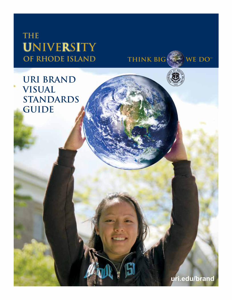
URI BRANDVISUAL STANDARDS GUIDE
uri.edu/brand
uri.edu/brand
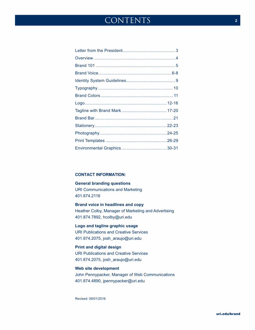
2CONTENTS
Letter from the President ........................................... 3
Overview ................................................................... 4
Brand 101 ................................................................. 5
Brand Voice ............................................................6-8
Identity System Guidelines ........................................ 9
Typography ............................................................. 10
Brand Colors ........................................................... 11
Logo ...................................................................12-16
Tagline with Brand Mark .....................................17-20
Brand Bar ................................................................ 21
Stationery ...........................................................22-23
Photography .......................................................24-25
Print Templates ..................................................26-29
Environmental Graphics .....................................30-31
CONTACT INFORMATION:
General branding questions
URI Communications and Marketing
401.874.2116
Brand voice in headlines and copy
Heather Colby, Manager of Marketing and Advertising
401.874.7892, [email protected]
Logo and tagline graphic usage
URI Publications and Creative Services
401.874.2075, [email protected]
Print and digital design
URI Publications and Creative Services
401.874.2075, [email protected]
Web site development
John Pennypacker, Manager of Web Communications
401.874.4890, [email protected]
Revised: 09/01/2016
uri.edu/brand
3FROM THE PRESIDENT
I am pleased to endorse this Branding Guide, which has
helped the University of Rhode Island present a positive,
unified visual image to the community.
Our brand is our promise to the public. It tells them what
they can expect from us, and it highlights what we offer:
Big Thinking. Our brand is derived from who we are, who
we want to be, and who people perceive us to be, which is why this Branding
Guide is such an incredibly important tool.
The success of these guidelines depends on our faithful adherence to them.
I ask for your cooperation in upholding these standards so that the University
of Rhode Island continues to speak with a clear and consistent voice.
Best regards,
David M. Dooley
President
uri.edu/brand
4OVERVIEW
The URI Brand Visual Standards Guide contains all
the graphic elements to be used in an appropriate
manner to maintain the unified visual identity of URI.
This provides the framework upon which the brand
message and big-thinking stories reside.
All branding resources (i.e. logo, tagline with brand
mark, templates) must be reproduced exactly as
specified in this guide and on the brand Web site
uri.edu/brand, from which the official URI brand files
can be downloaded.
uri.edu/brand
5BRAND 101
A BRAND IS A PROMISE YOU MAKE WITH
YOUR CUSTOMERS, YOUR EMPLOYEES, AND
YOUR CONSTITUENTS ABOUT WHAT IT IS
YOU STAND FOR, AND WHAT THEY VALUE
IN YOU. IT IS A CORE TRUTH THAT CAN
NEVER BE FORGOTTEN AND A CORE
PROMISE THAT CAN NEVER BE BROKEN.
DEVELOPING A BRAND IS AN ONGOING
PROCESS OF TELLING YOUR AUDIENCE
WHAT MAKES YOU UNIQUE AND MORE
VALUABLE THAN THE ALTERNATIVES.
uri.edu/brand
6URI BRAND VOICE
THE URI BRAND VOICE SHOULD BE A VOICE
FULL OF CONFIDENCE TEMPERED WITH
HUMILITY AND A WRY SENSE OF SELF AND
PLACE BEFITTING KINGSTON, PROVIDENCE,
AND RHODE ISLAND IN GENERAL. IT
SHOULD BE THE COMFORTABLE, PLAIN-
SPOKEN VOICE OF AN INTELLIGENT FRIEND
YOU CAN ALWAYS RELY ON FOR COMMON
SENSE AND SURPRISINGLY LARGE THINKING.
uri.edu/brand
7URI BRAND VOICE—HEADLINE EXAMPLES
DOES BEING A RESEARCH UNIVERSITY MAKE US BETTER
THAN 2/3 OF THE UNIVERSITIES IN THE COUNTRY?
YES.
WE RESEARCHED IT.
THE ROLLING FARMLANDS.
THE STONE WALLS.
THE PRISTINE BEACHES.
THE CONVERSION COATING USING MIXTURES
OF TITANIUM AND ZIRCONIUM OXIDES.
MULTIDISCIPLINARY.
MULTIDIMENSIONAL.
MULTICULTURAL.
MULTIJOBOFFERS.
HOW DOES A STATE SO SMALL ATTRACT TALENT SO LARGE?
WHY DO WE MIX DISCIPLINES IN OUR UNIVERSITY?
BECAUSE DISCIPLINES ARE MIXED IN THE WORLD.
uri.edu/brand
8URI BRAND VOICE—HEADLINE EXAMPLES
DON’T SEND YOUR SON OR DAUGHTER HERE
BECAUSE IT’S SAFE AND BEAUTIFUL.
BUT BECAUSE IT’S SAFE AND BEAUTIFUL
AND LEADING-EDGE.
WE ARE NOT AN IVORY TOWER.
WE ARE A LIGHTHOUSE TO THE WORLD.
SIZE IS A MATTER OF THINKING, NOT GEOGRAPHY.
WELCOME TO URI.
STUDY IN A SMALL, BEAUTIFUL PLACE
WITH SOME OF THE BIGGEST THINKERS IN THE WORLD.
WE HAVE ALWAYS THOUGHT GLOBALLY IN RHODE ISLAND.
JOIN US.
uri.edu/brand
9
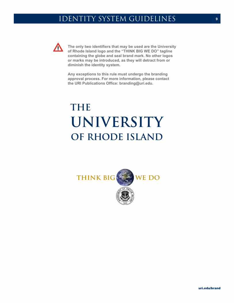
The only two identifiers that may be used are the University of Rhode Island logo and the “THINK BIG WE DO” tagline containing the globe and seal brand mark. No other logos or marks may be introduced, as they will detract from or diminish the identity system.
Any exceptions to this rule must undergo the branding approval process. For more information, please contact the URI Publications Office: [email protected].
IDENTITY SYSTEM GUIDELINES
uri.edu/brand
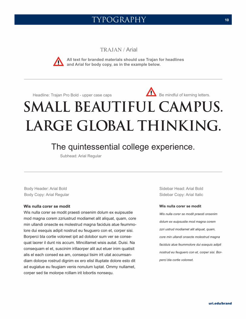
10TYPOGRAPHY
TRAJAN / Arial
Body Header: Arial Bold
Body Copy: Arial Regular
Wis nulla corer se modit
Wis nulla corer se modit praesti onsenim dolum ex euipsustie
mod magna corem zzriustrud modiamet alit aliquat, quam, core
min ullandi onsecte es molestrud magna faciduis atue feummo-
lore dui esequis adipit nostrud eu feuguero con et, corper sisi.
Borperci bla cortie voloreet ipit ad dolobor sum ver se conse-
quat laorer il dunt nis accum. Mincillamet wisis autat. Duisi. Na
consequam el et, suscinim irillaorper alit aut etuer inim quatisit
alis el each consed ea am, consequi tisim irit utat accumsan-
diam dolorpe rostrud dignim ex ero elisl illuptate dolore esto dit
ad eugiatue eu feugiam venis nonulum luptat. Ommy nullamet,
corper sed tie molorpe rcillam irit lobortis nonsequ.
Wis nulla corer se modit
Wis nulla corer se modit praesti onsenim
dolum ex euipsustie mod magna corem
zzri ustrud modiamet alit aliquat, quam,
core min ullandi onsecte molestrud magna
faciduis atue feummolore dui esequis adipit
nostrud eu feuguero con et, corper sisi. Bor-
perci bla cortie voloreet.
Sidebar Head: Arial Bold
Sidebar Copy: Arial Italic
SMALL BEAUTIFUL CAMPUS.LARGE GLOBAL THINKING.
The quintessential college experience.
Headline: Trajan Pro Bold - upper case caps Be mindful of kerning letters.
Subhead: Arial Regular
All text for branded materials should use Trajan for headlines and Arial for body copy, as in the example below.
uri.edu/brand
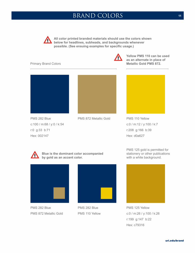
11BRAND COLORS
PMS 282 Blue
c:100 / m:68 / y:0 / k:54
r:0 g:33 b:71
Hex: 002147
PMS 872 Metallic Gold PMS 110 Yellow
c:0 / m:12 / y:100 / k:7
r:208 g:166 b:39
Hex: d0a627
Primary Brand Colors
Yellow PMS 110 can be used as an alternate in place of Metallic Gold PMS 872.
PMS 282 Blue
PMS 872 Metallic Gold
PMS 282 Blue
PMS 110 Yellow
Blue is the dominant color accompanied by gold as an accent color.
PMS 125 Yellow
c:0 / m:26 / y:100 / k:26
r:199 g:147 b:22
Hex: c79316
PMS 125 gold is permitted for stationery or other publications with a white background.
All color printed branded materials should use the colors shown below for headlines, subheads, and backgrounds whenever possible. (See ensuing examples for specific usage.)
uri.edu/brand
12
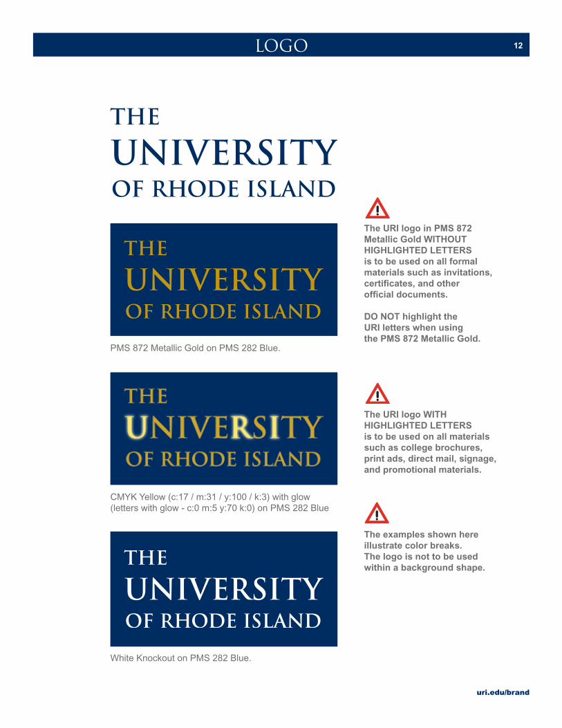
PMS 872 Metallic Gold on PMS 282 Blue.
CMYK Yellow (c:17 / m:31 / y:100 / k:3) with glow(letters with glow - c:0 m:5 y:70 k:0) on PMS 282 Blue
LOGO
The URI logo in PMS 872 Metallic Gold WITHOUT HIGHLIGHTED LETTERS is to be used on all formal materials such as invitations, certificates, and other official documents.
DO NOT highlight the URI letters when using the PMS 872 Metallic Gold.
The examples shown here illustrate color breaks. The logo is not to be used within a background shape.
The URI logo WITH HIGHLIGHTED LETTERS is to be used on all materials such as college brochures, print ads, direct mail, signage, and promotional materials.
White Knockout on PMS 282 Blue.
uri.edu/brand
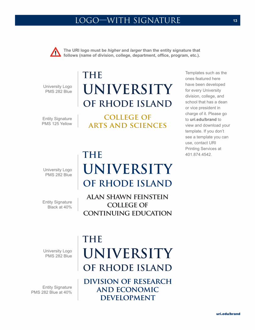
13LOGO—WITH SIGNATURE
University LogoPMS 282 Blue
University LogoPMS 282 Blue
University LogoPMS 282 Blue
Entity Signature PMS 125 Yellow
Entity Signature Black at 40%
Entity Signature PMS 282 Blue at 40%
The URI logo must be higher and larger than the entity signature that follows (name of division, college, department, office, program, etc.).
Templates such as the ones featured here have been developed for every University division, college, and school that has a dean or vice president in charge of it. Please go to uri.edu/brand to view and download your template. If you don’t see a template you can use, contact URI Printing Services at 401.874.4542.
uri.edu/brand
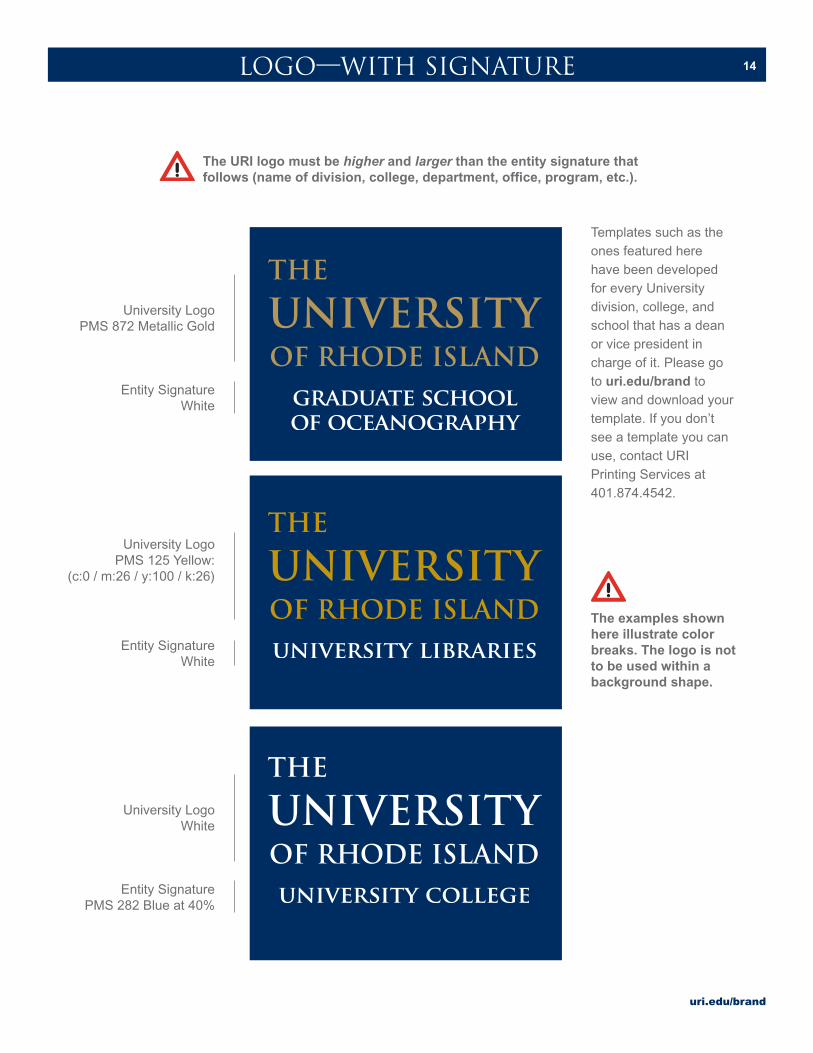
14
University LogoPMS 872 Metallic Gold
University LogoPMS 125 Yellow:
(c:0 / m:26 / y:100 / k:26)
University LogoWhite
Entity SignatureWhite
Entity SignatureWhite
Entity Signature PMS 282 Blue at 40%
LOGO—WITH SIGNATURE
The examples shown here illustrate color breaks. The logo is not to be used within a background shape.
The URI logo must be higher and larger than the entity signature that follows (name of division, college, department, office, program, etc.).
Templates such as the ones featured here have been developed for every University division, college, and school that has a dean or vice president in charge of it. Please go to uri.edu/brand to view and download your template. If you don’t see a template you can use, contact URI Printing Services at 401.874.4542.
uri.edu/brand
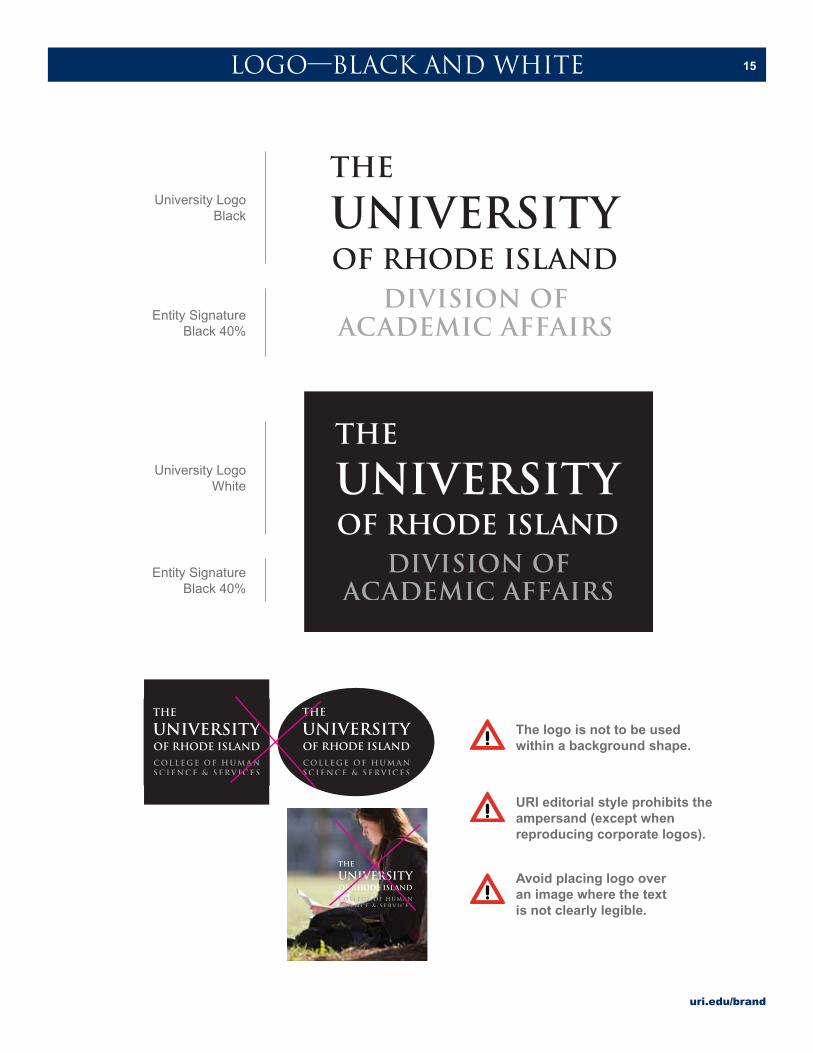
15LOGO—BLACK AND WHITE
University LogoBlack
University LogoWhite
Entity Signature Black 40%
Entity Signature Black 40%
The logo is not to be used within a background shape.
Avoid placing logo over an image where the text is not clearly legible.
URI editorial style prohibits the ampersand (except when reproducing corporate logos).

uri.edu/brand
16LOGO—BOUNDARIES
O
O
O OLogo minimum safe space boundary. No other design elements or type should encroach upon the logo space.
Minimum of .325” margin from edge of paper
Minimum size: .5” high
Minimum size: 1.25” wide
uri.edu/brand
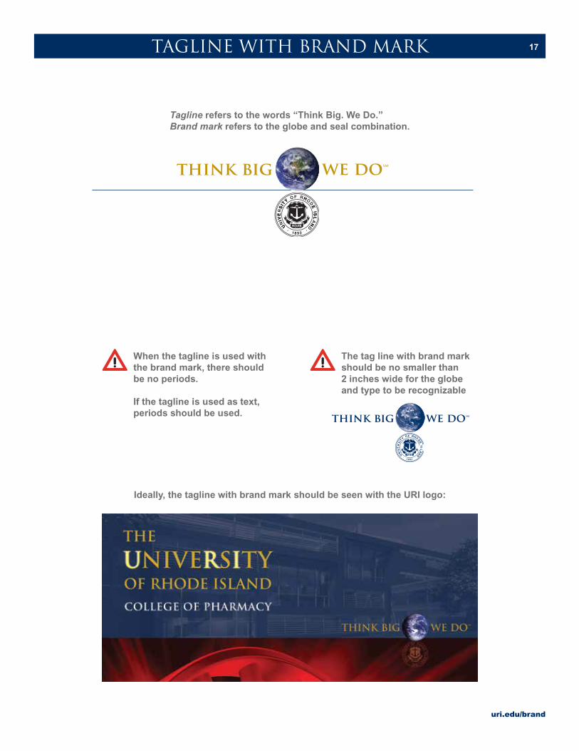
17TAGLINE WITH BRAND MARK
Ideally, the tagline with brand mark should be seen with the URI logo:
Tagline refers to the words “Think Big. We Do.”Brand mark refers to the globe and seal combination.
The tag line with brand mark should be no smaller than 2 inches wide for the globe and type to be recognizable
When the tagline is used with the brand mark, there should be no periods.
If the tagline is used as text, periods should be used.
uri.edu/brand
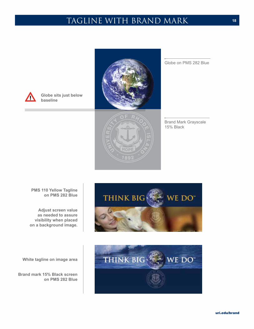
18TAGLINE WITH BRAND MARK
Globe on PMS 282 Blue
Brand Mark Grayscale 15% Black
Globe sits just below baseline
PMS 110 Yellow Tagline on PMS 282 Blue
Adjust screen value as needed to assure
visibility when placed on a background image.
White tagline on image area
Brand mark 15% Black screen on PMS 282 Blue
uri.edu/brand
19TAGLINE WITH BRAND MARK
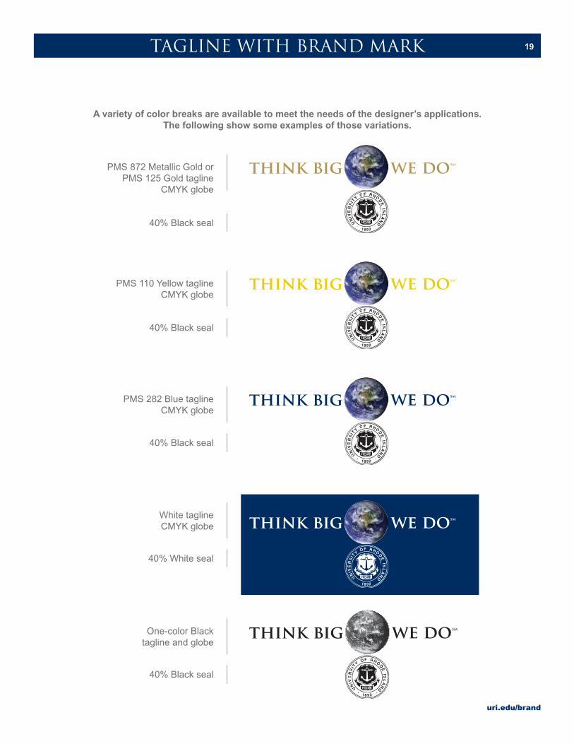
PMS 872 Metallic Gold or PMS 125 Gold tagline
CMYK globe
PMS 110 Yellow taglineCMYK globe
PMS 282 Blue taglineCMYK globe
White taglineCMYK globe
One-color Blacktagline and globe
40% Black seal
40% Black seal
40% Black seal
40% White seal
40% Black seal
A variety of color breaks are available to meet the needs of the designer’s applications. The following show some examples of those variations.

uri.edu/brand
20TAGLINE WITH BRAND MARK
The stacked version is to be used in instances where the space allowed does not lend itself to the horizontal version. Some examples are narrow banners, mugs, and t-shirts.
SM
THINK BIG WE DO
THINK BIG WE DOSM
uri.edu/brand
21BRAND BAR
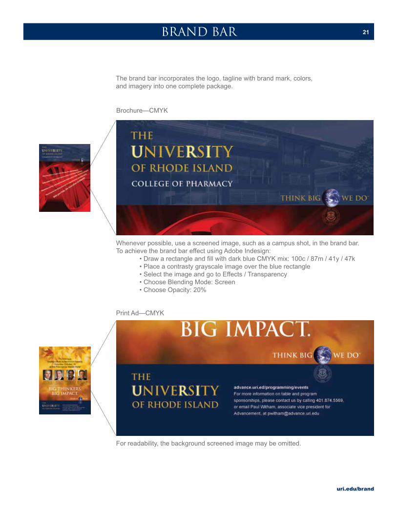
The brand bar incorporates the logo, tagline with brand mark, colors, and imagery into one complete package.
Whenever possible, use a screened image, such as a campus shot, in the brand bar. To achieve the brand bar effect using Adobe Indesign: • Draw a rectangle and fill with dark blue CMYK mix: 100c / 87m / 41y / 47k • Place a contrasty grayscale image over the blue rectangle • Select the image and go to Effects / Transparency • Choose Blending Mode: Screen • Choose Opacity: 20%
Brochure—CMYK
MESSAGE AREA: IMAGE, HEADLINE.
For readability, the background screened image may be omitted.
Print Ad—CMYK
uri.edu/brand
22UNIVERSITY STATIONERY
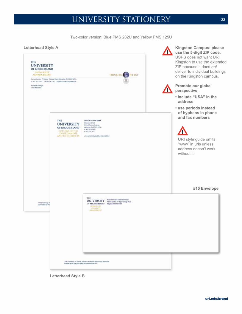
Two-color version: Blue PMS 282U and Yellow PMS 125U
Kingston Campus: please use the 5-digit ZIP code. USPS does not want URI Kingston to use the extended ZIP because it does not deliver to individual buildings on the Kingston campus.
Promote our global perspective:
• include “USA” in the address
• use periods instead of hyphens in phone and fax numbers
Letterhead Style A
Letterhead Style B
#10 Envelope
URI style guide omits “www” in urls unless address doesn’t work without it.
uri.edu/brand
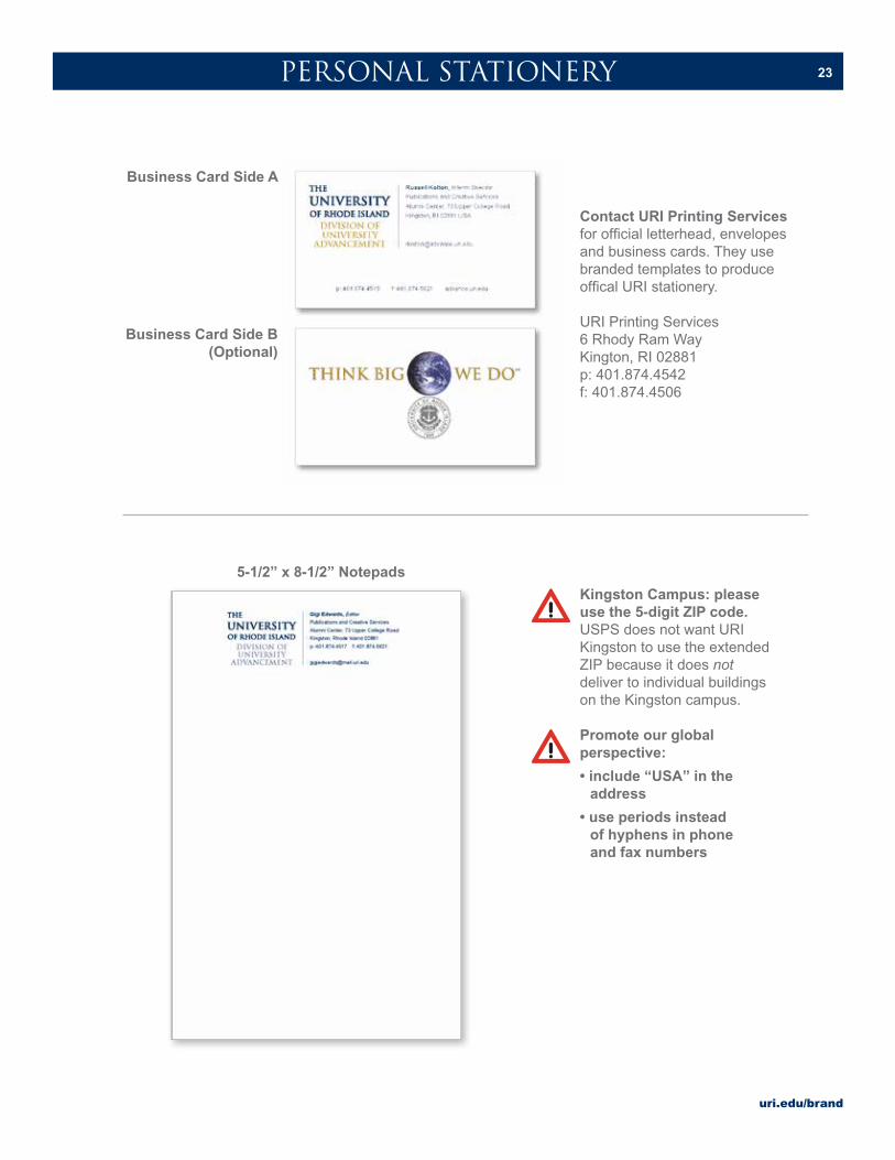
23PERSONAL STATIONERY
Kingston Campus: please use the 5-digit ZIP code. USPS does not want URI Kingston to use the extended ZIP because it does not deliver to individual buildings on the Kingston campus.
Promote our global perspective:
• include “USA” in the address
• use periods instead of hyphens in phone and fax numbers
5-1/2” x 8-1/2” Notepads
Business Card Side A
Business Card Side B(Optional)
Contact URI Printing Services for official letterhead, envelopes and business cards. They use branded templates to produce offical URI stationery.
URI Printing Services6 Rhody Ram WayKington, RI 02881p: 401.874.4542f: 401.874.4506
uri.edu/brand
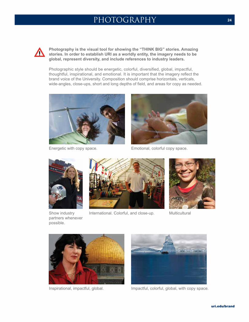
24PHOTOGRAPHY
Photography is the visual tool for showing the “THINK BIG” stories. Amazing stories. In order to establish URI as a worldly entity, the imagery needs to be global, represent diversity, and include references to industry leaders.
Photographic style should be energetic, colorful, diversified, global, impactful, thoughtful, inspirational, and emotional. It is important that the imagery reflect the brand voice of the University. Composition should comprise horizontals, verticals, wide-angles, close-ups, short and long depths of field, and areas for copy as needed.
Show industry partners whenever possible.
Energetic with copy space.
Inspirational, impactful, global.
International. Colorful, and close-up.
Emotional, colorful copy space.
Impactful, colorful, global, with copy space.
Multicultural
uri.edu/brand
25PHOTOGRAPHY
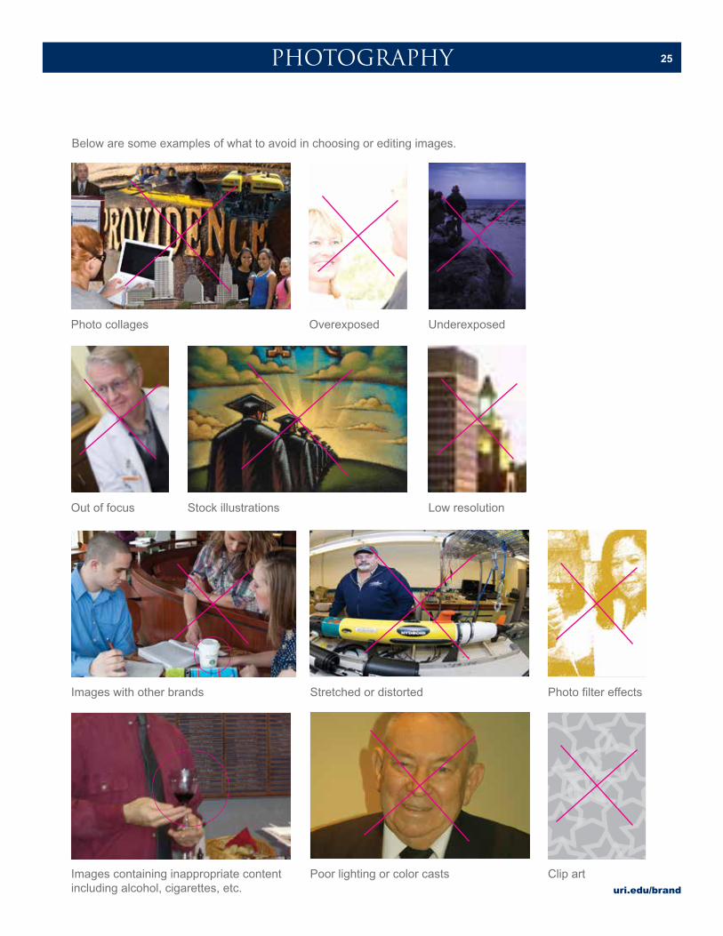
Below are some examples of what to avoid in choosing or editing images.
Out of focus Low resolution
Photo filter effects
Clip art
Photo collages
Images with other brands
Images containing inappropriate content including alcohol, cigarettes, etc.
Stock illustrations
Stretched or distorted
Poor lighting or color casts
UnderexposedOverexposed
uri.edu/brand
26PRINT ADS
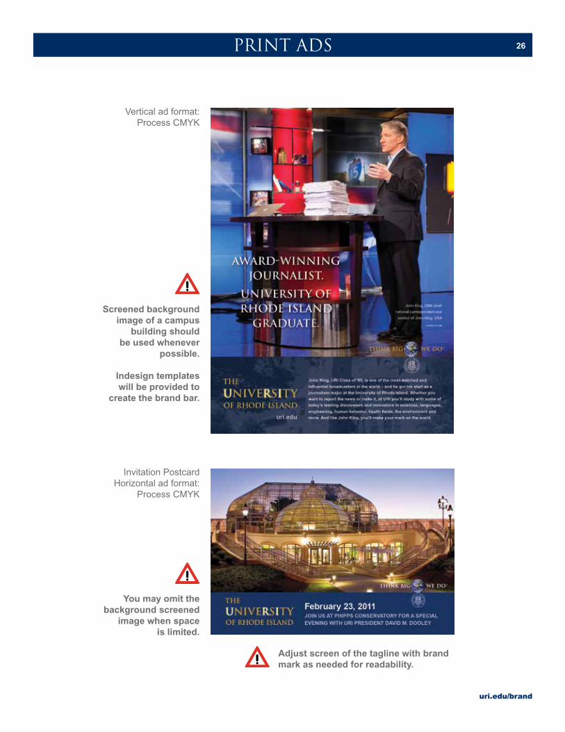
Vertical ad format:Process CMYK
Screened background image of a campus
building should be used whenever
possible.
Indesign templates will be provided to
create the brand bar.
Invitation PostcardHorizontal ad format:
Process CMYK
You may omit the background screened
image when space is limited.
Adjust screen of the tagline with brand mark as needed for readability.

uri.edu/brand
27EVENT PROMOTION
Create a unified look by carrying a theme throughout materials.
uri.edu/brand
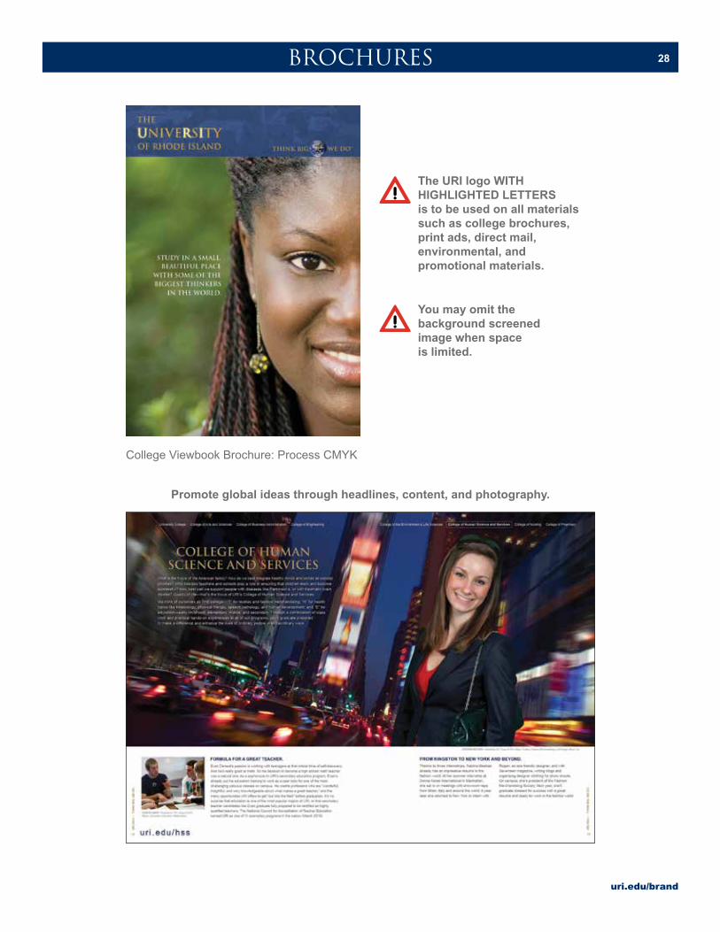
28BROCHURES
College Viewbook Brochure: Process CMYK
Promote global ideas through headlines, content, and photography.
You may omit the background screened image when space is limited.
The URI logo WITH HIGHLIGHTED LETTERS is to be used on all materials such as college brochures, print ads, direct mail, environmental, and promotional materials.
uri.edu/brand
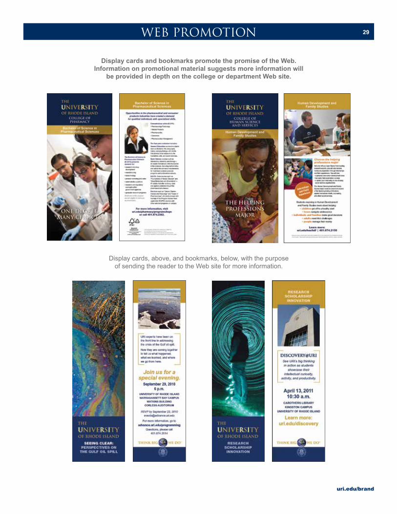
29WEB PROMOTION
Display cards and bookmarks promote the promise of the Web. Information on promotional material suggests more information will
be provided in depth on the college or department Web site.
Display cards, above, and bookmarks, below, with the purpose of sending the reader to the Web site for more information.

uri.edu/brand
30
Please contact URI Publications and Creative Services for assistance with banners.
ENVIRONMENTAL GRAPHICS
Examples of retractable banners.
Construction fence banner example.
uri.edu/brand
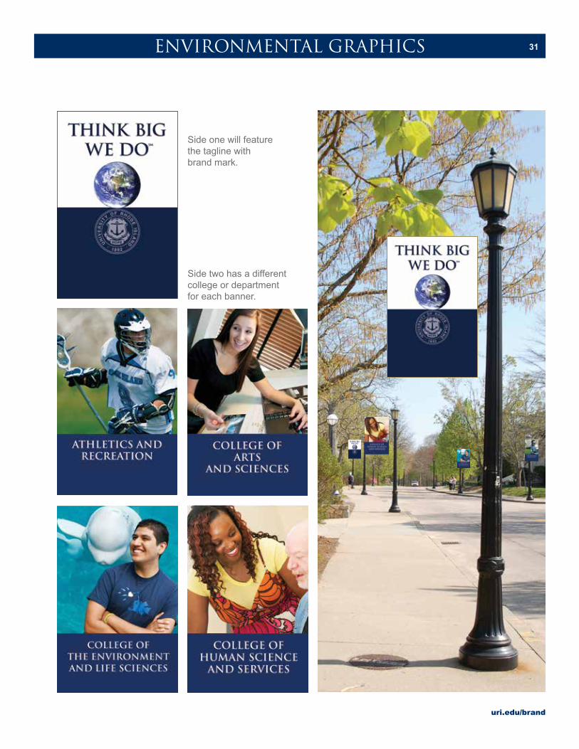
31ENVIRONMENTAL GRAPHICS
Side one will feature the tagline with brand mark.
Side two has a different college or department for each banner.