unit 18 evaluation
TRANSCRIPT

Unit 18- Evaluation
For this unit we had to create an advertising agency and create a marketing campaign for a new product.
Firstly, as initial research, we looked through a variety of unusual print adverts (from companies such as Volvo and BMW) which helped us to gain understanding of how existing, successful companies advertise certain products to their target audiences. This was a great source of inspiration for me as previously I had no real understanding of how advertising companies
successfully manage to get the audience’s attention and eventually encourage them to purchase them. After looking at existing adverts we then went on to gaining a further understanding of the
advertising techniques: beauty appeal, celebrity endorsement, escape, independence/individuality, intelligence, lifestyle, nurture, peer approval, rebel, rhetorical question, scientific/statistical claim
and unfinished comparison/claim. All of these techniques hold a different way of getting the attention of the audience and would come in useful with our own advertising company, soon to
become ‘Hydra Advertising’.
After looking at print adverts we moved on to looking and analysing 4 different television adverts to enable us, as a company to be more knowledgeable with advertising on different platforms. These
adverts included TV adverts from advertising companies such as Weiden + Kennedy, Fallon Worldwide, TBWA and Saatchi and Saatchi.
After we had conducted our own initial research we joined together as a group and shared ideas with one another
to finalise a suitable name for our advertising company, soon to become ‘Hydra Advertising’. We created a mind map to collate a variety of ideas from each member of the group (Josh, Lily, Georgia
and I), during this process the idea of including ‘Hydra’ in the name had been highlighted. We all agreed that it was a good subject for our name and the name ‘Hydra Advertising’ was finalised. From having a name for our advertising company we could come up with a slogan; we all decided that we
wanted to make sure that the slogan correlated with the company name. We came up with ‘Re-generating good ideas’ and the reason behind this was as follows: a hydra is a mythological creature of which has many heads, these heads when cut off would re-generate into another head. This links back with the idea of regenerating good ideas because, as an advertising company we wanted potential customers to know that we are a strong, dominant company like a hydra and our ideas continually improve through previous mistakes made. We could then move on to create a logo that was fitting to the company, we each created our
own ideas and through a selection process it was decided that Lily’s logo was the most professional appearing of them all, therefore was chosen to be the final logo. It
consists of bold colours (red or black) which contrast with eachother over a white

background. These were chosen as they made it very clear for the viewers of the logo to read both the name and slogan, alongside this was a cartoon of a hydra creature which helped to make the
logo more interesting as it was fitting to the company name and filled empty space.
After managing to agree with each other about the final company name, slogan and logo and all being pleased with the outcome we had to decide on which product to advertise from the following:
A new brand of chewing gum A new cereal bar
A new bottled waterWe then all analysed all three products that we could choose from and thought of positive and negative factors of each product which gave us an insight to which we thought that we
could advertise the most successfully. After taking each of them into consideration we decided to focus on a new bottle of water as from firing ideas at each other we realised the
majority of our ideas related to water. This may have been because we had all been influenced by the drinks market ourselves.
This led us on to deciding a name for our new brand of water, we did this from a group meeting of ideas to try and find a quirky, unique name. We put them into a table (shown
below) to make them clear for each member to read.
In this stage I came up with the idea of ‘wasser’ as it meant water in German, I liked the idea of having a different language in our products name- I think this was influenced from existing companies such as ‘Evian’. However the name I had come up with
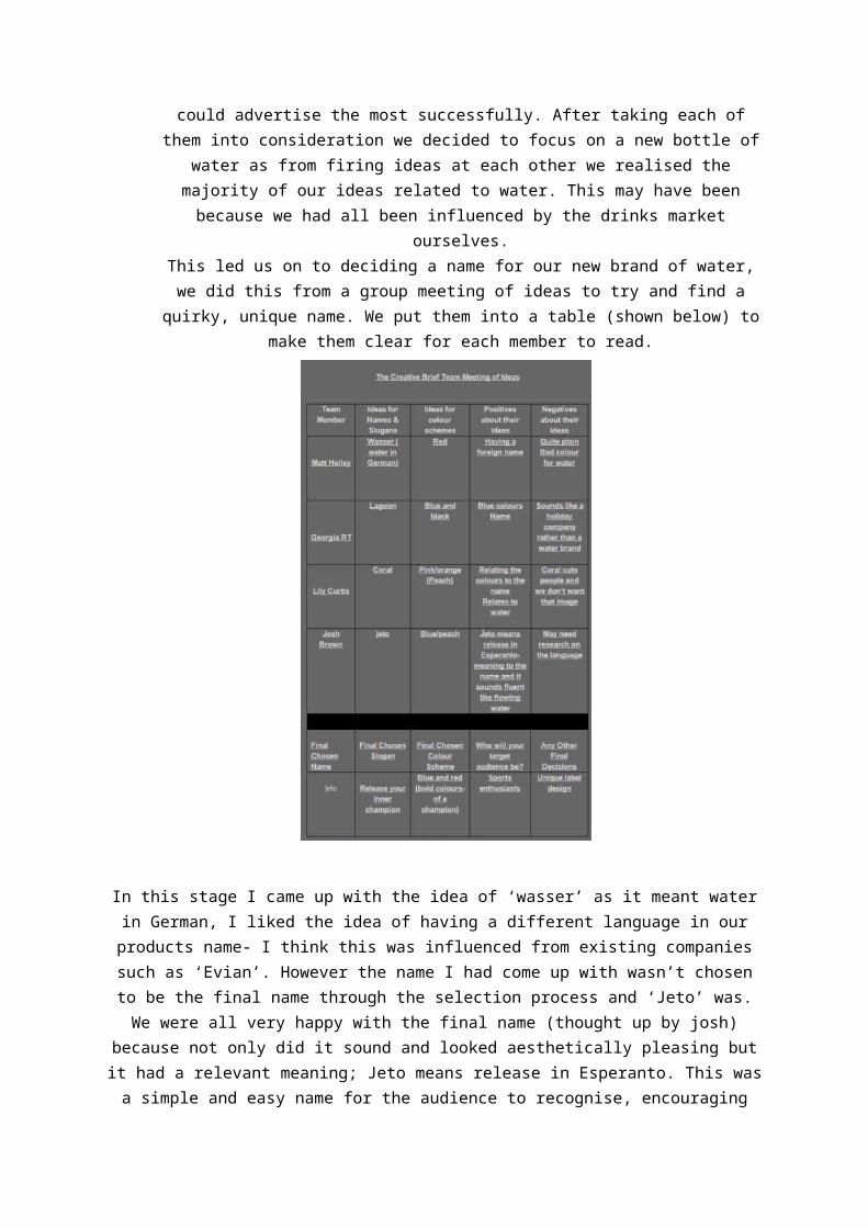
wasn’t chosen to be the final name through the selection process and ‘Jeto’ was. We were all very happy with the final name (thought up by josh) because not only did it sound and looked
aesthetically pleasing but it had a relevant meaning; Jeto means release in Esperanto. This was a simple and easy name for the audience to recognise, encouraging them to purchase it. As a group
we also thought that it would work well as it could enable us to create a slogan that was unique and memorable to our audience. Later on we came up with the slogan ‘release your inner champion’- this slogan worked well with our product ‘jeto’ as it means release and we have interpreted it into
our slogan.
Upon finalising our final brand name and slogan we went onto research
existing competitors in the market of bottled water. This gave us an
insight as to how company advertise their water that already exists on the market to their audience. I decided to look at ‘Evian’ for my research as
they had a very interesting advertising campaign, this could help us advertise our bottled water to our customers in a similar quirky way to
our competitors. The research formed a basis for our understanding for how to promote our products to our audience through print adverts; it also benefitted us to make sure that we were as successful as possible like our
competitors (Evian, Volvic etc.) so that we could become successful in the market of bottled water.
From gaining a better understanding of the competitive market we could focus on our own brand and apply the data that we had found through the previous stage. We knew the name for our product but to set us apart and
make us stand out from other companies we needed to design a unique logo. We all contributed to this process by designing our own interpretation of jeto in a logo, shown to the right. We then got together and discussed the
positive and negative aspects of each of the designs, concluding that the most professional logo was in fact Lily’s. We wanted something that was
bold and stood out; making it memorable to the consumers as they will be the ones seeing it and hopefully recognising the company after it has been established and Lily’s logo fitted the requirements. It had bold colours and was clear to read. As a group we also thought of ways in which we could
further improve the logo to make our brand seem more professional to our target audience (sports enthusiasts).
We added the silhouette of an athlete above the ‘o’ in the logo as it helps to further relate the product

to our target audience. Finally, to tie the logo together we added the slogan underneath as it will make the product more memorable to potential customers.
As highlighted previously we had a very specific target audience, being sports enthusiasts. As a group we concluded this prior to the logo stage as we thought while finalising
which product to focus on that there was a niche in the market for
performance enhancing bottled water. We described our target audience
during our pitch and used images of a variety of sports and people within them; this allowed us to show the
audience that our water is aimed at everyone that has an interest in sport
(show by the range of photographs used in our PowerPoint).
Now that as a group we had established the entire basis for our own product we went on to create our own individual print adverts. Each of us was assigned a different type of print advert form the
following:
Bus advert Tube advert
Magazine advert Website (banner) advert
In the group I was chosen to create the magazine advert for ‘Jeto’ while the others focused on their own sector. I decided to use a different type of
sport for my advert so I used rock climbing as my focus. I chose this sport because it is very demanding of the sports person’s body so they would require a drink, like ‘Jeto’ to ensure that they could perform to the best of their ability. We tried to keep all of the other adverts (such as the bus advert) simple with the logo being the main focus as the
audience would only see the advert for a short time period and it would make the product more memorable
for them. Whereas having an advert in a magazine it allowed us to include more information about the product as well as letting potential customers know that ‘jeto’ was now available in 3 new flavours. We decided to use bold,
bright colours such as blue and red (as present in the logo) because it would attract people’s attention and engaged

them into wanting to purchase the product, this will increase our sales and hopefully lead to the success of our bottled water.
In our advertising campaign to spread awareness of our product we decided to use a TV advert alongside the different print adverts. As a team we knew that a TV advert was a more
interesting and engaging medium for our company to interact with our audience. Before creating the advert we came together to share our individual ideas that we had for the TV advert. We all concluded that we wanted to focus our TV advert to be around sport as it would relate to our target audience and would give our product the best chance of being
successful through engaging our target audience. This led us to have a rough idea for locations for shooting our TV advert, they were between:
-Basketball in the rec -The school tennis courts
-The school fieldsAll of which were suitable locations for our TV advert as they were typical areas of which
sporting activities take place, making it a suitable location enabling the audience to make the link with ‘Jeto’ being a sports drink.
With the locations taken into consideration we could design a story board to give a rough structure to our TV advert. By having a story board it allowed us to have a better understanding of the shot types and
camera angles that we wanted to include in the advert .This benefitted the quality of our advert as it helped us to be efficient and productive with every
session that we spent filming as we knew which shots we needed to get.
In our story board a variety of sports were included as we originally thought that we could engage a wider percentage of our target audience. Upon development we decided it was better to focus on one specific sport as it was better to have one good quality idea for our advert opposed to three
mediocre at best ideas. This benefitted our advert as we could shoot it in one location and having a better idea led to a better quality final product.
Filming the final shots for the TV advert was a very fluid and efficient process as a result of the storyboard; even though it included different ideas it allowed us to include vital shots and camera
angles. Lily was assigned the role of being the camera operator for the advert and Georgia also contributed towards extra footage, leaving Josh and I were cast as the actors in the music video.
Creating the TV advert was possibly the most entertaining aspect of the promotional phase as it was more hands on and we were all more experienced in
this field of media. Filming was successful as the shots used in the final video were all at a good quality and we included the variety of the shots and camera angles that
we had anticipated. These helped to make the advert

appear as professional as possible to our audience- creating a professional and trustworthy brand image for ‘Jeto’.
After we had all of the clips that we required to make a fluent advert we moved onto the editing stage, our advert was edited using the programme ‘Adobe Premier Pro Cs5.5’. To increase the
efficiency of the unit our group split up into two, smaller groups. Georgia and Lily were in charge of editing the final TV advert while Josh and I progressed onto developing the groups pitch. We were
regularly updated with the progress of the TV advert and as a group were very pleased with the final outcome. We were pleased with it because it was very suitable to our target audience of sports
enthusiasts and had a humorous tone throughout, making it more memorable to the audience so that they would remember the product, ‘Jeto’. Another way that we could make sure that the advert
was memorable to the audience was by using a catchy song. Through group discussion we decided that ‘Kanye West- Power’ would be suitable as it is not only catching but gives the message that our
product will make you powerful in your performance. However, upon editing our video it was highlighted that Josh was wearing a different colour t-shirt in some of the clips, making it look less professional. This could have been resolved through clear organisation of props and if this unit was
re-done this could be avoided. Overall, the advert looked and sounded professional through having a suitable theme, song and product placement throughout- this would help us to compete with major
brands such as Volvic.
The final stage of the unit was to conduct a pitch to the peers in our class to try to inform and sell ‘Jeto’ to our target market. We started by creating a PowerPoint that concluded all of the basic information through short summaries. This made sure that we wouldn’t read directly from the
PowerPoint allowing us to make our pitch less boring and the most formal. We included a variety of related images to our PowerPoint so that our pitch was visually interesting and interactive as well as
the audience verbally receiving information. To ensure that our pitch was to the best standard possible (as this will help us to sell the product) we each rehearsed our section of the pitch to each
other. This would mean that each of us could speak fluently and with confidence, giving the impression to the audience that we were a serious company and we
could compete with bigger brands. Due to certain reasons we had to conduct our pitch with only three out of four members, this was a challenge but I think
that we had successfully overcome this but having the whole team could be a benefit next time.
Overall I am very pleased with all of the stages throughout this unit, from the research stages through to the final pitch. I think that we have created a very professional appearing product, advertising campaign and final pitch. This was successful due to each member of the team all
contributing towards every stage and suggesting improvements to help make them better. I think that every member in the group has developed their understanding of advertising in this unit and I think that we worked very well as a group very efficiently and effectively. To improve next time we

could take extra care in our filming stage through a consistent use of the same props but this is only a very small factor ultimately.