ui widget guidelines v1 - yoladavidmbatten.yolasite.com/resources/ui widget guidelin… · ·...
TRANSCRIPT

1
UI Widget Guidelines
FUNimation Creative / IT
David Batten, Sr. UX Architect
Draft

2
User Need Usage Criteria Widget to Use
Example
The user quickly needs to enter data into the system, which then in turn interprets the user’s input.
- Use when more explicit UI elements such as select boxes, radio buttons, checkboxes and multiple input fields make entering the data too complicated a process - Use when filling out forms takes too much time for the user compared to what he or she wants to accomplish - Use when the input you want to collect is regarding one topic. For instance a physical location or an event with a given start date - Use when expected input can be somewhat easily interpreted by a computer program - Do NOT use when the user can possibly ask anything. Only use for a narrowly defined purpose
Intelligent Fields (self Parsing) also known as Auto Complete and type ahead
The user needs to enter data into the system
- Use when you find yourself creating labels for input fields that do not really explain what the input field is all about - Use when you find yourself creating long and complicated labels for input fields, which in turn makes it hard for users to understand - Use when you can possibly express the context of the input field by placing it in a sentence - Use when you have a relatively small set of input fields and those input fields, in turn, have 5 or less possible values
Natural Language Form
The user needs to enter data into the system
- Use when the label of an input field does not fully explain what should be filled in, its format or when using such a label feels like over-explaining the interface - Use when you want to save the space that an additional label takes up - Use in combination with a label, to further explain what kind of input is needed
Field Masking
The user needs to hide sensitive information such as passwords, from prying eyes
- - Use when sensitive information being putted needs to be keep secret
Input Masking
The user needs to easily and quickly edit a value on a page
- -Use when the user needs to edit a relatively low number of fields
- -Use when the value the user needs to edit is of a simple format, ie a text string, drop down box, radio button, etc
- -Use if you want the user to be able to edit a value without actually going to an administration page, but by staying on the same page
Inline Editor

3
The user has entered data into the system and expects to receive feedback on the result of that submission.
- Use when you want to provide feedback to the user upon submitting content to your site - Use when you want to notify your users about errors that happened during form submission - Use when you want to let your users know that everything went as planned upon form submission.
Page Validation
The user has entered data into the system and expects to receive feedback on the result of that submission.
- Use when you want to provide feedback to the user upon entering information in a field - Use when you want to notify your users about errors that happened in a field or set of fields - Use when you want to let your users know that an error occurred upon field entry
Field Validation
The user wants to find or submit information based on a date or date range
- Use when the user wants to easily choose a date or date rang in order to submit, track, sort or filter data - Do NOT use in isolation, when the user is more familiar and efficient with another way of inputting a date. - Do NOT use when the date to be inputted is more easily inputted via writing the date as text – an example could be birthdays in the distant past (20, 30, 70 years back) requires many clicks for selection
Calendar/Date Picker
The user is about to go through the process of filling in data over several steps and is in need of guidance.
- Use when the user is about to go through a longer process of giving data to the system that is longer than two screens (steps) - Use when the steps of a process is so long that the user might get the impression that it will go on forever without the guidance of steps - Do NOT use when there is only 1 or 2 Steps in submitting data to the website - Do NOT use when the process of filling out data is easy foreseeable
Step Tracker
The user is waiting for a longer process or series of actions to be completed; such as downloading or making system wide changes
- When the user has to wait for a long process to complete and it is important to convey to the user how much more needs to be completed until done
Progress Bar / Completeness Meter

4
The user needs assistive instruction for the interaction he is about to perform or is in the middle of performing
- Use when an interaction with your website is not necessarily intuitive and self-explanatory - When the meaning or definition of an action is not necessarily intuitive and self-explanatory - Use to gently introduce functionality to the new and untrained user. - Use when you want to guide the user to get a good start with your web application
Tool Tips
The user wants to achieve a single goal which consists of multiple dependent steps
- Use when the user needs to perform a task or a goal that dictates more than one step - Use when the user needs to perform a complex task consisting of several dependent sub-tasks - Use when the user needs to input complex data into a system that is easier for the user to comprehend breaking the process down into multiple steps - User when the user needs guidance; the user wants to achieve an overall goal, but may not be familiar in the steps needed to reach the goal - Use when the steps needed to reach a final goal may vary due to decisions made in previous stages - Use when the user lacks necessary domain knowledge - Use when the user must complete steps in a specific sequence
Wizard / Stepped Form
You wish to know who the active user is in order to provide personalized content or opportunities to perform a function or make a purchase
- Use when you want to protect access to content to your website for your “core users” - Use when the information you wish to display depends on who the user is. It can depend on the user’s geography, time zone, age, interests. - Use when you want to protect the information of your users
Account Registration

5
The user needs to browse through a series of pages without refreshing the page
- Use when there is not enough space on the webpage to easily show all the content on one page - Use when there are more than 2 sections - Use when there is less than 8-10 sections depending on the length of each section name. - Use when section names are relatively short - Use when the content for each section has similar structure - Use when the content for each section is topically related - Use when the sections will be stationary on the page (ie, they will not move with page scrolling) - Use when you need to show what topic is being viewed - Do NOT use when the content inside each section would function just as well as its own separate page.
Module Tabs/Tabs
The user needs to navigate among sections of a website and while having clear indication of what section the user is currently looking at
- Use when there are more than 2 sections - Use when there is less than 8-10 sections depending on the length of each section name - Use when section names are relatively short - Use when you want the navigation to fill the entire width of a page - Use when you want to provide a list of the highest available sections/subsections of the website - Do NOT use when wanting to show content-specific data. - Do NOT use when there is no need to single out the currently selected option - Do NOT use when the list of sections or categories call for a “more…” link.
Navigation Tabs

6
The user needs to know his location in the website's hierarchical structure in order to possibly browse back to a higher level in the hierarchy.
- Use when the structure of the website follows a strict hierarchical structure of similar formatted content. - Use when the structure of the site is parted in to sections which can be divided into more subsections and so on - Use when the user is most likely to have landed on the page from an external source (another site deep linking to the web page in question). For instance from a blog or a search engine. - Use when the page in question is placed fairly deep into the hierarchy of pages and when no other form of visual navigation can show the details of the same deep level. - Use together with some sort of main navigation. - Do not use on the topmost level of the hierarchy (typically the welcome page) - Do not use alone as the main navigation of the website
Breadcrumbs
The user needs to have a series of categories or items in constant view so he can change the view of the data he is viewing on the page
- Use when the user needs to have options follow him on the page while scrolling up and down - Use when the user needs to switch views with respect to the data he is looking at
Floating Tabs
The user needs to move between different sections within a page without the use of tabs
- Use when the web page is very long and has sub sections - Use when there are definable sections within a page that are somehow topically related (ex: by product) - Use when it is necessary to move quickly from a section back to the top or bottom of a webpage - Should NEVER be used with a Hamburger Menu according to Luke W.
Vertical Navigation
The user wants to select an action but the GUI Widget does not have enough space for text labels
- Use when there is not enough space for text labels for user actions - Use when the graphic depiction of the action can be intuitively understood - Can be used as a simple depiction of graphical elements or combined with a drop down
Icon Buttons - Toolbar

7
The user wants to make a quick selection between 7 and 15 options in an interface
- Use this UI element when there are 7 to 15 options your user can choose from - Do NOT use when there are less than 7 items and more than 15 items - Can sometimes be paired with a client-side auto-complete or type ahead function input field if there are more than 15 items and the list scrolls
Drop down list box
The user wants to make a quick selection between up to 71 options which may have similarities or differences that are illustrated in a graphical manner
- Use when you have graphical representations of items without labels - Use when you have graphical representations of items with labels - Use when there are up to 71 graphical representations (such as colors) to be displayed without labels - Use to illustrate the similarities or differences between items in a graphical manner
Preview Drop down list box
The user needs to go back to a safe start location of the website
- Use when the user often enters the website through a page other than the start site. The user needs to be able to easily find his way to the starting point or front page of the website.
Home Link
The user needs to access a specific section or functionality of a site in a quick way regardless of hierarchy
- Use to shortcut an otherwise hierarchical structure of a website. - Use when you have many sections of your website with possibly long section names. - Use to show functionality that is important to all users regardless on what page they are visiting. - Use to link to parts of a website that are more frequently used than others, but does not follow the hierarchical structure of the main navigation. - Visually anchor the content of each page with a base consistent, substantial design element
Footer or SiteMap
The user needs to navigate among sections of a website and there is plenty of space to show such navigation
-Use when there are more than 2 main sections of a site -Use when there less than 8-10 sections depending on the length of each section name. -Use when your functionality resembles one of a desktop application. Imitate the metaphor. -Use when it is important to show ALL the subsections of a topical area or ALL options for high level navigational elements
Mega Menu

8
The user needs to navigate among a website’s sections while still being able to quickly browse or navigate to another section or subsection
· Use when you want the benefits of a normal sidebar menu, but do not have the space to list all options. · Use when there are more than 2 main sections on a website each with 2 or more subsections. · Use when you have less than 10 main sections
Accordion Menu
The user needs to browse through a set of items and possibly select one of them
- Use when you have a large set of items to show, but want to let the user concentrate his or her attention only on a select few items at a time - Use when you want to tease the user by letting him or her know that there are more items available than what is currently shown. - Use when you do not have enough space to show all items at once. - Use when you have highly visual items to represent such as movie posters, album covers, products etc. - Do not use when the items are non-visual such as links to text articles, PDF documents etc. - Do not use when the content linked to cannot be immediately identified by an image.
Product Carousel
The user needs to view a subset of sorted data that is not easily displayed on one page
- Use when there is more data than what is comfortably fitted into one screen. - Use when the dataset is ordered into amount of interest (that usually means newest first) - Do not use when you don’t want the user to pause for navigating to the next page
Pagination
The user wants to find more data in the same category and/or contribute data in the same category
- Use when the content on your website is possibly mapped into multiple categories and does not necessarily only fit into one hierarchical category. - Use when you want users to contribute data to your website and let them organize their contributed data themselves
Tag
The user wants to re order the results shown in a table by specific columns
- · Use when you have a very large data set of results that is too large to show in one page - · Use when one or more table columns can easily be summarized into categories
Table Filter

9
The user wishes to narrow down results by specifying different categories which may or may not have additional sub categories without refreshing the whole page (just a section or subsection of it)
- Use when search results can be so plentiful that getting an overview of all results will last a lifetime - Use when search results can be categorized; the search most be contextual. - Do not use when your search is not easily categorized
Filters/Filtering
The user needs to enter information into a text box which is prone to be mis-typed, hard to remember or ambiguous
- Use to help ambiguity-issues, when an item can be entered in multiple ways - Use when the type of information entered can readily be matched with a specific piece of information in the system. - Use when suggestions can be pulled from a set of data that is manageable in size. - Use when input speed is an important goal - Use when input accuracy is an important goal - Use when the number of items would be too large or inconvenient to display in a standard drop down box. - Do not use if you want to provide the user an overview of all options available
Autocomplete
The user needs to search or scan a table for the values that is of interest
- Use when there are many rows in the table (above 10), which makes it hard to single out one row and its relation to other rows - Use when there are more than one page to show - Use when you want to be able to compare rows in a table – for instance numbers. - Do not use if the amount of rows are few and the table is easy to search or scan.
Table Sort/Column Sort
The user wants to buy multiple products, which are collected over time through a shopping process
- Use when the user can possibly buy more than one product.
- Use when the user can possibly buy more than one instance of a product.
- Use when the user may want to return later to carry on shopping
- Use when the user may want to return at a later time to conduct payment
Shopping Cart

10
The user needs to have a series of categories or items in constant view so he can change the view of the data he is viewing on the page
- Use when the user needs to switch views with respect to the data he is looking at within a page - Use when graphical elements are needed to convey meaning that labels normally would - Use when graphical elements can enhance the meaning of the accompanying labels - Use when additional ‘glitter’ is needed in a web page
Tabs with Illustrations
The user needs to have a series of categories or items in constant view so he can change the view of the data he is viewing on the page
- Use as a second level navigation inside a component (example: reviews and tree-view lists) - Use when the user needs to switch views with respect to the data he is looking at within a page
Simplified Tabs
The user needs to make a selection
- Use when the user may select any number of choices, including zero, one, or several in combination - Use when the user can select a single option or turn something on or off
Check Boxes
The user needs to make a selection
- Use when there is a list of two or more options that are mutually exclusive - Use when the user must select exactly one choice and no more
Radio Buttons
The user needs to enter data
- Use when a single piece of data can be broken down into (somewhat) logical components - Use when the system’s backend cannot parse the single piece of data down into logical components - Use when it is necessary to visually join the subcomponents together - Do NOT use when the system’s backend can effectively parse the data - Try not to use as breaking down the data violates the users mental model of said data
Compound Fields

11
The user has not yet decided to perform an action
- Use when there needs to be a main element in a web page that solicits an action from the user - Use when you need to grab the user’s attention and solicit an important action - Use to support a planned path to conversion
Primary CTA buttons
The user has not yet decided to perform an action
- Use when there needs to be an element in a web page that solicits an action from the user - Use when there are multiple actions on a page that are of more importance -
Secondary CTA Buttons
The user wants to make a purchase
- Use when the user wants to add items to a shopping cart - Use when the user want to make a single purchase
Buy Buttons
The user wants to make a purchase
- The user wants to finalize the purchase of multiple items - The user is at the end of a flow
Orange Checkout Buttons
The user needs to make a selection
- Use when the user can select a default values bound to a primary button - Use when the user can select from a list of mutually exclusive values displayed in a drop-down list bound to a secondary button - a composite control with which the user can select a default value bound to a primary button, or select from a list of mutually exclusive values displayed in a drop-down list bound to a secondary button.
Split buttons

12
The user needs to go to another hypertext file or another place within the current file
- Use when there is a need to visually reinforce the verbiage being used in a hyper text link - Do NOT use when sufficiently understood verbiage exists - Do NOT use when the webpage is visually Cluttered
Link with Icon
The user may need additional information or explanation about an element on the page
- Use when there is no need to provide additional verbiage along the icon and yet you need a way for the user to learn more w/o putting that specific text on the web page - Can be implemented as a button (not advised unless it is necessary to take the user to another page which contains the information) - Can be implemented as an icon rollover and/or tool tip (advised when the information can be concisely conveyed w/o taking the user to another page)
Information Icon
The user needs to go to another hypertext file or another place within the current file
- Use when sufficiently understood verbiage exists for the link label - Use when the webpage is visually cluttered - DO NOT use when there is a need to visually reinforce the verbiage being used in a hyper text link - either takes the user to another section of the webpage or opens a modal/lightbox
Link
The user needs to make a choice to go to another hypertext file or place within the current file from a list of predetermined files or places
- Use when you want to direct the user to places you want them to navigate to - Use when you want to present the user with a list of related places to decrease their cognitive load - Mostly used at the bottom pages - Should generally be avoided
Link Lists / Link Farm
The user needs to discern the difference between one area on a web page and an adjoining area
- Use to visually separate areas/sections of a web page
Dividers

13
The user wants to find something
- Use when the user wants to find information or products across all indexes in a database
Basic Search
The user wants to find something
- Use when the user wants to find something that is restricted to a subset of a database - Use in order to narrow down results and get a more exact match - Should be avoided because users will often choose the wrong parameter and get a worse match than when searching the entire database
Scoped Search
The user has reached a decision point
- Use when it is required that users take an action before they continue back to the parent application or page - Use when there is NO other alternative as they are disruptive, steal focus and hide UI designs that suffer from lack of forethought and logic - Do NOT use when content needs scroll bars, such as large amounts of text and tables - Use very sparingly as they are prone to human habituation of dismissing them when they appear
Modals
The user wants to see specific images or other web content
- Use when fully displaying images or textual content would make pages unnecessarily large - Use when image or content usefulness is totally dependent on the interest or focus of the user
Lightboxes
The user is presented with information
- Use when it is important to give the user immediate feedback about the state of an action - Do NOT use when communicating the status of an action at the field level
Page Notifications

14
The user is presented with information
- Use when you need to inform the user that an operation is in progress - Use to reassure the user that the system is not hung or waiting for user input - Use when you need to provide a rough estimate to the user of how far through a task the system has progressed
Progress Indicator
The user is presented with information about an action
- Use when you need to inform the user that an operation is in progress - Use to reassure the user that the system is not hung or waiting for user input -
Loading Indicator - button
The user wants to adjust parameters associated with media
- Use when you need to adjust the audio of a media presentation - Use when you want to start, stop or pause a media presentation
Video controls
The user wants to move between chunks or groupings of data in a webpage
- Use when content needs to be divided up into discrete pages or chunks - Use when organizing or numbering a lot of data within a webpage makes it more manageable - Use when the organizational chunks of information are 7 units or less
Pagination – Small Page Count
The user wants to move between chunks or groupings of data in a webpage
- Use when content needs to be divided up into discrete pages or chunks - Use when organizing or numbering a lot of data within a webpage makes it more manageable - Use when the organizational chunks of information is more than 10 units but less than 100 units
Pagination – Medium Page Count
The user wants to move between chunks or groupings of data in a webpage
- Use when content needs to be divided up into discrete pages or chunks - Use when organizing or numbering a lot of data within a webpage makes it more manageable - Use when the organizational chunks of information is more than 100 units but less than 1001 units
Pagination – Large Page Count
15
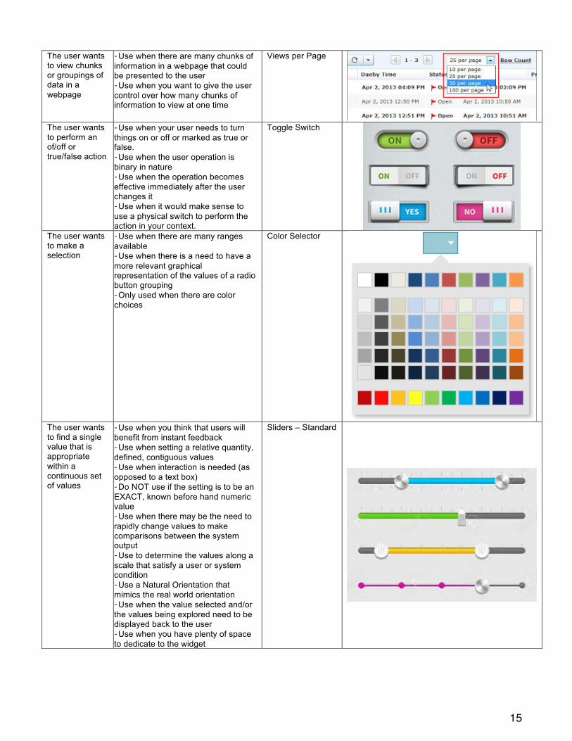
The user wants to view chunks or groupings of data in a webpage
- Use when there are many chunks of information in a webpage that could be presented to the user - Use when you want to give the user control over how many chunks of information to view at one time
Views per Page
The user wants to perform an of/off or true/false action
- Use when your user needs to turn things on or off or marked as true or false. - Use when the user operation is binary in nature - Use when the operation becomes effective immediately after the user changes it - Use when it would make sense to use a physical switch to perform the action in your context.
Toggle Switch
The user wants to make a selection
- Use when there are many ranges available - Use when there is a need to have a more relevant graphical representation of the values of a radio button grouping - Only used when there are color choices
Color Selector
The user wants to find a single value that is appropriate within a continuous set of values
- Use when you think that users will benefit from instant feedback - Use when setting a relative quantity, defined, contiguous values - Use when interaction is needed (as opposed to a text box) - Do NOT use if the setting is to be an EXACT, known before hand numeric value - Use when there may be the need to rapidly change values to make comparisons between the system output - Use to determine the values along a scale that satisfy a user or system condition - Use a Natural Orientation that mimics the real world orientation - Use when the value selected and/or the values being explored need to be displayed back to the user - Use when you have plenty of space to dedicate to the widget
Sliders – Standard

16
The user wants to find and set appropriate upper and lower values that are within a continuous set of values
- Use when you think that users will benefit from instant feedback - Use when setting the area of variation between upper and lower limits on a particular scale - Use when interaction is needed (as opposed to text boxes) - Do NOT use if the setting is to be an EXACT, known numeric value - Use when there may be the need to rapidly change values to make comparisons between the system output - Use to determine the values along a scale that satisfy a user or system condition - Use a Natural Orientation that mimics the real world orientation - Use when the value selected and/or the values being explored need to be displayed back to the user - Use when you have plenty of space to dedicate to the widget
Sliders – Range
The user wants to find a relative value that is appropriate within a continuous set of values
- Use when you think that users will benefit from instant feedback - Use when setting a relative quantity, defined, contiguous values (such as volume or brightness) - Use when interaction is needed (as opposed to a text box) - Do NOT use if the setting is to be an EXACT, known before hand numeric value - Use when there may be the need to rapidly change values to make comparisons between the system output - Use a Natural Orientation that mimics the real world orientation - Use when the value selected does not need to be displayed back to the user - Use when you have plenty of space to dedicate to the widget
Sliders - Simplified

17
The user want to manipulate specific content for viewing
- Use when there's a need for a highly customized scrollbar within an image container to hide or show a previous and after state, or to reveal different types of features within a product image. - Use only when illustrating and displaying products or services. - DO NOT use to reveal or hide important information that requires user's attention
Image Reveal Slider
The user needs to select a specific value within a defined range and from a defined set of valid values (Ordinal & Interval Data)
- Use when there are predetermined set values that increase in size - Use when values to select from are fixed and cannot be modified - Use when the user MAY know the value he desires - Use when the user wants to simply move up or down in the value space by one to three values from their current setting - Use with data that has a logical ordering (Day of week, Month of year, numerical progression) - Do NOT use for Nominal Data - The UI element may have ‘+’ and ‘-‘ indicating interval data or ‘∧’ and ‘∨’ indicating ordinal data
Spin Box (with text entry field)
The user needs to view and compare multiple products while gather as much info as possible before proceeding deeper into a specific product page
- Use when it is important to use visuals for the product/service - Use in conjunction with other product comparisons - Do NOT use when information is limited or there is no need to compare with other products - Works best in a carousel or multi-listing layout
“Flip-Card” Cards