two variable statistics - haesemathematics.com · firstly, we can describe the direction of the...
TRANSCRIPT

20Chapter
Two variablestatistics
Contents:
Syllabus reference: 6.7, 6.8, 6.9
A
B
C
D
E
Correlation
Measuring correlation
Line of best fit by eye
Linear regression
The test ofindependence
Â2
IB_STSL-2edmagentacyan yellow black
0 05 5
25
25
75
75
50
50
95
95
100
100 0 05 5
25
25
75
75
50
50
95
95
100
100
Y:\HAESE\IB_STSL-2ed\IB_STSL-2ed_20\593IB_STSL-2_20.CDR Monday, 15 February 2010 4:36:59 PM PETER
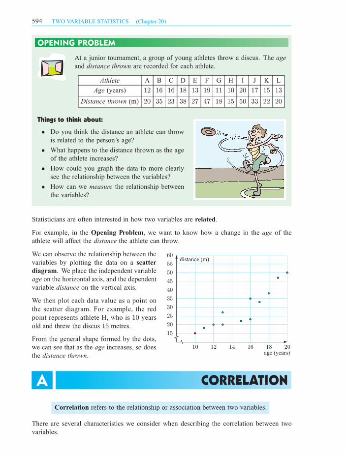
OPENING PROBLEM
At a junior tournament, a group of young athletes throw a discus. The age
and distance thrown are recorded for each athlete.
Athlete A B C D E F G H I J K L
Age (years) 12 16 16 18 13 19 11 10 20 17 15 13
Distance thrown (m) 20 35 23 38 27 47 18 15 50 33 22 20
Things to think about:
² Do you think the distance an athlete can throw
is related to the person’s age?
² What happens to the distance thrown as the age
of the athlete increases?
² How could you graph the data to more clearly
see the relationship between the variables?
² How can we measure the relationship between
the variables?
Statisticians are often interested in how two variables are related.
For example, in the Opening Problem, we want to know how a change in the age of the
athlete will affect the distance the athlete can throw.
We can observe the relationship between the
variables by plotting the data on a scatter
diagram. We place the independent variable
age on the horizontal axis, and the dependent
variable distance on the vertical axis.
From the general shape formed by the dots,
we can see that as the age increases, so does
the distance thrown.
Correlation refers to the relationship or association between two variables.
There are several characteristics we consider when describing the correlation between two
variables.
CORRELATIONA
15
20
25
30
35
40
45
50
55
60
10 12 14 16 18 20age (years)
distance (m)
594 TWO VARIABLE STATISTICS (Chapter 20)
We then plot each data value as a point on
the scatter diagram. For example, the red
point represents athlete H, who is years
old and threw the discus metres.
1015
IB_STSL-2edmagentacyan yellow black
0 05 5
25
25
75
75
50
50
95
95
100
100 0 05 5
25
25
75
75
50
50
95
95
100
100
Y:\HAESE\IB_STSL-2ed\IB_STSL-2ed_20\594IB_STSL-2_20.CDR Wednesday, 3 March 2010 1:51:19 PM PETER

Firstly, we can describe the direction of the correlation.
For a generally upward trend, we say that the correlation
is positive. An increase in the independent variable means
that the dependent variable generally increases.
For a generally downward trend, we say that the correlation
is negative. An increase in the independent variable means
that the dependent variable generally decreases.
For randomly scattered points, with no upward or downward
trend, we say there is no correlation.
Secondly, we can describe the strength of the correlation, or how closely the data follows a
pattern or trend. The strength of correlation is usually described as either strong, moderate,
or weak.
strong positive
strong negative
moderate positive
moderate negative
weak positive
weak negative
Thirdly, we can determine whether the points follow a linear trend, which means they
approximately form a straight line.
These points are roughly linear. These points do not follow a linear trend.
strong moderate weak
595TWO VARIABLE STATISTICS (Chapter 20)
IB_STSL-2edmagentacyan yellow black
0 05 5
25
25
75
75
50
50
95
95
100
100 0 05 5
25
25
75
75
50
50
95
95
100
100
Y:\HAESE\IB_STSL-2ed\IB_STSL-2ed_20\595IB_STSL-2_20.CDR Tuesday, 16 February 2010 10:15:58 AM PETER
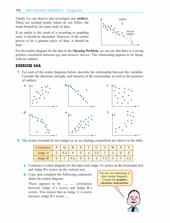
Finally we can observe and investigate any outliers.
These are isolated points which do not follow the
trend formed by the main body of data.
If an outlier is the result of a recording or graphing
error, it should be discarded. However, if the outlier
proves to be a genuine piece of data, it should be
kept.
For the scatter diagram for the data in the Opening Problem, we can say that there is a strong
positive correlation between age and distance thrown. The relationship appears to be linear,
with no outliers.
EXERCISE 20A
1 For each of the scatter diagrams below, describe the relationship between the variables.
Consider the direction, strength, and linearity of the relationship, as well as the presence
of outliers.
a b c
d e f
2 The scores awarded by two judges at an ice skating competition are shown in the table.
Competitor P Q R S T U V W X Y
Judge A 5 6:5 8 9 4 2:5 7 5 6 3
Judge B 6 7 8:5 9 5 4 7:5 5 7 4:5
a Construct a scatter diagram for this data with Judge A’s scores on the horizontal axis
and Judge B’s scores on the vertical axis.
b
outlier
not anoutlier
Copy and complete the following comments
about the scatter diagram:
There appears to be ...., .... correlation
between Judge A’s scores and Judge B’s
scores. This means that as Judge A’s scores
increase, Judge B’s scores ....
You can use technology to
draw scatter diagrams.
Consult the
.
graphics
calculator instructions
y
x
y
x
y
x
y
x
y
x
y
x
596 TWO VARIABLE STATISTICS (Chapter 20)
IB_STSL-2edmagentacyan yellow black
0 05 5
25
25
75
75
50
50
95
95
100
100 0 05 5
25
25
75
75
50
50
95
95
100
100
Y:\HAESE\IB_STSL-2ed\IB_STSL-2ed_20\596IB_STSL-2_20.CDR Tuesday, 16 February 2010 10:16:01 AM PETER
3 The results of a group of students for a Maths test and an
Art essay are compared:
Student A B C D E F G H I J
Maths test 64 67 69 70 73 74 77 82 84 85
Art essay 85 82 80 82 72 71 70 71 62 66
a Construct a scatter diagram for the data. Make the
scales on both axes from 60 to 90.
b Describe the relationship between the Mathematics
and Art marks.
4 For the following pairs of variables, choose the scatter diagram which would best illustrate
the relationship between the variables.
a x = the number of apples bought by customers, y = the total cost of apples
b x = the number of pushups a student can perform in one minute,
y = the time taken for the student to run 100 metres
c x = the height of people, y = the weight of people
d x = the distance a student travels to school, y = the height of the student’s uncle
A B C D
5 The scatter diagram alongside shows the
marks obtained by students in a test out
of 50 marks, plotted against the number
of hours each student studied for the test.
a Describe the correlation between the
variables.
b How should the outlier be treated?
Explain your answer.
In the previous section, we classified the strength of the correlation between two variables as
either strong, moderate, or weak. We observed the points on a scatter diagram, and made a
judgement as to how clearly the points formed a linear relationship.
To give a more precise measure of the strength of linear correlation, we can use Pearson’s
product-moment correlation coefficient r.
MEASURING CORRELATIONB
y
x
This data is called
data because
variables are
recorded for each
individiual.
bivariate
two
y
x
y
x
y
x
0
10
20
30
40
50
60
0 2 4 6 8 10 12no. of hours of study
marks
597TWO VARIABLE STATISTICS (Chapter 20)
IB_STSL-2edmagentacyan yellow black
0 05 5
25
25
75
75
50
50
95
95
100
100 0 05 5
25
25
75
75
50
50
95
95
100
100
Y:\HAESE\IB_STSL-2ed\IB_STSL-2ed_20\597IB_STSL-2_20.CDR Wednesday, 3 March 2010 1:51:44 PM PETER
Given a set of n pairs of data values for the variables
X and Y , Pearson’s correlation coefficient is
r =sxy
sxsy
X x1 x2 x3 .... xn
Y y1 y2 y3 .... yn
where sxy =
P(x¡ x)(y ¡ y)
n=
Pxy
n¡ x y is the covariance of X and Y
sx =
rP(x¡ x)2
n=
rPx2
n¡ x2 is the standard deviation of X
sy =
rP(y ¡ y)2
n=
rPy2
n¡ y2 is the standard deviation of Y .
So, r =
P(x¡ x)(y ¡ y)pP
(x¡ x)2pP
(y ¡ y)2or
Pxy ¡ nx ypP
x2 ¡ nx2pP
y2 ¡ ny2
The values of r range from ¡1 to +1.
A positive value for r indicates the variables are positively correlated.
An increase in one of the variables will result in an increase in the other.
A negative value for r indicates the variables are negatively correlated.
An increase in one of the variables will result in a decrease in the other.
The size of r indicates the strength of the correlation.
A value of r close to +1 or ¡1 indicates strong correlation between the variables.
A value of r close to zero indicates weak correlation between the variables.
Here are some scatter diagrams showing various values of r:
Positive correlation:
Negative correlation:
y
xr = +1
y
xr = +0.8
y
xr = +0.5
y
xr = +0.2
y
xr = -1
y
xr = -0.8
y
xr = -0.5
y
xr = -0.2
598 TWO VARIABLE STATISTICS (Chapter 20)
The sign of r indicates the direction of the correlation.
IB_STSL-2edmagentacyan yellow black
0 05 5
25
25
75
75
50
50
95
95
100
100 0 05 5
25
25
75
75
50
50
95
95
100
100
Y:\HAESE\IB_STSL-2ed\IB_STSL-2ed_20\598IB_STSL-2_20.CDR Wednesday, 3 March 2010 1:54:51 PM PETER

The Department of Road Safety wants to know if
there is any association between average speed
in the metropolitan area and the age of drivers.
They commission a device to be fitted in cars of
drivers of different ages.
The results are shown in the scatter diagram.
The r-value for this association is +0:027.
Describe the association.
As r is close to zero, there is no correlation between the two variables.
We observe this in the graph as the points are randomly scattered.
PotVolume
(x L)
Time to boil
(y min)
A 1 3
B 2 4
C 4 6
D 5 8
Sue investigates how the volume of water in
a pot affects how long it takes to boil on the
stove. The results are given in the table.
Find Pearson’s correlation coefficient between
the two variables.
x y xy x2 y2
1 3 3 1 9
2 4 8 4 16
4 6 24 16 36
5 8 40 25 64
Totals: 12 21 75 46 125
There are 4 pairs of data values, so n = 4.
x =
Px
n= 12
4= 3
y =
Py
n= 21
4= 5:25
r =
Pxy ¡ nx ypP
x2 ¡ nx2pP
y2 ¡ ny2
=75¡ 4£ 3£ 5:25p
46¡ 4£ 32p125¡ 4£ 5:252
=12p
10p14:75
¼ 0:988
Positive r means that as the volume of
water increases, so does the time to boil
the water. Since r is close to 1, there is a
strong positive correlation.
Example 2 Self Tutor
Example 1 Self Tutor
volume (L)
2
4
6
8
2 4 6
time (min)
50
20 30 40 50 60 70 80 90
60
70
average speed (kmh )_ -1
age (years)
599TWO VARIABLE STATISTICS (Chapter 20)
IB_STSL-2edmagentacyan yellow black
0 05 5
25
25
75
75
50
50
95
95
100
100 0 05 5
25
25
75
75
50
50
95
95
100
100
Y:\HAESE\IB_STSL-2ed\IB_STSL-2ed_20\599IB_STSL-2_20.CDR Tuesday, 16 February 2010 10:16:12 AM PETER
quantity (g)
num
ber
of
bee
tles
5
5 10
10
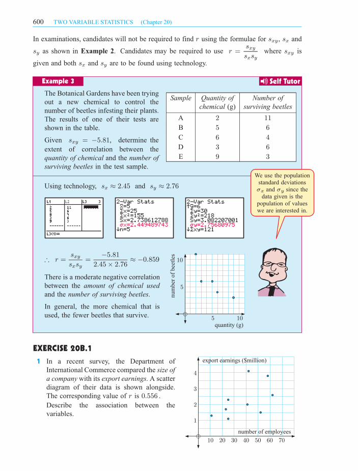
In examinations, candidates will not be required to find r using the formulae for sxy, sx and
sy as shown in Example 2. Candidates may be required to use r =sxy
sxsywhere sxy is
given and both sx and sy are to be found using technology.
Sample Quantity of
chemical (g)
Number of
surviving beetles
A 2 11
B 5 6
C 6 4
D 3 6
E 9 3
The Botanical Gardens have been trying
out a new chemical to control the
number of beetles infesting their plants.
The results of one of their tests are
shown in the table.
Given sxy = ¡5:81, determine the
extent of correlation between the
quantity of chemical and the number of
surviving beetles in the test sample.
Using technology, sx ¼ 2:45 and sy ¼ 2:76
) r =sxy
sxsy=
¡5:81
2:45£ 2:76¼ ¡0:859
There is a moderate negative correlation
between the amount of chemical used
and the number of surviving beetles.
In general, the more chemical that is
used, the fewer beetles that survive.
EXERCISE 20B.1
1 In a recent survey, the Department of
International Commerce compared the size of
a company with its export earnings. A scatter
diagram of their data is shown alongside.
The corresponding value of r is 0:556 .
Describe the association between the
variables.
Example 3 Self Tutor
We use the population
standard deviations
and since the
data given is the
population of values
we are interested in.
¾ ¾x y
export earnings ($million)
number of employees
1
2
3
4
10 20 30 40 50 60 70
600 TWO VARIABLE STATISTICS (Chapter 20)
IB_STSL-2edmagentacyan yellow black
0 05 5
25
25
75
75
50
50
95
95
100
100 0 05 5
25
25
75
75
50
50
95
95
100
100
Y:\HAESE\IB_STSL-2ed\IB_STSL-2ed_20\600IB_STSL-2_20.CDR Friday, 26 March 2010 2:01:52 PM PETER
y
x
y
x
y
x
y
x
y
x
x
y
(3, 4)
(2, 3)
(1, 2)x
y
(1, 2)(2, 1)
(3, 0) x
y
1
2
1 2
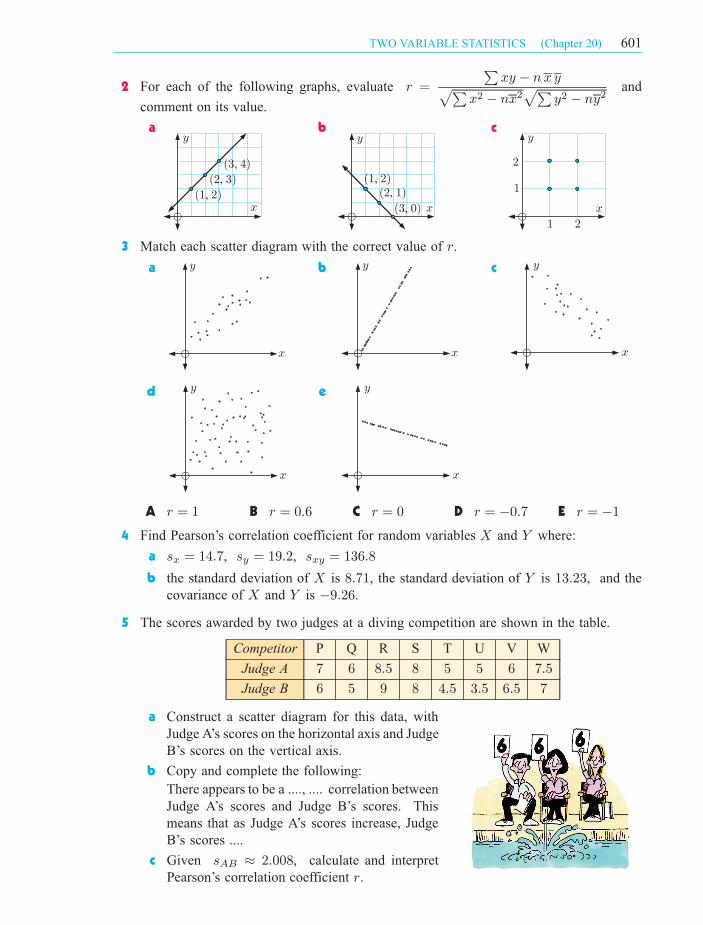
2 For each of the following graphs, evaluate r =
Pxy ¡ nx ypP
x2 ¡ nx2pP
y2 ¡ ny2and
a b c
3 Match each scatter diagram with the correct value of r.
a b c
d e
A r = 1 B r = 0:6 C r = 0 D r = ¡0:7 E r = ¡1
4 Find Pearson’s correlation coefficient for random variables X and Y where:
a sx = 14:7, sy = 19:2, sxy = 136:8
b the standard deviation of X is 8:71, the standard deviation of Y is 13:23, and the
covariance of X and Y is ¡9:26.
5 The scores awarded by two judges at a diving competition are shown in the table.
Competitor P Q R S T U V W
Judge A 7 6 8:5 8 5 5 6 7:5
Judge B 6 5 9 8 4:5 3:5 6:5 7
a Construct a scatter diagram for this data, with
Judge A’s scores on the horizontal axis and Judge
B’s scores on the vertical axis.
b Copy and complete the following:
There appears to be a ...., .... correlation between
Judge A’s scores and Judge B’s scores. This
means that as Judge A’s scores increase, Judge
B’s scores ....
c
601TWO VARIABLE STATISTICS (Chapter 20)
Given sAB ¼ 2:008, calculate and interpret
Pearson’s correlation coefficient r.
comment on its value.
IB_STSL-2edmagentacyan yellow black
0 05 5
25
25
75
75
50
50
95
95
100
100 0 05 5
25
25
75
75
50
50
95
95
100
100
Y:\HAESE\IB_STSL-2ed\IB_STSL-2ed_20\601IB_STSL-2_20.CDR Wednesday, 10 March 2010 9:13:28 AM PETER

STATISTICS
PACKAGE
6 A basketballer takes 20 shots from each of ten different positions marked on the court.
The table below shows how far each position is from the goal, and how many shots were
successful:
Position A B C D E F G H I J
Distance from goal (x m) 2 5 3:5 6:2 4:5 1:5 7 4:1 3 5:6
Successful shots (y) 17 6 10 5 8 18 6 8 13 9
a Draw a scatter diagram of the data.
b Do you think r will be positive or negative?
c Given sxy = ¡6:68, calculate the value of r.
d Copy and complete:
As the distance from goal increases, the number of successful shots generally ....
THE COEFFICIENT OF DETERMINATION r2
value strength of correlation
r2 = 0 no correlation
0 < r2 < 0:25 very weak correlation
0:25 6 r2 < 0:50 weak correlation
0:50 6 r2 < 0:75 moderate correlation
0:75 6 r2 < 0:90 strong correlation
0:90 6 r2 < 1 very strong correlation
r2 = 1 perfect correlation
To help describe the strength
of correlation we calculate the
coefficient of determination r2.
This is simply the square of Pearson’s
correlation coefficient r, and as
such the direction of correlation is
eliminated.
The table alongside is a guide for
describing the strength of linear
correlation using the coefficient of
determination.
USING TECHNOLOGY TO CALCULATE r AND r2
Given a set of bivariate data, you can use your calculator to find the values of
r and r2. For help, consult the graphics calculator instructions at the front
of the book.
Alternatively, you can use the statistics package on your CD.
At a father-son camp, the heights of the fathers and their sons were measured.
Father’s height (x cm) 175 183 170 167 179 180 183 185 170 181 185
Son’s height (y cm) 167 178 158 162 171 167 180 177 152 164 172
a Draw a scatter diagram of the data. b Calculate r and r2 for the data.
c Describe the correlation between the variables.
Example 4 Self Tutor
602 TWO VARIABLE STATISTICS (Chapter 20)
IB_STSL-2edmagentacyan yellow black
0 05 5
25
25
75
75
50
50
95
95
100
100 0 05 5
25
25
75
75
50
50
95
95
100
100
Y:\HAESE\IB_STSL-2ed\IB_STSL-2ed_20\602IB_STSL-2_20.CDR Tuesday, 16 February 2010 10:16:23 AM PETER
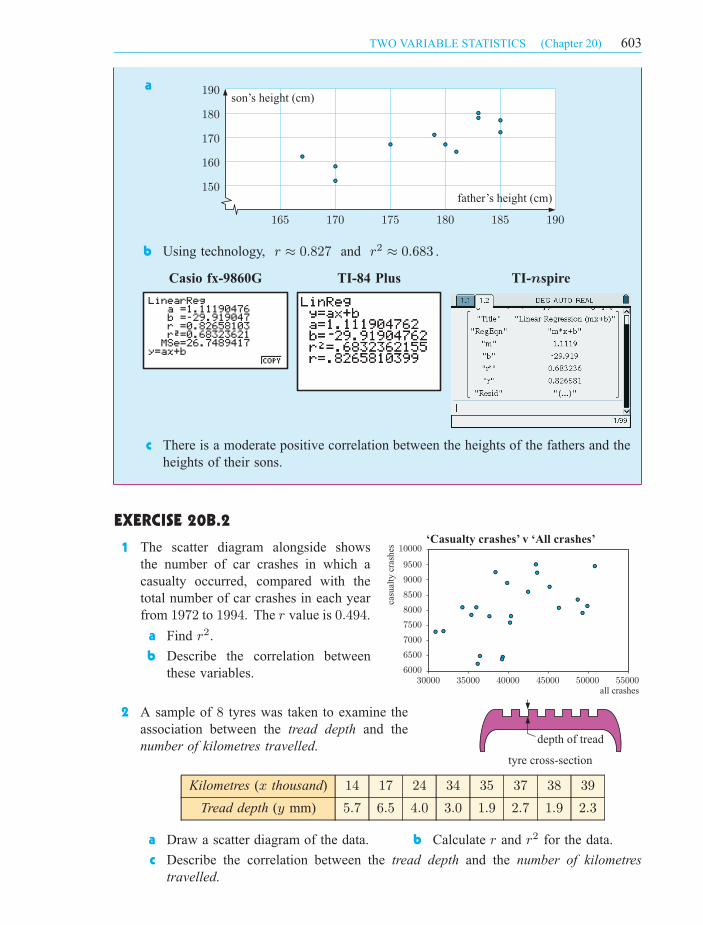
Casio fx-9860G TI- spirenTI-84 Plus
depth of tread
tyre cross-section
300006000
6500
7000
7500
8000
8500
9000
9500
10000
35000 40000 45000 50000 55000
casu
alty
cras
hes
all crashes
‘Casualty crashes’ v ‘All crashes’
150
160
170
180
190
165 170 175 180 185 190
father’s height (cm)
son’s height (cm)a
b Using technology, r ¼ 0:827 and r2 ¼ 0:683 .
c There is a moderate positive correlation between the heights of the fathers and the
heights of their sons.
EXERCISE 20B.2
1
2 A sample of 8 tyres was taken to examine the
association between the tread depth and the
number of kilometres travelled.
Kilometres (x thousand) 14 17 24 34 35 37 38 39
Tread depth (y mm) 5:7 6:5 4:0 3:0 1:9 2:7 1:9 2:3
a Draw a scatter diagram of the data. b Calculate r and r2 for the data.
c Describe the correlation between the tread depth and the number of kilometres
travelled.
603TWO VARIABLE STATISTICS (Chapter 20)
The scatter diagram alongside shows
the number of car crashes in which a
casualty occurred, compared with the
total number of car crashes in each year
from 1972 to 1994. The r value is 0:494.
a Find r2.
b Describe the correlation between
these variables.
IB_STSL-2edmagentacyan yellow black
0 05 5
25
25
75
75
50
50
95
95
100
100 0 05 5
25
25
75
75
50
50
95
95
100
100
Y:\HAESE\IB_STSL-2ed\IB_STSL-2ed_20\603IB_STSL-2_20.CDR Tuesday, 16 February 2010 12:00:58 PM PETER

15
20
25
30
35
40
45
50
55
60
10 12 14 16 18 20age (years)
distance (m)
3 A garden centre manager believes that during March, the number of customers is related
to the temperature at noon. Over a period of a fortnight the number of customers and
the noon temperature were recorded.
Temperature (x oC) 23 25 28 30 30 27 25 28 32 31 33 29 27
Number of customers (y) 57 64 62 75 69 58 61 78 80 67 84 73 76
a Draw a scatter diagram of the data. b Calculate r and r2 for the data.
c Describe the association between the number of customers and the noon temperature
for the garden centre in question.
4 Revisit the Opening Problem on page 594. Calculate r and r2 for this data. Hence
describe the association between the variables.
Consider again the data from the Opening Problem:
Athlete A B C D E F G H I J K L
Age (years) 12 16 16 18 13 19 11 10 20 17 15 13
Distance thrown (m) 20 35 23 38 27 47 18 15 50 33 22 20
We can see from the scatter diagram and
question 4 of the previous exercise that there
is a strong positive linear correlation between
age and distance thrown.
We can therefore model the data using a line
of best fit.
One way of drawing a line of best fit connecting variables X and Y is as follows:
Step 1: Calculate the mean of the X values x, and the mean of the Y values y.
Step 2: Mark the mean point (x, y) on the scatter diagram.
Step 3: Draw a line through the mean point such that about the same number of data
points are above the line as below it.
The line formed is called a line of best fit by eye. This line will vary from person to person.
LINE OF BEST FIT BY EYEC
604 TWO VARIABLE STATISTICS (Chapter 20)
IB_STSL-2edmagentacyan yellow black
0 05 5
25
25
75
75
50
50
95
95
100
100 0 05 5
25
25
75
75
50
50
95
95
100
100
Y:\HAESE\IB_STSL-2ed\IB_STSL-2ed_20\604IB_STSL-2_20.CDR Tuesday, 16 February 2010 10:16:30 AM PETER

lower pole
upper pole
line ofbest fit
inter-polation
extra-polation
extra-polation
y
x
0
10
20
30
40
50
60
70
80
90
100
0 5 10 15 20 25 30 35
~78
14
~26
distance (m)
age (years)
15
20
25
30
35
40
45
50
55
60
10 12 14 16 18 20age (years)
distance (m)
mean point
For the Opening Problem, the mean point is
(15, 29). So, we draw our line of best fit
through (15, 29).
We can use the line of best fit to estimate the
value of y for any given value of x, and vice
versa.
INTERPOLATION AND EXTRAPOLATION
Consider the data in the scatter diagram alongside.
A line of best fit has been drawn so we can predict
the value of one variable for a given value of the
other.
If we predict a y value for an x value in between
the smallest and largest values that were supplied,
we say we are interpolating in between the poles.
If we predict a y value for an x value outside the
smallest and largest x values that were supplied,
we say we are extrapolating outside the poles.
The accuracy of an interpolation depends on how
linear the original data was. This can be gauged by the correlation coefficient and by ensuring
that the data is randomly scattered around the line of best fit.
The accuracy of an extrapolation depends not only on how linear the original data was, but
also on the assumption that the linear trend will continue past the poles. The validity of this
assumption depends greatly on the situation under investigation.
For example, using our line of best fit from
the Opening Problem data, the age of 14 is
within the range of ages already supplied. So,
it is reasonable to predict that a 14 year old
will be able to throw the discus 26 m.
However, it is unreasonable to predict that a
30 year old will throw the discus 78 m. The
age of 30 is outside the range of values already
supplied, and it is unlikely that the linear trend
shown in the data will continue up to the age
of 30.
605TWO VARIABLE STATISTICS (Chapter 20)
IB_STSL-2edmagentacyan yellow black
0 05 5
25
25
75
75
50
50
95
95
100
100 0 05 5
25
25
75
75
50
50
95
95
100
100
Y:\HAESE\IB_STSL-2ed\IB_STSL-2ed_20\605IB_STSL-2_20.CDR Tuesday, 16 February 2010 10:16:33 AM PETER

20
30
40
50
60
0 10 20 30 40 50 60 70 80
mean point
35 75
~55
time (min)
temperature (°C)
On a hot day, six cars were left in the sun for
various lengths of time. The length of time each
car was left in the sun was recorded, as well as
the temperature inside the car at the end of the
period.
Car A B C D E F
Time (x min) 50 5 25 40 15 45
Temperature (y oC) 47 28 36 42 34 41
a Calculate x and y.
b Draw a scatter diagram for the data.
c Plot the mean point (x, y) on the scatter diagram and draw a line of best fit through
the mean point.
d Predict the temperature of a car which has been left in the sun for:
i 35 minutes ii 75 minutes.
e Comment on the reliability of your predictions in d.
a x =50 + 5 + 25 + 40 + 15 + 45
6= 30, y =
47 + 28 + 36 + 42 + 34 + 41
6= 38
b, c
d i When x = 35, y ¼ 40. So, the temperature of a car left in the sun for
35 minutes will be approximately 40oC.
ii When x = 75, y ¼ 55. So, the temperature of a car left in the sun for
75 minutes will be approximately 55oC.
e The prediction in d i is reliable, as the data appears linear, and this is an
interpolation.
The prediction in d ii may be unreliable, as it is an extrapolation, and the linear
trend displayed by the data may not apply over 75 minutes.
Example 5 Self Tutor
606 TWO VARIABLE STATISTICS (Chapter 20)
IB_STSL-2edmagentacyan yellow black
0 05 5
25
25
75
75
50
50
95
95
100
100 0 05 5
25
25
75
75
50
50
95
95
100
100
Y:\HAESE\IB_STSL-2ed\IB_STSL-2ed_20\606IB_STSL-2_20.CDR Wednesday, 3 March 2010 2:14:04 PM PETER
EXERCISE 20C
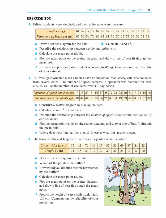
1 Fifteen students were weighed, and their pulse rates were measured:
Weight (x kg) 61 52 47 72 62 79 57 45 67 71 80 58 51 43 55
Pulse rate (y beats per min) 65 59 54 74 69 87 61 59 70 69 75 60 56 53 58
a Draw a scatter diagram for the data. b Calculate r and r2.
c Describe the relationship between weight and pulse rate.
d Calculate the mean point (x, y).
e Plot the mean point on the scatter diagram, and draw a line of best fit through the
mean point.
f Estimate the pulse rate of a student who weighs 65 kg. Comment on the reliability
of your estimate.
2 To investigate whether speed cameras have an impact on road safety, data was collected
from several cities. The number of speed cameras in operation was recorded for each
city, as well as the number of accidents over a 7 day period.
Number of speed cameras (x) 7 15 20 3 16 17 28 17 24 25 20 5 16 25 15 19
Number of car accidents (y) 48 35 31 52 40 35 28 30 34 19 29 42 31 21 37 32
a Construct a scatter diagram to display the data.
b Calculate r and r2 for the data.
c Describe the relationship between the number of speed cameras and the number of
car accidents.
d Plot the mean point (x, y) on the scatter diagram, and draw a line of best fit through
the mean point.
e Where does your line cut the y-axis? Interpret what this answer means.
3 The trunk widths and heights of the trees in a garden were recorded:
Trunk width (x cm) 35 47 72 40 15 87 20 66 57 24 32
Height (y m) 11 18 24 12 3 30 22 21 17 5 10
a Draw a scatter diagram of the data.
b Which of the points is an outlier?
c How would you describe the tree represented
by the outlier?
d Calculate the mean point (x, y).
e Plot the mean point on the scatter diagram,
and draw a line of best fit through the mean
point.
f Predict the height of a tree with trunk width
120 cm. Comment on the reliability of your
prediction.
607TWO VARIABLE STATISTICS (Chapter 20)
IB_STSL-2edmagentacyan yellow black
0 05 5
25
25
75
75
50
50
95
95
100
100 0 05 5
25
25
75
75
50
50
95
95
100
100
Y:\HAESE\IB_STSL-2ed\IB_STSL-2ed_20\607IB_STSL-2_20.CDR Wednesday, 3 March 2010 2:14:18 PM PETER

DEMO
y
x
d1
d2 d3
d4
The problem with drawing a line of best fit by eye is that the line drawn will vary from one
person to another.
Instead, mathematicians use a method known as linear regression to find the equation of the
line which best fits the data. The most common method is the method of ‘least squares’.
THE LEAST SQUARES REGRESSION LINE
Consider the set of points alongside.
For any line we draw to model the points, we can
find the vertical distances d1, d2, d3, .... between
each point and the line.
We can then square each of these distances, and find
their sum d 2
1+ d 2
2+ d 2
3+ ::::
If the line is a good fit for the data, most of the
distances will be small, and so the sum of their
squares will also be small.
The least squares regression line is the line which makes this sum as small as
possible.
The demonstration alongside allows you to experiment with various data sets.
Use trial and error to find the least squares line of best fit for each set.
THE LEAST SQUARES REGRESSION FORMULA
The least squares regression line for a set of data (x, y) is
y ¡ y =sxy
sx2(x¡ x).
The valuesxy
sx2is the gradient of the line of best fit.
Note: In examinations, the value of sxy will be given. The value of sx should be found
using technology.
Consider the data alongside.
x 2 5 9 7 9 10 7
y 25 17 11 10 8 7 13
a Given sxy ¼ ¡14:3, find the
equation of the least squares line
of best fit connecting x and y.
b Estimate the value of y when x = 6. Comment on the reliability of your estimate.
LINEAR REGRESSIOND
Example 6 Self Tutor
608 TWO VARIABLE STATISTICS (Chapter 20)
IB_STSL-2edmagentacyan yellow black
0 05 5
25
25
75
75
50
50
95
95
100
100 0 05 5
25
25
75
75
50
50
95
95
100
100
Y:\HAESE\IB_STSL-2ed\IB_STSL-2ed_20\608IB_STSL-2_20.CDR Tuesday, 16 February 2010 10:16:44 AM PETER
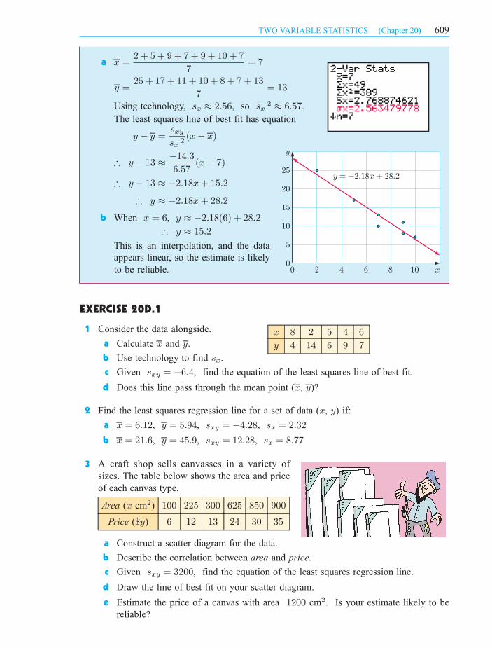
a x =2 + 5 + 9 + 7 + 9 + 10 + 7
7= 7
y =25 + 17 + 11 + 10 + 8 + 7 + 13
7= 13
Using technology, sx ¼ 2:56, so sx2 ¼ 6:57.
The least squares line of best fit has equation
y ¡ y =sxy
sx 2(x¡ x)
) y ¡ 13 ¼ ¡14:3
6:57(x¡ 7)
) y ¡ 13 ¼ ¡2:18x+ 15:2
) y ¼ ¡2:18x+ 28:2
b When x = 6, y ¼ ¡2:18(6) + 28:2
) y ¼ 15:2
This is an interpolation, and the data
appears linear, so the estimate is likely
to be reliable.
EXERCISE 20D.1
x 8 2 5 4 6
y 4 14 6 9 7
1 Consider the data alongside.
a Calculate x and y.
b Use technology to find sx.
c Given sxy = ¡6:4, find the equation of the least squares line of best fit.
d Does this line pass through the mean point (x, y)?
2 Find the least squares regression line for a set of data (x, y) if:
a x = 6:12, y = 5:94, sxy = ¡4:28, sx = 2:32
b x = 21:6, y = 45:9, sxy = 12:28, sx = 8:77
3
Area (x cm2) 100 225 300 625 850 900
Price ($y) 6 12 13 24 30 35
a Construct a scatter diagram for the data.
b Describe the correlation between area and price.
c Given sxy = 3200, find the equation of the least squares regression line.
d Draw the line of best fit on your scatter diagram.
e Estimate the price of a canvas with area 1200 cm2. Is your estimate likely to be
reliable?
A craft shop sells canvasses in a variety of
sizes. The table below shows the area and price
of each canvas type.
0
5
10
15
20
25
y
0 2 4 6 8 10 x
y = -2.18x + 28.2
609TWO VARIABLE STATISTICS (Chapter 20)
IB_STSL-2edmagentacyan yellow black
0 05 5
25
25
75
75
50
50
95
95
100
100 0 05 5
25
25
75
75
50
50
95
95
100
100
Y:\HAESE\IB_STSL-2ed\IB_STSL-2ed_20\609IB_STSL-2_20.CDR Tuesday, 16 February 2010 10:16:48 AM PETER
4 Two variables X and Y are such that x = 12:4, y = 21:5, sxy = ¡7:84, sx = 3:91 .
a Find the equation of the least squares regression line.
b
c Comment on the likely accuracy of your estimate.
5 A group of children were asked the number of hours they spent exercising and watching
television each week.
Exercise (x hours per week) 4 1 8 7 10 3 3 2
Television (y hours per week) 12 24 5 9 1 18 11 16
a Draw a scatter diagram for the data.
b Given sxy = ¡19, find the equation of the least squares line of best fit.
c Give an interpretation of the gradient and the y-intercept of this line.
d Another child exercises for 5 hours each week. Estimate how long he spends
watching television each week.
USING TECHNOLOGY
We can use technology to find the equation of the line of best fit. For help, consult the
graphics calculator instructions at the start of the book.
The table below shows the annual income and average weekly grocery bill for a selection
of families.
Income (x thousand pounds) 55 36 25 47 60 64 42 50
Grocery bill (y pounds) 120 90 60 160 190 250 110 150
a Construct a scatter diagram to illustrate the data.
b Use technology to find the line of best fit.
c Estimate the weekly grocery bill for a family with an annual income of $95 000.
Comment on whether this estimate is likely to be reliable.
a
Example 7 Self Tutor
0
50
100
150
200
250
300
0 10 20 30 40 50 60 70
grocery bill ( )$
income ( thousands)$
610 TWO VARIABLE STATISTICS (Chapter 20)
Estimate the value of y when x = 11.
IB_STSL-2edmagentacyan yellow black
0 05 5
25
25
75
75
50
50
95
95
100
100 0 05 5
25
25
75
75
50
50
95
95
100
100
Y:\HAESE\IB_STSL-2ed\IB_STSL-2ed_20\610IB_STSL-2_20.CDR Wednesday, 3 March 2010 2:15:26 PM PETER

b Using technology, the line of best fit is y ¼ 4:18x¡ 56:7
c When x = 95, y ¼ 4:18(95)¡ 56:7 ¼ 340
So, we expect a family with an income of $95 000 to have a weekly grocery bill
of approximately $340.
This is an extrapolation, however, so the estimate may not be reliable.
EXERCISE 20D.2
FieldBachelor
degree ($x)
PhD
($y)
Chemical engineer 38 250 48 750
Computer coder 41 750 68 270
Electrical engineer 38 250 56 750
Sociologist 32 750 38 300
Applied mathematician 43 000 72 600
Accountant 38 550 46 000
1 A newspaper reports starting salaries
for recently graduated university
students which depend on whether
they hold a Bachelor degree or a
PhD.
a Draw a scatter diagram for the
data.
b Determine r and r2:
c Describe the association
between starting salaries for
Bachelor degrees and starting
salaries for PhDs.
d Find the equation of the line of best fit.
e Interpret the gradient of this line.
f The starting salary for an economist with a Bachelor degree is $40 000:
i Predict the starting salary for an economist with a PhD.
ii Comment on the reliability of your prediction.
2 Steve wanted to see whether there was any relationship between the temperature when
he leaves for work in the morning, and the time it takes to get to work.
He collected data over a 14 day period:
Temperature (x oC) 25 19 23 27 32 35 29 27 21 18 16 17 28 34
Time (y min) 35 42 49 31 37 33 31 47 42 36 45 33 48 39
a Draw a scatter diagram of the data.
b Calculate r and r2.
c Describe the relationship between the variables.
d Is it reasonable to try to find a line of best fit for this data?
Casio fx-9860G TI-84 Plus TI- spiren
611TWO VARIABLE STATISTICS (Chapter 20)
IB_STSL-2edmagentacyan yellow black
0 05 5
25
25
75
75
50
50
95
95
100
100 0 05 5
25
25
75
75
50
50
95
95
100
100
Y:\HAESE\IB_STSL-2ed\IB_STSL-2ed_20\611IB_STSL-2_20.CDR Tuesday, 16 February 2010 10:16:55 AM PETER
3 The table below shows the price of petrol and the number of customers per hour for
sixteen petrol stations.
Petrol price (x cents per litre) 105:9 106:9 109:9 104:5 104:9 111:9 110:5 112:9
Number of customers (y) 45 42 25 48 43 15 19 10
Petrol price (x cents per litre) 107:5 108:0 104:9 102:9 110:9 106:9 105:5 109:5
Number of customers (y) 30 23 42 50 12 24 32 17
a Calculate r and r2 for the data.
b Describe the relationship between the petrol price and the number of customers.
c Use technology to find the line of best fit.
d Interpret the gradient of this line.
e Estimate the number of customers per hour for a petrol station which sells petrol at
115:9 cents per litre.
f Comment on the validity of your estimate in e.
4 The table below contains information on the maximum speed and maximum altitude
obtainable (ceiling) for nineteen World War II fighter planes. The maximum speed is
given in thousands of km h¡1, and the ceiling is given in km.
max. speed ceiling
0:46 8:84
0:42 10:06
0:53 10:97
0:53 9:906
0:49 9:448
0:53 10:36
0:68 11:73
max. speed ceiling
0:68 10:66
0:72 11:27
0:71 12:64
0:66 11:12
0:78 12:80
0:73 11:88
max. speed ceiling
0:67 12:49
0:57 10:66
0:44 10:51
0:67 11:58
0:70 11:73
0:52 10:36
a Draw a scatter diagram for this data. b Determine the r and r2 values.
c
d Use technology to find the line of best fit.
e Estimate the ceiling for a fighter plane with a maximum speed of 600 km h¡1.
5 The yield of pumpkins on a farm depends on the quantity of fertiliser used.
Fertiliser (x g m¡2) 4 13 20 26 30 35 50Yield (y kg) 1:8 2:9 3:8 4:2 4:7 5:7 4:4
a Draw a scatter diagram of the data and identify the outlier.
b Calculate the correlation coefficient:
i with the outlier included ii without the outlier.
c Calculate the equation of the least squares regression line:
i with the outlier included ii without the outlier.
d If you wish to estimate the yield when 15 g m¡2 of fertiliser is used, which regression
line from c should be used?
e Can you explain what may have caused the outlier?
612 TWO VARIABLE STATISTICS (Chapter 20)
Describe the association between maximum speed (x) and ceiling (y).
IB_STSL-2edmagentacyan yellow black
0 05 5
25
25
75
75
50
50
95
95
100
100 0 05 5
25
25
75
75
50
50
95
95
100
100
Y:\HAESE\IB_STSL-2ed\IB_STSL-2ed_20\612IB_STSL-2_20.CDR Wednesday, 3 March 2010 2:16:16 PM PETER
INVESTIGATION SPEARMAN’S RANK ORDER CORRELATION
COEFFICIENT (EXTENSION)
Suppose we wish to test the degree of agreement between two judges, for
example, wine tasting judges at a vintage festival, or judges at a diving
competition.
To do this we use Spearman’s rank order correlation coefficient
t = 1¡
6P
d2
n(n2¡ 1)
where
and
t is Spearman’s rank order correlation coefficient
d is the difference in the ranking
n is the number of rankingsPd2 is the sum of the squares of the differences.
What to do:
1 Amy and Lee are two wine judges. They are considering six red wines: A, B, C,
D, E and F. They taste each wine and rank them in order, with 1 being the best and
6 the worst. The results of their judging are shown in the table which follows:
Wine A B C D E F
Amy’s order 3 1 6 2 4 5
Lee’s order 6 5 2 1 3 4
Notice that
for wine A, d = 6¡ 3 = 3
and for wine C, d = 6¡ 2 = 4
a Find Spearman’s rank order correlation coefficient for the wine tasting data.
b Graph the data with Amy’s order on one axis and Lee’s order on the other axis.
c Comment on the degree of agreement between their rankings of the wine.
d What is the significance of the sign of t?
Wine A B C D E F
Amy’s order 1 2 4 3 5 6
Lee’s order 2 1 3 4 6 5
2 Amy and Lee then taste six white
wines. Their rankings are:
a Find Spearman’s rank order correlation coefficient for the wine tasting data.
b Graph the data with Amy’s order on one axis and Lee’s order on the other axis.
c Comment on the degree of agreement between their rankings of the wine.
d What is the significance of the sign of t?
3 Find t for: a perfect agreement b completely opposite order.
4 Construct some examples of your own for the following cases:
a t being close to +1 b t being close to ¡1 c t being close to 0
d t being positive e t being negative.
As a consequence of your investigation, comment on these five categories.
5 Arrange some competitions of your own choosing and test for rank agreement
between the views of two friends. Record all data and show all calculations. You
could examine preferences in food tasting, or sports watched on TV.
613TWO VARIABLE STATISTICS (Chapter 20)
IB_STSL-2edmagentacyan yellow black
0 05 5
25
25
75
75
50
50
95
95
100
100 0 05 5
25
25
75
75
50
50
95
95
100
100
Y:\HAESE\IB_STSL-2ed\IB_STSL-2ed_20\613IB_STSL-2_20.CDR Tuesday, 16 February 2010 10:17:03 AM PETER

Regular
exercise
No regular
exercisesum
Male 110 106 216
Female 98 86 184
sum 208 192 400
This table shows the results of a sample of
400 randomly selected adults classified
according to gender and regular exercise.
We call this a 2£ 2 contingency table.
We may be interested in how the variables gender and regular exercise are related. The
variables may be dependent, for example females may be more likely to exercise regularly
than males. Alternatively, the variables may be independent, which means the gender of a
person has no effect on whether they exercise regularly.
CALCULATING Â2
Regular
exercise
No regular
exercisesum
Male 216
Female 184
sum 208 192 400
To test whether gender and regular exercise
are independent, we first consider only the
sum values of the contingency table. We then
calculate the values we would expect to obtain
if the variables were independent.
For example, if gender and regular exercise were independent, then
P(male \ regular exercise) = P(male)£ P(regular exercise)
= 216
400£ 208
400
So, in a sample of 400 adults, we would expect
400£ ¡216400
£ 208
400
¢= 216£208
400= 112:32 to be male and exercise regularly.
We can perform similar calculations for each cell to obtain
an expected frequency table of values we would expect to
obtain if the variables were independent.
Regular
exercise
No regular
exercisesum
Male 216£208
400= 112:32 216£192
400= 103:68 216
Female 184£208
400= 95:68 184£192
400= 88:32 184
sum 208 192 400
THE Â2 TEST OF INDEPENDENCEE
For each cell, we
multiply the row sum by
the column sum, then
divide by the total.
614 TWO VARIABLE STATISTICS (Chapter 20)
The chi-squared or Â2 test is used to determine whether two variables from the same sample
are independent.
IB_STSL-2edmagentacyan yellow black
0 05 5
25
25
75
75
50
50
95
95
100
100 0 05 5
25
25
75
75
50
50
95
95
100
100
Y:\HAESE\IB_STSL-2ed\IB_STSL-2ed_20\614IB_STSL-2_20.CDR Tuesday, 16 February 2010 12:03:23 PM PETER

The Â2 test examines the difference between the observed values we obtained from our
sample, and the expected values we have calculated.
If the variables are independent, the observed and expected values will be very similar. This
means that the values of (fo ¡ fe) will be small, and so Â2
calc will be small.
If the variables are not independent, the observed values will differ significantly from the
expected values. The values of (fo ¡ fe) will be large, and hence Â2
calc will be large.
For our example on gender and regular exercise, our Â2 calculation is
fo fe fo ¡ fe (fo ¡ fe)2
(fo ¡ fe)2
fe
110 112:32 ¡2:32 5:3824 0:0479
106 103:68 2:32 5:3824 0:0519
98 95:68 2:32 5:3824 0:0563
86 88:32 ¡2:32 5:3824 0:0609
Total ¼ 0:2170
In this case, Â2
calc ¼ 0:217, which is very small.
This indicates that gender and regular exercise are independent.
EXERCISE 20E.1
1 Find Â2
calc for the following contingency tables:
a Likes
football
Dislikes
football sum
Male 21 5 26
Female 7 17 24
sum 28 22 50
b M1 M2 sum
N1 31 22 53
N2 20 27 47
sum 51 49 100
c S1 S2 sum
R1 28 17
R2 52 41
sum
d Left
handed
Right
handed sum
Employed 8 62
Unemployed 4 26
sum
e A1 A2
B1 24 11
B2 16 18
B3 25 12
f T1 T2 T3 T4
D1 31 22 21 16
D2 23 19 22 13
2 Use a calculator to check your answers to question 1. Consult the graphics calculator
instructions at the start of the book if you need assistance. Your answers may differ
slightly from the calculator’s answers if you have rounded the expected values.
615TWO VARIABLE STATISTICS (Chapter 20)
Â2
calc =X (fo ¡ fe)
2
fe
where
and
fo is an observed frequency
fe is an expected frequency.
IB_STSL-2edmagentacyan yellow black
0 05 5
25
25
75
75
50
50
95
95
100
100 0 05 5
25
25
75
75
50
50
95
95
100
100
Y:\HAESE\IB_STSL-2ed\IB_STSL-2ed_20\615IB_STSL-2_20.CDR Tuesday, 16 March 2010 3:04:49 PM PETER

FORMAL TEST FOR INDEPENDENCE
We have seen that a small value of Â2 indicates that two variables are independent, while a
large value of Â2 indicates that the variables are not independent.
We will now consider a more formal test which determines how large Â2 must be for us to
conclude the variables are not independent.
DEGREES OF FREEDOM
In a Â2 table the number of degrees of freedom (df) is the number of values which are free
to vary.
A1 A2 sum
B1 12
B2 8
sum 15 5 20
A1 A2 sum
B1 9 3 12
B2 6 2 8
sum 15 5 20
Consider the 2£2 contingency table alongside, with the sum
values given.
The value in the top left corner is free to vary, as it can take
many possible values, one of which is 9. However, once we
set this value, the remaining values are not free to vary, as
they are determined by the row and column sums.
So, the number of degrees of freedom is 1, which is
(2¡ 1)£ (2¡ 1).
In a 3£3 contingency table, we can choose (3¡1)£(3¡1) = 4 values before the remaining
values are not free to vary.
C1 C2 C3 sum
D1 12
D2 8
D3 13
sum 13 9 11 33
C1 C2 C3 sum
D1 5 3 4 12
D2 2 4 2 8
D3 6 2 5 13
sum 13 9 11 33
For a contingency table which is r £ c in size, df = (r ¡ 1)(c¡ 1).
Our original gender and regular exercise contingency table is 2£2, so the number of degrees
of freedom is df = (2¡ 1)£ (2¡ 1) = 1.
TABLE OF CRITICAL VALUES Degrees of Area right of table value
freedom (df) 0:10 0:05 0:01
1 2:71 3:84 6:632 4:61 5:99 9:213 6:25 7:81 11:344 7:78 9:49 13:285 9:24 11:07 15:096 10:64 12:59 16:817 12:02 14:07 18:488 13:36 15:51 20:099 14:68 16:92 21:6710 15:99 18:31 23:21
The Â2 distribution graph is:
The values 0:10, 0:05, 0:01, or 10%, 5%, 1%,
are called significance levels and these are
the ones which are commonly used to test for
independence.
616 TWO VARIABLE STATISTICS (Chapter 20)
Â2
a
area of rejection
IB_STSL-2edmagentacyan yellow black
0 05 5
25
25
75
75
50
50
95
95
100
100 0 05 5
25
25
75
75
50
50
95
95
100
100
Y:\HAESE\IB_STSL-2ed\IB_STSL-2ed_20\616IB_STSL-2_20.CDR Wednesday, 3 March 2010 2:32:26 PM PETER

For a given significance level and degrees of freedom, the table gives the critical value of
Â2, above which we conclude the variables are not independent.
For example, at a 5% significance level with df = 1, Â20:05 = 3:84. This means that at a
5% significance level, the departure between the observed and expected values is too great if
Â2
calc > 3:84.
Likewise, at a 1% significance level with df = 7, the departure between the observed and
expected values is too great if Â2
calc > 18:48.
Important: In order for Â2 to be distributed approximately as shown in the graph, the sample
size n must be sufficiently large. Generally, n is sufficiently large if no more
than 20% of values in the expected value table are less than 5, and none of the
expected values is less than 1.
THE p-VALUE
When finding Â2 on your calculator, a p-value is also provided. This can be used, together
with the Â2 value and the critical value, to determine whether or not to accept that the variables
are independent.
For a given contingency table, the p-value is the probability of obtaining observed values
as far or further from the expected values, assuming the variables are independent.
If the p-value is smaller than the significance level, then it is sufficiently unlikely that we
would have obtained the observed results if the variables had been independent. We therefore
conclude that the variables are not independent.
It is not always essential to use the p-value when testing for independence, as we can perform
the test by simply comparing Â2
calc with the critical value. However, the p-value does give
a more meaningful measure of how likely it is that the variables are independent.
THE FORMAL TEST FOR INDEPENDENCE
Step 1: State H0 called the null hypothesis. This is a statement that the two variables
being considered are independent.
State H1 called the alternative hypothesis. This is a statement that the two
variables being considered are not independent.
Step 2: Calculate df = (r ¡ 1)(c¡ 1).
Step 3: Quote the significance level required, 10%, 5% or 1%.
Step 4: State the rejection inequality Â2
calc > k where k is obtained from the table
of critical values.
Step 5: From the contingency table, find Â2
calc =X (fo ¡ fe)
2
fe.
Step 6: We either reject H0 or do not reject H0, depending on the result of the rejection
inequality.
Step 7: We could also use a p-value to help us with our decision making.
For example, at a 5% significance level: If p < 0:05, we reject H0.
If p > 0:05, we do not reject H0.
617TWO VARIABLE STATISTICS (Chapter 20)
IB_STSL-2edmagentacyan yellow black
0 05 5
25
25
75
75
50
50
95
95
100
100 0 05 5
25
25
75
75
50
50
95
95
100
100
Y:\HAESE\IB_STSL-2ed\IB_STSL-2ed_20\617IB_STSL-2_20.CDR Tuesday, 16 February 2010 10:17:18 AM PETER
Year group
9 10 11 12
change 7 9 13 14
no change 14 12 9 7
A survey was given to randomly chosen high
school students from years 9 to 12 on possible
changes to the school’s canteen.
The contingency table shows the results.
H0 is that year group and change are independent.
H1 is that year group and change are not independent.
df = (2¡ 1)(4¡ 1) = 3 The significance level is 5% or 0:05.
We reject H0 if Â2
calc > 7:81. ffrom the table of critical valuesgThe 2£ 4 contingency table is:
Year group sum
9 10 11 12
C 7 9 13 14 43
C0 14 12 9 7 42
sum 21 21 22 21 85
The expected frequency table is:
Year group
9 10 11 12
C 10:6 10:6 11:1 10:6
C0 10:4 10:4 10:9 10:4
Example 8 Self Tutor
At a level, test whether the proportion of students wanting a change depends on
the year group.
5%
618 TWO VARIABLE STATISTICS (Chapter 20)
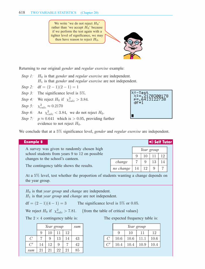
Returning to our original gender and regular exercise example:
Step 1: H0 is that gender and regular exercise are independent.
H1 is that gender and regular exercise are not independent.
Step 2: df = (2¡ 1)(2¡ 1) = 1
Step 3: The significance level is 5%.
Step 4: We reject H0 if Â2
calc > 3:84.
Step 5: Â2
calc ¼ 0:2170
Step 6: As Â2
calc < 3:84, we do not reject H0.
Step 7: p ¼ 0:641 which is > 0:05, providing further
evidence to not reject H0.
We conclude that at a 5% significance level, gender and regular exercise are independent.
We write ‘we do not reject ’
rather than ‘we accept ’ because
if we perform the test again with a
tighter level of significance, we may
then have reason to reject .
H
H
H
0
0
0
IB_STSL-2edmagentacyan yellow black
0 05 5
25
25
75
75
50
50
95
95
100
100 0 05 5
25
25
75
75
50
50
95
95
100
100
Y:\HAESE\IB_STSL-2ed\IB_STSL-2ed_20\618IB_STSL-2_20.CDR Tuesday, 16 March 2010 3:05:34 PM PETER
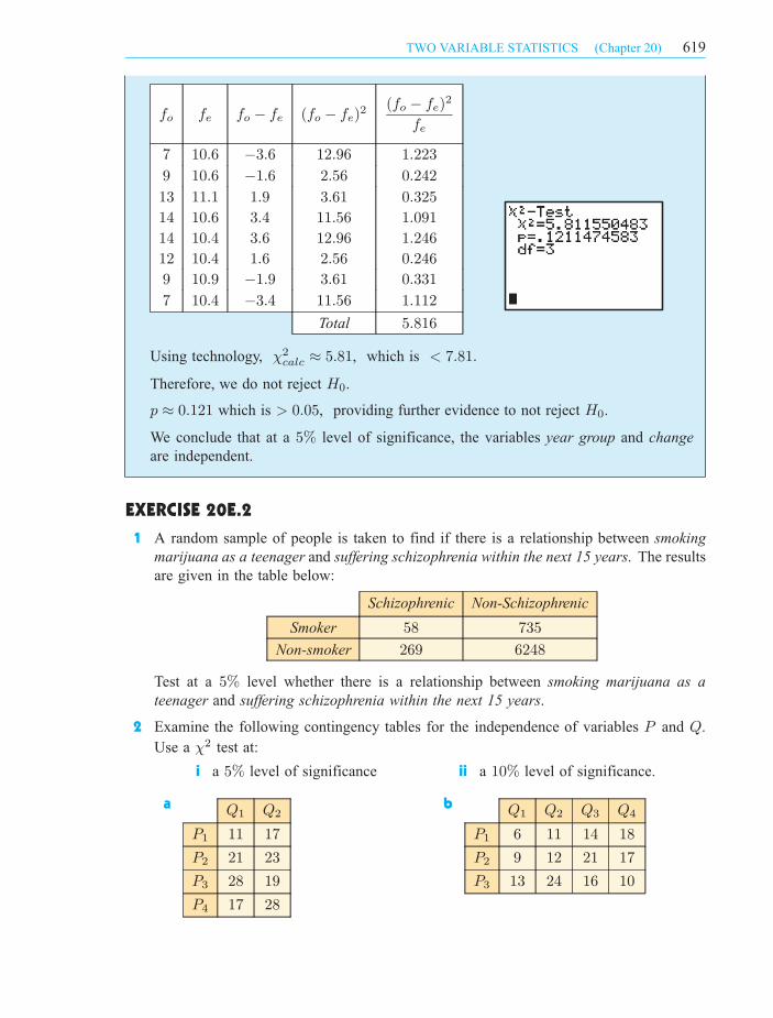
fo fe fo ¡ fe (fo ¡ fe)2
(fo ¡ fe)2
fe
7 10:6 ¡3:6 12:96 1:223
9 10:6 ¡1:6 2:56 0:242
13 11:1 1:9 3:61 0:325
14 10:6 3:4 11:56 1:091
14 10:4 3:6 12:96 1:246
12 10:4 1:6 2:56 0:246
9 10:9 ¡1:9 3:61 0:331
7 10:4 ¡3:4 11:56 1:112
Total 5:816
Using technology, Â2
calc ¼ 5:81, which is < 7:81:
Therefore, we do not reject H0.
p ¼ 0:121 which is > 0:05, providing further evidence to not reject H0.
We conclude that at a 5% level of significance, the variables year group and change
are independent.
EXERCISE 20E.2
1 A random sample of people is taken to find if there is a relationship between smoking
marijuana as a teenager and suffering schizophrenia within the next 15 years. The results
are given in the table below:
Schizophrenic Non-Schizophrenic
Smoker 58 735
Non-smoker 269 6248
Test at a 5% level whether there is a relationship between smoking marijuana as a
teenager and suffering schizophrenia within the next 15 years.
2 Examine the following contingency tables for the independence of variables P and Q.
Use a Â2 test at:
i a 5% level of significance ii a 10% level of significance.
a Q1 Q2
P1 11 17
P2 21 23
P3 28 19
P4 17 28
b Q1 Q2 Q3 Q4
P1 6 11 14 18
P2 9 12 21 17
P3 13 24 16 10
619TWO VARIABLE STATISTICS (Chapter 20)
IB_STSL-2edmagentacyan yellow black
0 05 5
25
25
75
75
50
50
95
95
100
100 0 05 5
25
25
75
75
50
50
95
95
100
100
Y:\HAESE\IB_STSL-2ed\IB_STSL-2ed_20\619IB_STSL-2_20.CDR Tuesday, 16 February 2010 10:17:25 AM PETER
Age of voter
18 to 35 36 to 59 60+
Party A 85 95 131
Party B 168 197 173
3
Income level
low average high very high
Smoker 82 167 74 31
Non-smoker 212 668 428 168
4 The table shows the results
of a random sample of people
comparing annual income and
cigarette smoking.
Test at a 10% level whether
income is associated with smoking.
Weight
light medium heavy obese
Diabetic 11 19 21 38
Non-diabetic 79 68 74 53
5 This contingency table shows the
responses of a randomly chosen
sample of adults regarding the
person’s weight and whether they
have diabetes.
Test at a 1% level whether there
is a link between weight and
suffering diabetes.
COMBINING DATA
Â2 tests can be unreliable if more than 20% of the expected values are less than 5.
Consider the following contingency table:
P1 P2
Q1 42 28
Q2 50 15
Q3 3 4
The chi-squared calculated value for this data is 6:28, with 2degrees of freedom.
At a 5% significance level, the critical value is 5:99.
Since 6:28 > 5:99 we would conclude that, at a 5% significance
level, the two events were not independent.
Now consider the expected values for this table:
P1 P2
Q1 46:8 23:2
Q2 43:5 21:5
Q3 4:68 2:32
There are 2 cells in the table with values < 5, so 331
3% of
the expected values are < 5.
This means that the conclusion drawn above may not be
reliable.
620 TWO VARIABLE STATISTICS (Chapter 20)
The table opposite shows the way in
which a random sample of people intend
to vote in the next election.
Test at a 5% level whether there is any
association between the age of a voter
and the party they wish to vote for.
We can improve the reliability of the test by combining rows or columns so that there are no
cells which have expected values < 5. In this case we combine rows Q2 and Q3 to produce
P1 P2
Q1 42 28
Q2 and Q3 53 19
which has expected values
P1 P2
Q1 46:8 23:2
Q2 and Q3 48:2 23:8
IB_STSL-2edmagentacyan yellow black
0 05 5
25
25
75
75
50
50
95
95
100
100 0 05 5
25
25
75
75
50
50
95
95
100
100
Y:\HAESE\IB_STSL-2ed\IB_STSL-2ed_20\620IB_STSL-2_20.CDR Friday, 26 March 2010 2:47:54 PM PETER
REVIEW SET 20A
TWO VARIABLE STATISTICS (Chapter 20) 621
Having done this, Â2
calc ¼ 2:97 with df = 1, and at a 5% significance level the critical
value is 3:84. Since 2:97 < 3:84, we conclude that, at a 5% significance level, the two
variables are independent. Thus, the original conclusion was incorrect.
EXERCISE 20E.3
P1 P2 P3 P4
Q1 4 7 15 19
Q2 5 12 10 11
1 Consider the contingency table alongside:
a Calculate the expected values.
b What percentage of the expected values are
less than 5?
c Combine the data so that none of the cells have an expected value less than 5.
2 The following table is a result of a major investigation considering the two factors of
intelligence level and cigarette smoking.
Intelligence level
low average high very high
Non smoker 279 386 96 2
Medium level smoker 123 201 58 5
Heavy smoker 100 147 64 2
a Test at a 1% level whether there is a link between intelligence level and cigarette
smoking.
b Observe the expected values. Combine appropriate columns to reduce the number
of cells with expected values < 5.
c Perform this test again at the 1% level. Is your conclusion the same as in part a?
1 Thomas rode for an hour each day for eleven days. He recorded the number of
kilometres he rode along with the temperature that day.
Temperature, T oC 32:9 33:9 35:2 37:1 38:9 30:3 32:5 31:7 35:7 36:3 34:7
Distance, d km 26:5 26:7 24:4 19:8 18:5 32:6 28:7 29:4 23:8 21:2 29:7
a Using technology, construct a scatter diagram of the data.
b Find and interpret Pearson’s correlation coefficient for the two variables.
c Calculate the equation of the least squares regression line. How hot must it get
before Thomas does not ride at all?
2 The contingency table below shows the results of motor vehicle accidents in relation
to whether the traveller was wearing a seat belt.
Serious injury Permanent disablement Death
Wearing a belt 189 104 58
Not wearing a belt 83 67 46
Find Â2 and test at a 5% level whether the wearing of a seat belt and severity of
injury are independent factors.
IB_STSL-2edmagentacyan yellow black
0 05 5
25
25
75
75
50
50
95
95
100
100 0 05 5
25
25
75
75
50
50
95
95
100
100
Y:\HAESE\IB_STSL-2ed\IB_STSL-2ed_20\621IB_STSL-2_20.CDR Wednesday, 3 March 2010 2:19:03 PM PETER

622 TWO VARIABLE STATISTICS (Chapter 20)
3 A clothing store recorded the length of time customers were in the store and the
amount they spent.
Time (min) 8 18 5 10 17 11 2 13 18 4 11 20 23 22 17
Money (E) 40 78 0 46 72 86 0 59 33 0 0 122 90 137 93
a Draw a scatter diagram of the data. b Calculate the mean point.
c Plot the mean point on your diagram and draw a line of best fit through the
mean point.
d Describe the relationship between time in the store and money spent.
4 A drinks vendor varies the price of Supa-fizz on a daily basis. He records the number
of sales of the drink as shown:
Price (p) $2:50 $1:90 $1:60 $2:10 $2:20 $1:40 $1:70 $1:85
Sales (s) 389 450 448 386 381 458 597 431
a Produce a scatter diagram for the data.
b Are there any outliers? If so, should they be included in the analysis?
c Calculate the least squares regression line.
d Do you think the least squares regression line would give an accurate prediction
of sales if Super-fizz was priced at 50 cents? Explain your answer.
5 Eight identical flower beds contain petunias. The different beds were watered
different numbers of times each week, and the number of flowers each bed produced
was recorded in the table below:
Number of waterings (n) 0 1 2 3 4 5 6 7
Flowers produced (f ) 18 52 86 123 158 191 228 250
a Which is the independent variable?
b Calculate the equation of the least squares regression line.
c Plot the least squares regression line on a scatter diagram of the data.
d Violet has two beds of petunias. One she
waters five times a fortnight (21
2times a
week), and the other ten times a week.
i How many flowers can she expect
from each bed?
ii Which is the more reliable estimate?
Q1 Q2 Q3 Q4
P1 19 23 27 39
P2 11 20 27 35
P3 26 39 21 30
6 Examine the following contingency table for the
independence of factors P and Q.
Use a Â2 test: a at a 5% level of significance
b at a 1% level of significance.
IB_STSL-2edmagentacyan yellow black
0 05 5
25
25
75
75
50
50
95
95
100
100 0 05 5
25
25
75
75
50
50
95
95
100
100
Y:\HAESE\IB_STSL-2ed\IB_STSL-2ed_20\622IB_STSL-2_20.cdr Wednesday, 3 March 2010 2:19:34 PM PETER
REVIEW SET 20B
TWO VARIABLE STATISTICS (Chapter 20) 623
1 A homebuyer makes a table of the prices of 2 bedroom flats in Greater Bristol, and
their distances from the city centre.
Distance (km) 17 4 16 8 6 10 11 5 2 5
Price (1000s of pounds) 100 216 135 150 177 120 130 140 209 170
a Draw a scatter diagram of the data.
c Comment on the relationship between a flat’s distance from the centre of Bristol,
and its price.
2 The following table gives the average number of children for different family
incomes.
Income (I thousand $) 20 25 30 35 40 50 60 70 90
Number of children, n 4:2 3:4 3:2 2:9 2:7 2:5 2:3 2:1 1:9
a Construct an appropriate graph to display the data.
b Find r and r2.
c Find the equation of the line of best fit.
d Alina and Vera examine the data. Alina thinks that the value for a $20 000income is an outlier. Vera disagrees, saying that the data is non-linear. Who do
you think is right, and why?
Age of driver
18 to 30 31 to 54 55+
Increase 234 169 134
No increase 156 191 233
3 The table shows the responses to a
survey about whether the city speed
limit should be increased.
Test at a 5% level whether there is
any association between the age of a
driver and increasing the speed limit.
4 The following table shows the results from a major investigation considering the two
factors intelligence level and business success.
Business
success
Intelligence level
low average high very high
No success 35 30 41 25
Low success 28 41 26 29
Success 35 24 41 56
High success 52 38 63 72
Test at a 1% level whether there is a link between intelligence level and business
success.
b Given sxy = ¡141:08, find r and r2.
IB_STSL-2edmagentacyan yellow black
0 05 5
25
25
75
75
50
50
95
95
100
100 0 05 5
25
25
75
75
50
50
95
95
100
100
Y:\HAESE\IB_STSL-2ed\IB_STSL-2ed_20\623IB_STSL-2_20.cdr Wednesday, 3 March 2010 2:20:09 PM PETER
624 TWO VARIABLE STATISTICS (Chapter 20)
5 Safety authorities advise drivers to travel
three seconds behind the car in front of
them. This provides the driver with a greater
chance of avoiding a collision if the car in
front has to brake quickly or is itself involved
in an accident.
A test was carried out to find out how long
it would take a driver to bring a car to rest
from the time a red light was flashed. The
following results are for one driver in the
same car under the same test conditions.
Speed (v km h¡1) 10 20 30 40 50 60 70 80 90
Stopping time (t s) 1:23 1:54 1:88 2:20 2:52 2:83 3:15 3:45 3:83
a Produce a scatter diagram of the data and indicate its most likely model type.
b Find the linear model which best fits the data.
c Use the model to estimate the stopping time for a speed of:
i 55 km h¡1 ii 110 km h¡1
d Interpret the vertical intercept of the model.
6 Two supervillains, Silent Predator and the Furry Reaper, terrorise Metropolis by
abducting fair maidens (most of whom happen to be journalists). The superhero
Superman believes that they are collaborating, alternatively abducting fair maidens
so as not to compete with each other for ransom money. He plots their abduction
rate below, in dozens of maidens.
Silent Predator (p) 4 6 5 9 3 5 8 11 3 7 7 4
Furry Reaper (r) 13 10 11 8 11 9 6 6 12 7 10 8
a Plot the data on a scatter diagram with Silent Predator on the horizontal axis.
b Find the least squares regression line.
c Calculate r and r2, and hence describe the strength of Silent Predator and Furry
Reaper’s relationship. Is there any evidence to support Superman’s suspicions?
d Estimate the number of the Furry Reaper’s abductions when the Silent Predator’s
were 6 dozen.
e Why is the model inappropriate when the Furry Reaper abducts more than 20dozen maidens?
f Calculate the p- and r-intercepts of the regression line. What do these values
represent?
g If Superman is faced with a choice of capturing one supervillain but not the
other, which should he choose?
IB_STSL-2edmagentacyan yellow black
0 05 5
25
25
75
75
50
50
95
95
100
100 0 05 5
25
25
75
75
50
50
95
95
100
100
Y:\HAESE\IB_STSL-2ed\IB_STSL-2ed_20\624IB_STSL-2_20.cdr Wednesday, 10 March 2010 9:14:47 AM PETER