top 5 data visualization errors
TRANSCRIPT

1
TOP 5 DATA VISUALIZATION ERRORS
Professor Kristen Sosulski, Ed.DNew York University Stern School of Business@sosulski | [email protected] | kristensosulski.com

2
Introduction• Building data visualizations is easy. • In fact, you can build beautiful geospatial, categorical,
statistical, relational, multivariate, and time series displays with little effort, as long the data is presented in the correct format.
• However, it’s always important to study and review the output of your visualizations; the default settings can result in errors of omission and poor scaling.
Copyright 2016 Kristen Sosulski [email protected] @sosulski kristensosulski.com

3
Learn how to avoid errors made by data visualization
software.
Copyright 2016 Kristen Sosulski [email protected] @sosulski kristensosulski.com

4
Top 5 errors made by software
Maps: Excluding AK
and HIPoor scaling Excluding the
data source
Using different shades for
bars
Encodings without
explanation
Copyright 2016 Kristen Sosulski [email protected] @sosulski kristensosulski.com

5
ERROR 1

6
What’s wrong with this map?
Copyright 2016 Kristen Sosulski [email protected] @sosulski kristensosulski.com

7
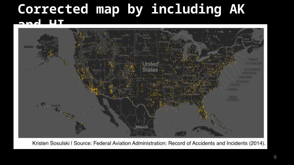
Answer:
The map below shows the location of aviation incidents and accidents in the US. However, it only shows the 48 contiguous states.

8
How do we correct this error?• When mapping data points on a geospatial display of
the United States, be sure to include all 50 states.
• To include Alaska and Hawaii on your map, simply take screenshots of the two states from your original visualization (you may have to zoom out or pan), and paste them near the west coast of the US.
Copyright 2016 Kristen Sosulski [email protected] @sosulski kristensosulski.com
9
Corrected map by including AK and HI.

10
ERROR 2

11
What’s wrong with this chart?

12
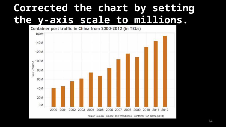
Answer:• The bars represent the number of TEUs by
year in China’s ports. The y-axis presents the data in thousands.
• The numbers on the scale are difficult to read such as 40200K.
• 40200K is simply, 40,200,000 or 40.2 million.
Copyright 2016 Kristen Sosulski [email protected] @sosulski kristensosulski.com

13
How do we correct this error?• In this case, the y-axis should be set to the
highest denomination, which in this case in millions.
• I see this mistake often with Tableau generated charts. See the corrected chart on the next slide.
Copyright 2016 Kristen Sosulski [email protected] @sosulski kristensosulski.com
14
Corrected the chart by setting the y-axis scale to millions.

15
ERROR 3

16
What’s missing from this chart?
Copyright 2016 Kristen Sosulski [email protected] @sosulski kristensosulski.com

17
Answer:• Omitting a reference to the data source.
This makes it impossible to check the validity and integrity of the visual presentation.
• Also, the scale is also omitted on this chart.

18
Corrected the chart by adding the data source.
Source: NYC Open Data: 311 Calls (2010-2015)Copyright 2016 Kristen Sosulski [email protected] @sosulski kristensosulski.com

19
ERROR 4

20
What’s confusing about this this chart?
Copyright 2016 Kristen Sosulski [email protected] @sosulski kristensosulski.com
21
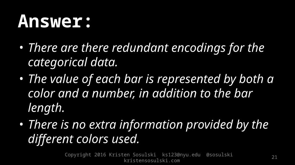
Answer:• There are there redundant encodings for the
categorical data.• The value of each bar is represented by both a
color and a number, in addition to the bar length.
• There is no extra information provided by the different colors used.
Copyright 2016 Kristen Sosulski [email protected] @sosulski kristensosulski.com

22
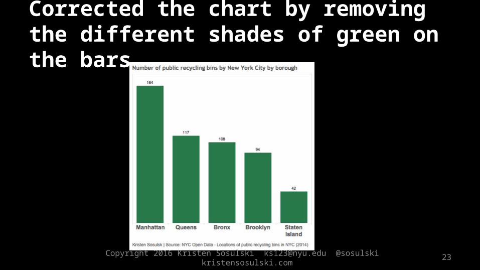
How do we correct the error?• Remove the different colors or shading
within the same bar chart. • The label describing the bar should make
it clear enough what the bar represents..
Copyright 2016 Kristen Sosulski [email protected] @sosulski kristensosulski.com
23
Corrected the chart by removing the different shades of green on the bars.
Copyright 2016 Kristen Sosulski [email protected] @sosulski kristensosulski.com

24
ERROR 5

25
What’s unclear about this map?
Copyright 2016 Kristen Sosulski [email protected] @sosulski kristensosulski.com

26
Answer:• There is no description of what the colors, bubbles, and bubble
size signify in the chart.
• Bubble charts are used to display multivariate data. The size of a bubble represents a quantitative value such as population or quantity, while the color usually is a categorical variable such as region.
• The position of the bubble is the intersection of the x and y coordinates. In this case, it is the longitude and latitude.

27
How can we fix this error?Simply include a legend to explain the color codes and sizes of your bubbles.
Copyright 2016 Kristen Sosulski [email protected] @sosulski kristensosulski.com

28
Corrected the error by including a legend.

29
Summary: 5 errors made by data visualization software.
Maps: Excluding AK
and HIPoor scaling Excluding the
data source
Using different shades for
bars
Encodings without
explanationCopyright 2016 Kristen Sosulski [email protected] @sosulski kristensosulski.com
30
By checking for these five errors made by data visualization software, you’ll be on your way to creating data visualizations like a pro.
Copyright 2016 Kristen Sosulski [email protected] @sosulski kristensosulski.com

31
Are there any other errors that you’ve come across in your data visualization work? Do you have any questions? Contact me on twitter @sosulski.
You can learn more on my blog at http://kristensosulski.com
Questions? Comments?
Copyright 2016 Kristen Sosulski [email protected] @sosulski kristensosulski.com

32
Thank you!Professor Kristen Sosulski, Ed.DNew York University Stern School of Business
@sosulski | [email protected] | kristensosulski.com