tms instrumentation workshop for firemonkey developers … · tms instrumentation workshop for...
TRANSCRIPT
TMS SOFTWARE TMS Instrumentation Workshop for FireMonkey
DEVELOPERS GUIDE
1
TMS Instrumentation Workshop for FireMonkey
DEVELOPERS GUIDE
May 2012 Copyright © 2012 by tmssoftware.com bvba
Web: http://www.tmssoftware.com Email: [email protected]

TMS SOFTWARE TMS Instrumentation Workshop for FireMonkey
DEVELOPERS GUIDE
2
Index
Availability ............................................................................................................................................... 3
Description .............................................................................................................................................. 3
List of available controls .......................................................................................................................... 5
Shapes ............................................................................................................................................. 5
Components .................................................................................................................................... 5
TMS Instrumentation Workshop components in detail .......................................................................... 9
TTMSFMXCircularGauge .................................................................................................................. 9
TTMSFMXLinearGauge .................................................................................................................. 13
TTMSFMXJogMeter ....................................................................................................................... 14
TTMSFMX7SegLED ......................................................................................................................... 15
TTMSFMXCompass ........................................................................................................................ 16
TTMSFMXRotarySwitch & TTMSFMXKnobSwitch ......................................................................... 17
TTMSFMXMatrixLabel ................................................................................................................... 18
TTMSFMXScope ............................................................................................................................. 20
TTMSFMXSpinner .......................................................................................................................... 22
TTMSFMXLEDMeter & TTMSFMXLEDScope .................................................................................. 24
TTMSFMXLED & TTMSFMXLEDBar ................................................................................................ 25
TTMSFMXSlider ............................................................................................................................. 25
General FireMonkey component usage guidlines ................................................................................. 26
Visual part ...................................................................................................................................... 26
Non-visual part .............................................................................................................................. 26
Naming convention ....................................................................................................................... 26
Styling ............................................................................................................................................ 26
Components .................................................................................................................................. 30
Cross-platform deployment of applications with TMS Instrumentation WorkShop for
FireMonkey components .............................................................................................................. 31
Samples ................................................................................................................................................. 33
TMS Instrumentation WorkShop Demo ........................................................................................ 33
FireMonkey Styles ......................................................................................................................... 35
TMS SOFTWARE TMS Instrumentation Workshop for FireMonkey
DEVELOPERS GUIDE
3
Availability
TMS Instrumentation Workshop for FireMonkey is a set of instrumentation controls for application development with the FireMonkey framework for Win32, Win64, OS-X32 and iOS. versions: TMS Instrumentation WorkShop for FireMonkey is available for Delphi XE2 & C++Builder XE2 update 4 and newer releases.
Description
The TMS Instrumentation Workshop is designed to visualize data typical for instrumentation control applications, implementing the new architecture and design methodology of Embarcadero’s latest framework: FireMonkey. FireMonkey is a component framework that separates the visual and non-visual part of a component and offers the benefit of cross platform deployment. The layout or style of a control is designed in a separate file which is then loaded from the component. The calculations and interactions are handled in the code of the component and are connected with the graphical elements described in the layout or style file. With the TMS Instrumentation Workshop we introduce the first set of FireMonkey controls that are created from scratch specifically for the FireMonkey framework. Similar to the TMS Instrumentation Workshop for VCL you will find gauge-, meter-, scope- and LED controls. In this developers guide an overview of the different components is given, features are highlighted and it is explained how to work with them and how they are designed. IMPORTANT NOTICE:

TMS SOFTWARE TMS Instrumentation Workshop for FireMonkey
DEVELOPERS GUIDE
4
If the FireMonkey framework is new to you, please see the chapter “General FireMonkey component usage guidelines” that offers an introduction that is recommended to read before you start working with the TMS Instrumentation Workshop component set.
TMS SOFTWARE TMS Instrumentation Workshop for FireMonkey
DEVELOPERS GUIDE
5
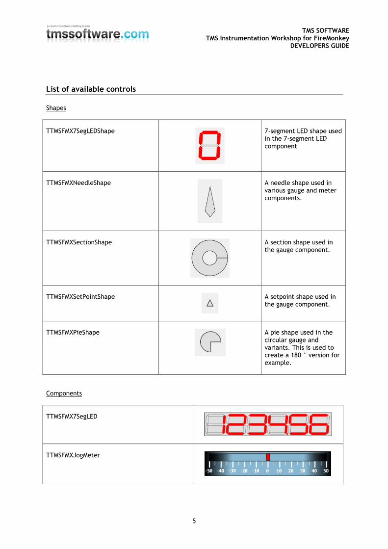
List of available controls
Shapes
TTMSFMX7SegLEDShape
7-segment LED shape used in the 7-segment LED component
TTMSFMXNeedleShape
A needle shape used in various gauge and meter components.
TTMSFMXSectionShape
A section shape used in the gauge component.
TTMSFMXSetPointShape
A setpoint shape used in the gauge component.
TTMSFMXPieShape
A pie shape used in the circular gauge and variants. This is used to create a 180 ° version for example.
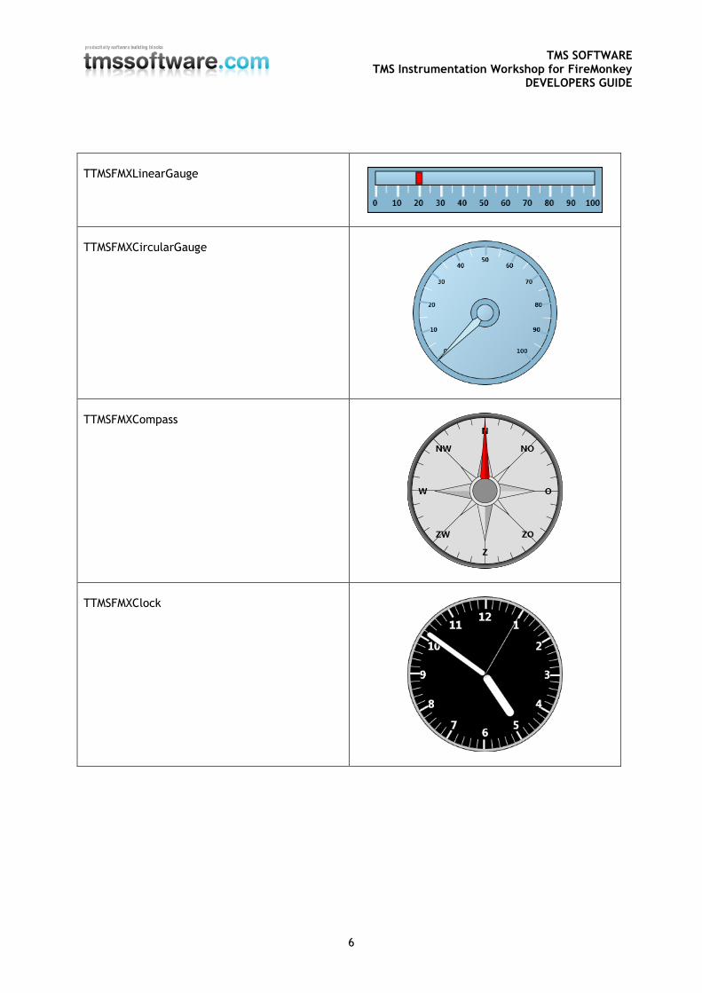
Components
TTMSFMX7SegLED
TTMSFMXJogMeter
TMS SOFTWARE TMS Instrumentation Workshop for FireMonkey
DEVELOPERS GUIDE
6
TTMSFMXLinearGauge
TTMSFMXCircularGauge
TTMSFMXCompass
TTMSFMXClock
TMS SOFTWARE TMS Instrumentation Workshop for FireMonkey
DEVELOPERS GUIDE
7
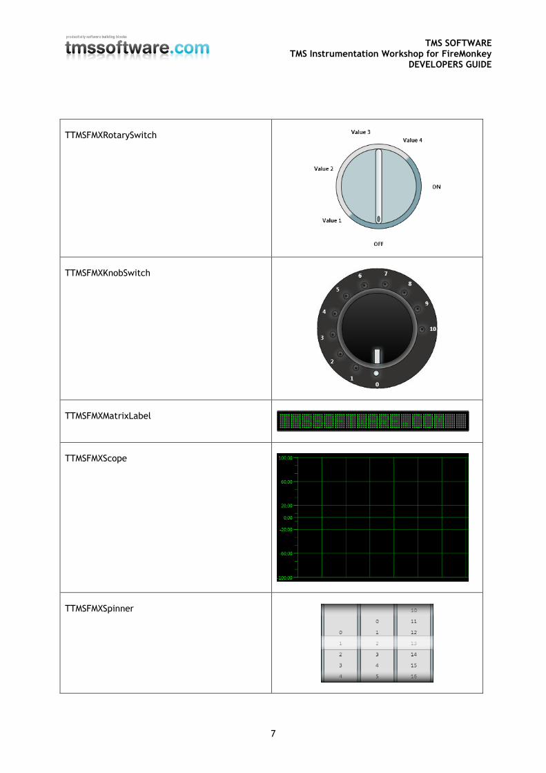
TTMSFMXRotarySwitch
TTMSFMXKnobSwitch
TTMSFMXMatrixLabel
TTMSFMXScope
TTMSFMXSpinner
TMS SOFTWARE TMS Instrumentation Workshop for FireMonkey
DEVELOPERS GUIDE
8
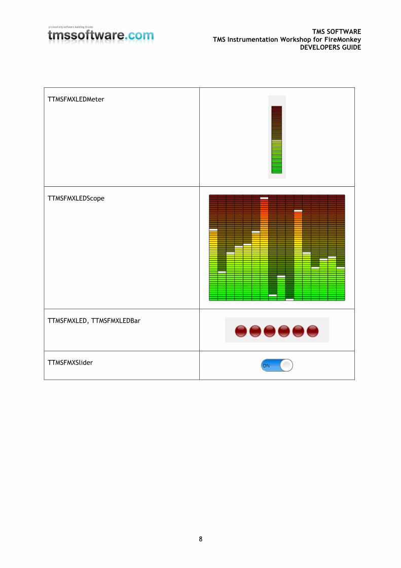
TTMSFMXLEDMeter
TTMSFMXLEDScope
TTMSFMXLED, TTMSFMXLEDBar
TTMSFMXSlider
TMS SOFTWARE TMS Instrumentation Workshop for FireMonkey
DEVELOPERS GUIDE
9
TMS Instrumentation Workshop components in detail
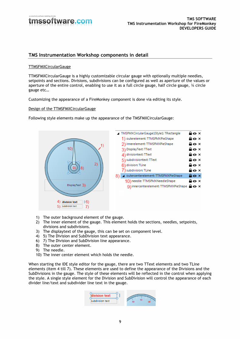
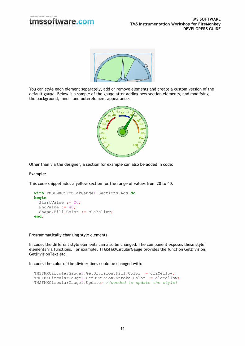
TTMSFMXCircularGauge TTMSFMXCircularGauge is a highly customizable circular gauge with optionally multiple needles, setpoints and sections. Divisions, subdivisions can be configured as well as aperture of the values or aperture of the entire control, enabling to use it as a full circle gauge, half circle gauge, ¾ circle gauge etc… Customizing the appearance of a FireMonkey component is done via editing its style. Design of the TTMSFMXCircularGauge Following style elements make up the appearance of the TMSFMXCircularGauge:
1) The outer background element of the gauge. 2) The inner element of the gauge. This element holds the sections, needles, setpoints,
divisions and subdivisions. 3) The displaytext of the gauge, this can be set on component level. 4) 5) The Division and SubDivision text appearance. 6) 7) The Division and SubDivision line appearance. 8) The outer center element. 9) The needle. 10) The inner center element which holds the needle.
When starting the IDE style editor for the gauge, there are two TText elements and two TLine elements (item 4 till 7). These elements are used to define the appearance of the Divisions and the SubDivisions in the gauge. The style of these elements will be reflected in the control when applying the style. A single style element for the Division and SubDivision will control the appearance of each divider line/text and subdivider line text in the gauge.
TMS SOFTWARE TMS Instrumentation Workshop for FireMonkey
DEVELOPERS GUIDE
10
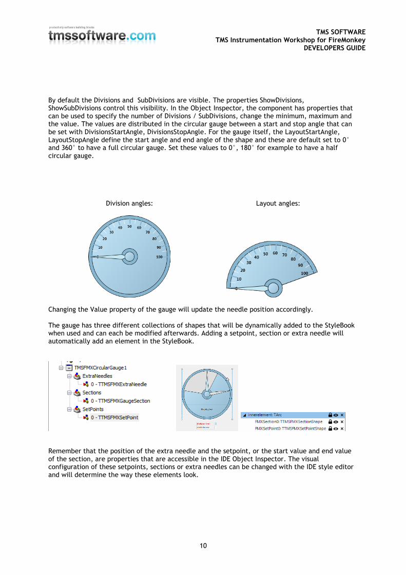
By default the Divisions and SubDivisions are visible. The properties ShowDivisions, ShowSubDivisions control this visibility. In the Object Inspector, the component has properties that can be used to specify the number of Divisions / SubDivisions, change the minimum, maximum and the value. The values are distributed in the circular gauge between a start and stop angle that can be set with DivisionsStartAngle, DivisionsStopAngle. For the gauge itself, the LayoutStartAngle, LayoutStopAngle define the start angle and end angle of the shape and these are default set to 0° and 360° to have a full circular gauge. Set these values to 0°, 180° for example to have a half circular gauge.
Division angles: Layout angles:
Changing the Value property of the gauge will update the needle position accordingly. The gauge has three different collections of shapes that will be dynamically added to the StyleBook when used and can each be modified afterwards. Adding a setpoint, section or extra needle will automatically add an element in the StyleBook.
Remember that the position of the extra needle and the setpoint, or the start value and end value of the section, are properties that are accessible in the IDE Object Inspector. The visual configuration of these setpoints, sections or extra needles can be changed with the IDE style editor and will determine the way these elements look.
TMS SOFTWARE TMS Instrumentation Workshop for FireMonkey
DEVELOPERS GUIDE
11
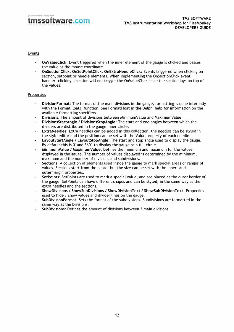
You can style each element separately, add or remove elements and create a custom version of the default gauge. Below is a sample of the gauge after adding new section elements, and modifying the background, inner- and outerelement appearances.
Other than via the designer, a section for example can also be added in code: Example: This code snippet adds a yellow section for the range of values from 20 to 40: with TMSFMXCircularGauge1.Sections.Add do
begin
StartValue := 20;
EndValue := 40;
Shape.Fill.Color := claYellow;
end;
Programmatically changing style elements In code, the different style elements can also be changed. The component exposes these style elements via functions. For example, TTMSFMXCircularGauge provides the function GetDivision, GetDivisionText etc… In code, the color of the divider lines could be changed with: TMSFMXCircularGauge1.GetDivision.Fill.Color := claYellow;
TMSFMXCircularGauge1.GetDivision.Stroke.Color := claYellow;
TMSFMXCircularGauge1.Update; //needed to update the style!
TMS SOFTWARE TMS Instrumentation Workshop for FireMonkey
DEVELOPERS GUIDE
12
Events
- OnValueClick: Event triggered when the inner element of the gauge is clicked and passes the value at the mouse coordinate.
- OnSectionClick, OnSetPointClick, OnExtraNeedleClick: Events triggered when clicking on section, setpoint or needle elements. When implementing the OnSectionClick event handler, clicking a section will not trigger the OnValueClick since the section lays on top of the values.
Properties
- DivisionFormat: The format of the main divisions in the gauge, formatting is done internally with the FormatFloat() function. See FormatFloat in the Delphi help for information on the available formatting specifiers.
- Divisions: The amount of divisions between MinimumValue and MaximumValue. - DivisionsStartAngle / DivisionsStopAngle: The start and end angles between which the
dividers are distributed in the gauge inner circle. - ExtraNeedles: Extra needles can be added in this collection, the needles can be styled in
the style editor and the position can be set with the Value property of each needle. - LayoutStartAngle / LayoutStopAngle: The start and stop angle used to display the gauge.
By default this is 0°and 360° to display the gauge as a full circle. - MinimumValue / MaximumValue: Defines the minimum and maximum for the values
displayed in the gauge. The number of values displayed is determined by the minimum, maximum and the number of divisions and subdivisions.
- Sections: A collection of elements used inside the gauge to mark special areas or ranges of values. Sections start from the center but the size can be set with the inner- and outermargin properties.
- SetPoints: SetPoints are used to mark a special value, and are placed at the outer border of the gauge. SetPoints can have different shapes and can be styled, in the same way as the extra needles and the sections.
- ShowDivisions / ShowSubDivisions / ShowDivisionText / ShowSubDivisionText: Properties used to hide / show values and divider lines on the gauge.
- SubDivisionFormat: Sets the format of the subdivisions. Subdivisions are formatted in the same way as the Divisions.
- SubDivisions: Defines the amount of divisions between 2 main divisions.
TMS SOFTWARE TMS Instrumentation Workshop for FireMonkey
DEVELOPERS GUIDE
13
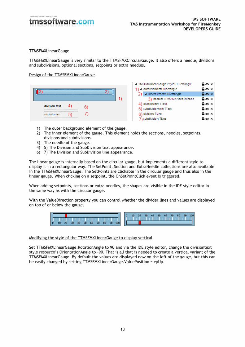
TTMSFMXLinearGauge TTMSFMXLinearGauge is very similar to the TTMSFMXCircularGauge. It also offers a needle, divisions and subdivisions, optional sections, setpoints or extra needles. Design of the TTMSFMXLinearGauge
1) The outer background element of the gauge. 2) The inner element of the gauge. This element holds the sections, needles, setpoints,
divisions and subdivisions. 3) The needle of the gauge. 4) 5) The Division and SubDivision text appearance. 6) 7) The Division and SubDivision line appearance.
The linear gauge is internally based on the circular gauge, but implements a different style to display it in a rectangular way. The SetPoint, Section and ExtraNeedle collections are also available in the TTMSFMXLinearGauge. The SetPoints are clickable in the circular gauge and thus also in the linear gauge. When clicking on a setpoint, the OnSetPointClick event is triggered. When adding setpoints, sections or extra needles, the shapes are visible in the IDE style editor in the same way as with the circular gauge. With the ValueDirection property you can control whether the divider lines and values are displayed on top of or below the gauge.
Modifying the style of the TTMSFMXLinearGauge to display vertical Set TTMSFMXLinearGauge.RotationAngle to 90 and via the IDE style editor, change the divisiontext style resource’s OrientationAngle to -90. That is all that is needed to create a vertical variant of the TTMSFMXLinearGauge. By default the values are displayed now on the left of the gauge, but this can be easily changed by setting TTMSFMXLinearGauge.ValuePosition = vpUp.
TMS SOFTWARE TMS Instrumentation Workshop for FireMonkey
DEVELOPERS GUIDE
14
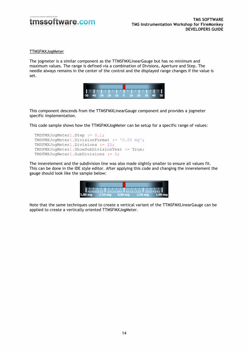
TTMSFMXJogMeter The jogmeter is a similar component as the TTMSFMXLinearGauge but has no minimum and maximum values. The range is defined via a combination of Divisions, Aperture and Step. The needle always remains in the center of the control and the displayed range changes if the value is set.
This component descends from the TTMSFMXLinearGauge component and provides a jogmeter specific implementation. This code sample shows how the TTMSFMXJogMeter can be setup for a specific range of values: TMSFMXJogMeter1.Step := 0.1;
TMSFMXJogMeter1.DivisionFormat := '0.00 mg';
TMSFMXJogMeter1.Divisions := 25;
TMSFMXJogMeter1.ShowSubDivisionText := True;
TMSFMXJogMeter1.SubDivisions := 5;
The innerelement and the subdivision line was also made slightly smaller to ensure all values fit. This can be done in the IDE style editor. After applying this code and changing the innerelement the gauge should look like the sample below:
Note that the same techniques used to create a vertical variant of the TTMSFMXLinearGauge can be applied to create a vertically oriented TTMSFMXJogMeter.
TMS SOFTWARE TMS Instrumentation Workshop for FireMonkey
DEVELOPERS GUIDE
15
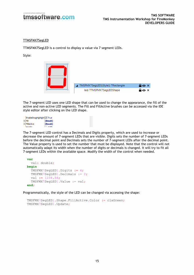
TTMSFMX7SegLED TTMSFMX7SegLED is a control to display a value via 7 segment LEDs. Style:
The 7-segment LED uses one LED shape that can be used to change the appearance, the fill of the active and non-active LED segments. The Fill and FillActive brushes can be accessed via the IDE style editor after clicking on the LED shape.
The 7-segment LED control has a Decimals and Digits property, which are used to increase or decrease the amount of 7-segment LEDs that are visible. Digits sets the number of 7-segment LEDs before the decimal point and Decimals sets the number of 7-segment LEDs after the decimal point. The Value property is used to set the number that must be displayed. Note that the control will not automatically adapt its width when the number of digits or decimals is changed. It will try to fit all 7-segment LEDs within the available space. Modify the width of the control when needed. var
val: double;
begin
TMSFMX7SegLED1.Digits := 4;
TMSFMX7SegLED1.Decimals := 2;
val := 1234.56;
TMSFMX7SegLED1.Value := val;
end;
Programmatically, the style of the LED can be changed via accessing the shape: TMSFMX7SegLED1.Shape.FillActive.Color := claGreen;
TMSFMX7SegLED1.Update;
TMS SOFTWARE TMS Instrumentation Workshop for FireMonkey
DEVELOPERS GUIDE
16
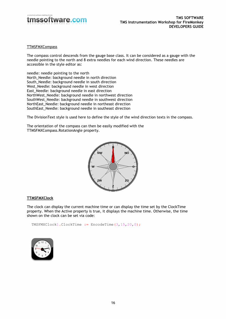
TTMSFMXCompass The compass control descends from the gauge base class. It can be considered as a gauge with the needle pointing to the north and 8 extra needles for each wind direction. These needles are accessible in the style editor as: needle: needle pointing to the north North_Needle: background needle in north direction South_Needle: background needle in south direction West_Needle: background needle in west direction East_Needle: background needle in east direction NorthWest_Needle: background needle in northwest direction SouthWest_Needle: background needle in southwest direction NorthEast_Needle: background needle in northeast direction SouthEast_Needle: background needle in southeast direction The DivisionText style is used here to define the style of the wind direction texts in the compass. The orientation of the compass can then be easily modified with the TTMSFMXCompass.RotationAngle property.
TTMSFMXClock The clock can display the current machine time or can display the time set by the ClockTime property. When the Active property is true, it displays the machine time. Otherwise, the time shown on the clock can be set via code: TMSFMXClock1.ClockTime := EncodeTime(3,15,20,0);
TMS SOFTWARE TMS Instrumentation Workshop for FireMonkey
DEVELOPERS GUIDE
17
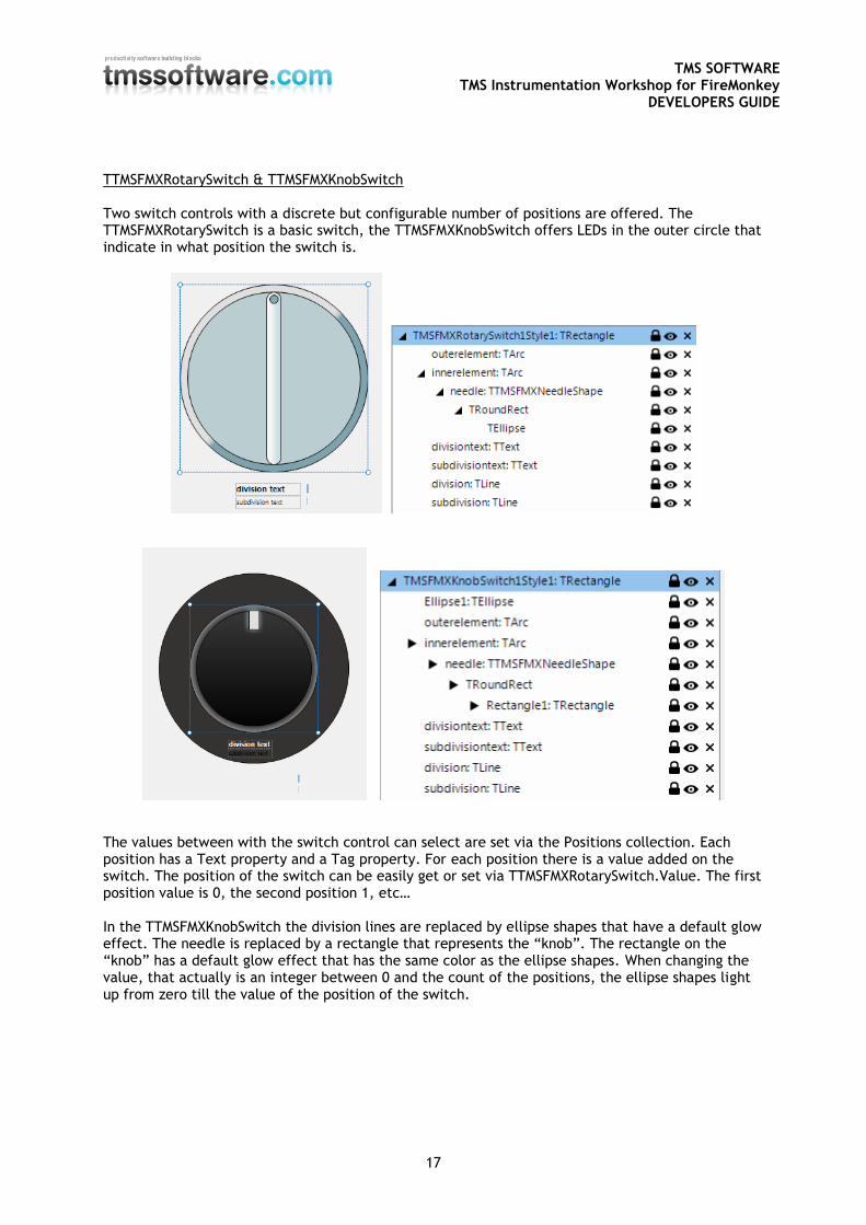
TTMSFMXRotarySwitch & TTMSFMXKnobSwitch Two switch controls with a discrete but configurable number of positions are offered. The TTMSFMXRotarySwitch is a basic switch, the TTMSFMXKnobSwitch offers LEDs in the outer circle that indicate in what position the switch is.
The values between with the switch control can select are set via the Positions collection. Each position has a Text property and a Tag property. For each position there is a value added on the switch. The position of the switch can be easily get or set via TTMSFMXRotarySwitch.Value. The first position value is 0, the second position 1, etc… In the TTMSFMXKnobSwitch the division lines are replaced by ellipse shapes that have a default glow effect. The needle is replaced by a rectangle that represents the “knob”. The rectangle on the “knob” has a default glow effect that has the same color as the ellipse shapes. When changing the value, that actually is an integer between 0 and the count of the positions, the ellipse shapes light up from zero till the value of the position of the switch.
TMS SOFTWARE TMS Instrumentation Workshop for FireMonkey
DEVELOPERS GUIDE
18
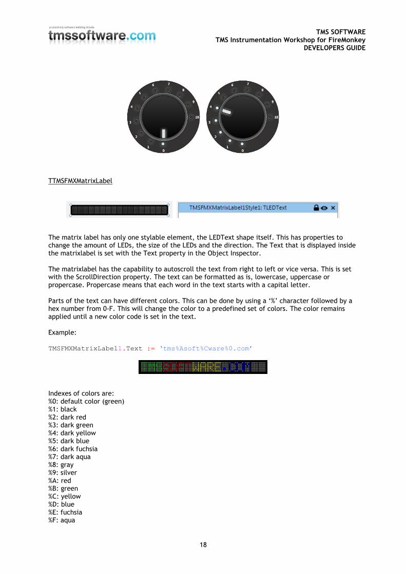
TTMSFMXMatrixLabel
The matrix label has only one stylable element, the LEDText shape itself. This has properties to change the amount of LEDs, the size of the LEDs and the direction. The Text that is displayed inside the matrixlabel is set with the Text property in the Object Inspector. The matrixlabel has the capability to autoscroll the text from right to left or vice versa. This is set with the ScrollDirection property. The text can be formatted as is, lowercase, uppercase or propercase. Propercase means that each word in the text starts with a capital letter. Parts of the text can have different colors. This can be done by using a ‘%’ character followed by a hex number from 0-F. This will change the color to a predefined set of colors. The color remains applied until a new color code is set in the text. Example: TMSFMXMatrixLabel1.Text := ‘tms%Asoft%Cware%0.com’
Indexes of colors are: %0: default color (green) %1: black %2: dark red %3: dark green %4: dark yellow %5: dark blue %6: dark fuchsia %7: dark aqua %8: gray %9: silver %A: red %B: green %C: yellow %D: blue %E: fuchsia %F: aqua
TMS SOFTWARE TMS Instrumentation Workshop for FireMonkey
DEVELOPERS GUIDE
19
Properties
- AutoScroll: Automatically scrolls the text from in the scrolldirection if true. - ScrollDirection: The direction in which the text scrolls if the AutoScroll property is true. - Text: The text of the label. - TimeInterval: Sets the scroll speed.
Style element properties
- LEDs: The number of visible matrix LEDs. - LEDStyle: The size of the matrix LEDs : ls14x20, ls19x27, ls9x13. - LEDsVisible: Shows / hides the inactive LEDs in the matrix. - Margin: the amount of spacing between the top / bottom of the label and the LEDs. - Orientation: LEDs can be displayed horizontal / vertical. - Spacing: The amount of spacing between the LEDs - Text: The text of the label. The text set in the StyleBook is overriden by the property at
component level. - TextColor: The default color of the text. - TextStyle: The automatic casing that will be applied: uppercase, lowercase, propercase or
as is.
TMS SOFTWARE TMS Instrumentation Workshop for FireMonkey
DEVELOPERS GUIDE
20
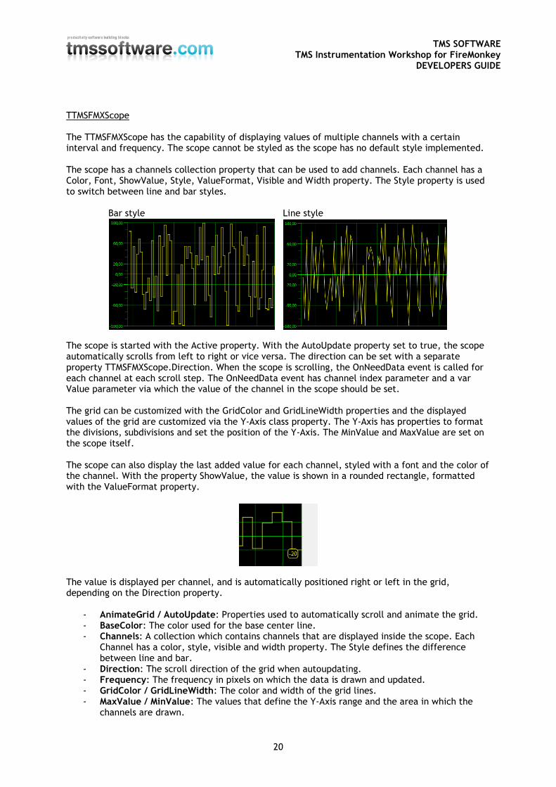
TTMSFMXScope The TTMSFMXScope has the capability of displaying values of multiple channels with a certain interval and frequency. The scope cannot be styled as the scope has no default style implemented. The scope has a channels collection property that can be used to add channels. Each channel has a Color, Font, ShowValue, Style, ValueFormat, Visible and Width property. The Style property is used to switch between line and bar styles. Bar style Line style
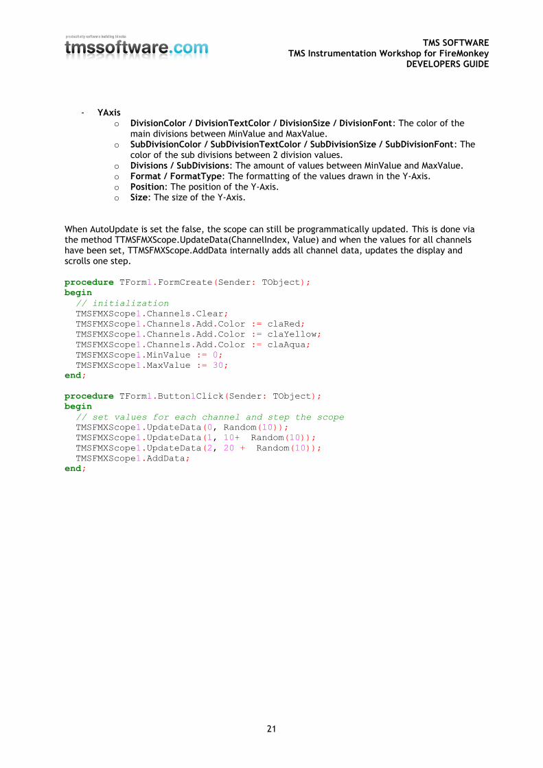
The scope is started with the Active property. With the AutoUpdate property set to true, the scope automatically scrolls from left to right or vice versa. The direction can be set with a separate property TTMSFMXScope.Direction. When the scope is scrolling, the OnNeedData event is called for each channel at each scroll step. The OnNeedData event has channel index parameter and a var Value parameter via which the value of the channel in the scope should be set. The grid can be customized with the GridColor and GridLineWidth properties and the displayed values of the grid are customized via the Y-Axis class property. The Y-Axis has properties to format the divisions, subdivisions and set the position of the Y-Axis. The MinValue and MaxValue are set on the scope itself. The scope can also display the last added value for each channel, styled with a font and the color of the channel. With the property ShowValue, the value is shown in a rounded rectangle, formatted with the ValueFormat property.
The value is displayed per channel, and is automatically positioned right or left in the grid, depending on the Direction property.
- AnimateGrid / AutoUpdate: Properties used to automatically scroll and animate the grid. - BaseColor: The color used for the base center line. - Channels: A collection which contains channels that are displayed inside the scope. Each
Channel has a color, style, visible and width property. The Style defines the difference between line and bar.
- Direction: The scroll direction of the grid when autoupdating. - Frequency: The frequency in pixels on which the data is drawn and updated. - GridColor / GridLineWidth: The color and width of the grid lines. - MaxValue / MinValue: The values that define the Y-Axis range and the area in which the
channels are drawn.
TMS SOFTWARE TMS Instrumentation Workshop for FireMonkey
DEVELOPERS GUIDE
21
- YAxis o DivisionColor / DivisionTextColor / DivisionSize / DivisionFont: The color of the
main divisions between MinValue and MaxValue. o SubDivisionColor / SubDivisionTextColor / SubDivisionSize / SubDivisionFont: The
color of the sub divisions between 2 division values. o Divisions / SubDivisions: The amount of values between MinValue and MaxValue. o Format / FormatType: The formatting of the values drawn in the Y-Axis. o Position: The position of the Y-Axis. o Size: The size of the Y-Axis.
When AutoUpdate is set the false, the scope can still be programmatically updated. This is done via the method TTMSFMXScope.UpdateData(ChannelIndex, Value) and when the values for all channels have been set, TTMSFMXScope.AddData internally adds all channel data, updates the display and scrolls one step. procedure TForm1.FormCreate(Sender: TObject);
begin
// initialization
TMSFMXScope1.Channels.Clear;
TMSFMXScope1.Channels.Add.Color := claRed;
TMSFMXScope1.Channels.Add.Color := claYellow;
TMSFMXScope1.Channels.Add.Color := claAqua;
TMSFMXScope1.MinValue := 0;
TMSFMXScope1.MaxValue := 30;
end;
procedure TForm1.Button1Click(Sender: TObject);
begin
// set values for each channel and step the scope
TMSFMXScope1.UpdateData(0, Random(10));
TMSFMXScope1.UpdateData(1, 10+ Random(10));
TMSFMXScope1.UpdateData(2, 20 + Random(10));
TMSFMXScope1.AddData;
end;
TMS SOFTWARE TMS Instrumentation Workshop for FireMonkey
DEVELOPERS GUIDE
22
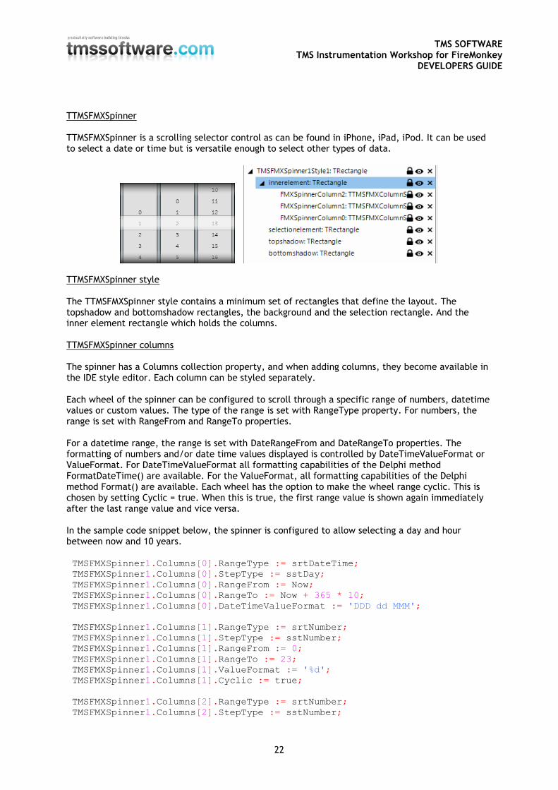
TTMSFMXSpinner TTMSFMXSpinner is a scrolling selector control as can be found in iPhone, iPad, iPod. It can be used to select a date or time but is versatile enough to select other types of data.
TTMSFMXSpinner style The TTMSFMXSpinner style contains a minimum set of rectangles that define the layout. The topshadow and bottomshadow rectangles, the background and the selection rectangle. And the inner element rectangle which holds the columns. TTMSFMXSpinner columns The spinner has a Columns collection property, and when adding columns, they become available in the IDE style editor. Each column can be styled separately. Each wheel of the spinner can be configured to scroll through a specific range of numbers, datetime values or custom values. The type of the range is set with RangeType property. For numbers, the range is set with RangeFrom and RangeTo properties. For a datetime range, the range is set with DateRangeFrom and DateRangeTo properties. The formatting of numbers and/or date time values displayed is controlled by DateTimeValueFormat or ValueFormat. For DateTimeValueFormat all formatting capabilities of the Delphi method FormatDateTime() are available. For the ValueFormat, all formatting capabilities of the Delphi method Format() are available. Each wheel has the option to make the wheel range cyclic. This is chosen by setting Cyclic = true. When this is true, the first range value is shown again immediately after the last range value and vice versa. In the sample code snippet below, the spinner is configured to allow selecting a day and hour between now and 10 years. TMSFMXSpinner1.Columns[0].RangeType := srtDateTime; TMSFMXSpinner1.Columns[0].StepType := sstDay;
TMSFMXSpinner1.Columns[0].RangeFrom := Now;
TMSFMXSpinner1.Columns[0].RangeTo := Now + 365 * 10;
TMSFMXSpinner1.Columns[0].DateTimeValueFormat := 'DDD dd MMM';
TMSFMXSpinner1.Columns[1].RangeType := srtNumber;
TMSFMXSpinner1.Columns[1].StepType := sstNumber;
TMSFMXSpinner1.Columns[1].RangeFrom := 0;
TMSFMXSpinner1.Columns[1].RangeTo := 23;
TMSFMXSpinner1.Columns[1].ValueFormat := '%d';
TMSFMXSpinner1.Columns[1].Cyclic := true;
TMSFMXSpinner1.Columns[2].RangeType := srtNumber;
TMSFMXSpinner1.Columns[2].StepType := sstNumber;
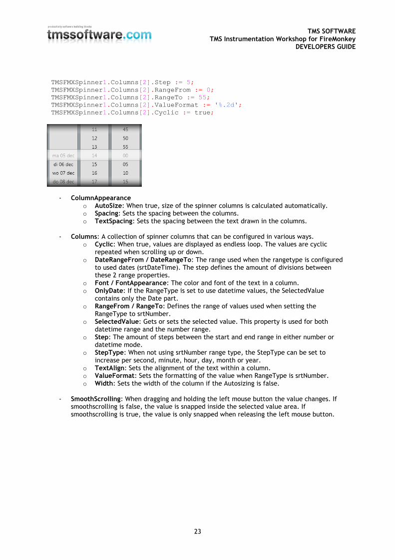
TMS SOFTWARE TMS Instrumentation Workshop for FireMonkey
DEVELOPERS GUIDE
23
TMSFMXSpinner1.Columns[2].Step := 5;
TMSFMXSpinner1.Columns[2].RangeFrom := 0;
TMSFMXSpinner1.Columns[2].RangeTo := 55;
TMSFMXSpinner1.Columns[2].ValueFormat := '%.2d';
TMSFMXSpinner1.Columns[2].Cyclic := true;
- ColumnAppearance o AutoSize: When true, size of the spinner columns is calculated automatically. o Spacing: Sets the spacing between the columns. o TextSpacing: Sets the spacing between the text drawn in the columns.
- Columns: A collection of spinner columns that can be configured in various ways.
o Cyclic: When true, values are displayed as endless loop. The values are cyclic repeated when scrolling up or down.
o DateRangeFrom / DateRangeTo: The range used when the rangetype is configured to used dates (srtDateTime). The step defines the amount of divisions between these 2 range properties.
o Font / FontAppearance: The color and font of the text in a column. o OnlyDate: If the RangeType is set to use datetime values, the SelectedValue
contains only the Date part. o RangeFrom / RangeTo: Defines the range of values used when setting the
RangeType to srtNumber. o SelectedValue: Gets or sets the selected value. This property is used for both
datetime range and the number range. o Step: The amount of steps between the start and end range in either number or
datetime mode. o StepType: When not using srtNumber range type, the StepType can be set to
increase per second, minute, hour, day, month or year. o TextAlign: Sets the alignment of the text within a column. o ValueFormat: Sets the formatting of the value when RangeType is srtNumber. o Width: Sets the width of the column if the Autosizing is false.
- SmoothScrolling: When dragging and holding the left mouse button the value changes. If
smoothscrolling is false, the value is snapped inside the selected value area. If smoothscrolling is true, the value is only snapped when releasing the left mouse button.
TMS SOFTWARE TMS Instrumentation Workshop for FireMonkey
DEVELOPERS GUIDE
24
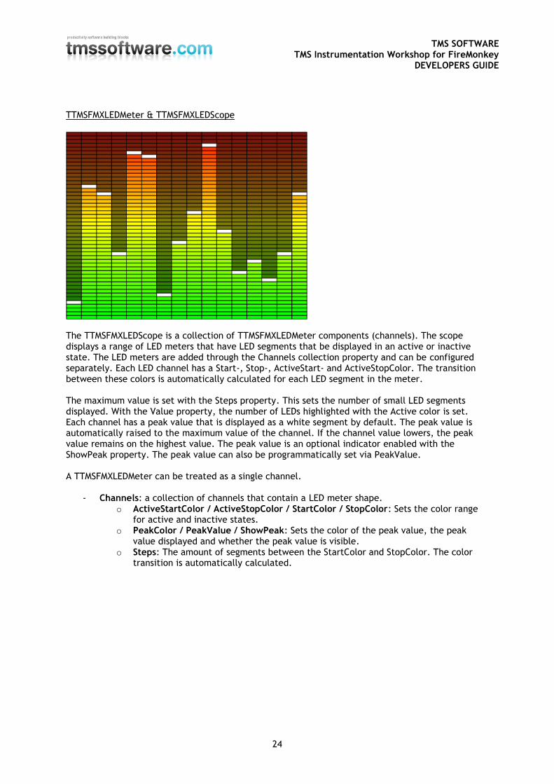
TTMSFMXLEDMeter & TTMSFMXLEDScope
The TTMSFMXLEDScope is a collection of TTMSFMXLEDMeter components (channels). The scope displays a range of LED meters that have LED segments that be displayed in an active or inactive state. The LED meters are added through the Channels collection property and can be configured separately. Each LED channel has a Start-, Stop-, ActiveStart- and ActiveStopColor. The transition between these colors is automatically calculated for each LED segment in the meter. The maximum value is set with the Steps property. This sets the number of small LED segments displayed. With the Value property, the number of LEDs highlighted with the Active color is set. Each channel has a peak value that is displayed as a white segment by default. The peak value is automatically raised to the maximum value of the channel. If the channel value lowers, the peak value remains on the highest value. The peak value is an optional indicator enabled with the ShowPeak property. The peak value can also be programmatically set via PeakValue. A TTMSFMXLEDMeter can be treated as a single channel.
- Channels: a collection of channels that contain a LED meter shape. o ActiveStartColor / ActiveStopColor / StartColor / StopColor: Sets the color range
for active and inactive states. o PeakColor / PeakValue / ShowPeak: Sets the color of the peak value, the peak
value displayed and whether the peak value is visible. o Steps: The amount of segments between the StartColor and StopColor. The color
transition is automatically calculated.
TMS SOFTWARE TMS Instrumentation Workshop for FireMonkey
DEVELOPERS GUIDE
25
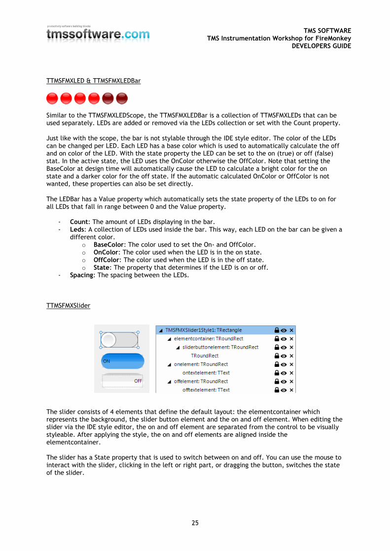
TTMSFMXLED & TTMSFMXLEDBar
Similar to the TTMSFMXLEDScope, the TTMSFMXLEDBar is a collection of TTMSFMXLEDs that can be used separately. LEDs are added or removed via the LEDs collection or set with the Count property. Just like with the scope, the bar is not stylable through the IDE style editor. The color of the LEDs can be changed per LED. Each LED has a base color which is used to automatically calculate the off and on color of the LED. With the state property the LED can be set to the on (true) or off (false) stat. In the active state, the LED uses the OnColor otherwise the OffColor. Note that setting the BaseColor at design time will automatically cause the LED to calculate a bright color for the on state and a darker color for the off state. If the automatic calculated OnColor or OffColor is not wanted, these properties can also be set directly. The LEDBar has a Value property which automatically sets the state property of the LEDs to on for all LEDs that fall in range between 0 and the Value property.
- Count: The amount of LEDs displaying in the bar. - Leds: A collection of LEDs used inside the bar. This way, each LED on the bar can be given a
different color. o BaseColor: The color used to set the On- and OffColor. o OnColor: The color used when the LED is in the on state. o OffColor: The color used when the LED is in the off state. o State: The property that determines if the LED is on or off.
- Spacing: The spacing between the LEDs. TTMSFMXSlider
The slider consists of 4 elements that define the default layout: the elementcontainer which represents the background, the slider button element and the on and off element. When editing the slider via the IDE style editor, the on and off element are separated from the control to be visually styleable. After applying the style, the on and off elements are aligned inside the elementcontainer. The slider has a State property that is used to switch between on and off. You can use the mouse to interact with the slider, clicking in the left or right part, or dragging the button, switches the state of the slider.
TMS SOFTWARE TMS Instrumentation Workshop for FireMonkey
DEVELOPERS GUIDE
26
General FireMonkey component usage guidlines
With the new FireMonkey framework, the methodology to create and use components has dramatically changed. A component now exists of 2 parts. Visual part The visual part is stored in a .style file, which is compiled to a .res file through an .rc file. The .rc file is included in the package and must be recompiled whenever a change is made to the .style file. For each component in this set you will find a .style file. In this file, the default layout of the component is stored. You will notice different elements, basic elements such as an arc, ellipse, rectangle … The elements combine and define the layout of a control. The basic elements are called shapes, and are already available by default. The TMS Instrumentation Workshop for FireMonkey takes this new way of styling one step further: custom shapes. In several components you will find custom shapes registered and useable in a new application, and used in the component by default. Each shape or element can have a StyleName, which is used in the non-visual part of the control for interaction. This name is key in the relationship or “style-contract” between style resource and component code. Non-visual part The non-visual part of the component interacts with the shapes defined in the .style file. This is a normal .pas unit file as was used for VCL component, yet little to no painting is done in code. As explained above, the visual part is already defined by the style. The component defined in this unit needs to inherit from the TStyledControl class, which can be styled at designtime. This is the base class for all styleable controls, just like the TCustomControl class was the base class for most controls in the VCL framework. Naming convention It is always good practice to handle a consistent naming convention, therefore all .rc, .pas files and .style files should start with the FireMonkey unit scope name “FMX.”, such as the units: FMX.Types, FMX.Dialogs, FMX.Objects … Inside the style file each element can have a StyleName, which can be used in the non-visual part to address the resource. Make sure each element has a unique StyleName to avoid mistakes when interacting with the component. All combinations of elements must be encapsulated within a rectangle element that is invisible by default (through the Fill.Kind and Stroke.Kind = bkNone), and has the StyleName of the component. If you have a component named TFMXMyFirstControl, the the StyleName of the rectangle encapsulating all other elements must be set to FMXMyFirstControlStyle. The “T” is removed and “Style” is added. Styling Each component inherits from TTMSFMXBaseControl which implements a basic Fill and Stroke, and handles the style resource files that define the default layout of the component. To change the visuals of the component you no longer have corresponding properties in the object inspector.
TMS SOFTWARE TMS Instrumentation Workshop for FireMonkey
DEVELOPERS GUIDE
27
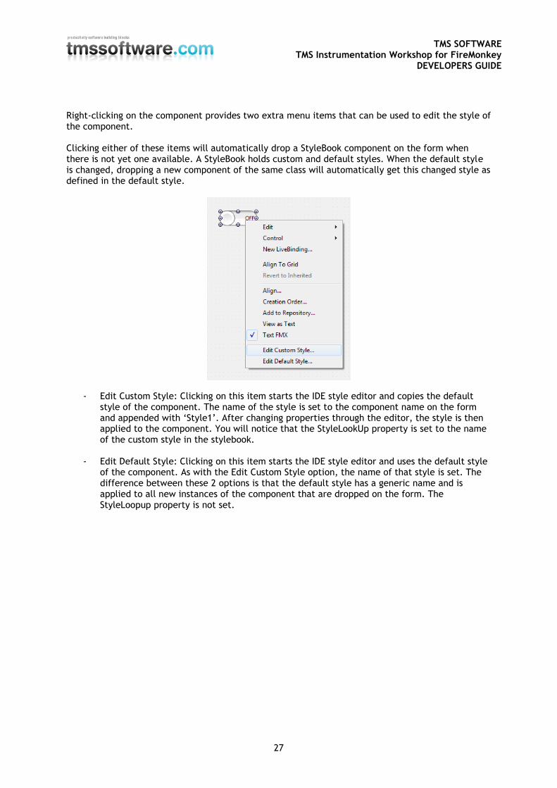
Right-clicking on the component provides two extra menu items that can be used to edit the style of the component. Clicking either of these items will automatically drop a StyleBook component on the form when there is not yet one available. A StyleBook holds custom and default styles. When the default style is changed, dropping a new component of the same class will automatically get this changed style as defined in the default style.
- Edit Custom Style: Clicking on this item starts the IDE style editor and copies the default style of the component. The name of the style is set to the component name on the form and appended with ‘Style1’. After changing properties through the editor, the style is then applied to the component. You will notice that the StyleLookUp property is set to the name of the custom style in the stylebook.
- Edit Default Style: Clicking on this item starts the IDE style editor and uses the default style of the component. As with the Edit Custom Style option, the name of that style is set. The difference between these 2 options is that the default style has a generic name and is applied to all new instances of the component that are dropped on the form. The StyleLoopup property is not set.
TMS SOFTWARE TMS Instrumentation Workshop for FireMonkey
DEVELOPERS GUIDE
28
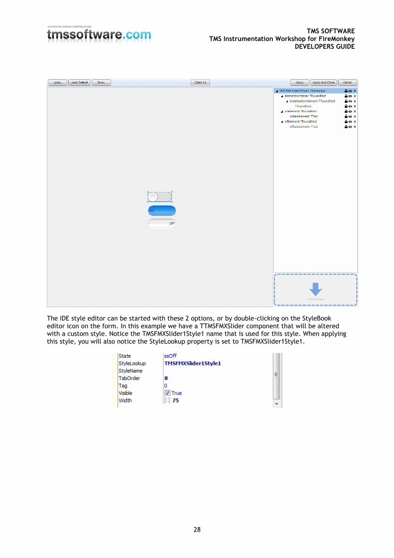
The IDE style editor can be started with these 2 options, or by double-clicking on the StyleBook editor icon on the form. In this example we have a TTMSFMXSlider component that will be altered with a custom style. Notice the TMSFMXSlider1Style1 name that is used for this style. When applying this style, you will also notice the StyleLookup property is set to TMSFMXSlider1Style1.
TMS SOFTWARE TMS Instrumentation Workshop for FireMonkey
DEVELOPERS GUIDE
29
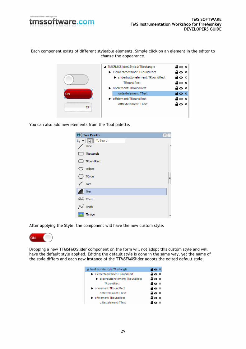
Each component exists of different styleable elements. Simple click on an element in the editor to change the appearance.
You can also add new elements from the Tool palette.
After applying the Style, the component will have the new custom style.
Dropping a new TTMSFMXSlider component on the form will not adopt this custom style and will have the default style applied. Editing the default style is done in the same way, yet the name of the style differs and each new instance of the TTMSFMXSlider adopts the edited default style.
TMS SOFTWARE TMS Instrumentation Workshop for FireMonkey
DEVELOPERS GUIDE
30
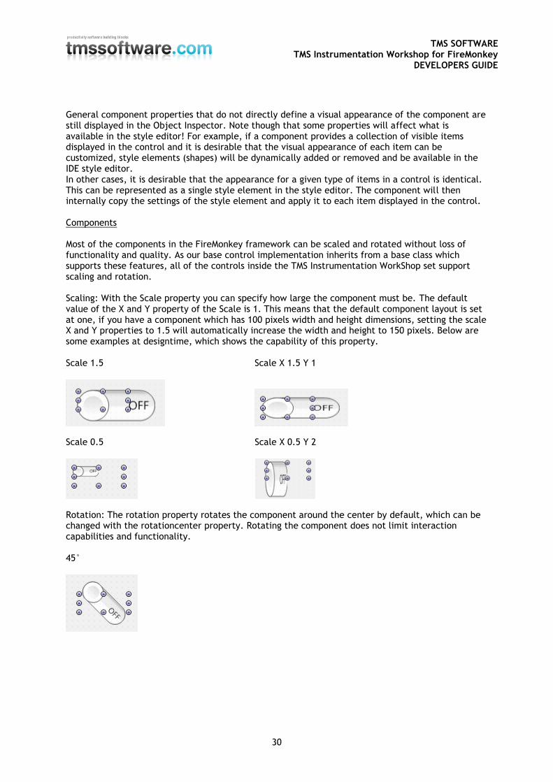
General component properties that do not directly define a visual appearance of the component are still displayed in the Object Inspector. Note though that some properties will affect what is available in the style editor! For example, if a component provides a collection of visible items displayed in the control and it is desirable that the visual appearance of each item can be customized, style elements (shapes) will be dynamically added or removed and be available in the IDE style editor. In other cases, it is desirable that the appearance for a given type of items in a control is identical. This can be represented as a single style element in the style editor. The component will then internally copy the settings of the style element and apply it to each item displayed in the control. Components Most of the components in the FireMonkey framework can be scaled and rotated without loss of functionality and quality. As our base control implementation inherits from a base class which supports these features, all of the controls inside the TMS Instrumentation WorkShop set support scaling and rotation. Scaling: With the Scale property you can specify how large the component must be. The default value of the X and Y property of the Scale is 1. This means that the default component layout is set at one, if you have a component which has 100 pixels width and height dimensions, setting the scale X and Y properties to 1.5 will automatically increase the width and height to 150 pixels. Below are some examples at designtime, which shows the capability of this property. Scale 1.5 Scale X 1.5 Y 1
Scale 0.5 Scale X 0.5 Y 2
Rotation: The rotation property rotates the component around the center by default, which can be changed with the rotationcenter property. Rotating the component does not limit interaction capabilities and functionality. 45°
TMS SOFTWARE TMS Instrumentation Workshop for FireMonkey
DEVELOPERS GUIDE
31
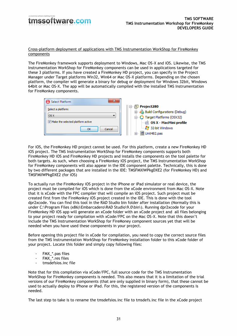
Cross-platform deployment of applications with TMS Instrumentation WorkShop for FireMonkey components The FireMonkey framework supports deployment to Windows, Mac OS-X and iOS. Likewise, the TMS Instrumentation WorkShop for FireMonkey components can be used in applications targeted for these 3 platforms. If you have created a FireMonkey HD project, you can specify in the Project Manager under Target platforms Win32, Win64 or Mac OS-X platforms. Depending on the chosen platform, the compiler will generate a binary for debug or deployment for Windows 32bit, Windows 64bit or Mac OS-X. The app will be automatically compiled with the installed TMS Instrumentation for FireMonkey components.
For iOS, the FireMonkey HD project cannot be used. For this platform, create a new FireMonkey HD iOS project. The TMS Instrumentation WorkShop for FireMonkey components supports both FireMonkey HD iOS and FireMonkey HD projects and installs the components on the tool palette for both targets. As such, when choosing a FireMonkey iOS project, the TMS Instrumentation WorkShop for FireMonkey components will also appear in the IDE component palette. Technically, this is done by two different packages that are installed in the IDE: TMSFMXIWPkgDXE2 (for FireMonkey HD) and TMSFMIIWPkgDXE2 (for iOS) To actually run the FireMonkey iOS project in the iPhone or iPad simulator or real device, the project must be compiled for iOS which is done from the xCode environment from Mac OS-X. Note that it is xCode with the FPC compiler that will compile an iOS project. Such project must be created first from the FireMonkey iOS project created in the IDE. This is done with the tool dpr2xcode. You can find this tool in the RAD Studio bin folder after installation (Normally this is under C:\Program Files (x86)\Embarcadero\RAD Studio\9.0\bin\). Running dpr2xcode for your FireMonkey HD iOS app will generate an xCode folder with an xCode project and all files belonging to your project ready for compilation with xCode/FPC on the Mac OS-X. Note that this doesn’t include the TMS Instrumentation WorkShop for FireMoney component sources yet that will be needed when you have used these components in your project. Before opening this project file in xCode for compilation, you need to copy the correct source files from the TMS Instrumentation WorkShop for FireMonkey installation folder to this xCode folder of your project. Locate this folder and simply copy following files:
- FMX_*.pas files - FMX_*.res files - tmsdefsios.inc file
Note that for this compilation via xCode/FPC, full source code for the TMS Instrumentation WorkShop for FireMonkey components is needed. This also means that it is a limitation of the trial versions of our FireMonkey components (that are only supplied in binary form), that these cannot be used to actually deploy to iPhone or iPad. For this, the registered version of the components is needed. The last step to take is to rename the tmsdefsios.inc file to tmsdefs.inc file in the xCode project
TMS SOFTWARE TMS Instrumentation Workshop for FireMonkey
DEVELOPERS GUIDE
32
folder in order to compile correctly with xCode/FPC. After opening the project in xCode, click the run button, which will automatically compile and run the project in the simulator or real device. More information about deploying on different platforms can be found on: http://docwiki.embarcadero.com/RADStudio/en/Connecting_Your_PC_to_a_Mac More information about deploying in xCode can be found on: http://docwiki.embarcadero.com/RADStudio/en/FireMonkey_Development_Setup_for_iOS
TMS SOFTWARE TMS Instrumentation Workshop for FireMonkey
DEVELOPERS GUIDE
33
Samples
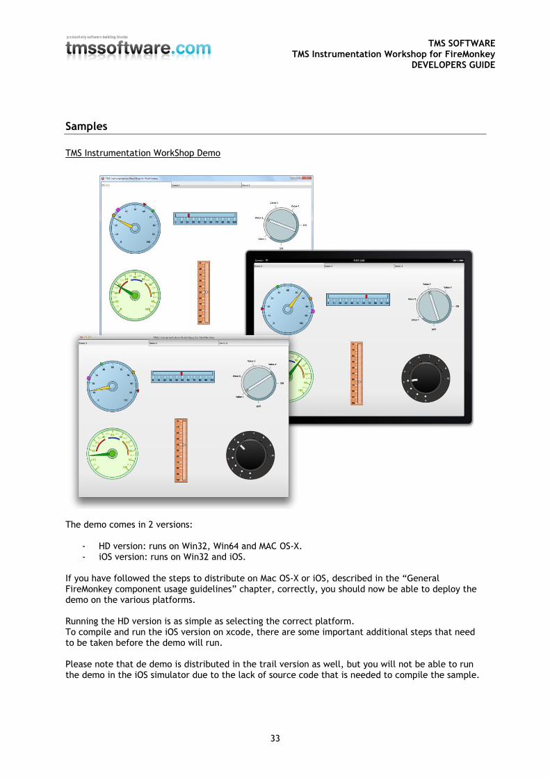
TMS Instrumentation WorkShop Demo
The demo comes in 2 versions:
- HD version: runs on Win32, Win64 and MAC OS-X. - iOS version: runs on Win32 and iOS.
If you have followed the steps to distribute on Mac OS-X or iOS, described in the “General FireMonkey component usage guidelines” chapter, correctly, you should now be able to deploy the demo on the various platforms. Running the HD version is as simple as selecting the correct platform. To compile and run the iOS version on xcode, there are some important additional steps that need to be taken before the demo will run. Please note that de demo is distributed in the trail version as well, but you will not be able to run the demo in the iOS simulator due to the lack of source code that is needed to compile the sample.
TMS SOFTWARE TMS Instrumentation Workshop for FireMonkey
DEVELOPERS GUIDE
34
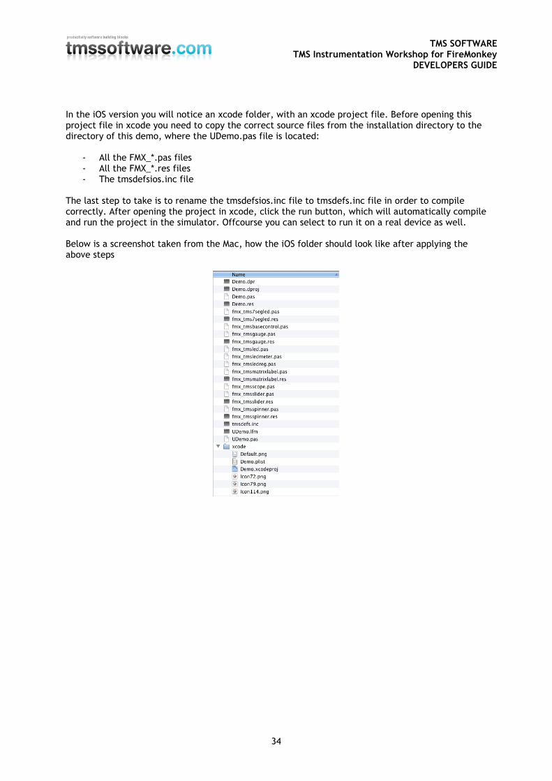
In the iOS version you will notice an xcode folder, with an xcode project file. Before opening this project file in xcode you need to copy the correct source files from the installation directory to the directory of this demo, where the UDemo.pas file is located:
- All the FMX_*.pas files - All the FMX_*.res files - The tmsdefsios.inc file
The last step to take is to rename the tmsdefsios.inc file to tmsdefs.inc file in order to compile correctly. After opening the project in xcode, click the run button, which will automatically compile and run the project in the simulator. Offcourse you can select to run it on a real device as well. Below is a screenshot taken from the Mac, how the iOS folder should look like after applying the above steps
TMS SOFTWARE TMS Instrumentation Workshop for FireMonkey
DEVELOPERS GUIDE
35
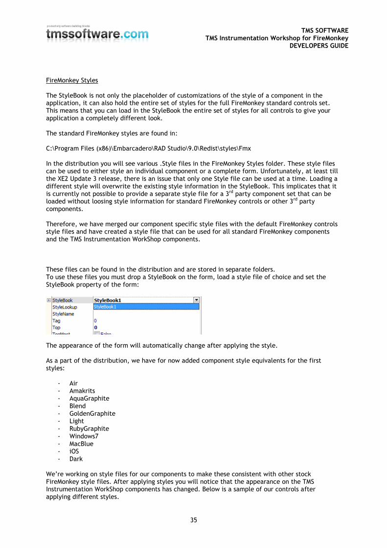
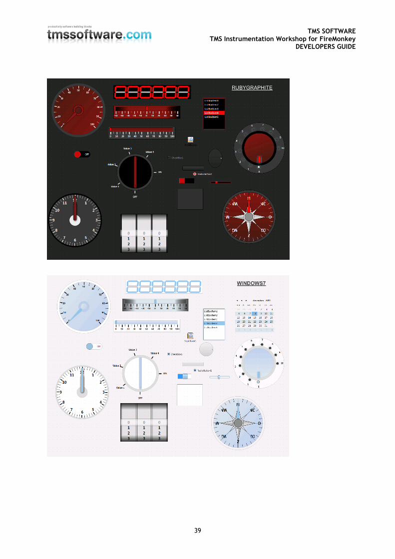
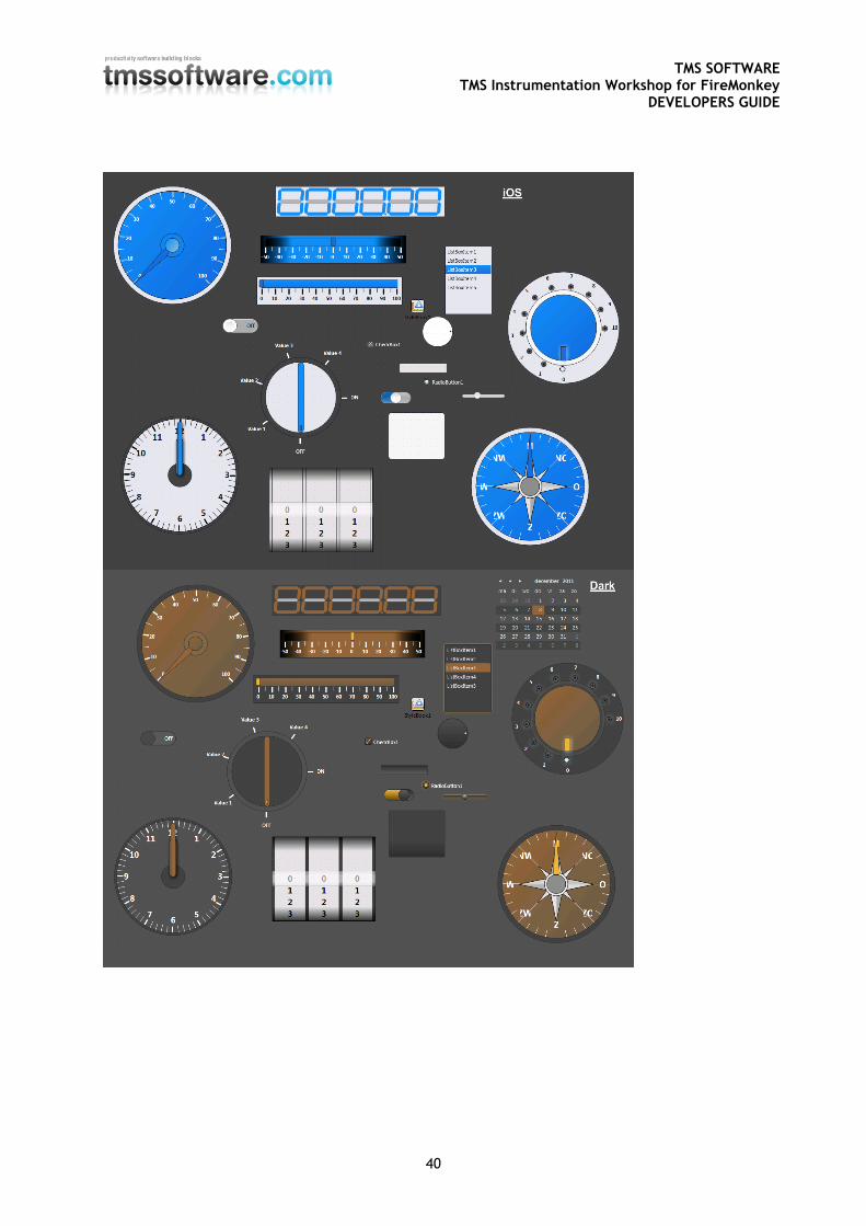
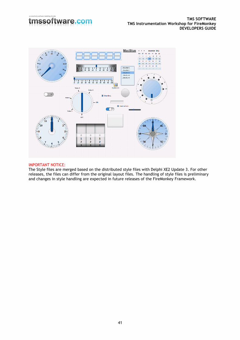
FireMonkey Styles The StyleBook is not only the placeholder of customizations of the style of a component in the application, it can also hold the entire set of styles for the full FireMonkey standard controls set. This means that you can load in the StyleBook the entire set of styles for all controls to give your application a completely different look. The standard FireMonkey styles are found in: C:\Program Files (x86)\Embarcadero\RAD Studio\9.0\Redist\styles\Fmx In the distribution you will see various .Style files in the FireMonkey Styles folder. These style files can be used to either style an individual component or a complete form. Unfortunately, at least till the XE2 Update 3 release, there is an issue that only one Style file can be used at a time. Loading a different style will overwrite the existing style information in the StyleBook. This implicates that it is currently not possible to provide a separate style file for a 3rd party component set that can be loaded without loosing style information for standard FireMonkey controls or other 3rd party components. Therefore, we have merged our component specific style files with the default FireMonkey controls style files and have created a style file that can be used for all standard FireMonkey components and the TMS Instrumentation WorkShop components. These files can be found in the distribution and are stored in separate folders. To use these files you must drop a StyleBook on the form, load a style file of choice and set the StyleBook property of the form:
The appearance of the form will automatically change after applying the style. As a part of the distribution, we have for now added component style equivalents for the first styles:
- Air - Amakrits - AquaGraphite - Blend - GoldenGraphite - Light - RubyGraphite - Windows7 - MacBlue - iOS - Dark
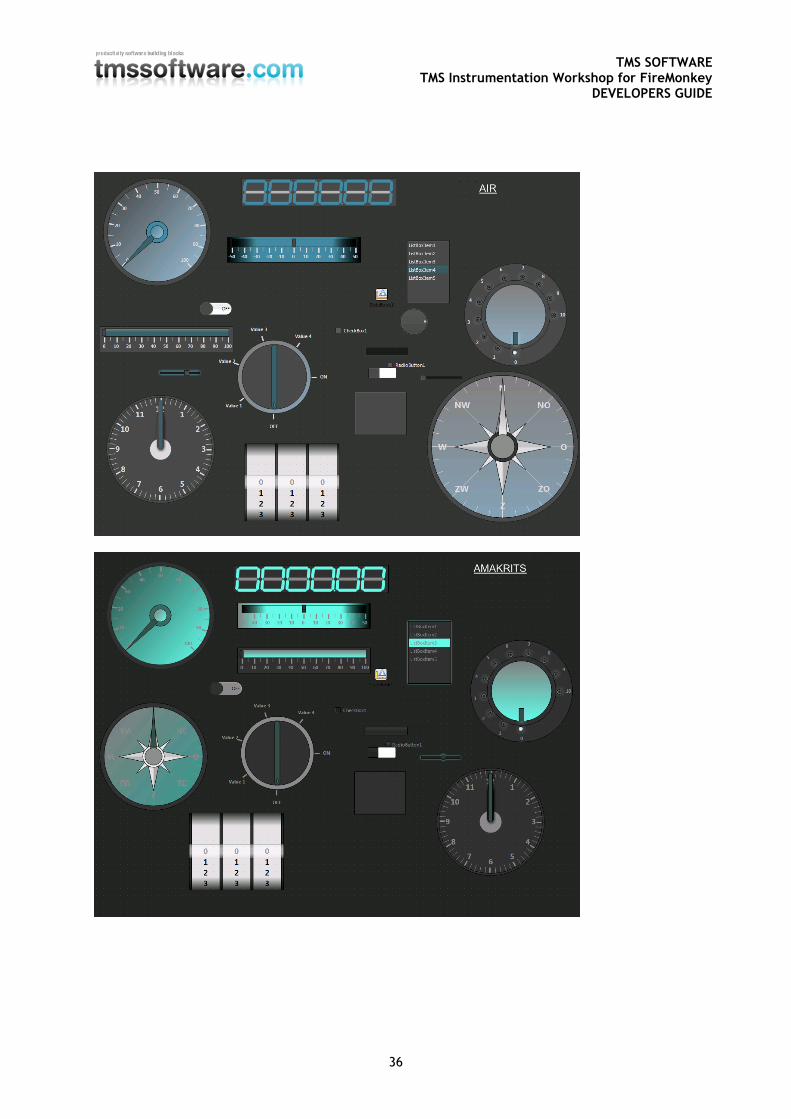
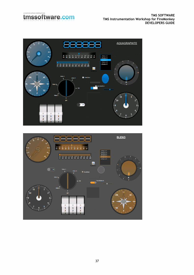
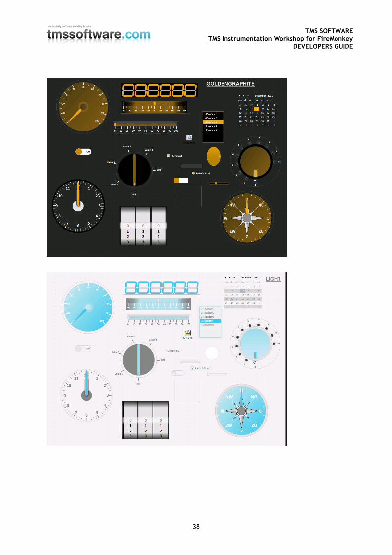
We’re working on style files for our components to make these consistent with other stock FireMonkey style files. After applying styles you will notice that the appearance on the TMS Instrumentation WorkShop components has changed. Below is a sample of our controls after applying different styles.
TMS SOFTWARE TMS Instrumentation Workshop for FireMonkey
DEVELOPERS GUIDE
36
TMS SOFTWARE TMS Instrumentation Workshop for FireMonkey
DEVELOPERS GUIDE
37
TMS SOFTWARE TMS Instrumentation Workshop for FireMonkey
DEVELOPERS GUIDE
38
TMS SOFTWARE TMS Instrumentation Workshop for FireMonkey
DEVELOPERS GUIDE
39
TMS SOFTWARE TMS Instrumentation Workshop for FireMonkey
DEVELOPERS GUIDE
40
TMS SOFTWARE TMS Instrumentation Workshop for FireMonkey
DEVELOPERS GUIDE
41
IMPORTANT NOTICE: The Style files are merged based on the distributed style files with Delphi XE2 Update 3. For other releases, the files can differ from the original layout files. The handling of style files is preliminary and changes in style handling are expected in future releases of the FireMonkey Framework.