tizen mobile design_guidelines
TRANSCRIPT
The Tizen Mobile
Design Guidelines
© 2015 Tizen Project, a Linux Foundation Project. All Rights Reserved. Linux is a registered trademark of Linus Torvalds.
Tizen is a registered trademark of The Linux Foundation. * Other names and brands may be claimed as the property of others. Except as noted, this content is licensed under Creative Commons Attribution 3.0. For details, see the Content License.
2
The Tizen Mobile Design Guidelines
Table of Contents
1. TIZEN MOBILE DESIGN PRINCIPLES 5
FOCUS ON THE PRIMARY GOALS 5
1.1.1 Focus on the Primary Goals 5
1.1.2 Design the First Screen to Satisfy 80% of User Needs 7
1.1.3 Design One Action to Run a Feature 7
CREATE A SENSE OF FLOW 8
1.2.1 Avoid Unnecessary Steps 8
1.2.2 Include Visual Hierarchy and Animations to Guide Users 9
1.2.3 Follow Platform-wide Conventions 10
PROVIDE INFORMATION AT A GLANCE 11
1.3.1 Place Essential Information First 11
1.3.2 Visually Separate the Components by the Uses 12
1.3.3 Visually Express What Users Can Do 13
2. MOBILE SPECIFIC STYLES 14
THEME COLORS 14
COLOR SWATCH 14
FONT STYLES 15
LIST PRINCIPLES 18
3. TIZEN MOBILE UX OVERVIEW 20
HOME STRUCTURE 20
3.1.1 Home Screen 21
3.1.2 All Apps Screen 22
3.1.3 Recent Screen 23
3.1.4 Lock Screen 24
3.1.5 Notification Panel 25
GESTURES 26
HARDWARE KEYS ON THE DEVICE 28
ACCESSIBILITY 29
3.4.1 Tizen Screen Reader 29
3.4.2 Guidelines for Designing Reader-Compatible Content 31
3.4.3 Adjustable Font Size 34
4. DESIGN PATTERNS 36
APP STRUCTURE 36
4.1.1 Main View 37
4.1.2 Detail View 39
3
The Tizen Mobile Design Guidelines
4.1.3 Main View Edit Mode 43
4.1.4 Detail View Edit Mode 44
APP HANDLING 45
4.2.1 Starting and Stopping an App 45
4.2.2 Multitask Handling 46
NOTIFICATIONS 47
4.3.1 Accessing the Notifications 47
4.3.2 Instant Notifications 51
4.3.3 Active Notifications 52
4.3.4 Full View Notifications 53
4.3.5 Badges 55
WIDGETS 56
4.4.1 Information Widgets 56
4.4.2 Interactive Widgets 57
4.4.3 Hybrid Widgets 57
4.4.4 Design Guidelines for Widgets 59
SCREEN ORIENTATIONS 63
4.5.1 Portrait Orientation 63
4.5.2 Landscape Orientation 63
4.5.3 Transition between Different Screen Orientations 65
SCREEN LAYOUT 68
4.6.1 Header 69
4.6.2 Content Area 70
4.6.3 Footer 72
NAVIGATION DESIGN 73
4.7.1 Back and Cancel 73
4.7.2 Home Key 74
4.7.3 Navigation within an App 75
4.7.4 Navigation between Apps 76
4.7.5 User Actions Inside an App 77
SETTINGS 86
4.8.1 Designing Settings 86
4.8.2 Preference UI Controls 88
4.8.3 Tips for Designing Settings 93
5. UI COMPONENTS FOR TIZEN APP DESIGN 98
NAVIGATION ELEMENTS 98
5.1.1 Title Bar 98
5.1.2 Tabs 100
5.1.3 Navigation Bar 101
5.1.4 Scroll Components 102
PRESENTATION VIEWS 105
5.2.1 List View 105
5.2.2 Grid View 106
4
The Tizen Mobile Design Guidelines
5.2.3 Group Index 107
5.2.4 Progress Components 108
USER INPUT COMPONENTS 110
5.3.1 Button 110
5.3.2 Checkbox Components 112
5.3.3 Radio Button 114
5.3.4 Text Input 114
5.3.5 Dropdown Menu 116
5.3.6 Slider 117
5.3.7 Picker 118
ASSIST VIEW 121
5
The Tizen Mobile Design Guidelines
1. Tizen Mobile Design Principles
Tizen design principles explained in this section of the document are provided to suggest clear guidelines for developers, to design simple and easy-to-use apps for everyone.
Focus on the Primary Goals Ensure that your app allows users to easily use its major features. You can simplify the screen layout of your app and emphasize important features so that users can easily find them.
1.1.1 Focus on the Primary Goals
Identify the Primary Goals and Provide the Components in a Noticeable Way
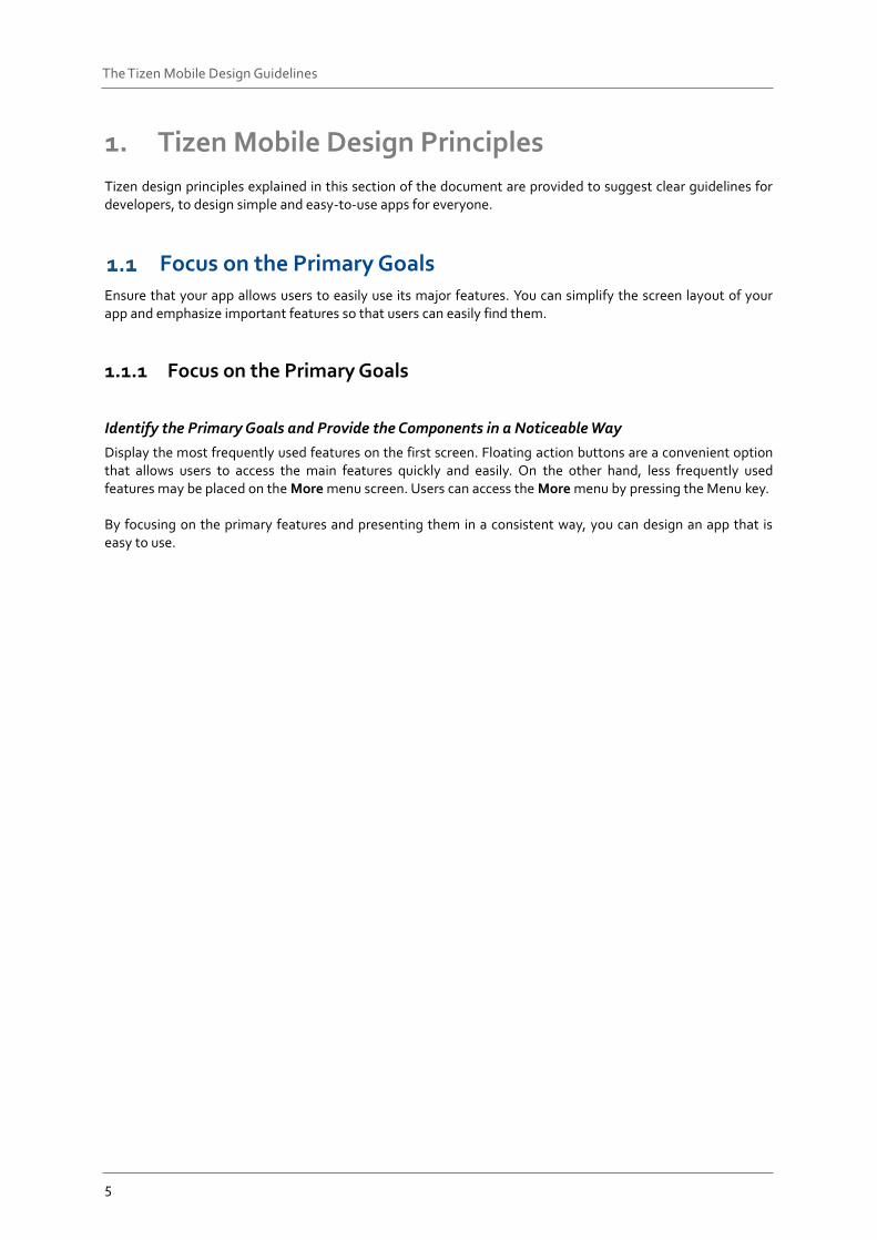
Display the most frequently used features on the first screen. Floating action buttons are a convenient option that allows users to access the main features quickly and easily. On the other hand, less frequently used features may be placed on the More menu screen. Users can access the More menu by pressing the Menu key. By focusing on the primary features and presenting them in a consistent way, you can design an app that is easy to use.
6
The Tizen Mobile Design Guidelines
Figure: Examples of a floating button, and the Menu and Back keys
7
The Tizen Mobile Design Guidelines
1.1.2 Design the First Screen to Satisfy 80% of User Needs
Provide Essential Information First and Give Additional Information upon Request
Users are only interested in the information they need. Therefore, provide only essential information on the screen. You can provide more detailed information when a user requests it or takes action, but avoid trying to provide everything on one screen. When you design a screen layout, ensure that you include enough empty space between information. It increases the readability and allows users to be able to understand given information more easily.
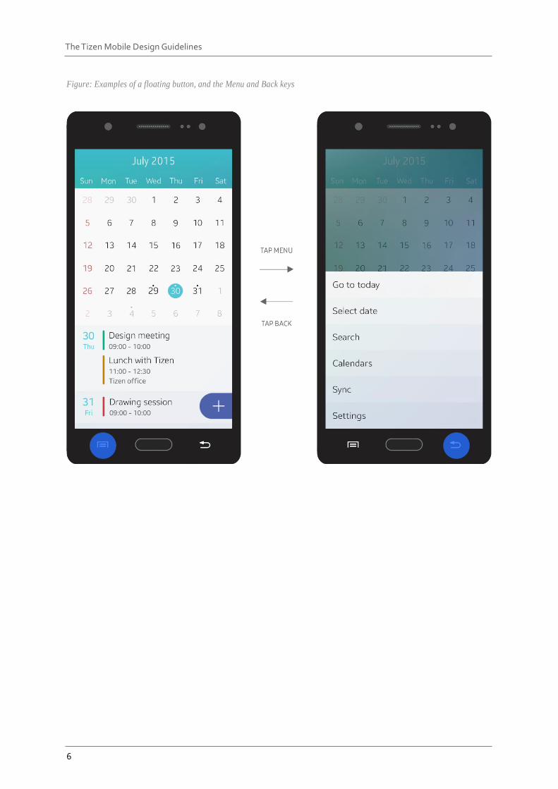
1.1.3 Design One Action to Run a Feature
Provide One Simple Way for Users to Achieve their Goals
Providing multiple ways to access a single feature may confuse users. Tizen aims to keep its design simple and practical because it targets a wide range of users, from beginners to advanced users. Hidden gestures or menus without any visual cues are not recommended when designing Tizen apps. Avoid using hidden gestures or additional quick actions that require tutorials in your design. Find the most effective and reasonable way to perform an action and allow users to access it via an action button. If you need to add subordinate actions in the design, provide them in More menu.
Figure 1. The More menu screen
8
The Tizen Mobile Design Guidelines
Create a Sense of Flow A good flow in the app design makes it easy for users to make decisions. Users may lose interest in your app if it is hard to navigate and difficult to understand.
1.2.1 Avoid Unnecessary Steps
Provide Users with an Accessible Structure
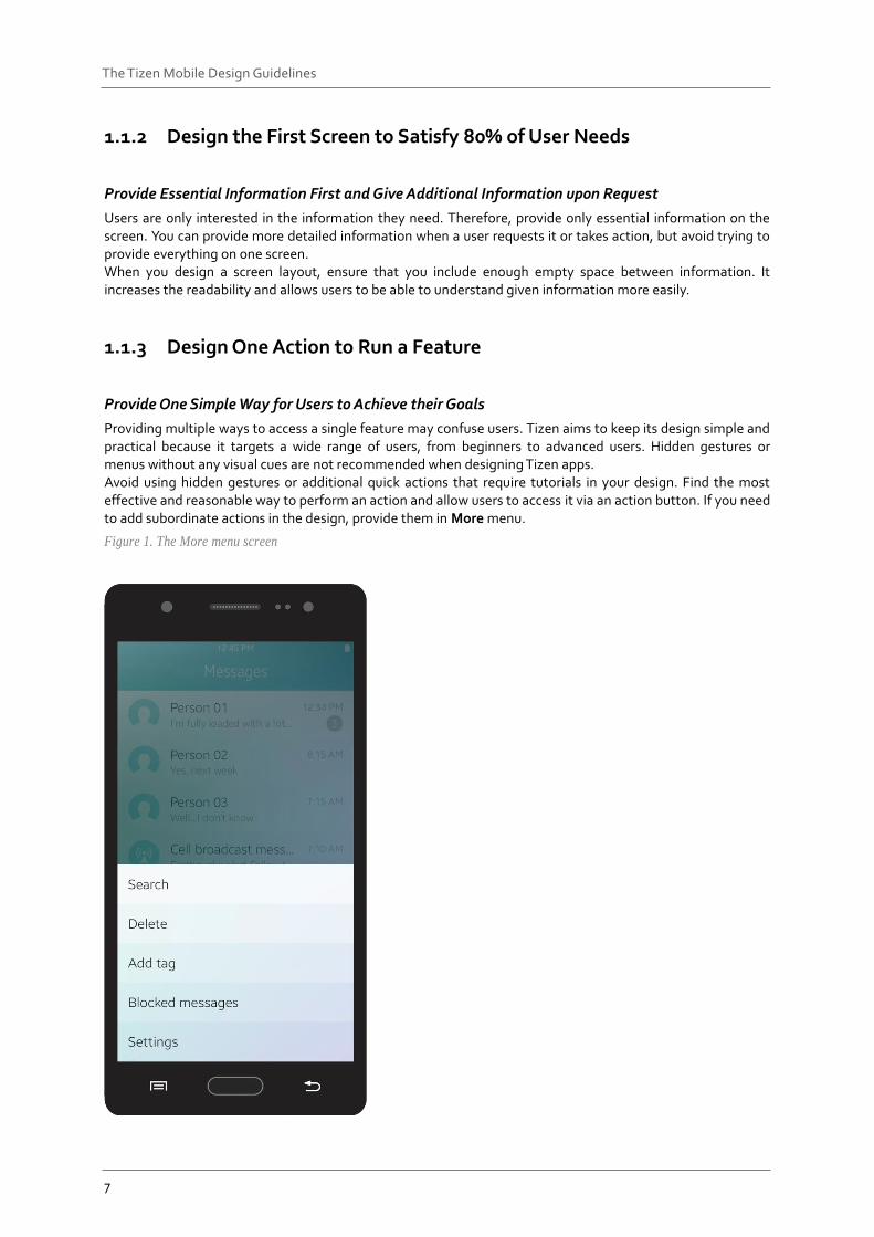
Ensure that the access flow of your app does not include any redundant steps. Eliminate unnecessary dialog boxes and confirmation windows that slow down user progress. Users want quick access to information, to complete their tasks in fewer steps. Help users instantly perform simple actions. For example, quick access to the Internet browser is a good feature to have. By facilitating user access to major websites, you can minimize the effort required.
Figure: Quick access feature for an Internet browser
9
The Tizen Mobile Design Guidelines
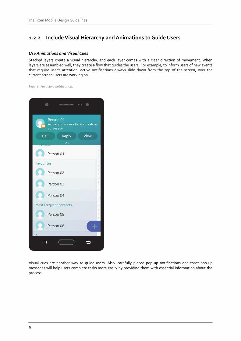
1.2.2 Include Visual Hierarchy and Animations to Guide Users
Use Animations and Visual Cues
Stacked layers create a visual hierarchy, and each layer comes with a clear direction of movement. When layers are assembled well, they create a flow that guides the users. For example, to inform users of new events that require user’s attention, active notifications always slide down from the top of the screen, over the current screen users are working on.
Figure: An active notification.
Visual cues are another way to guide users. Also, carefully placed pop-up notifications and toast pop-up messages will help users complete tasks more easily by providing them with essential information about the process.
10
The Tizen Mobile Design Guidelines
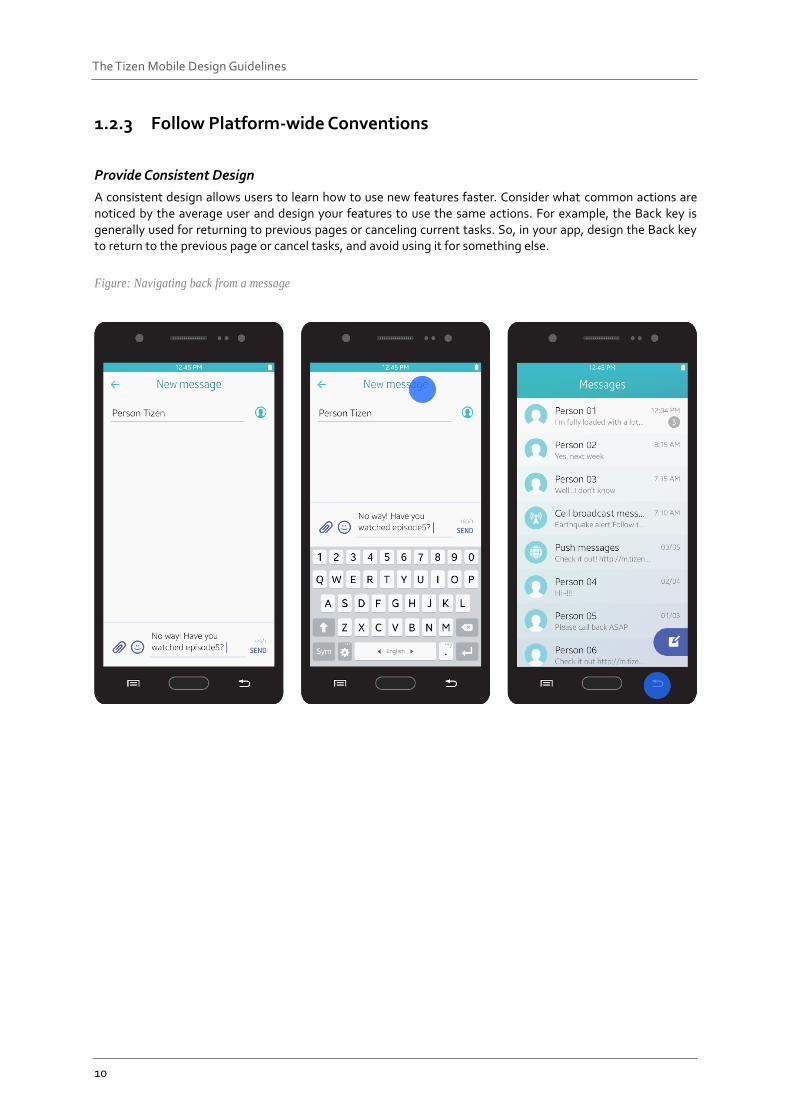
1.2.3 Follow Platform-wide Conventions
Provide Consistent Design
A consistent design allows users to learn how to use new features faster. Consider what common actions are noticed by the average user and design your features to use the same actions. For example, the Back key is generally used for returning to previous pages or canceling current tasks. So, in your app, design the Back key to return to the previous page or cancel tasks, and avoid using it for something else.
Figure: Navigating back from a message
11
The Tizen Mobile Design Guidelines
Provide Information at a Glance When you design screens for your app, ensure that the purpose of each screen is easily understood at a glance. Design the primary information to be clearly visible and easily accessible.
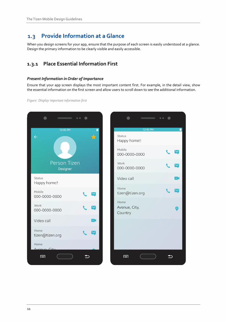
1.3.1 Place Essential Information First
Present Information in Order of Importance
Ensure that your app screen displays the most important content first. For example, in the detail view, show the essential information on the first screen and allow users to scroll down to see the additional information.
Figure: Display important information first
12
The Tizen Mobile Design Guidelines
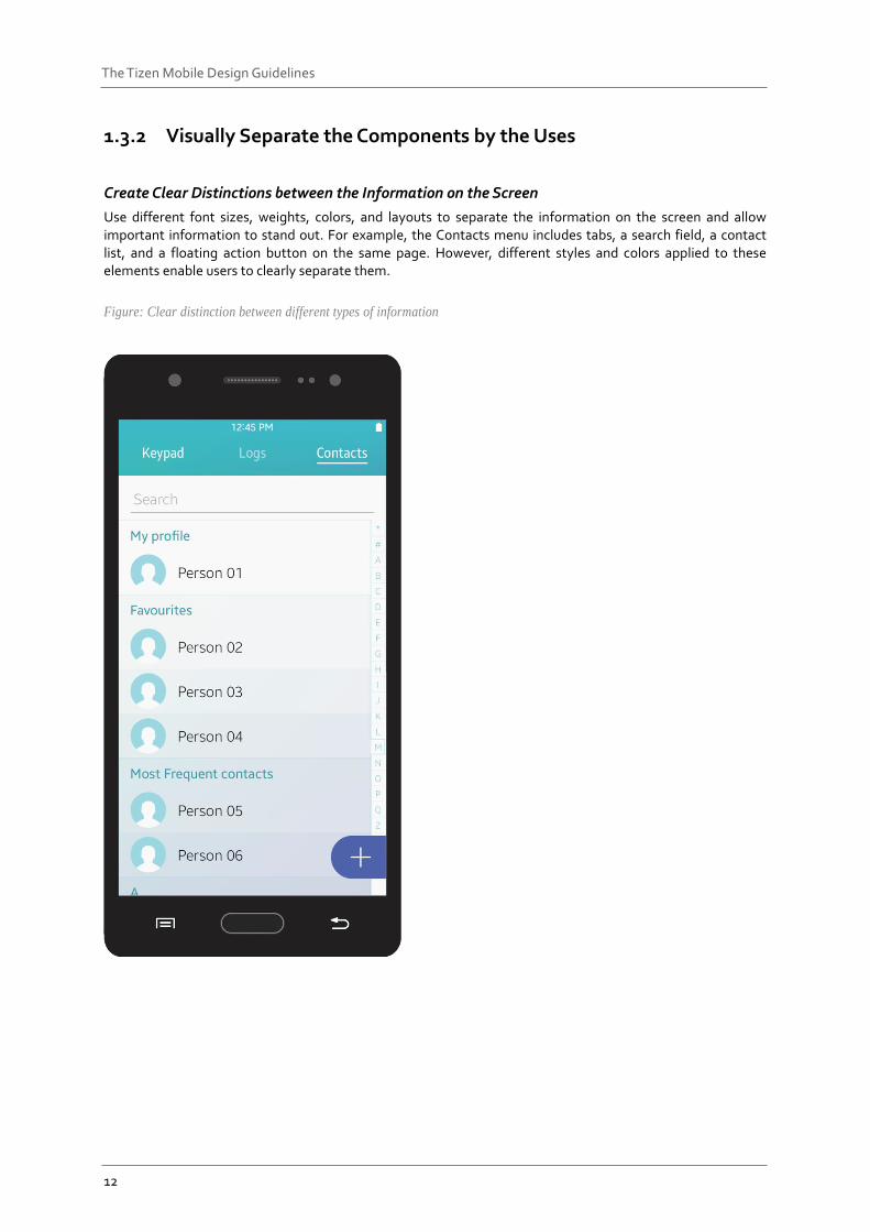
1.3.2 Visually Separate the Components by the Uses
Create Clear Distinctions between the Information on the Screen
Use different font sizes, weights, colors, and layouts to separate the information on the screen and allow important information to stand out. For example, the Contacts menu includes tabs, a search field, a contact list, and a floating action button on the same page. However, different styles and colors applied to these elements enable users to clearly separate them.
Figure: Clear distinction between different types of information
13
The Tizen Mobile Design Guidelines
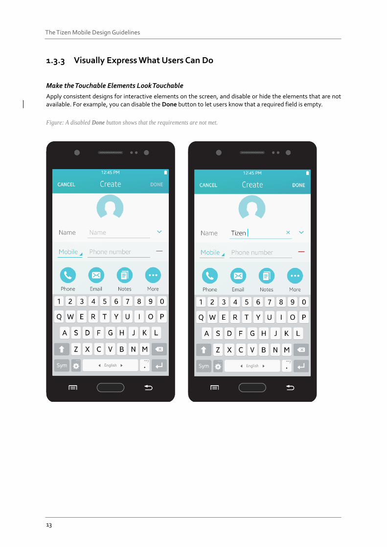
1.3.3 Visually Express What Users Can Do
Make the Touchable Elements Look Touchable
Apply consistent designs for interactive elements on the screen, and disable or hide the elements that are not available. For example, you can disable the Done button to let users know that a required field is empty.
Figure: A disabled Done button shows that the requirements are not met.
14
The Tizen Mobile Design Guidelines
2. Mobile Specific Styles
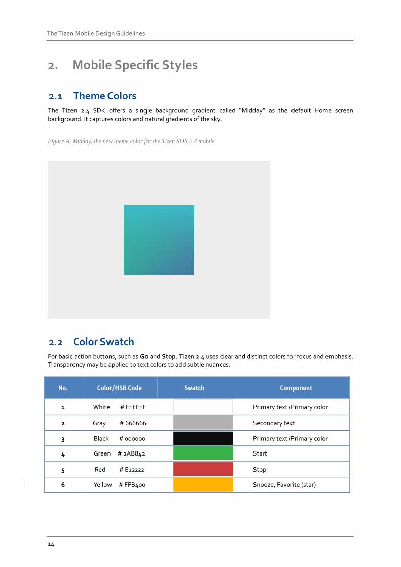
Theme Colors The Tizen 2.4 SDK offers a single background gradient called “Midday” as the default Home screen background. It captures colors and natural gradients of the sky.
Figure A. Midday, the new theme color for the Tizen SDK 2.4 mobile
Color Swatch For basic action buttons, such as Go and Stop, Tizen 2.4 uses clear and distinct colors for focus and emphasis. Transparency may be applied to text colors to add subtle nuances.
No. Color/HSB Code Swatch Component
1 White # FFFFFF
Primary text /Primary color
2 Gray # 666666
Secondary text
3 Black # 000000
Primary text /Primary color
4 Green # 2AB842
Start
5 Red # E12222
Stop
6 Yellow # FFB400
Snooze, Favorite (star)
15
The Tizen Mobile Design Guidelines
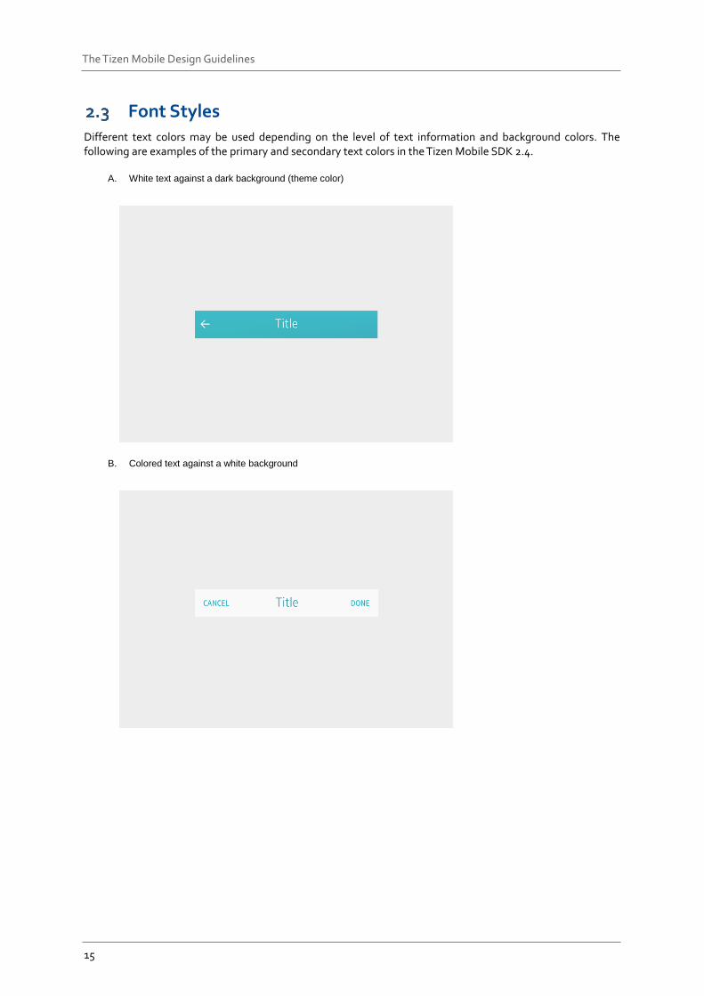
Font Styles Different text colors may be used depending on the level of text information and background colors. The following are examples of the primary and secondary text colors in the Tizen Mobile SDK 2.4.
A. White text against a dark background (theme color)
B. Colored text against a white background
16
The Tizen Mobile Design Guidelines
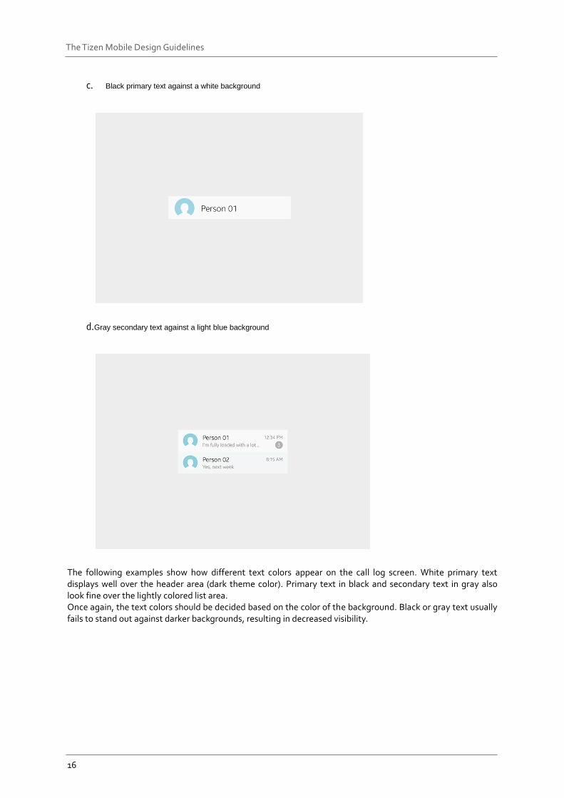
c. Black primary text against a white background
d. Gray secondary text against a light blue background
The following examples show how different text colors appear on the call log screen. White primary text displays well over the header area (dark theme color). Primary text in black and secondary text in gray also look fine over the lightly colored list area. Once again, the text colors should be decided based on the color of the background. Black or gray text usually fails to stand out against darker backgrounds, resulting in decreased visibility.
17
The Tizen Mobile Design Guidelines
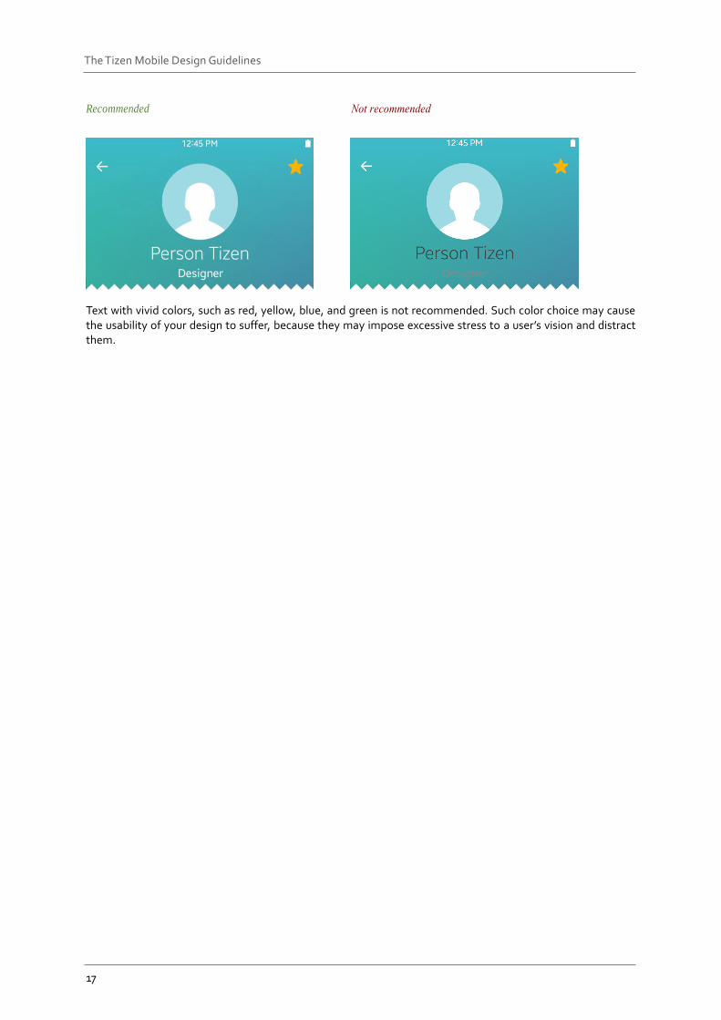
Recommended
Text with vivid colors, such as red, yellow, blue, and green is not recommended. Such color choice may cause the usability of your design to suffer, because they may impose excessive stress to a user’s vision and distract them.
18
The Tizen Mobile Design Guidelines
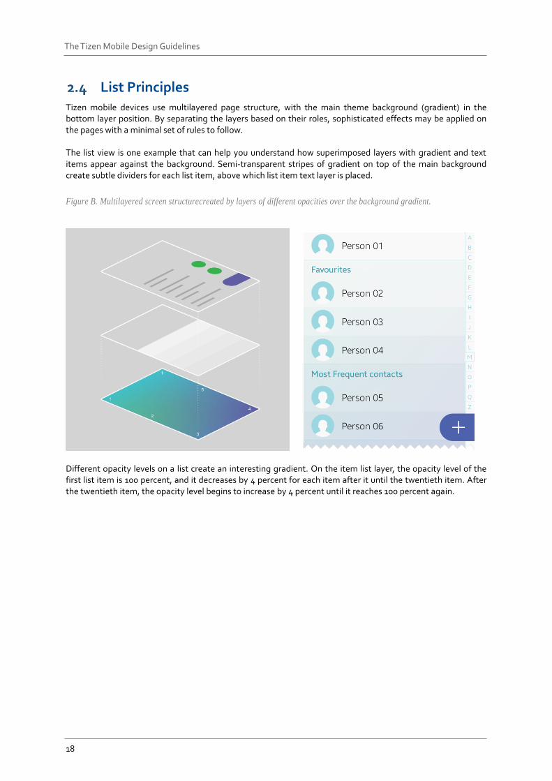
List Principles Tizen mobile devices use multilayered page structure, with the main theme background (gradient) in the bottom layer position. By separating the layers based on their roles, sophisticated effects may be applied on the pages with a minimal set of rules to follow. The list view is one example that can help you understand how superimposed layers with gradient and text items appear against the background. Semi-transparent stripes of gradient on top of the main background create subtle dividers for each list item, above which list item text layer is placed.
Figure B. Multilayered screen structurecreated by layers of different opacities over the background gradient.
Different opacity levels on a list create an interesting gradient. On the item list layer, the opacity level of the first list item is 100 percent, and it decreases by 4 percent for each item after it until the twentieth item. After the twentieth item, the opacity level begins to increase by 4 percent until it reaches 100 percent again.
19
The Tizen Mobile Design Guidelines
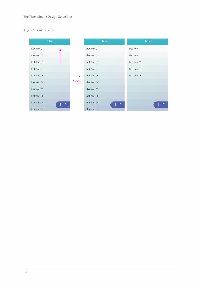
Figure C. Scrolling a list
20
The Tizen Mobile Design Guidelines
3. Tizen Mobile UX Overview
Tizen provides a solid framework that supports stable app designs. It provides several basic screens, such as the Home screen, Lock screen, Recent screen, and notification panel. Design your apps to share the screen and UI properties of these basic screens to ensure a consistent user experience.
Home Structure This section provides information about the following main elements to enhance your understanding on the Tizen mobile platform.
Home screen
All apps screen
Recent screen
Lock screen
Notification panel
21
The Tizen Mobile Design Guidelines
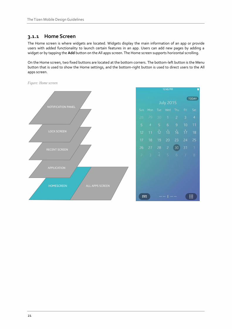
3.1.1 Home Screen The Home screen is where widgets are located. Widgets display the main information of an app or provide users with added functionality to launch certain features in an app. Users can add new pages by adding a widget or by tapping the Add button on the All apps screen. The Home screen supports horizontal scrolling. On the Home screen, two fixed buttons are located at the bottom corners. The bottom-left button is the Menu button that is used to show the Home settings, and the bottom-right button is used to direct users to the All apps screen.
Figure: Home screen
22
The Tizen Mobile Design Guidelines
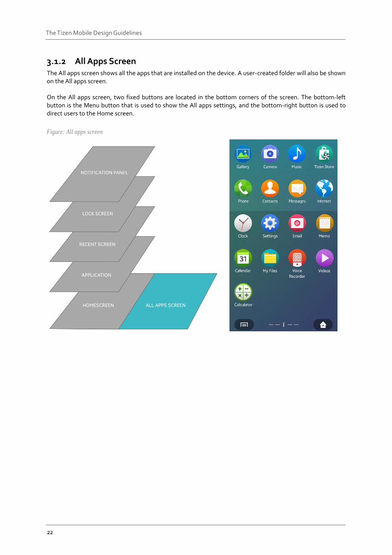
3.1.2 All Apps Screen The All apps screen shows all the apps that are installed on the device. A user-created folder will also be shown on the All apps screen. On the All apps screen, two fixed buttons are located in the bottom corners of the screen. The bottom-left button is the Menu button that is used to show the All apps settings, and the bottom-right button is used to direct users to the Home screen.
Figure: All apps screen
23
The Tizen Mobile Design Guidelines
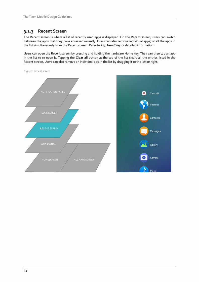
3.1.3 Recent Screen The Recent screen is where a list of recently used apps is displayed. On the Recent screen, users can switch between the apps that they have accessed recently. Users can also remove individual apps, or all the apps in the list simultaneously from the Recent screen. Refer to App Handling for detailed information. Users can open the Recent screen by pressing and holding the hardware Home key. They can then tap an app in the list to re-open it. Tapping the Clear all button at the top of the list clears all the entries listed in the Recent screen. Users can also remove an individual app in the list by dragging it to the left or right.
Figure: Recent screen
24
The Tizen Mobile Design Guidelines
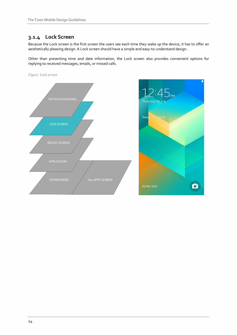
3.1.4 Lock Screen Because the Lock screen is the first screen the users see each time they wake up the device, it has to offer an aesthetically pleasing design. A Lock screen should have a simple and easy-to-understand design. Other than presenting time and date information, the Lock screen also provides convenient options for replying to received messages, emails, or missed calls.
Figure: Lock screen
25
The Tizen Mobile Design Guidelines
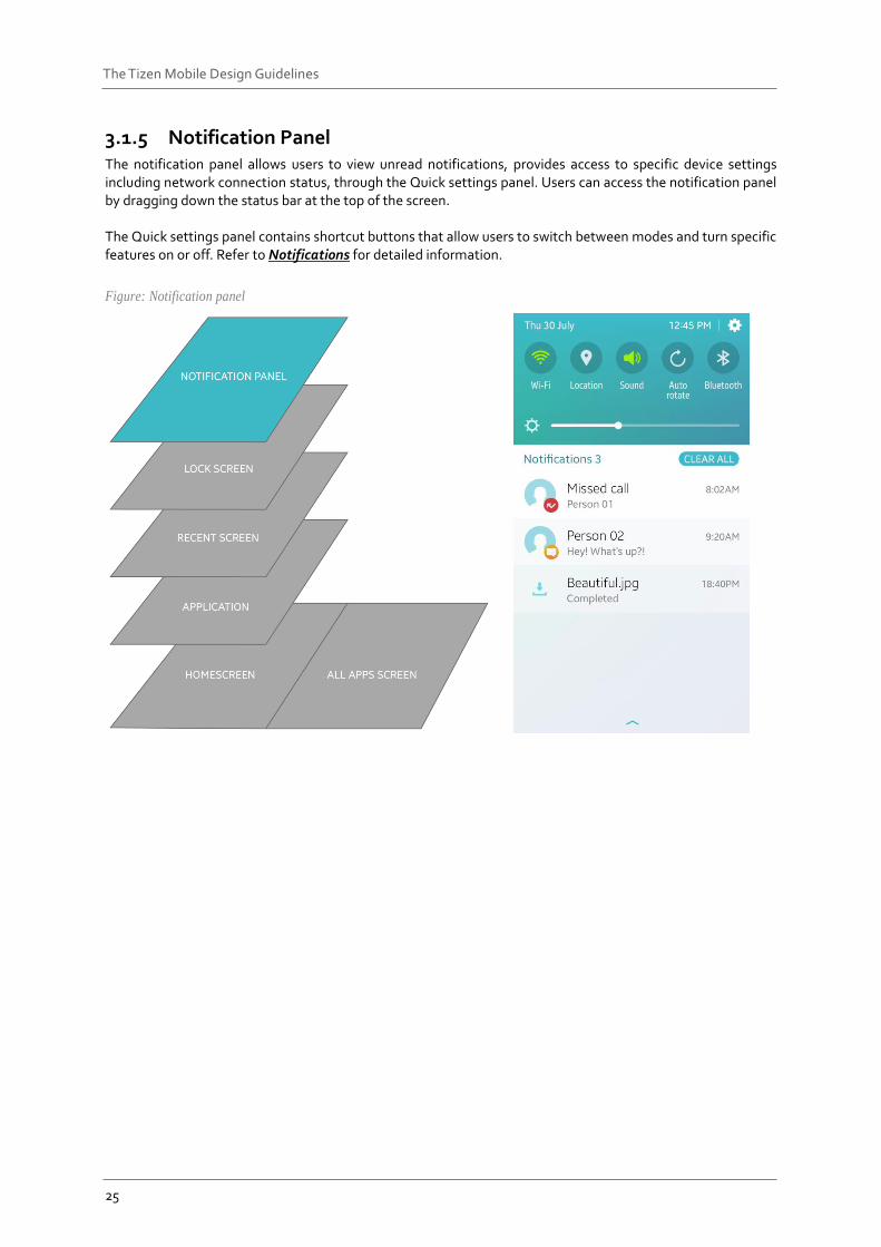
3.1.5 Notification Panel The notification panel allows users to view unread notifications, provides access to specific device settings including network connection status, through the Quick settings panel. Users can access the notification panel by dragging down the status bar at the top of the screen. The Quick settings panel contains shortcut buttons that allow users to switch between modes and turn specific features on or off. Refer to Notifications for detailed information.
Figure: Notification panel
26
The Tizen Mobile Design Guidelines
Gestures The Tizen platform supports a wide variety of gestures that allow users to directly access content on touch screen devices. For example, users can tap the screen to select an element, swipe to scroll through content on the screen, or drag and drop an element to move it. When you design your apps, make sure you match the gestures in your app with those provided by the Tizen platform. This ensures consistent user experience, especially when multiple apps are running at the same time. The following lists guidelines for designing new gestures for your apps.
DO NOT use the basic touch gestures defined in this guideline for different actions.
DO NOT assign custom gestures for the basic actions that already have common gestures assigned to them.
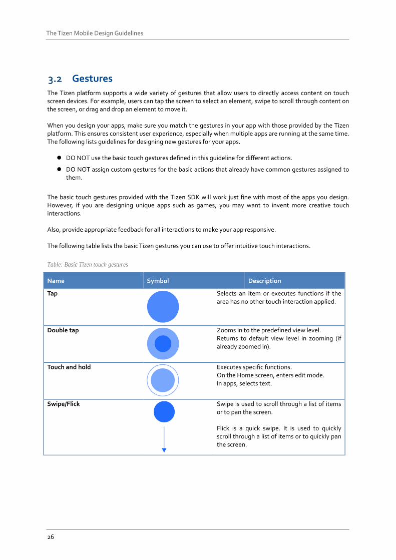
The basic touch gestures provided with the Tizen SDK will work just fine with most of the apps you design. However, if you are designing unique apps such as games, you may want to invent more creative touch interactions. Also, provide appropriate feedback for all interactions to make your app responsive. The following table lists the basic Tizen gestures you can use to offer intuitive touch interactions.
Table: Basic Tizen touch gestures
Name Symbol Description
Tap
Selects an item or executes functions if the area has no other touch interaction applied.
Double tap
Zooms in to the predefined view level. Returns to default view level in zooming (if already zoomed in).
Touch and hold
Executes specific functions. On the Home screen, enters edit mode. In apps, selects text.
Swipe/Flick
Swipe is used to scroll through a list of items or to pan the screen. Flick is a quick swipe. It is used to quickly scroll through a list of items or to quickly pan the screen.
27
The Tizen Mobile Design Guidelines
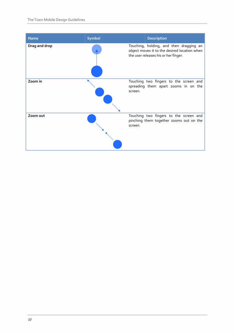
Name Symbol Description
Drag and drop
Touching, holding, and then dragging an object moves it to the desired location when the user releases his or her finger.
Zoom in
Touching two fingers to the screen and spreading them apart zooms in on the screen.
Zoom out
Touching two fingers to the screen and pinching them together zooms out on the screen.
28
The Tizen Mobile Design Guidelines
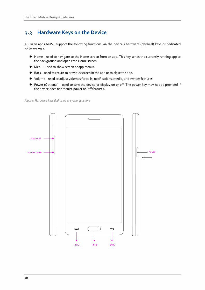
Hardware Keys on the Device All Tizen apps MUST support the following functions via the device’s hardware (physical) keys or dedicated software keys.
Home – used to navigate to the Home screen from an app. This key sends the currently running app to the background and opens the Home screen.
Menu – used to show screen or app menus.
Back – used to return to previous screen in the app or to close the app.
Volume – used to adjust volumes for calls, notifications, media, and system features.
Power (Optional) – used to turn the device or display on or off. The power key may not be provided if the device does not require power on/off features.
Figure: Hardware keys dedicated to system functions
29
The Tizen Mobile Design Guidelines
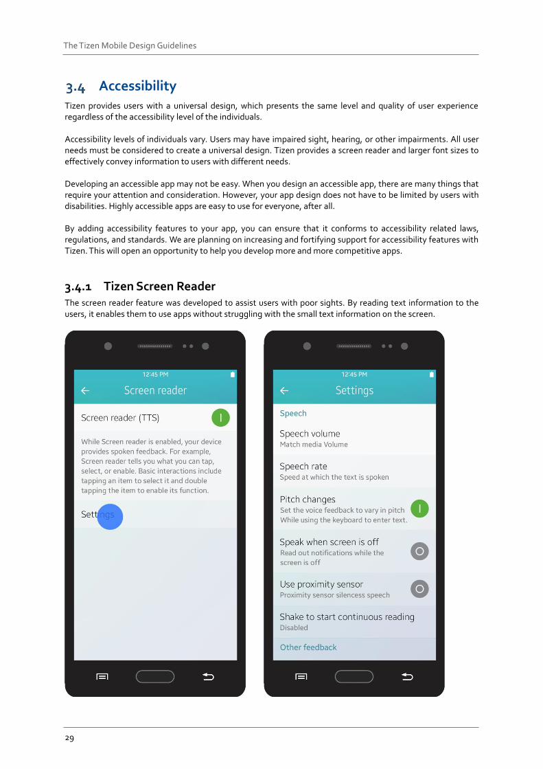
Accessibility Tizen provides users with a universal design, which presents the same level and quality of user experience regardless of the accessibility level of the individuals. Accessibility levels of individuals vary. Users may have impaired sight, hearing, or other impairments. All user needs must be considered to create a universal design. Tizen provides a screen reader and larger font sizes to effectively convey information to users with different needs. Developing an accessible app may not be easy. When you design an accessible app, there are many things that require your attention and consideration. However, your app design does not have to be limited by users with disabilities. Highly accessible apps are easy to use for everyone, after all. By adding accessibility features to your app, you can ensure that it conforms to accessibility related laws, regulations, and standards. We are planning on increasing and fortifying support for accessibility features with Tizen. This will open an opportunity to help you develop more and more competitive apps.
3.4.1 Tizen Screen Reader The screen reader feature was developed to assist users with poor sights. By reading text information to the users, it enables them to use apps without struggling with the small text information on the screen.
30
The Tizen Mobile Design Guidelines
Using this feature, you can design an app to provide a pleasant user experience to users with poor eyesight. It utilizes a TTS (text-to-speech) engine to transform the text and graphics on the screen into audible information. The screen reader recognizes the selected information or user interface, and provides audible feedback if a subsequent action is required. Because Tizen 2.4 fully supports the screen reader feature, you do not have to add additional graphical elements to your app to enable it. The following are guidelines for designing apps that support the screen reader.
31
The Tizen Mobile Design Guidelines
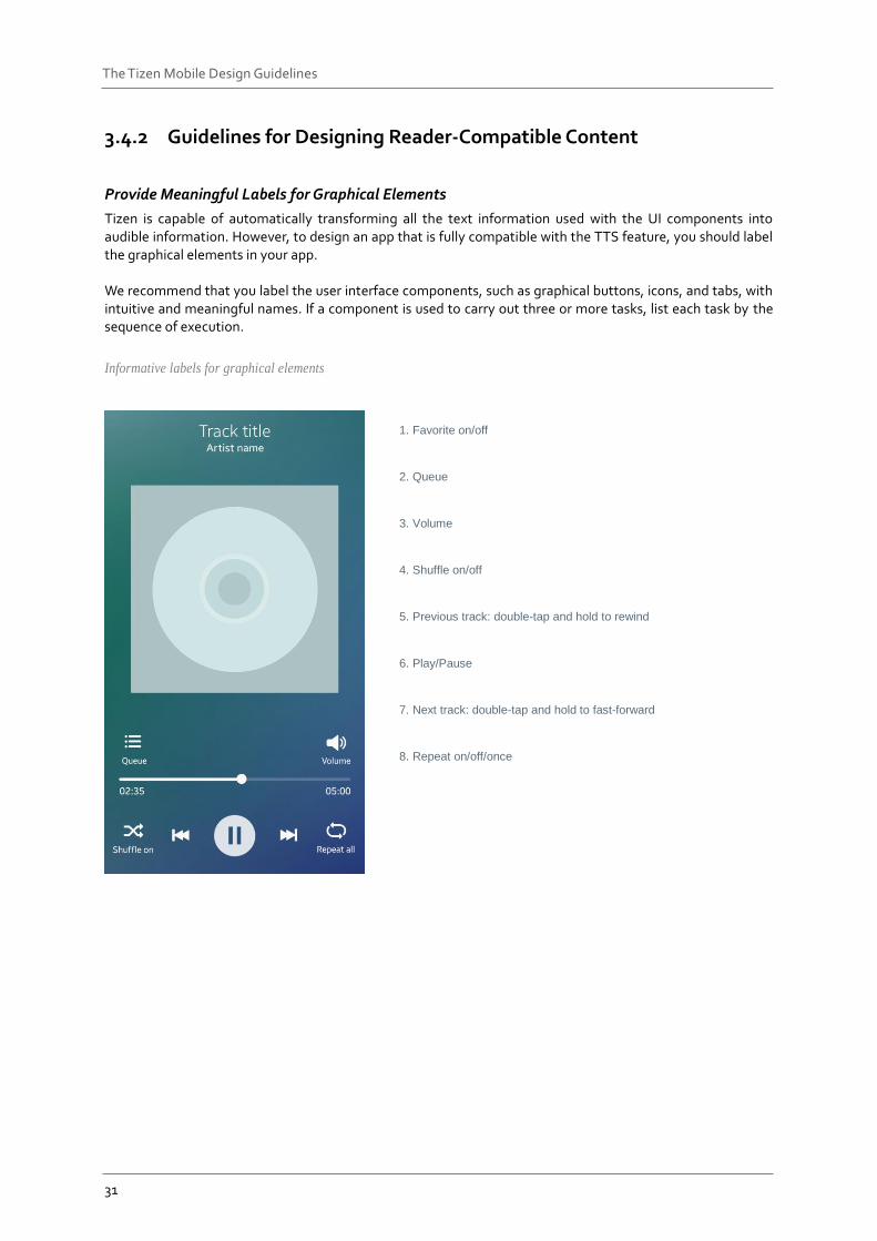
3.4.2 Guidelines for Designing Reader-Compatible Content
Provide Meaningful Labels for Graphical Elements
Tizen is capable of automatically transforming all the text information used with the UI components into audible information. However, to design an app that is fully compatible with the TTS feature, you should label the graphical elements in your app. We recommend that you label the user interface components, such as graphical buttons, icons, and tabs, with intuitive and meaningful names. If a component is used to carry out three or more tasks, list each task by the sequence of execution.
Informative labels for graphical elements
1. Favorite on/off
2. Queue
3. Volume
4. Shuffle on/off
5. Previous track: double-tap and hold to rewind
6. Play/Pause
7. Next track: double-tap and hold to fast-forward
8. Repeat on/off/once
32
The Tizen Mobile Design Guidelines
Use System Controls
Additional labeling is not required if you use the controls provided by the system in your app. Tizen provides labels, trait information, and optional attributes attached to the default user controls. For example, a radio button comes with a label text and a trait (selected/unselected), and a slider for screen brightness control comes with a label, a trait (%n of %n), and an optional attribute (flick up and down to adjust the position). If you need to design your own controls for your app, refer to the examples of the system controls and label it with meaningful information to help users.
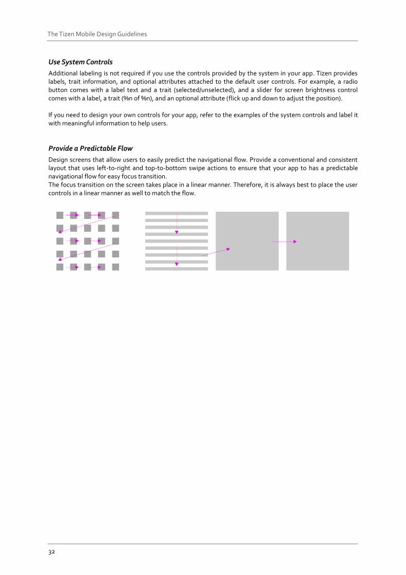
Provide a Predictable Flow
Design screens that allow users to easily predict the navigational flow. Provide a conventional and consistent layout that uses left-to-right and top-to-bottom swipe actions to ensure that your app to has a predictable navigational flow for easy focus transition. The focus transition on the screen takes place in a linear manner. Therefore, it is always best to place the user controls in a linear manner as well to match the flow.
33
The Tizen Mobile Design Guidelines
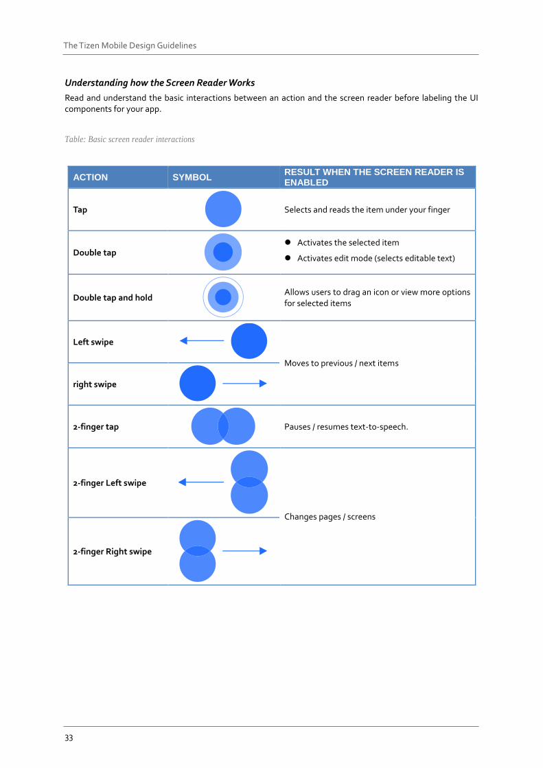
Understanding how the Screen Reader Works
Read and understand the basic interactions between an action and the screen reader before labeling the UI components for your app.
Table: Basic screen reader interactions
ACTION SYMBOL RESULT WHEN THE SCREEN READER IS ENABLED
Tap
Selects and reads the item under your finger
Double tap
Activates the selected item
Activates edit mode (selects editable text)
Double tap and hold
Allows users to drag an icon or view more options for selected items
Left swipe
Moves to previous / next items
right swipe
2-finger tap
Pauses / resumes text-to-speech.
2-finger Left swipe
Changes pages / screens
2-finger Right swipe
34
The Tizen Mobile Design Guidelines
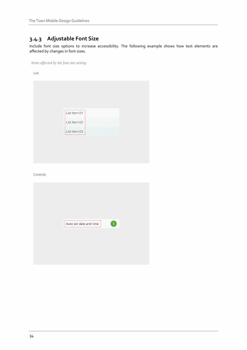
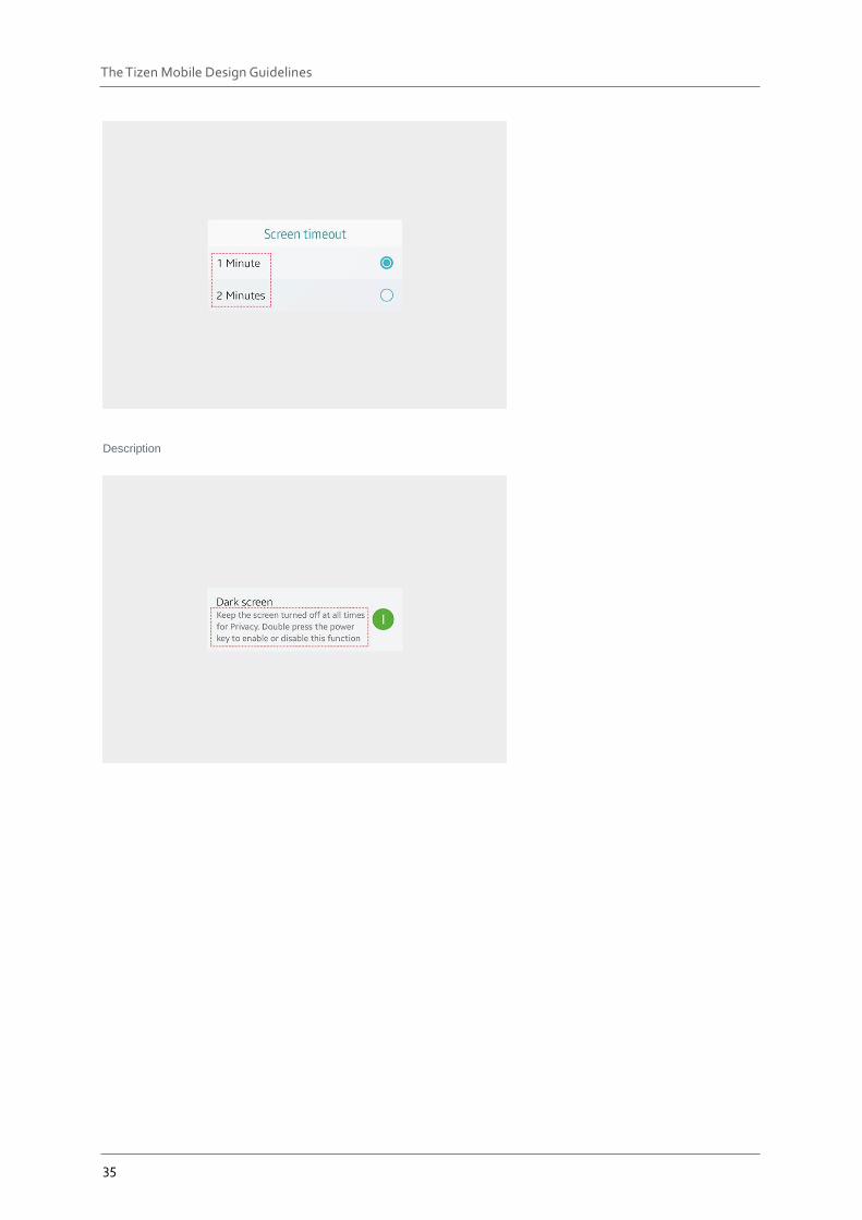
3.4.3 Adjustable Font Size Include font size options to increase accessibility. The following example shows how text elements are affected by changes in font sizes.
Items affected by the font size setting
List
Controls
35
The Tizen Mobile Design Guidelines
Description
36
The Tizen Mobile Design Guidelines
4. Design Patterns
App Structure The Tizen platform provides you with a wide range of UI components to help you design your apps. You can select and use the UI components depending on the purpose and main features of your app. This section aims to explain basic app structures designed with some of the most common UI components as examples.
Note For apps that require special layouts (such as cameras, video players, and games), the following guidelines may not be applicable.
Apps in general have a structure of more than two layers, and they can contain normal and edit modes while being used.
Table: Levels and modes of app screens
NORMAL MODE EDIT MODE
TOP LEVEL Main view Main view edit mode
LOWER LEVEL Detail view Detail view edit mode
Design app screens as simple as possible. The simpler the structure, the easier it is for users to navigate. Multiple views are not necessary in some cases; just one view may be enough. When you design a screen with multiple items on it, display them as a list and show details when an item is selected.
37
The Tizen Mobile Design Guidelines
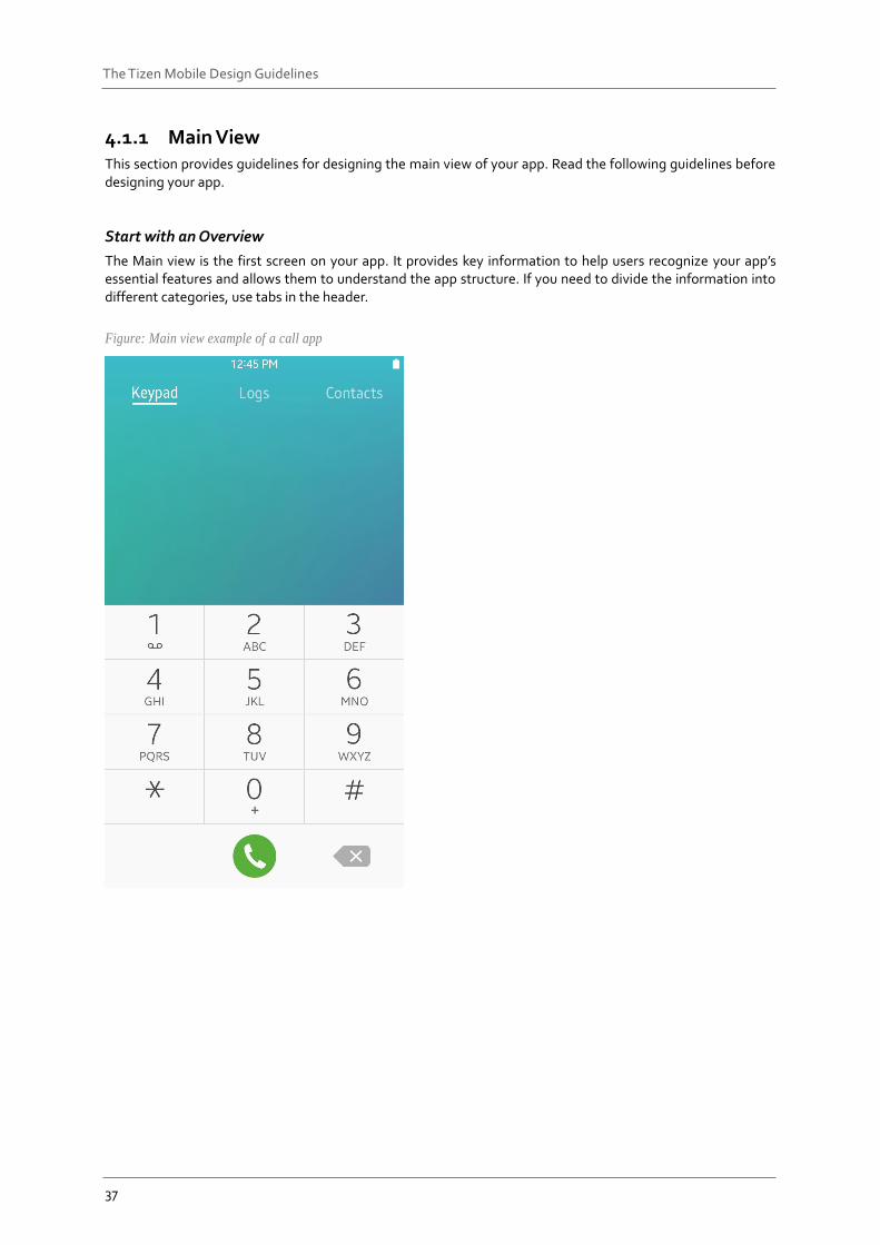
4.1.1 Main View This section provides guidelines for designing the main view of your app. Read the following guidelines before designing your app.
Start with an Overview
The Main view is the first screen on your app. It provides key information to help users recognize your app’s essential features and allows them to understand the app structure. If you need to divide the information into different categories, use tabs in the header.
Figure: Main view example of a call app
38
The Tizen Mobile Design Guidelines
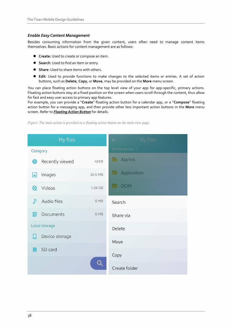
Enable Easy Content Management
Besides consuming information from the given content, users often need to manage content items themselves. Basic actions for content management are as follows:
Create: Used to create or compose an item.
Search: Used to find an item or entry.
Share: Used to share items with others.
Edit: Used to provide functions to make changes to the selected items or entries. A set of action buttons, such as Delete, Copy, or Move, may be provided on the More menu screen.
You can place floating action buttons on the top level view of your app for app-specific, primary actions. Floating action buttons stay at a fixed position on the screen when users scroll through the content, thus allow for fast and easy user access to primary app features. For example, you can provide a “Create” floating action button for a calendar app, or a “Compose” floating action button for a messaging app, and then provide other less important action buttons in the More menu screen. Refer to Floating Action Button for details.
Figure: The main action is provided as a floating action button on the main view page.
39
The Tizen Mobile Design Guidelines
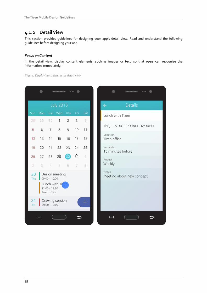
4.1.2 Detail View This section provides guidelines for designing your app’s detail view. Read and understand the following guidelines before designing your app.
Focus on Content
In the detail view, display content elements, such as images or text, so that users can recognize the information immediately.
Figure: Displaying content in the detail view
40
The Tizen Mobile Design Guidelines
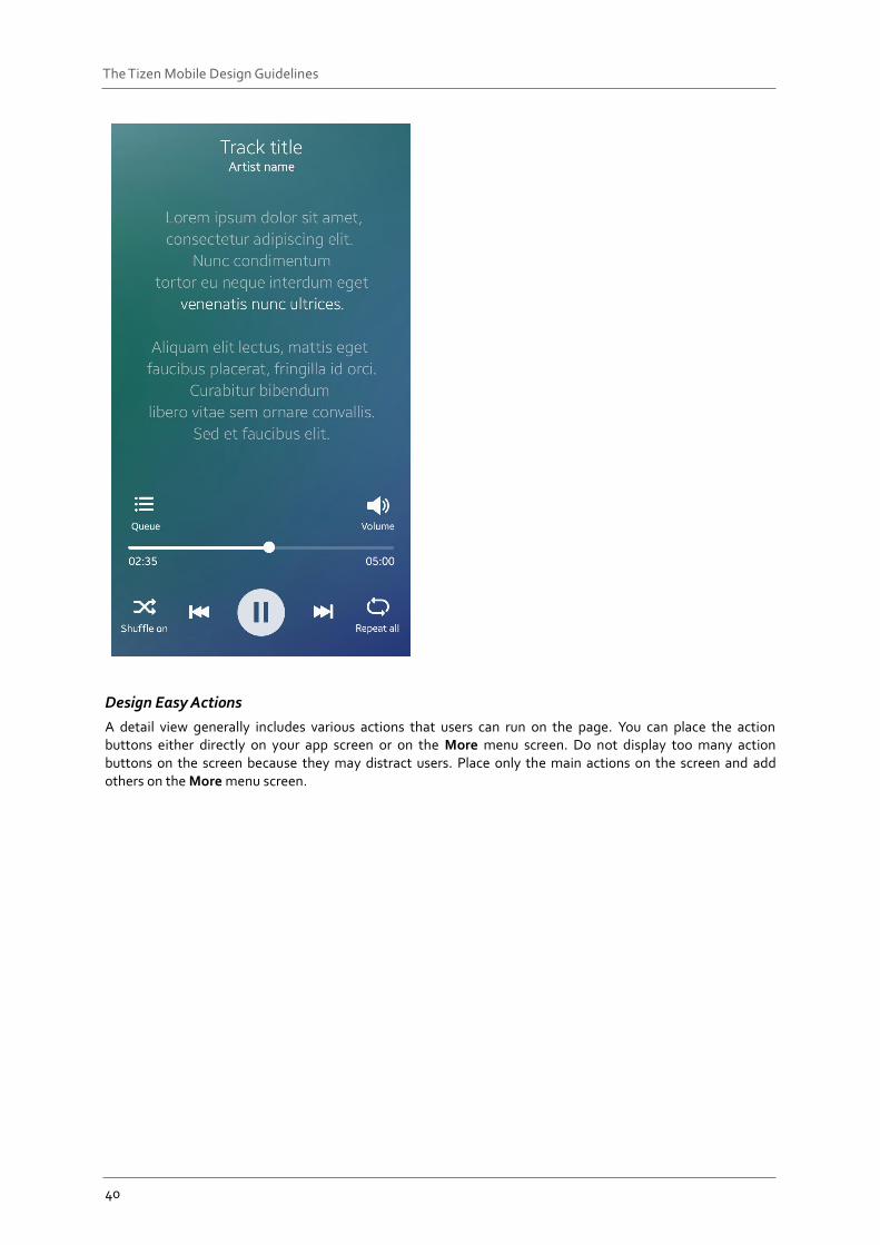
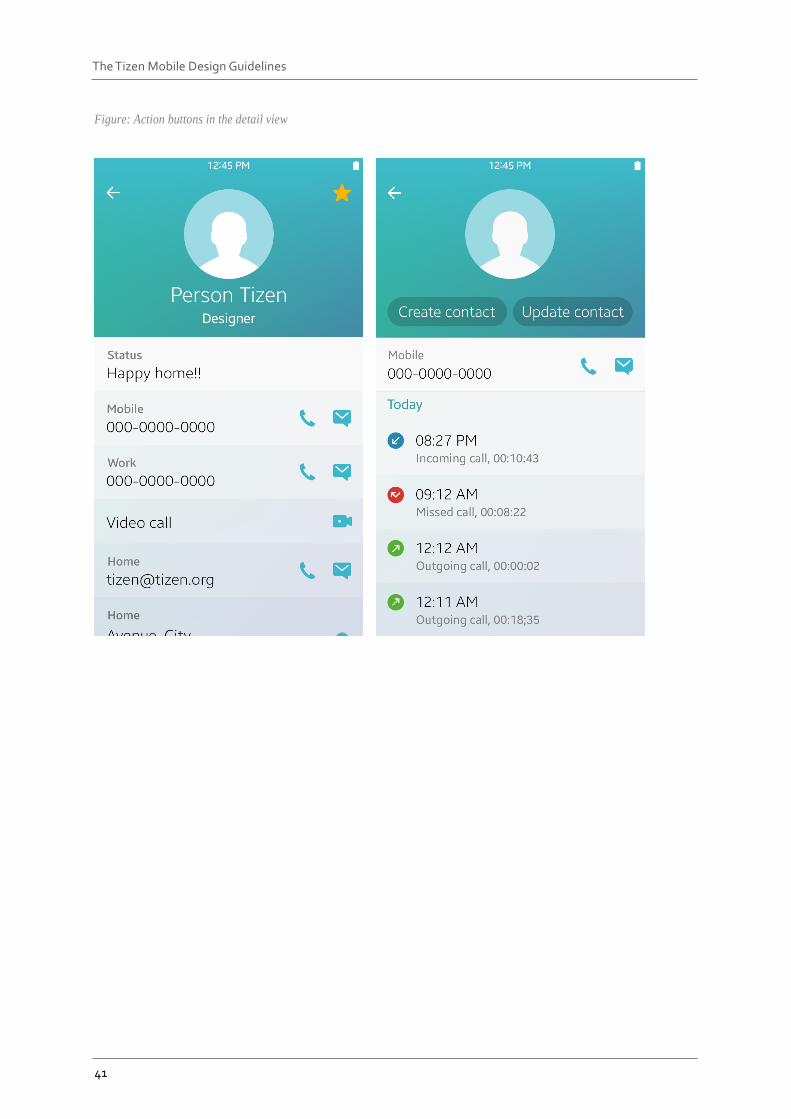
Design Easy Actions
A detail view generally includes various actions that users can run on the page. You can place the action buttons either directly on your app screen or on the More menu screen. Do not display too many action buttons on the screen because they may distract users. Place only the main actions on the screen and add others on the More menu screen.
41
The Tizen Mobile Design Guidelines
Figure: Action buttons in the detail view
42
The Tizen Mobile Design Guidelines
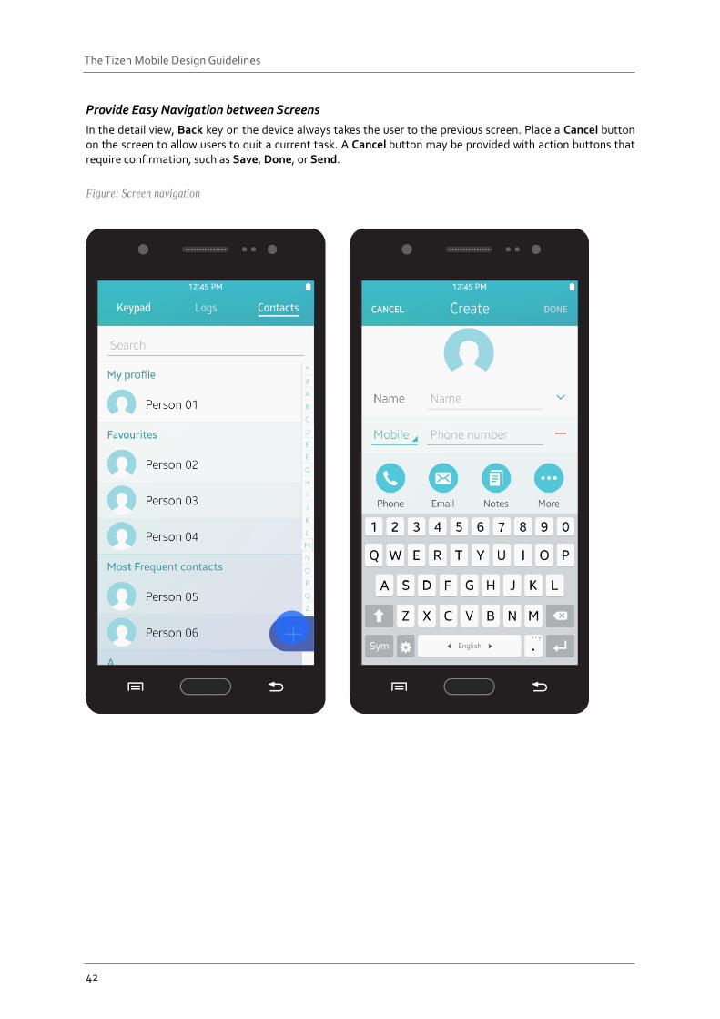
Provide Easy Navigation between Screens
In the detail view, Back key on the device always takes the user to the previous screen. Place a Cancel button on the screen to allow users to quit a current task. A Cancel button may be provided with action buttons that require confirmation, such as Save, Done, or Send.
Figure: Screen navigation
43
The Tizen Mobile Design Guidelines
4.1.3 Main View Edit Mode This section provides guidelines for designing the main view edit mode of your app. Read the following guidelines before designing your app.
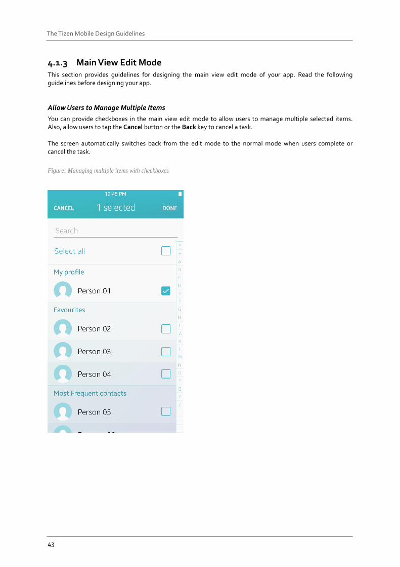
Allow Users to Manage Multiple Items
You can provide checkboxes in the main view edit mode to allow users to manage multiple selected items. Also, allow users to tap the Cancel button or the Back key to cancel a task. The screen automatically switches back from the edit mode to the normal mode when users complete or cancel the task.
Figure: Managing multiple items with checkboxes
44
The Tizen Mobile Design Guidelines
4.1.4 Detail View Edit Mode This section provides guidelines for designing the detail view edit mode of your app. Read the following guidelines before designing your app.
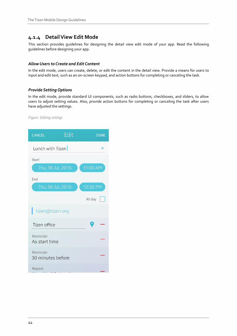
Allow Users to Create and Edit Content
In the edit mode, users can create, delete, or edit the content in the detail view. Provide a means for users to input and edit text, such as an on-screen keypad, and action buttons for completing or canceling the task.
Provide Setting Options
In the edit mode, provide standard UI components, such as radio buttons, checkboxes, and sliders, to allow users to adjust setting values. Also, provide action buttons for completing or canceling the task after users have adjusted the settings.
Figure: Editing settings
45
The Tizen Mobile Design Guidelines
App Handling This section provides guidelines on how to design an app to launch and close. In this section, you can also find guidelines for allowing users to switch between the currently launched apps.
4.2.1 Starting and Stopping an App How you design your app to open and close is very important, because users begin to evaluate your app the moment they open it for the first time, and this evaluation process ends only after they have closed the app. The following lists basic guidelines for designing your app’s opening and closing actions:
Make Your App to Start Immediately
Avoid providing additional steps or procedures that may annoy users. Once started, your app’s top level view should show the essential functions and the overview of the app structure. Refer to App Structure for details.
Indicate the Progress if It Takes Time to Launch
It is always best to design your app to launch immediately after users select it. If your app requires loading time before starting, provide a progress or activity indicator to inform users. Refer to Progress Components for details.
Maintain the Orientation
If you design your app to work in both landscape and portrait modes, design it to match the orientation users are in to avoid unnecessary adjustments. If your app only utilizes one orientation, design it to launch in that orientation. Users will figure out that they should rotate the device to view the content.
Provide a Short and Clear Tutorial if Necessary
It is always the best to design your app to be simple so that users can use it without tutorials. However, if you think users need specific information to use your app properly, provide an interactive tutorial session. When you do this, make your tutorial as interesting as possible to draw users’ attention. Also, for those who already know what to do, design the tutorial with an option to skip it.
Avoid Asking Users to Evaluate Your App before They Use It
Users need enough time to actually use your app before forming opinions. You may want to know as soon as possible what users feel and think about your app, but asking them too early does more harm than good. It may irritate users or their opinions may not be fully formed. Therefore, allow enough time for users to experience your app before you ask them to rate it.
Design Your App to Remember User Activities
You can provide users with increased usability by designing your app to remember previous user activities. This way, users can always go back to the task exactly where they left it.
Provide Information about Unexpected Termination
Needless to say, it is always best to ensure that your app does not terminate unexpectedly in the first place. However, explain to users what had happened if it does, and provide them with a solution to avoid it and continue to use your app.
46
The Tizen Mobile Design Guidelines
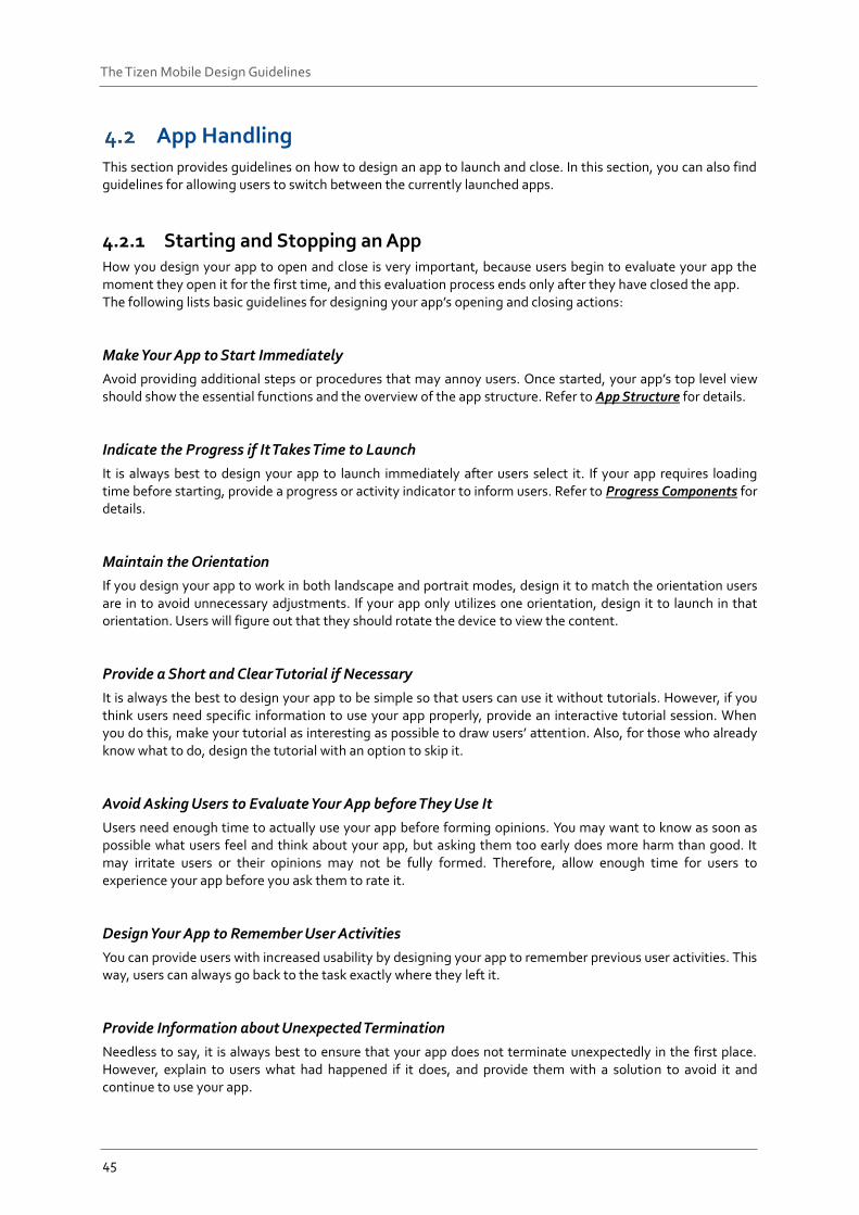
4.2.2 Multitask Handling Tizen supports multitask handling. Users can see the list of recently used apps in the Recent screen and switch between the apps by simply tapping the icons. Refer to Recent Screen for details.
Figure: Recent screen
To support multitasking, your app should be capable of running in the background in a paused state when users leave it. When users switch back to your app, the process is resumed instantly. The following lists the guidelines for designing apps that support multitasking.
Design your apps to be ready for unexpected switching.
Users can switch between apps any time. Your app should be capable of saving the current state appropriately to allow users to continue to use your app from where they left off. If it is a content-oriented app, such as a game, or a media player, your app should pause automatically to prevent users from missing content.
Continue and complete user task, if appropriate.
Apps, such as music players or call apps, should run in the background when users open another app in the foreground.
Design your app to run in the background and complete a user task if the user explicitly intended it, or if it is a simple task which does not require additional user input.
47
The Tizen Mobile Design Guidelines
Notifications You can use the notification API to notify users of the new events in your app, such as new messages or updates. Notifications draw users’ attention and provide information about new events or relevant actions. To take instant actions, users can directly access your app from the notification. They can also stay on the current task flow and take actions later from the notification panel, where the logs for unchecked messages are kept. The Tizen notification UI supports multimodal feedbacks, which are combinations of visual, auditory, and tactile events. The following lists guidelines for designing notifications.
Do not overuse notifications. Choose appropriate notification types for each event and offer notifications in a way that does not annoy users.
Use badges to show the number of notifications. Badges can be placed on image-based UI components, such as app icons and image tabs.
Continue to display information about new events even if the user has dismissed the notifications in the notification panel.
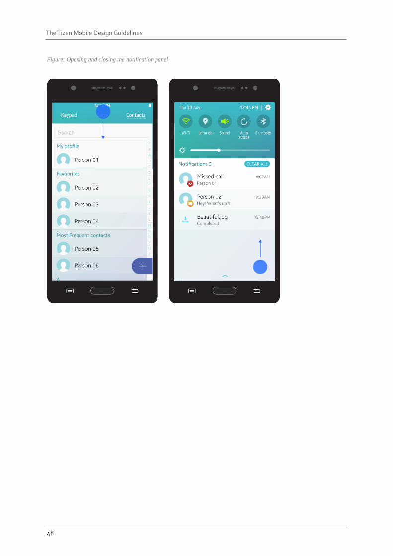
4.3.1 Accessing the Notifications On the notification panel, users can check the current event they are notified for, or the events they have missed, such as recent text messages, missed calls, and emails. Users can access the notification panel from anywhere in the OS simply by dragging down the status bar, which normally contains ongoing tasks and event notifications.
48
The Tizen Mobile Design Guidelines
Figure: Opening and closing the notification panel
49
The Tizen Mobile Design Guidelines
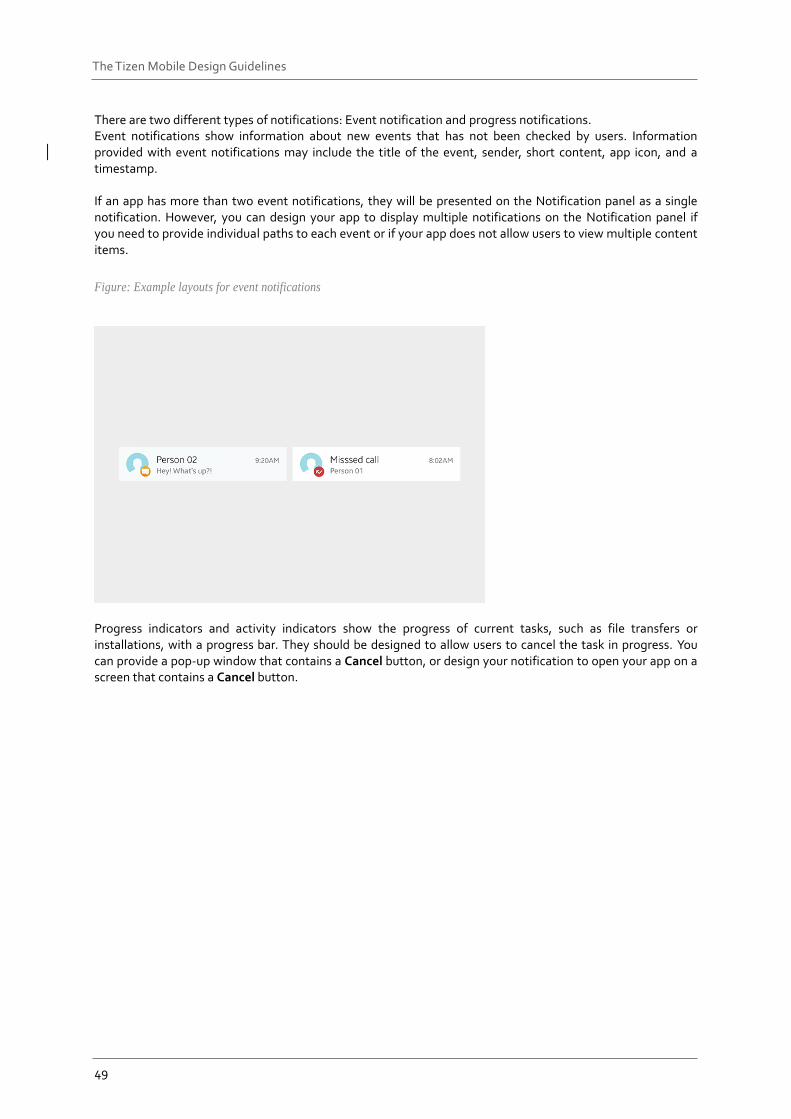
There are two different types of notifications: Event notification and progress notifications. Event notifications show information about new events that has not been checked by users. Information provided with event notifications may include the title of the event, sender, short content, app icon, and a timestamp. If an app has more than two event notifications, they will be presented on the Notification panel as a single notification. However, you can design your app to display multiple notifications on the Notification panel if you need to provide individual paths to each event or if your app does not allow users to view multiple content items.
Figure: Example layouts for event notifications
Progress indicators and activity indicators show the progress of current tasks, such as file transfers or installations, with a progress bar. They should be designed to allow users to cancel the task in progress. You can provide a pop-up window that contains a Cancel button, or design your notification to open your app on a screen that contains a Cancel button.
50
The Tizen Mobile Design Guidelines
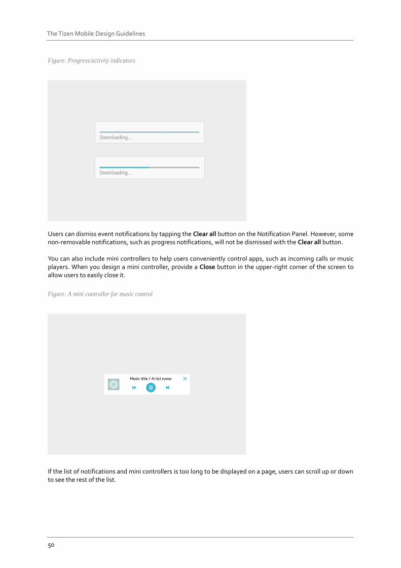
Figure: Progress/activity indicators
Users can dismiss event notifications by tapping the Clear all button on the Notification Panel. However, some non-removable notifications, such as progress notifications, will not be dismissed with the Clear all button. You can also include mini controllers to help users conveniently control apps, such as incoming calls or music players. When you design a mini controller, provide a Close button in the upper-right corner of the screen to allow users to easily close it.
Figure: A mini controller for music control
If the list of notifications and mini controllers is too long to be displayed on a page, users can scroll up or down to see the rest of the list.
51
The Tizen Mobile Design Guidelines
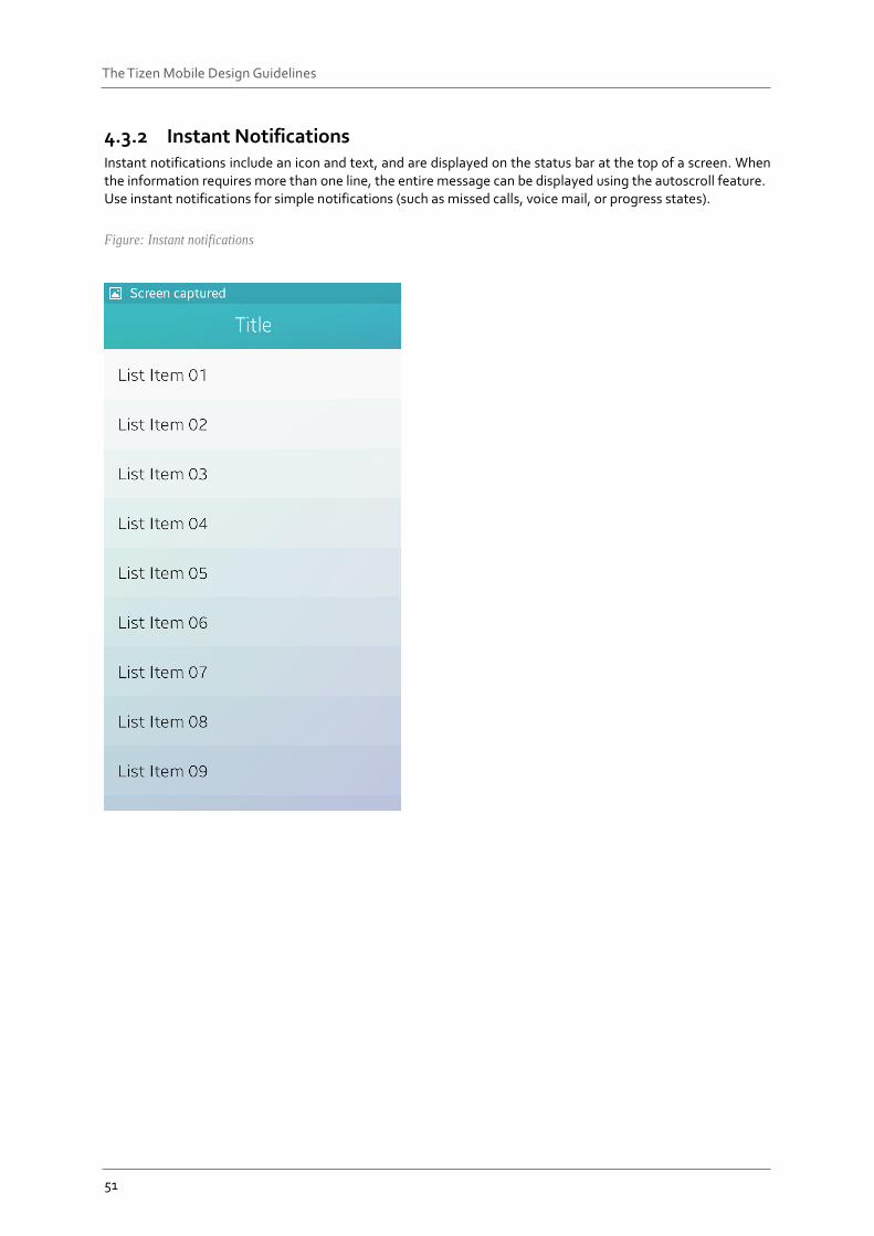
4.3.2 Instant Notifications Instant notifications include an icon and text, and are displayed on the status bar at the top of a screen. When the information requires more than one line, the entire message can be displayed using the autoscroll feature. Use instant notifications for simple notifications (such as missed calls, voice mail, or progress states).
Figure: Instant notifications
52
The Tizen Mobile Design Guidelines
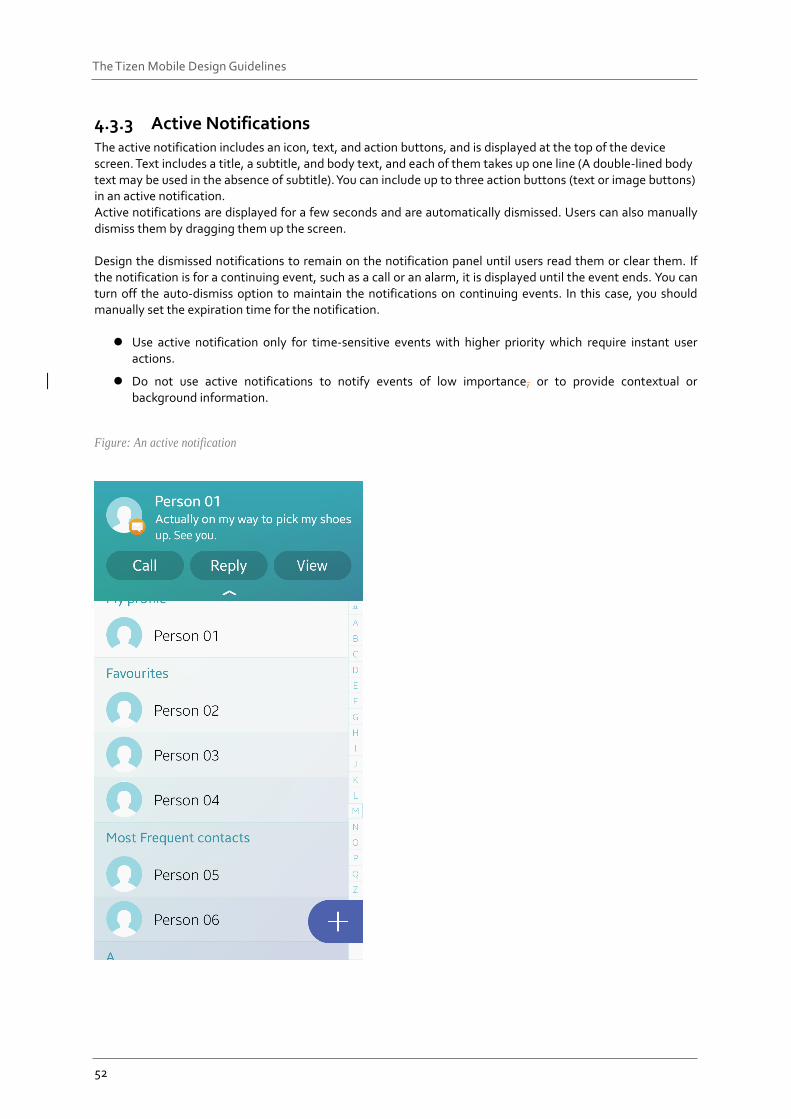
4.3.3 Active Notifications The active notification includes an icon, text, and action buttons, and is displayed at the top of the device screen. Text includes a title, a subtitle, and body text, and each of them takes up one line (A double-lined body text may be used in the absence of subtitle). You can include up to three action buttons (text or image buttons) in an active notification. Active notifications are displayed for a few seconds and are automatically dismissed. Users can also manually dismiss them by dragging them up the screen. Design the dismissed notifications to remain on the notification panel until users read them or clear them. If the notification is for a continuing event, such as a call or an alarm, it is displayed until the event ends. You can turn off the auto-dismiss option to maintain the notifications on continuing events. In this case, you should manually set the expiration time for the notification.
Use active notification only for time-sensitive events with higher priority which require instant user actions.
Do not use active notifications to notify events of low importance, or to provide contextual or background information.
Figure: An active notification
53
The Tizen Mobile Design Guidelines
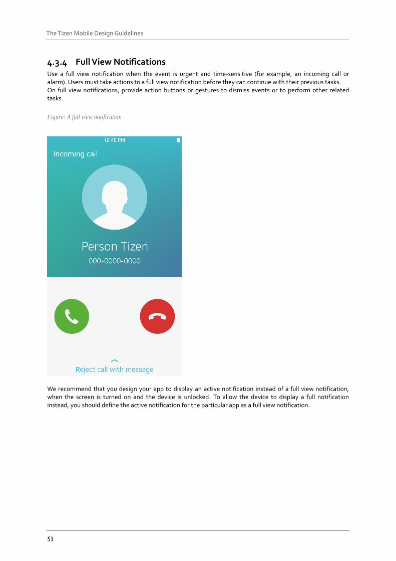
4.3.4 Full View Notifications Use a full view notification when the event is urgent and time-sensitive (for example, an incoming call or alarm). Users must take actions to a full view notification before they can continue with their previous tasks. On full view notifications, provide action buttons or gestures to dismiss events or to perform other related tasks.
Figure: A full view notification
We recommend that you design your app to display an active notification instead of a full view notification, when the screen is turned on and the device is unlocked. To allow the device to display a full notification instead, you should define the active notification for the particular app as a full view notification.
54
The Tizen Mobile Design Guidelines
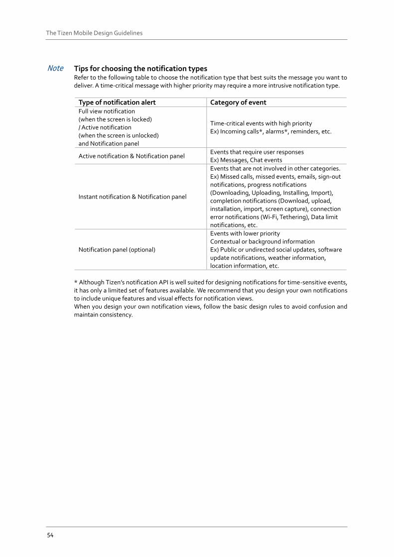
Note Tips for choosing the notification types Refer to the following table to choose the notification type that best suits the message you want to deliver. A time-critical message with higher priority may require a more intrusive notification type.
Type of notification alert Category of event Full view notification (when the screen is locked) / Active notification (when the screen is unlocked) and Notification panel
Time-critical events with high priority Ex) Incoming calls*, alarms*, reminders, etc.
Active notification & Notification panel Events that require user responses Ex) Messages, Chat events
Instant notification & Notification panel
Events that are not involved in other categories. Ex) Missed calls, missed events, emails, sign-out notifications, progress notifications (Downloading, Uploading, Installing, Import), completion notifications (Download, upload, installation, import, screen capture), connection error notifications (Wi-Fi, Tethering), Data limit notifications, etc.
Notification panel (optional)
Events with lower priority Contextual or background information Ex) Public or undirected social updates, software update notifications, weather information, location information, etc.
* Although Tizen’s notification API is well suited for designing notifications for time-sensitive events, it has only a limited set of features available. We recommend that you design your own notifications to include unique features and visual effects for notification views. When you design your own notification views, follow the basic design rules to avoid confusion and maintain consistency.
55
The Tizen Mobile Design Guidelines
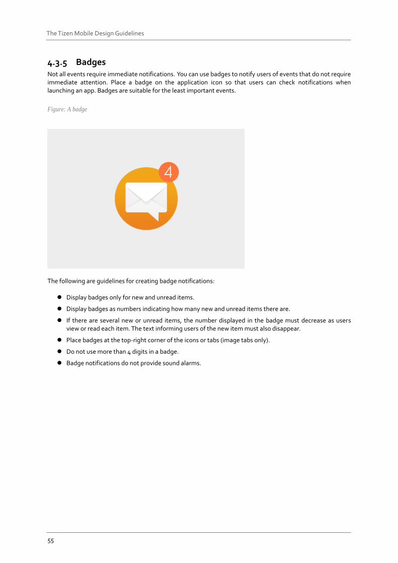
4.3.5 Badges Not all events require immediate notifications. You can use badges to notify users of events that do not require immediate attention. Place a badge on the application icon so that users can check notifications when launching an app. Badges are suitable for the least important events.
Figure: A badge
The following are guidelines for creating badge notifications:
Display badges only for new and unread items.
Display badges as numbers indicating how many new and unread items there are.
If there are several new or unread items, the number displayed in the badge must decrease as users view or read each item. The text informing users of the new item must also disappear.
Place badges at the top-right corner of the icons or tabs (image tabs only).
Do not use more than 4 digits in a badge.
Badge notifications do not provide sound alarms.
56
The Tizen Mobile Design Guidelines
Widgets Widgets are essential components for Home screen customization. Working together with the host apps, widgets notify users of important information at a glance. Using widgets, users may gain access to certain app features without opening the app. You may include a variety of features in your widgets to increase usability of your app. Depending on the content and features they provide, widgets may be divided into the following categories.
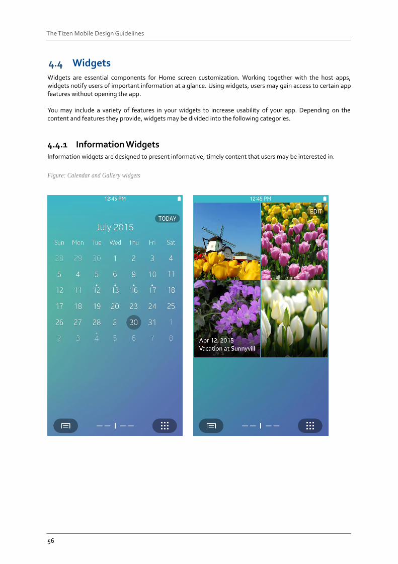
4.4.1 Information Widgets Information widgets are designed to present informative, timely content that users may be interested in.
Figure: Calendar and Gallery widgets
57
The Tizen Mobile Design Guidelines
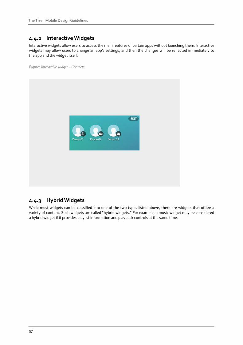
4.4.2 Interactive Widgets Interactive widgets allow users to access the main features of certain apps without launching them. Interactive widgets may allow users to change an app’s settings, and then the changes will be reflected immediately to the app and the widget itself.
Figure: Interactive widget – Contacts
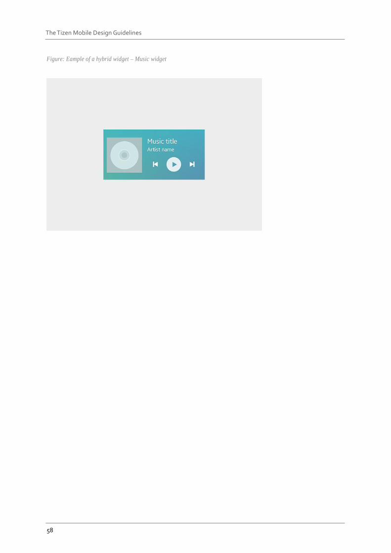
4.4.3 Hybrid Widgets While most widgets can be classified into one of the two types listed above, there are widgets that utilize a variety of content. Such widgets are called “hybrid widgets.” For example, a music widget may be considered a hybrid widget if it provides playlist information and playback controls at the same time.
58
The Tizen Mobile Design Guidelines
Figure: Eample of a hybrid widget – Music widget
59
The Tizen Mobile Design Guidelines
4.4.4 Design Guidelines for Widgets
Content
When you design widgets, what matters most is the quality of the content provided in your widgets. Concise information, provided in a timely manner, adds value to your widgets and apps and convinces users to access your app to obtain more information.
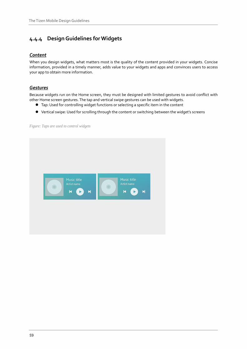
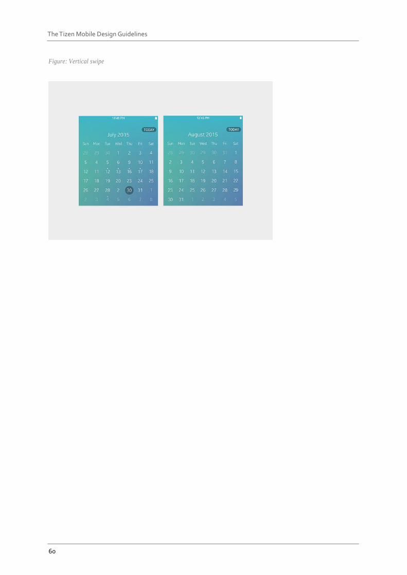
Gestures
Because widgets run on the Home screen, they must be designed with limited gestures to avoid conflict with other Home screen gestures. The tap and vertical swipe gestures can be used with widgets.
Tap: Used for controlling widget functions or selecting a specific item in the content
Vertical swipe: Used for scrolling through the content or switching between the widget’s screens
Figure: Taps are used to control widgets
60
The Tizen Mobile Design Guidelines
Figure: Vertical swipe
61
The Tizen Mobile Design Guidelines
Access to Apps
In addition to displaying content, widgets provide direct paths to the host applications. You can include UI elements in your widgets to provide shortcuts to the apps, or to certain features. Users can tap the shortcuts on the widget to:
open the initial app screen
open the app with a detailed view of the selected content
open a specific function screen, such as settings, in an app
Widget Size
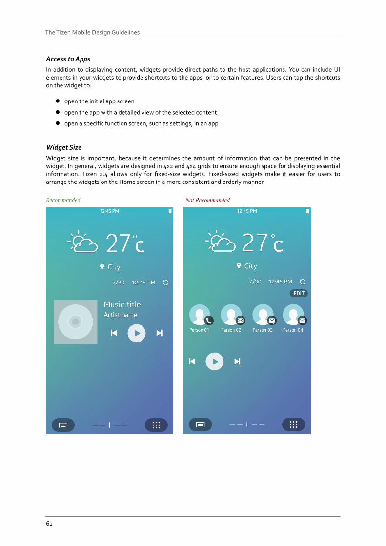
Widget size is important, because it determines the amount of information that can be presented in the widget. In general, widgets are designed in 4x2 and 4x4 grids to ensure enough space for displaying essential information. Tizen 2.4 allows only for fixed-size widgets. Fixed-sized widgets make it easier for users to arrange the widgets on the Home screen in a more consistent and orderly manner.
Recommanded
62
The Tizen Mobile Design Guidelines
Configuration
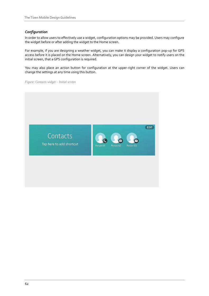
In order to allow users to effectively use a widget, configuration options may be provided. Users may configure the widget before or after adding the widget to the Home screen. For example, if you are designing a weather widget, you can make it display a configuration pop-up for GPS access before it is placed on the Home screen. Alternatively, you can design your widget to notify users on the initial screen, that a GPS configuration is required. You may also place an action button for configuration at the upper-right corner of the widget. Users can change the settings at any time using this button.
Figure: Contacts widget – Initial screen
63
The Tizen Mobile Design Guidelines
Screen Orientations
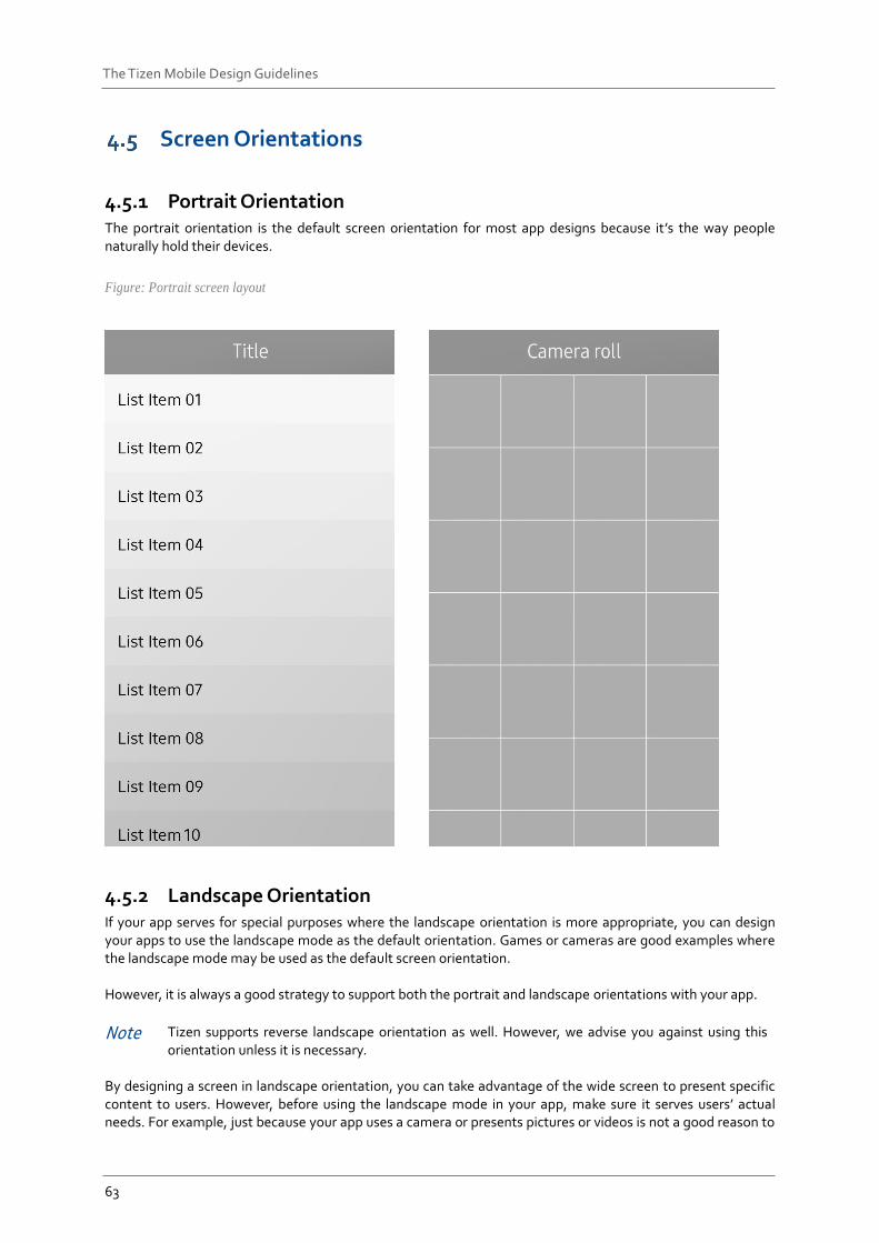
4.5.1 Portrait Orientation The portrait orientation is the default screen orientation for most app designs because it’s the way people naturally hold their devices.
Figure: Portrait screen layout
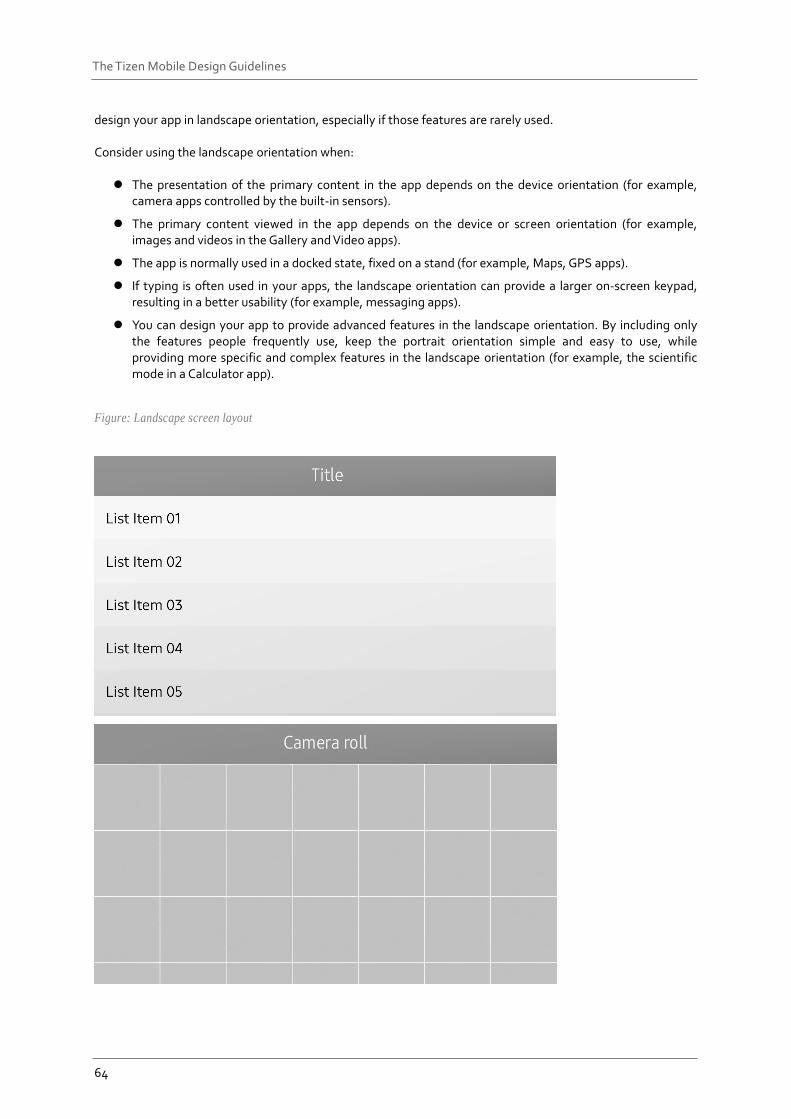
4.5.2 Landscape Orientation If your app serves for special purposes where the landscape orientation is more appropriate, you can design your apps to use the landscape mode as the default orientation. Games or cameras are good examples where the landscape mode may be used as the default screen orientation. However, it is always a good strategy to support both the portrait and landscape orientations with your app.
Note Tizen supports reverse landscape orientation as well. However, we advise you against using this orientation unless it is necessary.
By designing a screen in landscape orientation, you can take advantage of the wide screen to present specific content to users. However, before using the landscape mode in your app, make sure it serves users’ actual needs. For example, just because your app uses a camera or presents pictures or videos is not a good reason to
64
The Tizen Mobile Design Guidelines
design your app in landscape orientation, especially if those features are rarely used. Consider using the landscape orientation when:
The presentation of the primary content in the app depends on the device orientation (for example, camera apps controlled by the built-in sensors).
The primary content viewed in the app depends on the device or screen orientation (for example, images and videos in the Gallery and Video apps).
The app is normally used in a docked state, fixed on a stand (for example, Maps, GPS apps).
If typing is often used in your apps, the landscape orientation can provide a larger on-screen keypad, resulting in a better usability (for example, messaging apps).
You can design your app to provide advanced features in the landscape orientation. By including only the features people frequently use, keep the portrait orientation simple and easy to use, while providing more specific and complex features in the landscape orientation (for example, the scientific mode in a Calculator app).
Figure: Landscape screen layout
65
The Tizen Mobile Design Guidelines
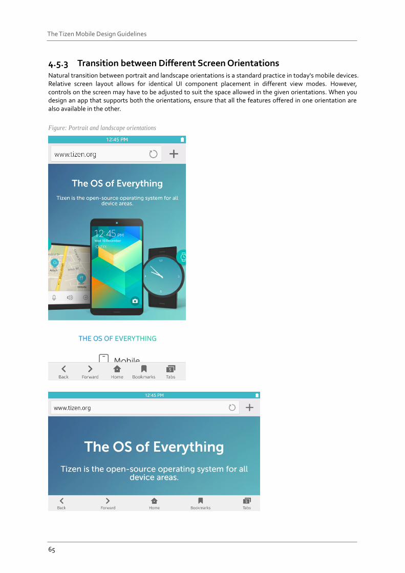
4.5.3 Transition between Different Screen Orientations Natural transition between portrait and landscape orientations is a standard practice in today's mobile devices. Relative screen layout allows for identical UI component placement in different view modes. However, controls on the screen may have to be adjusted to suit the space allowed in the given orientations. When you design an app that supports both the orientations, ensure that all the features offered in one orientation are also available in the other.
Figure: Portrait and landscape orientations
66
The Tizen Mobile Design Guidelines
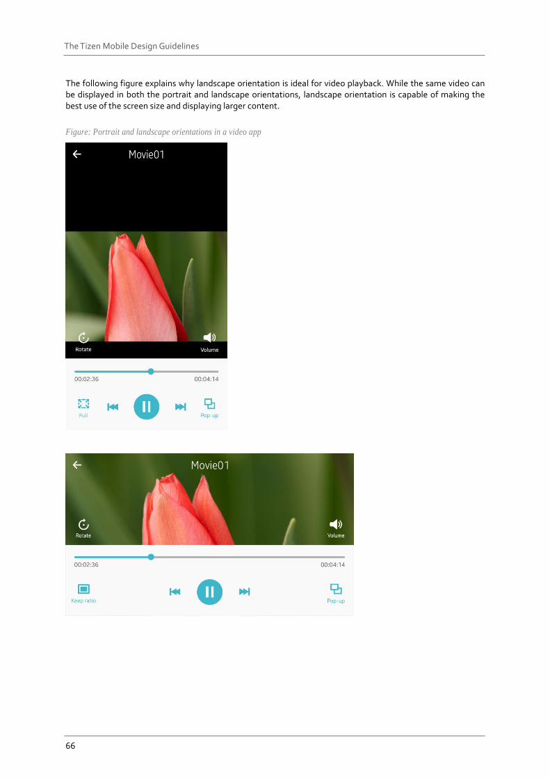
The following figure explains why landscape orientation is ideal for video playback. While the same video can be displayed in both the portrait and landscape orientations, landscape orientation is capable of making the best use of the screen size and displaying larger content.
Figure: Portrait and landscape orientations in a video app
67
The Tizen Mobile Design Guidelines
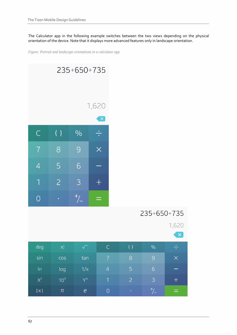
The Calculator app in the following example switches between the two views depending on the physical orientation of the device. Note that it displays more advanced features only in landscape orientation.
Figure: Portrait and landscape orientations in a calculator app
68
The Tizen Mobile Design Guidelines
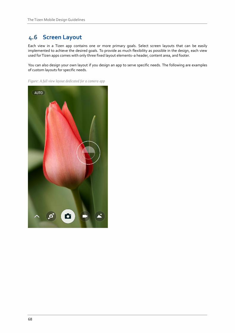
Screen Layout Each view in a Tizen app contains one or more primary goals. Select screen layouts that can be easily implemented to achieve the desired goals. To provide as much flexibility as possible in the design, each view used for Tizen apps comes with only three fixed layout elements–a header, content area, and footer. You can also design your own layout if you design an app to serve specific needs. The following are examples of custom layouts for specific needs.
Figure: A full view layout dedicated for a camera app
69
The Tizen Mobile Design Guidelines
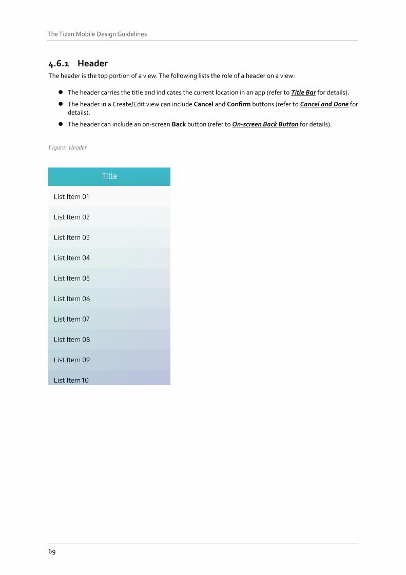
4.6.1 Header The header is the top portion of a view. The following lists the role of a header on a view:
The header carries the title and indicates the current location in an app (refer to Title Bar for details).
The header in a Create/Edit view can include Cancel and Confirm buttons (refer to Cancel and Done for details).
The header can include an on-screen Back button (refer to On-screen Back Button for details).
Figure: Header
70
The Tizen Mobile Design Guidelines
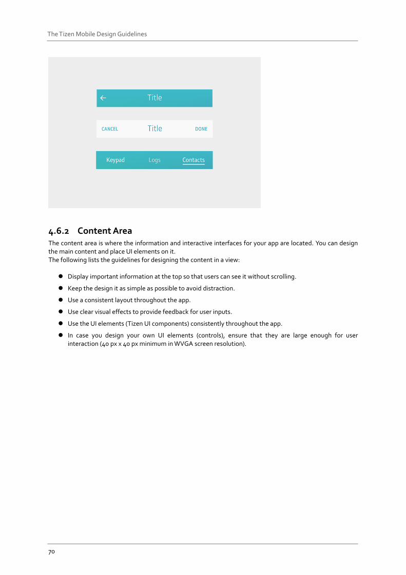
4.6.2 Content Area The content area is where the information and interactive interfaces for your app are located. You can design the main content and place UI elements on it. The following lists the guidelines for designing the content in a view:
Display important information at the top so that users can see it without scrolling.
Keep the design it as simple as possible to avoid distraction.
Use a consistent layout throughout the app.
Use clear visual effects to provide feedback for user inputs.
Use the UI elements (Tizen UI components) consistently throughout the app.
In case you design your own UI elements (controls), ensure that they are large enough for user interaction (40 px x 40 px minimum in WVGA screen resolution).
71
The Tizen Mobile Design Guidelines
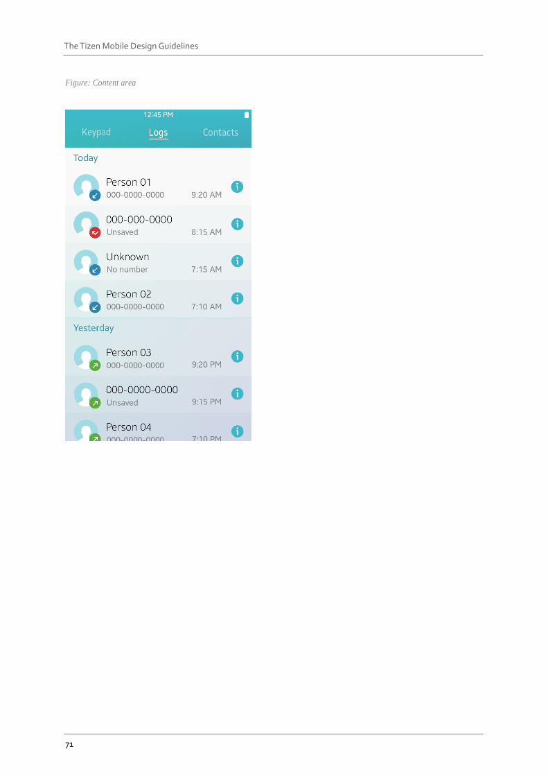
Figure: Content area
72
The Tizen Mobile Design Guidelines
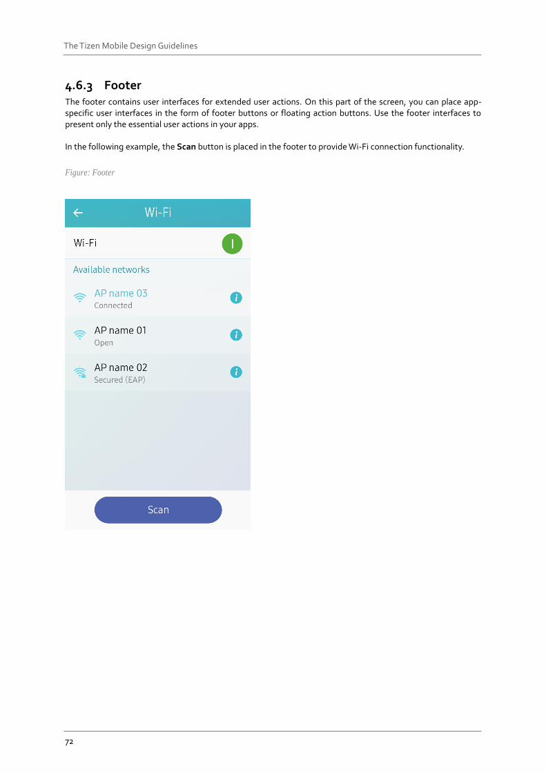
4.6.3 Footer The footer contains user interfaces for extended user actions. On this part of the screen, you can place app-specific user interfaces in the form of footer buttons or floating action buttons. Use the footer interfaces to present only the essential user actions in your apps. In the following example, the Scan button is placed in the footer to provide Wi-Fi connection functionality.
Figure: Footer
73
The Tizen Mobile Design Guidelines
Navigation Design When you design a Tizen app, ensure that the changes in the depth in an app are reflected on the screen. The navigation design should consistently provide information about the depth of the view users are currently accessing. Navigation design is one biggest factor that decides an app’s usability level. Therefore, plan the navigation structure and consider all related issues as early as possible in your development process.
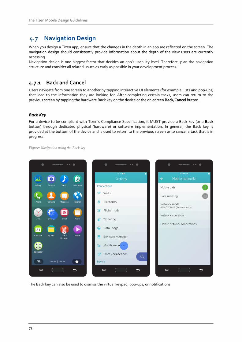
4.7.1 Back and Cancel Users navigate from one screen to another by tapping interactive UI elements (for example, lists and pop-ups) that lead to the information they are looking for. After completing certain tasks, users can return to the previous screen by tapping the hardware Back key on the device or the on-screen Back/Cancel button.
Back Key
For a device to be compliant with Tizen’s Compliance Specification, it MUST provide a Back key (or a Back button) through dedicated physical (hardware) or software implementation. In general, the Back key is provided at the bottom of the device and is used to return to the previous screen or to cancel a task that is in progress.
Figure: Navigation using the Back key
The Back key can also be used to dismiss the virtual keypad, pop-ups, or notifications.
74
The Tizen Mobile Design Guidelines
On-Screen Back Button
In Tizen 2.4, a layout design with a title bar requires the on-screen Back button. An on-screen Back button should be located on the left side of the title bar. The on-screen Back button performs tasks that are nearly identical to the physical Back key. You cannot provide the on-screen Back button:
On the top view.
If Save, Edit, or Create action buttons are used on the same screen. A Cancel button should be provided instead of the Back button.
Cancel Button
A Cancel button is used to close a screen for the current task and return to the previous screen. A Cancel button may be used with other action buttons, such as Send, Done, and Delete.
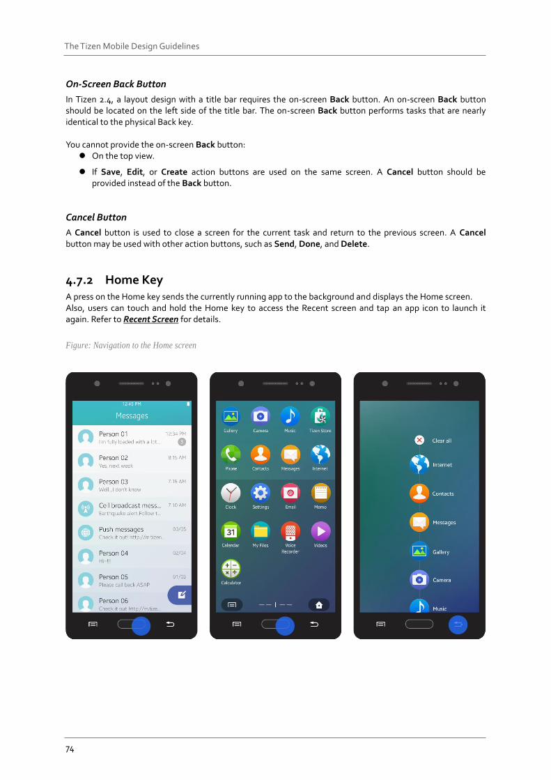
4.7.2 Home Key A press on the Home key sends the currently running app to the background and displays the Home screen. Also, users can touch and hold the Home key to access the Recent screen and tap an app icon to launch it again. Refer to Recent Screen for details.
Figure: Navigation to the Home screen
75
The Tizen Mobile Design Guidelines
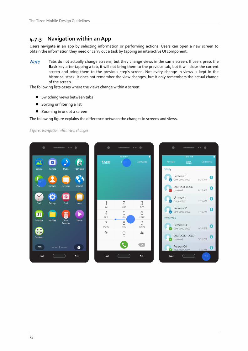
4.7.3 Navigation within an App Users navigate in an app by selecting information or performing actions. Users can open a new screen to obtain the information they need or carry out a task by tapping an interactive UI component.
Note Tabs do not actually change screens, but they change views in the same screen. If users press the Back key after tapping a tab, it will not bring them to the previous tab, but it will close the current screen and bring them to the previous step’s screen. Not every change in views is kept in the historical stack. It does not remember the view changes, but it only remembers the actual change of the screen.
The following lists cases where the views change within a screen:
Switching views between tabs
Sorting or filtering a list
Zooming in or out a screen
The following figure explains the difference between the changes in screens and views.
Figure: Navigation when view changes
76
The Tizen Mobile Design Guidelines
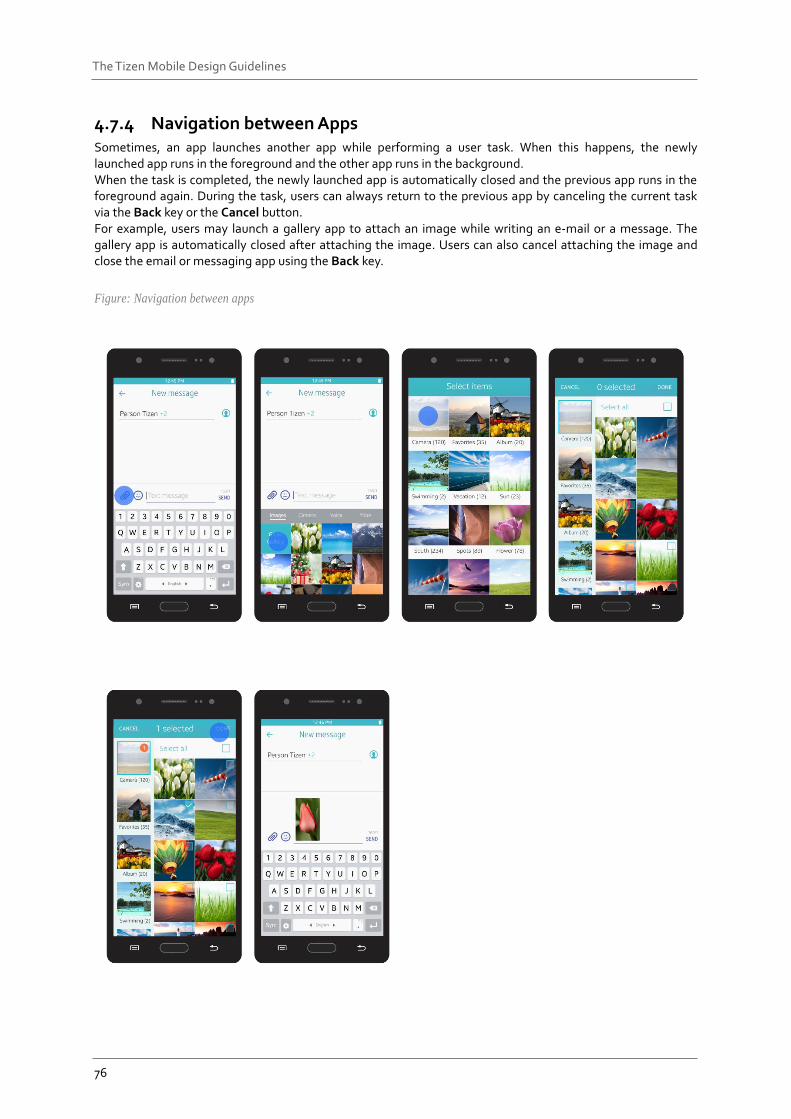
4.7.4 Navigation between Apps Sometimes, an app launches another app while performing a user task. When this happens, the newly launched app runs in the foreground and the other app runs in the background. When the task is completed, the newly launched app is automatically closed and the previous app runs in the foreground again. During the task, users can always return to the previous app by canceling the current task via the Back key or the Cancel button. For example, users may launch a gallery app to attach an image while writing an e-mail or a message. The gallery app is automatically closed after attaching the image. Users can also cancel attaching the image and close the email or messaging app using the Back key.
Figure: Navigation between apps
77
The Tizen Mobile Design Guidelines
4.7.5 User Actions Inside an App You can use the basic elements provided with the Tizen 2.4 SDK to design various features for your app. This section provides information about designing patterns for data creation and modification.
Creating Entries
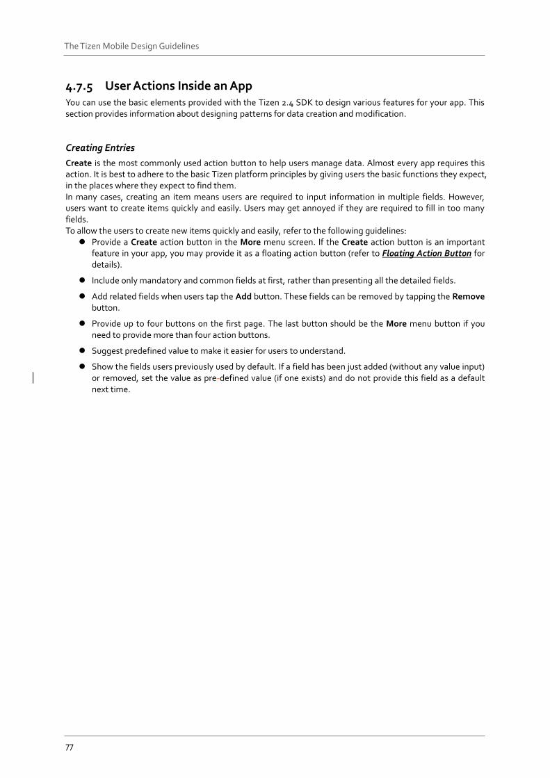
Create is the most commonly used action button to help users manage data. Almost every app requires this action. It is best to adhere to the basic Tizen platform principles by giving users the basic functions they expect, in the places where they expect to find them. In many cases, creating an item means users are required to input information in multiple fields. However, users want to create items quickly and easily. Users may get annoyed if they are required to fill in too many fields. To allow the users to create new items quickly and easily, refer to the following guidelines:
Provide a Create action button in the More menu screen. If the Create action button is an important feature in your app, you may provide it as a floating action button (refer to Floating Action Button for details).
Include only mandatory and common fields at first, rather than presenting all the detailed fields.
Add related fields when users tap the Add button. These fields can be removed by tapping the Remove button.
Provide up to four buttons on the first page. The last button should be the More menu button if you need to provide more than four action buttons.
Suggest predefined value to make it easier for users to understand.
Show the fields users previously used by default. If a field has been just added (without any value input) or removed, set the value as pre-defined value (if one exists) and do not provide this field as a default next time.
78
The Tizen Mobile Design Guidelines
Figure: Create mode
Selecting Multiple Items
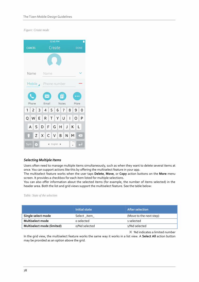
Users often need to manage multiple items simultaneously, such as when they want to delete several items at once. You can support actions like this by offering the multiselect feature in your app. The multiselect feature works when the user taps Delete, Move, or Copy action buttons on the More menu screen. It provides a checkbox for each item listed for multiple selections. You can also offer information about the selected items (for example, the number of items selected) in the header area. Both the list and grid views support the multiselect feature. See the table below:
Table: State of the selection
Initial state After selection
Single select mode Select _item_ (Move to the next step)
Multiselect mode 0 selected 1 selected
Multiselect mode (limited) 0/%d selected 1/%d selected
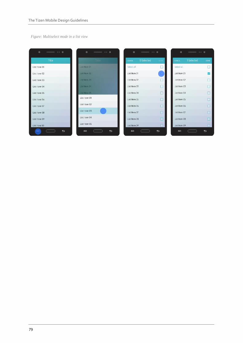
※ %d indicates a limited number In the grid view, the multiselect feature works the same way it works in a list view. A Select All action button may be provided as an option above the grid.
79
The Tizen Mobile Design Guidelines
Figure: Multiselect mode in a list view
80
The Tizen Mobile Design Guidelines
Figure: Multi-selection in a grid view
The Select All action button scrolls with the list. Tapping the Select All button selects all the items in the list, and tapping it again deselects all the selected items.
Figure: Select All feature
81
The Tizen Mobile Design Guidelines
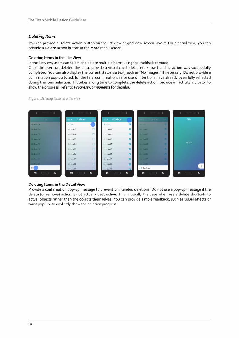
Deleting Items
You can provide a Delete action button on the list view or grid view screen layout. For a detail view, you can provide a Delete action button in the More menu screen. Deleting Items in the List View In the list view, users can select and delete multiple items using the multiselect mode. Once the user has deleted the data, provide a visual cue to let users know that the action was successfully completed. You can also display the current status via text, such as “No images,” if necessary. Do not provide a confirmation pop-up to ask for the final confirmation, since users’ intentions have already been fully reflected during the item selection. If it takes a long time to complete the delete action, provide an activity indicator to show the progress (refer to Progress Components for details).
Figure: Deleting items in a list view
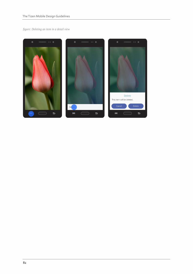
Deleting Items in the Detail View Provide a confirmation pop-up message to prevent unintended deletions. Do not use a pop-up message if the delete (or remove) action is not actually destructive. This is usually the case when users delete shortcuts to actual objects rather than the objects themselves. You can provide simple feedback, such as visual effects or toast pop-up, to explicitly show the deletion progress.
82
The Tizen Mobile Design Guidelines
figure: Deleting an item in a detail view
83
The Tizen Mobile Design Guidelines
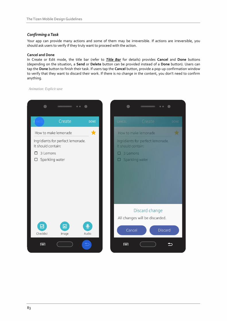
Confirming a Task
Your app can provide many actions and some of them may be irreversible. If actions are irreversible, you should ask users to verify if they truly want to proceed with the action. Cancel and Done In Create or Edit mode, the title bar (refer to Title Bar for details) provides Cancel and Done buttons (depending on the situation, a Send or Delete button can be provided instead of a Done button). Users can tap the Done button to finish their task. If users tap the Cancel button, provide a pop-up confirmation window to verify that they want to discard their work. If there is no change in the content, you don’t need to confirm anything.
Animation: Explicit save
84
The Tizen Mobile Design Guidelines
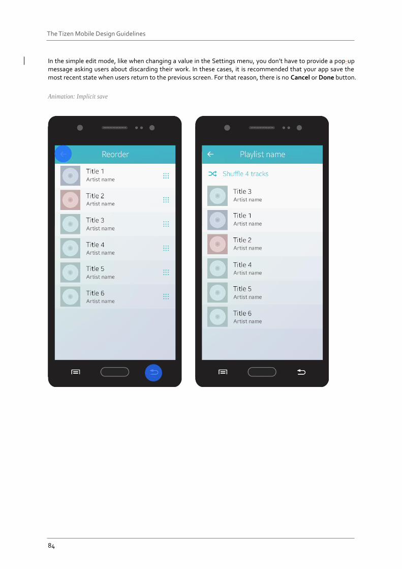
In the simple edit mode, like when changing a value in the Settings menu, you don’t have to provide a pop-up message asking users about discarding their work. In these cases, it is recommended that your app save the most recent state when users return to the previous screen. For that reason, there is no Cancel or Done button.
Animation: Implicit save
85
The Tizen Mobile Design Guidelines
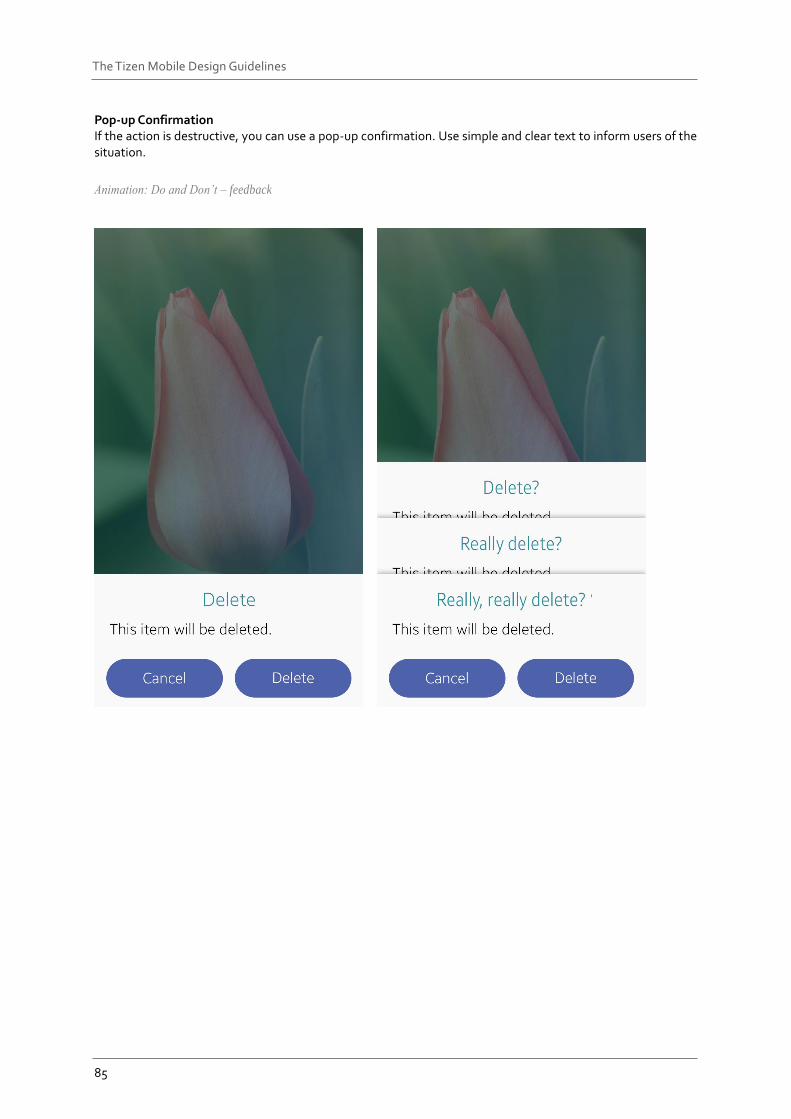
Pop-up Confirmation If the action is destructive, you can use a pop-up confirmation. Use simple and clear text to inform users of the situation.
Animation: Do and Don’t – feedback
86
The Tizen Mobile Design Guidelines
Settings In Settings, users can view and customize various functions. By offering the right settings at the right time, you can enrich your app’s user experience.
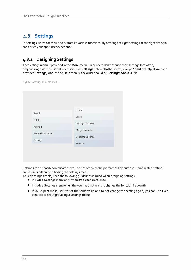
4.8.1 Designing Settings The Settings menu is provided in the More menu. Since users don’t change their settings that often, emphasizing this menu is not necessary. Put Settings below all other items, except About or Help. If your app provides Settings, About, and Help menus, the order should be Settings>About>Help.
Figure: Settings in More menu
Settings can be easily complicated if you do not organize the preferences by purpose. Complicated settings cause users difficulty in finding the Settings menu. To keep things simple, keep the following guidelines in mind when designing settings:
Include a Settings menu only when it’s a user preference.
Include a Settings menu when the user may not want to change the function frequently.
If you expect most users to set the same value and to not change the setting again, you can use fixed behavior without providing a Settings menu.
87
The Tizen Mobile Design Guidelines
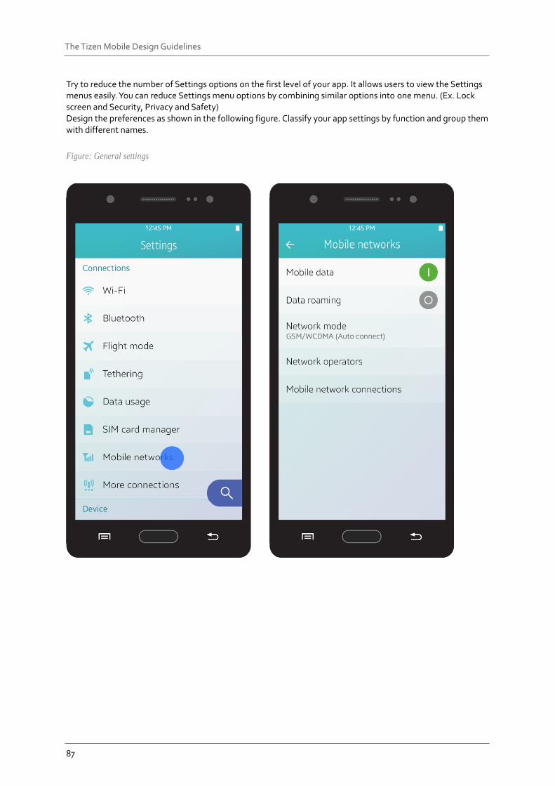
Try to reduce the number of Settings options on the first level of your app. It allows users to view the Settings menus easily. You can reduce Settings menu options by combining similar options into one menu. (Ex. Lock screen and Security, Privacy and Safety) Design the preferences as shown in the following figure. Classify your app settings by function and group them with different names.
Figure: General settings
88
The Tizen Mobile Design Guidelines
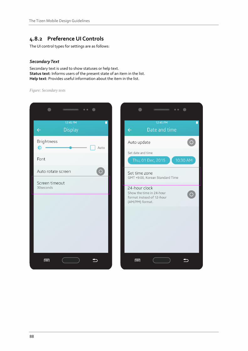
4.8.2 Preference UI Controls The UI control types for settings are as follows:
Secondary Text
Secondary text is used to show statuses or help text. Status text: Informs users of the present state of an item in the list. Help text: Provides useful information about the item in the list.
Figure: Secondary texts

89
The Tizen Mobile Design Guidelines
Toggles
These controls help the user enable or disable specific functions. Refer to Toggle for more information.
Figure: Toggles
90
The Tizen Mobile Design Guidelines
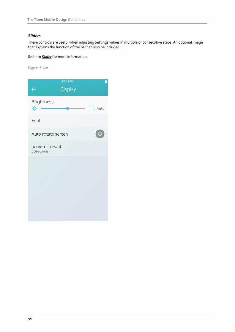
Sliders
These controls are useful when adjusting Settings values in multiple or consecutive steps. An optional image that explains the function of the bar can also be included. Refer to Slider for more information.
Figure: Slider
91
The Tizen Mobile Design Guidelines
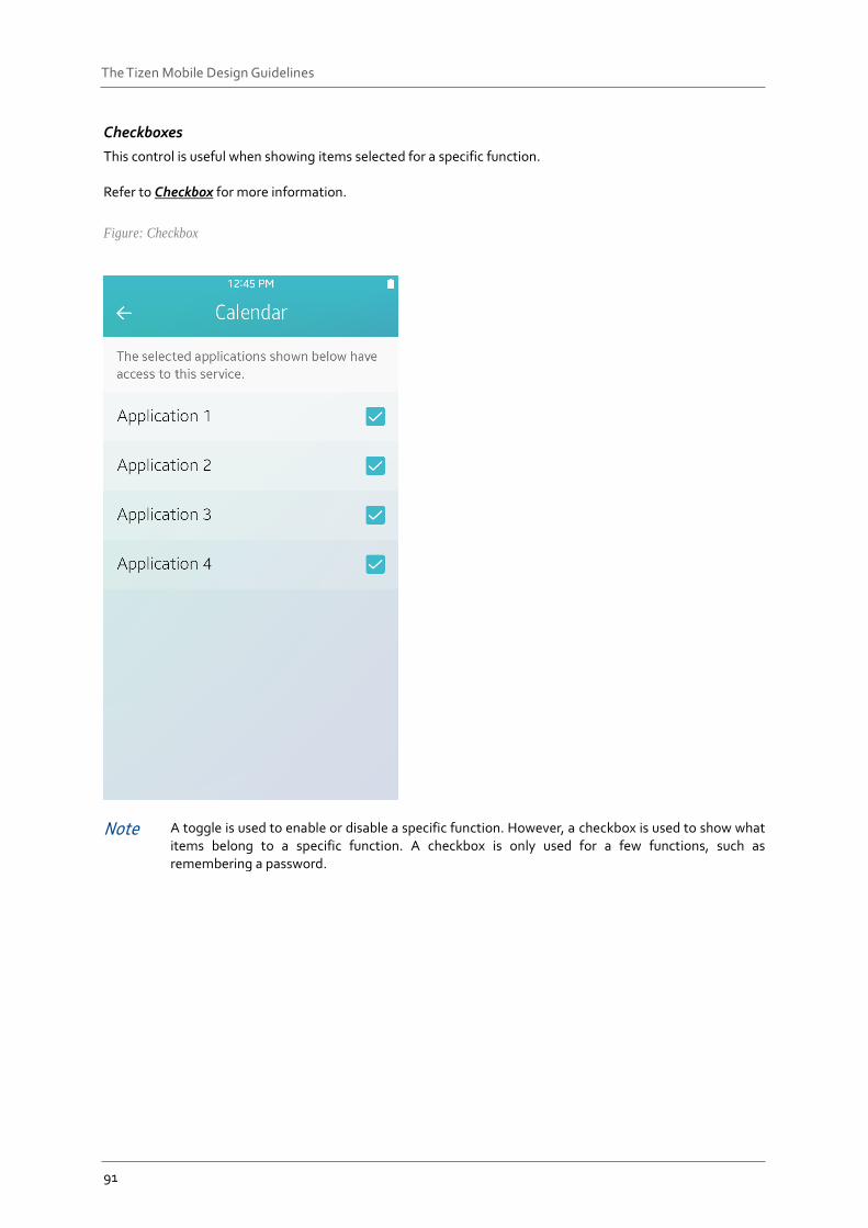
Checkboxes
This control is useful when showing items selected for a specific function. Refer to Checkbox for more information.
Figure: Checkbox
Note A toggle is used to enable or disable a specific function. However, a checkbox is used to show what items belong to a specific function. A checkbox is only used for a few functions, such as remembering a password.
92
The Tizen Mobile Design Guidelines
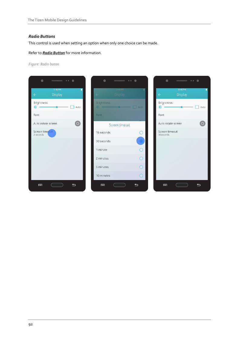
Radio Buttons
This control is used when setting an option when only one choice can be made. Refer to Radio Button for more information.
Figure: Radio button
93
The Tizen Mobile Design Guidelines
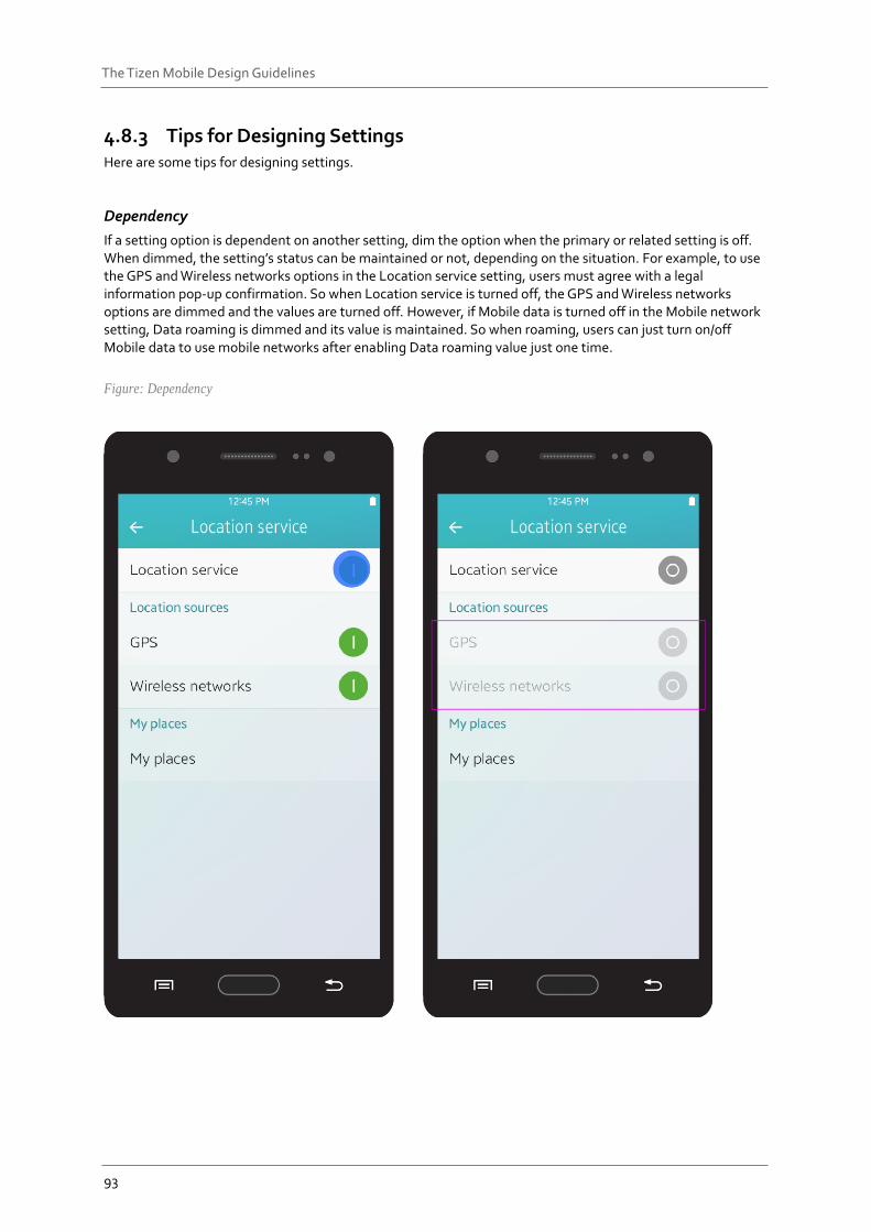
4.8.3 Tips for Designing Settings Here are some tips for designing settings.
Dependency
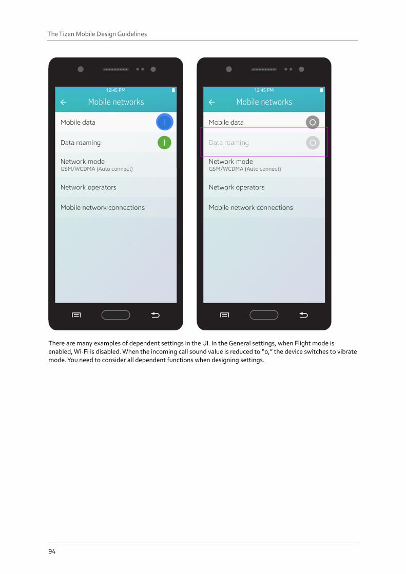
If a setting option is dependent on another setting, dim the option when the primary or related setting is off. When dimmed, the setting’s status can be maintained or not, depending on the situation. For example, to use the GPS and Wireless networks options in the Location service setting, users must agree with a legal information pop-up confirmation. So when Location service is turned off, the GPS and Wireless networks options are dimmed and the values are turned off. However, if Mobile data is turned off in the Mobile network setting, Data roaming is dimmed and its value is maintained. So when roaming, users can just turn on/off Mobile data to use mobile networks after enabling Data roaming value just one time.
Figure: Dependency
94
The Tizen Mobile Design Guidelines
There are many examples of dependent settings in the UI. In the General settings, when Flight mode is enabled, Wi-Fi is disabled. When the incoming call sound value is reduced to “0,” the device switches to vibrate mode. You need to consider all dependent functions when designing settings.
95
The Tizen Mobile Design Guidelines
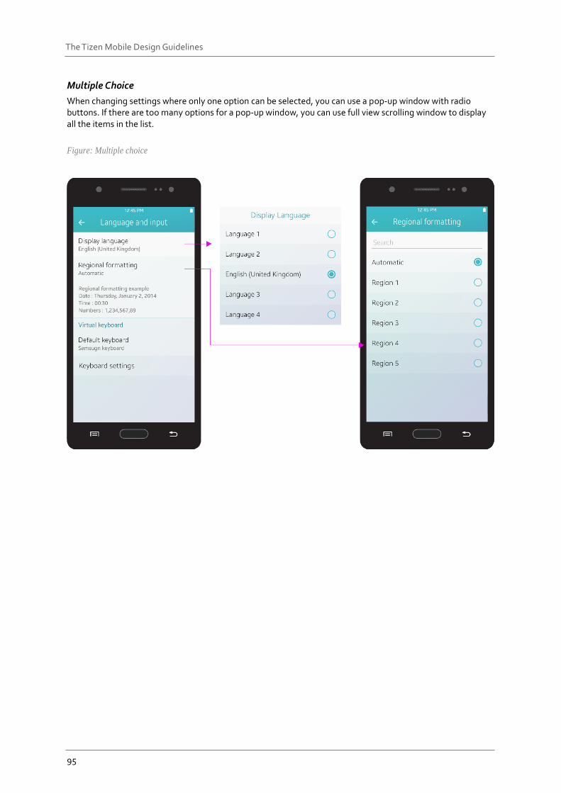
Multiple Choice
When changing settings where only one option can be selected, you can use a pop-up window with radio buttons. If there are too many options for a pop-up window, you can use full view scrolling window to display all the items in the list.
Figure: Multiple choice
96
The Tizen Mobile Design Guidelines
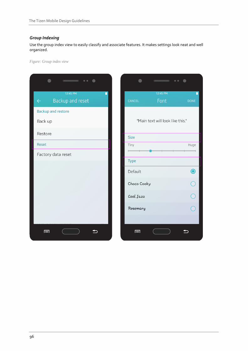
Group Indexing
Use the group index view to easily classify and associate features. It makes settings look neat and well organized.
Figure: Group index view
97
The Tizen Mobile Design Guidelines
Default Values
When choosing the default values of your settings, you should consider carefully. Most users don’t change settings values too often. Some users may not even know that there is a settings option they can use. If users feel that the default operation of your app is complicated, they will think your app is just difficult. Keep the following guidelines in mind when choosing default values:
Choose a value that will be suitable for the majority of users.
Choose a value that is known to be safe and generally adequate.
Choose a value that provides better security.
Choose a neutral value.
Choose a value that uses fewer data and battery resources.
98
The Tizen Mobile Design Guidelines
5. UI components for Tizen App design
This chapter provides information about the basic UI components in the Tizen SDK. You can include these components in your app designs to implement specific features. Tizen UI components may be divided into four categories:.
Navigation elements are used to browse content and switch between screens.
Presentation views are used to display the main content of an app in different forms.
User input elements are used to collect user input for specific tasks.
Assist views are used to provide additional information.
Navigation Elements Navigation elements are used to browse content and switch between screens. The following elements in the list belong to the navigation elements.
Title bar
Tabs
Navigation bar
Scroll components
Scroll bar Index scroll Page indicator
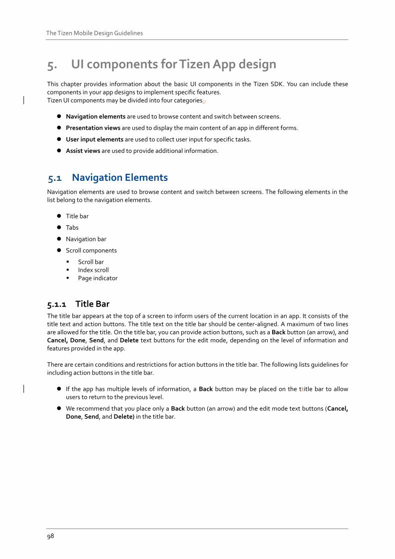
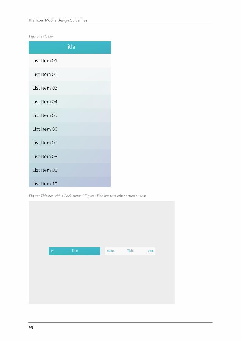
5.1.1 Title Bar The title bar appears at the top of a screen to inform users of the current location in an app. It consists of the title text and action buttons. The title text on the title bar should be center-aligned. A maximum of two lines are allowed for the title. On the title bar, you can provide action buttons, such as a Back button (an arrow), and Cancel, Done, Send, and Delete text buttons for the edit mode, depending on the level of information and features provided in the app. There are certain conditions and restrictions for action buttons in the title bar. The following lists guidelines for including action buttons in the title bar.
If the app has multiple levels of information, a Back button may be placed on the ttitle bar to allow users to return to the previous level.
We recommend that you place only a Back button (an arrow) and the edit mode text buttons (Cancel, Done, Send, and Delete) in the title bar.
99
The Tizen Mobile Design Guidelines
Figure: Title bar
Figure: Title bar with a Back button / Figure: Title bar with other action buttons
100
The Tizen Mobile Design Guidelines
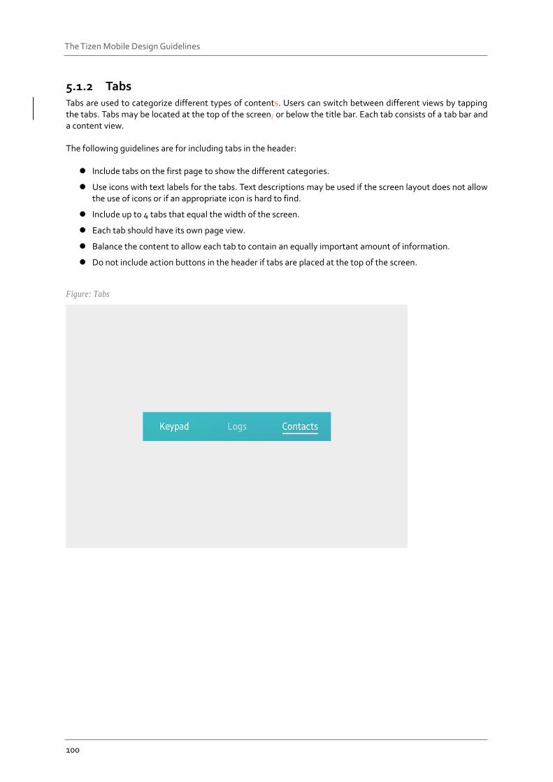
5.1.2 Tabs Tabs are used to categorize different types of contents. Users can switch between different views by tapping the tabs. Tabs may be located at the top of the screen, or below the title bar. Each tab consists of a tab bar and a content view. The following guidelines are for including tabs in the header:
Include tabs on the first page to show the different categories.
Use icons with text labels for the tabs. Text descriptions may be used if the screen layout does not allow the use of icons or if an appropriate icon is hard to find.
Include up to 4 tabs that equal the width of the screen.
Each tab should have its own page view.
Balance the content to allow each tab to contain an equally important amount of information.
Do not include action buttons in the header if tabs are placed at the top of the screen.
Figure: Tabs
101
The Tizen Mobile Design Guidelines
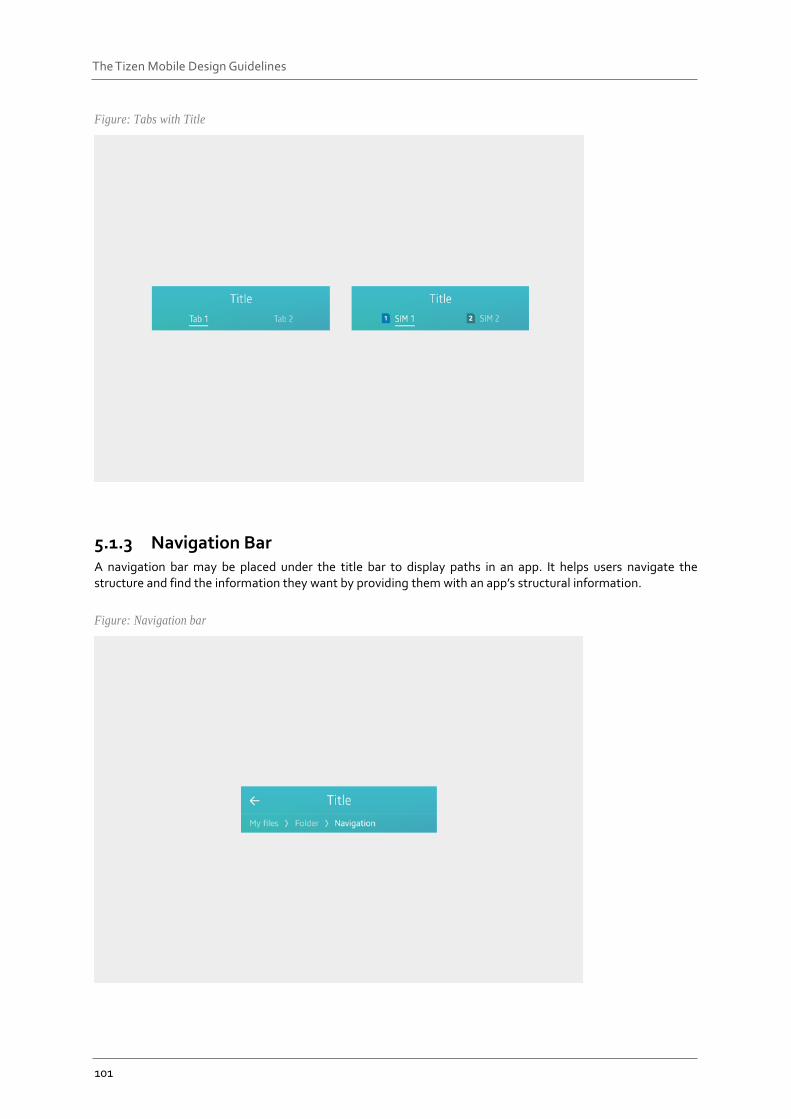
Figure: Tabs with Title
5.1.3 Navigation Bar A navigation bar may be placed under the title bar to display paths in an app. It helps users navigate the structure and find the information they want by providing them with an app’s structural information.
Figure: Navigation bar
102
The Tizen Mobile Design Guidelines
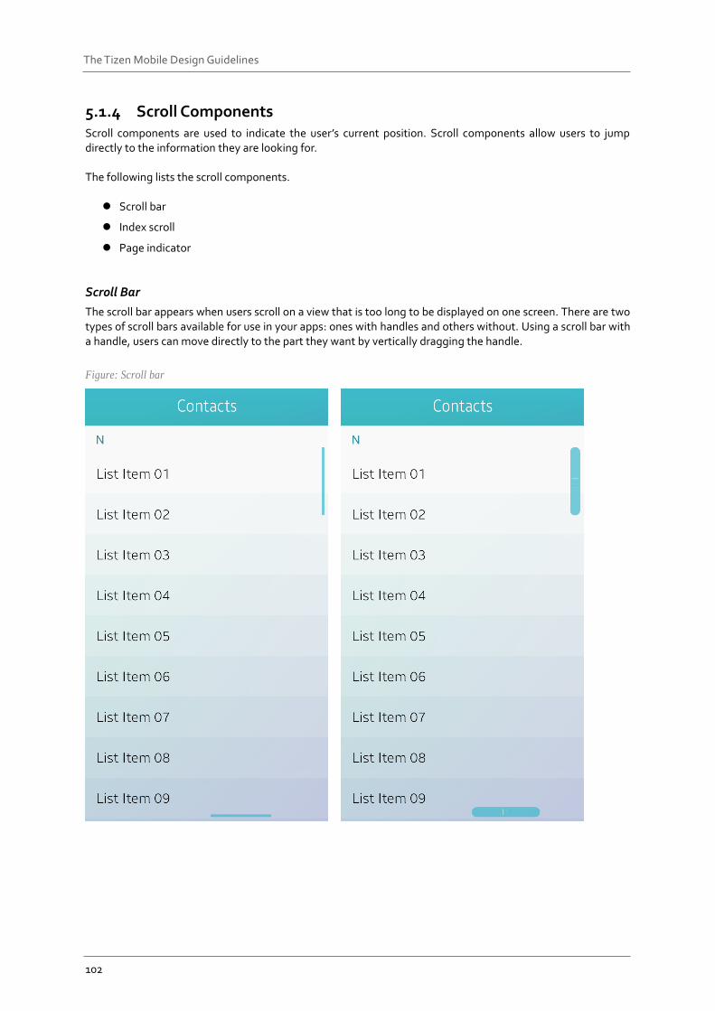
5.1.4 Scroll Components Scroll components are used to indicate the user’s current position. Scroll components allow users to jump directly to the information they are looking for. The following lists the scroll components.
Scroll bar
Index scroll
Page indicator
Scroll Bar
The scroll bar appears when users scroll on a view that is too long to be displayed on one screen. There are two types of scroll bars available for use in your apps: ones with handles and others without. Using a scroll bar with a handle, users can move directly to the part they want by vertically dragging the handle.
Figure: Scroll bar
103
The Tizen Mobile Design Guidelines
Index Scroll
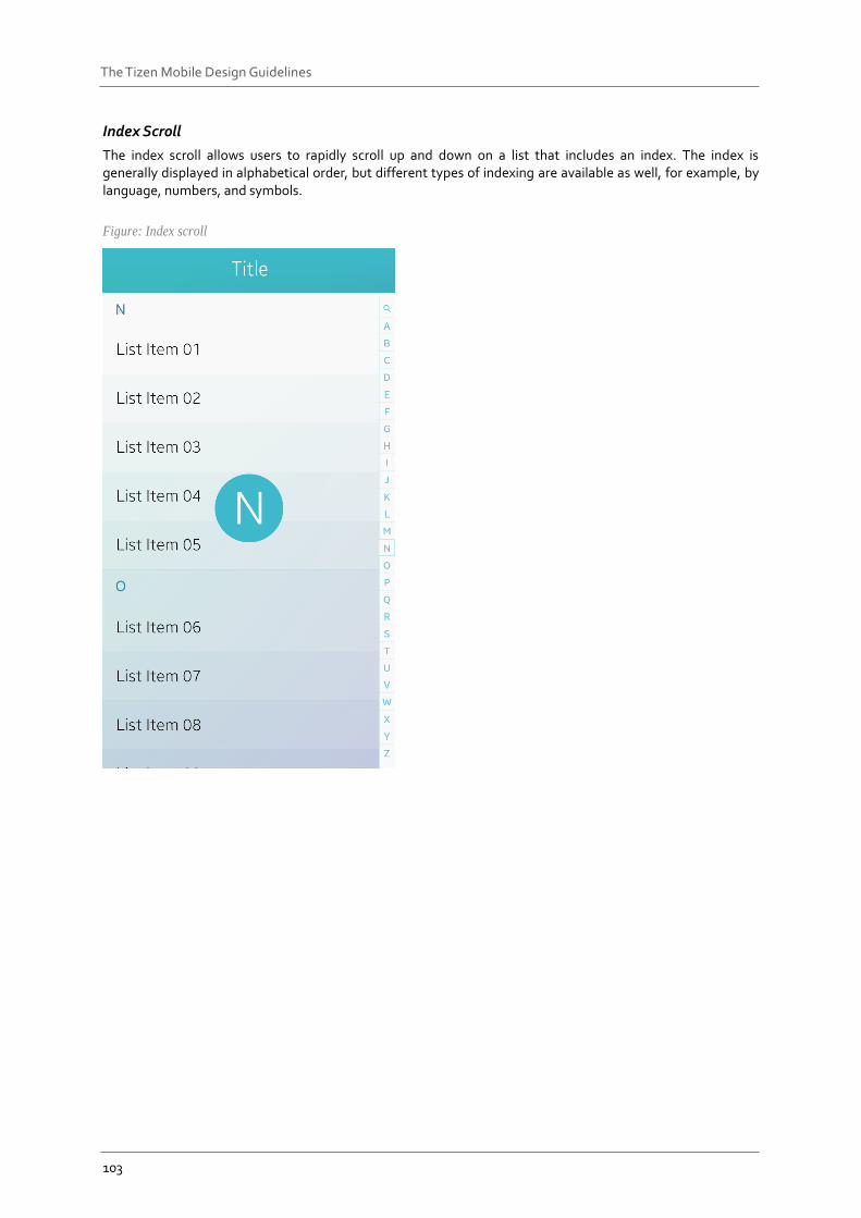
The index scroll allows users to rapidly scroll up and down on a list that includes an index. The index is generally displayed in alphabetical order, but different types of indexing are available as well, for example, by language, numbers, and symbols.
Figure: Index scroll
104
The Tizen Mobile Design Guidelines
Page Indicator
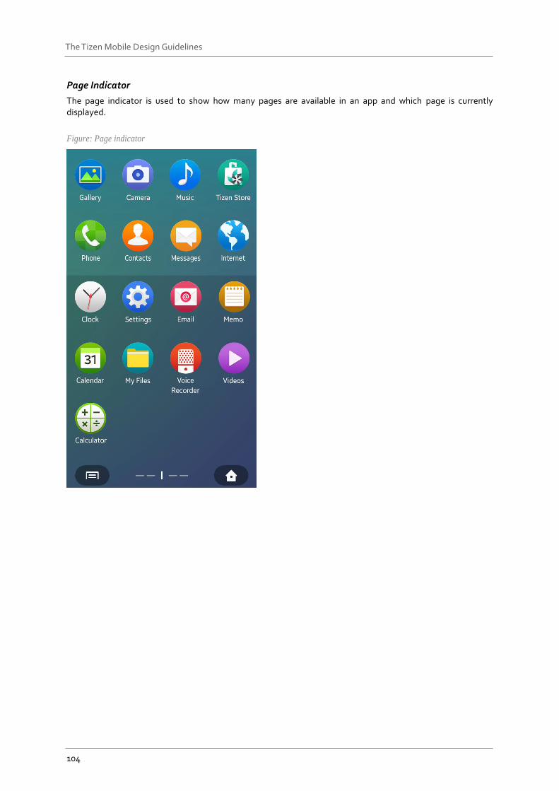
The page indicator is used to show how many pages are available in an app and which page is currently displayed.
Figure: Page indicator
105
The Tizen Mobile Design Guidelines
Presentation Views Presentation views are used to display the main content of an app in different forms. The following lists different types of Presentation views:.
List view
Grid view
Group index
Progress components
a) Progress indicator
b) Activity indicator
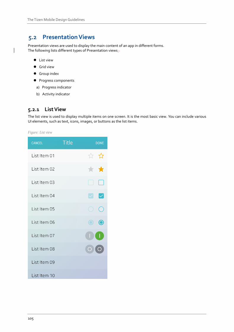
5.2.1 List View The list view is used to display multiple items on one screen. It is the most basic view. You can include various UI elements, such as text, icons, images, or buttons as the list items.
Figure: List view
106
The Tizen Mobile Design Guidelines
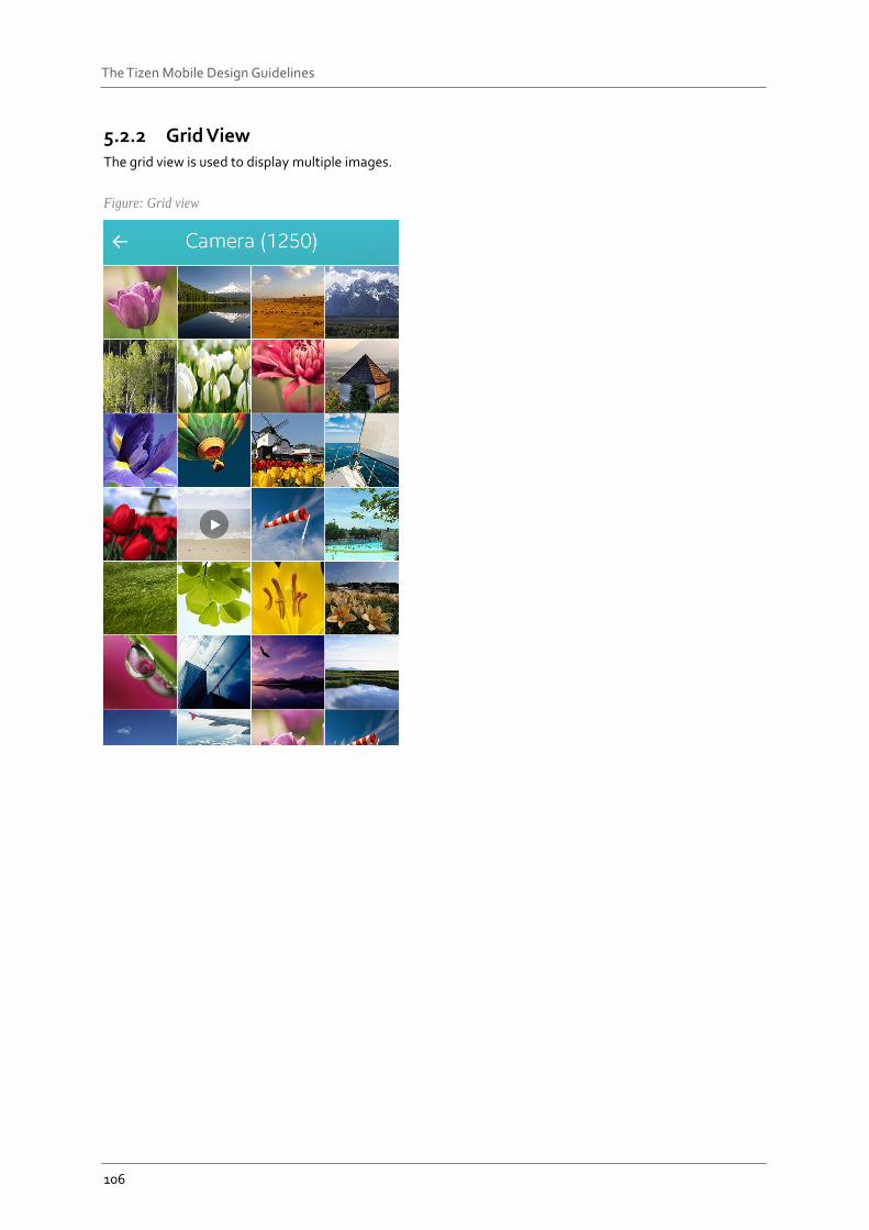
5.2.2 Grid View The grid view is used to display multiple images.
Figure: Grid view
107
The Tizen Mobile Design Guidelines
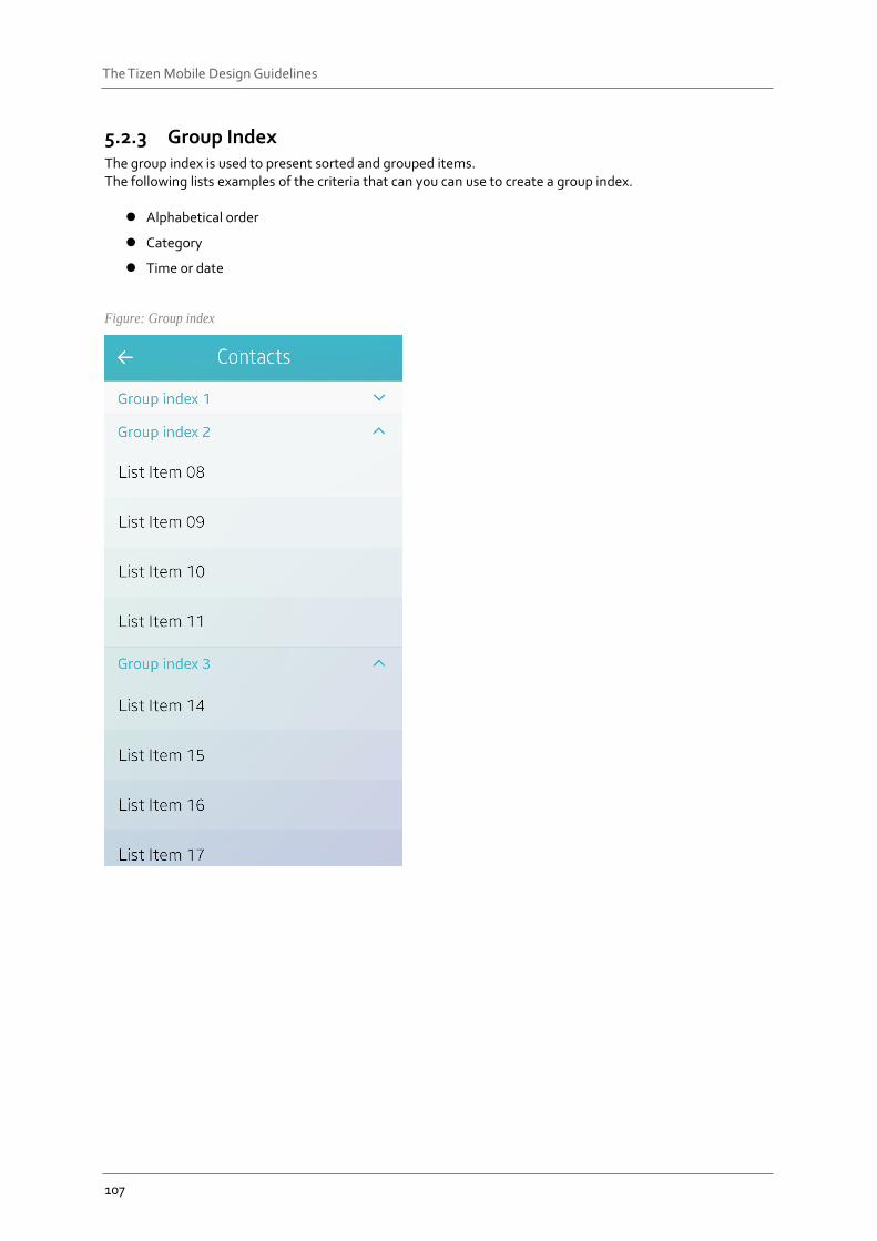
5.2.3 Group Index The group index is used to present sorted and grouped items. The following lists examples of the criteria that can you can use to create a group index.
Alphabetical order
Category
Time or date
Figure: Group index
108
The Tizen Mobile Design Guidelines
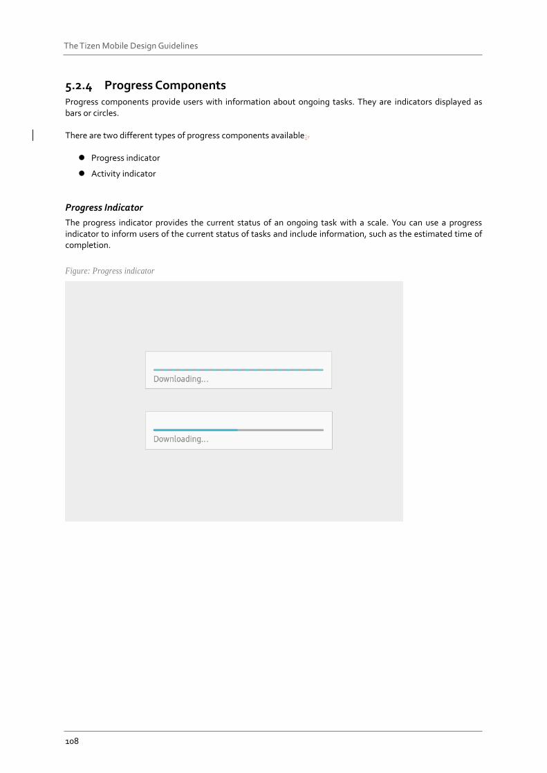
5.2.4 Progress Components Progress components provide users with information about ongoing tasks. They are indicators displayed as bars or circles. There are two different types of progress components available:.
Progress indicator
Activity indicator
Progress Indicator
The progress indicator provides the current status of an ongoing task with a scale. You can use a progress indicator to inform users of the current status of tasks and include information, such as the estimated time of completion.
Figure: Progress indicator
109
The Tizen Mobile Design Guidelines
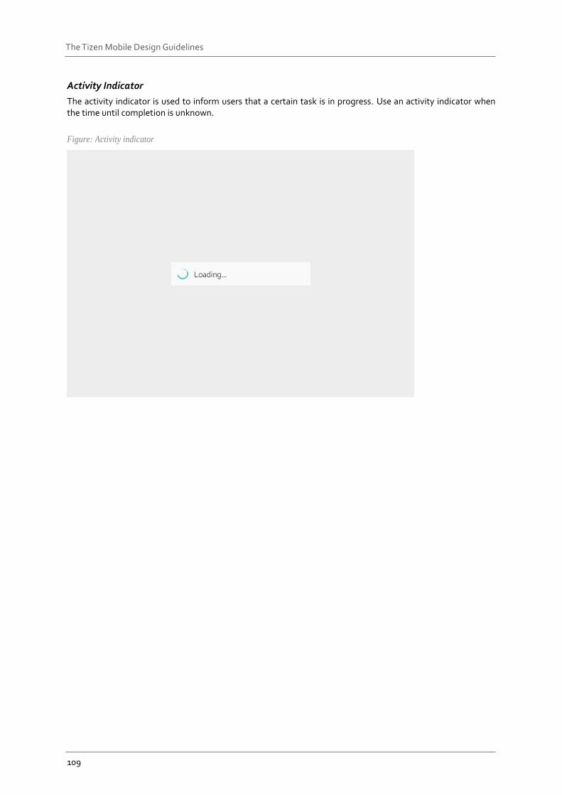
Activity Indicator
The activity indicator is used to inform users that a certain task is in progress. Use an activity indicator when the time until completion is unknown.
Figure: Activity indicator
110
The Tizen Mobile Design Guidelines
User Input Components User input components are used to collect user input for specific tasks.
Button
Circle button Box button Bottom button
Checkbox components
Toggle Checkbox Favorite
Radio button
Text input
Dropdown menu
Slider
Picker
(A) Number picker (B) Date and time picker
-Time picker -Date picker
(C) Color Picker
5.3.1 Button A button is used to allow user interactions to trigger events. On a button, you can include text, an image, or both. The following lists different types of buttons available:
Circle button
Box button
Bottom button
Circle Button
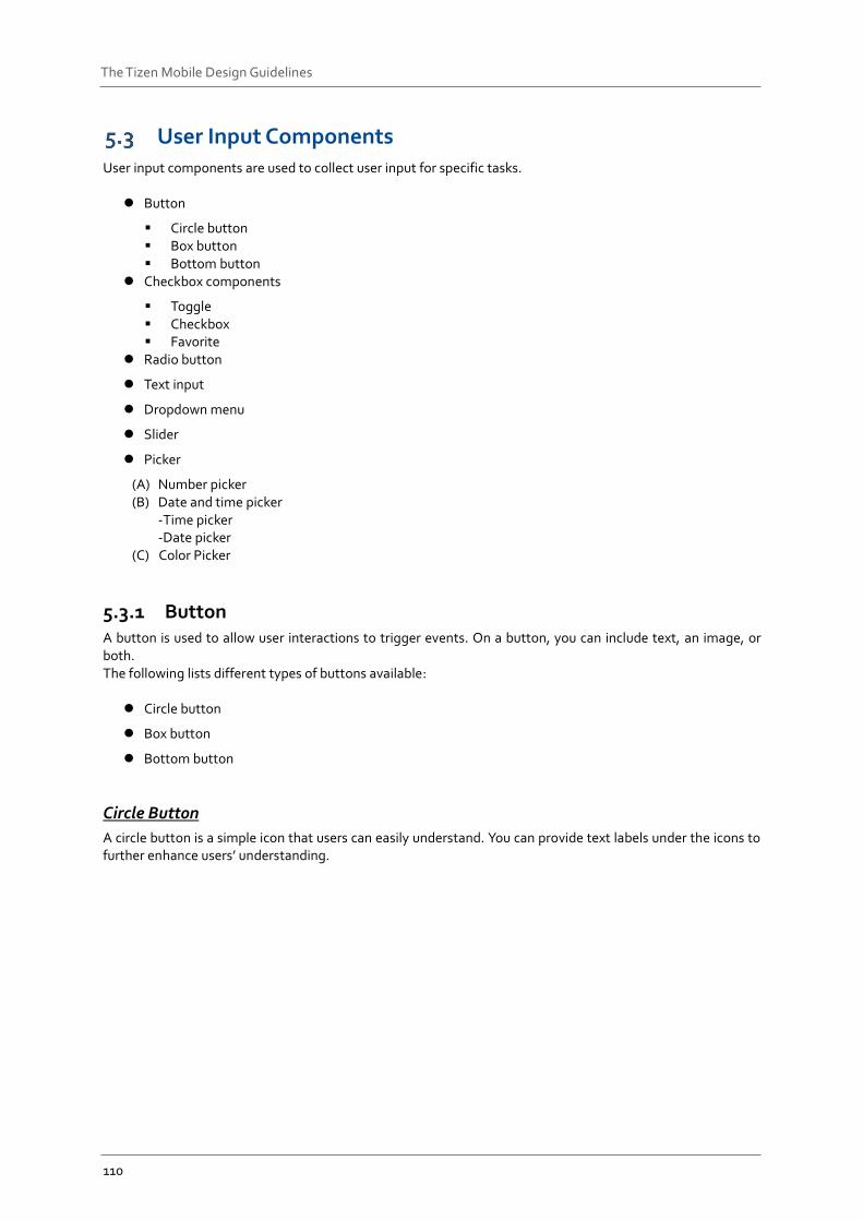
A circle button is a simple icon that users can easily understand. You can provide text labels under the icons to further enhance users’ understanding.
111
The Tizen Mobile Design Guidelines
Figure: Circle buttons
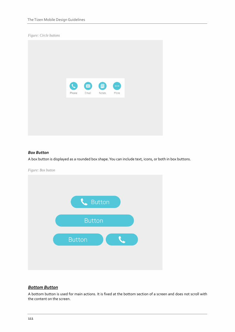
Box Button
A box button is displayed as a rounded box shape. You can include text, icons, or both in box buttons.
Figure: Box button
Bottom Button
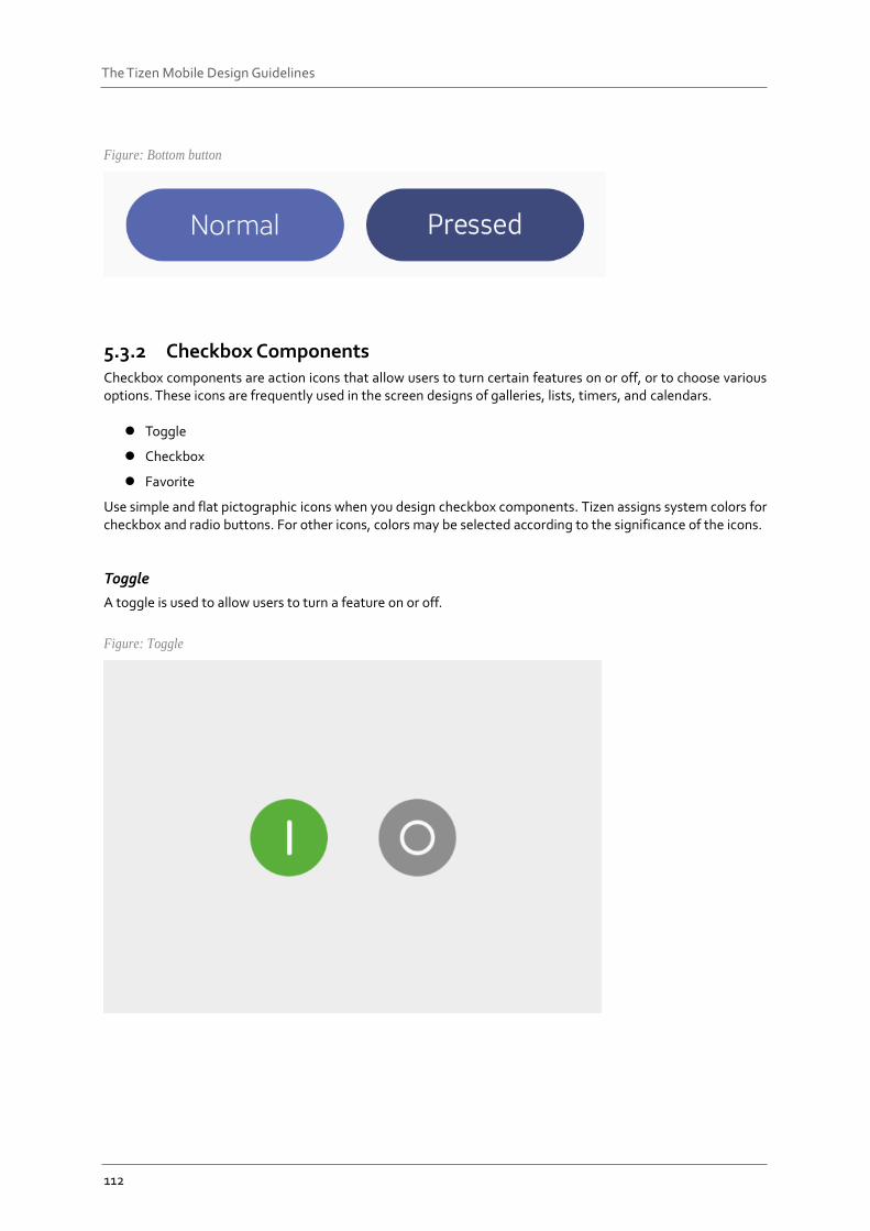
A bottom button is used for main actions. It is fixed at the bottom section of a screen and does not scroll with the content on the screen.
112
The Tizen Mobile Design Guidelines
Figure: Bottom button
5.3.2 Checkbox Components Checkbox components are action icons that allow users to turn certain features on or off, or to choose various options. These icons are frequently used in the screen designs of galleries, lists, timers, and calendars.
Toggle
Checkbox
Favorite
Use simple and flat pictographic icons when you design checkbox components. Tizen assigns system colors for checkbox and radio buttons. For other icons, colors may be selected according to the significance of the icons.
Toggle
A toggle is used to allow users to turn a feature on or off.
Figure: Toggle
113
The Tizen Mobile Design Guidelines
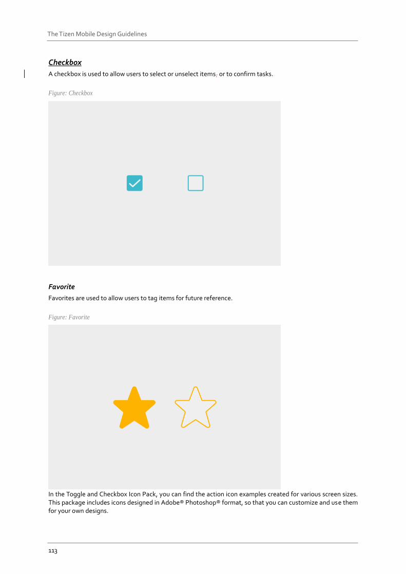
Checkbox
A checkbox is used to allow users to select or unselect items, or to confirm tasks.
Figure: Checkbox
Favorite
Favorites are used to allow users to tag items for future reference.
Figure: Favorite
In the Toggle and Checkbox Icon Pack, you can find the action icon examples created for various screen sizes. This package includes icons designed in Adobe® Photoshop® format, so that you can customize and use them for your own designs.
114
The Tizen Mobile Design Guidelines
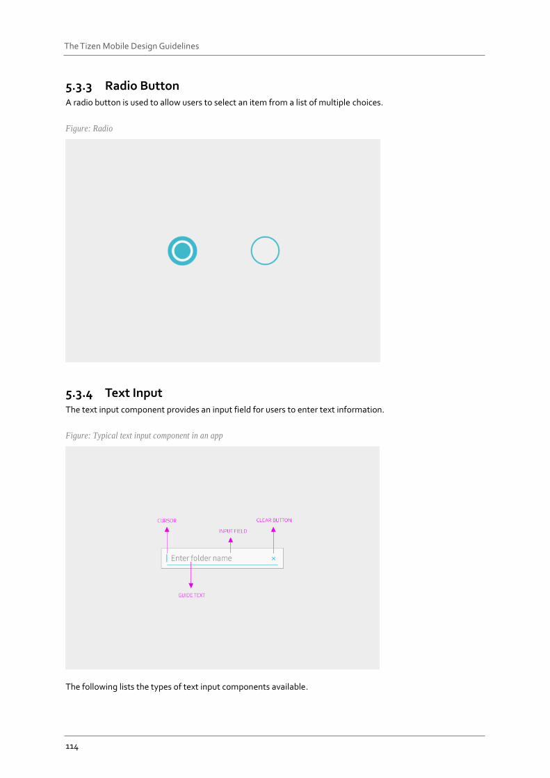
5.3.3 Radio Button A radio button is used to allow users to select an item from a list of multiple choices.
Figure: Radio
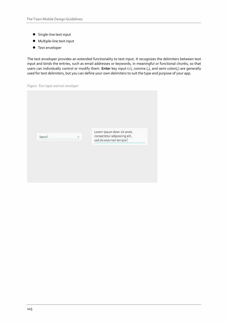
5.3.4 Text Input The text input component provides an input field for users to enter text information.
Figure: Typical text input component in an app
The following lists the types of text input components available.
115
The Tizen Mobile Design Guidelines
Single-line text input
Multiple-line text input
Text enveloper
The text enveloper provides an extended functionality to text input. It recognizes the delimiters between text input and binds the entries, such as email addresses or keywords, in meaningful or functional chunks, so that
users can individually control or modify them. Enter key input (↵), comma (,), and semi colon(;) are generally used for text delimiters, but you can define your own delimiters to suit the type and purpose of your app.
Figure: Text input and text enveloper
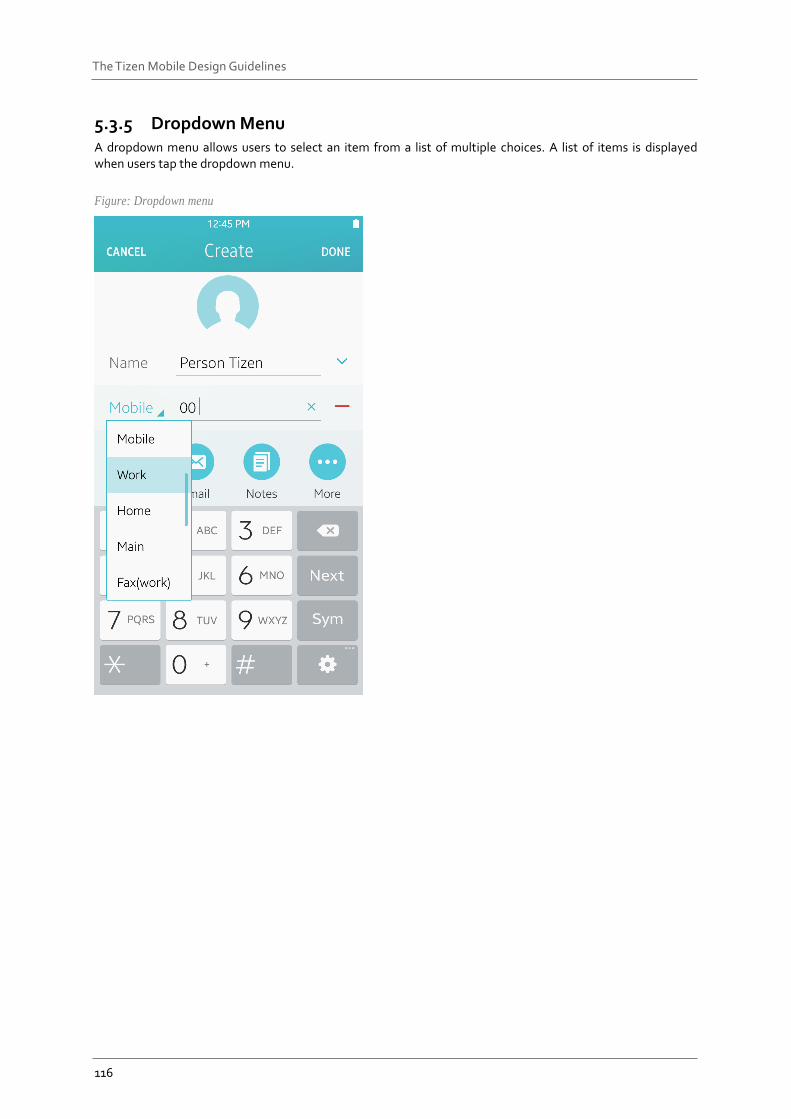
116
The Tizen Mobile Design Guidelines
5.3.5 Dropdown Menu A dropdown menu allows users to select an item from a list of multiple choices. A list of items is displayed when users tap the dropdown menu.
Figure: Dropdown menu
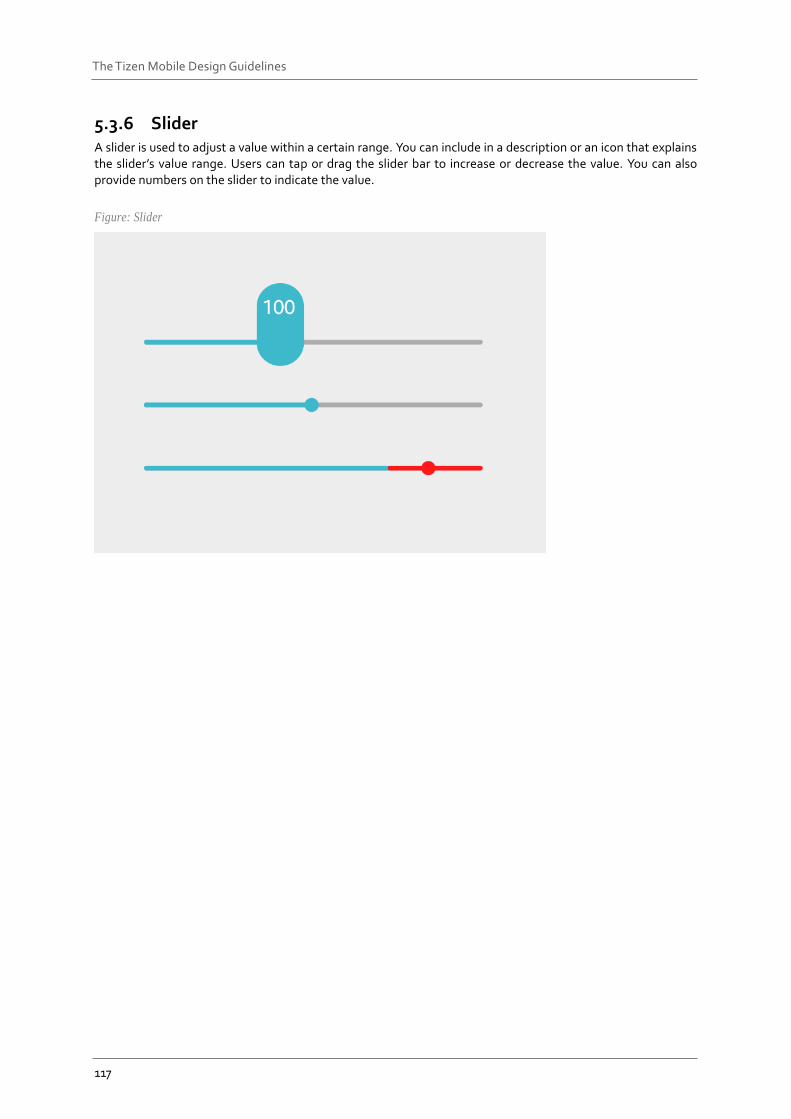
117
The Tizen Mobile Design Guidelines
5.3.6 Slider A slider is used to adjust a value within a certain range. You can include in a description or an icon that explains the slider’s value range. Users can tap or drag the slider bar to increase or decrease the value. You can also provide numbers on the slider to indicate the value.
Figure: Slider
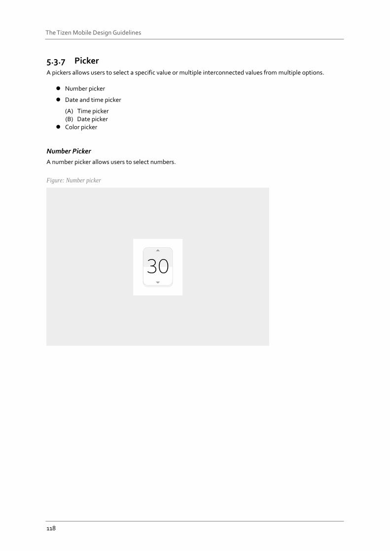
118
The Tizen Mobile Design Guidelines
5.3.7 Picker A pickers allows users to select a specific value or multiple interconnected values from multiple options.
Number picker
Date and time picker
(A) Time picker (B) Date picker
Color picker
Number Picker
A number picker allows users to select numbers.
Figure: Number picker
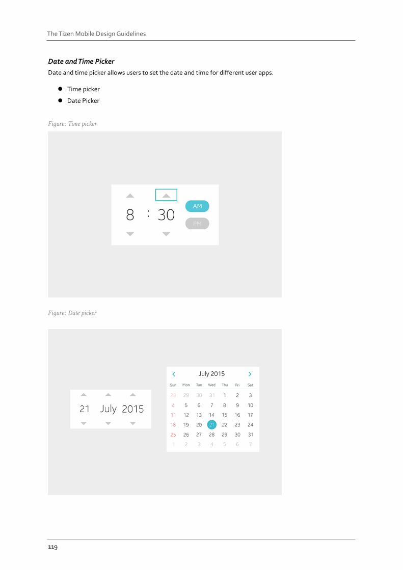
119
The Tizen Mobile Design Guidelines
Date and Time Picker
Date and time picker allows users to set the date and time for different user apps.
Time picker
Date Picker
Figure: Time picker
Figure: Date picker
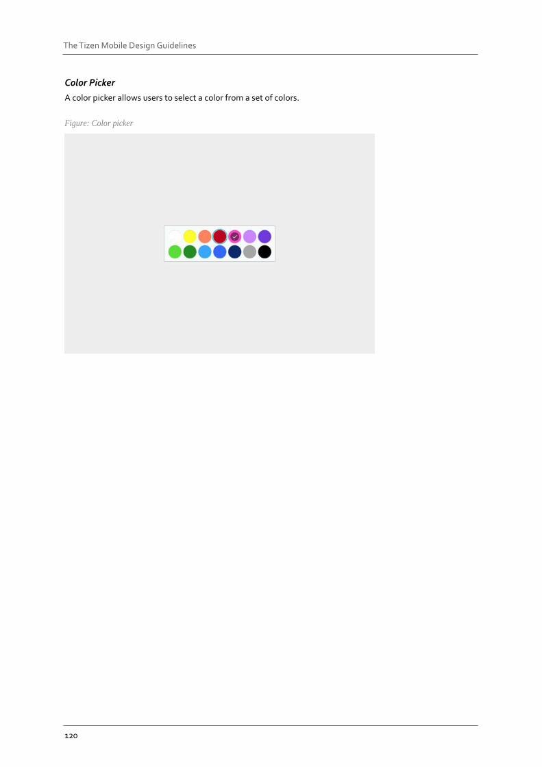
120
The Tizen Mobile Design Guidelines
Color Picker
A color picker allows users to select a color from a set of colors.
Figure: Color picker
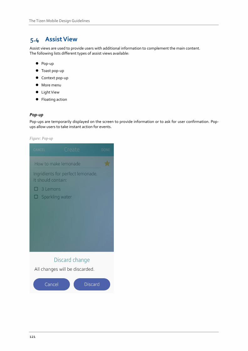
121
The Tizen Mobile Design Guidelines
Assist View Assist views are used to provide users with additional information to complement the main content. The following lists different types of assist views available:
Pop-up
Toast pop-up
Context pop-up
More menu
Light View
Floating action
Pop-up
Pop-ups are temporarily displayed on the screen to provide information or to ask for user confirmation. Pop-ups allow users to take instant action for events.
Figure: Pop-up

122
The Tizen Mobile Design Guidelines
Toast Pop-up
Toast pop-ups are used to deliver simple notifications.
Figure: Toast
Context Pop-up
Context pop-ups are used to provide options for the currently selected objects.
Figure: Context Pop-up
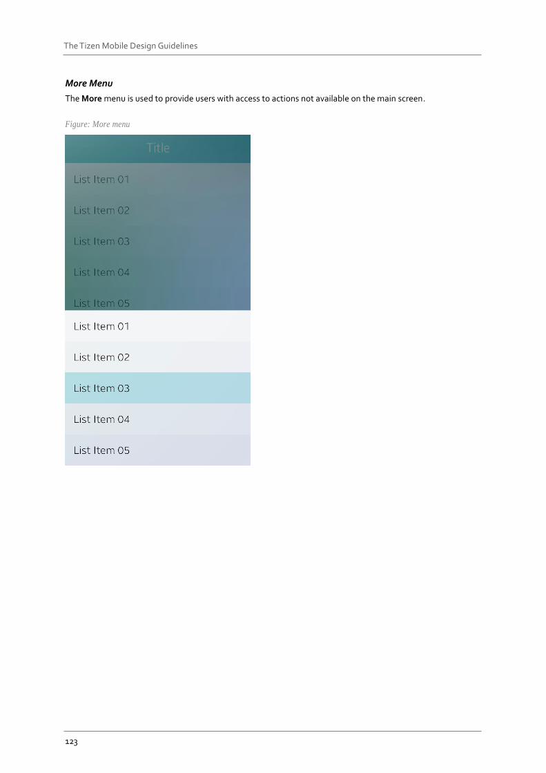
123
The Tizen Mobile Design Guidelines
More Menu
The More menu is used to provide users with access to actions not available on the main screen.
Figure: More menu
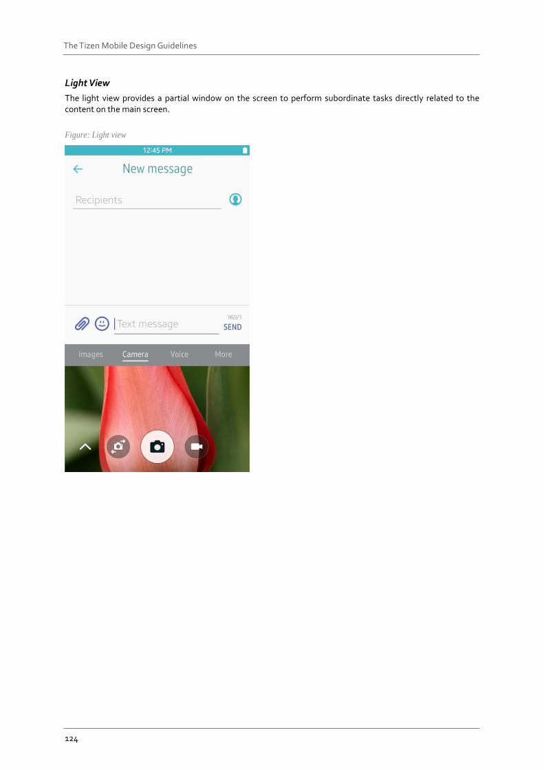
124
The Tizen Mobile Design Guidelines
Light View
The light view provides a partial window on the screen to perform subordinate tasks directly related to the content on the main screen.
Figure: Light view
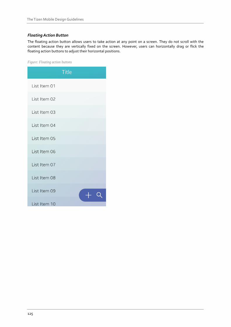
125
The Tizen Mobile Design Guidelines
Floating Action Button
The floating action button allows users to take action at any point on a screen. They do not scroll with the content because they are vertically fixed on the screen. However, users can horizontally drag or flick the floating action buttons to adjust their horizontal positions.
Figure: Floating action buttons