time and change: colour, taste and conservation … · the general surroundings ... consider how...
TRANSCRIPT

Colour in Art, Design & Nature
TIME AND CHANGE: COLOUR, TASTE AND CONSERVATION
J.P. CAMPBELLHonorary Fellow, History of Art, ACE, University of Edinburgh, UK.
ABSTRACTThis paper surveys some major factors which commonly affect colour in paintings over time, with particular reference to art historical judgements about artists’ original intentions. A range of the most common causes of colour alteration, both external and intrinsic, such as surface dirt, darkening varnish, over-painting and old re-touching, the natural yellowing of ageing oil, the rising refractive index of drying oil, fugitive pigments and the effects of light is considered. The extent to which these changes in the appearance of paintings have con-sequences for taste, have implications for the training of art historians and affect how far conservators can, or should, restore colours to their original state is briefl y noted.Keywords: Dirt, varnish, oil, re-touching, over-painting, conservation, fugitive, refractive index, light, pigment.
1 INTRODUCTIONTime changes the appearance of paintings, and these changes affect how works of art are attributed, evaluated, interpreted and appreciated, as the engraving by William Hogarth’s (1697–1764) Time Smoking a Picture 1761 graphically demonstrates (Fig. 1). The illustration shows an oil painting, already obscured by the application of layers of tinted varnish, being further damaged by Father Time, who blows a grimy pall of dirty smoke over the original bright pigments.
Colours, as well as supports, grounds and varnishes of paintings, change over time. These changes can be caused by the intervention of external forces: by accident, such as damage through damp or abrasion and their subsequent repair, by deliberate application of superfi cial layers of glue or var-nish, or simply from the gradual deposit of dirty grease from candle smoke and settling grime from the general surroundings. Changes in colour may also develop from the intrinsic nature of the mate-rials used to make the painting. When ageing paintings are examined, the critic’s understanding of the artist’s intention about the role of colour in his work will be affected by the alterations that have occurred since it was made. To make any reasonable judgement about a painting, art critics should consider how far time has damaged the colour and the colour-tonal balance of that particular work of art, and how far these changes might affect the perception, interpretation and judgement of the artist’s intention. Conservators of paintings have to consider, on a case by case basis, what they ought to do about re-touching missing, damaged or changed areas of paint.
Colour has always held a central role in the study and appreciation of paintings. In the late 17th century, French artists and professional art historians hotly debated the relative supremacy of draw-ing or colour in painting [1]. Roger de Piles (1635–1709) rationalised the judgement of the quality of an artist’s achievement by dividing artistic achievement into four aspects: composition, draw-ing, colour and expression. He allotted marks for each aspect on a score chart with marks from 1 to 20, where 20 equalled unattainable, divine perfection. In this system, Michelangelo only attained a score of 4 out of 20 for colour, whereas Titian was considered to be supreme in colour with the maximum attainable mark of 18 [2]. At least one reason why Michelangelo’s ability as a colourist was so underrated by critics such as De Piles and Sir Joshua Reynolds (1723–1792) was that his paintings had suffered changes over time. We can see from the recent cleaning project of Michelangelo’s Sistine Ceiling, that accumulated layers of glue and deposits of candle grease dirt on the surface of the ceiling had dimmed the effect of the original bright tints almost to a mono-chromatic appearance [3, 4].
www.witpress.com, ISSN 1755-8336 (on-line) WIT Transactions on State of the Art in Science and Engineering, Vol 49, © 2011 WIT Press
doi:10.2495/978-1-84564-568-7/08

78 Colour in Art, Design & Nature
If art historians are to make informed judgements about colour in paintings they need to under-stand that the appearance of most works of art has changed since they were fi rst made, and that colour is one of the major aspects which may have substantially altered over time.
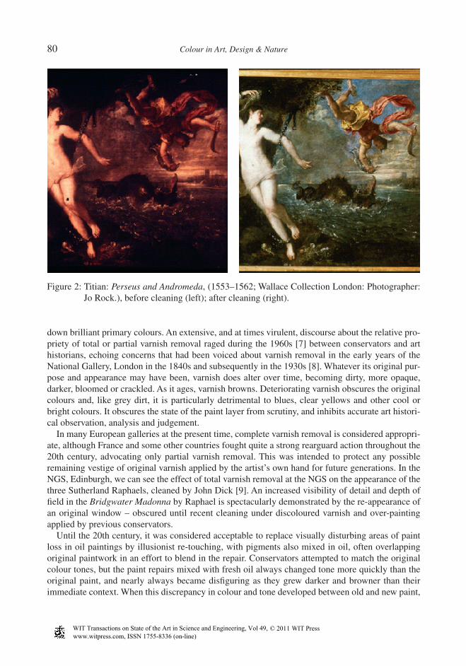
2 CHANGE ABOVE THE PIGMENT LAYERTitian (1488/1490–1576) painted Perseus and Andromeda (1553–1562) as part of one of the most prestigious commissions of the late Renaissance. King Philip II of Spain (1527–1598) commis-sioned an expensive group of large oil paintings of subjects from Ovid for his palace in Spain, when Titian – in the 1550s – was at the very height of his mature powers as a colourist. Titain’s contem-porary and great biographer of 16th century painting, Giorgio Vasari (1511–1574), judged that the newly completed Perseus and Andromeda was the most attractive painting imaginable: a prime example of the leading Venetian colourist’s work [5]. The painting (together with the companion pieces now hanging in the National Gallery of Scotland (NGS), Edinburgh: Diana and Acteon and Diana and Calisto, and at least three further scenes from Ovid) was one of the most famous paint-ings in the world when it was made. Nevertheless, in spite of this auspicious beginning, the painting
Figure 1: William Hogarth, Time Smoking a Picture, Photographer: Jo Rock.
www.witpress.com, ISSN 1755-8336 (on-line) WIT Transactions on State of the Art in Science and Engineering, Vol 49, © 2011 WIT Press

Colour in Art, Design & Nature 79
was in such a poor physical condition by the 19th century that it was unrecognisable as Titian’s work, and looked as if it was painted entirely in variegated browns (Fig. 2).
Perseus and Andromeda led a very dangerous and much travelled life, and the painting bears the marks of many vicissitudes suffered over more than four hundred years. Painted in Venice in 1554, it travelled (off its stretcher and rolled up) to Ghent, where it was received by Philip of Spain in 1556. It was then sent to Spain, where it hung in the Spanish royal collection as one of the group of related Ovidian poesies. By 1626, the picture had left the royal collection and moved, partly by sea, to Eng-land where it was registered as an item in Van Dyck’s (1599–1641) collection in London at the time of his death ([6], p. 396). (Van Dyck died in 1641; his estate was registered in 1644.) It was taken back to Antwerp, before being bought by the 10th Earl of Northumberland, and it then passed through a series of English collections. It changed so much in the process that it lost its identity, and was purchased by the third Marquess of Hertford in 1815 as a painting by another Venetian artist – Paulo Veronese (1528–1588). After being crated for six years in a warehouse, it came to Hertford House, now the Wallace collection, where it was stored for 18 years before being hung, to its very great detriment, in the bathroom at Hertford.
The odyssey of the Perseus and Andromeda has left its mark . . . We should, in these circumstances, be grateful that there is anything to see at all. ([6], p. 406)
In comparing Titian’s Perseus and Andromeda (1553–1562) before and after cleaning (Fig. 2, left and right), it is evident that an art critic would form a completely different judgement about the art-ist’s ability as a colourist, dependent on whether the painting was studied before or after its restoration treatment. Figure 2 (left), before the painting was cleaned and restored, shows how dark, brown in tint, lacking in apparent depth or volume and practically illegible in some areas it had become. The edges of the picture were badly damaged and had suffered several repairs. Paint in many areas had been squashed, scuffed or lost altogether. A great deal of discoloured over-painting had been applied to areas of widespread paint loss and the repairs and re-touching made with oil had darkened consid-erably. An attempt to conceal this discrepancy of tone between old and new paint had been made by applying layers of tinted varnish. The considerable changes to the appearance and condition of the painting are the consequence of the extreme physical conditions which it had experienced over the centuries. Herbert Lank cleaned the Perseus and Andromeda at the beginning of the 1980s. When Lank had fi rst removed the grey brown layers of dirt, then the brown-stained layers of darkened varnish and, fi nally, some of the degraded oil re-touching on Titian’s Perseus and Andromeda, then Titian’s original delicate primrose yellows on Perseus’s costume, clear cerulean blues in the sky, subtle modelling of a middle distance landscape, special relationships between the pearly body of Andromeda and the glam-orous, technicolour Perseus all became visible. It is now again the most attractive painting imaginable, and the authorship of Titian and his eminence as a master of colour is re-established.
As far as fi lms of surface dirt are concerned, there is general agreement among art historians and conservators that it is proper to remove candle grease, dust, etc., because these are entirely external to the work of art, and have nothing to do with the intention of the artist. Methods of how to do this, however, remain debatable. Spit cleaning is considered a fairly safe method to take off surface dirt from oil paintings, but in the past many abrasive, bleaching or corrosive methods were used – ashes, bread, onion, acid, water – which can score, bleach or alter the colour and appearance of the paint surface. If these treatments have been used, they are bound to affect what we see today.
Varnish removal is a totally different issue from removal of surface dirt, and is much more conten-tious. Clear, transparent varnish may be have been applied to oil paintings by the artist himself, in order to enhance the full value of colours. There is some evidence that varnish could sometimes have been tinted (usually neutral or brown) by the painter himself, and be deliberately intended to tone
www.witpress.com, ISSN 1755-8336 (on-line) WIT Transactions on State of the Art in Science and Engineering, Vol 49, © 2011 WIT Press
80 Colour in Art, Design & Nature
down brilliant primary colours. An extensive, and at times virulent, discourse about the relative pro-priety of total or partial varnish removal raged during the 1960s [7] between conservators and art historians, echoing concerns that had been voiced about varnish removal in the early years of the National Gallery, London in the 1840s and subsequently in the 1930s [8]. Whatever its original pur-pose and appearance may have been, varnish does alter over time, becoming dirty, more opaque, darker, bloomed or crackled. As it ages, varnish browns. Deteriorating varnish obscures the original colours and, like grey dirt, it is particularly detrimental to blues, clear yellows and other cool or bright colours. It obscures the state of the paint layer from scrutiny, and inhibits accurate art histori-cal observation, analysis and judgement.
In many European galleries at the present time, complete varnish removal is considered appropri-ate, although France and some other countries fought quite a strong rearguard action throughout the 20th century, advocating only partial varnish removal. This was intended to protect any possible remaining vestige of original varnish applied by the artist’s own hand for future generations. In the NGS, Edinburgh, we can see the effect of total varnish removal at the NGS on the appearance of the three Sutherland Raphaels, cleaned by John Dick [9]. An increased visibility of detail and depth of fi eld in the Bridgwater Madonna by Raphael is spectacularly demonstrated by the re-appearance of an original window – obscured until recent cleaning under discoloured varnish and over-painting applied by previous conservators.
Until the 20th century, it was considered acceptable to replace visually disturbing areas of paint loss in oil paintings by illusionist re-touching, with pigments also mixed in oil, often overlapping original paintwork in an effort to blend in the repair. Conservators attempted to match the original colour tones, but the paint repairs mixed with fresh oil always changed tone more quickly than the original paint, and nearly always became disfi guring as they grew darker and browner than their immediate context. When this discrepancy in colour and tone developed between old and new paint,
Figure 2: Titian: Perseus and Andromeda, (1553–1562; Wallace Collection London: Photographer: Jo Rock.), before cleaning (left); after cleaning (right).
www.witpress.com, ISSN 1755-8336 (on-line) WIT Transactions on State of the Art in Science and Engineering, Vol 49, © 2011 WIT Press

Colour in Art, Design & Nature 81
a common solution was to disguise the increasing difference in tone with a tinted layer of varnish, thus obscuring the whole image even further [10]. Now conservators usually remove unsightly repainted patches, and fi ll in lacunae (taking care not to overlap any original paint) using pigments fl oated in a modern vehicle that does not brown with age. In the case of the Perseus and Andromeda, paint loss was so extensively distributed over the canvas that total replacement of old repaints seemed unrealistic.
3 CHANGES INTRINSIC TO MATERIALSExternal factors such as surface dirt, discoloured varnish and re-touches clearly tend to increase the browness and darkness, making whites yellow, yellows brown and blues green in ageing paintings. In the case of oil paintings, these effects are greatly exacerbated by the nature of the very medium in which the pigments are mixed. Oil itself changes over time: it yellows, and its refractive index rises during drying, usually causing increased transparency, irregularly, over the whole image. Many pig-ments with a refractive index level only slightly higher than wet oil appear to be opaque when the paint is newly applied, but become more transparent as the oil medium dries. The gap between the refractive index of the oil medium and the refractive index of the individual pigment continues to close over time, quite quickly at fi rst and then increasingly slowly. The optical effect of this is that one can gradually see deeper into to the layers of paint, tones darken, forms appear fl atter, distances reduce and depth of fi eld becomes shallower. Often under-drawing or changes made by the artist (pentimenti), which were originally covered by opaque paint, become visible, as the oil paint dries and becomes transparent enough to reveal forms that the artist intended to conceal [11]. Both paint-ings by Antoine Watteau (1684–1721) in the NGS show optically confusing effects of the rising refractive index of oil. In the Le Denicheur de Moineaux (c. 1710) (Fig. 3), considerable areas of over-painting (made by a later hand when the picture changed its function from being a shop sign) have become semi-transparent, revealing sections of Watteau’s original decorative design. Watteau’s own changes to the poses of his two principal fi gures in Fetes Venetiennes (c. 1717) (Fig. 4) are now clearly visible: the original placing of the male dancer’s legs becomes increasingly evident as years pass, giving him a four-legged appearance, while the tilted hat and original hemline of his partner’s costume, painted over by Watteau during the gestation of the picture, can now be seen quite clearly.
As early as 1926, Arthur Pillans Laurie (1861–1949), Professor of Chemistry and Principal of Heriot Watt College, Edinburgh from 1900, cited nine properties of oil which affect colour in paint-ings, in his The Painter’s Methods and Materials [12]. Laurie notes remedial action that could have been taken by the painter in the fi rst place to ameliorate the effects of time on oil paintings. Painting over a white ground rather than on a middle tinted base, so that the brilliance of the white gesso could counteract the darkening effect of the increasingly transparent pigment/oil layers, is instanced in Laurie’s Point 7. It is perfectly clear from the surviving evidence, however, that few painters from the 16th century onwards, who worked in oil, had much technical knowledge about the nature of oil or its changing optical relationship to the pigments they were using.
It is evident to us now, from studying the armies of oil portraits of important men of the past three or four centuries, who stand in their place of work against sober backgrounds, that something has gone seriously wrong with the artist’s original visual concept. Faces, and sometimes hands, con-structed with thick layers of paint containing a great deal of white, usually remain well modelled, full of form and character. Dark areas like the background and the dark clothed fi gures, however, are normally thinly painted, and have lost their volume, looking like one dimensional cardboard cut-outs. From the 17th century, one of the recognised challenges to painters was successful volumetric modelling of masses in blacks. Van Dyck was considered the great master of variegated blacks, and
www.witpress.com, ISSN 1755-8336 (on-line) WIT Transactions on State of the Art in Science and Engineering, Vol 49, © 2011 WIT Press

82 Colour in Art, Design & Nature
artists who hoped to emulate the distinguished effects of the master paid particular attention to nuanced shading of impressive fi gures clothed in rich robes or well cut suits. Painters did not realise that the very medium in which they worked would eventually foil this ambition. Most of the original careful modelling of dark-clad fi gures, many details of clothing, most differentiation of texture, subtle changes of tone and colour between fi gure and dark background, can now only be discerned in infra-red photographs or X-rays. No amount of dirt or varnish removal from these thinly painted blacks can restore the painter’s original effects of mass and volume, which continue to degrade. There is little that a conservator can do about this situation.
4 PIGMENT CHANGEArtists have always yearned for jewel-like, vivid, pure, clear hues, and these tend to come from toxic lead, arsenic or mercurial compounds, or from unstable animal or plant extracts, such as cochineal or the madders. Although Renaissance artists often ground their own pigments from tried and tested recipes, it became common from the 18th century onwards to buy from professional colour-men, who supplied ready made pigments and materials which could be seductively bright but were often unstable, and which had other undesirable properties. Pigments themselves, for instance, are not immune to change. Some inert colours are very stable over time, but these are often the duller earth colours such as the yellow ochres, umbers or terra verte and terra cotta [13, 14].
Perhaps the most common and dramatic pigment change is that of copper resinate green, verdigris or copper acetate green, which oxidises if it is not sealed from the air and which then turns from a
Figure 3: Antoine Watteau, The Robber of the Sparrow’s Nest, Courtesy of the National Gallery of Scotland.
www.witpress.com, ISSN 1755-8336 (on-line) WIT Transactions on State of the Art in Science and Engineering, Vol 49, © 2011 WIT Press

Colour in Art, Design & Nature 83
light, pure green to a deepening brown ([13], p. 73–75). When Titian’s early work in the NGS, The Three Ages of Man (1513–1514) (Fig. 5) was cleaned and dirty varnish removed, subtle, cool colours in the clear blue sky and misty landscape background were revealed.
However, the trees and the plants, grass and foliage in the foreground remain brown (Fig. 5, right). When Titian painted the picture, the virile young couple sat among a spring landscape, where nature was appropriately represented by light, modelled greens. Now this area has become full of dark, fl at autumnal browns, more appropriate to the fi nal season of life. This colour change has happened entirely through the nature of the materials used, via chemical alteration, from within the pigment itself, completely contradicting the original message of verdure, burgeoning growth and vigour in the foreground. Affi cionados can often be misled by this particular type of colour change. Claude Lorraine’s (1600–1682) landscapes became so much revered by the 18th century intelligensia that, when the green foliage in the paintings turned brown, connoisseurs thought that the brown was intentional. They bought especially brown-tinted looking-glasses (Claude Glasses) to examine nature in its ‘improved’ state, and they considered that they were viewing nature as she ought to be in an ideal world: brown, and not green. The imagined authority of great artists and its effect on taste, led even eminent 19th century painters like Sir Charles Eastlake (1793–1865) to ‘tone’ their own paintings:
All vivid warm colours, and spots of any such colour in a larger mass, when toned, and reduced by brown, are not only more harmonious and agreeable, but appear to have their actual hues deepened. [15]
Figure 4: Antoine Watteau, Fetes Venetiennes, Courtesy of the National Gallery of Scotland.
www.witpress.com, ISSN 1755-8336 (on-line) WIT Transactions on State of the Art in Science and Engineering, Vol 49, © 2011 WIT Press

84 Colour in Art, Design & Nature
Eastlake had great authority in 19th century Britain as a Director of the National Gallery of London, Secretary to the Fine Arts Commission, scholar, and as a professional painter. Many followed dictates laid out in his texts on painting technique:
The toning brown should be used everywhere to mitigate crudeness, even in partial tints (that may be too vivid) and spots – for where, on a very light scale the toning is proportioned – not only in draperies, skies, landscape and inanimate objects, but even in fl esh [15].
These ideas had great infl uence in corrupting 19th century taste by equating bright colours in paint-ing with vulgarity, but they were corroborating an already fi xed conviction among connoisseurs. The art patron and amateur landscape artist Sir George Beaumont (1753–1827) averred that a good land-scape painting should have the tone of an old violin, and the story goes that Constable (1776–1837) took the violin belonging to his friend and fellow guest, Sir David Wilkie (17855-1841), and laid it on Sir George’s bright green lawn, in order to demonstrate the falsehood of their host’s idea.
5 FUGITIVE PIGMENTSAll these instigators of change in the appearance of oil paintings caused old pictures to look very fl at and brown, in contrast to the descriptions of how they struck viewers when newly made. There is yet a further major issue related to colour change which has grossly affected art historical judge-ment: that of fugitive pigments. A notorious example of colour disappearing completely and causing an embarrassing misunderstanding among art historians in the interpretation of iconogra-phy, is the tempera painting in the National Gallery, London by Lorenzo Monaco (c. 1370–1445) of The Coronation of the Virgin completed in 1413 (Fig. 6). Scholarly discussions about the sym-bolism of the very unusual colour of the Virgin’s white robe as a demonstration of her inviolate innocence and essential purity were undercut when the painting was considered for conservation. At this point, an area of the Virgin’s white robe, which had been protected from light by over-painting, was found to be a rich royal mauve. Tests on white areas revealed that a fugitive (probably vegetable based) red lac with blue underlay had been used and the red on the surface had faded over time, affected by the ultra violet rays of daylight. The symbolism of the original purple had traditionally indicated the royalty of the Queen of Heaven rather than the innocence of the Virgin [16].
Later, in an 18th century context, when artists were continually seeking brilliant and jewel-like primary colours in ready-made industrial pigments available from their colour suppliers, J.B. Greuze (1725–1805) painted his famous Girl Mourning her Dead Canary (NGS) in 1765 (Fig. 7). It was
Figure 5: Titian (Tiziano Vecelli), Three Ages of Man, on long term loan to the National Gallery of Scotland, Courtesy of Private Owner: before cleaning (left); tree – after cleaning and varnish removal (right).
www.witpress.com, ISSN 1755-8336 (on-line) WIT Transactions on State of the Art in Science and Engineering, Vol 49, © 2011 WIT Press

Colour in Art, Design & Nature 85
exhibited that year in the Paris Salon, where it created a great stir and was immediately written up in an enthusiastic review by Diderot. (Denis Diderot (1713–1784) was a prominent French writer, encyclopaedist, philosopher and infl uential art critic in the Enlightenment.) Two and a half centuries later the picture features a bird that is grey, not yellow, among blue foliage. It is clear that a semi-transparent, uniform semi-transparent glaze of fugitive, vegetable yellow had been laid over a monochromatic modelling of the form of the bird to produce yellow, and over the blue modelling of the leaves to give an optical reading of green, but it is also clear that this yellow has been affected over the years by light. The yellow pigment can only now be identifi ed by chemical analysis. The painting was fully described by Diderot in the year it appeared at the Salon, and we can deduce that Greuze had used an unreliable pigment: seduced no doubt, like so many artists in the 18th century, by the clarity, purity and intensity of the yellow offered by the colour salesmen. Many bright pig-ments proved susceptible to ultraviolet rays and faded in sunlight.
Nineteenth century paintings in the NGS by Sir David Wilkie 1785–1841, such as The Irish Whisky Still, 1835 (Fig. 8), provide a depressing reminder that even artists who were particularly careful about materials did not always know what they were doing about colour when they bought ‘ready-mades’. Bitumen, or asphaltum, is a tarry compound that looked as clear as honey when new, but which never dried, which continuously darkened, became opaque and cracked, and which
Figure 6: Lorenzo Monaco, Coronation of the Virgin, Courtesy of the National Gallery, London. Copyright National Gallery, London.
Figure 7: Jean-Baptiste Greuze, Girl Mourning a Dead Canary, Courtesy of the National Gallery of Scotland.
www.witpress.com, ISSN 1755-8336 (on-line) WIT Transactions on State of the Art in Science and Engineering, Vol 49, © 2011 WIT Press

86 Colour in Art, Design & Nature
corrupted other pigments as it deteriorated. Like Sir Joshua Reynolds before him, Wilkie became a complete convert to this mixture, and used it as varnish, pigment and medium in his later paintings, to their great detriment, in his search for a transparent Rembrandtesque golden glow in shadowed areas. Thomas Gainsborough’s Mrs. Graham (1775–1777, NGS) demonstrates that it was possible, even in the 18th century, to avoid many of these pitfalls and to create lasting, magical colours with paint using a very simple technique, with pure colours, simple thinning vehicles and very basic oil. Even Gainsborough, however, fell foul of fugitive pigments on occasion [17].
6 CONCLUSIONIt is clear, from what we have seen, that even the greatest of paintings may suffer severe physical damage and change greatly in appearance over time. It is evident that oil presents particular prob-lems as a painting medium. The question for conservators has been how far to intervene with remedial work when a visually disturbing amount of paint has been lost, and colour has disappeared or changed. This is a diffi cult decision, and each problem has to be considered on its merits. In the past, it was common to grossly over-clean paintings, taking off not only dirt and varnish but even the surface of original paint. In the infamous case of cleaning the two great Altieri Claudes in 1799, a conservator was observed to have excoriated the paint level ‘in several places’ to the very canvas. In this case, Sir Thomas Lawrence and Sir Benjamin West expostulated with the cleaner, accusing him of fl aying Claude’s great works, but he was undismayed, claiming that ‘all would very easily be put to rights’ by painting in the missing areas of colour [18]. He was not alone in this cavalier attitude. It was then considered permissible – even desirable – for restorers to fi ll in lacunae, and to over-paint original passages and brighten up colours to make the work look like new. This is not now consid-ered to be permissible. The history of the work must be considered; original paintwork must not be prejudiced by over-painting; original and new must be distinguishable at a certain distance; any intervention must be reversible as far as possible.
An extreme case of repair of paint loss, where all these issues have been clinically considered, can be seen in the Crucifi xion, Sta. Croce, by Cimabue (c. 1240–1302?) (Fig. 9, left), where an Italian restoration theory using a system of colour abstraction has been employed. This icon of the city of Florence suffered huge areas of paint loss during the Florence fl ood of 1966, but due to its prominent position as a mascot of the city, it was clear that some acceptable resuscitation programme was essential (Fig. 9, middle). Psychologists as well as art historians and art conservators were consulted and eventually they evolved a much publicised theory of perception [19, 20] crystalised by Umberto Baldini. This theory aimed to create a bridge of abstract, toned hatching between the large areas of paint loss. All retrievable original paint was preserved. These abstract infi lls are supposed to enable
Figure 8: Sir David Wilkie, The Irish Whisky Still, Courtesy of the National Gallery of Scotland.
www.witpress.com, ISSN 1755-8336 (on-line) WIT Transactions on State of the Art in Science and Engineering, Vol 49, © 2011 WIT Press

Colour in Art, Design & Nature 87
the eye to pass from one surviving area of the image to the next. Few observers of this technique judge the theory of colour abstraction to be completely convincing.
A question which regularly faces most conservators of 19th century oil paintings remains. What should the restorer do in such a case, where the painting is an important historical document, and greatly damaged? The general consensus among conservators it to make the painting physically safe, but then to intervene as little as possible. With the increasing sophistication of investigative methods like ultraviolet examination, infra-red photography and X-rays it is possible to examine the physical state of a painting. Chemical analysis of paint and some non-invasive techniques can reveal the original existence of fugitive colours. Virtual imaging can recreate the original brilliant of colouring of an oil painting on the screen without prejudicing the actual work itself. In the future, we may see in the major galleries these virtual images displayed beside paintings which have been grossly changed by time. They should help us to imagine the original intention of the artist, when the works were fi rst created, and may enable art historians and critics to make more informed judgements about colour in works of art.
REFERENCES [1] Roger de Piles, Dialogue sur le coloris [Dialogue upon colour], 1673. [2] Roger de Piles, Cours de peinture par principes avec un balance de peintres [The Principles of
Painting], 1708. Reproduced in Elisabeth G. Holt, Literary Sources of Art History, Princeton University Press: Princeton, pp. 415–416, 1947.
[3] Colalucci, G., Michelangelo’s Colours Rediscovered in the Sistine Chapel, Harmony, 1986. [4] Beck, J.H. & Daley, M., Art Restoration: the Culture, the Business and the Scandal, John Murray:
London, 1993. [5] Vasari, G. (1511–1579), Lives of the Painters, Sculptors and Architects, Vols. I and II, Everyman’s
Library, 1996. [6] Ingamells, J., ‘Perseus and Andromeda’: the provenance. Burlington Magazine, 124(952), 1982. [7] Ruhemann, H., The cleaning of paintings, 1960. Burlington Magazine, 1960–1963. Appendix
D2, Controversy in 1846, pp. 327–335. [8] Hendy, P., Cleaned Pictures (1936–1947), National Gallery, 1947. [9] Clifford, T., Dick, J. & Weston-Lewis, A., Raphael: The Pursuit of Perfection, National Galleries
of Scotland Publications, 1994.
Figure 9: Cimabue, Crucifi xion in Santa Croce Florence, before, during and after restoration, Photographer Jo Rock.
www.witpress.com, ISSN 1755-8336 (on-line) WIT Transactions on State of the Art in Science and Engineering, Vol 49, © 2011 WIT Press

88 Colour in Art, Design & Nature
[10] Restauration des peintures, Les dossiers du departement des peitntures 21, Musee du Louvre, No. 9, pp. 34–36, 1984. Repeints assombris et vernis jauni.
[11] Ruhemann, H., The Cleaning of Paintings, Praeger, p. 167, 1967.[12] Laurie, A.P., The Painter’s Methods and Materials, Dover: New York, p. 155, 1967.[13] Harley, R.D., Artist’s Pigments c1600–1835, 1970.[14] Feller, R.L., Artists’ Pigments: A Handbook of their History and Characteristics, CUP, 1985.[15] Eastlake, C.L., Sir, Methods and Materials of Painting of the Great Schools and Masters,
Vol. 2, Dover: New York, pp. 363–364, 1960.[16] Burnstock, A., The fading of the virgin’s robe in Lorenzo Monaco’s ‘Coronation of the Virgin’.
National Gallery Technical Bulletin, 12, pp. 58–65, 1988.[17] Bomford, D., Roy A. & Saunders, D., Gainsborough’s ‘Dr. Ralph Schomberg’. NGL Technical
Bulletin, 12, pp. 44–57, 1988.[18] Whitley, Artists and their Friends in England, Vol. 2, pp. 358–359, 1700–1799.[19] Baldini, U. & Casazza, O., The Cimabue Crucifi x, Exhibition Catalogue: Florence, 1982.[20] Baldini, U., Teoria del restauro e unita di metodologia, 2 vols, Nardini Publications: Florence,
1978 and 1981.
www.witpress.com, ISSN 1755-8336 (on-line) WIT Transactions on State of the Art in Science and Engineering, Vol 49, © 2011 WIT Press