through diversity effectiveness air forum 2006 may 18, 2006 dynamic charts: an approach to making...
TRANSCRIPT

TH
RO
UG
H D
IVE
RS
ITY
TH
RO
UG
H D
IVE
RS
ITY
EF
FE
CT
IVE
NE
SS
EF
FE
CT
IVE
NE
SS
AIR Forum 2006
May 18, 2006
Dynamic Charts:
An approach to making institutional data available through graphical means
Leo Vélez-RamosUniversity of Puerto Rico: Mayaguez Campus
Institutional Research and Planning Office
Thursday, 3:50 p.m. – 4:30 p.m.

2May 18, 2006 Dynamic Charts: An approach to making institutional data available through graphical means.
Topics
Background Motivation Objectives Demonstration Tools for the Job Questions / Comments
3May 18, 2006 Dynamic Charts: An approach to making institutional data available through graphical means.
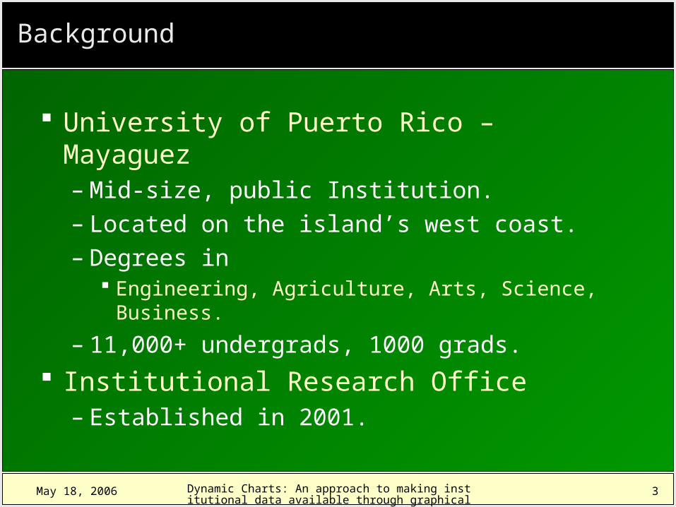
Background
University of Puerto Rico – Mayaguez– Mid-size, public Institution.– Located on the island’s west coast.– Degrees in
Engineering, Agriculture, Arts, Science, Business.
– 11,000+ undergrads, 1000 grads.
Institutional Research Office– Established in 2001.
4May 18, 2006 Dynamic Charts: An approach to making institutional data available through graphical means.
Motivation
“Modern data graphics can do much more than simply substitute for small statistical tables. At their best, graphics are instruments for reasoning about quantitative information. Often the most effective ways to describe, explore, and summarize a set of numbers – even a very large set – is to look at pictures of those numbers. Furthermore, of all methods for analyzing and communicating statistical information, well-designed data graphics are usually the simplest and at the same time the most powerful.”
Edward R. Tufte The Visual Display of Quantitative
Information1983 Graphics Press
5May 18, 2006 Dynamic Charts: An approach to making institutional data available through graphical means.
Motivation
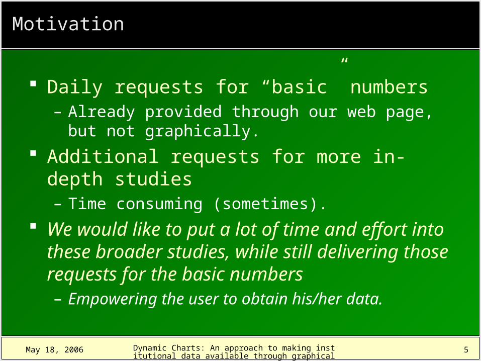
Daily requests for “basic” numbers– Already provided through our web page, but not
graphically.
Additional requests for more in-depth studies– Time consuming (sometimes).
We would like to put a lot of time and effort into these broader studies, while still delivering those requests for the basic numbers– Empowering the user to obtain his/her data.
6May 18, 2006 Dynamic Charts: An approach to making institutional data available through graphical means.
Objectives
To provide a web based, interactive system for delivering basic, routine institutional data– Provide data in tables as well as charts.– Easy to use.– Available for everyone who needs it.
To feed this system with data from our institutional database.
To establish a method for adding new content to the system.

7May 18, 2006 Dynamic Charts: An approach to making institutional data available through graphical means.
Demonstration

8May 18, 2006 Dynamic Charts: An approach to making institutional data available through graphical means.
Advantages
Table and chart provided in one integrated view– Can be used as an online tool for analysis, with
limited capabilities.
Charts are updated automatically as data is modified or new information is added to the institutional database.
Data is kept centralized in one place Routinely requests are self-attended, leaving
more time for other tasks.

9May 18, 2006 Dynamic Charts: An approach to making institutional data available through graphical means.
Limitations (Room for Improvement)
Limited number of categories– More to come: admissions, faculty/staff, student
performance (grades, dropouts, transfers, etc). No search mechanisms available
– “I’d like to see every available chart related to the School of Business.”
No querying parameters– Cannot establish a “custom” initial dataset.
Internet Explorer is the only browser currently supported– Currently addressing this issue.

10
May 18, 2006 Dynamic Charts: An approach to making institutional data available through graphical means.
Tools for the Job
Oracle Database & Tools– Ongoing Datawarehouse Effort.
Apache HTTP Server Php scripting language
– Ties everything up. Swiff Chart Pro & Generator
– Charts styling and publishing. Adobe/Macromedia Flash
– Charts Menu. HTML, XML, Javascript

11
May 18, 2006 Dynamic Charts: An approach to making institutional data available through graphical means.
System Diagram
37%
25%
19%19%
Client (Browser) HTTP Server Database Server
ChartData
ChartDetails
Titles, Colors, fonts…
IR Datawarehouse
12
May 18, 2006 Dynamic Charts: An approach to making institutional data available through graphical means.
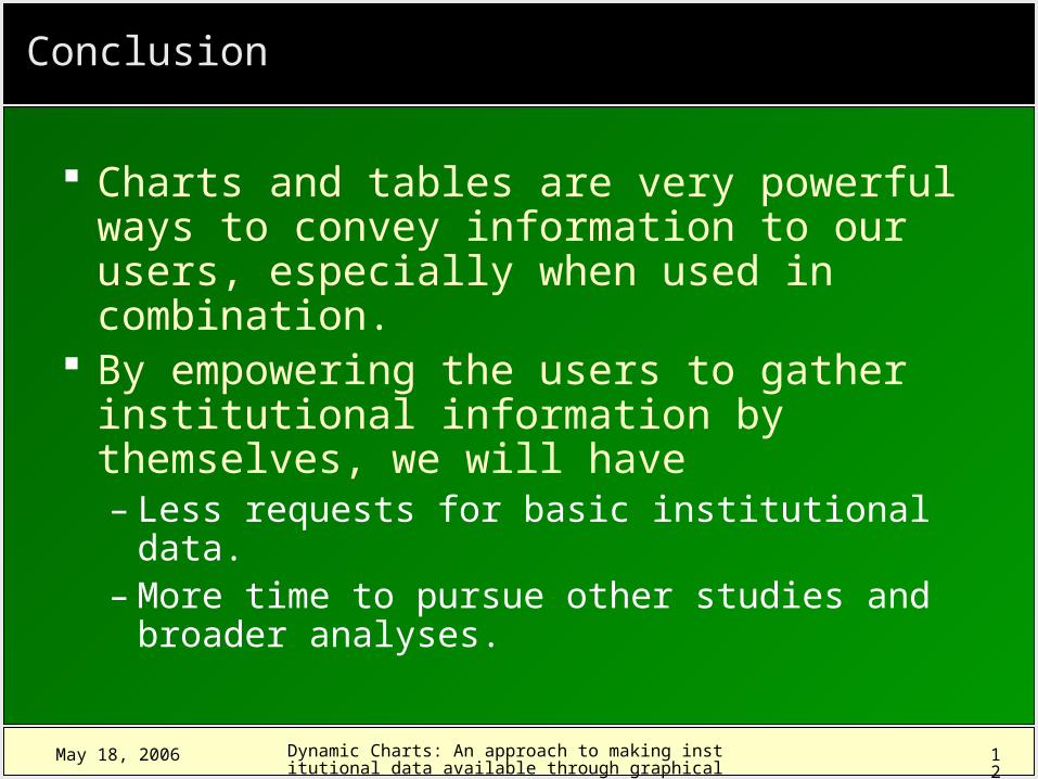
Conclusion
Charts and tables are very powerful ways to convey information to our users, especially when used in combination.
By empowering the users to gather institutional information by themselves, we will have– Less requests for basic institutional data.– More time to pursue other studies and
broader analyses.

13
May 18, 2006 Dynamic Charts: An approach to making institutional data available through graphical means.
More Information on Tools
Oracle Database & Tools http://www.oracle.com
Php scripting language http://www.php.net
Swiff Chart Pro & Generator http://www.globfx.com
Adobe/Macromedia Flash http://www.adobe.com

14
May 18, 2006 Dynamic Charts: An approach to making institutional data available through graphical means.
Questions

15
May 18, 2006 Dynamic Charts: An approach to making institutional data available through graphical means.
Thank You!
Leo O. Vélez-Ramos
Auxiliary Researcher
University of Puerto Rico - Mayaguez
Presentation: http://oiip.uprm.edu/pres1.html
Charts: http://oiip.uprm.edu/charts_menu.php